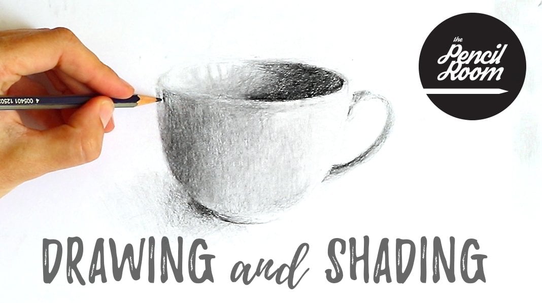
Transcripts
1. Introduction: Hello, I'm Emily. I'm an artist from New
Zealand and I teach drawing classes online
through my business that pizza room online. In this lesson, we're going
to go right back to basics. We're going to cover all
of the sketching basics, including proportion,
simple shapes, shading, and hard
and soft edges. And I'm going to try and
keep it as simple as possible so I won't get
carried away with the drawing, will keep it at a sketch stage, but it's going to cover
everything that you need to get. A sketch that has
three-dimensional form and that has a likeness
to your subject.
2. Materials: These are the materials
you're going to need. You will need a sketchbook. You will need an HB pencil, something that you could
use quite lightly, and then you need a darker
pencil like a to-be pencil. I'm using my Staedtler Mars technical mechanical
pencil here. It has a quite a sharp blade. This is quite a dark one too, so that you'll be able to
see it when I'm sketching. And then when we
move to shading, I'm going to use this to-be. It's a Tombow monograph
pencil and it's very soft, gives quite dark marks. And then you'll also
need in eraser as well.
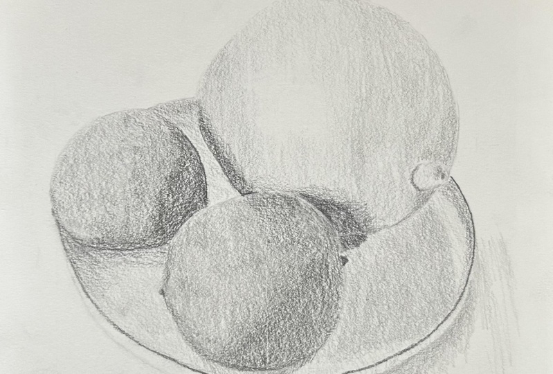
3. Our Subject: This is the image that we're
going to be sketching. It's quite simple. It has
some spherical shapes and it quite easy to
observe and figure out. And it's also got that
ellipse of the bowl as well. It's simple, but sometimes
when things are simple, you don't have a lot of
room to hide as well. I've chosen this
one just because it's a really good one for
getting that sense of form. How can you get that
lemon and those lines to look like they are rounded. And how can you get the
lights and the darks and the to help with
that seats are full. We can turn this into a
black and white image and it's just going to
help us see it without the distraction of the color. It also helps us
to see the value of color are the
different tonal values. So you can see the
yellow of the lemon is lighter than the
green of the lives. You can also see that I've
bought the grid up on. This is in procreate
on the iPad. And we're going to use
that grid to start off. I don't often use
grids, to be honest. I do use this very
simple cross-section. Sometimes I'll draw
it, sometimes I won't, I'll just be using
it in my mind. I have nothing against
using grids in gridding out your whole drawing and mapping everything
out before you start shading working
grid by grid, but it just doesn't
really work for me. I like the exit sketch
on the go as well. And difficult to grid off something that you're
looking at in real life. This is a kind of an easy way to use a grid on a photograph, but also to be able
to represent the grid that you might be imagining in your mind when you're looking at a subject that's in front
of you in real life.
4. Proportion: So hopefully you can
see the grid there. I'll just draw it out for you. So it's a little bit clearer for this first stage
that we go through. So we've got the line
coming across here, a line coming down here. And then we've got the square
and I've used that square, or I've learned
that square up with the sides and the
bottom of the bowl. And you can see
that the width of the drawing is going to be
what the width of the bone is. This very first thing
we're going to do is just map out a very simple
grid on your page. It's going to determine
how big our drawing is. Let's bring this
up bigger so you can see it more clearly. I'll draw us in a similar
size to that grid as well. He's don't have to be
perfectly straight lines. I'm not big on
perfect lines anyway. And then we'll go
seem to align this, this is the most important, actually this excess
and here because we can always read outwards
if we need to, we want to be able
to see into things around this x axis here. I think I'm here for my
squeeze a little bit uneven. Maybe these ones need to
come out just a little bit further to try and get
each one of these square. He wanted to get really
particular with that. You can measure them. Chick these edges that
they're all about the same amount should
be somewhere in-between. And keep your marks
really liked using an HB pencil or even a to
H of your heavy handed. And we can always
go darker later on that I'll draw dark enough that you can
see it on the video. We've got our
cross-section in here now. And like I said, this is a really good
thing to imagine. Anytime you're
drawing something, think about the whole
composition or think about the entirety of what's going in your drawing in the
unimagined with a scene, two pointers on a
horizontal line and on the vertical line. And now we can start to put
in these different parts. So we'll have one line here. The other one's going to just
come over the edge here. And it's going to sit slightly below halfway on that line. And then we've got the lumen, which is going to cut
through the center here and come out around here. But the first thing I'm
gonna do is put in the bowl. So you can see it just
comes up here and then we can even look
at this triangle shape. So use the grid
that you've got on there to see the negative
space, this space here. And try to match that
to the photograph. If you've downloaded
the photograph, you can actually
be drawing on top of the photograph as well. You know, just to kind
of get you I used to what you're seeing or convince yourself of what you're seeing. Here is where the ball
comes up to about here. Keep it light and sketchy. And then if we think
about how far down the bowl comes in this section, it's definitely below
halfway of this square. So it might be,
make it out here. And then it sort of gives us a way to place the
back of the bowl. This should be a
nice smooth ellipse. Work your way around
until you get something that feels balanced. You can tidy up the
lines if you want. If you're drawing light
enough, you might not have two. And now let's go. He didn't put in
this first line, this one in the scene
to look at with the vertical line
intersects the line. If we think about one side
of the line being here, in one side being here, then this one in the middle, it's just slightly to the right of halfway
across the lime. I hope that makes sense. We can also think about how does the, the end of the line, the left-hand side of the line, where does it line up with
the center of the square? So each one of these
could be graded up again. But don't, don't spend
too much time doing it. Like I said, I'm
I'm all for grids, but I also like to
keep things practical, so this one's pretty good
to come out to about here, I'm looking at where
it occurs across. That square. Comes up quite close
and it's an oval shape. So this is the
bottom of the bowl. We've also got to bring in just the top rim of
the bowl as well. So it's just going to come up a little bit to be out there. We can tidy that up
later and we can also bring it down a little
bit later if we need to. Main thing is the
relationship between these, these lemons and, or
lime and lemon in lines. Shaping their loose
ellipse is going. And then we've got one
that's going to come slightly outside and our grid, and we think about halfway. Here. You can see that this comes almost three quarters
of the way across. Here. It's halfway. That would
be three-quarters, but it's not quite three-quarters,
so it's about there. And then we can
bring this one in. It's going to come
up to about here. It's going to go out
just beyond our grid. Very slightly even
when you don't even need to have it go
beyond the grid if you don't want to have a look at where it
intersects this line, it's not all the way down, it's just a small space. There. Has less than halfway
down this square. Any, and get you loose ellipses going in another simple
shape with this lemon here. Now what am I do for this
one is just putting a bit of a cross-section to try and
get the angle of it right. So we can imagine that
there's a line going from the point straight
through the center of it, dividing it in half. It shows us the
angle also shows us that nice triangle across
the grid and it will help us see the angle
more clearly to Nina is going to come from
about here looking at space in-between the
deadline and that Lehman, the space in here In around and it comes maybe three-quarters of the way up this one, maybe
a little bit more. Three-quarters of the way out of the squid is where
it's going to cross. And we can also look
at the shapes outside. So there's this
white shape here. Look at this white shape here
to try and get this side. These are simple shapes. Hopefully you can see those. Okay, I might just make
things a little bit dark and it's a bit easier
to see, sorry about that. Lehman. Okay, so that's the basic shapes that beginning down rub out
any of the grid lines. And then we're
just going to have a look at some of the angles. So regret anything
you don't need. And we'll add a little bit
more detail to these fruits.
5. Shapes & Angles: First stage is just
getting it down on paper. In finding those simple shapes, we've figured out the
proportion not by measuring the objects themselves
and comparing them, but, but just by using that grid and that's another
form of measuring. If you wanted to, you
could also do this by taking maybe the
width of that line and comparing it to the width of that lemon and seeing how many
times it fits. But we don't need to do that because we've used
our simple grid. So now I'm just going to
go through and have a look for the axis of each
one of these fruits. So you can see that the end of that line there and the
other individ here. So that's sort of on net angle. This one here, it looks
like it's on there. You can see the little tempo
of it just about here. And now we're just
going to have a look at some negative spaces in some angles and make sure
we've got these shapes right. So it's quite straight here. We're going to actually
put in straight lines where we can see them. It's hard when you've
got curved objects. Sometimes it Theorem quite clear if you look
for them though, look at this line
here in the lime is, is pretty straight up here. Before it starts
to curve around. Going across here is
an angle comes down, an angle that goes up on
an angle there as well. Keep these lights so
if you can angle. So even if you can't
see any straight lines, we're looking for the
angles of the curves. So you might sort of think
it curves up and around, but it actually gives
out a little bit first. This angle here,
look at how the, the curve starts and then how it finishes when it
starts to change direction. So it's quite a
straight line here too. So putting in those
straight lines just helps to avoid making big round objects when they're maybe not
completely round. And the other thing we can do is look at the negative shapes. So look at the shape
of the bowl in here and see if you've
got that shape. You can even draw
around that shape. Really focused on that shape in the photograph and draw
around what you see. I'm not, not looking
at the lime or lemon, I'm looking at the
negative space. Same in here, and Simon here. So I can see quite
clearly that I've got something not quite right here. It's pretty close. But if I follow that
negative shape of the bowl in here and
try to draw around, it starts to change a bit here
to keep these lines light. Now we've got some shapes that are a little bit more accurate. She'll just put in one. Again, look at the
shape negative space. I think maybe my grid might have been just a little bit too wide on that side because something's not quite
matching up here. So I'm just going to
draw what I see for now. And just check those
negative spaces of the bowl. Outside the bowl here. What's not right about this? Something's not quite right. You can see that something's
not quite right. You've got to just play around
and figure out what it is. Look for angles again. What I've just been
even that maybe it comes across a little
bit more thing. It's because it doesn't
quite match in with this. To come around here. You might have seen it coming. You go now the bowl-shaped
looks a bit more natural in draw that ellipse. And again, if you haven't
quite got it right yet. Okay, So moving along quickly, we've got our shapes in there. We've got some angles. It's put in this detail here
of this little pointy part. So I'm just going
to draw a circle or ellipse to represent that. And then I'm going to
look at the angles again. So it's an angle here. And here. Keep your lines light,
especially where there's no each little spot in there. And then we can do the same with these ones. It's
a bit hard to see. So just like a dark
shape in here, this little shape like that. Maybe a little dimple. Just the dark shape here. It's, it's pretty simple.
6. Light & Dark: The next step we're
going to really focus on the lights
and the darks. And we're going to take a two value approach
or two tone approach. So we're only going to be
looking for two values. So we're gonna be
looking for what's light and what's dark, and we're not going to
worry about the highlights. So around, about
here on the lemon, you can see some white reflecting
from the light source. Not going to worry about that. That's something we might bring that with our eraser later on, but we're just thinking
about how to get that sits around and squinting your eyes. Squinted at now with me. See if you can pick out the light sides and the dark
sides of each one of those. Some of the areas you can
have to make a decision. Around here. You see that slightly darker
area is darker than this, but it's not as dark
as the shadows. You're going have to
decide does it belong to the light or does it
belong to the dark, will split it into
just two values. Keep it really simple. And then maybe if we need to, we can bring in just one
more like this sort of area. We're going to sketch out
the shapes that we can see. So we're looking
for light and dark. The easiest thing to do is
really just look for the dark. And you're going to
sketch it if you can in the same value. So it's definitely not dark
and maybe start light first. So I'm going to sketch
in this shape here, start light and then think
about the value that it is. And we're only thinking
about two values. So we're thinking
about a light value, something that's lighter
than middle gray. And it will thinking about a value that's darker
than middle gray. So when we put this line and
we could make it about dock, this should hopefully
get you thinking about what value it is. Even when you're just
sketching in these shapes, I've sketched it and
now I'm really thinking about what, what value is it? Maybe correct it if you
need to correct it. And then we will, when we
look on the lines here, where do you see the darker
shaping, the lightest shape? So say a shape like here
is a bit confusing. I think there's
some marks on it, but I still see a
shape like this. We can also think
about where the light is coming from and
that might help us. So you see that reflection
near the light's coming from the left-hand side, which tells us that this
area here should be lit up. This theory here should
be lit up as well. This theory here will be
one of the shadow sides, but we're going to keep that
light for now because it's obviously still catching
quite a bit of the light. But here this looks, give me a bit dark
and down around here, again, make it as
dark as the value, you're going to shade
it, this one here. Again, we've got to
make some decisions. We've got dark, we've got dark, but this is not as dark as this. So for me the darkest
part is like like that. And then in the bowl and most of it's like
there's a shadow here. It's quite strong
that we could put in. Comes around to the
bottom of this one here. Thinking about the
value you are going to make it in the each of the, inside each of the bowl here.
7. Block Shading: Now we're going to
shade these in. We're going to shade the
light first and in the dark. And we're going to do
this quite quickly. So it's about sketching, it's about just blocking
something really quick. I'm just going to use up
and down stroke like this. You can go back and forth. You might want to hold
your pencil overhand so we could go down, down, down, down, down, down. And if you get gaps like that, then you just come back
opposite direction. You don't wanna go
too much darker. So when you come back, you
just look less pressure. You might go up, might need to tune your
sketchbook around a bit. You might hold it overhand
and go up, up, up, up, down, down, down, down. So a typical practice
of this, or if it's, if you're finding that your lines instead of
going all over the place, then you could just shade up and down using
the side of the pin. So this gives maybe more of a graphic
look to the drawing. So everything is
going to be I liked value or a dark value, starting with a light value
carrying all of this space. You see I'm not even
worrying about it if I go over them lines. One thing about
the aegis is just, I should've said this before, but if he was a really dark, make sure that they
are the same value is the shading that you're going to be putting
in minor a bit darker because I wanted you
to be able to see them, but I'm just going
to lighten up any of these ones on the light side. Doesn't matter so much on the dark side just for as light. So think I've got pretty close
to the value in the lemon. The lines are a little
bit darker overall. And if you squint, you can
see that in this light here, right here, I'm going
to try and go push just a little bit harder
and go a bit darker. You can come back over, you can go up and down
shading if you want to do this one with
up and down shading, just so you can see, although
it will look a little bit different, just like that. Or down, down, down. This is really good practice for PMs will control as well. Find your pizza
gets a bit blunt, but it kinda works, I
think, in your favor. When you're doing
this, see these ones are a little bit more filled in, in this one where my
pencil is sharp at. So try and make these lines a little bit darker
than the lemon. And then we'll get a bit of
difference between them. So that's the light. And then we're going to
come in with the dark and I'm going to switch
my pencils here. This is my tube paints
or I'm going to use it on its side so I get the
same kind of broad Mark. I don't want like a sharp
pointy Mac like this. Quite abroad now, I'm using
the overhand as well. It's pizza was getting
a little bit short. I really liked these
Tombow pencils, but they are quite soft. And this one as well. Hipaa, look at this
value and this value. This one's much darker because it's the cast shadow
from the line. This is, this is a
bit of shadow here, probably from the lemon, but it's also just the
color of their Lima. Thank you. Want to make sure it's balanced. And it might mean
putting this one in. And then just get rid of some of these whitespaces
and then coming back to this one and making
sure it is a doc id doc. And then this one here, look at that dark compared
to that one and that one, this is the darkest one. And we can refine these. So this is just the initial
stages of a sketch. You could I mean, you can
take this as far as you want, if you want to turn
it into a more realistic drawing later you can. This is also a good
lesson for understanding the process that an
artist would go through. Even if they're not
drawing all this out. This is what they're seeing
in their mind or what they're trying to see is these big
shapes of light and dark. It's tidy that went
up a little bit. I have a squint at your drawing. Have a squint at the photograph and squint at your drawing. It's going to make
this overall light area a little bit darker. This one too. I'm just looking
at this compared to this. And this definitely
needs to be darker here. This needs to be just
maybe slightly darker. Okay, now we'll put some
shading in the bowl and it's pretty light and here should probably
keep going down, down, down just to keep the overall style the same
bit darker around there. Let's do all of this
light and they will put an edge shadow inside the bowl. Not actually like a shadow that comes around here. Is lighter than
this dark shadow. And per be about the
same as this shadow. A little bit darker and here, but let's just put in something
to define where it is. Make it lighter than this one. So your lime doesn't disappear. And **** around here. It's put in the shadow over here as well if you've got
to knock that one out, but it's definitely
shadow down there. And here. Maybe one in here.
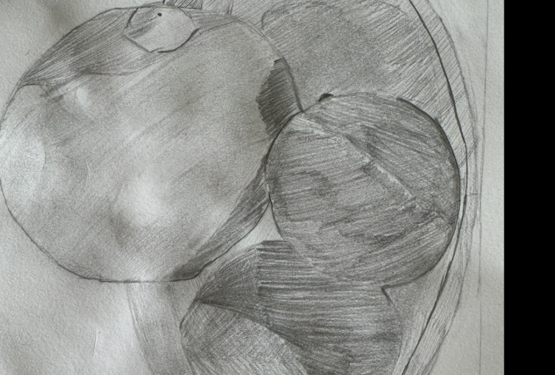
8. Values & Edges: So there's a very
basic, simple sketch, but hopefully you can get a sense of form
already from your drawing. And this is a really
good way to practice in something that
you didn't want to go on and do a
finished drawing off. So you start off just doing
a quick sketch like this. Figure some things
out before you attack your final drawing so you're not having
to figure them out. In that drawing. What we can do now is
we can go through and refine some of the shading
will just do a little bit. We're going to add in a
couple more values as well. Don't, don't get
carried away with this. I'd treat it just as
still as a sketch. That mean this one
up a little bit as I say the photograph
on the screen, still treat it as a sketch. But we can just bring
a few more values to give it even more forms. So generally speaking, you want to have at
least three values. Five is ideal for a sketch, but at least three, because if you think about
three-dimensions, You've got height,
width, and depth. Each one of those
dimensions is going to be treated in a slightly
different way or it's going to have different light
effects on it. It's going to have
either shadow or light or somewhere in-between. So think about 3s now. Highlight mid-tone shadow,
height, width, depth. Three-dimensions. 3d is have a go at putting
in a little bit more. We've got the highlight
here, so that's another value that
we can put in in. I just do that with the erase that and make sure you've
got the right place. Pull that out a little bit. Lighter near two. And now we can add in those
extra shapes. So there was this shadow area
down here that's shallow, but it's not really
a dark shadow. It's just for being
more of a mid tone. The light is not
hitting it directly. The lights obviously
coming from this direction hitting this broad
area, the side. It's not reaching the top
or the front of the lemon. So we can go and put in a line. Think about the value of that line that
you're putting in. Because what it comes down here, I think it's a little
bit down there. And then just build
it up a little bit. It doesn't want to
be as dark as this. Keep looking at it as
you do it as well. Flicking your eye back to the
photograph all the time to think about with what
you're doing needs to stop. We need to listen the pressure. If you want to make
it a bit bolder, a bit more graphic
than you can add in those straight lines again. On this In part here, we've got our light value. And then there's a
dark shape here. Darker shape, not as
dark as our shadow. And maybe just under here
is a little bit darker. If you've got big
white gaps like this part here that's
going to get in the way. So you can just very
lightly shade over those to push them
back a little bit. Maybe I need a little
bit more shading. Tricky area just here in
a bit confused by it. Sort of in-between
this one. In this one. It's maybe a slightly
dark area here. Maybe it comes along
that shadow area. And it can get rid of
any big whitespaces. Lemon, I'm going to
darken this up as well. The other thing we're
going to talk about is Hs and I'm going to
leave it to later, but we mostly talk
about now and it's a hard edges and soft edges. So you can see around
this line here, it's quite a hard edge of
dark shadow on the lemon. Just changing the shape of
that a little bit here. So when I looked at
that shadow shape, I saw that at the front of the aluminum wasn't quite right. So we can put in there hard edge down here is a
little bit softer. It's dark but as a bit
softer underneath. And then we can
build up that shadow a little bit just in there. So that shadow has
two values and at least it's got one
here and one here, and maybe another
one in the middle, even in the shadow. If you want to get into that, it's quite soft too. Let's have a look at this one. Just needs to come over
just a little bit. I quite often find
when I look at the, the shadow shapes that
I see quite a lot more. You're seeing it
more objectively. And again, there's
a sharp each hue with a top of that lemon top of it in line meets the
shadow of the Lehman. Thinking about the value of
building up a little bit. Move on to this line here and
have a look at the values. Compare them from here to
here are about the same. In the photograph. There are some markings on there we're not going
to worry about that. Have looked at the ages, it's
note outline around here. But when we come down here,
there's a dark soft edge. It's hard where it
meets the, the bowl. But you can see there's
a slight shadow there, so softens as it comes up
across the bottom of the line. I'm gonna put in. Use the point of my pencil. I'm still using a pre, the equivalent of maybe
an HB. It's quite sharp. It's quite sharp but dark. It's actually for being late. But I'm definitely not. For b in terms of darkness. Bring that line in there. If you are using a dark pencil, if you need to get darker, I'm value, then make
sure it's nice. And in shoppers shopping. So this is a to-be. You can do the same thing, bring in that line using
the point of view paint. So if it starts to get blonde
as you're going along, It's like a six or something. Even someone who is
you can just tune, twist your pencil around and you find another each on the pencil. And they can give you another
sort of pointy sharp edge. And then I'm going to shade
that dark value along there. Made it sort of soften out
into the value on the line. This little nub in
here is quite dark, so darken it up. How do you do in soft edges? And got height h on the side, soft teetered on the side
of also got lost edges. You can see between
here and here in the photograph. It's
pretty similar. There's not a lot of
difference between those two. Also. Also maybe just here and
here with its shadow stat. So light and off. This is not a lot of difference between that part
of the lime in it, part of the lemon, It's just
slightly darker underneath. But just making sure
you've got those absence of Hs or absence of outlines. It's important to know
dark outline around this line is just ever so
slightly darker than the lemon. I'm just going to
soften off this. Here. Says the doc that I put around the shop
page that I put around, it needs to be blended
into this shadow. Trying not to get too, too caught up in the small
details for this one, we're trying to just keep it at overall look at
value in sketching. I think this definitely
needs to go dark. And when I put in
that dark shadow, I can see that this all needs
to be a little bit darker, especially getting rid of those little white marks down there. And maybe there's
another area across here that is just a little
bit darker as well. It's hard to tell if
it's patterns or shadow. Just put that in as well. Maybe a little bit up here. And also just evening
out in Emacs, any light paths
want to get rid of those shading along here. In this a shadow under
here which we forgot. So you see the
shadow and the bowl. I've got a big whitespace. Just sort of thinking about
why that's looked like it was standing out because it's
just white underneath it. Let's put it shadow and under the attuned
just disappears. So moving on to this
one, look at the each, how strong this shop or how
sharp edges against the lime, the back line against
the frontline. And also this edge here, very sharp against the whites. There's a lot of contrast this,
I'm going to put that in. You got to make
sure that the line that you put in or the outline is only as dark as your value. Shaded value is going to be. You can use this to
see if you find any, any areas or in discrepancies. And the shape is something
not quite right here. Shape with their front line. But I'm just going
to leave it for now because I think it's a
little bit too late. We've gone too far. I
think what is this? This is just a little
bit too high app should be more about here. And then it gets set a
bit of a different curve, actually, not too
hard to change here. And shade that in trying
to keep that nice sharp, crisp edge against
the front line. Get rid of any whitespaces. And near to this, each down here is quite soft as it blends
into the shadow. Is soft shadow underneath
the line as well, which you start to see
as you come around the side because this part
of the line is light. And then we've got this shadow
area coming through here. So as it comes around, Jordan with your pencil, the value you want it to be. Maybe something like that. And then shaded and looking for something in
between this one and this one. Something a little
bit wrong here I, it looks a bit strange. I'm just going to look at the
negative shape of the bowl. It's what it is there. This is a shadow area in here. It's helped me find the shape of that bowl a little bit better. If we look at this lime and
the bowl in the photograph, the lines much darker
than the bolt. So I've got to make a decision. I can either lighten this ball up where I can
darken up the lime. And I think I'm just
going to lighten up the ball a little bit. I saw that because I was
looking at the edges. So looking at this age around here of this lime in thinking
about how it compares, thinking about the type
of each that it was. And then I noticed
was it's too similar to the bowl and needs to
be darker than the bowl. I'm just going to build it
up a little bit as well. So this one here, this is at darkest ones that really
go for it on that one. If you layer too much, you've probably going
to get into trouble with not being able
to layer anymore. You sort of Gamma up
the tooth of the paper and you sort of get to the limit of how much
the paper that can hold, how much graphite on
the paper can hold. So just be aware of that. But you can always just do lines to keep building
it up a little bit.
9. Balancing The Drawing: Now that we get to this point, we're really just balancing
things in refining things in, we probably wouldn't take it too much further in this drawing, but I want you to
just have a look at your citrus fruit
and new drawing, see if anything's stands out
as maybe not quite right, but first off and then use the photograph to see if you
can discover what it is. And then look at the photograph
and look at your drawing. Look at the photograph,
look at your drawing. Try and see if you can
figure out anything that needs to be adjusted
in terms of value. So this line is still just
a little bit too light. Maybe it's just in
this dark path here. Beef that out a little bit. If you've got any
little paths like this that you haven't
shaded properly, see that light at the end it's
going to go against your, the form is going
to break it up. So you got to pay attention
to those small areas as well. Is a soft edge here. Soft shaded line. Maybe slightly lighter on
that edge in through here. So we could bring in
this kind of shape. Then we can look at the
details on the bowl, so it's a little bit
darker back here. Are a few little highlights. Highlight in there.
It's not white. It's great, but I just bring it out and then
shade over it again. And of course we've got
the dark room of the bowl, which is just the
detailing on the bowl. It's not it's nothing
to do with shadow. We can put it and I just
keep it really soft. You don't want it to overpower
the rest of your drawing. But it's also good
practice for getting these soft shaded lines
and especially on a curve. You pretty fun one
direction, it feels strange. It's quite hard for me
to go that direction. So I'll come back this way. Excusing the side of your
pencil slowly if you need to. Very light over here, I'm always just disappears into the tabletop that there's
more of a shadow on the side and it's also going to
be just slightly darker on this side is it's quite
hard to see in the photograph. It's quite hard to
tell the difference, but this side and this
side are different. This one will be lighter. And we can do that by looking, if you look really closely, it is bright white here and it's not as bright
white over here. Then is a shadow
underneath the ball. Think about the
each, each theory. What kind of edges is at hard? Is it soft? Dark? Is it light? It's quite soft because
it's formed by the shadow. And it's also thicker
in the middle. And then it starts to
Ethan as you come around.
10. Reviewing Your Drawing: The last thing we're
gonna do in this drawing is just a little
bit more balancing. A bit of a review that we
always do in these classes. Like I said, you can take
this further if you want, but I want to keep it
at a sketch level. And the last thing we
do is just to really squint at that photograph.
Squinted at drawing. I might squint at my
drawing first actually and just have a look
at and think about, well, where are the
lightest areas? So I've got here, here and here in the bowl and then
look at the photograph. And those are lighter
series, they probably are. And then do the same
with the darkest areas in a probably got most
of the darker series. This one could be darker. But the other thing
you can do is squint back and forward between the
two and see what stands out. So when I do that, I see that
I've got this area here, which is quite light. Is light is this value. But in the photograph, if we identified those values, Let's see if we can do that now. So we've got this value here
compared to this value. So if I draw them out, can you see the difference
between those two values? But in my drawing,
they're about the same. So I need to make sure this one is dark and then this one, sorry not to use my
dark pencil here. Bring it in, maybe make it a little bit
more defined as well. It's quite strong
coming out of there. Make sure your outlines and
docket in your shaded values. In looking at underneath, there is quite a soft edge. So I'm comparing this to this, to this, this part, to this part, to this part. You see what's missing
in my drawing? This part here should be
darker than this part here. The moment is lighter. I need to bring in some
darker values there. And maybe you can see the shape of dark shadow that
comes around like this. And just go around and look
at your teachers as well. Have you got the
correct each had each. There were another hard edge. Got a soft edge to
the shadow here. And it's soft under here. Probably need to
bring this shadow around just a little bit more. Again, a little bit darker
when it into this one. And then it gets lighter as it goes towards the
outside of the ball. Shouldn't be anything white. And here, because
it's not white. It's very light,
but it's not white. Tiny little gaps don't matter too much and
this is a very big, so these gets here are quite big and they make it look
whiter than it is. Then it should be.
Here's quite wide. It's going to tidy up at top, but because their age and looking at that one should
be darker than this. Do not completely sure
about this Frontline. I think maybe it does need
to be dark at overall. Maybe it's just got a slightly dark at each around
the top there. Little bit of shadow just there. You've got one of these
Tombow Mono erasers. They're really good
just for fixing it. Really small areas. I'm just going through
and figuring out any small errors that I can see. The more you look, the
more you're going to see. I could keep going on
this for a long time, but I think we'll
leave it there.
11. Take It Further: If you did want to
take this further, I mean, you can just
keep building up values. You could also use your, use a piece of tissue to smooth
things out a little bit. And be very careful about doing this because
you don't want to erase what you don't want to merge those values
into each other to match. And also if you take this and then put it on a lighter area, you can get darker values. So using a new area. And it will give you a little bit more
smoothly smoothness. It'll take away those, those lines that we've been
using for shading. And the reason we were
using those lines was just to get
something down quickly. We could spend hours doing
tiny little circles, but those broad strokes cover a lot of ground really quickly. In here, the shadows. It's quite soft and nice so
I can be afforded push it a little bit harder with my
tissue there, then smudge it. Just be aware that
if you are going to continue with the
storing and build out more, the more smudging that you do, the more it fills up the
tooth of the paper as well. And you might find it difficult
to lay a pizza over top. I think it fills it up
and it probably also just damages the paper a little
bit as well when you're pushing hard with the
smudging. So just keep it. Just a really small touch, really light touch
when you're doing it. Then we could erase
L grid as well. Mono Zero eraser, really good for just
tightening up edges, especially if you get
bit smudgy like I do. You see my hand there. Tend to get paid a lot
being left-handed. Tidying up these H's over
the corner of an eraser. You can cut a little bit
off and eraser as well. Especially when we've been using that line, shading or hatching. Sometimes you go outside the lines a little bit and this can just clean things up and
make it look really tidy. Maybe not so much about
making it look tidy, but just refining
the edges to better reflect what you see
in the photograph. Just lightening up
this part here as well because it's
really bright there. I think there was
just no smudging. And an actual fact
that the table java is slightly darker
than the bowl on that side. So there's maybe you could
use a bit of smudging, find a bit of your tissue. Its duty. Smudge a
bit at the table top, and then use an eraser
to bring out fit, light each of the ball. Just refining this fat totally. The more you look,
the more you see. It's lighter in the photograph. It's lighter here
than it is here. And mine is actually
the opposite. It's lighter in the bowl. Then on the lines and
darkening of the shadow here, There's quite dark
underneath the lime and then it just quickly disappears. And in here as well.
12. Summary: I hope you enjoyed the lesson and hope you learned
something from it. It's good sometimes just
to go back to basics and really focus on the
essentials that you need. So you need proportion, you need to shape shading, and you need at
least three values. Or actually, you could get away with just two
values and you can have a really decent sketch that shows the form of the
subject that you're drawing. Thanks very much for joining me and I hope to see you again in another sketch club
class. See you next time.
 Emily Armstrong, The Pencil Room Online