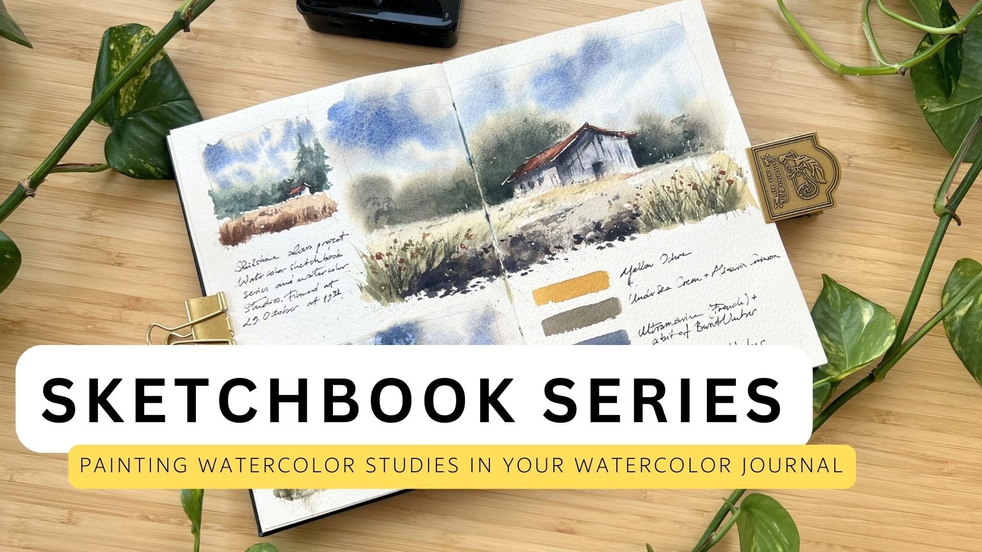
Transcripts
1. Intro: Hi there, Welcome to the
gouache painting class. Here we'll explore
key techniques and considerations when working
with this versatile medium. This class is here to walk you through the wonderful word
of painting with gouache. On toned paper, it's got everything covered from
picking out your materials, the importance of tonal values, color mixing for a
natural palette, getting the consistency of
your gouache just right, sketching your
masterpiece and finally, painting it in stages,
hope you enjoy.
2. Materials: First, we are going to review the materials needed
for painting. In my personal experience, I have developed
a preference for smooth toned paper when
working with gouache. This sketch book has a smooth texture that is
particularly appealing to me as the gouache paint spreads easier on
the smooth texture. The toned paper provides a perfect canvas for the colors to fully
express themselves. It's fascinating how the colors once applied to the paper, seem to take on a
life of their own. They connect, blend,
and interact in a way that brings the
depicted scene to life, giving it vibrancy and depth. When I work on white paper, I prefer to use hot
pressed watercolor paper, which also has a smooth texture. When painting on
watercolor paper, it's important to note that you generally need more water
to distribute the paint. This is especially
good to know if the watercolor paper
has a strong texture, like cold pressed paper. This is my air tight
palette for gouache. It has a additional
cover which prevents air from getting in and
drying out the paint. I have had very good
experiences with this palette. The colors do not
dry out at all. I lightly spray them with
water about once a week. If I am not using the
palette for a longer period, I will provide you with the arrangement of the
colors as a file in the project section so that you can always track
which color I am using. Next, let's talk about brushes. I have a set of
synthetic gouache brushes. I like the flat brush
as it can cover big areas and you can use
its site for details. I also use round brushes, which make different
kinds of strokes. Try different brushes
to see what you like. It's often about
what you prefer. I suggest having at
least one bigger brush and some small ones for
details or small pictures. If I had to choose two, I would choose these two. A flat brush and a
small round brush. If you are a beginner, I suggest purchasing
an affordable set with six to eight colors. My preferred brands are Schmincke Horadam, and
Windsor and Newton. Their colors are
highly pigmented and I appreciate the
consistency of the paint. When painting with gouache, you'll often use more white
paint than other colors. I recommend getting
an extra tube or a larger one right away. I have a selection of paints that I currently
use on my palette. It includes primary colors and some convenience colors
like olive green. As I mentioned earlier, I will share the list with
you in the resources. Other materials you'll
need are a pencil, a clip, watercups, and a palette for
mixing your colors. I prefer ceramic
palettes as they don't stain and are easy
to clean with water. I also recommend having a spray bottle on hand
to moisten your paints.
3. Tonal values: In this lesson, we will delve deeply into the topic
of tonal values. These play a crucial
role in painting as they help us depict light shadows
and depth in our artwork. They contribute to creating a three dimensional illusion on a two dimensional surface. Tonal values are also necessary for
distinguishing shapes. We will cover the basics
of using tonal values and learn tips and tricks for identifying and
applying tonal values. But what are tonal values? Tonal value refers to
a color's brightness. It describes how light
or dark a color is. Selecting the appropriate
tonal value is crucial, even more than the
choice of color. Using tonal values,
you can achieve clear lightning conditions and separate the shapes
in your painting. Here is the value scale. It's divided into ten
values from white to black. Each color corresponds
to a value on the scale. We have light tones, mid tones, and dark tones. In nature or on
reference images, you often find a broad spectrum
of these tonal values, which can be quite overwhelming. I always try to
simplify the reference in the shapes of three
to four tonal values. For this, I use the
concept of prime planes, as described by John F. Carlson in his book on
landscape painting. According to this concept, there are four prime
planes in a landscape. The first is the flat plane, for example, the ground. The second is the upright
plane of the trees. The third one is the sloping plane of
mountains and hills. The last is the sky, as
our main source of light. Each of these planes
is assigned to a tonal value which
are interconnected. The sky, being the
source of light, has the lightest value. Slanting plans,
such as mountains, have a mid level value. In contrast, upright
planes like trees, have the darkest value. The flat ground
has a total value that is lighter than
the slanting plane, but darker than the sky. Let's divide an image conceptually into shapes
with different tonal values. The differences are most
noticeable when you squint your eyes or convert the reference to
black and white. For illustration, I have blurred the image to simulate
squinting your eyes. You can clearly see
the different planes. The sky is the brightest
area in the picture. The horizontal areas, as the meadow is the second
lightest in value. The vertical elements in the landscape are
the darkest areas. Here's another example. When you squint your eyes, you will probably see that the sky is the lightest
part of the picture. The meadows as the
horizontal plane are the second lightest the
vertical elements. The trees are the darkest
parts of this reference. In gouache painting, the
lightest tonal value of any color can be obtained by
mixing the color with white. As you add more white, the tonal value becomes lighter. I suggest practicing this
technique on small thumbnails. Initially, the medium
you use doesn't matter. You could use gouache, markers
or even a simple pencil. Let's summarize this a bit. In gouache painting, selecting the appropriate tonal value or the brightness of a
color is crucial. The image is
conceptually divided into shapes with
different tonal values, with the sky often being
the lightest area, Horizontal areas like meadows
being the second lightest, and vertical elements, like
trees being the darkest. Squinting your eyes or converting the
reference into black and white can help identify
these differences. You can get the
lightest shade of any color by mixing
it with white.
4. Mixing colors: Creating color harmony within gouache studies requires a
particular and mindful approach. The first step is to
use a limited palette, which forces you to experiment with
different color mixes. Thus expanding
your understanding of color theory and application. Adding too many colors might make your image
look a bit chaotic, especially if the colors don't really relate
to each other. By mixing primary
colors together, red, yellow, and blue, a vast
array of use can be achieved. The second step is, rather than using the colors
straight from the tubes, try to blend them together
in various proportions. It's a fun experiment you could try.
Pick a limited palette of three to five
colors and some white. And play around with
different color combinations on a piece of paper, or even create your
own swatchbook. You'd be surprised at the
variety of shades you can create just by mixing the
colors in different ratios. It's a great way to see how the colors interact
with each other. I've got my own
swatchbook here. It's a place where I can
freely experiment with color combinations and have
them all in one place. Plus, it allows me
to quickly test different combinations
without having to search for a
motive or reference first. Aadding the same color to each of your mixtures
can further foster harmony, creating a cohesive and
unified color scheme within the artwork. To try this
out add the same color, in my case it's Burnt Sienna,
to each of your base colors. Because each color contains
a portion of Burnt Sienna, it automatically
creates color harmony. The third point I want to
mention, is to mix colors using the ones already on your
mixing palette for harmony. You'll notice that I don't clean my palette while painting. By consistently adding colors to the existing colors
on my mixing palette, they naturally blend together, resulting in a harmoneous
overall image. If you're striving for natural colors in
your gouache studies, it's advisable to avoid using colors directly
from the tube. Colors straight from the tube are usually vibrant
and unnatural, Making paintings appear
artificial and bold. Of course, this can be a style
that you might aspire to, but I feel more comfortable
with more muted colors. Instead, consider mixing them with complementary
colors, or earth hones. This approach can result in more nuanced and
realistic hues that mimic those found in
nature more accurately. The first method I'd
like to demonstrate involves blending the color
with its complementary color. Complementary colors
are those that sit directly opposite each
other on the color wheel. For instance, the complementary
color to green is red, and for yellow, it's violet. Suppose you have
prepared green color, like Viridian (green), on your palette. To create a more natural mix, simply add its
complementary color, red. This could be Scarlet
Red, Alizarin Crimson, Burnt Sienna, or any other red
available on your palette. The second way to mute
color is to mix them with earthy colors
such as Burnt Umber, Burn Sienna, Yellow
Ochre, or English Red. You can easily get
a natural blue by blending your blue
with an earthy color, like Burnt Umber or Burnt Sienna. Green is an incredibly
versatile color. It symbolizes peace, hope,
renewal, and freedom. Given its fundamental
role in nature, it deserves special
attention in this lesson. Trees, shrubs, and grass are excellent subjects for
practicing color mixing. Look for references, or go out and observe nature closely. You'll see blue green spruces, yellow green buds in spring, dark green conifers, and the deep green shadows
on summer grass. Then try to recreate the natural green
tones you've observed. To weaken green tones. I apply the principle
which I have implemented in the section
how to mix natural colors. If the color mixes
are too bright, you can mute them down with
some red or an earth tone. This works with both premade green mixes from the tube and
with your own green mixes. A subdued green can be obtained
with a warm yellow tone, like titanium gold ochre and ultramarine blue, and burnt sienna to make it even more muted. On the other hand, you
can achieve a vibrant spring green by
mixing a cool yellow, such as lemon yellow with a blue like
ultramarine blue, the mixture will probably
come out bright, so you can tone
it down with red. To mix dark green colors, there are several possibilities. Either you first mix a green and then darken it with indigo, ivory black, or burnt umber. You can also mix ivory
black with yellow and directly get a
quiet dark green tone. I use two types of white paint. On the one hand, I use permanent
white or titanum white, which is highly opaque, so the mix can quickly
look chalky and pastel-like.
I use it only for the lightest lights at
the end of the painting or when I want to lighten
up a color dramatically. The second white I use is zinc white. It is a transparent white and doesn't make
colors look chalky, but it also has less coverage. It is an excellent white for
mixing. To darken colors consider using hues with a
naturally dark tonal value, such as burnt umber, indigo
and ivory black. Ivory black, a warm black, is ideal for mixing dark greens or darkening
premixed green tones. As I mentioned in the
previous section, indigo, a dark blue is useful
when you aim to darken blue hues or
cool down a dark color. Utilize burnt umber to mix
darker gray or brown tones, or to generally
warm up the (dark) color. To lighten a color, you can add either a color that is lighter in tonal
value or white. First, attempt to lighten the color with a lighter
color from your palette, like lemon yellow for
lightning greens. If this doesn't achieve the desired effect,
you can add white. However, using white
should be the last resort. Always try using a
lighter color first. Adding white can
make the colors look pastel-like. If you add white, you may need to warm up the mixture again by
adding a warm tone. Questions, I constantly
ask myself why mixing: Does the color mix
need to be cooler or warmer? Does the color mix need
to be lighter or darker? Let's summarize the key points.
To create color harmony in gouache studies use a limited palette and experiment with
different color mixes. Mixing primary colors and
adding the same color to each mixture can create color
harmony. For natural colors avoid using colors
directly from the tube. Instead, mix them with complementary colors
or earth tones. Natural greens can
be obtained by adding red or burnt
sienna to a yellow-blue mix. Darken colors with dark tonal value colors and lighten with lighter
colors, or white, using white as a last resort. Always review the colors
that you're mixing by asking yourself
questions about color temperature, and tonal value.
5. Consistency of Gouache: Gouache is a unique
medium that bridges the gap between watercolor
and acrylic paint. It features color pigments, chalk, and a binder
called gum arabic. Gouache is water soluble,
much like watercolor. This property eliminates
concern about the paint drying in
the mixing palette or staining clothing, making particularly
user friendly. You can also reactivate and reuse dried gouache paints
by adding water. Gouache is often compared
to watercolor, but it differs from
it in its opacity. Upon drying, gouache
creates a matt chalk like finish. Compared to acrylic, acrylic dries much
glossier than gouache. Maintaining the
right consistency of gouache is very important. If you are used to watercolors, you mind tend to mix too much
water in the gouache paint. As a result, it loses what makes it special,
namely its opacity. Therefore, it's important
to keep in mind that gouache should not
be fluid in nature, but it should maintain
a creamy consistency. Let me show you what I mean. I have a paint here with a
fairly thick consistency. I need to add more water, but only a small amount. I scoop some paint onto the palette and barely dip
the brush into the water, moistening just the tip, The paint spreads much easier now. The color is much more uniform and not
interrupted like the first one. Let me show you another example. This color has a fairly
creamy consistency right away from the tube. I don't need any water
to make it spreadable. Invest some time and effort into understanding
your palette. Test each color straight
from the tube to determine the exact amount of water each one requires to achieve
a creamy consistency. Keep in mind that
not all colors are created equal in terms
of transparency. Some colors are more
transparent than others. Also, try out your paints
on different papers. I have my toned
sketchbook here and I will compare it to cold
pressed watercolor paper. To do this, I apply paint with the same amount of
water on both surfaces. The mix spreads easily
on smooth paper, but the brushstrokes break
on the cold pressed paper. When you're working with cold
pressed watercolor paper, it's essential to add a bit
more water to the paint. This makes the paint
more manageable and easier to work with
on this type of surface. Apply paint in uniform
and even layers. Avoid applying the initial
layers too thickly and refrain from making the
final layers overly watery. To watery paint will not have coverage and will dissolve
the underlying layers. Consistency is the key. You can tell when the paint starts to dry by its appearance. It will start to take on a mat look as it dries. To avoid that, moist them
with water from time to time.
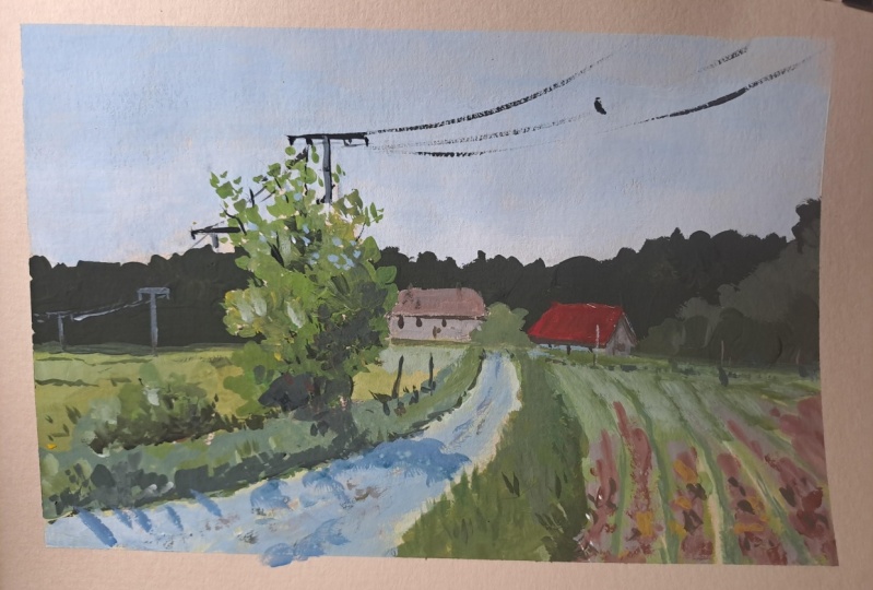
6. Class project: Drawing: Let's begin with the drawing. My pencil is a mechanical
pencil with an HB lead. I will overlay the
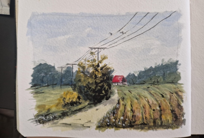
reference picture here on the right so you
can draw along with me. I start by drawing the
frame for the image, which gives me an orientation of how large the image will be, as well as for the layout
division of the page. The aspect ratio of width to height is also
determined this way. Since the cut out in
the reference is good, I simply adopt it. I start with the horizon line. The markings of the
half sides help me avoid positioning
the horizon line directly in the middle. I intentionally do not make
the horizon line to straight, this makes it more dynamic. Then I sketch the path because
of the perspective distortion, it appears wider at the front and narrows
towards the back, similar to the grass
tufts on the side. The drawing will be a
simple contour sketch free from hatching or details. Focus on the task, work at a steady pace and try to capture the unique
aspects of the subjects. I sketch the main
shapes of the house, focusing on the roof and
walls without detailing. Then I draw the tree
in foreground. the power lines taper
towards the background. Then I sketch the trees
in the background, ensuring to vary their heights. There's some meadow in front
of the house on the left. Here and there I
reinforce some lines. The house on the left
is drawn in front view. I incorporate the power poles which get smaller
towards the back. That concludes the drawing. I will upload it as a picture in the reference
for your reference.
7. Class project: Analyzing the reference: We've completed the
sketch. Now I would like to review the colors and tonal values of the
reference image with you. Before I start painting, I always analyze the
picture in terms of the biggest shapes
and its tonal values. I group the surfaces
in big shapes, compare their tonal values, and divide the picture into
different tonal value areas. I try then to find appropriate mid tone
for each area first, without considering the
highlights and dark accents. Let's have a look.
The sky is clearly one of the biggest and the
lightest part of the image. We want to try to capture that. The color is
a very light blue, with lots of white.
Relative to the sky, the horizontal surface, the meadow, and the path are the
second lightest areas. The color is a middle value green with slight shift
in color temperature. The vertical trees in the background are the
darkest part of the image. The color is a very
dark, cool green. This will be our roadmap
for the painting. Our main goal will be to fill
in the shapes with color, ensuring the value
relationships are correct. We will identify an average
color for the biggest shapes. Also, we want to
simplify the scene. While the reference may show individual trees like
this in the background, we will try to create
one unified shape.
8. Class project: Big shapes - Part 1: I like to start with the sky. This way I establish the
lightest tono value at the beginning and can use it as a reference when painting the
other shapes in the image. First, wet the brush and
dry it on the paper. Make sure it's not too
wet while painting. Dry it on the paper
whenever it's needed. For very light
colors such as the sky, it's recommended to start with white paint and
gradually add color. Trying to lighten
a color by adding white later can be
more challenging. Mix a large amount of white with a small bit of ultramarine blue, add a tiny hint of burnt
umber to neutralize it. It might take some minutes to find the right
value and color. Be patient and feel free to
pause the video as needed. Also don't skimp on the paint. It's better to
have a bit more on the palette than to
constantly remix the hue. Add some water If you notice that the color
is getting too dry, but remember, gouache
should not be fluid. It should have a
creamy consistency. Begin to fill in the sky shape
with bold brush strokes. As soon as you
notice that the paint is not sliding easily
over the paper, add a bit of water, but not too much, so that the paint does not
lose its opacity. The sky is slightly
bluer at the top, while it becomes lighter
towards the horizon. To avoid a uniform sky, I use short brush
strokes to apply color. This technique adds variation to the otherwise uniform area. When adding colors, I
ensure the differences in total value are subtle. Usually I keep the top
part slightly darker and bluer as I move
towards the bottom, I lighten it by
introducing white. Near the horizon. Add more
white and a small amount of helio turquoise to give
it a slight (green-) bluish tint. I am not aiming to create
a perfect color gradient. Instead, the short brush strokes make the sky appear
slightly irregular, making it more interesting. As long as the paint is
not completely dry, I soften edges. Rinse the
brush for the next step, and dry it on the paper. The brush shouldn't be too wet. To create the base green color, I combine titanium gold
ocre with ultramarine blue. You could also use any other yellow or blue in your palette. The key is to use english red or burnt sienna to make it appear more natural. You can also use
red if you don't have english red or burnt
siena in your palette. I always mix several shades of green directly
next to each other. A clearer one, a slightly
muted one, and a cooler one. For the distant meadows, the tone is cooler and lighter. The closer we come to the front, the tone becomes
clearer and warmer. I apply the color directly onto the paper and compare
it with the sky. I remember that the color
will darken as it dries. The color can be
even a bit lighter. It's too dark
compared to the sky. Therefore I mix in more white
and yellow and correct it. White makes the tones
pastel-like and cooler. Mix in some yellow, if the tone becomes too cool. It can even be a bit lighter. I add a bit of water, whenever I notice the color
drying on the palette. I'm preparing more paint to continue with the right
side of the field. The color is a light cool green made from titanium gold
and ultramarine blue. To quickly lighten the color, I'm adding titanium
white and then giving it a slightly warm tone
by adding yellow again. On the right side
of the painting, I hint at the field furrows. Due to the perspective, the furrows become wider
towards the front. I keep mixing the
remaining colors on the palette into the mixture to vary the color temperature. Use the warmest and
most saturated greens right at the front to
enhance the effect of aerial perspective. Paint loosely as corrections are
easy with gouache. When I need more control, I use the side of my flat
brush. In the foreground, my mix is warmer with more yellow and it becomes
cooler with more blue as it moves towards the background. Paint in even layers, not too thick nor too thin. Remember, the paint has to
be creamy and manageable. In the reference image, a slight shadow is noticeable. The reference was
captured on a cloudy day, so the shadow isn't
very distinct. Nevertheless, I still
want to represent it. Then I paint the
meadow on the left of the path using
the same principle. Wider and warmer in tone
towards the foreground. Narrower and cooler
towards the background. I don't solely depend
on the reference. If the values look right
in relation to each other, the painting will look correct. The meadow behind the bush appears yellowish due
to blooming flowers. However, since no individual
flowers are noticeable, and this is not essential
for the picture statement, the area is painted in a
warm, yellowish green. For this, I mix a little
more titanium gold into the existing
green mixtures. I add some burnt sienna to
make the mix a bit redder. I constantly try to bring in some color temperature shifts to make the area look
more interesting. By repeating the same color at different parts of the image, I enhanced the overall
harmonious impression. When changing colors, I thoroughly rinse the brush
and dry it on the paper.
9. Class project: Big shapes - Part 2: For the base color of the path, I mix titanium gold ochre with the existing blue mix from the sky and a lot of white. The tonal value of the path is comparable to the sky,
just a bit darker. Once again, I use
titanium white since I aim to quickly lighten the color mix. That looks pretty right. Towards the background, I mix in a bit more blue and white To cool down the
color temperature. I indicate the texture in the foreground
with the same color. For the shape of trees, a very dark green tone is mixed. It should be darker than the sky and the horizontal
meadow surface. For this, I use ivory black and titanium gold ochre. These colors together create a very beautiful, deep green. Vary the temperature by adding ultramarine blue, titanium gold, and burnt siena. Premix different
color temperatures on the palette and
vary the brush load each time you need to
take up fresh color. I start by painting
the trees as a mass, not as individual
trees, but as a group. Details are not necessary here, even if light and
shadow can be seen between the three crowns
in the reference. Each time I pick a color, I slightly vary the mix without making significant changes
to the tonal value. As I do this, I refer to the original image to notice the subtle change in
color temperature. Use the colors on the
mixing palette over and over again and change
them slightly if you need to. Keep adding small amounts of water to
make the paint manageable. if needed. I use all sides of my brush to vary
the application of color. I create a connection to the right side by applying
the same color there. Use all sides of your brush to make the brush
strokes varied. The trees directly by
the buildings are warmer and more saturated than the tree masses in the background. I also depict this in the picture without
changing the tonal value. You see, I'm constantly trying to bring variation
into the colors. While mixing I
always ask myself, does the color mix need
to be cooler or warmer? Does the color mix need
to be lighter or darker?
10. Class project: Big shapes - Part 3: Now it's time to paint the
tree in the foreground. Compared to the trees
in the background, it will be painted in a slightly more detailed
and saturated color. But first, it gets its base tone. To make the
green more saturated, I mix lemon yellow and
ultramarine blue in and I start to hint the bush in the foreground with the
narrow side of the brush. I attempt to allow some
sky to shine through. The light comes from the top left. Towards the bottom right, the color mix becomes darker to indicate the shadow. At the top, I make sure to leave
gaps for the sky. And towards the bottom, the application of
color becomes denser. Individual leaves are indicated
at the edge of the tree. I continue with the small
bush in the same way. The top with a warmer tone, the
bottom a bit darker. Add some lemon yellow to
increase the saturation. To indicate individual leaves, I now change the brush. I suggest a few branches. For the darkest places, I mix ivory black, titanium gold ochre,
and burnt siena. While mixing, I
always ask myself, does the color mix need
to be cooler or warmer? Does the color mix need
to be lighter or darker?
11. Class project: Variation and darks - Part 1: Moving on to the second
phase of the painting, I want to break down those larger shapes into
smaller, more complex ones. Also, I want to
set dark accents. This phase is where I make sure the values or colors
are just right. I start by setting dark
accents in the shadows. This gives the painting
more contrast. Be careful not to incorporate
too many dark spots. The bush should retain its lightness. To
depict tufts of grass, I vary the brush
hold and pressure, resulting in different
brushstrokes. I am trying to avoid
repeating elements. I also keep an eye out for variations in
color temperature. For this, I still
use the colors on the palette and
slightly modify them. This brings harmony
to the picture. Even when changing the
color temperature, maintain the similar value to
keep the shape consistent. I notice that the grass is
a bit darker in the back. When I squint, I can
see a horizontal strip. I replicate this in my painting. Always compare your
paintings with the reference and make
changes when necessary. Next, I move onto the roofs. I would categorize both as red. The back roof is definitely
more muted and lighter. The front one is more
saturated and less pale. I thoroughly clean
the brush and dry on the paper for the rear roof. I mix alizarin crimson and
warm it up with titanium gold ochre. I also mute it with some green
and lighten it with white. The white makes it
even more muted. I think this will
be the right tone. I vary the application, sometimes more white,
sometimes more red. I even incorporate some
reddish green for interest. I always try to incorporate already mixed colors somewhere
else in the picture. The repetition helps
with the harmony. Like here in the foreground. The paper does not
necessarily have to be completely covered. Due
to its medium tint, it integrates naturally
into the picture. With a bit more burnt umber, I paint the earth in the
furrows of the field. Make sure that the
details in the foreground are strengthened, but less
towards the background. I use various colors, ensuring that the tonal
value remains consistent to avoid high contrast.
In the foreground, I add more details. Instead of painting each
individual blade of grass, I create the illusion of grass through irregular
brushstrokes. As usual I vary the
color temperature. The grass to the left of the path has a
shadow of its own, which I depict with a dark green mixture
and a flat brush. I change the brush again
and hint tufts of grass. Be patient during the
painting process. Ask yourself, where does the painting need
something more? Take your time and place
your brush thoughtfully.
12. Class project: Variation and darks - Part 2: The path seems a bit flat to me. I want to vary the color
temperature a bit. For that, I mix burnt umber, ultramarine blue and
white to get a gray tone. I try it out. Nah,
it's a bit too dark. I add white to the
palette and mix in the previously mixed
color. That looks better. I try to depict
the gravel texture of the path without
being too precise. Again, I'm adding
more details in the foreground and less
in the background. The beige is a unique mix of burnt umber, titanium
gold ochre and white. It also suits the facade color. The sky on the day the reference photo was
taken was slightly overcast. But the shadow from the
bush is still slightly noticeable. Due to the
lightening conditions, the contrast with
the brighter areas of the path is not
very pronounced. Therefore, I take the
base color from the path and slightly darken and cool
it with ultramarine blue. I use the same mixture for
the shadow side of the barn. The bush casts its shadow
on the adjacent meadow, so I darken the
color in this area. Now I'm painting
the second roof. This roof is a bit more saturated and warmer than
the one in the back. So I mix alizarin crimson, titanium gold ochre
and red scarlet. A bit more of red scarlet. It can even be a little warmer. I hint at the barns wooden cladding with burnt
umber and ultramarine blue. The mix should be pretty dark. I used the same mix to paint the roof overhang
on the gable side. The wooden cladding on
the gable side is a bit lighter to the end. I add some of my beige
color to the mix. Now the windows. The facade of the
house in the back is painted with a light
warm gray tone.
13. Class project: Details and accents: Now we enter that
final detail phase. I emphasize the darkest
and lightest areas again and increase the contrast
in the front of the image. For this, I mix a very
dark brown color. It will suggest the shadows on the ground in
the foreground. I work with a
transparent mixture to highlight the texture
of the wooden cladding. With a lot of white
and a bit of beige, I set highlights on the path. I also set highlights in
the area of the earth to increase the contrast a bit. I redraw the masts since the pencil sketch is
lost under the gouache paint. I then paint them using a dark color mixture
of burnt umber, ultramarine blue
and ivory black. To simplify drawing
straight lines, I turn the sketchbook sideways. I load the brush with plenty of paint to prevent
running out mid-stroke. Fine lines are best achieved
in a single stroke. In the background, I
also suggest a fence. Let's continue with the masts. The utility poles are
slightly lighter on the left side because the
light comes from the left. I suggest this to make them
look more three-dimensional. Here and there I add a few highlights
and the power lines. I've added the little
birds on the lines. They are not there
in the reference, but the suggestion of something alive makes
the picture friendlier. This is the phase
where you decide how much more you want to
bring into the image. I totally enjoy this phase. It completes the picture. So, that's it! I want to
summarize the key points. Once again, remember
the art of painting is all about maintaining a balance between your values and colors. Take your time, there's
no need to rush. Corrections are easy
made with gouache, so paint loosely. It's important to not be overly dependent
on your reference. Start with mid value colors add the darkest and
lightest colors at the end. Maintain the same value when changing color
temperature within a shape. Wait for the painting to
dry before adding details. Enjoy the process and
let the creativity flow. Happy painting, and
thanks for watching, bye.
 JowishkaArt, Architect and Artist