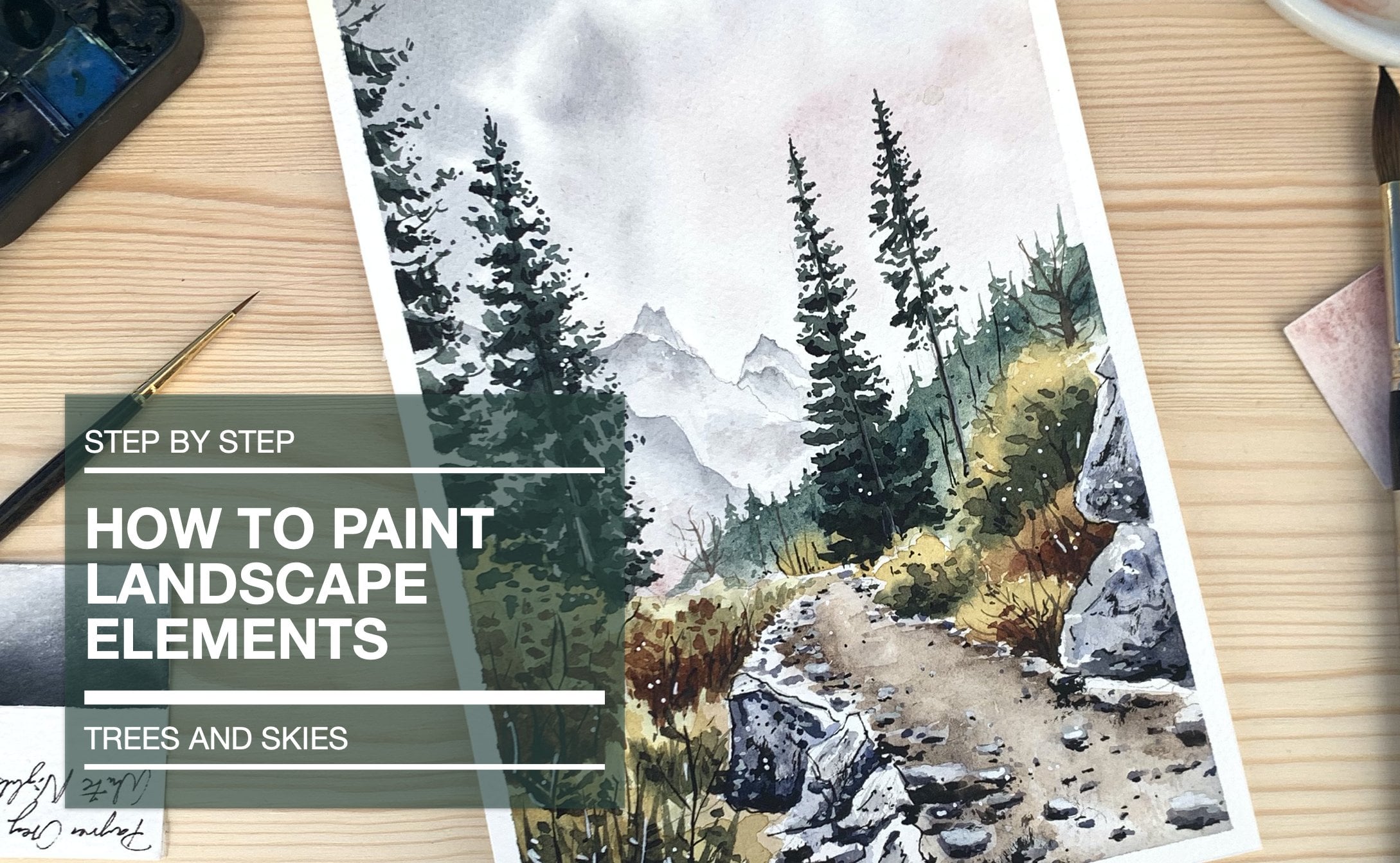
Transcripts
1. Intro: Hi guys. In this class, I will show you how to paint a beautiful water call landscape using watercolors. My name is your future. I'm an architect from Heidelberg, Germany. I work on my profession, is an architect, but I love to spend my free time painting, and that's why I'm here In the first section off this class, we will talk about the materials you'll need to create this kind offense cape. I will show you step by step, how to do this catch while creating an interesting composition. We start with the sky, which is elementary for the mood and atmosphere in the art. Then, when you talk about choosing colors, how I handled the foreground middle ground off a painting and how you can create a sense of that with the right color choice. After this, we start to build up the painting with the foreground middle ground from the first layout for the last layers, where we work out the details and at final textures, depending with. So I hope you carry on watching, and I hope you enjoy the class
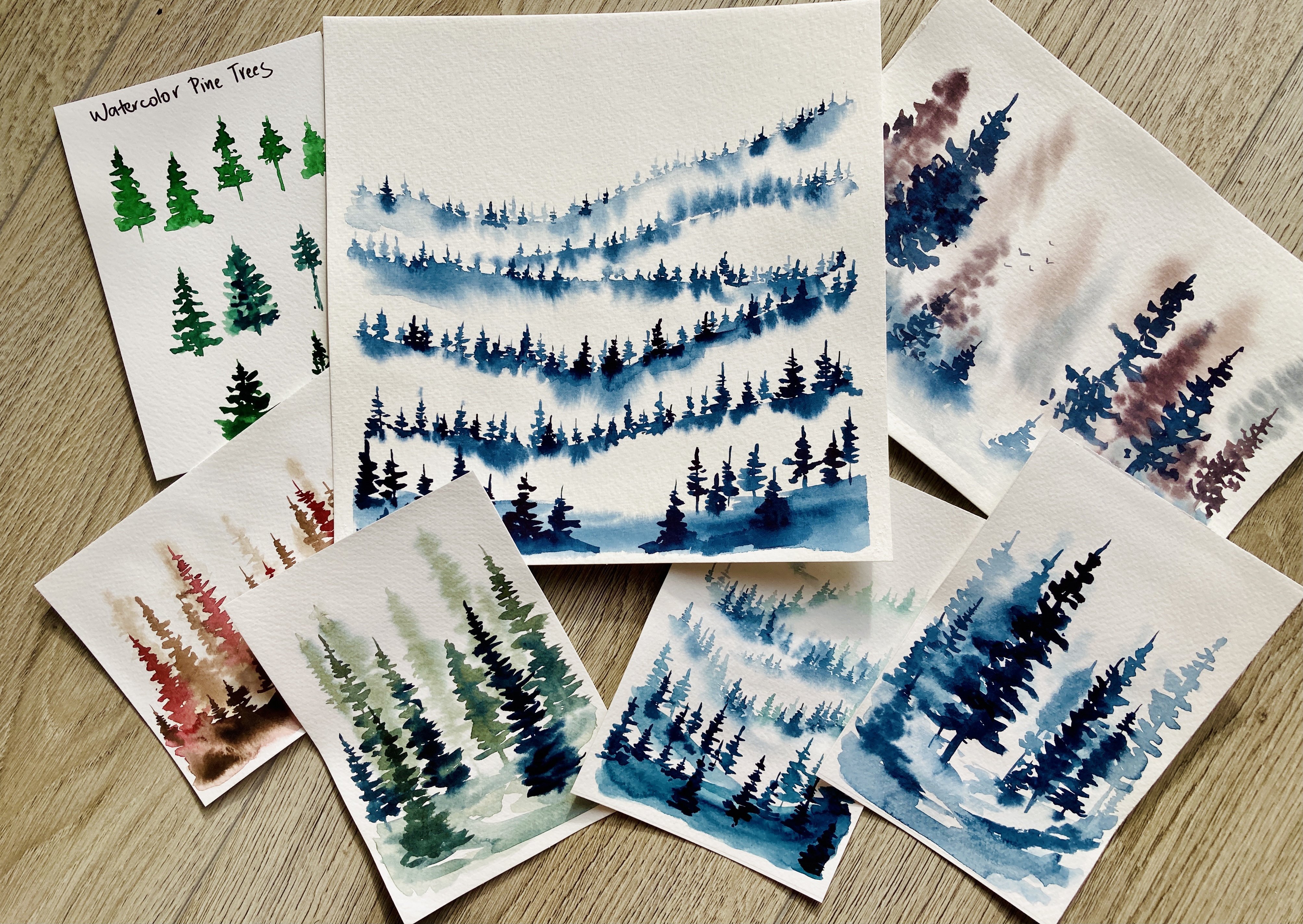
2. Material and colors: Let's talk about the choice of art supplies for this painting. I just want to go over very quickly what materials you're going to need for this Claire's. I like to do my sketch with the technical pencil because I don't want to waste time to sharpen it. I will mask parts off the painting with a masking marker before adding the water color to the paper for the details. On very end off the process, I will use my Lammy pen with black waterproofing with a white marker. I like to add highlights, but this step is optional as well as the Indian part. Let's talk about the washes in Water Cola's remember that you don't have to get the same Rogers and water follows that I use. Anything similar will work, so I have three round brushes Here. I have a number 12 saber rush for the bigger shapes from the painting and number eight and six synthetic brushes. For details. I will use a big, flat brush for wedding, the watercolor paper before I drop in the pain on the sky. But if you don't have any flat brush, any bigger brush will do the next brush I would use its a rigger. Brush it as a very fine point, which helps you to pay the branches off the trees easily. The last brush I would use is a Chinese brush with gold hair, which is very useful to create the texture in the foreground. I'm going to tell you now what colors I will use for this painting. But as I said before, you don't really need the same Brian O value. Just look for something similar and makes a friend ultra marine and warned number to achieve the kind of bluish gray for this cry of the clouds. Luna blue and undersea green from the distant background trees. Caroline Green for the corner falls on the left hand side for the following year. In the middle, I will use Indian gold for the highlight and underst agreeing for the shades for the Dobbs , I will add in the go to the mix. My color palette for the foreground will be Indian gold, transparent brought oxide, transparent red oxide, phone number and CPR for creating them CPR and indigo. I used to dock all calls and create shadows on the foliage. This is my palate for mixing my paint. I don't really clean it before starting a new painting because the paint can be used again by wetting it with water. An old dish towel will help you to death your brother strike if needed. I'm using tape to tape down my watercolor paper because I'm working wet, wet on large areas and I want avoid uneven, wavy paper. The paper I used is a cold press, 300 G s m and 100% cotton watercolor paper. I recommend you always to choose a good quality watercolor paper simply because with bad quality paper, you won't reach your results. You can reach with artist quality paper and don't forget, you will need to containers off water one to wash your brushes out and one for mixing the paint. So when you have prepared all the materials, let's get started
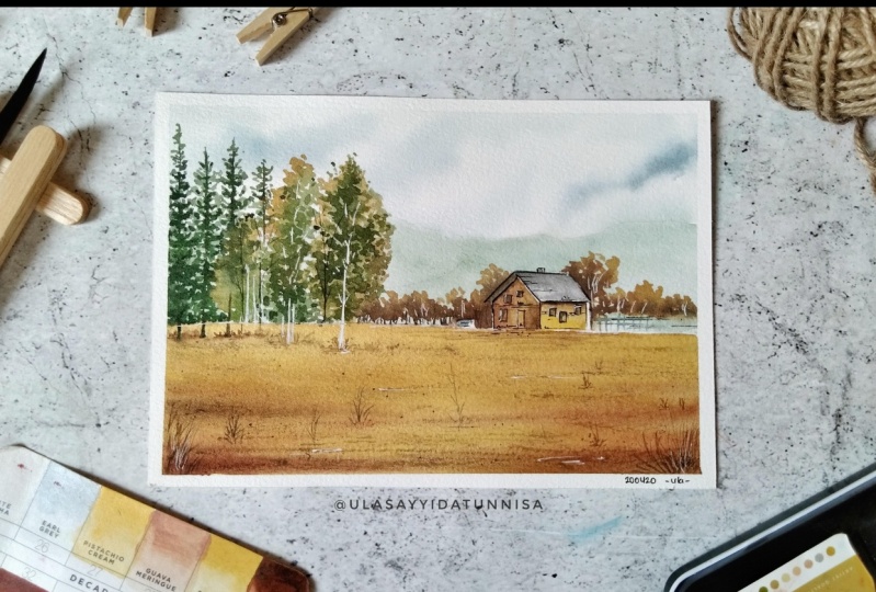
3. Sketch and composition : thank you. The first step is to tape your watercolor paper on a piece of cardboard or, in my case, a clipboard to make sure the paper stays in flat and do not call. This is the reference photo I found on honest splash dot com, a platform where you can find freely usable images. The basic rule off composition I apply during words catching protest is called The Rule Off Herds. You can place the horizontal line of third way down, starting from the top or 1/3 way up from the bottom. In today's case, I decided to place my horizontal line on the bottom. Now we did the same vertically, but only in our imagination. The place where the imagined vertical line in our horizontal line meat is our focal point. In today's painting, the focal point will be the cabin. A lower Horie's online can help you create drama and distance within your painting. It's actually my favorite for landscape paintings like this. Using this method, you have four possibilities to locate the focal point off your sketch at one off four red spots where lines in the sect try to figure out the geometrical shapes off the buildings. Catch off the rough outlines off the painting competence. Try not to press too hard. We don't want the sketch to stand out. We placed the carnivores on the left corner off the painting by overlaying parts to the image. You can create an effect of that. After I finished this kept in part, I begin to mask parts off the painting with a masking Marco before I start with the first washes. I like the masking fluid as a marco because it's portable and you don't need a brush for applying it. The only disadvantage is that you calmed fill in bigger shapes with. But in today's case, we want to hire dictates like tree trunks, branches, the trailer and the fans on the right side, off the cabin before putting on the paint or water. Make sure to let the masking fluid dry world in the next video. We'll work on the first washes, so see you in the next video
4. First washes: you before wetting the paper checked by tapping on the masking fluid. If it's dry, if it's sticky, you have to wait a few more minutes. I begin with bringing the sky washed down. Therefore, I went the paper with my flat brush. I load the brush with French ultra marine and burned and sweep it over this quiet suggest clouds. Freud shop just by blending the pain with them. Brush and pushed the pain into the white areas. Load the brush again with the same mix and repeat the steps. Then load the brush with his stronger mix off the same cause and apply it wet into wept, suggesting shades in the dark loads. To avoid sharp edges, clean the brush, dry it and blend the paint on the paper. The next step will be to pay in the background trees, the colors. I will need our luna blue and honesty green. With this mix I achieve called green color, which is perfect for distant trees and forests. I wait this guy wash to set up, but not completely dry before I laid in the wash on the news so it would remain diffused and have a soft edge this will additionally strengthen the effect off distance use. Attempt brush to blend the color, avoiding sharp edges. Take the darker mix off the same colors to get some darker values to the background. Let the washes drive next step, or use a hair dryer to speed it up. A good way to suggest stepped into landscape is to use warm colors in the foreground. Therefore, I will use Indian gold for the whole area up to the horizontal line. I load the brush with paint and sweep it over the paper. I use a lot of water for the first layer in the wet pain. I had a strong a mix of Indian gold I. You stock up and strong are tones like transparent red oxide and transparent brown oxide. Closer to the viewer, this would have suggest depth. Also sweep the brush with relaxed and loose movements over the paper I doctor in the mix up with bone number and use it for the edges off the painting at a little CPR to the mix again. Let the washes thrive for next step or use a hair dry out of speeded up
5. Middle ground - Basic layer: use of the number 12 round brush and Indian gold to paint the trees in the middle ground. Ive space between the four Yech to create a natural look at shadow to the wept Indian gold layer was phone number at some transparent red oxide for variation. Repeat the steps on the other side of the house first layer and Indian gold and at shades and don't amber and transparent brown oxide to the wet paint suggests tree trunks with the rika brush and a dark CPR mix. - Now we continue to paint the trees in the middle ground. With this makes changed. The number 12 brown brush again begin to paint. The trees in the middle ground was an Indian gold. Vary the pressure and leave hints off wide for lose effect. When painting, please think about them. In three zones in the distance, we see simple NASA's off freeze and no details is the middle ground. We see the overall shape off the tree. It's strong, and we get a sense for plums off foliage. When threes are closed to us, we see individual leaves and branches step in undersea green, wet into it. Use a stronger undersea green makes to paint the shades off the tree tops. Remember not to cover too much with the strong mix. Continue to paint the background trees with the same mix off Indian gold and undersea green - before beginning to pain. The carnivores on the left hand side let the paint dry to avoid bleed into another. Used the tip off your brush to paint the tree drunk off the evergreen with peril and green . Make sure to paint that wrong with an irregular broken line. Now I changed the number eight synthetic brush to define the structure off. The color falls by putting varying pressure on the brush. You can create more interesting marks. See you in the next video.
6. Middle ground and foreground - Textures: with less water and more pigment. I continue painting the Conifers with peril in green. There you really a seen as a mass, but I like to giving them a little more shaped by working out tops. - I'm using the side of my brush for flat strokes in the middle, off the tree. At the tip off, my brush for individual branches on the edges begin to darken the treetop on its bottom. Again, I tried to lose an up the tree top on the edges and create different values, working wet and wet by overlaying parts off the lighter layers with darker Kahlo's. Again and again, you make the four year to look moralistic. I like very the forms off the three tops to add a bit of variety with the mix off won't number, and CPR paints the tree trunks changed to a number six round brush to work more on details . Remember that tree trunks are always wider at the bottom, then on the top now at final shadows to increase the contrast, suggest individual ranges by overlaying the light parts with a strong makes off amnesty green and a little off we go. - Let's continue of the shadows on the foreground. For that, I used transparent brown oxide suggest grasses with the tip off the brush. Now it's time to at interest to the foreground. For that, I used transparent brown oxide and paint grasses and a kind of plans with the number six brush. Following the rules of perspective, the details are bigger in the foreground and smaller in the background. - I love the brush with a stronger mix off CPR and gold. Further, over 50 taels for painting the grasses in the foreground make a fast movement upwards with the top off the brush. Now it's time for texture. For that, I used the almost dry goat hair brush to bring in some more shadow area years in the foreground. Make gently strokes and move the only world stripe rush over the paper. The structure off the paper will help you to get the texture effect stronger, darker tones close to the viewer suggest depth in the landscape. It's better by flipping the number 12 brush loaded with CPR on the number six brush to the next video. We go on with the cabin and some more additional details in the middle ground
7. Middle ground - House and details: use the number A round brush with transparent red oxide. The pain the building drop in Indian gold to the right side, and this will spread upward. Creating texture suggest shadows under the roof and on the left. War off. Kevin, using a stronger makes off, read upside at some brown oxide and found Alma makes the strength and the effect of shadows on the roof. Hello to dry or used the hair dryer for the roof. I used a mix off rent, ultra Marine and but IM bank. That's actually my favorite mix for mixing graze if you want a bluish gray at more blue, and if you want to achieve a one brownish grey at more bone number. When you feel like putting too much paint on the paper, there's a simple trick to fix it. Use a clean brush. It has to be dr for the party overworked, and it will absorb the wet paint. It's timeto continue working on the trees, paid the shadow off the foliage with under screen to intensify the specialty off them. Give our parts for the middle values and work loser on the top off the tree. Use a darker mix on the very bottom off the trees. Now I makes India go to undersea green to work out the darkest darks on the trees and to increase the contrast can load the brush off a strong mix off French, ultra marine and bond number toe at darker values on the cabin, then wash the brush out, dep it a bit from the water and blend the mixed toe. Abide a sharp edge and some structure of the same mix to suggest a wooden facade with erase are removed the masking fluid from the paper, but pay attention to let the paint dry. Before doing this. The white spaces the mask include left on the paper are too wide, so I darken them a little with very weak mix off, honestly green for painting the wide birch tree trunks I use friend, ultra Marine and burnt umber. - I used the same mix for the shadows on the wide fence. For more contrast, I transparent brown oxide trees in the middle ground on the edge to the house at a little off CPR to the mix and paint some branches, trunks and the windows off the cabin. Awful change to the rigger brush and at very fine branches to the threes. Awful. Some more details for the foreground. For the same mix, I add a little off red oxide near the house to give more prominence to the focal point. In the next lesson, we will at the final details with ink and a white Marco, So see you there.
8. Final details with ink and white pen : for giving the painting the last touches. I used my Lami pen with waterproof ink. In this case, it doesn't have to be Want to prove you can also use a black fine liner? - This is a wide Posca Marca I used for highlights. Use it in parts you want, lighten up things or just for texture. So I think we are finished. I hope you enjoy the class. I would love to hear feedback and see your results on Instagram. Share it with me using this hashtag If you have any questions, do not hesitate to contact me. I would love to hear from you, so see you soon.
 JowishkaArt, Architect and Artist