Transcripts
1. Welcome to the Class: Have you ever
wondered that using minimal art supplies
and a color palette, you can create some
beautiful paintings? Winter is my favorite season, and I remember the first
time I witnessed a snowfall. Wash is a medium that I'm
exploring these days. The most amazing part
about the entire class is that we are going to use
only black and white color, which is a part of a
monochromatic color scheme. And a single color
which is going to enhance a class project. We are going to use basic and simple techniques
of painting. The class is suited
for beginners and also intermediate and
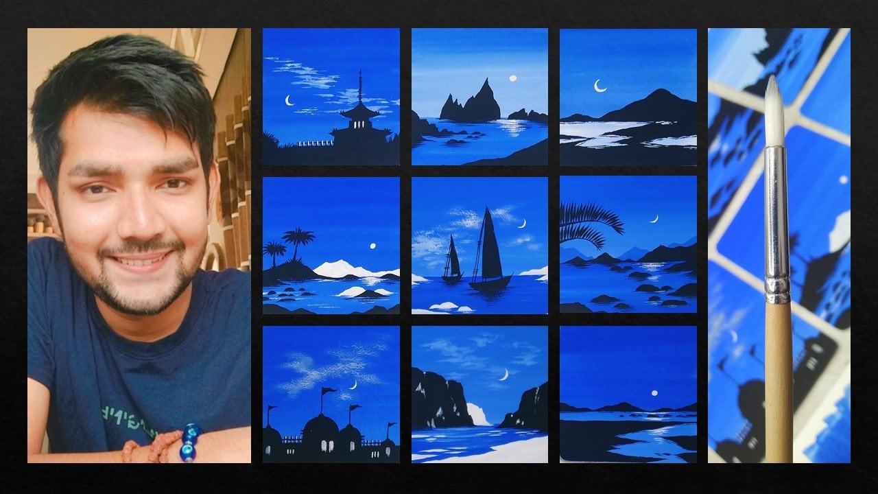
advanced level artists can try it everybody. I'm Patel, a self taught independent artist and an interior designer
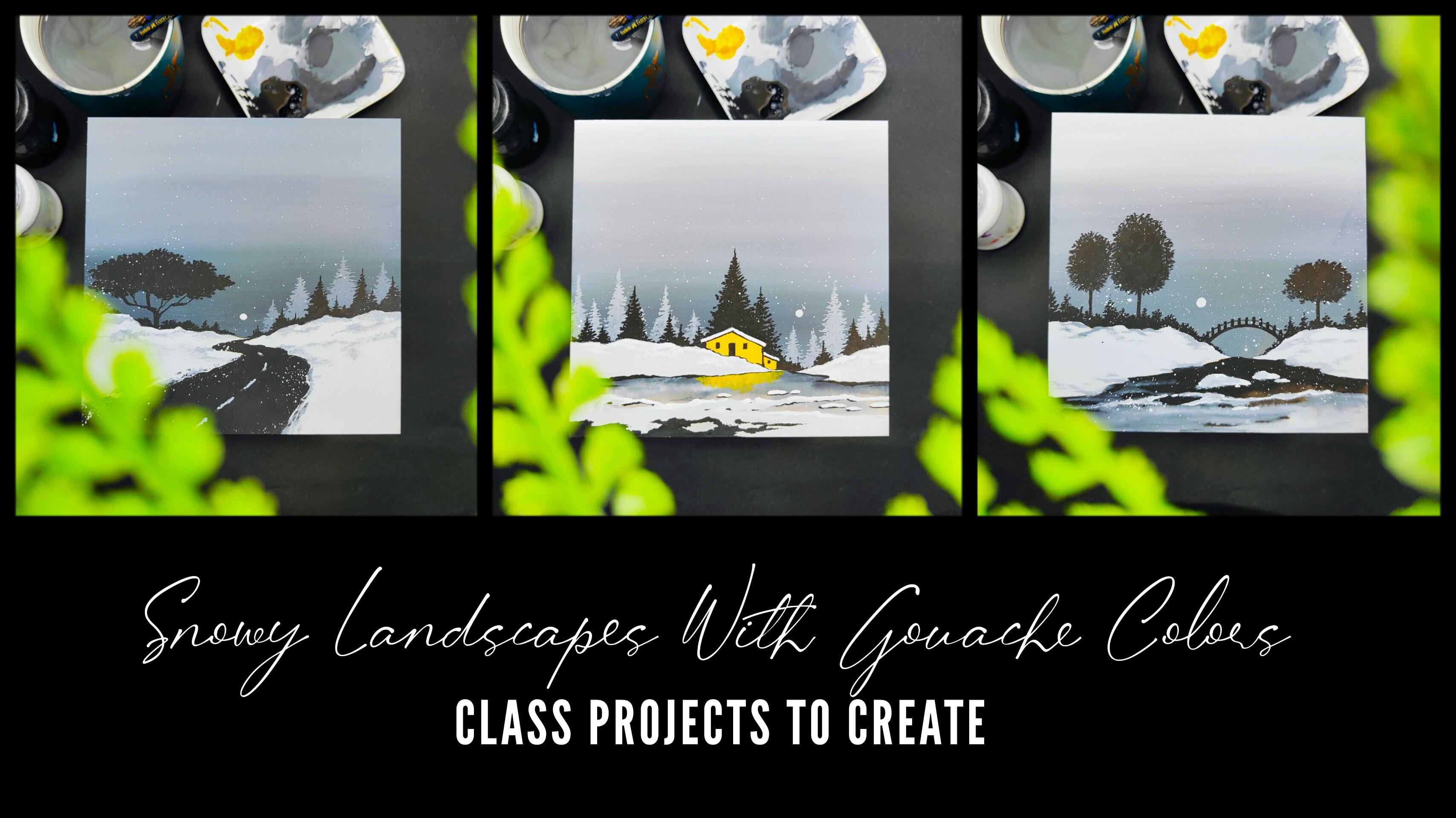
by profession. You can find most of my artworks being displayed on Instagram. I go by the name Schrag Artions. In this class, we
are going to paint three beautiful snowy
landscape paintings using the medium of gas colors. As an artist, I love to
explore different art mediums. As someone who's very much
passionate about teaching art, my major focus is always
to create classes for intermediate and
beginners who are trying to develop their
skills on a regular basis. We're going to start by learning about all the art
supplies in detail. We're going to talk
about the gas colors and the brushes that we are going to use for the entire class. Before starting with
all the class projects, we are going to
have a simple and easy practice session in which we're going to learn about all the elements and how
to paint them in detail. The practice sheet will
help you a lot to develop confidence and enhance
your painting skills. We're going to create all
the three class projects on square coasters. In case you do not want
to paint on coasters, you can use a watercolor
paper as well. I'll be teaching
you how to place your coaster carefully
on a desk surface so that it doesn't move using a monochromatic color scheme. We're going to paint a
beautiful gradient background. You're going to paint all
the elements that are required for all the snowy landscapes that we're
going to create. There is going to be a very
easy and simple technique to create a snowy effect to
the entire class project. Using easy and
simple brush strokes and some basic
techniques of painting, we are going to combine
all the elements together to form the
snowy landscape, which creates an
amazing scenery. In case you're new
to wash colors, there is no prior
knowledge required. All the class
projects are elegant, easy, and simple to create. I'm super excited and
happy to share this class with all of you
without any delay. Grab your art supplies. Join me and let's get started on this creative
journey together.
2. Art Supplies: Before we start,
let us talk about all the art supplies in detail that you will need for
this entire class. No need to worry at
all in case you're missing out on any
particular art supply. You will find it very easily in any nearby local art store, or you can go for any other
good alternative as well. Here you can observe one
of the class project. It is a simple square coaster. The size is approximately
15 centimeters by 15 centimeters, which is six inch by six inch. Here we have one
more class project. It is a same square
coaster only. Let me show you
the exact coaster. It's basically an MDF coaster. Mdf basically stands for
medium density fiberboard. In case you do not want to
paint on a square coaster, you can use a
watercolor paper of size five and it is 300 GSM, so you can cut it out
into an exact square. Or you can paint on a rectangular
piece of paper as well. According to your convenience, you can select a
watercolor paper or you can paint on
a square coaster. Now for the entire class, we are going to have a
monochromatic color scheme. We are going to form using
black and white color only. But there is going to be
one simple color which is med yellow that we're going to use in one of our
class projects. It's just a good
element that creates an nice contrast in the entire monochromatic
color scheme. Then we are going to
use two Gh colors only, which is black and white. And that is the most
amazing part about the entire class using
these two colors, we're going to create
some beautiful shades. Then next up, we have a
simple color palette. You can use any
good color palette, which is having enough space to take out good amount
of color in it. You can observe my color
palette is already dirty and it is having
a lot of colors in it. Then comes one of the most
important art supply, which is the brushes that
we are going to use. But apart from that, you will need a simple pencil to draw a basic sketch before starting to paint the
entire class project. We are going to use only three brushes for the entire class. The first one is a round
brush of size seven. The second one is a round
brush of size three. The last brush is a
flat brush of size 11. These are the three brushes that you will need for
the entire class. No need to worry
about the brand. You can go for any good
alternative that works for you. Just make sure that you
use a good quality brush. Then we have a simple tissue
paper on which we can dab the brush to remove axis
amount of water and color. Tissue paper basically plays a very important part
while we are painting. Whenever we want to remove access amount of water or color, we can just simply dab
our brushes on it. Then we have a
simple cup of water. You can observe my
water is already dirty. These are all the
art supplies that you will need for
this entire class. No need to worry at
all in case you're missing out on any
particular art supply. You will find it very easily in any nearby local
art store or you can go for any other good
alternative as well. Now let us move
towards the next part.
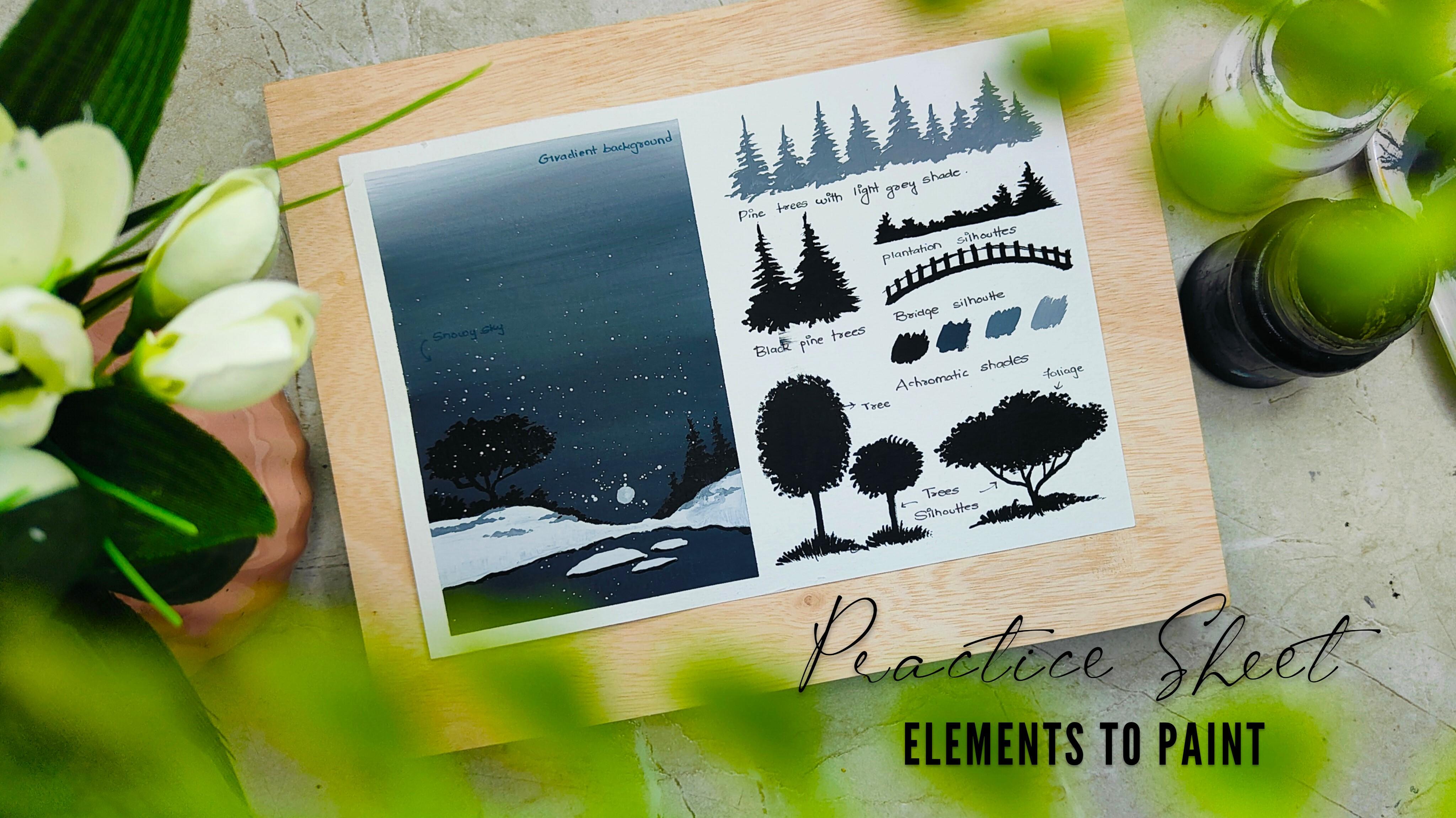
3. Lets Practice the Elements: Everybody, before we start
with all the class projects, let us learn about
all the elements and how to paint them in detail. The practice sheet will
help you a lot to develop confidence and improvise
your painting skills here. As you can observe, I
have taken my 300 GSM, five size watercolor paper. I have simply placed it in a horizontal position
on the desk. As you can observe, if you observe the class
project carefully, you can observe a
nice gradient effect on the entire background, which is the sky area. You can similarly observe it on the next class project as well. Now you will wonder that
we are going to create this beautiful
gradient background using black and white
color together. It's a very simple
and easy technique. On the watercolor paper, you can observe
that I have simply separated a section
using masking tape. Initially, we're
going to learn how we can create this beautiful
gradient background, which is having a
nice darker shade and we are moving slowly
towards a lighter shade. Let me tell you about
the masking tape. It's a simple 1 " masking tape. You will find it very easily in any nearby local art store. And I have just applied it on half of the entire
watercolor paper. Now I'll be using my
flat brush of size 11, and we're going to
apply a thin coat of water on the entire surface. No need to hurry at all. Try to apply an
even coat of water. Make sure that you do not leave any space between
the masking tape and the watercolor
paper that will not look nice once the
entire color dries up. As you can observe, it's a simple horizontal
movement and I have just simply applied a thin coat of water on the entire surface. In case you find that the coat is not an even coat of water, you can just simply
take some more color. Now in the color palette, you can observe there are
a lot of shades of gray, black, and white together. Just add a little bit of
water and loose in the color. Initially, we want
a darker shade which is very near to black. You can take some amount
of black color from the tub and make a nice
darker tone of black color. Apply it on the bottom portion
of the entire surface. No need to hurry at all. It's a simple
horizontal movement. Make sure that there
is no space left between the masking tape
and the watercolor paper. Now you can observe, I've taken my round brush
of size seven, added a little bit of
white color in it, so that the shade becomes
a little bit more lighter. Now apply again just
above the darker tone. It's a simple
horizontal movement. Now we are going to take
some more white color in the color palette to
make it even lighter. It's a process, no
need to worry at all. You can just add white color slowly to make the
shade lighter. You will slowly observe that the moment we start
adding white color, the shade gets lighter and the gradient effect will
slowly come into picture. You will observe that, again, I have added some
more white color on the topmost portion. You can just supply
solid white color. Right now, you will
observe a line of separation between
all the shades, darker shades, and
the lighter shades. Simply clean your flat brush, make it a little bit
dry by dabbing it onto the tissue paper from
the above portion. Slowly, you can move towards the bottom part by blending
all the colors together, but make sure you do not have axis amount of water
in your brush. That will not give you a
nice blend altogether. As you can observe, I have
added a little bit of water, but it is not in an axis amount. Now the more horizontal
strokes you will apply, the better blend you'll get. Let the background
dry for a while and you'll observe a nice
gradient effect. Now let us paint
some landscape area which is very much
snowy in nature. I'll take my round
brush of size seven, take some good amount of
solid white color in it. Add a little bit of water
in case you find that your color is a little bit
stiff in the color palette. No need to hurry at all
in case you want to draw the landscape area
using a pencil first. And then you want
to paint inside solid white color that
is absolutely fine, but you can directly also paint. It's a very natural shape of the entire landscape portion. You can observe I have
a nice mountainous area on the right and left
portion, both the sides. And we are going to paint a nice rock body which is full of snow in between both
the landscape areas. This is basically
a simple scenery to let you know that we are going to paint above the gradient effect
that we have painted. No need to worry at all. It is not at all
necessary that you paint in the exact same way
I'm painting right now. You can create your
own scenery as well now on the landscape area, to make the snow look a little bit more
natural and in depth, I've taken a little bit
of gray color and I have used it tip to dab it
on the entire surface, and you can observe it's a very random and natural movement. Now I'll take my round
brush of size three, take some good amount of
solid black color in it, and we are going to
paint a beautiful tree on the landscape area, which is on the
left hand portion. You just have to use the
tip of your round brush. Add these little strokes, combine them together to
form a nice outline for the entire bush and fill in
solid black color inside. No need to hurry at all. Try to paint it in a very
slow and steady manner. Now, once we are done
with the entire bush, we are going to paint its stem, which is the entire trunk. You just have to use the tip. Combine these little strokes coming out from the entire bush. Simply paint the entire trunk. You can observe we
have just simply used basic brush techniques and painted a beautiful
sell out for a tree. Now to paint a little bit of plantations just above
the landscape area, you can just use the tip of
your round brush of size three and use it tip to paint
these little bushy area. Similarly, I'll be adding these plantations on
the right hand portion. Also, no need to hurry at all. Try to paint it in a very
slow and steady manner. Try to use the tip of
your brush to get in these pointed tips
on the top portion. You can also convert them
into smaller pine trees by making it completely pointed
on the topmost portion, I'll just use the tip of my round brush to
paint in smaller area. You can also use the
solid black color just below the landscape area to enhance it a little
bit so that it looks a little bit more
in depth and detail. It's a simple and
easy scenery which I painted to show you how we can paint it on a
radiant background. Now using my brush
of size three, I have taken some solid
white color in it. Add a little bit of water. Tap your finger on the brush, and you will observe
the white color getting splattered on the entire
surface in the form of snow. It's a very easy and
simple technique. Using the same
brush, you can paint a beautiful moon in the
entire sky area as well. You can decide the position according to your convenience. You can also experiment
with the entire scenery. It is not at all
compulsory that you paint it in the exact
same way I have painted. Now, you can simply
remove the masking tape. Try to remove the masking
tape in an angle so that you do not end up tearing your
beautiful practice sheet. You will observe a nice edge. And similarly, you can use
the masking tape while you are creating a class project
on the watercolor paper. If you do not want to
paint it on a coaster. I hope that you've
got an exact idea of how to paint a beautiful
gradient background. Now let us paint all
the beautiful elements and learn them in detail. There are elements like pine
trees, some bushy trees, a bridge, some basic elements that you've got to
paint in a sellout format. But initially, we
are going to paint the pine trees using
a shade of gray, which is basically
replicating as if the pine tree is
in the back area. And the solid black
color replicates that the pine tree is
in the front portion. It's basically the
difference of perspective. I'll use a simple shade of gray, adding some white
and black color together in the color palette. Use your round brush
of size three and add these vertical lines
having difference in height. The variation in the
height basically creates a nice aesthetic in
the entire painting. Now using the same brush, I'll take some good amount
of gray color in it. You just have to apply little strokes starting
from the top portion. And as you move towards
the bottom area, slowly increase the size of the strokes that
you're making. It's a very simple and
easy technique to paint pine trees and you will also
enjoy the entire process. Similarly for a bigger
pine tree, also, you just have to apply little
strokes on the top portion. As you move towards
the bottom area, simply increase the size of the strokes that
you're making. You can complete
the entire portion. Now we're going to use
the same technique to paint the pine trees
using solid black color. Add the vertical lines according to your
convenience and add these little strokes from the top portion slowly as you move towards
the bottom area, increase the size of the
strokes that you're making. This time we have
difference in color. Basically, black color
will be replicating as if the pine trees are
in the front portion, very much near to
the entire vision, and the gray trees are
basically on the back portion. Now using the same brush, I have just added
horizontal line, replicating the ground line. To add these little plantations, you can use the tip of your round brush and move
it in this random manner. You can combine these
little strokes to form some amazing plantations
on the bottom area. Now in this particular
class project, you can observe a
nice bridge sill out. It's a very easy technique. Use your round brush
of size three. Make a curved stroke in a
slow and steady manner. Apply a little bit of pressure to make the stroke a
little bit thicker. Now using the same
brush and its tip, I'll just add these vertical
lines on the entire surface, which is creating the entire aesthetic for the entire bridge. These are basically the
poles on the entire bridge. And just connect them using the same curved stroke
that we painted initially. But this time apply a
little bit less pressure to make the stroke a
little bit thinner. This is how you can paint a
beautiful bridge sill out. Now we have some
nice bushy trees. You just have to use the
tip of your round brush. Combine these little
strokes together and you can just simply observe the
movement of my round brush. The outline is basically very much in a rough
and random manner. Now, I'll be using
the same brush to add solid black color
in the inner portion. You can also experiment with the shape and the size
of the entire bush area. It is absolutely fine
if you experiment. Now, once we are done
with the entire bush, we are just going to
paint the entire trunk, which is a simple vertical line. You can apply a little
bit of pressure on the brush to make the
trunk a little bit thicker. Now to paint another bush
which is a little bit horizontal and a little bit
different from the first one, but the technique
is absolutely same. You just have to create a
beautiful outline using minor strokes and apply solid black color in
the inner portion. Now to add a little bit of
plantation in the bottom area, I'll just use simple
thin strokes. In this particular
class project, you can observe another
tree which is having some good variation in
the entire bushy area. You can just add
these little strokes, combine them together, form a different
shape this time, and you can just create
the entire outline. Once we are done
with the outline, we are going to fill
in solid black color. In inner portion, you
can observe that I'm using a similar movement
of my round brush. It's a vertical movement in the same direction so that
once the color dries up, it looks in an even format. Now we're just going to combine these little strokes coming out from the bush and just
convert it into a nice trunk, which is a little bit thicker in order to show you the
entire color palette. The first one is a
solid black color that I took from
the color palette. Now slowly, I'll be
adding a little bit of white to make it
into a gray color, which is a little
bit darker as well. Now to make it
even more lighter, you can add a little bit of water and some white
color as well, so it can get a little
bit more lighter in tone. Last but not the least is going to be a solid white color, but it's not going to be visible on the white paper sheet. I'll just add a
light gray shade. There are number of
possibilities to create these beautiful variation in between the black and
white color together. It's a monochromatic
color scheme. You can observe the entire
practice sheet carefully. I have added some
nice labels to it. The practice sheet
will help you a lot to keep a record
of your artwork. Trust me on this.
Before starting with all the class projects. The practice sheet will also
help you a lot to develop some more confidence and
improvise your painting skills. Now let us move
towards the next part.
4. Lets Place the Coaster: Everybody, Before we start
with the class projects, let us learn how you have
to place your coaster on your desk so that it does not move when you're
painting on it. It's a simple masking
tape of size 1 ". Take a little bit
of masking tape, overlap both its end on each other and convert it into
a double sided tape. Apply it on the entire
surface of the coaster. Similarly, I'll be taking
one more piece and apply it on the next corner
of the entire coaster. It's a simple process of making a masking tape
into a double sided tape, so that when we place it on
the entire desk surface, the coaster does not
move and you can paint it in a good and
comfortable manner. Now I'll take the last piece and place it in the last corner. Simply flip the entire coaster. Place it wherever you want to paint on the entire surface. Now just apply a little
bit of pressure on the entire coaster
using your fingers. And you will observe
that the coaster will be placed on the desk
surface without moving. Now let us move
towards the next part.
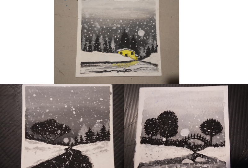
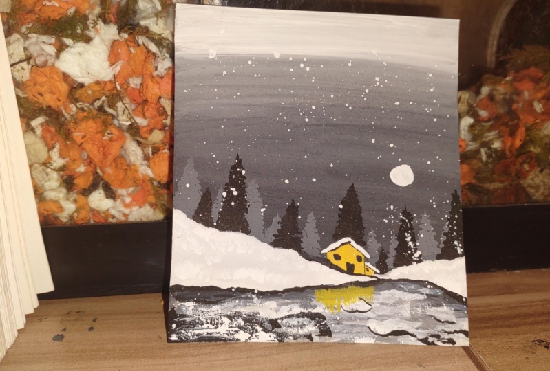
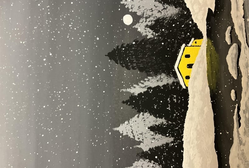
5. Painting 1 - House by the Lake: Hey buddy, You're
most welcome to the first painting which
is House by the Lake. As you can observe,
I'm ready with my coaster placed on the desk. All the art supplies
are placed nearby so that we can access them
in an easy manner. I'm going to use my
simple pencil to draw a basic sketch of the landscape area that we have for this particular
class project. You can observe on
the bottom portion, I have just applied a horizontal
line just above that. We're going to create
this irregular surface, which is basically a plateau. Then we're going to
draw a simple house. Simply draw two vertical lines, and we are going to
draw a simple roof. As you can observe, it's
a very easy technique to draw an entire house. Now we are going to
paint the background. I have taken my flat brush of
size 11 and we're going to apply a thin coat of water initially on the upper surface. You just have to be
very much careful just above the line that we
have drawn using pencil. You can use the tip
of your flat brush to apply the thin coat of
water in difficult areas. As you move towards
the above portion, you can slowly apply
horizontal strokes. You can observe, I am just
applying a thin coat of water very carefully
near the outline area. The reason behind
applying a thin coat of water initially on the entire
surface of the coaster is so that the colors
can blend in together in a nice way and your brush can move smoothly on
the entire surface. This is basically known as
a wet on wet technique. As you can observe, I have taken some amount
of black color in the color palette
and we're going to create a darker tone of gray. I'll be taking some
white color as well. Now, combining both
the colors together, you just have to create
a nice dark gray shade. No need to hurry at
all. Take your time. No need to worry about creating an exact shade that I'm
creating right now. There can be a little
bit difference. Also, you just have to make sure that you create a
nice consistency of water and color together. There shouldn't be
axis amount of water. Now you can observe using
the tip of my flat brush, I'm just applying the
first coat of color, just above the pencil
line that we drew. Now once you have
applied the first coat, you can slowly apply
horizontal strokes. Applying this darker tone of
gray on the above portion. We are not going to
cover the entire surface with this particular color. Now we are going to make
another shade which is going to be even lighter
than this particular shade. Add a little bit of white color. You can take a little bit of water also to loosen the colora, but make sure that
you do not have access amount of water. Now you can observe that
this particular shade is even lighter
than the first one. You have to apply it just
above the first one. No need to hurry at all. Take your time and apply a
good horizontal strokes. No need to worry
about the shade. It is not going to be exactly similar to the one
that I have created. There can be a little
bit of difference. Now you can observe the
difference between the first and the second
shade that we apply. Now using your round
brush of size seven, you can simply apply
solid white color in the topmost portion. Now I'll be taking some amount of water and you
will observe that we have a nice solid white
color on the topmost portion. Now slowly, you can apply
horizontal strokes between all the three colors to blend them together and get
a nice gradient effect. You can dab your brush onto
the tissue paper in case you find there is axis amount
of water in your brush. The more horizontal
strokes you will apply, the better blend
you'll get altogether. Now let the background
dry for a while and let us paint the beautiful
house that we have. For this particular
entire project, we are going to have one single color which is med yellow, which is going to create a nice contrast with the background. The entire scheme is monochrome, but to create some nice attraction for the
entire painting, we're just using med yellow. I'll be taking my round
brush of size three and I'm going to
take some amount of med Yellow in
the color palette. Add a little bit of water
to lose in the color. And we're going to cover the entire surface of the house using this particular color. No need to hurry at all. Paint it in a very slow
and steady manner. Use the tip of your round brush to paint in difficult areas. There is a little bit portion of the house on the right
hand side as well. You can paint there. Now, since we are going to paint
a snowy landscape, I'll be taking some
solid white color in the color palette using the
same brush of size three. Apply this solid white
color on the roof portion. Extend it a little bit
on the outside portion from the wall area so that the roof can look a little
bit more attractive. We are basically trying to show as if the roof is
completely covered with snow. That's why I've used
solid white color. Now using some black color in the round brush
of size three, you can just apply a thin stroke just below the roof
that we have painted. And you can also
enhance the walls by applying these vertical strokes. You just have to use the tip
of your own brush to get thinner strokes and apply
least pressure on the brush. Using the same brush, I'll be painting two windows
and one door. So it's a rectangular shape
only no need to hurry at all. Try to paint it in a very
slow and steady manner. We are almost done with
the entire house element. Now I have created
a shade of gray. As you can observe on the paper, you can add a little
bit of water. Take some white and
black together, create a nice shade
of gray right now. As you can observe,
the more water and white color you apply, the lighter the shade will get. You can select it according
to your convenience. Now, we are going to
paint some pine trees which are going to be
in the background, which are far from the house. I'm just using my round
brush of size three. You can simply draw
a vertical line to decide the position
of the pine tree, Basically to have a variation and make the painting look a little bit more aesthetic
and attractive. You can play with the
height of the pine trees as well by having difference
in the vertical lines. Now, how to paint
the pine trees? It's a very simple
and easy technique. You just have to apply
these little strokes using the tip of
your round brush. Now as you move towards
the bottom area, you can simply increase the size of the strokes that
you're making right now. No need to hurry at all. Try to paint it in a very slow
and steady manner. Take your time.
You can experiment with the shape and the size
of the pine tree as well. You can observe we have painted two beautiful pine trees
just beside the house. Similarly, we are going to paint the bigger
pine tree as well. And the method is absolutely same in case you are
not that much confident enough to paint the pine
tree directly towards your final coaster and you do not want to spoil your
beautiful background. What you can do is
you can practice it on a rough scrape
of paper initially, and then you can come
towards your final painting. It will help you a lot to develop confidence
while painting, and your chances of making
mistakes will be very less. Also, one more thing,
I would like to tell you that this particular step of painting pine trees is really peaceful and you'll
enjoy the entire step. We have one more pine tree
on the right hand side. These pine trees are basically a little bit far from the house, that's why we have
taken a shade of gray. Now, repeating the same steps and method of painting
the pine trees, we are going to add
these pine trees on the left hand
portion as well, just above the landscape area. I have started to apply the vertical lines having
difference in height. It is all up to you according
to your convenience. You can create your own
composition of the pine trees. You can decide their position. You can play with
the height as well. Just remember the basic
technique of how to paint it, and you can create your own
beautiful scenery as well. You can observe I have added a little pine tree just on the left hand portion and
we have an empty space. We can add one more pine
tree there as well. It would be really
great if you use the tip of your round brush
to apply thin strokes and try to get less pressure on the brush that you can
get a thinner stroke. In case you find
that your color is a little bit stiff in
the color palette, you can add a little
bit of water. Just make sure that you do not add axis amount of water in it. It will definitely decrease
the saturation of the color. In case you find that there is axis amount of water
in your brush, just simply dab it
onto the tissue paper. Now we are done with the
pine trees which are in the background and
far from the house. Now we are going to paint
the pine trees which are a little bit near to the house according to the perspective. I'm going to take
a darker color. This time, we are taking
solid black color. The method and the step to paint the pine tree is
absolutely same. I've simply drawn
a vertical line just above the house
as you can observe. And I'll be slowly starting to apply these little strokes
from the top portion. As I'm moving towards
the bottom area, which is near the roof
of the entire house, I'm simply increasing the size of the strokes that I'm making. No need to hurry at all. Try to paint it in a very
slow and steady manner. Be a little bit careful
near the entire roof area. We do not want to add these little strokes
inside the house. It will spoil the entire house. I'm just being very careful
near the house area. You can apply least pressure
to get thinner strokes. And you can use the tip of
your round brush carefully. Right now, you can observe
a difference between the gray shade of the pine tree and the
solid black color. There is a nice difference between the front
and back portion. There is a good contrast
with the background as well. Now, similarly, I'll be painting some more pine trees having variation near to
the entire house. And we're also going to paint it above the landscape area also. But while we are painting the pine trees
near to the house, you have to be a little bit careful because we do not want to get inside the house area. We are just creating it in
the background portion, you can observe
that I'm using the. My round brush near the
landscape area as well. I'll be deciding the position of the pine trees that are going
to be in solid black color. You can apply the
vertical strokes according to the
vertical strokes that you applied initially. For the gray pine trees, make sure that you
have difference in the height than the first pine
trees that we painted with gray because we want to create a nice combination of
both the colors together. You can observe I have applied the vertical strokes in between the gray pine trees
that we painted. It creates a nice combination
of all the trees together. You can also observe that I'm having variation in the height. Also, no need to hurry at all. Try to paint it in a very
slow and steady manner in case you are not confident enough to paint the pine trees directly
towards your final coaster. You do not want to spoil
your beautiful background, which is absolutely fine. What you can do is you
can practice it on a rough scrape of
paper initially, and then you can come
towards your final painting. It will help you a lot to develop confidence
while painting, and your chances of making
mistakes will be very less. Similarly, we are going to add the pine trees on the
right hand portion, also just above the
landscape area. You can observe I'm
using the tip of my round brush to
cover the entire area. Now we have a little bit of
portion left on the house, which is on the left side. You can cover that with
solid black color. Now we are going to paint
the landscape area, which is completely
covered with snow. I'll be taking some solid white color in the
color palette. And it's a little
bit of gray shade. No need to worry at all. You can create your
own shade as well. Just make sure that you apply
the good amount of water and color together or else you can use a solid
white color as well. That is also absolutely fine. You can observe I'm using
my round brush of size seven and we are just trying
to cover the entire area. You can carefully observe the
movement of my round brush. I'm trying to move it
in a similar direction, which is a simple
vertical movement to cover the area where
there is smaller portion. You can use the tip
of your round brush. No need to hurry at all. Make sure that you
apply the color in the entire area without leaving any space on
the entire coaster. Add a little bit of
water in case you find that your color
is a little bit stiff. Similarly, we'll be painting
the landscape area on the right hand side
as well right now. Basically we have even
coat of the entire color. We're going to create
some depth as well. As you can observe, we have painted the entire
landscape area. Now I'm going to take some
solid white color to create a nice texture of the snow on the topmost portion of the
entire landscape area. It's a very simple
and easy technique. You just have to take some
solid white color from the color palette or from
the gas color tub as well. That is absolutely fine. Just dab your brush onto the tissue paper
and make sure that your brush is having
minimum amount of water. Make it a little bit dry in case you find that there is
excess amount of water, you can simply dab it onto the tissue paper Using the tip of my round
brush of size seven. I'm just creating this
nice snowy texture just on the topmost layer
of the landscape area. You can apply these
rough strokes on the middle portion as well, but it is not going to
be in a maximum amount. We are just going to
apply it in a random way. No need to worry at
all about painting it in the exact same way
I'm painting right now. You can create your own
natural composition as well. These are all natural elements, so you don't have to
worry about painting it in the exact same way
I'm painting right now. In fact, I would love
to experiment and create some different
sceneries as well. Right now, you will observe
a minor contrast between this rough texture that we applied and the
background color. You can take a little
bit of gray shade also to enhance
the snow element. It is absolutely
fine if you do that. If you do not want to do that, that is also completely okay. Also, in case you
want to practice how to give this
particular texture, you can apply it on a rough
scrape of paper initially, and then you can come towards your final painting as well. Now we are going to
have a beautiful lake In the bottom portion, I'm taking my round
brush of size three. Take a good amount of
solid black color in it, add a little bit of water to get a nice consistency of
water and color together. Now use the tip of your round brush and be
a little bit careful. While you're painting just
below the landscape area, which is completely white, we do not want to spoil it, that's why be a
little bit careful. Now, once we are
done painting just below the landscape
area, you can use the Brush in a good manner. You can add a little bit of
water to loosen the color up, and you can apply this solid black color
strokes randomly. Now I'll be taking my
round brush of size seven and we're going to take some good amount of
solid white color in it. Having a good amount
of water as well. Apply just below the first layer of black that we applied. And you'll observe a
nice blend of colors together forming a
beautiful gray shade. It's a very simple
and easy technique and it's done in a
very random way. Also, no need to worry at all, just apply the strokes in a
very random and natural way. No need to worry about
the output coming in. In the exact same way
I'm painting right now, you can get a
beautiful output of the entire lake in a very
natural and random way. You can observe, I'm taking a combination of
black and white color together and we have
a good amount of water on the entire
surface as well. The colors are blending in
together in a very random way. Only also you can observe a beautiful shades
of gray forming together. It's basically a combination
of black and white color together and forming a
monochromatic color scheme. No need to hurry at all. Try to paint it in a very
slow and steady manner. Take a good amount of water in this particular area in case you want to practice this particular lake element on a rough scrape
of paper initially, and then come towards
your final coaster. That is also absolutely fine. Now you can observe we have got a nice darker shade near
to the landscape area. As we move towards
the bottom portion, we have a solid white color. Let it dry for a while. Now take some good amount of solid white color in
your round brush of size seven and apply these
random horizontal strokes on the bottom portion. This is basically solid snow
on the entire lake area, which is in a very random and natural way you can observe. I'm using the round brush
in a very rough way, only just applying these
horizontal strokes. Combining together forming
a nice composition of snow, which is on the bottom portion. It might look a
little bit difficult, but it is a very simple
and easy technique. You just have to apply
it in a very random way. Only no need to worry at all
and completely forget about the fact of painting it in the exact same way I
have painted right now. You can create your
composition of the snow right now here
in a very random way. You can apply these strokes in a rough way and according
to your convenience. So you'll observe
a good composition of snow in this particular
landscape area. Now, the most amazing
part about Gh colors is that after the
Gh color dries, it gives a very nice
matte finish to the entire surface
and you'll observe it very nicely when
you paint it live. Now I'll be using
my same brush of seven and I'm going to paint some ice bergs on the lake area. You just have to apply these
little horizontal strokes, which are very much
curved in nature and you can use the tip of your round brush to paint them. We are almost done
painting the snow area. Now let us enhance the
landscape area a little bit, creating a beautiful contrast. You can use your round
brush of size three. Take a little bit of solid
black color in it and apply this particular thin stroke of black just below
the landscape area. This will create a nice contrast between the lake and
the landscape area. The landscape area will look
a little bit more in depth. No need to hurry at all. Try to paint it in a very
slow and steady manner. And you can use the tip
of your round rush to get thinner strokes and apply
less pressure on it Now. Similarly, we are going to use the same solid black
color to enhance the icebergs that we have painted and the snow
on the bottom portion, which is on the
entire lake area. You just have to apply
these thin strokes of solid black color below the
snow that we have painted. It creates a nice depth
on the entire lake area. You can add this particular
solid black color in random way on
the snow as well, where you have left some space. Once we apply the
solid black color, it creates a nice depth and it makes the snow look a
little bit more realistic. Now, in case you do
not want to create this particular effect directly towards your final coaster, you can practice it on a rough
scrape of paper initially, and then you can come
towards your final painting. This will definitely help you a lot to develop confidence
while painting, and your chances of making
mistakes will be less. Now, on the left hand portion
of the entire coaster, we have some good amount of snow and we want to create
some good depth. I'll be just taking
some solid black color. I have applied a
nice random stroke. Just below the snow
that we have painted. And we're going to add solid black color in
the entire portion on the left hand side so
that we can create some nice depth on the
entire bottom portion. I want to just remind
you about not to worry, in case you are not
able to paint it in the exact same way I'm
painting right now. It's a very natural
and organic scenery. There can be difference
and it is absolutely fine. In fact, I would love to see the experiment and
difference in the scenery. You can paint it completely according to your convenience. Now you can observe
we are almost done painting the snow area
on the lake portion, I'll be taking some
solid white color in the color palette using my
round brush of size three. And we are going to
splatter some color, creating a beautiful
snow effect. You can take a little bit of water and combine
the color together. Make a good
composition of color. And simply tap your
finger onto the brush. You will slowly find that the white color will splatter on the entire surface
in the form of small white dots
forming some good snow. No need to splatter
a lot of color. You can just splatter the
color in an optimum amount. Now using the same
solid white color, I'll paint a beautiful moon just above the pine trees
that we have painted. You can decide the position of the mon according to your
convenience as well. It is absolutely fine. You just have to draw
a circular shape using your brush and then you can fill in solid white color
in the inner portion. Now I'll be taking
some solid black color in my round brush of size three. We can just finish the windows and the
door that we painted. So you can use the tip of
your round brush to paint a thin stroke of black just in between the house
and the landscape area, so that there can be a line of difference and a good
contrast between them. No need to hurry at all. Try to paint it in a very
slow and steady manner. Apply least pressure
on your round rush. You can finish the doors and window also using the
tip of the round rush. Now comes one of the
most important element, which is the
reflection effect of the beautiful mid
yellow house that we're going to apply
on the lake area. I'll be taking some yellow
in the color palette, add a little bit of water
to loose in the color. I'm going to use my round
brush of size three. And we're going to apply these vertical strokes just
below the landscape area, creating a beautiful
reflection effect. No need to hurry at all. Try to paint it in a very
slow and steady manner. Take some good amount of
color from the color palette. You can observe the
movement of my round brush. It's a simple vertical movement and no need to apply
a lot of pressure. Just keep your hand very
much loose and light slowly. We are going to paint this
mid yellow color just below the landscape area where
we have the entire house. Also, this is basically the reflection of the entire
house in the lake area. And it makes the
entire painting look a little bit more
aesthetic and elegant. You can apply these strokes in the ends which are
vanishing slowly. I will simply decrease the size of the vertical
strokes that I'm making. We are done with the
entire painting. Let me take you a little
bit closer so that you can observe all
the details carefully. I hope that you enjoyed painting this particular snowy landscape and got to learn something new. Now let us move towards
the next painting.
6. Painting 2 - Road to the Forest: Everybody, you're most welcome
to the second painting, which is Road to the Forest. As you can observe,
I'm ready with my coaster and all the
art supplies nearby. I'm going to use
my simple pencil to create the landscape
area on the coaster. It's a very irregular line, which we have drawn in
a horizontal format. No need to hurry at all. Try to draw it in a
slow and steady manner. We're going to have a nice road. You can observe these are simple curved lines and
it's in perspective. It is not at all necessary
that you draw it in the exact same way
I'm drawing right now. You can have your
own composition of the entire road as well. Since I have drawn the entire road in a perspective manner, it is getting smaller as we move towards the
topmost portion. Now once we are done
with the entire sketch, I'm using my flat
brush of size 11, and we're going to apply
a thin coat of water just above the landscape area that we drew using the pencil. No need to hurry at all. Try to apply an even coat of water on the entire surface of the coaster and make sure
that there is no space left. This is basically known as
a wet on wet technique, in which we apply a thin
coat of water initially. So that the colors can blend
in together in a nice way and your brush can move in a smooth manner on
the entire surface. Now, once we have applied a nice coat of water
on the surface, we're going to create a
nice gradient effect. In the entire background, you can observe the
movement of my flat brush. It's a simple
horizontal movement. Now in the color palette, you can observe we have
some solid black color and we are going to make
it a dark gray shade. I'll be taking some amount of white color from the gage tub. As you can observe, I have
added a little bit of solid white color in the black that we have in
the color palette. And I'll be mixing it
well using my flat brush. The entire color scheme for
the project is monochromatic. We are going to make shades using black and
white color together. Now, you don't have to worry in case you're not able to get the exact shade that I'm
preparing right now. It is absolutely fine. There might be minor differences to make a darker shade of gray. I have added a little bit of black in the color right now. It's not an exact black color. It's a darker shade of gray that you can observe
in the color palette. Take your time and make a nice composition of
color and water together. Make sure that you do not have axis amount of water in it. I'll be simply using the
tip of my flat brush and I'm applying it just
above the landscape area. That is the space that you have to paint a little bit carefully. Because we have variation
in the entire line, there isn't a simple
horizontal line. You can then apply
another horizontal stroke just above the first one. Now you can observe a
dark shade of gray here. Now we are going to make
it a little bit lighter, so you can add a little bit of solid white color in
the color palette. And you will observe that we get a different shade of gray. Now, it's a little bit
lighter than the first one. Since we want to create
a nice gradient effect. Again, I'll be taking
it in my flat brush. Apply just above the
first dark shade of gray. You can already observe a
difference in both the colors. Now again, we are going to make it even lighter this time. Before that you can blend in
both the colors together. Just simply dab your brush to the tissue paper to make
it a little bit lighter. And then you can blend in
both the colors together. This will help you
to remove a line of separation between
both the colors. Now we are going to take
some solid white color in the color palette again, and I'll be making
another shade of gray, which is going to
be even lighter. It's basically a process
which you will definitely enjoy creating different
shades of gray together, mixing both the black
and white colors together in case you do not want to paint
the gradient effect directly towards
your final coaster. What you can do is
you can practice it on a rough scrape
of paper initially, and then you can come
towards your final coaster. This will help you a lot to develop confidence
while painting. Now you can observe on
the topmost portion, we have another
lighter shade of gray. And we are going to blend
it with the bottom colors. Again, you can just apply these horizontal
strokes together, blending all the
colors together. Now one thing that
I can tell you is the more horizontal
strokes you apply, the better blend you'll get for the entire radiant background. Now let the background
dry for a while, you will observe a
nice matt finish. As you can observe, we are
done with the background. Now let us paint a
beautiful bushy tree, which is going to have
a nice variation in it. So I'll be using my round
brush of size three. Take some good amount of solid black color in
your color palette. The reason behind selecting a solid black color is
so that it can create a nice contrast with the background and
the entire sellout will look really elegant. It's a very simple
and easy technique. Just simply use the tip
of your round brush. You have to create these little strokes
which are combining together to form a beautiful
outline for the bushy tree. Now once you're done
with the outline, you have to fill in solid
black color Inside, you can observe the
movement of my round brush. It's a simple vertical movement. I'm just trying to move the
brush in the same direction. Once you're done with
the entire bush, you can use the tip of
your own brush and apply these random strokes to create variation in
the entire outline. And the tree can look a
little bit more attractive. No need to worry
about painting it in the exact same way I'm
painting right now. You can create your own
natural and organic shape for the entire
bushy tree as well. Slowly we get a nice fill
out for a bushy tree. Now once we are done
with the entire bush, we're going to just add these little branches which are going to combine together. We are going to attach
it with a tree trunk. So it's a very simple
and easy step. Use the tip of your round brush and take these little
strokes out of the bush, combine them together, and
attach it to a main trunk. Apply least pressure on the
brush to get thinner strokes. No need to hurry at all. Try to paint it in a very
slow and steady manner. Wherever you want to
have thicker strokes, you can apply some
pressure on the brush. And wherever you want to
paint thinner strokes, just use the tip of your round brush and apply
least pressure on it. Now, once we are done
with the entire tree, we are going to add
some plantations, which is going to be just
above the landscape area. It's a very easy step. Again, you just have to use
the tip of your round brush. Take some good amount
of solid black color in it and apply these
random strokes, which is creating
some nice plantation. And it's basically
the sill out of the plants that we have
above the landscape area. Once we are done
adding the plantation in the left hand portion, we're going to add some plants on the right hand side as well, but this time we are going
to have some variation. Some pine trees which are
going to be in the background. I have made a nice
shade of gray, a simple vertical line, deciding the position
of the pine tree. Basically to paint
the pine tree, it's a very easy step. You just have to add these little strokes on
the vertical line. Start with smaller strokes
on the topmost portion, and as you move towards
the bottom area, simply increase the size of the strokes that
you're making. It's a very easy and fun step to create these
beautiful pine trees. The vertical line basically helps you to decide
the position. It is absolutely fine. You can paint the pine trees according to your convenience. You can play with the
shape and sizes as well. I've added one more pine tree which is going to
be in a gray shade, and it's a little bit
bigger than the first one, but the method and step
is absolutely same. I'm just adding these little
strokes and you can observe the randomness of my hand and you can observe
the movement. Also, no need to worry
about perfection. I'll add one more pine tree, which is going to be a little
bit smaller in gray shade. The gray shade is
basically showing the trees are a little bit
far from the entire scenery. Once we are done
with the pine trees in this particular shade, we are going to paint
some pine trees using solid black color as well, which basically replicates
that these trees are in the front portion
according to the perspective. I'm adding the last pine tree in the right hand portion
of the entire coaster. I hope that you got
an exact idea of how you have to paint
the pine trees now. Similarly, we are going
to add some plantations and pine trees using
solid black color. Simply add a little bit of
water in the color balette. In case you find that your
color is a little bit stiff, I'll be adding the
vertical lines this time in between the
gray pine trees, so that there can be a nice variation between
both the trees. Once we are done with
the vertical line, you just have to add
these little strokes on the topmost portion. As you move towards
the bottom area, just simply increase the size of the strokes that
you're making. You can observe I have added
few more vertical lines having some nice variation with the background pine trees. Also, it would be
really great if you experiment with the
entire scenery. That is absolutely fine. You can create your
own composition of the trees together. You can play with the
shape and the sizes. You can create your
own combination of two to three trees
together as well. There is always possibility for experimenting and you can paint according to
your convenience. No need to worry
about painting it in the exact same
way I have painted. You can observe we are done with all the plants above
the landscape area. Now let us paint the beautiful landscape area that we have, which is completely
covered with snow. I'll be taking some
good amount of solid white color in
the color palette. And I'll add a little bit of water so that we
can lose the color. No need to hurry at all. Try to have a good combination of color and water together. You can observe I'm using my
round brush of size seven. I'm using the tip of the round brush to
paint the outline. Initially, you can observe how
carefully I'm applying it. You can use the tip of the round brush to
paint in smaller areas. Make sure that you
do not move on. The above portion where we
have painted the landscape, we do not want to add this white color in
the road area as well. Be a little bit careful.
Near the outlines, you can observe we have to
fill in solid white color in the inner portion. No
need to hurry at all. Try to paint it in a very
slow and steady manner. You can create the outline also initially using the brush, and then you can fill in
solid white color inside. Now you can observe we've got a nice solid white patch in
this entire landscape area. Similarly, we are going to add this particular color on the
right hand portion as well. Also, I would like to
tell you that this is a very satisfying process of
adding a solid white patch. You will feel a nice sense of satisfaction when you're
filling in particular color. You can observe the movement
of my brush as well. It's a simple vertical movement. Now as you can observe, we are done with the entire
solid white color. Now to create some
nice depth and detail to make the snow look
a little bit more realistic, we're going to add some texture. But before that, let
us paint the road. First I'll be taking my
round brush of size three. Take some good amount
of solid black color in it and you can just paint
the outline initially. You can observe I'm
using the tip of my round brush to paint
the outline first. And then you can fill in solid black color in the
entire portion. Be a little bit careful near
the outline because we do not want to spoil the
entire background area. Once you're done
with the outline, you can carefully just fill in solid black color in
the inner portion. No need to worry at all. Try to paint it in a slow
and steady manner. Make a good combination of
color and water together. Make sure that you do not
have axis amount of water. In case you have axis amount
of water in your brush, just simply dab it
on tissue paper. Right now you can observe a
nice solid black patch for the entire road to make it a little bit realistic
and in depth, you can just add
these random strokes which are on the
outline on the snow, which is basically replicating
that the road is in depth. Just make sure that you
apply a rough patch, try to have less amount
of water in your brush. You can simply dab it onto the tissue paper to remove excess amount of water from it. You can observe I'm using
the tip of my round brush to create this rough strokes
using solid black color. We are done painting
the entire road. Now let us add some nice texture in the landscape area
where we have the snow. I'll be just making
a lighter shade of gray as you can observe
in the color palette. No need to worry about the
shade that I have created. You can get your
own shade as well. No need to worry about getting the exact shade that I have
created in the color palette. Once you have created
a nice gray shade using black and white
color together, you have to use your round
brush of size seven. Make it a little
bit dry by wrabbing it onto the tissue paper
so that you can get a rough texture on the entire surface in case you will have
water in your brush. You are not going to get
this nice dry texture. Make sure that you dab it
onto the tissue paper. You can observe that
I'm trying to create this beautiful texture on the topmost portion of
the landscape area. This particular texture
will help you to get a nice depth and detail
to the snow body. There is no specific
way of applying the rough texture using
this particular gray shade. You can apply these strokes
in a random manner. It is absolutely fine
that in case you are not able to paint it in the exact same way I'm painting right now, You can just apply the texture according
to your convenience. Slowly, you can observe
that we are creating some good depth in the
entire landscape area. Now you can just observe the movement of my
round brush as well. Some areas I have
used the tip of the round brush to apply
less texture in some area, you can just apply some
pressure on the brush to apply some good
solid gray shade. Again, I'll be telling
you the same thing in case you are not that much confident enough to paint the texture directly towards
your final painting. What you can do is you
can practice it on a rough scrape of
paper initially, and then you can come
towards your final painting. This will help you a lot to develop confidence
while painting, and the chances of making
mistakes will be very less. Now you can observe,
I'm just applying my round brush in this random
way on the entire surface, which is creating an
even lighter texture on the entire surface. This is also a very
satisfying step while applying a nice texture on
the entire snowy surface. In case you find that there is axis amount of water
in your brush, just simply dab your brush
onto the tissue paper so that axis amount of water
will be removed and you can get this
beautiful gray texture. Now once we are done
with the texture, we are going to add a line of separation on the entire road, which basically replicates
the left and right lane. I'm using my simple pencil to draw it first so that we
can get the exact idea. These are basically simple lines which are getting a
little bit larger. As we come towards
the bottom portion, I'll be taking my round
brush of size three. Take some good amount of solid white color in
the color palette. Add a little bit of
water in case you find that your color
is a little bit stiff. Using the tip of my round brush, I'm going to paint these lines. No need to worry
about perfection, just simply use the tip of your round brush and cover
the entire pencil line. You can observe it creates a nice contrast with
the black background. This is basically a
line of separation between left and the
right lane on the road. Now using the same
solid white color, add a little bit of water
to loosen the color up. Now simply tap your finger to
the round brush to splatter some white dots on this particular area so that we can create
a snowy effect. No need to hurry at all. Try to do this particular step
in a very careful manner. We are not going to apply the white dots on
the entire surface. Just apply it in a random way. The more finger you'll
tap on your brush, the better splattered
effect you'll get. Again, it's a very
satisfying process. You'll definitely enjoy
this particular step. You can add a little bit of water in your brush
in case you're not able to splatter the color to the entire
surface of the coaster. The splattered color basically forms snowy effect in
the entire painting. Similarly, we are going to add this particular
effect on the background. Also, you can simply tap
your finger to the brush and apply this splattered effect in the background,
in the sky area. You can use another brush to
tap the first brush as well. It is also absolutely
fine in case you want to practice it on a rough scrape of
paper initially, that is also absolutely fine. And then you can come
towards your final painting. Now using the same
solid white color. I have painted a beautiful
moon just above the road. You just have to paint
a circular shape using the tip of
your round brush. We are done with the
entire painting. Let me take you a little
bit closer so that you can observe all the
details carefully. I hope that you enjoyed painting
this particular coaster. Now let us move towards
the next painting.
7. Painting 3 - The Garden Bridge: Everybody, you're most welcome
to the third painting, which is The Garden Bridge. As you can observe,
I'm ready with all my art supplies
nearby and the coaster. I'll be using my simple pencil
to draw a rough sketch. Initially, we are starting
with the landscape area. You just have to draw a
simple, irregular line. I'm starting from the
left hand portion, coming towards the
right hand area. Similarly, we are going to
do it on the bottom portion. We have two landscape area. Basically, we can also draw some icebergs in
the water body area that we have in the bottom area. Then I'm going to draw
a simple curved line, which is basically
the position of the entire bridge connecting
both the landscape areas. I'll be using my flat
brush of size 11, and we're going to
apply a thin coat of water just above
the landscape area. We are going to
paint a beautiful gradient effect in
the background. No need to hurry at all. Try to apply an even coat on the entire surface
of the coaster. This is basically known
as a ton wet technique, in which we apply a thin
coat of water initially. So that the colors can
blend in a good manner and the brush can move smoothly
for the gradient effect. We are going to start with
a dark shade of gray, and slowly we'll move towards the white color in
the color palette. You can observe I've taken some amount of solid black color and the color palette is already having some
good shades of gray. You can add a little bit of water and create a dark
shade of gray in it. No need to worry about getting the exact shade that
I'm creating right now. There can be some differences. It is absolutely fine. I'm adding a little bit of
white to make the shade a little bit lighter.
This is how it works. You have to create
your own combinations. You can also create
your color palette using black and white
color together, having some different
shades of gray. So once we have created a
beautiful dark shade of gray, we are going to apply it just
above the landscape area. As you can observe,
I'm using the tip of my flat brush to paint in
this irregular surface. You have to be a little bit careful while you're painting. Try to paint it in a
slow and steady manner. And once you're done with the portion just above
the landscape area, you can simply apply it in
this horizontal format. Now, once we are done with
the dark shade of gray, we are going to make
it a little bit lighter than the first one. So that we can create a
nice gradient effect. Add a little bit of
solid white color in the color palette so that you can get a lighter shade of gray. Simply apply it above
the darker shade. It's a simple horizontal
movement again, and you'll see a
line of separation between both the colors. Now we are going to create
another shade of gray, which is going to be even
lighter than the second one. Take some good amount of
solid white color from the guash color tube and apply
it on the above portion. It is going to be
absolutely solid white. Slowly move towards
the bottom area. You'll observe a nice blend
between all the colors. The more horizontal
strokes you apply, the better blend you'll get. Now once we have applied
all the three shades, let us blend them in
a very good manner. Just clean your flat
brush of size 11, dab it onto the tissue paper, make it a little bit dry, and start applying these horizontal strokes
from the bottom portion, slowly move towards
the above area. The more horizontal
strokes you'll apply, the better blend
you'll get altogether. And you'll observe a beautiful gradient effect in
the background. Let it dry for a while. I'll be using my round
brush of size three. And once the background is dry, take some good amount
of solid black color in it and we are going
to paint a bushy tree. It's a very simple
and easy step. Using the tip of the round brush have some good amount of
solid black color in it. Make these little strokes
which are combining together, forming a random
outline of a tree. Once you're done
with the outline, we are going to fill in solid black color in the
inner portion. But before that, let us
paint another Busche tree, which is going to be a little bit bigger than the first one. Again, the step is
absolutely same. You just have to apply these
little strokes randomly, creating a beautiful outline of a bushy tree. No need
to hurry at all. Try to paint it in a very
slow and steady manner. Try to have a good composition of color and water together so that the saturation of solid black color
does not decreases. Once you're done
with the outline, just fill in solid black
color in the inner portion, creating a beautiful fill
out for the complete tree. Similarly, I'll be filling in solid black color in the
bigger tree as well. You can observe the
movement of my round brush. It's a simple
vertical direction. You can use the tip
of your round brush to enhance the outline
as well creating these random strokes
and making the tree look a little bit more
attractive and aesthetic. Apply less pressure on the
brush to get thinner strokes. If you want to get
thicker strokes, apply a little bit of pressure
on your detailing brush. Now using the same round
brush of size three, I'll just add these
vertical lines, which is basically the
trunk of the tree. Now just above the
landscape area, we are going to have
some plantation. It's basically the sill
out of the plantation. It's a very easy
and simple step. You just have to use the tip of your round brush creating
these random strokes. You just have to create
the outline initially and then you can fill in solid black color in the
inner portion. This basically replicates
the plantation, which is above the
landscape area. In case you're not that
much confident enough to create this sill out directly towards
your final painting. What you can do is you
can practice it on a rough scrape of
paper initially, and then you can come
towards your final painting. This will definitely
help you a lot to develop confidence
and your chances of making mistakes will be very less now the way we have added landscape area
on the left hand portion. Similarly, we are going to paint another bushy tree and landscape area on the
right hand side as well. I'll be taking my round
brush of size three again, I have taken some good amount
of solid black color in it. The process is absolutely same. I have created an outline using these little strokes
combining together. Once you're done
with the outline, just fill in solid black
color in the inner portion. You can make the tree look
a little bit attractive by adding these random
strokes on the outline. Now using the tip
of the round brush, I'll paint the trunk as well. We are done with the tree
and we're going to add the plantation in this
particular area as well. It's a very simple
and easy technique. You just have to
randomly use the tip of your round brush to paint these little plantations just
above the landscape area. On the right hand side, now we have a nice bridge connecting both the
landscape areas. You just have to use the tip of your round brush carefully. Take some good amount of
black color in it and paint this curved shape connecting both the
landscape areas. Now using the tip of
the same round brush, I'll just add these
vertical lines, creating some aesthetics
for the entire bridge. These are basically
the side fence of the bridge and we are going
to connect it all together. Again, we'll be taking some good amount of solid black color. Apply least pressure
on your round brush. Use the tip of your
round brush and connect all the vertical
strokes together. It's the same curved stroke
that we painted initially. This is how you have to paint a beautiful sell
out for the bridge. Now let us paint
the landscape area. I'll be taking some solid white color in the
color palette. Add a little bit of water
to loose in the colora. No need to hurry at all. Make sure that you
create a good shade of solid white color. You can add a little bit of black in it to make
it a little bit gray. Also, the landscape area is
completely covered in snow, that's why we are
taking some good amount of solid white color and
a little bit of black. I'll be using my round
brush of size seven. And you can observe using
the tip of the round brush, you can paint in the outline
area very carefully. And then you can observe the same movement
of my round brush, which is in this
vertical direction. Take some good amount
of color and water together so that you
maintain a nice consistency. No need to hurry at all. Try to paint it in a slow and steady manner and make
sure that there is no space left on
the entire poster where we are painting right now. Now, similarly,
we'll be painting the landscape area in the
right hand portion as well. The step is absolutely same. Take some good amount of solid white color and apply
the outline initially, and then you have to fill
in the solid color inside. The entire landscape
is covered with snow. We are also going to add some nice texture which is going to enhance
the entire element. In case you find that there is axis amount of water
in your brush, just simply dab it
on tissue paper to remove axis amount of water. Now let us paint the lake, which is on the bottom area. So I'll be taking my round
brush of size seven. Take some good amount
of solid black color in it from the color palette, add a little bit of
water in case you find that the color is
a little bit stiff. No need to hurry at all.
Just apply the outline. Initially, just below
the landscape area. Using the tip of
the round brush, you can observe
slow DPR filling in solid black color just
below the landscape area. We want to make it a little
bit dense and in depth. That's why we are applying
this solid black color. You can add a little bit of
water to loosen the calora. That is absolutely fine. And you just have to apply
these random strokes. So slowly I'll cover the entire area using
solid black color, having some good
amount of water in it. Because we are also going to add some solid white color to create a nice blend and some gray shades
in the background. You can observe now I have taken some good amount of
solid white color. Also the color blends with the black color and form these
beautiful shades of gray. It's a very simple
and easy technique. No need to worry at all. No need to worry
about painting it in the exact same way I
have painted right now. This will naturally
happen since we have applied a nice amount of
water in the background. The colors will automatically blend in this particular format. I would like to
tell you personally that no need to worry
about the output. It will naturally come
in a very nice way only you can observe. While applying the white color. I'm leaving some black
****** in between also. That creates a nice sense of depth and detail
in the painting. We're almost done
painting the entire lake. Now we have these small
icebergs in between the lake. You just have to take
solid white color in your round brush
of size seven. Just clean it in water and take some good amount of
solid white color. Just add these little strokes which are not at all
in a perfect manner, you just have to
apply it randomly. I'm also going to add these rough white strokes
in the bottom portion, which basically replicates
the snow in a random way. Only again, I'll be telling
you the same thing. No need to worry
about painting it in the exact same way I
have painted right now. You can create your
own composition of fallen snow as well. You can play with the
shape and sizes as well. It's absolutely up to you. You can create your entire
scenery by yourself as well. There is always possibility for exploring and experimenting. I'll be taking my round
brush of size seven again, and you can observe
on the paper, you just have to
create this beautiful rough texture, the
landscape area. I've taken a good shade of
gray from the color palette. Add a little bit
of water in case you find the color is
a little bit stiff. But make it completely dry by dabbing it onto
the tissue paper. There will be more color and
less water in the brush, and you will observe
that you can create this beautiful texture on
the entire landscape area. In case you are not that
much confident enough to create this rough texture directly towards
your final painting. You can practice it on a rough
scrape of paper initially, and then you can come
towards your final painting. It's a very simple
and easy step. You just have to rub your brush in this particular manner, mostly on the
topmost portion and the bottom area of the
entire landscape area. And you just have to apply it in this random fashion only. There isn't any specific
way of applying it. You can apply it on the
snow that we painted, in the below portion, and
the icebergs as well, to make it a little bit
more realistic and in depth by adding this
particular texture, the painting looks a little bit more attractive and aesthetic. We are almost done
creating all the elements. Now let us paint
a beautiful moon. I'm trying to paint
a circular shape just above the bridge. On the left hand portion, you can decide the position of the moon according to
your convenience as well. It's a very simple
and easy step. Just take some good amount of solid white color in
your round brush. Use the tip of your arm brush to paint this beautiful
circular shape. No need to hurry at all. Try to paint it in a very
slow and steady manner in case you want to increase
the size of the moon. That is also absolutely fine. You can also paint
a crescent moon. You are free to experiment
with the entire element. You can see I'm almost done painting a beautiful
moon in the background. We are almost done with
the entire scenery. Now let us add a snowy effect
to the entire painting. Take a little bit of water from the cup of water in
your color palette. Mix it with solid
white color carefully, and simply tap your
finger onto the brush. You will observe the white
color splattering on the entire coaster in
the form of white dots. These white dots
basically looks like snow effect and it looks really amazing once
you do it by yourself. And you will observe
a nice sense of satisfaction as well. There isn't any specific way of applying this splatter effect. You can do it in a very
random and natural way. No need to hurry at all. Try to do it in a very
slow and steady manner. We are done with the
entire painting. Let me take you a little
bit closer so that you can observe all
the details carefully. I hope that you enjoyed painting this particular class project and got to learn something new. Now, let us move
towards the next part.
8. Class Conclusion: When it comes to exploring
different art forms, I love to explore
them in detail. The most amazing part about wash colors is the mat finish. It gives when it dries up. There are a lot of possibilities that you can find
out once you start exploring the entire medium While creating this
particular class, I made any number of mistakes. And that is something
I always tell my students not to be
afraid of making mistakes. One thing that I always
suggest my students is to maintain an art
journal on which you can practice on a regular basis. So that you can keep a record of your artwork and
improvise your skills. In case you have any questions or doubts related to the class, feel free to ask them
in the discussion. I would love to answer them all. I would be really
excited to see all of your class projects into
the project gallery. It would be really great if you leave a review for
the class as it encourages me a lot and my class can reach
a wider audience. I'm very happy and excited to share this
class with all of you. And at the end, I would like to say keep practicing,
keep learning. Thank you so much for joining the class and happy painting.
 Rutvik Patel, Artist and Instructor