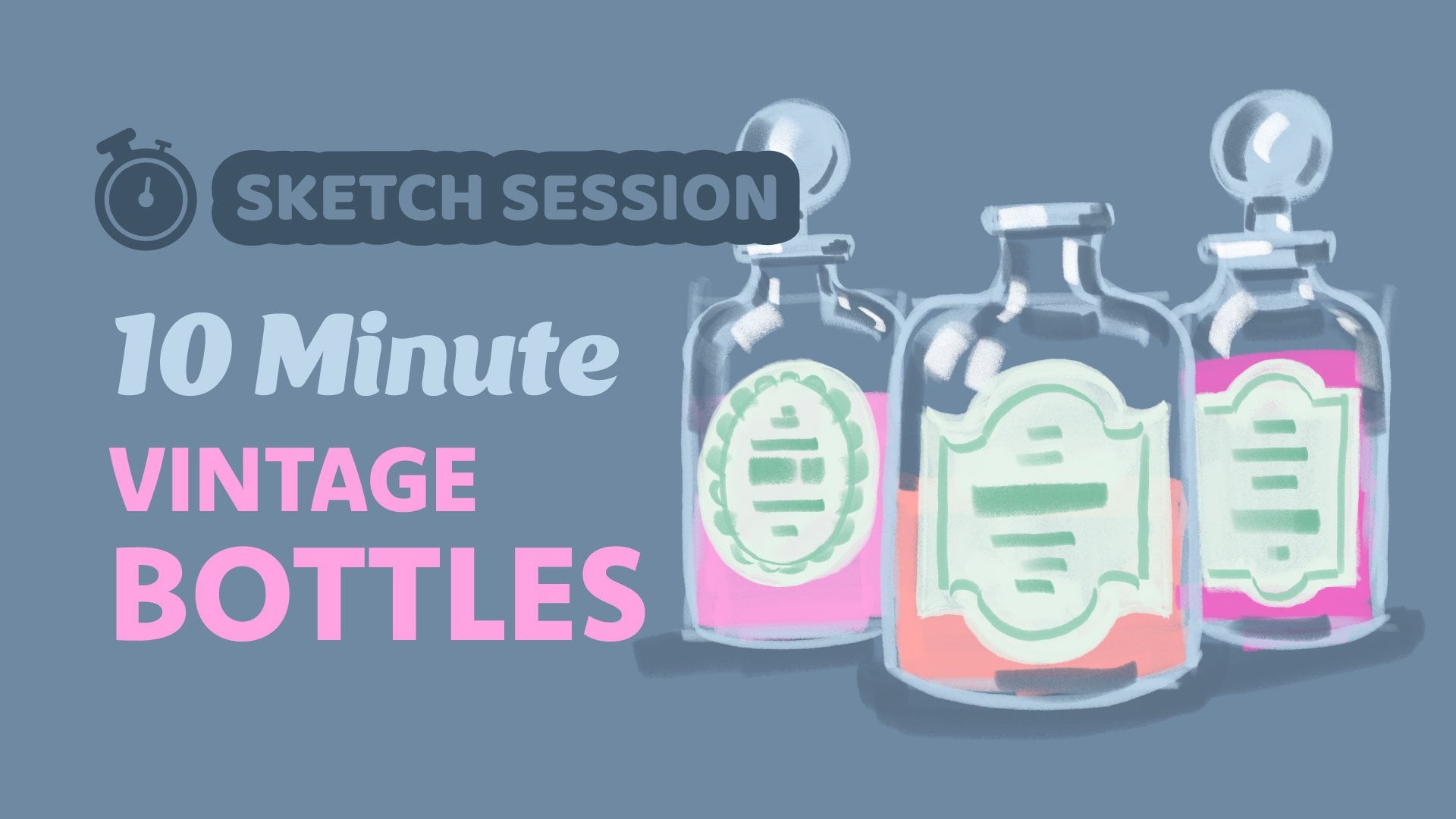
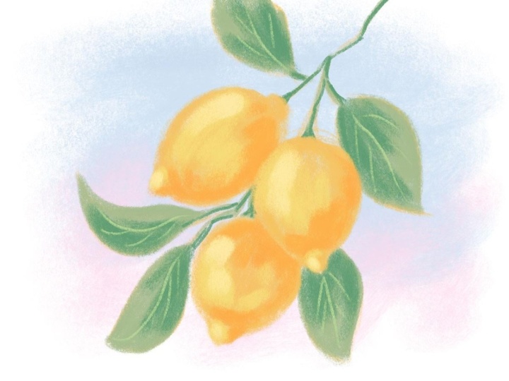
Sketch Session: Lemons
 Gia Graham, Illustrator & Lettering Artist
Watch this class and thousands more
Watch this class and thousands more
Lessons in This Class
-
-
1.
Intro
0:30
-
2.
Quick Sketch
6:43
-
3.
Drawing Review
0:39
-
-
- --
- Beginner level
- Intermediate level
- Advanced level
- All levels
Community Generated
The level is determined by a majority opinion of students who have reviewed this class. The teacher's recommendation is shown until at least 5 student responses are collected.
47
Students
11
Projects
About This Class
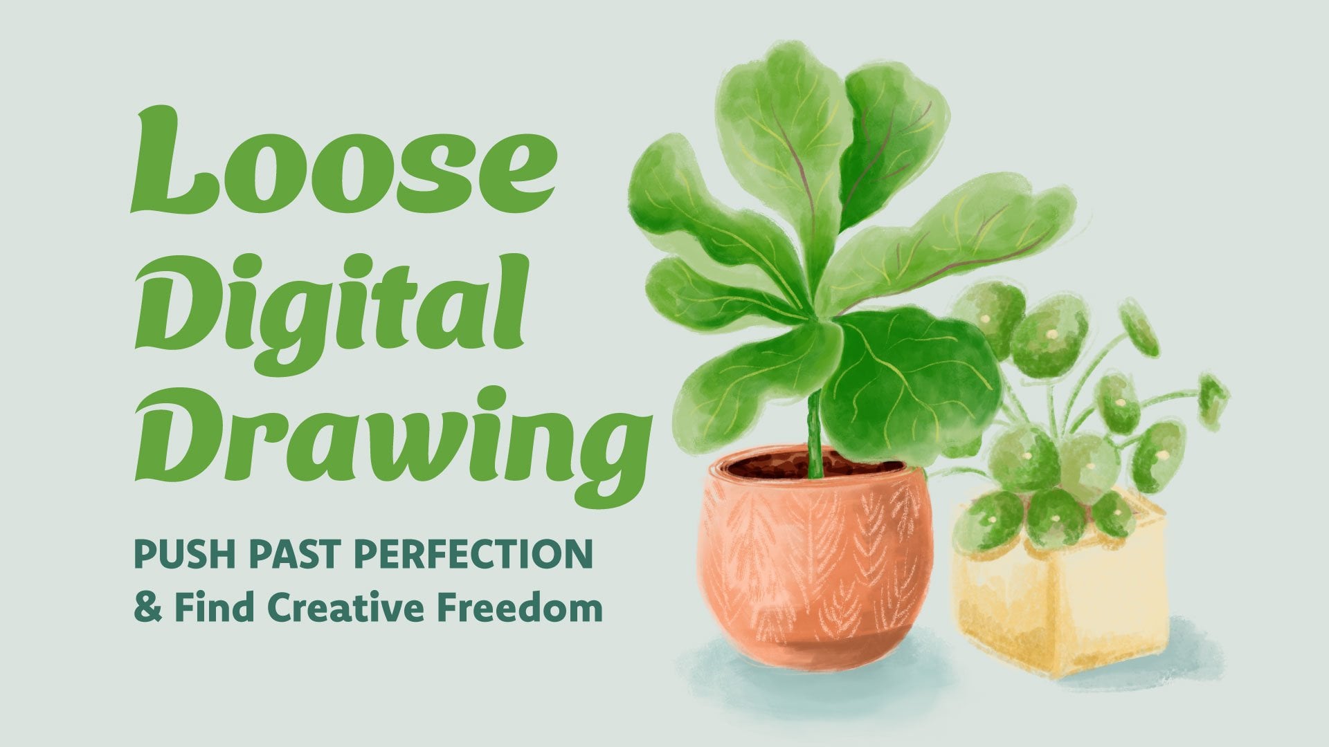
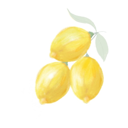
In this short class, we’re going to continue with the sketching sessions we started in my Loose Digital Drawing class. We’re going to loosen up with a quick color sketch which we’ll aim to complete in 10 minutes or less.
The goal is NOT perfection here - quite the opposite. The goal of this exercise is to get used to making quick, confident marks, to embrace our mistakes and to push past perfection.
Meet Your Teacher

Hello and welcome - I'm so glad you're here!
My name is Gia and I'm a designer, hand lettering artist and illustrator. I was born and raised in Barbados but I live and work out of my sunny home studio in the southern city of Atlanta, Georgia.
My creative experience ranges from corporate design and branding to art direction, photo styling and stationery design but my current focus is licensing my artwork to product based companies.
I've picked up several handy skills, tricks and techniques along my creative journey and I'm excited to share them with you!
. . .
I can't wait to see what you create so please be sure to post your class projects and if you share them on Instagram, be sure to tag me!
Speaking of Instagram, let's conn... See full profile
Hands-on Class Project
Resources:
- You can download the reference images and color palette below.
- Want to try a polished drawing using the same brush? Watch this tutorial.
Project:
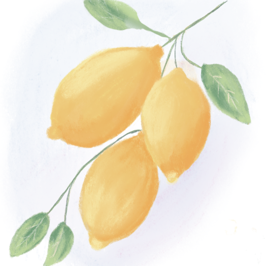
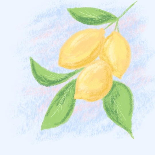
The project for this class is to create a loose, expressive drawing of lemons, using the reference image provided. The goals for this project are:
- Try to complete the drawing in color
- Try to complete the drawing without relying on a pencil sketch
- Try to complete the drawing in 10 minutes or less
- Try not to erase or use the 'undo' feature - embrace your mistakes!
If 10 minutes feels daunting, you're welcome to start practicing with more time (15 or 20 minutes) and eventually work your way down to 10. The reason for the time limit is so we don't spend time trying to perfect every detail.
Class Ratings
Why Join Skillshare?
Take award-winning Skillshare Original Classes
Each class has short lessons, hands-on projects
Your membership supports Skillshare teachers
Learn From Anywhere
Take classes on the go with the Skillshare app. Stream or download to watch on the plane, the subway, or wherever you learn best.