Transcripts
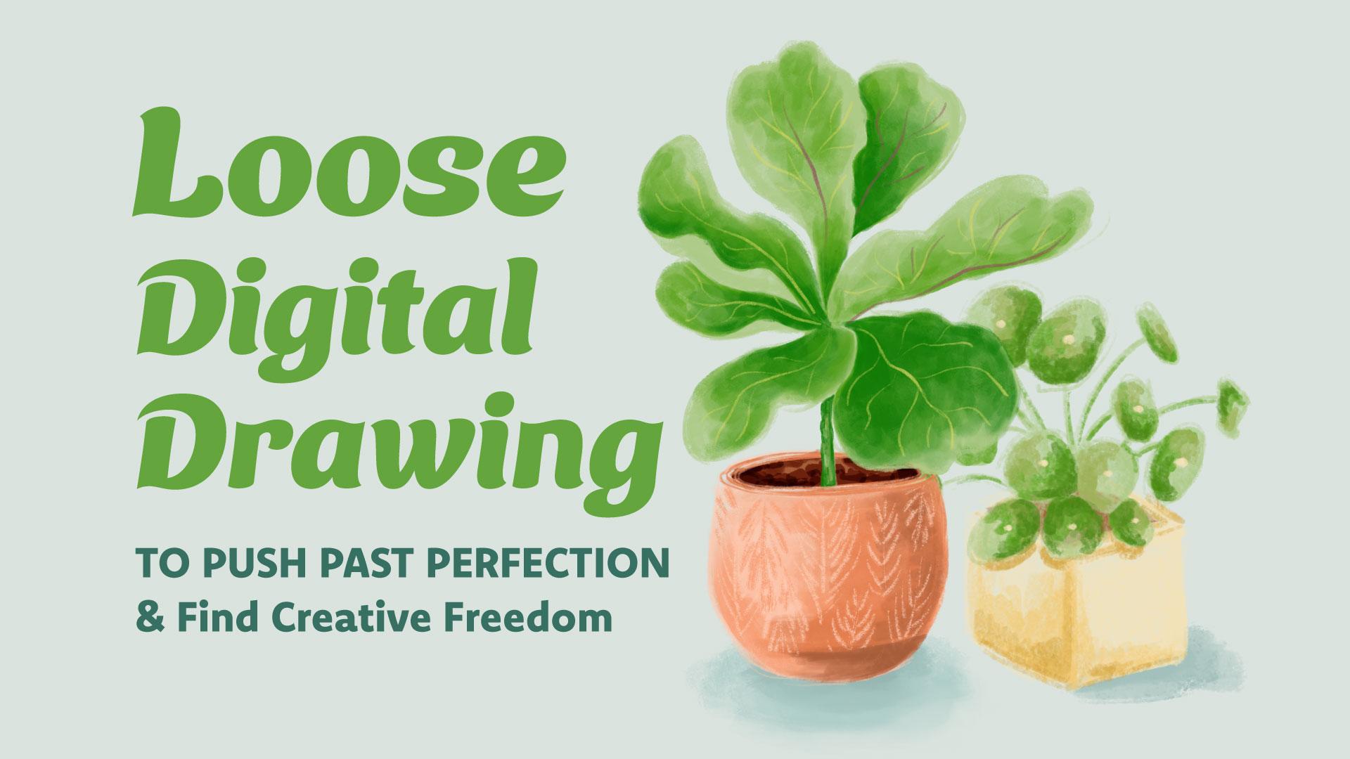
1. Intro: We're going to push
past perfection by practicing painting potted
plants in Procreate. Say that five times fast. If you've ever succumbed
to the fear of the blank page or if
you've ever started on a piece of artwork but spent so much time trying to make it perfect that
you never finished it, then you're probably a
bit of a perfectionist, and I can completely relate. Hi. My name is Geo Graham, and I'm a full time illustrator, hand lettering artist, and
lifelong perfectionist. Recently, I've been
actively working on embracing
imperfection in life, but especially in my artwork. And I can admit I still
have a long way to go. In many ways, perfectionism
has served me well, driving me to create
high quality work. But I've also noticed
that in many ways, it can stifle my
creativity, as well. There's a freedom and
spontaneity that's lost when you're bogged down by perfecting every little detail. And that freedom is often what makes art
resonate and connect. In this class, I'm
going to share several easy exercises
that will help you get out of your head
so that you can get into the flow of art
making without judgment. We will begin with a quick
mark making exercise where we will test the four brushes we'll be using
throughout the class. Then we will loosen up with
a few warm up exercises, followed by a series of
four quick color sketches. Finally, we will bring all those techniques
together as we create a perfectly imperfect digital
painting of a potted plant. This class is ideal if
you have experience with Procreate and you feel very comfortable with
drawing in the app, and you're just
looking for new ways to explore creatively. If you're ready to let loose, push past perfection and inject more spontaneity
into your drawing process, then let's get started.
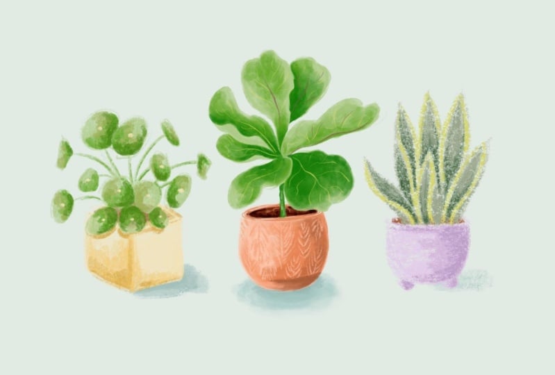
2. Class Project: The project for this
class is to draw a potted plant in a
loose, expressive style. You can either draw from one of the reference images provided or you can choose
your own image. The goal is to start and finish the class project
drawing in one sitting. Now, you don't have to
give yourself a time limit if that feels too
stressful, but ideally, you'll work towards
that goal since the point of this
process is to let go and get comfortable
with being quick and spontaneous
with your art making. Class, you'll need your iPad
with the Procreate app, an Apple Pencil, and a timer. You can use a timer
app on your phone, a kitchen timer or
whatever you have handy. By the way, I also just want to mention that at the
time of filming, the new Procreate 5.4 upgrade
was not yet available, so you'll be seeing
the classic version of the brush library
throughout the class. If you want to learn more about the brand new brush
library in Procreate 5.4, you can take a look at this
video on my YouTube channel. Don't forget to upload your artwork to the
Project Gallery. To upload a project, scroll below the video and click on the Projects
and Resources tab. Then head over to
the My Project box and click Submit Project. Type the name of your project
in the project title box, and if you'd like, you can share a few words about your artwork. In the section below where
it says add more content, click the Image button to
find and upload your image. You're welcome to upload all of your artwork and time sketches along with the final project. Or you can just upload
your favorite from the collection of drawings we'll be creating in this class. Remember to upload a cover
image because that's what will show up as your thumbnail in
the project gallery. Then finally hit
the Publish button to share to the Project Gallery. Okay, let's get
started with class. Up next, we're going to explore the brushes
we'll be drawing with.
3. Brush Exploration: Now, before we start drawing, let's choose our brushes and
explore how they behave. So I'm going to
start a new canvas, and I'm going to set
it to 1,500 pixels wide by 2000 pixels tall. And I'm going to leave
the DPI set to 300. Now, hopefully you've
already downloaded the Brush behaviors test sheet and saved it to the
camera on your iPad. And if you have
already done that, you can go to the Actions menu, make sure you've tapped on AD. Then tap Insert a photo, and this will bring up
the camera of your iPad and select the Brush
behaviors test sheet. I'm going to name
this layer template. And we don't actually
want to draw on this template layer, so I'm going to swipe
left to lock it. Now I can add a new layer above, and we'll be doing our brush
tests on this new layer. Now, I'm going to start with this medium orange from
our palette but of course, you can do this test with
whatever color you want. Now, the four brushes
we're going to be using in this class are
Gloaming Eaglehawk, Copperhead, and
the marker brush. So let's go ahead and
find these brushes and pin them so that we can
access them really easily. So first, we're going to go to the drawing section
of the brush library, and we're going to
select Gloaming. And I'm just going to do a quick scribble so that it shows up in the
recent section. Now that it's appeared here, I can swipe left and pin it. You'll see a little star show up so that you'll know
that the brush is pinned. Now, we're going to go back to the drawing section and
choose the Eaglehawk Brush. Let's just do a quick
scribble test with that. Head back to the recent section, swipe left to pin. Now let's look for
the Copperhead Brush, which is also located
in the drawing section. So let's tap that. Do a quick little test. Head back over to
the recent section. Pin that. And then finally, we're going to go to
the inking section and scroll all the way down till
you find the marker brush. Just going to use
it really quickly, so it shows up in
the recent section. And I'll pin that as well. Okay, I'm just going to clear
out all of these scribbles. And now you can see that
all the brushes we'll be using are here in
the recent section, so we don't have to go looking for them every time
we want to use them. Okay, let's start our tests. We're going to first start
with the gloaming brush. And while we're doing
these brush tests, we're going to first
test the brush strokes, see what the strokes look
like at different sizes. Then we're going to
test the transparency, just to see if each of these brushes have
any transparency. Or if they're completely opaque. And then we're going to
do a quick shading test just to see how this brush behaves
when we try to create a gradient of color for shading. So with a stroke test, we're going to start with
a really small size. Then we'll test the brush at a medium size and at
its largest size. Now, for the shading
and transparency tests, I'm actually going to switch
to the lightest orange, kind of this peachy color. I'm going to bring my brush
size down quite a bit. And what we're going to do is just ink each of these circles, making sure that they overlap. This doesn't have to be
particularly neat or perfect. We just want two
overlapping circles. Now, we can see that the overlapped area
is a tiny bit darker. So this brush is
semi transparent. Now for the shading test, again, we're just going to fill
this circle with color. And I'm not using the
automatic color fill. I'm manually filling the circle. And then I'm going to
choose the medium orange. I'm actually going to
bump my brush size up a little and add another
layer of color. And then choose
the darkest orange and add another
layer of color here. Now, I'm curious to see if I add more layers of
this darker orange, if it will get much darker,
and it doesn't really. It gets a little bit more dense. You see less texture, but it doesn't really
deepen the color. So now I'm going to switch to the smudge tool in
this same brush, and here's a quick
shortcut for that. If you've got the brush you
want to use already selected, all you have to do is press
and hold on the smudge tool, and it will automatically switch to that brush that
you were already using. I just want to see how
well this brush blends. Let's see. Let's make
that a little larger. Now, as always, when you
use the smudge tool, you do lose some texture, so that's something
to keep in mind. Let's move on to the
Eaglehawk Brush. So we're going to go back to the recent section where all of our brushes are pinned,
select Eaglehawk. And I'm going to start out
with that medium orange. And let's start with
a pretty small size. Then test a medium size. And let's see a large size. So as you can see, this brush has some great texture to it. Now let's see about
the transparency. I'm going to switch back
to this lighter color and drop this brush size down. Now, the Eaglehawk Brush
is quite similar to gloaming in that there is
a tiny bit of overlap, so it's semi transparent. Now let's try our shading test. Now, I just want to show you why I'm filling the color manually. This is a very textured brush, as you can see, and if
I were to drop fill, it will fill the whole page. And even if I were to reduce the threshold by dragging
my pencil to the left, you can see it creates a very solid fill with a very textured outline, and
that's not what we want. Now I'm going to go
to the medium orange. And again, these are
just quick tests, so we're not trying to create
a perfect sphere here. I just want to see what the
color does when it's layered on top of each other and then what it does
when it's blended. So again, I'm going to tap
and hold the smudge tool, double check that it switched
to the Eaglehawk Brush. I'm just going to do
a little blending. Now, this one
actually blends a lot more smoothly than
the gloaming brush. This is a really, really buttery smooth blend
without much effort. All right, onto the
Copperhead Brush. Let's go back to
the recent section. Select Copperhead. And I'm going to select that medium orange
for the stroke tests. I'm going to start
this out fairly small. Let's see it at a medium size. And I have a feeling
this large size is going to take over this area, so I'm actually not going
to go to the largest. This brush gets quite unruly
when it's at a larger size. Back to the peach color. And clearly, with this brush, I need to keep it fairly small if I'm going
to have any control There's really no
transparency here. We're not seeing much of a difference where
the two overlap. Now, this shading test
should be interesting. I'm going to increase the
size to fill let's go with the medium orange and the dark orange. Now, as you can see,
this is a really rough, sketchy kind of brush. So I'm curious to see what it will do with the smudge tool. So I'm gonna tap and
hold, double check. It has switched. Now, let's see. Will this blend at all? So definitely not your
typical blending behavior, but it could be interesting, depending on how it's used. Next up is the marker brush. So I'm going to select that
from our pinned brushes, go back to the medium
orange, reduce the size. Medium and fairly large. This one gets very feathery
and textured at a large size. Now let's try our transparency
test with the peach color. Now, as we can see, this
brush is very transparent. So there's a stark difference
when the colors overlap. So since we know how
transparent this brush is, I don't even think we need to switch colors
for the shading. So I'm going to go
ahead and fill. And as you can see, just overlapping this same color creates a totally
different color. So I'm just going
to keep the light peach and add another layer. And add another layer again. So as you can see,
with this brush, it just keeps getting darker and darker each time you
add a new layer. So I'm going to switch
over to the smudge tool. And let's see if
this will blend. I'm using circular motions here. Hm. And clearly, I
have to be careful about how I use this smudge
tool with this brush, so I think it's safest to blend from the light areas
into the dark areas. Now, this is a really
quick exercise to give us an idea of how
the brushes will perform. I've actually done
a more in depth review of each of these brushes. So you can check
those videos out on my YouTube channel
if you want to get a little bit more detail about how each of
these brushes behaves. Now that we've
explored each brush, it's time to do a few
warm up exercises. I'll see you in the next lesson.
4. Part One: In this first section
of the class, we're going to work on a
few warm up exercises. Over the next four lessons, we're going to draw four
different plant pot shapes, and we're going to draw each
shape four times so that we can practice drawing each of them with the
different brushes. We're going to do these warm ups so that we can get
used to drawing shapes quickly so that we can build confidence
in our strokes. These warm ups will also
give us the opportunity to practice working with loose expressive shading techniques.
5. Warm-up Exercise #1: Square Pot: For our warm ups, let's create a new canvas. And let's set the
size to 3,000 pixels wide by 3,200 pixels tall, and we're going to keep
the DPI at 300 as usual. If you've already downloaded
the warm up exercise sheet, go to the Actions
menu, tap on ad. Insert a photo and
tap on that template. Again, we don't want to
draw on the template layer. So first, I'm going to name it, and then I'm going to
swipe left to lock it. Now you're going
to want to create two layers above
this template layer. So just tap on the
plus sign twice. This topmost layer
is where we're going to draw our first
set of plant pots. Going to just do a simple
square pot for the first shape. You can use this
reference photo I provided for you in
the resources section, or you can choose your own. As you can see on
the exercise sheet, I've already got the
brushes labeled for us, and we're going to draw our
little loose color sketches in each of these boxes. So let's go ahead and start
with the gloaming brush. And I'm going to use this group of yellows for this
particular exercise. I'm going to start with
the lightest yellow. Now remember, we're just going to be really
loose with this. And so for this square, I'm just going to start with
a vertical line and add two diagonals and close that off with another
vertical line, and same on this side. I'm just going to drag
that down a little bit. Then add the two lines at the
top to complete the shape. So I'm going to increase
the brush size just slightly and quickly
fill this with color. Again, these are loose sketches. We're not aiming for perfection. So you really want to hold
your pencil really loose and lightly You don't want
any tension in your hand. And if you've got bits that are, you know, colored
outside the lines, again, that's perfectly fine. Now I'm going to switch to the medium version
of the yellow. Bring my brush size
down a tiny bit, and we're going to
do the shading. So I'm going to act like the sun is coming
from this direction. So this will be the
lighter area on the box, and this part will be in shadow. First, I'm going to delineate
that vertical and then just go ahead and
fill this side. Now, I don't want
to fill completely. Let's imagine that some
of the light might be hitting this top
side a little bit. We have this darker section on this planter
towards the bottom, so we're just going to add a
little bit more color there. And I'm going to add a little bit of shading
on this side, as well, because it's unlikely that it's going to be blasted
completely with light. So it'll be a little
bit of variation. And again, we've got
this darker section. While I've got
this medium color, I could maybe add a little bit more definition to the top of the planter box. Now, for the darkest yellow, I'm going to kind of mark
that vertical again, but I'm not going to go
all the way to the top. And I'm going to get
this bottom section. I do the same here as well. But I'm not going to go all
the way across on this side. Now, we've left the top open
because it is a planter, so this part will be
filled with the dirt. So we're going to go
to that layer below, and that's where we
can add the dirt. G to choose the brown
and just quickly fill in that square. And let's see if I reduce
the brush size, yeah, I can get a little bit darker because remember this
brush is semi transparent, just so it doesn't look so flat. Alright. That's our first
plant pot shape. Really rough, using
the gloaming brush. Now that I've walked you
through the first one, you can take the wheel and try the next three on your own. For those, you'll be
working with the Eaglehawk, Copperhead, and marker brushes. Remember, the point of this
is to help you loosen up, get your hands moving quickly, get accustomed to making decisions quickly,
and, of course, to help you get used to
living with mistakes when something doesn't
work out as intended. This is how my four
warm ups turned out. Once you're done with
the four sketches, you can go ahead and
group those two layers. I'm going to call
this group shape one. Then you can turn
off that group, create two new layers, and you'll have your
fresh template ready to go to sketch
shape number two, which we'll do in
the next lesson.
6. Warm-up Exercise #2: Cylindrical Pot: We're going to move on to
the second planter shape, but we're going to up
the ante a little. For the next three lessons, we're going to aim
to draw each warm up sketch in 4 minutes or less. The time constraint is there so you don't have time to
overthink anything. It's okay if the shapes
are a little wonky. It's okay if they're random
strokes here and there. Remember, the goal is to
embrace the imperfection. A reminder, this class is best
suited for those who have experience with drawing and feel comfortable with
using Procreate. Now, if you're brand
new to drawing or you've never used
the app before, you're welcome to do
these warm ups without the time constraint until
you feel more comfortable. However, the ultimate goal is to build towards that four
minute limitation because it will just help you
make decisions more quickly and not fuss too
much about minor mistakes. Okay, let's move on
to our second shape, which is a basic
cylindrical footed pot. So I'm going to use this
group of blues for this one, starting with the lightest blue, and switch to Eaglehawk. By the way, I already started this warm up page using
the Gloaming Brush, which we used in
the last lesson. And for each of these
warm up lessons, I'm going to show you the
process with a different brush. But when you're doing these
warm ups on your own, I'd like you to practice drawing each sketch with each of
the four different brushes. Now you can grab your timer
and set it to 4 minutes. Alright? Let's get
the timer started. Even though the timer is on, I don't want you
to feel panicked. The time limit is just
there to remind you not to get too caught up in
perfecting every detail. Take a deep breath, remain
present, and relaxed. The aim here is to
build confidence in your strokes and try not to
second guess your decisions. Just remember you want to hold your pencil really nice and loose looser than
you usually would, and just change your brush
size to help with control. Alright. Now I'm going to
start building some shadow. And what I'm finding
with the Eaglehawk Brush is the larger it is, the softer that shading will be. Then when you get
into smaller sizes, you can get some
more defined lines. I'm just going to try to blend this little
area a little bit. And now I can go down
to the dirt layer. Add the dirt. There's our second shape. Okay, so how did that feel? If it made you feel a little uncomfortable, that's
actually okay, because it means you're stepping outside of your comfort zone, and that's what
we're hoping for. Now, if working with
the time limit made you feel terribly anxious and
you absolutely hated it, feel free to take a
step back and finish the warm up page without the time limit until you feel
a little more comfortable. If you're up for the challenge, go ahead and
complete the rest of the time sketches using
the other three brushes. Before we move on, let's group the layers
we just worked on, and we're going to name
that group shape two. Now, turn off that group, tap the plus sign twice to create two new
layers above that. And in the next
lesson, we're going to work on plant pot
shape number three.
7. Warm-up Exercise #3: Footed Pot: The third planter shape
is also a footed pot, but it has separate
little feet and the bottom of the pot
is quite rounded. For this warm up,
we're going to use the Copperhead Brush, and again, we're going to try to complete the sketch in under 4 minutes. I'm going to use this
group of purples, so I'm going to start
with the lightest. Choose the Copperhead Brush. And remember, with this one, we want to start fairly small so that we can
control the brush. So this will also start
with a horizontal oval, and then we're basically
creating a U below that. And then from there, we can
just add the two little feet. Pretty straightforward. Now you can fill the shape, drop the size down a bit. Much like the cylinder,
this is a rounded shape, so you'll have a
little bit more shadow towards the edges. So I'm going to choose
a darker purple, bump the size of my
brush up a little, and just follow
that rounded shape. I'm going to reduce the
size of the brush to get these smaller
details on the feet. I'm just going to add kind of an L shaped shadow
on each of those feet. Now, go to the darker
purple and layer on yet another layer of color just to deepen
that shadow a little. And this is one of
those brushes where you can really get away
with being kind of scratchy and messy because that's just the
personality of the brush. And if you try to fight it and make things a little
too neat and too, refined, it's just gonna cause frustration because that's just not what this brush wants to do. I actually do want to beef up the shadow at
the bottom edge. So I'm gonna go with
this really dark purple and just apply a tiny
bit to that lower edge, just to give it some separation. The dark purple is a
little heavy on this side, but rather than erase or blend, I'm just going to
layer on more of the light purple and then
just rework that area. Back to the dirt layer. Oops, again, got to
keep this brush small. Alright. There is
the Copperhead Brush with 42 seconds to spare. Now it's your turn.
Go ahead and complete the warm up sheet by drawing the same sketch
three more times, using the other brushes. I will admit that I struggled a bit with the marker
brush sketch because that brush can be a little tricky to use because
of the color shifting. And I found myself resorting to my old ways by spending way too much time trying to get the shading to look really
smooth and perfect, which, of course, is the opposite of what
we're trying to do here. What can I say old
habits die hard? One of the reasons
we're sketching each pot with all of the brushes is so that we can make
note of what worked or what didn't work
with each sketch, then make adjustments so we can build confidence not
only with the brushes, but with our process, as well. In the next lesson,
we're going to tackle plant pot shape number four and have a go at
the marker brush.
8. Warm-up Exercise #4: Geometric Pot: The fourth and final planter has a fun kind of trapezoid shape. And although it has this
great geometric pattern, we're just going to focus on the shape alone for
this warm up session. This time, we're going
to use the marker brush, and we will try to complete the sketch in under 4 minutes. I've grouped the two layers from the last warm up and named
that group shape three. Now add two new layers, choose the marker brush and just double check
to make sure you're working on the top layer. For this one, I'm going to go
back to those orange hues, starting with the
lightest peach color. Alright, let me start the timer. Time, I'm going to start
with a horizontal line, then turn it into a
very narrow oval. From there, add a
diagonal line on each end and a slightly
curved line below that. Then add two more
diagonal lines this time facing inward and a
horizontal line for the base. Remember, this Marker Brush is very transparent and it will shift color every time you pick up your pencil
and put it back down. And I want a nice
solid base layer. So I'm going to
keep my pencil down the entire time I
fill this shape. I'm trying not to repeat
the same mistakes I made with this brush when I
worked on the last warm up, so I'm going to try a
different approach here. I've got the brush at
a fairly large size, and I'm just going to try
adding a few layers of color on this side so the color gets deeper
with each pass. Now, I'm just going to add a few more layers on the very edge here to try to deepen
the color in that area. Let me try the dark orange I do want this to
go a little deeper. Right now, it's just getting
brighter and brighter. But I want it to go a
little deeper in color. So with this brush,
you really just have to play and see what happens. Okay, I'm gonna switch
over to the smudge tool, which is set to
the marker brush. Now, this is interesting. I'm finding that if I just
kind of push the smudge tool, that blends this a little
bit better, actually. And then if I push
it the other way, it almost erases some
areas. That's interesting. And if I go back and
forth like that, it creates a smoother blend. I'll have to play with
that a little bit more when I'm not
on a time crunch. Alright. There is our
fourth plant pot shape. Now it's your turn. Complete
the warm up sheet by drawing this same plant pot three more times using the
other three brushes. Well, that's it for
the warm up exercises. I hope these timed studies help you feel a little
more comfortable with working quickly
and also help you feel more confident working
with these different brushes. From here, we're
going to move on to drawing some actual plants. I'll see you in the next lesson.
9. Part Two: Now it's time to put
plants in those pots. In each of the
next four lessons, we're going to draw
a different plant, and we're going to reuse the plant pot shapes we explored during the
warm up exercises. The goal is to keep things loose, experimental
and spontaneous. So we're going to remove the safety net of
a pencil sketch, and we're going
straight to color. We're also going
to limit ourselves to just 15 minutes for each of these sketches so that
we're not tempted to overwork or perfect
them. Let's dive in.
10. Timed Sketch: Money Plant: Oh. For this lesson, you're going to need
the Td sketches template and the Money
Plant reference photo. Be sure to download those
from the resources section and have both saved to
the cameo of your iPad. You'll also need to
have your timer handy. Let's create a new canvas, and we're going to go back to
these vertical dimensions. So we're going to set our
canvas to 1,500 pixels wide by 2000 pixels tall
and keep the DPI at 300. So let's go to the
Actions menu, tap Add, insert a photo and find the template for
the timed sketches. Again, I want to lock
this template layer. Because we don't want
to draw on that layer, create a new layer above it. So as you can see
here, we've got four different boxes which
we'll be drawing in and a little note for
which plant and which brush we'll be using
in each of the boxes. Ideally, we want to do each of these sketches in
15 minutes or less, so we really don't have the time to continuously tweak to
try to make it perfect. We're going to be
loose and spontaneous. So let's start with the
Money Plant sketch. First, let me pull up
the reference photo. So go to the Actions menu, tap on Canvas, tap on reference. Then you're going to tap image, import, and go ahead and
choose the Money Plant photo. Now, as a template shows, we're going to be using
the Gloaming brush. So let me choose that
from the recent section. I do want to mention
that you are free to switch out the pot styles
for any of these plants. You can use any of the four pot styles that we drew during the
warm up exercises, or you can replicate exactly what's shown in the
reference photos. Totally up to you. In this case, I'm going to go ahead
and use this square pot, and I'm going to go with
this yellow combination. So I'm going to start
with the lightest color. And again, no pencil sketches. We're just diving right
in. Let me get my timer. Now, just as a reminder, like we did with the
warm up exercises, remember to keep your
pencil grip nice and loose. You don't want your lines to be too controlled or precise. Keep it loose and expressive. It's okay to make it
a little bit messy, and we want to try to erase
as little as possible. Those extra lines and strokes add to the
character of the piece. So we're trying to embrace that. Alright, let's give it a go. By the way, for
the sake of time, I will probably jump some
of the footage forward and edit out long pauses so this
lesson doesn't get too long. Here I'm just drawing
the simple box shape, just like we did in the warm up. Then I'll add the shading. I was just about to tap undo to erase that, but
I caught myself. Just like before, I'll
add more shading to the left side because that's
where the shadow is falling. I've switched to the
light green so I can sketch the placement
of the stems. And this doesn't need
to be super accurate. Just try to get the general
position of everything. These leaves have
a round ish shape. None of them are
exactly circles. So you can really get away with drawing just wonky shapes here. And keep in mind, we only see a side view of some
of the leaves, so that shape will be almost
triangular in some cases. Then up front, you mostly see the round leaves
clustered together, and the stems aren't even
visible in those areas. Now, I can increase the size of the brush to fill the
leaves with color. This gloaming brush is so
smooth and nice that you can do this really quickly without being
too precious about it, and it will still look decent. I am doing all of
this on one layer, since it's just a sketch. And part of the reason
I'm doing this is because working on
one layer removes the safety net of
being able to simply delete or adjust a layer
if you make a mistake. Now, I'm going to
use this darker green to define the leaf shapes, especially in areas
where they overlap. It just helps to create
some separation. I'm not using any
specific technique here. I'm not being too technical about where the
shadows should fall. I'm just making loose marks wherever I think they should go. I'm adding a third green really just because I think having multiple tones of the
same color just helps to add depth and makes things
a little more interesting. I want to add one more green. So I'm going to select the
bright green I used before, but I'm going to
darken it a bit by just dragging that color
down on the color wheel. And then I can add that
color in a few areas. I see these little dots here. I want to go ahead and
incorporate those as well. So I'm going to go
back to the yellow. But my brush sides down a bit. I think I should add just a
little shading to the stems, as well, just to
beef those up a bit. I do feel like there's a little too much blank space
on the left side, so I'm going to add one
more leaf and stem here. I'm going to deepen the
shading on the pot to help it look a little
more solid and grounded. And I'll also add a
couple little shadows beneath those leaves that
are hanging over the edge. While I've got this dark color, I can also add a few lines to define the shape of the
pot a little bit more. I think I will create a
new layer, drag it below, go back to the brown, and I'll add that dirt, even though it's barely
going to be visible. I'm just going to pinch the plant and the
dirt layer together. That's our money plant. Really quick sketch. You know, it's not perfect, but it is nice and
loose and expressive. And there's a certain charm
with all its imperfections. Up next, we're going to move
on to our second sketch. I'll see you in the next lesson.
11. Timed Sketch: Rubber Plant: Okay, let's tackle our
second time sketch. This time we're drawing
the rubber plant. Go ahead and pull up
that reference image, and we'll be using the Eaglehawk
Brush this time around. For this one, I'm going
to switch over to the group of orange colors,
starting with the lite. And rather than using this pot, I've decided to use that more trapezoid shaped pot that we drew during the
warm up exercise. Again, we're going to aim for 15 minutes or under
for this sketch. And that doesn't mean
necessarily to rush. It just means that
we're not taking extra time to try to make
everything super precise. Alright, so let me get my
timer going and get started. So I'm starting with
essentially the same shape from warm up number four, although this one is
turning out to be a little more squat,
but that's okay. I'm just going to
fill the shape with color and switch to a darker orange for the
first layer of shading. I'm keeping the shading
on the right side of the pot just like I
did in the warm up. Onto the next orange
in the palette, which is a little bit darker. And I'll deepen that shadow in this lower section where the shape of the
pot tilts inward. I'm going to add a little bit of shading on this side, too. Same at the top here. And notice that I'm not trying
to make this shading super smooth and I'm not doing any blending with
the smudge tool. Keeping all the brush
strokes visible is just going to add to the
energy of the sketch. One last layer of
color for the shading. This brown is much darker than the oranges
I've used so far, so I'm going to use this
one fairly sparingly. I just realized that I drew
this on the same layer, but I actually want to get
it on a different layer. So I'm just going to select it three finger swipe,
cut and paste. So now it's on its own layer. So I have a little bit more
freedom to move it around. I'm going to go back with
that lighter color and kind of map out the
shape of the plant. For the leaves, I'm
going to start with this pale green and have
that act as the base color. If you have areas
where leaves overlap, you can just leave a
little white space between those leaves so that you know
where the overlap happens. And then later come back in with a darker green to
add the shadow. But before I get
to that, I'm just going to get all of
these leaves filled. And by the way, the
reason I'm constantly changing the size
of my brush is to get more control in smaller
areas by reducing the size, and then increasing
the size when I want to fill larger areas quickly. Alright, now the
base color is down. I can choose a darker green, and first, I will define that shadow between the
overlapping leaves. And then I'll add
that darker color to a couple of the
other leaves as well. Now, I can layer
on a darker green. Now, this leaf is really dark. This is kind of
this purply color. But it's brighter right here, so I'm not going to go all the way to the edge with this color. And I'm gonna go back in
with this lighter green. Just touch up that
edge a little bit. And I'm going to
add that dark color to a couple other leaves, but not too much, though. I
don't want it to take over. I can also use this color to
define the stems a bit more. Now, I'm going to
add that maroon vein that goes down the center
of a couple of the leaves. This color is really strong, so I'm trying to be really
light with my strokes here. I notice that for some leaves, that center line is
actually much lighter. So here I'm using
the same light green that I used for the base color. There's also a bit of a highlight
in the reference photo, so I'm just going
to add a couple of these light green lines to give the impression
of a highlight. Now, back to the maroon color to add a little more
definition to the stem, this will also help tie that color into the
rest of the plant. And finally, the dirt. This time, I'm just going to
add it on the same layer. I'm not doing this
on a separate layer. And there's the final sketch. I managed to finish in
just under 15 minutes. Up next, we're going
to try drawing a Snake Plant with what might be the most
challenging brush.
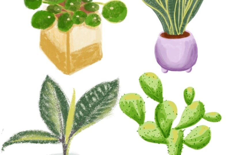
12. Timed Sketch: Snake Plant: Now we're going to move
on to the Snake Plant. So go ahead and pull that image up in your
reference window. Once again, you're
welcome to draw the plant exactly as it appears
in the reference image, or you can swap out your pot, which is
what I'm going to do. I'm going to use
pot shape number three from our
warm up exercises, and we're going to be drawing this sketch with the
Copperhead Brush. So go ahead and choose that brush from your
pinned brushes. I'm going to hop over to
this palette of purples. And again, I'm going to start
with the lightest color. I'm going to do the pot
in the purple, of course, and the plant in this
group of darker greens. Now, last time I forgot
to create a new layer, so let's go ahead
and do that first. And this Copperhead
Brush tends to be a little easier to work
with at a smaller size, so I'm going to reduce my size. Alright, I have
everything set up. Let's get started
with the sketching. This spot was the rounded one
with the two little feet. So I'm going to get that
shape outlined first. Then fill with the base color. I'm just going to tilt this slightly because it
is a little lopsided. Now I'll switch to
a darker purple to start the shading process. Then deepen that
color along the edge of the pot and on the feet. Moving on to the leaves now, I'm going to start with
a really light green to first draw the shapes.
That'll be the base color. And I'm going to start
with the central leaf. And you can see the leaf kind of curves in on
itself a little bit. I'll leave a little gap there so that I'll know
where the edge is. Then I can switch to this bright chartreuse
to outline those edges. Now I can go in with a darker
green to finish it off. This brush is really grainy. So working on such a
small drawing is rather tricky because the rough grain tends to want to take over, and it's difficult to
get nice defined lines. The challenge here is
to try to work with the brush and all its quirks rather than fighting against it, which honestly is
easier said than done, especially if you're not used to working with a brush
that's this grainy. Back to the pale
green base color to tackle the next leaf. Since most of the leaves on this plant
overlap each other, I will follow this process of completing one leaf at a time, rather than inking them all
with the base color first, like I did with the
Rubber Plant sketch. You know, sometimes it's
necessary to switch up your process depending on
what it is you're drawing. Now, I'll switch
to an even darker green to deepen some
of that shading. Alright, let me work on filling
the rest of these spaces. I'm not going to follow the
reference image exactly. Since this is such
a small sketch and this brush is so grainy, trying to draw that many leaves might just start to look
like a cluttered mess. So I will simplify things and add maybe another
three or four leaves. So again, I'll start
with the basic shape in the light green base color. Outline the edges in chartreuse. Fill with the medium green. Then add shading
with the dark green. All right, nt and repeat. For this leaf, I
want to separate it from the leaf
in the foreground. So I'm going to go straight into that dark green to
define that edge there. Then I can go back
to the medium green to finish this top section. Now, I want to add the dirt, so I'm going to
create a new layer, drag it below, choose the brown, and just add that dirt
in the background. When you're done, remember to pinch those two layers together. I have a few minutes
left, so I want to experiment with the smudge
tool to see what that does. I just want to see if
it will smooth out that grain a little so it's
not quite so distracting. Hmm. That did smooth things out, but not enough to reduce the white spaces
between the grain. It also blended away a little
too much of my dark green, so I'm going to add
some of that back in. I'll add back in some of
that medium green, too. Okay, I think I can
call it quits there. That's the Snake Plant
sketch. All done. Up next, we're going to
work on the Cactus drawing, which will be our fourth
and final timed sketch.
13. Timed Sketch: Cactus: Alright, let's tackle
our last timed sketch. This time we're going to
be drawing the Cactus. And I'm going to be using pot shape number two from
our warm up exercises, which is pretty much like
this cylindrical pot, except that it has a little
foot on the bottom of it. So you're welcome to use
whichever pot shape you prefer. And this time around,
I will be using this group of blues for the pot. And as indicated
on our template, we're going to be using
the Marker Brush. So go ahead and
create a new layer, switch to the Marker Brush. And I'm going to choose the
lightest blue in the palette. So get your time ready,
and let's get started. This pot shape is
very straightforward, and after doing the
warm up exercises, hopefully you're feeling pretty confident about
drawing these shapes. Remember that with this brush, the color shifts every
time you pick up your pencil and add
a new brush stroke. So I'm keeping my pencil
down the entire time I fill the base layer so I can start
with a nice flat color. Now I can build up the
shading on the right side. And because of the
way this brush works, I don't even need to
change the color. It's just going
to get deeper and deeper with every paint stroke. Going to add a little shading
on this side as well. I'll remember the pot is round, so there will be less light hitting the sides as it curves. Now, these colors do get darker and darker
as you go along. So let me try starting
with this green, but I'm actually going to make an even lighter version.
Let's see what that does. Again, I'm going to try to keep my pencil down as I fill each of these sections so I get
a nice smooth base color. Alright. So I'm sticking
with this color, and I'm just going to add
a few layers deepen it. Just remember that every time
you pick your pencil up, you're going to create a
darker version of the color. This is where we really have
to get comfortable with the look of visible,
unrefined brushstrokes. Let's see what happens
if I drop in this color. Mm, not exactly what I expected. Depending on where
this green lands, it's shifting to a much darker color than I
thought it would. And that's the other
thing with this brush, you kind of have to be
prepared for surprises. Sometimes they're
pleasant surprises, sometimes they're not. Which is exactly why I've
included this brush in our lineup because
it's another one that forces you to release control and just go for the ride and see
where it takes you. I'm gonna try this
chartreuse see what it does. And let's see. I'm gonna go back to
this green to add a few of those little dots. Now, I'm just going to add
the dirt on a new layer. Let me drag it
below, use my brown. And I can go ahead and add a couple more layers of
that brown to deepen it up. And then I'm going to
pinch those two together. And there's our
Cactus. That actually came together rather quickly. So there we have our four very loose,
quick timed sketches. So in the next lesson,
we're going to spend a little more time drawing a full sized plant illustration, putting into practice
everything we learned from our warm up exercises and
these timed sketches.
14. Part Three: In this last section
of the class, we're going to work on the
class project illustration. So it's time to pick your plant. You're welcome to choose any potted plant photo
that inspires you, or you can use the same
reference photo I'll be using, which you can find in
the resources section. For this illustration,
you can use any of the four brushes that we've been practicing with
throughout the class, or you can choose to
use multiple brushes in this one piece to create an
interesting mixed media look. Alright, let's get started.
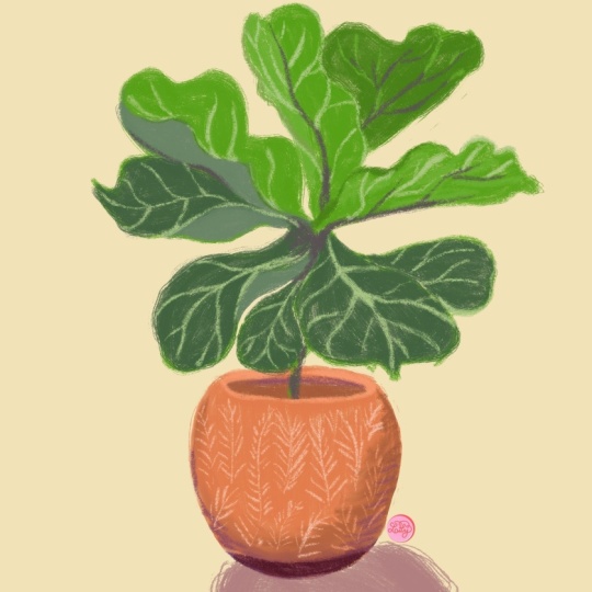
15. Final Drawing - Pick Your Plant!: After all those exercises, I hope you now
feel warmed up and loose and ready to tackle
this final drawing. Now, since this will be the
official class project, I'm going to go back
to a larger canvas. So I'm going back
to the 3,000 pixels square and 300 DPI
as my settings. And you're welcome to choose any potted plant for
your reference photo. I'm going to go ahead and
pull up my reference window. Important image from my camero, and I'm going to choose this
really pretty fiddle leaf. Colors on the pot are similar to the oranges from the palette. I might have to create
a couple new greens, but we'll just see how it goes. And I'm not setting a
timer for this piece, but I am going to
try to complete it in less than 30 or
40 minutes because, again, the point isn't to work this piece
into perfection. I'm going to keep it nice
and loose and really try to just get into the flow
and enjoy the process, including any mistakes
that come along. I want you to give yourself
a lot of freedom here. So, feel free to choose from any of the brushes that we've been using
throughout the class. You can pick your
favorite one and complete the entire drawing
with that one brush, or you can bounce back and forth between
all four brushes, depending on what
elements you're painting or sketching
or drawing. So this is an opportunity to simply play and
see what happens. No, I really enjoyed how
soft the gloaming brush was. So I'm going to start my
sketch with that brush, and I'm going to start with
this really light peach. As usual, I'm starting out with a light sketch of the pot. And by the way, I will
probably need to jump ahead occasionally and edit out long pauses for
the sake of time. Now that I have the shape
of the pot figured out, I can increase the brush size, and this gloaming brush will put down a light wash of color to start with. Let's see. I'm going to switch to
the eagle hawk brush and use the darker orange for
the next layer of color. I'm not aiming for a
perfectly smooth fill here. I'm just embracing
all the brush marks and uneven layers of color. Back to that light peach, and I'll add a little highlight
here on the left side. There's a shadow here
on the right side, so I'm going to switch
to a darker orange. Let's see. I'm
going to switch to brown for this lower
section of the pot. I think this section needs
to be a little darker, but I don't necessarily
want to change the color. So I'm just going to
add a few more layers to make it a little more dense. Back to the dark orange, and I'm going to add
a little definition to the rim of the pot here. Don't forget, you can turn your canvas in
whatever direction helps you draw a shape with
the most ease and comfort. You know, if you have tension in your hands or in your posture, it's going to make
it challenging to lean into this loose
style of drawing. So I think I'll come back and do the details on the pot later. But the next thing I want to do is kind of map out the plant. I might actually have to
make the pot a little bit smaller so that I
can get my plant to fit. And I think I'll draw the
plant on a separate layer just because I'm not
100% sure of my sizing. And even though you
can't really see the stem here only right
towards the bottom, I'm drawing the
whole thing in just to give me a sense
of the center point. Okay, so I'm first
going to map out the general shape and
position of these leaves. And this plant is kind
of interesting to draw because the leaves don't
really have a uniform shape. They're kind of all
over the place. So I'm not trying to
be too precise here. I'm not going for a
super realistic drawing. I just want to get
the general shapes in generally the right position. Now, since I'm doing all these
leaves on the same layer, I'm using that technique of just leaving a little bit of
space between the leaves so that I'll know where to come back in and drop
in more shading. Because if I fill everything in, it will just look like
a big blob of color, and I'll lose all of the
individual leaf shapes. So this first pass of color will be kind of rough
and really loose. And as usual, I'm switching the brush sides
constantly to give me more control with smaller areas or a quicker fill
in larger areas. Hmm. This leaf is actually
more in the foreground. So I'm going to change
this shape here, and I'll just use my
eraser tool to redefine the edge and separate it
from the background leaf. We're just making
adjustments as we go along because we don't have a perfected sketch
we're working from. So just got to be
in the moment and spontaneous and adjust
things as necessary. I've got this massive gap here, which isn't here. So let me see. I think this leaf is supposed
to be a little bit bigger. And maybe this one is meant to come out
a little bit more. Okay, I think that
makes more sense. There's my base layer.
Now I can start building shading a dimension with
more layers of color. I'm gonna switch to
this bright green, and first, I'm going to define those edges where
the leaves overlap. Remember, we're not going
for photorealism here, so I'm just adding
the darker green in the general areas where I see
some shadow in the photo, but I'm not aiming
for 100% accuracy. Remember when you have
overlapping leaves like this, you want to keep the edge of the top leaf a little lighter to help create
that separation. Same process here, add
the darker green on the background leaf along the edge where the
two leaves overlap. Then on the foreground leaf, I'll keep the color light
on the right side to help maintain that
visual separation from the leaf below it. It looks like the edge of
this leaf curves up slightly. So I'm going to draw that line in Then I can add the darker green on
this side of the line, and that's gonna help create the effect of the leaf
being slightly cupped. Let's see. This one's
got a little curve, too. I'd like to add a
slightly deeper color, but these greens are
a little too cool. So I think I'm going to adjust the green I'm currently using. Let me pull up the color disc, and maybe I'll shift
a little more towards blue and then go
a little darker. Let's see how that works.
I think that works. I might have to go
a little darker. Yeah, I think I need to go
a little tiny bit darker. Yeah, okay that's
better. I'll use this color to deepen some of the shadows and to vary the overall colors
on some leaves. Okay, so now some
of these leaves have kind of a
burgundy colored vein. I guess that's on the underside. And then on the tops, it's a much lighter green, kind of a yellowish green. So let's try the chartreuse
color for the veins. I'm going to switch
to the gloaming brush because it has a nice taper, and I think it will
make it easier to draw these really light lines. I've got the brush at
a pretty small size, and I'm using really, really light strokes here. Those veins are really delicate, and this is a much lighter
and brighter color than the green I
used for the leaf. So if I'm too heavy handed here, it will create way
too much contrast, which will just
become distracting. So a really like touch
is necessary here. Okay, so it looks
like the rest of these we're looking at the
underside of the leaf. So I'm going to use
that maroon that we used for the rubber
plant earlier. Then here some of these offshoots
are in a lighter color. No, I've drawn this line
a little bit too long, but I'm on the same layer, so I've got to figure out how to make
it work. So let's see. I can cover up a little
bit right here with the lightest green
and then go back in with a slightly darker
green to blend that out. And I think I actually
have to adjust the shape of this leaf
just a little bit. 'cause it kind of looks like
it's just randomly floating. So we're gonna make it work. And I'll go a tiny bit darker because I've got
an overlapping leaf here. That'll help with the separation between these two leaves. Alright, that makes a
little bit more sense. Now, I can define the
stem a little more. I don't want to make a
perfectly straight line because that's not
gonna look natural. And I'll just throw
in a couple of different greens so the
color isn't too flat, which again, wouldn't
look natural. And I'm going to create one last layer and draw
my dirt on that layer, and I've dragged it to
the bottom of the stack. And I'm going to use the
marker brush for this because the color will shift
nicely when I add more layers of color
in some areas. Now for the details on the pot. So I'm going to go back
to the light peach, and then the copperhead might actually be a good
brush for this. Let's see. It looks like these are just simplified leaf shapes. So I'm going to start by placing the vertical lines for
the center of each leaf. Then I can add the diagonal
lines on either side. They almost look kind
of like leaf skeletons. Okay, I think a background
color would be nice. Let's see. I can go with
that really light blue. I think that's a
little too dark. So I'm going to go with the
really light, icy blue. And I'm going to
create a new layer and drag it to the
bottom of the stack, so it's right above the
background layer. And let's see. I'm gonna go with a
slightly darker blue. And what brush should I use? Let me try Eagle hawk and
just draw that shadow. And I think that's it. It's definitely not perfect. It's a little wonky, but I think those things
add to the charm. And my total track
time, 52 minutes.
16. Final Thoughts & Thank You!: Thanks so much for joining
me on this journey toward letting loose and
embracing imperfection. I really hope this
class has given you permission or
encouragement to let go a little and appreciate a more unpolished version of
your artwork, flaws and all. I can't wait to see your
artwork in the project gallery. And if you enjoyed this
class, please leave a review. If you'd like to
learn more from me, be sure to check out
my other courses and my YouTube channel where
I share procreate tips, tutorials, and drawing videos. You'd like access to free
monthly color palettes, early bird discounts
on workshops, and the latest scoop
on new classes, you can also subscribe
to my email newsletter. As always, it's been
a pleasure sharing this creative space with you,
and I'll see you next time.
 Gia Graham, Illustrator & Lettering Artist