Transcripts
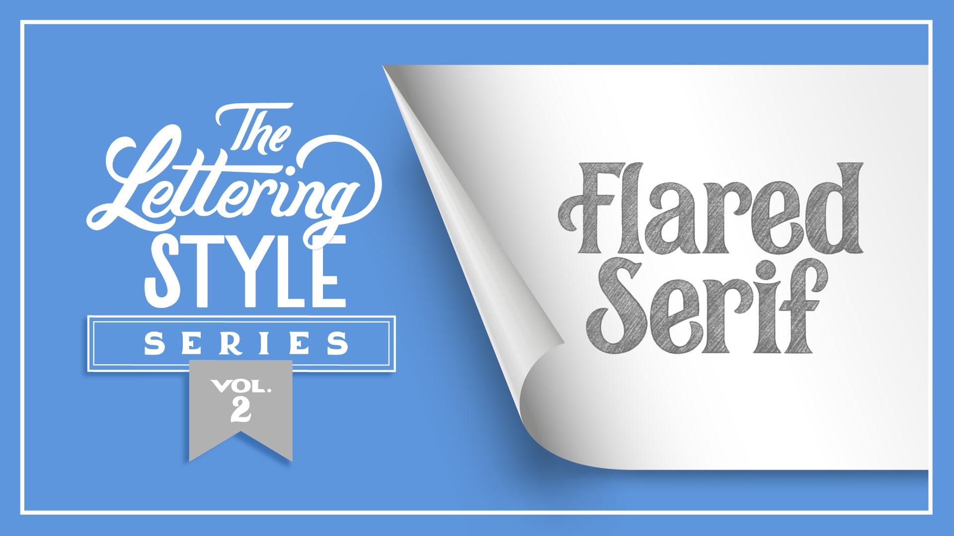
1. Intro: Oh. Welcome to volume two of
the lettering style series. In Volume one, I showed you how to draw inspiration
from a reference which provided a starting point for all 26 letters
of the alphabet. But what if your reference image does not include
a full alphabet? Hi. My name is Gia Graham, and I'm an Illustrator
and hand lettering artist born in Barbados,
based in Atlanta. I've had the pleasure of
teaching hand lettering to thousands of
beginner students over the past several years, and the number one topic
most students are curious about is how to approach
letter style creation. So I've developed
the series to answer those questions one
short class at a time. In this class, we're going to be creating a flared serif style, and we're going to pull
inspiration from a specimen which does not include every
letter of the alphabet. I will show you how
to establish rules for your new lettering
style based on the letterform anatomy of
your reference so that you can apply those same rules
to create new letterforms, even when there's no
example to follow. By the end of this class, you'll be able to build
an entire alphabet of both uppercase and
lowercase letters, allowing you the freedom
to draw any word or phrase in this
flared serif style. Now, this is a beginner
friendly class, but if you've never taken
a lettering class before, it would be best to start with my hand lettering
in Procreate class, which will give you a good
start with the fundamentals, including all the
terminology we'll be using in this class and
throughout the series. Whether you're drawing
in Procreate on the iPad like I am or whether
you're drawing on paper, grab the pencil of your
choice, and let's get started.
2. Style Breakdown: Let's first take a moment
to understand the structure of serif styles before we dive into the
sketching process. We know that a serif is a small line or foot at
the end of a stroke. These little feet
can be stylized in many different ways to give your lettering a specific look. Here are a few examples of
different types of serifs. With a bracketed serif,
there is a smooth, curved transition between the
stem and the serif stroke. With a slab serif, the strokes are bold and heavy. Now, a slab serif can
also be bracketed, which just means that there is a curved transition added to the bold serif. A
hair line seraph. It's basically the
opposite of a slab serif. Here, the seraph is very thin, creating a high contrast look, meaning there's a
distinct difference between the thicks and
thins of the latter form. Serifs can also come in many creative rule
bending forms as well. For example, bifurcated serifs
are split into two pieces, creating a decorative flare. Wedge seraps have a
sharp, triangular shape. A cupped serif is very
similar to a bracketed serif, but in this case, there's a concave curve to
the sarah stroke. The style we will
be focusing on in this class is a flared serif. In this case, the serif gradually curves outward
from the stroke, creating a flared shape. If you think of the other
serifs as feet of the letter, then a flared seraph would be more like bell bottom pants. Specimen we'll be using for inspiration comes
from this book, Vintage Type and Graphics by Steven Heller and Louise Fee. The sample is part of
the Sheridan series, which looks like
it's been pulled from a manufacturer's catalog, and the date range is sometime around or
before the 1930s. Let's first take
a moment to break down the characteristics
of this style. The high crossbars and slightly elongated letters give the style an art deco feel. This style does
have flared cerras, but they're so subtle and so tiny, they're
barely noticeable. The crossbars on the A and H are stylized and they
have a curve to them, but that detail is not used on other horizontal strokes
like the second arms of the E and F. A similar wavy stroke can also be
found in the uppercase N, but I'm not seeing it in any of the other uppercase letters
in this particular specimen. There's an interesting
mix of terminals here. The S R and the number three
have very rounded terminals. But then the lowercase T, the E, and the uppercase C, have
elongated curved terminals, shaped almost like a sickle. The lowercase letters are tall and quite close to
the cap height. And with these proportions, the ascenders are rather short, as you can see with the T, B, H, K and D. There are no descenders
in this sample, so we can just assume that the descenders
would be short as well. Rather than being pointed, the apex on the A
and M are flat. And the same on the vertex
of the W and the V, they're flat against
the baseline instead of being pointed. Now that we have an
understanding of the characteristics of this
style, let's make it our own. I'll see you in the next lesson.
3. Modifying Lowercase Letters: As mentioned in the last lesson, the lowercase letters on this original style
are quite tall. And we're going to stick
to similar proportions. So the first thing we
need to do is draw guides to make sure the sizing is
consistent with each letter. First, I'm going to turn on
my Canvas guides because having this grid on the canvas makes drawing the lettering
guides much easier. Now, I like to use bright colors for
my lettering guides just so they stand out. So I'm starting
with a bright pink, and first I'm going
to draw my baseline. Then the X height line. And this will give me the height of the lowercase letters. And we're also going to add the cap height and a
guide for the descenders, but I'm going to do those
in a different color. And as we discussed, the
uppercase letters are not much taller than
the lowercase letters. So the X height is going to be pretty close to
the cap height. And like I've already mentioned, there are no descenders in
the specimen that we have, but I'm going to assume
that those are going to be pretty close to the baseline. So I'll draw a line
for those as well. When creating a style, there are certain elements of letterform anatomy that will be shared with several
letters in the alphabet. And these repeated elements give the style structure
and consistency. One of the most
important elements to establish first is the stem. Now as a reminder, the stem is the main vertical or diagonal
stroke of a letter form. So it's basically the
backbone of the letter. Using the vintage
specimen as inspiration, let's modify a few
lowercase letters, starting with the stem. Remember, as we discussed in
volume one of the series, it's super important to use
your observation skills when you're looking at lettering
and using it for reference. So here we can see that the
style is relatively narrow. There's some nice contrast right here at the shoulder of the H, where it goes from
thin to thick, and the negative
space is quite tall. So to modify this, the first thing I'm
inclined to do is to make the seraps
much more prominent. So I'm going to
exaggerate the flair. So we're starting
with that stem, which is going to
start on the baseline and go all the way up
to the cap height. So for the stem, I'm aiming for a similar width
as the reference, but like I said, I'm going
to exaggerate that serif. And this stem has a serif on the top and the
bottom of the stroke. And since it is a flared serif, it's just going to
gradually taper outwards. I'm just going to fill
that in so we get a better sense of
what that solid shape is going to look like. So we've got that
stem established. Then the shoulder of
the H would curve over, and then you'll have another
vertical stroke here. So rather than
redrawing that stem, I am going to duplicate
it and move it over. Since the flared seraphs
are more exaggerated, I'm going to shift
that duplicate over enough so that the two
seraps aren't touching. But I don't want it to be too far away because I still want that fairly narrow,
elongated look. Now I can erase the top half of the stroke and then create
that curve to connect the two. And remember, if you want
to add that contrast, make sure the stroke gets a little narrower as it
moves towards the stem. Here's a modified version. So we basically kept
the proportions, but we definitely have more
of a flared serif look, and the negative space in this version is a
little bit more open. Drawing this one letter, we've already established a few things the
width of the stem, the height of the asenders, the size and shape of the flared serifs and the
size of the negative space. Now, with those basic
things in place, we can apply these
established rules to several other letters. You can not only reuse
the shape of the stem, but you can also apply
this same shape to the M, the N, and the U. Now let's modify the B. Now, I've already made
a duplicate of the H so that I can reuse the stem
that I've already drawn. So I'm going to erase the
shoulder of this H. So again, the stem is our starting point. Looking at the reference image, the B has a little contrast
here just like the H did, so it gets thinner as it
goes towards the stem. Oddly enough, it has
this little point at the end of the stem rather than going into a small
serif, like it does here. So on the stem,
I'm going to keep the flared serif on the top. But rather than
recreating this point, I think what I'll
do is I'll round out the bottom of the stem. So the flare is
on the left side. But here on the right side, it will just make room for me to attach the bowl of the B. The other thing I'm going
to do actually is turn on my sketch of the H.
I've reduced the opacity, so it's just really
light in the background. And I'm just going to mark
the width of the H. Now, the B will be rounded, so it'll be a little bit wider, but this will give me a
good point of reference. So I don't make the B
too wide or too narrow. Alright, so I'm going
to draw that bowl. And remember, your
rounded letters are going to go slightly beyond your guides because
they have overshoot. Now, curved letters can
be a little bit tricky, so sometimes it just requires a lot of trial and error
to get the shape right. And again, it's
really important to fill that shape because
you really can't tell what the solid
form will look like until you've
filled in your shape. Now, I just want to see
that be side by side with the H. And so far, they
look good together. The negative space
is similar in size. And even though, you know, we've adjusted the stem here, it still very much feels like
they're in the same family. So now with drawing this B, we've established
some new rules. We have a secondary version of the stem with this curved area, and we've also established
the shape of the bowl. Now we can take that same
shape of the bowl and we can apply those rules
to the lowercase D, the G, the P, and the Q. And here you can see how
that alternate curved stem has been used as
the starting point for each of these letters. Now let's try a
letter with curves. The lowercase E in this
specimen has a lot going on. It's kind of a quirky
little letter. The crossbar is angled
and slightly curved. It has that elongated, curved, almost sickle shaped terminal, and this crossbar
sits quite high. So the top half of the E is a lot shorter than the
bottom half of the E. So I'm going to start
with an oval shape. And just like we had a
little contrast with those other letters where it got narrower in certain areas, I'm going to do the same here. So the stroke will
be narrower at the top and the
bottom just slightly. And I think this is a good width for the vertical
part of the stem, but we'll probably need
to make some adjustments. It's rare to get it
right the first time. So on this side, I want to match this width as best as I can. And I like this angled crossbar, so I'm going to keep that, but I'm not going to make
it curved, though. I like the idea of
a curved terminal, but this might be
a little extreme, so I'm going to simplify that. All right, so let me clean
this up a little bit and fill the shape so I can get a better sense
of what it looks like. All right, there's
the modified version. And now that we have the shape of the terminal established, it can also be used to
create the lowercase A, F, R and T. Speaking of terminals, with letters like C, S, and Z, it can be a bit repetitive
and sometimes even awkward to use the same terminal shape on both ends of the stroke. In this case, it's okay
and probably recommended, actually, to switch it up
and use a mix of terminals. Rather than using
the curve terminal at the start of the stroke, you could use the flared
serif shape instead. Lastly, let's try a letter
with a diagonal stem. This V is fairly
straightforward. There is some contrast, just like with the
other letters. So the downstroke is
thicker than the upstroke, and it does have a
little bit of a flare at the vertex and
the vertex is flat. It doesn't come to a point. Again, I've duplicated that stem that we first
drew with the H, and I'm going to use that
as a starting point. So I'm just going to angle that I've decided to make this angle a little bit wider than the
original version, and we'll see how
that works out. I may have to make
adjustments later. Now, that upstroke is going
to be a little bit narrower. Now, to add those flared serifs, it's a little bit trickier on an angled stroke because you want the flare
to be obvious, but you don't want
this to be so wide that it's out of proportion. And since this
upstroke is narrower, that flare is going to be a
little bit narrower, as well. I'm also going to
add a seraph to this vertex where the two
strokes meet. This is optional. It's just another way
to stylize the letter, but you don't have to have this. I think that actually needs
to be a little bit wider. Now, of course, the V is
a very simple letter, so there's not much else to it. But once you've drawn the V, you have a starting point
for the lowercase W, the X and the Y. As you can see, although we've only sketched four letters, we have a roadmap
for how to create almost every other lowercase
letter in the alphabet. In the resources, I've included my sketches for the entire
lowercase alphabet, if you'd like to use it as a reference for your
own practice sketches. Up next, we're going to tackle
a few uppercase letters. I'll see you in the next lesson.
4. Modifying Uppercase Letters: This Sheridan specimen
has an interesting, somewhat eclectic mix
of uppercase letters. Some letters like the A, the M, the C, N, and S are stylized in a very distinct way while
others are a bit more basic. Although it seems like a
little bit of a hodgepodge, they all work fairly
well together. Admittedly, there are some spacing issues
in this specimen. You can see here that some
of the letters feel like they're a little cramped
and too close together. While with other combinations, it feels like there's a
little too much space. But overall, it doesn't look as disjointed as one would expect. I personally think that
the combination of upper and lowercase letters
works best with this style. For the modified version, I want to keep some of the quirkiness of the
original uppercase letters, but make the characters
feel more cohesive overall. To help achieve
this, let's first start with a few general
rules to follow. Just like we did with
the lowercase letters, we're going to start with the H to help us
establish these rules. Of course, the
first rule is that the uppercase letters
will have flared serifs, just like we used on
the lowercase letters. Rather than trying to guess
the right size of the stroke, I can just use the
same stem that we used for the lowercase H. Since it's already
the right length, it goes all the way
up to the cap height, and the shape of the serifs
has already been set. So I'm going to just
erase what I don't need. The next rule we
want to establish is the general width of
these uppercase letters. Now, we already know that
the uppercase letters are not much taller than
the lowercase versions, but we still want them
to feel really tall. So making them
slightly condensed or slightly narrow will
help achieve this. So I'm going to
go back to that H that we already sketched, and I'm going to use it as
a guide for the width of this uppercase H.
So I'm going to duplicate that stem and drag it out to about the same
width as that lowercase H. And I'll pinch those
two layers together. The third rule is that
we're going to keep the slightly high crossbars
from the original version. Ordinarily, the
crossbar on this H would probably land
somewhere around here, but we're going to
shift that up slightly. So I'm going to set the
crossbar somewhere around here. And remember that
horizontal strokes need to be a little bit thinner than the
vertical strokes to adjust for the
optical illusion. So there's a very
basic version of the uppercase H. And again, the rules we've established
are the flared serifs, just like the lowercase letters, a slightly condensed
width and high crossbars. Now, the goal is to keep
these same rules top of mind when drawing every
other uppercase letter in this modified style. I do want to keep a
little personality, So let's make this a little
bit more interesting. Instead of using
this wavy stroke, I think it might be
interesting to bring in the curved shape from the terminals we used on
the lowercase letters, and just create a simple
swash on this crossbar. So I'm just going to extend
this to the left and have it curve to mimic that
shape on the terminals. And with everything else, you just make adjustments until the shape looks the
way you want it to. And there's the altered version. Now, this same crossbar with the swash can also be applied to the uppercase A and the
uppercase F. Of course, these versions with
the swashes would mostly be used at
the start of a word. When lettering a word with
all uppercase letters, in most scenarios, it would make more sense to use a
simplified version. Now let's modify the uppercase E. The original version is
fairly straightforward. The center arm sits quite high, which is an aesthetic
that we're keeping. But I personally don't love
the proportions of this E. As a general rule, this center arm is usually a little bit shorter than the top
and bottom arms. So the fact that it
is the same length as this top arm visually makes it feel like it's sticking out further than it should. So I personally don't love that, so I'm going to make
an adjustment there. And again, I'm
going to start with the stem that we've
been using throughout. And for consistency,
I'm going to use the H that we just drew
as a guide for the width. So I'm just going to
mark a really light line here so that I'll know how wide to draw this E. So I'm going to start
with that top arm. And for now, I'm
just going to sketch out a basic rectangle, and then we'll make decisions
about the terminals later. First, I want to
get a good sense of the basic shape
of the letter. And again, that center arm
is going to be fairly high, so I'm going to draw
that about here. And I want to keep
the width of this pretty consistent
with that top arm. But as I mentioned, I'm
going to make it shorter. I'm probably going to adjust the length of these
arms even more, but for right now, we're
just getting shapes down. Now, that's to start
with the basic shape, but of course, it
needs a little bit more personality and more style. Now, we've got these three
terminals to figure out. Remember the mixed terminals on the C and the S from
the last lesson. I'm going to apply that
same styling here. So I'm going to add that
flared serif to the top arm. So I'm just going to angle this so I can create that flare I'm going to add a similar
flare on this center arm. I'm going to make that
even shorter, as well. And then for the bottom arm, I'm going to use that
curved terminal. This will, of course, create consistency with the other
letters we've drawn so far and much like the swash
on the crossbar of the H, this will bring an extra
element of flourish, especially when the E is used as the first letter of a word. And of course, you'll
just nudge and tweak until the shape creates a
nice smooth transition. There's our modified version. Now, of course, you could use a more simplified version if the E will be part of a word
using all uppercase letters. So now that we've established this curved terminal
on this letter, this same style can be applied to other uppercase
letters as well, like the C, the J, the L, the S, and the Z. The N, I've decided not
to change too much. I quite like the wavy
diagonal stroke, and I think it
brings an unexpected twist to this lettering style. Now, anatomically, the thickest part of the
N is the diagonal stroke. So instead of using the starter stem that we've been using for
the other letters, I need to make the vertical
strokes much more narrow, but I do want to keep the
shape of my flared serif, so I'm going to cheat. So I'm going to use
the selection tool. And I'm going to select
half of this stem And I'm just going to nudge it to the left to make
a skinnier version. This is what I'm
going to use for the two vertical strokes
on the N. Again, I'm going to go back
to that uppercase H as my guide for the width. And I've duplicated
this skinnier stem, and I'm just going to
drag the duplicate over to match the
width of that H. Now, what I can do is use
this original stem as a guide for the width
of the diagonal stroke, just like we did for the
letter V in the last lesson. Now, I can already see
comparing to the original, this diagonal is much
wider than this, so I will probably need to
make some adjustments here. But I can at least use this
as a starting point for where to position
this diagonal stroke. And then we can work from there. So there's our starting point, and I have to make
that wavy shape. So it looks like
it curves inward here and then downward slightly. The trick is to make
sure that the wave here transitions smoothly into
the curve of the serif, both at the top and
at the bottom here. So, that might require a
little trial and error. I've made my wave shape a little bit more exaggerated,
but I think it works. Now that we've got
that figured out, the same wavy diagonal can also be applied
to the letters M, W, X, and Z. Now, each of these letters
is very different. So the wave shape did
need to be adjusted slightly to accommodate the structure of
each letter form, but the shape is
distinct enough that it helps with the continuity
throughout the style. Is no uppercase P
in our reference, but we can piece together the structure based on the rules we've
already established. So of course, we're going
to start with our stem. And again, I'm going to use the percateH as a point of reference for the
width of the letter. So I know that the
bowl of the P will extend to somewhere around here. I'm actually going to
turn that back on because the crossbar of the H can also give a general
guide for how high up the bowl
of the P will sit. So I'm going to mark that
somewhere around here as well. And let's see what
that might look like. This positioning might be
a little too exaggerated, so I'm actually going to
just bring that down a bit, maybe to around here. And remember, the
stroke gets a little thinner as it approaches
the stem here and here. There's the P. It's
pretty straightforward. There are not a lot of
bells and whistles, and that's okay because we don't need every single letter in the uppercase version to be filled with swashes
and flourishes. But even a letter as simple
and straightforward as this P gives us a really good starting
point for other letters, like the R and even the B. Now, for the B, I kept the top bowl as high as
the crossbar of the H. So I just needed to tweak the proportions of the
P slightly in order to transform it into the B.
I've got one last quick tip. When you start lettering
words and phrases, it's sometimes necessary to make adjustments based on the
specific word you're drawing. For example, you'll
notice that I created an altered version of the lowercase L when I drew
the words for flared serif. That's because
initially, when I placed the stylized F with the standard lowercase
L next to each other, it was creating too
much negative space between the letter forms, and I didn't have the
option to bring them closer together because they were
fighting for the same space. Stylized that lowercase L so that it would fit
a little bit more seamlessly with the uppercase F. So remember that once you've
established your rules, it's okay to bend them slightly for the
sake of the layout, as long as it's still legible and it makes sense visually. In the resources, I've also included my sketches for all of the uppercase letters
so that you can use it as a reference
when you're practicing. Of course, you're
always welcome to modify the style
in different ways, if you want to create something
that's uniquely your own. Just remember that
in your process, you need to establish these
kinds of guidelines for yourself so that
all of your letters feel like they belong
to the same family. Up next, we're going to take a look at the class assignment. I'll see you in the next lesson.
5. Class Assignment: Mm. Your assignment
for this class is to letter a word or short phrase with the new
style you just created. You can draw a simple pencil
sketch or you can ink and embellish the lettering with Illustrated elements to
create your final piece. If you need a little
guidance on how to achieve clean lines when
you're inking your lettering, I share several tips in lessons six and seven of my Improve
your lettering class. So be sure to check that out. Please be sure to
share your work in the project gallery when you've completed
your assignment. To share your project,
scroll down below the class video and go to the
Projects and Resources tab. Click on the Class
Project button. Name your project and upload
as many images as you'd like by clicking on the image icon where it
says, add more content. I look forward to seeing
what you come up with.
6. Final Thoughts: I hope this class has
given you some insight on how to pull inspiration
from a limited source and then use your knowledge
of letterform structure and anatomy to develop your own
style from that inspiration. Don't forget, I've
included my sketches for all 26 letters in this
flared serif style, both uppercase and lowercase. You can find those
in the resources, and you're welcome to
use these sketches as a reference for when you practice building
these letterforms. If you enjoyed this class, I'd love it if you
would leave a review. Your reviews not only help
me improve my classes, they also help prospective
students know what to expect. Don't forget to share your
work in the project gallery and look out for volume three
of this series coming soon. As always, it's been a pleasure sharing this creative
space with you, and I'll see you
in the next class.
 Gia Graham, Illustrator & Lettering Artist