Transcripts
1. Intro: If you've recently started on your hand lettering
journey and you want to gain more confidence and consistency with
your lettering. Or if you want a few tips on how to make your work
look more polished, then you've come to
the right class. Hi, my name is
Gia Graham and I'm an illustrator and
lettering artist and top teacher
here on Skillshare. Just like with learning
any new skill, the early days of your
lettering journey can feel challenging, overwhelming, and
even frustrating. It can sometimes feel like
where you are and where you want to be our
light years away. I certainly felt that
way starting out. The good news is that you
won't feel that way forever. With consistent practice,
your lettering will improve. And sometimes all it
takes to progress to the next level is for that one thing to click
that a-ha moment. When something you've learned
helps everything fall into place and suddenly the process
feels a little bit easier. In this class, I'll be sharing
a few hand lettering tips and tricks that will hopefully spark one of those a-ha
moments for you. So you can elevate your work and take the next step in
your lettering journey. I will share pointers and
practice exercises to help with the most common challenges beginner
students face, like drawing steady clean lines, drawing tricky
letters with curves, improving spacing, creating consistent
letter forms and more. By the end of this class, you will know how to
observe your lettering, identify the problem areas, and make adjustments
accordingly. This is a beginner
friendly fast, but it is a follow-up to my Hand Lettering
in Procreate class. So if you've never tried
hand lettering before, recommend that you
watch that class first and then revisit this one. I will be working digitally on the iPad using the
Procreate app. But many of these
tips will apply to analog lettering
on paper as well. So go ahead and grab
your pencil of choice, and let's get started.
2. Class Project: The project for this
class is to recreate an old lettering piece
using the tips you learned in this class to
improve on the original, depending on how long you've been on your lettering journey, your original piece might
just be a week old, or it might be two
or three years old. It doesn't really
matter how much time has elapsed since you
created the original. The goal is to see how
these tips you'll learn in this class will help you improve even in
the smallest ways. Because those small
changes eventually add up to big
improvements over time. After watching the class and trying to practice exercises. Look for one of the
first letter in pieces you ever created and draw it again using the process I will
outline in the class. You can use the same
lettering style, try a different style, change the colors, or add illustrative elements
if you'd like, but the words or phrase
should be the same. Once you've recreated
that piece, post it to the project
gallery along with the original to
share your project. Scroll down below
the class video. Then go to the Projects
and Resources tab. The class project button. Name your project and upload as many images
as you'd like by clicking the image icon where
it says add more content. You can also type notes or ask questions within
the project area. Don't forget to
upload a cover image because that's what will
appear in the gallery view. Also be sure to note
the dates on each of your lettering pieces
so we can see how the new version compares
to the original. Along with the practice
exercises throughout the class. I've also created
a PDF guide for you with helpful notes on
letterforms structure, which you can always
use as a reference. You can find the PDF guide under the projects and resources tab, but only when viewing the class in a web browser,
not in the app. I can't wait to
see your projects. But first, let's get
started with class. I'll see you in the next lesson.
3. The First Step: The first step towards improving your lettering is to observe. It's easy to get tunnel vision when you're
working on lettering because you're so focused on drawing each letter one at a
time with the Canvas zoomed in that it's easy to lose sight of the word or
phrase as a whole. This ultra focus can
sometimes mean that you're not truly observing your
lettering as you draw. For example, when I first started learning hand lettering, I would misspell
words all the time. If you scroll far enough
back in my Instagram feed, I'm sure you'll find pieces that I posted with misspelled words. Since I was so hyper-focused on drawing each individual letter, I would lose sight
of the big picture. These days. I hardly ever misspell
words in my work. On the one hand, it's because I'm
more at ease with the lettering process
and it doesn't take as much extreme focus
to draw each letter. But it's also because I
zoom out frequently to observe the piece as a whole so that I can make
adjustments as I go along. Avoiding that tunnel
vision is often the first hurdle to overcome when learning how
to improve your lettering. It's really important to start the habit
of stepping back, or in this case, zooming out. So you can look at the
entire piece as a whole. You should do this frequently
while you're working. If you've already taken
my find your style class, you already know
that I believe that observation is an integral
part to being an artist. The ability to pay attention
to detail is a huge asset, I would say even a necessity when it comes to
improving your lettering. So the first step is
clearly to observe, but you're probably wondering, what exactly am I
supposed to be observing? We all know that in order
to correct a problem, we must first identify it before finalizing a piece
checklist that you can use to try to identify
where the problem areas might be or the letter
forms structured correctly, or the letter forums consistent. Do the lines and
curves look clean? Is the spacing consistent? Are my letters sitting on
the baseline correctly? And lastly, does this flourish
or ligature feel forced? Throughout the class? I will break down each of
these checklists items, give you a few tips and techniques on how
to improve them. And in some cases, I'll also give you some
practice exercises to help you build the muscle
memory you'll need to become a better
lettering artists. At the end of the class, we will revisit an old piece of lettering and I'll show
you how to make your way through this checklist and
how to make adjustments to your lettering once the
problem areas are identified. Now I want to clarify
that the goal here is to improve your lettering
form and technique. We're not trying to make
the letters perfect. The beauty and hand lettering
is that it's done by hand. So inherently, there'll be some imperfection which gives
it a hand-crafted feel. We're not aiming to make our lettering look
like a computer font. These tips and tricks are simply about
improving your craft. With that being said, we're going to tackle the
first item on the checklist, which is letter form structure. I'll see you in the next lesson.
4. Letterform Structure: Before we can begin to make improvements on our lettering, we first have to
understand the basics of each letter form and how
they should be structured. One of the fundamental rules
of letterforms structure is that upstrokes are thin
and downstrokes are thick. I cover this in my hand
lettering fundamentals class, where I also include
a PDF stroke guide, which you can use for reference. Remember that the letter
form does not have to have high contrast for
this rule to apply. By the way, high contrast
means when the letter has obvious thick
and thin strokes, even low contrast letters will have slightly different
stroke widths. And those slight
adjustments can help make your lettering
feel more polished. For example, this n might
seem fine at first glance, but it's actually not structured correctly because the thickness
is in the wrong place. Here the two vertical lines are thicker than the diagonal. But the diagonal stroke
should actually be the widest part of
the n. Therefore, to improve this letter form, I need to thicken up
the diagonal stroke. Now the fuel is more solid
and well proportioned. Another structural standard
to remember is that horizontal strokes should be slightly thinner than vertical
and diagonal strokes. For example, the
horizontal stroke on this T is the same width
as the downstroke. As you can see, it
makes the letter look a little top heavy, making the horizontal
stroke slightly thinner. We'll adjust for
that visual balance and help the latter
feel more proportioned. Now, the trick is
you also have to be careful not to make the
horizontal too thin. As you can see here, this horizontal stroke is about half the width
of the downstroke, which also feels
disproportionate. So the bottom line is
that you don't want your horizontal strokes to
be too thick or too thin, make them a little narrower
than your downstrokes. And they should be just right. Knowing these basics of how each letter is supposed
to be structured is the biggest challenge
when it comes to improving the quality
of your lettering, especially when
you're a beginner. To help with this, I've
created a PDF guide for you, which breaks down each letter of the alphabet and the basics of how it should be structured. This should be a helpful
reference for when you get stuck on those
tricky letters. Remember the PDF guide can be accessed if you're viewing
the class in a browser, not in the app. Let's look at a
couple of examples. The letter most students have
the hardest time with is the letter S. I've already shared a couple of tips on how to draw this letter. And for a refresher
on those techniques, you can always watch
less than 11 in my hand lettering
in Procreate class. But for now, let's revisit
how the letter should be structured so you'll know how to make adjustments accordingly. Here's a quick structure recap. The S has three main parts to
open counters and a spine. The spine is a downstroke, so it should be the widest
part of the letter. The bottom open counter
is slightly larger and should extend a little
past the top open counter. This helps the letter
feel grounded and it helps avoid it from looking
as though it's tilted. Since this is a rounded letter, there should be overshoot, meaning that the curve
sticks out a little bit past the baseline
and the cap height. If you add a serifs
to the letter S, it should be vertical, not on an angle or horizontal. I've looked through
several projects from my beginner students and traced a few of the letter S I
found with common mistakes. Now that we know how the
S should be structured, Let's see if we can
spot the problem areas. In this example, the spine is narrower than the
two open counters, making the spine wider. We'll fix this problem. In this S, the top open counter is larger than the
bottom open counter, which makes the letter
look top-heavy. Remember the bottom
part of the S should be larger
than the top part. Here there are two
problem areas. First, the bottom part
of the S does not extend past the top
part like it should. This makes the
letter look a little unstable as though
it's tipping forward. Also, the serifs are not vertical and they're angled
in two different directions. Which further adds to the
feeling of instability. Making the bottom
open counter extend past the top helps
let her feel stable. And the vertical surface also help provide that
upright feeling. As I mentioned before, I've
made a PDF for you which includes structural notes for each letter of the alphabet. Feel free to reference the
guide whenever you feel unsure about how to draw
a particular letter form. I promise you that
with practice, these structural rules
will become second nature. And then time. You won't need to
reference a guide nearly as much if at all. Up next, we're going
to go over a few tips on how to create
consistent letterforms. I'll see you in the next lesson.
5. Consistent Letterforms: In a recent survey, I asked
students to tell me what they struggle with the most when it comes to learning
hand lettering. One of the top responses was, how to make your letters
look consistent. Here are a few tips to
help with consistency. I'm sure it's tempting to
jump straight into lettering and skip this step of drawing
your guidelines first. Or sometimes you might
be tempted to just use the Canvas guides so you don't have to pause to draw your own. My advice is don't succumb
to that temptation. Using guidelines is the first
and most important step to making your
lettering consistent. If you're not sure how
to create guidelines, revisit lesson four of my hand lettering
in Procreate class, there are a couple of different
ways you can ensure that your strokes are a
consistent width. The first is by using
circle templates. Remember in the
last lesson I used circles to show the
difference in stroke widths. This is a great way to keep
your strokes consistent. Create a new layer above
your lettering and draw a circle the same width as
one of your downstrokes. Then create a circle the same width as one
of your upstrokes. Finally, do the same for
a horizontal stroke. You can then take the
downstroke circle and move it around to measure it against all the downstrokes and your lettering, making
adjustments accordingly. Do the same for the upstrokes and horizontal strokes as well. Using a wide brush over
your skeleton sketch is a great way to make sure that your strokes are a
consistent width. I mentioned this in my hand
lettering fundamentals class, but I want to go into
little more detail here. My current go-to wide brush is the block pencil brush by sin milk Inc. Another good option
is the nickel round brush, which is free with procreate and can be found in the
painting section. Whatever brush you choose, you'll want it to have a nice
sharp edges and no taper. Of course, you'll
first want to map out your letters with a
rough skeleton sketch, and I use the six
B pencil for this. Next, determine how thick
you want the strokes of your letter forms to
be on a new layer. Make a few test strokes
in different sizes, then decide what size will work best for the lettering
you're creating. Here's a tip. When
you've made your choice, save that brush size. To do that, tap on the percentage slider until
a little window pops up. In the window you'll
see the brush size, a sample image of the brush, and a plus sign. Tap the plus sign
to save that size. When you do that, you'll notice a blue line appears
on the slider, and that tells you that
this size has been saved. If you move the slider, you'll see that that
blue line turns gray, and that gray line remains in that spot indicating
your saved size. By the way, the saved
brush size will only appear when you have that
particular brush selected. For example, if I switch
to the six B pencil, you'll notice that the
indicators are gone. When I switch back to the black pencil,
they appear again. I'm going to use this
first brush size for all the downstrokes. So I'm going to go through
and draw all of those lines. You'll notice that I'm drawing above and below the guides. Once I've drawn all my lines, I will go back in and erase
the excess right up to the guidelines to ensure that all my letters are
exactly the same height. Now for the upstrokes, these will need to be slightly thinner than the downstrokes. So I'm going to drop
the brush size down by about ten percentage
points and then save that. Now go through and draw
all the upstrokes. I'm going to use
this smaller size for all of the rounded
letters as well. The reason for this
is because if I use the same width as I did
for the downstrokes, it will make the rounded letters
look a little too bulky. So I have to adjust for
that visual difference. Also, don't forget to add overshoot for all of
your rounded letters. Now I'll go through
the same process for all of the
horizontal strokes, making sure that I make those slightly smaller
than the upstrokes. Now you have a solid base sketch with consistent letter forms. From here you can go straight
into inking or you can do another iteration where you add a bit more style like
serifs for example. By the way, when inking, just to remember to
stay inside the lines. If you ink beyond the
lines of the sketch, you'll run the risk of adding
weight to the strokes, which will once again make
your letters inconsistent. If your brush size is too big, make it a little smaller so the placement of each line
is easier to control. Another trick for
keeping your stroke size consistent and actually
for speeding up your workflow is to create a sample stroke and
then duplicate it. Sketch one vertical stroke
in the desired width. Then duplicate the
layer and move that duplicated stroke into
position for the next letter. Repeat this process until all the vertical
strokes are complete. Do the same with the upstrokes, making sure the upstroke is a little thinner than
the downstroke. Once it's the size you want, duplicate it, and move it into position for
the next letter. During the sketching phase, you can also angle the
strokes where necessary. One important thing
to note, however, is that you don't want to angle your duplicate
strokes during the inking phase because
Procreate uses raster files. So when you manipulate objects, they will lose
their crisp edges. So try to only do this during the sketching phase before
you ink your lettering. For the O, we know
that the left side is a downstroke while the
right side is an upstroke. You can use the strokes we've already drawn as a template. I'm going to copy one of the downstrokes
for the left side. And I'm going to copy one of the upstrokes and put
that on the right side. Pinch to merge those layers
and reduce the opacity. Now, I'll use those widths
as a guide to draw my o. Keep in mind that this
duplicating method also applies to completed
letters as well. Whenever there's a repeating
letter in your word, you don't need to redraw
that letter multiple times. Simply duplicate the
completed letter and move it into place. I can actually use
that duplicating shortcut for this C as well. I've already drawn
the O so I can duplicate it and
erase the areas. I don't need to make
the seat. That way. I know the widths and the
shapes are consistent. To recap, my tips for creating consistent letters are
always use your guides. You circle templates,
or you can sketch with a white brush or
duplicate your strokes. Up. Next, we're going to tackle
another common challenge, which is how to
create clean lines. I'll see you in the next lesson.
6. Creating Clean Lines: Another frequently asked
questions I get from students is how to draw clean lines. Here are my top three tips. The first thing you want
to do is to start with the right Procreate
settings and brushes. Make sure your
canvas size is large enough and your
DPI is set to 300. I mentioned this in my
Fundamentals class, but to reiterate here, 3 thousand pixels is a pretty safe size that
will give you good-quality. This size is the equivalent
to ten inches square. And on my current iPad Pro, which has quite a
lot of storage, this gives me 204
layers to work with. If you have a smaller
iPad with less storage, you can start out
at 1500 pixels, but keep the DPI at 300. Next, make sure you're using a nice smooth brush with no taper when you're
inking your lettering. Remember with hand lettering, you're drawing the strokes, not writing them like you
would with calligraphy. I've found that it's much
easier to control the line work with a brush that gives you
a smooth, straight strokes. These days I only use the monoline brush for
inking my letter forms. Although you will
sometimes need to reduce the size of your brush for
inking smaller details. Don't make your brush
size too small. Remember that Procreate
is a pixel based app. The smaller your lines are, the more pixels you will see. With a thicker line, the pixels are more
tightly grouped together so the line
appears smoother. There are also a few brush
adjustments you can make. If you're really
struggling with holding your hands steady and
you need a little boost. You can give these
a try as well. Tap on the brush you're using to open up the brush settings. Choose stabilization. One of the most helpful
adjustments you can make is to turn up the
streamline setting. This is a really easy shortcut to help smooth out your strokes. I'll show you the
difference it makes. First, I'll turn it down to 0%. And here's what it looks
like when I draw a spiral. Now when I turn this
streamline backup to a 100%, you can see how much
smoother the lines are. Another setting you can
adjust is stabilization. However, I wouldn't recommend
going higher than 20, maybe 25% though,
because this effect can become a bit distracting when it's used at higher percentages. Tip number two to reveal. This may sound really simple, but when you're
just starting out, it's really easy to overlook. Holding the pencil in a vise
grip who will not help. It will actually
hinder your progress and exhaust your
hands in the process. If you're having a hard
time drawing fluid lines, remember to loosen that grip. Go ahead and grab your pencil and hold it like
you normally would. But makes sure there's no
tension in your fingers. You should be able
to flex your fingers and move the pencil
around pretty easily. Now, draw your attention
to your arm and shoulder. Are they tight to your body? If so, relax those as well. Bring your shoulders down
to a more relaxed position. And you can even roll
them a couple of times to release some tension. When drawing is often necessary
to use your entire arm, not just your hand and wrist. So it's important to
keep everything from your shoulders down as
relaxed as possible. Here's a little practice
exercise to help you loosen up before you
start working on a piece. We're just going to draw a
page full of loose circles. I personally find
it's best to do this with a pencil brush. Now they don't have to
be perfect circles. They might end up
looking a little wonky, maybe more like ovals,
but that's okay. Start with large circles
and fill the canvas. Then you can go through and as smaller circles and
the open spaces. Here's what you
should think about when you're doing this exercise. You don't want to
draw from your wrist because that won't give you
a full range of motion. Try to keep your wrists steady and draw with your entire arm. Aim for large sweeping motions and try to draw unbroken lines, not small, sketchy strokes. This is a great
exercise to do as a warm up before you
start your lettering. The third tip for
creating clean lines and your lettering is to
lengthen your lines. The goal is to create long
fluid strokes because fluid lines look much cleaner
than tiny sketchy strokes. Here's an exercise to help
you build that muscle. You're going to plot two
points on your Canvas, one on the left than
one on the right. Then connect those points
with a long unbroken lines, go back and forth a few times
with just those two points. Then you can add another
point and connect that. You can keep going like this, adding new points and making those connections until you basically fill the
page with lions. Again, you'll notice that
I'm not drawing from the wrist and moving
my entire arm. This is why you need to relax your upper body so that that movement can
come more fluidly. Not only will this
exercise help you practice getting
nice smooth lines, it also helps to train your
hand eye coordination. So eventually there becomes
less of a disconnect between what your hands are doing and what your brain
wants them to do. It's almost like you start
thinking with your hands. Again. It's about building
that muscle memory. So repetition is key. To recap. My top three tips for
creating clean lines are to start with the best
Procreate settings and brushes. Relax and lengthen
your lines up. Next, I'll share a few tips for tackling those tricky curves. I'll see you in the next lesson.
7. Letters with Curves: Another challenge
that most beginners face is drawing
letters with curves. This can definitely
be daunting at first, but here are a few
tips to help you tackle those curvy characters. Guess what? You don't
have to master the art of creating perfectly
seamless curves. You can tackle curved
shapes by breaking them down into smaller sections. This sounds really basic, but it's not always obvious when you're just starting out. Keep in mind that
even though you're tackling the curve in sections, you still want to use long fluid lines for
each of those sections. Pick an area to start
from and draw your curve. When starting on
the next section, the trick is to
overlap the first, this will help make it look
like one continuous line. Some people are more comfortable pushing the pencil
outwards to draw a curve. While some people prefer to
pull the pencil towards them. I don't subscribe to
any strict rule here. I say do whatever feels best for you as long as it
gets the job done. Also remember that you
can and should rotate the canvas in whatever
direction you need to make it
easier for yourself. When you're just
starting out and your hand isn't very steady. I know that this can still
be challenging even when you break the curve
into smaller sections. So here are a few
practice exercises that will help you build your
curve drawing skills. First up is target
practice with arcs. This is similar to the
target practice exercise we did in the last lesson. Except instead of
straight lines, we're going to be drawing arcs. First, draw a horizontal line
and then plot two points, a starting point
and an end point, then draw a target
point somewhere above. So the goal is to start
here at the starting point. Then draw a curve that hits this target and ends
at the end point. The goal is to
make your curve as smooth and fluid as possible. So you can continue to
add more target points. Each curve won't be
perfect and they won't always hit the target
points. And that's okay. With repetition. It will get better every time you
do this exercise. Now for S curve target practice, for this one, you're going
to draw a vertical line. And again, we're going
to plot two points, the starting point
and an end point. Then you're going to
draw two target points, one on either side of
the vertical line. And these can be
positioned anywhere. What you want to do is start
at the starting point, hit the first target, cross the vertical line, hit the second target, and then end at the end point. The goal here is to get comfortable with
creating fluid curves. Again, you want to
use your entire arm and not just your wrist. Keep adding new target
points and connecting them with an unbroken
curved line. Lastly, you can try and target
practice with wave shapes. For this one, we're
going to start out with two vertical lines. Here are going to
basically connect these lines with wave shapes. So starting on the left side, your line is going to start very briefly on the vertical curve. Hit the second line, and it will end just briefly
on the vertical as well. So this is what it's
gonna look like. When you get to the bottom,
you can start again, but this time you'll make
your way up the line. Going in the opposite
direction will probably feel odd and a little wonky at
first, but keep going. The more you do it, the
easier it will become. Tip number two is to remember that when it
comes to lettering, there is a horizontal
in every curve. There is no letter
form that contains a perfect circle
or a perfect arc. The curve will always shift to a horizontal at some point. This horizontal
shifts can sometimes be very brief and very subtle, but it's always there. When drawing an,
OH, for example, the top of the ladder will
start on a horizontal for a brief moment before
it starts to curve. Then it will return to a
horizontal briefly at the bottom of video before continuing
the curve on the other side. Also remember in lesson
four we talked about horizontal strokes
being slightly thinner. That means that the
top and bottom of the OH will not be as
thick as the sides. Here are more examples of
where the horizontal falls on various curved letters and how much of a horizontal
there should be. I know it's really
tempting to use the quick shape feature in
Procreate to make ovals, circles, and arcs for you. I see students do
this all the time. But that shortcut
actually distorts your letter forms rather than
making them look cleaner. For example, this o created with perfect ovals isn't
actually quite correct because the
curve doesn't shift to a brief horizontal at the
top and the bottom. Here's another example. You can see the difference
between these two C's. This one I created by using
the quick shape tool. I just use an oval
to create the C. And you can see that
there's no point at which the curve shifts
to a horizontal. It's just a perfect curve. Whereas here the curve
shifts to the horizontal, ever so slightly along the top, as well as here
along the bottom. This just helps the
latter formed feel more grounded and
stable on the baseline. Whereas here this feels a little less grounded and stable. This mistake is even more
prominent when drawing a letter where the curve is attached to a stem like the p, For example. I often see students do something like this
where they will draw an ellipse and use the quick shape feature to
help make it a perfect arc. Then they'll attach
that arc to the stem. Now let's compare that
with a P that's drawn more accurately and there's
no horizontal here, so the curve starts
directly from the stem, but this attachment
to the stem isn't as nice and fluid compared to when the curve
starts out on the horizontal and then
starts to curve. Okay, let's recap. Drawing curves becomes much easier if you break it
down into sections. Try target practice exercises to strengthen your curve
drawing skills, and always start your
curves on the horizontal. Up next, we'll talk through another highly requested
topic which is spacing. I'll see you in the next lesson.
8. Spacing: Spacing can be a real challenge even for experienced letters. It's one of those
things that you don't really notice if it's done well, but it can ruin a piece
if it's done poorly. Good spacing will not only make your lettering appear
polished and consistent, it will also make
it easier to read. Whereas poor spacing
can negatively affect legibility and
even become distracting. One of the reasons why it's
so challenging is because there are no rigid calculations
for getting it right. It's fluid and how you approach it can change
depending on the word, the letters, Word, even the lettering
style you choose can affect how you
approach spacing. Although the rules
can be a bit fluid, there's still a few guidelines
that you can keep in mind. The first tip is to make sure there's equal negative space. The negative space
inside and around your letters is just as important as the letter
forms themselves. So it's really helpful to
get into the habit of paying attention to the negative space when working on your lettering. As a general rule, the space between the
letters should be approximately the same as the
space within the letters. For example, with bold
lettering styles, the space inside the letters
will be fairly small. The space between the letters should also be fairly small, which means the spacing
would be closer. On the other hand, with
thin lettering styles, the strokes aren't
taking up much space, so you will have larger open
spaces inside the letters. You'll want to match that
between the letters as well. So the spacing would
be a bit wider. Now as you can see,
there won't be a one-to-one comparison in terms of the shape of
the negative space. It's more about volume. The areas should feel
fairly equal overall. Also, just keep in
mind that this is a general guideline and it may not perfectly apply to
all lettering scenarios. Tip number two is all about optical versus
mechanical adjustments. Here's an example of
mechanical spacing. When you draw two letters, you might think to measure that space between the letters. Then apply that measurement to all the other
letters in the word. Although this spacing
between each of the letters is
technically equal, visually it looks inconsistent. The reason why it
looks strange is because this type of
mechanical spacing doesn't accommodate all
the optical illusions letter pairs will create. Here's what I mean. Generally speaking, letters
fall into three basic shapes. Rectangle, circle, and triangle. Letters like B, E, H and N would fit into
a rectangle shape. Letters like C, G, O, and Q would fit into
a circular shape. Then you've got
letters like a, T, v, and y, which would fit
into a triangular shape. So let's look at the word hat. Here we have a rectangle
letter next to a triangle, which is then followed
by an inverted triangle. As you can see when the letters
are spaced, mechanically, the triangles create quite a
lot of extra negative space. To counteract this,
you'll need to make optical adjustments to reduce the amount
of negative space between that pair of
triangular letters. This usually means bringing those letters closer together. Tip number three is
that you can make stylistic adjustments to
help with your spacing. Even after making
optical adjustments, there's still some
lettering combinations that are notoriously
difficult to make work. Here. For example, the L and the I, as well as the H and T, are as close to each
other as possible. But there's still a bit too
much negative space between those letters compared to the space between all
the other letters. In this case, you can also make stylistic adjustments to help the spacing feel
more consistent. The first thing I can do to help eliminate this extra space here is I can move
the eye and tuck it into that open
space created by the L. I can make that smaller. Then what I can do is I can stylize the L so
that it's slightly curved and it'll create a
nice little nuc for that. I just sit in. I can even around this
part of the eye so that it creates a nice shape
mirroring the curve of the L. Now that I've
established this kind of wavy horizontal stroke, I can mimic that here
in other letters of the word so that
everything feels consistent. So I'm gonna do the
same here on the F. Now I can shift
this over so that I fill that gap between
the I and the G. Now I can go through and stylize these
horizontals as well. Now, for the t and h, There's still a
lot of space here. But what I can do is have
the crossbar of the t sit above the H so that it
will help to close that gap. So first I'm going
to shorten one of these strokes on
the age just a little. Then I'm going to shift the teat over and have it
fill that space. So I now have to make the stem of the
T a little bit longer. And I'm also going to
create this kind of wavy crossbar on the T. Then just like how I created a little curve here
to mimic this curve, I can do the same with the age. With a few stylized adjustments. I've managed to fix
the spacing issues and give the lettering a little bit more
personality while I'm at it. To recap, as a general rule, the volume of
negative space in and around your letters
should be about equal. Of course there are exceptions, but this is a good
guideline to consider. You can make optical
adjustments to account for different letter
shape combinations. And you can also make stylistic adjustments to
optimize your spacing. Up. Next, I will share
a few pointers for lettering on slanted
and curved baselines. I'll see you in the next lesson.
9. Slanted and Curved Baselines: A great way to get creative
with your lettering is to incorporate slanted or curved baselines into your layouts. I often include curves and slants in my work
because it adds creative interests and it often makes a piece feel
more engaging. I absolutely encourage beginners to give this a try as well, but it's important to understand
how to do it correctly. Number one, biggest beginner mistake I see is
tilted lettering. You're probably thinking, well, of course it's going to be
tilted if it's on a slant. Actually, that's not the case. Even when you're lettering on a slanted or curved baseline, your letter forms should still remain vertical. Let's
break that down. For slanted baselines,
you don't want to simply turn your entire
word on an angle. Instead, what you want to
do is climb the incline. First, draw the
slanted baseline. Now to ensure that the Cap Height guide
is on the same angle, I'm just going to
duplicate this line. Move it up to wherever I
want the cap height to be. Then pinch to merge
those two layers. Now I'm switching to
the six B pencil. And I'm going to let
her the word slant, which obviously relates
to what we're doing. But it will also
create a couple of challenges which I can show
you how to work through. Now I think what
often happens with beginners is they
just turn the canvas and let her their word as though it were on
a straight baseline. But as you can see, you'll end up with
tilted letters. So that's not what
we're going to do. Instead, I'm going to keep
each letter vertical. And I'm just going
to stair-step the lettering to claim that incline. It's also really helpful to have your Canvas guides on
because you can use these verticals as a reference so that you don't
tilt your letters. So I'm going to let her this
word in two different ways. So let's start with
the first example, starting with the letter S.
And I'm actually going to draw that guide so that I'm really clear that
I'm staying on the vertical. So I'm going to start
with the letter S. I'm actually going to use
the method that I showed in my Fundamentals class
for drawing the letter S. Going to split this oval. And remembering the structure. You're going to want your spine to be the thickest
part of the letter. This top open counter
won't go out as far. If you're wondering why
I continually fill in my letter forms that
so that I can get a really good sense
of the structure. When it's just the outlines, it's harder to tell what the
volume of the letter is like and exactly what
the shape is like. Filling it in helps to really
determined that structure. So we've got our S and
it's perfectly vertical. Now for the L, we're going to
again follow that vertical, making sure that it's not
tilted one way or the other. Now here's the tricky part. What do you do when you're
lettering on a slant and you have a letter with a
horizontal stroke in it, like the L or the crossbar of the t. You can either follow this slant at baseline or you can keep it straight
as you normally would. And I'll show you both ways. Let's first start with
the slanted version. So I'm going to follow the
slant and baseline for this L. And I'm also following the
slant for this sarah is, Ella has a really
tiny serif on it. And I'm following the slanted
baseline for that as well. Now for the a, this
can get a little bit tricky because it's one of
those triangular letters. So even if it's really
close to the l, this open space by the L and
the open space created by the triangle will create a lot of extra space between
these two letters. We're going to have
to adjust for that. So first I'm going to
build the a kind of off to the side and then I'll move
it back into position. When drawing the
letter a on a slant, It's really important to
use that vertical guide. Otherwise it can get
really wonky, really fast. You want the apex of
the a that point at the top of the a to be centered
on that vertical line. So I'm going to use that as my guide and start from there. And because this is on a slant, the left side of the a will
be a little bit longer than the right side to
accommodate that slope. Also remember that
the apex of the a, there's a little
overshoot there, so it's going to
come a little bit above your cap height line. I'm just building
thickness on this. Bit by bit. It's not quite as thick as
these downstrokes, so I'll add a little bit more. When I clean this up,
I'll go back in and use my circle templates to make sure that all of
the strokes are consistent. Since the serifs and horizontal strokes are
following the slant, I'll have the crossbar of the a follow this slant as well. Now that I've got the structure, figure it out, I now need
to fit it into the word. And this is where the
tips about spacing from the last lesson
come into play. Now as I mentioned before, even if I were to position
the a right next to the L, because of the shape, it's creating too
much negative space. So I'm going to need to make
some stylistic adjustments. By the way, I have the a on a separate layer which is going
to make that much easier. So I think what I can
do is nudge the a into that open space to close
up that gap a little bit. But I'll need to shorten
the upstroke and possibly lengthen the
horizontal stroke on the L so that they
work well together. First, I'm just going
to shorten this. And in doing so, I realized that I also should
move the crossbar up a bit. Let's start with that. And I'm going to adjust the horizontal stroke on
this L so that it fits here. Inside, just inside the
a, a little bit better. And then I'm just going
to take a little styling.
10. Legibility: When it comes to hand
lettering, legibility is key. Of course, lettering should
be creative and eye-catching, but it's only truly successful
if it's easy to read. There are several mistakes I
often see beginner students make which negatively
impact eligibility. Here are a few tips for how
to avoid those mistakes. The first tip is to
avoid over flourishing. Flourishes can add elegance, personality, and expressive style to
hand lettering layouts. There are many experienced
lettering artists who incorporate flourishes into their lettering so beautifully that it seems
completely effortless. By the way, I've included links to all of these artists in the resources section in case you'd like to see
more of their work. For beginners, it's
really tempting to immediately want to mimic this beautifully
elaborate style. But the challenge is that
flourishing can actually become a distraction when it's overdone or when
it's not done well, here are three things to keep in mind when it comes
to flourishes. First, remember, restraint. Little goes a long way when
it comes to flourishing. A couple well-placed flourishes
can actually be more impactful than multiple oddly placed
flourishes and curly cues. So remember to show a bit of restraint when deciding
to place them. The second thing
to keep in mind is that it takes technique, the pros, make it look easy. But please remember that
it requires quite a bit of technical skill to create
beautiful flourishes. I've been lettering almost
daily for five years, and I still struggled to get fancy flourishes to
look quite right. The only way to get
better at flourishing is to practice, practice, practice. Lastly, remember to
go with the float. Your flourishes should flow seamlessly from the letter form. Ideally, you want to
think through the flourishing early on in
the sketching phase, rather than attempting
to add them to your letter forms
after the fact. For example, I've seen
students draw a letter, then try to add the
flourish afterwards. As you can see, it
doesn't flow very well because the line abruptly
changes direction. Instead, in this case, what you would want
to do is think of the flourish while
sketching the E. The downstroke would seamlessly
flow into that flourish. Or a much simpler
option is to extend the crossbar and make a
simple flourish here, rather than trying to add
it to the downstroke. Keep in mind that getting
just the right curves and swishes will sometimes take
a lot of trial and error. Like we discussed
earlier in the class, you'll want to keep
your grip loose and move your entire arm
to help with the flow. Try lots of different options before you settle on
what will work best. One way to get comfortable
with flowing strokes as to warm up by
practicing a few loops, you can start off with a few
loose figure eight loops. Remember to draw with
your entire arm, not just your wrist. And you're going
to go down, curve, up, around, and then down again. The aim is to keep
your pencil down and try to make one fluid motion. This shape could
work as a flourish on the lowercase y, for example. Then you can move on to
practicing half loops. These could be
used, for example, in a flourish for
an uppercase T. Tip number two is to
avoid forced ligatures. A ligature is where two
or more letters are joined together to
create a single glyph. And a glyph is a unique
letter form or symbol. Ligatures can be tricky
because it takes a certain amount of finesse
to get them just right. As you can see in this
time-lapse footage, David Soto is
masterfully creating a ligature with an
F and ampersand and the letter H. And
it takes lots of time and experimentation
to get it right. When a ligature works
well, in this case, it flows seamlessly with the letter forms and
it's still easy to read. On the other hand,
if it's forced, it can have a negative
result of affecting the legibility when attempting
to create a ligature, keep these things in mind. Ask yourself, will it
distort the letter form? Or will it create a
distracting or awkward shape? Here are two examples where
the ligature has been forced. In this example, there
was an attempt to connect the dot of
the I with the end. Here the letter forms have been distorted to force the ligature. The upstroke of an end doesn't naturally turn
backwards like this. It almost feels as
though it's been broken and twisted around. Also, the eye doesn't
expect the dot of the I to be elongated
in this way. So it creates another
distortion which makes you pause for a second
to decipher the word. Here, the same ligature idea is used, but more effectively. In this case, the R and the
dot of the I are combined, but the detail is secondary to the
legibility of the word. The reason this works
is because none of the letter forms have
been overly distorted. The R and the I are still
structured as expected. Another thing that
helps here is that the ball terminals on the other letters
have the same feel, so everything flows seamlessly. Here's an example of when
a forced ligature creates an awkward or distracting shape
before reading the words. The first thing that one notices
is this prominent shape. With these two words, there actually aren't
really any seamless ways to join two letter forms
together to create a ligature. And that's completely okay. Remember, ligatures
are supposed to be a creative enhancement
to your lettering. There certainly
not a requirement. Unless there's an obvious
place for a ligature, It's perfectly fine to
skip it altogether. Up next, we're going to
put all of these tips into practice as we rework
an old lettering piece. I'll see you in the next lesson.
11. Observe and Adjust: Now that we've covered these
top tips for how to improve, Let's revisit the
observation process using an old lettering
piece for practice. I'm going to be improving
on this piece I created in February of 2018. At this point, I
had been lettering for about two months and I was participating in a weekly drawing challenge
called homework, which Lauren Hom was
hosting at the time. The prompt for this
piece was to create a refreshingly honest Valentine by completing the sentence. I love you so much. I add a weird, silly or honest expression of what true love means to you. My artwork said, I
love you so much. I'd suffer through
early morning chitchat even before my coffee. True story asked my husband, It's been four years since
I let her this piece. I was very proud of how it
turned out at the time. And rightfully so because it's important to celebrate
every step of the journey. This was a big achievement
for me as a brand new lettering artists with only two months of lettering
practice at that time. Of course, I've
learned a lot since then and I've had a
lot more practice. So I can now see
several issues with this piece that can
definitely be improved. Let's go down the checklist.
Number one on the list. Are the letter forms
structured correctly? I definitely see a few
structural issues. For example, in this
phrase, early morning, I immediately noticed that the thin stroke on the
a is on the wrong side. The thin upstrokes
should be on the left, while the thicker downstroke
should be on the right. The same issue is
happening with the M and the N. For the M. This first stroke should
be thin because it's an upstroke and the last stroke should be a thick downstroke. And with the n, the diagonals
should be thickest. So all of this will
need to be addressed. And I actually might make some changes to the
style of these letters. Number two on the checklist or the letter forms consistent. I can see that
there's definitely some inconsistency with the stroke widths
of these letters. So I'm going to improve
on that as well. Number three on the checklist, do the lines and
curves look clean? While some of these
lines are a bit shaky, especially on the curves. So that will need to
be cleaned up a bit. Number four, is a
spacing consistent? I think the spacing is a little
too tight and some areas which makes the words feel crowded and a little
difficult to read. So I will adjust the
spacing when I rework this. Number five, are my letters sitting on the
baseline correctly? That's a definite no. My letters were clearly tilting
on this curved baseline, so I need to correct that. And finally, number six, does this flourish or
ligature feel forced? The two ligatures I
included do feel forced. And I think they draw a little too much
attention to themselves. And then these curlicue
flourishes are a bit excessive and they make the lettering feel
overly decorated. I think I might simplify the flourishes and ligatures
when I remake this. Those are the six
checklist items. So now let's work on
correcting those issues. I'm going to keep my layout
essentially the same with five Stat two lines and curved lettering in a
banner for this six line. So the first thing
I'm gonna do is just kind of plot where all of my words are going to be with a really rough skeleton sketch. I'm going to keep, I
love you fairly large, like it is here. Then maybe make so much
a little bit smaller. As you can see, I'm
pretty much following the same basic layout structure
as the original artwork. And of course I'm going to
switch things up a little bit with styles and details. But I've got my basic
structure down. So before I get into really
finalizing anything, I'm going to start
drawing my guides. Actually think I'm
going to add a curve to this first baseline just to make it a little
bit more dynamic. And here's another trick for
drawing a symmetrical curve. You can just use
the symmetry tool so that you're sure that your curve is the same
shape on both sides. Alright, my guides are drawn, so now it's time to build out these letter forms to
help with legibility. I'm going to simplify
this lettering and I'm going to give the letter
forms a little more weight. So I'm first going to
reduce the opacity on my skeleton sketch. Now for this first pass, I'm just kind of playing
with the letter forms and trying to see
what I come up with. And then I'll go back in and make adjustments
and clean things up, makes sure that each stroke is consistent width
and all the things that we've talked about
so far in the class. Now I've got an L and an O here. So I think I'll use that
trick that we used before. And I actually used it in
my original where I took the o to help with the spacing. Since I'm drawing low
contrast letters, there aren't very obvious
thicks and thins, but I'm going to use my
circle templates to make sure that the subtle weight changes
are in the correct places. I'm using the duplicate
method here to make sure that all of my vertical
strokes are consistent. And wherever a
letter is repeated, I'll just draw it
once and duplicate it rather than redrawing
it two or more times. Again, I'm going to duplicate
here because I just drew this T and I can use it
in this spot as well. By the way, I
should mention that this duplicating
method only works when you're using the same size and the same style of lettering. For example, I let her a couple
of O's in the first line. But it wouldn't have
made sense to duplicate this o to use in the second line because the style is slightly different and the
size is different. So for example, if
I were to duplicate that o and reduce the
size to fit on this line, you can see it's much narrower and the stroke widths
are different. So it really would not
have worked on this line. Just remember when you're
using this duplicating method, it needs to be the same size and the same style of lettering. My rough sketch for the
lettering is done this. So I'm going to just quickly think through some of
the embellishments. I'm going to use
leaves and flowers. That's my thing. But instead
of this large flower here, I think I'm going to incorporate
a coffee mug just so that it works with the
theme of the lettering. Now I can move on to inking. I'm breaking my curves
down into sections so that I can make them
as clean as possible. Now I've created these words
in a thin Monoline Style. And if you remember
from a previous lesson, thin styles work well
with more space. So I can space these
out a little bit and give them more room than I did in the
original version. Unlike in my first
version this time I made sure to keep all
of my letters vertical on this curved baseline and they're climbing the incline
rather than tilting. I actually decided not
to use any ligatures because there's already so
much to look at in this piece. I feel like it would
just clutter the layout. For that same reason, I just use a couple of very simple embellishments
on the letter forms. I'm not sure that they really
even count as flourishes. And instead I've added a lot more embellishment with the leaves and
surrounding illustration. Here's the final transformation. And this is how it
compares to the original. My technique has definitely
improved over the years. My work is cleaner and my overall style has
slowly but surely evolved, which is what we're aiming for, steady improvements over time.
12. Final Thoughts: Now that you know
how to evaluate your lettering and what you
can do to make improvements. It's your turn to
recreate an old piece of lettering using the checklist of action items as your guide. As I mentioned before, if you're still new to hand lettering, that old piece
might be something you just created
a few weeks ago. Or if you have more experience, you can create a
much older piece. Remember that we're not
looking for perfection. The goal is to use the
tips you learned in the class to help you improve. That improvement might
be slow at first. But if you implement these tips along with regular practice, the improvement will happen. If you want to
chart your progress on your lettering journey. You can even repeat this
process once or twice a year. Find an old piece of artwork and recreate it so that you can
see how you've improved. It's always a nice
confidence boost to see physical evidence of your growth and take a moment
to celebrate it. I'm really looking forward
to seeing your projects. Remember to post both
the original and the updated version in
the project gallery. If you'd like my feedback, just leave a note with
your project to let me know if you've enjoyed it. I love it. If you
would leave a review. Your reviews not only helped
me improve my classes, but they also help
prospective students know what to expect. If you'd like to continue on
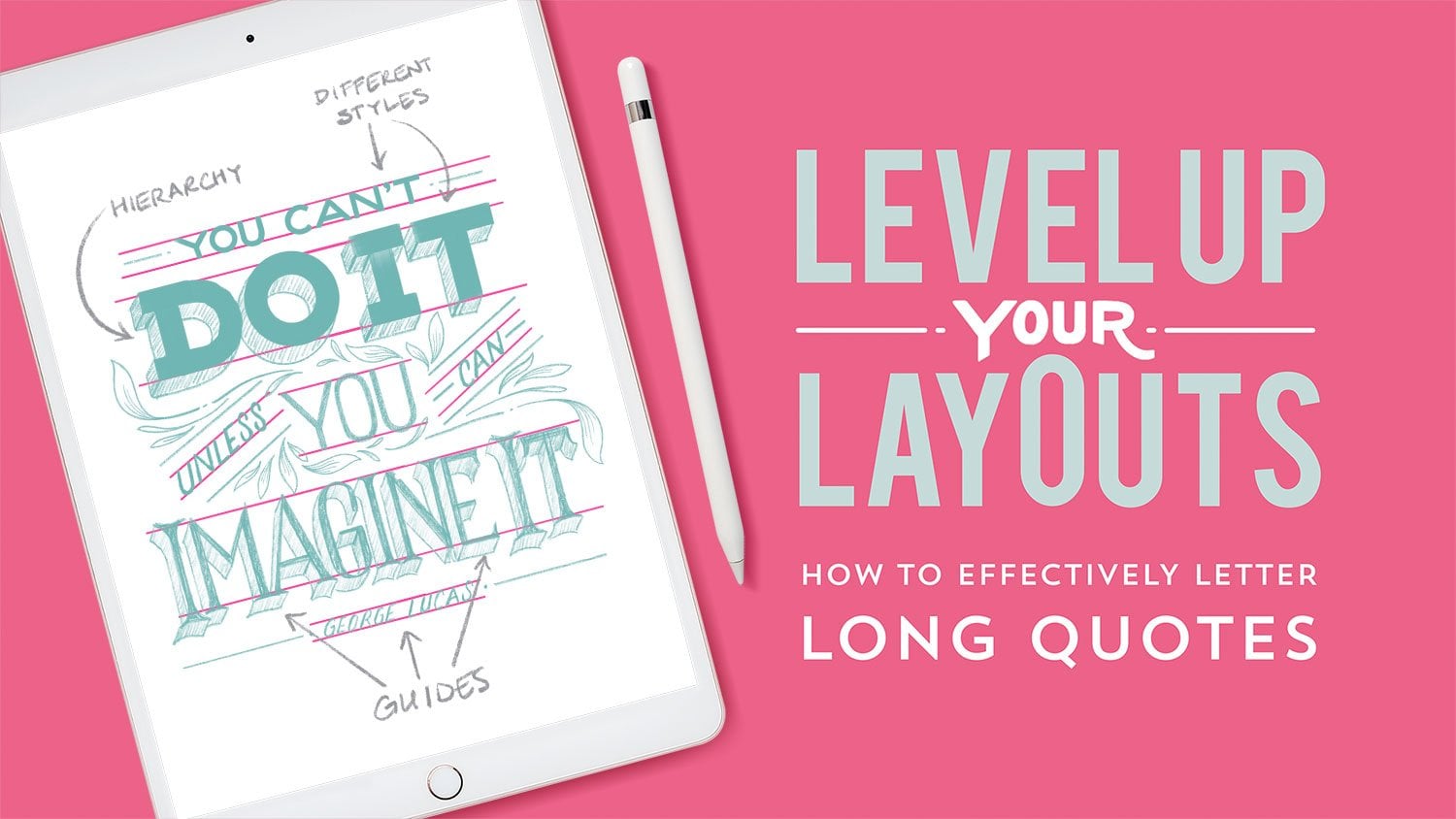
your hand lettering journey, you can watch my other classes like level up your layouts, which will give you tips
for lettering long quotes, or simple words to stunning art in which I
show you how to combine hand lettering with illustration or my Finder style class, which helps guide you
through the process of developing your
own unique style. You can also click
the follow button. You'll be the first to know
whenever I post a new class. And for short lettering
and drawing tutorials, you can also follow
me on YouTube. As always, it's been a pleasure sharing this creative
space with you. And I look forward to seeing
you in the next class.
 Gia Graham, Illustrator & Lettering Artist