Transcripts
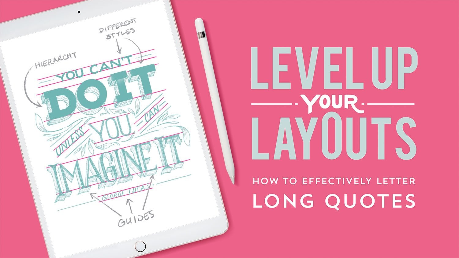
1. Introduction: I always start a piece that I'm going to work on with brainstorming and sketching. So this is a really great way to practice that technique of getting ideas down on paper and then honing in on the idea that works best. Hello, my name is Gia Graham and I'm a hand lettering artist and illustrator based in Atlanta, originally from sunny Barbados. In the online space. You might recognize my work from Instagram and out in the real-world, you might have seen my work on products like greeting cards sold in stores like Trader Joe's and target. Today's live session is about sketching and exploring ideas for how to combine hand-lettering with illustration. And we're going to be drawing food inspired art using three different methods. I go into detail about these three methods in my most recent class called simple words to studying art. And I thought it would be a fun exercise to walk through those methods in a bite sides way with students. Students and I will be sketching together and I will be using the Procreate app on the iPad Pro, but really all you need Is pencil and paper or your favorite method for sketching. You can sketch with me and follow the ideas that I'm going to be working through. Or you can come up with ideas on your own. It will just be a fun, loose, stress-free process. I hope you'll come away from the class with a few ideas and a little more confidence in the idea generation process when it comes to creating hand lettering that combines illustration. This class was recorded live, so I was able to interact with students while sketching and answer any of the questions they had. Okay, this is going to be a fun class, so let's get started.
2. Getting Started: My name is Jasmine severe, that it is my great honor and pleasure to be your host as with the most is today for this live session with the incredible geographic. So with no further ado, I'd love to just hand it over to you to kick us into the session. Okay? So what I'm gonna do is I'm going to break it down into three different sections. So I'll be drawing the foods that I mentioned earlier that Hamilton's introduced to the American palette. So that's french fries, ice cream, and Mac, Angie's. And I'm going to use three different methods. These are the three methods I teach in my most recent class called simple words to studying art. And I'll go through each method as we go along. So we're going to start with what I call the lettering primary method, which basically just means that the lettering is going to take center stage. And the illustration that will, we're going to use. It's just going to be there to enhance the lettering and serve as a supporting. And I'm going to just kind of walk through a couple of ideas. You're more than welcome to come up with your own ideas or you can follow along with me. You know, if something's sparks an idea for you, Have at it and sketch. So like I mentioned, it's just going to be loose and about idea generation, right? So the first thing I think about when I think of french fries are those, you know, those little paper containers at the fries come in, especially at a fast food restaurant. So I think that's where I'm going to start in terms of how I illustrate or what I'm going to illustrate. But I mentioned that this is a lettering primary methods. So the lettering is going to be the star of the show. So keeping this in mind, I'm going to first go ahead and roughly sketch the word phrase. And then think through how I can incorporate the illustration. So the first thing I think of is maybe I can have this replace the I. So let me try just kinda nudging this over a little bit, give myself some room. Probably need a little bit more room than that. So I can incorporate my illustrate creation here maybe. Or I could make this the backdrop of the lettering. So I can I'm actually going to use this and give myself a little space for my lettering. And this is a little trick that I often do, is I'll, if I don't know what my spacing is going to be exactly, I'll sketch the first and last letters and kind of just position everything in between. So I could kinda have that sit in front of the illustration. And the thing I think though that's missing here, is some movement. This is very upright and I mean it looks fine, but I think there needs to be some movement here. So maybe I'll try drawing the lettering on a curve. If you're ever in a pinch for how to add a little bit more interests to the lettering if it's just feeling a little bit stagnant, try putting it on a curve that almost always, instantly adds a little bit more. Makes it a little bit more dynamic. So let me try lettering this on a curve. And again, I'm gonna do my invertible beginning and an end trick here. And I can position all the other letters in the space available. And with this, instead of using this really upright container, I can have a basket of fries kind of sit in this space created by the curve. And rather than just kind of having the fries only sit in this space, I can get a little playful with it and have the phrase kind of flying around. And this way I can also start to fill any dead space created by the letter forms. So I like where this is going, so I'm going to pursue this one a little bit further. So I'm going to copy and paste down to a new layer and use this as my guide. Again, I'm not going to really finalize this sketch. I'm just still working really loose, but I do want to see what it will look like if I make the lettering a little bit more chunky, little more substantial. And if you've ever taken any of my lettering classes, you know, I do the whole drawing, the guides and, you know, making sure that all of your strokes are even and all of that we're not doing any of that today. We're more interested in kind of pursuing an idea and seeing how it will work. More so then perfecting it. And by the way, during sketching, it's really helpful if you fill in your letter forms. It's really the only way to see how they're working. You know, if you can, you need that negative and positive space to see if somehow something's looking. So I always recommend just really loosely filling in letter forms even during the sketching phase. And if I were to take this to final, I could do things like add a drop shadow here or, you know, add some inline detail to the lead harangue to make it more interesting. But there's a really good start for where I could potentially take this piece if I were to take it to completion.
3. Illustrative Lettering: The next method that we're going to talk about is the illustrative lettering method. Now, this is where the lettering will take on characteristics of whatever the subject matter is. So you can either have the letter forms are made out of objects, or you can just have the lettering, like I mentioned, take on characteristics. So there could be various things that you do with the lettering that will give you hints of what it is you're trying to portray. So for this one, I'm going to let her ice cream, again are using the illustrative lettering methods. So I think of, I guess what I'll do first is just quickly sketch the word ice cream and then see where I can go from there. This one can get a little bit tricky. I mean, I guess I can make the eye a cone. So in terms of objects becoming letter forms, it gets a little tricky with this word because they're not that many opportunities to make that happen other than this questionable I in ice cream. So I think with the illustrative lettering method, I think what works a little bit better is just make a quick list of the features of whatever your subject matter is. And then you can think about how to make that work with your lettering. So when I think of ice cream, what do we think of sprinkles? Maybe melted Carmel or chocolate. Maybe a cherry on top. Yeah, colds. Diane says cold, drips, melting ice cream, dripping. Nuts. Good one, lindsey. Okay, Nuts. A waffles. Ou and that makes me think of a cone and general. Yeah, I got the cherry on top. I think these are all good. But what Spoon? Spoon as good. So jotting all these things down and just kind of having them nearby will help start to generate some ideas. So I think what with this in mind, what I will do is first letter of the word, the word, and then figure out ways to incorporate a couple of these things. So let's see. I'm going to do a fairly chunky lettering styles since I want to add illustration to the letter forms themselves. So I'm just gonna do a quick skeleton first. And since I know I want this to be a little on the chunky side, I'm going to use a white brush. This one does not come free with procreate, but I really love it when I'm doing like beefy lettering styles. It's the block pencil. My friend Cynthia, and local ink make this brush. And it's a pretty wide and textural brush. Actually want it to be even wider than that. Okay? So I'm just going to make this really loose and fun. All right, so I'm going to use that as my guide. So I'll reduce the opacity on it. And go back to my 6 B pencil. And I'm going to sketch the outline of it and then incorporate the illustration. A little bit of a flurry happening in the chat, but I couldn't stop to read anything. Is there any are there any questions I can answer? Well, I'm just getting you. What you missed in the chat was a ton of community support. It a couple of technical questions, but we had an amazing Skillshare community just come right in and answer that. So by the way, for who it was, it was asking about using a font because there weren't to verse and lettering. This is a great trick to use. If you use a really wide brush and just write some thing basically in your own handwriting. You can go back and trace it and make it look a little bit more hand-drawn. So what I could do is that whole idea of the drippy topping. I can add some drips to each of these letter forms to make it look like. Now that doesn't look right. Oops, to make it look like drizzled chocolate. And I can even add a few little drips. Make it look like it's melting a little bit. And then can have a few sprinkles. Think somebody mentioned, not send. There are some other toppings. You know, you can add your toppings to the letters. And maybe I could even add some lines here at the bottom. Send to kinda, you know, how the waffle cone has those crisscrossing lines. You can kind of suggest waffle cone if I add some lines here. And maybe I'll, I have my little cherry on top right here. There's my illustrated illustrative lettering version of ice cream.
4. Primary Illustration: So the last method that we're going to play around with is the illustration primary method. So in this scenario, we want the illustration to be the most prominent feature and then the lettering will be built into the scene. Illustration is going to be the kind of driving focus. What do we think of when I think of mechanism? She's the first thing I think is a giant bowl. I think the the thin layer of baked Delicious. Delicious is at the top. That is, yes. That is very specific to Thanksgiving. Thanksgiving mac and cheese, specifically, black Thanksgiving mac and cheese. That weight, it's gotta be baked. Yeah, absolutely. In the Caribbean to, I mean, we actually call it macaroni pie, which confuses a lot of people. But yeah, if it has to be baked or it's not my country. So okay, If I draw giant bowl of mac and cheese, this one's not baked. Okay, so I've got my big bowl here. Well, how do I incorporate the lettering? I could just put the lettering on the bowl. Maybe it could be on a curve. Let's see. We can follow the shape of the bowl. In that a new class that I have, simple word sustaining art, I talk a lot in the illustration primary method about having your illustration create containers for your lettering. So this container could be a container for your lettering. So you can kind of have the lettering take the shape of the bowl. And that's nice enough. Not all that compelling to be honest. It like if it were like a logo or something like that, it's kind of in its own little container. Sure. As an illustration, I think it needs a little bit more. I can try taking the macaroni out of the wall. Let's see. Say maybe if I put it on a giant fork, let's see what that looks like. Go we've got one clarifying question. What was the name? Could you remind the method that you used? What the method was called, where you use the food as one of the letters O, that's the illustrated lettering method. So you're basically, I mean, all lettering is illustrated, but you're creating lettering out of illustrations or you're making your lettering look more like an illustration. Men, just the letter form. Cool, Thank you so much. This is kinda fun, but the question is, where do I put my lettering on this one? I could create like a banner. I have my lettering citizen this make my little macaroni elbow nice and cheesy. There's another option. It would be good if I spill cheese, correct. I think I want to take this macaroni elbow kind of sitting on its own a little bit further. And I'm going to draw the ingredients. So I'll do macaroni elbow again. And I can pair that with a nice big wedge of keys. And these can be my two containers for the lettering. So I can put Matt create here. And the G is. All right. And if I were taking this to final, because I've got this ampersand kinda sitting on top of the cheese and it's really close to this lettering here. And thinking ahead, when finalizing this, I would make the ampersand either much bolder color or add a drop shadow to it, something to help it stand out from the illustration that it's in front of. But yeah, there's my illustration, primary version of the lettering. So again, the, the drawing is the main focus, stands front-and-center. And the idea is to just kind of find ways to incorporate the lettering into that drawing in a way that feels like it makes sense. And it's organic. It's just not kinda slapped on top of it.
5. Final Thoughts: All right, We did it. Thanks so much for joining me. I hope this session gave you a few new ideas for how to approach idea generation and sketching. And I hope you had fun. I do hope you'll share your sketches in the project gallery and interact with fellow students by liking and commenting on their work as well. As I mentioned before, I dig a little bit deeper into each of these methods in my newest class called simple words to studying art. So be sure to check that out as well. Thanks again for joining me and be sure to follow me here on Skillshare so you'll be alerted whenever I post a new class and I look forward to seeing you next time.
 Gia Graham, Illustrator & Lettering Artist