Transcripts
1. Intro: Are you curious about
how to come up with different lettering styles or how to find inspiration
for lettering styles? Or maybe you're
wondering how to build a full alphabet in
a particular style. Since publishing
my very firsthand lettering class four years ago, one of the topics
students have been most curious about is
lettering styles. And these are some of the most common questions I receive. I think it's about time I
answer those questions. But rather than try to fit such a broad topic into
one intensive class, I've decided to break it up into several short bite size classes in this lettering style series. Hi. My name is Jia Graham, and I'm a hand lettering
artist and illustrator, born in Barbados
based in Atlanta. Although I have a formal
education in graphic design, my hand lettering
skills have actually been mostly self
taught through books, online classes, tutorials, and lots and lots and
lots of practice. Over the years, I've
been fortunate enough to create lettering for
companies like Spotify, Penguin Random House, Lionsgate, American Greetings, the US
Postal Service, and more. I've also had the pleasure of sharing my love
for lettering and teaching all the tips and tricks I've learned to
thousands of students. Throughout the series,
we're going to explore several different
lettering styles. I will show you how to pinpoint the characteristics
of a particular style, how to use reference images, and how to re interpret and remix the letter forms
to create a new style. In this first class,
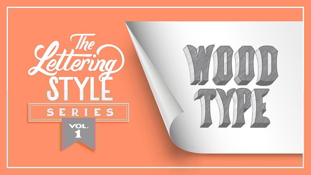
Volume one of the series, we're going to create
a lettering style inspired by vintage wood type. By the end of the class,
you'll be able to create multiple letter
forms in this style, giving you the foundation to create a lettering
layout of your own. This is a beginner
friendly class. However, if you've never taken
a lettering class before, it would be best to start with my hand lettering
in Procreate class, which will give you a good
start with the fundamentals, including all of the
terminology that we'll be using in this class and
throughout the series. Whether you're
drawing in Procreate on the iPad like I am, or whether you're
drawing on paper, grab the pencil of your choice, and let's get started.
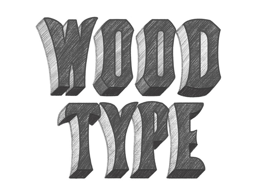
2. Style Breakdown: As I mentioned in the intro, we're going to be drawing
a lettering style based on vintage wood type. In case you're not familiar, wood type refers to the letter forms carved
into blocks of wood, which were used on letter
presses to print posters, placards, and ads in
the 19th century. Wood was a more flexible and affordable
option than metal. So some wood types
could be quite large for printing
colorful billboards. When it comes to using reference
images as inspiration, one of the biggest
challenges is that you never want to outrighte
copy someone else's work. It's important to
be very mindful of other artists
intellectual property, and you never want
to infringe on someone else's
copyrighted material. The reason I'm
starting the series off with Wood type specimens for inspiration is because
these lettering styles date back to as
early as the 1820s, so they're old enough to
be in the public domain, meaning there's little
chance of a copyright claim. So if you're looking
for reference material that won't get you in trouble, wood type specimen books
are a great place to start. 100 Wood type Alphabets is a
really good reference book. It's published by Dover
Publications and features full alphabets from Rob Roy Kelly's extensive
Wood type collection. By the way, Rob Roy Kelly also wrote this book,
American Wood Type, 18 25 to 1,900, which includes more of
the history of wood type and examples of some of
those ads and posters. Also, Kelly's entire collection has been beautifully
archived in this book, the Rob Roy Kelly American
Wood Type collection by David Shields. And if you're interested
in adding any of these books to your
own reference library, I will leave links for you
in the resources section. Anyway, back to this book. I found a fairly simple, straightforward specimen
that we can work with. It's called Concave
Tuscan Condensed. I've said this before in some of my other classes but
it's worth repeating. Observation is a huge
part of being an artist. When looking at lettering
for inspiration, it's important to really observe the letter forms so that you can understand how
they're structured. Once you've gathered
that knowledge, it will be easier to alter and remix the forms so
that you can create something that's inspired
by what you saw rather than simply copying it to
create an exact replica. Let's study some of the
characteristics of this style. The slope refers to the angle. In this case, the
letters are vertical, so there is no slope. The letters in the
style are very narrow, hence the condensed
descriptor in the name. A stem is the main vertical or diagonal stroke of a letter. Here, the stems are
slightly curved inward, so they have a concave
shape to them, which also is
indicated in the name. A terminal refers to
how a stroke ends. In this case, the terminals all have a slightly
concave shape as well. As you can see, the ends of
these strokes curve inward. Although curves are used
throughout this style, the parts of the letters
that would normally be rounded are quite angular. So rather than the
being smooth and round, it's essentially made
of four straight lines with these concave curves
cut out of the shape. And this creates kind of a
pointy and angular look. It's especially noticeable
on the S and the B. You'll also notice
that the tops and bottoms of the rounded
letters are completely flat. So letters that would
normally have overshoot like C S and Q have no
overshoot with this style. You'll notice that the
negative spaces in the letter forms are
mostly tall and skinny. It's very clear in the counters, which are the partly or
fully enclosed areas, like in the O, the Q, and the D. And this
minimal negative space can also be seen
in other letters, like the W, X and Y. In this style, these
areas are quite small, whereas they would be much
more open in other styles. In the resources section, I've included a copy of this full alphabet
for you to use as a reference so you can take your time and study
the letter forms. It will also come in
handy when we start sketching these letter
forms in the next lesson.
3. Observe and Replicate: Okay, we've gone
through the checklist, and we know intellectually
how these letters work. Now it's time for us to do some sketching to get a
feel for how they're built. Let's start with the
letter E. As we discussed, there's no slope, so
we're going to be starting on a vertical axis. And remember, this is
a condensed letter. It's quite skinny. So the arms of the E are going
to be fairly short. So that's the basic skeleton. So now I'm just going to add
a little weight to that. And I'm just adding the weight in basic rectangular shapes, and then we'll kind
of build from there. By the way, it's really
important that you fill in your shapes
when you're sketching letters because
that helps you to get a better sense of volume
and the overall shape. And I made an extra
large version of the six B pencil for
a quick and easy fill. Now, we really don't
have to worry about making these really
pristine and perfect, because, again, we're just exploring how these
letters are built. Okay, there's a basic shape. Now, remember, this style had that slight inward curve to create a stem with
a concave shape. So going to Draw that curve. And the other tip I'll give you is that it's helpful to use both your pencil and your eraser when you're
creating your letter forms. So you can use the pencil
to add to the shape and you can use the eraser kind of like a carving tool to take
away from the shape. Now let's tackle
these terminals. With this style, those terminals also have a slight inward curve. I actually think
these might be a little too long for
this condensed style. So I'm just going to
erase all the way down and that will also help me make sure that the arms
are the same length. Now I can curve that shape. Now, it looks like this curve
also goes this way as well. There's a slight curve
in this direction. And on the central arm, the curve goes both ways. As well as on the terminal. Now, this middle arm
isn't quite centered, so I'm just going
to select that, shift it up slightly. Now, another characteristic of this letter is that
the connection between the stem and
the arm was curved. So let's go ahead
and round that out. And the stem actually
curves inward just a tiny bit in this
direction as well. Now, the connection between this middle arm and the
stem is a bit more angular. So I'm going to adjust that. And remember, during
this process, you can be as messy
as you need to be. You know, we're just
trying to figure out the structure of
this letter form, so you're not going to get
it perfect on the first try. You know, this is an
exploratory phase. So just take your time. There'll be lots of
erasing and redrawing, and that's perfectly fine. All right, I think that's
a pretty decent replica of the E. And again, just a reminder at this stage, we're just replicating
the letters for practice so that we
understand how they're built. Let's try another one. Let's try a letter with some curves. So let's tackle the O. Now like we talked
about earlier, all the rounded shapes in the style have been squared off. So even though
we're drawing an O, rather than starting
with an oval shape, I'm going to start
with a rectangle. I'm just going to add a
little weight to that. Keeping in mind
that the counter, the open section in the center
of the O was quite narrow. And again, I'm going to quickly fill that shape so
that it's solid. All right. So now we've
got that concave shape on the outer edges on
the left and right. And then here on the corners, we kind of have these
notches cut out. And now for the counter, let's make that kind of
stretched oval shape. So these strokes are gonna
slightly curved as well. Top and bottom of this
letter are also very flat. All right, I think that's
a fairly close copy. Now, the D is very
similar to the O. They share a lot of
the same structure. So rather than
starting from scratch, I'm actually going to duplicate this O and build
the D from here. So the right side of the D looks almost identical to
the right side of the O. So we're just going to make
adjustments to the left side. So I'm actually going
to erase half of it. All right, let's see
if we can figure out how the left side works. So again, no slope, so we've got a vertical stem. And the stem here is
curved on the outside. And it almost looks
straight on the inside, but there is a little
bit of a curve. Alright, let's make this solid to see what it
actually looks like. Alright, the counter here is
also pretty much an oval. All right, there's the D. Now, figuring out how the D works is actually going
to make it really easy to understand the P. They
both share the same stem, and the bowl of the P is basically a shortened
version of the D. So like we did before,
I've duplicated the D, and I'm just going to start by the pieces that I
don't need right now. And I'm going to keep the stem. So the bowl on this p
sits fairly high up. Usually, you want
your bowl to sit a little lower than the
center point of the stem, but it looks like this one is
about at the center point. And I'm going to
create the bowl out of straight lines since this style doesn't have typical curves. Okay, we're going
to make that solid. Now, having made it solid, I can already see that
this is a little too wide. So I'm going to select
and just shift it. And I think that's a little
closer to the actual size. Now, since this is a
shorter shape than the D, the curve on the right side
is a bit more pronounced, or at least it appears
to be a little more pronounced than
it did on the D. Like all the other letters, it's very straight at the top, and we've got those same
cutouts on the corners. And then this counter
is kind of a D shape. So it curves on the left. And this side of the counter is actually
not perfectly straight. But I now have a
misalignment because this is curving this way and the stem
starts a little further in. So I believe I need to adjust
the shape of the stem. It looks like this is
flaring a little too much. So I'm just going to
make that adjustment. Take that down a bit. And I've got to flatten out
the bottom part as well. Alright, I think
that's fairly close. And there were definitely a
few details that were more complex than they appear to
be by just looking at them, which is kind of the point
of this whole exercise. Unless you actually go through the process of
drawing it yourself, it's easy to miss a lot of the nuance in the letter forms. Up next, we're going
to explore ways to modify and stylize
these letters. I'll see you in the next lesson.
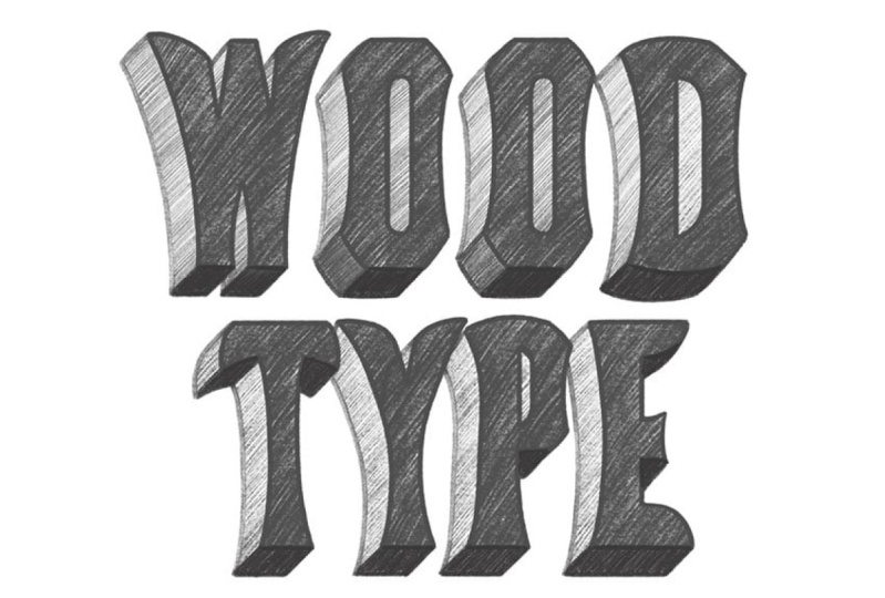
4. Modify and Stylize: L. Now that we've gone
through the process of sketching replicas
of those letters, hopefully, you have a
deeper understanding for the basic structure
of this style. Now, let's take it a bit further by modifying
some of those features, so we're creating a new version that's inspired by this style. When looking through
specimen books, you'll notice that sometimes the wood type
manufacturers would create highly ornamental versions of the same basic type in order
to create a new style. By the way, this is another
beautiful reference book. It's called specimens
of chromatic wood type. And there are a few samples of the same concave
Tuscan condensed. But here, the letter forms are much more elaborately stylized. We aren't going to
do anything quite so elaborate with
our version, though. We're just going to
keep things simple. If you don't feel quite ready
to take this next step, you're welcome to
continue replicating more letter forms until you feel like you've
got the hang of it. Now, I've gone back to
the layer with the E, and I made a duplicate
of that layer. So I'm going to shift my
duplicated version to the right so that we still have the replicated version
as a reference. I'll be making changes to
this duplicated layer. Now, when you're
adjusting the style, think back to the list of
characteristics we noted in a previous lesson and choose one or two
characteristics to alter. Now, as we already
know, these terminals, the ends of these strokes
have this concave shape, which makes them
feel a bit severe. It's creating these two points here that feel a
little bit sharp. So I'd like to
soften that a bit. So rather than curving inward, it will be interesting to
see what happens if the ends of these terminals
curve outward instead. So let's just Try that, have this curve outward and up. In doing so, also create more of a curve here on the top rather than
having it quite so rigid. So now the top of the E will go slightly
above the cap height. I'm actually going to draw the cap height and
baseline on another layer. So it's easier to
see how this is now breaking the barrier
of the cap height. Now, rather than having this
curved connection here, I think it would actually look better if it's a
little more straight. So I'm going to straighten this up and do the same thing here. Have it curve slightly
below the baseline, and have this curve this way. Soften those angles. But keep more of an angle
here at the connection. Now, this dips down
a little too much, so I think I'll adjust that. Now, just having that curve go upward and downward
like this above the cap height and
below the baseline already makes the letter form
feel a little more relaxed, I think, because it's not so rigidly confined to the
cap height and baseline. And I think I'll leave
the mile arm like it is. I think it's an
interesting contrast to the top and bottom arms. Now, another detail we can add to give this style,
this new style, a bit more personality is
we can add a drop shadow, which I think is
fitting to give it a three dimensional
feel since it is inspired by physical
blocks of wood type. If you're not sure how
to create a drop shadow, I demonstrate it step by
step in the shadows and detail lesson of my hand
lettering in Procreate class. Are we gonna fill
in that drop shadow just like we do with the letter sketch just to help
give us a sense of volume. T As you can see, a couple small changes can completely alter the
look of this style. Now we can apply the
same logic we use to make these adjustments
to adjust the O. Again, I've duplicated
the layer with the O. I'm going to shift
one to the left. Now, just like the
concave cutouts on the E, the points created by these cutouts also
feel rather harsh. So again, we want to soften it in this new style
that we're creating. So instead of these curves, let's see what happens
if we just make them straight lines. Y. Alright, that already feels
a little less severe. The other thing we can do is adjust the counter,
this negative space. We can exaggerate
the narrowness of it by making it
slightly smaller. And this time,
rather than having an oval with these curved sides, let's making the sides straight. And we'll keep the curve
at the top and the bottom. That's just two simple changes, and it already has a
very different feel. Now I'm going to create
the drop shadow. There's our new O. Now we're going to make
the same adjustments to the curves of the D
as we did with the O. So I'm going to straighten
out those corners. Now, remember when
we stylized the E, we broke the confines of the
cap height and the baseline. And we had those
strokes dipped slightly below the baseline and
slightly above the cap height. Well, we're going
to do something similar here as well with the D. I've got my cap height
and baseline guides up, and rather than
having the top and the bottom of the D so flat, I'm going to add a
little bit of a curve. Let's see how that looks. I'm going to have the
top of the D curved slightly so that it's
above the cap height. There's a little bit
of overshoot there. And then I'll have that flow
into the curve of the stem. And same here at the
bottom with the baseline. Just a slight curve. We don't
want it to be too rounded. And just like we adjusted
the counter of the O, I'm going to do
that here as well. So this time, I'm going to have the left side pretty straight. I'm also going to extend the length of that
counter as well. Now that we've made the top
and bottom a little rounded, it's creating more volume at the top and the bottom
of the D. So I'm going to offset that by
making the counter longer. Now, I'm keeping the left
side of the shape flat, but I'm going to
have the right side curved so that it's really
obvious that this is a D. And the last thing we'll
do is add that drop shadow. Now, remember, when we
sketched the replica of the P, we noted that this
area of the P, the bowl was almost an
exact match to the D. So we're going to
make the same changes we made for the D on the P. So starting with straightening
out these corners, and we can make this counter
a little more narrow. And then round out the
top edge a little. Again, rounding this out
creates more volume here, so let's eate the counter. Now we're also going to add a slight curve
down here as well. Then I think we can make these areas a
little more narrow. And adjust those angles. And remember, we're
making this up as we go along, so, you know, you're going to just make adjustments and tweaks
until it looks right. And we'll just add
that drop shadow. Since we have access to the entire alphabet in this style, feel free to adjust more
letter forms for practice. Also, keep in mind that
you can experiment with the details to stylize these
letters in different ways. Up next, we're going to take a look at the class assignment. I'll see you in the next lesson.
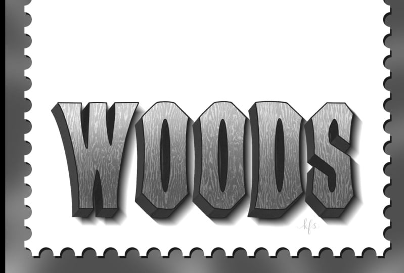
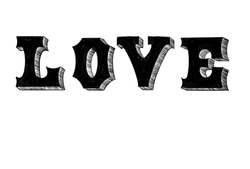
5. Class Assignment: Your assignment for this
class is to letter a word or short phrase with the
new style you just created, whether you followed
the version I made in the demonstration or came
up with your own version. You can keep it simple by just lettering the words
like I did here, or you're welcome to create
a more detailed layout. Now, this will just
be a pencil sketch, so you can focus on the
lettering without getting bogged down by details like color
palettes and brush options. Please be sure to
share your work in the project gallery when you've
completed the assignment. To share your project,
scroll down below the class video and go to the
Projects and Resources tab. Click on the Class
Project button. Name your project, and upload
as many images as you'd like by clicking on the Image icon where it
says, Add more content. I look forward to seeing
what you come up with.
6. Final Thoughts: I hope this has given you a
helpful framework for how to create lettering inspired
by an existing reference. Although the process
may seem slow and methodical now, eventually, these observations and decisions will become second nature, and you'll be able
to skip straight to the modify and stylized step. The key is to start training your brain to work in this way. I encourage you to explore
other ways to adjust the original letter forms to create your own
stylized version. Don't be afraid to experiment and see what you come up with. If you enjoyed the class, I'd love it if you
would leave a review. Your reviews not only help
me improve my classes, they also help prospective
students know what to expect. As I mentioned
earlier in the class, this will be an ongoing series, so stay tuned for
Volume two coming soon. It's been a pleasure sharing this creative space with you, and I'll see you next time.
 Gia Graham, Illustrator & Lettering Artist