Transcripts
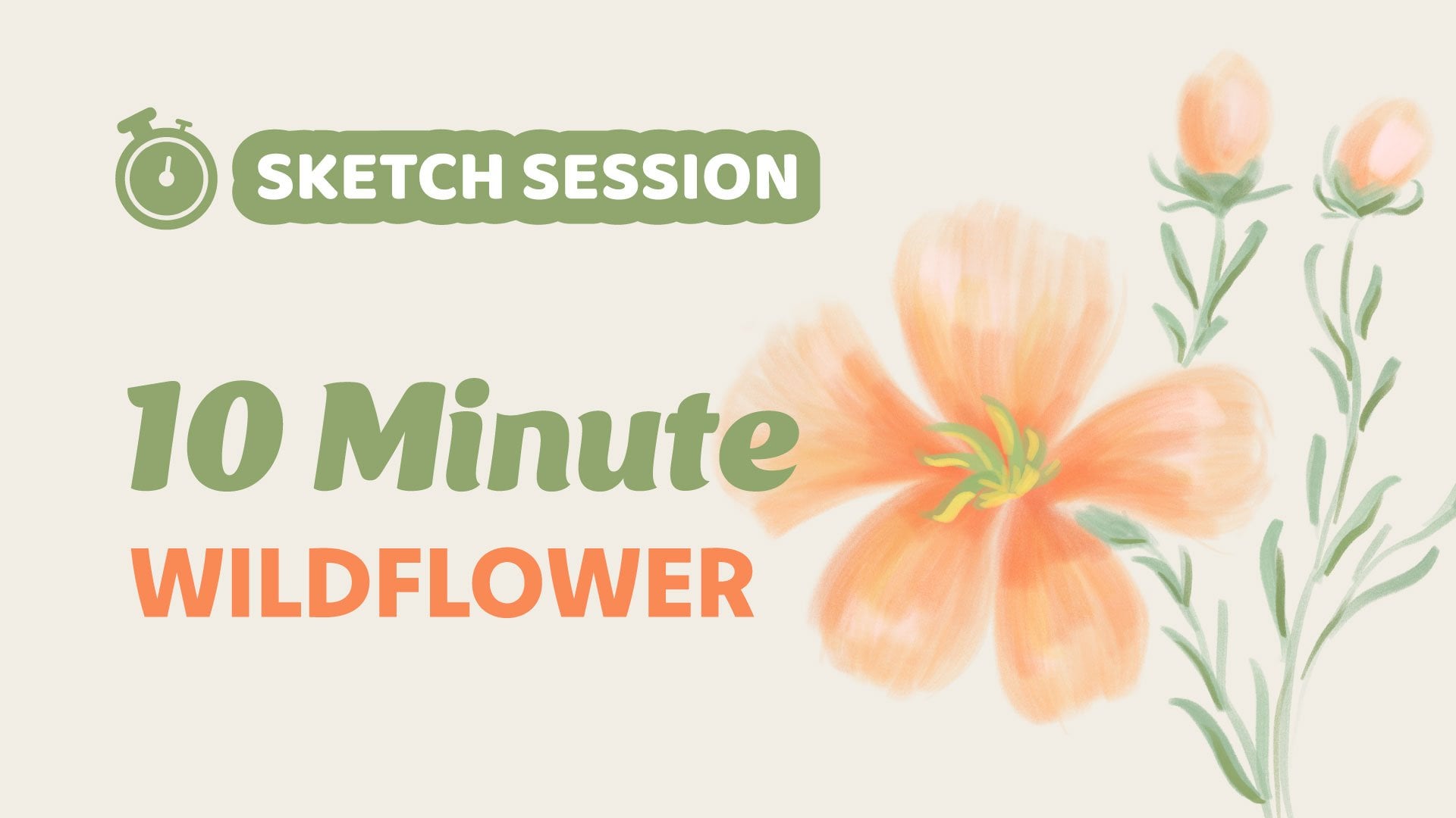
1. Intro: Hi, friends. Welcome to
another sketch session. In this collection
of short classes, we're going to continue
with the sketching sessions we started in my Loose
Digital Drawing class, and we're going to loosen up
with a quick color sketch which we'll aim to complete
in 10 minutes or less. The goal of this exercise is
to get used to making quick, confident marks to embrace our mistakes and to
push past perfection. In this sketch session,
we're going to draw vintage bottles. Let's dive in.
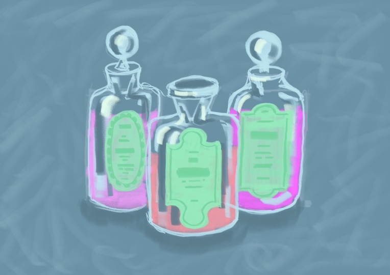
2. Quick Sketch: This is the reference
photo we'll be using, which you can download in
the resources section. The first thing
we're going to do is change the background color. Let's use the medium
blue from the palette. And I'm also going
to turn on drawing guides and increase the
size of the grid slightly. This will just help us
make sure our lines are relatively straight and our
bottles aren't too lopsided. For the brush, open up the
new Procreate library, go to the pencils set, and we're going to use Warata. Okay, go ahead and
set your timer for 10 minutes, and
let's get started. I'm using the light
blue from the palette, and I'm going to map
out the placement of the bottles with basic
geometric shapes. So we're going to
draw a rectangle in the center for the bottle
in the foreground. Then the bottom edge of the
other two rectangles will be a little higher up since those two bottles
are further back. We can use basic triangle shapes for the neck of the bottles. And for now, I'll
just draw a line and a circle for the stoppers on
the two background bottles. Okay, now we can use
that basic framework as a guide to make the shapes
a little more accurate. So I'm going to round
out the corners, add a lip at the top
of that bottleneck, and define the shapes
on this side as well. Then I can continue to do the same for the other two bottles. Now, you'll notice that I
change the direction of my canvas a lot
during this process. It's much easier to make quick confident marks when your arm is at a
comfortable angle. So instead of contorting yourself to draw a line
in a certain direction, it's best to just move the
canvas around as you need to. And here, I'm using the side of the pencil tip to get
a nice broad stroke so I can quickly fill the circle to create a sphere on
the bottle stopper. Then I can also use those
broad strokes to quickly add a few lines to help give
the illusion of volume. This brush has actually
grown on me quite a bit because you can use a sight of the pencil tip in this way. When I first reviewed it, I didn't really love it for
a typical pencil sketching. And I'll leave a
link to that brush review video so you
can see what I mean. But once I started playing
around with it a bit more, I realized that it's actually
a great sketching brush. Once I stopped expecting it to mimic the look of
a graphite pencil, it was easier to appreciate all of the things it
actually does well. Another thing I
really like about this brush is how
smooth the grain is. So you get a really nice,
almost buttery feel. When you use it in
color like this, it doesn't even
look like pencil. It looks more like chalk
or maybe even charcoal. Okay, here I've switched to the dark blue from the palette, and I'm just adding a few of those broad strokes in the
darker color for shadow. I forgot to mention
that I've included this palette in the
resources section for you. You can pull the
colors directly from the JPEG image or
copy the hex codes. And actually, if you subscribe
to my email newsletter, this palette will
look familiar to you, and it's because
it's essentially the same one I shared
in my February email. I just added a
couple extra shades of one or two of the colors. Of course, you don't have
to use this palette. You can use a completely different set of
colors if you prefer. Now I'm using white
for a few highlights. Now, the white is pretty stark, so I don't want to overdo it. It's a balance here
because I want to be somewhat mindful of the
placement of these highlights, but I also can't overthink it because of the
time constraint. Okay, that'll do. Now I'm going to draw the
labels on a new layer, starting with the
really pale green. I decided to do this on a new
layer because I knew that getting the shape and size of the oval might be a bit tricky. This way, I have the flexibility to draw it really quickly, then resize and
reposition as needed. Again, I'm using the side of the pencil tip to get
a nice broad stroke, which just makes it much easier to fill these
shapes very quickly. It's already hard to
draw circles and ovals, but it seems even harder to do when you're
kind of in a rush. Okay. Okay, finally, I can resize
and move this into position. These shapes with
the straight edges should be a bit easier
to draw quickly. Now, as you can see,
compared to the reference, shape is not at all accurate. But remember, we're not going
for 100% accuracy here. As long as you get
the general idea of the shape, it's fine. Again, I'm using the side of the pencil tip to get
a nice broad stroke, which makes it much easier
to fill these shapes. It's also handy for making quick adjustments to
the shape as well. And Now, as you can see, drawing the labels,
filling them with color, and adjusting the shapes
can eat up a lot of time. So when you're doing
this exercise, it might be helpful to start
with just one bottle first, see how it goes, and then work your way up
to the group of three. Now, of course, I could use the drop fill feature to
add color to these shapes, but you'd still need to clean up the edges where the fill
meets the outlines. And I just think that the really solid color
that the drop fill creates takes away from the
loose sketchy aesthetic. Alright, now I'm using
the medium green to add those borders
on the labels. Round shapes are challenging, so feel free to break up
that oval if you need to. And using the sight
of the pencil tip is a helpful cheat here, as well, because
it will fill that scalloped edge with
just a few strokes. The border on these
two is much simpler. And remember, they don't need to perfectly match the
shape of the labels. Now I'll use the
darker green to draw a few simple lines to indicate
the text on the labels. And I'm switching
up between using the point and the side
of the pencil tip, so I can get different
widths on those lines. Okay, one more new layer. And I'm going to drag that
below the other two layers because I'm going
to add a shadow below the bottles on this layer, and I'm using the
darkest blue for this. Time's running out,
but I'm just going to quickly add some color to each of the bottles using each of the three
different pinks. Alright, gosh, that one
was down to the wire.
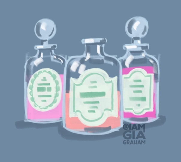
3. Drawing Review: Here's how my final
sketch turned out. As you saw, I just barely
finished in 10 minutes. So it might be a
challenge to draw all three bottles with
such a short time limit. So feel free to give yourself
20 minutes instead of ten. Or like I mentioned
during the demo, you can start with
just one bottle, maybe the one in the center and see if you can get that
done within the 10 minutes. I also encourage you to try this exercise a couple
more times for practice, because, of course,
the more you practice, the more comfortable you'll
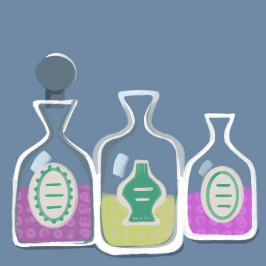
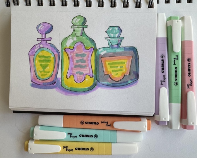
become with the process. Here are a couple more
sketches I tried. This one took me
about 12 minutes, and this one took about
8 minutes to finish just the one bottle because the shape and details were
a little more complicated. I've included both of the
reference photos I used here, in case you want to try
these sketches, as well. Just a reminder this exercise isn't about creating
something perfect. It's about creating
something expressive. I really look forward to seeing your expressive drawings
in the project gallery. And if you'd like to try drawing something similar at a slower, more structured
pace, you can watch this full tutorial
where I show you how to paint this Vintage
Perfume Bottle. I'll leave a link for
this YouTube video in the resources section. I hope you had fun, and I'll
see you in the next session.
 Gia Graham, Illustrator & Lettering Artist