Transcripts
1. Introduction: Hi everybody. Sandy. Sandy here. Named by my parents,
Sandra Sandy. I have always been
known as Sandy, sandy in everyday life. Self-expression through art has taken many forms
through the gears, from learning to draw
with John navy on TV to holding summer art camp
in my parents garage. When I was 13. I graduated from art college
with a degree in illustration and
painting 45 years ago and have been in the
art field ever since. I owned an advertising
illustration and signed studio with my ex
husband until 1996. I then turned my
attention to painting full time and selling my
watercolors at art shows. In 1999, I discovered Whitney and became one of his
third-generation disciples. In 2001, my new husband and I built a spacious
studio onto our house. I could better accommodate my
growing number of students. I've been teaching online for more than a decade and added
alcohol ink to my offerings. In 2013. For 20 plus years, I've been teaching people of all ages how to express
themselves and let go of the idea of perfection and the fear
of making mistakes. I strive to inspire
students by showing the house and explaining the
whys behind the principles, techniques, and
the spirit of art. In this class, I'm
gonna show you a fun, loose technique for sketching
in watercolor and ink. I firmly believe drawing is an important skill needed for sharpening many
abilities as an artist, learning to draw is
learning how to really see your drawing style is as personal as
your handwriting. And it is what sets you
apart and makes you unique. It highlights your personality
and your creativity. You need to extrapolate inspiration from
other people's work, hone your craft and add your own personal flair to
stand out from other artists. Practice and
experimentation will lead to results that you may be able to incorporate into your own distinctive
manner of expression. I'll go over all the supplies I use to do my
watercolor sketches. And the project will
familiarize you with my philosophy, process
and techniques. I've included loves of reference pronounce
with this class. Resources include grid drawings, hand lettering, charts,
photo reference, and more. Follow along with my
step-by-step tutorials. Stay loose, have fun, and enjoy the process. Don't worry about
making mistakes. That's how we learn. Making something out
of our mistakes is a good way to develop and
enhance our creativity. A sketchbook is a great
way to gather ideas, experiment, and make mistakes. You don't have to show
everyone your sketches. Do it for yourself and for your own improvement
and enjoyment. It's great to follow along with the tutorial to learn techniques and refine your skills as long as you give the
instructor credit. But once you've gotten
the basics down, you should try to develop your own style that
is unique to you. Take inspiration from
different artists, different styles and
different techniques and combine your favorite
elements from each of them. Don't become a carbon
copy of another artist. Keep practicing,
experimenting, growing, and adding new skills
to your toolbox. Don't think too
much about making art that fits with
your specific style. Instead, just let your ability
and art evolve naturally. Thank you so much
for joining me here. I'm really looking forward
to seeing your sketches. Let's get started.
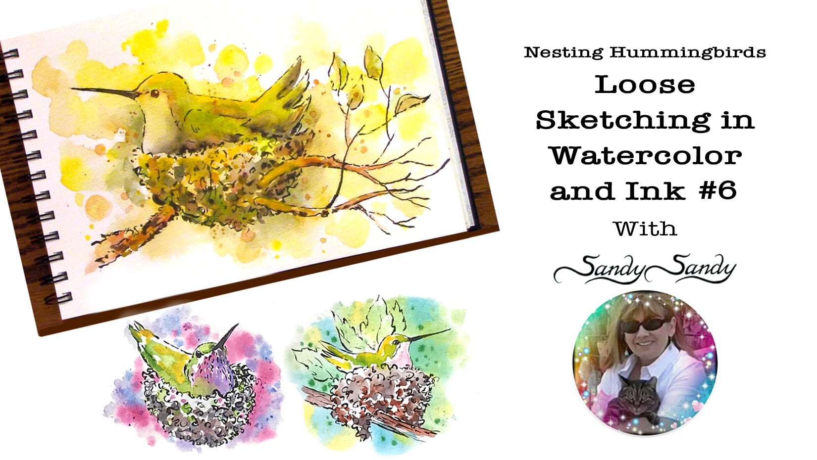
2. Reference: Today we're just going to
do a single hummingbird. I gave you some grid drawings. Practice with the grid
drawings first because it will sort of get you back
into the swing of things. And it will make it
easier when you go to sketch without a grid. I have these two drawings that I'm using for
reference and this, I'm not gonna do it with a grid. But this is the pose
that I have setup in front of me that I'm using
for the gesture of my bird. And I've used this
gesture many, many times. Same pose, done different ways. This is a little
print that I have, and this is a watercolor
actually just on drawing paper. I even use the same pose on my business card and on my logo, on my website with a
little alteration. Also, you can use the same pose by just
changing the tail, changing the wing position, changing the head position. And all of that changes the whole gesture
of your drawing. And it makes it very
easy because you're, each drawing is building
upon the next one.
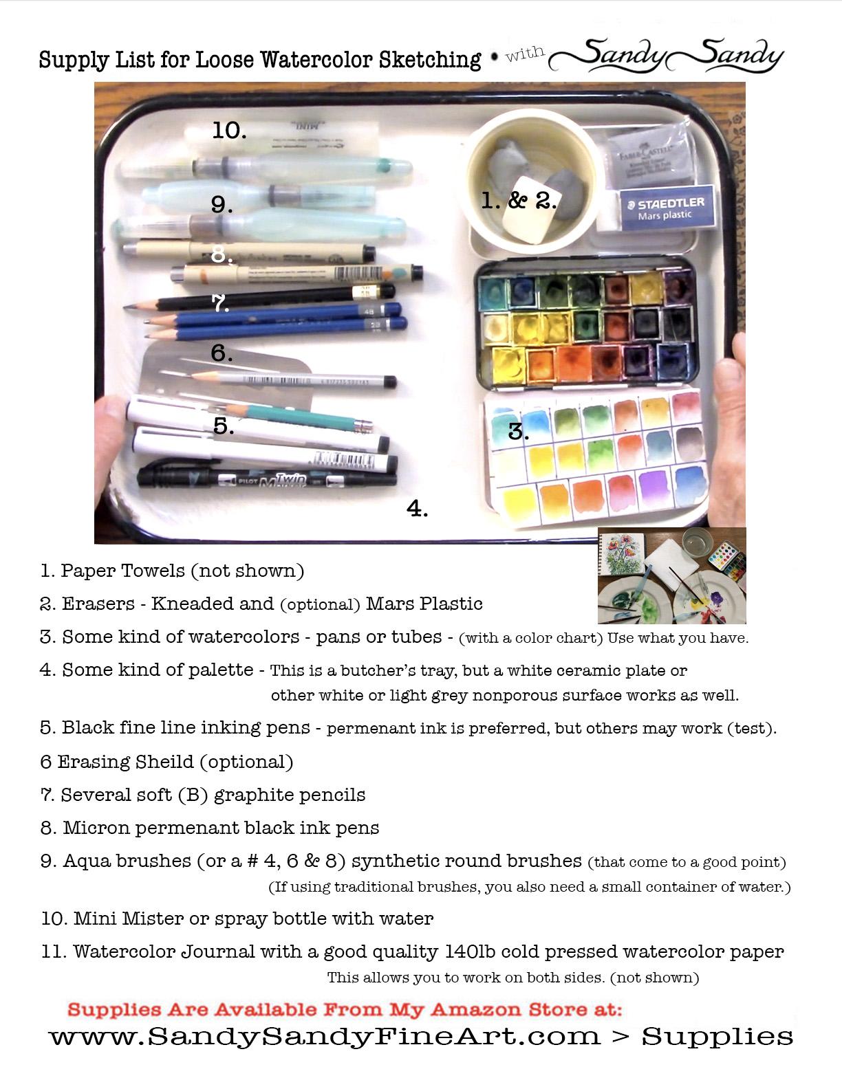
3. Supplies: I wanted to go over the
materials that I'm using. First thing that I want to
mention is about erasers. I like to use a kneaded eraser. Usually when I'm drawing, I have two different brands of kneaded eraser here and they
are not all created equal. This is the fabric Estelle kneaded eraser and I have
that on my Amazon store. And I also had the
Mars plastic eraser. Kneaded eraser is called a kneaded eraser because
you can need it. You can use it like silly putty to get the graphite
out of the eraser. You can use the kneaded eraser
a lot of different ways. You can actually just
dab on a drawing to the light lip or you can go ahead and erase
the whole thing. But when it gets a lot
of graphite on it, you can actually clean
it by just meeting it. Now I have this other
eraser here and I don't know really what brand it is. But as you see, it doesn't pull apart the same
way as the fabric Estelle kneaded eraser leaves
like the sticky film. You can feel it
on your hands and I'm sure it leaves
it on the papers. Well, not all kneaded
erasers are created equal. Now, I usually take
an eraser this size and I break it up into
several smaller erasers. The beauty of the kneaded
eraser is that you can actually mold it into a tiny little shape to get in and lighten or erase
a very small area. Also have erasing shield. When you're doing
pencil drawings and not gonna be erasing
it after you do it. And you just want to lighten a small part or
erase a small part. This shield really comes in handy because you
wouldn't put it on the paper and then you can not disturb the areas around it. So one more thing with
the Mars plastic eraser, because this is, It's kind of a big eraser and you don't
really need it that big. So I usually just use
an exacto knife and cut the eraser and a half
before I start using it. The Mars plastic doesn't leave a lot of debris
on your paper, like some erasers do. And also with the
kneaded eraser, it really doesn't leave
any debris at all. So both of these erasers
are very good to use. I have all my other supplies here and I'm going to keep it simple today and I'm gonna use my little field
artist sketching box. And of course I have a color
chart that I have created. I have one for you, Poe paper and one
for cotton rag. I keep that right in the
palette and it's really handy. These field artists boxes
come with 12 colors. And I added this center row from another cheap set that I got. But you can also fill
these little pants. These are half pans
with tube watercolor. When they get low, you can just put tube watercolor
in there and let it dry. And then you've got
your pants felt backup. That's several
drawing pencils here. I like to use a soft drawing
pencil anywhere from an HB to a Forbes
or even a five KB. Use for sketching. Usually have several sharpened and ready to go where
I start something. I have two micron pens here. I think I have an OH and an O5. I also have two
water-soluble Micron pens. I tried an experiment with the water-soluble Micron
pens, the watercolor paper. I was thinking I could come
back with water and actually move the ink to get a
value online sketch. But it didn't work
out because it just soaked right into the
fibers of the paper. You can use either one
and not have it bleed. I'm going to be using my
awkward brushes today. I've got three different sizes. And it's a good idea to
put your top on the end of your brush so that you don't lose it
while you're working. I have a little mini
MR. And I use that to wet my colors in my palette. Or if I'm working on a big
palette like I am today, this is a butcher's tray. I can wet my pigments
on my palette. Last but not least, I use a good quality wire bound
professional grade cotton read journal with a £140
cold press surface. See more details on the supply list in
the resource section.
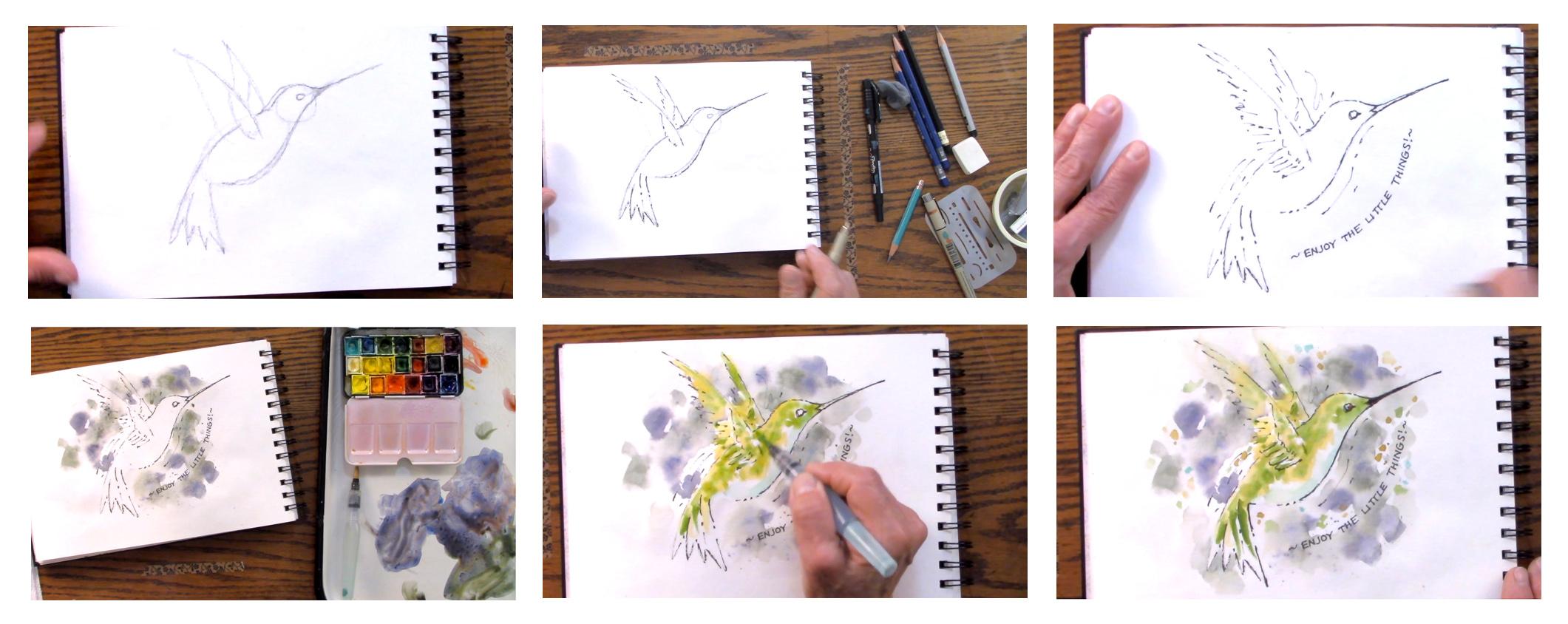
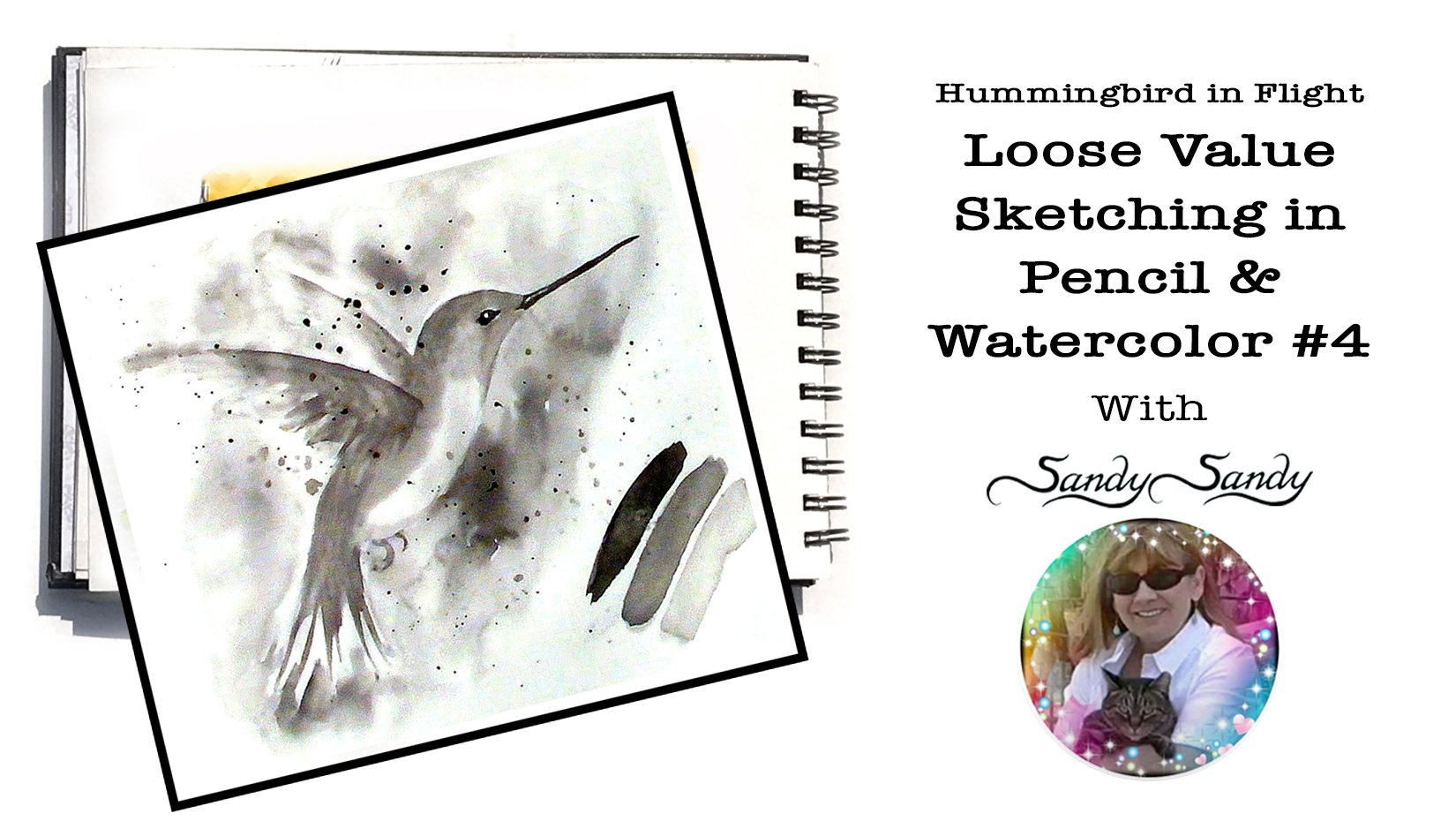
4. Pencil Drawing: If I have just
sharpened my pencil, see that it's very, very sharp. I don't really like it
all that much that sharp. So I would add just
use it and kind of wear down that point so
it isn't quite so sharp. So I'm gonna go ahead
and use one that I've already got worn down here. I start all of my
drawings the same way. I do a very light gesture. And then I turn my pencil and I refine my sketch that way. The first thing I'm gonna do is draw a circle for the head. I'm gonna be drawing darker than I normally do so
that you guys can see it. But I usually do this
first step very, very lightly because
I send draw over it. So I do a circle for the head and then an
oval for the body. I would do line for the beak. I have to decide which direction
I want the head bowing. And the beak determines what direction that
the head would be in. In the statutes going
down a little bit. I think I'm going
to make it go up. Then the tail could be a lot of different
configurations in our drawing here, It's just like a triangle that comes off the bat like this. We're sort of a
modified triangle. Then the wings, the front wing comes in front of the body here. Then the back wing would be on the other
side of the body. That again, it's
just a triangle. That's our basic sketch
or gesture of our bird. I'm gonna go ahead
since you saw it, I'm gonna go ahead and lighten
it up a little bit and I can just take my kneaded eraser and just dab it on the
paper and it will just lightened along without smearing
it or getting rid of it. If you can get into
the habit of just doing a quick gesture first, it really does save
a lot of time and a lot of decision-making
when you can do that. Now I notice on my sketch here the wings are facing
further back, but it doesn't matter if you follow it exactly because
it's still gonna look right. Now I'm coming in with my pencil held like I would
to write my name. And I'm just coming in
here with a sketchy line. See, I'm not just
going like this, I'm feeling my way through it. Come here. Then the top of the
head would be here. Body. You can see the body through the ways because the winds are just
gonna be a blur. Maybe I need to make that body little
bigger down this way. Maybe that needs to go. You can adjust. As you're drawing this, you can adjust and see what you really
want to do with it. Then here, gonna be my tail. The tail doesn't have to
be fanned out like this. The tail can just
come to a point. I is gonna be right in
line with this speed. Okay? I'm going to use
that angle for the beak. And then if you come
straight out here, this is where the
eyes are gonna be.
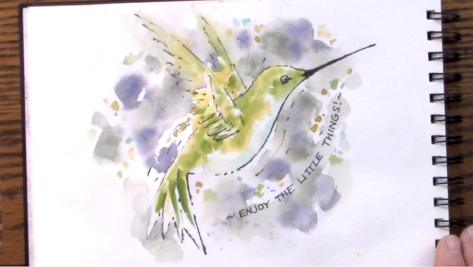
5. Inking: The next thing I'm gonna
do is come in with my pen. I have an O five. You can't really go by the number on the pen because what I've found is
when you start using them, a lot of times the
very fine points end up getting thicker and
I don't know why that is. Maybe the little filament gets bent or something inside of it. But I'm gonna try this 005 and see how thick
it actually is. I like to use a Lost
and Found edge. Vary the thickness of my line
and the more things that you can think of
to vary your line, your color, your edges, the more interesting your
drawing is gonna be, or your sketch or your painting. I'm going to say the light is
coming from the upper left. So that means that my bottom part of the bird
is gonna be in shadow. That means my line is going
to be thicker down here. So I am just sort of
scribbling that line on. I don't like how this writing. I also have a pilot Twin
Marker which I can use. But even the fine point
on this is fairly thick. So I'm going to try the O1. Try to make this line. You can use Lost
and Found edges. You can use a dashed
line here and there. You can actually break
the line so that it's sort of
disappears in spots. Term this great new. Try to make this top one
very thin and very light. But see how it's not. You can tell on the video it's
not really a smooth line. It doesn't have to
be a smooth line. You can vary it. It makes it more interesting
rather than having the same way lying all the
way around your figure. I'm going to try to
make it very light. I'm gonna skip it right there. I'm not even gonna have
a line right there. Skip it. Here. Maybe come in
with a thicker line. For variation. Here, you're gonna see that body through those
wings a little bit there. Here. The wings are blurry
when there are flights. So maybe a you don't have
to do all of the lines just sort of indicate little
bit of that wing. If you can get used the angle of your hand to draw this wing, can use the curve
a little longer. As I've mentioned before, hummingbirds are all
individuals and you don't have to worry too much about proportions because
they vary so much. Don't be afraid to change
the position or the length, the length of the body, the width of the body in
relation to the head. All those things vary
greatly with hummingbirds. And there's also so
many different kinds of hummingbirds here with the wing, this part comes in
front of the body. The feathers that are near the body are perpendicular
to the top of that wing. But as they come
up, they fan out. And then I usually
with my hummingbirds, I'll do some kind of action line here to show the movement. Say, make it look like it's in flight. And the beak like this. It's good to start the beat kind of thin and then if you need to, you can always go in and
thicken it up a little bit. A little bit towards
the front of center.
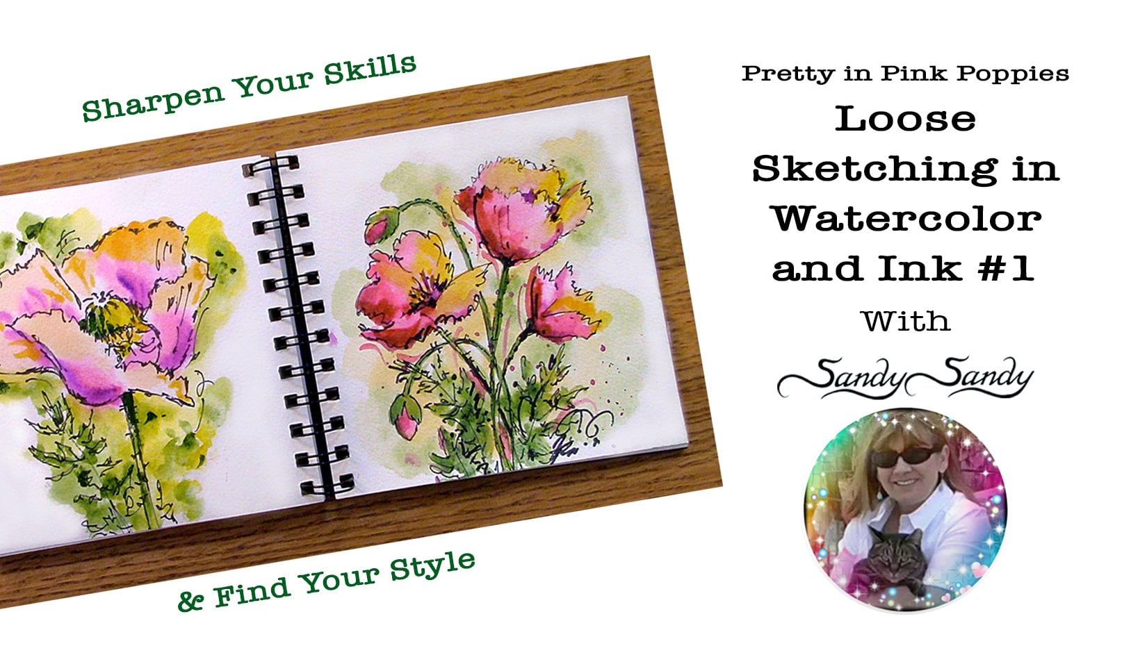
6. Lettering: One thing that I did
want to show you today is that you can do lettering in your journal
pretty easily and I added a page of hand lettering. And how you would do that? How do I go about that is usually usually I
do it afterwards, but I'm gonna go ahead
and show it to you now. I'm gonna say they'll
follow this line here. Just draw a line and then
another line close to it. You can practice this
hand lettering on a piece of graph paper
works really well. I'm gonna say enjoy. These are just block
letters and they have no letters that go above
or below the line. I'm just gonna say Enjoy. When you have a T or a
couple of repeat letters, you can just join them together. You don't have to
leave a big space. Little things. It's just basically
all uppercase letters. They're just done
in a block style. They don't come above
or below the line. I'm gonna go ahead and
use this micron pen. This could be a
little bit thicker. This way I can erase
everything all at once. If you have nice handwriting, you could just hand
write it you want to. But this is a nice way. If you're doing a journal, say you're traveling and you want to put the
name of the place. Or if you have something
in my little notes, you can just write them in with these block letters and add some interests to
your journal entry. And it gives you a
little bit more variety to your pieces. Would just be like that. And you can add little
embellishments to do a few doodles or whatever. Then I just take
my kneaded eraser and just erase my pencil line. I might come back after
I put watercolor on this thick and some of my
lines add some more lines. There's no set in stone
formula for this. But I find I like to put the ink on before the watercolor. You wouldn't have to. But the thing is, then your pencil lines are gonna
be set on your paper. You're not gonna be able
to erase them if you do the watercolor before
you do your ink work. But that's enough for now. No, I'm gonna get my
watercolors ready.
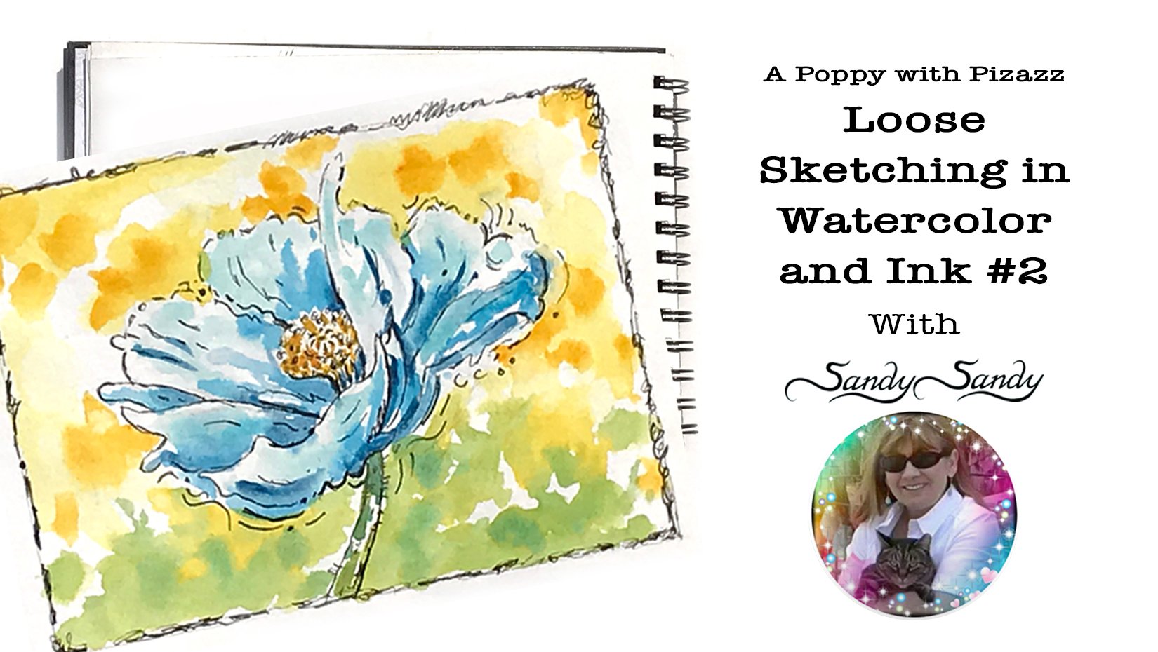
7. Planning: I spread my paints, but they're drying
up pretty quickly. I'm going to do that again. Now I'm going to be playing with some different techniques. With the watercolor too. You could actually
just do a sketch like this and then do
random patches of color behind the hummingbird that wouldn't have to follow
your line or anything. Not paying attention to the
borders of your drawing. I like to do my colors sort
of out of register anyway. I think it makes it look more spontaneous and more playful. And that's what I'm
going for my sketches. The last thing I want
my sketches to be as tight and look too formal. I want it to be a very
informal looking piece. To use these aqua brushes, all you need to do is squeeze them a little bit to get
some of the water out. I'm just making sure that
they're clean first. So you can do it either way. You can do your background first or you could do
your failure first. I think today I'm gonna go ahead and do my
background first. But a male warmer colors come forward and cool colors recede. But you don't have to get
that complicated with it. In a sketch. You can experiment
with your sketches. You can try different
color combinations. You could do the same drawing or sketch and try it
several different ways, like I basically did here. This is the same exact posts
that we're doing here. And I tried it with
some different colors. I also just tried
it just in pencil. So don't be afraid to experiment with your colors and
with your techniques. I think what I'm gonna
do is background first and I'm just
coming in here, I'm squeezing my brush
to get some water. I don't omit. We'll put some water
down on my paper. I'm going to go right over
the wings here because those, that part is going
to be translucent. Coming right over the beak. I'm gonna make a grayish color. Taking some blue. Gonna take a little orange. Blue and orange are compliments. They're going to
grade each other out. I used one brush for the orange and one
brush for the blue. If I only had one brush, I would have to clean my brush before I dipped
it into the other color. So I'm just gonna take a little bit of that
blue there is blue on my brush and add
it to this orange. Now if I was to add orange to the blue because it's
the lighter color, I would have to
add a whole lot of that orange to make
a gray to that blue. But since the blue
is a darker color, I only need to add a little bit. I only added what was
on the brush already. It's kind of a greenish gray, which I like because
that's okay. But if I wanted to
make that grayer, maybe what I'll do is I'll
have two different grays. Here's a greenish gray. I can come in here with
my orange brush and because it's very
similar to red, I can just put a
little bit of red on it and add that over here. See what happens now
that's too much red. I have a pink and green. I need to add some more blue. Now let's kind of go in purple. Now I have sort of a
brown, brown, and green. I'm going to add some more blue. Some more orange or red. Little bit. Still warm, very warm. Blue. That's where the color
I was going for, just a sort of a purplish
gray. Right now. I'm going to use that. None. I'm going to come over
here to this blue. What two different
colors of gray? I don't want I don't
really care what they are, but I would like to different colors so that I
can mix them on the paper. Just a little bit of
that orangeish color. They look pretty
close, don't they? Add a little green to that? I have a greenish gray, purplish gray, and we're
just gonna go with fat.
8. Background: Looking at my paper
in the light, I see it's pretty dry. Brush. Dirty it up. All my brushes. Brush. Display, squeezing it
on my paper towel. Come back in here and
re-wet some of this. I want some hard lines. I want some soft
lines where it's wet, it's going to be soft
and where it's dry, it's gonna be harder. Come in with this
greenish color first. All the time I'm
thinking variation. I want variety in
color and shape. I want, I want as much
variety as I can think of. I also want to reserve
some of my whitespace. Coming in with my
bluish gray color, purplish gray, where it is. Even going to splatter
a little bit. Take my paper towel and protect some of the areas
that I don't want splatter. I didn't cover up this
because I can just come back and blot it off. That should come right off. Just a little damp little
water on my paper towel. Just take that off. I'm just going to let
that dry a little bit. You can actually make it look like splatter if you
wanted to come in and add a little bit of
dots with your brush. Like here, I don't
like the way that color is only on one
side of the beak. So I'm going to come in with a little bit more value
and bring it through. You don't want to stop things in a spot that isn't
to your advantage. I want to lighten up
some of these areas. You can come in with a paper
towel while it's still damp. If I did this right away, when I first put the color down, it would almost
remove all of it. But I've let it sit for a
while now and it's actually soaked into the
fibers of the paper. Got to clean my brushes. I'm coming in and just with the paper towel
just squeezing. Now if you're working
at home like this, you can actually
have a container of water and that will help you
clean your brushes faster. You can just dip your brush
into your container of water. Swish it around the way you
would with a normal brush. And I'm going to clean
up my palette here.
9. Painting the Bird: I'm gonna go ahead and add some yellow highlights
to this hummingbird. Taking some yellow ocher color. They don't want it
to be real bright. I don't think maybe I do. Taking some yellow
ocher and some of this cadmium yellow,
just very bright. I have a couple of different
colors of yellow here. I'm going to use my other brush and pick up a couple of
different colors of green. I have more than I have
this olivine type green. And then I have a real
bright green here. I'm going to get both
of those greens. It's real bright one. Almost got it. So bright. Olivine color. Then, just because
I loved the color. I'm going to take
some turquoise. Just have to try to
be playful with it. Doesn't have to be a field studying like an Audubon study. I have a couple of
different colors of yellow. I've got a couple of
different colors of green, and I've got some turquoise. But you can make your
hummingbird any color you want. I'm gonna come in here
with some of this yellow. And some of us should be
fairly wet yet damp anyway, it's not completely wet. I took some of that bright
yellow and then I'm gonna come in with some
of that yellow ocher, which is a little bit more
of a brownish yellow. Then I'm gonna come in
here, clean my brush. So I just had more clean water. And I said my light's
coming from the upper left, so that means the
top of the bird here is going to be lighter. So I'm gonna go ahead and use
that yellowish color here, the top bird here. And now I'm going to add some
green into this wing here. Come back with my yellow and
blend it in a few spots. Try to leave some whitespace. Green, I think I'm going
to use this yellow brush. Just pick up some green with
my yellow brush and add some indication of
some feathers here. Just some little dots here. Appear. Darker strokes. For the wings. This is gonna be in shadow. So I'm going to bring
in this turquoise color that I have underneath the blend that a little bit little bit more
green, greenish blue.
10. Final Details: I want to incorporate some of that color into
the outside area. I'm going to clean my
brush a little bit. Cleaning it, just dabbing
it on my paper towel, coming back and
picking up some of that yellow ocher color. Whatever you do to one
part of the painting, make sure that you mirror it or repeat it in different
parts of the painting. When you see a painting
that seems this united, it's usually because they have one color appear
one color down here, something else over here, and they have it carried it
through the entire piece. It's always good to repeat. I tell this story all the time about when I took the tone
couch workshop and he said, if you had 30 people in a
room and everybody tour, they're painting into
four equal parts and threw them into a pile. You should be able to
pick out your pieces from that pile of 120 pieces. Because you should repeat your colors throughout
your piece. I don't really have to
put the green in two. Because if I was to tear
this in four parts, I think I've got pretty much
all the colors throughout, but I'm just trying
to make a point here. Now. Also, I don't want all my dots, all my patches of color, the same size, the same shape. Its variety. Variety is what makes
your piece interesting. Very everything that
you can think of. The only thing really
left to do as the eye. Now I could come in with
some brown watercolor or I could just fill
that in with my pen. I'm going to put a little dot
of that blue in there too. Blues, kind of bright and it looks like a
reflection in the eye. I'm going to add a few
of these little dots to just around the piece. Don't space them out
like polka dots. Cluster them, put two
or three together, and then two or three
somewhere else. One could be big, one could be small. I wish I hadn't gotten rid of all my background
color because I like to put a little bit of background color down in here. Take some blue and a
little bit of orange. Maybe not the same exact color, but just wanted to outline that channel
just a little bit there. I'm just coming back in with some water and softening that. Maybe a little more
blue into that. I'm going to come in
with a little bit of brown like this burnt
sienna color right here. Just a tiny little bit
of brown in the eye. And I can just come
in with the pen. This is the pilot twin
marker and it has a thick and thin and I'm using
the thicker end right now. But as I get up into
the small part here, switch to the pointer end. So now I have to decide if I want to add some more line work. I think under here
where it's in shadow. I'd like to thicken up some of that line to make it look a little bit more
like it's in shadow. I'm not connecting all my lines, leaving it sketchy, looking, trying to be playful with it. I'm not trying to
connect all the dots. I find that when you leave some things to the
viewer's imagination, they get more involved in the piece and come back. You want to remove
some of the pigment? Appear. If I wanted to blur these wings out a
little bit more, I can just come in
with some water. Just remove a
little bit of that. Look like it's blending into the background
a little bit more. I try to stay loose with it. I tend to want to tighten up so it's more of a challenge
for me to stay loose with it.
11. Closing Thoughts: Repeat the same drawing
as many times as you can, because it takes 12
to 20 repetitions to become proficient
at something. Just think how a
musician or an athlete practices the same
movement over and over. Do the same sketch, but reverse it, change
the colors or line work. How you make your
marks and use color. We'll define your style and
set you apart visually. Experiment with curved
and angular lines, varying the width,
length, and texture. Play with your colors, edges, intensity, temperature,
contrast, and value. I like to work in series and examine the things in
nature that I love. Working in a series will
accelerate your artistic growth. Exploring your interests
as a basis for your artwork will help give your artwork a specific
direction and focus. This will allow you
to use your voice as an artist to develop
your own style. Searching, exploring, and
refining variations of the same theme uncovers hidden nuances with
layers of possibilities. Do quicker pieces. Instead of obsessing over
getting something perfect. Try taking 30 or fewer
seconds to draw gestures. Aim to get the underlying
form an idea of your subject matter rather than drawing the minute details. Thank you so much
for joining me here. I hope you enjoyed
this demonstration. I'm really looking forward to
seeing what you do with it. I hope you find inspiration and creativity and making mistakes
to be your good friends. Happy creating everyone. Thanks again. In bye-bye.
 Sandy Sandy, Learn.Love.Create with SandySandyArt