Transcripts
1. Introduction: Hi everybody. I graduated from art
college with a degree in illustration and
painting 45 years ago. And have been in the
art field ever since. I've been teaching online
for more than a decade and have been conducting
in-person classes for more than double that. I strive to inspire
students showing the house and explaining the
whys behind the principles, techniques, and
the spirit of art. I believe the drawing
is an important skill needed for sharpening many
abilities as an artist, learning to draw is
learning how to really see. My husband Jerry and I
live on a small spread. We call the Santa Rosa in the
pine barrens of New Jersey. It's a place called tabernacle on the edge of
the Wharton state forest. Although we share our home
with prestigious birds, such as Hawks, owls, and an occasional eagle. My favorite among them
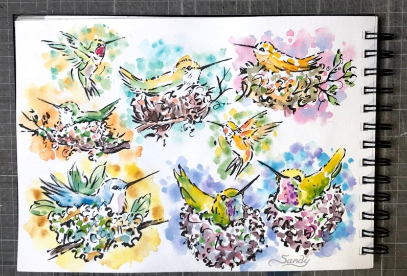
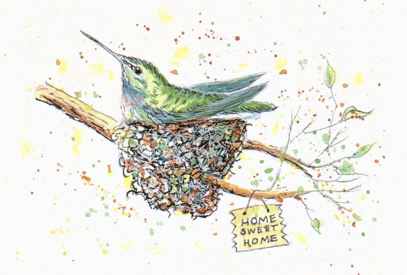
are the hummingbirds that we get in droves
every spring and summer. I like to work in series and examine the things in
nature that I love. What do you love? Exploring your interests
as a basis for your artwork will help give your artwork a specific
direction and focus. This will allow you
to use your voice as an artist to develop
your own style. In this class, I'm going
to show you a fun, loose technique for sketching
in watercolor and ink. I'm gonna be using
the same materials as in my other watercolor
sketching lessons. Here, you'll get lots of
supplemental material. I've included photo reference, drawing exercises and more. Follow along with my
step-by-step tutorials. Stay loose, have fun, and enjoy the process. Don't worry about
making mistakes. That's how we learn. A sketch book is a great
way to gather ideas, experiment, and make mistakes. You don't have to show
everyone your sketches. Do it for yourself and for your own improvement
and enjoyment. He practicing,
experimenting, growing, and adding new skills
to your toolbox. Don't think too much
about making art that fits with your
specific style. Instead, just let your ability
and art evolve naturally.
2. Training Exercises: Under resources, you'll find training exercises
for sharpening your drawing and seeing muscles. The two I practice regularly, our gesture drawing
and blind contour. Gestures are the foundation for almost all of my sketches. In this segment, I
show you how to start doing two-minute
gestures from life. This exercise will improve
your skills quickly because we process 2D and
3D reference differently. I've got my subject tier
setup, roughly eye level. You don't want to be looking way down at your subject
all the time. So I like to try to get my little figurines
about eye level. I'm using the aes ti,
simple interval timer. You can download it onto
your phone or your iPad. I have mindset at 12
sets of two minutes. The action is two minutes and
the break is ten seconds. And all I have to
do is touch this. Let's go. And you can set it up
for any intervals I find two-minute gestures
are very good to do. And ten seconds is enough to turn your subject
a quarter of a turn. Each time the buzzer goes off, the bell goes off. You want to sketch
for two minutes. When it goes off again, turn it another quarter turn. So each two minutes.
3. Supplies: I'm gonna be using the same materials as in my other watercolor
sketching lessons. I like to use a kneaded eraser. Usually when I'm drawing. I have all my other
supplies here. And I'm going to keep it simple today
and I'm going to use my little field
artist sketching box. And of course I have a color
chart that I have created. I have one for you, Paul paper and one
for cotton rag. I keep that right in the
palette and it's really handy. These field artists boxes
come with 12 colors, and I added the center row
from another set that I got. But you can also fill
these little pens. These are half pans
with tube watercolor. When they get low, you can just put tube watercolor
in there and let it dry. And then you've got your
pants filled backup. I've got several
drawing pencils here. I like to use a soft
drawing pencil. And anywhere from an HB, two A4 B, or even a 5-bit. Use for sketching. Usually have several sharpened and ready to go where
I start something, I have two micron pens here. I think I have an
O1 and an O five. I also have two
water-soluble Micron pens. I'm gonna be using my
aqua brush just today. I've got three different sizes. And it's a good idea to
put your top on the end of your brush so that you don't lose it
while you're working. And I have a little
mini MR. And I use that to wet my colors in my palette. Or if I'm working on bid
palette like I am today, this is a butcher's tray. I can wet my pigments
on my palette. I have a couple of different sized brushes and I
really loved these brushes. They're not expensive brushes, but the rounds really
come to a good point. And also the bristles
are short, very springy. The ebony splendor know this is an eight and this is a six. But they come to
such a nice point that you can use them
for very fine work. I do have one new item, the Pentel pocket brush. Well, I can use it on
this piece right here. And I really like it. And then I did two more sketches in this other
sketchbook that I have. The only thing I've found
with this is that it takes a lot longer for it
to dry than the micron pen. And when I went back
with my kneaded eraser, I did smudge it some. And I had waited awhile. I didn't go right in. So I just wanted
to let you know, be careful about that. And really, if you
do get one of these, let it dry thoroughly
before you go back and try to erase it. And also one other thing I found out now this is
just drawing paper. I use the ink brush first. But because this paper is not as absorbent as
watercolor paper, when I put the water on, it did bleed the Inca
little bit right in here. It was gray. It wasn't anything major, but it's just something to note that on a drawing type paper, you may get a little bit
of bleed with the ink. This one is a sketchpad and
this one is a drawing pad. So the same type, it's stress more, but this
paper will not take a wash. It's too thin. In fact, you can
even see through it. But if I know I'm not
going to put a wash on it, I often just use the sketch pad. And last but not least, I use a good-quality wire bound
professional grade cotton read journal with a £140
cold press surface. See more details on the supply list in
the resource section.
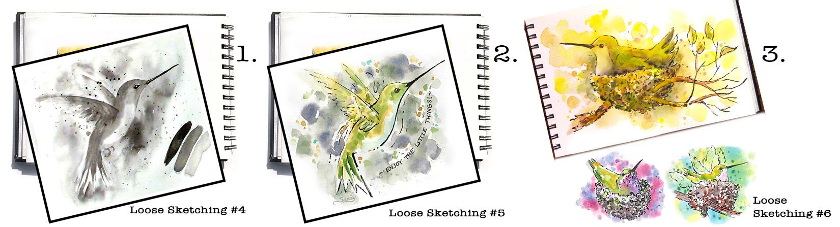
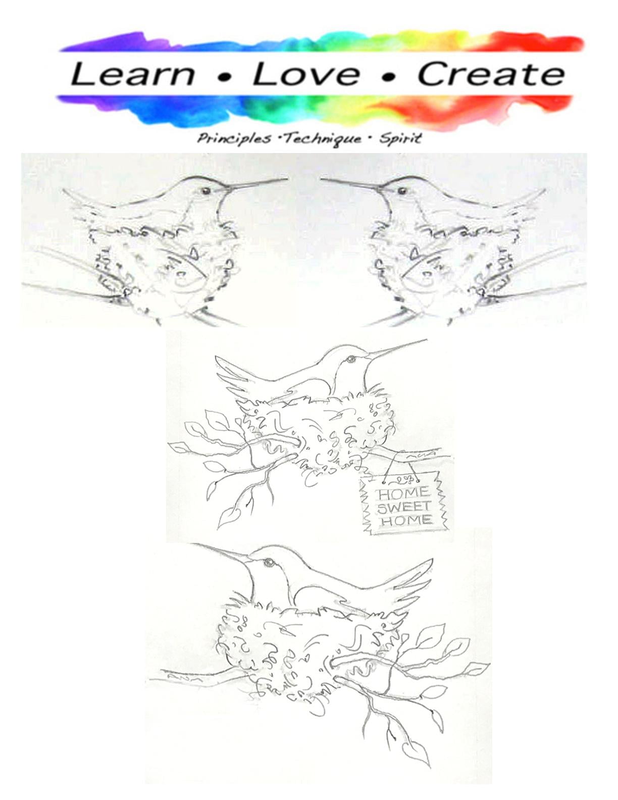
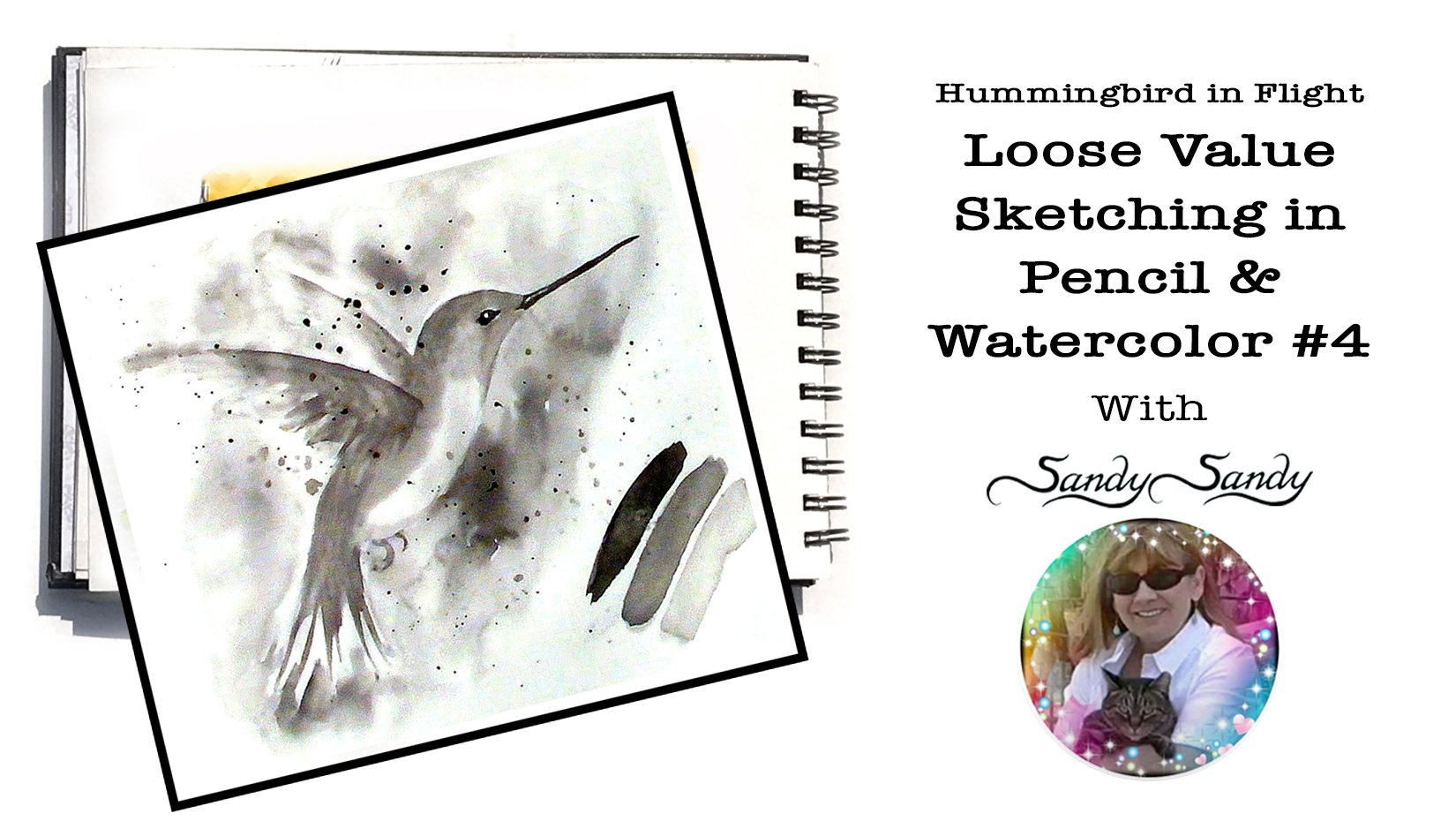
4. Pencil Sketch - Bird #1: I'm just going to go ahead and sketch it in the way I
would normally do it. And that is just to use my pencil like a
wan to start out, I use the simple shapes that are gonna be underneath and
I'm going to draw a darker, so it will show up here. I'm going to draw
my simple shapes. First, my head. And you don't have to, this is so simple the shape that you really wouldn't
have to do that. Do it without
drawing that shape. But I pretty much
everything that way. I draw simple shapes. And then I build my drawing
on those simple shapes. Unless I'm doing a grid drawing. And in that case, I would just be
copying the shapes in each square of my grid here than on the beak
is kind of going up a little bit on my reference. This is just a cup shape here, so I'm just going to rough
in that simple shape. When you're doing it
draws light as you can. It looks very light, but I'm drawing pretty dark. You can see it there. Now. I think I want to make
the head a little bigger. Now, turning my
pencil to do this, don't always have to use your pencil like a wand
when you're drawing. If you don't want to, it's totally up to you. But I would suggest
if you're not using your pencil like a wan, to then do a sketchy line. As you're moving along. Don't just try to
do one single line. Feel your way around
as you're doing it. My bird sitting a little
bit higher out of the nest than I
have in my sketch. That's okay. Does it have to be exactly
like what I have here? I want you to kinda do
your own thing with it. Not even really looking
at it all that closely. I'm just drawing
in some branches. I always tried to criss-cross some of the branches
because if you don't, it just it looks pasted on. And you can kind of
go out and then come back a little bit out and
come back and then go up. Here. If I wanna do another one, say here up and then come off, it just looks more natural
than all the branches coming off the very
top of the twig. I think that's probably
enough branches. Then I just usually do
the traditional leaf. You can make it any kind
of leaf that you want to. I tried to remember too, make some of the
leaves aside view. So maybe you would,
you would see something more like that. Some of the branches
can be bear. You don't have to put leaves on every single branch either. Here it would be
thicker and then here something comes off of it. So maybe that would be
part of that branch. Doesn't have to get as
complicated as this, but I'm just giving you some pointers for anytime
you're drawing trees. Here on the NES, there's all kinds of little
calligraphy like strokes. You don't have to really put
those in with the pencil because they're easy enough
to draw with the pen. So I'm not going to draw those.
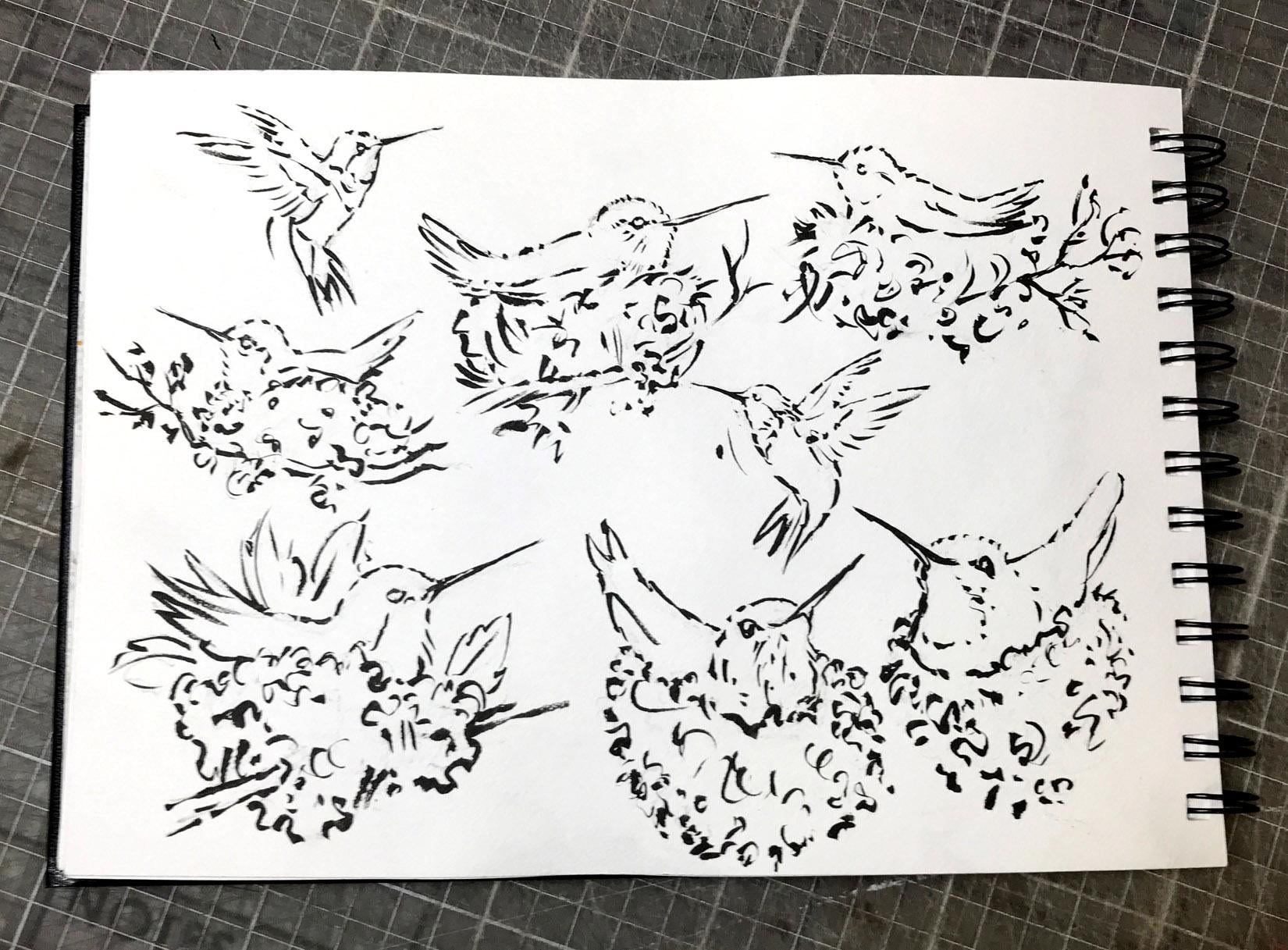
5. Inking - Bird #1: Now I'm going to come
in with this brush pen. If you're real soft with it and using it more on the point, you get a very, very fine line, just like you would
with a brush. Because it really is a brush. It's got plastic bristles
like the aqua brush. What I'm going to do
up here is try to make my line really,
really fine. You don't have one of these yet. Just use your micron pen
or your pilot twin marker. And you're just
going to have to go over your lines where you
want to thicken them up. When I'm doing ink work, I'm trying to think where
my light's coming from. I'm going to say
that the light's coming from the upper left here. And I'm going to make the underside of
things a thicker line. And the top part of things
will be a thinner line. And again, just like if
you're using a regular pen, you want to try to remember
to vary your lines. The more variety you
put into your sketch, the more interesting
it's going to be. This actually is a
time-saver, this brush. And I did put it on
our class supply list. It doesn't dry as quick
as the micron Mel, what I should've done in hindsight is I should've
started over here on the left and worked my
way down across the page so that I don't smear it because I can still
see it's shiny. So I'm going to just
grab a paper towel here and put it right on top. And I'm going to
start over here. So this is going to be lit. So I don't want a
real thick line. They're here on the beak. I want to keep it. Then at the end. See how I'm trying to skip
my line a little bit, make it a little bit more interesting than just
a straight line. Be kinda comes up into a V-shape and it
points to the eye. So I'm really barely even
touching it for this part, put the pen at less of an angle. When you have your
pen like this, it's going to give
you a thicker line. If you have it more upright, you can get a thinner
stroke with it. I can always put
more ink work in, but you can always take it out. So now I get to do the nest, all kinds of different
squiggly lines. And so I'm trying
to get a variety of thick and thin
different strokes. Maybe some of them are
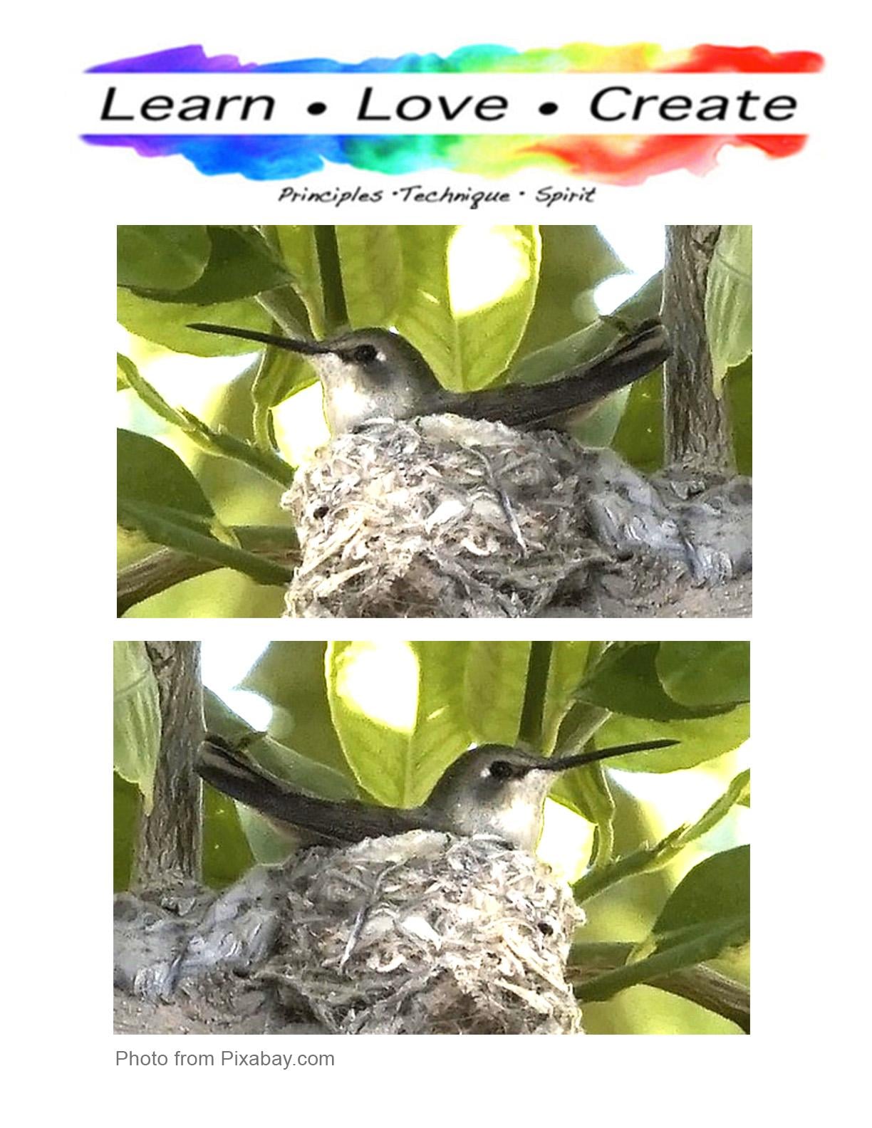
pretty straight and big. Some of them would be curvy. That other image, that front
arm view of the bird in the nest had a
pretty good close-up of that nest as far
as the texture. Almost looks like
a jigsaw puzzle. In a way, there's different
colors and different shapes. Of course they're all organic. So most of them are curved
rather than Angular. You don't see a lot of
angular lines in nature. In general. Just going to turn this here. This will make the
curve much easier for me because I'm using
the curve of my wrist. You don't really have to do it, but it makes it easier
in anytime you can do something that
makes your job easier, why not do it? This is going to
cross over that. I think that's enough. I have a little bit down
here that I didn't finish.
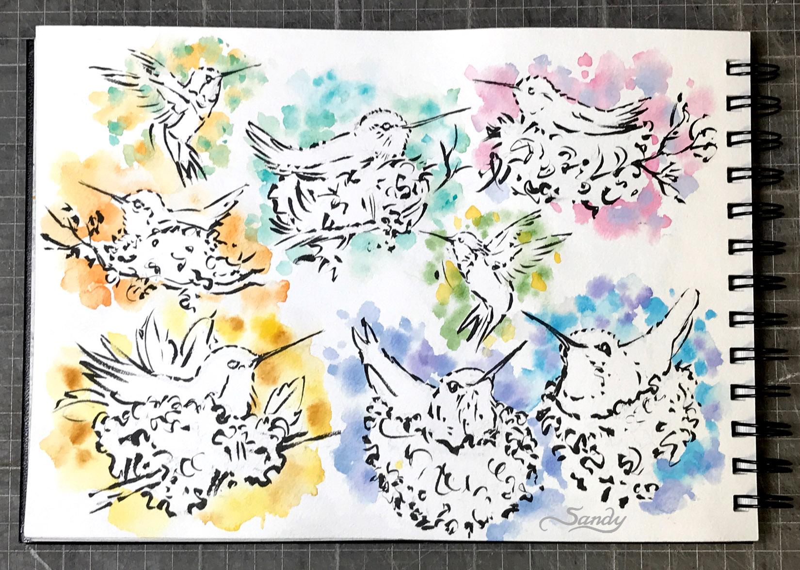
6. Painting the Background - Bird #1: You can erase by just
dabbing the paper. If you're unsure if your
piece is completely dry, That's maybe a safer bet. I like a diagonal
flow to my pieces. This one doesn't really
have a diagonal flow. It's horrible horizontal. But I could add more of a diagonal flow with my
pigment if I want to. You don't have to
make it diagonal. But a diagonal flow
usually will be more dynamic and more interesting than a horizontal or vertical. I'm just going to come in
with some yellows and golds. Maybe I should test it
first and see what I like. I can just make some shapes. Most of them are hard edge. I wanted to go with this. Then I need another color
that's close to it. So we're going to try
the cadmium yellow, which is a lot brighter. But I tried to get some
variation inside the shape. And then right before it dries, you can come back with
your damp brush and you can soften your
edge just in spots. Say I wanted to
soften it in there. Just come in and
kind of tickle it to get that soft edge there. Tick lit maybe over here, not all over the place, but just in a few spots. I wanted to go with
a diagonal flow. Picking up some yellow ocher. I'm going to put,
since the yellow ocher is a darker yellow
or brown in it, I'm going to put that
color towards the bottom. And then I'm going to come back with this brighter yellow. With that more towards the top. Different size dots. Little bit of a
lighter yellow fears come in there with a little
bit of this yellow ocher.
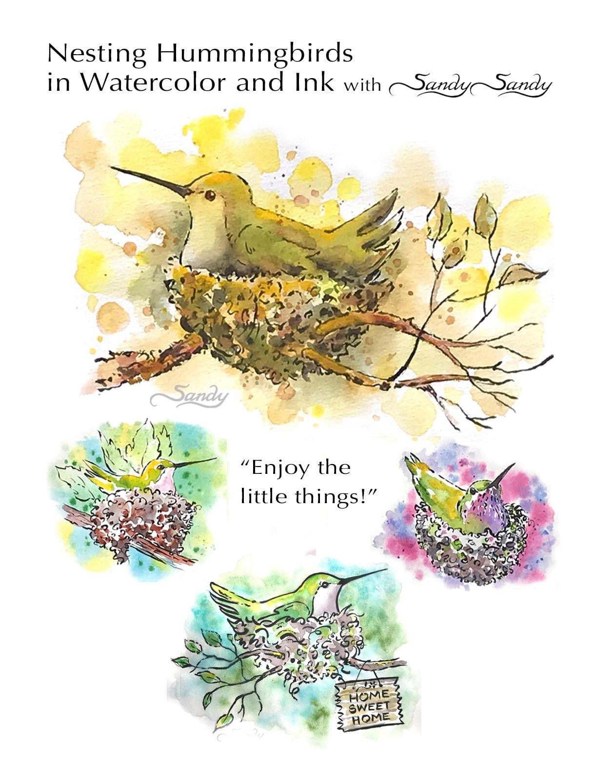
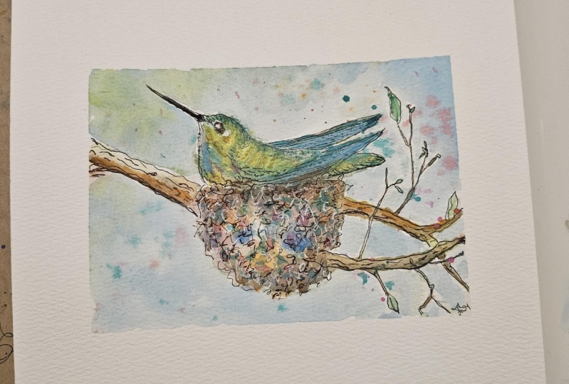
7. Painting the Bird & Nest - Bird #1: Now I'm going to add some
value to my artwork. First I'm going to wet the
background of my bird. Looking at it in
the light to see where it might still be dry. Then I'm gonna come in
with some brighter yellow. Put it up here at the top, and then come in with some green below it and let it blend. Come in with a
little bit of black. And add a little bit
of value down in here. Adding a little bit
over on this side, I said the light was coming
from the upper left. So that means that
the right side and the underside is going
to be in shadow. More of that bright yellow up here on the top of the nest. And then some more of that
grayish color on the bottom. More of that green down here. Carry that through. Common in with some more
of the brown color. Add a little value
to the branches. A little bit of water to
blend that in a little bit. Little bit of that brown
color to in the nest. Be a little bit in the bird, just in a couple of spots, in the leaves, just to
add some variation. May be a little
bit of this brown. I will come in with some of that black and
add that to the beak. Little bit more of that
black down in here. Just to add a little
bit more depth, a little bit more green value here. On this side. Whatever you do to one spot, you got to continue it
somewhere else in the painting. So now I'm coming back with damp brush and just
blending that a little bit. Maybe soften this
a little bit here. Add just a little bit more. Here when they're leaving
some hard and softening some. It'd be a little
bit of yellow to make the sprint stand out. Alright, they're just going to finish this off
with a little bit of splatter using that
yellow ocher color that I used for the background. Adding a little bit of brown
to make it a little darker. Maybe a couple of little
bigger dots and that color lighten that up by just
dabbing it a little bit.
8. Painting the Background - Bird #2: The first thing I'm
going to do is add some water to this. Want to make sure that you can
see a sheen on your paper. You can dip it in the
water and squeeze it. But I got a little on the tail. I'm going right over the leaves. You want? I'm just gonna do
a soft background. Like a more of a
pastel, a background. It's going to be green and blue, so I don't have to
worry about the leaves. You can just go over it. And I'm going to put some
of this blue color here. I have some blue here. And since I have
extra aqua brushes, I'm going to use one for blue. I'm going to use one
for some yellow. And I'm going to use
one for some green. I'm going to start
with the blue. I have to make sure that it's
still shiny in it really isn't drawing up
pretty quickly here. So I'm gonna come back
in with the brush. You want to make sure
that your background, especially on the drawing paper, you don't want to
put a lot of water on and you can always
expand it out. So just basically start
next to your figure. So wet all around your figure and you don't have
to bring it out too much. And then you can come back
and add some more water on the very outside before
you bring your pigment. And I don't have the
image in front of me. I don't know if it has this branch coming
through it like this, but you can improvise. It doesn't have to be
exactly like the picture. And I'm just going
to come in here and add some blue all
around the painting. Very soft. And this technique works pretty good on the
drawing paper as well. So I think that
little yellow first, so I'm going to add a
little yellow to that. But I'm coming all
around the whole piece. Remember the story I
told you last week, and I know the people who
take large classes with me. I've heard it a 100 times about. You want to repeat
your color throughout all the areas of your painting because it
will make it more of a unit. I'm adding a little bit of yellow to my green
because it looks a bit overpowering compared
to the other color. So again, I'm going to leave some whitespace just
in a few spots. I'm going in with
more of just that darker green now I know the front of my bird
is going to be white. So I want to come in
with more value here, where the front of the
bird is going to be. Maybe the front of the nest
here is going to be light to maybe back here. By the nest, I'm going
to add some more green. But I think I pretty much
have the color all around. Now, one thing here
where I have the beak. You want to make sure you run
that color over the beak. Because as I said, when I did the video of
the hummingbird in grays, you don't want to
stop your color right on top of the beak because then it's
going to look strange. I'm going to try
splatter in it here with my aqua brush just
to see how it goes. See when a cover up
this other part. Go to try. Probably have to put
some more pigment on it. So I'm getting some more
of that darker green. So hopefully it will show up. You don't want it down there. Okay, Well, it doesn't work real great with the aqua brush. So you could actually
come in and add some dots with the brush if, if that's all you
have your somewhere and all you have is
your uncle brushes. You could come in and add
a little bit of texture. With that tip of that brush. Try not to make
them all the same size and all of the same
value and all that. Maybe if we blocked the
feral and don't squeeze it, I can get a little bit No. I was thinking I could get
a little smaller dots. But because it's wet, it's bleeding out. That's okay. It's a sketch, not meant
to be a masterpiece. It's an exercise basically. That's the beauty of
having a sketch book, is that it's yours. You don't have to
worry about what am I gonna do with all
these paintings? Just do it for yourself.
9. Painting the Bird & Nest- Bird #2: I'm here with some
bright yellow. Bright compared to
the background. More saturated, the color is
more saturated for the nest, I think I'm going to use
some brighter brown color, like a burnt sienna, kinda dotting it in there. And then some add some black to that for
different color brown. We're value in the center of interests than in
the background. Here. Just going to blend a
little bit of that color up into the part where the
light would be hitting it. So it's a lighter value
of these other colors. Then branch back. Here. You're going to have
a little bit of a shadow under her chin. Going to add some
pink into that. That's all I'm gonna
do on that one.
10. Painting the Background - Bird #3: Got red, pink and the purple, mixing them together
like a rose color. Usually I start out
with a color and then I would mix another
color with it. And you want to go with
an analogous color. And that means that it's close to the other color
on the color wheel. You don't want to put
too much contrast into your background. You don't want to go with
complements in your background because I like to keep my background colors
more in the background. When you bring in complements
in your background, it's going to make
all those colors seem much more important because when you put complimentary colors
next to each other, they brighten each other
so they're going to compete with your
center of interest, which is your bird. What I like to do is a more subdued background and
it doesn't have to be cool. Like this is more of
a cool background. This one is going to be
more of a warm background. I think I want to
add some blue to it to cool it down a little bit. So I'm just going
to come in here to this darker blue color
and make a pile of that. And then I'll leave
that separate. But I can mix it on my painting. Okay, so now I have to go
in and wet my background. And you're using
these in your studio. Having water here does speed up the process
because you can clean your brush a lot faster by
dipping into your water. I'm squeezing and wedding it. From here just makes
it go a little faster. I'm looking at the sheen
to see where I've been. And it really does
help to work on these and assembly line fashion, even if it's just two at a time. Because now see,
while I'm waiting for this to dry from
work on this one, I'm looking at it
in a light to see where there might
need more water, where it needs to be
sopped up a little bit. It looks like it's pulling
up just a little bit here. So you can do this on the drawing paper
to just go in with your paper towel and just
dab it in a few spots here. Coming in. Trying to make my shapes, my color, masses, different
sizes, different shapes. If I add some dots, I want them to be different sizes and
different distances apart so they don't
look like poke it off. Some, adding some of
the blue to the pink to get a purplish color because
I want to transition. I said I was going to mix it on the paper and I am going
to do some of that. But I also want sort of an intermediate color color
that's a little bit of both. Leaving some white space. If you get too much on, just come in, dab it
with your paper towel. That's pretty wet over here. And I can see there's spots
where it's kinda pulling up. It's very forgiving. If you get too much in one spot, just go back with
your paper towel. Like I said over here. The paper I don't know
if you could tell, but it's kind of
Boeing downwards. And so the water is accumulating
over here on this side. Got too much water. Just come back and
dab it a little bit. You can control your water
amount in your brush a little better with a regular
brush because I could then drive a fair love. My brush, and my brush would
become a thirsty brush. And it's going to
actually pick up water. It's hard to pick up water
with the aqua brush. At least I find it. So with this dry brush, now, dry brush is really damp. It's really not completely dry. It's drier than my paper. So see here, I can come in
and pick up some pigment on. My brush is acting like
a sponge over here. It's too wet to get
a darker value. So it probably be a good idea
to have a regular brush in your sketching kits
so that if you're somewhere and you wanted to use a damp brush to
pull out some water, you'd be able to I'm just coming in here with
this bluish purplish color. Now here where the
paper was dry, I have really dark splatter. So you can just come in with some water kind of
feather that out. Or you could come in with your paper towel
and blot it here. Maybe these Somalis,
I don't want so dark.
11. Painting the Bird & Nest - Bird #3: This one, I said I
was going to maybe make it a purple Gore get, I'm going to do the nest first. Blue into that. Good. In contrast, they wouldn't necessarily
look like this in real life. But this doesn't have
to look like real life. Guess I'll make her
green just so that it stands out from the
rest of the piece. Yellow to this top part. As it goes down into the nest, it, it would be
darker under here. Maybe I'll carry that
green a little bit through in the nest a little bit so that I carry that color
through the whole piece. The only thing left to do
on her as the dark beat. And I could come
back with my pen. I wanted to when it's dry, ran into that wet
part right there.
12. Closing Thoughts: Thanks for sticking around. I just wanted to show you
some different ways that you can change up your sketches. You don't always have to
do them the same way. It's really good to experiment. They don't always turn out, but mistakes are
your best friends, so don't be afraid to
make some mistakes. Practice makes it easier. The more you try
different things and the more you do this, the easier it will be. So thanks so much for joining
me and for following along. I really appreciate it. I hope you enjoyed this lesson. I hope you'll give it a try. I'll be creating Bye-bye.
 Sandy Sandy, Learn.Love.Create with SandySandyArt