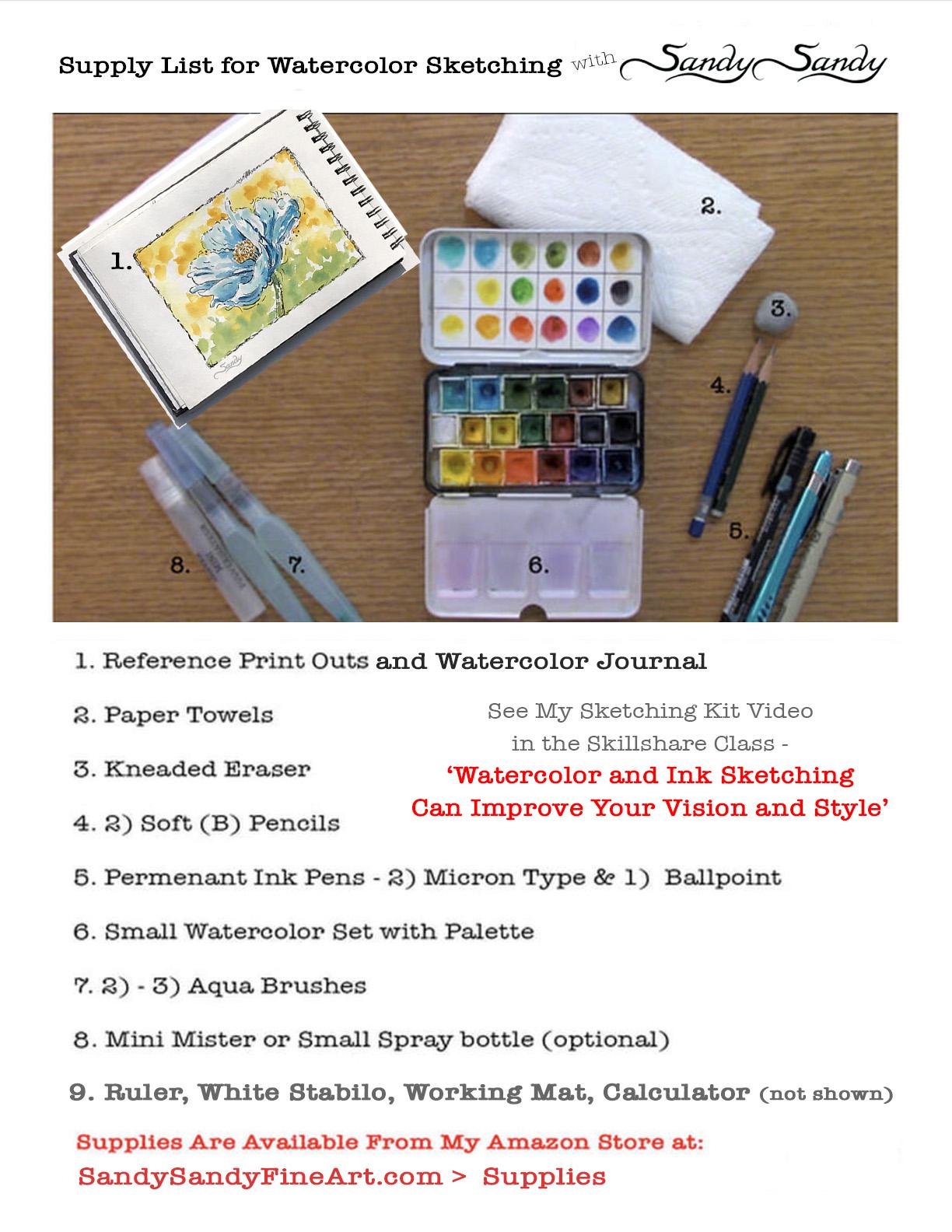
Transcripts
1. Introduction: I'm Sandy. Sandy. And yes, in case you're wondering, that is my real name. I'm a full-time artist online and in-person instructor from Southern New Jersey, USA. I've been painting in watercolor for over 40 years. Now. I've been teaching people of all ages the principals, techniques and the spirit of art. This class includes photo reference class project examples, grid worksheets, and supply list downloads. I include grid drawings in many of my classes. I'll show you how to put a grid on your reference material. I encourage students to stay loose and see big shapes first. And the grid will help you to see details and relationships more accurately. Various options for transferring your drawing will be discussed and demonstrated. The ink work will be done in a fun, playful, spontaneous manner. Lively watercolor is applied to render the form. The importance of value is discussed and demonstrated. Along with painting techniques. Thoughts on color selection, complements chroma, edges, shapes and texture are addressed. Come join me and create an expressive Poppy with pencil, watercolor, and ink. It's lots of fun and easier than you think. Okay.
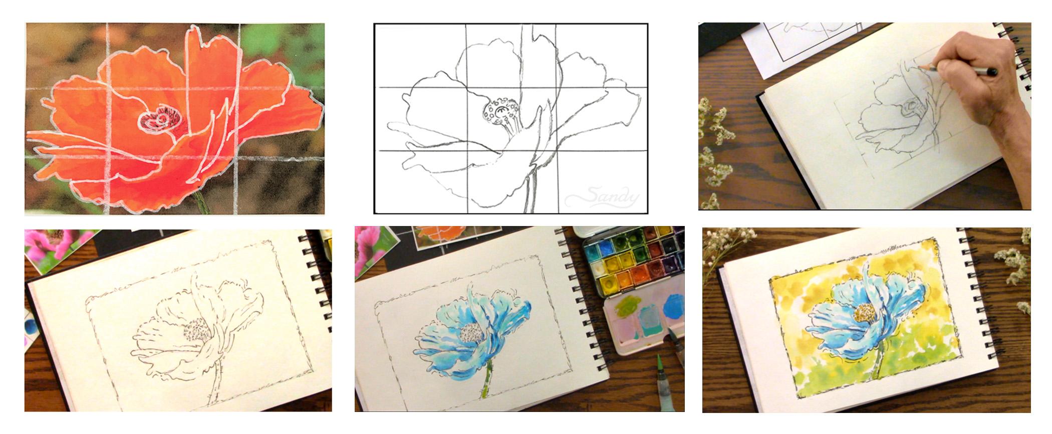
2. Grids: Now if you want to put a grid on your reference, you're going to need a calculator if your math challenge, like, I am, this image is about 33 quarters little less. I can actually round this off to 3.5 by about two and three-quarters. I'm going to round that off to 2.5. So again, this is like a two to three ratio. I'm going to come up here on my calculator on my phone. And I'm going to put 3.5 divided by three is 1.16. That would be about 11 eighth inch in increments of three. And what I generally do is start from each end and then if the middle is a little off, I don't worry about it too much. I usually let the equal parts beyond either end. And then the middle can be a little bit off. So I'm going to go one and an eighth inch in. And then I'm going to see what it is for the other side. This time, instead of using the Posca pen, I'm using a white stuff below. And I'm going to come in here and it's a little over 3.5. So I'm just going to divide that distance, just going to come in a little bit from each side. So I'm going to come one and an eighth here. And come in one and an eighth over here. Same thing on the top. One and an eighth. One and an eighth. You're basically just breaking each side down into three somewhat equal parts. So our short side is 2.5. So 2.5 divided by three is 0.83. So we know that's a little bit bigger than three quarters. So I'm going to make it seven eighths. So I'm going to come down from the top seven eighths, or down from the top 7, 8. And up from the bottom 7, eighth. This one's a little off and need to come there. Okay, So then all I do is I come in here and connect my lines. So you can use a white stuff below like this. Or you can use a cost the pen or white gel pen. Or if your images light enough, you could even use a black pen, a ballpoint pen or whatever. Just have to find something that's going to show up on your piece. Well, that's off. So let me see what I did here. What that's 78. Okay. I went too far. You can tell when you start to connect your lines if you've made a mistake. So I need to come back over here and connect those two lines. Now I have my grid and I'm just going to copy off the shapes within this grid.
3. Pencil Drawing: I've got my eraser and my pencil here. Then the first thing I'm gonna do is I'm going to hold my pencil like a wand and I'm just going to come in here and tried to map out the big overall shape of this, just looking at big shapes and where those shapes intersect our grid. So now we're going to go and hold my pencil like I would to write my name. And I'm going to look at negative shapes first here. To start up here, we see this, this shape right in here. Looking at the shapes and I'm seeing that this line comes right out of where that intersects. So and it doesn't come down very far. And then this almost touches the slowing, but it comes down like this center. And then this line, this comes out a little bit more. Slowing, is almost just below just above that. That comes up all the way. Going to bring that in just a little bit. And I broke that out a little bit. Like I said before, you know, exaggerate. Especially with an organic shape like this. You don't have to stick exactly with the photo. This was a building or a person's face. Then you would have to really stick to your reference. But with flowers, trees, that kind of thing, you have more artistic license to change it around and make it a little bit more interesting, are a little more appealing like right here. I'm making that come up and curve a little more than it actually does in the photo. So then I would either trace this off using my light tablet or a window. I think it's an easier way to transfer on paper then using transfer paper. But it's totally up to you. If you wanted to do this flower on black paper, you would need to use white transfer paper, white graphite paper. And if you wanted to do it on a white or a light colored paper, you need to use black graphite paper or gray. All we really need here is a stem like, like to see a stem coming in here. Make it wide enough. You don't want this fourth thing to topple over from a very thin stem. You know, your stems always going to be in relation to your center. You don't want to make your stem over here, like directly down, kinda have to follow the curve of the flower and place your stem according to where the center of the flower is.
4. Transferring: I'm going to use one of my smaller working mats to draw this in my watercolor journal. You can do it from the grid or you can try it free hand. The grid does help you to see the shapes a lot better. So if you're new to this, go ahead and use the downloadable grids that I have for the eight by 10 mat and draw on your paper that way. Hey, I'm going to use a little bit of a smaller opening. This is for the five by seven MET and the opening is 33 quarter by 53 quarter. This is a 4.5 by 6.5. But I'm going to show you how you can visually gail you're drawing using a working man. So I'm just going to draw the outline of this mat lightly in my journal here. And I'm going to put little tick marks in pencil where those grid lines occur. So I've got a light pencil sketch and I've got indications of where my grid lines would be. Holding my pencil like a wand. I'm going to roughly put in my lines very lightly trying to get down the big shapes first. So there's my overall shape. And then here if I come over here, this line here, like you can add in a little light line if you want, you can draw the whole grid, especially the first time you draw a certain flower or subject, use the grid if you want to be more accurate and you want to start seeing shapes better, just use the grid. You can, I could have drawn this in and I could have put this down and used a ruler to connect those lines very lightly. Okay, I think I have enough of a background, outline, shape. And now I'm going to start coming in with my pencil held, like I would write my name and I'm going to start refining the shapes a little bit more. But don't run a think of what I'm doing as drawing petals. I want to think of it as just shapes. So and I'm looking at both my drawing and my reference as I'm doing this.
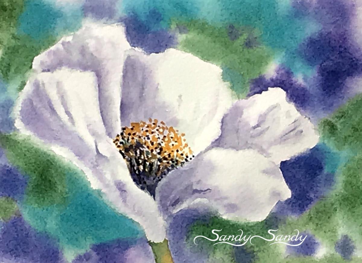
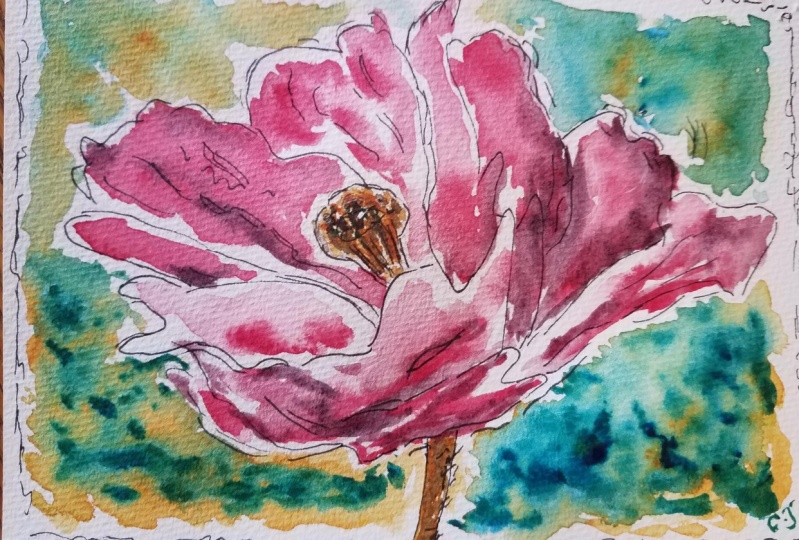
5. Inking: Hey, I'm coming in with the micron O2 and I'm going to try to keep my lines sketchy and I'm just coming in and filling in my outline here. But I'm not using a continuous line, it's a Lost and Found line. As I said, I'm trying to remain sketchy with this. It's in my sketchbook. And I want to stay loose and playful with it. Sometimes I do a double line, sometimes I might go out of the line and just fill in the details of this flower in a playful, sketchy manner. Sort of improvising because from this photo you really can't see what's going on in that center too much. But what I have learned about poppies is that there are so many varieties of poppies out there and so many different types centers that the sky's the limit. I mean, get creative with it and don't worry about it not looking like the photograph, because drawing should be an invention. It should be something different from your reference. You should be tried to use your imagination and your creativity to create something that's more than just a photograph. It's got more personality and it's got more life to it that a photograph and it becomes part of your artistic voice because the way you do it is going to be different from the way I do it. And that's the way it should be. You don't want to try to copy somebody else's style or the way they do something you want to try to find your own way. You're only take what you see others do, but tried to do it in your own way. This is a time for you to shine. This is a time for you to have fun with it. And this doesn't have those little hairy things, but I'm going to draw a few on here. Okay. I think I'm going to go ahead and erase everything. And so I'm just coming in with my kneaded eraser and just erasing my pencil lines. I want to put a border around this. They don't want to make it so tight. So I'm going to come in and just lightly go around the outside of this little met just to give myself a boundary here. And that'll just going to come in with my micron pen and finish bringing this down. And up here, I'm just going to make this really playful. So brakes and the line, some double Lloyd, some thicker, some thinner. Just playing the sketch and it should be fun. Yes, it's an exercise to improve your skills. But there's nothing that says you can't have fun doing it. Just loosely following the outline, breaking the line and spots. But getting online.
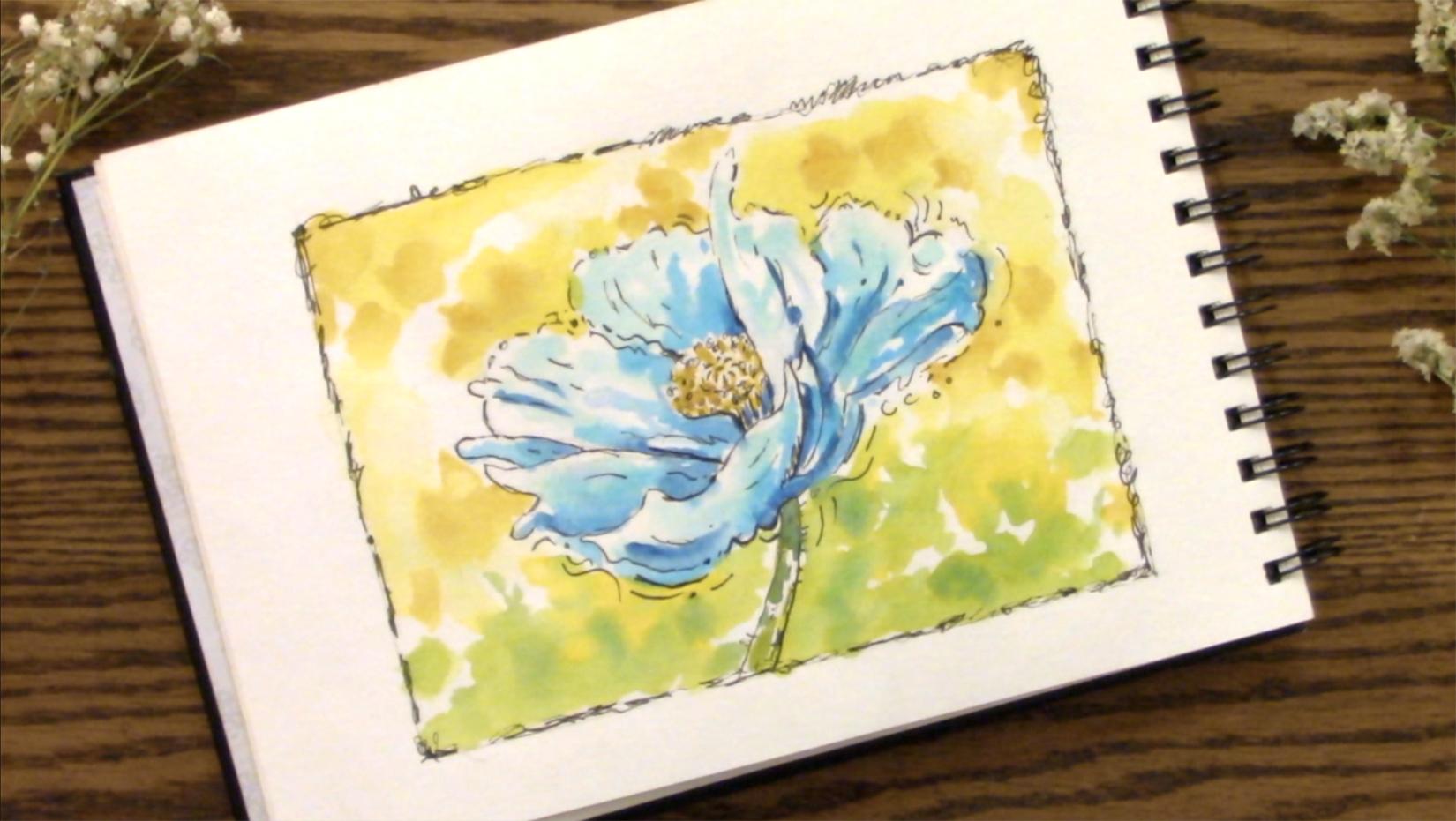
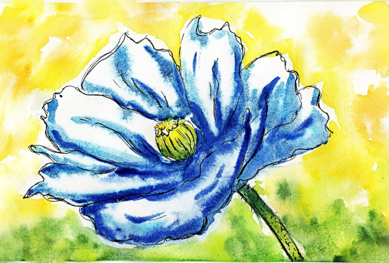
6. Painting • Flower: I think I'm going to make this one blue just for the sake of variety. And I'm going to have the light coming from the upper left this time. And I'm going to start wetting some of these areas with clean water for you. Pick up any pigment and leave some whitespace showing. It'll be real meticulous about it. Just tear in there. Then I'm going to come in with my turquoise color and add a little bit of lightness up here, where the light is going to be hitting it, leaving some white space at the edge. Being very loose with it. It's just a sketch, doesn't have to be something that you're worried about. Your just tried to exercise your skills. Okay. So that was all done with my turquoise color. That color is a Winsor and Newton color and I got it extra and added it to my little travel palette. The travel palette came with 12 colors and the center part is empty, so I added some more half pans from some other sets into it. Plus I got this turquoise because it's my favorite color and I just needed to have it. I'm going to take this other blue, this darker blue. It's a blue with more red in it. You can see next to the turquoise, It's more purplish. So I'm going to come here and I'm going to start putting that blue in where I think it would be more away from the light, where the light is not hitting it as strongly as it would be in these upper parts. Down in here, it's going to be darker, where it's away from the light. Down in here, underneath and on the right side, it's going to be darker. Maybe. I need to go out of the line a little bit here. So I just come in and go out of the line that's called going out of register. It will help your piece to appear or spontaneous and playful. Ok. Now what other color can I put? That would be even a little darker. Well, I have another blue according to my color chart, I've used these two blues and now I'm going to come in and use this blue, which is a darker value. So I'm using all separate OCO brushes here, but you can just use the same brush. And you really wouldn't even have to clean it because we're going from light to dark. I mean, you should clean it, but you don't have to be that meticulous about it because they're all blues, so they're going to blend together. Darker blue. Down in here. Remember, watercolor will dry back about 30 percent lighter. Send you want to really beef up your color while it's wet. Try to think. How is that going to look when it dries? Mean maybe do with just a couple of darker lines. With this dark color. Down in here too. It's going to have some dark where that center is deep down in that in the folds of those petals. See how quick that was. Very playful and very quick. So we're going to come in with some yellow and just put it here on my palette. And then I'm just going to touch it with this blue brush. And now I've got green. I'm going to add a little more blue to this underside where it's going to be darker.
7. Painting • Background: I'm thinking my background, I want to make orange, orange and yellow because that's the complement of blue. So I do want some green down in this part does to sort of suggest that There's some foliage down in that part. So I'm going to take a clean brush. I'm cleaning it on my paper towel, just squeezing it a little bit until it looks clean. And then I just come up here and just squeeze out a little bit of water as I sort of tickle this page here. And I want to leave some white spots for variety. We don't want it all to be soft. We want some hard edges for contrast. Okay? Now I'm going to pick up some yellow papers drawing up really quickly today. No, I did spritz my palette before I started. Just going to skip around here with this yellow, blending it with more water to lighten it. Were picked just picking it up full strength to add more contrast in a more value to it. Hi, Now we're going to come back in with a little bit of this blue. Go back into my yellow and do some green down in here. A little bit more blue. I'm just going in and adding the blue right into that wet pigment. Just suggesting a little bit of greenery down here. Letting it blend on the page song. Remember to look at your shapes. You don't want all the same size and all the same shape in all the same color. The more variety you can put into this, the more interesting it's going to be, the longer people are going to want to look at it, because it's going to hold their attention. Okay, now in this top part up here, I'm cleaning my brush now. I want to go with something orangeish colors. So I'm going to pick up my yellow again and add a little of this light orange color. My paper's pretty dry. It's drying up pretty quickly on me. Probably have to come back in with some clear water. Okay. So now I'm cleaning my brush and I'm just going to tickle some of these edges where it looks a little bit too hard edge, but picked up some green over there. So at blot that off of my brush. Maybe I want to connect few of these spots. Maybe a little yellow up here and spot there couple of hard edge colors. I think that's all I'm going to do to that. And then I'm going to come in with that same yellow color at the very top of this. Blue. And I'm trying to leave some whitespace here too. And then I'm going to come in with a little of that orange color further down into the front, this center. And I think that's all I'm going to do to this one. I like it. It's nice and fresh and spontaneous. Wait until this dries up a little bit and then I'll come back and thicken up a few of these ink lines.
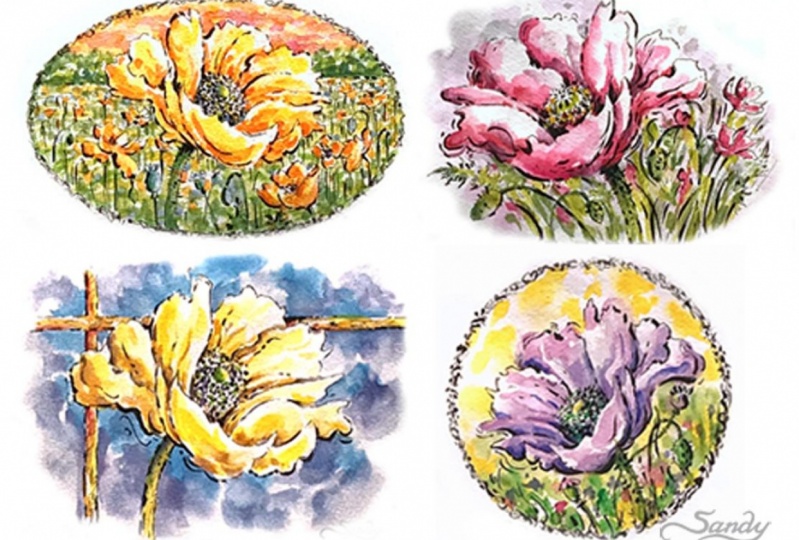
8. Final Details: Okay, the watercolor is all dry. I'm going to come in and finish this up with an 05 micron pen. It's a little bit thicker than the one that I did the initial line work with. I'm just going to jazz it up a little bit in just a few spots. Going to start by adding some darker lines to the side. That's in shadow. Lights coming from the upper left. So the right side and the underside is going to be more in shadow. Just accentuating the line work a little bit more. Now, when you go fast, you get a thinner line. So even though this is an 05, I can't get a fairly thin line with it by going quickly, by using the pen in a very quick stroke. Scribble little bit here and there. Add a little bit more depth to the center. And I never really did DTO, this top part here. But, uh, kinda like the way it is, so I'm not going to mess with that. Where would the shadows be in this? Tried to still stay playful. I don't want to tighten up on it. Then I'm just going to come up here and scribble a little bit more on this border. Just tear and they're leaving against the Lost and Found. Adjust. The water doesn't have to come all the way across. You can leave some spots where it doesn't connect, like gray here, doesn't connect there. Hello. And I like how the outline of this flower in a few spots. I've totally not connected it alone like that. I don't want to overdo it. So I'm going to call this one done. Just a fun little sketch, don't in my watercolor sketchbook with watercolor paper and using my aqua brushes and my little travel palette. Repeat the same drawing as many times Kn, because it takes 12 to 20 repetitions to become proficient at something. See how many poppy sketches you can create out of the photo reference I've provided. Do the same sketch, but reverse it, change the colors or lying or experiment with curved and angular lines. Vary the width, length, and texture. Thanks again for joining me here. Until next time. Happy creating. Bye-bye.
 Sandy Sandy, Learn.Love.Create with SandySandyArt