Transcripts
1. Introduction: If you've been dabbling
in surface pattern design or illustration as a fun
hobby for awhile now, you may be at the
point where you're ready to get serious about it, put a portfolio together, and to start reaching
out to companies. In my experience, this step was a more daunting prospect than learning to make patterns
in the first place. So let's keep things simple and focus on just one baby
step in that process. Sell sheets. My name
is Rebecca Flaherty, and I'm an artist,
content creator and general ran creative type
person based here in the UK. Before 2020, when the
world turned upside down, I was actually a
wedding calligrapher, and surface pattern
design was what I did to relax and have
fun at the weekends. However, when weddings
came to a holt overnight, I used the time off to throw
everything I had into making my dream of living off my surface pattern
designs a reality. Since then, I've had the joy of seeing my designs
come to life on all sorts of products in all sorts of places
around the world. Simple but professional
looking cell sheets are a must if you want to get
started licensing your artwork. When I started out, I made the mistake of thinking
I had to design a whole new cell sheet for every single design or
collection I ever made, which occasionally
took more time than making the piece of
art in the first place. By creating a simple
template that can be easily integrated
into your workflow, you can ditch the
analysis paralysis, get your designs out there in
front of potential clients, and then get back to
working on the next design. The simple cell sheet layouts that I'm going to
teach you to make are the exact same ones I still use in my own online portfolio. If you have a handful
of patterns or illustrations sat on your computer ready for
the world to see, then consider this
class as the next step in your journey to getting
them out there in the world. We'll be starting
with the basics that every cell
sheet should have, as well as a few
optional extras, and then you can
take what you've learned and use it to create your own simple
templates that you can use over and over again. I'll be using Photoshop, but you could use
different software if you're more familiar
with something else. You'll be making a multi
layered template that can be used for patterns
or illustrations, collections or single pieces, showing off your patterns in different color ways
or different scales. Once you have your template, you can use it over
and over again for each new design you create, and I'm also going to show
you how I incorporate it into my overall art making
and sharing workflow. Ready to begin, then
let's get started.
2. Class Project: As you follow along
with this class, you'll be creating your
class project, which is, of course, your very own
self sheet template. Yours can be an exact copy of the sample we'll be
working through in class, or you can let your creativity run world and come up with
something unique to you. I'd love for you to share them in the project gallery with some of your beautiful artwork
applied to the template. I love seeing all your
lovely patterns and illustrations every time
I publish a new class. Please make sure
that you only share a low resolution version of your artwork for
your own protection. I'll teach you how to do
that later in the class. And I strongly suggest
making sure that you hide any sensitive information that might be on the sales sheet, things like your e mail
address or phone number. To upload your class project,
go to the projects tab, and from there, you can submit a project and upload your files. I can't wait to
see what you make.
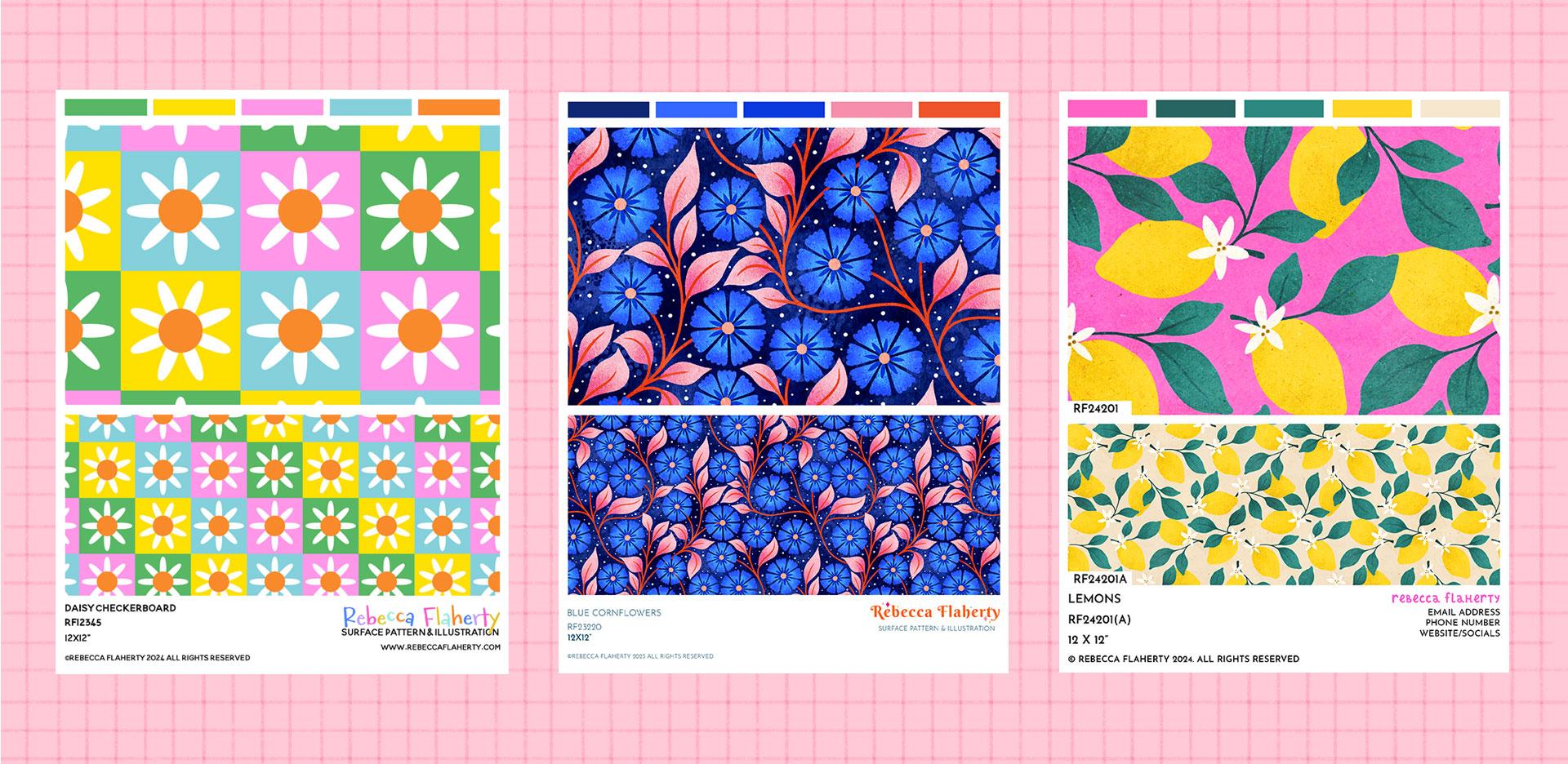
3. What is a Sell Sheet?: So what even is a sell sheet? Think of a sell sheet as a resume for each
piece of art you make. It's a one page information
sheet all about your design that can tell the
potential client all they need to
know at a glance. It should be a standalone
document that needs no further introduction or cover e mail to go with it.
This part is key. And I'm not saying
don't write cover e mails when you send
art work out to clients. That would be a bit weird, not
dmention rude and awkward. But if your cell sheet gets separated from the
original e mail and maybe forwarded onto
someone else in the company or the
cell sheet gets saved, but then the e mail is deleted. If there was some vital piece
of information that was only on the e mail and not
on the cell sheet itself, like the SKU for the
artwork, or worst of all, your name and contact details, how are they ever
going to be able to e mail you back and
tell you they love it? So I'll say that again. A cell sheet is a one
page standalone document that can tell a client all
they need to know at a glance. This is my master
cell sheet document. I've got each different use
case in its own folder. So if I have a single pattern, I'll use this folder
here to apply it. If I have a placement
illustration, I can turn off the pattern group and turn this one on instead. If I have a collection, I
have a folder for that here. And if I have a pattern
and matching illustration, I can use this group. So as you can see, this is a real one size
fits all document. You don't need to have lots of separate files dotted
all over the place, and once this is set up, you can use it over
and over again. There's a lot of
information here, though, so let's have a look at what you actually need to include
on a sale sheet. The basic information
that needs to be on your sale sheet is a good
quality version of the artwork. This doesn't necessarily
mean high as 300 DPI, unless, of course, you're
printing your self sheet. What I mean is that
you don't want it to be so low in resolution or so small on the page that a buyer can barely see
it or appreciate it. It needs to be a high
enough resolution, that your art looks good, but not so high that someone can pirate it if you're
posting it online. This is especially relevant
if you plan to have an open access portfolio
on your website. You can always create
it in high resolution, so you've got the option
of printing and then export a lower resolution
for sharing online, which I'll show you
how to do later. You also need to have the name and or SKU for your artwork. A SKU number is an absolute
essential in my opinion. You can have several designs all called something
fairly similar like, I don't know,
pretty blue floral. But as long as they
each have a unique SKU, then there isn't going
to be any confusion over which design or your
client is referring to. It also makes it super quick and easy to
locate the files on your hard drive if you include
the SKU in the file name. You don't have to
overclicate SKU allocation. I use my initials, RF, then the year I
made the design in, and then I just begin a o
one for the first designer make that year and then O two
for the second and so on. If you have two designs that
are technically the same one like this pattern and the print I made by redrawing a motif, then I would add an A, B, or C to that so that I
can tell them apart, but keep them tagged under
the same main design. A little side lesson here now. The reason I don't class them as two separate designs is if I were to license this one to a client at any level
of exclusivity, I wouldn't be able to
license this one to somebody else because it's
a copy of this design. When you're licensing your work, it's not just other
people copying your artwork that's
copyright infringement. You can actually get
into trouble for copying your own designs too. So that's why I would
count these two as the same design and therefore
give them the same SKU. And then the AB helps me
differentiate between them. You can also use
this if you have the same design in different
color as, for example. I'm the first to
admit that thinking up names for my art is hard, but even I can normally
manage to think of something vaguely creative
sounding for the name, so I will include
that here as well. Your name and contact details. This is arguably the second most important detail to
go on a cell sheet. But in terms of flow,
it feels like it should be more part of the
footer text than the headline. Either way, it's vital
not to leave it off. As I mentioned earlier,
your sales sheets will often get detached
from the original e mail, cover letter, or business card you sent or handed
them out with. If you haven't
included your name and contact details
on that sheet, nobody's going to be able to e mail you and ask to license it. I would say, bare minimum, you want to have your name
and email address on there. You could also put
your phone number on there if that feels
relevant for you. So those things are the bare minimum that should be on there. As you can see, it's
a nice, small list. So if all this is new to you and you're already
feeling overwhelmed, you can just go with
those few details, and you've already
got yourselves a professional cell
sheet ready to use. On the other hand,
there might be a few other things
you want to include, such as the artwork size. You can leave this
off if you want to, but I've learned
from experience that it makes things
easier further down the line if you've
told a client in advance what size
the artwork is. It avoids problems like
them assuming a pattern or illustration is on a larger
scale than it actually is. For example, if
they need to know if that motif is going
to fit their dove cover. So if it's only 6 " square, you might as well
state it up front. None of this forms
a legal contract or anything scary like that. It's just for clients to
see at a glance whether your art is going to fit on the product they
want to use it on. If you have a weird
random sized design, just round it down to
the nearest whole inch or centimeter to keep it simple. However, if you feel
like having the size on there is going to overclicate things or slow it down for you, then feel free to
leave that off. Optional item number two is
a description of the design. Some artists like
to get some kind of introduction or evocative
words to describe their art. I love writing
informational copy, but I absolutely hate
creative writing. Even thinking up like
nice sounding name some way artwork is hard enough. So considering this art
description is optional. Of course, I'm going
to leave it out. However, for you, this might be a step in the process
that you absolutely love. Maybe you even start
your designs this way and come up with this
beautiful description of what feelings
your artwork will evoke before you even
pick up a pencil to draw. And if that's you, then
absolutely include it here. This is how you take these templates and
make them your own. Optional item number
three is a color palette. This, again, is an optional one. A creative director can see from your art what
colors are in it. So there's certainly no need
to list them separately. However, I'll tell you
why I do include it, and then you can decide for yourself whether
you want it or not. So, creative writing
isn't my thing, but color palettes are. I just love seeing
a pretty row of colors lined up at the
top of my cell sheet, and I also find it useful
as a resource for me to look back on and reuse color palettes from
previous designs. It only takes a couple of
seconds extra work with the hydropatol so it's not even really a big
time trade off. Most of all though, I
personally think that it elevates the overall style and aesthetic of the cell sheet. Basically, it just
sparks joy for me. So if you want to include
this, then feel free. But if you feel like
it's a waste of time, then feel free to cut the fluff. Websites and socials. These definitely
aren't necessary. But if you feel like it might be beneficial for someone to check out your online presence and get a feel for who you are, then you might want to
include either one of these. I'd say having both
is possibly overkill, so just stick to
one or the other. Your logo. If you have a logo, then feel free to include it. But if you don't have a logo or brand name figured out yet, don't let that stop you
from getting started on your sales sheets and
building out your portfolio. A type name is just
fine, and in fact, that's what I use online.
A copyright statement. I'm including this in
the optional section because it should
go without saying that the art in your
sale sheet is yours and not for anyone to use unless
they have your permission. However, the reality is that it sadly doesn't
go without saying, so it's best to
include this just so no one can turn around and
say they weren't told. All rights reserved just
means that nobody may use your artwork unless they obtain your permission. Mock ups. These can look nice and help a buyer to visualize
your art on a product, but they definitely
aren't essential. If you're just getting started, you might not actually
have any mock ups to use or even know
how to use one yet. I don't want you to feel
like this is something that means you can't get started
making sales sheets today. I don't use them in mine. Just like with the
color palettes, where I said a creative director doesn't really need you to spell out the colors for them when they're right
there in the design. I also kind of feel like someone who buys
art for their job already has a pretty
good eye for knowing what sort of art will look
good on their products. However, unlike
the color palette, which only takes a few seconds, adding a mock up can take
significantly longer. First of all, you've
got to choose the right mock up
for the product. It's not just a case of
putting one mock up in your sales sheet
template and then using it on every
design you create. Then you'd need to adjust the
scale, position, et cetera, and it can make the
whole process of even making a cell sheet feel too
much to get started with. Remember, this is all about creating a workflow that
allows you to quickly and seamlessly
create a cell sheet as part of your overall
design process. I don't want this to
feel like a bigger task than it needs to be when
you're just getting started. As always, ou, if you love mockups and this isn't going to be come like a paralyzed
by choice stage for you, then by all means, include
them if you want to. Okay, so now we know
what a sale sheet is. Next, we'll look at how and where you can use
your sales sheets. I first started
creating sales sheets. When I decided it
was time to start organizing my grown collection
of work into a portfolio. Before 2020 and all the
life changes it brought, I was actually a wedding
calligrapher and surface pattern design was just a hobby and a tiny
side hustle for me. However, when weddings
came to a holt overnight, I decided to use the time off
to throw everything I had into making my dream of living off my surface pattern
designs a reality. Very first thing I knew I
needed to do was get my artwork organized into a portfolio and ready to show
off to the world. I already knew that cell sheets
were what I needed to get my art onto if I was going to
be sending out to clients. And so I decided to build
a portfolio website where the cell sheets could
look pretty enough to be how I also displayed
my artwork on it. As a quick side note,
I'm already working on a follow up class for
this one to show you how to build a simple
portfolio website to show off your cell sheets,
so stay tuned for that. So as for the how and
where to use a sell sheet, my answer is everywhere. I wanted to build
one template that I could use on my
portfolio website, create PDFs with to pitch to clients and print
if I wanted to put together a physical
document to snail mail or handout and even sharing
on social media. There's no reason
you can't share your sales sheets on Instagram
as long as you remember to remove personal details like e mail address
or phone number, if you don't want to get
spammed by companies promising to grow your Instagram by how of many followers seriously. So now that we know how and where to use a sell
sheet and what it is, in the next lesson,
we'll dive into photoshop and start making one.
4. Document Setup: Before I begin, let me
remind you you can use whatever software you normally work in to set this document up. Photoshop is my
weapon of choice, so that's what I'll be
guiding you through here, and then you can adapt the
steps to suit your software. So before you create
a new document, some things to think about are, will you want to print it? If so, where are you based and what standard paper
sizes are used there. But then where are most of your clients based
might they want to print it and what standard paper sizes might they
want to print in. For me, I was 99% certain I wouldn't want
to print my designs. I don't have any dreams of attending in person trade shows, and I know I'd always be e mailing rather than
snail mailing. But I didn't want to
not be able to print. So I decided to create
the document in 300 DPI, which means I could
print if I wanted to, and then I could just keep it at a fairly small size to keep
the file size manageable. I went for US letter size, which is pretty
much the same size as A four paper here in the UK. I figured that if either got
printed on the wrong paper, this wear around would mean
just a small margin and no important info would
be cut off the sides as opposed to a bigger chunk and then part of
the design being cut off the top and bottom if
I made it on A four paper, and then someone printed
it on US letter paper. The image and text
are nice and clear, and the average file size for a PNG image I've exported like this is about one to 2 megabytes depending on the amount
of colors in the design. You don't want to be
exporting huge images that will make your portfolio
site slow to load. Storage space on
your computer or external hard drive might be
a limiting factor here too. On the other hand, if you like big files and you cannot lie, sorry, that joke will
never get old for me, and you absolutely
know in advance you intend on doing trade
shows in the future, then A three or an equivalent US size might
be better for you. So here in a photoshop, I'm going to create a
document with a width of 8.5 " and a height of 11, and the DPI will choose 300. The next question is, what color profile should
you create this in. This depends on whether you're predominantly creating
this document for print or for sharing online and what color space you
create designs in. I don't want to over
complicate things here, but I also don't want to miss an opportunity to
clarify things, and I don't want to gloss over something that I
know causes a lot of confusion and
uncertainty when you're just getting started
in digital design. So I'm going to
attempt to clarify things without getting too deep. So I create my designs
in RGB because that's the format required for the places I get them printed. Not so long ago, it used to be an almost hard and
fast rule that print work should be in CMYK, and then work only
destined to be used on screen should be in RGB. It's not so clear cut though. These days, modern printers, especially those that print
on demand platforms use, and those specializing in smaller print runs for
things like custom fabric, which is where a lot
of the designs I license to smaller companies
end up being printed. They actually require RGB files. So that's why I work in RGB, unless a specific project
brief dictates otherwise. Top tip learned from
hard experience. If you're doing custom
work for a client, always ask them for their
print specifications before you start working. In terms of this
cell sheet document, if you're most going to
be sharing it online and you work in RGB anyway, then I would create it in RGB. If all of your patterns
and illustrations are already in CMYK because
that's how you work, then you can make this
document in CMY K two. If you work in a mix, then I would create this
cell sheet document in RGB and it will display both types of
artwork just fine, whether they're RGB or CMYK. You can bring CMYK artwork
into an RGB cell sheet, and the colors will
look almost the same. But if you bring RGB artwork
into a CMYK cell sheet. It's probably going
to dull down a lot of your bright colors and it's not really going to look
like you intended it to. If you decide you want
to print something, you can always convert a copy to CMYK later if you need to. So I've got mine in RGB
color at eight bit depth. And for the color profile,
I've got this one here. It's quite a common one to use. So once you've got
all of that, you can go ahead and click Create. Now that we're in this screen, let's make sure that you've got all the different panels that we're going to be using. The main ones that we're
going to be using are the swatches panel here
and the patterns panel. If you don't have those showing, you can go up to window and enable them here from this list. We're also going to need
to enable the rulers because we're going
to be dragging out guidelines from those. So go up to view and go down
to rulers and check that, and then you'll have your
rulers around the edge. And then one last
thing we need to do is make sure we've got
snapping turned on. So again, we're going
to go up to view. And down here where
it says snap, make sure that has
a tick next to it. Now that we have all that
set up in the next lesson, we'll start adding
our text layers.
5. The Text Group: So let's start by adding a layer for our
first line of text. So we'll come down here to this plus icon and
we'll add a layer. Over here to the text tool, and we'll just click down here. And this first line of text is going to be the title for
each piece of artwork. So I'll just type in
artwork name down in here. And then I'm going to in on this so we can see
it a bit better. So let's select this by
double clicking here, and then we have that selected. In terms of size, I wouldn't go any smaller
than 12 point for the vault. You want to keep it
nice and easy to read, especially if you'll be reducing the resolution later
when you export. I keep mine in all caps. I click up here. You can see, I've got all caps toggled there. I have it in capitals because
I don't have to think about which letters I do or don't want to
capitalize each time. I also think it looks more
neatly spaced if it's all in one uniform thing with no ascenders or descenders
making it look uneven. That's just me being
weird and fussy, though. Um, font, I would choose something that's
fairly simple to read. This isn't the place
for fancy script fonts. You just want something
really simple and clear and easy to read. In terms of alignment, I'm going to set it
to left justification because we're going
to have this all like lined up down this side here. And then when we click on this to change the text each time, I don't want to
have to realign it, which is what we
would have to do if we had it on centered. So we want it left justified for this column of text that
we're going to have there. So press escape
to come off that. Vi Zoom it so we can
see the whole page. Press command zero. You can see roughly where I've
got it on the page. Now that that first
line of text is in, I'm going to set up
our first guideline. I want to create a margin all around the edges
of the document. I'm going to go for a
small gap of 50 pixels. You can go for more or less depending on the size
of your document. So we're going to grab the
rectangle select all up here, and then up here
where it says style. We're going to
click on that, and we're going to change
it to fixed size. And then I'm going
to change this to 50 pixels for the width and
50 pixels for the height. And now we can click on the Canvas and
that's going to make a little box that is 50
pixels by 50 pixels. I'm going to Zoom in a bit, and then I'm going
to grab it and snap it into the top left corner
of the document there. Now, up here with the rulers, we can click up here
and drag one down, and that's going to snap to
the bottom edge of it there, and then drag out from here. And now, we've got a nice 50
pixel border round there. And then we can
drag this down into the bottom right corner of the document and do the same
drag a roller down to there. And drug a rule at
eight from that one. And I'm going to press
Command D to deselect. And then you can see we've got our first set of guidelines marking out that nice white
space around the edges. So now, make sure you're
on your text layer, and we're going to press
Command T to transform. And I'm going to drag
this and snap it to the edge of that
guideline there. And then press Enter to set. So we'll get all of these
lines of text in here and then sort out the vertical
distribution afterwards. So now, I'm going to duplicate this layer by
pressing Command J. Then I'm going to double
click the T on this layer. And then on this one, I'm going
to type in my SKU number. I'm actually just
going to type in S K U one, two,
three, four, five. Then I'm going to
grab my move to again and holding down
Command Shift and then press the down
arrow key and just bring this down a little
bit underneath there. And you'll see over
here that as long as you don't try and
rename these layers, If you just double
click the text, whatever you type
in as your text, the layer gets renamed that, so it's nice and easy to
see what is on each layer. So I'm going to duplicate
this one, Command J, and I'm going to press hold
down command shift and the down arrow and bring
that one down a little bit. Double click on
that one. And then this is going to
be our dimensions. So I'll just put 12
by 12 " for this one. In my master document,
I actually have quite a few different versions
of this layer in there. I know that most
of the artwork I create is in a few set sizes, so I just have a
layer for each size, and then I can just
show and hide those as needed without having
to retype it each time. And then last of all
down here on this side, I have my copyright notice. So I'm going to duplicate
this one again. Command J, and then just move that down
to the bottom there. So to get that copyright symbol, you can either have a look in the glyphs panel to
see if it's in there. Select your text. So find
this little symbol there. If you don't have that,
you can go to window, and it's called Glyphs panel. And you can scroll down here
and have a look and see if the font you're
using actually has a copyright symbol,
it might be in here. And then you can just
double tap on that. Or you can open up
Google and type in copyright symbol and
then copy and paste. I'll let you in on one of my nerdy time saving hacks here. I actually have a note pinned in my notes app that has all of these random symbols
by end up needing to use quite often for
on screen graphics. So while I'm editing videos
that use these quite a lot, so keyboard shortcut
keys pop ups, I'll be forever back and
forth copying these. I'll have this notes app open
for copy and pasting rather than having to keep
going to Google or search through the glyphs
and copy and pasting. If you find that when you
paste the symbol in here, you have like a weird box or something similar to
that looking like that. That will be because
the font you've chosen doesn't actually have
a copyright symbol in it. So you can either
choose a different font for either the whole thing, if that's easier or just
that one character there. So now that we have all of
those lines of text in there, we can line at the bottom one and then work
upwards from there. So I'm going to grab
this bottom one here and press command and snap that one
down to the bottom there. Press enter on that one. You don't have to have
these all of the same size. If you want to make some of them bigger, you can
absolutely do that. I might grab this layer, the SKU number and the size
might change that to 16. With these three
layers still selected, I'm holding down
Command and Shift, and we'll just bring those
down to the bottom there. And then we can select all of these layers and then
come up to here, make sure you've got
selection in that box there, and we're going to distribute these all evenly
vertically like that. So we zoom press command zero. That's how at the bottom of our cell sheet is looking
at the moment. So now over to this side, and you can add your name
and contact details. You can either bring
in your logo as a PNG file or just type in your name in a font
that suits your branding. Remember, if you don't
have a logo sorted yet, don't let this hold you
back from getting started. You type name will
do, and actually, that's all I have
on my cell sheet. So I'm going to go ahead and put one in on this version too. So I'll duplicate
this layer here. And double click on that and
set that to right justify. And then with my move tool, I'm going to press command to T, and just drag that across. I'm holding shift
as I drag this, so we bring it across
snap to that same line, and then snap it
to the edge here, and then press
Enter to set that. So let's just change
that to Rebecca FlaherD And then maybe we'll change the font to
something a bit more fancy. So I'll just change that to something that's a
bit more meat, maybe. And we can change the color of that too. We'll make it pink. Then I'll press Command J
to duplicate this layer again and then just
shuffle that down. And then put the font back to our original font we were using, and we'll change
this back to black. And this one can be
your e mail address. Make this a little bit smaller. And then move that up, so it's just underneath there. And then I'll duplicate
that one again. Bring it down. Change to phone number if you want
to put that on there. And then duplicate that
again with Comanche. And if you wanted to
have website or socials, you could put that
on there, too. And then I'm going to
grab these three layers, and we'll do that vertical
distribution thing again. There we go. So that is
now all of our texts done. That's all the text we need
to put on this document. If you want to do the multiple dimensions thing
that I mentioned, then this text layer here, you can just press Command
J to duplicate that. So, for example, if
you know you also work quite commonly in eight
by eight inch tiles, you could have an eight inch
by eight inch in there, and then you'll see
you've got that as an option to show or hide. When you're bringing in
different sizes of artwork, and as long as you
don't manually change the names on
any of these layers, the layer name is
going to update to whatever text
you have in there, so it's easy to see what
sizes on each layer. Now, I'm going to grab
all of these text layers. So go to the bottom one and then go up to the top one
and shift click that, and then we're going
to group those. And we'll name this layer group. Text. And then to make this
document easier to navigate, I'm going to choose a
layer color for these. Just choose this green for that, and then all of
those text layers will have that green highlight, and it just makes it a
little bit easier to navigate when you've got
a lot of layers open. So that is now all
of the text set up, and in the next lesson,
I'll show you how I set up my color palette
layers at the top.
6. The Colour Swatches Group: So with the color swatches, the first thing to decide here is how many colors
you want to have. You don't want it to be too busy up here on this part
of the document, and less is definitely more. I'd stick with either five or six. I'm going
to go with five. So the way I space these out nicely is to let
photoshop do the mass, or at least the
tricky parts anyway. So I know that I want five of these evenly spaced
across my document. I know I've got a 50
pixel gap on each edge. So this is 50 pixels here
and 50 pixels there. And then I want to
have a 50 pixel gap in between each swatch. So that's six 50 pixel gaps
altogether, 300 pixels. My entire document
width is 2,550 pixels. You can get that by pressing Command Option and
changing this to pixels, and that will tell you
your document size there. So now that I have
those numbers, I can get photoshop to work out how wide these
rectangles need to be. So we're going to go to
the rectangle tool here. If yours looks different, it will be set to whichever
of these you last used. So it might look
like the line tool. If you don't see
a rectangle here, you can right click and then
choose the rectangle tool. So, click on your Canvas. And then in this
box for the width, we're going to type in Brackets
255 -300 close brackets, forward slash or
divided by five. To put that into a
generic formula, it's your document width minus the total gap width divided
by the number of colors. And then for the height,
you can just leave this at something
like 100 pixels. That would be a good size
to use, and then press. And then that's
going to make a box there in just the
right size for us. So now, I'll grab my move tool, and I'm going to snap this up into the corner of
the guidelines there. Let's zoom in so we can see the whole width
of the document there. So I've snapped this up into the corner against
those guidelines there. So I'm going to duplicate
this four times now. So one, two, three, four. So I've got five
rectangles altogether now, and then I'm going to
snap one of them over here into this corner
against those guidelines. Now I'm going to select all
of them in my layers here. And then up here in the alignment tools,
which you'll have, if you've got your
move tool selected, I'm going to distribute the
spacing evenly across there. And then I'm going to
press Command colon now to hide the guidelines. And you'll see we've got these nice 50 pixel gaps
all the way across there, and those are nice
and leave past. I'm going to quickly just drop a piece of artwork in here, nice so I can show
you how quick and easy it is to select
the colors for this. So I'm going to grab my drop at all, shortcut for that is. And then I'm going to command
click on this box here. I'll take me to that layer,
and then I could just click on the document
and pull the color. Then to move on to the next
box, you command click, and then you can do a normal click to
grab the color again. Command click to change boxes. Normal click to grab the color. Basically, when
you press command, it takes you back
to the move tool. So I just add some pinks. And that's how
quickly it is to grab the colors for your color
palette at the top. I've just noticed on these rectangles that
I've got a line on them. You can see here the fill is pink on this one
I have selected, but they've got a line
around the outside. So what I'm going to do
is select all of those, grab the rectangle tool. And for this stroke here, I'm just going to
change it to no stroke. And then when we zoom in. You'll see there's no
line around those, now. So yeah, grabbing the colors for these only takes a few seconds. And like I said, I find these really useful just for
myself to be able to look back through my
portfolio and reuse these color palettes for either new or coordinating designs. If you take a look at my
simple portfolio website here, this is an older one which
I don't use anymore. But you can see how
it looks really slick with all the
designs matching aligned. And I think the row of color
swatches up there really elevates not only the design
of the individual sheet, but also the whole
portfolio itself. So, back in our
photoshop document, there's one last thing to
do here before we move on, which is to select all of
these layers and group them. And same as we did before, I'm going to make these a color. We can make these orange, and
we'll rename this swatches. And then you can see if you've got all of
these layers open, then you're scrolling
in between the layers. It's easy to see when you move on from one group onto the next. And then if you want to close all of your folder
groups all at the same time, just command and click on
the little arrow here, and that will close
all of your groups. If you want to open them
all at the same time, you can command and click
on that to open them again. In the next lesson, we'll create our very first artwork
template for a pattern file.
7. The Single Pattern Group: So in this lesson,
we're going to create some rectangle boxes, getting all nicely lined up, and then we can drop our
pattern files into them. Before we do that,
though, let's just have a quick refresher on how to add a pattern into your
swatches and photo shop. I have a patentile open in here, and it's just the pattern
that I have on view. You need to have it cropped
to just your patentile. Then you go to your
patterns panel, which we opened when we
set things up by going to the window menu and then
selecting the patterns panel. All that we have to do
to get our pattern into the swatches here is to click
on this little plus icon, and then the pattern
is now up there. Then we can add a new layer, fill it with this
pattern by clicking it. It will look exactly
the same to start with. But you can see now we can
drag it around and change the scale by double clicking
here on the layer thumbnail. Now we can go back to
our cell sheet template. So on my cell sheet, I have one big box
at the top and then a slightly smaller one
at the bottom so that I can show the same pattern
in two different scales. You could also use
it for showing the same pattern in two
different colorways. In terms of applying a fill to a rectangle,
there's two options. We can make a rectangle, and you can fill
those with patterns, or you can apply a
layer over the top. Clip it down. I'll go
through all of this properly in a minute and have a pattern fill clipped
over a rectangle. Those are both good options for applying patterns to rectangles. I prefer to just make
a plain rectangle and then apply a
pattern fill clipped over the top because it's easier to move the pattern
around doing it this way. If I hide this one to change
the scale of this one, you double click, and
that's how you would do it for a pattern
fill as well. So let's change
this scale to 50%. And we can do the same
with this one as well. So we'll double click on this. And change that to 50%. If I want to have a
different part of the pattern showing
on this one here, I can just with my move tool, I can easily drag that around, whereas on this one, if I do that, it
moves the whole box. To do that. The
way that you drag this pattern around is you
have to double click onto it, and then you can move it around. So I prefer to do it
this way and have the pattern fill
over the top just because it's easier to
quickly move stuff around. So we'll delete those and then go over how to properly do that. First of all, let's add some more guidelines
to this document. So I'm going to grab my
rectangle select tool. I've still got it in fixed size and the width and height of 50. So I'm going to just click and add a little 50 pixel box there. Then I'm going to drag
this down to just above the artwork. Name layer. And I want to have 50 pixels
of white space above that. Okay. So that we can drag another guideline
down to there. Snap, I'm going to press
Command D to deselect, and then let's press command zero to have the whole
document on view. I want to add another
guideline note that marks a line of 50
pixels down from these. So let's zoom in to go up there. Grab our rectangle select tool. Click to make a
little box there, and we'll snap that to the
colors watch rectangle there, and we can drag a guideline
down and snap it to there. Command D to deselect, and then command zero, so we can view the whole page. So if we just wanted to put one big rectangle of
pattern on there, we could grab the
rectangle tool. And then this will snap.
To those guidelines there. And then on this
layer here above it, I'm going to hold down option
and float between the two, and you'll see that little arrow there, can click on that, and then that's going to clip this layer down to what's below, and I can fill that
with my pattern swatch. So if you just wanted a single rectangle filled with pattern, that's how you'd go
about doing that. I like to have two
rectangles though, so I can show this off
at different scales. So I'm going to delete
this pattern fill over the top and switch
back to my move tool. I'm going to duplicate this rectangle here,
press Command J, and going to grab my
rectangle marquee tool here, drop another little
box onto the canvas and kind of basically just decide what ratio I
want these to be. So do I want mostly like a big section for this
one and a smaller one here? Do I want it half and half? I think I'm going
to go for something roughly like one
third of the way up. And then I'm going to grab my rulers and drag
them down to it there. Command D to deselect, and then I can resize these two rectangles to
snap to the edges of there. So I just grab this one
and the rectangle tool. I can drag that one and
snap it to the top. And then this one and
snap it to the bottom. So now, we've got two
rectangles there. We can apply those
pattern fills to them. So we'll add a layer
above this big one and fill that and
then clip it down, and then add a layer
above the smaller one. Apply the pattern to it and
then click that one down. I'm going to reorder
these so that the big rectangle
is actually like at the top in our layers
panel. There we go. So the one underneath, I'll make that a slightly
smaller scale. So we'll double
click on this and then change the scale
on that to 50% maybe. Can make a bit smaller. Try 30%, and I'll hide the guidelines now so that
we can see the liver. So then we go, we've got
these two rectangles now, which are easy to apply
any pattern to you can select both of the
layers at the same time, and then apply all your
patterns to these, and that will hold
the scale on those. So anytime you add
a new pattern, it's still going to
keep this one and this one at the relevance scale, so you'll get a large scale
and a smaller scale pattern. And then we can grab
some colors from this, so I'll just press command
and click on this one, we'll grab two shades of yellow. And then a couple
of shades of green. Okay. And that nice
dark purple there. And that's how to set up your first simple
pattern layer for your cell sheet to
show one pattern in either two colors or
two different scales. Let's command and click on this to close all of our groups. And we'll put this all
in a new group now. So we'll select all of
those layers. Group those. We'll call this single pattern and choose a color
marker for those. So that's our single pattern group set up and ready to go no. In the next lesson, we'll
look at how to set up a group for a placement
illustration. A.
8. The Single Illustration Group: So now we're going to
have a look at how to put together a group where you can place single illustrations into. So we'll start
actually by copying this rectangle here and using
that as the basis for it. So let's come down to here. This is that one, and we'll press Command
C on this layer. Then we'll close that group and we'll press Command Shift V, which is paste in place. And we're going to come over
here to our rectangle tool. And I'm just going
to drag this down to here so that it snaps
to the bottom of that one. So we've got one big rectangle
filling that space there. And then press
Enter to set that. So now we've got one
big rectangle here, which we can place motifs on or prints and then
center it on that. I'm going to change it to just a cream background for now, and we'll close our
single pattern group so that none of that's
poking out from behind it. So now you could bring
in a motif on this. To be able to center things
on this rectangle, though, we need to know
where the center of this rectangle is
because otherwise, it's just going
to try and center stuff on the whole page. So I'm going to press Command T, and then I'm going to
press command colon to bring my guidelines back up. And I'm going to drag this down here and snap it
to the middle there. And we can also put one in the middle of
the document there. So now where these
intersect here, that's the middle
of this rectangle. So just press escape to come
off the editing of that. And then I'm going to go
to file. Place embedded. So now we can snap that using these guidelines there to the middle and just bring
down the scale on that. Make sure I've got the
image constrained first. So we'll check that, and then we can bring the scale
of this down. And that's nice centered on that rectangle and press Enter. And because this has already got a cream colored background, I'm going to change
this rectangle here to white to match the rest. And then if I hide
the guidelines. You can see we've now got that placement illustration
centered on there. I'm going to group
these together. It's all press. Click on those and shift
click on that one. And we'll group those, and let's change this to placement. And we'll give it
a color as well. So I'm going to get
rid of this for now, and I'll change
the color of this back to something so
that we can see it. Sometimes you might
have more than one placement to put on
your sales sheet. For example, if it's a set of four matching designs for
greeting cards or something, and you might want to put
four on the same thing. So we'll look at how to set up some evenly space rectangles
to put on the now. So I'm going to
duplicate this one. We're pressing
Command J. Make it a different color for
a bit of contrast. And I'm going to
press command T. So what we want to do is make it like a quarter of
the size of this, but we want to take into account the 50 pixel gap that
we've been using. So for the width, I'm
going to unconstrain this, and I'm going to
put divided by two. And so that we get that 50
pixel gap down the middle, we actually need
to take 25 pixels. So half of the 50 pixels off of each of these rectangles
for the width and height. So in the box here, you put divided by two, so forward two and then -25. And then the same
in this one here for the height,
you go to the end, and we'll put
divided by two -25, and then you can
press Enter on that. And then we should
be able to snap this up into the corner there. And bring up the
guidelines and zoom in, so we can make sure we've got that going straight
into the corner there. And then press
Enter to set that. And then we can just drag
another one over here so we can click on that
and press option, hold down shift and snap another one into
the corner there. Then we can select
both of these. And then again, just
option click and drag those two down there whilst holding down option
and the shift key. And I'll just zoom in to the corners there to make
sure that's snapped properly, which is, I just zoom in, you can see that's evenly placed those around
the guidelines with that nice 50 pix or
gap there because we took 25 off here
and 25 off there. If you've used different
measurements for yours, if you've used a bigger
gap around the edge, then you'd put half of whatever
that gap was in there. No, we can hide this
one underneath. And these guidelines, actually, we can probably
get rid of those. So I'm going with my
move tool selected, I'm just going to hover over there till I have that symbol, and then I can drag this. Up there. So this is looking
a bit less distracting, now, and it will be useful to have the centers of these
boxes marked directly. So let's click on one of them. Press Command, we'll
drag a guideline to there and there snapping it
to these middle nodes there. And then if we click on this
one here and press Commande, we can do the same for that one. And then we'll have center guidelines set up
for all of those. It's just press return there. And then you can bring in artwork to place
on these as well. And then you can easily center it on these boxes like that. Just whizz through
placing all these on. And then once you've
got all those on there, if you wanted to keep the background for whatever
reason, you could do that, or you could just change all of these
rectangles to white. Hide the guidelines,
and then you've got your four nicely lined
up prints there. If you were placing in
a transparent motif, then you could change these background
colors to something that suits that and reflects
what's in your portfolio. So I'll just copy all
of this one here, and we'll paste this
just onto this one here. So I'm going to do command Shift V. It's going to paste
it into the middle. Command T. Just bring
the sides of this down. But my guidelines back up to help me snap that into place. So then with these
background rectangles, is where it's useful to have
these setups so you can change it to a appropriate
color for your artwork. So that is how you would set up a folder for all
these placements, just a bit of house keeping now. We'll just get rid of
I'm going to change all of these back to that cream
color so that they all match. And we'll get rid of that one. And I'm going to group these
ones here inside the group, and we'll just call
those times four, and then we've got
this single one here, so it's easy to turn
all of those on or off. And then those are
all marked with pink, so that as we're scrolling, it's easy to see where one thing ends and where the
next thing starts. So that's how to set up a folder for your
placement prints. In the next lesson, we'll
look at how to set up a folder where you can show off a matching print and pattern.
9. The Print and Pattern: Oh. So now that we've looked at how to place in a pattern group and
a placement group. We'll look at how to combine those two into a cell sheet that could show off a print and
then matching patterns. Something like this one here, where we've got a print
up in this corner and then some matching
patterns around the outside nicely and
evenly spaced out. Let's hide that one for now. And I'm going to re show the placement group because we'll use this as a jumping off
point for the design. So we'll press come on J
to copy this whole group, and I'll give it a
different color. And we'll call this
one print and pattern. So we use these rectangles as a basis for filling
out this group. And if we show this one again, I made this box, so it would
fit the ratio of this print. I typically work in a
three to four ratio for my rectangular prints. If you work in something
like eight by ten, five by seven kind
of dimensions, you'll be able to adjust
this to fit yours as well. So I'll close this one off
and show my guidelines. And the first guideline I
need to add is one that goes down along the edge
of this box here. So I'm going to click
on this layer here and press Command T. Then I can drag a guideline out
from the side and snap it to the edge of that
box. No press escape. And then to set the
ratio for this box here, we can go to our
rectangular marquee tool, and we've been using
fixed size so far, but we're going to change
that to fixed ratio now. I'm going to change
this to three by four. So now, that will only let us draw boxes that fit that ratio. So I'm just going to
zoom in a little bit, and I'm going to
drag a box out from this guideline here until
it snaps to that one there. Then I'm going to drag a guide to the end of this box here. So now, we've got a
three by four ratio box here that we can
put our print into. For this side, you could
leave these two as they are, or if you want to mirror
the three by four, you can just drag that one
and snap it into the corner. And then drag a
guideline down to that. And we're going to press Command D. And the next thing
we want to do is have this little 50 pixel gap B at the end of those two boxes. So we change this from fixed
ratio back to fixed size. That's still on our 50 pixels. And I'm just going to click up here and then drag this box and snap it to that guideline and drag another
one down above it. And then we can
drag it down here. And put another
guideline on there. And we can press Command D. This is getting a bit busy now
with all these guidelines, but we can turn this off and get rid of some in
a minute as well. So now we need to resize
these rectangles. So let's start with
this one here. I'm going to press for
my rectangle tool, and I'm going to bring this down here and snap it
to that edge there. Press Enter. Then we'll grab
the rectangle underneath. And bring that one down there. I'm going to turn off
the group underneath, and then we can see
the gaps under there. So then we can select this
one here, drag that one up. And then select this one here and drag it to just above it. Now if I turn the guides off. You can see we've got those nice evenly space boxes there. So to bring in my print, I'm going to make sure
it's above this one, so I'll click on
this one, and then press Command Option P
to place our print in. Bring down the
scale on that one. And then we can fill these
boxes with our pattern. For this, you can either use the rectangle to add
the pattern to or you can add a layer over the top and make it a pattern
fill and clip it down. Just depends whether
you want to be able to drag the patterns around without having to click
into this box to do it. Just for the sake of not
taking too long doing this, I'm going to leave these
as rectangles for now, but if you want to use
the pattern fill option and clip that over the boxes,
you could do that as well. So I'd like to have one that's
kind of a nice big size. And shows off the nice
texture detail there. And then we'll make this one. 50% and then have this one
as a smaller scale pattern. That's how you'd set up
a Sals layer group for having a print and then some matching patterns
around the outside. Here's a quick montage with some ideas for different
layouts that you could try. In the next lesson,
we'll look at how to set up one final layer group, which is for a
pattern collection to show off your hero print, your secondary print,
and your blenders.
10. The Collection Group: So we've got one last
group to create, which is one like this, which you can use for
a pattern collection to show off your hero, your secondary prints,
and then your blenders. Granted, this isn't the
best example of what a good hero secondary and blenders should be like because these aren't
really blenders, but you get the idea. These are the first patterns
I grabbed off my computer. Let's hide this one. And I'm going to turn on the print and pattern
again because again, we'll use this as a basis
for the other designs. So we'll press Command J
to duplicate this group. We'll hide that one underneath and just put the example
down there out of the way. So first of all, let's just
make these into plain colors, so they're not going
to distract us. And we can get rid
of that one there. So now we can turn our guides
on as well, first of all, let's do something to make
these a bit more simple, so we can get rid of
these two lines here. We'll drag those back
up off the edge. We'll keep these ones
in because they help us mark out the middle points
when we're placing artwork in. And we can also get
rid of these two here. So we'll just drag
those back up. Oh, and this one
here, we can move to. So already, that's looking
a lot more simple, but we are going to
add some more in now. I think for the hero
and the secondary, I'm going to stick with
this box, the size is here. So we'll just grab this one. Press, and we'll just
bring this one down, and hopefully we can snap it to the same size as that one
and then press enter. I'll probably delete this one. And What I want to do is have four boxes going along the bottom that are
all the same size. So this one will be
the same height, but we want it to end
kind of about there. So we want a 50 pix or gap
spread across this guideline. So let's go to our
rectangle Marquee tool. Click down here, and then we'll snap that to the
middle of that line. Then we can drag a
guideline in from there. And snap one on each side. I can press Command D. And then if we grab this rectangle, and then we can just bring this over and snap
it over there, press enter, and
then that's resized. And then we just want to repeat that rectangle all along this
edge with our move tool. If we press Option Shift
and click on this, we can snap that across to there and then do
the same again. Option Shift, click and drag and line that up
underneath that one. And then to do that one last time and snap it
to this edge there, and you'll see all of those gaps are the same, which
is just what we want. So now, we've got this setup for putting our
pattern collection in. Well, we've got
that in this view, I'm going to clear up these extra guidelines
that we don't need. And actually, we can turn
those guides off now, so that looks a bit
less cluttered. So again, with this group, you can either fill
the rectangles with pattern or you can put a
pattern fill over the top. I think I am actually
going to put a pattern fill over the
top for these because you likely would be wanting
to move these around to show off different
parts of your pattern. We can add a layer over the top, and I'm going to
find my patterns, and we'll just add this
first one in there. Option click between the
two to clip it down. And then going to change the scale on this one to
something a bit smaller. I would say probably
a hero pattern. It's worth having that
fairly large scale or just at least in a scale that shows off a nice
amount of pattern. And then we can do the
same on this group. So add a layer above.
Add in our pattern. Clip it down. And then we
can just drag this end. I think I do probably want
that one a little bit smaller. Something like that. And then we just need to repeat that
for these over the bottom. And then, because I
know I probably want these all around about
the same sort of scale. Rather than adding
a pattern fill and read and changing
the scale on each one, I'm going to press option, click on this layer
and drag a copy of that over each of those
and then clip them down. And then I can just click on this one and fill it with
the different patterns. And then that's our basic
layout for this one done. When I send out a cell sheet like this that has the
whole collection on it, I would have maybe, like, SKU, 12345 to 1235. So it would list the range
of SKU numbers on there. I always also attach a separate cell sheet
for each pattern, so it has the SKU number on it. But in case you might
just want to send this. Let's look at how to
put a SKU onto each of these designs so that a buyer can easily communicate to you which design
they're talking about. Let's collect this group
and find our text group, and we want to find
the SKU layer. So let's press Command C
to copy this whole layer. And then we'll go
up into this group here and command Shift V to paste that in
place up at the top. So now, drag that up here. And then so that that
stands out and is easy to read over the top of whatever pattern you might have in there. I'm going to put a rectangle
behind it for contrast, and then we'll change the
color of this to white. So let's go down to
the layer underneath. Add a layer. Grab
a rectangle tool. And we'll just draw a
rectangle in there, and then we can drag that and snap it down
into the box there. I'm going to shofle that along so it's a bit more
centered on the box. And then I'm just going to
select both those layers. Command J, Command T, And then we can snap
that over there, and then just repeat that
for these ones as well. So select both layers. Command J. Let's not
that down there. Command J again. So now, let's close this layer on that. So we've now got all
of these layers here. I can get rid of my example now. And let's name this one
Pat and collection. I can change the
color of this one to something different
again to the rest. And then that is
all of our layers for this document ready to go. This is template is all
setup and ready to be used. So in the next lesson,
we'll look at how to save and export this for
both print and online use.
11. Saving and Exporting: Now that our template
is finished, we're ready to save and export. In terms of saving
and exporting, you've got a few options. The first and most
important thing to do is to save this whole document
as a master template. Hopefully, like me, you've been saving as we've
been going along, but if not, press Command S right now and save
it right away. If you watch my class on
Society six templates, you'll see my other
videos on the topic. You'll know that I love to use tags for organizing my files. This document is also a
file that I like to tag with the same one that I add to my print on demand templates. If I go into my finder here, and I click on this
processing tag. You'll see all of
these documents here. There's things like my
Instagram template. Pinterest pins, print
on demand templates, and also my sale sheet. So if we go back into
Photoshop and I'm going to press Command Shift
S to save as. So up here in this box here, I would add this processing
tag to it there. Then when I finish
a piece of artwork and I'm ready to make
all the assets for it, I can just click on this
processing tag over here and then pull up all of those
documents all in one go. I don't know if there's anything like these tags in windows. So if you don't have those,
what you could do is just keep all of these
template files in one folder, so they're easy to
find all in one go. So let's just press
save on that one. So that's this template itself saved and ready to use again. Now we'll have a
look at saving and exporting the individual
cell sheet files themselves. If you want to save
a working PSD copy for every single
cell sheet you make, then once you have
it ready to export, then you could do command
option S to save a copy. If you do this and later, you spot something on
your exported cell sheet, you can open up
this working copy, change it, and
then re export it. I have to say I
actually don't save a working copy for each
individual cell sheet, though. There's two reasons
I don't do this. One is storage space. My working document here is currently about 600 megabytes, which is quite a
lot of space to add on for every single
design I make. The second reason
I decided not to bother saving a separate
working copy for each one. I I I ever do need to go
back and change something, it really doesn't
take too long to just remake it using the
original template. Everything's all set
up in there, and it's just a case of ring
applying the pattern, dropping the colors back in, and then changing the
title, et cetera. I'd rather take the
chance and have to remake a file every
once in a while than save a PSD version of every single design I ever make on the off chance. I
might want to change it. So it's up to you
whether you want to save a PSD version for
each design or not. If you do want to do this, one way of keeping
the file size down is to delete any layer
groups you aren't using. So, for example, if I
was exporting this, I could get rid of these
groups that I have hidden. I could delete
those and not save those in the working PSD copy. And now we come
to the exporting. First, we'll export
for sharing online. So this document is currently
US letter size and 300 DPI. We don't want to be
sharing artwork that big, a size and quality online. It's going to make your portfolio
website slower to load, which is a thing that
affects SEO ranking, and it also makes it easier for your art to
be pirated or stolen. I reduce my document
to about 1,000 pixels wide and then
reduce the DPI to 72. I find this image size to be good quality for
viewing online, even on retina display or
on my Pmax smartphone. It's low res and no
good for printing, read stealing, but it still looks good on these
high res displays. When I export as a PNG, it normally results
in an image size of about one to 2 megabytes depending on the
colors in the artwork, so it's nice and small
to store and load two. I save a copy by using the Safer Web export
function in Photoshop. It's located up here
in the file export. It always takes me a
while to find it on here because I use the
keyboard shortcut. So it's here, safer web, and I use the keyboard shortcut, which is shift option Command S. Sometimes this window takes
a little while to loads. So don't worry if
yours takes a while. The colors normally look really bright in this window,
but don't worry. This isn't how the
exported file will look. I don't know why it
looks brighter in here. So, to export our low
red online version, change the width here to something around
about 1,000 pixels. I use ten 80 pixels
just because that's the number I have in my head from it being the
width for Instagram. So that's what I use.
You could absolutely post these cell sheets on
Instagram if you want to do. So why not make them the
correct size for that. Up here, for image type, I normally save it as a PNG 24. I tend to save most of my images a PNG files because
it's a lossless format. A JPEG file would
be a lot smaller. We're talking around
500 kilobytes. But if you look
at the difference between these two files here, you can see the JPEG version has compression artifacts
creeping in there, which you don't get with
the lossless PNG version. And for some things, I'll trade the smaller file size for
a bit of JPEG compression. But for my portfolio images, I do want better image quality, and it's not a massive
difference in file size. So feel free to choose
whichever suits you need best. So then down here,
you can click Save. And choose where you
want to save your file. Again, don't forget to add the SKU number and the
name of your file, or you're going to have
1 million documents all over your hard drive
with the same file name. And then we'll click Save. If you think you'll also want to print your self sheet one day, or you want the option of
being able to print it, you can also save out a high resolution US letter
version or A four, if that's the size
you've been using. And then you can
just export it as a regular PNG file or
even save it as a PDF. If you're already used to exporting documents for
print from photoshop, use whichever way you
normally print it. If you're not short and
you've never done it before, what you can do is go to port. And at the top here, you should have a quick
export option. I have mi set to PNG because that's the file type that
I normally like to use. If you want to change
yours to something else, like if you've got PNG
and you wish that said JPEG or if you've got JPEG
and you wish it was PNG, you can come up here
to photoshop settings, go to Export, and then you can save your quick export
format up there. So I'm going to press
Command E to export this. And I'll just add the SKU 1234, and we'll put print ready. Or you can put 300 DPI something so that you know that
that's the full size one. So then we've got our
online version here. Which is 2.1 megabytes. And then we've got our
print ready one here, which is 10.6 megabytes. As I said, though, I
don't bother saving out a high resolution
version because I don't have any intentions
of printing these. And in the unlikely event that I do need to
print something, I'll just put up with remaking the ones that I want to print. However, if you think you
might want to print yours or you can't face the thought
of having to remake them, then just save out a high
resolution copy two. And with that, we are done. In the last video, we'll
wrap things up and take a quick peek at how this
template fits into my workflow.
12. Next Steps: Well, done, you've finished all the lessons and
we'll soon have a beautiful cell
sheet template to use for showcasing
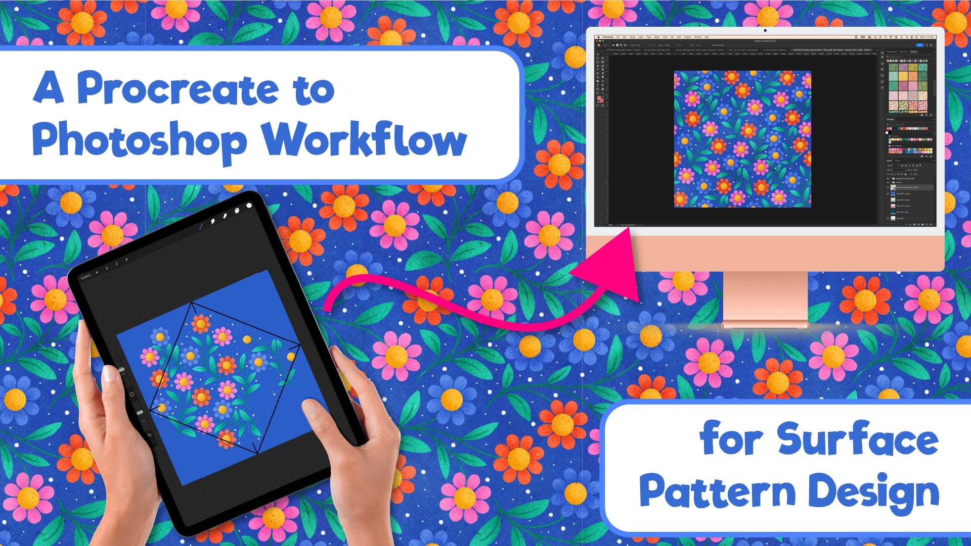
your lovely artwork. Here's a real life example of how I fit mine into my workflow. So I have this pattern here, which I've just finished making
in Procreate on my iPad. First of all, I'll
use Photoshop to build out the pattern
using smart objects. This makes it possible
to build out a pattern super fast using a
few shortcut keys. If you want to
learn all about my Procreate or Photoshop workflow, everything you
need to know is in this Skillshare class here. Once my pat is finished, and I'm happy with the colors, and I've checked the
repeat, I'll add it to my pattern panel up here. Now, I'll export a
copy of the patentle and then open up all
my asset templates. They're all tagged with
this green processing tag so that I can open them
all with one click. I've got print on
demand templates here. I've got my Instagram template and some pinterest
templates that I've made, and also my cell sheet template. Basically, every template I might want to apply
this design to. I much prefer to do this all in one go and
not have to keep going back to a design to redo random bits
at random times. It saves time and I know that
once it's done, it's done. It's little things
like this that help me stay productive. Not spend too much
time going back and forth in the admin
stages of pattern design or illustration and
allow me to get back to making the next piece of
art as soon as possible. I've got skill share class on making Society six
templates like this and also a social media templates class if you want
to check those out too. So with all my templates open, I'll just go through applying
the plat to each one and quickly exporting them
using a quick save action, which I cover in my society
six templates class. Then with everything
saved into one folder, I can back rename them all
with the designs SKU number. Drop the pins in my
pinterest folder, social media posts in
my social media folder, and then group all
the others into an assets folder and drop that into the main folder
for this design. When I have a design completed
and ready to be uploaded, I tag it as an upload
so that I can easily find everything that is
ready to be uploaded. And so they're less
than 15 minutes after finishing up that
rough pattern in Procreate. I now have a finished
patentle print demand assets, social media and portfolio all taken care of
and ready to go. The next time I'm having
either a portfolio, social media or print on demand upload day.
So there you go. That's how I create
my sales sheets and integrate it into my
workflow so that I can spend as little time as possible on the boring admin aspects of the job and get back to creating more art
as soon as I can. I hope you find
this class useful and informative and
that it helps you take the next step on your
surface pattern design or illustration journey. I know that there's
so many aspects to running this whole online
business thing that we do, especially when you're
a one person business, and you're responsible
for all of them. If there's one thing that's kept me afloat all these years, and I wish I'd learn sooner, it's that having
workflows and systems set up is crucial to keeping
all the cogs moving. I hope this knowledge
helps you to remember not to over
complicate things and that no part of your
business has to be all singing or all dancing
right from the beginning. You just need to take that
first step and get started. You just need to begin with
a basic design that can evolve over time as your
confidence and your skills grow. Don't forget to share
your sole sheets in the project gallery so
that I can see them. One of the best things
about teaching on Skillshare is I get to see all
of your beautiful artwork. Don't forget to turn
off the layers with the e mail address or contact
details before you put a copy for the project gallery if you don't want those to be publicly visible on the
Skillshare website, though. I'd also consider
turning those off before you share on
social media as well. But that's up to you, of course. When you're sharing
your project, don't forget to spread the love, drop alike, and a nice comment on someone else's design too. And talking of sharing the love if you've enjoyed this class, then please leave me
a quick review as it helps other students
find the good classes, and it's always nice
for us teachers to read lovely reviews too. If you have any questions, start up a conversation in
the discussions tab. I do my best to check in
there every week or so, and I will always
get back to you. If you want to see
more from me online, I have a YouTube
channel where I share weekly patent
tutorials every Friday and tips and tricks
every Wednesday. My YouTube user name
is A Rebecca Flaherty. You can see more of my
artwork over on Instagram, where I go by at Becky Flaherty, and I host a weekly drawing
challenge community there. We're currently working our way through 52 weeks of florals, drawing different flowers from different parts of
the world every week. It's great fun and
a fab community to meet fellow floral artists. That's a bit of
mouthful. Don't forget to follow me here
on Skill Share, to make sure that you're
the first to know whenever I publish a new class. I'm already working on a follow up to this class
where I'll show you how to build a simple portfolio website for your sales sheets. So do look out for
that one coming soon. Or if you're
watching this later, then it may already
be published. Have fun. Stay creative, and I will see you next time.
 Rebecca Flaherty, Surface Pattern Artist & Content Creator