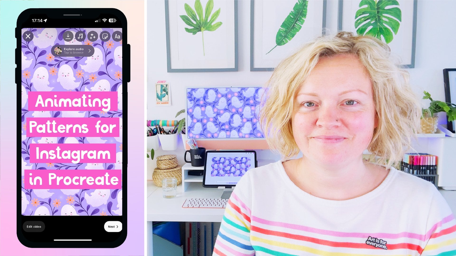
Transcripts
1. Trailer: [MUSIC] Sometimes it feels like it takes forever to upload our surface pattern designs to print-on-demand
sites like Society6. For me, and probably you too. It's my least favorite
part of the whole process. I'm always looking for ways to speed it up and get back to the fun parts of being an
artist, actually making art. Whilst I can't do anything about your router's upload
speeds, I can teach you all the ways I
figured out to make the upload process as
quick as possible. My name is Rebecca Flaherty,
but you can call me Becky. I get to spend my
days working as a surface pattern
designer here in the United Kingdom
where I've been running my own online business
for over seven years now. During that time, I've licensed my artwork for a whole
range of products from cosmetics packaging
to cloth nappies and dog harnesses,
to name a few. A big chunk of my
income also comes from print-on-demand sites like
Spoonflower and Society6. In this class, I'm
going to teach you how to save time
with your Society6 workflow spending less time on the upload process and making just the assets you need using simple templates that can be
used over and over again. You'll learn how by using a few specific
templates, you can easily scale your
surface patterns to the best on all the different
products without having to go in and adjust the scale for each one when you upload them. I'll show you how to create a cool and frankly
miraculous Photoshop action that will allow you
to whiz through the preparation
process and then how a name and organize your
files in order to find them easily and upload them in
the correct order because, yes, the order you upload
them actually makes a big difference to how long
the whole process takes. I'll walk you through the
exact steps and order I do it in so that you can
save time too. The other equally
important value that this class will bring
to your work is that by optimizing your designs in
this way you will find that your artwork always looks great on a full
range of products. Your art will really
shine and stand out. This class is a must for anyone
who uploads their work to Society6 and is suitable for all levels from beginner to
seasoned print-on-demand pros. It is geared towards Society6 users so
that I can get really super specific, but
the principles can easily be tweaked to other
print-on-demand platforms. As creators, we
love to create and not spend hours each
week uploading our work. Don't let this be a bigger
time suck than it needs to be. Excited to get started?
Then let's go.
2. Overview & Class Project: [MUSIC] It's always
good to start with a high-level overview
and a bit of background before we jump right into
the technical stuff. Let's do that now. You mentioned if print on-demand websites have been one of
the biggest game changers in the last decade for both new and established surface
pattern designers. It's a great way to
dip your toe into the licensing world and start earning money from your
designs from day one. However, one of the more tangible differences
I find between licensing your
design to a client and licensing through
print on demand, is the amount of time you spend on your design once
you've finished creating it. If your design is just going into
your portfolio, all you have to do is
put it on a sell sheet, publish it into your portfolio. Apart from pitching
and marketing it, you're done and can get right on with creating
your next design. But we've print on
demand for this class, we're talking society6. You have to create some assets
to upload to the platform, then adjust them to
fit on each product. Even with a fast
Internet connection, it can take a considerable
amount of time, sometimes even longer
than it took to create the pattern
in the first place. It's helpful to think of a print on demand
workflow in three stages, you have stage one creation, which is you're
creating your pattern. Then stage two,
preparation where you make assets to
upload to society6, like a square print, a
vertical, and horizontal one. Then stage three, is the uploading where
you go through and upload your assets and apply them and adjust them for each product. We'll be jumping in
about stage two, which is all about getting
a good system in place, creating a set of
templates, and a range of specific sizes that can be applied to several
different products. Storing and naming them in a super specific way to
make uploading quicker. Everything in the prep
stage is geared towards saving time in the last
stage, the uploading. In the last step, we'll
look at ways to make it as quick and
efficient as possible. We can maximize our
time by uploading in a very specific order and then tackling it in three passes, so that we only have
to individually edit a handful of products. Once you have your
finished artwork, how do you go about deciding what assets to make
for uploading? Well, the best place
to start is to look on the artist Help pages for your chosen print
on demand platform. society6 has a page
specifically dedicated to all of the different
pixel dimensions for most of the
products it sells. Most of the products
are listed here along with the
dimension for each one. If you're looking for
something specific, you can search by
using Command F. If you can't find what
you're looking for, then you can always find the pixel dimensions on the
product upload page itself. Then may even be a
template for some of them. Let's go back to the page
with all the dimensions. You'll see here that it
quotes three sizes to create. If you want to be able to
enable all the products. It's basically an
enormous square, horizontal, and vertical file. For a long time, I did
just use these sizes and there's certainly nothing wrong with taking this approach. However, the thing
which made me look for alternatives was
that you either need to go and painstakingly
adjust the scale for each individual product or, you can leave it as it is. But then the scale on a
lot of things will be tiny and they just
don't look any good. It's much better to make some small assets in
various dimensions, which can then be enabled for
several different products. For example, you've
probably noticed when you enable the the
Android wallet case, you can also enable
that for the face mask. Through a bit of
trial and error, I figured out a basic set of templates which I needed
to make in order to have an asset for every
product and have it be in a scale that wouldn't need
adjusting once uploaded. Another thing I learned
through that process of trial and error is that it makes a difference which audio upload and enable the
different assets. For example, if you upload
the biggest files first, it's going to automatically apply that file to most things. You would then have to
click through into each one and select the correct
smaller template for it. However, if you upload
the small assets first, they will get applied
to any that they fit so you can quickly enable them and then upload the larger assets and
enable those last. I eventually figured
out a workflow to have each product looking good with the minimum amount of time spent prepping
and uploading. I'm not joking when I say
it feels like it takes half the time and half the
amount of clicking around, in order to get all the designs
enabled and looking good. Because it's a routine
of specific steps, after a while you can perform it almost just by muscle memory, and you can have
your half your eye binge-watching a good
box at the same time, which doesn't sound as
bad a night, is it? Hopefully that gives you a feel for the big
picture we're going for. As some of these steps may
seem a little weird or random, just bear with me as
they are all geared towards saving time further
along in the process. Your project for this
class is to share a screenshot of your
print on demand templates folder or setup, and then a screenshot of a
product you have uploaded to your society6 or other
print on demand store. I'd love for you to share
any tips that you have for the print on demand
upload process as well. To get started in
the next video, we'll look at how to
save your patterns as a swatch file for using in the templates we'll be creating.
3. Adding the Pattern Swatch: [MUSIC] Let's jump right into this
workflow and get started. Right now, I'm at
the stage where I've just finished making
this pattern. This is my finished tile. I know it's seamless and
that it's tiling properly. First job I need to do is to add this to my patterns
panel up here. If you don't have this showing, you can go up to Window and
find patterns down here, then it will come up for you. All that we have to do, assuming you've got
just a pattern showing here and it's really simple, we just click this
little plus icon here. Just leave the name as it
is and we'll click "Okay". Then it will add that
swatch to our panel. I come down here and I
add a layer over the top. I can click to apply
this pattern to it. It won't look any different
to start with because it's just a copy of the pattern directly on top of the pattern. But if I come up here and grab my move tool and then we can click and drag
and move that around. If we double-click on
the thumbnail here, we can come in and change the
scale to anything we like. That's changed it because
this is a pattern layer. That's all you have to do to get your patterns into
your pattern's panel. If you've created your pattern in Illustrator, for example, you can still use this method that I'm going to be teaching. You just need to bring the
pattern tile into Photoshop first before applying it to
the different templates. Over here, I've got
a really simple PNG of a pattern that I've
exported from Illustrator. Now, I don't know if
you've ever noticed is a common thing when you export pattern tiles
from Illustrator, you can sometimes get this white gap down
some of the edges. It's quite obvious and
noticeable in this tile here. Let's go into Illustrator
and look at how my design is made up from
this blue pattern tile, which it tiles perfectly
in Illustrator. If I go over to the swatches, grab this, and we'll
make this a pattern. Then we'll apply
it to this square. Let's change the scale
so we can see lots of [inaudible] There we go. You can see it tiles
perfectly within Illustrator. There's no gaps there. There's no problems
with this pattern. However, if I
export that pattern and then bring it into Photoshop and then if I add this one as a pattern swatch like we
did with the mushrooms, then we'll apply
it to this layer. There we go. That's
just gone over the top. If we drag this over and
then underneath if I put a lighter layer or
just do a color fill. This orange will do. With
that color underneath, you can see this
gap showing there. That has to do with the way that Illustrator exports the tile. You'll notice there
isn't a gap showing through the white diamond here. It's just on the background. One way of getting
around that problem not happening in the first place, so we're talking
prevention here, is when you export your
pattern tile from Illustrator, if you have things
going off the edges of the tile like these
diamonds there, you won't get that gap problem. It's where you have something ending at the edge of the tile. If you make your
background slightly bigger so that it comes past
the edges of your artboard, so if we were to
export this now, we shouldn't have
that gap problem. Let's export this
pattern to do a test. Let's just add something after the name there so
it's different. Then if we go and open this in Photoshop and then we add this to our pattern's
panel and the swatches, I can already see here that it doesn't have that
gap down the side. But let's go into this
one and then let's select that pattern fill and we'll
apply this new one to it. You'll see we don't
have that gap anymore. You'll be pleased to
know there's a way of fixing this problem within Photoshop without having to go back into Illustrator
and change things. Let's get rid of this
pattern fill layer and drag this color fill layer underneath and then we
have our title here. Over here, you can see
we've got this thin line. It's actually not a white line, it's a semi-transparent line. When you export
from Illustrator, it makes the edge of
anything that cuts off at the edge of the artboard
semi-transparent. If we duplicate this layer, keep an eye here on this
part as I duplicate, I'm just going to
press Command J. You'll see that that
starts to disappear. You can't actually see
that transparency anymore. If I grab all these layers and then merge them together, where's it gone? There we go, merge layers. Then we add this as a pattern in the pattern's panel, set that there. Then let's go and add
a layer above this. We'll apply this new
pattern to the layer. Then when we drag this one over, you'll see we don't
have that problem with the gap on it anymore. That's a good general tip when exporting patterns from
Illustrator anyway, send your background color past the edges of the artboard. But if that's not possible and you're
dealing with something, you don't have the
original files anymore and you've
got a tile you've already exported and you want to bring it into
Photoshop to do this, just duplicate
that layer several times and it will knock
out that transparency. When I'm exporting
patterns from Illustrator, I'll always make sure
I've got everything going off the edges
of the artboard. But I also will bring tiles into Photoshop
to double-check for this guttering/gap
transparency problem. I'll always bring it into
Photoshop to check before I upload it to anywhere
like Spoonflower or Society6 or send
it on to a client. That is Step 1 done. We have our pattern in
our patterns panel in Photoshop ready to apply to our templates
when we make them. That's what we'll be looking
at in the next lesson.
4. Basic Templates: [MUSIC] The simplest files
to get started with are these 13 here. We've got the can, the iPad cover, the iWallet cover, the watch strap, the towel, an acrylic print, default large horizontal file, the leggings are next, and then we've got
a recessed print, a large square file, and a large vertical file. Although I forgot to highlight
them there at the top, you can also include the mug and the phone
case in this list. We'll be using a basic
rectangle or square for each of these and a simple
pattern fill to cover them. Some of them will be enabled
on multiple products like this vertical file, which
were used on the curtains, wall hangings, and yoga
mats to name a few. Some of them, like
the watch strap, will be used for just one item. Let's go ahead and
open these up. With them all selected,
we're going to double-click and open
them in Photoshop. As we look through
these patterns, you'll see on some of them, I have these guidelines on there and that's to mark the
center of the design. This is so that if I have
a geometric pattern, let's just apply this one
here and then we'll zoom in, I can click and drag. I know that my geometric design is lined up nicely
in the template. Another reason is
once we've made these assets, we'll be increasing the scale
of some of them. This vertical template here, we're going to use
this for the curtains, but we will also be using it for the wall hangings and the rugs by zooming
in and cropping it. It will be just this
middle part on view. I want to make
sure that if I had a pattern that if it had
a lot more detail on it. Which one should we choose? Let's use this swirly one here. This one's a much larger scale. This center area, I
would want to make sure that there was a nice
part of the pattern showing in the middle there
because that's what we'll be showing when we zoom in and crop it for the wall hangings. As I said, all of
these files will be available to download
from my website, but we're going to go ahead and look at how to set up one
of those for ourselves now. A file that I don't have open here is the
table runner file. We'll start by going to Society6's pixel dimension
page and we will do "Command F" and search
for table runner on here. You'll notice that
table runner isn't actually on this
list of dimensions. I guess it's a newer design and they've not updated
this page yet. I'll be putting a
link for this page on their resources, by the way, but don't worry if you can't find a dimension you're
looking for on here because if you go and click on a piece of artwork
that you've already uploaded, then you can scroll down and find the one
that you are looking for. We scroll down here, we
can get to table runner. You can click on "Edit"
for that and then up here we can see the pixel
dimensions that you need. You can see this one is
1,729 by 9,000 pixels. Although it's a
minimum of 96 DPI, we're going to create
a document of 300 DPI, just so that we know it's the best resolution
that it can be. Once we have those dimensions, we can go into
Photoshop and click "File", "New", and
enter them in here. It was width 1,729 with
a height of 9,000. We're going to keep this
at 300 pixels per inch. Society6 files should be in RGB color and we can leave this color
profile as it is as well. Then we can click "Create". The first thing we'll
want to do is to mark out the center
using our guidelines so that if we were using
a geometric pattern that we could line
up with the center. You need to make sure
you've got your ruler showing around the edges here. If yours are not there, you can go to "View" and make sure you
have rulers checked. Once we're here, we
need to make sure we have snap turned on as well. With our Move Tool, which you can get
by pressing "V", we are going to drag a
guideline from up here in this top ruler and drag it about halfway down
and you'll see it'll snap into place and
then you can let it go. Then over here to the left, we'll drag one across and snap that to
the center as well. Now our center is marked out. If we are using a
pattern which we wanted to have centered, we could easily do that by dragging the
pattern on the right. The next thing is to create a layer to
actually put our pattern on. We're going to come up to
our pattern's panel here and we can click on our mushrooms pattern swatch and that will apply
this to this layer. This scale here, I think
probably looks a bit too big. If all the mushrooms
were the same color, then this would probably be
an okay scale to use but because we've got this line
here of the blue mushrooms, it just looks a bit
weird and off-center. We could try centering them, I guess, but I think it would probably
look better a bit smaller. Let's double-click over
here on this thumbnail and if we highlight this, we can use Shift and the
down arrow to go down in increments of 10 or you can just use go up and down in
increments of one. We can adjust this. I think probably it might
look quite nice at 50 and then we can use these guidelines to line up the mushrooms. We could either have
the blue ones going down the middle or we could have these ones going down with the
blue either side. I think given that some of
this will be seam allowance, it's probably going to be
nicer to have these down the middle and then have a
row of blue either side. I think we'll leave
that one how it is. I think that's
looking pretty good. Next thing to do is
to save the document. I'm going to do "Command
Shift S" to "Save As" and I'm going to save this in my Print on Demand
folder, which I have here. This is on my hard drive, I have a Print on Demand folder. I can get here nice and quickly. I have dragged it over
here to my favorites. I can just click on that
and go straight there. In my Society6 Templates folder, I can then save this
one as table runner. But before we click Save, up here where it says tags, I'm going to click into
here and I'm going to apply my Society6 tag to it so it will save with
this on it already. If you were setting this up for the first time and you didn't already have a tag done here
which you wanted to use, you can type one in
here and start one off. Let's just type Skillshare
and it will give the option to create a new tag and then choose a
color for that. Let's go for blue because I don't have any
blues over here yet. Then you can press
"Enter" and that will now be saved with
that blue tag on it. It's going to be in my
Print on Demand folder. Let's go into our
Society6 Templates. You can see that one's nice
saved with that tag on it. If you want to change the tags, you can right-click on
it and click on "Tags". You can delete it if you
put the wrong one on, and you can assign
the right tag to it, and then press "Enter". Once you've created
a tag to have it show up on your sidebar here, if you click on "All Tags", you'll see a list of all the
tags that you have here. You can click and
you can drag it over here and add
it to your sidebar. I clicked that but there won't actually be anything
on there now, but you get the idea. Let's go back to
our Society6 ones. That is essentially
all you need to do for creating those
basic templates. Go to Society6's website and look up the pixel
dimensions either from that list on the Help page, or if what you're looking
for isn't in there, you can go to the
Product page on the Upload screen and note down the
dimensions from there. Then you just create
your document, add your guidelines
to the center, and then add your
pattern fill layer, and then save your document, tagging it with
your Society6 tag and adding it to the sidebar
so you can easily find it. Once you've made all of your basic templates or
downloaded them from my website, we will go on to creating some more advanced templates
in the next lesson.
5. Advanced Templates: [MUSIC] So now let's have
a look at how to set up some of the more
complicated templates. We'll start with
the notebook cover. So hit Command F to find
it on the screen here. Notebook cover, as you can
see is 3,675 by 2,475 pixels. So we will open up Photoshop, go to create a new document, and we'll do 3675, the width, and 2,475 for the height. We will leave all of the
details as they were before and click on "Create". To start with, it's exactly
the same as our basic files. We need to create a
pattern fill layer on this first layer, so we will add a layer here, and then go to our patterns and select this as
the pattern fill. I think that's probably a bit
too big for this notebook, so let's go to our layers, double-click on the
thumbnail and we'll bring the scale of
this down a little. Let's go with 50 percent. Now, we should still have rulers and snap-enabled
form before so you can drag a guide
line down from the top and across
from the side, just as we did for
these basic templates. Now, we have the
centers marked out. Because this is a
wrap-around document, we know that that center line is where our spine is going to be. Let's add a spine line
with the rectangle tool. It will help here to think in real life how big you
want your spine to be. I think probably about an inch either side of the center would be a good size to go with. So just click anywhere
on the document. The width, we're going
to change to two inches because we want one inch either side of that center line, so we'll type two
inches for the width. Then the height, I
think the document was like two thousand and
something pixels high, so as long as we put
something bigger than that, we can put in 3,000 pixels and it can go off the
edges, that will be fine. Once you've done that,
you can click "Okay". That will make this rectangle
on our document for us. With our move tool,
we can drag this. It might be easy with
Command T actually. Then we can snap it
to the center like that and press Enter to
set that transformation. Now, we have this
nice rectangle here, which will be the spine
for our notebook. Then, if we go to our layers, as long as we got this
rectangle selected, we can go to our
swatches and choose any color for the spine
of our notebook to be. Another way of changing
the color if you want to select colors
directly from the document, if we go to our layers, and let's double-click
on the rectangle, on the thumbnail there, and then you get an
eyedropper tool, and you can click and pull colors directly from the image. Let's find a darker color. Normally looks good
for the spine. Let's see if we can get
this nice dark blue there. There we go. That's two ways of
changing color, either with swatches or by pulling colors directly
from the document. All that's left to do with
the notebook now is to save it in your print-on-demand
templates folder. The next template that
we're going to look at setting up is the socks. That's when we can
actually download directly from
Society6's website. To find this one,
you'll need to find the socks in the Upload screen, then we're going to click
"Edit" on that one. You'll see up here, you
can download the template. We'll click on that and download
the Photoshop template. Then that will be
in your downloads, so you can go ahead
and open that. Here's the template
as you'll download it from Society6's website. You'll see it's already got a lot of guidelines
added to it to mark the centers and the
various seems on the document. It does look quite
complicated at first glance, but we are just going
to be adding two simple pattern fills to this. All we really need
to worry about is filling this right
foot rectangle here, and over on the other side, this left foot one with
our pattern fills. I find the easiest
way to do this is with the rectangular
marquee tool. Click on that and
then make sure up in the style that you have a normal style selected because we don't
want a fixed size. Click and drag and snap to these guidelines and
make a rectangle there. Then above where it says
place your art here. This download comes
with a free typo in it. Let's just change that one. We'll add a layer above that. Then with our bucket fill tool,
which you can get with G, we're going to click and fill that rectangle
that we've just marked. Then we can press
Command D to deselect. Then we can go to our
Pattern's panel and click on our pattern to apply a fill over the top
of that rectangle. If we go to our layers, again, you can see it's clipped it
over that rectangle there. This pattern actually
needs rotating. If we zoom in, we can
see on the right here, this is the top,
and on the left, we've got the toe; so the
mushrooms at the moment are going across and we want
them going down the sock. If we double-click on
our thumbnail here, we can change the
angle of the pattern. If we make it minus 90 degrees, the
pattern rotates and our mushrooms are now
nicely going down the sock. That's our right foot
[LAUGHTER] sorted out, now we need to do the left foot. We can add a new layer. As same as before with
our marquee tool, we can click and drag
over the left foot area. Then with our bucket tool, again, which is G, on this new layer we've created, we can click and fill that and then press
Command D to deselect. Then we can go to our
Pattern's panel and apply our mushrooms pattern to
this left foot as well. Now, this is going to need rotating 90 degrees
the other way, so we'll go to our layers, click on the thumbnail
for this one, and change the angle
to 90 degrees. There we go. That
is both pattern fills done for this template. This layer here
says Do not remove, so we'll leave that one there. The rectangle we can hide
and the key we can hide. Now, this pattern. template is ready for
exporting and saving. We've got these two layers, which are our pattern fills, and as long as we've
got these two selected, we can apply any pattern
from our Pattern's panel. If you've got a ditsy print, I guess, you could call it, like these mushrooms
where it doesn't matter where it is, I wouldn't bother
aligning them too much. But if you've got a
geometric pattern like this, it's nice to go into your layers and select each
pattern fill one by one, make sure you've just
got one selected, and then you can click
on the pattern and just drag it and snap
it to those, well, not snap it because
it won't snap, but you can align it with those guidelines and then
the socks will both match. The last template
that we're going to do is well and truly
a bespoke one. It's for these framed
mini art prints. The reason I like to use a
specific template for this is, as it says up here, you can create your
own white matte by scaling the print down. You can see this is full-size
and I've scaled it down, so I have this nice white
matte around the outside. I just think it looks
a lot nicer like that. But the reason you need to make a specific template for this, if we were would just
use any old ratio, even these dimensions up here, these give a ratio to
fill this whole area. If we don't use one that's
different to that ratio, let me find the one for the
recessed print, for example. I think it's this one. Let's just apply
this one, center it, and make it fit that way. If we were to bring this down, you can see if you don't have exactly the right ratio
to fill this space, you'll have white gaps around the edge in your white
matte that don't look even. I just think if you're not
going to have it even, it looks better without it. If you're going to
have a white matte, you want a nice even one. Let's now put this back
to 2,841 by 3,951. So if we make this so
it fills the space, you can see there's some hanging off the top and the bottom. Which means that when
we bring it down to, I think 38 or 39 percent. I normally have this up. You get this nice even white
mat all around the edge. Let's just center that one. So the way to get started on this template is up here with the minimum dimensions
we want to start by making a document that
is the size of this, but then we want to
take an even amount off all of the edges, so we'll start with these
dimensions up here. So for a portrait we've
got 938 by 1,238, so let's remember those and
then go over into Photoshop. So we can come into Photoshop
and we do ''File New''. I went to the dimensions
in here which is 938 by 1,238 and we'll leave all of these details as they are and then click ''Create''. So let's have a look at the
image dimensions for this, so we can press ''Command Option I'' and you can see
we've got 938 by 1,238 and in inches that is just over 3 by 4 inches which is the real size for
those mini prints. In order to have something like a six millimeter
mapped on those, we need to shrink this by six
millimeters on every side, so we're going to go to
our rectangular marquee tool and we're going to choose a fixed size and up here we want six millimeters for the width and six millimeters
for the height. Then you can just click
anywhere on the document and then drag this little
box into the corner, and then making sure you've
got Rulers and Snap still on. You can drag a guideline
from the side on the top and I bring this down to that corner and snap the
guides to that one as well. I'm going to press "Command
D" to de-select and I also want to drag guidelines around the edges of
the document as well. Now we can go up to this
where it says Fixed Size and I'm going to change that to normal for the rest of this. I'm going to drag a rectangle to cover the whole of the
document and I'm going to use my bucket fill tool and I'm going
to click in there. I'm going to press
''Command D'' to de-select. On a different layer, I'm going to add one and I'm going to use the
marquee tool again to mark out a box here and with the bucket
fill tool and I'll use a different
color for this. I'm going to go back to my
crop tool and I'm going to make our canvas a bit bigger, so we can see what
we're working with. I'm going to zoom
out by pressing ''Command Minus'' and I'm just going to hold
down ''Option'' to drag out from the center. Let's just make that a
little bigger and I enter. Now we can zoom back in. So this peach rectangle here
that is the actual ratio of the artwork that we need to
upload in order to be able to shrink it down and have it
fit evenly within this box. If I press ''Command
T'' on here, I'm just going to increase this but bring it so it matches the
sides of the document. You can see we've got
this a little bit extra up here and there
which is how it looked in the upload screen
so that when we bring that down in size and
go back down again, we get this nice
even matte around the outside and the
press ''Escape Next''. I don't want to save that size. We know that this is the ratio of the artwork which we
need to create an upload, but as you can see
even if we were using the smallest size of 1,238 by 938 this is nice smaller than Society6 would allow you
to upload for that asset. We need to make this bigger. If you remember on the
upload screen and I said I always make mine
bigger than this 1,238 by 938 anyway
because if I make it a little bit larger
it would allow me to apply it to lots
of other assets. For example other
assets which you use this template are the poster, bath mat, travel mug, the serving tray
and cutting board, acrylic box, and even
the folding stool. Now the largest one of
those is the poster which needs to be
2,718 pixels by 3,618. If we select this one, press ''Command T'', we can go up here into the
width box and the height box. Let's try typing in the
biggest one of those the height which was 3,618. Remember to type pixels after it just so it doesn't
think you're doing percent or inches if you had either of those
in there previously. Before we press
''Enter'', we're going to check the other dimension. You need to make sure you
have Image constrain. If you realize you didn't, you'd need to press
''Escape'' or ''Undo''. Make sure you have
image constraint on and then do this again. You can see here it says
we have a width of 2,627, but we actually need 2718. By adjusting the height first, that doesn't give
us enough width, so let's change the width
instead to 2,718px. That will give us 3,742 which
is bigger than we need, but that's absolutely fine. I'm going to zoom out now. I'm not going to press ''Enter" and I'm going to drag a
guideline and snap it up here and at the bottom and the left and the right
and that has now marked out the size that our document
and template needs to be so I can press
''Escape'' because I don't need that rectangle
to actually be bigger. Now we need to change our canvas size to snap
to these guidelines, so we'll go back to C.
We should just be able to snap these into
those corners there. Just make sure that one's done and then we can press
''Enter'' to set that and then we can press
''Command Option I'' to get the image size
and just double-check that we have an image which is going to be
big enough to fit that 2,718 by 3,618 and
this definitely won't be. I'm going to press
''V'' for my move tool, and if I add a layer above I can then get rid of these two. I think it would
actually be easier to clear all these guides first, so we'll go to ''View Guides'' and we'll just
clear all those and then we can just drag in one from the side and one from the top
to make our halfway points. Now we can go up to our pattern's panel and we can apply our pattern to this layer. You can then change the scale on that if you wanted to
make that a bit smaller. I think I'm going to
double-click and change that scale down a little bit to something which will
look good for serving trays as well as the mini
prints, something like that. Now what we need to do is
save this and we'll press ''Command Shift S'' to save as. We're in our templates folder, we will call this Featured and we want to add our
Society6 tag to it. All of this is correct so
we can just click ''Save''. That is how I set my
featured image up. I'll put a copy
of my template on my website for you to be
able to download and use, and I'll put a link for that
in the Resources section.
6. Deciding What to Leave Out: [MUSIC] It can be tempting
to want to enable every single product for
every single design. However, not all designs will look good on every
single product. A plain rectangle of pattern doesn't really work
well on a t-shirt, and a placement motif, for example, doesn't
really work on leggings. There are ways of getting
around this though. You can clip your pattern to texts like I have in this
example with the word mushroom. We could use any other shape, like in this art
print by Carly Watts. You can use a cameo. You can also just isolate one motif from your pattern
if it's big enough. In general though,
I leave things like stickers and apparel
disabled for patterns. Here's a list of the
assets I would leave out or at least carefully consider for each of the
two design types. You're free, of course, to
ignore this advice and use your own judgment on what
works with your designs. There's no hard and
fast rules on this, and it's just down to your personal thoughts
on what looks good.
7. File Naming: So one last thing that
we need to do before we start creating and then
saving our assets. This will save us time later, is to make a few changes
to the file names. As I mentioned in
an earlier lesson, it does make a difference what order you
upload the files in. If you upload the bigger
files first, such as the large square file or the vertical or
horizontal file, they will get applied to
everything automatically. Then you have to click into each product to change it to
one of the smaller files. To make sure that I can always easily upload in
the right order, I'll make a few edits
to the file names, which you might have spotted
as we've been going along. Society6 let you upload an initial eight
files all in one go. So to make sure those eight
are at the top of my list, let's just change
this to a list view. When I upload, I
upload in list view. To make sure I can easily
upload in the right order, I organize these in alphabetical order by clicking up here on the name column. The first eight that
I want to upload, which is these eight here, I add a one to the beginning
of the file name for those so that they will always be at the top of that list. Then I know when I go
to my upload screen, I can just click at the top, Shift-click at the bottom, those will upload first. The first image you click on, and upload also becomes the
default featured image. Although you can change that before you move on
to the next screen, you can't then change
it afterwards. So to make sure that this file is always at
the top of my list, I just add an extra one to the beginning
of the file name, so that way it's
always at the top. Now this step is one of
those things I mentioned in the overview video
that just seem a bit weird and random as
you're going through. But honestly, naming your files like this will save
you so much time. You'll always be
able to just click on Upload and then really easily find the files that
you want to add upload first. After a while it just becomes
muscle memory and you can do these steps so
easily and quickly and speed through your uploads. So if you're using the templates that I provide on my website, then yours will already
be named like this. But if you're creating
your own set from scratch, then you can now go through
and rename your files using the list in the resources
section as a reference. I'm just going to show
you the quickest way to rename those files
in a batch name. With all of the files that
you want to rename selected, you can right-click on one
of them and click on Rename. If you go to add a text
add one and a space, and then that will add a one. You need to make sure you have
before name checked here. If you do after name, it's going to put it at the end, you need to have before name. Then that will add
a one to all of those file names that
we've just selected, so we can click on Rename. Then you can see they've gotten to the top
of the list now because we're searching
alphabetically and they're all at
the top of the list. Then for our featured one, with it selected, click on it again and do one,
one, and a space. Then that should pop to the
top of the list like that. So now that's all our template
set up and ready to use. In the next lesson, we're going to
learn about setting up a speedy quick save action.
8. The Speedy Save Action: Now, in general, and in life, I like to think of myself
as quite a patient person, but when it comes to
computers and workflow, I am anything but patient. I don't know about you, but I find it's so annoying
having to click "Okay" multiple times and select the
same options time and time again when I'm exporting
a big batch of files. For example, if I
save a copy of this, I have to click "Save
on my computer" and then have to choose the
folder and select a file type. Scrolling down here to do that. I have to type a file
name in each time. Then click "Save" and
then click "Okay" to this former option as well. That is way too many
clicks for one job for me and I definitely prefer
to be a one-click wonder. I created a Photoshop action to be able to do all of
these for me in one step. It selects all of those options, but you can just do that
with one key press. You can see here, if I save in the normal way, I have to do Command Option S. Let's choose Save
on my computer. I have to go and choose
my assets folder. Let's just leave this
as untitled for now. I want to export it as a PNG and then click "Save" and then click "Okay"
to this option. Whereas I have an action
setup so if I press "F6". Let's go to my actions
and put in button mode. We can also just
click on where is it? S6 RB Save. We can click on that
and that has now performed all of those actions for us, all of those steps. If we go into my assets folder, that's the original one I did and this one here
has ended up here as a copy by me just pressing that
button just with one click and it's even saved in
the correct folder. Let's have a look at how
to set up that action. If you don't have your
actions panel open, you can get that
by going to Window and choosing the actions panel. Let's just make
this a bit bigger and close off that one
and make sure we're working in this set
because I don't want to overwrite any of my
existing actions. Choose a folder to
save your actions and you might have some
default folders up here if you've not used
them and deleted them. If you want to set
up a new folder to put your own actions in, you can click on
this folder here, and let's just call
this Skillshare 2. With that folder selected, we're going to press "Plus"
to save a new action, and let's call this quick save. You can choose a shortcut
key that you want to use. Some of these keys will be already assigned to different
things on your computer for example I think F6 is the default key for making the color palette pop
out or something. If you do choose something that already has something
assigned to it, it will tell you when you click "Okay" to save the action, and then it's up
to you whether to keep that shortcut if
it's something you do use or if you're okay
overwriting it. Let's go with F14 for this one. I find that if I don't put
the name of the shortcut key that I've designated
into the action title, until I've used it a few times I'll forever have to go back in and open up the options and find out what key I
actually assigned to it. A tip is to write the key you've chosen up here in the name, and then you will see it every time and it's
easier to remember. You don't need to give it a color unless you
really want to. You can also use Shift
or Command key with one of these shortcut keys that
can be a way of getting around not overwriting
existing shortcuts. We're going to click
"Record" and then everything we do from this point onwards will be recorded in this action. For example, if I
forgot I was recording, what can I do? Chose, select color
for this layer. You can see if we go
back to our actions, just set that and then
go back to our actions. You can see that
it's remembered that it's doing that and is recorded that as part of the action. If you forget that you're
recording and have that happen, you can stop, and then afterwards you can go and select any steps that
you didn't mean to record, and then you can just drag those down into the bin down there. Then you can go back up to
your action, select that one, press "Record" again, and then you can continue
recording the steps that you do want on that action. The first step we're going
to do is Command Option S, which is the shortcut
for Save a Copy. I'm going to press that now, and I'm going to choose
save on my computer. I'm going to set up a special
folder called assets, which is one that I
will use for saving these assets to every
single time we do this. I'm going to create one
here called assets. This asset folder will become
like a holding area for us. This is a folder we will
always be exporting every asset into no
matter what design is. The reason I do this, instead
of saving straight into the main design folder
where I keep things like the PSD file and
the pattern tiles, is that we'd have to
set that location every time I start exporting
a new set of designs. But this way, I can always export into this
one holding area, and then from there
to my renaming, and then group them
and move them to their final destination in
the main design folder, I won't have to set up
destination every time. The file name we can leave as it is because that will
default to whatever the name of your document you're saving from is so
we can leave that. The next thing to do is
to choose the format. I always go with PNG because
it's a lossless format. But if you're a JPEG
person and you save those, that's totally okay as well. You can choose JPEG. I'm going to click to
embed the color profile and then click "Save" and
then this pop-up here, we can just click "Okay"
to the large file size. At that point, you
can stop recording and if we open up the Save
action now you can see it's remembered and recorded
all of those steps. Saving it as a PNG, the
location of the file and it's also going to add copy
to the end of the file name, which we'll see in a second. If I press "F14" now and as I completed a
run-through of that action and we can go into our files. We can see we've
got this one here, which has just been
created by pressing the F14 key with the
copy on the end. That's how quick and
easy it is to save those files using
quick save action. I'm going to put all
the different steps that we went through in the PDF in the resources section so you can easily
refer back to that. Once you've made all of the different assets
that you need, the next thing to do
is to group them up and store them in
the correct folder. Let's find our assets
in our print-on-demand. A good tip here is to drag
the folder into your sidebar, and then you can always easily
find it by clicking on it. If we go into the
assets folder here, and let's just make
this a bit smaller so we can see everything. You can see I've gone through and I've saved a copy for each
of those different templates. We're going to click and
drag over all these files to select them and then we can right-click on one of them
and then we can go down to rename and then up here we're
going to select "Add Text". I like to add a unique identifier
to each of these filenames so that basically I
don't end up with a million files on my
system called S6 H copy. For these ones, I'm going to add mushrooms blue
to the beginning of each file name and
make sure you add a space after your
final word otherwise, it will squish it all
up against it like this and also make sure that
you have before name up here selected rather
than after name. Now that's been added
to all of those files and there's one other
thing I'd like to do, which is just to get rid of the word copy at the
end of the file name. Just because it bugs me and it doesn't need to
be there as well. I'm going to go to file, rename and choose "Replace Text" and then I want to get rid
of is a space and then copy and then I want to replace
it with no space at all. That will just take the
whole thing off the end and then you can click "Rename". Then those name don't
have copy on the end and they're all named
how we want them. Bonus tip time here. I've got this file
here called Insta, on this file here called
Pin and that's because when I'm making all
these asset files and adding my patterns to
them to make the assets. I will also pull out
my Pinterest and my Instagram templates so I can make those
at the same time. If you want to know
more about this, then I have a whole class
about how to set up and use these templates and I'll put a link to that
in the resources sheet. Once I've renamed
all these files, first thing I would do
would be to drag these two and put them in my
social media folder, and then all of these here, I will just right-click and
drag and make a new folder. Let's call these
mushrooms blue assets. Then I will drag this folder out of the assets holding area and into the main folder which has all of the other
assets for this design. Drag and drop that one in here and then those assets
are all now ready for uploading to Society6. That is all the basic
steps for your speedy save and how to then
group the files up and where to store
them eventually. That is the very last step
in the preparation process and it may seem like it took
a lot of effort to get here, but once you've done
all these things once, there are workflows that
will be then in place to make things easier every
single time you do this. Once you've had your patterns
added to your swatches, you've got your templates made, you can then just
whiz through making these assets each time, which is what we'll look
at in the next lesson.
9. Creating Assets: Now that we've made all of our templates and they're in their folder ready to go, we can work a way through making a set
of assets to upload. The first thing I'm going
to do is open my templates. I'm going to hit Command O, and I'm going to click on my
''Society 6'' template list. I'm going to highlight all of these by pressing Command A, and then we can go
ahead and click "Open". Let's just start working
our way through these. We can use this pattern up
here in the pattern's panel. The first one here
is the leggings and we want the scale fairly
small for this one. This leggings template
is downloaded from Society 6's website, so it has the mask in it. You can turn that
on to visualize how your pattern is going to
look on the leggings. I think that's an okay
size for the leggings. It could be smaller. But then if you make it smaller, that would look okay
in real life on the product if you
had it in your hand, but somebody buying that
is going to be looking it from the preview
screen on Society 6. It's not really
going to show up as being much more than just a blur at that scale and I don't think anyone would bother buying it if they looked
at it like that. We will leave our
scale like this. It's cool for leggings and also large enough to be able
to see in the preview. Just remember to turn the mask
back off before you save. Then I'm going to press
the ''Quick Save'' button. I'm going to use my previous
one which I set up, which was F6, although we did F14
in the example. You can see that little
cursor spending there, that's because it's saving
and that is now done. Next up we have the socks. The two pattern layers here
are both selected already, so we can just apply
a pattern to those. I don't think I need
to adjust that, so I can just press F6
again to save this one. This one does take
quite awhile to save because it's
quite a large file. Next, we have the
featured image. Let's move this one around. Going to use my move tool to drag this pattern
around a bit. I want the blue mushrooms centered but not
perfectly centered. Yeah. This is a
difficult one to place. That'll do. Now we can just
press F6 to save that one. This one is a small file,
so it's quite quick. Then the next file we
have is the can cooler. We can apply our
pattern to that, just give that one
a little adjust, and then press F6 again to save. Then we've got the iPad cover. Then we can save that one. Next one is the iWallet, which is used for the phone
covers. That will do. I think that scale looks okay. Then F6 to save that one. Then next up is the phone cover. Let's center it so that we've got some blue mushroom
showing in there. I think actually I'm going to make this scale a bit smaller. We'll double-click
on the thumbnail, and we'll take this down to, let's try 30 percent, and then we can get a few more of those blue mushrooms
in there as well. I think that one's looking okay so we will press
F6 again to save. The next we've got our watch. Because I've used these templates
before, and in general, all my patterns that I make
are nearly all 3,600 pixels square so whatever pattern I have saved in here from
the previous time, I made the pattern,
it's going to be this same scale
this time around. If we double-click on here, this one is already
down to 20 percent. This should be an
okay kind of scale. Obviously, when you
make your patterns, if you use lots of different
sizes of pattern tiles, or if you make some patterns that are really big and bold, and then others that are
small and intricate and tiny, you will have a
bit more adjusting to do rather than just being able to click on and apply this watch without
editing it each time. I just wanted to point
out, don't think that because I'm not adjusting
the scale each time, that this is not
something that you might need to do
with your patterns. Is the case of taking
these principles and then applying
them to your style, your design, and your workflow. Then because that's
all our files that we can get to along
here, along the top, we need to click on these
little arrows up here on the top right and then we can start at the other end and work our way back a little. The first one we have
is the acrylic print. As we talks about in
a previous lesson on deciding what to leave out, this acrylic print is one of the ones that I may
or may not use. If I check the scale
of this pattern, I'll double-click
on this thumbnail, it's definitely
always 100 percent. For this pattern, I'm
not quite sure that it works as an art
print of this scale, but we'll make it and then
decide on the upload screen. If it works, we can leave it enabled or we can disable it. It is better to just
make it now and have it and then not have to go back and make another one. We'll just save this one
now and then decide later. Now we have the notebook. I'm going to apply my pattern
to this layer down here, that has the pattern on it, and then I can double-click on this color fill
over the rectangle, and we can pull a color
from the document. Then just give that
a quick adjust and then press the quick
save shortcut key. Then next one is the mug. The scale on this
one is fine again so just pull that into
place and then F6 to save. Then next one we've got
is the table runner. I think I'll go with
the blue mushrooms down the middle for this one. Just get that centered
and then F6 to save. This one is also
quite a large file, so it takes a while to save. Then the next file we have
to do is the recessed print. This one, I think the
scale for this pattern is also probably 100 percent
and can't go any bigger. We'll leave it like that
and then we'll save. Then the next file is the large square one for which is used
for the wall murals. This one would also be
100 percent likely. You could always make it
smaller if you wanted, but just not any bigger
than 100 percent. Let's save that one. Then we've got the towel. Just drag these into
the middle and save. Then where do we
get to over here? We did the watch, I think
this horizontal one is next. We can apply the machines
pattern to this one as well. Again, this one is a huge file, so you'll more than likely want your scale at 100 percent
for this one too. Let me press F6 to save this. Then last of all, we've got
the large vertical file. Let's apply that, and then just send to these mushrooms
on the middle line there, and then press F6 to save. Let's look in a bit more
depth at what I mean by resizing and scaling things
for each different product. Let's use the phone case
as an example for this. Where did it go? There it is. Let's use this pattern that we made earlier from Illustrator. Now obviously this
is a huge scale compared to the mushrooms, so will double-click
on the thumbnail. You could make this
as low as two, three, four, five percent, and have a really
small polka dot scale, or you could have something
bigger like this. Let's go for five percent. Then if you wanted to, you can drag this around and
center it on the guidelines. That's what I mean about choosing different scales
for different products. I think we've got some
other patterns up here we could look
at as an example. For this one, it's a really
teeny-tiny dizzy scale, so this one would need
to be a lot bigger. Then obviously we
could go up as far as up to 100 percent if you wanted for just a
few dots on there. Or you could take it
to somewhere around 60 percent and have that size. Do we have any
others we could use? I think this one is also a
3,600 pixels square scale. I think this one again is a
similar size to these others. Yeah, we've got these two here. This is a good example. These are the same
pattern but just at different scales
because they were originally made from
a vector pattern. That 100 percent, that's as big as
that one would go. Hopefully, that gives
you a few examples of how you'd adjust the scale
for different patterns. If we look on the vertical file, the one that we
use for curtains, we could go with
this huge one here, and then you have the option of having this supermassive
if you wanted, or you could take it down to a really small scale
for the curtains. You could take it down to 20, even probably as low
as five percent, and that would still
work as a fabric. It really depends on the
scale that you have here. It depends on the scale that
you created your pattern and also what scale you then
want on each product. But as I mentioned
with the leggings, bear in mind that
although in real life, if you were looking at
in a shop and you saw leggings or curtains with
a pattern in this scale, it would look okay and
you'd be able to see it a lot better because it's
right there in front of you, versus looking at a
thumbnail image on a screen. If you were to have a
leggings pattern with something tiny like
that in real life, that would look okay. But on a thumbnail, on a screen, people might not give it a
second look because it just doesn't stand out enough and
you can't see that detail. Hopefully, that gives you a feel for how you would go and create all your assets and how quick it is using that
speedy, safe action. You don't have to
leave this screen each time and do
all those things, you can just apply
your pattern and then press that button and
whatever you've chosen for it, knowing that it's saving
in your Assets folder. I've got mine, the ones I've just made
all saved out in here, ready for renaming and then grouping and putting in
their final destination. Before we move on, I just really want to
reiterate that you shouldn't go above 100 percent with these patterns when
you're scaling them. If we go back to the mushrooms and we just take this up to, let's go for 160, this scale might look great for the curtains
at that size, but it was only 300 DPI when
the scale was 100 percent. If we make it bigger, we're lowering the resolution, and this image
would no longer be a 300 DPI image anymore because we've
expanded the pattern. By all means scale your
patterns down if you want to, but just don't scale
them above 100 percent. Now, in the next video, we will move on to
the final step, which is actually
uploading them.
10. The Upload Workflow: Here we are in the
Society6 Artist Studio. Probably the easiest way for me to show you this is to
just walk you through how I would upload a
set of designs and then explain as I go the reasoning for each of the different
parts that I'm doing. Let's go to Add New Design and let's get the
files uploading and then we can do the
filename afterwards. As I said, I organize these so that they can be quickly
chosen and then uploaded. I always have this in list view and then organized by name. Then that way we've got my
featured at the top of the list and all these with one
on the top as well. We can select that one and then shift-click
on the last one there, and then click on "Open"
to start uploading these. Then we need to think of a title I'm just going to call this
Cobalt Blue Mushrooms. That will do. Then depending on how fast
your Internet connection is, you begin to see
these uploading, they're quite small files. These initial ones should
upload quite quickly. Once all of these
finished uploading, your Continue will go black
and you can click "Okay". Make sure before you
move on to the next part that you're featured
image is this one. If you're using my files, it will be 2841 times 3951, and the one which
we've called featured. If you have something else selected and you'd uploaded
something else first, like this watch strap here, this would be the default image. Then this enormous tool
file will be the one that's enabled as your
default image in the screen. It's also the one
that would become the default image for
all your art prints. This would be
automatically selected. Make sure that you
have the image that you want to have here. In this case, we're
using the featured image because that's all
we uploaded first. You can go back from
this screen here, but once you go forward
after this point, you won't be able to change
that featured image. As far as I've searched because there's a few times
I've put the wrong one on here and it just annoys me because it doesn't have the right
image in this studio screen. If anyone does know
how to do that, then please let me know. But as far as I'm aware, it's not possible in this
interface to change. Make sure you've got
the right one selected and then check to
say, hopefully, it's your own work and you've
not copied it from anyone and whether it does or
doesn't have mature content. Then you can click "Continue". This will take a
moment to populate all the thumbnails that
can currently be enabled. While it's doing that, we
can choose a category. I'm going to enter a few tags. I always put my name
in as a tag just in case anyone goes
from, I don't know, my Instagram to Society6
to find something, and then at least if
they type in my name, they'll be able to find my
work and go from there. I always type Rebecca Flaherty. I think I've read somewhere on a Society6 blog post a while ago that they prefer you to use single-word tags in this box. But if it's something, you have to use two
words, for example, here in the suggested tags, we've got chalk charcoal, where there's a space, it actually has a hyphen. If you're typing your
name and surname separate it with a hyphen
rather than a space. Just go ahead and
do that and then I'm just going to enter
two or three tags here. Normally, I try and use as many as I can
up to the full 20, but just do this quickly. I'll put in mushrooms and pattern and leave
it like that for now. Then the description
is literally my least favorite
part of any aspect of being an artist or
pattern designer at all. Having to write in descriptions
for things like this. Because I'm like, well, I like drawing flowers. I like pretty things. I made a pattern of it. I don't really have anything
deep meaningful to say about my work apart from its pretty and it
makes me smile. Just write whatever
you want in here. If you're good at
writing descriptions, more power to you, but I'm just going
to write something in here like cobalt, blue, and yellow,
ocher, mushrooms. Get some keywords in
there that will do. Then always, in the end
of my descriptions, I just write surface pattern
design by Rebecca Flaherty. But that's about as creative as I can get for a description. Once you have done
that, you can save it. Because if you were to click on any of
these other things, you'd lose everything
you just put in there if you didn't
save it first. The reason my screen suddenly
looks different here, and it's in dark mode, is that is now actually 05:00
o'clock in the morning. I don't know about
you, but if I use Society6 later in the day like I was in the
previous screen, it takes such a long time for all these
thumbnails to pop up. I abandoned trying to get back to work at whatever
time I was doing yesterday and set my alarm
for five, jumped out of bed. I went straight into
recording this. I wasn't even 100
percent sure that it would work and be any
better at this time. But I am pleased to report that Society6 loads much quicker at 5:00 AM GMT, UK time. I don't feel so bad for being
out of bed at five o'clock because at least it works. Let's get started with this
uploading and enabling. As I said, I do the whole
thing in three passes. We're going to go and
scroll down through all of these things and
just enable the ones that I want to enable to
start with that I have files for them and any that I
want to edit slightly. Instead of just clicking on
"Edit" in the normal way, I'm going to
Command-click on edit, and that will open it
in another tab up here. For this framed mini print, I want to use the featured
image and adjust it slightly as we looked at before pulling it in so we
get that white map. Instead of clicking
on edit normally, I'm going to Command-click, and that will open in
a new tab up here. Then I can come back
to that and work on all the edits whilst
I'm uploading the bigger files at the
end of this first parse. Let's start going through and enabling the
ones on this parse and then setting aside for
later any that I want to edit. The framed mini art print. The mini art print. These use the same template. I can just edit this one, so I can command, click on this one and
we can edit that later. The first one we're
going to enable is the frame to Canvas. These art prints here will
be auto-enabled anyway, and they are using the
default featured image. I'm going to leave
the Metal Print off and leave the Poster and
the Wood Wall Art for now. I'm going to turn on
the Throw Pillow, Rectangular Pillow,
and Wall Clock. I'm going to Command-click
on the Wallpaper, and that will come up here and I can upload a
file for that later because I have got a repeating
one that will fit that. I'm going to enable the Coffee
Table and the Credenza. We'll leave these because I think the scale is a bit
too big on these ones. I'm going to turn
on the Hand and Bath Towel, the bath mat, and then we can turn
on the Wine Chiller, Water Bottle, Placemat, Coffee Mug, Travel Mug. I'm going to leave the Coaster and we can turn this Trays
and Cutting Boards on. The acrylic tray,
acrylic box desk mat. I'm going to Command-click
on the notebook because we have a separate
file for that one. I will turn on the
stationary cards. I'm going to leave the sticker, and then down here
in the text section, we can turn on all of these
files and enable them. These are all covered by our initial upload of
those first eight files. Then down here in the
clothing section, I'm going to turn on
the fanny pack or bum bag as we call it over here. Then we can turn
on the face mask, the tote bag, and then down here there we go, the carry all pouch. Then down here in this
section, once these pop-up, we can put on the can cooler, the folding stool,
the beach towel. That is our first pass down. We've gone through and
enabled everything we can. I'm going to use
this Welcome Mat to upload the large
vertical file. We can click on that one and find our S6 V file
down there at the bottom. Then while this big
one is uploading, we can get on with ones
that we saved over here. If you have a pattern
tile which is at least 3,600 pixels square or 300 DPI, you can upload that
for the wallpaper. If your file is
smaller than that or if it's not a perfect square, you won't be able to
upload a rectangle, then you'll have to skip
the wallpaper upload. The next one we can work on while that's uploading
is our notebook. We can upload the specific
file for that one. Then we can go and work on our framed mini art print next. Do see how useful it is to
be able to have these in separate tabs to upload at the same time as all those
big files are uploading. You need to find
your featured image using the pixel dimensions, and then we can
center it like that. Then, depending on the
exact dimensions you have, somewhere either 38, 39, somewhere around there, should be the right
scale to have this even border
around the outside. If you've used my file, you should find it
is 38 or 39 percent. Yours may be slightly different if you've got a few pixels
above or below that. We're going to apply this
positioning to the poster and the mini art print, not the acrylic tray
and serving tray. Once you've done that, you
can click on "Enable", and that is those products done. You can close that tab and then go back to
our Notebook tab. It looks like it's uploaded. It's showing down here. Just we need to wait for
it to populate there. I might just click on "Refresh". There we go. This one is always
centered horizontally, but I always need to
center it vertically. When I click on the vertical one you'll see it'll jump slightly. Don't ask me why that
always need centering. Then you can click, "Save
& Enable" on that one. We don't want to apply
this to anything else, so we'll skip that step and
then we can close that tab. Then we're back
in our wallpaper, which again looks
like it's uploaded. We just need to refresh, and there we go. We can leave the
scale as it uploads. Don't change that because
you will find that you have gaps if you move
it around slightly. Mine is 100 percent because
it is 3,600 exactly. But if yours is bigger than that then yours might be
less than 100 percent. I'm going to give
this a quick center just to be double sure, and then we can save that one. I want to apply
this positioning to the Wood Wall Art and
also the Coaster, because I think it's fun to have a patterned repeating tile for those products because
it's seamless. You can play around with the
coasters and arrange them in any order you like it's just an extra little
fun thing to do, and that's also something
you could do with a Wood Wall Art
if you wanted to. If you didn't have a
repeating tile that you were uploading for
the wallpaper, you can use the large
vertical file for the Wood Wall Art
and the Coaster instead in the next steps. Then they can just click
to enable this one and then that's another
tab we can close because we're done
with that now. Then we're back here in
our Welcome Mat file where we uploaded the
large vertical one. This has been nicely
uploading for us in the background
and it's now ready. I'm going to take the
scale of this one up to 100 percent, and then I'm going to
click "Save" and "Enable". I'm not going to apply it
to any of these products because these ones
have other templates. That is the first part done. You see what I mean about these bigger files being
auto applied to everything. Now that we've uploaded
that large vertical file that has been put in here as the default for
the acrylic print. Now let's start working
on the other file s that we can enable using
that large vertical file. This time, I'm going to
enable the wall hanging. I'm going to change the scale, so we'll Command-click
on the wall hanging. If you hadn't uploaded a repeating tile
for the wallpaper, you could go ahead and Command-click on the
wood wall art at this point as well and use the large vertical
file for that one too. We can turn on both
of the curtains. Although it's not
popped up here, I know that I'm going to use this large vertical file
for the wall tapestry, but I will adjust the scale. We'll Command-click
on that one as well, and then we can turn
on the floor pillow. We can turn on the
throw blanket. I'll leave the rug for now. I'm going to Command-click
on the bar stool and we can use that to enable the other two pieces
of furniture there. You can turn on all of the remaining bedding
in this section. We can turn on the tablecloth. I'm going to Command-click
on the coaster because I do want to
edit that file slightly. You can turn on wrapping paper at this point,
if it looks good. Coming down here,
we can now turn on the backpack and
also these files down here can now be enabled. The sling chair, floor cushion, sunshade, we'll leave the outdoor rug
because that works better with the horizontal file. But we can turn on the
yoga towel, the yoga mat, and then we can normal click
on the picnic blanket, and then we'll use
that to upload our large horizontal file. We want to find our
big horizontal one and upload that here, and then we can go and work our way through
these other tabs. These wall hangings, I always
crank up to 100 per cent, and then I'm going
to click "Save". Then I'm going to do the
same with the wall tapestry. Take this up as
big as it will go. I find that with
these two products, the wall tapestry and
the wall hanging, bigger tends to look better than don't really suited
to smallest scales. Go with what looks best
for your patterns. I'm going to choose this
large vertical file to use for the bar
stool as well, and while that's
doing its thing, we can move on to the coaster. The only difference
I want to make here is I just want to
repeat this design on all of the coasters
because I think this scale looks nicer and also, like I said, you can then play with these in a
repeating pattern. That's just a little bit of
extra fun that you can have if you've got a square pattern
tile and the scale works. If you didn't have a
square pattern tile here, then I would suggest using
the large vertical file and just scaling that to look good on the
different coasters. Back to the past or
now, we can center this and bring the size up a bit
to something that looks good. Give it another center, and then we can save
and enable this. We want to enable this also for the side table and
the counter stool. Then we can enable
both of those, and then we can close that tab. Then we can just click, "Save & Enable" on the wall tapestry because we already made
the changes to this one. I think I just forgot
to click "Save". We don't want to apply it
to any of those things. Then we can just close that
tab and in our wall hanging, that's ready now we also don't want to apply
that to anything else, and so we will skip that Step 2. Then we can close that
one and we should be back with our picnic
blanket uploaded. I'm just going to save
this one as it is, and I'm going to enable this for the all over graphic tee. That's nearly all of our
large files uploaded now. This is the third and final pass where we would just go in and pop any other individual templates of things
that we have. We do have a recessed
and acrylic print, I'm Command-clicking
on these by the way. We'll leave the metal
print for now because that is going to use
the same file that we upload for the
recessed framed print. We can leave that for now. We have a large square
file for the wall mural. We can Command-click
on that one. I'm going to
Command-click on the rug because we can use the
large horizontal file and enable that
for all the rugs. The bench we can now turn on. Then scrolling down
here, the tablecloth. I thought that I'd enabled
the tablecloth before with the large vertical file, but I think maybe I didn't
actually click on it properly. That one's probably
going to pop up in a minute with the
horizontal file. You can either use
the horizontal or the vertical file
for your tablecloth, whichever you think looks best. So you can enable
that with a vertical or you can leave it till now and enable it with
the horizontal file. I'm just going to go ahead
and turn that one on now. That's definitely turned on now. We have a table runner file so we can Command-click
on that one. I'm not going to upload
the jigsaw puzzle because I think the pattern
file doesn't really work on a jigsaw puzzle. I know that you get those
crazy jigsaw puzzles that are like beat
beans and smarties, and they're fun to do. But yes, I just don't
think that my pattern in that scale especially
works as a jigsaw puzzle. I'm going to leave that one, but you can decide for
your individual patterns. I'm also going to leave
the sticker disabled. Again, that's just
my preference. You know your patterns and you're welcome to enable
that if you wanted to, or like I mentioned
in a previous lesson, if you've clipped your
pattern to something like a quote and have a transparent background that would look great
on the stickers, then you could apply that here. We've got to turn that one on. The same goes for the clothes. I'm going to leave all
these t-shirts turned off. I think they're best left
for placement prints, so we'll leave
those as they are. But I do have a sock file, so we can Command-click
on the socks, and the duffle bag
can now be turned on. That uses the horizontal file. Then one last thing, just down at the bottom here, all that's left on here
is the kids clothes, which we won't be uploading. Just the one last
thing is the leggings, so we can do a normal
click on this. We don't need to open this in
a new window or a new tab. We can upload the leggings and then move on to the next tab and then it is just a
case of going through these and finding all
the files for these. We'll do the recessed and
then the acrylic print. Then we can upload
the wall mural with a large square file. The helicopter going
overhead right now. Then for the rug, we can use
our large horizontal file. Once that pops up there, we can take the scale up
as big as it will go, as big as you think
looks good for yours and then I'm
going to save this one. I want to apply it to the Welcome Mat and
the outdoor rug. I know we already enabled the Welcome Mat with
a vertical file, but I think it's just
nice to have these all using the same file
for all the rugs. We can close that tab and then
go onto the table runner, and we have a separate file for that one down at the bottom. Last but not least, socks. Then let's go over and see if our leggings have
finished uploading now. It looks like they've
uploaded, but again, we just need to
refresh it to see it in the little preview
window there. There we go. I can save that one. I don't want to apply
this to other things. You could apply this
to the backpack if you wanted a smaller
scale on there, but I quite like the biggest
scale on my backpack, so I use the vertical file
which we enabled earlier. But if you wanted
the smaller scale, you could put that on
the backpack here. I'm going to skip this step. We can close this tab. The recess print has
now been uploaded, so we can save that one. Close the tab. The acrylic print also looks
like that one is done. We refresh, and there
we go, that's in there. This is one of the
largest print file of all the art prints. This is one that I might look at and decide whether
to enable or not, depending on how good the
pattern looks in there. You can generate previews, they take a while to load, so I'm just going to click
"Save & Enable" for now and then we'll look at it
back in the main screen and decide whether
it works or not. Looking at it here, I
think probably that scale does look too small
in the acrylic print, so I think I'm
going to turn that one off on this occasion. We can now close
this tab as well. Then in this one, we've
got the wall mural. It always looks cool seeing
that on in the preview there. Let's get rid of this one. It looks like the table
runner is also uploaded. We can just refresh this one. That's looking good, so
we can just save that. Then last of all, we can close that tab and
move on to the socks. There we go. Now, this is one that always imports a wonky on
the vertical axis, so we'll just give
that a center there. Then we can save
and enable that. The last thing to do
is go through now and just do a quick visual
check on everything to make sure that everything's working just as we want it to. That one's turned off. The metal print we can
enable because that uses the template that we uploaded
for the recessed print. Still waiting for
the wall tapestry to preview and the thumbnail, even though we have edited
that one individually. We'll just give them
a chance to pop up while we go through and
check everything else. As we scroll down, everything's looking
as we intended it to. A thing I'm also
checking is that things didn't want to enable are
definitely turned off, like the clothes in here. See I just making sure
that these are not enabled and then I can just quickly
scroll down to the bottom. Wait for the rugs to pop up, they're all looking okay. I can now go all way
back up to the top. Hopefully, the wall tapestry
will eventually appear. You've got two options
in this situation. You can either wait
for it to pop up before you click "Publish", or because we went in and we individually
edited that one, it's a pretty safe bet that
it should be looking correct. Sometimes it's easier
to hit "Publish" and then go and look
at the product screen just to double-check it and make any edits, so
which I'll do that. I think everything's done and I just need to
tick this to say that I'm ready to publish. That's come up with the next. Now let's just give it one
more try at refreshing. There we go. That's popped up now and that's looking
how we want it to. We're ready to click on that and then publish our artwork. That is now done and
published in our shop. Now, obviously I'm
fully aware that that may have seemed like I went through that really
fast and it's difficult to absorb all of that
information all in one go. Because these are steps
that you can repeat over and over again in the
same order each time, I'm going to put all of these in a step-by-step cheat sheet in the resources section for
you to be able to download so you can print it off
or have it on your iPad or phone looking at it
as you work your way through your own set of uploads. Hopefully that'll be a really
useful resource for you. Like I said, after a while, it just becomes muscle memory, you just remember where
to click on the screen, what to enable, what
command to click on. It just really speeds
up the whole process and it doesn't have to take
up all of your concentration and you should be able
to listen to some music or watch something nice on TV whilst you're doing
it to make it more fun. Another benefit to this method is that once you're used to it, when you find yourself
in a situation where the thumbnails
aren't showing, you can still go through and
enable the same products in the same order without needing
to see the preview first. Like I mentioned, I'm finding the site is really
slow at the moment. I think it's the
run-up to Christmas and that's why everyone's
trying to upload their stuff and why I had to get up
at 5:00 AM to film this. But during the day when none
of the images were showing, I actually was still able
to upload a whole set of designs flying blind
with no images showing. Then I left it as a draft
until a quieter time of day when the preview images
were loading and then I was able to just
give it a final check over. I think the only thing
that I needed to adjust was the mini art prints, but apart from that
everything was correct and I was able to go
ahead and publish it. One final benefit that I
want to share with you is that by having a very specific
step-by-step process, you can actually very
easily outsource the whole uploading process to someone else if you want to. For a while, my teenage daughter wanted to earn a
bit of extra cash, so she was doing some
of my uploads for me, working through the
exact same set of steps and notes on each design. Side note, she didn't
last long as she found it even more
boring than I do, but it was super easy to
hand that task over to her because of the workflow
that I had set up. If you were a really
prolific artist and you have a lot of
designs to get through, you might even want to
consider outsourcing this step to a virtual
assistant or someone similar. You can tweak the steps
that I've shared to suit your own designs
and processes, and then hand over the cheat
sheet to somebody else. I really hope that you find some or all of the ideas I've shared useful for speeding
up your workflow.
11. Thank you!: [MUSIC] Thank you so much
for watching my class. I absolutely love
being able to share my productivity tips with other people and also
learning yours too. So if you have any tips or hacks for saving time
with print on demand, then please do share that with me in the discussion section. I also host a weekly
Wednesday tip swap for creatives over on Instagram. If you want to
join in with that, you can find me @BEKKiFLAHERTY. You can learn more about
me and what I do over on my website,
rebeccaflaherty.com, and if you'd like to
see more of my classes, then be sure to follow
me here on Skillshare to get notified as soon as
new classes are published. If you found this class useful, then please leave
me a quick review and if you have any
questions in the meantime, please hit me up in the
discussion section. Stay productive and I
will see you next time. [MUSIC] I absolutely love being
able to share my product. I absolutely love
being at- [MUSIC]
 Rebecca Flaherty, Surface Pattern Artist & Content Creator