Transcripts
1. Introduction: Do you ever find the most
perfect and beautiful flower that inspires you to
create an illustration, but then you look closer, and think, I can't draw
that, it's too complicated. I couldn't even draw it once, never mind drawing it 10
times to make a pattern? Well, there's more than
one way to draw a flower, and it doesn't have
to be photorealistic. Most floral designs you see are stylized in some way or another. As you train your
artistic inner eye, your own signature style will start to emerge as
you see flowers, and the shapes within them
through your own unique lens. My name is Rebecca Flaherty, and I'm a full-time
Illustrator and Surface Pattern
Designer from the UK. I'm pretty much addicted
to drawing florals, and I think most
of the artwork I license probably has
flowers in it somewhere, as well as creating
art for print on-demand platforms like
Spoonflower and Threadless. I also have experience licensing my designs
directly to companies. I'm happy to be able to share
that knowledge with you, so you can learn from my real life experience and
occasional mistakes too. In this class, you're
going to learn how to use Procreate stamp brushes as your secret weapon
for sketching out cohesive and aesthetically
pleasing designs. I use these stamps
in my sketch layer, so that when I
come to trace over them in my final designs, I have some uniformity, but also a unique hand-drawn
feel for each motif. I'll show you how to set up a master brush template canvas, with guidelines at
the exact angles for any number of pencils. As we push beyond the limits of Procreates default
lines of symmetry. By the end of this class, you'll have picked up
lots of ideas to create your own stylized
floral illustrations. We'll be using the liquefy tool, and filling our illustrations
using reference layers. Learning how to create
balanced compositions, and using shading layers and texture to add depth
through our artwork. We're going to be using
all these skills to create three different types of floral illustrations
using our stamp brushes to sketch
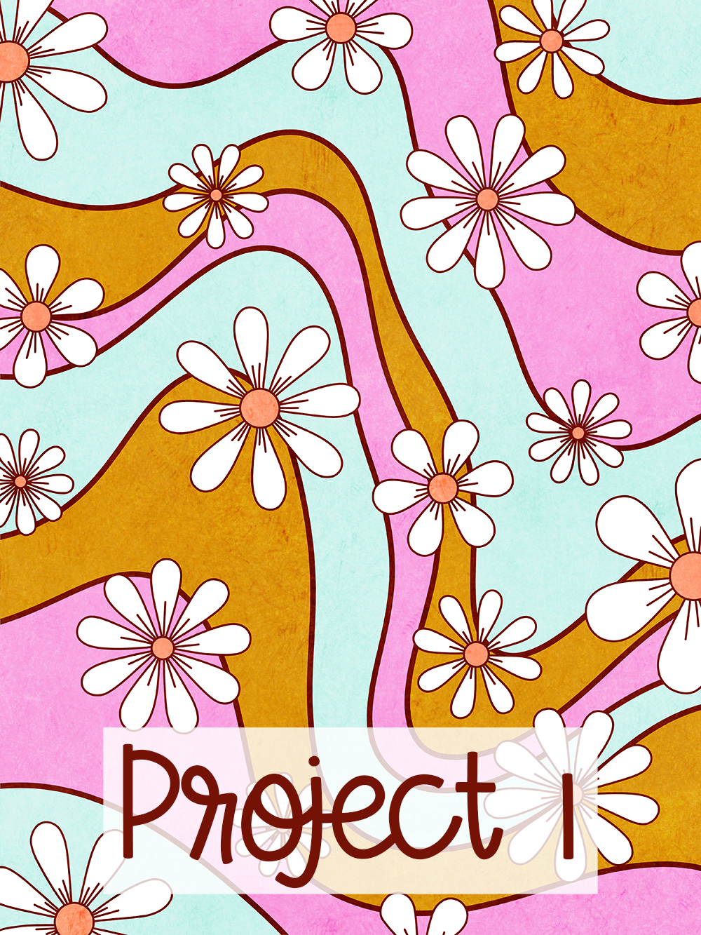
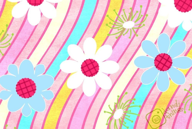
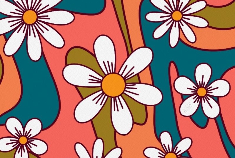
the designs out. First up is a groovy '70s floral with basic
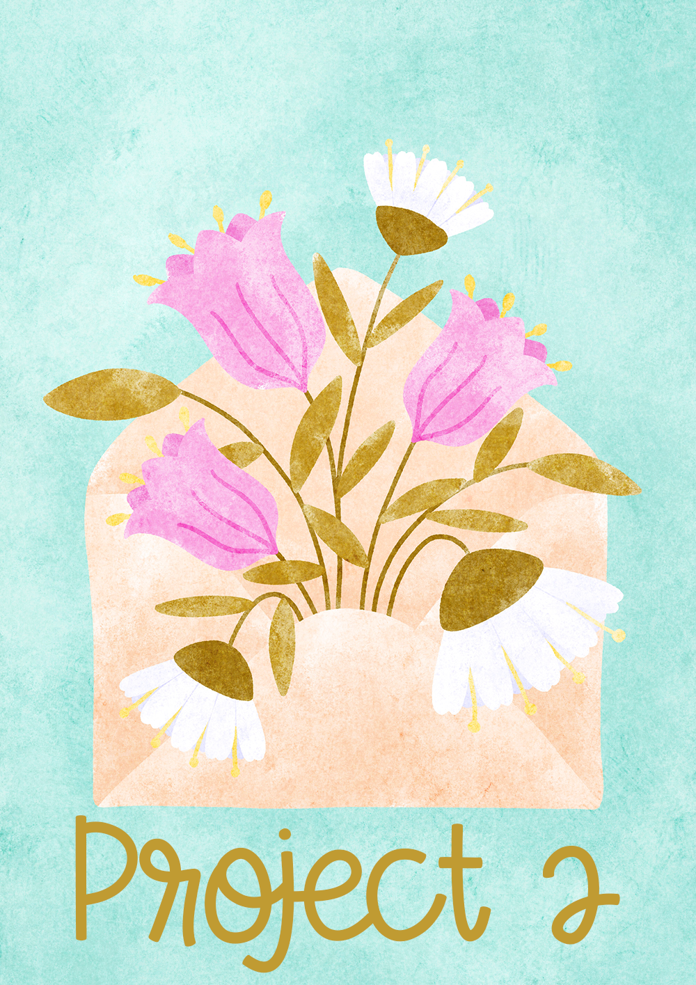
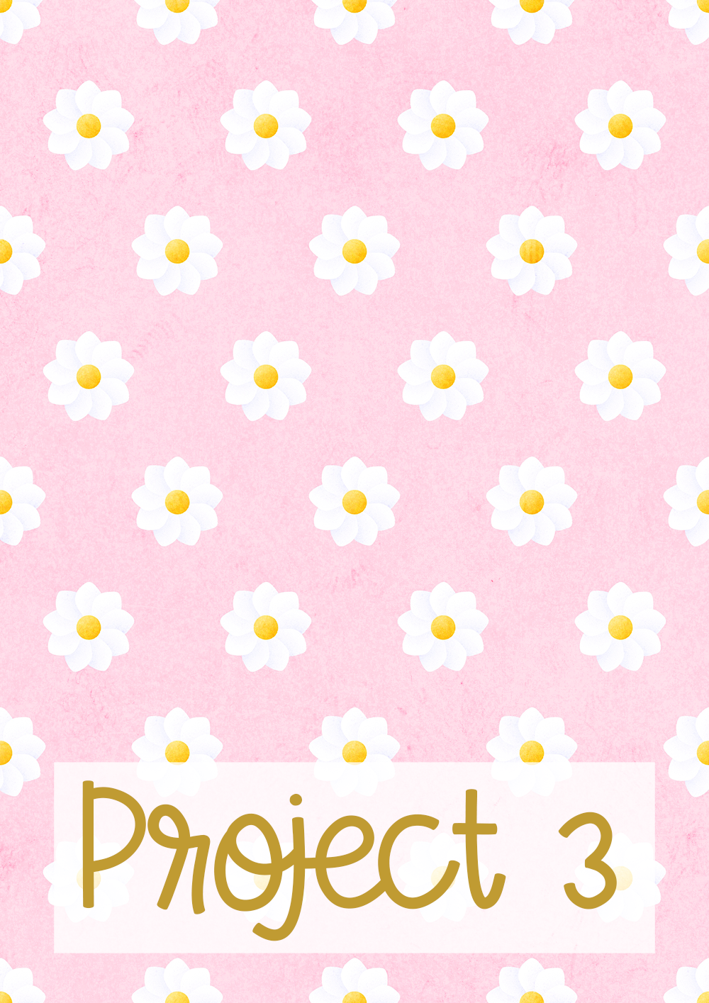
geometric daisy shapes. Then floral envelope design as we explore side view florals. Lastly, a super quick
and easy floral pattern using a layer mask to
create overlapping petals. I hope the biggest skill
you'll develop will be how to look at any flower, and break it down
into simple shapes. Adding or taking away details to re-interpret it to fit your own unique
style and aesthetic. If you don't feel like you
find your signature style yet, then I want you to note that, looking at flower shapes and
simplifying this way was how I really discovered and distilled down my
own signature style. Exercises like these
are so good for spotting common threads in our work, and leaning into them. This class is perfect
for beginners who are just starting out on
their artistic journey, but I've also created it to be a fun and leisurely
class for all levels. There are certainly a
few tips and tricks included which will be
useful for praise too. You don't need any prior
knowledge to take this class. All you'll need is an iPad with the latest version of Procreate
plus an Apple pencil. Are you ready to get
started? Then let's go.
2. Overview and Class Project: For this class,
we're going to be creating three projects
as we work through. You can have a go at
just one or all three. If you're a complete beginner, then I recommend starting with the more simple designs and then working through the
projects in order. We'll start by making a very simple flat floral stamp brush that can how to
draw any number of petals with perfect symmetry, pushing past the limitations of the four or eight lines of symmetry which the
Procreate software allows. Then we'll use these
simple stamps to create a groovy
flowerpot illustration. This style of '70s illustration is all about the
hand-drawn feel. By using the floral stamps as a guide and then tracing
over them freehand, we get that perfect
hand-drawn cartoony look. The second project
you'll create is a floral envelope illustration. For this design, we're
going to look at using more complex side view,
three-dimensional stamps. We'll really lean into
exploring how to style it ways and find your own ways
of interpreting them. We'll use either
our own photos or copyright-free
reference material to create our own flower shapes. You'll then have a set of
floral stamps which you can put together to create an envelope
flowers illustration. For our third project, we'll look at how to combine the simple floral shapes from lesson 1 with the overlapping
layers from lesson 2. We'll use shading and
layer masks to create depth and dimension
from our floral stamps. We'll create a flower
that has perfectly spaced and overlapping
petals and then use it to create a really simple and fun pattern that
you could use to make a fun wallpaper or an
Instagram stories background. You are of course,
welcome to copy any of the designs I make in
order to follow along with the class but just remember that you wouldn't then be
able to sell that design. If you want to create
designs which you could sell in places like
Redbubble, or Society6, or license, then
you will need to come up with something
new and unique, and I can't wait to see
what you do create. If you want to use
the brush set that I use for the illustrations
in this class, then you can download
that for free for my website and I'll put the link for that
in the cheat sheet, which you can download from
the class resources section. Don't forget to upload all your work to the
project gallery, including any work
in progress shots. If you get stuck along the
way and would like help or feedback, in
the lesson videos, I'll show you how to upload
a low resolution file from Procreate and how to upload
it to Skillshare website. Seeing all your beautiful
project is my favorite part. I'm especially excited to see all the beautiful floral
designs from this class. In the next lesson,
we'll get started.
3. Setting up a Brush Canvas: Here we are in our
Procreate gallery. Let's create a Canvas to
make some brushes, shall we? Up here on the right, we're going to tap
this little Plus icon. It's going to bring
up a whole range of Canvas sizes we
could choose from. You've probably
used to the idea of going big or going home when
it comes to illustrations, but when we're making brushes, we can keep things
small and manageable. The brushes themselves will never be used in a
final piece of artwork, so it doesn't matter if
they're a bit rough around the edges or if they pixelate
when we make them bigger. We don't need to fill
up our iPads with huge brush canvases
or put a strain on the iPad by using
huge brush files. If you've got a
smaller or older iPad, it's going to be thankful to
you for this, especially. I make my brushes on 1,000
pixels square Canvas, which is plenty big enough
for making these brushes. I've got default brush
Canvas down here. Let's have a look at
how to set them up. Tap on this new
Canvas icon up here. Let's enter the dimensions. We want 1,000 pixels for the width and 1,000
pixels for the height. We'll keep the resolution at 300 DPI just because that's
a good number to stick to as a default and everyone's
maximum amount of layers is going to be
a bit different on this depending on
their iPad spec. Don't worry if you've got a different number
in there than me. We're going to be only
using a handful of layers. Have a tap up here where
it says, Untitled Canvas, and you can name this one brush creating Canvas or
something similar to that. The color profile
isn't important as these brushes aren't going to
be used for final artwork. But because I tend
to create all of my artwork in the sRGB profile, because that one's good
for digital printing, I'm just going to
leave it as it is. Is a good idea to be in
the habit of consciously checking and selecting your
preferred profile each time. Funny story, one time I
was working on a drawing using the exact
same color palette as I had used in another, and I couldn't, for
the life of me, understand why the green
I was using was in a different spot
on the color scale than it was on the other one. I kept going back and forth
between the two documents, really confused as to
what was going on. I finally realized
it was because I had accidentally created
the new document in the P3 color space, which has got a much
wider range of colors. What was fully saturated
in the sRGB document was a third of the way across the spectrum in the P3 document, and I could go even brighter. Anyway, the color profile doesn't matter with
this brush document, but just remember,
it's good to be in the habit of checking each time. The time-lapse setting,
we can leave alone, unless you want to
change it down to low quality to keep
your file sizes down. If you're recording
a time-lapse, that video data is going to
add to your overall file size depending on whether you
have it set to 1080 or 4K. It could be adding
an extra one to 400 megabytes per
one minute of video, which is something to
consider if you don't have a big storage
capacity on your iPad. If you've never actually
used time lapses, and you want to turn
that off completely, you can do that over in
the main iPad settings. We come down here,
and go to Settings, and we scroll down to Procreate. You can toggle disable
time-lapse and turn it off, and it won't record
any time-lapse data for any documents you create. Just don't forget that, if you have got it turned off, if you ever do want to go
back and watch a time-lapse, you would need to turn this on back before you start drawing. Let's go back over to
our Procreate document, and under Canvas properties, I'm going to change the
background color to black, because when you make a brush, it needs to be drawn in white. Setting this document color to black will save us having to switch the background
color every single time we open the document if
we'd left it as white. It doesn't actually
have to be pure black. You could make it in your favorite shade of
pink if you want to. Now those are all done, we can tap on Create, and that will open
up our new document. Then if we go back out
into the gallery again and we tap on this
new document icon, and go all the way down here, you'll see that you'll be
able to open that brush creating Canvas each time you
want to make a new brush. Although that said, you'll
probably want to keep using this one and duplicate it
or add more layers to it. As we're going to be adding
in some guidelines that you'd then have to make from scratch each time you wanted to use it. But if you did delete
your master by accident, you've got that one done in your settings to add a new one. Let's go back into our document, and let's set up these guides. We're going to go out
to our Actions tab and tap on Canvas, and down here where it
says Drawing guide, we're going to turn
that Guide on, and then you'll see
that a grid has appeared over our background. Now let's tap on
Edit Drawing guide. In this screen, we can change what type of things the
Drawing guide does. You can change the size
or the angle of the grid, you could change
it to triangles, you can put a vanishing
point on using the perspective or
you can use symmetry, which is the mode that we're
going to be using today. Incidentally, if you ever
want to reset any of these, like why we've made
this a crazy angle, if you tap on the blue dot, and then you can tap Reset, and that will bring
it back to normal. That's the same for
perspective as well. You can tap Delete and
reset it that way. Symmetry. The symmetry
tool in Procreate is so much fun to play
with as you'll find out in a second if you've
never used it before. In your options down here, you've got several
different lines of symmetry that you
can choose from. Vertical is going to
mirror it left and right, so you could use that to
draw something like a heart. Horizontal, is going to
mirror top and bottom, so you could use that
to draw a dog bone. Quadrant is going to split your Canvas into four sections. What you draw in
one quarter will be mirrored in all the
other four quarters. Radial gives you the option to have diagonal lines of symmetry, and whatever you
draw in this one, will be mirrored in
the other eight. Rotational symmetry will rotate what you draw as well
at the same time. Honestly, you could
make a whole class just about the
symmetry in Procreate, as indeed many other
teachers have. If you've never experimented with it before, just
pause this video, and have a bit of fun
playing around with it, and get to know how it works. It's so mesmerizing
and relaxing. Just be careful not to
get too side-tracked. Once you've set up how many different lines you
want to use there, you can then tap Done, and you can go in here, and start to have a play. Then you can go back in here
to edit the drawing guide, and change those things, again, if you want to, just tap, undo on that, and we can go back into our
Edit Drawing guide. The options we want,
let's stick with radial. Let's make sure we have rotational symmetry
off for this, and you want the
Assisted drawing on. If you have Assisted
drawing off, you'll just get the guidelines as a visual guide to drawing, whereas with
Assisted drawing on, it will actually do the
mirroring part as well. You can also change the color and thickness of these lines. You can make them more
or less noticeable. I'm going to bring
this all the way up, so it's easy to see
why we're filming. Then, now when we go
up to our layers, if I just tap "Done" up there, and then we go up
here to our layers, you'll see this layer, now says, Drawing Assist underneath
the layer name. Then, if we now do some drawing, it's going to do that
mirroring for us. I'm going to tap with two
fingers to undo that. You can see how
easy it is to get side-track by how
mesmerizing it is to use. This Drawing Assist works
on a layer by layer basis. If I add a new layer here, you'll see this one doesn't
have Drawing Assist on it. To get that on, you need
to tap on the layer, tap "Drawing Assist," and
then that will turn on there. If you want to turn
it off on a layer, you just do that
again to turn it off. That can be toggled on
or off during drawing, and it will use the
last settings that you chose in the Edit
Drawing guide screen. That's our Canvas,
now ready to draw on. In the next lesson, we'll draw some fun flower shapes
using the symmetry tool.
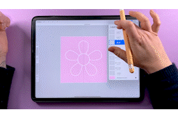
4. Simple Flower Shapes: Let's pick up our pencils
and get drawing, shall we? We're going to make
some super simple 70s flower pattern inspired daisies
for this first project. The first flower is going
to have eight petals. We can use this radial symmetry setting to help us
out with that one. But we actually need
to turn it off first because I want to draw the circle for the middle
of the flower, and that's going to be easier
without drawing assist on. On this layer that we
created above that, which doesn't have
drawing assist on, we can just draw on that
one and then merge it down. Otherwise, you
would turn drawing assist off on this layer, but we'll just draw
on this one for now. I'm going to set my brush
color to white for this one. You always need to
make brushes in white if you want them
to be fully opaque. Let's just get the
palette that I want to be working from
and choose white. For drawing these,
you can use whichever your favorite sketching
or drawing brush is. I'm going to go down here to the pencils in the
sketching section, and I'm going to grab the
Narendra brush for this one. I've got it turned up
as big as it will go. I think I've probably increased the streamlining
a bit on this one as well. Let's put that up to
50%. There we go. I want a little bit of smoothing while
we're drawing these. I just double-check again that we've got our
brush in white. Let's start by drawing
this circle in the middle. I've recently learned
a much quicker way of drawing perfect circles after watching Peggy Dean's class
on gestures in Procreate. You might be used to
drawing, holding, and then tapping up here
to make it into a circle, but what you can actually do
if you draw a circle, hold, and then tap with your finger, that will snap it to a perfect
circle when you release, which is much quicker
than the other way. Let's look it again. You draw, hold, tap and
it snaps to a circle. Draw, hold, tap and snap. Just going to
quickly undo those. It's so much quicker
doing it that way than the old way I was
doing it of holding, tapping up here, choosing a circle and then tapping
again to come off it. I'll link to you Peggy's
class about gestures in Procreate so you can check
that one out if you want. Once we've got a circle, we want to put it
into the middle of the canvas in the center. We're going to tap up
here on transform. Then you want to come down
here and make sure in your snapping settings
that you've got magnetics and snapping
both turned on, and both of these sliders
up as far as they will go. Then we can drag the circle right into the
middle of the canvas. What you want to
see is those two orange lines crossing over. Then you can release
that circle as it's now centered on the canvas. Now, we either need
to turn drawing assist back on if you
had it turned off, or in our case, we'd
have been merging it down onto a layer that already
had drawing assist on. Now starting in the middle, we can draw our first petal in, and you'll see it mirrors it all the way around
the canvas like that, because we've got
radial turned on. We could also draw petals going out to
the side like this, but I want my petals to all be the exact same size and shape. I'm going to get that by
rotating the first ones we drew. Let's go up here
to our layers and duplicate this layer by swiping to the left
and tapping duplicate. Now I'm going to tap transform, and then I'm going to tap this
little green node up here. Then in this box you can type the exact number of degrees
that you want to rotate by. There's 360 degrees in a circle, and we want to spread eight
petals evenly around that. 360/8 is 45, so let's type 45 into that box. Obviously, you can also drag it and move it
around manually. If I just change that
back to zero in a second, you can grab the green
node and you can drag it around and snap
it to the diagonal, but it's a good idea right from the beginning for
this class to get used to the idea of using some maths right from the start, as we're going to be
relying on it for some of the more tricky shapes
later, but don't panic. I'm going to be putting
all the numbers into the cheat sheet for you. We'll cover that later. We know that we want
to move it 45 degrees. You've snapped it,
but as I said, get used to it right
from the beginning, tapping the green node and typing the exact number
you want in there. Once that's in place,
you can set it by tapping the transform
arrow again. Now we've got a perfectly
spaced identical petals. But the thing is, I want more of daisy-like design in
a stylized 70s style, with all my petals being completely separated
from each other. You can see where
I've drawn it here that these petals are
actually overlapping. If you imagine, if I draw a line coming down here between
the two symmetry markers, that's marking the halfway
point between the guidelines. Anything I draw which goes
more than halfway past here, if I pass that line, we're going to get
some overlapping. What we're going to do
is make some guidelines. We can put those on another
layer and then we'll be able to see where
that halfway point is. Let's just undo that. Let's go back to just
having our circle there. We can use that
again in a second, but we'll just hide
that layer for now. I'm going to add a
new layer on top. We want to turn drawing
assist on for this one. In this new layer, we're going to draw a line
going from the center, right up to the top. Then we're going to
hold it until it snaps, and then I'm going to let go. If you'd drawn
something that was a little bit more
wiggly like that, you hold it until it snaps, line it up with the middle
and then you can let go. Now we've got the center of
our document marked out. Just going to go and
edit the lines of symmetry up here and
edit drawing guide. If we were just using a
vertical symmetry like that, we wouldn't actually be able to see where the middle
was if we didn't have this white line that we drew going
across the middle. It's useful to have this first guide setup which
marks the center of it. Let's put that back to radial. This layer here, I'm going
to rename it as center. I'm going to
duplicate that layer. I'm going to just lock
this one underneath. We'll leave that one there. That's our first guideline setup to mark the center
of the document. This one which we
just duplicated. Let's duplicate that one again. I'm going to hide this one at the bottom, which we locked. Now what we need to do
is rotate this one. I'm going to tap
on the transform. I'm going to tap
on the green node and rotate it 45 degrees. Then it's going to snap to these halfway lines that we've got there,
the diagonal ones. What we want to mark is the
halfway point between these two so that we know how far we can draw without overlapping. If we snap these two together, we pinch the two
layers together. If we duplicate
this layer again, tap on the transform arrow and we want to mark
the halfway point. These are all 45 degrees apart. 45/2 is 22.5, so we will rotate
this by 22.5 degrees. You can see now we've got the
halfway point marked out. What I recommend
you do is reduce the opacity on the bottom
one to something around 50, and then your middle lines, halfway ones, you can take
to something like 25%. Hopefully you can
see those lines. I would normally
keep them in white, but I think so that
you can definitely see them clearly from the camera, I'm going to undo
that opacity change, and I'm going to fill
them with black. I'll fill up those layers. Then I'm going to fill
them with black and then bring the opacity down to about halfway on this one, maybe a bit lower
because it's darker. Then the halfway points we can take right down like that, and then that should be
a bit easier to see. Once you've got those two in the color and opacity
that you want, you can pinch those two
together to merge them. We'll call this eight lines. Then let's bring our
circle back up to the top, and we can make that
one visible again. Also need to change
my brush color back to white because
we're making a brush. Now we can go back to this
layer with the circle on it. When we draw our petals in, we just need to make sure
we don't cross this line. Just going to make sure that
I'm on the right layer. On here, I'm going to zoom in a bit so I
can see a bit better. I'm going to make sure I stay
within these guidelines. I've kept it inside of
the line on each side. Now, we can duplicate
this layer, tap the transform, tap on the green node, rotate it by 45 degrees, and now we've got all eight
petals nicely separated. That's our first flower done. We can merge those
layers together. I'm just going to
grab my eraser, zoom into the middle here, just make sure it's not too big, and then get a better eraser, turn the size down, and
then I'm just going to erase all of these
middle lines in there. Then we zoom out and I'm going to hide the
guidelines for now. That is our first flower done, a daisy with eight petals. But if you want to
make a flower with maybe five or six petals in it, in the next lesson,
we'll find out how to go beyond Procreate's
default symmetry tool
5. Beyond 4 Lines of Symmetry: Let's have a look at making a
five or six petaled flower. We'll start off with the
five petal flower first. The first thing we
need to do is to make a guide similar
to this one. Trigger warning this
will require some maths, but all the numbers
that you'll need are on the class
cheat sheet PDF, which you can download from
the resources section. You can have it
open on your phone or printed off next
to you as you work. You won't need to remember
all these numbers or work them out each time
if you don't want to. Just stick with me through
this next bit and know that all the numbers are written down for you to use later. Let's add a new layer
to work on and let's go and edit the drawing guide
for these five petal flowers. For these ones, we just want to have vertical
symmetry turned on. Now that we've lost
our center marker, let's go and turn this one back on so that we can always see where the middle
of the document is. On this new layer, I'm
with drawing assist on. I might actually
unlock this and reduce the opacity on that one a bit so it's not
too distracting. On this new layer I'm
with drawing assist on. Draw a line from the
middle to the top again and snap it to the
center guideline. Because we have
vertical symmetry on, it's just repeating
left and right, it's not also going to repeat top and bottom or
off to the corners. With the other drawings that we made because they
were all coming out from the middle
in all directions and it was also
repeated down here, they were centered
on the document. When we tap to transform, we had the whole
document selected. Whereas if I tap now, we only have this
part here selected. If I rotate that,
it's going to rotate it around the middle
of that selection. What we need to do is
to be able to rotate the whole document around
the middle of the document. If we add a little corner mark
in each of these corners, it's going to take the selection
all the way to the edge. Now when we tap to transform, it's going to grab
the whole layer, which includes everything
going right up to the edge, these little marks we
drew so now we can rotate this whole layer around the middle
of the document, which is what we need to do. Let's now duplicate this layer. We're going to tap Transform. This time we want to
spread five petals around this 360-degree
circle, 360/5 is 72. That's what we need to
put in this box here. Tap that again to set it and if we wanted to
rotate this layer again. Because the marks we put in are now off to the side
on the Canvas, we still only have this
tiny bit here selected. What we'll do,
rather than putting in more markers on
the layer each time, we'll go back down to
our original layer, the one that has the
corner markers on it, and we'll just keep rotating
and duplicating this one. Let's duplicate this again. Tap to transform. This time, we want
to move it around by another 72 degrees
further than this one. We want to move at
72 plus another 72. That's 144 altogether. Let's tap the green node
and put 144 in the box. Now at this point, we can merge all three and we can
flip this over to the other side because
we've got all of these lines put in on
the left-hand side. We're going to pinch to
merge these together. I'm going to
duplicate the layer. Then we've still got
the corner markers in. We can grab the whole
canvas and we can flip it horizontally and then pinch
those two layers together. Now we have our five lines of
symmetry mapped out there. Those are what will be our
five lines of symmetry. Now, we need to mark the
halfway points on those. We've still got our corner
markers in place from before, so we are still
going to be able to rotate around the center. Let's duplicate this
and tap to transform. These gaps are 72 degrees. Halfway is going
to be 36 degrees. I'm going to go and turn the bottom center guideline off, so that's not confusing us. Now we've got these
halfway points marked. I'm going to change the opacity on these like we did before. I'll bring that one
down to about 25 and then bring this one down to about 50% or maybe a bit
higher, so you can see it. Hopefully, you can see these. I've got the bottom layer about 50% and the top
layer somewhere around 25. I can merge these two together
and I'm going to name this one five lines and then we'll go ahead
and lock that layer. Let's drag it down
to the bottom. We'll keep all our
guides at the bottom and then work on flowers at the top. Let's start by
drawing a circle for this five-petaled
flower on a new layer. I'm going to leave drawing
assist off on that. For next, we need
to draw the circle. Draw, hold, tap, and snap. Then with snapping turned on, we're going to center this in
the middle of the document. Just keep moving around
bit by bit until you get those orange lines
crossing over there. Now we can turn drawing
assist on this layer. We know that we need to keep this side of that halfway line when we draw this petal and we've got our vertical
symmetry turned on. Let's just draw a
petal in like before, something like that
going up there. Then we're going to duplicate
and transform this around the canvas in the same way that we did to make
the guidelines. On this layer, we need some of these corner marks and I'm just going to hide this
one under here, so it's not distracting us. On this layer here,
we want to add the corner guides in
so that we have those. Now with that there, we can grab the whole canvas and rotate
it around the middle. Let's duplicate this layer. Let's tap to transform and it was 72 degrees for a
five-petaled flower, so let's type that in there. That's petal 1 in and then we go back down to
the original layer, the one that has the
corner marks on it. We'll duplicate that. Tap to transform and we
want 72 plus another 72, so 144, and now we can merge these by pinching them all together and we can
duplicate it again. Tap to transform and because
we've got one side in, we can flip it
horizontally and now we can merge those
two together and grab our eraser to take
out these corner marks and zoom in and get the bits in the middle
of the flower as well. There we go. That's a perfectly symmetrical
five-petaled flower. That's our five-petaled
flower done. To cement that process
into our heads, we'll repeat it for a six-petal flower and then
you should be able to do it for any number of petals that you
might want to use. Let's hide this layer. Guides first, we're
going to draw a line going from the middle
to the top and then we're going to add the
marks in the corners so that we can transform and duplicate this
around the center. I'm going to duplicate this
layer and we want six petals. So 360/6 is 60 degrees. Don't forget, I'm putting
all these numbers in the Cheat Sheet for you. We're going to tap the
transform type in 60 up here. Then on the first layer
that we worked on, the one that has the
corner marks on it, we duplicate that again. Tap to transform and we want to rotate it 60 plus another 60, so that's 120 altogether. Now the thing with a
six-pointed guideline, is we could have actually drawn
all the way down and then we'd be rotating the other
side at the same time as well. But because you might
not always know in advance whether
your petal would be repeated at the top and bottom because it isn't
in the five points. If you look at that one is
not repeated at the bottom. We'll stick to doing
this just one line going up from the middle and then have many number
of degrees around. But what we can do
when you realize that the next one is going to be
lined up with the middle. For this six point, we
can merge these together, we can duplicate, and we can actually flip
this one vertically. We can now merge
those two together, duplicate it, transform it, and now we can flip it horizontally and
merge those together. That's our six lines
of symmetry in there. We want to now mark the
halfway points on those. Let's duplicate
this layer again. Tap to transform and
this is 60 degrees, so halfway is going to be 30. We'll put that in the box
up there and then we've got our 30 degree angle
mark right there. Now I can bring the
opacity down on these two and then bring this one down a little
bit further again. Then we can merge
these two together. Let's rename this one
and call it six lines. Then to draw the flower, we add a layer up
at the top here. We'll leave drawing
assist off to start with. We'll draw our center circle, so draw, hold, tap, and snap, and then we're going to center this
in the middle of the canvas, making sure we have snapping on. Now, we can draw
our petal staying within these center
guidelines here. Then on this layer, let's be smart and we'll erase these middle parts
before we do the transforming so we don't have to erase all of them at the end. Let's add our corner
guides on this one, and then we're
going to duplicate, tap to transform type 60
degrees up in the box. Then we're going to
grab our bottom layer, duplicate it again. Then we want 60 plus
another 60, which is 120. Because we know this is going to make the next
petal down here, we can merge those together. We can duplicate,
tap to transform, and we can flip that
vertically now. Duplicate it again, and then transform, flip horizontally as well. Then what we need to do is erase these corner marks up here on this one and that is
your six pointed flower. I'm also now going to whiz
through a time-lapse of making guides and a
flower with nine points, so that you can see what I mean about needing to put
more petals in on this side before you get to the point where you
can flip it over. I'm going to whiz through
this on a time-lapse as the steps are exactly
the same as before. It's just a case of using different angles and this
is playing at double time. If you want to watch
it in real-time, you can adjust the play
speed to know 0.5, maybe turn the sound off, and then you can see exactly
what I'm doing in real-time. All the numbers that
I use in this one will be in the cheat
sheet as well. Now we have our first
four basic flowers made and you know how to adapt this to any
number of petals. In the next lesson, we'll learn how to turn
these into brushes.
6. Stamp Brush Setup: Let's turn this flower into
a stamp brush, shall we? Step 1 is to get this
into the clipboard. Go to the layer, tap
it, and tap "Copy". You may have that
in your clipboard. Now, we're going to
tap on the brush menu, come all the way up here, and you'll see there's an option
to add a new brush set. This is the set
where we're going to keep all of our stamp
brushes that we make. Give it a name that makes
sense to you for that. I'm going to call
mine flower brushes. If you're feeling cute,
you could add an emoji at the beginning
or something like that if you wanted to as well. You can see from
my brush library that I'm obviously quite often in a cute mood because all of mine have emojis on them. In your brush set up here, tap this little plus icon, and this is going to create
a new brush from scratch. We're already going
to have some of the most basic defaults in here, and there are a lot
of settings in here. That's a good thing
because that's what makes Procreate such an amazing piece
of software to draw with. Think of all these
gorgeous brushes that are available to us, which mimic things
like real watercolor. But it can feel a little bit daunting if you ever want
to make your own brushes. But the good news is, we
don't even need to look at most of these settings here
to make a stamp brush. We only need a
few. What we'll do is to make our way
down this list, looking at very few
settings that you will want to adjust
and experiment with. Starting at the very top, the first thing you
want to do is turn spacing all the
way up to the max, and you'll see here
that this brush is made up of this circle shape. If you have it all the way down, all those dots are placed
so close together, it comes out as a line. If you take the spacing
all the way up, there's a lot of space between those shapes and
that's what we want. Each one of those
will be our stamp. The next setting down
here is stabilization, and those should all
be left at zeros. We don't need to touch the
taper settings either. The next one here is shape. Shape is the main section that we're going to
want to work with. This here is your shape source. You can see at the moment
is this circle shape, which is why when
I draw over here, we're getting circles
on the drawing board. What we want to do is to swap that circle and have that
be our flower shape. Tap on "Edit" up here, and then we're going to tap on "Import" and then
tap on "Paste". Then you'll see your flower
will appear down in this box. If you find nothing happens, then let's just have a look
at why that might have been. I'm just going to tap
"Done" for a minute actually, so cancel. If you find nothing happened, then go back to your layers, try tapping the layer again and try copying that again
and trying it one more time. If still nothing is happening, then go and check
that your flower is definitely white and not black. Just going to fill
this layer with black, and then I'm going to copy this. If I go into the brush here, and if I try and
paste this in now, nothing is going
to show in there. It has to be white or at least not pure black for this to work. If you've drawn in gray
or any other color, you'll find that
when you paste in, it would show up in the box, but it would not
draw a full opacity. I'm not on a white layer here. Let's add a layer above there. If you use black, you'll get a zero opacity brush, and you won't see anything. If we fill this layer
with a gray now, and then let's copy this layer, and then we'll paste this
into our shape source. It will show up if you've
done it in color or gray, but then when you go and
draw with it on your Canvas, it won't ever draw
a full opacity unless you've used pure white. Let's go back and change this to white on our flower layer, and then we can select it, we can copy it. Then let's go back
into our brush, import and paste that pure white in there
for this flower. Now, you can see here
where we had dots before. Those have now
turned into flowers because we've replaced
the shape source. Can do a bit of testing
here on the drawing pad. Can you see how it's reacting to the different
pressure I'm using? If I do really soft taps, we get a really faint flower, and if I do really heavy taps, we get more dark ones. That's a great feature to
have with a drawing brush, but it's not so great
in a stamp brush, and I want all of these to be uniform and the same
opacity all the time. Let's go and fix that. Come down to Apple Pencil, and under pressure, where it has opacity, bring that all the way down, and you'll see that those
are now all full opacity. Another setting you
might want to change is the angle or the
rotation of the flowers. You can see here
that these are all facing perfectly upright, and at the same angle. You might want to build
in a bit of variation, especially if you're
working on a pattern. You might want to add a bit of randomization to the angle. On this one, we
come up to shape. Both the scatter and the rotation sliders affect the rotation angle
of the flowers. Honestly, trial and
error and having a bit of a play around will
be your best options here. If I want a bit of
subtle rotation, I'm normally set both of
these somewhere around 20%, and that gives me a
good bit of rotation built into it without
it being too much. You might want a bit
more or a bit less. It may vary for each
different brush that you use. Always have a bit of an
experiment with this one. You may even want to
leave it off altogether, and adjust the
rotation manually with the selection tool after
you've drawn a flower. This setting is very much
a personal preference, so do have an experiment
and see what works for you. The only other setting
that you might want to use in here for
your stamp brush is the size in the settings down
here in the properties tab. If you find that
you're working on a big canvas and you can't get your stamp brush big enough, you can come in and adjust this slider here to
the maximum size, and you could take that all
the way up and then you'd be able to do much
bigger stamps. Let's clear that
mess up a minute. [LAUGHTER] You could draw
that any size you wanted to within reason with
this set to maximum. You can take the brush
much bigger than 100%. It's going to get more
fuzzy and pixelated, but that's okay because we're
just sketching with it. If we tap down here, you'll see in here
for the preview, we've got a preview of the
albeit spaced out brushstroke. We've got a few
instances of the flower. If you just want to
have a single image of the flower like I've got for these ones
here, to get that, you go into your
brush settings again, and up here where it says on the properties tab,
use stamp preview. If you turn that on,
that's then going to just use one instance of it. You'll probably want to
turn that down to something like 10% for the preview size, and then you should have a nice, easy to spot clear image
of your brush in there. Now, we can test our brush out. Let's just add a layer in here, and we can test out the brush. You can see you can have
the size all the way up, and this is absolutely huge, or you can go all the
way down to tiny. One last thing that you
might want to do is to name or author your brush. You can come up
here to your brush, tap on the edit icon and let's come down to
the about brush tab. You can give your brush a name. I'll call this one Daisy Brush. You can put your name in as the person that made the brush, and you can add a photo
or logo if you want. Then in this section down here, you can sign your name. Then if you tap "Create
New Reset Point", then those details will now
be saved for that brush. Those are the simple
steps for turning your illustrated
shapes into a brush. I'm going to quickly
go over them one more time because
it's always good to watch a second example to
help you remember a process. What I would suggest you do, rather than creating a new
brush from scratch each time, once you've made
one and you've got those settings in there, you wouldn't want
to always have to change the stroke
path and opacity. What I would do is to swipe left and
duplicate this brush, and you can come into
that one and just edit the settings that
you want to each time. Let's grab a six petaled
flower on this one. I think it's this layer here. Let's tap "Copy". Then editing this one that
we've just duplicate, we'll come to the shape tab, tap "Edit", import, and paste in our new shape. That's pretty much all we
would need to do each time. You could come down by the
brush tab and rename this one. Maybe put Daisy Brush 6
because it's got six points. If I'm honest, if
we come down here, you'll see I'm absolutely useless at renaming
the brushes I make, and I don't rebother
renaming them at all, and it just keeps adding a one
every time I duplicate it. But if you want to rename yours, that's the thing you could do. Now, we've got this six petaled Daisy Brush as well as
our five petaled one. I just want to come
in here and show you a couple more things that
you can do over here. One thing you can do is, if you wanted to rotate this, you can rotate the brush in
increments of 90 degrees by grabbing it with two
fingers and swiping it round. This can be useful if
you've got a stamp which you want to use in a
specific direction, and somehow your canvas has
got turned upside down, which can sometimes
happen if you've flipped your iPad and
rotated the canvas, and you'll be wondering
why the brush you're using has suddenly started
stamping sideways. If it's too late
to flip the canvas back the other way, you
could come in here, rotate the brush and get it to the angle
that you need it at. You can always come in and
rotate it back again later. Sometimes I've even ended up accidentally rotating
my brush canvas, so all the brushes I made in a particular session
were 90 degrees off. You can see down
here that there's one that I never
bothered moving around. If you want to change that, you can come in here, edit the shape, grab it, and rotate it back the
way it's supposed to be. That is how you would do that. Now that we've covered
everything you need to know about creating
your stamp brushes, once you've added yours into your new brush set and
are ready to move on. In the next lesson, we'll learn how to
use them to create a groovy flower
power illustration
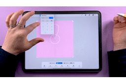
7. Project 1: Flower Power Floral Pt.1: For this drawing, let's use an A4 or a letter sized Canvas. Feel free to go bigger
if you want to. I just didn't want
to make something so big that you might not have enough layers on a
smaller or an older iPad. If you do go bigger though, just note that some
of the brush sizes and other settings I mentioned might not be exactly the same as the
ones you'd need to use. I thought we'd go for a classic psychedelic
70s background with our daisies just
sprinkled over the top. We could either draw in
all those waves just in free hand or we could have some fun with the
Liquify tool. Shall we? I'm going to grab any old
sketching brush to do with this and any color is fine to use for this layer as it's
just our sketch layer. I'm going to start by drawing some wavy diagonal
lines up here. These don't have to be perfect, they don't have to be spaced
out evenly or anything. It's just to get
something to work from. Then we'll go up to our
adjustments up here and we'll tap on "Liquify"
down at the bottom. I've got my size at 76%, pressure is all the way up, distortion all the way down, and momentum all the way up too. We're going to use push
down here on the left. Then what I'm going
to do is just use the liquify tool to
really push out and squeeze up some of
these lines so we get a really cool, wavy
distorted effect. This tool is another one that's
really fun to play with. Don't be scared to have
a good play around and shift things around
too. It's really fun. I think I'm happy with that. But as I say, have a
play with this to get to a point where you've
got some nice wavy lines going on there. Once you're done with
that, you can tap the adjustments again
to come up with that. Then we're going to add
a layer above this. Then I'm going to use
from this brush set the 70s line work brush smooth, which is the same
as in airbrushing. It's pretty similar to this hard airbrush
down at the bottom, but it has some extra
smoothing on it. I'm going to use this 70s
line work brush smooth there. I'm going to use this
brown color here. One of the key elements of
70s illustrations like this was the use of heavy outlines and they often use brown
shades instead of black. I'm going to use this
reddish brown color here and making sure I'm on my new layer and got my brush
size at 9% at the moment. Let's just see what
that looks like. I might want to make that
a little bit bigger. I'm just going to go
ahead and trace over these lines and where I've got a bit of wave
stuff going on there, I'll just free hand those and I might add some here
here at the bottom as well. We're going to come in and just trace over all these lines. These ones, I want to
be nice and smooth which is why I've got the
smoothing on this brush. I always find tracing is
really relaxing to do. I never mind a bit
of tracing work. For these ones, we'll just add a bit of free hand in there and maybe some done there and
a little bit up there. Once that's done,
I'm going to hide this sketch underneath and
we'll rename this layer lines. Now when it comes
to filling this in, we could just drop our colors
down in-between like that. But the problem is we wouldn't be able to
come back and then edit them very easily because
it's all on the same layer. What I'm going to do is
add a layer underneath. On this layer, if you tap "Reference", that's going to use the pixels
on this layer as a guide when you come to use your color
fill on the other layers. We can go on this layer
and it's just going to fill that bit based
off what is up here. Let's carry on doing that. I think I'll do three colors. That will be every three lines. We'll have 1, 2, 3 and it'll be on this one. I think that part up there
needs to be done as well. I think that's everything. Then we'll add a new
layer underneath. We still got this one as our reference layer and we'll choose a different color
and then we can color drop onto
this one as well. Then we can add a new layer and I'm going to
use pink this time. We can just use color
drop to fill in those other bits. I
miss this one here. We can go back onto this layer, fill it with this
greeny brown color. At this point, that's looking
pretty groovy already. I think this would
make a nice background or phone case just
as it is on its own. But let's add some flowers
to this, shall we?
8. Project 1: Flower Power Floral Pt.2: Before we move on, there's
a thing I wanted to show you that I learned while I was doing research for this class. Did you know that as well
as color drop fills, Procreate has swatch drop fills. If I add a layer here, and we'll drag it up here so that we can
see what we're doing, it's here, did you
know that you don't have to select the color here and then drag it in from
the top corner up there? You can long press on the
swatch and then drag that over and use that to fill
like that. How cool is that? That's something I
learned while I was researching some of the
stuff for doing this class. I found it in the
Procreate Handbook. It's a great place to go to look for any extra info on Procreate. Anyway, back to the class. Let's just get rid of this. There we go. You should now have your
lines on a layer up here, and then each of these color fills on a separate
layer underneath. Let's tap on this one and turn this reference
layer off for now. I'm also going to name all
these layers and group them. These layers, I'm going to
call this one Stripe 1, I'll call this one Stripe 2, and then finally Stripe 3. Then we can group all
of these together and we'll name this
whole group Background. That's going to keep
everything nice and tidy. Honestly, I wasn't always
such a layer structure, neat freak, but it does save so much time
in the long run. It's worth forcing yourself
into doing it by habit. The great thing
is, because we've kept all these on
separate layers, we can now easily
change the color by Alpha-locking and then choosing another color to fill
that layer with. You can just tap on that
and tap "Fill Layer". Nice colors there as well. Or we can come up to Hue and Saturation up here and change
the color that way as well. Just undo that. I'm going to keep these colors as
they are I think. That's why it's so
important to keep your colors on separate layers. Now I'm going to work on our sketch layer
for the flowers. Let's come above our Background and we'll add a layer
for the sketch. I'm going to keep
my brush white now, because I think that's going
to be nice and easy to see. Let's start with
nine-pointed flower. Let's add in a few of those. I might do some in a
slightly different size. Let's do 1, 2, 3. Then let's do some
six-pointed ones as well. I'm going to make
these a medium size, not too small, too big. Let's go for this medium size. Don't forget to do some
going off the edge as well. Then maybe we could do some
five-pointed ones as well. Let's just grab this brush. Let's just put a few of
those off the edges. I want to really capture
the lovely cartoony hand-drawn feel that 1970s
artwork like this had, so tracing over these
instead of having these perfectly
uniform stamp shapes is going to look just perfect. Figure out what size you want everything to be and
just stamp them all up. Go for a range of sizes. For these ones, you'll
probably want the rotation and scatter set to about 20% as
we looked in the last lesson. As I said, if you want to
fine tune any of the angles, you can always select and then rotate and change
those angles yourself. Once you're happy
with your layout, we are ready to trace over them. We'll add a new
layer above this. I'm going to use this brown
color on the brush again. I'm going to use the
70s line work brush, but not the smooth version. Again, you could use the
hard air brush for this. This one doesn't have as much smoothing on it
compared to the other one. If I just draw here, you can see we can still get a little bit of
wobble going on there. It's not smoothing as
much as the other one. We compare it to the other. You can see this one gives almost as perfect align
as what's underneath. Also you can't draw very
fast with this either. That's the whole reason
that we're tracing over these because we want that little bit of
wobble in there, and we don't want to just use the stamps that we've
put underneath. Let's start up here on this one. For the circles in the middle, I don't mind those
being perfect. Remember the quick way to draw those is to draw your circle, hold and then tap to release, and then you'll get
your perfect circle. Now, ideally, what you
don't want is little bits poking out into the middle
of the circle like this. If you're finding it
hard to not do that, what you can do is draw all
of your circles in first. I'll do that quickly now, and then I'll catch
you up in a second. Once all your circles
are drawn in, come up here and grab the Select tool and choose
Automatic down here. Then you want to tap in the middle of all
of these circles. The threshold doesn't matter
too much because we only want to be drawing outside
them, not inside them. You don't have to worry about
the threshold as long as you're selecting most of what's inside, we
should be okay. Just tap all of these. You can drag to the side and change the threshold
if you want to. You can bring it as
high as it will go, but without selecting
everything, so you can pull to the
left to reduce it. You want to be as high as it can go without making
everything blue. That should be good, I
think that's about 90%. When you've got all
of these middle selected, tap "Invert", and then that's going to select everything apart from
these middle bits. We'll be able to draw
everywhere except there. Then you'll see these bits
are grayed out in the middle. If we draw our flowers, petals, you'll see you won't be able to draw on that
bit in the middle. Much easier. What you
need to do now is just go round and trace in all of your flower
petals like this. Missed one down here. Just finish this one off. Once you've finished
your tracing, you can deselect all of that. We can also come in here and
hide our sketch layer now. The next job is
going to be to fill in all of our middle parts. The same way we did using these stripes as a
reference layer, I'm going to tap on
this flower layer and make this one a
reference layer now. I'm going to add a
layer underneath. Choose my yellow,
and I'm going to fill all of my
middle parts yellow. These colors are
looking so lush. Once we've got all those in, we're going to add
another layer. This one can be above that one. Still using this as a reference, we can use white to
fill in the petals. Or of course, you can use any other color that
you want to choose. Quickly go around and color-drop
all of your petals in. If you've accidentally
tap on a line, you're going to see
this halo effect. If that happens, just tap with two fingers to undo and
then you can go back to filling in just the
petals. There we go. I forgot this little
guy down here again. Let's just fill that
one in. Now we're done. Just to add to this a little bit more and go with the
hand-drawn vibe. What I might want to do is add some little lines coming out of the middles of these daisies. I'm not 100% sure if I
want to keep that though. We can do it on another
layer and then we can always toggle backwards and forwards and see if
we like it or not. I'm going to use
this brown color. Then in the same way
that we selected the middle parts so that we
didn't draw onto the middle, I'm going to do a similar thing, selecting these yellow parts. Let's just remove this one as a reference layer
to start with. Then we've got the yellow
on this layer here. Let's just rename that so we
can see what we're doing. Then we've got the petals, and then we've got
the daisies up here. Then this one we'll just name extra lines. Very imaginative. For the middles, if
we select this layer, tap it, and then tap to select, and then we invert
the selection. Now we have everything apart
from the middle selected. We can grab a brush and
we'll be able to draw from the middle outwards and not draw on the yellow parts just to make sure we're on
the right layer though. Now we can start drawing
from the middle outwards. Don't worry about
all these being the same length or
the same angle. This can be really
freehand, really freestyle. We're going for a
retro cartoony, hand-drawn fill with these. If we wanted perfect flowers, I'd probably use a
different program or software to do this,
probably Illustrator. I wouldn't be freestyling
them like this. Although that said,
I think I do want to have the same
number in each one. Where I've got
three in this one, probably do three on
the rest as well. Once you've gone
over all the lines, you can deselect everything and then you'll be able to
toggle this layer on and off and choose whether you want to keep
it on or turn it off. I think I like mine, so
I'm going to leave it on. But if your gut is telling
you something different, then that's totally cool and
you should listen to it. Taking this in
your own direction is definitely a good idea. Now that we've finished
all the illustration, you might want to have another play around with the colors, but otherwise we're all done. You can now save a JPEG copy and upload it to the
project gallery. I'd suggest saving a
small low-res version, which is always a good idea when posting your work online. If you want to do that, come out into the gallery,
duplicate this canvas. Let's open this one here. Come up to your actions
and we will go down here to where it says,
Crop and Resize. Then we're going to
tap on "Settings" and we're going to turn
on Resample canvas. You'll see that lock
these dimensions up here. We can tap on the height and
we can change it to pixels. I would say, change the height to
something like 1,000 pixels. You can change the DPI to 72, nice, low resolution, small file to work with. You can tap "Done". Here you
see this has now changed. The image is looking
a little more fuzzy and blurred
around the edges. But if you think it's going
to be that sort of size on the screen in the
project gallery, that's going to be perfect, and it's a great
size for uploading when we don't want to put full high resolution work in there. Once you've done that, you can save it by tapping "Share". What am I doing? Up here, share, and then save it as a JPEG
into your camera roll. Then you can open up
Skillshare in a web browser, tap on "Create Project". In this section, you can
tap on, "Add Image", add a photo from your camera
roll, and then upload it. That's now in the
project gallery because it's a nice small image. It's going to upload
very quickly. I can't wait to see all of
your groovy illustrations. In the next lesson, we'll look at how to
create a slightly more complex, stylized,
three-dimensional flower.
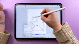
9. Side View Floral Shapes Pt.1: For this lesson, you're either going to need
to be someone who can draw flowers 100%
from their imagination. Or you're going to need
some reference material. You can either use
your own photos. If you're anything like me, you probably have a
camera roll chock full of weeds and wildflowers ready
for this very occasion. You can also find lots
of inspiration online. Pinterest is a go-to
for a lot of us, and I love it too. But I want to stay
away from using Pinterest to find
reference images. Because with Pinterest, you're mostly going to find images of illustrations on there
illustrations that have already been stylized
by another artist. We want to stylize the flowers
in our own unique way, so in case you're not
familiar with it, let me introduce you
to unsplash.com. Millions of fantastic photos from lovely
photographers who under the Unsplash license give us permission to use their
photos in any way we like. I've put a link into
the cheat sheet for this collection that I've
created of side view flowers, which you're welcome to
use as a starting point. Grab yourself two
or three photos that you would
like to work with. A quick space-saving
way to grab a flower because we're only
going to be working on a small canvas for this, is to take a screenshot
with however you do that on your iPad and then rather than having this whole thing
saved as a screenshot, if you crop it down to just
the flower that you want, you're going to get a
much smaller image there. If you want to add
it as a reference, then you would need to save
it to your camera roll. But if what you want
to do as copy and paste it directly
into the Canvas, then you can come up here, tap Copy, and then you can
then delete this screenshot. It's not saving up space on your camera roll
and then you can go back into procreate and swipe down with three
fingers to paste. That's a really quick way of not having a camera
roll filled up with screenshots or a
downloads folder filled up with huge
high res photos. If you do want to download the full high
resolution version, you can all see tap
here, Download, and then it will save
to your downloads folder on your iPad. But you should find that a
quick screenshot is fine here, especially as we're only working on 1,000 pixel wide Canvas. Let me have a look through
the photos we've got here. I think I'm going to use this
one here as a reference. I'll just take a
screenshot of this one. I think I will
save these ones to my camera roll so that I
can do them all in one go. Tap "Done" on that one, save to photos and maybe
let's choose this one here. This looks like quite an
interesting one to work with. We'll just save that one
to the camera roll as well and these ones here, these bell flowers, so I
think they're going to be a good shape to use as well. Let's just crop this down to maybe just the
individual flower actually. Then tap "Done" and
save it to photos. Have a look through
all of these photos, such through Unsplash, and find any flowers that
you'd like to work with. Then we'll go back
over into Procreate. Let's open up a brush
creating Canvas. You could use the other
one and duplicate that, but we're not actually
going to need to use any of the guidelines that we set
up in there for this one. I'm just going to
start a fresh Canvas. As I said, there's two ways we could bring the flowers in here. We could insert a
photo like this. Then choose one from
our camera roll. Having it actually in your
procreate document like this is especially useful if you
want to trace over a flower. The other thing we can do
to get it into our canvas because we have that photo of the first flower
on the clipboard. You can swipe down
with three fingers and then paste it into your
document like that. If you've just been copying and pasting one
flower at a time, that would be how
you would do that without having it clog
up your camera roll. The other thing we can
do is if we tap up here and we tap on Canvas, and then turn on reference, and then tap on "Image." Then import an image here. You can bring an image in from your camera roll and have it floating off to
the side of the canvas, not actually in your document. This can be useful if you're
filming a time-lapse and don't want the photo in what
video you're going to share. That's three ways
you could bring a reference image
into procreate. This next part is probably the trickiest part of the
whole class for me to teach with the Maths and the other aspects is just
step-by-step instructions. But breaking down these flowers and how they look is
going to be different for everyone and it comes down to your own eyes, style
and intuition. I'll do my best to
narrate what I'm thinking and seeing as I go, but as you're working, it's okay and it's
a good thing if other ideas are
jumping out at you. The more times you do it, the more you'll start to lean in your own way of seeing
and interpreting things. To start with, I'm
going to hide these and I think I'm
going to bring in that yellow daisy that
we were looking at. I'm going to tap up here, around here till you get back, come up and then you can
import and bringing the daisy. Just going to tap the
corners to resize this. When I'm thinking about how to simplify a flower like this, I try and break it down into
about three or four layers. The middle layer would be
the pollen and stamens, which you can't see
from this angle. But that doesn't
mean that we can't add them in if we want
them to be there. The bottom layer will be a petals at the
back, which again, we can't see, but
that doesn't mean we can't add some out at the top. Then the top layer would be
these petals at the front. If I was going to
do a fourth layer where I was adding
this body part of it, that will be an
optional fourth layer. My illustrations are very
stylized and whimsical, so I'm not going to be trying to capture every single petal and every different angle
here and I'm not going to hesitate to change up the shapes if I feel like it. Your style might be
more lifelike though, and you might even want to trace over some of the
parts of a flower, which is totally
allowed by the way. That's the very reason we used Unsplash to get these photos because these photos are
licensed to be used in this way. However, grabbing a
photo off of Pinterest, that's another
photographer's work. They have not given you permission and you
have not sought permission to trace over that photo and use
it in your work. I think with this, flower, I'm going to make
it symmetrical. I'm going to turn on my
symmetry in the drawing guide and I want vertical symmetry
like that, so that's okay. Just resize this one again. I think I'm going to start with the top layer
of these petals. I'm going to grab my brush, I'm going to use this draw ink one and we're going to
be drawing in white. Let's just add a new layer and turn on drawing assist for this because we want
it to be symmetrical. I'm just going to draw some cute daisy petal shapes coming out. I'm not going to
worry too much about angles and overlapping
and stuff. I'm just going to
go cuteness here. I think that's, that's probably
okay for first attempt. If you wanted to add more
petals, you could do that. I've only used three here. There's lots more
petals up there. If you want to put
wavy lines on the top, if that was the thing
you wanted to do. It's just a case of like zooming in and figuring
out which details stand out to you
and which ones you want to incorporate
into your designs. You might choose to bring
these lines that you can see coming out
of the middle there. You could add those
in like that. Although this is a
shadow where we've got two petals overlapping, you might decide that
that looks quite cool as an element and you could incorporate that into your
flour and stylize it that way. Yeah, have a look at all the little [inaudible]
that you can see on the flower and decide what you want to incorporate
into yours. You can even add things
that aren't there. Like you might decide you
want to completely change up the shape on the
end of these petals and put some frilly
bits like that. Anything goes and just go with what stands out to
you and your imagination, so that is the top
layer, the first layer. Although like I said, we can't see the
bottom petals here. We know they're there and in
terms of if we're thinking about those stylized daisies that we drew in the last lesson, imagined in turning
those forward and imagining that the petals are there peeping
out at the back, we can definitely add
some of those in. I'm just going to
put those in here. The back looks like an okay angle and then
I'm going to take my eraser because these one
is here at the top layer, we can erase these parts
where they overlap. I need to make my eraser
a bit smaller there. Then for the middle layer, I said we could imagine like
the pollen and the stamens, like the center circle of
the flowers that we drew. Obviously we can't see that from this angle and the
photo, but again, we know it's there
and we can add it in any way that we
might want to draw it. I'm going to put a semi-circle coming over
there and then we can, like before erase the bits that overlap with petals that
we aren't going to see. That's the middle layer done
and you could possibly, maybe put some little stamens out like that as well with
the bits on the end of them. Then erase those bits
where they've overlapped. Then sometimes like I said, I might add this part in here, which I think are called
the sepals and receptacles. But don't quote me on
that. I'm not a botanist. But yeah, you could imagine if your stomach is like
coming up here, you could have
something coming out from this central line and just coming out in a
nice body shape like that. If you wanted to add
that on as well. We've broken this
daisy shape down into one layer for the
background petals. Then we've got a middle layer of the stamens and any bits
that come out of the middle. We've got the petals on top and then a fourth layer of this, the bud part where it
joins onto the stalk. That's just one way of looking at this flower
and interpreting it. I'm just going to show you the one that I came
up with when I was doing a run through
for this earlier. I hide these layers here. Looking at this
flower yesterday. This is the brush that I came
up with for this flower. Another completely different way of looking at the same flower. I've added more of
these petals in here, the narrower fitted Morin. I've picked out some of the
lines and added them in. Drawn lots more
petals in the back and gone for a completely
different shape underneath. Even the same artists looking
at the same flower on two different days
and you'll see and pick out different
things each time you look. Obviously to add
this as a brush, you would copy this layer and then find one that
you've recently added. You can duplicate that. Tap on to that to edit the, go to "Shape", "Edit", "Import", "Paste." and that will be your new
brush added in there.
10. Side View Floral Shapes Pt.2: Another shape that
I like the look of was these beautiful bellflowers. I love these flowers. Let's
have a go at tackling these. I'm going to hide this
layer now and I'm going to turn drawing assist
on because I'm going to do these
symmetrical as well. See I love these
bellflowers and I use the shape a lot
of my drawings. If you have the right brush. Let's go back to my
recents and find this one. You could easily
just draw these in two dimensions and that
would look nice enough. But looking at this and trying to look for my
three layers in there, I think I would possibly have the whole silhouette shape as my top layer, the top petals. Then I might try and draw
some stamens inside, like you can see some of that, but I might try and
make those longer so that they stick
out at the top of the flower a little bit more. What's the word I'm looking
for. With the perspective, [LAUGHTER] like the top
of the flower is here, I might instead add some petals coming
out of that behind. Let's have a look at
how that could look. Let's just start. I think I'll draw it
the other way up. This one is pointing upwards. I'm going to follow the
shape of this nice curve here because I like that. This middle pointy one comes up a bit higher than
these two on the edge. Let's stop there. Might
be a bit too high. Just undo that and then
curve those round like that. I might go for that as my
silhouette, my top layer. Then we could imagine
that there's two extra coming in-between
those on the back here. Might be a bit too pointy. Let's have another go. I think they might be a bit too pointy. Let's just undo those. Let's try and make them
with the pencil not the eraser and make those
a more curved shape. That looks better I think. That would be our base
layer of the flower. Then for the middle layer, I think it would be nice to
add some stamens and again, coming out just here. Then instead of circles
on the end of these, I think I'm going to
do like oval shapes, like Lilly pollen stamens. The ones that stay in your cloth if you
don't cut them off. Then let's erase these extra lines that
we don't need there. Then instead of drawing like that bud shape
at the bottom. Well, we've got these frilly bits coming
off at the side. But instead of doing
that, I think I might take that
inspiration to add some line work up into the flower so I can see
what that looks like. Maybe a bit more spaced out. I think I'll use that as the basic shape
for my bellflower. We'll go to this layer. We'll tap Copy, go and duplicate our last
brush. We can find it. I've got no idea
which side I was working and that
doesn't really matter. We'll just grab a brush. Here's the trial run one that
I made from this yesterday, which again is
slightly different. I've gone for more rounded, bell-like shape on
this one as opposed to the more like twisty curve. But let's duplicate that one. Tap on the Edit icon
and go to Shape, Edit, Import, and Paste, and we are done. Again, another example of
the same artist looking at the same picture on
two different days and you will get different
results each time. I'm very much looking
forward to seeing all the different
shapes that you create when you're working on
your class projects. But let's have a look at a couple more examples before we start using these brushes. Let's have a look at the, I think it was a blossom petal. Let's bring that one
in. Blossom flower. Let's hide this layer and
we'll add another one. Again, I think we'll
use drawing assist here because I'm gonna make
this one symmetrical as well. Let's turn on drawing assist. Let's turn this around and
have it facing this way up. These blossoms that essentially
a side view of the like, the five petal shape. If I can find one, do I have one here? Up here. This five petal shape
that we made earlier. I'm going to imagine that being folded in half and then with
the stamens in the middle. We've got two petals there at the back and then
three at the front. But we might change that
as we go to make it fit. Let's grab my
sketching brush and I'm going to start by
drawing these two petals in at the back, and then that will
be my bottom layer. Then although with these
three at the front, we're looking at those
very much site on. I'm going to imagine
them more curled up, and like standing
up a lot higher. Let's have a go at drawing
that one in there. Then this will may be a
bit shorter in the middle. Then we can grab our eraser and erase what
will be the overlap there. No. That's not the right
one, getting confused. That bit. There we go. [LAUGHTER]. Then do I want to add an
extra one in the back there? No. I definitely don't. I do feel like these
might need to come up a bit higher angle maybe. Maybe I'm going to draw
different ones first. Maybe we'll draw the
back ones with three. Well the front ones with three, let's draw these
front petals first and then nope select like that. Do I want to try a
more curvy angle? Let's see how that looks. Then maybe we can put these two in the back
coming out there. Then I'm going to
imagine that we can see maybe a little bit of something or maybe take that up a bit higher.
Just don't do that. A little bit of something peeping out in the middle there. Then we can put the stamens poking out in-between the leaves
there as well. Maybe make them a bit longer. We can put the tops on the
stamens, some little dots, and then erase any parts
that you don't want to see. Then we can again
copy this layer. Then go to our brushes. Find the one that
we were just using. Again, I can't remember
which one I was just using, but any of these is fine. Just swipe to duplicate, tap to edit, and then go up to Shape,
Edit, Import, Paste. That is another brush
added to our brush set. When I was filming,
I forgot that I had already done the
yellow flower Daisy. You're actually going to get two versions of me
interpreting this flower. I was going to edit today, but I think it's useful to see even more ways of looking
at the same flower. Looking at this Daisy, it has quite a few more
petals than the last one. I think I'm going to use
symmetry for this one as well. I think for this one, also I'm going to add a fourth layer and put this bud part
on down here as well. Let's start with that layer. If I'm using the
right brush, that is. Just grab my drawing
brush and I'm going to make a bowl shaped semicircle
down here at the bottom. That's going to be my top layer. Then the next layer down
would be these top petals. I'm going to imagine
a middle part on this, although
we can't see it. A circle with some
stamens in the middle. Then again, although
we can't see them, there is a backlayer
of flower so I might put some more petals
poking out the back as well. Let's add the top petals first, which is roughly draw these in until I get them
how I want them. Then just erase
the scruffy bits. These already need stamp brushes so they don't have
to be perfect, but you can erase some of the
scruffy bits of you want. Then it's up to you how you interpret the shapes
of these petals, that's going to be
individual to all of us. For example if we zoom in here, you can see they're
actually quite flat or possibly even go down a little bit at the top layer so that might be something you want to incorporate
into your design. I think I might
change mine and just erase those little
extra bits there. You can change up the shapes on the ends of the
petals or for these, you might focus on the lines that come out from
the middle of the flower. Or you might even want to add some extra
embellishments on there, some little dots or
something like that. Or these parts here, although that's shadow where you've got overlapping leaves, you might decide that's
the way you want to stylize your flower
in this illustration. We've got our top layer. Next down, we've
got the top petals. Now I'm going to imagine
some back petals creeping in-between here for the parts behind the flowers, maybe make them a bit lower. We can at least
pretend we've got some perspective going on here. Then if you wanted to,
you could maybe add some stamens as well on these. I'm going to put some coming out from just in-between
the petals there. She's big circles on the
end of these actually. That's how I'm choosing to
interpret this one this time. Once you've got a design
you are happy with, you can then copy it and go to your brushes and then find
a recent one to duplicate. Then go to Edit, Import, and Paste. Then you've got that brush
ready to use as well. A couple of points to
note when you're adding these brushes is
that they almost certainly won't be
centered on the layer. If you wanted to transform this, make sure that
you've got snapping on and turned all the way up. You could center it before you copy it if you wanted to have
it centered on the layer. Let's copy that now and
go and edit this one. Import, Paste. If you wanted it to be
centered so that you've got more an idea of why
you're stamping it. You probably also want
to have the scatter and rotation turned off for
these side-view shapes. Because with these,
you'll likely want to stamp these and then use
the select tool to change the rotation yourself to get the perfect position
on the Canvas to suit the angle of the stem
that you've drawn for them. Once you've drawn
all of your flowers, and you've got two or
three different motifs to use and then you've
added them as brushes, head onto the next
lesson and we will use them in another
illustration.
11. Project 2: Floral Envelope Pt.1: Let's have a look at project to this floral envelope
illustration. I've got this document open on an A4 or letter size Canvas. But as before, go
bigger if you want to. You can either freehand
your envelope or you can use the template to draw and trace over which I've put
in the class cheat sheet. The quickest way to get
it into Procreate is probably to open the
PDF on your iPad, take a screenshot of the page
with the envelope on it, then copy it, delete the
screenshot like you did before, and then go back into Procreate, swipe down with three
fingers and paste it in. You can then resize it
and use it to trace over. It only needs to
be a rough guide, so don't worry if it gets
pixelated when you enlarge it. If you want to draw
your own envelope, you can do that as well. I'm going to do that now. Let's add a new layer and
turn on our drawing guide. We can use the symmetry
tool to draw this. [LAUGHTER] Then we only have
to draw half an envelope. I'm just using the drawing
brush from this set here. Let's start envelopes,
go down here. Across the bottom, this
is the sketch layer. Remember this isn't the one I'm going to use for
my final illustration. Then they come up,
they're curved. Then there's the flap
there with a curve on it. Then take a slight
flaps to go underneath. I think I can definitely
make those a bit straighter. Let's try that again.
There we go. Maybe not. You can either free hand your envelope or just import the one from
the cheat sheet. For this illustration, I'm using the doodle brush
and I'm going to also use the scrubby
texture that come in this advert,
is on my website. If you want to download
those for free, you can do that, there is
a link in the cheat sheet. If you want to use something
slightly different, I would just suggest
either using from the Procreate default sets, the marker brush, or the dry ink brush. Thinking about how I'm
going to lay this out. Layouts which look good are
things placed in odd numbers. Groups of three work well. Switching up sizes
is another way to have a nicely
balanced composition. Instead of having the
same floral stamp three times at the same size, I'm going to try and
change up the sizes. Let's start with
the bell flower. I think I can even find them. It's got like three
or four brush sets on the go here. There we go. [LAUGHTER] I think I'll start
with a big one up here. I'm going to put this
on a layer above the envelope so that I can move these around
and transform them. Not on the same layer as
the envelope at this stage. Let's see how big this
is going to come out. Yeah, we could definitely
go a bit bigger with that. It's an okay size. I think we'll stick with that,
and we could transform it and make it a little bit
bigger if we needed to anyway. I'm going to turn
off snapping and magnetics so that we can
free transform this. I'm going to move it up there, a little bit of an angle, which is placed
that one in there. I'm going to have
one coming here. I think I might have one over here and then
one at the bottom. I'm going to duplicate
this and transform it. This isn't the
thing I would do on a final illustration layer, but because this is a sketch, it's okay to transform and
we don't have to worry about things getting pixelated because we've transformed
them too many times. Just duplicate this again, and we will flip this one, I think over to the other side, and bring this one
over here, I think. Then I'm going to
add another layer, and we'll grab the
daisy brush this time. Let's see how big this
guy is. Too small. Let's make it a
bit bigger. We can resize it as we need anyway. I think I'm going
to place one up here to a small
one up here maybe. Varying this by putting
the small daisy next to the biggest bell flower just to make the layout
more interesting. Then I think we'll
do another one here and one down over that side, just put that, coming to pin down over the
envelope there. Then we're going
to duplicate that. Let's have one over
this side as well. We didn't want it to look too symmetrical
with the other ones. Let's take this one down
a bit lower. Here we go. Then we can pinch
all of those to merge once we've got them
all in the place we want. Then I'm going to add
a layer underneath that to draw in the stems, and then I'll be able to erase any parts of the stems where
they crossover easily. Just freehand these in. We join this one up and pretend it's part
of the same plant. That's another thing with drawing stylized
imaginary florals, is that it's fun to
just imagine [LAUGHTER] different bits of
plants stuck together. Plants in real life don't have two different types of
flowers growing out of them. But if we want to
imagine it this way, then we totally can. I think all that's missing from this envelope now is a few
little sprigs of leaves. I've got a nice space here. I'm going to just draw some
leaves coming out of there. I could do some on this plant and some down here
to fill the gaps, and then maybe I have another sprig coming out
of this gap as well. Imagine some of
these overlapping and going behind
the flowers too, and then maybe one there and
one just drooping down here. I've got space for one more.
Maybe put one in there. What I'm going to do
now is use my eraser to rabbi where I know I'd want
them to be tucking behind. Just say that the sketch
doesn't get too busy. What else do we want to do? This one, we can erase
the stem in the middle. I'll go around and try and
erase all the stems now. If we wanted to make
it less confusing then duplicate the envelope,
hide one of them. You've got an intact
envelope to go back to. Then on the envelope play you
can also erase the parts. I've got Drawing Assist on. [LAUGHTER] Turn Drawing
Assist off when you do this. Then you can go in
and erase parts of the envelope that you won't
actually be drawing as well. Then if we go to the
layer with the stalks, we can erase those as well. I know sketch layers
are meant to be messy, but sometimes it is nice to tidy up your sketch
layer a little bit. I think that's probably
all I need to erase. I keep seeing more bits
even as I'm saying that, so I'll just take
these off as well. Some down here on that petal. I keep spotting more and more. I think that's done this time. Once you have your sketch
layer all figured out, you can merge all of those layers together into
one single sketch layer. Now that we've got the bones
of our sketch laid out, we're ready to start
putting in some of these shapes and things
when coloring in. But I want to show
you how I intend on doing the coloring
for this first. Let's just add a
new layer in here. I'm going to change
the background color first so you can
see what I'm doing. Let's put a layer in
here and I'm going to grab a white color
for drawing this. What I'm going to do
is I'm going to draw all the shapes in white
as a flat white shape. Then I'm going to add a
layer above that one, clip it to the
layer below and use this scrubby texture with a color that I
actually want to use. Then I'm going to
draw over the top to get this nice
textured effect over it. This is a much better way
of creating texture using the clipping mask like this rather than doing
something like, I just grabbed the right brush, drawing the shapes like this, filling them and then alpha
locking the layer and then drawing over the top of that with your scrubby texture. The benefit of doing it this way is if you wanted to
change the color of that, you can just alpha lock
that clipping mask, grab another color,
and then tap to fill that layer and your
texture is kept intact. You still got that. But if you tap to fill the shape here, you're going to lose your
texture because it's just going to flat fill
that whole area. You'd have to use the hue
and saturation to do that, which it takes a bit longer. The clipping mask is a much more flexible way of adding texture. Then you've got the option
of recoloring much easier. Let's just get rid of those and show our sketch layer again. I like to have my
sketch layer on the very top and then
work underneath. I'm going to add a
layer underneath here. I'm going to reduce
the opacity on my sketch and I've got the
blend mode set to multiply. You could leave it as
normal, either is fine. I'm going to draw
underneath this. But if you want to
have your sketch on the bottom and draw on top, if that's how you do it,
that's fine to do it that way. Use whichever you
prefer working with. If you've never tried
one or the other, then why not give
something different a go. The benefit of having
it on top is that you still get to see
these line details over the top once you've drawn your shapes
in and you don't have to keep moving things around to be able to see those. But then disadvantage is
that you might find that it fills in the way.
Choose whichever you like. Let's start by drawing the
shapes for the envelope. These going to be in white
with the doodle brush. I'm just going to trace over the base of the
envelope to do this. My drawings are normally
quite wobbly and not completely perfect because
that's the style I use. So it doesn't matter that
you've gone over the edges. If you wanted to
draw straight lines, you could hold and snap and draw a nice
straight lines like that. But I'm going for
the wobbly look here because that's
how I like it. The next part I'm
going to do is to add the side flaps for
the next layer. They'd be the next
layer up. I'm going to add a layer above. I'm actually going to change
to a different color, any other color is fine because if we draw with white
on top of white, we're not going to be able
to see what we're doing. I'm going to clip this
to the layer below. Then starting off the edge here, I'm just going to trace over these side flaps around here and then connect it
up with where we started. Then do the same
on the other side. Could have used Drawing Assist here if we wanted
it symmetrical, but we're going for
wobbly non-uniformity so we'll leave that as it is. Then you can color
drop to fill those. I'm actually going to turn
the drawing guide off because we don't need
that distracting us. Then I'm going to
add a layer above and clip this one as well. The last thing to
draw off the envelope is this bottom flap here. Just make sure you've joined
that backup there and then you can color drop to
fill that as well. Now I'm going to Alpha lock these two colored layers and fill them in with
the white color. Now, we can add some shading on to the clipped color
layers above these. I'm going to start with
the bottom envelope layer, and I'm going to add a layer. Because we've already got these two layers
clipped above it, this one is going to get
clipped to it automatically. I'm going to choose
this peachy color. I'm going to grab the
scrubby texture brush from my flower Stylised Floral set. I'm going to scribble in. This brush has got
a direction to the grain so if you twist
it around as you go, you'll get nice changes in the direction of your
grain coming through. Don't press too hard, otherwise you'll get
really flat color. If you press too hard,
you won't see the grain. Don't be afraid to leave some nice white patches
showing through. That's the base layer done now. We're going to go
to the side flaps, add a layer above, and that would also get
automatically clipped. We can start to color those in. Don't worry about
not being able to see the edges because
we'd be adding shading in later and that will help with the
shadow and highlights. That will show us
where our edges are. Then we're going to add a layer
above this triangle here. This one we will need to tap and clip this to
the layer below. Then with this layer, because with these, what we're clipping everything to is
this shape at the bottom. We're going to need to use a layer mask to make this work. If I hide this layer, you can see that the shading
has spread out past that. To make sure they only covers this flap because although
we've clipped it to this one, this one is in turn clipped
to the whole shape here. We're going to tap this
layer here and tap Select. Then on this layer here
with the shading one, we're going to tap
that one and tap Mask. That's going to stick to just covering that
envelope flap layer. We can also do this
with the side flaps. I just de-select and turn this one off
and this shading on. You can see that's going
out past the edges as well. If we tap the white layer
underneath and tap Select. Then on this layer, if
we tap and tap Mask, that's going to just mask off the areas that we
don't want to see. Now we can show all of
those layers again. If we just turn our sketch off, you'll see that it's now showing the individual
layers much better. Once we've got all
our motifs in place, we'll also come back and add some shading
to this as well.
12. Project 2: Floral Envelope Pt.2: I'm just going to put
my sketch back in. I'm going to start by
drawing the stalks, I think. I think when I'm
drawing these flowers, to start off with, I'm not going to worry about
getting them in between the right layers of the
envelope at the moment, we'll do that part of the end. I'm just going to
add a layer above here and we'll just
draw the stalks on top. Remember, we want to be drawing in white while we're doing this, so I'm going to draw the flower
stems in first, I think. Just make sure I've
got the right brush. Then we can just draw
all of these flower stems coming down into
the middle like that. Don't forget to
extend them down past the envelope flap so that they
can be tucked under that. I think that's all
of our stalks. None of them crossover, so those can all be
on the same layer. Now we can add a
layer above this one. Let's name this one underneath, stalks, and clip this
one to that layer. Let's use our green color and the scrubby brush and just add some shading
over the top there. You can be nice and
messy with this, it doesn't have to be perfect. Just hiding that, I can see I've missed a little bit
of green there, but that's going to be underneath the flower
parts, so that's okay. I think the next thing
I'm going to do is let's put the leaves on next, so let's add a layer above this one and go back to white, grab our doodle brush and I'm going to draw all
these leaves in there. Then once you've got
all those drawn in, you can use the color drop
to fill them all in as well. Same as before, we're going
to add a layer above, clip it to the layer below, choose our green color
and the scrubby texture. I think I might go
for a little bit of a lighter color for the leaves
than the stalk actually. Let's give that a try. Then just draw and scribble and move
the canvas around as you go. There we go. That's
our leaves done. The next thing I'm
going to do is to work on these bell flowers. For these, I'm going to use the dark pink color
here for the first layer. Starting off on
the bottom layer, which is these
shadowy bits here, I'm going to draw these in. I need to remember I need to
draw these in white so yeah. Draw these in white and not the dark pink color and then just finished those bits off on the other
flowers as well. That's what we need
to do on that layer. You can then continue
to fill those in, then add a layer above them, clip it to the layer below, and now we can grab
our pink color and add a scrubby texture brush and add the shading to
that bottom layer. Now, the next layer
to do would be the stamens because they
should be popping up on top of these but underneath
the main top flower. Let's add a layer in here, and then with our doodle brush and using the correct
white color this time, we can then add those stamens
in on the layer above. Then you're getting
the hang of this now. Add a layer above, clip it to the layer below, grab our shading color
and our scrubby brush, and we can fill in those stamens with that
nice yellow color. This has got the
sketch layer blended down on top of it because
I'm working above, so they look a bit dirty
while we're working, but they are that nice, bright
yellow color underneath. You can always hide and show the sketch layer just
every now and then just to check your colors
are all working out. Then last of all, we've just added a layer to draw these bell
flower shapes in. Then we're going to use
color drop to fill them, and then we go back
to our layers, and we're going to
add a layer above, clip it to them, and we're going to grab
a lighter pink this time to do the shading with the
scrubby brush over there. I just give that a
nice scribbly texture, moving it around and
varying up the pressure. The last thing to do is put these little bits
of line work in. I'm going to show you
a little trick here. If you use a pure gray
color, so anywhere, right on this left edge here, as far as you can go
off on this left side, any mid-gray color will do/ on a layer
above your shading, we're going to clip
this one down as well and I'm going to use
the doodle brush again. We're going to use
this gray color to draw all of these lines in. It does look a bit weird at the moment but just stick with me because I have a trick to make
this look better. I'm just going to undo that because I think I want to have this line a bit more wavy.
It's looking too straight. Keep bearing with me because I know that this looks
weird at the moment. Now, you know me, I always
like to think about having maximum editing
ability for colors. With these ones here, so the shading that
we've clipped, if we want to change this, all we have to do is, I'll lock the layer, and then we can drop a new color in. If we choose a darker
pink for this color, we're then going to have
to change the colors on this one every time we change
the colors underneath, but if we use this gray color and set the blend
mode to color burn, we might want to reduce
the opacity a bit as well. You can see if I hide
this sketch layer, we just get a lovely, nice darker pink color, and we still get to see all
that texture showing through. What it also means
is if we Alpha lock this layer and if
we want to choose a peach color for
these bell flowers, we can then tap to fill that
layer and that linework over the top would also blend perfectly
with our new color. That's a quick little tip for adding linework
details to flowers, is to try the gray color and use color burn to blend it down and then you won't always
have to keep changing both of the colors as you change the color of
your base layer. This top one is going to
change automatically. I just need to fix this
bit of yellow here that I missed and then that is
all the bell flowers done
13. Project 2: Floral Envelope Pt.3: Next, we can start
work on the daisies. Before I do that,
I'm going to group all of these pink
flowers together. I'm just swiping to the right on each layer
and then we can tap group, rename this group pink flowers, and then I should probably
go through and rename all of these ones that I
forgot to do as we're going along as well. Then we should group
all of these green ones together and label those up, and then we can
add a layer above here and start on our daisies. I'm going to start
by adding this like the bud or receptacle,
whatever it was called. We're going to draw
those in white. I'm going to give myself five points for remembering to choose white and not green. We're going to draw these in air and then we can use color drop to fill them in. Just draw over that, there
have been a miss there. Then we can add a
layer above that, clip it to the layer below, and we can use our green color with our scrubby brush
to add the texture in. Let's name as we go this time, call this one buds, and then we want to be working underneath these layers now. We'll go underneath
and add a layer, and we're going to add
the petals in white. So that we can use
color drop in a second, I'm just going to
hide this layer, and then underneath
on my petals layer, I'm going to close off the shape so that we can use
color drop later. Now we can add a layer above these and I can
re-show the buds now. See, I'm pausing here
because I was planning on doing these petals
in a peachy color, or actually I might
use this lilac one. But now I've seen
them like this, I actually quite like them in just the white color, I
think that looks nice. I'm reconsidering whether
to color these in or not. But the great thing is because we are using clipping masks, I can go ahead, add the shading, and then decide at the end if I
want to keep it or not. Actually, maybe if I do
like that quite lightly, it's just going to look like a little bit of daisy shadow. Let's have a look, gone
too dark there, I think. Let's try that again. No. [LAUGHTER] Yeah,
lighter definitely. I think I might just
leave it like that. Let's have a quick look. Show and hide, maybe, we'll see. Anyway, the next
thing to do is to add the darker petals underneath. We'll draw those in white and then we'll have a final
compare at the end. I'm just going to
start down here under the leaf drawing a shape
underneath as well so that I can join
it up and have one single shape to be able
to color-fill with later. Just close this one up
underneath as well, and then let's pick
one last of all. I hope that's joined up
somewhere underneath, we'll find that when
we feel. That's fine. Just fill those in, and then we'll add
a layer above this, clip it to the one underneath, and we'll use this
lilac color to do some shading on the petals below just a little bit with the
right brush, of course. Now we can add a
layer above this and we can put the stamens in, which needs to be in white.
I'll get it right in the end. Then we can clip our
shading layer to this one and at the
yellow in there. Then at this point, we can
hide our sketch layer and have a look at the
comparison and make a decision on these
flowers on the color. I think I am going
to keep these mostly white and use that shading, but what I will need to do is to make the envelope
darker underneath, so there's a bit more
contrast down here. We can work on that
when we do the shading. The first job that we
need to do is to take these envelope layers and
move them up above the stems. I'm going to unclip
this one here, and we can use the
same mask technique as we used earlier. You want to tap on this layer, like your base envelope layer, tap select, and then
invert your selection. You'll see it will
switch so that you can now draw on the
outside of this now. Then on this layer mask
here for the flap, make sure you're on
this layer mask, not the shading underneath. You want it to be on the layer
mask up there like that. Then with a pure black brush, you can then draw onto that mask and then mask
off that extra area too. Now we're done with
that selection, and we can grab this layer; the layer mask, the shading, and also the envelope flap 2. You should have four
layers selected there. Your white envelope flap, the mask on it, and then the shading, and then the mask. Then we can drag these up
above the green stuff, and then it's going
to mask it off. I'm going to move it down. Let's put it in between
these and then we'll still have that little leaf
peeping over the top there. You can see where
I've put that in and it's got a clipping
mask below it. It's clipped itself to
that, so just tap on that, tap clipping mask, and now we've got that all masked off nicely. The next job is to
add some shading to the envelope to help these
layers stand out a bit, to help the daisies and also
the layers on the envelope. On our layer here, we're going to add some
shading along this part. Let's grab this peach color and pull it down and grab
a slightly darker version. Let's find our texture brush, and we'll just add some shading
behind that flap there. That's looking much
better already. The next place that we want
to put some extra shading is down on these layers to show that they go underneath
this front flap here. Let's select those layers. Again, make sure you're
drawing on the shading, not on the layer mask, and you can just
darken it up there behind that front envelope flap. This way we also get to add some contrast
between the envelope and our daisies as well. That's popping a lot more now. Last of all, I
think we should add some shading down to the base of this envelope just
to grind it a bit, I think it would help. Then again, make sure
you're on the shading, not the layer mask layer, and then you can just darken that up a little
bit at the bottom there. I think that's working
a bit better now with that extra shading in there. One last thing that I wanted
to do is just add a bit of texture and definition and movement to the background
rather than this flat color. Anywhere down here
at the bottom, I'm going to add a layer just
underneath the envelope, and then I'm going to grab
my color that I use for the background and
just pull down and get a slightly
darker version of that. Then I'm going to use this
scrubby texture brush and just add some shading coming out from
behind the envelope and maybe a bit around
the edges as well. Then I'm going to go
back into the colors, select this one again and grab a slightly lighter version and mix that one in with it too. Then come back to the dark
one, go a bit darker, and then just go around
the edges to give it that classic vignette look. Then I'm going to grab a smaller brush and
just add a little bit extra around the
edges of the envelope just to help that pop
and stand out as well. There we go. That's
project Number 2 done using our side-view
floral stamps. Again, if you want
to upload this to the project gallery and you want to do the
low-res version, what I would do is to go out to the gallery, duplicate that, and then save out the
low-resolution version, following the steps
that we used in a previous lesson for saving a smaller
version of this one. Then in the next lesson, we'll look at creating an overlapping flower
pattern like this one.
14. Overlapping Floral Shapes: For this last type
of stylized motif, we're going to combine
the front end view of a flower with some layers so that you can have continually
overlapping petals. Let's pull up our guidelines and we're going to
use the nine lines, one for this flower. With these types of flowers, we want these ones to overlap. These midpoints are still
going to be useful here. We need to know where they
are so that we can make sure that we're drawing pass
that line this time. You'll get a different
look depending on how far past you go. With this one here. Let me just hide these lines. With this one, I went just past the central guideline so
you get a slight overlap. Then with this one here, you can see I took
it all the way out to the beginning of where the next marker
would be and we've got a much bigger overlap here. Let's put these guides back
in nice so we can use them. To start off, this is
the same as before. We're going to draw
a middle petal, sorry a middle circle in
the middle like that. Then we can center this one. Make sure you've got snapping and magnetics turned on there. Then we can turn drawing
assist on for this layer now. We're using vertical symmetry on this layer like we were before
with the other flowers. I'm going to draw
a petal same as before and I'm
going to go just a little way past this halfway
marker with this one. Maybe go a little bit more pointy bit further
with this one. I have another go try and
make it a bit further and a bit more pointy. There we go. Then as before, we're
going to duplicate and transform this
around the canvas. Let's rub at that part in the middle there
that we don't need. Then with a pen, we're going to add
a corner guideline with our pen not the eraser. Then we can transform
it around the middle. This one is a nine petal flower, so 360/9 is 40. Then we duplicate this
bottom one again. Tap to transform 40
plus another 40 is 80 and then we can duplicate this bottom one
again, 80+40 is 120. Don't forget all the
math for this is in the cheat sheet and then
we do this one more time. Duplicate the bottom one and
120 plus another 40 is 160. We're now at the
point where we can flip this over horizontally. We merge these together and
then swipe to duplicate, tap to transform and flip horizontally and then we can merge those
last two together. Then you can see
we've got these going all the way round with
these little overlaps. Now you can either
have these all overlapping perfectly like
in a spiral like this one, one on top of the other, perfectly all the way round. Or if you wanted to, you could erase just some of the middle parts so
that you have for example on this one, you could have this one on top, this next one underneath
if we erase this bit, and then this one
we could have on top and then this
next one underneath. Then when you get to the bottom, you'll need to turn drawing, assist off and choose which of these you
want to have on top. You could randomize these up. You could have a few on
different levels or layers. But for the one that
I'm going to do here, I'm going to work all the
way round in the spiral. But that other way is an option if you
wanted to take this, develop it further, and add a bit more randomness
to your designs. But I'm just going to go
and undo those steps now. Tapping with two fingers. We're going to work on having
a spiral like this one. Let's put our original
flower back in and we can hide
these markers next, we're done with those. When it comes to erasing these, it's going to be
easier for you to decide which side
you're going to erase and then work your way around in a
spiral from there. I'm going to work on
the left-hand side and erase what's inside. I have drawing assist on still. You need to turn that
off for this part. I'm just going to make my
eraser or a bit smaller. Left-hand side of the petal and I'm going to
erase what's inside. Then we can spin this around left-hand side and
erase what's inside. Left-hand side,
erased the inside. Then you can just keep working
your way around like this. Where I've got little bits like this and it's a bit
jaggedy and messed up is okay because it's not meant to be perfect
and don't forget, this is just for sketch layers. It's nice to work
without the pressure of having to have perfect
lines sometimes. I think we were this way up, top petal was pointing upwards. That's how it should
look once you've erased all the inside
lines on those. What we need to do now is
copy what's on this layer. Let's erase our
corner markers first. Let's tap to copy this layer. Don't forget when
you're doing this. If you wanted, you could add for example lines on these layers if you wanted or you could
do little lines and dots, all things like that. You don't have to stick with just the plain flower outline
if you don't want to, if you feel like stylizing
it in your own way, then definitely go for that. We're going to just tap to copy and then we'll go
to our brushes, try and find what
we were just using. I've got three sets
on the go here, but this one here will do. We're going to
swipe to duplicate, tap to edit and then
we go to Shape, Edit, Import, paste
and we are done. Can obviously adjust the
scatter if you wanted to. I'm going to turn this
scatter off for this one. Then in the next lesson, I'm going to show you how
to use layer masks and shading to get this
continually overlapping effect
15. Overlapping Petals with Layer Masks: I'm in another A4
document here again, which is similar
to US letter size. Let's grab our brush with
the flower we just made. Let's stamp a nice big
one in the middle here. Maybe that's too
big, actually, no, that's probably okay that size, and let's center this
on the document. I've got snapping turned
on and all the way up. I can see here in the binding box where it's going past the
edges of the flower. So I must have had some
small bits of corner markers left on that I didn't erase
properly when I copied that. I could leave it as is, but because I do want this properly centered
on the document, I'm going to go back into
the other brush Canvas, and I'm going to
change that one. Let's go back in here, go into our layers, make
sure we're on the right one, and then I'm going
to grab my eraser and see if we can
do a better job of erasing the
corners on this one. Then, if we tap to transform, you can see that
that binding box is around the flower now. We can copy, go back
into our brush, tap to "Edit", and paste
that new one in there. Then now we can go back
into our A4 document. If we add another layer up here and go to
grab this one now, you can see that it's
just grabbing the flower, not any space around it. Let's center this one. It's going to be easier if we delete that layer underneath, or it's going to try and center
around that one as well. There we go. Now that's centered properly in the
middle of the document. I'm going to reduce the
opacity down to this one, and I'm going to add
a layer underneath, and I'm going to set this
one on top to multiply. And then on this
layer underneath, I'm going to start by drawing the center middle
circle for the flower. Let's just see
what brush I have. Let's use the doodle brush
from my brush set here. It might be a
little bit too big. We're just going to draw, tap, and snap, and then we can
color drop fill this one. Then because we're going
to have nine petals here, it's going to be
quite a few layers, so we need to be careful to
keep track of what's what. I'm going to name this layer center and then
drag and layer underneath. I'm going to add another one on top because I don't
want to have to keep adding layers above and then dragging them
back down underneath. So let's change the
background color as well so we can see the white petals. I'm going to change my color
to white for these petals. Let's draw in our first petal, and what you want to
do is extend it past this line here where
it gets cut off. I'm going to start
anywhere on this petal, follow the line around,
and then draw it, so it's going past
into the next petal, and then we can color fill. Then I'm going to add a
layer on top of this one. To keep track of
where I'm going, I'm going to use
a different color for each petal from this point. So I'm going to do
this one over the top, pass into the next
petal and join it up. If I was doing
this all in white, it would be really hard to see. If I just change
this one to white, you can see it would
be really hard to keep track of what's what, so we just pick a
different color for each petal as we go around. Add a new layer, grab a different color. On this one I did
not add a new layer, so let's add a new layer above that and then draw it on so that everything is all on separate
layers. There we go. It's quite relaxing
tracing over these. As I said before, I always
love a bit of tracing work. It's quite slow and meditative. This brush that I have has
a multiplied effect on it, so if you draw and then
draw over the top, you get that double layer. If you want to get rid of that, like up here where I just added this bit to
take it further past. If you Alpha lock
the layer and then tap on "Fill Layer" it will just flatten everything
out in there. That's a way to
get around that if you just want flat shapes. Then I'm going to use the
shortcut of long-pressing the color to go back to
the last one that we used. You can just keep adding layers, long press to go back to
the color that you used. That's our last petal in there. Obviously, we're
working on layers and this one is the
last one we've drawn, it's on the top, but
it's now above this one. The trick is getting
this last one here to tuck underneath this one, even though it's
on the top layer. What you need to
do is go down to your bottom petal layer here. Tap on it, tap "Select" and we want to have the
selection inverted. Down here, tap "Invert" and then you can come up
to your top petal layer. I'm going to tap it, and then over here we're going
to tap on "Mask". Then that's going to
mask off the area that was covering that
bottom petal there. What we can do now is
to go through and Alpha lock all of these
petals on these layers, and we can fill them with whatever color you
actually wanted them to be. I'm going to go and
fill mine with white. I'm sure I had white
selected just a second ago. That was weird. I think it was because I
was on the layer mask. Anyway, just fill all these in. And then when you get
to this top one here, make sure that you're filling the layer with the petal on it, like this, rather than being on the layer mask and
filling that layer because that's going
to undo the work we did putting the
layer mask in. Let's just undo that and
make sure this bottom one, thus this should be
the dark blue one. That's the one you want to fill. At this point, we can now hide our guidelines because we're done with those for the moment. You can see now that
we've taken those off, we can't really see the outlines of where the petals are
overlapping at all. So what we're going
to do is to add some shading now to show
the overlaps on those. You can see why it was
easier to draw with them in different colors
rather than white. It's going to get even trickier in a second when we try and figure out what's where and
where to put the shading. Before we move on
to that, though, I just want to draw your
attention to something that happens when you use
layer masks in Procreate. If we zoom right in here, and I'm going to make the
background a different color. You may already be
able to see it. If I make it this darker color, you can see around the
edges of the layer mask here that you're going to get this hairline gap
creeping in around it. What we can do to knock that
out is right on the bottom, underneath the very
bottom petal there, if we add a layer here, grab the same color
as you've used for your petals and then just
using any old brush, just trace and make a filler to go underneath
and fill that gap in. We've got that little small
line under there now, and I can go back and change my background color to
this nice pink color again. Overall these petals, we could shade directly onto
these by Alpha locking, but as you know, I prefer to
have the colors editable. We're going to add a
clipping mask over the top of these rather than drawing on that bottom layer. I've added a layer here, and I clip it to
the layer below, and then I'm going to grab
a slightly darker color, I'm going to use this
nice lilac color. With a shading brush, so I've got medium
nozzle airbrush here. I've got mine set to 37% for the size and my opacity is 53%. This is a really big brush, so what I'm going to do is try and start drawing
from somewhere down here so that we just get the very edges of this spray showing up
here on this petal. Let's just put this to test. But if I zoom in a bit, you can see that that's
just starting to creep in there nicely
through the edge, and what I want is a nice
subtle effect like this. That's the shading on
the first petal done. Now we can work on this one. Let's turn our guide on, so we can keep track of where the edges of
these things are. On this petal, this one here, next one up, I'm going to start
somewhere down here and do that shading. This, again, is on the layer above clipped
down to the layer below. Then if we hide this again, you can see we've got that
nice shading effect there, where this one is darker
because it's underneath. Let's put our guide back in now. Got to this next
layer, add a layer, clip it down to the layer below, and carry on putting
the shading in. Then you can just repeat this, working your way around doing the shading on
all those layers. Then, when you get
to this last layer, the one with the layer mask is, you just add a layer above the layer mask and clip
that down in the same way, and repeat just as we did
for the other petals. Exactly the same. Then if we turn this the right way
up and hide the guidelines, and now you can see we've got this lovely overlapping
spiral petal effect going on. All that's left to do now is add a layer above the center. Clip that one down as well, and let's choose something
a little darker than this yellow to shade the
bottom corner of that. Going to use the nozzle
spray brush again. Maybe something a bit darker. Actually, maybe we could even take a little bit more orange. Let's try that. There we go. Then let's go and find a nice, lighter shade coming in just
touching the top there. We could probably go a
lot lighter with that. Maybe a bit lighter
again, I think. There we go. That's
looking nice. I think we could
probably go a bit darker down on the
bottom corner there. Lovely. Then what you would do is now you can delete the sketch layer because
we don't need that. You would probably want
to group all of these. Just swipe to the right on
each layer to select them, not forgetting that last
little layer underneath. That little extra
bit. There we go. Then at the top, you
can tap "Group". Because there are so
many layers there, it's a good idea to group them to keep them
tidy like this. What you would
probably want to do is have each of those flowers in a separate group if we were
using more than one of these. That's how I get my
continually overlapping effect using shading and layer masks. In the next lesson, we will make a floral
pattern with these.
16. Project 3: Floral Pattern: So I use these
overlapping styles like this quite a
lot in my patterns. I would normally have the brush
set to rotate a little on these so I would probably
have it about 20%, like I showed you
for the others. So they're all a
little different, dotted around the canvas. But patterns are a whole
other class though. If you want to learn how to use flour stamp brushes
like this in a pattern, just like this one
that I'm doing here, then I quite literally have
a whole other class on that. So that would be a great follow on class to take
after this one if you want to dive into
that now that you know how to make your
floral stamp brushes, and I will link to that
one in the cheat sheet. But I love patterns so much, I've come up with a super quick and easy
pattern that we can still tackle here today for
this last class project. I'm not suggesting
this as a method for making patterns for
something super important, but it's perfect
for something fun, like a phone wallpaper
or an Instagram post. Pattern work doesn't always
have to be serious and sometimes it's fun just to do
something because it's fun. So hold tight because this
might blow your mind. So what we're going to do, I want to keep these
layers intact. So I'm going to duplicate this group and then we can
hide this bottom layer. If you're short on
layers on your iPad, then I would come out
into the gallery, duplicate this whole project, and then you could start a new one and instead
of duplicating, you can just go ahead
and flatten this group, you can also get rid
of this one now. So I'm going to make
sure that this flower is still centered on the Canvas. Good, it's still centered. So now we're going to add
some marks to the corner now, like we did when we
were making our brush, I'm going to put these in black so that we can see
them nice and easy. Put some marks in the
corner just there. So we're not going to duplicate this layer and with
snapping turned on, snapping and magnetics, and then everything turned all the way up to the top there. Drag this layer halfway over to the left and you'll see it snap into place there with
the orange lines. Duplicate this
bottom layer again, and drag this one
halfway over to the right until it snaps
into place as well. Now, we can merge these
three layers together. Then we can duplicate
these merge layers and we're going to drag this one halfway down until it snaps into place there
with those orange lines. That means it's moved exactly halfway and then we're going to duplicate this bottom layer
again and drag it up halfway. Now what we want to do is erase those black
marks that we put in. The easiest way to
do that is hide all of these layers and
then just have one showing at a time and
then you can know which ones are showing and know which ones you are
meant to be erasing. Oh, and you'll still get the wrong ones even if you
do it that way apparently. On this one, although the lines are showing they are
hidden behind the flowers, we'll erase those anyway. That's all of those one's done. Now, you can merge all three
of those layers into one. So now comes the magic part, which I came up with
so that we could get a bit of half-drop
going on in here. So rather than just having
these in a straight line grid, a half-drop is where we would have this one repeated
down here in the middle. So we're going to add a
layer underneath our daisy, and we're going to fill it with a color, it doesn't matter. Any color will do because
it's not going to be part of the final pattern. Then we're going to
select this layer, this one here, and move that halfway across
until that snaps into place. So now we've got a
rectangle that is exactly half the
width of the canvas. So if we center this, we've now got a marker
a quarter of the way of the canvas marked out so we
can now snap to this line. So now we need to do
the same vertically. Add a layer, we should use a different color for this one so we can
keep track of them, and just color fill
the whole layer. Then we're going to select
it and we're going to track this one halfway down until
that snaps into place, always looking out for those
lines crossing over there. So now we can drag it
back up and center it in the middle of the canvas and we have those lines
crossing over there. So now we've got these
points here that we can center our flowers
on. Get ready. You can now duplicate
these daisies, and on this layer that
we've duplicated, we're going to drag
it and snap it to where those two
markers their cross, and that will now snap
to that quarter of the way point where;
how cool is that? Then you can see we've got
these nicely marked out. If we duplicate this
bottom one again, because we need to put the other half of
these daisies in, and then we can drag
this one up and across and that's going to snap nicely into
place there as well. We can zoom in and just check and you can see
there's no gaps there. Even though these are
on different layers, this is perfectly seamless. As you go in, it's a good idea
to zoom in and check this. So we can duplicate this
bottom layer again. We just need to fill in
these other parts of the daisies so we can
snap these ones up here. Maybe move that just
that one at the top there and duplicate that
bottom layer again, just to put that bottom left corner of that
daisy down there. Again, zoom in and just check that everything's
nice and seamless. If you do find that you've
got things misaligned, go back to this layer again and just try again
with lining it up. If you find that it's
still misaligned, then it's probably because
you didn't have either of these two layers aligned perfectly when you
moved them halfway. So if you find that
you're still stuck, go back to here and then redo your layer filling
and moving along, just get rid of that second, making sure that you've always
got snapping turned on and magnetic both all the way up to the top and you should
eventually get there. So now we can merge all, not with them hidden because
that will just delete them. Now we can merge
all of these layers together and we can put
this all into one layer. This is actually now a
seamless pattern tile. You could save this
out and upload it to somewhere and it would repeat as many times as you need it to. I don't necessarily
recommend this for important pattern designs, but it's absolutely perfect
for doing something like a fun Instagram post
or some wallpaper. I think I'm going to use
this as a phone wallpaper. So I think we could probably do with a few more repeats in here because I want more of these daisies repeated
across my phone. So let's duplicate this layer and let's hide this one underneath so we have
something to go back to. On the top one we're going to
transform it and then grab this blue node here and we're going to drag
this and snap it. Make sure we have a
uniform on and we're going to snap it to a
quarter of the document. So you can see those
orange lines there. Then you can
duplicate that layer again and drag it over
until they snap into place, and then zoom in and
check that that's still looking good there where
they're joined and that's okay. We've got no misalignment. So we can merge those
two layers together now, duplicate them, and then drag
them down to the bottom. My dog is currently
snoring under my desk, so I do apologize if that's
picking up on the mic. He's now giving me the side eye because I had the cheek to
wake him up to film him. Anyway, that would make a great iPad or
iPhone wallpaper. If you want to do that,
you can save the image to your camera roll and then choose to set it as a wallpaper. As I said, the beauty of tracing these flowers is that
you can have each one slightly different and
I know we haven't got that going on here because we just made it from one flower. But as I said, I do have
another class by using these type of floral stamps to make a more complicated pattern. So that you can definitely take what you've learned
here and combine it with that class to make some
lovely patterns like these, which I make in Procreate
with my floral stamp brushes. So you can save this
as a JPEG and then use it as an iPad
wallpaper as it is, or you could make a tall vertical wallpaper
that you could use on your Instagram stories and give away as
a free wallpaper. If you do share on Instagram, please tag me so I can see it and here's what
you need to do. If you want to turn it into
a tall narrow wallpaper, swipe down with three
fingers to copy all. Then go out into your gallery
and create a new canvas, which is 1080 pixels by 1920. For the DPI, 144 that
should be enough. I know phones are really
high res these days, but you still don't want to be putting 300 pixels out there. 144 is perfect for wallpaper. Then you can tap
Create and that is now the correct resolution and
ratio for Instagram stories. So once we're in this document, we can then swipe down
with three fingers and paste our wallpaper in. You can either just keep it at this scale as it is
if you wanted to, you can tap Fit to Canvas and that's going to
expand it to fit in there. Remember, this is just
a phone wallpaper, so we don't need to worry about
a tiny bit of pixelation. It's not going to
be a huge deal. We're not going to zoom in that big on one of our phone screens. It's only going to be
this size in real life. There we go. How fun was that? I've never actually made
a pattern like this using the centered half of the
canvas with those before. I was determined to
get a pattern into this class somewhere that was going to be easy
enough to follow, even if you've never
made a pattern before. So we are nearly done
and in the next video, we'll wrap things up and I'll go over some more ways that you could use this skill for making stamp brushes
in Procreate.
17. Next Steps: Thank you for taking
this class with me. I hope you've enjoyed it. I wanted to make something
a bit more focused on fun projects than my previous
workflow based classes. Productivity I'm
thinking about ways to make something that will
make us money all great. But I wanted to make a
class to remind myself as much as you that
making some fun, pretty art things just
for the sake of it, is a perfectly acceptable
way to spend your time. Don't get me wrong
now, I totally use all these floors
stamp brushes in my studio every single day. What you've learned is
definitely a win on both counts. Here are a few more examples
of artworks I've made using the stamp brushes
as the starting point. The possibilities
are endless and you don't have to limit
yourself to flowers either. I hope you especially
find the tips on drawing stylized flowers in
your own way useful. Last year I co-hosted a signature style challenge
over on Instagram, and although I
thought I knew pretty well what my
signature style was, it was the active continually
drawing stylized flowers each month from photographs, which helped me to distill
it down even further. It really is a worthwhile
exercise to spend some time on. Don't forget to upload your beautiful works of art
to the project gallery. Stopping by to look
at them is always a welcome distraction
during my working day. Don't forget you can
earn certificates for posting class
projects now too. If you want any feedback,
help, or advice, you can always reach me
through the discussions tab. We try to look in once
a week and I will always get back to you
if you need an answer. If you want to see more for me, I have a YouTube channel where
I post weekly time lapses, tips, and tutorials
for illustration, surface pattern and
design in Procreate. If join challenges and
community are your thing, then you can keep
up with those via my monthly newsletter
or over on Instagram. When you sign up
for my newsletter, you'll also get access to my freebie library which has things like Procreate palettes, mockups, and other
templates in there. As a thank you for
taking this class, I'm going to add some of my Procreate floor stamp
brushes in there for you too. You can find the links
for all those things either in the class
cheat sheet or by going to my Instagram
@bekkiflaherty and following the
links in my bio there. Most importantly though, don't forget to follow me
here on Skillshare. Thank you if you already are, because then you'll
be the first to know whenever I publish a new class or if I have exciting news like Skillshare membership
giveaway to share with you. If you've enjoyed
taking this class, then please leave
me a quick review, they help other students to know which classes
are the good ones, and they're always nice
first teachers to read to. Thank you again, stay creative and I will
see you next time.
18. Bloopers: I guess I'm doing a bloopers
reel for this class. Aesthetically pleasing form.
Stop trying to be funny. We'll create is a floral art. At least we got these designs. Designs for the blooper reel? Simple floral. That sounded weird. We'll create a flower. Perfectly shaped. We're going to create, but remember, you can't use anybody's copied
design, commercially. Great design commercially. Commershnary is not even a word. Don't use anybody's copied
design commercially. Maybe we can add it
to the dictionary. Commercially. Going
to do it this time. Commercially. Can't use the
copied design commercially. Cool. Let's put it another way, you wouldn't be able to sell
that design. Let's try that. Always fun getting naked also
when you're on your own. Should get uptight. I
hope you've enjoyed it. Helps it when I press
play on my teleprompter. What is that noise? Fun. Always nice when the
machinery there. They're using it. Watson
thinks base class. That's in my previous work. Work for your money. Last year I got to host a signature-style
project gallery. I feel I was looking
all over the place. Most importantly though,
don't forget to follow me. Why is this not scrolling? Because then you'll
be the first to know. That was really cheesy. Being Cheesy is good. If you've enjoyed this, that
was a bit loud. The video is Pasha, at
least we got some stuff. Lovely. it was real,
hey, that's good.
 Rebecca Flaherty, Surface Pattern Artist & Content Creator