Transcripts
1. Introduction: If you're on the journey
to licensing your designs as an illustrator or
surface pan designer, having an online
hub where you can send clients to
browse your work is essential if you want
to start pitching to companies and getting
your artwork licensed. If you have any kind
of Adobe subscription, and you probably already have the Adobe Portfolio suite
included as part of your plan. Using the Adobe portfolio
platform to build your website is a
great way to get some extra value out
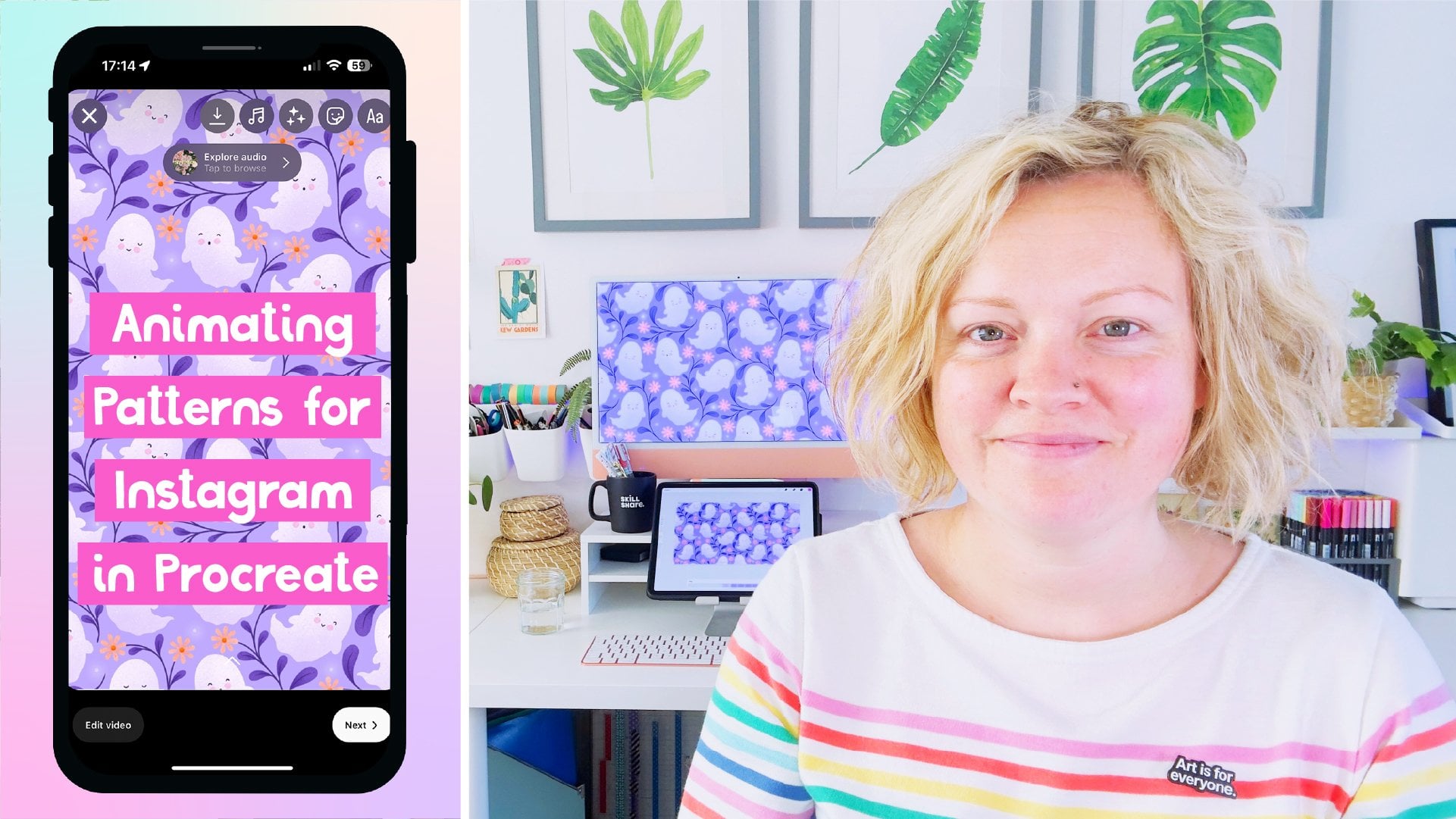
of your subscription. My name is ca Flat, and I'm a floral
pattern obsessed artist and digital content creator. I've licensed numerous designs
over the last few years, and many of these leads
came through clients finding my work on social
media or Pinterest, clicking through to view
my online portfolio, and then getting in touch with me from the contact form there. That's how easy it can be to
send clients to your work and why it's so important to have a system like
that in place. I'm going to go through
the whole process of setting up a website using the Adobe portfolio
interface from start to finish. We'll cover everything from
your first login all the way through to hitting published and sharing the
link with clients. It's really important to
know that you don't need to be able to code.
I certainly don't. And you don't need to have any existing knowledge about website designed to take
this class or use the Adobe portfolio interface. It's a really simple platform
and very beginner friendly. In this class, you'll learn your way around the
portfolio interface, how to choose theme
for your portfolio, and how to set up an
eye catching home page. We'll look at how to
organize your work into categories so
that buyers can easily find the art they're looking
for and how to set up a contact page so
they can get in touch with you right from
inside your website. We'll go through all of the options and
customization settings so that you've got
everything you need to get on with building a portfolio website that matches your style
and brand asthtic. We'll also look at some of
the pros and cons on having a password protected website if that's something you
think you might need. And please don't worry
if new things scare you. We'll be covering things in
a really intuitive order so that you don't
get too overwhelmed. I'll cover one thing at a time, starting with the
bare minimum that you need in order
to quickly get to you to the point where
you're ready to start uploading your artwork
to your website. Then you can come back and
play with the settings and layout once the important
parts are in place. Having a little home for
yourself on the Internet is a really important item
to check off the to Dist if you want to move
from art hobbyist to a professional who's ready to start licensing or
selling their art. You don't need to
have an all singing and all dancing website. A simple, easy to navigate
portfolio to show off the designs plus a contact page is actually
all that you need. And if you follow the
steps in this class, that's exactly what
you'll have. Let's go.
2. Overview + Class Project: As always, every artist and designer has their own
way of doing things. And in this class, I'm
going to show you how I put a portfolio
website together. If you can, it would be
no bad thing to watch similar classes by other artists and implement some
of their ideas, too. There's no one way
to do these things, and the more inputs
you have, the better. In truth, I've wanted to make a class like this
for a long time, but I was hesitant to make
a class solely focused on one portfolio platform that maybe not everyone
would have access to. I know that not everyone
uses adobe software, and unlike me saying
that anything you make in photoshop you
can probably also do in Affinity Designer is not quite the same
for building a website. But then I also realized
without getting platform specific and going through
it in detailed step by step, it wouldn't actually be a very useful or
implementable class. So because Adobe portfolio
is what I got started with, what I know how to use and
what I have access to, that's what I'm going to
be using for this class. May not even be aware of this, but if you have any kind
of Creative Cloud plan, then you will probably
have Adobe portfolio included with it already
in your subscription. You can check this by
signing into Creative Cloud. Click on Manage
account and then have a look in your included
apps and services. It will be under Web Apps, and it took me way too long to realize this was a
thing I already had access to when I
was procrastinating over getting my
portfolio together. Some of the concepts and
advice I'll be going over will apply to all portfolio
websites in general. So even if you ultimately use another platform
for your portfolio, then you'll still
come away with some good ideas to get you started. Do bear in mind though
that this class ultimately is about building an
Adobe portfolio website. I'm not going to
be able to answer any technical questions that you might have about
other platforms. In its most basic form, a portfolio website
needs to be able to display your work in
an organized format, ideally be easy to sort through using
something like tags or categories and be easy for
you to maintain and add to. If you already have a website, it can be something as simple as an image gallery that you've
set up on a dedicated page. Even if you do already
have a website, you can still host your
portfolio somewhere else and then link to it
from your normal website. This way, you can
take advantage of the portfolio
templates, styling, and features that
are available on the AWP portfolio
website platform, which might not be available on the framework which your
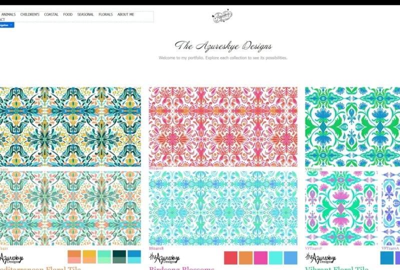
own website is built on. Let's have a look at my
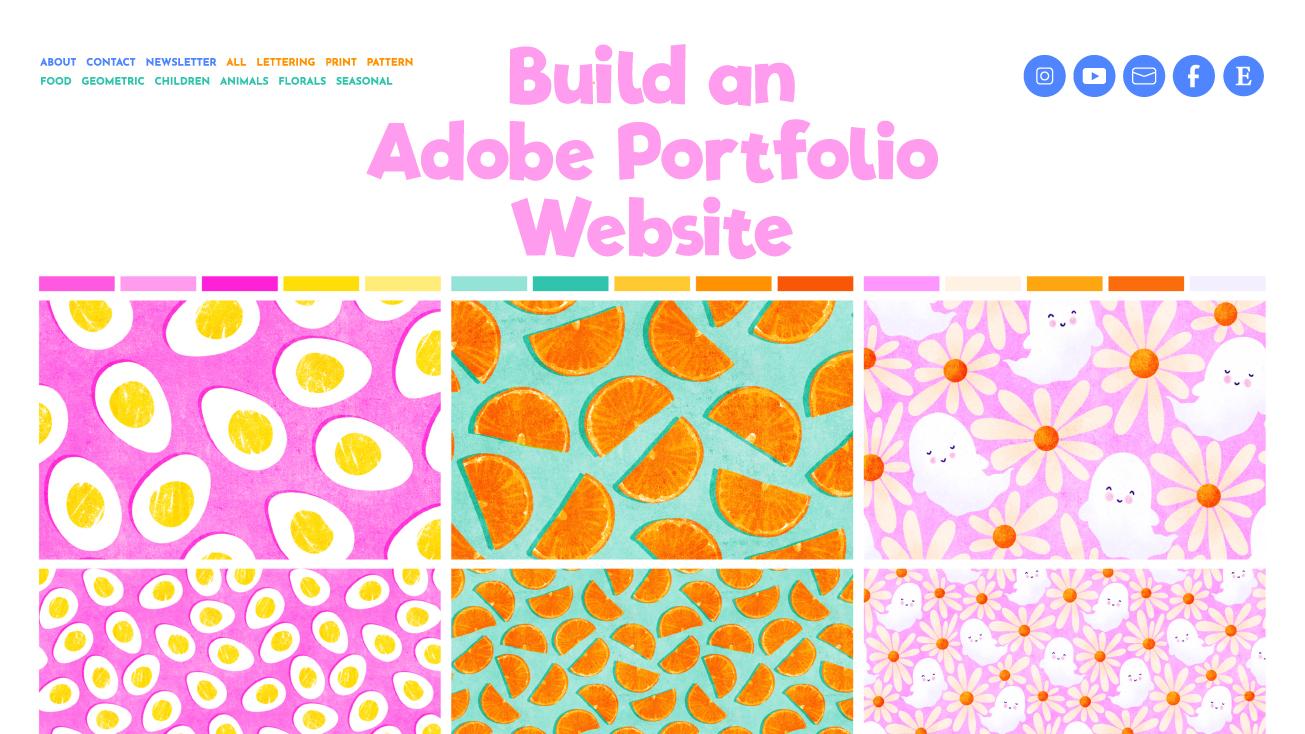
portfolio website here. Up in the top here, you
can see I've sorted my designs into various
themes or collections. This makes it easier
for a buyer to narrow their search when they're
looking for something specific. Then you can click on
one of these images. You'll recognize this as a cell sheet if you've taken
the last class I made. And in fact, if you
haven't taken that class, then I definitely
recommend that as a follow on or even before this one as we'll be using those cell sheets we made
to fill out our portfolio. So once you click on the cover image for one of the artworks, this then opens a page for
that design where you can add more information to it like a description or mock ups. Your class project is to
share a screenshot of either a page like this or from the home page
of your portfolio. Doesn't have to be
finished, doesn't have to be using Adobe
portfolio, and it can, like I said, just be
an image gallery on your own website if that's all
you have available to E&A. So now that you have a
feel for what we're going to be working on,
let's get started.
3. Creating a new Site: So we're going to
start by heading to portfolio.ab.com, and
we're going to sign in. As you can see, I've already got a few websites here already. You can have up to five
separate websites here, which is actually really cool. You can use them to
create something like a Lincoln Bio page
for Instagram. This one here is a redirect page for my old Colligraphy website. And for a while, I actually use this as my main blog site. So as you can see,
there's a whole load of different ways
you could use this. And if you've already got a
creative Clyd subscription, then this is a good way to get some extra value out of it. So let's click on
Create New Site. Here you'll see
all the different templates you can choose from. But first, you need to
decide if you're creating a full portfolio
or a welcome page. We're going to go with full
portfolio because well, the clue isn't the name really. That's what we're here to make. So we'll circle back to the welcome page feature
later on in the class. So you can click on any of these templates
for a closer look. We'll try this one here. And once you're on
the template page, you can see how it will look on different devices up here. So this is the
desktop for this one. This is how it would
look on a tablet. And then this is how it would
look on a mobile device. It can be hard at this
stage to visualize how this page would look with your R or your cell sheets in there. But it's really easy to switch between themes once you
have your site set up. So don't worry too much about having this
perfect right now. Just pick one that
you like the look of F. I'm going to choose Hagen as that's the one I use
for my portfolio website. All of the things up here in the top bar are customizable, and we can add our
own things in there. We can also change
fonts, colors, and the aspect ratios
of these boxes here. So again, don't overthink
things at this stage. The finessing will
all come later. So I'm going to click up
here to use this theme. And then you'll see this
blank framework here with all your tools and
options down the side here. I know that new interfaces and new software can
feel overwhelming. So please don't worry
about feeling like you need to know what all of
this does at this stage. We'll tackle each bit as we come to it throughout the class. All you need to know at
this stage is that these are your controls and settings
here in the left column, and this is the working
preview of your site here. You can make changes to
things here in the preview, but they won't go live
until you publish them. By the way, don't
be afraid to hit publish at any point as we're
working through this class. Yes, your site will go live, but you're not going to break
the Internet or anything, and nobody knows how to find your website unless
you tell them. We'll look at this in
more detail later, but I just thought
I'd mentioned it now, so it's not sat there
like some Do not press this button kind of thing that you can't help wanting to press. So this page we're on here is your home page or work
page, as they call it here. And there's one other page
that gets set up for you, and that is a contact page. In the next lesson, we'll
customize a few things on our home page so that it looks
a bit more familiar to us.
4. Homepage Customisation: So when you hover over any of
the items in your preview, you'll have this little
box here that pops up, and that tells you
what the item is and the little pencil icon
means that you can edit it. Let's first of all, start
up here with the logo. When I click edit, this
section on the left has all the options available for customizing whatever it
is, I've just clicked on. I'm going to leave
things like margins and padding and things like that
alone for the most part, as it's pretty safe to just stick with the
defaults for those. But the style column here, that has a few things
that we can change. So the first thing to decide
is if you want to have a logo image or just a type name for
your portfolio website. Either of these is just as good. If you have a logo,
you can use that. But if you don't have your
branding figured out yet, you can just use some text. All of this can always be
updated at a later date, so don't spend too long
overthinking any of this. If you want text, you
can edit this in here, so just highlight that, and then you can type
something different in there. You could simply leave
it as your name, change it to your
business or studio name, or add something like
illustration or design after it. You can change the
font here for this. And we'll also look at
how to change the font used across the entire
website later too. The other settings down
here should be fairly familiar to you from other software you
will have used before. You can change the
size and the alignment of the text and also
the color here. Here where it says roll over, that refers to the
color that this text changes when
you roll over it. If you want to change
that, I click on this, and I can change this to
something like purple. And then when we
go back to normal, and then I go back over this, you'll see that's changed
the rollover color. So any changes we make here, we get a preview of it in
this window straightaway. So this website isn't published at all at the
moment, but if it were, and somebody was on my website right now hovering
over the logo, they wouldn't actually
see that change just yet because we
haven't hit publish. All of these edits we
make in this window, don't update in real
time on our website. They will only update once
we hit published down here. So don't worry about making crazy edits and trying
things out here. If you want to see what
your site will look like, you can click on Preview here. And then you can
test the changes before you publish anything. You can view it, first
of all in desktop, and then you can
see what all the changes will look like in different devices and also at different aspect ratios as well, whether you have the mobile
that way up or this way up. Let's just go back to edit. It's always good to
check that your site does look good on
our mobile device, as that's what many people
are using these days. So the other setting
down here for Logo, if I go back to that, is
what it links to here. And this means what will happen when somebody clicks
on this here? At the moment, it's linking to our work page AKA home page. So that's probably
a good thing to leave it as wherever
somebody is in your site, this bit will always be visible, and they can click up
here and come back to your homepage or work page,
as it's referred to here. Wanted to change that
to something else, if you wanted it to
be your contact page, you can update that
by changing it here, but we're going to leave
it as work for now. We'll look at how to
change the name of this page later to
home so that it's a bit more intuitive to see home and click on
Home up here later. If you do have a logo and
you want to use that, or just to see how it looks, then switch over to
the image tab here, and you can upload a logo image. So that will then
update and you'll have your logo up there
instead of the type text. If you want to make
this a bit smaller, you can set a maximum
width for it, or try something like 100, and that makes it a
bit smaller there. I think it looks a
bit better if it's a bit smaller and a
bit more minimal, and it also has a bit more
breathing space around it. If I just delete that, that is always
going to be kind of butted right up
against the top there, so I think it looks a bit
better if it is a bit, a bit more minimal, and has a bit more breathing
space around it. So I'm going to set mine to
a max width of 100 pixels. And again, we can
preview that and see what it looks like
on a mobile device. So we just click on this one. That doesn't look
too big on there and it looks nice and spaced out, not too big, not too small, so we can go back to edit. L et's click on this
to edit it again. And again, here,
you can set a link for your logo just the same
as you could for the text, so we'll leave that
linking to work. If you decide you don't want any logo or any text at
all up here in the middle, you can come out here, and you can actually toggle the whole thing off if you don't want anything
up there at all. I'm going to leave mine
on because I think it looks nice there. We're
just a little logo there. But as you said, you
don't have to have any thing there, you
can toggle that off. You'll also notice this bit
up here in the navigation. You can toggle that off if you don't want anything
up there at all. But again, we'll leave that on. So this next section here
above where our pages will go. This is called the Mast head. So the first thing we can
edit here is the text. First of all, we'll
edit the text here, and then we'll look
at how to customize it and make it a bit more
pretty if you want to. It's totally up to you
what you write in here. To edit the text, just
like we did with the logo, you click on the pencil
like we did here, and then you can edit the
text in this box up here. I think I'm just going to leave it like this for
this sample site. And then this
statement underneath, you can also edit this one. Click on the little pencil there and then in this box here, you can change this to
something else if you'd like. You might want to
put something like your strap line up there, or some brief instructions
on how to use the site, something like please get
in touch via the contact, but if you'd like
more information on any of these designs,
et cetera, et cetera. If you can't think what's
to write in here for now, just leave it with this
placeholder text for now. If you want this most head here to be a different
background color, you can do that by
clicking up here and then to include
background color, and then you can choose a
new color for that here. You could even use an
image for the background. If we click up here on
Masked head options and go to masked
head background, then you can upload
something there. Try this one. And then that
will eventually update, and it will apply this
background image. You'll see it's a
lot lighter here. If we go to overlay. It's because it includes
this white overlay on it, which you can adjust here. If you take it all the way down so it doesn't have any overlay, probably whatever
background image you put on there is going to make
it hard to read the text. So if you do want some kind
of image in your header, I would have this
capacity set to something so that you can still see the
text here nice and easily. I'm actually going to
just remove the image and go back to masthead options, and I'm going to take off
the background color. And I'm just going to
leave this plain white because I personally
think this looks a lot better if you just let the images down
here do the talking and just let this bit up here be pretty minimal and plain, and then your images below
will really stand out. If you don't want this
section here at all, we can go back out here to the main page setting
scroll down here, and you can turn the
masthead off in this and not have that up there
at all if you don't want it. So let's scroll down and
see what's actually at the bottom of the page here because we haven't
done that yet. At the bottom, you've
got your footer here, and that we'll say powered by Adobe portfolio as a default. If you want to change that text, you can do that up here and
have something else in there. You can toggle this whole thing on and off if you want to. You can turn the
footer off down here, and that won't be there at all. Or you could simply change it to something like your
copyright statement. So if I just select all this, you could just put your
copyright statement in here. One last thing we'll customize
on our home page before we move on is the
navigation bar rep here. At the moment, the only pages we have on our website
are these two up here, so we can't add anything
else up there just yet, but we can add some
social icons up here. So we'll click here to edit the navigation bar and
click on Customize. Then we can click up here, and down here where
it says social icons, toggle that on and
then click on it. And then any of these
social platforms that you want to be up here, you can add your link in there, and then they walk here up here. I'm just going to paste my
Instagram link in there. And come back to this one, and where it says,
Instagram, if I can find it. You can paste my link in there, turn that one on, and then we've got a link to our
Instagram page up there. You can go through
these and toggle on any of these that you like. There's Society six,
there's Etsy somewhere. So yeah, you can go through and update these social icons, and these will also update for anywhere else
you want to use them. So, for example, if we wanted to put put them down
here in our Footer, if we click on Footer down here, and up here, toggle
on social icons, that's also going to put on any we have turned on down there, so they'll be visible at the
bottom of your website, too. So once you have your logo,
masthead, navigation, and foota all sorted out, and customized to your liking, don't forget you can always come back and change
things later. You'll be ready to
start uploading some artwork in the next lesson.
5. Creating Your First Page: So this is where it starts
to get really exciting. Uploading your portfolio
sheet is really simple. All you need to do is click
here where it says Add page, or you can click up here. So we're going to choose
a to add a page here. So here you need to add
the title of your artwork. I find that I always
have to go back into my finder and check which one what I'm
supposed to be uploading. So this is the first
one I'm going to do. So let's see what
the name of this is it's 23009 Tropical Ts. So I'm going to
enter that in here. If you use SKU numbers for your designs, then
enter that here too. If you and a
potential client are emailing back and forth
about licensing a design, it is so much easier
to figure out which design they mean if they
can quote the SKU number. So by having it right
here in the page title, it keeps it front and center
and they're more likely to see it and quote it when
they're asking about a design. For now, we'll leave the
destination as work, although you could also
put it in the navigation, and then this specific
page would appear up here, but we're going to leave everything in our
work collection. We don't want to make
this the homepage, so now we can go and
click Create Page. Now we have our
first custom page. And as you can see from this list down here at the bottom, there is a whole load of things that you can add to a page. We're mostly going to be
stick in to using images. But with all these options
here for text and videos, there really is no reason you couldn't use this
platform to build a simple website
for yourself and not just limit yourself
to a design portfolio. So let's get our
first image uploaded. We just click on this, and
then we can upload our image. I'm going to be using the
cell sheets that I make for all my designs as the
images on this website. I'll put the link for
the class I have on creating those in the
resources section. So I'm going to upload
this first one here. The first image is
going to be the ones which shows all the patterns
in this collection. So if you've got a whole
pattern collection, and you want to put the
pattern collection sheet here to go first, could do that, or if you've got just a
standalone design and it's in multiple colorways
or multiple sizes, you could have this
one here at the top. And then at the
bottom of the image, you'll see this little
plus icon there. We can add something
else onto this page. So if we tap that, we get
all those options again, so I'm going to add image and put this one
here at the bottom. If you're not going to use
cell sheets like these ones, you can just upload a
low resolution version of your artwork if you prefer. Just make sure you keep
it low resolution. 72 DPI is a good size, and not more than about
1,000 pixels wide. This will keep the file sizes down and page loading speeds up, as well as making
your art less useful to art stealers and AI scrapers. You can actually
prevent people from saving images from your
website if you want to. Go to your main site
settings up here, and under site options, you can toggle disable
right clicking to protect your
images on or off. Obviously, people can still take screenshots
if they want to, but it's nice to
have this feature there if you want
to make use of it. We're going to
come back and look at all these settings
in a later video, but I just wanted
to show you this bit now while we were
talking about it. So back on our
artwork page here. This one at the top
is the main kind of cover image for the
collection I have. So if you're uploading
a collection, this one would be the cell sheet that has all the different
images from the collection. I've only got one other
that goes with this, where I'm just showing the
pattern in a large scale. You had more than one image
that you wanted to add. It's kind of nice to add
that as a photo gallery. I'm going to click on this
and show you how to do that. We're going to add a photo grid, and then we can upload files, and let's just
pretend that these four here are also matching,
so we'll upload those. And then you'll see
that instead of putting them like directly
underneath full size, you get all of the
patterns side by side. You can still, if
we go into preview, click on these and
see them full size. So they don't have
to stay that small, so you can still go through
the other images there. So that's a nice way to add extra patterns in a collection
if you're uploading a collection of artwork
is to have the main image at the top and then add
a photo grid underneath. Let's go back to back to edit. I'm going to get rid of
these to delete an item. You just click on that
little drop down menu there, and we can click on delete
grid. And that's now gone. A photo grid at the bottom
is also a great place to put any mock ups that you might have using these patterns. If you want to add a
short description of the artwork or notes on any
of the current licenses, you can add some text
up at the top here. We come up above our image, and this little
plus will appear. We can click on that, and we
can add a few lines of text. I say notes on licenses, I just mean something brief
like if it's currently licensed under any kind of
exclusive license somewhere, or if it's unavailable, you might put current licenses, children's were Exclusive
Expires 31, January 2026. Don't feel though
that you have to add text if you don't want to. This is your website and you can choose to include or
want not to include. All that this needs
to be is a place where people can go to
browse your artwork. Having just images
is totally fine, especially if you're
using sell sheets, and they have all the
important information on them down here already. So let's go back out
into our home page by clicking up here and see what this is
looking like now. You'll see this first page here now has a different
cover image on it. If you wanted to change
it to something else, you can edit the cover
image by clicking on page up here and go
to edit cover image. You can change it to any of the images you've
uploaded on that page. So if we wanted to have
it as this one instead, that will change
the image there, but I'm going to leave
it on this one as that shows a bit more
of the design off. You also have options for how these cover
images are shown. If your cell sheets
are a different ratio, maybe you use landscape ones. You can edit that here, so
we'll come out from this menu. Scroll down, and
we're going to go and edit the images for
all collections. So if we added other
collections later on, this we also update
them for those as opposed to just this
collection of work here. So we want to go to
edit all collections, and we can go to aspect ratio. And at the moment, I've
got this custom 34. And that fits the ratio of the cell sheets that I'm using. If yours was
something different, you could choose it down here if it doesn't quite fit there. So, for example, if
you wanted square, you could choose that of
your cell sheets a square. Or if you know what the ratio of your shell cell sheet is and you want to change it
to something else, you can click on Custom
and edit this here. So if yours were rectangular
the other way around, and they were like four,
three instead of 34, you can type that in here. Then you can do recrop covers, and that will
adjust all of them. So if you design yours to look good in this
ratio, that would work. I'm going to change
mine back to 34. And do re crop covers, and that's going to put it
back who it was before. You can also toggle the name and date of the artwork if you don't want that to appear
when you roll over it here, so we can go out to
there and down here, you can toggle page titles
and page dates on or off. The date is going to default
to the date you uploaded it, which might not necessarily
be the same date you made the artwork or the same year that
you made the artwork. Want to get rid
of the date, just turn that off here, and
then it won't show. But if you want to
have the date there to show what year you made it, just edit the page info. We need to turn
this back on again. You can click on Edit Page Info, and then you can
change the date here, so I could change this to 2020, if that was when I made it, and then that would change there. You don't like these
rollover options at all, like, you want to get rid of it, so it doesn't do this at all, and they can actually be
really annoying if you're on a Zoom call with someone
doing a screenshare, and you keep moving
your mice around and point using it to point to the one that
you're talking about. So you're saying, Oh,
yeah, this one here, and then as soon as you
point, it disappears. That is actually quite annoying. So to turn this off, we're going to go to all collections, page covers and click
on cover images. Then down here, where it's got overlay, overlay
on rollover. You can reduce the
opacity on that. It's kind of nice to
have a little bit. So you can kind of if you're on a screen showing Zoom call, it highlights which
one you're on, but it doesn't completely
obscure the image. So play around with that until you have
something you like. You can just turn the opacity completely off if you don't want it to do anything at all, and it would just
show that there. But then it can be difficult to see the title,
as you can see. So I'm going to have this
on something like 20%. Let's come back out
to our main menu now. So that's our first
page finish now. To add another page from here, you can click on
either this one. By default, this is always going to be at the
bottom of your list. So if you have quite a
full portfolio of pages, you'd have to scroll
all the way down to the bottom to see this add page. So once you've got
a few on there, the easiest way to add pages
is going to be up here. One thing to note is that when you add a page from up here, after a while, this changes from adding it to work to navigation. I don't know why it
changes to that. If you add a page to navigation, let's just put test page
up here and create it. You'll see it's now
added test page up here in our navigation. If you forget to change
that to home or work, whichever you have it set up, and it adds a page up
here to navigation. That's an easy thing to fix. We can come over here
to our essentials menu. Click on pages, and from here, you can drag and drop and
reorder any of your pages. So click on test page up here, which has been added
in its own section and drag it down here
into your work menu. And then if we come out of here, you'll see it's gone from here, and if we go back out into
our main website page, It's here in our
work collection now. You can also use this
menu to reorder pages. So if we wanted this
one to come first, you can drag and drop
the pages around. And if you wanted to put something into your
navigation menu, you could drag something
back out up there, and you'll see that
will go up there in your navigation menu. For example, if you created
something like an about page, you could drag it up there
and have a link to it. You'll also see that
all of these pages have a little toggle
button next to them here. If you want to disable a
page without deleting it, you can just turn
that page off here, and that will then not show it on your website if
we click out here. That page is now gone, but it hasn't deleted the page.
It's just not showing. So I'm going to go ahead
and add a few more of these pages in now so that we have something
to work with. And then in the next lesson, we'll have a look
at how to create collections and
categorize our artwork.
6. Creating a Collection 1: Let's have a look at how to
create a collection so that we can make our artwork a
bit easier to navigate. When I'm talking about
collections here, what I really mean is
categories like animals, geometric, lettering,
patterns, prints, et cetera. A collection is a grid that
shows a group of sub pages. You may have not
actually noticed we already have a collection. If I go over here
to our pages list, you'll see that this work page is actually a
collection already. So our home page is
basically a page, which shows everything
in our work collection. So let's create a
new collection now. Here, we're going to click Plus, or you can do it from
If you're out here, you can click on this plus here, and we're going to
create a new collection. So give you your collection a title for this
one. We'll pick. Let's go with seasonal
for this one. And we don't want this
to be our homepage. We're going to click
on Create collection. So now, this has landed
us on another page, which looks kind of
similar to our home page, in that it has all this up here, and then it's got space
for pages down here. So, whereas our home page is a page that shows everything
in our home collection. This is a page that shows everything in our
seasonal collection. And you'll see seasonal has been added to our navigation
bar up there. If we click on our
pages up here, what we can do is to drag
things from one into the other, so we can add stuff
to this collection. The thing is, if we drag it out of here and put
it into another one, it's not going to show in
our work collection anymore. And what we want for our home
page is to show everything, all the work that we have. Luckily, pages can belong to
more than one collection. What we can choose is to show
it in multiple collections. If we click on this gear here, and for this one, we click, show in multiple collections, already showing in our
seasonal collection because we just
dragged it in there, but we can toggle this one and have it show in work as well. And if we click done,
you'll see that will now appear in our work collection and our seasonal collection. A thing which we can
do at this point is change work to something a
bit more helpful like all, which is a bit more of an
intuitive filter term. So on this page's menu, go to the gear up here, and we can choose Edit
collection title. And we're just simply going
to change this one to all. And now if we come out
onto this page here, we've got all our
seasonal items, and then it's a
bit more obvious. We can click on all knowing that that's going to
show all of our things. So our home page is now no longer called
work, it's called A. And when we go to add something, a new page, we want the destination to be set
as all instead of work. So now let's add
another collection. Let's click up here
and add a collection, and this one, we
can make floral. And let's create
this collection. So now we can turn on any that we want to be in
our floral collection. So my tropical toucans, they were definitely florals, as was the moss rose. So what I'm going to
say to you before we go any further is that
I want you to make a list of all the collections or categories that you want
to have on your website. You welcome to use the list
of categories that I have on my portfolio website
as a starting point, and then you can add any
others that you want to, and I'll put a list for that
in the class rest sheet. The reason I want you
to stop and do this now before we go
any further is that it's quite tedious going
through this list of pages and toggling all the
collections on for a page. So ideally, you only
want to do it once. Imagine you've got
all your pages set up and you've got all the
collections categorized, and then you decide to
add an animals category. So I could add the
category animals, but I've already
gone and categorized this tucs piece here and
turned on florals for this. At this point, I'd
have to go back into that Tucs menu and add
it to animals as well. So it's much easier to create all your
collection pages first. And then when you choose multiple collections
for a design, you'll have a full list here, and you can just go
through once and turn on all the collections that
you want it to show in. It's inevitable that you
will have to redo it at some point as we all think of things further down the line. But at least if you've sat and brainstormed it now
at the beginning, you won't have to
do it too often. So your next job at this point is to make a list
of collections and then add each one
to your website using the Create
collection option. I'm going to add all
my collections in, and then we'll come back
and add them to the list. So I've got a list
of collections here. I've gone for animals, children, geometric, food, pattern,
print, and lettering. That's not an exhaustive
list, and as I said, I'll put a full list of
suggestions in the resources. If you want to have
them in a better order, you can do that by dragging and dropping them the same as we did with the
individual pages. So I'm just going to
drag all up to the top. Sometimes that might
be a bit fiddly, and you might have to just
move it up one at a time, or a like it did for me, then it might suddenly jump
and you can drag it up. Now, we've got all at
the top of our list. And if we go to the
top of this page here, you'll see all of
those have been added to to our navigation bar, and somebody visiting our
website could then easily, if they want a food pattern, they can go to our food page, and they would see
everything that we've tagged in that
collection appear here. Now that I have all
of the collections, I think I might need in here. I'm going to go through the few pages that I have uploaded, and I'm going to tag these
in the relevant collections. So for flamingos, that
could be for animals. I think this pattern is quite suitable for children as well. And you could choose to make that seasonal as
well if you wanted to. So then we can click
down on that one. And then this X one. That's also quite suitable
for kids, as well. So I'm going to tag
that one for children and tug it in food. You can see how
this is much better to do once you have
your full list in here, and you can go through
that full list and change it just
once for each item. You'll know which ones
you have and haven't done yet from this icon here, which shows it appears
in multiple collections. You'll be really pleased to know that in terms of the basics, we've covered everything you
need to know to get on with building out your portfolio
website from this point. Once you have all your
collections added, just keep uploading
your artwork and assigning it to the relevant
collections as you go, and you'll slowly, but surely be building out your portfolio. How exciting is that. In
the next few lessons, I'll go through some of
the other settings and customizations that
you might want to use. But if you're not
ready to go there yet, then feel free to hit
pause and get stuck into your uploading. A
7. Adding Extra Pages 1: As we talked about already, you have the option
of setting up extra pages as well as
your artwork pages. One that you already have
is your contact page, so we'll have a look
at that one first. The thing that I
like about having a contact form page is that people don't get to see
your e mail address unless you choose to
e mail them back. My advice is never display your e mail
address on your website, unless you enjoy sifting through pages and pages of spam e mails. One can contact you
with this form, and it will get forwarded to the e mail address that
you put in this box here, which will probably be the
default contact e mail address you have assigned to
your AOB account. You can customize
the form if you want to ask a few
more questions. Often, I get asked about
licensing a design, and then I have to reply asking for more info like who they are, what company they're from, what products they
want to use it on, what their budget is, if they
want an exclusive license, et cetera, et cetera. So for the contact
form on my website, I ask those questions up front. It saves a lot of time,
and if you want to copy the questions that I
have in my contact form, I'll list those in the class
resources sheet for you. To edit the Fm options, you click on Contact
Form up here, and then you can simply
turn on this field, go to Edit label. You could choose
additional info, and you can make it
a text area field. And then that's going
to create a box for them to type in some additional info that can be anything. If you want to ask a question, something like exclusive license or non exclusive license, you can tell go on a new field and change this to
license requirement. And then if you choose
edit placeholder text, you could put non exclusive. And if you make it
a required field, then they will have
to fill that out, if we type on done, and there at the
bottom, you can see, they'll have to fill
this field out, and that gives them a hint as to what they're supposed
to be putting in there. Once this form is set up, you can give it a test to
make sure it's working. You'll need to publish your
site first, but as I said, don't worry about
publishing it before it's ready because nobody
will know it exists. So if you haven't published
your site already, do that now and
give this a test, so you can click on Publish. And as you can
see, nothing scary happened and I have not
broken the Internet, so we can go to view your site. We'll click on Contact, and you can just
test your form out. Fill this out, and
then click Submit, and then make sure that
that comes through to the e mail address
that you chose. So what other pages might you want to have
on your website? How about page? This might be especially
useful if you don't have a website yet and
you're going to use this portfolio as
your main website. Just create a new
page. Call it about. Keep it in navigation
and do create page. Now you can add some text, some images to this page, and just write a short bio
about yourself in there. Another page you
might want to add is a way to sign up
to your mailing list, especially if you've got an e mail list for art directors. Unfortunately, you
can't actually embed e mail list forms directly into your Adobe portfolio website. As you'll see if you click
on this embed thing here, it only allows you to
embed these in there, and I've tried embedding
forms in there from both Mel chip and my
provider flow desk, and you can't embed
those in there. But if your e mail list provider has a page where you
can send people to, you can add a button or a link from your
portfolio website. So I'll use Flow desk
for my e mail list, and before that,
I use mail chip. Both of those platforms allow you to create a sign up page, so I'll put the
links for those in the resources sheet for you. So once you have a page created with your e mail
marketing provider, go to the plus icon up
here and choose Link. We'll put newsletter. For the link title there, and then you can paste
your link in there. I would make it open
in a new tab so that people can find their
way back easily enough. So let's create this. Now
when you click on this, you'll be taken to the sign
up page for your newsletter. As you can see, you
really can build yourself a functional
website using this platform. And in fact, I actually use this as my main website
for quite a while. If you're just getting
started and you're already paying for either photoshop
or illustrator anyway, it's a great way to
get a simple website set up at no additional cost. In the next lesson,
we'll go through all of these site settings one by one and have a look
at what they all do.
8. Site Settings: So let's go through each of the items in this settings
tab here one by one. First up here is
your domain name. And the first thing
to say here is, don't panic because
you don't have to buy a domain name or anything
scary like that. That's one of the reasons I like Adobe portfolio as an option. You can use thefolo do and add your own customization to it provided it's available. You'll have some default
populated in here, which you can change
to something else. Do note that you can only
change this five times. So think carefully when
deciding what to rename it to. The name is unavailable,
it will tell you up here. I'll just type in that as I know I'm using
that somewhere else. So if we click on Apply, I will tell you up here if
that name is already taken. And don't worry that doesn't count towards your five changes. So try and choose something that is as close to your name or business name as
possible so that it's something easy to
remember, say, or write. If you do decide you want to
buy a custom domain name, you can either do that
through this option here, or if you already have
a domain name that you want to assign to it,
you can do that here. That's what I've
done with one of my old website domain names, if I just come out here. And we click on this one. And you'll see I've got a
custom domain name in there. And I use this to redirect
people to my current website. Side note time. Never let
your old domain names expire. I remember a while ago listening to the
design beat podcast, it was a Halloween
Horror Stories episode. And the presenter was saying, how she changed her
website domain name from her studio name to her own name and let the
old domain name expire. A while later, her husband
Googled a name clicking on an old link and found that someone had brought up
the old domain name, and now it was, well, let's say it wasn't a
design website anymore. She realized to her horror
that every website she'd ever designed for a client had a link to her old website
in the Footer text, and that anyone who clicked on that was being taken to this, again, well, let's say, not very nice website. Can you even imagine
awful that would be? Luckily, a few hundred
dollars later, she was able to buy back
the old domain name, but please learn from her
mistake and never let your old domain names expire if you care about
your future brand. So if you want to use
your own domain name, you can do that by following
the instructions here, but that's not something
I'm going to cover in this class because it
gets way too techy, and there's just
a whole bunch of different options depending on which website you're
connecting to, who your provider is, et cetera. So now we come down to the
next setting here, home page. This is pretty obvious. We'll
keep our set to you all. And you can also choose a
four oh four page here too, which is what people will
get sent to if they click on a broken link or a page
that doesn't exist anymore. So I would leave that as
your home page as well. Then we come to analytics. If you're a number cruncher
and you love looking at data, you can set up a Google Analytics thing
here if you want to. I'm not going to go into
that for this class, as it definitely
doesn't fall under the heading of a simple
portfolio website. I'm not even sure that a
portfolio website needs to be SEO friendly or attract
random web visitors, which we'll talk
about in a minute. But if data makes you happy and you want to
see the analytics, this is where you
would set that up. Search optimization and metatags also go hand in hand with this. If you want your portfolio
to attract organic traffic, then go ahead and
fill these out. But if you want your
portfolio to be more private, it won't do any harm
to leave these empty. And in the Adobe documentation for custom metatags are here, it says, Custom metatags
is an advanced setting. If you're not
familiar with code, we recommend using the
meta keyword settings within search optimization. This automatically
converts your tags into HTML code in the back end. If you do want to
put some tags in, put those on the search
optimization page instead. And I will tell you here now, I do not have either
of these things filled out for my portfolio website
because I consider it more of a private place
where I will send people as opposed to being a thing that I want people to stumble on. I don't mind if I'm not gaining organic web traffic to my my
portfolio website anyway. So the next item on
this list is favicon. Your favicon is that
cute little icon that appears on the tab of
a web browser up here. You can upload your logo, and we'll use this logo again. And then you'll see that put
up there, and eventually, these ones up here will change to your custom logo as well when you're
looking at your website. And you can also upload your logo for a web
clip icon as well. And that's the icon used if you or someone saves a
bookmark for your website. Social sharing thumbnail. That's for mouthful to say,
social sharing thumbnail. That's the image
that may appear in search results or if someone shares a link to your website. You can upload your
logo here too, or maybe a picture of yourself. So next of all, we
have site options. We already looked at turning right click to download
images on or off. I'm not sure there's a right
or a wrong choice here. Screenshots are still a thing, so it's not going to stop
people grabbing images, and you may actually want people to be able to
danlod your images. Quite often, I'll get e mails
where art directors have screenshotted or
downloaded images of mine to ask if
they're available. That's how they get in
contact and want to describe which image
they're talking about. If you have a public site, you might want to
disable it and leave it on if you have
a protected site, which brings us on to the next setting,
password protection. If the last choice was tricky, this one is even harder to
password protect or not. I honestly don't know the
right or wrong answer to this, so I'm going to give
you some pointers. You might want to use
password protection so that other artists or art dealers can't just
go and snoop around your portfolio copying your ideas and seeing
what you're up to. But how different is your portfolio going to be
than your Instagram feed? If what's in your
portfolio is really basically the same as what
goes on your Instagram grid, there's really not much point password protecting it here. However, if you do like
to keep some designs private and would only show
them to art directors, then you might want to
password protect it. However, if an art director finds you on Instagram
clicks through to your portfolio and then can't get in because it's
locked and then has to contact you and wait for a reply before they
can see your art, they might have
moved on and chosen something else from
somebody else by then. Those are basically the
two things to weigh up. And the answer will be different
for each one of us and may even be different at
different stages in our careers. If you do choose to
password protect your page, then this here is all that somebody will see when
they visit your page. So if you do decide
you want to have a password protected website,
later on in this class, I'll show you how to
add a welcome page for your portfolio that can be
visible before this page here. Let's go back to our
website settings here. Cookie banner.
Disclaimer, I am not qualified to give advice on
this, so please don't ask me. You need to check for yourself what the laws and regulations are in your part
of the world and anywhere that you might
get visitors from. Lastly, these three
settings down here, restore website styles. That's going to undo
all your editing. So don't click that one
unless you want to go back to a complete restart.
Unpublished site. If you need to take your
website for any reason, like it says here,
you can unpublish it without having to delete it. So you can take this down
temporarily and choose a temporary message to put up there and accounting region, that's all to do with
Eurodobe account. So I would leave that alone. Now that we've looked through
all of these site settings. In the next lesson, we're going to go back and
have another look at themes now that we've got some more content
on our website, so we can see how our website would look with different
themes applied to it.
9. Themes: Remember at the beginning, I
said not to get too hung up on choosing a theme because you can go back and change it later. Well, later is now, my friend. Let's have a look at how
easy it is to switch themes. So, here in our essential list, we're going to choose themes. This is going to take
you back out into this screen with all of the
different themes in it. So let's go ahead and
chose a new one now. Let's have a look and see
how this one here looks. So we can click, Ue this theme. And then, as you can see, all of the information we've entered in the other theme for our website is all
included here in this one. So it's much easier to
do this when you have a few of your pages
already uploaded, your logo and your
collections in there, and then you can really
see how it's going to kind of look on
you as it were. If you want to try another
one, you can go out to themes and try a new one. So let's try having a
look with this one, no. So as you can see, this one looks a whole
bunch different. We've got this
massive logo here. All of the navigation
is along there. And then we've got these
different crop on our pages, and they have the information
there underneath. To go back to your very first
editor of your website, click on Themes again, and
find the original one, which was Hagen,
here we were using. Click on Continue editing. Don't click on Restore Defaults. If you click on
Restore Defaults, it's going to undo any of the styling that
changes that you made. So the content will
still be in there, but if you changed
fonts, colors, et cetera, that's going to
restore the defaults on those. So click on Continue editing. And then you'll see
your original edits and everything still right
where you left them. Let's go back out here to themes again and go to this
one we just applied. So this one here, Mercedes, I'm going to go to
continue editing. Although we didn't actually
make any edits on this one. So on this one,
the cover images. Let's have a look
and see if we can crop those so that they show in the vertical orientation like we have on
the other website. So we'll go down here and we want to go to all collections, and we'll click on page covers
and click on aspect ratio. And then let's go to Custom and previously
we had them at 34. So let's try that and
see how this looks here. So that's a better shape,
but as you can see, it's still not quite
shown them properly, let's try re crop covers
and see if that helps. So when you do recrop covers, it's going to crop those
all back down for you. You can have multiple edits of your website, we've
edited this one, but we can still go back
out into themes up here, and we can go back
into our original one, continue editing this one. And this one is all
still here as I left it. So basically, you
have the opportunity to really play around
and get creative here. One thing you'll notice on
some of the themes is that the navigation here displays
all the page names too, which looks kind of way too busy and overcomplicated
for our purposes. If that's the only thing
that's putting you off choosing a certain
theme over another, then here's how
to turn that off. So you go into navigation
settings, do customize, and here, click
this little arrow, and then up here, you can
turn off the sub page titles. So then it would
still just display your categories down here. So, if you've chosen
the theme and you've got all of your
pages showing here, go to edit navigation, navigation container and
turn off sub page titles. Don't forget you can change the cover image ratio as well. So, for example, rose
this theme setting here, seems it might not work
that well with our images, but if we go to all collections, go to page covers and
choose aspect ratio, and then in here, choose custom, and we can change this 23, four, like we had it on
the other version, and then do recrop covers. And then you'll see it will
display those much nicer. So, have fun and play around here in the themes for
as long as you want to. Just don't forget
the part about not restoring defaults unless
you really mean to. In the next lesson,
we'll have a look at background colors and fonts.
10. Background Colours & Fonts: This is where you
really get to make the website feel like your own. Once I've chosen a theme, playing around with
the colors and fonts is my next favorite part. There's a set of basic
fonts here to choose from, and they will apply
to the whole website. You'll still be able to edit the fonts for individual
things afterwards, so we could change this to
something different there. But changing the fonts
from this main thing, site wide background
colors and fonts will update the fonts
for the whole website. So if you'd already picked
a font for these to use, you'd have to go back in and
change these afterwards. If you don't like any
of these fonts here, you can actually use
any of the fonts that Adobe provide in their
creative Clad subscription. There is so many of
these to choose from. I would suggest
choosing something quite simple and
plain and clear here because the font you choose
here in your main settings is the one that any paragraph text on your pages would
also be written in. So whilst a font like
this could look really cool for a header or
a title on a page, it's going to be too much if you're writing your
page descriptions, and you've got the text in this. So choose something nice
and simple and clean. I'm going to choose
this one here. You find a font you
want, you can click Ad font, tap on Done, and then when you go to change the font
in your list here, that one will be
at the top there, so we could click on that one. And now that's going to change all the font throughout
the website to this font, so that will apply to
the navigation menu, the titles here,
and even the text on the page thumbnails here. We put some text on
this one, I think. And as you can see,
it's applied it to the text at the top
of this one as well. So once you've got
a font chosen for your main website
sort of default text, you can then choose a different
font for these up here. So if we click on our masthead
title and go to Fonts, and we can go back
out to add fonts, and then we could choose something a bit more
fancy from in here. So if you wanted something
in a nice handwritten style, we could choose
this. Add the font. Click on Don, and then
for our masthead title, we can click here and
change it to this one. And once we've added a font, it will be available
in other areas, so we could change
this text as well. And we can still
choose that one there. So back in our background
colors and font settings, you can also experiment
between light and dark themes. At the moment, this
is an a light theme. If you're someone that
prefers dark themes, you could choose that, and this is how your
website would look. Because all of my
pages are in white, I like having the light theme as it hides the edges of those, and they kind of just
look like they're all part of the same image. In these settings here,
you can also choose an entirely different
background color for your website
if you wanted to. So if we just choose kind of
a light peach color there, it's going to automatically
have that overlay that we had before on your mast head to make it a little
bit more light. If you like it like that,
you can leave it how it is. If you want this to be the same, then you need to go back out
into your masthead options. And if we go up here and
choose masthead background, and then click on Overlay, and you can just bring
this down to zero, and then you'll have
that background color be the same throughout
your whole website. If you're a surface
pattern designer, you can even upload a patent tile to use as a background throughout
your whole website. So let's try and see
what that looks like. So I'm going to upload
this Avocado one. Depending on the
size of your image, this might take a while. If you want to use a patentile, I would use a low
resolution one. This one I'm uploading here is a full 12 inch square 300 DPI, which is why it's taken so long. If you want to upload
a patent tile, then I would reduce
the DPI on that so that you're not uploading
massive images. So after a while there,
you can see this will repeat as the background
for your whole website. You can. If you go
to image options, you can have it go at
different scales here. So if you choose
don't scale image, that's just going to
upload it at 100%, and this one will make
it a little bit smaller. I have to say, though, this
is probably going to be a bit wild for most of us unless
wild is your aesthetic, and then that could
look really cool. But personally, I
prefer it with white. So I'm going to go back to background and take
that color off, and I'm also going to go to image options and go to remove. So we're back to a nice,
plain, simple white. I prefer white because it
just matches with my pages, as I said, and I just like
the clean lines it creates. In the next lesson,
we'll learn how to add a welcome page as an
optional extra to your site.
11. Add a Welcome Page: So as we looked at
earlier in the class, if you choose to have a
password protected portfolio, your only option for a home page is this blank screen here. It looks much nicer if
you can have a sort of pre portfolio page
to say something like, Hi, this is my portfolio for potential
licensing partners. If you have the password, please click here to enter. Email me for the password, or click here to go back to my main website or
Instagram, et cetera. So let's have a look
at how to set that up. It's actually going to
be a whole other website with a different address
to your portfolio. You may have seen that when
we were adding pages earlier, you can add a welcome page to your portfolio from within the portfolio website
that you're working on. But if you want to have site
wide password protection, then that welcome page would
also be password protected, which isn't going to help us. So that's why we're making
this a separate website. So we're going to
go back out into the main portfolio page here, and we're going to
add a new website. And up here, where it says full portfolio or Welcome page, we are going to choose
Welcome page this time. So you've got a
few templates down here and there's not as
many to choose from, and these are all very simple. So just choose one that
you like the look of. Again, remembering
that you can always go back and choose
a new layout later. So let's click on this one
and use this one here. You'll be pleased to see that
the interface is the same, so everything should
still feel familiar here. We'll start here by adding
a photo or an image. If you've got a head shot,
you could use that here. Or if you want to
use a nice piece of your artwork or a pattern,
you can use that too. If you've got a head
shot, it's always nice to use a photo of
your real face if you can, but you can use a piece of artwork if you really
don't want to use a photo. So with this text here,
you can just click on this and edit it to
say something else. So you can put
something like Hello, welcome to my portfolio. This is a password
protected site for potential
licensing partners. If you have the password,
click to enter Blow or to request access,
please get in touch. Then you can edit
this button here, so we'll click on that
and choose Edit button. And we can change the text on this so we can put Enter
password in there, and then down here
where it says Link. We can link to either something within our website, but
we don't want to do that. We want to use an external URL. And then in here, you would put the actual website
of your portfolio. If you can't remember
what that is, we can come out of here. We can go back into
our portfolio. Edit this one that
we've been working on. Go into our settings. Go to our domain name, Copy this, and go back out
here again to our portfolio. Edit this one here,
the Welcome page. Go back to editing our button, and then you put the
website in here, so WW. Then you can paste the
first bit of your URL, and then it will be portfolio. So now, when someone
clicks on this, we click on Publish site. And let's go to view our site. And when someone clicks on this, they'll be taken to this page, which I don't have
password protected, but if it was
password protected, we'd have a blank page like this one here where they would then enter the password, and then they would
get into this site. So we've got an option
to send people here, and they can click to
then get in our website. So what we want to do next is make it easy for
them to get in touch with us and request a
password if they're somebody that should be
getting into our website. So You've got two options, you can either put
a contact form directly here on your page, or you could do a button that leads to a
contact form page. I think it's probably a bit less confusing if you
have a second button that says request access and then takes them to
a contact form. So we'll do it that way around. But if you wanted to do that, you could put the
contact form in there. And do that, and we'll
add in a button instead. And then we can edit the button, and change this one
to request access. Now, we need to go and create a new contact page
for this to link to. So let's go back out here and we'll create
a page this time. So create a custom page, and we'll just call it contact, and we can leave it in
navigation for this one. We don't have an navigation
bar showing in this one, so it's not going to
show up on this page. So we click Create. And then on this page,
same as we did earlier, we're going to create
a contact form. Now on this page,
we can add a form, check the settings
for this and then edit the same way as
we did in Lesson six, and then this will
be ready to use. So let's just leave
this and click done. Then we can go back out
into our home page. And then this request
access button. Let's go to edit button, and we want to link
to our contact page. So now if we update livesit, And view our site here. We've got these
two options here. We can either enter password, which would take us to our
password protected website, or you can do request access, and then they can leave their details and write
a message to us there. Then if we decide they are somebody that should be
looking at our portfolio, we can e mail them back
with the password. Back on this site here, you can also update
your social icons, edit social icons, and then you can put those so you
can paste that in there. And then turn these on. It's nice to give someone somewhere else to go
from this if they're not entering a password
and they decide that they shouldn't be looking
around your portfolio, and they don't request access. It's nice to give them a way to get back to your main website. If you don't have
a main website, these social icons will work. Otherwise, you can just click a button and edit
this one and put, like, return to website, and then just paste
your website in there. Then if we update our website. L et's open this and yet
another tab over here, so we can do return to website, and that will eventually take
us back to my main website, or if we do this one, that will then take us
to my Instagram page. So now, you've got the bones
of this website built out. You've got the basic
buttons on there to take people onto where
they need to go. You can then adjust things
like the colors and the font, the same way as we did before
to match the branding on either your main website
or your portfolio website, which presumably would be the same branding as it's
all part of your brand. You have that done,
now you would need to go through all of
these site settings here just like we did before and upload things
like a favicon, social sharing, icon, et cetera, choose your image protection. And also, you'd need to choose a home page domain
name for this. So if you've chosen to have a
password protected website, then the website that you
want to use for this one, this welcome page,
this one should also be something
that's quite easy to remember because this
website is the one you will be giving out as when you
linked your portfolio. Then they can get to
your other actual portfolio website from this one. So this subdomain here that you choose for
this welcome page, this should be something
nice and memorable. Once all of that's done,
you can hit publish. And then whenever you
link your portfolio, instead of using your
actual portfolio address, you would use this website here so that visitors will
land here first. Before we move on
to the next lesson, I just want to add that
if you ever want to build your own Lincoln
Bio page for Instagram, these welcome pages
are perfect for that. You can just keep making more buttons here and
adding your links to them, and then link to this page in
your Instagram Lincoln Bio. And that is pretty much
it for this class. You should now have everything
you need to start building your portfolio website out and get on with uploading
all those images. And the last lesson,
we'll wrap things up and talk about what
your next steps might be.
12. Next Steps: Congratulations on
finishing the course. Your most obvious next step, if you haven't done so
already is to publish your website and start
sharing it with the world. If you have a public portfolio, I would love it if you
shared a link to your site along with your screenshot
in the project gallery. If you'd like any
feedback or critique from either myself or fellow
students, please ask. In terms of sharing your portfolio with
prospective buyers, that depends on
whether your site is password protected or not. Assuming it's open to everyone, you can promote to it by
linking from your main website, social media links, and
even from Pinterest. You can post images of
your patterns or mockups, and then link those
to your portfolio. When it comes to maintaining your website and keeping it
updated with new images, you know I am passionate about
its systems and workflows. In my previous class
on cell sheets, I showed you how I
create a cell sheet for each piece of
artwork as soon as the design is completed as part of my art processing workflow. I keep a folder on
my computer where I drag a copy of any new
cell sheets I make. Then when I'm having an uploads
day once every few weeks, I can just upload
everything from this folder to my website knowing I haven't
missed anything. Once it's all uploaded, I can then delete all of
these because I've still got the original copies in the main document files for
these artworks. Try and set aside maybe one day a month to
updating your portfolio, and then maybe once a quarter
e mailing art directors on your e mail list because you have an e mail list, right. To say you've added some
new designs and maybe including a few images of your favorite
ones to the e mail, include a link and
a password reminder if needed in the e mail, and you've got yourself a
nice little system there. As I mentioned, I used this
portfolio framework for my main website for
quite a while until I was ready to invest in
something a bit fancier. But if all you need is a
place on the web to host your portfolio and somewhere to some people to find out a
little bit more about you, this could be all
that you ever need. It's so simple to use, and it's really easy
to give your site a new look every once in a
while. Just pick a new theme. I really hope this class
gets you one step closer to getting your designs out there in the world and onto products. Having a home or
central hub online for your artwork is all
that you need in order to start e mailing
companies you'd like to work with and giving them
a link to your portfolio. If you have any
questions, start up a conversation in
the discussions tab. I'll do my best to check
in there every week or so, and I will always
get back to you. If you have a few moments and
you've enjoyed this class, I'd love it if you could
leave me a quick review. It's always nice
to get an e mail saying someone's left
a lovely review, and I even take
screenshots of some of lovely ones and keep
them in a folder on my computer to read again
when I feel like I need a bit of motivation to get
started on my next class. If you want to see
more for me online, I have a YouTube channel where I share weekly pattern tutorials. My YouTube user name
is at Rebecca Flatty. I've recently quit
using Instagram because of their policy
for using our artwork to train their AI models and not giving everyone the
option to opt out of that. So if you want to see
more for my artwork, you can find me on
Cara from now on, where I go by at Becky Flaherty. There's a lovely artist
community there, and there's just a really refreshing
vibe to the platform. Do forget to follow me here
on Skillshare to make sure that you're the first
to know whenever I publish a new class. And thank you to those
of you who already are. Have fun, stay creative, and I will see you next time.
 Rebecca Flaherty, Surface Pattern Artist & Content Creator