Transcripts
1. Class Intro: I'm so excited to share
this class with you. What is better than
shimmering gold? Oh, my gosh. It has captivated me for as
long as I've been creating, and I seem to find a way to work it into a lot
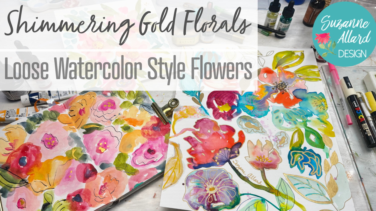
of my artwork. I designed this Shimmering
Gold Florals class to be a soothing and relaxing
class that helps you unwind, slow down and reconnect with your intuitive
creativity through the magic of juicy
watery florals, dressed up with luxurious
gold and some inky accents. Did you know that the
real gold that we use today on Earth originated in the cosmos billions
of years ago? Yes, it's born from
explosive collisions of neutron stars and ancient
cataclysmic events. So the gold on Earth traveled across the universe to
eventually find its way here. For some reason, this makes
me love gold even more. Of course, we
aren't going to use real gold in this class, but I like to think
of every shimmer of gold that we add
as like a touch of stardust and a reminder of this incredible beauty that
was forged in the stars. Hi, I'm Suzanne Allard, and my passion is creating
art that exudes joy and encouraging people like you to express their
creative spirit, which we all possess. I didn't start painting until
I was about 52 and have learned almost everything I know online in classes like this. I now license my
art for products, sell originals and prints and various products
on my website, as well as teaching
online, which I love. In this class, we're
going to embrace a slow meditative process that's all about
presence and flow. We begin by gathering
inspiration from floral and
botanical images, allowing ideas to
develop organically by just noticing what we like
and are captivated by. Then in a relaxed and intuitive
way, we'll create loose, watery florals using
watercolor or wash, but you could also use
water down acrylic. We're going to let the paint, the water, the brush, and the paper interact freely to create unexpected
magic on the page. No pressure, no perfection, just the joy of watching colors bleed and
blend and unfold. It's so fine. Once our watery layers
have work their magic, we'll respond to what emerges. We're going to add
delicate ink lines for definition or interest, and then layer some
metallic gold with pens, ink pens, and bottled
ink with a dip pen. This layered approach
teaches you to be loose, to trust the process
and yourself, and to respond intuitively
to what unfolds before you. Perfect practice for slowing
down in a busy world. So whether you're a beginner, seeking calm or an
experienced artist craving some mindful play, I invite you to create luminous, joyful pieces that feel
like an expression of you. Join me. Let's add a little
cosmic shimmer to your art. I can't wait to paint with you.
2. Let's talk supplies: Alright. Let's do one
of my favorite things. Let's talk supplies. Yes, I think I am a bit
of a supply addict. But there are worse
problems I have. So again, as I say
in all my classes, you do not need all
these supplies. I like to show you everything. That way, you know, you're learning about it and you can put it on
your wish list. I do have all of these
supplies with links, clickable links, many
of them on Amazon. And when you buy
from those links, I get a tiny percentage
which helps me buy more supplies and use
them and make classes. So I appreciate that very much. And I always want to encourage people to
use what they have. There are some things here that you may not
have and that you, like I said, want to
add to your wish list. But I don't ever want you to
feel like you have to have all this to create like this
because you don't right, so let's get looking at
what we've got here. So there's two main
paintings in this class, and then just a
little, you know, kind of a little thing I'm
showing you at the end. But for the larger painting,
the first one we do, I actually used bristol paper
in this vellum surface. You do not need to get this. I was just experimenting. It's a smoother paper
than watercolor. It's actually designed for
you'll see it says dry media, but people do use
it for wet media. You know, I would
use watercolor. You've probably much more
likely that you have it, and it's going to bleed more, and you may just not a sense watercolor paper
is more bumpy that the markers might not go on as smoothly as they do on the bristle as you're
watching me do it. So that's the only thing to
just you might observe that, but you can still do it. It's no problem. Okay, so that's the surface
for that painting. And I use a little palette. Any palette is fine.
Palette paper is fine. This paint that I'm using in this first painting
is more watery, so that's why I used something like this instead of
the palette paper. But you could use a paper plate. You could use, oh, gosh, anything that
has little wells, you could use the
paper plate would only work if it's you've
got that coating, but a ceramic plate if you've
got enough room between, but some sort of palette
with wells is ideal. And then for paints
for the first one, I was experimenting with
these doctor PH Martins. They're a liquid watercolor. And this is a little set I did link to it for
you called hydras, and it came with a few
more colors than this, but these are the colors I used. And they are just highly,
highly pigmented. So the little goes
a very long way. And they're lovely. If you don't have
something like this, you absolutely don't
need to get these. You can use watercolor and just dilute them with more
water. And more paint. So try to make your own
sort of version of this, just to help you with the flow. If you're using acrylic, same thing, you know, mix them, get them to a nice pigmented, but watery consistency
if you want this kind of flow that
you see in this class. Gouache is fine, Aqua
gouache is fine. I mean, the only
thing you probably couldn't use in this
way are oil paints. But even then, you probably
could add a medium to those and get them more
flowy and probably good. So I don't never say never. Alright, so that's
what I used for the first painting,
liquid watercolors. And then we go into using, um Pens, mark making tools. And I used this brush, just one brush the whole thing, which is number 12, Princeton Aqua Elite,
number 12 round. So any large round works. It just gives you
more freedom to push the paint around and not be
too fussy with a small brush. You could try a flat brush. You're just going to
get different shapes or a filbert experiment. Then I switched and used
once the paint dries, we go to some jelly rolls. These are just really nice. The pigment sort of sits
on top, which I like. And so I picked a few
of my favorite colors, and then we get into the
gold. You know, I love gold. So I used for the
finest one a Pentel. Cigna, I've got all of this. Actually, it's a sunburst, is the one I like best. I've got, again, links to all
this in the supply notes. And then this is a fine point, so it's a little bit thicker and then a medium point for the
fat, big chunks of gold. I also used some Posca markers. These are acrylic paint markers. There are other kind of off
brand acrylic paint markers, and some of them
are pretty good. These are just so
tried and true. I've had these three
colors now probably for four years, and
they're still going. I mean, it depends on how
much you use them, of course. I just use them here and
there, maybe three years. And a white pen is
nice, sometimes. This is the Nibal signal. Again, it sits on top. So those are the
things we use to make marks after the paint dried. And that was the first painting that you'll see the larger one. The second one that we
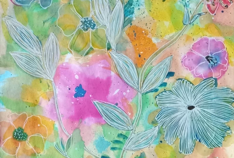
do in a sketchbook, I use this sketchbook, which I really love because
of the linen cover, the size. Also, it's 90 pound paper, which is a little less
than the usual 100 well, a lot less than 140 pound. But, I was looking for a
blank page to show you. But I guess I don't
have any in this one. So it's still plenty heavy, but it's not as
bulky as you see in a in a 140 pounds sketchbook. So yeah, and this is by
it's called handbook. Handbook journal by Speedball. And I get these on Amazon, and I don't know,
it just feels nice. But any sketchbook, again, any sketchbook, I would just
say or watercolor paper. So you could do the same thing
on the co paper you used. You don't have to do it in
a sketchbook, obviously. For this one, I used some
gouache and HR gouache is fine. You could do it in
watercolor as well. I was just playing around with different things,
limited palette. Um I did not use
many colors in this, and I used, you know, the Navy to change the intensity of some of
these, the navy blue. And I used palette paper, which I often use when I'm mixing something that's
not really watery because, you know, it'll slide
off if it's too watery. Although I've done
it here and there. And the brush I used was the number eight
round from my set. This is one of these are the
brushes that I have made, and they are I release them a couple of
times a year on my website. But all you need
is the same brush that you're using here is
fine. A big round brush. And the long handle, though, is really a nice thing to
play with being loose. And you'll see in this one I hold I stand up and I
hold the brush like this, and that just gives you a
lot sort of more organic. And I think, um playful approach to creating
the flowers versus, you know, taking a small
brush and doing that. Now, that's fine. It's just a different
kind of work, and maybe it comes
later in the details. But for that initial, like, just getting these shapes out, I love to kind of get some distance and
use a larger brush. Alright. On that
sketchbook painting, I do use a dip pen. And some indigo ink. And then, of course, this gold ink. So let's
talk about those. The dip pen is, you know, used for calligraphy
traditionally, and it just makes lovely marks. When you push down, you
get a thick and thin, which is just a nice feeling. And I like the
ergonomics of this one. This one's by E&M. E and then like a plus and an M. And the ink that I use in that the indigo
is this Sentellier ink, and I bought a few
different inks to try to find one that was
water resistant, just for a different
effect that didn't just immediately sort of bleed,
and that's this one. And then I love using this
liquitex Idscent bright gold. I just shake it up,
and I often use the dropper itself as
the mark making tool. Alright, and then the last but certainly not least
supply that I use in just a little bit little
piece of art I show you at the end is this gorgeous, well, it's all in Japanese, but I listed it
in a supply list. It's Kuratki Mica gold ink here, let me open
it and show you. Um, oh, my gosh. Look at that. It just
feels like liquid gold. It's just so delicious. It needs to be shaken right now. So I use that with a dip pen, but of course, you could
use it with a brush, too. You just really want to
wash out your brushes when you're using ink. So, yeah. I think I've covered it, and these are really fun projects. Let's look at what
we might use for inspiration for things like
this in the next video.
3. Gathering inspiration: Okay, getting inspiration. This is one of my
favorite things to do. And I do like having a few
beautiful books to look at. Of course, there's
Pinterest and, you know, so many images on the
Internet that you can get inspiration
from, as well. So don't feel like you have
to go out and buy books, but I don't know, there's
just something nice, isn't there about looking at
a book and getting inspired. And when I do this for
something like this, I'm not necessarily copying. I might hold it open while I'm working and have a
page that spoke to me, or I might just flip through
and sort of get them in my brain and then
just start creating. So let's see if we can get
some fun things in our brain. This book, seeing seeds is
just gorgeous because it's got this beautiful photography often really expanded
and enlarged, you know, close up of
seeds and seed pods. So it's unusual, but and
beautiful. I mean, look at that. So you could do a floral, just a botanical, I guess, it would be using seed pods and seeds is it looks like an
insect is inspiration. Look at the textures
and the lines. You can get an idea
like that to do with your ink shapes like this
that you can do in a flower, leaves, so many
different leaf shapes. Look at those berries. They gorgeous. Look
at that little shape. So, you know, you can collect a few things visually
that speak to you. Oh, look at the pomegranates. And say, Oh, oh, that's a fun shape that you're going to
suggest some of them. Again, we're not doing
botanical painting. We're sort of Oh, that's a beautiful
texture there, isn't it? We're just getting this kind of these kind of textures and sort of movement, shape, color even with color
we can do anything we want, but look at that star burst kind of feel,
beautiful leaf there. Maybe I'll include a few of these in the class
resources for you. That's a beautiful picture. Just in case you want
to have them handy. Ah, the textures.
Beautiful there. So you could flip
through Pentrest. You could flip
through some images. If you're like me,
you have about a bazillion saved images that are floral and
botanical in nature. I also love this book, the flower recipe book. The idea was, you know, they were going to
give you a bouquet and then the recipes
like a cookbook. But what I like about it
from a painting perspective is it has these layouts like this where you can really
see the shapes of things. So you could literally just
open this page and say, I want to capture these shapes. I've always loved
nastertium leaves. I had some in my garden
this year. It was so fun. I just love their shape. So actually, I'll snap a picture of that
for you or scan it for you. And let's find another spread. There's so many. And then I did one time just a
simple floral with just these crass pedia There's another
kind of theme you could do with a succulent. I'll just hold it and you
could also screenshot, right? There you go. Click. That way, you can
capture what you like. Let's see. I'm looking for
another one that I like. I don't know. I
love to just flip through and you never know
what mood you're gonna be in, right, and say, Oh, that one. That one today. That one. I mean, that's a beautiful
shape of the peony, which is one of my
favorite flowers. You can screenshot that.
If you like peonies, this has got some
beautiful centers. Look at that. That's a
good one to screenshot. I'll go ahead and scan that one. This is a flower you see. It seems like more
in Australia protea, but what a beautiful shape. Let's see if there's
one more spread. That one's got some
nasturium, some dahlias. One of my favorite
flowers n anculs. But, you know, I'm
never thinking, Oh, let me make a blank
in these paintings. I once in a while will say, Oh, I want a big open peony and
sort of make peony is shape, but I'm really just
letting my imagination go. So, now we've got some
inspiration in our brain. You can take the
time if you want to just play with some of
these shapes individually, but I like to dive in and see what shows up. So
let's get painting.
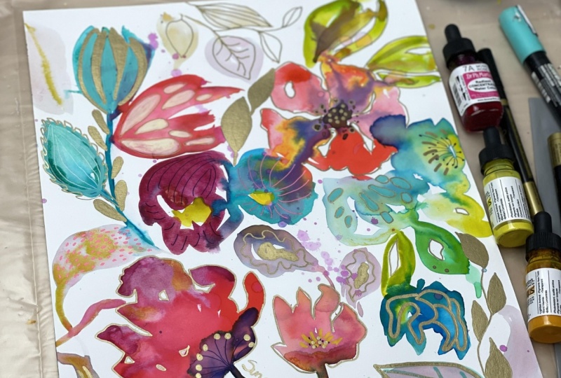
4. Laying down floral elements: Alright, so we are ready to go. I've got my paper taped down just to keep it
from shifting around. That's not a necessary thing,
but it's nice to have. And I've got no real plan
at this point in terms of, you know, I haven't done
a sketch previously. I really love to, you know, get inspired by looking at either real florals
or photos of florals. And then just I might have some of those
laying around me to look at. Or I might just be
kind of going with the flow in terms of the
flow of the paint and, you know, making
imaginary flowers. I'm really not trying to say, Oh, let's make this. So I've gotten some of the warm red and some of the yellow, and then I'm dipping into
a little bit of, you know, I grabbed a little bit of my blue to make just a little bit of
darkness toward the center. And you can see,
I love the bleed, and this is the
Bristol vellum paper, but if you used watercolor,
it would bleed even more. I was just experimenting. And I've grabbed some
of that thalo blue, which is like a turquoise. And, you know, really
playing with more water, less water and letting
things happen. Do you see how that orange, the middle from
the larger flower has bled all the way out
into the turquoise one. And that's great. I don't I don't fret about that. I'm wanting things
like that to happen. I didn't plan that, but
we'll see where it ends up. And now I've mixed a bit
of a green and you know, just these few colors, you can start playing. And so I'm getting a little bit of warm yellow into that green to warm it up. I do like my greens. It's just personal preference. I like them warm like an olive. So that's why I added
that warm yellow. And so I'm just taking
that brush loosely, really lighting the brush and the paint and the paper
do the work, really, because the paper sort of dictates how the
colors will flow. I've grabbed a little
bit of that more of that magenta color. And I don't really have
a plan color wise, either in terms of sticking
with I've got, you know, a limited palette
here of colors and just seeing what you can
make so many colors. But you see how
with my brush work, I'm being really
loose and playful and switching my hand around. This flowers sort of
feeling like maybe a peony, you know, sort of from the side. I like to
think about that. Some flowers, you know, will be from the side or an angle and some
will be just open. And probably what I'm thinking about most in
something like this is if you just took a bunch of beautiful flowers and
leaves and sort of tossed them up in the air
and they landed into this, you know, just
gorgeous arrangement, might that look like? And so I'm dabbing a little bit of dark into that center of that
smaller flower. And I'm not, you know, I encourage you
to just not worry about things like,
well, you know, a flower there might not make sense or a leaf there
might not make sense, or, you know, if your brain starts to,
you know, our brains do, brain starts to say, Well, you can't make a pink
leaf or you can't make a blue turquoise flower or any of that stuff
that the brain does. Just try to just let that go. Now, here, my paper
buckled a little, and I don't want the color
to run all the way off. So sometimes I'll just
take whatever I've got. In this case, a little
paint bottle and weigh it down and and if
that makes a mark, so what? You know, it'll be interesting. Here I'm throwing a
little bit of dark to the underneath of the pony, but it's a little too
much, so I'm dabbing it. Having a paper towel handy
is always a nice tool when you're working with
flowy paint so that you can, you want some of that
uncontrolled stuff, but you also want to be able to rein it in when you need to. Now, here, you'll notice, I just learned this I don't know, a few years ago that when you're doing a
composition like this, having some really soft bits along with the
more intense bits. So you'll see me add some almost invisible type leaves
throughout this. But here I'm sort of playing with the idea
of a roundish flower. Then it turned into started with a turquoise and
I had it some purple. And now I'm trying
to darken a center. I put the paint right on the
paper and then got the idea of dragging it off into these
into these sort of stems. So that was fun. A lot of these ideas just come while you're
painting and creating. It's just that's what I love about this particular process. Especially as you see how the paint is moving
and reacting. So it's a mix of sort of, like, these leaves look
very leaf like, you know, they look you know, it's not mysterious
what they are. But other shapes, I like
to just have some mystery. So there, I use my brush to
pull up some of that color, and that's another
way to pull up color. It's just to take a clean brush and dab it in a paper towel
so that it's not too wet, and then it'll act like a
sponge and pull up some color. So you can use that tool or you can use a paper
towel to pull up color. I'm just looking for where I might add
something and balance, I'm thinking about balance, too. You know, I want elements
in this composition, too. I want the whole thing, excuse
me, to balance, you know, to not feel too heavy or intense on one side
or too light on another. So you do something,
you study it. You think, m. What do I
want to do to this now? And at the same time, the paint and paper are doing their thing. So it's a bit of a
dance, isn't it? With something like
this. And then water, you know, the
amount of water can just change things so much. It took me a while to learn
the value of just doing very light bits of things and like that
that I'm doing now, just a little bit
of light background because there are a lot of
stars emerging in this show, if you think of, like, a movie and the stars and then
the supporting actors. So these really transparent, soft, and they're just
lovely, aren't they? You know, sometimes
I end up liking them as much or more than the stars. So that just takes the
tiniest amount of pigment, and it's mostly water. It will dry a little darker, so keep that in mind. So Usually, it does. And, you know, you can always
do another layer over. Although I did this piece not wanting to fuss
and overwork things. But that being said, you know, you can always come in with another layer if you felt like something
was just too faint. And you can find the most
beautiful colors this way, too, but just sort of you
see what I've got, you know, bits of pieces of
green and things that have mixed into really
either a soft brown or a really soft plum, colors that kind of
define definition, which I've read are
the best colors. The ones that you can't
quite describe or define. These are lovely
neutrals that are being made through the process. And you will find your
own personal preference for what kind of
neutrals you like. You might like cooler ones. You might like warmer ones. You know, you might like
them to be more gray or more blue or more in the purple
family or just whatever. Neutrals are fascinating. Now I'm thinking I
should do a class on neutrals because they're
just so interesting. And they really allow
everything else to pop. Okay, so what I'm doing here is I've decided that was
just too intense, so I'm adding water to it. And you can see the
pigment in my paper towel. I'm dabbing and pulling up. I just wanted to tone
that down a little bit. And, you know, it had it
wasn't completely dry, but it had dried a bit. So you're really letting the paint and what's
happening guide you here. And then I'm also looking
at the whole composition. You know, I'll pull I'll go in. Like I just did that, added
some yellow to those, and now a stem, and then I'll pull
back and look. And if it helps you if
you're sitting down, stand up and look. I'll
do that sometimes. You get some distance
and just say, Okay, how is this whole
thing coming together? Here I'm putting I've decided, maybe that's a flower,
and let's add a center. The other tool that helps
with kind of looking at your whole
composition is to pause and take a photo with your phone because that'll immediately make it very
small and give you distance. And that's really helpful, too. I do that quite
often. So you see me using the paper
towel quite a bit. I just don't like how
intense that blue green is, but I love how the orange
is bleeding into it. So here I'm wedding and getting another paper
towel and blotting that, too. These paints are beautiful
but very intense. So learning to work with those a little goes a long way. So yeah, so I'm standing now. I don't know if
you can tell, and I'm because it's giving me, you know, this is
not a tiny piece. It's 11 by 14, so I'm needing to stand to get some distance and also
some freedom of movement. Unless you're working on a very small piece or sketchbook, you're kind of constricted
physically when you sit. You know, you can't
straighten out your arm. And so keep that in mind, you might find yourself
freer and looser by standing and having a bit more distance and
physical freedom to move your arm and and play. It somehow encourages
play. I don't know. I can when I think of, you know, a kindergarten class
or just a group of kindergarteners sitting
at those art tables, standing and painting, it
just can be more freeing. So this is what I'm
doing now is looking, thinking about, do I want to add any more before
I let this dry? Do I need any um, is anything speaking to me? Is anything feeling
like it's too much or needs to be more or do I want to
adjust the values? Do I want to make something
darker or lighter? You do have to have
a variety of values. And so I think I'm adding a bit of dark up there because there's some dark in
that lower left corner, and it sort of then becomes all mid value in the really
the whole right section. So I'm coming in with a
bit darker flower center. And now that that flour that I'm working on has dried some, you can come in with
these dots that will stay more dot like
and not blend. So that's the other tool you have is just the drying time. If you want things
really running, then, you know, then you
blend when things are wet. But if you want things to sit like those dots, then
you give it some time. This is always fun. I took
a little bit of paint, watery paint, and then hit my
brush over the whole thing. And it's always a bit like, Ah, but it's just paint
and it's just playing. And it's just it
adds a bit of fun to see what happens
when you do that. I'm still not liking how
intense that turquoise. I'm feeling like it's
dominating too much, so I'm taking out some of the color and
the leaf and the stem. Well, my paper towel's
gonna be pretty, isn't it? So, yeah. Got a good start on this, we'll let it dry and
see what happens next.
5. Adding inky linework: Okay. Now, this is so fun. I mean, I love all
parts of this process, but adding line work
is I don't know. It feels like when you get
dressed and then you add your jewelry or I don't know. I just it brings
things together, and it's just such a
fun, relaxing process. So I've started here with a jelly roll
pen. This is a Navy. You know, if you've taken
my classes, you know, I love Navy for a dark. Um even though, you know, from here, it looks like
black. I don't know. For me, maybe it doesn't matter, but so I don't know. I think Black can be beautiful, too, so use whatever you've got. In terms of where I'm
adding this linework, it's just, you know, it's just been over the years of learning about what I like. So, you know, this whole thing is about discovering
what you like, you know, what you like when you laid down your floral
elements and what you enjoy the look of and the execution of in
terms of linework, you know, what do you
enjoy actually doing? Um, I'm picking I love how hugeno that right there is
a shape that I thought, you know, that
looks like a center where it would left
white in there. Let me make some little stamen. And so you're really
letting the paint and how it's dried and form what
you want to do next. You're looking around,
and now I'm switching to a white jelly to
see if I can get it to show up on this
dark turquoise, and it is showing
up a little bit. That's also a way to tone down something if you want to is do it with line
work or accentuate it. Now I've grabbed my Poskas. Pascas there are lots of
acrylic markers out there, but they are kind of tried
and true for performing. You're seeing me push on it
to get the ink to come out. So all these pens, none
of them are perfect. It's a matter of
finding ones that are better and the
colors that you like. So here, again, I'm just looking for what shapes and elements
would feel nice there. I don't even need
to think about, Oh, let me make this
a leaf or a flower. I can so you have softened that turquoise
again, isn't that funny? It just kept bothering me. So, you know, you do
what you got to do, and you can color in with these, color bigger shapes, and completely change
what was underneath. And they're acrylic,
so they're opaque. And if you do multiple layers, you know, you can really
get completely opaque. But one layer is semi opaque. And I'm doing the same thing in terms of balance
and elements. And I'm just looking
for, you know, adding elements or bits or marks that I would
enjoy and that I think are interesting and not
worrying about you know, where this goes in terms of, am I really I think what you have to keep in
mind is not think about, Oh, I'm going to ruin this. You're not going to
ruin this because you're learning and
you're exploring. And if it ends up in a place you don't like,
well, first of all, usually something like this,
there may be pieces of it that you don't enjoy when
you're done, but that's okay. There will be
pieces that you do, and you can just do it again
because the whole thing was so relaxing and stress free if you're approaching it in that way that you
can do these all day long. You're just pushing color around really is the first step. And now we're experimenting with various markers and
pens and colors. Here I'm thinking
some little bits of yellow might help
balance things. Putting in flower centers is so fun little stamens
and little marks. And if you've looked
at enough plants, you know that pretty
much everything exists, especially if you
look at plants from around the world.
It's just crazy. There are leaves with holes. There are, it's unlimited. So you're not gonna
create something that's, um, so bizarre that it could never exist
if you've seen some of the bizarre plants out
there in the world. Don't worry about that.
Let that free you from, thinking about making
sure everything looks, I don't know, realistic
or representational. Let yourself play with
color, line, shape. This is a fluorescent
jelly roll, which you can't see as much
in the camera, but it does. It's fun. It does add a pizzas and helps bring some of that pink to other places
in the composition. So here I'm taking the pen and adding completely
new elements, which I've done I did
with the Navy, as well. Thinking about, you know, where would it be nice to add maybe where there's white space that's there's nothing
wrong with white space. And this is personal
preference, of course, you might like You know, you might have liked this at the end of the last
video and said, you know, I don't
want any linework, but it's fun to play. Here are some dots.
And especially something like this
that could lend itself so well to a pattern, it's fun to have elements
of interest in it. So just making little
floorescent pink dots. I did live in
Florida for a while, and that will free you up in terms of what's on plants.
There's everything there. There's a thi plant, TI
that is hot. The leaves. They're just leaves,
but they're hot pink with some green, but like a magenta hot. You know, so do
anything you want.
6. Shimmering gold!: Okay, so a little
bit more line work, and then we're going
to start using gold. And I've got a cup of coffee here because I'm done painting, and I know I won't I won't
dip my brush into my coffee, which I can't tell you how many times I've done or my tea. It's usually tea, but I just thought I'd add a
few more little dots now that everything's dry from the last time
and just a bit more. I wanted a little more structure around this element here. And I'm getting ready to decide that I'm
ready to move on to, um, to the gold. And, you know, when you do
a line like I just did, don't feel like you have
to go and do the same line on the leaf from this
same quote plant, you're more thinking
about the composition. Where does where is
something needed. So and really take this
as a meditative practice. You'll see I've got
my head on my hand. You could have music. I would be a lovely thing to just
have music playing, too. Because it's it's all sort
of playful and soothing. So here I'm just taking the
thinner pilot gold pen. And again, I do have links
to all these supplies, all these tested and true things that I think I've tried something like 12
different gold pens, but these are again, none
of them are perfect. They do. They all
sometimes clog up, but these are the
best that I've found. And see how I just made
this squiggly line? Like, you can do, my
gosh, anything you want. You want to think about variety. So here on top of the paska that we put
in earlier that's dry. Now we can come in with some metallic gold,
little stamens. And it's hard for the camera to pick up the
metallic gold, but it's yummy. I'll try to show you
that in some images, but it's just I kind of have
to trust me that this is metallic gold and
that it looks very shimmery as soon as you, you know, hold it to the light. But gold in the camera, I've noticed this just
posting on Instagram. If you don't take it
the photo at an angle, it will just look
like a pale brown. So I'm choosing some
elements to I really enjoy sometimes making lines around loosely the shapes
that the paint has made. But you wouldn't want to do
that on everything, you know? So you here I'm doing it
on the negative space. So I'm making a shape around the white bits that
are showing through. It's just a playful process. And you can see that
I'm starting to say, Oh, let me do it here, too, and you just have
to be careful to not go in here and
here and here, and, you know, don't cover the whole thing with
the same I don't know. You know, there are no rules. If that's what you
want to do, do that. But I would encourage you
to think about variety. I'm on a roll with the
outlining, clearly. And you're not worrying
about an exact outline, but it can just be fun, especially with the gold to
come along this watercolor coming in with the fine
point, doing some more. And I'm standing
back, sitting back. Actually, I'm sitting now
because this is more, you know, this would be
tough to do standing. And I'm adding, you know, it could be the
suggestion of petals. With lines, you can just
take it in any direction you want in terms of the weight of them,
the shape of them. And so I think at this point, I'm still using the thin one, but I'm gonna switch soon. But I isn't it funny how I'm going
back to that turquoise. And now I'm sort
of making, like, a serrated edge around it like maybe a rose
leaf would have. Um I think I felt like that corner just
was sort of falling flat other than that turquoise,
that bright turquoise. So now I'm switching
to the fat marker, where you really get
big chunks of gold, and it's just really beautiful. And, you know, you can see that I'm basically painting on gold. Now you can see the gold
treatment of everything. So now you can make some big
chunks of gold, basically. You could also do
this with gold leaf. It's just, you know,
just a different. The pen makes it so
easy just pull out the pen and do it. It's
a little different. Much easier to control with
a pen, that's for sure. See, now there I made sort
of these hard gold lines, and it does end up
working in the end. But some of it, I don't know, I think I
could have left that off. And you can clearly
see that you can take this whole process too far. So that's something
to watch for. I always laugh at
the phrase that the artist Helen Dardik
uses too Muchery. She does these really intricate, colorful and just there's a lot going on in her
work, and I love it. But she calls it too muchery. So I'm thinking about that, too. I'm doing what I'm enjoying and sort of keeping
in the back of my mind, you know, at what point
does it feel done and, like, I don't want to
add any more things. But coming in with
the gold dots, which this bigger pen
makes really nice. Gold bits and gold bits at the center of
flower are lovely. That's me thinking,
Okay, don't overdo it, but what else do you
want to do here? Put it away, and let's
think for a while, and let's let it settle.
7. Refining and finishing: Okay, so here's where I come in, and I've given it a
day or so or maybe later that day and let
it be I've untaped it. And so I had that
edge that was taped. So I'm just playing a little bit more with the fine
point gold pen. And now I'm picking up the
smallest gold pen I have. And just playing with
some other elements, looking at the whole thing. With the gold, I want
to make sure that it's since I'm using so much gold in this
that it's balanced. Plus, I'm just
having fun with it. With the gold and any pen work, you can bring things forward
or push things back. So here I decided that I
didn't really care for those fluorescent
pink outlined leaves or they just didn't
feel like they were, I think, sophisticated
enough for that element. So I colored them in
with the gold pen. Oh. And I'm tracing some previous ink lines
with the gold there. I love how that turned out. Picking up and turning it
around like this helps too. Picking it up and looking for where do I want
to add something? What caught my eye
on these were these? These are the shapes that
I had made with the posca. And so now I'm going around
them with the gold ink. Isn't that pretty
how that flower there to my lower left bleeds
into the other flower. Now, those are those
darker marks I made, and I circled some of
them with the gold. And then bringing in my fat pen and making
some more dots, just accentuating
the center of that. It's so fun to do all this. Always looking at balance.
Do I have variety? Trying to decide what to do
there because I don't like these fluorescent
pink flowers there. So I start out with
my thinner gold pen, and I think, No, I'm just
gonna color that in. Sort of like I did the others. I'm just gonna make them
solid gold little leaves. And I do one, and I think, Okay, well, let's see what happens and I cover the stem
with the thin one. And I pretty much go
all in on the gold on those because I just they were an element that I tried
and I didn't care for. Care for it. And now there
are these lovely gold leaves. I think trying to cover up
every bit of pink is funny. I like how the
spatter turned out. Do you see how it
spread in the center? And you could do
another spatter. I like to sometimes
make my signature an element of the design. So I've got my gold pen, and there was sort of an
empty space in there. And, you know, sometimes
I make squiggly lines, so really a signature is just sort of a squiggly line.
So I threw that in there. I don't always do
that. You know, I'll do it in one of
the lower corners, but sometimes it's kind
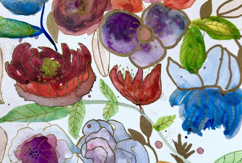
of fun to do that. So I found that when it dried, I really liked this
subtle look of the outline of some of these
flowers with the gold. So I came in and did a
little bit more of that. And then I like this
idea of taking the bits, the accidental bits
that were white, you know, that were left, and I went around gold
and some of those. I didn't plan that. That's what I love about this process. I just let the
painting speak to me and give me ideas and each time you do
something like this, you'll pick up a few ideas. So you can see me
just holding it up there and twisting
it in the light so I can see clearly where
the gold is and where maybe I need more or I want more
getting that shimmer. Maybe where I want
it a little heavier. But we are definitely
getting close to the end, as I and you can see I slow down as I get
to the end because, you know, there's less to do. I'm thinking more about is it time to stop or is there something else
that I want to do? I decided those. Remember how I talked about the
opacity of the pascas. I'm doing another coat on top
of those marks I made with the same ivory Poska pen just to get those showing
up a little bit more. And I could have just
done a few of them. You don't have to do every
element in the same way. I do love the Ivor paska. And The whole
things so relaxing. I'm looking at it now, and I'm thinking that
we're done. Time to stop. All right. I want you to be able to see all
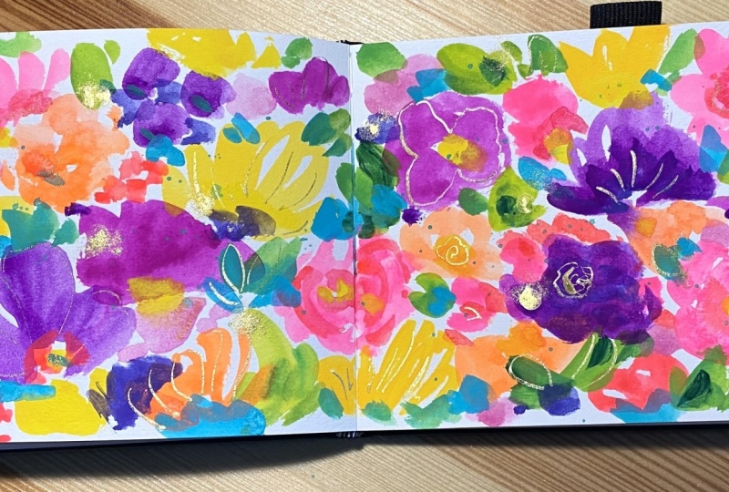
the gold close up. And the way it shimmers
when you move in the light. Okay. Yeah, so pretty. It makes it softer when
you look at it this way. See how it's not just
brown lines and it's actual metallic shimmery,
gilded flowers. So fun. I want a
scarf out of this. Oh, it would be
pretty or fabric.
8. Sketchbook floral with gold: Okay, so for this floral
with some gold and ink, I'm working in the
watercolor sketchbook. I've got some paints in a
little plastic palette, and then some on
the palette paper. And this is a mixture
of the gouache and the aqua gouache that I talked
about in the supply video. So I'm starting with, you know, I've taken a warm red and a
magenta and mixed it with white to get this sort of
variety of salmon colors, and see I'm holding the brush. Um, No like a pen as much. More like a magic wand. And it can help
actually to stand. I talked about that before, but that can help you
hold the brush that way. Especially when you're doing the start of painting
and you're doing these sort of big shapes and flowiness and you're not
doing the detail line work. So I love just varying
color, as you can see, I go back to the palette and throwing a little bit of
warmth into those colors. I never like to use a color
straight out of the tube. I feel like colors are
your signature, you know? So making your own colors is, I think, important and well, first of all, it's so much fun. And then also it's just
part of your style. You'll make colors that you like and discover
colors you don't like. So you can see there like
that yellow felt too bold. So I just grab some white. I'm working quickly here. I'm trying I'm doing
that on purpose. I highly recommend it
because especially if you stand and you don't allow yourself to get
fussy, that helps that, too. Who would think that
would help that, right? Just standing versus
sitting, but it can help. You're further away from it. You're more kind of
looking down on it. And I'm trying to be I'm
going loose and playful and at least in these early stages quickly
so that I don't over fuss. I don't you know, I'm putting in some centers now. And I don't rinse
my brush a lot, but I rinse it
when I'm changing, you know, from one color
family to another. Like, I just rinsed it
to go from the florals. But I don't even mind, like, I don't want it completely clean because I want some bits, you get really interesting
colors by leaving some bits of paint of
color in your brush. And you can even incorporate the concept of a mother color, if you haven't heard of that, where if you leave
something in your brush, you're kind of doing
that naturally. But the idea of a mother
color is that there's one color that is in all of your mixtures for
a particular painting, and it can help with cohesion. It can be just the tiniest bit, but I sort of do that
naturally by never completely. I'm not going to say
never, but usually not completely
cleaning my brush. So now I've got the cooler red, and I'm not really thinking so much about what
types of flowers. I'm just thinking about variety. And I also like to
think about angle. So some flowers will be as if you're looking
at them straight on. But you can change
the direction of the flower by just
changing the shape and also the center where you put the center can make it
sort of look to the side, look, you know, down up
in different directions. So be thinking about that
and also some profile. They're like faces, right,
you know, in a crowd. And a crowd, they're
not all looking at you. They're looking various ways. So I like to think about that. Keeping it very loose, holding my brush in a really
loose way. Not like a pen. And I'm thinking about, okay, what else do I need in this? And I love to bring in a
little bit of that navy or indigo paint for
some some darkness, but also I just love the color. This watercolor sketchbook
is a lovely 90 pound paper, which I put a link to
in the supply list. Normally, if I'm working
on watercolor paper, I would want it to be 140 pound, but in a sketchbook, that can get chunky
and just I don't know. I can just feel too thick, and it's a nice quality, so it feels lovely. Here I'm bringing in my
darks to find some centers. And even if you've made
a shape and you wish the center were sort of more on the side so that the flower
is looking the other way, you can just put it there
and then come back in later and put some
flower shape around it. So I'm getting out the ink, the navy, the indigo ink, and things are still wet, but this particular ink that
I found is water resistant. So I like there are
times when I want an ink that will
flow and blend more, but there are times when
I want one that's going to not flow as much. So did you see that drop? You know, you can
dab it like I did. You can leave it.
You can blend it. No one will ever know
that it was there. You could even splatter
that area so that it looks like it's part
of what you intended. So, yeah, if I've tried an ink, so those little bits there that I just did will
blend a little bit. But if I were using a watery ink or an ink that is
not water resistant, these lines would be bleeding all into the stuff,
which is fine. There's nothing wrong with
that. It's all what you want. But I began to get
curious about, well, what if I had an
ink that doesn't do that? I mean, you can
wait till it dries, too. That's another idea. But this Sennelier ink is nice. And so as far as where
to put these lines, you know, it's
Artist discretion. It just allows me to bring a little more structure
and interest. And it's just fun. So maybe they're sort
of pedaly type shapes, maybe they're just
kind of outlining, but I'm keeping it loose. I'm not tracing,
if you'll notice, like I did in any other painting where I did more sort of exact, it wasn't really
exact, but, you know, I outlined the flowers. Here, I'm trying to be loose and create a sense of
movement and energy. And it's just fun to
play with a dip pen. It doesn't you can't
control it as much. So you get different
weighted lines, you know, which is lovely. You know, the line will be thick and thin, depending
on the pressure. Has a nice organic feel. I'm thinking about, do I
want any more Navy lines before I get out the gold, the liquidex gold, and
I decided to go for it. You shake that up, and it is
a beautiful iridescent gold. I just use the dropper. I didn't do a lot on this
one, because it was just, you know, more of a quick loose
sketch in the sketchbook. But I love the marks that
this dropper tool gives you. Trying to get in the
habit of, you know, while I have the tools
out, go ahead and sign even in the sketchbook. I don't always remember, but it's a good habit to get into. Alright, let's look
at it close up now. Okay, let's look
close up at some of this gorgeous liquitex gold ink. And also the navy ink, how it just bleeds
and bits places, but not in others. And using that
liquitex gold dropper as the mark making tools, well, it's practical because you don't have to clean gold
ink out of a brush, but also because you
can't overctrol it, you get some kind of
really I don't know, unplanned type marks,
which I really like. Like that one there.
And you could go through this with a gold pen and do a little bit
more if you wanted. Yep. Hardest discretion, how much or little
you want to do. So here's another quick
I'm just showing you another little
floral on the way I used this Karataki ink. To just highlight a few
bits. Isn't it shimmery. I did film it, and
I'll show you that, but it's in a portrait camera. So portrait. Here we go. Yeah. Here's that
beautiful Karataki ink. Oh, my God, it's just
so it's just it's like painting it feels like you're painting or drawing
with solid gold. So I did a portrait so that
I could really get close in to show you how
sparkly it is. Anyway, this is just
a little example of how you can use this ink.
9. Wrap up and resources: Thank you for joining
me in this class. I hope that you
enjoyed those pops of shimmered gold as much as I did. It was so fun to you know, to go back in and look at
some of the bits and change, respond to what was on
there and have the gold. And I just hope that
you saw how much I ended up changing
or adjusting and, you know, responding
differently, taking a break, and how much fun it was
to just relax and not feel pressure or even have an idea of where exactly
this was going to go. I love creating that way, so I hope that you
were able to do that. And if not, just
keep practicing. It's something that um, you would think comes
naturally, but it doesn't. It comes more naturally
to sort of say, I'm going to do a leaf or a stem with three leaves here
and two leaves there and, you know, to have this
very specific plan. But when you can let yourself
go a little bit, you know, that's when I think
you get some real magic and play music and try things like that to
relax yourself, cup of tea, and think of it as
meditative painting and enjoying the process and not being focused
on the outcome. That also is learned. Oh, it's funny. Anyway, I
did want to tell you about, of course, the supply list you already know
about with Links. Also, I have a Youtube channel, which has all kinds of things on it. You might
want to look at that. Then I have a Facebook
student only group, you would either have gotten a link to that in the
email to this class, the welcome email or
if you don't have it, just email me at art at Suzanne allard.com and I'll be happy to send you
an invite for that. And I have many other
online classes, laurels, landscapes, and I'm going to be probably doing
some still life soon. So I've been playing
with those ideas, and that's going to
be a lot of fun. Well, I think they're
all a lot of fun. I just think it's I think it is a wonderful exercise to follow what seems interesting
to you at the time. I think too often we say, no, I have to paint this
or I have to master this. I have to master florals or landscapes or
whatever you're into, still life, and then I
can do something else. But I find that I
get bored easily. I like dancing among subject matters and even mediums and they always
inform each other. It's never wasted. You're advancing the
whole thing in my view. Anyway, that's a little
bit of my philosophy, which I'm just on a
journey like you. We'll keep creating because
creating is good for your soul and that's good for the world. We'll
see you next time.
 Suzanne Allard, Landscape, Floral, Abstract Painting Teacher