Transcripts
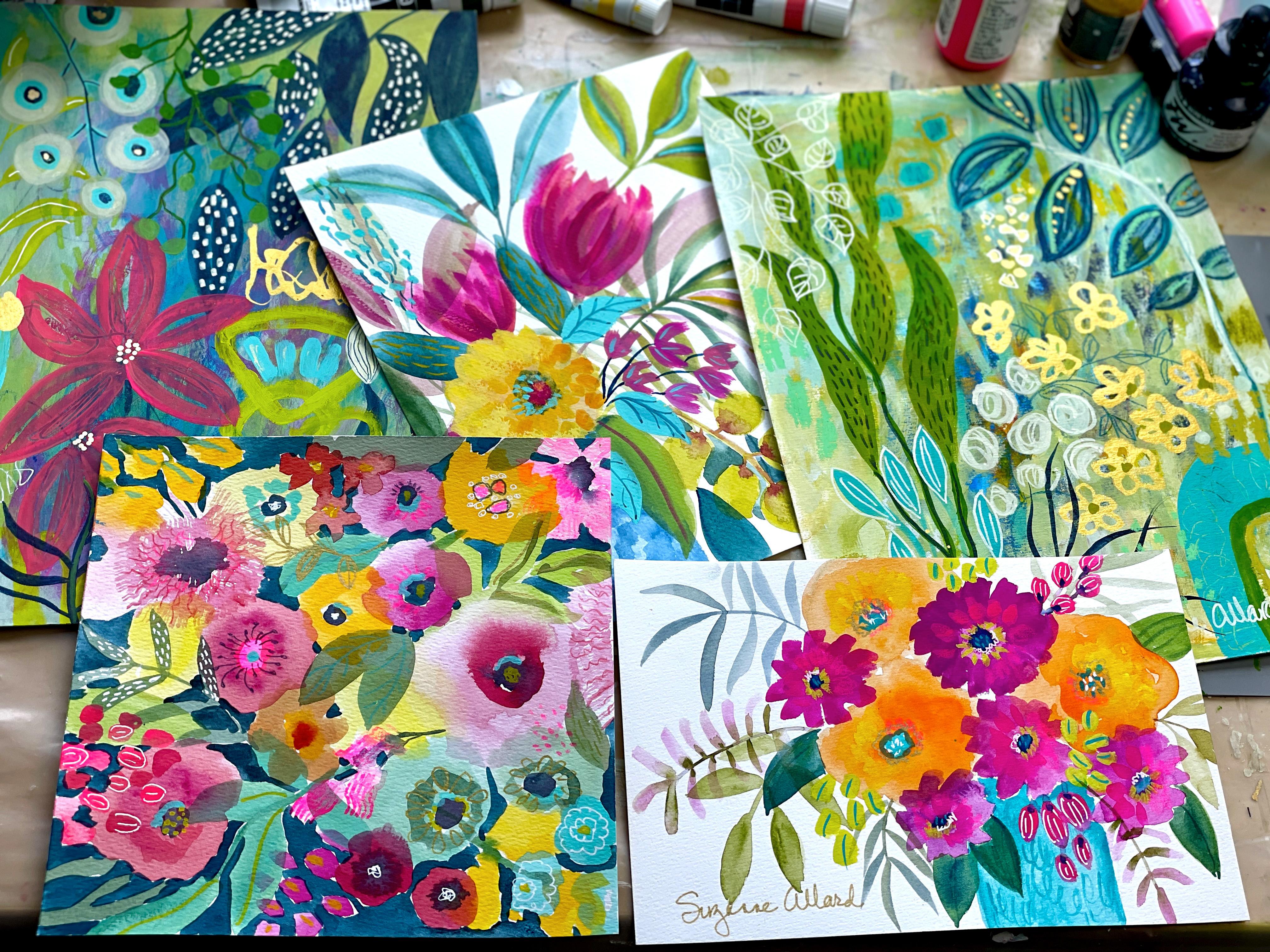
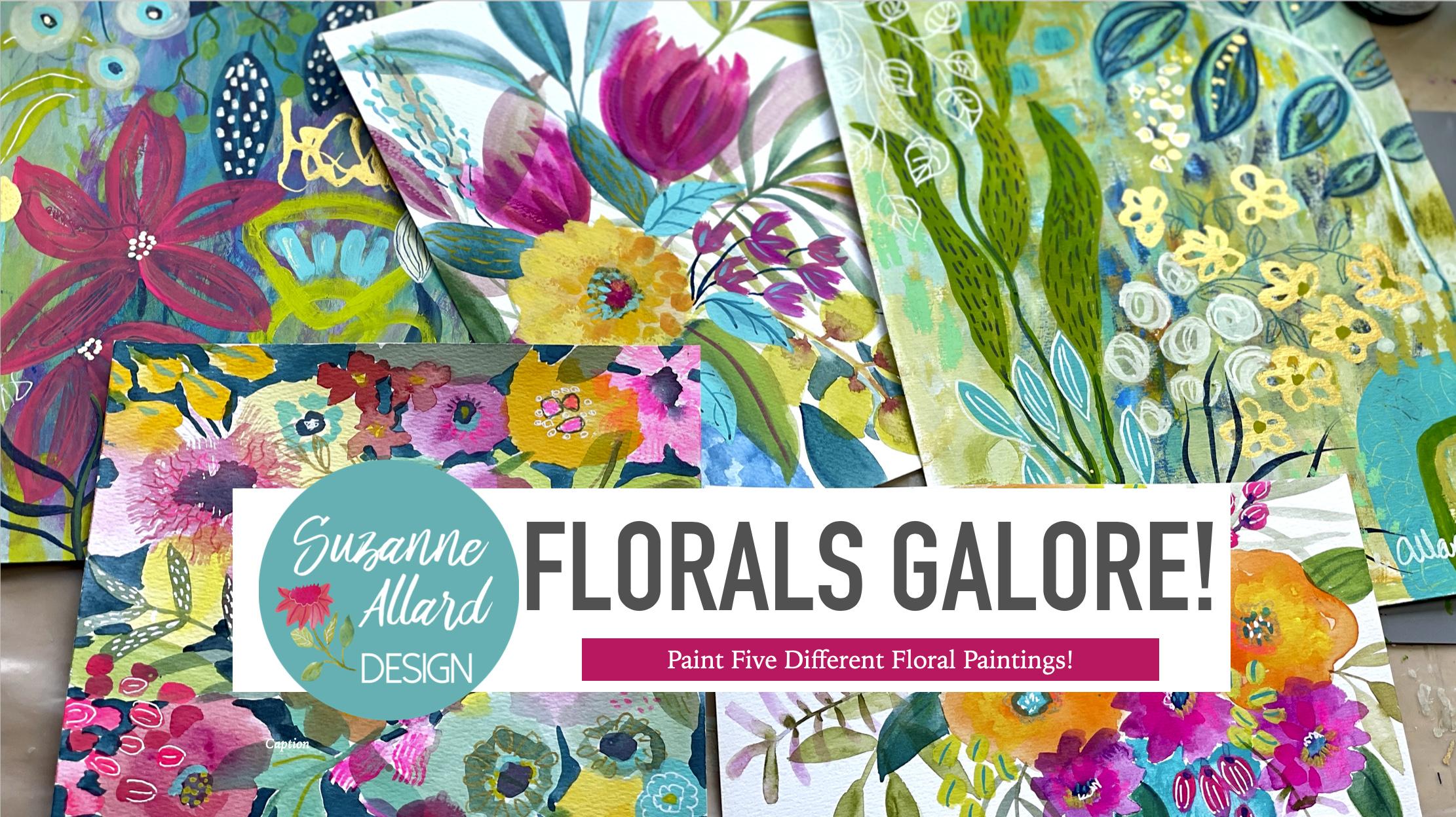
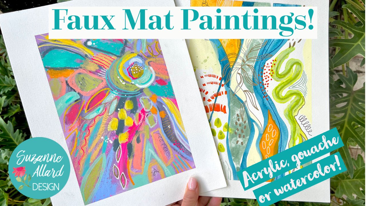
1. Florals Galore Intro: Are you ready to paint Paul kinds of laurels? This class is packed. I've got four completely different types of florals in this class is really for classes and one. And we're going to lose, we're going to do book, hey, we're going to be abstract, different compositions. We're going to talk about how I look at a composition and figure out where the eyes moving and what's missing in terms of interest and balance and just that wow factor with color. And so we're going to do, as I said, for different types, we're going to do call it Chevy brocade, which is something that I came upon by working in my sketchbook. And so we'll create this painting will also do what I call a half, okay, which is that you see half of it on the page. And that has its own challenges from a composition point of view. So we'll create this. Then we're going to do some loose florals, literary, just so much fun because they're very free and it doesn't matter which way they go. And they're just, I would say, probably one of the least stressful types of paintings that I know of. So, and then we add details, and this is gonna be lots of fun. Then we're gonna do an abstract floral garden. And we're going to create this one from scratch, from a blank piece of paper. And it has all kinds of little details that will create. And then we're going to finish this one. The background was already there and then we're going to finish and you can see the metallic gold and have fun creating this film. So join me, this is going to be fine encouraging just like all of my other classes. And we will use a variety of supplies, mostly gouache paint in these, but if you have acrylic or even watercolor, you can use those as well. And then I'll show you all my favorite pens and supplies and pencils. But again, I always encourage you to use what you have. Don't be afraid to try this. All levels can try this class and we'll just go through each 40 again as if it's each one is its own contained class. Already. I can't wait to have you join me. See you soon.
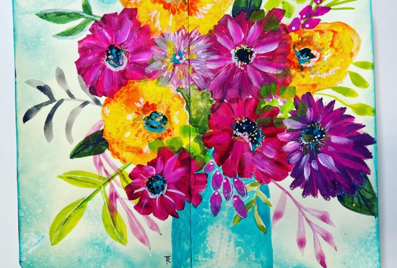
2. 1. Chubby Bouquet Intro and Beginning: Are you ready to paint the Chevy Volt? I name these up because I started painting them in this sketch book, which is the horizontal kinda long. And to make these bouquets fit, I ended up making them really chubby him fall, which I love how they turned out. And then here's another one. So to do that, like I said, just the shape ended up being that way. So I start coin, which has the bookcase stuff. I pick this one out that we're gonna do. And it's going to end up looking like this and we're going to paint it together. So let's get to it. Here are the supplies that we use in this trivial k painting. The paints are used are the Winsor Newton gouache. You can use any course that you have. You can even use watercolor. Just want to use more of it to get the intensity here. And you might need a layer a bit more. You could also use acrylic. It's just, that's going to look a little different than those, but you can have water and kind of make it look a little bit more like a water-based paint. So you can use either regular gouache or acrylic wash. These are two different kinds I have. For this one here, I just used the regular wash and then I also used a few pens. But let's talk about the brushes first. My favorite brushes for florals that are round brushes are these Princeton velvet touch. And this is a 6, 8. I don't think I used, you know, any one of these. You don't need all three because they have such a nice point on, on that. You can do those finer things even if it's a size eight. So I would say if you're only getting one brush air on, a little bit larger one, and just practice doing finer lines with it with a softer touch. If you end up getting two, then it's nice to take a smaller brush or even something else like this. Really liked this Winsor Newton round was completely, the paint is completely peeled off of it. But it's a good little brush. Good for fine work. Can't even tell you what size it is anymore. Probably a one or a two. So the color is that I used are the, my favorite turquoise in the world is this Winsor Newton cobalt turquoise light. I have a brand new tube, but I'm determined to use this. Then another kind of special color is this linden green. And you can see this in other brands, as well as not just the Windsor brand. I think Turner has an acrylic quash, the Kohut fresh green, same, same basic thing, but it's a bright greenish yellow that I like to use in my paintings. And then I used any type of rows or I think there's some violet here. This is Bengal rows. Alizarin crimson, any type of magenta color is fine. And then just something dark so you can use a Prussian blue. This is kinda go, one of my go to. And then I generally make my greens with various combinations of yellow and blue. And then you can even have orange if you have it. And get some interesting greens. If you add orange to blue, just a tiny bit. So the other thing when when we finished painting that I did is a little bit of details you saw, you'll see me do with these tools. So I'm going to show you to these. This is the posca metallic pen, 0.7 millimeter. And for finer work, it's my favorite metallic pen. And this is probably my favorite white planet. So uni-ball signal. And I put these things on the supply list and then this PRISMA color fluorescent is worth, we end up doing this with. And really it's almost takes the place of one of my favorite colors of paint, which is opera pink, fluorescent pink, or opera pink. So if you have that, that'll work too. You don't need the pencil. And then I did a little bit, not much with my indigo pencil, and this is a favorite Castile pencil, but any pencil is fine, so fat. And I used a six by eight piece of paper because I was trying to imitate the, the shape in the sketchbook. Long horizontal shape for the chubby bouquet that you can use any size paper you want to. Okay, let's get painting. Okay, so we're looking here at the sketch book. This is the mole skin watercolor sketchbook. So heavy watercolor paper. And taking those super color too. And dash is a Swiss main pencil and I'm sketching, this is a turquoise color and I'm just really lightly sketching. It doesn't have to be this pencil or this color. Basically, I'm looking for a pencil that is going to be water-soluble. And even if you don't have that and you just have a regular pencil, just be really faint with your marks. And you'll end up painting over it. And you can see this is incredibly faint. And I'm just looking at the example which I am including in the downloads. So you'll have the same one. And I'm sketching in the larger circles for where the larger blooms will be. And then the pink ones. And not the other details and just the base. And then you're seeing what I'm pointing to there is that there are some faint foliage in the background. Then I'm going to paint first. And so I'm using really watered-down wash here. You could also use watercolor for this. But it's, it's faint. So you're adding water and just thinking of something that in the background. And that will really just support of the final painting, but not certainly not be the star of the show. More of a supporting actor. And I'm getting a variety of greens as I go through this. Doing some foliage. You can make these any, actually out to be green. You can make them any shape that you want. Because if you look at nature, leaves come in all kinds of colors, not just green. I'm going to understanding little interests. Particular stem ended up not being very faint. I tend to, tends to happen to me when I use that color. Spread of great hall of cream and love it. How about a little bit of orange here and just change the shape. I like how a lot of color variety in what I do. And just adding a little something pretty dramatically change the color. It's amazing how little paint it takes to make a painting like this. There's not much paint in my little tray there. So not very many colors either. And I'm pulling these stems out kinda in-between are behind those sketched in round shapes. And it just doesn't matter if they end up getting painted over part of it's just getting their background. Marrying the color, the leaf shape. And it's a very relaxing process. Okay, Um, so I just take a blank sheet and fill it with leaves like this. And you can practice this particular you're pressing down to the point of the brush. Very barely, barely touching with the point. And then pressing and lifting to get that leaf shape where it's fine pointed at the one end and at the other end. That just takes lots of practice. Practicing being delicate, thoughtful. It makes you really be mindful because I have made plenty of leaves that was kinda clunky. Because I just stop concentrating why I was doing. And remember that these paints, these water-soluble paints, all you do to change the color. The simplest thing that changes is to add more water. So even if I don't add another color just by adding water, I get a lighter shade. So I've got five. If you've taken my classes, you know, I like odd numbers. I've got five leaves now. So I'm feeling like that's enough for right now. I'm just sketching in with the orange, kind of a chubby bloom. Looking at my reference, I'm using the Marigold. You can use any version of, well, if you want to use orange, you don't need to use orange, but orange or even you don't have orange and mix some red and some yellow. And we'll make those any color you like. And I'm trying to avoid making it perfectly round. It's kinda peaking out from under that other balloons. So I'm sort of paying attention to that boundary that I had that I sketched in. And you can see my brush here on these flowers is larger. This is leave, it's a 10, the outset 10. And I am thinking about going in darker in the center. Then this one, I left the center without pain. And I really try to avoid putting the center of a flower in the center bloom. In other words, I feel like I've needs to be a little off somewhere. If you look at it. Okay. Occassionally, there'll be a bloom depending on your vantage point that is literally centered perfectly, perfectly round with its center right in the center, but mostly not. So it gives it a looser feel. And the more natural look to have those centers, I think of them as little eyes looking every which way. When I add little creatures, flowers. So I've got my main three orange blooms. And then we will add and let those dry.
3. 2. Chubby Bouquet Part 2: All right, let's continue with our Chevy bouquet. Now, the paints I am using you do not need to use this exact paint, brand or color. But I've got a couple of yellows, couple of roses. And the oranges is called Marigold Yellow. And then the rows is called Bengal rows. And then my favorite, this cobalt turquoise light, which I would say if you are going to buy a Winsor Newton pain, that would be the one. I've got an indigo in there, but just a blue, you'll see I use it to mix. And so again, it doesn't have to be those colors. But I'm getting a couple of flat brushes along with my round bread has got a little bit of my head shot. And then I have that kind of unique brush. These brush shapes are called brights and I use them along with my rounds quite a bit. I'm getting a little bit of rows. And you know, by grabbing just a little bit of blue really enable you have, you can take that rows and a little more purpley direction. I, then I'm throwing in some orange to just basically create a color that is not straight out of the tube. And this is where you can just have a lot of fun. Before doing a painting. I'm just mixing colors now you can see there it went to violet. I didn't want it to be that purple. So I'm adding more of the rows and getting up. I needed more because I just dab that indigo is so intense that you have to be really careful not to grab too much. Little of this paint goes a long way. And that's what I love about backwash. Very intense colors. I'm just looking for trying to get some color to a color that I've gotten my inspiration piece there. And I'm using bright, but you would need to, you could also use the round. And these flowers have a little bit more of a petal. I just switch switch towel is holding my brush. The reason I do that sometimes it can help you stay looser to hold it this way instead of holding it the way we hold pencils and pens. And just can keep you from getting too meticulous because this is supposed to be a loose style of bouquets. Not exactly representative and realistic. Adding water along the way to vary the color a little bit. And then going back to the street, I have to do this other one over here. And I do often draw in the center somewhere either before or along the process of making a balloon. Because then I can remind myself to try not to put it in the exact center of the bloom, although it looks like I did on that first one. And again, just trying to keep from overworking, which is always a challenge, and from trying to make it look too, too much exactly like a flower, I've grabbed a little white because that bloom over there on the right lower right is lighter in color. And just look at how just adding the white really took that color to a different place. I love using. And I mentioned this in the supply list, but if you don't have goulash and you have watercolors using white gouache wash. We'll make them much more opaque, more like wash. So you can almost get a gouache like effect when you add white to colors. It's just that you don't always want to add white to colors who don't make some more past Delhi. So you just want to keep that in mind. So you'll look, I'm going for the color being slightly different on every single bloom and even within the bloom. And you can do that by grabbing another color in your palette, adding water. So. Basically adding pigment, taking pigment away. All those things will and adding a different color, all those things will change it. And you noticed I did the three orange bouquets, so I'm going for a five of this other type of flower and burying them in size. And I'm thinking about just changing the color a little bit. So I'm grabbing a tiny bit more than indigo. But you could easily grabbed a little bit of green, which would have kinda doubled the pink down. Just depend on the effect to u1. This one's smaller. Still holding my brush in that way that forces me to be loose, doesn't let me over work or be overly exact with my brush. I'm getting some lemon yellow, which is a very cool yellow actually. Whereas the one that's on there, the marigold Joel's a very warm yellow. So this is where I'm looking at my inspiration piece where I had done some lemon yellow well pastel. And I'm attempting to kind of have that same effect here with straight out of the tube. So highly pigment and lemon yellow. Just another way to try to get some of that variation. It adds a little bit of a highlight to each bloom. You know, the way that lights, light hits bouquets is what I'm thinking about. And now I'm thinking about the centers which I did an indigo. I'm adding a little water because that's straight. Indigo is very intense. High end was my center is I always try to, again not make them round and just be a little bit loose with how they show up. Now when I wanted to blossom, and that's how you can blot it, just wet your brush and put it on there and it'll soak it up and then you just dab a paper towel. So that center, I wanted to make a little less round C you have just doing that added interests to that flower, just not making it perfectly round. And I like that some of those centers are darker than others. So I'm thinking about what to do next. Thinking about the vase and just the composition, and we'll let this dry out.
4. 3. Chubby Bouquet Part 3: Okay, We're going to bring this home. When it comes together. Like this is probably my favorite part. So I'm getting that color that I love, the Winsor Newton cobalt turquoise light. And I'm determined the US, there's so much paint left than that. It seems funny, but I have a new tube because I wouldn't want to find myself out of it. But I am going to make the most out of what's in this one. And I'm just putting paint inside it. I mean, water inside it so that I can get all that GZ pigment that's in there. And then I'll start the fresh to when this one's empty. I'm just going through and lightly painting. I'm not trying to be too precise. The base behind these blooms. Just like watercolor and gouache, you can vary the color by moving the brush around and also adding more water, less water. And you just immediately have texture in your vase by that's what I'm doing now is kind of moving the water in the paint around until I feel like I have some texture. Then I'm taking a pattern paper towel, blotting it. Getting even more texture. Just playing like this until I get the effect that I like is dropped to that tube of paint. I think I decided I wanted to try it again and see if I could get more of the quilted pattern that is in the paper towel and then I'm just taking the back of my brush, just creating some interests. When you think about pottery and other things, the vessels are made out of. I have a whole vessel. Board and Pinterest register collect pictures of beautiful vessels. And you know, whether they're made out of pottery or glass, they have beautiful texture. So just trying to play with something like that. And then I'm bringing the turquoise up into some centers for these blooms. I don't know that I've done a painting without turquoise. I'm thinking about now these really bright short fat leaves. And this is another one of my favorite colors, which I find in just about every brand, but this is the linden green. And if I can't find it and I've been a brand of paint that I'm using. I I'll make it, which is basically a lemon yellow with little bit of green, will give you those kind of linden green. But this color is bright and beautiful. So I might add that to my, if you're gonna get a couple Windsor, if you're gonna splurge on a couple, Winsor Newton colors, the turquoise and the linden green would be the ones that I would say are more unique and harder to make. Greens are easy to make. In general. Pinks are pretty easy to make. Of course, to make pink you now and see what I did there. Did you see I put the linden green down and it just didn't show up because it was on top of other bloom. So what I did is I added a touch of white, which just really made that linden green much more opaque and popped. So I really liked that and went back over the other leaves. So I'm looking for where am I going to put the third set of these? And I'm using the round here, but given the shape that I'm creating, you could have used the brights as well. Since I have this sort of yummy color out. I'm thinking, why not enhance these these flowers centers? And you'll see that I generally make little bits longer on one side. Not even all the way around. Unless the flower's facing straight at me. And then I might have a more even. Marks around the center. But I liked out what those linden green did and they're really brought the centers to life. I'm pausing, thinking about what does this need next? What direction do I go in next? I'm picking up one of my roses. And this is probably my opera pink. Yeah. I'm probably going to have to add another color that I would say opera pink of any brand really pops. It just had something that this one I think is an opera read. Opera pink is a little more fluorescence like the one in the sketchbook that I'm using as my inspiration. But it just add some dimension. And again, I don't go all the way around. I'm just kinda being lose. Adding a touch of those color on each bloom. Even if you don't think it shows up, it does something. It adds dimension. Now I'm picking up some greens, and greens are so fun to make you. A great exercise is just to take some blue and some yellow and then some orange and play with. Okay. So I have to interrupt myself. That was an accident. My my my brush still had some opera pink in it. I didn't wash it out enough. And I loved that effect because when I added the green and I was going to paint over it and I stopped it because I thought that that little accident, that pink leaf with a, with a set with sort of a bit of green was really pretty and I wanted it to be kinda that square shapes. I stopped and grab the bright, I switched to the brain and I made these these pink leaves that I have to work quickly because I need them to be wet. So I just got two brushes going and then I've dabbed the beginning of him with the green and it'll travel out. Yeah. So bad happened because I didn't watch all the pink out of the upper pink is so intense that when I switched my brush, it didn't all come out and I kept going and ended up being a really happy accident. Because what this did was it brought that color pink that's in those five blooms out into the composition. And some which makes your eye move around. And then I decided it needed a middle stem. So I like it when things like this happen. Because I had indented that, just go out and do more greenery. Course. I've recently been to several botanical gardens where I just keep being reminded that leaves are often red and pink and so many shades of green, but often other colors, yellows was spots and all kinds of things. So I think it's fun to deviate from the norm. I even saw the rare green flower tree that I think was it from Bolivia. Now, go some from somewhere in Asia. And the flowers are green. Ok, and let's finish this bouquets up in the next module.
5. 4. Chubby Bouquet Finishing: All right, so that's dried and now this is that fund stage of adding interest. More leaves. I'm kinda looking around the composition to see where does it feel like something's missing, either in color, size, shape. And I decided to make another stem of those kink leaves with the green centers. So I'm using the two brushes again. And looking at my reference photo, even though this book is obviously different than that one. In some ways. I do like to have something coming down onto my vase. And so here again, you can see that I grabbed the Bengal rows, but then it was not opaque enough and too dark. So I grab some white. The thing I love about gouache and I mean, this works with acrylic too, is that you, you know, you can change the color anytime. Had something, let it dry, paint over it. So I'm thinking about where else do I want those little kind of. But they are, maybe they're buds. Maybe they're a type of leaf. Who knows? I'm grabbing the opera, which is the really bright fluorescent paint. And just seeing is that gives me kinda more of a pop that I was looking for on those opera, red and pink always gives you a pop. If anything, you might have to tone it down. I'm realizing I'm going to have to let that dry a little bit before. I'll put some on there, but it's from the colors below. We'll have to dry, I think before I can get the pop that I'm looking for. So I've learned that opera red, which is what I used there, and opera pink are different. Makes sense, right? Hopper reds a little, they're both really bright and almost fluorescent, but the upper reds a little darker. And you can see that here because my inspiration piece is opera pink. And that's like a true fluorescent pink. But the upper red is it's still a pain, but it's a little bit more subdued. So now I'm thinking about in, I'm looking around going, I don't have any large leaves coming out of this book. And I also love making a sort of write Hall of color. And so I'm doing both of those things here looking around saying, where can I put some larger leaves and use one of my favorite shades of green? Of course I'm going to vary a greens. Green is such an amazing color. It can, you know, there can be so many nuanced shades of green. I think. I know you could say that about any color. But for some reason, I think green offers even more possibilities. Maybe it's just because I love. I had someone call, comment them on Instagram, said, Look at all those nurturing greens. And I loved that comment and I, I told her, I said what a great way to describe green. I think it does feel nurturing to me, probably because it's the color of most plants. And maybe because it gives us oxygen. But it just feels nurturing. And you know, you can go, you can go as far as you want with this. You could fill the background completely with a variety of elements. Softer, some lighter here I've added a little more water to the, to the Guassian. I actually liked the lighter version that I had down there, but I went to I darkened it. Where else? What does it need? That's what I'm always thinking about. Whereas my eye moving around. What looks lopsided or, you know, like it needs attention. There's kind of a blank space there that I thought was strange. So I decided to put a large leaf in there. And some of these decisions, you know, as you do them or as you watch me to him, you might say no, don't do that. I liked it better before that happens. Now I've seen that those are dry. And I'll be able to get some of that opera red on there to give more the shade I was looking for. I'm just putting a little base on each of these. Every time I add a detail like that little bit of interest. It just I don't know, it just brings, starts to bring the piece together. But that's taken a lot of experimentation and practice and painting. I have stacks and stacks of paintings and about 10 sketchbooks, probably not all filled, of course. Now I'm taking my metallic gold posca pen. You're not going to see this detail too much from here, but It's a soft metallic. It's not, it's not like a gold foil would be very, very brilliant, but it's a nice pen. I like it. I use it often to assign paintings. And I just feel like it had something to leaves and looms. And another kinda one of my tricks that I often do is put a little bit of turquoise. Somewhere in a bloom. Might be on a pedal, maybe the center. And this is true whether I'm working with acrylic wash, anything. And this is the amount of detail that you add is of course, personal preference. There have been times where I felt I've gone too far. And then there are paintings will need more than that. I go back to here, I'm wanting to make some sort of, I do love textures. So some sort of pattern texture in the vase. And I'm just taking the turquoise from the tube which is darker than the, than the watered-down version on the vase and just creating some lines that are feeling like a pattern in that base or something, some texture. So I'm pulling out sunlight though 2s. This is a Prismacolor, basically as a fluorescent pink. It's called neon pink. And I'm adding in some of that places, some places it's showing up in some places it as I'm just adding another highlight. Him holding it in a way that is keeping me from being too. I'm not trying to draw here some holding it. If you see I'm holding it. It's not the way you would hold a pencil to write because I wanted to keep myself from being too nice to deliberate with it. This is my little travel pouch. It's actually you get them on on Amazon. It's reusable ziplock bag that I bought for the kitchen and then I started using them for art supplies when I travel. This is my indigo pencil, which you can see is not doing much on those darker leaves. This is a favorite Callisto, indigo. Indigo is one of my favorite darks to use. So you saw the paint that I used in the centers. And now I'm going to work on this a little bit of again, white detail in some of the centers to basically show like a light hitting it. And I don't do it all the way around. Just a part of it. And then a little bit of but this time I decided to do some lines on these versus the kind of squigglies that I did and the inspiration piece. And this white pen is the uni-ball signal. I have tried. I don't know how many white pens, at least 10. I'm sure more. And passcodes are great. But for detail work, There's pen works really well. So I would say for those kind of thing, It's my favorite at this point. So we're getting to the point where I'm thinking, okay, you know, I don't need to do more and I'm going to assign it. And I can always come back to it the next day. In this case, I decided it was done in anymore would be taking away from it. So thanks for joining me on this chubby bouquet painting.
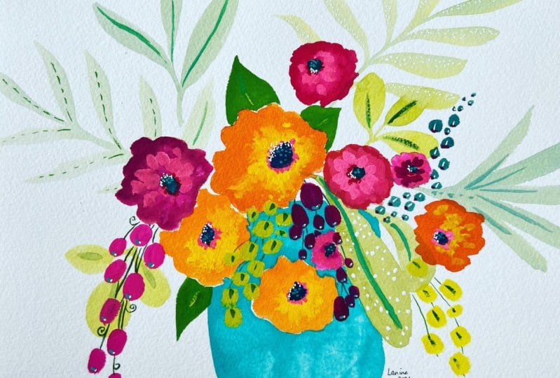
6. 1. Half Bouquet Intro and Beginning: One of the things that can create drama and a floral is just doing half of okay, or a partial, okay. On a piece of paper or a canvas. I'm sure you've seen these. So what I did is I started with one in the sketchbook. And this was my new sketch book, the handbook part journal. And it's less intimidating to, to create a half, but there are some little tricks that we'll talk about. So this was the inspiration for the painting that we're going to create in class. Where it's a patterned, maybe mimicking some kind of pottery they are, and then some blooms, not a super full bouquet. The one we end up painting is more full than this one. But we're going to use to wash regular brush and keep it simple, right? So that's what we're gonna be working from. And then this is the painting that we're going to end up creating in the class. So you can see it's a little bit more full and we'll talk about some of the things that you've learned as you make it half in the sense that it has to give the appearance that the rest of it is there and that it's balanced. Otherwise, it just kinda looks funny. So anyway, this is going to be a lot of fun. Oh, my favorite colors. And looking forward to this with you. All right, let's take a look at the supplies that, um, we use in this project. Paper is nothing fancy. This is a Fabriano Studio Watercolor, which is basically their artist grade. And it's eight by 1040 pounds. I think this, this paired with 12 sheets was maybe like $6. So it's not too bad. It's a good, it's a good paper. And then these little guys, I really like these for travel, but I also end up using them in the studio. But I only use them for my gouache because later on you'll see a change poets for the hacker. Oh gosh, because remember guage is water-soluble. That's what's called, this, is not this one. And so these can be reconstitute with water. If I wanted to clean this off completely, it would come clean. I mean, it might be stained but there wouldn't be dried or adhered paint. If I used these for the acrylic wash, then they would stay there and they would basically ruined them. So I, I try to remember, believe me, it's paper experienced to use palettes that I like with just either gouache or watercolor. Or if I'm going to use them with acral GARCH, wash them out great afterwards. And then when I started this painting, this is the painting that we do. I started with the Winsor and Newton colors. And I really don't use that many. I have my favorites and then I mix. So a yellow is fine and it doesn't need to be Winsor Newton collage. It can be. I also like I have here the Turner gouache which I like as well. Turner makes the regular wash. And then it's a little confusing, the acro squash. So I'll talk about that in a minute. But and there's other types of quash like this as this one, this particular tube as a whole name wash, again, different from the acrylic whole vein, which is this one. At least they look different, which is helpful. The Turner ones, the bottle, the tubes sort of look the same. But I started with garage. You don't have to, you could start with macro, gosh, if you have it, you could even do the background of this piece in watercolor because it's, we're just doing it lightly. And the colors that you see me use are either an indigo or a Prussian blue. That's these two. And that's where I get my darks and I mix that a lot with the various yellows to get my greens. And then once I built up those layers with the guage or watercolor in the background. I came through and use more acral guage. So this Hen particular turquoise is one of my favorites. Winsor Newton has a, fits my favorite turquoise. You can tell I do have a new one, but I'm determined uses went up. It's the cobalt turquoise light and I could have used that as well. But I grabbed the arco guage and I did some highlighting with that. And I just switched, I didn't need the switch tack or glass or just fib. So you could use either one and it doesn't really disturb below too much. So those are the supplies I used on this piece. And let's go paint it. Okay, so here we're going to start our half. Okay, I've got a journal here by hand, but we journal. Watercolor journal, and this was my first page in it. And it was really lovely paper. So I decided to create this with you all. And the idea is that you're painting of, okay, basically a half, or I guess in this case it's three quarters of a bouquet and leaves kinda what's happening on the other side to the imagination. And it's just a different take on a floral so that you don't have to think about what it would be, the entire thing. So I grabbed some amusing traditional glass here, not Harper gouache at this point using Winsor Newton. And I've taken that Prussian blue. These Winsor Newton paints are amazing. And then the way I got that texture in the small one on the journalist by doing what pages do there, which is dabbing with a paper towel that has paper dolls have those little notches on them and those little eggs cool to patterns of things. And so I was just playing with the idea of getting a texture in the vessel. I did a square vessel here. I ended up liking The rounder shapes that I did in the journal. But this is what you do. You, you just experiment. And now i'm, I'm mixes. I go clearly. I have, you know, your basic colors there that I've picked out that were in the original piece. And then I just go from there and pick out what sounds like. It feels like it's going to be pretty. And I went in a completely different direction in terms of a leaf here. I didn't have a leaf like this or a series. But it just felt like something I wanted to do. And you'll notice that I mix the colors a lot. I kinda like to think that no amine in nature, no two leaves are the same, right? So that's what I'm doing is grabbing colors, grabbing water, of course, when you're using gouache or watercolor, just adding water to your brush will change the color and the intensity of that color. So that's what I'm doing here toward the M, That's just adding more water so they're getting lighter. And I also like to make the leaves go in different directions. Now I'm taking some cream and blues and i'm, I'm laying in some what will be background leaves. Background foliage. That the indigo blue here are Prussian blue. Either one works. Next, what's a little bit of green and then a little bit of tiny bit of orange just to drop back the intensity of it. It's a complimentary color, oranges to the blue. So it will kind of reduce the intensity of it. It's kind of a good trick. And I've always loved a really vibrant green. So that's what I've got going here. I don't really have a plan in mind. You'll see how I deal with the challenges that come up in this composition as we go through it. Sometimes I plan more, but I just wanted this to be quick. And well, I'll tell you about a couple of things. I did that then I would do differently. My inner butt and I fix them. But that's part of learning to paint. Thinking about what, what you like. And here I am and just decided to do a set of round stemless, some round leaves. So we can see that bright mustard color plane back through a little more pigment to get a little bit different. And then this is always fun to do with gouache and watercolor. Picked up some of that Rose and just dabbing it from there. Phase so the leaves. And sometimes it needs a little help, especially if it's the paint has dried at all. So you can kind of pull it like that with some water so that it can bleed. And just, you know, just a little touch of color down there. Love about fun. So here you can see I'm continuing to make decisions about where do I want these kinda background leaves and playing with the idea of Burgundy leaves. I was recently at the Naples botanical garden and just reminded that leaves come in so many colors and textures and patterns and just nature is such an inspiration that you don't need to. You really don't need to limit yourself when you're doing either either or foliage or flowers. So I'm trying to stay loose here and just kinda using the larger brush and drawing these leaves out and thinking about, okay, that would just be flowing, draping those kinds of feelings. Now, I'm thinking about starting those. I guess they could be tulips. And I mixing. I don't work really with colors just from the tube, so I mix on the paper. And I end up, you know, it's personal preference, but I end up going over these flowers to make them less translucent. Think I'm adding some white now. White will always see how it makes it opaque. White will always increase the opacity.
7. 2. Half Bouquet Awkward Stage: So we're filling in this Tula, just adding some more upright rows. And this is, this is something I'll end up fixing later. I just, the stem came out to stray. And you really want to puzzled look at that straight there. But it just came out too. I should have curved and more. And so I end up not liking that and I'll show you what I do with it, but just needed to add more natural curve. Although now that I'm looking at it may then being too picky because tulips do have a pretty straight stem and it is leaning over. So I don't know. It just bothered me later. That's the thing. Sometimes you do things and they bother you. But I think what it is is if you look at the one in my in my journal there, it's bent over and so it's actually not the stem that was a problem. It was bloom is just not pentose. And that for me, I'm probably nitpicking, but that's what it is sometimes to get things GRI like them. So now I'm thinking about, you know, where do I want? Do I want to fill in the rest of that? And I decide to go with a large yellow bloom, which I end up adjusting later on you'll see. And you'll have to do a few coats for this too. Cover. But I think I did that. I mean, I was thinking, okay, I don't like these stems. And then assault, funny, after the yellow bloom, I, I liked it better without it. So then I went and fixed that. So this ended up being the one on the journal kind of flowed so easily. I liked it. And then this one ended up being challenging. And I wanted to show you what that's like. And it happens to all of us. P&l. Sometimes, sometimes when you're creating for a class to you, you don't take the time for you. You feel like, I don't know that you just darn as free. So it could be that could be that I was thinking about the class or high end up liking it. Okay, at the end, I fix the things that I don't like it and I'll walk you through that. But right now I'm thinking about, okay, where do I do something else? It's feeling a bit crowded on the right side. And I'm wondering if I should have put that big poem looking, leave, but I really like it. And then I decided that I just didn't like seeing so much vase and I often bring leaves down over the vase. So that's that's not unusual for me. I also decided later that I didn't really like the square with the rounder almost better. Wasn't challenging little project. So I am doing a first layer of green just like the yellow. It'll have to dry and it'll have to be some layers to make those elements work. That's just the process. Then to get the opacity on that home, that tulip up above will take several layers. Now, I haven't found me a bouquet of Xenia. And so that's what I'm looking at and thinking about what those yellow one, I end up making it too round. I think it's because that Xenia was staring right at me and it was very round. But I don't really want that perfect of a circle pinto painting. Oh, yeah, I've pulled it out so I could show it to you. Yeah. It's orange but it is so they're all Xenia's just look that way, right? So I was using that for inspiration. My daughter said, Xenia's are so perfect. They look fake. Ice city. I know. I kinda I love them in a way, but I don't like that part of them. So I'm going in with another layer. Just adding some more vibrancy to those flowers. Thinking about what would I I think I'm feeling like I want a little bit different shade of rows. And that's why I grab that other ashamed. But I ended up thinking I just need maybe some white and that will oh yeah, I know I got another idea. And I thought, let me leave the tulips alone and I made my little sort of pink. That's what it was. I wanted to start out with some different pinks. And so did you see how I just added a touch of yellow to that pink and it's just completely turned it into just a really lovely color. And then I go through each, each of these leaves, add a little bit different color in each of them so that there is something. And grabbed a smaller brush and the Prussian blue and just kinda sketching in some, some stems. And I did like those flowers, unlike the addition of those. He decided to block that so that it was a little more subtle. These are leaves, I wanted to have more cascading down. And that's always a challenge when it's after the fact. And I really wanted a leaf behind the the stem with the, with the round leaves. So it's not that difficult. You just kinda sketch in where you think the leaf would be suggested behind there and it seems like it would be tedious, but I actually like doing this. So I'm trying to decide where we're going to put another one or is that enough? And the whitespace between those leaves and the vase is still bothering me, so I end up squeezing another one in. Changing colors again. It's good practice this behind painting. Sometimes I go, I finish a painting and then this side, even ones like this, that I want a background color and that, and that's really tricky because when you're going through the whole thing, and I ended up liking that, that part of it. Still running more feeling in this book. Okay, we'll keep working on it.
8. 3. Half Bouquet Making it Complete: So this has dried. I decided that, remember I talked about how that stem, he came out of that flower to straight. So this is me working on. Okay, what do I do about that? So I first I blotted the pain and pulled some of it up with a paper towel. Then I tried creating a new stem just there, and that didn't really work. So I plotted some more. Here. We're seeing fixing and action. And, you know, it's funny because now that I look at it, I mean, yeah, it is definitely too straight for me. But I decide that I need to move on and work on some other things and let that dry since I wet it and blooded it. So now I'm pulling some of this burgundy color into the leaves. The botanical gardens, you see a lot of Burgundy in the leaves, but I just wanted to touch of it, so I plotted some of that. And I'm looking for what's missing. Where do I bring the color around? And I'd like to bring the greens around and the teal will come later. But I like to, I just feel like it gives life and pop to painting to have the reds a little bit in the greens and the greens a little bit and the reds and some variety moving things around. And so here is now my second attempt to kind of disguise that straights town. So I couldn't just put one leaf and then plus that area was kind of, you know, empty over there. That left side of the bowl. Okay, and then I really liked this color that you just make because we use the palette and mix whoever's in there and what's on your brush and it ends up being a cool color. So then I said, Well, I'm going to use this color other places through in a segment. Now you see that it's dried and I'm like, How around that flower is. I don't like how empty space at the left. So let's work on fixing the flower first, make it a little less perfectly round. I'm using two different weights. These are Turner acro Bosch, and I'm going to get some white because remember, white increases capacity. And since I'm trying to reshape those flower, I need a little bit more opacity. So I'm mixing that with that lemon yellow and I'm with the cadmium yellow. And I'm just I decided to take the flare out for the left because that area needed to be filled in any way. And so this is just a process. Literally when you do this, you have no idea if it's going to work or not. For me, great. You just might be a complete fail. And but more often than not, if I just stick with a painting and work through the issues. First of all, I learned so much and and then I end up with a painting, you know, whereas if I had just, which I almost did actually because there were challenges on this one that I just thought, you know what, let me just start over. And every time I have that thought and I say, well, okay, we can start over, but let's first try to see what we can resolve the issues in this painting. And most of the time I end up being able to do that by just something like the CNL. So I'm taking the various whites and yellows and it probably won't be able to do too much until I let that dry. But I'm going to keep playing and you can see I keep putting in the yellow and the white, kinda layering to see if I can get what I'm looking for an already the flower looks, you know, like it's not round and so we'll leave that for a while and I'm going to work on how do I make more going on to the left because it is a half up. Okay. Well, that I really ended up being like a three-quarters located in that because I made the base pretty large. But they're so there has to be the suggestion that there's more going on on the other side. Otherwise, it's going to look lop-sided even if most of what we see is on the right side of that. Okay. So this is where I'm filling in and making it look a little less empty over on that side. And as I was painting those, I thought wash up. The burgundy leaf first and then the green one, but you never know what idea you're going to have and when you're going to have it, right? So I think now I've added a little bit more weight to that side and bringing that color around. So some various places so that I can. Now let's get going with the teal, turquoise teal. And this is that acral gosh. There is this color in the Winsor Newton called light cobalt turquoise. It's gorgeous as well, and that's just the regular gouache, so it doesn't have to be ARPU wash on darkening it here. I'm just a little bit. And then I darkened it. And I just kinda want a little bit darker version at first. And I'm still, I always kind of look for places to put in my turquoise highlights, but I'm still dealing with that that stem of the tulip that they didn't like. And I'm thinking about where else do I want to put turquoise and what shape do I want these leaves to be in? Looking at the whole composition, thinking about where else can I put another leaf and something that pops. I love that these bouquets with leaves can a cascading out and around. So was quiet, she can do that. You can paint over pretty successfully. Met decided I want these leaves, so it's just a little bit fatter. And I'm thinking about making sure that they're currently not too straight. And then it's kind of a thing that I almost always dunes put little turquoise highlights throughout a painting. It just is one of those details That makes things pop is as long as you don't go too far. So that's what I'm doing now is thinking about where do I want that and what shade. And I again wanted to fill in that left side a little bit more. Some I like to use. You always want to think about smaller elements with larger elements. And I didn't have really, other than those little pink flowers, too many small elements on this one. So this was a good opportunity to add a small element and also fill in that left side. He's can be there. If you look at a bouquet, there's all kinds of elements that could bring them this kind of a look. It could be little buds, it could be a little tiny leaves, it could be little tiny flowers. It doesn't really matter. In this composition. They're just representing these smaller shapes and some variety. And it draws your eye up from those three turquoise ones. And I just wanted to make it more of a shape and draw your eye up there. I've got my indigo. I love indigo. That's how I like to get my darks. I decided I wanted to give a little more color and weight to those upper leaves, or at least, at least bring some of that darker color up. And then I'm bringing it down over the turquoise to start adding details with my Princeton brush, velvet touch, brush, love those pressures. How a lot of things that you'll notice in my work is that there's a lot of different colors going on and things that really I think makes the painting more interesting for me anyway. I often put turquoise and darks in my leaves and in my blooms. Especially look at what that turquoise line does there to those Greenleaf's. Makes my heart sing and spread the characters around more. So I like to put again in a smaller element. And so I decided to take the yellow and make some little marks on these two leaves. And this is that stage where I'm looking and saying, Okay, how much is enough? And I feel like it's done now.
9. 1. Loose Floral Intro and Beginning: Okay, and loose florals, these are so much fun because they're just a little bit more free then it okay, so let's first talk about what we're going to use. So the paper is this, nothing special? Master's Touch premium watercolor pad. I picked it up at Hobby Lobby. Is eight by eight. Of course, you can use any size and shape you want. This is just a really approachable size, not too big. As just make sure you get a good, a 140 pound paper so that it has some good tooth to it and some good thickness to it as your jar of water. And for a palette, because I'm going to use, I'm going to use acrylic wash with those one. Some of the other projects we've used just regular wash where I use this palette. But if I use acrylic paint and this, even if it's acrylic wash, it will dry in this and stay and run them. So I use pallet paper. And it can be you can via this white or gray and you don't have to use pile of paper. I just have it so I'm using it, but you can use a paper plate a plastic plate for that paper plate, you would have to cover it with plastic. I also make these palettes out of I take the sticky on me, show you this. So, you know, it's sticky glad wrap. And I just take a piece of cardboard and cover it. And then when it gets mocked up too much, sometimes I cut it out, use it for collage. But that makes a pilot too. So lots of options for power. I've painted people or my family laughs at me because I'll take stuff that comes in the mail or, you know, a package of something from the kitchen and use use it as a pallet. So some sort of pallet. And then for paint, like I said, I'm gonna do this one a M acrylic wash just to kinda give you change from the regular glass. No particular reason either one can be used. You can even use acrylic. You would just water it down a little bit and play with it to try to get it to work on the watercolor paper the way you want it to. And you might need to do some layering because acrylic paint teens tends to be more translucent than wash and less intense pigments. So you might just have to layer a bit more. You can also use watercolor, of course, in that case, you would use more of the watercolor and water down less to get the intensity of wash. And that's why it is low cost so much the concentrated pigment makes me happy. So I'm just grabbing some random colors. I always make sure though, that I'm grabbing the primaries. So a yellow or too. So this happens to be one of my favorite. This is the whole Bain aqua wash mustered, one of my favorite colors. And I always make sure I've got so some yellows, a red, and a rose. I start an indigo of some kind. It can be an indigo. It can be of this as black blue by Turner. And then I always have my turquoise. These are just my favorites. And then from there I mix the only other green that I'll buy. Sometimes there's one of these, either fresh green or sometimes it's called linden green, but it's the really bright. But you can make it also with a later lemony yellow and a tiny bit of blue, so you don't need back color necessarily. And then brushes. So just really loose one like this, you only one, probably larger so that you can get some of those bigger shapes. So these are my favorite brushes for florals and they're Princeton velvet touches. But you don't really need a fancy brush for those who are not doing precise work. You're just kinda laying the color on. And I do have this fun little brush I picked up. You can see we'll use on some flowers. It's got its cut, so that gives a line. And this one is by Moderna Royal and laying nickel, I think I picked it up at Hobby Lobby as well. And of course you always want to have white. And then for some of the details, some of my gotos are await. Well, this is a jelly roll. I don't like the jelly roll as much as the. Unit ball signal. I just think it gives a better line. So that's my go to. And then for IntelliJ cold, which I use a lot of for finer work like this. Or who knows, we may put in some larger bits of gold, but for a finer, I like this pen that when he posca. And then if I want bigger chunks of gold, this crafts mart from Michaels, or really any paint pen, but this one has a really nice gold to it. And then sometimes I go through with details with pencil. In this case, I have my, again, my go-to colors is an indigo pencil, Bye Faber Castile. And this is May green by a favorite Castile. And then this one is who? Neon rows and you can get that kind of bright color. The other thing that showing up right here, this bright color is either called, sometimes it's called Opera red. So that's another painter when it's really bright, almost neon. Pretty much NEA, or they're also called opera pink. I don't know why they're combat. I should look that up, but I do like to use that really bright pink and a painting and brings it to life. All right, so those are the supplies and let's get painting. So the first thing we're gonna do is take my larger brush and create some of these large shapes of color. And at this point they probably don't even look like flowers. There are just roundish shape since I'm going to take some of my brighter colors like the pinks will always take out some white because we'll be mixing to make a lighter pink and orange course you can make orange with yellow and red. I just happen to have this deep yellow whole Bain. That's nice. Let's put some red down and get some blew out, some of those so we can make some greens. And I'm not going to put a lot of thought into what's going where excepted just have a variety of colors and shapes almost filling up the page. But I'm going to start with this and we'll see where it goes. I don't like to use straight from the tube, so I'll make something to get something more interesting. So I just grabbed a bit of orange and we'll just start playing. So I'll see how I'm holding my brush for this loose work. I, I don't at this stage, I don't want to be doing this and want to really keep it loose and playful. And I do sometimes think about the fact that florals are the colors more intense towards the center. So then I'll come back and dab a little bit more of a bear. And I'm also thinking about where the center of the flower is, because that's kinda the way it's facing. And I want them facing different ways. Also, I can mix some of that other color in here. I wanna make sure that I'm not making perfectly round shapes. And that I don't even need to take the brighter color all the way around like I did here. And I'm keeping my brush pretty full of water. This is my number 10. And I'm also varying the size of what I'm creating. And maybe there are two right next to each other. But it's a pretty color, isn't it? That's that primary magenta from whole grain. I'm going to be thinking about bits of color too. We definitely want to go off the page. Maybe I'll do some pinks now. You get some really interesting pinks when you mix white with red. Lot of times you mix it with more of a magenta. But if he's just makes it with red, sometimes it's really locally. So let's go for a really large one over here. And later on we'll come back and define these a little bit. Remember this is a really loose, but we'll use line and detail to define it a little bit, we won't. And maybe I want to make big pink one that's kinda coming off the page here. So that would be the center and I'll just go run like that. Do you hope playful you can be with this. I'm taking a little bit of a darker pigment around the center. Let's go to the yellow. I don't clean my brush out all the way for this. I don't want to because then I don't get an interesting color. Depends. But in this case I left a little bit of pink in there so that this yellow would be more interesting. C can also make different shapes. Like the side of a flower hand we can bleed into other flowers. Let's go over here to this Marion gold is what I think they should have called that color. And we can come down. Maybe there's a flower coming down this way. Maybe there's one with some petals. Don't always see the center of a flower rate. Susan. Shapes like that. We want them to up here, really liking this color. So let's just mix it with this a little bit and do like something. Maybe coming off. Some punches, maybe even a sort of a stem, trying to say lose holding the brush, loose. On to the next video.
10. 2. Loose Floral Part 2: And here's where I can grab a bit of indigo and make a green so that I can bleed back green in here. Maybe into here. Maybe here to stay with my green. Now I'm going to go for a little bit brighter green. So I'm going to add some of this lemon yellow, start mixing in some leaf shapes. Maybe there's a leaf stem kinda coming up here, bleeding into their ear. A little bit more blue and a little bit more yellow. See how little paint it takes to create something. Always amazes me. I always, when I'm traveling to pain or taking paints with me, I end up taking too much thinking, well, I want to paint a lot, but it doesn't take much actual paint took depends of course, on the style of painting you're doing. Handy now we can turn this right because it's, there's no direction. I'm gonna go darker here. I think I'm going to start incorporating some turquoise. Usually I darken this turquoise because it's just much more water. I'm putting turquoise on top of it. And you have just kinda put, putting in some color. It could be a leaf behind there. Also, I like to make flowers that are not just pink and yellow and other colors like this kind of pale minty something rather. Maybe there's two those here. And I just like a variety of color. So that's what sit here and go, well, let's mix this with this. Get another color entirely. Because when I'm coming a little more definition to maybe we'll put some red in there and see what happens. Haven't used much red so we can go to read, to solve. And it was whatever is already in my brush, which is a little bit of green. Maybe make some little suggestion of some smaller blooms over here. Go back to this magenta here. I don't know if you can hear that, but the ice cream truck is coming through the neighborhood. So I hope you can hear it such a nice sound unless you never have, I don't know, RAM memories of running out. I don't know where we'll look how nice that bleed is. Where I was, where I heard an ice cream truck. I still love ice cream. Okay, let's take this out the way. You can also use a fan Lesch if you have one on both, just so you can see, I'm take the red here and do something like this is kinda playing with it. Maybe there's one coming off right here. A big flower. Sometimes wiggle it. We'll come through and I'll put some let's see. I know we'll do we'll get some of this in here. Because center and that's dark. Let me do that here too. Could we do need to start adding in some darker colors for contrast? And in this one I made a indigo background. But Burgundy is also nice. So with this, we could, let's come over here with some opera pink. And we'll see what we can do. Look at that Woof. That is a whole, another thing that is bright, basically it's fluorescent. Let's see, maybe we'll just make some little, unlike some kind of flower like that. And then over here can be on more traditional shape. And then we'll just have to be sound in the center, which had only this pressure. Isn't going to water this down a little bit. It is so intense, this pink. Soften that a little bit. And then maybe take some Navy is stem. I like to bleed. It's part of why we use watercolor and gouache is to kick that. It's just playing with when is the right At what point is it dry enough so to the point that you want the bleed. So like these really glad because it wasn't dry at all. But you can go back in and add and then these had dried, so it stays more like that. So you just play with There's no right or wrong, you're just playing with what you like. And you can make some centers, yellow centers, or just one of the ways I like to add contrast. All right, so now I'm kind of looking at it. Gladlib is missing. Or what, what needs to happen next. I'm going to turn it. Don't have as many greens is I usually have. So let's do something about maybe some darker greens. I love how many grains you can make. Its incredible was just really yellow variety, yellows and blues, and then drones and turquoise and even orange or red. Look what rebel do. Darkens it right up. So I can do something like this. And that's a pretty colors and he will take that around here like that. And you know, what made that color had that data flows and dab of red that I put in it. We'll do it again. I really liked how I made this leaf thing and then came in with the background. And it just, it's one of my favorite parts of that painting. So I'm looking for a place to do one of those here, except that it's already painted over, but we could do something like that here. So let's do, do it here for that and the whole membrane this way so they can get those leaves. And so I want some of this darker green in the middle and over here. And just keep making it with the blue or yellow. A little bit of red, a little bit more blue, will go yellow. That's almost turning into a gray there. So maybe too much red. I'll go back to a little bit more yellow. And let's see, we can kind of just, you know, there could be a leaf there. A little bit more. Yellow. Brighten that up a little bit. And then maybe I can bring it up to here. And this, if you just can never end up with the same color twice, which I really like. So that's a little bit more shaped. Leaf kinda combining loose with a little bit more intentional shaping. I'm just kinda looking around going where do I want to fill in? Remember, we're going to paint the background so I don't need to fill in everything. But I do want it to look balanced. And I think it's more full down here than it is up here. So I'm going to put maybe one more element here and here. And just deciding what that's going to be. And a lot of times I look at my own paintings or at pictures of flowers or floral bouquets are very inspiring. To try to figure out what to put next. So for example, this is where my sketch books come in handy. We can look at, say this one and say Okay what, this is loose floral and working on. But let's see if there's anything in here that gives us an idea. Which abstracts, which might be something in here. Do love these two little v's. That might be fun down here and see how they're pretty round. Let's do some of that. So, oops, before an integral over. And for those I think I'm going to use a brush that is not appointed. I like was another favorite that's peeling as a cotton brush. I really like my merchants, but it'll make it easier to make those circles. And we'll do them in a mixture of coral. That the dominant one and I go to colors coral because that's what I did these. And there were a mixture of coral red and then the opera pink. So let's get some coral and some water. And use this as inspiration right now. And I remember I went over these a couple times with different layers so and mixed with the red to get a darker coral, which I think will be nice here. They can overlap to just be in loose. You got too big of a chunk of Harper pink on that one. And remember when you're using these water-based paints or even acrylic, you change the color a lot by just adding more water and less pain. That's how you get a lighter version. Yeah, I like that. It's fun. Okay. So that's going to be there. Now what are we going to put here? Let's see if there's anything else that speaks to me. I do like that, but not for there. Let's see what else I have here. I am feeling like a violet type color would be nice like this. Now this was one that I did with a background in Burgundy. Oh, you know, I like these. Let's do these are kinda like and then I went over and with with little small brush. Yeah, if there isn't good inspiration in here too. So let's do some of these. Color. Maybe the teal haven't used much TO type. We're going to clean the pink out of error, that deal will not pop. So these are these kind of shapes I was like that. And I can leave a little center. So now I'm feeling like I want to come back here and do bring some of that turquoise over this direction because it's the only place it is. So we can start doing a little bit of elements around things. Maybe some lines. I love a little bit of teal around the center of a flower. Just be like it says, in a nice way. And feeling like I need something darker. But I'm remembering we're going to do an indigo background, so that will be our dark contrast. So mountain I'm trying to have to worry about that.
11. 3. Loose Floral Background: Okay. So for this stage, it's fluid has dried. Yeah, it's pretty much dry. And just dreaming it a little bit. It's not going to hurt. It. Were in a i'm I'm gonna do the background now because then we can come in and kinda just see how dark is making everything else look then do we need go through and create some more contrast. So I'm going to go in and loosely, just like here. And here, paint the background. And then we'll come in through details. I'm going to use my indigo, but I might pick us as black blue. I might add a little something to it to get the effect that I'm looking for. All right, so we're going to come in and paint the background. I've got my indigo that is mixing a little bit with what's on the paper, on that pallet paper. Sometimes I add a little bit of black just to get some places more water or less water or just to get a little variety I want I do want it to be recognizable as the same background color. So I don't want to vary it a lot, but I definitely vary it. And you can see that I'm coming in here very loosely, not trying to be precise, trying to promote dab, the color in, to the spaces. Remember these are called loose florals. So I don't, even those part, I don't want to be overly fussy about no rhyme or reason. It is kind of easier to start in the center and work out. Just because on your hand doesn't get in the parts that you just painted. But you can see that I not exactly following that, just kinda depends on what, what's on the, what's on the composition. But I love house, you start to do this. It just starts to come together. And we, hello, we're creating a composition or we're struggling with unifying. It. Sometimes does, is all it takes is a color that is throughout a piece. To unify it. I really like these stripy leaves and going in behind them just made them come to life. Obviously, I did speed up this footage. I don't paint this fast. Makes it look really, really fast. I think it's at least twice normal speed. I had to stop and close the blind there goes the sun comes in the window like that. Certain, certain time of the afternoon, which I love but makes it a little bit harder to see. So that looks pretty here to gosh. Now I have a train going by the house. You can hear in the background. But see how pretty that purple little bugs look with a navy behind them. Almost done here. I just think it brings it to life so much, gives it a richness and the depth. So once this dries, we will come back and add those little details.
12. 4. Loose Floral Adding Details: So let's bring this piece home with some details. Now, this is a personal preference thing. I, I'm I like it the way it is. We don't need to add details. I'm just going to do that though because that's what I did in the inspiration piece. A few, not a lot. You know, you've got a little bit here, here and there. But I just want to show you how I go through that process. Even though I'm not saying it needs to be done, a lot of it depends on what you want it to look like. Is this going to be a pattern for something or not? So I actually already scan this and the way it is in case you like it better and I like it better without without any details. And that's the benefit of scanning. I recommend if you have a scanner or at least photograph but at different stages because then you at least have a version of the image before you change it. Okay? Now you can also see here that I did a little bit in this one with some details, I used a pen. It looks like my indigo pen here. Just for some few details, I do think it really added here, use some pencil here. So we'll give it a shot and see where we end up. There's some white pencil there. Maybe I'll pull out some white, you never know. And then I have had, I love indigo as I've said. And it's really challenging to get an Good Indigo pen. I found these microns. The problem is that because I work over pastels and things see they end up drying up and doesn't work great. And then I've tried also, these pens are pretty good, but this is black. I've just say there's a Japanese pen Tombow. It's actually for writing. But I tried to, Sharpie had been through some variety of indigo pens anyway. And we doggy thinks I'm taking her for a walk, but I am not. So that's the saga of indigo pens. Let's go through this and see what might be nice in terms of adding detail. Using these coupled as an inspiration or anything else that you have that you want to use. And I'm thinking, you know, some of the like this feeling like I want some maybe sort of STEMI, things coming off of it. And you can have things that look realistic, things that don't look realistic. You can just do line, dots. It's really whatever your imagination wants to play with. Here. I'm just varying color of these. I mean, the length, not the color. And I kinda like that. Then we like this, needs something here. Maybe a third one. Then I could come back in here like this. This fluorescent pencil is so yummy. Just thinking of this maybe is light hitting the side of a flower. Can also take the turquoise and maybe do some lines on these two leaves seem a bit plane. I do like the wave. So in this one, I took the green pencil. You can barely see it. Are these little leaves here and there. Very subtle, probably didn't even notice until I pointed them out. And I could either do that with the Turkers while I could do it with the Navi 2. And then here I did it with the Navy pen, these little leaves. And I liked that. And I might try it with my gold pen, since my navy pen is misbehaving R3 now, pens are notoriously challenging, but they're worth, it. Goes over very good actually. It's just the fist guys. And on his way out, I think. So. I think it would be fun to just kind of have some petal shapes here. I'm picking up the ink because it's not wanting to flow. I think it might be There we go. I think it might be blocked. So I'm just picking up the pen almost like I would with a paintbrush or picking up the ink. Don't want to waste. So I love doing these loose florals that just they just seem very approachable and not intimidating. And I think I'm going to bring up this one of these little stems just kinda like this of leaves Like it back. You're getting to see alive. Equipment failure with the, the PAM is misbehaving now this one too. So I'm gonna do is draw that ink up. And sometimes these things and that being happy accident. And nobody knows except you that you didn't plan it that way. We shall see. I am going to plot some of that though, because it's just really heavy. Hello, paper towel. You have to be careful when you fill out something like this that you don't smear it. So I'm going to use the paper towel just to absorb some of it rather than pushing down on it. Every time you make every time something happens, you wearing something where I can even make this one thicker at the bottom and this one heavier at the bottom so that it looks like part of my grand plan. I'll call that embracing the equipment failure. And maybe just some lines through these. Think it might be fun to do some white lines up in these leaves. Maybe some smaller little somethings. Something like this with a little bit of texture. Just amazes me how it can add some interest in depth and disaster to a piece. Thinking about doing odd numbers. So I'm just gonna do this to five of the leaves. Come down here and detail these guys a little bit. Its own weight circles in here. Maybe their stamen, nose. And I'm feeling like these main needle definition. Some of them. When I do something like this, I don't do all of them. And then the arm wrestling with I really like this flower just the way it is with the bleeding. So I am going to resist the temptation to do something to it. And I make some kind of squiggly center and there there's great bleeding and Matt to look at that played into their lab. I've seen this screen anywhere where you can do a few things may or may not show up. And even just do some small fluorescent pencil again. I'm thinking about if I've got a little element up here, I might want a little one down here. And that's kinda what's going through my head. And I see that these little red flowers didn't really have a sender, which is fine, but I'm gonna go ahead and take a yellow pencil and just color that in. See if I like that. And then maybe I'll add white on top of that. Then I can also take a yellow paint, marker, dots. I was just feeling like I needed a little bit more yellow up here. I still feel like I do. So maybe I'll just tell C of making these little larger helps. If not, I might look for another place to add an email. You just kinda go until you are liking what you're seeing? I'm not sure there's any I could stop at any point, probably at this point and it would be fine. I'm thinking that this was that fan brush, which was really fun. Then I'm wanting I'm wanting some little bit more definition in there and so but I don't want to make it up dramatically different color. Let's see what those coral bent pencil does. Yeah, I think that just helps separate this flower from this bar. Doesn't love screen lines. This whole process, you know, it's over time when you just paint and paint and paint and paint, which I've painted a lot. I've got stacks and sketchbooks full. You just start to begin to trust yourself. And also know that, you know, It's not that scary if it doesn't go well, you can recover. You can paint over. I usually forced myself to stick with the painting and at least get it to a place where I like it more. Rather than just throwing it out. My aunt, who's an artist, she would just fall it up and throw it in the trash. And if that's what you wanna do, great. I just I find that I learn a lot when I say No, stay with it, stay with it, see what CBG and solve its problems. And then I end up learning maybe nothing, maybe just a little something here. I think I'm done with it. And this is the kinda thing where, you know, you can come back the next day and see you if you think it's missing something. I think it's pretty good. I might decide I want a little bit more gold accents somewhere, but then I might not. So that's kind of how we add details in that process. And it's just trial and error. Really. Have fun.
13. 1. Abstract Botanical Garden Intro, Inspiration and Supplies: One of the ways that I love to express with color, and I seem to, even though I do abstracts that, don't have the technical elements, it seems like most of them do. They end up, I just want to do something that's a leave for something. And so I'm calling these like a botanical garden, abstract botanical garden because they are abstract. They have the paternal uncle element and they feel like gardens to me. They end up creating something that feels like something I'd like to walk into. And I was doing these for a while, but they really took off after I visited a lot of botanical gardens and got so inspired. So we're going to do one of those and they can be different styles. So something like this, which is kinda bigger, bolder shapes. And I would say this is kind of in the same style. This one actually isn't gold foil which no full Dubai we might. This one also has the larger shapes and a abstract background. And then this one's kind of actually invite you in into the garden. So I don't know what direction we're gonna go. We'll just have to see it out. It'll be one of these kinds of versions. It'll be fun to see how it turns out, but we will have a variety of supplies, use more acrylic and this one than in some of the other floral glasses, but also some gosh, It's just that when we laid on the base and it doesn't make sense to use expensive goulash to lay down the background becomes that's going to end up being mostly covered. And guage comes in little tubes and cost Morris Oh, makes more sense to do some of the heavy lifting so to speak, with the acrylics. So anyway, we're gonna have fun with this line and let's create a garden that you would love to get yourself lost in. All right, so let's take a look at some of these that I have here in this stack. I just loved doing any, so I end up making backgrounds that have a lot of interesting texture. So we'll do that. We'll start with a blank sheet of paper and then I do layers. I've got a whole other class on abstract botanical gardens. But I wanted to do another one here in this class. So see here, you're gonna see, I'm gonna walk through some of these paintings and limb. This is a lot of acrylic with some flesh on the top. And then we'll talk about supplies. So this has a boulder shapes, little bit more, maybe modern, I would call it them, say this one. This is also that way. This, I think I might try a piece of this for the class. This is a mixed media paper that's toned gray, but this is white paper, so it doesn't need to be that way. And I did use gold foil on this one. I've got I don't think I have any ink. I don't see any oh, yeah. A little bit. Little bit of pen. A little bit of Posca pen. Yeah, here's the leaves. And this is acrylic on the bottom and then acro question on the top. What did not go through and do any details with ink? This one? Sometimes I do, sometimes I don't. This one kinda happened by accident that this idea of, you know, I did one and then I did another one and I thought this is really fun. So you can see that here I have definitely the use of ink pen here and here and some gold, metallic gold there. And this one is less abstract in the sense that it's in writing you in. But we'll definitely use these, some of these as inspiration. This is another one, gold foil. And it started out and I wasn't sure where it was going to go with it. And then I just started playing in different directions and this is where it ended up. And this is a really large one that I decided to do all in the blues and greens. And then I have this orange big leaf here. I wish I had not put it in the center so much. I don't want it to be too symmetrical, so I wish I put it like over here. But anyway, it gets interesting. Her like some parts of this. So as far as supplies, It's really whatever you have. So I'll use some basic acrylics for the bottom of this and you can use any brand you have. I know these are really reasonable. The novel color paints, which you can buy through directly through Nova Color online. They don't sell them at stores, but you don't need it, you don't need this. You can pick up any type of since we're just doing the background, you don't have to use expensive paints. For the background. You don't have to use golden and liquid techs and the heavy hitters. I do have those, but you don't have to use those. So I would, for the background, take any acrylic brand that you have. And then let me get the other supplies together and we'll talk about those. Right now. Do not get scared by this. The spread of subsidise. You do not need all of this. This is just, just showing you some options. So. As I said, you know, your acrylics and any colors for the base and pay for wise. I'm generally do these things on three different types of paper just depending on mood and what I have on hand, I use a watercolor paper. I do not use a high superhighway, fancy expensive one for these because look, you know, it's, it's, it's getting, it's not needing to perform like a watercolor paper. It doesn't need, it just needs a good amount of body to it, but it doesn't need, I don't need a beautiful grain. Do like the watercolor tooth that the paper has. So sometimes I'll use us like a studio grade watercolor paper like this Fabriano. I also like using the Bristol, but the vellum surface not the smooth. That's what Let's see here. Yeah, this is bone. You can just tell because it's smoother than watercolor paper and not as heavy as mixed media paper that see it's a 100 pound. So it works. I like it. I, you know, they each kind of give their different effect. And then what I've been playing with recently is this mixed media paper in any color. But I thought it'd be fun to experiment with the tone gray and those are toned tan and these will see this one. This one is the toned gray. And it just, you just leaves a little bit of texture showing you see that through there. That's kind of interesting. So I think I'll use that for this paper, for this project. But if you don't have it, don't despair. You can just use the white. And if you want that effect of the gray, then you can paint your, your watercolor paper or mixed media paper in this this shade of gray. This paper, those really interesting. I don't know if you can see. It's got teeny tiny little grains fibers that you can see. So I feel like that adds something. Alright. So that's paper. And we may or may not use oil pastels. I grab them sometimes, sometimes I don't, so don't worry about it if you have or don't have them. These are kinda just my go-to things that I have on my table. These are the woody 3 and ones. They are great little pencils that we'll go over just about anything and make really brilliant colors. And then the neo color crayons. Sometimes I used to go around things. I don't think I used a much and I'm going to use them on this a little bit. Might not have it looks like I might have in here. And then I have, I do use my posca pens. And just about everything, especially like the off-white, like you see here. And here. Just for detailing and interest, I use a variety of pencils. These are either super colors or PRISMA color. Let's see what else do I have? Probably a favorite Castile. They're just creamy and some are water-soluble. Some are not. Sometimes they use a white pen and only bot signal. It's really kinda which you have. So Wilton, Of course I do have the acrylic squash or regular gouache brush that I use as well, sometimes. Brush wise. So for this kind of thing, it just depends on what and doing. So for the background, you would use something that's kinda beat up like this because you're not, you're just getting down texture and color. And then as you start to get further along the way and you need to be trying to do Aleve even though these are not precise and exact, then I might use a brush that's got a little bit more shape tool. I'm grabbing an acrylic brush because it just depends on what paint you're using for these big leaves. This brush is better. But if I'm doing a smaller work, well, this is a watercolor brush on the problem of watercolor brushes for this kinda thing is soft and so just depends. Sometimes they work for me and sometimes I reach for the acrylics. They're a little more stiff. And I'll show you the different fields. I don't know if you can tell, but this just this is much more pliable than this. So that's the main difference between acrylic watercolor brushes. And so it just depends on the level of detail that detail work you're doing, what works. But it can be really frustrating to have a Rom brush, so I speak from experience or just a brush that I didn't have to be high-quality like this is a cheapy royal soft grip and it's quite good for this kind of detail for leaves and banks. So for this, you do not, for this particular type of painting, you don't need expensive brushes. You're not trying to be precise. And you don't need a ton of control. And then we, you know, every now and then I'll grab some gold ink. Oh, because it's so pretty I usually write from a bottle. So we might use in Golding, might have a variety of sources. I used. This was a liquid techs, iridescent break gold. And then I like metallic gold pins. There's pasco pounds, but just any paint marker that believe it or not, I like this crafts mart and expensive paint pan for gold. It's a really nice gold. All right, let's get started with making the background.
14. 2. Abstract Botanical Garden Underpainting: All right, So we're gonna take a sheet of this tone gray mixed media paper or whatever. This is, the vellum surface. If you do buy this or whatever, watercolor, Bristol or mixed media paper you have, this stuff is pretty heavy. Card stock and see what pounded is a 184 pounds. Yeah. But you don't need those. I thought I'd use it. So you can see if you like it. White paper is what I've been using for up until just fine this so and then we're going to, I think I'm gonna do some blues and greens. I grabbed this inexpensive acrylic paint. This is a jar ISO, which I just take from a larger container, Joseph and put it in this little think it was a pesto. And it just helps me keep it fresh and I use so much of it. Yeah. It keeps it nice and see whatever colors we can make colors obviously with these two graphs. And I'll just grab my turquoise. I don't know. Maybe we'll try pink. Just grab some colors. Were this is most of what we're going to paint now is going to get painted over anyway. So if we want to add color to it along the way, we can certainly do that. Here's another cheap yellow acrylic we can fill in there. For. Sometimes I have sort of lines, something like this on the show. You can take a China marker, either white or dark. Even a pencil. Just remember we're just creating interest in the background. This is a very free process, creating this background. So I'm not worried about, you know, the exact light supply or so forth. I'm just taking some various things and making some marks. So you can literally just do something like this. Maybe some of this. And then you can do some pain. We can also take, this is a good place to take some oil pastels because they'll do interesting things for underneath the paint. Sometimes they poke through, scrap some bright green here. Why not? This is also where you can take or what y3 and ones show up much because silver will throw it in there. You can use colored pencils here. And they don't do too much of that and I just start During the paint. And a lot of times what I'll do is do these backgrounds. When I'm watching TV with my husband or something just so they don't get too wrapped up and you just looking for to get coloring layer. See how different things react with each other. Right? Move that took place. This is the fellow turquoise color are often had though. Lemon yellow to it to just brighten it up. So I'm not even using a palette for that process. You can tell I am mixing right on the paper and changing first stroke size, keratinocyte direction. Right click that blue. We'll pass those doing down there. Going on that more of this this is Lucas fern. I just pick up sometimes when I'm at the juries are to Rama or whatever store you like to go to. A color that I know I can make it. I don't need to buy it, but it's sometimes a phone tree. Chris, I end up mixing every color. Anyway as you know, so you don't end up with too many tube colors. Working that oil, pastel and width the acrylic bur. Why not? Enough seats? Flip the gray paper. I don't really have to cover the whole science. The way that white. You don't really have to avoid either, but it just feels like not more stark. So that is an advantage, I guess to this paper. I'm thinking about where the color is and how it travels around the paper. But I'm not really thinking too much at this point. I don't want her to bits with a ungraded show through. So I will probably stop with the background painting pretty soon. How I clean my brush ones. And we can now probably will clean up all this, grab another one so that I can throw some of this pink in there. That'll be a fun little surprise. Getting a smaller brush loops was too much covered the entire painting or pink. And I'm just going to find some little places to put back. A little white. Yeah, just a little bit. I don't know too much I want to overpower loops is how I end up the chain rule when I self, which is who cares? Yeah, I think that's a good Really, I may want to stress a little more mystery. It's maybe some dark in here because some of them are covered. And I can read that in this. And some good texture here. Just making pencil marks. It's kinda fun after this at the end to see what, what made it through. Like I do like this pencil underneath here. Maybe it'll survive. Okay, I think we're going to let that dry.
15. 3. ABG Beginning the Main Painting: All right, This is dry and I've got a few colors here. From here, you can continue with acrylic or you can switch to hacker, goulash or gouache. You can even play more with your pencils and oil pastels is really just whatever you kind of feel like doing. So I'm just going to touch about how that, because they're complimentary colors, like green just pops against that purple. I'm going to bring some sort of coming down leaf here. And I love using like an indigo you can use. In fact, I've got some indigo ink here. You can use ink. You can use outro, gosh, why don't we just use ink sensors here? And the way that I make, if I can't find the color indigo, which is often the case, then I just mix up blue. A darker blue is you have with black. In fact, they even call Turner calls this color. Yeah, black, blue. So that's what you do. I'm probably going to need more of that. And since I wanted this to kinda come down, like so I'm going to get pointed brush, wet it a little bit because this indigo incus contents. And I'm just going to imagine that it's coming. Some sort of could be a big tree over here. Just kinda doing the broad brush of it. Now, it's fun to experiment with different media because Inc has sort of a more translucent effect depending on how much you use, how much water you add. Which can be a nice contrast to the opaque goulash. Now I was visiting the Botanical Gardens in Naples in Sarasota, Florida. I would just notice the variety of shapes of leaves and how they fall in cascade and climb and meander. And so I just try to remind myself of that if I find myself getting too precise and less precise is kind of a look. I wanted nothing you can do to keep yourself from getting too precise as change how you're holding the brush. Instead of that, you can hold approach like this and it will just make you be a little less precise. Maybe I'll have some sort of long things that come down. And what's cool about the ink is it's picking up some of those colors behind. Because we put down the kind of reacting to the past a little bit, blending here in there. You just as an interesting effect. It dries really fast. So I'm looking at this. I usually have my inspiration right in front of me and my pick and choose something that I didn't like him. This is pretty much an idea from their own. Yeah, I'm looking at these. Those are similar. And I'll include some of these on the class downloads so you can use them for inspiration if you life. Let's see what else we could borrow from one of these, I do like these sort of locking shapes here. And I also like these almost squarely, will use some of those. I like the little flowers and I like the shape leaves. So there's several things I can pull out. So what you'll do is either from your own work or someone else, just pull one thing that you like from it. I mean, that's not copying it over. If you copy, if you make little squares like this or you do an element in your painting like something you've seen that you life. That's perfectly okay. I'm going to make a color like a why MY color, I'll show you. I have one that's called fresh green. But you can also make it with just a little bit of green and then some lemon yellow. Don't use the orangey yellow because you won't get it. But a lemon yellow, a lighter, brighter yellow will give you this fresh green. Another one of my favorite colors. And let's get a little flesh just to make those interlocking nice. Who knows what they are? I love that color. Nothing too precise. Varying shapes, size of element. Usually when I have a color out like this, I think a little bit, but that's somewhere else. And I am loving us. And so, but what I might do is a really small, more detailed flower. I always am varying and thinking about large elements, small elements. So I think I might take something up here, just like that. So here I'm using a round brush. This is a four. I'm pressing down to make these leaves and then lifting up. This is another great thing to do in the evening or just when you're doing something else. Has been an iWatch, various Netflix series and I'll get my paints out and practice leaves or whatever, things like that. Color is so bright. We'll see you have a feeling that color might come back, but that's good for now. So we've got a nice here is some larger, something like this with some larger things that sort of same like flowers. So what I'm gonna do, I can always paint over it, but it gives me more control to take my pencil and make the stems and take, let's do. It's often really a nice surprise to paint something large in a place that seems like it just has smaller things. I don't know if that makes sense, but so this Okay, So I paint character over that which is fine. And then I'm going to do the second one maybe kinda coming down like this. You probably can't see that, but it gives me a kind of an outline of what I'm going to go on. How many use some of those coral red wash, which is a peachy color. But then I'm going to probably come in with some upper red. And just for kicks, let's see if we can add texture by taking that we'll pass down first. See if that just as long as Samsung. And now I'm going to take probably a round brush again. Yeah, this will work. We take something like coral red, but I want to mix and it's a little doll for what I wanted. So I'm going to mix in a little bit of this acrylic squash. They're the same thing, basically fluorescent pink. And I'll go back and forth. And I love the little bit of blue that's showing through. So I'm going to make some lines of the back of my brush. I could even leave bits like that. Because that pretty blue showing through and also has texture. Let's run those lines in. Yeah, I'm liking that. A little bit of that somewhere else. I'm going to get one of these little ones. Still. That's that fresh green, that's hard to go to the brush. I'm going to do maybe something like see these little sort of flowers here to some of these over here and maybe they're a part of the garden is in the background. Mixing going between the cup 40 and fluorescent. Okay, back to our inspiration pieces. Else. Could we do some of them? I have to try. Some of these have to dry before we could put, say, over those Navy Leaves, we can do some, some fun marks. But let's find a place to put some square things and I eat them like this color. So let's pull out you can either make yourself an awful weight, which was your Justo and white and some other colors. We'll just do that. I'll do that so that you can see how to make an off-white pulled it off. You probably know how you just take a lot of white and a little bit of some other things. Very little. So I'm gonna put a little bit of green to pink, maybe a little bit of blue ink. You can do a warm halfway at her cooler one. Want to warm up a little bit. So I'm going to get a little bit of a gold, basically a warm yellow. This is called permanent yellow, deep, teeny tiny bit. And then maybe a little more green. It's a bit too yellow. So I'm grabbing some more blue. That's a nice color. It's still pretty yellow here that knocked back a little bit. Nothing wrong with it. Mean yellowy. I just kinda going for a cooler. White. Okay, so now let's see where can we put these things? I'm going to do some down here, then maybe up there as well. So you just take a bright brush shaped brush, move it around. And sometimes I go back over them just to get the shape right. There's no right or wrong with those. And I think what I'll do is use this color up here, but not in the same way. I'm going to maybe do some leaves coming down here that look like at my round brush. Will probably have to do a couple of coats. And you can see that it didn't make enough yellow. I mean, weight. That's okay. We'll make another branch when I do the second code. Okay, let's like all of those bits dry and we'll come back to it.
16. 4. ABG Adding Botanical and Abstract Elements: Never done this, but I thought I hit record and I just painted all this and talk you through it all. And then I apparently was recording and I stop the recording. So I'm just going to rewind and I'll talk about what I did. So at first I came in, you know, from our last version it had dried. And I always recommend walking away so that you get fresh eyes. And this case it was a couple of days, but it doesn't need to be that long. And then I started looking for what else needs to be done. You know, what, feeling like it's missing. And I always loved to put turquoise in painting. So I grabbed, I started, first thing I did is I grabbed my aqua green Turner, Harcourt goulash. And I took a little bit of white, which is the muscle that I use may just mix it. And it came through a year. And I did these little centers of those white flowers we had last time I took the turquoise down here, put a few blobs here, and then I love fan brushes. Here's my assortment. This just fun to get texture. This one I picked up recently. And so what I did is I took this new one that I have, a little baby one. See, it's still got the turquoise paint from what I just did here. And I made these little guys and it just kinda varied the direction. And then I finished with the turquoise. Then I said, well, let me get my white posca pen. I have the ivory, this is the 1.8 milliliter. And then I have the super fat one, which I use a lot. It's really chunky right here. This is the crash. It looks like I've got pain over there over that eight millimeter and I took the eight now, you can use just your off white paint that you mix like the first layer that we did, the first coat of the off-white. You don't need the Posca markers. And I went over, It's the same thing, it's paint. I went over and did a second layer to make those leaves pop a little more. I dabbed these. Then I took this one and made some headlines here. And again, you can do all this with paint. And then I did these dots on all these leaves so that I did not do all of them because I'd just like to kinda have some mystery about them. And I wanted to kinda have some smaller wave highlights. So then I took my time to white pounds and usually the only ball works better. But sometimes I use a jelly roll cell for that. Loan me that I was just using. Okay. I don't know. I feel like it just it Here's butter to the paper and pen and the paint. So the signal, Moneyball. So that's why I used, Oops, to do these lines on these leaves here. And then I just made some circles here. And I did some squigglies here. I like squigglies. None and I'm thinking about it. I might as will sign my name down here. Actually, you know what, I will do that with the fold pinch and do that with you. Then I felt that I needed some little bits of navy and you could use the Navy ink. I use, it doesn't really matter the brand, but this is the Thaler rounding fw in the go. Or you could use a blue black or a black blue from I cannot tell the difference between a blue black and the black blue from Turner. Or you just mix your darkest blue that you have with some black or some Payne's gray. In any case, it's whatever dark you want to use and I just felt I needed more. So I came through with smaller brush like a one or a two. And I did these centers here and then I accentuated the stem so it would show up a little more. And they do these sort of long, elegant leaves and a little stem there. And then I was inspired by the fan shaped that, that, that, and I thought, well, I want to sort of outline some of those and make them knows what little flowers of some kind. Only did some of them. And then I wanted to use some of them metallic gold. You can use an ink. This is a liquid texts here, a decimal, right? Cold. It does have a really warm gold and you can see it will take a long time to dry it. Especially because the way I applied it and I don't always do those, you can use a brush, but since it's Inc I'd rather not come up my brushes. And I just take the dropper most times and I made these circles and then these dots. And I like kind of gives a different effect. So I like using that the dropper and it saves your brushes. You could also use a metallic gold pen. There are so many times any number of paint markers, you can find them online. They all have different shades of gold. If you don't have a golden glow pen, then I made this green. I took this hookers green, although you can just take a blue and a red or blue and agree, sorry, blue and a yellow and make a green. When I added some white and some yellow to warm it up. And turn this around and made this binary thing the way you know, Chung Li vine might reach down. And I can tell I'm probably going to come in, the next layer will come in there. And I want the stem to be a little bit more differentiated from the leaves. So probably come in and do that. But since I have that green made, I did some little leaves on these. Then I added some yellow to it and just do some little stems here. And that's where we are. It's gonna take a while for this to dry. So we're going to let this layer dry and see if anything else needs to be done. There's definitely filling up and feeling more like a composition. My eye is moving around. You know, that the Navy makes me kind of come down here and then up here and then down here. I can also follow the pink around here. It's here kinda brings me this way. Even if I my eyes or isn't on the Gold, I can do gold and move this way. The white moves me really from here, down here, it's in there. So that's kinda what I think about just like I just did this braid lie Me green comes from here, then somewhere up here and then back here. Yeah. So I'm liking I'm not sure we'll do much more, but I always walk away and we'll come back to it. And maybe we'll put some oil pastel in there. Or, you know, we haven't really used oil pastels, Neil colors, or the woody 3M ones. So let's see if we use any of that. In the next video.
17. 5. ABG Finishing Painting # One: All right, Now, this is where I come back and study it. And as I had thought, I do want the stem here to be a little differentiated from the leaves. And so we'll do something there. I'm also thinking about some, maybe gold and the center of these. And we want to assign it. Let's see what else does it feel like it needs? I might do some really thin lines. It might be nice to do because remember, I like to think little and fine like this two big shapes, the range. So let's see if I can get my little temperamental navy navy options. That it's my own fault, but I think I put my navy, my brown and some something. I don't know whether a kuru on top of oil pastel, but it became unhappy. So let's see if we can get it with just a white piece of paper making lines. Okay. It's sort of behaving on paper. And so let's try it on these. See if we can make some nice fine lines. Usually paint on pain or pain on ink, ring bone pain. Any of those combinations work. But oil pastels and some of, you know, Woody, some of them are kind of cranny things, can be hard on the pens. So this way I have some fine lines in here. Now I'm thinking about those anywhere else? Well, it might be interesting to see how they change the stems. I don't have to do all of them. So much of creating is just experimentation. Let's see. Yeah, I think that gives the definition I was looking for. Thinking about if there's anything else we want to do with the, with the pen, I might be fun to do. So it's this area's been bothering me, not because I can't leave a blank area alone. Maybe I do have trouble with that. But because I wanted something more more leave you on those because it just would be there would be on a plant like this. But to make it different. No different. I believe maybe I do something like this. Remember, we can always paint over or it could grab the aim can just make another dark leaf here. That seems like what I wanna do. Make it about Pose big. So let's do that. Just feels like it's belongs there. Remember I watered down that in quite a bit, so I'm making it a bit darker to cover up. To stand behind it. Yes, that's better. I'm going to try this gold pen and I usually have a white piece of something handy and I, I will end up, this will end up being the beginning of the background of another piece. So to get my pen's going like that. Just a bit of gold. We want some there. Maybe just a little on some of them. Getting close to what the artist hell and articles to maturity. But that's okay. It's one of the ways we learn employee. So I think I am pretty much done signing for so many ways to sign. So you can make a shape. That's like part of the painting. I've been playing recently with a shape similar to this since I do so many leaves, it comes down like that and it's kind of in this corner. And then I just put my essay in there. But you can also take here, take a paint brush and not make it really neat and sign right across. See if I have an example of that. But I don't wanna do that. Yeah, Here's a good example of that. See you there. And then it becomes kinda part of the painting. I really like how that turned out. I did that with a Posca marker. So let's just do that with this one. This pen doesn't show up quite as well. Why make sure that it's inked up and ready to go and give it a try. You do want to think about signing so that if you frame you're not signing into here where the signature will be behind the frame. So yeah, that didn't show up as much as the white. But I can go over another coat. I could also decide to do the white on top of those ones that dries I probably won't though. I don't really need or want my signatures to look perfect. And one of the kind of fit the style of a painting which is definitely not perfect. I think we're going to call this one done. Got some golden. They're different textures. You can see our underpainting. You can still see some of the elements that were interesting. And they just kind of look like light reflecting in the background. That's why when you do your underpainting, you want to have some dark areas, some lighter areas. Because look how that lighter green there started at kinda look like some light is coming through there and the same here. And then it looks darker and deeper here. So it just creates a lot of interest. All right, thanks for painting with me.
18. 6. ABG Painting # Two: All right. I thought since I wasn't able to record me actually painting part of that last one that I would take this one that's in progress. I'm watercolor paper and finish it with you. So you can see that the background may literally took a kind of rough, larger brush. I took just so turquoise. I had some elements of blues in there. I did not use oil pastels and this background, I just grabbed dabs of paint and what are they weren't like this to make the background. And then I went over it with a little more just sunspots. Then I took some oil pastel here, and this green, I took some yellows, does this. Here's some little bits of oil pastel and some white we'll pass down. And then I started putting in some elements. I made some little flowers out of the cool metallic gold right here, some dots. I painted the shapes here and then I took the back of my brush. Like that. Maybe a little leaf thing with these here. Brought this up here. This was, I drew with like a water-soluble colored pencil. You can use z here. Let's get the stash. I'll show you the steps. There's several brands of these that are, you just check the ones that are water-soluble and it doesn't need to be actually, I mean, most of them will dissolve or some water. Let's see here we have favorite Castile. And these are called Aqua realm, which tells you right in the name that they wanted soluble. These are PRISMA color there and they're not those particular kind. Then there has to be lows, right? This is the carbon fellow. I just collect this to be low. Morale is the one that is water-soluble. So these are fun to draw with and have elements that then later on you can come through with water and create that kind of effect. And then I took some of the turquoise paint. So now let's see where we take this one. I'd like to put some green in it. And maybe we'll start with one of these pencils just to draw an element in here. Something we learned, maybe coming up here. Yeah, it can be easier to draw with a pencil and then come back in with paint. Feeling like I want kind of an exotic plant here. And when I went to those botanical gardens, there's just so many crazy looking plants in the tropics who was in Florida. And it just helps to see that you can look at pictures to things that are in the jungle. And so I've got 1, 2, 3, 4, and let's add a fifth leaf. You probably can hardly see there. What you'll see on a large Django you're looking thing and it will put different colors in the leaves. So let's start with our background color of green, yellowy green. I've got some green here. Going to add some yellow to get more yellowy. And see if that's too yellow. I like that. Kpis kind of wavy. And I can vary the amount of water to change the color. Like that. Let's have this leaf go half the page to remember the thing about tropical gardens is Figaro, they grow on a reach and all the leaves are trying to get taller, reach further. A little more yellow in there. And I'm just using the main green. Here's a hookers green, but you could use her make. I don't really buy many grains are usually make them. This one's a really nice one that I like to have. Let's make this a little more yellow as leaf. And it's also going to glow of the page. And I'll make the stem a little darker. Chunks of. So what happens sometimes when you let wash dry? Palette? Because palette paper it will dry and then when you go to to get, it'll just come up into chunks. So anyway, it'll dry and I can brush it off. See if we can get some texture in there. Little bit. Like what that did. I'm liking this color, so I'll bring it over here. This isn't a mixture of botanical elements, abstract elements. Just trying to go with colors and shapes that seem interesting. Maybe do a really great center. And these colors are bright green. Income back through that. And, you know, they're lost because of the background. And I don't want to cover up the macron completely. Maybe I could take a very thin layer of pale green so that they could be more visible. And I'll still have that texture from behind. We'll see, we'll see how it works. It's a process deciding what you want to keep agenda painting over like this really light color. So I think I'm going to make some larger maybe circles here. Maybe there's some kind of flower that develop in the second coat, 12345678. So I'm going to make a ninth. It's gonna be kinda behind this one. And I'm saying it's funny how something can suggest you see that stroke goes this way. That's making me think it might be really fun to have the stems to these gold flowers. Go like this somewhere. So let's do that. Paint her colored pencil, sometimes, code pencil and then paint. So I'm going to just go like that. And like that. Yeah, like that. And who knows? Who knows? We might add more. I think I want these flowers, are these leaves to be darker? So I'm going to grab the integral. Maybe I'll just do a darker stripes, will start with stripes and then we'll see how that just on that brush. That's one reason I don't use expensive brushes for this kind of process. Because you're using JSR, you're using ink, and you don't really need them. See what happens. We start out with lines and you can always come afterwards and paint solid if we want. Yeah, like that. So stria do you mean has to come with some navy? Let's see if I like the shape is going to make my weight. I check. Mark sometimes k was just see if this bright pink I won't pay how that works. I'm gonna small mark. So this precious doing it. If not, I would switch to another brush. I think I'm going to make some small marks here.
19. 7. ABG Next Layers on Painting # Two: Okay, Now I'd like to do some long elegant leaves here. But I don't want to interfere with those too much. Yeah, we'll see what happens. The brushes for a long, elegant leaves that I like are these, sometimes they're called liner brushes, river. Let's see how a couple of really sin one. This Princeton liner and this scepter gold, Winsor Newton. Let's use the liner and see if it's going to be too thin. For what I'm thinking. That's more in care and the hands and water, so you have to be careful There's indigo ink if you use it straight, it can look like black, which is fine if that's what you want. Makes such a nice delicate leaf. So you push down, you start out his her front of practice. Anytime you don't feel like doing anything more complicated, just breaks as leaves, you touch it and then you push for the middle of the leaf and you slowly come up with a tip. So it ends up being thicker in the middle just like a leaf would be. And I like them to go every which way. And they hold a good amount of paint so you don't run out in your leaf. All right, what else do we wanna do? I really like how this background part it up so I don't want to do too much over it but sleep it will take some oil pastels and play with some colors. Like Do you like this color? These are the Mongo set that I got from juries are Adorama. This is all of the yellow. And this just DME. Kind of a creamy yellow, a green. I'm just putting bits of color. This is a subtle colors, so it's not. Think of it as a neutral. It's not going to set the world on fire, but it really creates interest with supporting actor. Let's look at, let's think of it that way. So supporting actor, what else do we want to do? Maybe taking some of this, see what this test, this is the pale green and maybe just a bit of it. These leaves are just kinda boring. Just be like a light passively on the leaves. Pretty color. It'll pass those concentric gray texture. Yeah, I do logos colors, so I'm going to put some bigger chunks of it. Staying looking and thinking I might want more of these flowers up here. So there'll be good because you can see how I make them with this is, this is a liquid techs here. It doesn't break gold. But any, any golden girl do you can even use of gold paint, pen. I like using the eyedropper. And I'm trying not to be too precise with the shape of these because they're flowers that are kind of going every which way. Okay, so I added some more gold flowers. I went over these with a second code. I added some sort of leafy things here, some gold dots there. I'm feeling like these leaves needle a little bit of white, something, but I do use an alpha lock, those ones base, It's a little darker than this I31. And so I'm gonna go with high free hand. Just get up from my blank paper and make sure, hey, we could shake on data. We give you lines and then decide, I'm not going to do small marks because I did that layer. I think I'll do lines. We could do this with a paintbrush and some white paint that you've mixed. And I'm going to have this pan out. Of course I'm thinking about where else I wanted to use it. Maybe you'll do some of these leaves. Leaves, some of them can have scraped through and since I got out, It's also good place to sign. Maybe I want to make a have to be careful because that gold I'm going to let it dry. I was going to make some stems coming out of those flowers up here, but I'm going to get ink on my posca pen. So we'll let it dry. These little guys though. We can do there drag. These are just gold dots that I made with the dropper of the ink. Doesn't that white is white pen just I don't know. It feels like to me that it had so much interest to come down here with a Joe Louis. You can even vary the thickness of the line by just having control. And just put my hand on the green paint. So I'm going to really lightly because I want a thin line here. And I'm going to just do some maybe sort of different shaped leaves here. Turn to make the leaves go every which way. The past homemaker doesn't love going over the past hour, but we will have you. Just go generally. What ended up being, it's probably my favorite element in here. So now I'm looking and saying, hey, what do I like? I like that. I like this, like these. So I'm going to do something else with those. We'll do come up, let this dry and come back and do a second coat in here and do something with these. And I'm still not happy with this. I'm gonna see if I make the stem wider or do I like it for any better? Something is bothering me about it now that just made it disappear. So that probably won't be the trick, but we will see we're going to let it dry and come back. Maybe we need the standard to be a completely different color. Okay, Let's try. Actually, you know, I'm gonna go ahead and do a second coat of this. These are going to be little flowers. So I'm just taking the Posca pen and kind of mimicking flowers. School mostly find here that way that can dry and we'll come back and see where we are. Anything else before we dry? Might be fun to put some. First quote is something here. I'm trying to be careful to not put the Posca pen and the oil pastel too much. I can always do paint if I want. Won't ruin any. Okay, let's let it dry.
20. 8. ABG Final Touches Painting # Two: Because this dry now and I've studied it. And I actually like, I don't think I'm gonna do a lot more to it. I'm going to do a couple of things I think, but my point really like where it is. So let's see. One of the things I thought I would do is go over this stem again and see if I like it. In the lighter color. Know that this is dry. It I'll be able to get highlighter pasco and see if that gives me the contrast I was looking for. And sometimes you can even do need to do another code. I liked how these turned out and just wanted to vary the size a little bit more. And then remember that pencil we did here with the stem of these flowers. Just want to add a couple more coming out and maybe do some little leaves. Now we pan. And if I take the pencil down here, It's funny. The stem is bothered me and I try to list that in the other. I think we're done. I don't want to overdo it. I'm happy with square root is. So again, you always take a break and then come back and see what you're saying, then that's part of the process and how you learn.
21. Florals Galore Protecting Your Work: A question I get asked a lot is what do you spray on these paintings to fix them or protect them. So I wanted to just show you a little bit because you're always learning about new things. So there are several products. So this is the, I would say the least toxic, most odor free. It's called Diigo fixative by spectrum of x. And you know, you have to shake it, it gets really a liquid, so it feels a little scary, pretty good out here painting. And I would be careful with, I wouldn't probably try it on a watercolor, although so what it says it a soft pastel. So chalk colored pencil, graphite. So it's more for that kind of thing. So I wouldn't put it on a street. Watercolor, for example, wouldn't spray it or push on something like this. Unless it was purple wash, then I wouldn't wouldn't run, but I wouldn't spray it on watercolor wash. But however, it works really well on soft pastels, oil pastels. So like this painting, which I want to work more on and this is workable. You can continue to work, but I wanted to set the color of this. This was those really soft pastels, a powdery ones that if you've ever worked with them from rubs write-off. So I was able to use this theory, got a fixative spectral effects on this. And there is chalk pastels, will Palestine, Hamas some pink. But the stuff that we'd really rub off is not running off at all. And I did do several coats. But I do like this product for this kind of thing, for these abstracts. As long as like I said, you're not using it on water-based paint. I think it's fine, but it gets a little scary when you spray it on because it feels like you just sprayed water. 100 beginning. But I haven't had it. As long as I stay away from water-based paints with its haven't had to do anything bad. Now, for water-based paints, I use if I want to continue to work on the painting or the cradle and workable, fixative. And let's see. I think this also says pencil, pass on chalk. But I have used, yeah, it says watercolor to India ink crayon. I have used it on everything and it's a much finer missed and the spectre affects so it, it lays on there and a nice layer and then sort of just sets it so you can continue to work on it. I don't always use it, but in a sketchbook I might protect it. And then when I'm completely done with something, you know, and I'm going to sell it or hang if I spray it with this liquid texts matte varnish, I like a matte finish. Like a glossy or semi gloss, so that's what I use to seal it for good. This is not to continue to work on it. And this can go on anything. In terms of watercolor. I would say, I'm sorry. It says I've used it on everything. But it's Liquitex professional. And I haven't had this has been my favorite. I've also used her cry along that diminish that, you know, it's a little cheaper than the liquid texts. And it's been fine. I just, I think there was one painting one time where I used this and I've left kind of a almost like a little bit of a cloudy film. I don't know if it was that the it was too warm outside. But ever since that happened then, depending on the painting, I'm a little hesitant to use it. I have not had that happened with the Liquitex. So again, I don't use them on all of them. But if I'm flow, I do. If I sold something, I'm gonna ship it, then I definitely make sure it's varnish. But if it's just in my sketchbook or it's in my studio and I'm playing with it. The only time I might use a fixative as if it's got those powdery or oil pastels and I want to make sure that that's set. So hopefully that gives you some options to know how to protect and preserve your work.
 Suzanne Allard, Landscape, Floral, Abstract Painting Teacher