Transcripts
1. Faux Mat Intro: We're going to create
what I call faux Matt. Basically we're going to use
tape around certain types of paper to create a mat on your
painting when it's done. These are two different
types of abstracts. One is going to be like this on acrylic paper that has a linen finish and it
really looks like a map. And I'll show you the
tricks and techniques to getting this nice crisp edge. And then the other one is what I call it a flowy abstract. It's got elements, but a lot of whitespace soothing,
color palette. So let's get started.
2. Supplies: Let's look at, talk about the supplies that we're
going to use in this class. So as far as paper, I use two different
types in this class. I use a watercolor paper and it really doesn't matter
the brand they use as long as it's
a decent quality, I would not buy the cheapest. And I would make sure
that it's a £140. So I have a different
varieties I'll use sometimes I use
the Fabriano students. Or you can do professional. You can use Strathmore, there's 300 series,
which is a yellow cover, and then the 400
series, which is best. They say it's biased. I'm saying I'm not
saying it's fast. And then Canson also
has a good watercolor. It does not need to
be a very expensive, but again, I wouldn't
go with the cheapest. You definitely won't get good results if you
use the cheapest. So that's the watercolor
paper the other painting has done on this acrylic paper. You don't have to use this. You could use watercolor
paper for both. I just wanted to show you this because it's got
this linen finish. It's nice and heavy. It's £246, really thick
and it just makes a nice, it really looks like
a mat on the edge. So if you're not doing the
reason that I use this for the one with acrylic
painting and Afro gouache is that it's doesn't absorb the way of watercolor
paper does. You'll see when we
do the paintings, but I just wanted
to show you both. Then for pallet paper, I just pick up any
palette paper, really keep like a half sheet of it and use that often is from my palette
and just throw it away. Or sometimes I use a piece of glass like this and
then scrape it off. So those are a couple
of palette options. As far as paint. What I use mostly in this class is gouache and acrylic wash. Lately It just
seems or an acrylic that I've been using more agro gouache
than regular gouache. So what's the difference? Well, I do have a YouTube
video about this, I believe, but going
into more detail, but in essence,
acrylic paint has size properties to it that make it permanent
when it's dried. So that's why when you
paint something in acrylic and you add water
to it after it's dry, you can't get it. They won't move, its will
not be reconstituted. So they've added those acrylic
properties to the garage. And all of these, I have three brands here. I'll show you a acrylic
or acro gouache. And that makes the
gouache permanent. Unlike regular gouache, which
is an opaque watercolor, it does not have the
acrylic added to it. So you can paint it. It'll dry, and then you can
reconstitute it with water. Neither is good or bad. It just depends on what
you're doing with it. So I am going to show you these three brands of gouache just so you have options just so you
know what's out there. And then you can also just
use acrylics for this class. The flowy painting we do will flow better if you've
got some gouache. Gouache or gouache
or watercolor. The acrylic when you, you can do it, but you'll just, sometimes you'll feel that the acrylic doesn't want to move on watercolor paper the way
that the other paints do. So I would experiment
with everything. So this is the Liquitex
acrylic gouache. It you'll know the
difference because it has the black top was there. Let me get let me get a
bottle of regular head. Here is the regular
acrylic liquid texts. Soft body is the white top, so the black top is
the auricle gouache. That's one option. Mostly what I tend to use
those Turner for acro gouache, the price is really
great for the quality. And I just think the
tubes are easier to deal with in travel with
but personal preference. And then another
brand that I use, an aqua brush, which is
a little more pricey, is the whole Bain. And it is thicker. And it can be challenging in the sense that it
just dries fast, so you just need more water when you're
using the whole vein. Compare it to the Turner. But the opacity and
the color is gorgeous. Alright? Of course you can
use acrylic paint. I use nova acrylic, sometimes I use
Liquitex, I use golden. Whatever acrylic paint. Again, don't buy the cheapest, but you don't need the
top of the line either. So the other thing
that you'll see me use a color or two of these. These are the abstract 3D liner and it makes like a 3D shape. It's kinda fun for abstracts. You'll see me use
a variety of pens, my favorite, by the way, I have links to most
of the stuff on my website that Suzanne
our.com under supplies. So I have these because
it's so hard to figure out. Just tested so many white
pens and gold bands. But anyway, I have
links to these, that linear ball signal
is my favorite white pen. They're not, none of
them are perfect, but these are my favorites. And then my favorite marker is the pilot gold marker,
hymns these sizes. I also like the Pentel gold pen. Again, links on my website,
I'm looking for it. I think I packed it because
we're getting ready to leave town as far as brushes. So you'll see me use
a variety of round or bright shaped bright is the C If I have any
breaks right here. So sometimes I'll use a liner. This is a velvet touch liner. A bright shape is just a
square shape like this. And sometimes I use
these when I'm using, are doing more precise work. And I want a round brush. I do like the Princeton
velvet touch brushes. But the only real unusual versus you'll see me use in this
class are these two, which is a liner to make
really long fan lines, and then a fan brush that makes just really
interesting textures. Then neither of these
are fancy or expensive. You can find them if pretty
much any art supply store. I do use the white
pen in the class. And then I also for texture, use some oil pastels. And this set is Mongo, which is a nice brand that I've found through camera where
originally found it, But Amazon has a
really good price. Also Jerry's art
around McCarthyism. I believe they carry
them, but anyway, I have a link to them on my
website and it's a set of, I think 48 colors. And the quality has been great. So that's that. And for varnish or finishing
off your paintings, I like to use either a workable, fixative by crime on if I'm going to
continue to work on it. Or a I'll put these in the supply list or a liquid
texts matte finish spray. I use sprays because
I'm working with paper and I just find that
they're easier to use. Let's get creating. I did want to add that. I talk about this
more in the class, but this is the other
supplier, the frog tape. And it is a frog tape comes
in blue, green, and yellow. Each one is a little bit less adhesive and this is
the gentlest one, which is why it doesn't
peel the paper. It's really nice and thin. And I find it works better than even what
they call artists paper, Artist's tape that I've tried. But if hardest tape is
all you can find online. But usually this is
probably available most of the world through Amazon
and its frog tape. But like I said, I'll show
you more in the class.
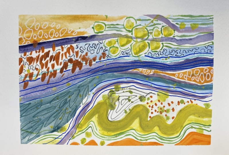
3. Faux Mat Beginning: So this is kinda fun. We're gonna do a matte painting. But before I, we take this up and I'll show
you what that means. I just wanted to show you that use the pallet paper alive. And that's all I
use when I travel. But I've been experimenting
with this piece of glass. Now, if you go to an art supply store and buy a glass palette there like $30. But this is just a kitchen cutting board from Amazon
for half that price. And it works really well. So I had this painting there and now I'm
just taking this is one of those razor
scrapers that I stole from my husband and my garage. He doesn't know,
but it's my mouse. And it's really easy
to get the blade out, to scrape off the pain is, and if it's not as easy, you just give it a spray with water and minus will show you my spray bottle, which I love. I use my spray bottle
because it's a Mr. When I am working in the paints are drying and
i'm I want some more time. And I also got this at Amazon, but it does really light
listen, spray mist. I think it's actually
a face mister. So we'll drive that off and
then we'll get going on this. I just wanted to show
you that palette, that glass palette
I've been using. I think I'm going to
transition to this rather than the paper when I'm at my
home studio like this. Now what I'm want to show
you is in this class, you can use acrylic paper, watercolor paper, or
mixed media paper. For this. I've done this with all three of them
and it works fine. But I was thinking
that for this, see how this acrylic paper, it almost imitates
the look of a canvas. It's got like a linen, a
feel and it's much thicker. Remember I said it was £246. So I think of the three papers that have
tried this technique with, the acrylic paper is
lends itself best to it. So what we do is we take the sheet of
paper and I've got some plastic here,
but you can do it. Meet you obviously
don't want to do it on a surface that you care
about getting paint on. My table has four
millimeter plastic on it. And then this is just a sheet that I could do it
straight on the plastic. This was a sheet of something that we were throwing
out and I thought, no, I can use that in a studio. But here's the
secret ingredient. This is frog tape. Let me get the
case and show you. And it comes in. It's called painter's tape, but it comes in different colors depending on the adhesion. So this is delicate surface. The yellow, I know
people have used the green and the blue successfully. I liked this one
because it never, I'm tears my paper
because it's done is it's the lightest
adhesion of the three. Let's see here. They call it, they say it has paint
black technology, but whatever it is, when I put it on, It gives
me a nice clean edge. And I've never had
pant leg through. And then when I remove it, it removes really easily. And this width, it comes
from different widths. So depends on the size
you want your map to be. But what I like about this technique is since
this is a nine vital sheet, we're going to put the tape
on it and then paint inside. It gives us kind of a
unique look at the edge. And then also, when
you're all done, you have something
that you can frame and without a mask because it
looks like it has a matte. And I also like how? Because we're going to just sell it and build up some layers. You'll have, you'll see
at the end, you'll have, you'll be able to
actually see and feel the edge of the painting
where the tape comes off. So those are all the reasons
that I think it's fun to do. And I just used the
width of the tape that way I don't have to
measure and worry about it. So I take the tape right
to the edge and I just carefully on the edge down here. And up at that corner. There we go. And then I do the other side and then top and bottom
or whatever order. Okay. So you want to have probably a little
more than I have here going over just to hold
the painting down. So I'm going to add a little bit just so that when I
if I'm being brought, it doesn't come up. Okay. So that's the frog tape. And now let's think about
what we wanna do here. So our painting is just
gonna be this size. Can I do go around the
edge and make sure that's really adhered along this edge. And then I'm going
to paint freely. I'm not going to
worry about whether it's passed on the tapes of the tape will be
filled with stuff. So first I'm going to just
do some gesso to build up some yummy ness on the paper. And we'll throw in some paint. I like to mix paint
with Joseph just because I already have
something going on. Let's maybe let's play
with something. Jennifer. Why don't we try like a plum. Here's a magenta and
I've got a Payne's gray or an ivory black
and we'll make it dark plum for our background. Why not? Here's a Payne's gray. And we can do that right
on the right on the paper. Let me just get a larger brush. This is Jessica that I've
just put in a kitchen jar. And now because I'm
using gesso, oh darn it, it's clogged again to get my this is a knitting
needle, believe it or not, from the days I used to
nip bead Perses he has I know I know it was many, many years ago and it
was, it was actually fun. You know, those beam passes
from Victorian times. That's what I was knitting with those tiny
knitting needles. Okay, we're not gonna
get a true problem because I'm using
gesso, which is white. So we're gonna get something short of what everybody
is clogged today. We get whatever we get is that I just locked lots of
sick Googliness on this paper. So I'm going to come
around here with us Just so I'm going right
up to the edge, I mean, past the edge of the
paint because I want that. I was talking about where you can feel that
started to paint. This will have to dry
quite awhile just because it's it's thick. So we could throw a
couple of other things on here before we let it dry, just making sure I have
it painted to the edge. With this tape. I haven't had yet to worry about it leaking past the tape. Just trying to get
suggestible off my brush so I don't waste it. And why don't we try a little more of the Payne's gray and just make
some marks with it. Let's make kind of a focal
point in this area here. I'm going to darken it a
little bit right there. We can even kind
of go like that. And why not? Because we're a little
fluorescent pink in there. I met first layer. Didn't want to come out. Okay. Well, let that dry.
4. Faux Mat Layer One: Now you may have noticed, is this dry that it buckles and the different papers buckle to a different degree. But I'll show you a
trick and how I fix that after the painting is done. So we're going to
ignore that for now. Alright, and give
out some goodies, some oil pastels, and
start some mark-making. I think what I want to
try and this one is making because I
like to vary things, some larger shapes and things. Let's see how we like that. And you want to make
sure and go off the edge with this whole concept of the foam mat so that
you're getting that effect. Love that turquoise woody. Trying to sharpen
couple of these. You know, what's funny is the stimulus come with a marker. I mean sharpener and I don't
know what I did with it. I'm going to have to
find it because it's particularly fat. Marker. Color wise. I am just grabbing what is occurring to me because
we can always change it. And it'll just be a lower layer. I think I've mentioned that the these are Mongo
supply or oil pastels. They're really quite
nice for the money. And the color of the pigment, the richness of them,
really happy with them. We've lasted quite a bit too. I've had these I would say I would probably
have these eight months. Now, you can see that there are some colors I
used more than others. In fact, let's do something. Let's pick a color that it doesn't look
like I've used much. This is sort of a gray. And what else have I not
used much of this tan color. Let's use those. I should
be using this more. It's pretty tiny hint of green. Let's see
what they call it. Dark, cool, gray. And then this one
is the pale ochre. That's pretty too. I tried every time I sit down to
create to do something new. Probably because I
get bored easily. But it does keep me always
learning something. Okay, So these are
larger shapes. Now, see, we could come in with just a few more
designs with CRAN. And of course you could
do the same style of painting really with just
one of these mediums. I just kinda like playing
with all of them. So I use them all lime green and it's one of those colors
I was talking about, but just brings
everything to life. Liking this. What else
we could we could do? We could take the liner, script liner, get some
paint, some thin marks. And how about a yellow? I do like these
Liquitex containers. They're just easier. If you're doing a small painting
to work like this. I love that Strong bit
of fluorescent there. It's also really fun
exercise to actually, I'll show you the tape to tape down several
of these, you know, like if you have space, you know, 34 or five of them. And I was thinking of
doing a class on this, but let me just show
you real quick. So I didn't I used scrap paper and which
already had marks, which is why they're
not really clean around the edge because I
was just messing around. And I took all these scrap
papers and put tape around them and then use the
same colors and just went and did different things from painting to
painting to painting. I think that'd be
a fun class to do. So, being really random, especially at the beginning, a little more thoughtful
at the end of them. I think I might want
some yellow here in the center and makes it
a little bit of weight. Remember, weight
increases opacity, especially if it's a
gouache or it just so happens the same
color as the tape. It's funny. It's a little hard
to I'm trying to, you know, you can do fits with your with your hand and
look at the beginning. It's a little viewfinder
or, you know, some people have
those viewfinders. You can make a little square
cut out on a piece of paper and look at it to try to see it without the yellow tape. I think I'm going to
lighten those up. Create a bit more
contrast between the lights and the darks. Maybe take my liner. Do a couple of lights
lines up here. So you can get acrylic to go or Agra Bosch to
go over oil pesto. Just have to have plenty
of paint on the brush. I like that. Pale yellow. I'm not really wanting to cover
a lot of the background. I'm going to do some, but I'm kind of liking that
purple is a background. So I'm thinking what I wanna
do is a pale turquoise and some spots and then maybe peel the tape and see how it looks and then work somewhere on it. Whereas nowadays say that
I want to pick this up. Okay, So let's make some pale turquoise
I'm going to grab. So turquoise can be made
if you don't have it. I'll show you with
a lemony yellow. So not a warm yellow, not
like this one. And a blue. Let's see, depends on the blue. I don't think I've
tried this particular blue or yellow. So
let's see what happens. They'll get a regular
bright brush. Just a tiny bit of that. Blue. Because any more of the blue, there we go, It's getting
a little more turquoise. Throw some white in there. And that's pretty check the
color on a scrap piece. It's pretty color but I
think I want it lighter. I'm going to add
more white. You go. It's amazing how much you use. It's incredible. That's my goals or
white like crazy. So it's a turquoise. It's a bit muted compared
to one that you buy. A color that I always think
it's a beautiful color. But I do buy a turquoise just because you can
get a real HOPWA. Green. I don't think
you need to spend money on greens, but turquoise. Oh, did you say Oh my gosh,
my turquoise exploded. Well, okay. I'm going to clean
that up. You right back.
5. Faux Mat Reveal: Oh my goodness, that was funny. So I've got my turquoise here. What I did is I used a palette knife and put
it back in the bottle. Got the pale turquoise, but it's a little more
minty than I want. So I'm going to add
just a touch of his yellow and get it a
little bit warmer. Alright, let me think. I'm just going to come through. That's pretty
against the purple. And it is peanut
man. Various places. Just hitting some of
these with a second code. And then I'm going
to let this dry. We'll take off the paint
as the funnest part. I mean, take off the tape. Then we might put
the yellow gone. We may be able to see what
else we wanna do to this. So we're going to let this dry. Alright, so I came back to
this and took a look at it. And I wanted to add some
more white and some lights. I came through, I recorded
all this but snack foods, so I'm recording it again. I did this lighter pastel and I just wanted
a little more contrast. I really like it, but I wanted to bring in
some of the white. And I also know that our
format is going to be white, so I just wanted to have
a bit of white in here. So I also took the
white Posca marker. It was a happy
accident because as I was priming it, it
started dribbling. And so I just went back and
got the splashes of paint. Of course, you can
do that by taking some white paint and
wetting your brush with it. Making, I don't
wanna do it again because that's enough
weight on there, but you get your paint wet with the white and then you can just hit it
against your hand. I just got some water on there. That's fine. This is all dry. And you can make splashes that way you can practice on
another piece of paper. And while I'm thinking
about her, well, I just something about
the palate reminded me to tell you if you
use glass like this, makes sure that you scrape it off before you use it again. Because if you start putting paint right
where you have paints, see that you'll get these pieces of paint
in your new paints. So when I come to paint, if I scrape it off and it's a little harder to
scrape if I haven't, please breathe it with water. You can see it's
still not that bad. It would be a lot
easier if I gave it a little spray and
then came through. Just like that. Make sure you put your razor sharp and then you can
clean up your stuff. But yeah, you don't
want to paint on top of the glass these
bits of paint, because you'll, you'll get them, they'll come up and be
in your next painting. All right. So that's
that on that. This is drying. I wanted to make that
a little more white. So I'll see if I can just do it this way so I'm
not disturbing it too much. I just wanted it to be because it's not quite
dry. There we go. What the Posca marker can blend with the color underneath. The I think I have
woody underneath there. So alright. Now when we take off
the yellow paint them, That's the exciting reveal. And then we'll also see if there's anything else we
wanna do to this painting. And it gets rid of
the yellow so we can see it more clearly
because right now, of course we see so much yellow. Alright, so let's
have the big reveal. Again, this is just
so fun because it's got a nice clean because
we've had paint on it. It's just nice and clean. And I pull gently. This way. I don't pull up,
pull back slowly. Just go slow. Careful. Hold down a corner, make sure it's once we uncover
this pretty white mat, then we're going
to be in danger of getting paint or
something else on it. That's, I already see
a little something. Show you a trick
that can move that. It's trying to remove it with the bank tape and I got
another mark on there. So we're gonna keep, firstly can try water course. So again it goes
slowly. Peeling. This is coming up easier because this is my
second time doing it. So yours will be a little bit because the recording field, so just know that
yours will be a little more taut and just carefully. Alright, so the
first thing we can try, especially with this Lynn, any papers just taking a dab
of water and a paper towel and seeing if that gets it
up doesn't look like it is. So then the next thing to try, I'm gonna go get one and
show you is a magic eraser. Believe it or not, I
have seen it work. So I'll go get that and let's
see if it cleans it up. But I want to show you look
how this linen texture, the mat that you get. The you can hear, listen to the page. It really looks like we painted a painting and then
stuck it on this paper. And with this linen
texture and heavy paper, That's how it feels. Now you have to be really
careful to not get it dirty. That's the hurdling. And if we continue
on the painting, which I think I want to do a few things once it's all dry, then I have to be really
mindful of not getting a dirty. So I'll be back with
a magic eraser. Okay. In case I
don't know if you don't have these
in your country, but this is what I'm using
Mr. Clean Magic Eraser, and we'll see if it works. I'm going to, this
is a new clean one, just going to wet the corner. It's coming off. You want to waste as little as possible because it will eventually
degrade the paper. But this paper is so it's
got this canvas texture. So yeah, it took it off. And now I just have
to be careful not to get fingerprints and everything else on this on this pretty white edges
that we've got here. So I would just be a little more careful
than I normally am. Wash my hands
before I come back, set it aside while it dries, and just be a little
more careful. So we'll come back
after this dries and see if there's anything
else we want to do to it. But what I love
about this as I did it on a nine by 12 paper. Now it's got this
beautiful edge, and I do need to sign it. And then I can stick it in
a frame that I can buy. And you've made
yourself some artwork. Alright, Let's let that dry.
6. Faux Mat Finishing Touches: Okay, Now that this is all dry, my spots are removed. I'm being careful
with my edge here. I'm looking at it and I think
I want to do a few things. So when I'm maybe
intensify some colors. Yeah. I'm just feeling
like I don't know. It needs something. I'm not sure. Sometimes it takes
me and going through it and doing a few things to Cl, so that's good, that's
happening to show you. So I'm taking the woody
when I'm scraping, it's upsetting the oil
pastel underneath. So that just means I need
to switch to oil pastel. I could also use
yellow acrylic paint. Now that I've already
disturbed that, I'm thinking about what, so I don't really like
these three white marks. So let's go over them. It's just about
figuring out what you like and don't like
and playing around. And not too many things you
can do or irreversible. Which is nice.
That looks better. This is where I have to
be careful though with the pastels to get it on here. I'm thinking that some of this pink might
be nice in here. I just want it to
have more inch. Highly technical artistic term. Maybe I will take
we could use this, but we, we talked towards
the hand on that. And I think the, you only get a few colors of posca pens will of course
get your favorite colors, in my case, are the colors
that I always feel like make everything pop and turquoise
is one of those for me. So I would have turquoise
posca for sure. You hate turquoise and
pick something else. I want some stripes somewhere. I'm thinking about where, where I can have them
and then what would they medium would I use? See how that works? Something up here, maybe. Pause guys agree, they will go over just about everything
if you're light, I went over the oil pastel
there and just lightly. And you can come back and do
more coats once it dries. To get that opacity. I'm going to cover up this
white with something. Let's see. Do I want
maybe an orange? So as I said, in
another painting, the oranges, one of those
colors they want to use, it brings things to life, especially against purple. Usually I'll make that
bigger over there. And a great way to rub in oil pastel is will
your fingers one, but also pencil eraser. See if they've got one
here that's clean. Just clean it off by
rubbing it on some paper. See if we can get it. Just mirrors it really well. I'll clean that orange
off and then I'll smear this dark gray over here. And only you and I will
know that there used to be three white blotches there. Pencils are also great. Just to make marks. You can do some small. They'll go on top of acrylic. Just something satisfying
about little shapes. It's saddled with a pencil, but you still see it. And this, this, this color, you can cover up some
of those white dots. I like some of them, but
some of them I don't. And it adds interest anyway because you
can kind of see it underneath. Business,
a pretty color. What is this? Salmon pink. So pretty. See what I mean
about being careful. I'm going to have to use
my Magic Eraser again. What we could do is
peel up like we did, and then take a look and see what you think it
needs and then retype it. It's an idea. Just seems
like too much work. But you could just make sure your hands are really clean, but I'm liking it better. It's starting to pop for me more and speak to me a
little bit more. I'm going to what I recommend, you know, where we
stand away from it. We haven't done gold. You know how I love my gold. Let's do some bits of gold. Get my pen working. Please recommend doing that
away from your project. Because sometimes
these, if you shake it, I've had that happen
as a happy accident. And you get drifts, see like there's a drip
that just landed. There. Might not be where
you want to drag. This one hadn't been
used in a couple of days. Here we go. And just taking a
really light touch because I'm think
of it as trying to lay the ink on the paper. See that rather than pressing because it got different
things on here that might not enjoy. The pressing too hard,
might disturb it. So just going gently, making a variety of marks here, I'm circling some of those
white dots, not all of them. Tracing over this. And let's see, I'm thinking about my eye
moving with the gold. And we want to do some here. And then with my fat pilot gold, I'm going to color
in these up here. That way. I've got gold coming
kinda throughout. And we'll assign it while
I'm here with the pencil. I think the only other
thing that I wanted to change is that I'm
nitpicking here, but that white dot there. I'm not sure I like it. So what I'm doing is
this helps you is cover it and see what you think
with it and without it. Actually you're kinda
like it with it. But I'll do that
sometimes, you know, do I want these two, I like this shape, cover it. Alright, so let's
finish up. Why not? Since this is a very
colorful piece. Now using these, you're
squeezing their 3D. So you're squeezing
this bead basically. That's why they're
called 3D liners. So I'm going to squeeze
squeeze it out and you do, you practice a
little, but it's not like we're being
really precise here. I have to think about,
okay, a little bit here. And maybe just
something coming here. This stuff you can
put over anything. So I'm being careful not to
scrape up the oil pastels. And maybe just a couple
of dots down here. When I want a
handle fluorescent, either grab this one. For lots of ways to
get fluorescent. You can use the ink. This
is Liquitex, acrylic ink. You can use paint. This is
Liquitex acrylic paint. And there are
fluorescent jelly rolls and fluorescent Prismacolor
colored pencils. Colored pencil. It just depends. Let me do a little
bit somewhere to show you how it works. If it's on top of the syphilis, an orange, it works if
it's on top of acrylic. But it wouldn't if I tried to do it here
on the oil pastel, it's just going to scrape
up the oil pastel. So let's see, let me stick with the fluorescent pink rather
than the orange just to show you how adults make a
mark on the acrylic here, but not on this, on this oil pastel. I
think I've done enough. Go one more magic
eraser cleaning to do. It's still a bit wet. And I think we're seeing why. I probably could
have done more of the painting when it
was still taped up. Then I don't have to worry about keeping it clean so much. Okay. Well, thanks
for joining me. I hope you make one of these. Now, the buckling that
we talked about earlier, we're going to let
this dry and I'll show you it actually has gone away. Largely. There's a little bit. So I'm going to show you
what we do once this is dry, this acrylic, this liner is
going to take a while to dry. Once that's dry, I'll
show you what we can do about any
buckling that remains.
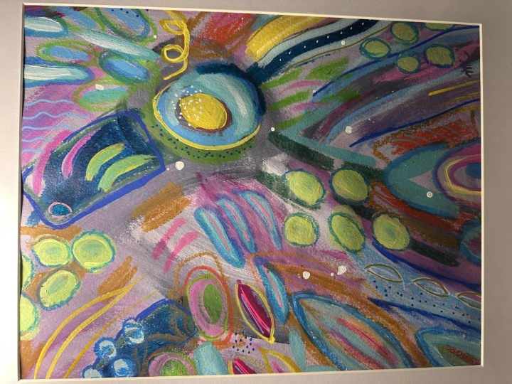
7. Flowy Painting 1: Beginning: So for this abstract, we are going to start with
a piece of nine by 12. Or if you have an eight by ten, that'll work to
watercolor paper. I'm just using a
Strathmore student grade, which is the one with
the yellow cover. They call it the 300 series. They call them better and then they call the
400 series best. So I'm just using which is
perfectly, perfectly good. And then I've got my tape. This is the it's
not quite an inch. It'll be in the supply list, but it doesn't matter as
long as it's whatever kind of margin or format you
want on your painting. So it's really up to you. And I go just a little bit past the paper because that's the only thing
holding it down. And I just line up my
edges carefully so that, you know, my border
is going to be. And you can do if
plastic like this, this is from the hardware store. Think it's for ML but which
just means it's thicker. It's a it's a bit
thicker as plastic. And put it on your no, this was probably the two
ML that I've doubled. So hurrying and just do it
on a piece of cardboard. Methylene chloride to make
sure I get this straight. Okay, so we've got
our paper taped and you just want to go around the theme and make sure
that you've sealed it. Make sure your hands are clean. And we're going to create
a simple, This is my, one of my little sketchbooks and where I started
experimenting with these kinds of abstracts. And what I did, and this
is I made a background of a color and then
these designs over it. And they're just
inspired by nature, the forms of nature
or the way that leaves and things
move and are shaped. Who's not? In this
particular style? There's not any right angles. Although I've seen
a lot of beautiful pieces of art that way. So this is just this particular exploration
I was doing was, you know, more about
fluid movements. And I use, I like using
the Navy is my dark. Can either use paint
or ink if you have it. And some of this is
paint and some is ink. But I'm going to stick
with paint on this one. So since that's
probably what you have and we'll see
what we come up with. I usually start with my the dark paint and
whatever dark you choose. So it could be black,
it could be a plumb, it could be a navy, a really dark green, whatever you like. And as far as colors, I just pick three or four of my favorites when I'm in
the mood for that day. So I would stick
to three or four. We'll see we'll see as we go. But you don't need a lot of
variety of color in this. Now I'm just getting out
my Turner acrylic Gouache. This is the black blue. You can make it with
black and blue. You don't need this color. And I'm getting my brush really saturated as
I store it here. And then I'm just going
to start with some coming down and pressing
and then lifting. And trying to be
really just loose and playful using the
interesting shapes and M variety of lines. So this is a big
brushes as a twelv. But if I go really lightly, I can get a thinner
line and then I can press down like this. And I just think
that these sort of organic looking shapes and
lines are fascinating. And so I'll maybe
come off of here. You know how you see branches and leaves and
vines and things like that. That's kinda what
I'm thinking of. But very loosely. Yeah, I think that's pretty. And then we'll take another color and we'll
come back to the blue. And this came out quite a bit brighter than when I use
the ink, which is fine. But one of the techniques
you can do too is if you have these neo color 2s, this is a Prussian blue
and I thought I had navy, but maybe this is just
my Prussian blue. It looks darker,
so let's try it. But while this is wet, you can come down here and
do something like this. And part of it will
interact or spread. And I could even take
my brush if I wanted and drag some water through. It. Just adds another
bit of interest. Maybe I'll bring this like this. That's pretty. I've also been really
loving a lime green. This is called fresh green, but you can mix it
by taking a yellow. It would usually work better
if you use a lemony yellow. I'll just make
some and show you, rather than a warm yellow
like this is a warm yellow, those cadmium yellow medium. It's just gonna be I mean, it can it can work too. It's just a little bit
different shade of the lime. And then you take a bit of
turquoise or a light blue, like a cobalt blue. And it doesn't take much. You can see there's
a lime color. I think I want it a
little more yellow, so I'm going to add a bit
more of this liquid texts. This is Liquitex,
acrylic, gouache. But I used acrylic here. So you can see that I'm kinda
throwing it all in there. And with this, I'm
going to be even more playful and just kinda see what shapes and
interesting things can happen. They don't control
the brush too much. And when to add a
bit of pink to that, that I have in my palette
to, to tone down. The center of this. Pink would be on the opposite
end on the color wheel. So it's going to tone
down lime and I'm just taking that little bit toned down color through the middle of this
for some dimension, I'm holding the brush
really loosely, making sure to add some water and taking these
little tendrils off. I might bring some of this
over and make some teeny tiny little or maybe
not so teeny-tiny. I feel like I want some circles, so I'm gonna get a different
brush because well, I could use this one. I'll show you. It's just yeah, there's
planet is over. There's plenty of water on it. To make a nice circle. That circle. I'll
call it a blob. And I don't want, I don't
want an actual circle, just a shape. A blob shape. Maybe vary the
size a little bit. And there's some drips wanting to happen because
my brushes so wet, so let's embrace that. I've put some paint on my
brush. It's nice and wet. I'm gonna just smack
it. Here we go. Make sure you're not
wearing clothes that you care about or you've got a paint shirt on or
something. When you do that. And that'll take a
while to dry as well this then we will
choose another color, which I'm was thinking
I would do pink. I want to do something
on the neutral side. So I think we're gonna
do this ash green. We can always add pink
highlights later. So this ash green is really a, this is by whole day and that's a gouache charcoal brush color, but you can create it by
doing a bit of green, a bit of blue, and white. It's, it's basically
a really pale gray, may need a tiny bit of black. It's a greenish, bluish gray. But you don't need to
create that color. I'm just sharing it with
you in case you want to. But I'm going for a neutral. So whatever. I'm I'm, what I'm thinking of is that I've got
two braids here. And so that I need something
that's on a neutral side. And that's why I'm
grabbing this. I'm adding a lot of water. Still got my same brush. And I think I'm going
to come up here. And the same kind of movement. Just get some of the
paint down here on this. But the other thing I could do, okay, so a couple of choices. I could just come up here
and go through here. Or I could color in, you know, bits that
this has made. And since I can do
this first and if I want to cover it
up, Let's do that. Let's do that so that you
can see how that works. And I'm not worried about filling it all
the way in because, you know, this is a loose piece. What is fun Go is at this stage to put that
down and then take some paper towel
that's crunched up and get some texture. Like so. And that's just, you know, Ryan's me of maybe lichen
on a tree, a moss. I like it a lot. So I think I want to try
another bit over here. Maybe over this way. Do that again. I'll fill that in. Just be careful that
when you have plotted, you know that you turn your paper towel to dry spot and black before
you bought it again. Otherwise, you'll
take your blocks and put them on other
parts of your painting. Isn't that pretty? Maybe we'll do a little
bit more down here. I know I'm varying
the, you know, the color or the because I've got it's lightening up
which is fine, good. And it's blending
a little bit less, which is pretty, I'm just kinda looking
at it, saying, Well, this is really interesting
and pretty, um, what am I going to do next, or am I going to take this color and do
something with it? Um, and I'm, I'm definitely
wanting some smaller lines. So I think what I'm gonna
do is take a small, this is a too wet. It put some of that color in. And think about
where I might want some really fine lines just as a contrast to
these heavier ones just makes it interesting. And I can do them
anywhere I want. I can come in here and kind
of do something like this, you know, so that there's just a different type of
thing going on there. Let's do five. You know how
I am about odd numbers. And I like that. Then I can come down here, maybe do the same thing. Make these sort of
different lengths and kind of wandering a little bit, not necessarily all
in one direction. This gives the viewer, the person looking at your painting something
else to look at, something else to discover
in your painting. I'm thinking, well those
still have to dry. Thinking. I'm thinking if
there's anything else I can do before it dries, just kinda whip out a bit more. I don't like how chunky
It's looking there. So I can take my brush and
rub that crayon a little bit. Softener. I like how it bled
here, the gouache. And then I'm thinking
about the next color. And a bit of orange may
be really interesting. Orange you can of course, make with yellow and red. I just happened to
have some here, but you really don't need
to buy all these colors. I think this would be a good
place to use the fan brush. There's all kinds of
fan brushes out there. There's small ones, big
ones, they're not expensive. I think these are from. You know, Michaels or one
of those types of stores. But it's a really
fun thing to have to get a bit of some
color in a different way, make a different kind of mark. So I'm going to take that and this is really more of a yellow. I'm going to add
some red to that. It's a little bit too yellow. Red here. It'll only
take a tiny bit, make this more of
an orange. Wow. I thought I used a tiny
bit and gotten very, very red very fast. So this is where it's great to take a scrap piece of paper. Anything you have is fine. I usually have several
papers around. I actually really
like that color. So I'm gonna go with that. So this brush can be used in
so many interesting ways. We can do something
like this. Fun. It's fun. It's good to practice
because you can decide if you want longer bits, shorter bits like that. And you know where you
want that Pinterest. And then I think it
would be good to take the same color and
do some smaller dots. So I've got a smaller brush
here with a round brush. This is a six. I'm getting it nice and saturated
with color. I think this is mostly dry. Well, even if it isn't, It's
okay if some of these blend, because that's part
of the beauty of using watercolor or gouache. I am turning my brush because that will get me
to make a different shape. So it's not all the
same kind of mark. It just looks more
natural and organic. Allows me to make different kinda going different
directions, different sizes. And I think it would be
pretty to take some of this, but lighten it up a little bit. And maybe coloring right here. Just to move the eye around. You notice that I'm not
worrying about staying within the boundary
because then it creates interest
where it overlaps. It's turned it to
green, which I like. And then if I look at
this and say, wow, that's intense, you know, do I want that much
intensity right there? I could experiment
with blotting. And if you wait a bit, you'll obviously pull up less. So I did get some texture
there but I didn't pull up as much pain as I did here because I just gave
it just a second. And gouache dries hypoglossal, especially dries really fast. But I do like how that looks. I'm going to do a
lighter version of it, meaning I'm going to add, use the same color
but add more water to my brush and come up here
and do the same thing here. Little more water. So that enlightens it up. And those dots have dried, which is pretty because
now they're underneath. Now, this is where
the yellow tape is. Kinda can be kinda distracting. So you can almost like take your hand and make a little
rectangle and look at your painting and try to see it without that yellow border. To help you judge. You know, because it looks like it has tons of
yellow in it, right. Because of the border. So we just have to try to, you know, playback, look at
it a little differently. It's gonna do a
little plot there. I love texture. Let's see. I'm going
to stand back. And I think this, this has some interesting
elements and I'm not sure that I want to like, I know I don't want to
clutter it up too much. I think we're at a good point where we can let this dry
because we're going to look at them making some marks with maybe some gold, some pen. You know, some things that can go on top of the
things that we've created. And so I think I'm going to
let this dry and we'll come back to it and see
what we wanna do next.
8. Flowy Painting 2: Finishing Up: Okay. The oblique,
this is nice and dry. And I noticed some
things that I wanted to change was other
medium or something. I feel like this lime, it's just too bright. It's kinda dominating. So we'll figure
out how to address that was maybe oil pastels
or paint or something. And in looking at it, I'm thinking about do
I want to introduce another color or do I want to just stay with
the colors I've got? Those are some of the
things I'm thinking about. Also along those lines, do I want to add
oil pastels a bit, or Neil color crayon
or Posca pen. And I think I do. So certainly metallic gold pen. But I thought first I
would use the posca. Think about, do I want
fluorescent in this? Or do I want to keep
a little quieter? I could do my standby
turquoise, which I love. And I want something. Hoping here maybe even
just some white lines like we did, like
I did on this one. So that's probably a
good place to start. Let's see if my
white pen markers are just notoriously
challenging. So I always keep a piece
of black paper you can see to warm it up
and get it flowing. This is my favorite, but it sometimes misbehaves. It's the uni-ball signal pen. So let's see if we
can get it to work. And I think I'll just take
these kind of like this. Just doing something
a little unexpected. And some circles would be
nice in here, I think. Going different directions. I'm glad my white pen
is behaving today. I love how that looks. I'm thinking about how I how
do I want to tone that down? I could do it with
certainly with white. I could also do it with you. I could take a pink
color over it. I could take some pen over it. I could even take
some colored pencil. Any number of
potential strategies to get it to calm down a bit. I wanted to come down
too much just a bit. Maybe what I'll do is take this more kind of Holloway
green and see what that does. I like that because it kind
of ties it in to this. And I can even rub
it in a little bit. Then maybe come through again. A lot of this process
is kinda looking, thinking about what,
where your eye is going. So with this kind of design, my eyes going up and then
down and up and down. And stopping, you
know, to look at these interesting things in
these interesting things. And I'm thinking I want a
gold leafy things somewhere. And I kinda want something here. So I think I'll do almost
like a branch coming out of here trying to make it, you know, in the
same vein of gently meandering and maybe
long narrow leaves. I tried to almost make these, um, you know, if I want
this look, just very Curvy, graceful, almost like the way you
think of a ballerinas arms. Because this is obviously
going to be a feature. So taking my time, making them going
different directions. This is something
good to practice. Maybe before you do it to
get the look that you want. Now, debating, do I, what? Do I want to leave them
lined like they are? Or do I want to color some
of them in with the gold? So while we think about that, I'm gonna come over here and do some sort of things
like this and gold During the direction. And the shape a little bit. And having go off the paper. Because that'll look interesting
when we peel the tape. Here. Things kinda fun to do is to find bits of the watercolor
that we made and then kind of line that we're following that natural fit
that the watercolor made. I think I want to add some
darker lines up there. The white I like, but I've got some
Jelly Roll pens and one is like a
color has this. Just got it recently because they don't
put the colors on it, but it's sort of a slate is
how I would describe it. I think it's going
to match this, but now I've gotta decide
where I want to put that. This is where I looked
through my sketchbook for inspiration on what kind of marks do I want? Do I want lines? Do I want a shade? I haven't done any squigglies. I do like my squigglies. I think I'm gonna do
another one here. And maybe just some small
marks here in the same pen. Just thinking about
textures from nature, shapes, patterns. This is a little bit of a
metallic, almost like a cuter. I'm still in bothered
by this great green. Plenty of the things that I'm
gonna take my ivory, posca. Just tone it down. At
least parts of it. This is, you can do the
same thing with a weight. Paint wash is just
take your white or off-white and
make an offer and, um, have water, so it's like a wash. Just
it's more translucent. I use this panel a lot this way. It's really good at I would say, my most used color because I
use it to push things back. Which is to say, calm them down, make them less. In the foreground. You know, like that what we did, what I just did there,
I think really helped. It's still a pretty green but it wasn't it's not
screaming at me anymore. Now I'm just messing around. What isn't that what
we're doing here? So messing around o in
fact, let's use the gut. The one that I use a lot is
the fat one of this color. Let's use that just, it
will hardly show up, but it creates another
kind of texture. Just put some of
it here like this. Jelly Roll ran a little bit. That's okay though. It will create pinterest like that in here too. Just out of ivory
color that makes the white show up more because it shows a little bit
different than the light. This is kinda fun. Just gonna, it's gonna
come down that one side of the stem. Like what Pepin. It's just
a lot of experimenting. You know, you, you, until you, this kind of thing and
experiment and play. Allow yourself to play
with different materials, different surfaces. You just can't, you
can't grow much. And if you hold yourself back
from that and I know it's hard to say use up
supplies if you don't, you know, if you're
not sure you're gonna make something worth it. But I encourage you
to play like this. You'll learn what you like
and don't like and want to replicate and try
somewhere else. I think we're getting pretty
close to time on this. I like what the ivory dead. Yeah, this is the PC
eight K, really fat one. That does interesting things. Now, do I want some
lines anywhere else? I'm going to stand back and take a look at the
whole composition. I'm kinda holding
my hand to see the, I'm making a little
rectangle so that I can see it without the the tape. And I think I think it's I think it's got
enough going on. I think it's interesting. You only bit I'm
wondering about is do I want some of this green here? But I don't think so because the green is coming up in there. So I think we're
gonna drum roll, peel off the tape. So much fun and you
can obviously change, have things after
you've peeled potato. The only thing is and I
speak from experience, it's really easy to get paint
on those taped up edges. So I do try to as best I can to to look at it,
go away from it, come back and make
sure that I think it's done before
I take the paint off just because I'm on my
table here in my hands. See, I mean, even just
now from doing that, taking this off, I
have to be careful. If you do get something
on that edge. A magic eraser with a
little bit of water, which is a product we
have here in the States. I don't know if it's
in other places, but you can remove some
things from paper. I'm just going to
peel these bits up. Now to this tape is
really good about not pulling up
pieces of the paper. But what also helps
is, you know, pulling this way
instead of this way. So full the tape back against
itself and slowly, slowly. I haven't had this tape. One time it ripped a
teeny bit of the edge, but I was pulling too fast. I was overeager. One is I love doing this with the
tape because it's so rewarding, it's so dramatic. I did forget to sign
the painting though. You know what, let
me do that before so that I don't
have to touch it. That way. We have less of a chance of mucking
up the edges. Okay, Here's another side. Sure. My hands are clean. Three sides. And I think there's this
size tape gives a perfect border for
this size paper. It's a little less than an inch. I'm really liking it. So much better without
the tape, isn't it? Okay. I actually don't think I
want to do a thing to it. I like how the edges came out. I feel like it's balanced. It's interesting. I'm pretty happy with that. What did we use? I guess color Y is 12345. I guess we used more
like six colors, not counting the sleep
pen and the gold. Alright, so this is a
great thing to try. It's a great way to experiment with your brushes and
see what they do, see what marks they make, and with your gold pen. And just have fun with it. Go forth and create.
 Suzanne Allard, Landscape, Floral, Abstract Painting Teacher