Transcripts
1. Intro: Sometimes when you're creating, it seems to flow, but sometimes it doesn't. And I fell in the class. I named the painting
persistence because we attempted a pretty
challenging project, which was to take a painting that I created in Procreate with layers and masks and things like that and recreate it on paper. So that was a tall task, but I loved working through it. And you'll see what happens
when you get to a place. And you're just, I've talked
about the ugly stage before, but where you just
really want to take the paper and throw
out the trash. The benefit of not doing
that and sticking with it and learning the what, how can you find the
solutions to the problems? And hardest one said, I wish I could
remember her name, but she said that art is about creating problems
and solving them. So we create problems
in this painting and maybe more than usual and then take the time
to solve them. The result ends up
being really lovely. So it'll take a
while to get here, but you're going to
learn what it's like to be persistent
when you create. And here's the
thing. The reason I love this process is I feel like you really learn in those places that
are uncomfortable, where you don't know where to
go next and you don't know exactly how to solve a paintings problems or
parts of the painting. That's where the learning is. So that's why I
wanted to film this and show you how you worked through all
that in order to improve. So join me, we'll have fun
persisting on this painting.
2. Supplies: Okay, let's talk about
supplies for this class. And the whole start with paper. And I'm going to show you
some supplies that I don't necessarily use all
of in this class. I'll show you what
we use as well, but I have my stuff here and I figured I might
as well show it to you. Paper. I ended up using acrylic
paper in the class, but watercolor paper is fine. And I ended up just selling it. And covering up the
texture of this linen, which is kinda acrylic Anyway. So whatever you got on hand, I would just say, generally don't use the cheapest
paper available, use 140 pound or heavier, whichever paper you use
just because it just did. You get it stays flatter. It holds me, throw on it better. And you don't need a fancy watercolor paper
like arches certainly. But a decent one. This trough, more, middle, middle, better, but
not their best. And then they do that. They did it for 300 series and then 400 series is the best. I have links to all these
at Suzanne outer.com under supplies and pretty much all the supplies
are listed there. Links to them. Okay. So paper and I
used a nine by 12, then the main paint that I
used as the Nova Color Paint. I don't know if
you've seen this, but this is a beautiful paint that is available only
through mail order. It's made in California. So some of you folks overseas, it's the shipping is
probably not worth it, although some people order
it because the paint itself is like an
artist grade paint pit, a student grade price. But anyway, I recently
collaborator, collaborated with
them on a bundle. If you go to their website and look at the artists bundles, you'll see the Suzanne
Howard bundle there. And you can also see get a link to it on my
website under supplies or I believe I put the link in the supply
list for this class. I also use some acro
gouache on top for layers. You don't have to do that. You can stick with acrylic. Any acrylic paint is fine, just use a good quality ones. So it could be nova,
could be Liquitex. It could be, you know, you don't need to use one
as expensive as a golden. But anyway, you could
use Liquitex basics. You don't need the
article gouache. I just like it for
layering because it gives that chalky finish. Then I've used in this. Sorry about that. You've probably heard that I've knocked the
microphone over. These are neo color
crayons and I use them. I'll show you how
to use them for texture on top of
the acrylic paint. Sometimes I often
use oil pastels. I don t think I use
them on this piece, but those are fun too. And then we do just saw the
paper just so as a primer, if you're not familiar with it, it it seals the surface of the paper so that
the paint stays on top. You'll find that if
you just a preference. But when I paint on
watercolor paper, especially the if you don't
gesture with the page is soaked into the paper and
you just it's just feels like you keep putting
more paint in and adjust, keeps absorbing it and it just doesn't give
me the layers that I want with the paint on top of the jostle and
then the media. Now if you use this
particular acrylic paper, It's almost like it's
free, It's very heavy. It's 246 pounds. A little linen finished. I love this paper. I have it on my links, but you do not need
to adjust on this. So far. The paper, the paint does just sit on top and it is for
acrylic painting. Brushes. I use, I used mostly for the, most of the painting these shape which is called a bright. And I have a for a size
four and a size six here. You could get away with
one or the other of these. And then there's some
finer detailed work that the leaves and things that
it's helpful to have a round. And it could be a
size four is fine. I've got a variety
and I like these. These are the Princeton
velvet touch. I have a link to
those, I love those. And then I also like these Winsor Newton Cotman brushes
that are, this is a two. They make really
helpful for details, dots, things like that. Some smaller detail,
brushes, palette. You can use glass. Like you'll see me use
a piece of glass or glass cutting board basically. And, or you can
use pallet paper, which is a product you can buy. Again, links to it on my
website that you just use. The piece of paper
is your palate and then toxic when you're done. This is something from
a different painting. I like those colors. So okay. Pen. Let me show you the pen
is my favorite white pen. I haven't linked to this one. On my website. It's the unit ball signal. I just, I love my posca pens. That's these guys. Grab them. But they just don't have great luck with
the thinner white ones. They just don't sit. They don't they don't
behave as well in the lighting doesn't show up
like it does with this one. Alright, I think I have covered all the suppliers
that we use in this class. And let's get to it.
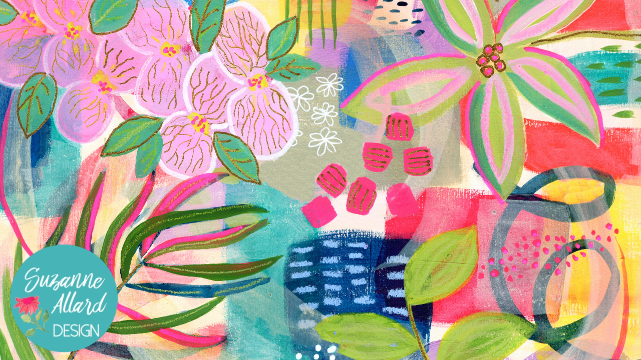
3. First Layer: For this abstract, we are going to use this as inspiration. This is a painting
that I created on the iPad and procreate. But I really love. I named it, you are loved. And it was a series of processes which I
don't need to go into because we're not
doing appropriate class. But I just love
how it turned out. So I wanted to do
something in this kind of vein on paper. So there's a lot of texture and probably would be
helpful for you to have this in the
class resources. You can download it and print it off and have it next
to you or up on a screen like I have
it here because you probably getting a
glare here from this. So anyway, you can
see that we're starting with some
just neutrals, quite a few neutrals
off white shapes. So that's how I built this with just some
shape and color. In fact, what's great
about Procreate is I can go back to, I can turn off everything
that I added on top of all this so that you can see
just what I started with. And we'll start there. Turn off a little bit more
at thrown off these leaves. You can see that
that's how it started. So we'll use that. In fact, I'll include this as well in the class resources so you can just
see how it starts. And we'll look, I've
got a piece of square. I don't know why I chose square. I just thought it'd be fun. Hello, it would
probably be better to start with a rectangle. I have this out, but now
that I'm looking at this, let's just start with a regular rectangular piece of paper. And you can use
watercolor paper, you can use acrylic paper. I've been experimenting
with lately. I'll grab a piece of acrylic and or you can use
mixed media paper. This acrylic paper, which I
got at Hobby Lobby in the US, is just a Master's Touch brand
and I like it, it's bits. And sometimes they have
50% off their products. So I think it can be a really good deal
and it's very heavy. There's 190 pound. So let's start with that. It already has some
built-in texture to it because it's thick. It's kind of like
a canvas would be, but also a little
bit of watercolor. So as long as you
use, I would say, for this kind of effect, you want something
with some texture, so watercolor or, you know,
nothing really smooth. Although then if
that's what you have, I always encouraged people
to use what they have, then you could you
could just add texture. Okay, so I'm gonna try not to
get paint on my iPad here. And we're going to start with a gesso layer for added texture. And since we know we're
using a lot of this, sort of It's a really
pale sand color is I guess what I'd call it. Not quite a pink, not a peach. But let's just go
ahead and just fill the whole thing in that color since there's quite a bit of it. So first we'll need
to make that color, which is the Jess, I was gonna be our white. And I'm gonna get a good
size brush of that. And then to get that color, we're just kinda need
teeniest bits of red. This is a maps all
crimson, crimson, but let's just see
how it's gonna be. That's gonna be way too much
red. You see here if we can. And then there's a bit
of yellow or orange. I still might have
too much red in that. To pink. Good Lord. Yeah, we want a much
lighter shade of this. So it is kinda the right shade
is just not enough white. So I'm gonna go clean my brush. Just like that. I've got
a big old chunk of gesso and mix up here and see if I
finally got the right ratio. I think so. I really
pale sandy color. And of course it
doesn't need to be all uniform. We're creating texture. After all. I get is a scrap
piece of paper. How paper? I do have plastic on this table, but I find that if I if I get Jess on it every
time I just saw something, then it just ends up
pretty filled with gel. So every time, so when I am
doing something like this, I just stick a scrap
piece of paper behind it. Keeps me from having to clean
the plastic on the table. A lot. Of course I can vary this in
terms of light and darkness. Kinda grabbing whatever
I made over here. Some places will be later in this shape and
some will be darker. And then I'm just painting
everybody, you know, I'm gonna move the iPad
right now because I know I'm gonna get jostle on it. And that's a little
different than getting just the one a piece of paper. So I'm just applying it
without a lot of care, just trying to get coverage. Spot down here. I'm still got more pink than I wanted there because
I have the pink on my brush when I first started
with mixing the red end. It's amazing though. How little of a color it takes just to get a
very subtle shading. Okay. I'm just going
through I don t need big raised paint globs on this just because
it will make it harder to paint some
of this detail later. So I do want to texture, but I don't necessarily want ridges for this
effect. So we're good. I'm just kinda brushing
away any ridges. And that's a great start. So we'll let that dry.
4. Beginning Shapes: Hello, Caleb, please. Let's let's get to this now. Don't be alarmed to see what
I want to leave it like this to show you that curled a
little bit. No big deal. Just going to gently. Ivory paper behaves differently. But most of them will do this. My studio here is
pretty dry and warm. So just kind of as we
put more paint on it, it'll straighten out and
then it might curl again. And just when you do those, you try not to crease. It gets more of a
gentle massage. I'm massaging the paper. When we're all done. There are techniques to flatten
it completely. So we just want to get
it flat enough that we can paint, which we did. Alright, so now we're gonna
go and do our shapes. We don't have to
do exactly this, obviously because we're just
using this for inspiration. But we're gonna, we're gonna try to keep the
texture in there, kind of roughness
of these shapes. They overlap a little bit. I'm going up so we're not
going to make perfect shapes or edges or anything like that. So the brush would be that you want to use
would be a bright, which is the square. And you can use any, this is a size six, but you could use a four or you could even Let's
see, what is this one? Yeah, brush sizes are, so it
just doesn't really help. Sometimes this has this
as ten and this is six. And this, so this is
supposed to be bigger, but it just depends on the manufacturer and
the short handle, long handle, watercolor, acrylic, so don't
worry about that, I guess about maybe this is
a third of an inch wide, but something like this or something like this
would be good. And let's start with
some of these reds. And I'm going to go, I think I want to go a little
bit more of an orangey red on this one. So let me get some
red and some yellow. And we always meet
our white out. It's gonna get a
tiny bit of yellow, more red, little bit of weight. Making kind of a coral red. And just make some
shapes, squares, Arches, letting that
texture show through. Let's see here we can do
to Archie thing here. So I could put water
on my brush too. This is kind of a
dry brush effect. So you get that nice
graininess almost. You see it here. If
I put water on it, just a different effect. But if I put water and it's
going to fill that in, and I do kind of want that
scratchy looking stuff. So I'm not going to add water
even though it feels dry. Okay. Then you're welcome to It's
just a personal preference. I'm just trying to
get a certain effect here with the dry scrubby look. More water. Just needed to mix up
a little bit more. Let's see here. Let's do
kind of a thing like that. And, um, that's
enough of that color. I'm going to switch
to magenta ish color. And I don't really need to wash my brush because then it's
gonna be all wet again. But I can get most of the er
a lot and at most a lot of the red out with a paper towel and then keep my brush dry. So I'm going to a
similar color, magenta. It shouldn't matter if
it shows up too much. If I see too much red, then I'll go ahead and wash it out. I think we'll be fine. Little bit of white. This is the quinacridone, red. Love that color. A little bit of weight to it and
it was pretty magical. Okay, so scratching in some shapes to one kinda
coming off the page here. And maybe something
going like this. And then I can lighten
that a whole lot and make even out a little
tiny bit of blue. And I can add like a
cabinet in blue or a cobalt blue and get
a periwinkle color. You more still pinky. Just makes it until
I like what I see. I don't want to have
even more blue. Okay. Let's see here. Not gonna get pain in my iPad. I'm just gonna make this
shape kinda look like it's behind that one. Okay. Still trying to keep
that scratchy effect with a dry brush. Alright, and this
is looking cool. Let's do a yellow for that. I will need to
wash out my brush. Loaded with red and pink
and purple at this point. I think we'll do yellow first
because then from there, we shouldn't need to wash
out our brush too much to go to the turquoise. Okay, pretty clean. So let's grab some yellow. And I know we're going to need some more
white because the yellow, It's pretty out of the
container, this cadmium yellow. But I'm just going to
soften it a touch. Still see some of
that red in my brush. Red is challenging to wash out. You can see some
of the road that was for the magenta bear that hadn't tried is coming
down. No problem. Just adds interest. So you can see them
overlapping a little bit. Just like our inspiration
painting is overlapped. Still kinda doing threes. I have done 3s,
three of each color, 50 k2, but I just like to
stay with the odd number. Of course we don't
have a finished composition which
we're gonna be adding other colors so we don't need
to worry about too much. Let's make a green now I've
still got some blue here. It's got a little pink in it and that'll make it
more interesting. I really like that
blue, her green. Nice, kinda neutral. Okay. You get C, you just get pinched interesting colors by leaving just a little bit of
color on your brush. Depends, depends on what
you're trying to make. So I mean, I definitely have failed is
doing now really go now and this is
draining the mode, time to clean the brush. But more often than that, I end up with a really
pretty color that I, you know, made my accident, which is how I make
most of my colors. See here. Let's come into here. And leaving that kind of the background
showing through. And remember that the background color
is one of our colors. So I'm trying not to cover
I have to remind myself, don't cover up all
of our sand color. Now, we're going to
make some turquoise. And I am going to
have to watch this because that'll
really make it too. So remember what the turquoise, unless you have
it, you're mixing. If you're using nova there, turquoise with a light yellow. That's probably too much yellow because it tastes
just a tiny bit. Oh, look at that
beautiful color. Okay. We're going to maybe make
some come cross here, overlapping a little bit. And you know, to keep that
brush dry when you wash it, just use your paper
towel to blot it. Just going to put a
bit of that and Lieber other color behind. I think something like this. I kind of like how the brush scratched over the edge there. So there are two colors that are in this that we
haven't done an aswell, probably more but the cobalt periwinkle blue
and then the Navy. So let's do the
lighter blue first. Because it's easier
to start with a light blue and not
have to clean our brush. Then if we start with the Navy, well, either way you would
just add more weight. Okay, so for our Navy, We're gonna get
the Payne's gray. Didn't want to open
and don't go to sleep. And then not the cobalt blue. Another, you know, a darker
blue if you haven't, this is the fellow blue
deep, but something dark. Energy, dark blue. Payne's gray itself is, it's called Payne's
gray, but it is pretty much a really dark blue. It's a cool, cool, dark. So you don't need a
little bit of blue. You could just use
straight Payne's gray. All right, and I
think I'll make a square type image here. Her chic leaving at scratched through and maybe
color this in up here. Yeah, like that.
Now let's see if we can just add weight and
get a nice cobalt blue, more of a baby blue. But if we have a little grid, I could let me just
grab my cobalt blue might make it easier. I don't want to cover
too much more App Bot. Let's scratch in a
little something here. Maybe. Something like that. We're going to
bring, we can bring those other colors and
with the elements too. So I think that's a good
place to stop and let it dry and then start
to build on layers.
5. Adding Elements: Alright, so the next
thing we're gonna do is add some of
these elements, will do these lines and these lines and some
dots and some marks. So to make a line like that, we can either use a narrow, bright or angle, you know, filbert as long as this narrow, because then you
can go like that. Probably the best thing to use, or a narrow, bright. This one's not narrow enough, but you could turn it this way and you could go like that. So you might want to practice
a little bit kinda warm up around will work too. It's just, there'll be pointed
at the end, which is fine. I mean, these are
kind of pointed, so whatever you
kinda look you want, but you can practice on a piece of paper with
different brushes and it's trying to curl
up again, isn't it? And I'm going to grab some Navy. I already have made
my alcohol goulash, black, blue to do. Let's see. Yeah, probably do it here
because I think it'll make the cascading leaves here. Now, the blue down here. Because if I do the
cascading leaves in blue, in the same color,
there'll be here. So we'll do our
mark somewhere here and get some water involved. You can even practice
on your palette. That works. Maybe a bit of the Payne's gray so that it darkens it
up a little bit more. And this is a free form. That's why you think you
wouldn't need to practice, but you really kinda do, um, at least I do, to kinda
get my brain saying, okay, you know, just be
free form about this. And you're gonna get, you
know, kind of variation. The practice is good to see
how much water you need. Oh my gosh. I just put I just put the
wet palette on the painting. Suzanne. It's good for you
to see these kinda things happened because you can
see how I deal with them. Well, my gosh,
that was actually, it'll probably add some
interesting stuff. You can tell I've done that
kind of thing before, right? So I'm going to scrape
off most of the paint. And then since this is all dry, I'm just going to use a wet paper towel and
get the rest of it. The beauty of acrylic and
aqua brush compared to say, a regular gouache
will never tell. Well, we, alright, let me get a clean piece of paper
and practice. Lines on. Goodness, I don't need
these pallet paper. I could use any paper,
but it's handy. So we're just gonna kinda come in and do like a swirly thing. The main thing is
you'll want to have plenty of paint on your brush. Okay. I'm gonna come in here. There we go for that one. We wanna do some dots. So we'll switch to any
number of little brushes. Or if you have an EV marker
that works fine too. Drop of water on that one. When you use a brush. And this happens to
sometimes the water, a water drop will
be C right there, stuck on a brush. And so it's a good habit, which I didn't do just to have
a paper towel just to dab to the body of the brush so that you don't get
that big data water. Just making these kind of
random size and where they are. But they do kinda bring the
viewer into the painting. All right. Now let's do a
squiggly over here and kind of a magenta color, which will use this
quinacridone magenta. Not only think I used the red because that's what
I used before. And use the same brush for it. First I'm going to mix
it up with some wait, just a little bit of white. I just got three new
pads of paper on Amazon. You know, Amazon basics has
that brand of their own. And that's what it was.
It was a good price. I go through a lot of it. And then I use glass to
just a piece of glass. Okay, That's good. Now I'm
going to grab the brush I was using doing the dab
my brush this time. So it's not water all over it. Okay. Because his dry. So let's see what's next. So next I have some other
elements like this flower. Let's see here. We can
still got these plots. Some more spots and
things like that. And some little I do like the way that cobalt
blue showed up there. Probably use an oil
pastel for that. Or you could use paint. A few
more squigglies and things. And then of course,
the big leaf, which I'm gonna put
kinda coming down here. You can put these
elements wherever you want and of course, as much or as
little as you want. So I think what I'm
gonna do next is make a color to do a kind
of a large leaf. Similar to this one here, but something a
little different. I don't want to
copy this exactly, even though it's
pretty darn close. So I'm going to make a green
and get my round brush. Kind of yellowy green. So we've got some
blue I already, Let's get some of
this yellow and see what kind of green
that makes very bright, which I can knock back with
a little bit of a magenta. Remember that you
want a duller colors. You use something
in the opposite of the color wheel and
it'll bring it down. I think I want some
weight in that. I'm just looking for
a color that makes, gives me the feeling I want. And you know, you
can always go over colors. That's the
beauty of them. So let's do the technique
with drawing at first. You can use a yellow
color to CRAN, you can use a water-soluble
colored pencil, or even when it's not because
we're going to paint over it and just use a similar color. It just, it's somehow easier as far as sometimes
for some people to draw with an instrument
other than a brush. And what's also good about it, as you can see now that
this got a bit too large, that top leave, so I just can wipe that off
with some water. Okay, So I finished that little plant and I did
the oil pastel here and here. And the color is my favorite. One of my favorites,
light has x4 violet. And I thought I'd come
over here with the same green and make just a little
leave anything like this. This is, I added
more weight to it. I think I'm going
to darken a backup. I liked the green. I like that green. I just want to make sure you
have enough water to get the lines that you want,
a movement that you want. So again, I'm with these things
coming into the painting. See they're pointing in. I'm bringing the viewer
into the painting. So that's, that's kinda just
the loose thought about it. Okay, Now we can take a white pen and do some
of these little details. Now, this is where
it's helpful to get out a scrap piece of paper. Ideally, a dark one to see
if things are working right. Because sometimes they, they
won't work right on the, on the, on your
sample or on paper. And that way you can kind
of go back-and-forth. And the squigglies, I
just I'm just kinda go by where I think it'd
be fun for them to be. There's no recipe except that I guess I
would not put them where it's already really busy, like right in here
is pretty busy, so I wouldn't add these there. I think some of
the little flowers will look pretty here though. And this is my
favorite white pen for small work like this. And I believe I have
a link on my website. So this applies for this one, but it's a uni-ball signal. Broad. It says, just have not, I love Posca markers, but I've not had good luck
with the white Posca markers. So here I'm just varying the
size of these little guys. And doing five of them. Could do any number
you want, of course. And maybe some dots. That's with a pen or so much easier than where
the paintbrush. That's why if, if I have the color and a Posca
or another pen, it's much more effective. If I don't, then I got to
make the color with paint. And there is a white outline
in this one on here. So we can go ahead
and do that brings a little bit of the
weight down here. So I'm thinking, you know, then I'll have sort of
weight here, here and here. It doesn't need to
be super intense, just kind of a hint of
a heavyweight line. And you might see, I don't know if he can tell him
having to kinda coax it to go over
some of the colors. It likes going over the green. More than it likes going
over our background. I think it's maybe not. Okay. So I just go
like this and kinda clean the head off. It might've gotten some oil
pastel on it or something. So funny, it was not
liking to go over there. Right after I talked about
how I like this pen. It's giving me problems. So let's try another option. I have a jelly
roll. Sometimes it likes certain papers better. It's not my favorite seat
because it's just too thin. Let's try another ONE. We can get that going. Let's see how you behave. Better. You're not, I think is going on. I think that my paint
is completely dry yet. So we're going to let it dry. I've noticed that happens
sometimes we'll let it dry and then come
back and do that. Okay. So we've got wristwatches, we got our various leaves. We'll let that dry, and
then we'll come back and do these cascading, pretty elegant branch there.
6. Add Sweeping Leaves: Okay, back to creating, which is the best
thing in the world. Okay. I just wanted to tell you a couple of
things I did before it dried, but I thought of after I stopped videoing
as I painted over this to cover up the way
those lines were going. And I'm not going
to fuss with that. It just didn't want
to draw on there. But there's a hint of them
left, which is kinda nice. Alright, now, the next
element I want to do are these leaves cascading down. They can be painted
or they can be done with paint marker. And as I was saying,
it's much easier. It depends. It depends on the
person and so forth. But I've got an AV
paint marker, posca. So I'm going to do it with that. Let me show you if you're
going to paint them though, how you would do that? Because chances are you probably have some
kind of paint marker. But in case you don't. I will show you how I paint
them and what brush to use. For something like this. A thin because these
are really thin leaves. So something like this, this is a two round would work. I also have this longer
almost like a liner, but it's not quite as long. But the longer they
are, you know, they can create that long leaf, but they can also be
harder to control. So we can try them both. I'm just gonna do a
couple of leaves here to show you will get the I'm gonna do
them in the Navy. Again. With the Payne's gray. I'm mixing acrylic,
an aggregate. No big deal. I'll just kinda show
you the paint version versus the marker version. You just want to have too
much as I'm dragging my brush and twisting it to get it
was just too full of paint, so it would have
made a big blob. These are cascading down. It might be easier
for you to do it from here or to flip your paper around and do it from
here. Sometimes I do boss. And you know, I'll do the stem first so we're
coming from here. So it'd be something
like this for the stem. And then I am applying pressure. If you're if it starts to
run out of paint at the end, that just means you need
a little more paint here and go like this. And this is why the
practice is so important, because it takes practice
to get that effect. You know, I like
the way these look, so I'm gonna do mine and paint. So let's just switch over. You get up, you
get definitely get a more natural or
cool color variation when you use paint
versus a paint marker. Alright, so I wanna
make it kinda and you'll notice that some of the leaves are doubling
over each other. It just creates kind of
a beautiful movement and the painting will come
out. Let's come up here. Try to keep my stem
on the thin side, which is sometimes hard to
make your hand remember. I'm okay and I'm going to come
just work on these leaves. Take your time. A little bit of pressure at
the beginning of the leaf, press down and then
lift that the tip. Just go slow. Make sure you get enough water in your
paint so that it moves. Okay. It ended up being
bigger than I was thinking for the scale
of the painting. If you look here,
it's, I don't know, maybe one-sixth of the painting and here it just seems
a little bigger. But that's okay. I don't think it's
I don't think it's definitely makes it
obviously a focal point, but I don't think
it's a disaster. Okay, the next thing I wanna do, I'm deciding if I want
to do any more of this. Navy. Maybe I'll do just a
little squiggle over here. And a little bit of
decorating on this flower. Maybe with kind of a, you know, it'd be pretty used to get something close to our
background color there. Which would mean, meaning
now there's already some pink and my brush. So all we need is a
tiny bit of yellow. We can get that sand
color. Tiny bit this time. Maybe just maybe I want
it more pink, we'll see. It might end up
just looking white. You get the idea though.
You're just decorating. Read that decorating stage. Yeah, it does look
like. So let's just add a teeny bit of pink. Pink and green are
some pretty together. This is the navicular hot pink. I don't think it's
a hot pink myself. But if I wanted height and I can add some fluorescent to it. So now the last effect
to try to create this is that I took something
over it and I'll see him, he get all the parts back. Yeah. I had colored
combine my signature. I can either I'll
throw on there. And I had There's a wash almost in a circular kind of outline of a
large, large flower. Kind of just, you can see
the parts here and here. And it seemed kind of a
peachy, super pale pink. So that's what we'll
do next, but this has to be completely dry. And we may end up saying we liked it
better the way it was. But it definitely comes down some of these colors
because it's just too, but to me this is too
aggressive right now. So this is going to
calm things down. We'll let this dry and
come back and do that.
7. Wash Layer: Here is our painting. It's doing that thing again. So I'm going to massage it. Alright, so now what
we're looking at is coming through with some
layers to soften some bits, particularly up in here. And there are a number
of ways you can do that. One of the ways I like to use as my really fat Posca marker. So I'll kinda demonstrate
the different days. And then the color of the wash I want is
either off white, we'll see how that looks. Maybe kinda going
toward the peach, pale peach that was in the background. So
I have some colors. You can make that kind of color with a pink little bit of a, actually just a tiny bit of red and yellow and mostly white. I have this color from Turner,
April, June, brilliant, which is kinda strange
because I think Zoom is yellow and French
and this is not yellow, but this is a ivory white
in Holbein acrylic wash. And then I have this on
bleached titanium screw, the Liquitex,
gouache or acrylic. This is called, this is the Liquitex soft body acrylics and this is called parchment. You get the idea though, you
don't need these colors. I have them because I do use
an off-white or ivory a lot. And so rather than having
to mix it every time, it takes awhile,
because you've got to put a little bit of yellow, teeny bit of blue,
teeny bit of red and white and kinda get it to the shade
that you want it to be. So I usually start with one
of these and then modify. Alright, so this is going to seem scary
to paint over this. Give it a go and see
how it turns out. What I'm gonna do is grab
a hold of my square. I know they're called bright, but it makes more
sense to me to call them square tipped brush. To make this, to paint a wash. And let's start with
this color and mix it. Maybe some white and see where. Because it's too it's too
bright. Little bit of this. I'm bleached titanium. We don't need much because
we're adding water. So we're making a a
very thin coat of this, a little bit white,
kinda mess with it. So they feel like
it's not so peachy. Mixing acrylic because this
color is a little bit cooler. Cool that down a little bit. Okay. That's a good color. Now got way too much paint on my brush. So I'm just going to
dip it and then come over here to a new place. And you don't always have a test piece of paper
because you can see, okay, What is that about? The opacity I want on this or do I need to
wash my brush more? That way? You can. We can always, well,
a couple of things. We can lighten the layer by blotting out
with paper towel. And since everything
here is dry, we can actually remove it
if we decide to excuse me. If we decide that it's
too opaque. Alright? So I'm gonna get some
paper towel, blot. Bit more water. I'm gonna err on thin because I can
always add right? And I'm just going
to come through here through this leaf branch and make kind of a soft mark like so. I just want it to
change the coloring, you know, was it goes
over the leaves. And I let that dry and
maybe do another one. And then maybe let's see where else would
I want to soften? I think down here. Maybe come something like this. You don't have to obviously make these marks circular. Here. What I did was he was a large Emilia and I don't know if you can
see the edges of it. Some of the petals, I blew it way up and it created these. So that's what I'm
thinking about. The edges, petals of a flower that is
laying on top of here. But it's huge and it just
giving me some ideas of what shapes and how they
interact with each other. So there were, if you look here. Some thinner lines and then
some thicker ones like here. And maybe something across here. You know, abstracts are
not representational. Actually heard an artist say, I'll work as abstract
if you think about it, because even if you're
trying to create exactly, you know, what a
flower looks like, it's not going to be
exactly like the flower. So it's still an abstract, it's still your interpretation
of that, of that subject. And I thought that
was interesting. So you're always getting
inspired by something out there. You know, there's nothing
new under the sun. And in this case, it's really large outlines of flowers that are
informing these, these layers that I'm doing
now has large one here. I want to cover up more
of that dark navy leaf. And I can vary the opacity
of my wash like there. I made that quite
a bit more opaque. I think my ticket to
the edge because I want that knocked back. Meaning that I want it to take you're not I think about when I
think of not having a back or moving forward, I don't know if
you've done any work graphically on computers
where you have layers. And it'll say, Do you want
to bring this forward or backward like in a
PowerPoint or others? Well, that's kinda
what we're doing. We're bringing
things forward and backward with this wash.
We're definitely taking them backward with our
little design elements and media like pastels, we brought them forward. This is starting to dry. I like what this
is doing though. And so thinking about
where I might want to put a second layer, but I want to wait
till it's dry. Otherwise, if you just kinda
ended up not really adding, if you don't like
that first layer dry, remember this is
an acrylic gouache will mix with acrylic, so it will be permanent. If I were using gouache on this layer which I could I would just again let it dry
and then just try not to disturb the layer too much because I put
one on top of it. So while I'm waiting for it
to dry, I'm thinking about, and I'm looking at my
inspiration piece. And there's not just
one color of this wash. There's some pink, the peach, it alters the colors below it. So I think I might want to make a soft pink and either go over some
of the areas we've started or maybe
even add a few more. And I'm just going for
the whole look. Now. I know I see one thing that I don't like and that
is that I've made these marks to kind of these
washes to kind of focus. You're right in the center, almost as if the large bloom is sitting on top of here
and that's the center. And I don't want my focal
point in the center. So I'm going to have to
figure out how to solve that by moving it even over here is better
than dead center. So what I can do, in fact, let's make the soft pink. And you can grab really any, let's grab a just a red blush. Had some, some of
his pH will make it a good pink, will say. Just the teeniest bit of red. That was probably too much. Yeah, that's a nice pink. Maybe a little more later. Now got a nice warm pink, warmer water. Check my opacity. It's pretty opaque. That's okay. We'll see how that looks. And I think I'm going to
bring a line like this shape rather to kind of move that to the side a little bit. Remembering the same
color and go over this. Did up here, we're
still seeing the leaves underneath that they're
changing color a little bit. Maybe bring that color over. I'm going over that first
layer of washes are, you know, it's just
a matter of layers. So you kinda just
have to be patient and work the layers
to your liking. I'm going to soften this edge because they're a
little softer that way. So I'm thinking about now, do I want to leave those
other bits the way they are, or maybe make them
a bit more opaque. And I think I do want to make
them a little more opaque. So I'm gonna get some
of this parchment, but just a kind of a cool beige, like a stone color. I'm looking at the
whole painting and just seeing if there's anything else I want
to knock back a little bit. And I can, I don't
need to just make these circular shapes obviously. So I can come here and knock back that dark blue a little
bit by just going over it. Then I think it's
interesting to see how the color changes
with the layer. You can see that you could, I mean, I've done this before. You could take the whole layer that we have done and cover it completely with a wash. And it would just
tone down everything. All your elements
would still be there. But you, you've taken
them back a bit. And you can even use the
dry brush technique here where I've got
paint on my brush, but it's scratchy
because there's no water and very little water. And I can do bits like this
to soften with more of a scratchy kind of
effect. Texture effect. If I want, I can, I can do it randomly. The dry brush. See how it gives us
leave some texture with the lighter color and
soften the intensity of them. I'm almost scrubbing
the paint can. I'm going to do the
same thing down here with the dry brush. My other layers are dry. So this is knocking back, adding a bit of texture. I'm gonna do the same
thing to this one because it's drawing my eye off the
paper that back end of it. I can do it. Here. The dry brush is
really helpful too. Texture. It's almost
like a desaturation. You know, if we
think of a color, it's really saturated like here, and we just do a little bit
of dry brush scrubbing. I shouldn't say, you know, you don't want to
use a great brush. This is, you know, it's
hard on the brush. Okay, I feel like we've knocked back layers now Mel let it dry, and then we'll bring some more
things to the foreground.
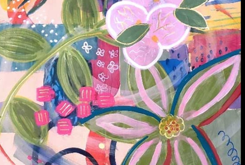
8. Adding Elements: Alright, it's dry. And
now I was thinking about, I want to make a kind of a
focal point on top here. And so I went through my
pictures because I'm always taking pictures everywhere I go of anything that I
think is pretty. And I thought that an abstract version of how these orchids
are kind of cascading down. So that's just the shape
we're looking for. We're obviously not going
to try to recreate that. But these shapes maybe coming from like so they
could come down here. I don't want to make them
come straight from here because it'll look too
symmetrical with that. They could also just
kinda come out this way. Let's see, I'm kind of drawing
with my fingers going, do I want it here? Or here? I think I
want it up here. Maybe coming like this
in this direction. So I'm going to take, since I'm gonna do,
I'm gonna pink. A cool pink doesn't
really matter as long as, you know, I stay in
the same family. And I'm just going
to sketch in this, you know, this kind
of shape like that. Remember this is a Neil colors, so it doesn't really matter if we need to remove any of it. We just add water and remove it. It really kinda like figure eights are loose
interpretation here. Vary the size a little bit and
overlap them a little bit. Maybe have this
one go like that. Since they're gonna be layered. All I have to do is think about which one do I want on top? So I'll put these below
and then we'll go adding them on top. Might have to let them dry. All right, so I'm just
going to make it pink. This is a color called carmine. Red will work. I just want a cooler pink. So you may, if you want
to cool pink also, you may want to add a bit of
tiny bit of blue to your, to your red and white. Let's see here. Which way do I want to use? I'll just use the clash. Could use acrylic gouache, I could even use Jericho. See so easy to put too much color when
you're mixing with white. It's pretty it kind
of goes with this. All right, so we said
we're going to start here loosely following my drawing, my sketch. So I let that dry a bit and
then I'll just continue. I'll I'll put the next
one on top, let it dry. Next one, next one. But I'll speed it up so you don't have to sit and watch it,
dry it with me. Okay. So while that dries, I'm what I did is I I'd have a little bit more weight
with each same color, but just a little
bit more white with each pair of petals. Just to give a little
bit of dimension and to make these appear
further to the front. So that's got to dry before
we do anything else to it. And I was thinking that this branch of
leaves needs to be more. It's just kind of faded
and let the purple. So I'm thinking about what I
wanna do to bring that out. Thinking about either
another layer of paint, which is probably
where I'll start, and then possibly
some oil pastel. Color wise. The green is fine, but I think I'd like it to
be a little bit brighter. So I'm going to
reach for kind of a lime green color and just brightening
it up a little bit and then maybe bring in
some of that lime green. This is where I start departing from our inspiration piece. He just always your right
artist's discretion getting a round brush.
But that lime green. A very intense color by
Turner, cold, fresh green. So a little goes a long way. Can also make a lime green by doing yellow with a tiny bit of green. But you want to use
a lemony yellow, not a, not a dark yellow. You know, I'm not a gold. That'll get you a pretty green, but it'll be more
like a olivine color. You can see how I've got water
mixed in and this is just, I'm very bright. Like that. It's making me want
to bring a bit of that into these petals. I could either outline
them or I could just do like a little thing to imitator, a little stamen in the center. Just to, they have of bright. I'm feeling the urge
to put some of that here with some white
belt because it's, let's knock it back a little bit with some of those peach. Just to reduce the intensity. I think I'm going to take
some over here. Let's see. Use it to change. It'll have the effect of changing some of those
Navy Leaves to look like green. Once it dries. It's interesting. This is
the process is experimenting and paintings don't just usually magically come
together will after, if they do, it's after
a lot of this kind of, especially something like
this where I'm trying to recreate something that
was created in Procreate, which is a fun, just an
interesting challenge. So it's just a great way
to learn about creating an effect that you
want to create while also creating an
entirely new painting. You know, and what's
the composition like? And does it work? I still feel like
it suffers from me. Oh my I still goes here, here, here and here.
Which is okay. I mean, it staying
on the painting. But I'm thinking about do I want to change the focal point? And I think once this dries and we can do
more layers with it, we can make it more, especially right in here. We can sort of decorate
these and bring out actually it's dry enough. We can do a
little bit of that. Can do it with some white. Let's get some, let's try some weight marker,
see if it's going. Now. It's kinda fun. And so I could do a really
refined line where, you know, to kinda
imitate the veins. It's, it's interesting in these abstract
compositions to have something in them that
has finer detail. That seems like a kind
of a juxtaposition. And these are, these
beanie lines in here. See those beanie lines. So let's try those and
see what we think about. Do I want them to wait or dark? We'll see what
shows up the best. Let's see if the weight
doesn't show up, then we can especially
doesn't show up on the marker. Pen
doesn't work, right? Why did they make
those work so hard, these white pens, this one seems like it might be on its way
out of ink, but it's full. Let's see. Another one. Gold or silver to Alright, I did some
white outline. I did these veins but not in all of them just to
kinda bring them forward. And I made my way outline
softer toward the back. And now I think it would
be fun to pick some of these leaves and paint something bright over them
and change their color. So I'm thinking about what
color I want that to be. Well, it could be something
bright or it could be white. Well, we can try both and
see a movie like maybe an opaque. Let's
try to correlate. This is opera read, they're
very close, very similar. It's got a fluorescent
quality to it, but not quite as right. Definitely makes things pop. I think some of it
would be nice. In here. It also been eating
something more here. So let's do some marks
in the center of this. I like with active. It's kinda makes it
interesting because you don't know whether these leaves are on top or below those layers
are kinda what's happening. Now I think I just want some
nice bold square shapes. Maybe right in here.
I don't know why, but these kinds of shapes
just make me happy. And I think we're at the
stage where we can do dots. You know, the, some of
the smaller decorating, finer details. So think about where I want to put some dots and
that's maybe right in here. Going to fully
saturate my brush. Make sure that my
pink consistency is fluid but not drippy. Okay. I really think it started coming together when I added the opera, read, Chandra and I took it and just made a line around
some of the elements. This is a good point to
stop and stand back. I think that when I do that, I still want this more faded. So I'm going to
hit it with this, the ivory posca, and
then we'll let that dry and I think we're
pretty close to done. Okay. Well, every time I say
we're pretty close to down, I find more things to play with. Just playing with the layers on those leaves and bring
them forward and backward. But I could keep
doing that forever. I think it's time to
walk away and let things dry and come back
with fresh eyes and see if there's anything that
this composition needs.
9. Finishing Finally!: Alright, I stepped away. I let it dry and I'm, you know, I'm glad I'm working through
this with you because I want to show you how you work
through challenges. And I knew, we knew
this was gonna be a challenge with the
procreate painting. But I wanted to show you
the dry brush technique and I'm giving it a
little bit of space. What I wanna do is knock back
this turquoise a little bit and come over some of these
leaves with sort of a green, a green color and see, this is the only part
that's bothering me now. So that's why I'm focused here. So first we will
knock back some of this turquoise just because I think there's too
much competing here. And of course, when someone
sees this finished painting, you know, I remember this
when you're working. They don't know what you went
through to get it there. You don't see all that they
don't care about all that. You know, they're just
enjoying the finished product. Some of my best paintings. I've taken the time to just
work through their issues. Remember, dry brush doesn't mean that the brush is actually dry. It just means that
there's very little water and just some paint. Okay. So Dr. For this green, I want kind of an olive green, which means a warmish screen. I want it different than these, but also not contrasting. So that's just going to mean kinda mixing and till it feels like the color
I'm looking for. The reason I felt like green is if this was feeling a little
red, white, and blue, these were pink, but
on top of the blue, they, they read as red. So it's feeling a little
American flag to me. Nothing wrong with that, but I don't want it
in the painting. So I'm gonna just try
some of the green. There's so many
plants in Florida, they're just like this pink
flowers or rather leaves, Navy part of leave his
navy part of it's pink, yellow, all kinds of colors. It's liberating and you know, to be reminded that you don't have to make
all your leaves green. We know that when
we look in nature, but we forget
sometimes when we're painting a bit of yellow, just varying the
color a little bit. And see what I get lost
in my studio for hours. But it's the only way
that I know to get better and learn and develop. His is I wish I could remember her name and artists I heard say is hired is about creating
problems and solving them. So you gotta get in there and create the
problems and solve them. To just some. Some lines here and
this looks angry, getting more green under here, but it's pretty want to make
a bit of a turquoise green and do kind of a suggestion of leaves
around those organs. So I'm just adding
a little bit of turquoise to that green. I couldn't make these less representational in
terms of petals. And I could make
them just a square, a blob and very loose. Nothing wrong either way. It just kind of, I think
it's kinda interesting to have the juxtaposition of very
non-representational things along with things that are a little more representational. Meaning that they
look like the thing. This looks like a paddle. All right. Time to let it dry. I had another, you know, walk away and come back. And it takes a lot of determination sometimes to get
these where you want them. But I have some ideas. I want it to fill in these leaves because it's just too distracting the
way it is to me. I want to take this new
color crayon and just bring a little bit of texture
to these and definition. At least for some leaves like that. And when you do the same thing for
these leaves will move. Try this bright green.
See if it shows up. If not, you can use paint
or a lighter color. This is a step below
pastel pencil, so it will be very chalky and I'll have
to spray fixative. But you could just
use a colored pencil. I just grabbed this
because the color when I was looking for
okay, I like that. So let's fill these in. And then I also want to do this. Now. These little white dots
got kind of disappeared. Okay, now I'm gonna do some gold pen highlights here and there I
have some ideas. I like to do minds
through some of these, sometimes going every which way. Alright, I'm gonna proclaim it done, I'm going to sign it. And I like the gold highlights. I went through and did
some of the veining here, but less, less
painting than here. Just to differentiate. Got some gold stems
and gold bits. And overall, I think it was a great learning about pushing
back and moving forward. Is it my favorite
painting I've ever done? No. But there's some parts I
really like that are great. Um, and this is what
happens when you paint. You'll find that every
painting you do, if you just push through,
you will learn so much. I really like this
area in here, a lot. Right in here. I like this. I'm still not in love with that. But I think it was
a great exercise. And as usual, probably when
I walk away and come back, I'll say, yeah, I like that
better with some time. So just be patient
with yourself and know that every painting
you're not going to love, but you're going to learn
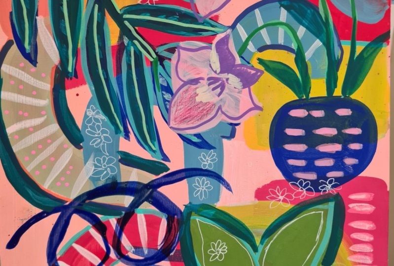
if you stick with it. Okay. Let's go to
the next project. I just wanted to show you that after saying it wasn't one
of my favorite paintings, I brought it outside
and he came to life. The lighting in the
studio is only so good. And I just love how it
looks against these plants. And just the gold. Really pretty and
it just is much more vibrant and
saturated here outside. So I'm really glad we stuck
with it. I think it's pretty.
 Suzanne Allard, Landscape, Floral, Abstract Painting Teacher