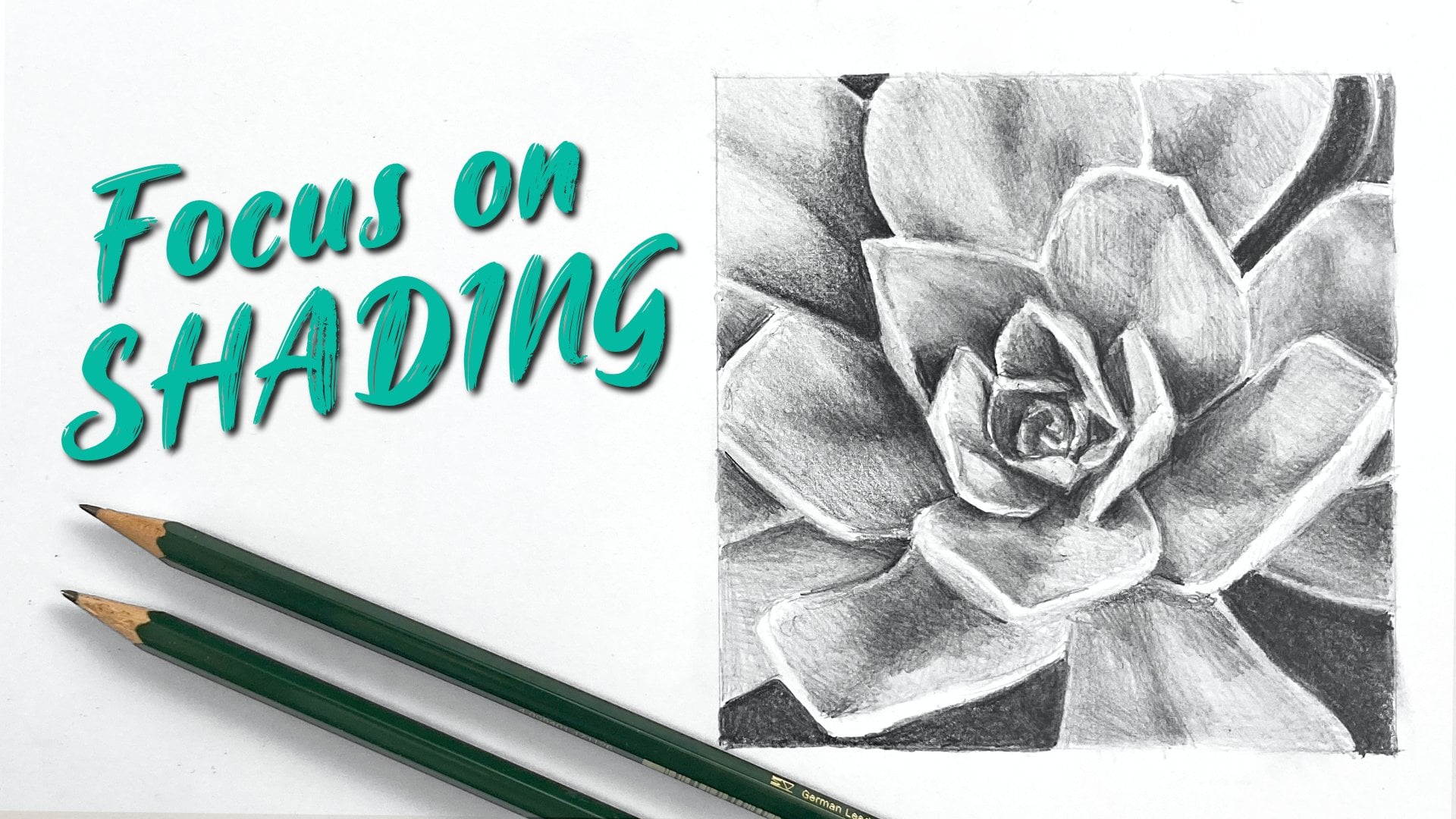
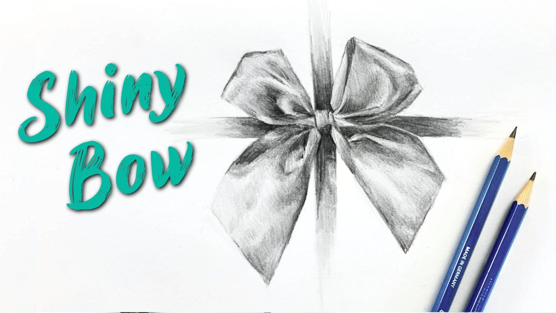
Transcripts
1. Introduction: Hi there, and welcome to the
Skillshare class. I'm Emily. I'm an artist from New
Zealand, and in this lesson, we're going to learn how to
draw flowing folds of fabric. And it all comes down
to two key skills, which we'll focus on
throughout the class. Number one is identifying
really subtle value changes, and number two is
being able to shade those subtle differences in
a smooth and controlled way. Start off with a quick
warm up exercise to get your eye used to the shapes that fabric makes
when it's folded. And I've also included an optional shading
exercise just as a kind of practice run if
you feel like you need it before we jump
into the main project. For the final
drawing, we'll focus on building up values gradually and paying close attention to the subtle transitions
between light and dark. Those transitions are
what's going to help create that flowing
effect of the fabric. Unfortunately, there's no
quick fix for creating a convincing three D
illusion of fabric folds. It just takes time and patience. But I'll share some
tips as we go along, and if you stick with it
and trust the process, I think you'll be impressed
by what you create.
2. Materials: For the materials,
you'll just need your basic drawing supplies, including light and
dark graphite pencils. I'll be using a two B and a six B pencil
throughout the class, but you might also want to
have a lighter pencil on hand, like an HB or maybe
even a two H, if you find that you can't draw light enough lines
with a two B pencil. We are drawing white fabric, so for the light edges, we're going to want the
lines to be pretty light. You may also need an eraser. I'm using a party eraser and
a Tombo monozero eraser pen, which helps me have a
little bit more precision. But if you don't have
either of those, any eraser will do, hopefully we won't be doing too
much erasing anyway. Some point, I'll be
doing some smudging to get a smooth effect, and I usually only do
a really small amount. I'm just going to use a
piece of tissue for that. If you want to smudge with
blending stumps, you can, but just use them
sparingly because overusing them can lead
to muddy and flat values. And of course, you'll
need your sketchbook. I'd allow yourself three
pages if you're going to do both the warm up exercises
and the drawing project.
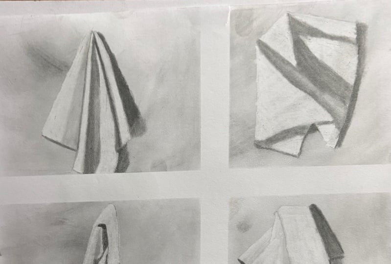
3. The Project: The project for this
class is to draw one of the supplied photos
of fabric folds. Now, you can follow along
with me using the same photo. You're welcome to choose one of the other ones if you
want more of a challenge, or maybe you can do one of
those for practice afterwards. Now, our aim is to get
a three D effect with nice smooth shading and to create flowing and
natural looking folds. And I'm going to show you how to do that in just a moment.
4. Exercise: Sketching With Construction Lines: Drawing folds of fabric can seem overwhelming because there's
so many random shapes. So we're going to start off
with a low pressure exercise to get used to the shapes
and angles that we can see. We'll be using construction
lines for this exercise. Construction lines are light and loose and
mostly straight lines. This is a warm up exercise
more than anything else, so don't worry about your
drawings being perfect. Ideally, your lines
will be light enough that you might not
even need to use an eraser, since you can just sketch over top of any lines that
you want to change. This one is definitely
about practice and not about perfection.
So just have fun with. So I have the
selection of fabric, folds and shapes, and
we're going to draw those over here in small
versions and quite quickly. So the idea here is that we get a sense of the
shapes and the angles, but we don't produce
a finished drawing. And actually, we want our
lines to be editable. So that's why we're going to
be using construction lines, which are light, loose lines, and you'll see me moving my hand a couple of times
in the direction that I want to go so we can hold the pencil a
little bit further back. We let the hand slide
across the page. And we draw light enough that we can change the
drawing as we go, so you shouldn't need to
erase your drawings too much. And for each one of
these, we'll also add in a small amount of
shading just to show the light in
the dark areas. So we're not going to
get into the details of the transitions just yet. We're just figuring out, well, where is the light
hitting and where is the shadow being cast
from those folds. Put these each up on screen. You can download
this and print this out if you like, so you
can have a closer look. But otherwise, you
might want to just draw from the screen because, like I said, these
are not finished drawings, just quick sketches. I'm using a two B pencil, but I'm going to
use it quite light. And just for my purposes
to keep things on screen, I'm going to divide my page up into four, but you
don't have to do this. Just make sure they're
small enough that you can fit four of
them on the page. So here we go with
the first one. Remember, light, loose lines. You see my hand moving
across the page. Put in the angles at
the top, the side. And then we can
look at each one of these shapes or these folds
as individual shapes. You'll see that I'm almost
doubling up on each line, and it's for two reasons. One is to get an idea of
which way my hand is going. And so I might make subtle
adjustments to that. If I see that my hand
starts going off in the wrong direction,
then I can adjust. And also so that I'm keeping that same loose
feeling of drawing, rather than getting
down on the point and moving slowly along
a single line. I want to keep things
sketchy and editable. So what do I mean by editable? Let's put in this shape here. Say I bring this out too
far, so it's too big. Then I can go over top and just draw
in the correct place. And I realize this
is quite light, so let me just
draw a bit darker, but I want you to keep your lines as light
as you possibly can. Because light lines
are editable lines. And that's what we want at
this stage of the drawing. Let me just quickly
darken mine up. That's the main shape now of that particular
composition of fabric. If I want to, I could put the shadow in and that
would be even lighter. From here, you can
make any corrections. So if you see something that is really obviously
out, then change it. If it's just a little bit
out, I wouldn't worry. I can see that this
is quite long. You know, it comes right down to this fold here and in the photograph, it's
a little bit higher. So I could just edit that now. And if your lines are
lighter than mine, which they should be, then this would just
sort of disappear once we put this one over top, this becomes more dominant. And then what we're going to
do is put in some shading. So I'm going to look
for the main sections of shading first, the main shapes that I can
see and sketch those out. I can see a shape down here. And then I'm just
going to fill that in. So it doesn't
really matter which direction you're
shading is going in. It's just blocking
in the dark areas. You might see some
things that need to be edited as you go along, see another little
shape just in there, and maybe this angle
needs to change a bit. But I'm not being
precious about it. So small errors, small proportional errors
are not a big deal for this. We're getting a feel for it. Put in this dark side
of that fold there. Let's come over here. We can see a light side and the dark side. The dark side doesn't come
quite halfway across. I'm going to keep it
closer to this edge. This one here, you could even sketch these
lightly in first, the shapes of shadow
comes up like this, and that's gonna be fit in. And as you're doing this,
you might notice that there's more subtle
variations of value as well. So in here, there's maybe
three different tones. Actually goes a little bit
lighter and then darker. We're not worrying
about that for now. We're just putting in the
blocks of light and shadow. So I've got that down, I can
go even stronger in there. Just looking for the
darkest parts now. Now, this has given us light, middle, and dark values. And the last thing we can do with this is have
a look at some of the edges and decide if we want to make
any of those darker. Now, some of this comes
down to experience. So knowing that
things that are lower down or have a shadow edge, things at the top,
we want to keep those quite light because
the light is hitting them. But you can also look
at the photograph, and you can see that this
shape of shadow here, it literally has a dark edge
to it, so I can put that in. Maybe there's a little bit here, and even this one
I could darken up. It's not a dark edge, but I know there's a dark shadow
underneath it. So it can be a dark edge,
gives a bit of weight. Maybe this one here
can darken up. And if you needed to, you know, if you had very
dark lines up here, then maybe you would
just erase those edges slightly to give yourself
the light edges at the top. Or, you know, say this one here, you want this to be
very, very light. You can push that
back a little bit, but I don't want you to
be erasing too much. So that's the first one. Let's
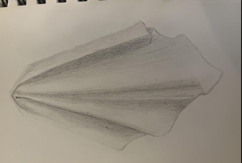
move on to the next one. This one's got some really
strong triangle shapes in it. I'm gonna pick out
the first one, that one right at the front. And again, I'm going
to draw quite dark, but keep yours light. So this is how light
yours should be. You might not even be able
to see it on the screen, but I'm going to darken mine up now just so that you can see it. So there are some subtle
changes to this edge. I'm not going to worry
about that just now. I can put that in soon. But first, I want to
get the main angles, shapes using construction lines. So you think about
constructing a structure or a framework or a skeleton
for your drawing first. That's what we mean by
construction lines. It's triangle shape in
here where it folds under, and then there's another
triangle shape there. Although we're not
measuring proportion, you can still use your
eye to compare lengths. So this is what I'm
doing all the time without even thinking
about it really is I'm looking at this triangle and I'm looking at this length
compared to this one. This one is longer,
this one is shorter. Same here. I'd look
at these three edges, and I can see just
by doing that. Now that my initial gauge of that triangle is not correct because all the edges
are about even. So even though I'm
drawing one edge, I'm also looking at other
edges or other distances. And you could do that,
too, if you can. If you can't about it,
comes with practice. And if you can't thing
to do is once you've got this first structure down is now to do a little
bit of analysis, make a few changes, edit
these editable lines. So I'm editing this
edge down here to give it that shape that
it has in the photograph. Maybe this one has a little
bit more of a curve. Giving me a quick
look at the angles. This one's a bit more straight up and down in the photograph. But, you know, it doesn't
have to be perfect. And I can see that, you
know, mine is a little bit taller than the
photograph, that's okay. Now we're gonna block in
those shapes of shadow. I tend to choose the darkest one first or the
strongest one first. So see this one here
is nice and strong. We're gonna block that in. Mark them out very lightly
first if you want to, and then just block them in
with some quick shading. If there's any big white
gaps between your shading, just go over again.
But very quickly. Some of these areas
are subtle values. They're not necessarily light or dark. They're
somewhere in between. So you have to make a decision. Are you going to add that to the light side or the dark side? So here I've decided
that this area, which is quite light, I'm still going to put
it to the dark side because it's a shadow. There's shadows
under here as well. In fact, most of this
will be in shadow, but, you know, leave a little bit of light
at the tip there. This one also is in shadow, even though there might be areas that look light in there. And then maybe even
on this front one, you can see some areas that are a little bit more
subtly in shadow. So there's something
here. A value here. I'm going a little bit
lighter this time, but it's created by a bit of a dip in that
front triangle there. Right, we got all of
the values in there, maybe you can you know,
the subtle one up there. Look for the lights
in the darks. Now, what have I
got going on here? That's part of the dark shape. If you want to put
a bit of the shadow in You can do that
the cast shadow. Just keep it lighter and looser
than the subject shadows. From here, finding your
very darkest parts. This is a little bit like
doing edges, as well. A lot of those wool be
edges, darkening them up. And looking at the edges,
where are you going to add some dark edges? Just give it a little
bit more depth and impact through your line work. So it's not only values and shaded values that
will create depth. It can be the quality of your line as well as
your line light or dark. We don't want a dark line
where there's something quite subtle or where
there's light hitting. So up here, mine's probably
a little bit heavy, but I started with dark lines. So you could see
what I was doing. If you started with light lines, you'd probably leave
that as it is. Down this side here, maybe we go a bit darker
because there's a shadow. So there's a little
bit of intuition in terms of where to add
those dark edges. But generally, edges at
the bottom will be darker. Not always, not a
hard and fast rule, but generally because there's
more shadow down there, so there's shadow here, so I
can make these dark edges. This one here, right
down the bottom here, you can actually see
a dark cast shadow, which is almost like a line around it, so it can be darker. Moving on. We're
going to do two more, and now that you've
got a feel for this, we're going to move a
little bit more quickly. So start by sketching
out the shapes. Look at the angles. Think about how they compare to vertical. You know, are they just
slightly past vertical or are they more
like 45 degrees, and we're looking at the
shapes that we can see. This one's a little
bit trickier. I'm just going with what
catches my eye first, so I saw this kind of like a upside down V shape,
putting that in there. And then there's this
triangle shape that comes across from inside that fold. So even though
there's curves here, I'm treating them more like straight lines than
curves because it's easier to draw
straight lines, the angle of straight lines than it is to measure a curve. So there's a bit
of a curve here, but I've broken it up into
straight lines where I can. Keep the hand moving. Keep the lines light. Now, if you got to this point
and you see an arrow, something draw over
top, adjust it. Don't rub anything out unless it's really going
to be in the way. Blocking in the dark
shapes that you can see, sketch them out first
if you want to. I start with the darkest, but I am also considering a slightly lighter shade
as well for some areas. Now, here is an example
of a very light shadow. But it's still important
to put in there. So when we put in these shadows, whether they're light
or dark shadows, it then creates the highlights. We those. We need the
dark to create the light. Down here, there's a
triangle of shadow where it folds over and inside. Here, there's a shadow, and then going through and
putting in some darker lines. Again, not pushing down at the tip and doing
a long slow line. You're just pushing
a little bit harder, but you're keeping
your lines loose and energetic, I would say. They might have a little flicks. Just makes them a little
bit more interesting. What's going on here? Yep. It's easy to get a little
bit lost. And last one. Drawing the shapes that
stick out to you first. Thinking about the angles. Are they close to
straight up and down? Are they close to horizontal? This one here, you can think
about one along the top, how close it is to horizontal? Using that loose, light, editable line that you
can change as you go. So decided the angle
wasn't quite right there, so I've just adjusted it
without rubbing anything out. Putting down, the
start of a line with a loose and a light touch means that you can
see where it's going and you can
adjust it before you finish that line,
you complete that line. You can make the adjustment
then and there as you see something that
is not quite right. So here's a little bit tricky. I've got all the angles in now, darken those up a little
bit so you can see them. I've got to put this
one in as well. Then just here where this
angle and this angle joined, there's a bit of an S curve. If you can, try to break
it down into angles. And same as we did
with the other ones. Now we're going to block
in the shadow areas, find something that
stands out to you. This one here is pretty dark.
It can all be in shadow. Anywhere where there's no white is a shadow area, basically. This one's also very dark. There's a shadow area, and here starts quite
strong down the bottom, then it fades out. But the white is only along this edge here
and maybe over here. So technically, all of this would be in
some kind of shadow, but we're going to
work on that more when we come to
the final drawing. And then choosing
where you're going to emphasize some of those
dark edges or maybe it's very strong strong folds or strong changes
in the direction, but make sure that they're dark. So down here could be
somewhere that you emphasize because nice and
strong and dark in there. And then I'd emphasize this one, where it outlines that dark
shape, but not all the way. I'm just darkening
this bottom edge, not this top edge
because that top edge belongs to a very light area. Try not to think too hard about this about putting
these dark lines. Just let your eye move
around the photograph, and as it's moving
around the photograph, your hand is also
moving and you're just picking out any of those areas that seem like they
should be heavier or darker. Any of those edges. So I hope that's given you
a good feel for some of the shapes that we
see in these folds of fabric and also how to use construction lines to edit
your drawing as you go. And hopefully, it's given you a little bit of
a warm up as well. We're going to get going
onto the protect soon.
5. Optional Exercise: Shading A Transition: This is an optional exercise
to show you the steps for achieving a smooth gradation or blend between
different values. And that's what
we're going to see when we're looking at
these folds of fabric, a smooth transition
from light to dark. Now, if you're confident
with your shading or if you've taken other
classes or courses with me that have covered shading smooth transitions
from light to dark, then you're welcome to skip this exercise and get
onto the main project. But if you're feeling
a little bit unsure, stick around and we'll go
through the process together. When it comes to
shading these folds, what we're aiming
for is something nice and smooth
that feels rounded. And the key to that is getting this smooth
transition in here. So the transition is where it
changes from light to dark. We need to be able to create
that with our shading. And you can see in this
photograph that you can't really tell exactly
where it changes. So that's what we're going
to work on in this exercise. How do we get something that
goes from light to dark without a hard edge in between? And it comes down to the
pressure of your pencil. Now, I'm going to be
using a two B pencil. If you find that you can't get a light enough mark
with a two B pencil, then by all means, try a
two H or an HB pencil. What we're going to do with
our pencil is rather than holding it in a
normal writing group, where you're exerting a lot of pressure down just
with your fingers, we're going to hold
it further back. So you're almost just resting
the pencil on the paper. You should be able to kind
of lift it up and then just let it sort of
drop a little bit. It's just touching the paper. We're not actually putting
any pressure down on it. And that's the sort of pressure that we need to be able
to shade very lightly, even with a soft dark
pencil like a two B pencil. So the pencil is just
brushing the paper. You need to hold it tight enough that you don't
drop the pencil, but not so tight
that you're pushing any pressure down onto the page. So nice relaxed hand, as well. So very quickly, we're going
to draw one of these folds. It's going to have a
long triangle shape. It doesn't have to be exact. This is just a practice
on. Don't make it too big. And then down here,
we're going to create a little bit of an S curve. So from here, it's
going to curve down and then up a little
bit, and then down again. And that's just to
help with the shape. To start with, when we're
shading these folds, we're going to look for
the light in the dark, which we've already done
in that previous exercise, and then we're going to
start shading in the dark. So even though I'm using
this as an example, we're not going to
refer directly to this. We're just going to
think about it having a light side and a dark side. So the light side is going
to stay white at the page. At the moment, the dark side, we need to shade in
this whole thing, but we want to try and
keep it nice and even. So it doesn't go dark and
light and dark and light. And you can do that by
shading in patches. The whole time I'm keeping the same pressure on the page
with my hand and my pencil, brushing the page with the
pencil, not pushing down. You can see it's a
little bit patchy, but I've kept the same
kind of pressure. So I get the same sort of value. You might be to shade
straight up and down, but it takes a little
bit more control. So I think these little
patches are okay. And we're not shading right
up to halfway because we want this space to be where we
create the transition. So we've got our dark
side, our light side, and then we're going to work on shading something that
goes from dark to light. And we want it to go
from dark to light. We want our pressure to go from heavy to light or what
it was to even lighter. So if we've got this pressure
for shading this value, then as we come across, we're going to
lessen the pressure until the pencil basically
is not touching the paper. It just sort of
lifts off the paper. So pressing down a
little bit and then lifting up so that it fades out. So essentially, what
we're doing is, I do it quite hard here. I'll push quite hard
so you can see going dark and then lessening
the pressure. You can go from light
to dark if you want. You can start very,
very light and then push a little bit harder
as you go across, but it's a bit easier to start dark and then lessen
the pressure. Obviously, we don't want
to start that dark. We want to start this dark. So getting that same kind of pressure, just
brushing the paper, and then lessening the
pressure as you come across. In this area where it
transitions into the white, we can work on that a
little bit as well. We've been using up and down
in this exercise so far, but you could also use
just little circles, very small circles,
barely touching the paper to fill
in any little gaps. So now we've got
almost a transition. We've got light, and there's maybe a little bit of a
line there. That's okay. Put just a few little kind
of feathery marks in there to blend this light
into this value. Now we can add another layer over top, and we're going
to do the same thing. We're going to go dark. And then lessen the pressure
as we come across, and it should just fade into that value that we
already had down there. So each time I'm doing this, I'm trying to get the same
amount of pressure so I get the same
value and trying to lessen off the pressure in the same amount
and at the same time. So you could be going
this way if you want to light and then pushing
a little bit harder, light, and then pushing harder. And you might end
up with something a little bit patchy,
that's okay. As we go through the exercise, I don't want you to
worry about patchiness or graininess of your paper. What I want you to think
about is the general value. Have you got light,
middle, and dark? And have you got a soft
transition between them? Patchy is okay, but we
don't want a hard line. So if you had something like say this is sort of a
middle gray value, and then you have a
dark value over top, if you've got a hard
line like that, you're never going to get
that softness of the fold. Anywhere you do end
up with a hard line, maybe because you had a patch that was a little
bit too strong, you can use those small circles. And the small
circles, I'll do it a bit bigger over here is literally circling your pencil on the page. I'm
doing very dark. I'm still keeping the side of the lead on the page
as much as I can, holding it a little bit
further back than normal, and you can again
control the pressure. And you end up with
little white gaps. You just keep
working over top of those to fill in the white gaps. And the nice thing about
this one, it doesn't have, you know, a direction. Sometimes the direction of your shading can
create kind of like edges or planes or sides
that we don't actually want. We don't want anything
to feel hard or like, it has a corner in this. So those little circles can
be really useful, as well, going over anywhere you want to blend the light and
the dark together. And you could keep
building this up. So if you wanted this
to go even darker, you do another layer
and another layer. So we build it up in layers. But we also work on
controlling the pressure of the pencil as you're coming
into the light area. From here, if you wanted
to, you could give things a little bit of a smudge just
to smooth out any marks. Now, we won't do this
until much later in the drawing we've got all of the values
in the right place. But you could start
at the light side and very lightly just blend across or smudge
across with that tissue. You see, you get something
nice and soft now, only a couple of swipes and then leave
it because the more you scrub around with this or a blending stick
or blending stump, the more gray you're
going to get. We don't want gray. We want
light to middle to dark. When we move on to the
project in a moment, just remember those key things, the pressure of your pencil, how much pressure you're exerting on the
tip of the pencil. It should just be
resting on the page, not being pushed
down into the page. And that might take a little bit of
getting used to if you haven't shaded or drawn
like this before, maybe on a scrap piece of paper, just move your hand around
and let your pencil make some marks and try and keep them as light as possible so
you can barely see them. That's the sort of pressure you want to be able to achieve. Not all the time,
obviously, because sometimes we want to go
a little bit darker, and we can push
down a little bit, but we need to be able
to go as light as that to be able to get
these transitions. Right. Let's get on
to the main project.
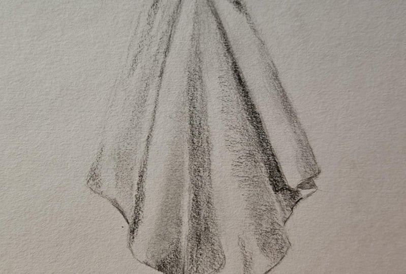
6. Starting The Project: Okay, I hope you're feeling
warmed up and ready to go. We're going to get onto
the main project now. I'm going to have the reference
photograph on screen, and I'll make it fairly large. But if you've got a
printer or another device, it might be a good idea to
download the image or print it out just so that you can take a closer look
if you need to. There are four different photos
that you can choose from, but you might want
to follow along with me for this project first using the same photo and
then use one of the other ones for
practice in your own time. And I think that's
where a lot of drawing improvement happens
is when you're having to apply the skills that you've learned on your own
in your own time. We're going to start in
exactly the same way. I'm going to go a little
bit bigger for this one, probably about the size of my hand and just put it in
the center of the page. I'm starting with
a two B pencil, I'm going to draw in
some construction lines. But if you are doing this along with me and you know that
you're heavy handed, maybe you go to an HB pencil, maybe even a two H pencil just for these
construction lines. We want them to be editable. We want to be able
to change them as we go without having
to rub them out. So remember a light touch on the paper and moving your
hand to get an idea. Los like you're
ghosting line first. Maybe you make a
start of the line, get an idea the
direction it's going, and then finalize it by finishing it, but
keeping it light. I'm not even worrying
about measuring this, but if you wanted to, you
could put a top and a bottom. If you want to try and
keep it on your page, I'm just doing it by eye and if it ends up a little bit
bigger than I said, bigger than the size of my hand, I think it's going to,
then, that's okay. Think about the angles compared to horizontal
and vertical. So as I draw this one here, I'm almost imagining, a straight line coming
down, a vertical line. And what does this line
that I'm drawing now? What's the comparison between a straight line and this line? When we come to the bottoms
of each one of these folds, I'm not drawing in
the curves yet. I'm just drawing a straight
line across on an angle, getting a feel for the angle, drawing the structure
of that angle. And then we can put
the curves in later. No, this is quite light. I don't want to go too dark, even to show you what I'm doing, but I will for these areas I
know are going to be darker. Because if you have a dark
edge where it should be light, then you're destroying that
illusion of three D form. The D form is made up of a
light side and a dark side. Or three values, usually, you highlight a
midtone and a shadow. Just down the bottom here,
there's a little bit of a slight curve undrum just drawing a straight
line down there, just to allow for
that little gap. Here's a pointy bit
right at the bottom. Changing the angle
slightly of that one and just drawing over top, not editing, sorry, not erasing. I am editing, but
I'm not erasing. This line here is almost
the same angle as this one, I think, but going the
opposite direction. There's a little bit of a gap there that's going
to be quite dark. Then we've got this
final fold here. Now, I maybe going to have to adjust this angle at the top a little bit, just
drawing over top. Actually, this one on this side, we could break it up into
two angles, one, two, Don't worry about the
curves at the bottom here. Mine is almost just
like a zig zag. I've drawn in the
angles of those curves. So these are my
construction lines, my structure, my skeleton
for the drawing. Now is a good time to do
a bit of an assessment, flick your eye between
the photograph and your drawing and just
compare some of those angles, see if any of them are out. This one here is pretty good because it's almost
straight up and down. I wonder if this needs to be
just a little bit bigger, a little bit more of an angle. But don't get too caught up in it being absolutely
perfect because the main goal of this project is to work on the shading and to get
that illusion of faults. So I've made some adjustments. If you need to, you can rub out the lines
that you don't need. You notice I didn't
rub them out first. I just drew over top. And then I can rub out what
I don't need afterwards. Otherwise, you run the risk
of, you know, rubbing it out, and then you draw it again
and you rub it out and draw it again because you don't have anything to compare to. And I'm also just
going to lighten up the top touch just by dabbing it because it's a very light
edge at the top there, and I don't want it to
feel heavy with a shadow. We could put a shadow in
the side if you want to, but I think I might wait to the end and maybe not even
put it in because I don't want to interfere with what
we're going to achieve with the folds themselves. Let's refine the
shape a little bit. So this angle down here, again, just drawing over
top to start with, if you've drawn light enough, you might not even have
to rub anything up. I've just put on that S curve. For that angle and then
there's an East curve, yeah, an est curve for this
angle down here as well. It's a little bit more subtle, but just rounding
off of the corner there and a rounding off of this corner and a
rounding off of this corner. And then this edge here
has a little bit of a upswing in it, and then a round
edge or curve here. This one here is an S curve. And then quite a
sharp turn here, but it's still a rounded corner. And same here. Sharp turn but a rounded corner and a little bit of an S
ben there as well. So those S bends are
going to help show the shape of the folder fabric, the way that they're
curving up and over. And if you have a look
right at the top here, there's a little bit of a kind of an apostrophe
shape curve over on itself. I might have to bring my top
edge up just a little bit. Because there's a
triangle that sits on top of that apostrophe. You know, you go to
try and keep track of all these folds of
fabric and these lines, make sure you've got
everything joining up in the right places. So this triangle up here joins into this
fold over onto the side. And this curved o
apostrophe shape is part of this fold here. And then there's a dark
area between them, like a crevice between them. So I've got the
construction down now. I'm pretty happy with
that. Mine is quite dark. I'm going to leave it dark just so you can see
what I'm doing. But the lighter you have this, the better because
we want these edges, you know, this one,
this one here, anywhere where
there's a highlight, we want those edges to be
as light as the value, which is white, basically.
7. Beginning The Shading: So now what we're
going to do is we're going to work our way across, putting in the
lights in the darks. We're going to do a little
bit more work than we did in those initial sketches where we just blocked in the
dark very quickly. We're going to get a
sense of the fold, the transition from light to dark for each one
of these folds. And then we'll need to go back over a second time
and just balance things out because we
need to figure out, you know, what's
the darkest value and what's the lightest value? How do they all
compare to each other? Before I move on,
I'm just going to put in the shape of shadow here because it's just going to
help me keep track of things. There's a strong
shape through here. It's more of a cast shadow. There's this folder fabric here and it's casting a shadow
onto this one here. I want to just
lightly put that in. Just so I don't get confused. And then I'm going
to start shading. Let's shade in this dark area in here because it's going to
give us a bit of structure, gets thinner as we come
up towards the top. Almost just like a
single line right at the top there. Quite dark. And then we have this fold here that goes from
dark to light. But can you see right
in this area here, there is a slightly
lighter area, and that is where some light is reflecting off the fold next
to it back into the shadow, but it's not as light
as the highlight. So it's still going
to be shaded. It's still in shadow. It's still going to
be a shaded value. So let's just go through
and shade all of this. And when we do our
second layer of shading, we'll remember to
keep a little bit lighter area down there. Just blocking in at the moment, I'm using a two B pencil. Trying to keep a
nice even pressure for each of these patches. If you want to do the whole
thing, if you can do that, moving your hand up and down, then that's fine. Go for it. Notice how it gets
narrower at the top here, the shadow area and
wider down the bottom. So now I've got a light
ear and a dark ear. I need to transition
them together. What I want you to
be aware of, though, is just how dark the shadows are on white folds of fabric. The tendency is to
keep our shadows much lighter than they
actually are just because we know this is white, and we expect all of
it to be quite light. But usually the shadows
on a white subject, depending on the lighting, but usually they're at
least a middle gray. I've got this value finder here, and this is just a
way of convincing yourself what kind of value
you're actually seeing. I can take a little bit of
getting used to figure out, you know, which is the correct value
because we have to separate value and color. But if you squint, I can see that this value here is pretty
close to that one. This one here is actually, that's pretty close, too, so it's maybe between these two. This one here is
definitely much darker. This one here is
definitely much lighter. So it's somewhere between
that one and that one. And if I then look
at my drawing, see just how much lighter my
drawing is than that value. It's much, much lighter. So I know that it's going to have to go darker at some point. We don't have to go as
dark as the photograph, but it's that contrast that creates the illusion
of light and dark. So what I might do
now is just put it in an extra layer, go a
little bit darker. Still not going to
be as dark as this. It's still very light
compared to that. But I can darken
things up later. I don't want to go
too strong too soon, and you can decide later on how much you want to
darken things up. Okay, now we're going to put
in that transitional value, so going from here to here, light pressure or lessening the pressure as we move from the dark side over
to the light side. Using side to side,
but you can use small circles if you're finding you're getting too many lines. What we want to make sure we've got in here is the
highlight areas, and anything that's not a highlight area is going
to be shadow or shading. So what I can see
is the highlights, really just down here
is the brightest part, but I'm going to exaggerate mine a little bit and say that this area up here is
also a white area, maybe even this area in here. So we can extend the
contrast a little bit just for a stronger effect. So that means all of this
in here needs to be shaded, just a light value,
leaving the white edge. And even through here
needs to be shaded very, very lightly because
without shading this area, I don't get this white
area at the top here. And I'm sorry if this
is a little bit light. So now I've got ascent of that fold going
from dark to light. I'm going to come in
with my six B pencil. You could use a four B. And I'm just gonna go darker through the center
here because remember, there's a slightly lighter
patch along this edge. And this pencil is
leaving a few marks. So I might switch to
little circles here. Whatever texture or pattern
you have in your shading, whether it's lines
or little circles, once you get the whole
drawing finished, as long as you've got the
values in the right place, those textures don't matter. You can smooth them out
later if you want to, but try not to get caught
up in the fact that, you know, it's got lines in
it or it looks scribbly. What we're aiming for
is the correct values. So now I've got this
slightly lighter area on the inside that reflected
light from this fold. But I've got a bit too strong
a divide from here to here. So I've got to rework
my way along this edge, lighting, lessening the pressure as I come towards light side. It's a lot of patients.
We're actually going through this
fairly quickly. And I've got a lot more
to do, but this one here, I've slowed down a little bit. But this drawing, we're going to go through it fairly
quickly compared to the time I would spend on it if I was
trying to get it. You're really
accurate and taking my time to compare the values, what's lighter than
something else? Where are the white
areas? What's darker than white, is
what I should say. That's probably the
one thing that I find that students are drawing
fabric is that they miss. They'll have a lot
of white areas, and the only white areas should be the
highlights should be the brightest parts
where light is shining directly on
the white fabric. Everything else needs
to be shaded in. If you have big gaps
of white through here, if I hadn't shaded in this area, even with a very light layer, that then looks
like a highlight, and it's in the incorrect place. Okay, moving on
to this one here, we're going to do
the same thing. Maybe we can speed it up
a little bit. We'll see. I'm going to shade
in the shadow side. And if you feel like you need to put in a
guideline there, you can just so that you
don't come too far over. Remember, we don't want to go
over into that middle area, that transition area yet. We just want to put
in the base layer of shading for the
shadow side of the fold. Keep that light edge as
you come up to that, it'll fold it over
part at the top. As I do the shading, I'm making sure I fill in any
little white gaps. You don't want big white gaps. A little bit of pattern
is okay in your shading, but we don't want big
gaps between your lines. So we don't want any white
in there that's going to disrupt that value and make it seem a
lot lighter than it is or make it seem like
it's its own value of white, like some kind of weird pattern or sprinkle of light on there. So we need to block in any
of those little white gaps. I'm going to go a bit
darker now because I can see that it is way too
light compared to this one. This is my six B pencil. I actually wish I
had a four B pencil in this brand, but I don't. And I'm sticking to the
same brands because different brands have
slightly different gradings, and they have different
qualities on the paper. So I know that
these ones here are lighter and smoother
than this brand, but because they're
smoother and lighter, the marks can actually look
a little bit scratchier. The marks show up a little
bit more, shading patterns. So this is a nice tensil
that fits in between the brands and between the dark brands and the light brands. Notice the reflected light on the outside edge of that
dark shadow there as well. Can you see that
in the photograph, light reflecting off from this highlight bouncing
into the shadow here. It's not going to
be as bright as the highlight because it's
not being hit directly. It's diffused light.
It's come to this fold. It's hit that directly,
and then some of it's bounced over
onto this edge. And so we need to
account for that. And I'm going to do that the
same way I did this one. I'll just darken up
this part a little bit, leaving a light edge afterwards. So what we're going
to do now is work on our transition coming from this dark area into
the light area, side to side, lessening the
pressure or small circles, also lessening the pressure as you come into the light side. As we come up towards
the top here, there's only a fine line of light or white on the
left hand side of this fold. Everything else
needs to be shaded. Look for the white areas in
the photograph on that fold. Make sure those
are the only areas that are white in your drawing. So when I come down here and
have a look at this part, we need just a little
bit more white there. I've gone a little bit too
far over at the bottom. But on the other side of it, there's a little bit
of shadow there, it an area that's not white. So just check. You've
got your transition coming over far enough
into the white. Should be barely touching the paper as you
come across there. And then we can go ahead and
darken up this dark area, but leaving that slightly lighter edge on the
right hand side. So only shading darker
up to about here, not right over to the edge. I'm using small
circles with this one to help integrate it. Now, if you find that you
can't get the light edge or you've gone too dark
of the reflected light, you could use an
eraser to bring that. Lending that darker part now
into the middle area again, switch back to your other pencil if you need to your
two B or your HB, whatever you're using, you don't need to use exactly the
same pencils as me, especially because we're
using different brands, but also because we probably all have
different abilities, different pressure on the paper, and you need to use the
right tools for you. So I'm just looking at that fold now, looking at the transition, how far it comes
across and making a few little refinements. Bring this darker
value up through here. I don't think I've got quite
a light enough edge there, so I am just going to very, very lightly bring that back
without making it white. Maybe I need to
bleed dead on again. Then we're gonna move
on to the next fold.
8. Shading Continued: Got two more main folds to go, how are you holding up? I hope you are
feeling patient and you're in the right kind of head space to be able to do
this drawing some justice. If you're not, if you're
feeling a bit tense or you're thinking about something else,
it's getting in the way. Then it's better to take a break because shading like
this does take time. It's not the most
interesting part of drawing, but it is exciting to get that
three D effect at the end. So you want to do
it justice and give yourself the head space and the time to make it
an enjoyable process. This fold I'm blocking in
shadow on the right side here. I can put in quite a dark
line down here because I know there's a dark
edge of that shadow, so I'm going to put
that in just to give myself a bit
more structure. And then we've got this
strong cast shadow over here, which is a lot more
defined, which is great. Makes it a little bit easier, but I'm just going to
start with this one. Just put something
in there. So I can see where that light area in between these
two is going to go. I think there's even a
little bit of a shadow down here with a bit of
an angle across the top, which might just be a
crease in the fabric, I think that's creating just a little bit of a
change in the plane, and there's a bit
of shadow there. And then all of this
is going to be dark. Now, I think I've gotten
my angle down here wrong, so I just correct
that a little bit. Look at that shape
of light down there. It's almost like a diamond shape if we joined it up over here, but maybe this angle is
just slightly downwards. All of this can be shaded in. Maybe you're getting
a feel for this now and you can speed up
the process a little bit without worrying too much about leaving little
white gaps or anything. Get that rhythm going. Fill in the white
gaps if you need to. And then we're going to
darken up this dark shadow. Have a look at it
in the photograph. You can see some variation
in it. What have we got? We've got the light reflected light on this fold that
we've already done. Then we've got a dark gray. Then we've got an even
darker gray in the middle. So we can put that in. It's dark in all of this
up, and then we put in that slightly darker
gray in there. It's right in the
middle of that recess. And I think as it comes up
towards the light area, it's actually darker than on the other side,
especially in here. There's some light bouncing
off there, reflected light. So some subtle things
going on in here. I know that min is too
light over the shadow area. Let's have a look with the
value finder for this value. So, it's this one
here when I squint. This gray value and the value on the photograph pretty
much blend together. This one, I think is
a little bit light. So I'm going to say
this value here. Look how different that is. My drawing is way, way lighter than the photograph
in that shadow area. So even though I'm not
going to go as dark as this because that would
require a lot of time, I am going to go darker
than what I've got. Another thing to
consider is how dark is this compared to
these other values that you've already got. And it's definitely
darker than this value. It's definitely darker
than this value. So it needs to be darker than
this and darker than this. Shade all of this in remembering to keep
that light edge of the fold next to it. All I'm doing here is
just darkening up. I'm not even worrying
about transitions, darkening it darkening it
up with another layer. The edges of the
shadow are defined, but they are quite soft still. So we don't want a very, very strong edge or sharp edge like we
might have down here. We want to have a shaded
edge that feels soft. So this is an area that's
getting a little bit patchy. I fill in a few of
those lighter parts, but this might be an area where I choose to use a tissue
or a blending stump. If I wanted to smooth
that out a bit. Let's put in that
dark area in here. Blending it into the
dark area beneath. Some subtle things
going on here. I think there's a little bit of a darker value just there. A little bit darker
on the side, as well. Don't worry about those
if you can't see them. I was just looking at this area. Here in the photograph,
it seems a little bit lighter than
everything else. So let's work on the transition coming from the right
side over to the left. This one is lighter
than the other values. Make sure you get
a nice flat layer filling in the white space. Look for the white
of the highlight. So this area up here is
all pretty much white. I mean, it's not as white
as, say, this edge, but I'm treating it as
white because I want it to be a highlight for this fold. To show that as a
highlight for this fold, everything else around it
needs to be some kind of gray. Maybe down here I choose as
a highlight for that fold, as well, 'cause
it's pretty light. So everything around
that needs to be a gray and have
transitional values where there should be
transitional values. This definitely needs to
go darker on this side, but not by too much. It's down here. Using small circles, lessening the pressure as I come across
towards the white area. The light area. You can get a darker
value two ways. You can push harder, but you can also
layer up over top. So you can do several layers
using the same pressure, and that should give
you a darker value. A little subtle value down here showing the other
side of that curve. Comes right over to
that cast shadow and then disappears into
this light area here. So very very light pressure
coming down into there. This one here maybe needs
a little bit more work, maybe needs a little
bit more value. But I'm going to go ahead
and put in this one over this side and
then also add in this very dark shape
so that I can see how much darker this one
needs to go by comparison. So we've got a classic
fold here, dark side. Shade that in. There's a few little wrinkles
in the edge up here. I'm not gonna worry about
those, but you could put them in or maybe I'll kind of put them in as
I do the shading. A strong angle to
the shadow up here. And then a light side, so we need to fade the shadow
side into the light side with changing pressure as we come across or
do the same thing, but with small circles, finding a value in between
the light and the dark, and you will need to move back and forth between
them a little bit. So as you go towards
the dark side, you can increase the pressure. As you come towards
the light side, you need to decrease
the pressure. Just barely touching the paper, brushing it with a
feather light touch. The thing that's really going to make this light side stand out is this dark recess in here, and the edge is pretty sharp. I'm using my 60 pencil here, trying to get a nice
smooth edge to that fold, comes up the top here. I've got that little
triangle shape. So even though it almost
looks like a line, I'm still using more
of a shading mark than a single line because
it's not a single line. It varies. It gets darker
or thicker at the top and then a little bit thinner,
and then it gets thicker. So we need to be able to make
those little adjustments. We can't do that
with a single line. Let's just fill in all
of that dark shape. Then we can get a sense of
what we're dealing with, what we need to balance out once we've got this very
dark shape in here. A little bit lighter
as it comes down here. And there's actually a
tiny little highlight in this bend of the fold here, so I'm going to
leave that white. And between that
and the value we've just shaded, there's
a darker value. So I mentioned this edge
here being quite sharp. But the one on the other
side feels a bit softer. And that's telling me that this needs to be darker
because at the moment, there's too much contrast
between this and this here. It needs to be closer. So I'm going to go over
this dark side of the fold, get it closer to that
dark value in the recess. Especially down the bottom here, and then transition it into the value that
I had down for. So blending into the
layer underneath. I'm using my 60
pencil to do that, but barely touching
the paper with it. So even with a 60 pencil, you should be able to get
an almost invisible mark if you are barely
touching the paper. So no pressure down
onto the paper, almost raising the
pencil up a little bit, lifting it up as you shade so that it's just
brushing the surface. And now that I've
put this one in, I can see that this one here
also needs to go darker. Let's go ahead and do that. Let's put in this
darker shape here too, because we didn't really
go dark with that before. Works the same way. Is
this one thicker at the bottom, thinner at the top. There's a little
postrophe shape in there. So I noticed that I
didn't really have the light edge here of
that apostrophe shape. So to get that, I need to put the darker shading in next to
the light area. Remember, without the dark, you won't have the light areas.
9. Balancing Your Values: Just about ready to finish this off with some refinements, but let's put in
some dark edges. Now, this is optional. You don't have to do
this, but I think it just enhances the illusion
a little bit. So I'm putting in
a dark edge there because it is actually darker
right at the edge there. There's a little bit
of a darker edge here. So it's like an outline, but then I'm softening it a little bit with
a bit of shading. Maybe just here and where
else maybe in here. This one, I'm not
darkening it up so much as just cleaning it up a little bit, making it a bit sharper. So technically, if we
wanted this to look really, really white, all of the background would
need to be shaded. You have a look at
the photograph there. It's actually a gray compared to the white highlights. I'm
not going to do that. I don't expect you to do that, but I just want you
to be aware of it. That's the way that you'd get this really strong illusion. You could try something
like this on gray paper with black charcoal
pencils and white chalk, and then you'd have
a gray background, and that would be
really effective. I think I've got all of
the edges that I need. I've just noticed
that I'm missing a shadow shape in here. The back of that fold. And I'm not going to add in the shadow. I think it's just going to interfere with things
a little bit too much. It'll be a bit distracting. If you did want to add it in, just keep it like kind
of a sketchy feel. I would or at least
a blurry feel. It could be something
kind of like this so that it doesn't detract from
the detail in the subject. Okay, so we're ready
to refine things. Now, this could involve getting things up to
the correct value. Getting this up to uh, what's a value
five on this card? It's closer than
it was, but it's still a little bit less. It's probably 6-7 here. Don't worry about the numbers, but it's between
these two, I think. How do I know that? Because when I look at
this one, if I squint, I can see that showing
up darker inside that inset compared
to the surrounding. This one, it's about the same,
maybe this one, as well. Somewhere in between
these two, anyway. So it was supposed
to be this one. I could build that up
darker if I wanted to, but I think I've got it dark enough to create that
illusion of the folds. So do have a think
about your values. Your shadow values should
be a middle gray, at least. So if you isolate them
like this, you know, with your hands or something
and they look still very, very light, then you
definitely need to go darker. Now is the time to do some blending if you want
to do some blending. So what I'm going to do
is I am going to add in some subtle adjustments. I'm going to put in this darker part through the semter here. What else? Maybe a little bit
more shading on a little bit more variation up here and maybe through here. So what I can do before I do that is a little
bit of blending. I'm just going to use a tissue. I'm not going to
use bleeding sum. I think that's just going
to get smudgy and horrible. And all I'm doing is a couple
of strokes. That's it. And it just takes away a little
bit of that scratchiness. It's like you're brushing
crumbs off a table. So there's not a lot of pressure there. You don't
need the pressure. If you push too hard, you're gonna smush the graphite
into the paper, and you're going to start to damage the paper itself or
the tooth of the paper. So it's just a little smoothing out of those textures,
and that's all. Maybe do a little bit
more here and a little bit more in that dark one
because it got a bit patchy. But what that does smooths
them out, which is great, but it also dilutes your
values just a little bit. So I've lost that slightly
darker value in there now. It muddies things up. So once I've done that smudging, now's the time for me to add in those subtle things
that I was going to add before and also just bring back any of the
values that I've lost. So there was this dark
area through here. I'm just using gentle circles, and I'm probably gonna have to build it up in a few layers. Especially after you smudge, sometimes that does make the
paper a little bit harder to layer onto because you push the graphite down into
the tooth of the paper. And this doesn't have
to be super strong. It just needs to be slightly darker in there.
That's pretty good. I go darker in here. D't know how I
missed that before. And it gets a little bit
darker through this part. I think the right side of this recess here is darker
than the left side. So essentially, what
we're doing now is we're looking at the values
that we've already got, the darks and lights
and the middles, and we're breaking
them up even further. Are they values
within those values? It's a little bit
darker down here and a little bit darker up here
within that one value. This one needs to be a little
bit darker down the bottom. So just cast your eye over
your drawing in pieces. So start with one fold. Look at the photograph,
compare it, flick your eye back and forth. Is there anything
that needs to change. Putting a little bit
of a darker value through the center here. And then move on
to another fold. It needs to be darker in here. You see as I'm making these
refinements that it's getting just a little
bit more realistic. It's getting a little
bit more depth. And it takes patience and
patience with your shading, but also patience with
your observation. So you don't want to rush. You want to take
your time to look carefully and find
those differences. What's different spot
the difference between your drawing and the photograph. So, find the subtle values within the values that
you've already shaded. And then once you've done that, what I also want
you to do is look at the areas of white
in your drawing. Now, the only areas of
white in your drawing should be the extreme
highlights in the photograph. So I've got quite a
bit of white up here, and all that should be white
up here is right along that edge and may a
little bit through here, but not as much
as what I've got. If you have a big white area, where there shouldn't
be a white area, so probably through here, mine is still a little bit white because now look at
the photograph, yes, it's light, but it's
not as light as this, or as light as right and here. What you're doing is you're
creating a false highlight, and that's going
to disrupt things. It's going to mess up your
values, mess up your form. And I find that's usually the thing that people
are struggling with with shading folds of
fabric is they're not getting enough form because they are leaving a
lot of white space. And I mentioned
that before. We see something like this as
being white, which it is. And we have this
idea in our head of the shadows being much
lighter than they actually are. Shadow on white is at least middle gray.
Look at this shadow here. It's very, very dark gray.
It's almost black, really. And even the shadows
on the folds, middle gray, closer
to middle gray, closer to dark gray
than they are to white. And you need that difference. We need to create the
difference between the highlight and
these other areas, these areas of
shadow in the folds. Otherwise, you won't get
that lovely undulating, flowing and rolling curve. So if you feel like you haven't
quite got the effect of the fold coming up
and curving over, look for those areas of
white in your drawing. Should they be there? That's what you need
to ask yourself. Are they the lightest
parts in the photograph? You can't have the
lightest parts in the correct place unless you have shading next to them. That's another way of
thinking about it. So actually, I sat down here should
be a little bit lighter. And maybe that's something
we missed is a little bit of shading up the side,
just down the bottom. Without the shading either
side of this highlight, the highlight doesn't exist. It's just the white
of the paper, and it doesn't stand for
anything in your drawing. So I'm going to finish
up here in a moment. I think I've got a good
illusion there of three D form. You can follow the
rest of the video, speed it up, but you can
follow it just to see if there's anything
else that I add. Check your edges, make sure
they're nice and clean. If you've got one of these mono zero Tombo mono zero erasers, they're great for
cleaning up your edges. Check whether your
edges are light enough. So I know we went through
and darkened some edges, but maybe there's some that
you need to lighten as well, just to show that they are an area that's
being hit by light. So if I darkened
up this edge here, it's going to feel more like closer to a cartoon because there'd be
an outline there. There's no outline.
There's a bit of shadow, but there's no outline in the photograph because
it's a light edge. If it's a light area, it's going to have a light edge. If it's a dark area, it can have a dark edge
if you want to add one. So there's no trick to
getting this effect. It's just careful looking, observation of the subject, and shading those values
that you see accurately. Everything is about comparisons. If this area is going
to be a white value, how much darker should
this value next to it be? And then as I come down here, how much darker should this
area be than that gray? So you're comparing
all the time. Even between the folds, if this is this dark,
how dark should this be? Should it be the same
or should it be darker? And if this is this dark,
how dark should this be? Maybe a bit darker in here. Still, and if you're stuck for what to do and you
feel like it needs more, but you're not quite sure what you're not seeing
it at the moment, then take a break. Coming back to your
drawing after a break is the only way you're gonna be able to
see it with fresh eyes. And sometimes you
need fresh take to be able to notice something that you
didn't notice before.
10. Tips For Refining Your Drawing: I finish this project, I
want to leave you with some tips that might help
you assess your own drawing. The first one is to
check your edges. Are your edges light where
there is a light area? And dark, if you want
to add a darker edge, a slight outline, you can
where there is a dark area. They'll just help emphasize the form by using
line and weight of line to enhance the value
that you have there. Check the values within values. So if you've got a big
broad flat area of gray, have a look at that
area in the photograph. Are there some variations
that you can add? Check that your reflected
light or bounce light in the shadow areas is darker than the highlight area
in the light areas. So it's always going to be darker because it is in shadow. So if we do a little test
here with our value finder, and you may not be able to see
this clear down on screen, but I can tell you
what's happening. We now look at the value of this light area, which
is bounced light. It's not a highlight.
It's not direct light. That's about a value
six, it's this one here. And when I compare that to the highlight area that
the light is bouncing from, that's about an eight. There's two steps difference between this light
and this light here. You need to make sure you
have that in your drawing. It's another common mistake. People see a light shape and I do it too still when
I'm drawing portraits. You see a light area and
inside a shadow part, you make it a lot
lighter than it actually should be.
It's still a shadow. And the last tip and probably the most important
I've mentioned several times throughout this project already is to look
for the highlights. Those are the brightest
parts in the subject. So I'd say, here,
here, here, here, maybe you can exaggerate a few up the top
here if you want to, even though they're probably not quite as bright as these ones. But pick out where those highlights are
in the photograph. And make sure you've got them in your drawing by having
shading surrounding them. So any area that is not
one of those ones you've identified should
have some shading. Maybe very, very light shading, but it needs to be darker than those highlights to
create those highlights. I hope you found this
tutorial useful. I really enjoy shading. Well, not the shading so much, but I enjoy getting this
illusion. It does take time. It does take patience, but it pays off if you spend that time observing and finding
those subtle details and varying that pressure of
your pencil being really, really careful with
how hard you press. Hey, thanks very much for
joining me for this class, and I hope that you'll
join me for the next one.
 Emily Armstrong, The Pencil Room Online