Transcripts
1. Introduction: Hi, I'm Emily, and welcome
to this drawing lesson. Beginner drawing
students often ask me, how can I make my
drawing more realistic? And the answer is shading. It's the shading that
brings a drawing to life by creating the illusion
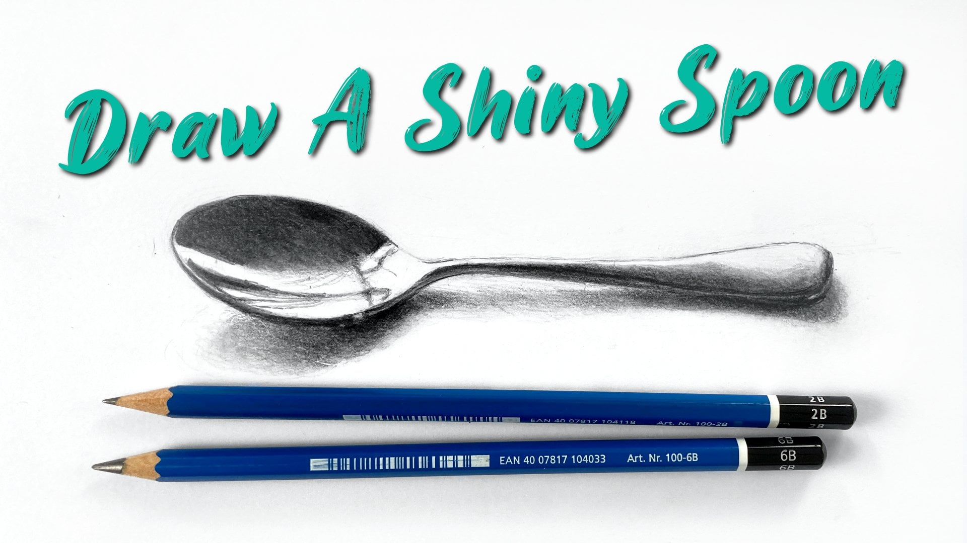
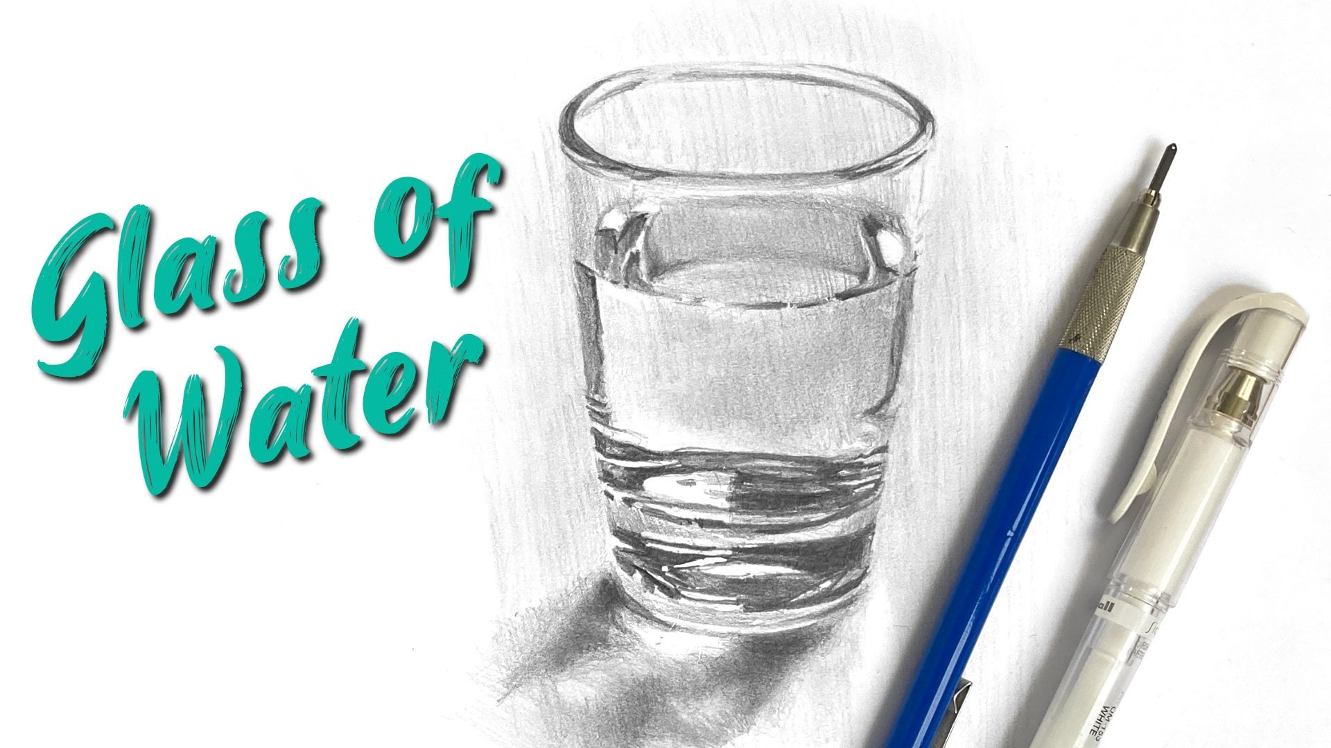
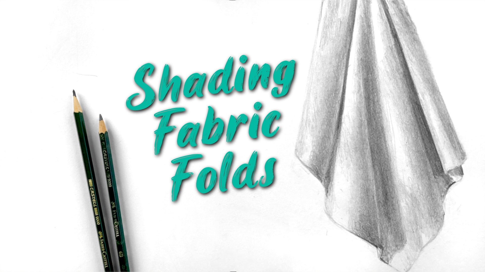
of three dimensional form. In this lesson, we're going to practice three kinds of shading, light shading, dark shading,
and blended shading. And the key to all three
of these is developing the control over the movement and the pressure of your pencil. To practice our shading,
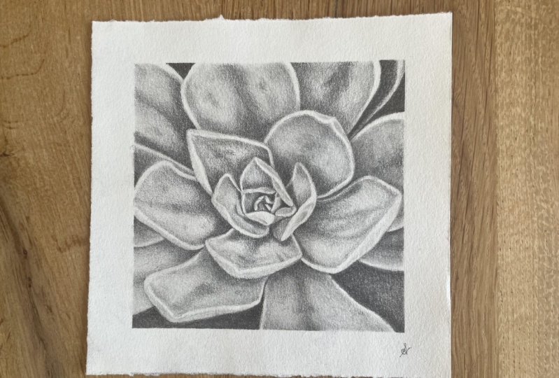
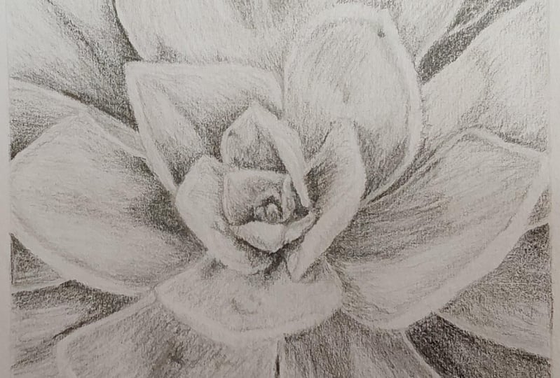
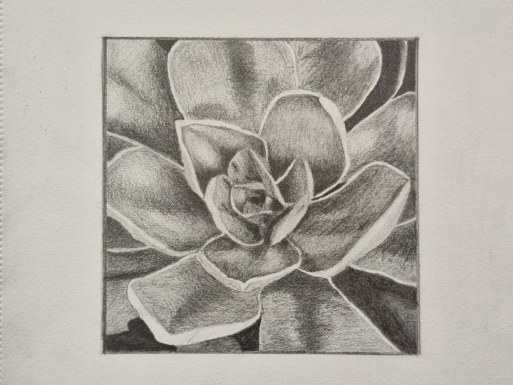
we're going to have a go at drawing the leaves of
this succulent plant. Our goal is to create the
illusion of depth and three dimensional forms so
that those leaves really feel like they're coming out
off the page towards us. I've included a printable
template that you can use to trace the
subject onto your page. If you can't print the
template for tracing, I'll take you through how to use the grid method to transfer the subject into
your sketchbook. Then we'll work through how
to shade the leaves to create an overall illusion
of depth and realism. For some parts of the drawing, I'll take you through
it step by step, and for other parts
of the drawing that might end up being a
little bit repetitive, I'll let you practice what
you've learned on your own. By practicing controlling
the pressure of your pencil for light
shading, dark shading, and blended shading, you develop the skills to create a drawing
that looks more realistic. So grab your materials
and let's get started.
2. Materials: So for materials for this class, we're going to stick with
our three basic pencils, the ones I normally recommend, which are a two H for very
light sketching at the start, then a two B for a
lot of our shading, and then a six B pencil for some of the
really dark shading. Now, whatever brand you have may dictate how
hard or soft these are. So if you do find that something
is not working for you, feel free to change out your pencils or
your pencil grades. These are just a
recommendation 2h2b and six B. You're also going to need either the template if
you're going to trace or if you can't print something off to trace it,
you need to print this off. Then you're going
to need a ruler and what we'll do is we're
actually grid it out, you can see the grid
lines in the photo. They're very faint,
but we'll draw a grid and then we will draw out this outline before
we start on our shading. For the shading, you might
like to have a piece of tissue just for a
little bit of smudging. You want to play around with some blending stumps, you can. But I think for this one, it's really good if you can focus on getting all
of the work done, all of the blending
done with just shading. Once you can do that, you can
shade pretty much anything. It's an easy, not a cheat, but it's something
people turn to, I think, these blending stumps, thinking that they'll be able to do a quick job and they'll be able to blend things
easily with them, but it's actually quite a
skill to use these as well. They're most effective when you can do the shading
first without this, this is just a finishing touch for getting rid of some of
the texture of your paper, maybe a few marks or lines that have shown
up with your shading. It's not a fix all so there is that option
if you want to do a little bit of end with a
blending stump, as well. Like I said, I
recommend trying your hardest to just stick
to using your pencils. And I can promise you that if you do that, it's
going to be a challenge, but it is going to really push you to improve
your shading skills, which is probably
why you're here. You're also going to need
an eraser of some kind. I've got my patty eraser, and I might use my tombo mono zero just to clean up some of the edges or bring out some of those white areas that you
can see in the photo there.
3. How To Use The Template: For this class, we're
really going to put all of our focus
into the shading, and we need to start with
something, obviously, but I've got this template
for you that you can trace and I'd recommend that
you do trace it if you can, just so that you
can, like I said, put all your focus into the shading and it'll speed
things up a little bit. If you can't print this off, which is what you need to do, if you want to trace it, then I will draw it with
you using the grid. It's probably just
going to take you an extra 15 or 20 minutes, but it's still a good way for
you to practice patience, which is also what
this class is about. So if you did want
to trace this, don't worry about
tracing the grid lines. There's some very fine
grid lines on here. But you're going to put it
underneath your page like this and then you're
going to hold that up against a window might be a little bit awkward
just for a while, so that the light is shining
through the back of it, and then you'll be able to
see those darker lines, and you can trace
around the square, trace around all
of the individual leaves and things as well. Now, it's really
important that you keep your tracing
very, very light. You may be tempted to push hard because you're going around
the line, you can see it. It's nice and clear for you shining through the
back of that page. But as light as you can, using a two H pencil and we'll talk a
little bit about why that needs to be light
in the next video. So the next video is going to be drawing this out
using the grid. If you can't print
this out, then you're going to
follow along with me. We're going to use a ruler
and we're going to grid out this drawing and get our
light lines in that way. Skip that video if you're
going to do the tracing. So go ahead and do
the tracing now and then move on to the video
after the next one.
4. Drawing With A Grid: Assuming you can't print
this out and trace it, we're going to go ahead and
draw it out with a grid. So you're going to
need a ruler for this. And each one of these
grids is about 1.5 ", each one of these
squares in the grid. You can do it whatever
size you want, but this is a good size. It's about the size of my hand. It's not going to take too long to do all the shading
that we want to in there. If we go too much smaller than these little
details in here, they're already quite fiddly. They're going to become
even more fiddly. So 1.5 " per square would be good and we've got three squares across and three squares up. You're just going
to grab your ruler, decide whereabouts it's
going to fit on your page. So three times 1.5 would be 4.5, so it's going to
go from the side to the side at 4.5 " and I'm
going to mark off 1.5 ". I'm going to mark off 3 ", and then I should have three markers, even distance apart. I know this is going to
be difficult to see. I'll go a little bit
darker with this pencil, but keep yours as
light as you can, and then I'm going to
draw a line across there. And then when we
come down the side, we want to try and
get it parallel with the line of our page,
the edge of our page. If it gets a bit crooked, it's not a big deal, but ideally we have it as straight as possible because
when it does become crooked, what we're putting
into that grid then becomes distorted as well. Not a huge deal
for this subject. So it's 4.5, mark off 1.5, mark off three, draw a
line down there as well. If you had a set square, the triangle one, the triangle ruler that
would be useful here because then you
can line part of it up with one edge of your page. It's just easier to
see the right angles then and you can check the right angles of
your grid as well. So 4.5, we're going
to match this up here try and get an even distance between the ruler and the
bottom of your page. I'm just running my eye
across there and making sure it's all about the same. You're going to mark zero, going to mark 1.5 and
we're going to mark three. Draw a line across there. Then we're coming up
the other side here and hopefully those line up
on a nice straight line. We're going to mark
our 1.5 and our three. Then it's just a
matter of joining up these lines on
the opposite sides. Keep these lines grid
lines really light, definitely lighter than mine. Two H pencil remember. I'm using about an HB. But that's just so that you
can see what I'm doing. So now we've got
these grid lines, and we're going to
start filling it in with what we've got here. So we've got the
photograph just here, and then I've got my grid here. And it's now just a
matter of filling in each one of these squares with what we can see in
that photograph. Now, some people like to work square to square, and
you could do that. Maybe you could start in
this one here and find the corner of that leaf and then come around and
draw the line above it. And then we can see how
this line here comes up and joins up about here
at the top of the square. We've got another little line. And then we've got one that's
going to just cut across this corner here and then
continue into the next one. That's a really
valid way to work. I'm going to actually
start in the middle and just get the middle in
there first because for me, that's the most important part. The center of the drawing is
where we're going to look, and it is quite fiddly. So once we get that
done, everything else is going to be a little
bit easier to fill in. It's just zoom in and have a look at the middle
here and I've tried to fit it all in that center square
when I set this up. But what we could do is actually add another grid over top of that center square just to see what exactly is
happening in there. If you've got this
on another screen, you could do this as well. If we think about
the halfway point there and maybe about
there, here and here. Then we can draw another
grid over there. Now, I know that's
probably not terribly helpful because it
does make things a little bit more
difficult to see, but just to demonstrate
how I'm looking at this, you can do it without
drawing the grid, but you're still
thinking about how the center square is
divided up into four. What is right at the center? Or what is slightly to
the left of the center. I can see that there's
that longish petal. It's mostly in this
bottom quarter here. Once we get a couple
of these shapes in, they're going to be
placeholders and they're going to make everything
else a little bit easier. So I'm just drawing in this little shape
here that I can see. It's got a little triangle
bit on the top as well. Do your best with
this in the area. Like I said before,
if things are a little bit out of place,
it's not a big deal. Now we've got this
shape that comes up. It's got a little bit
of an edge to it, and then almost like
a triangle shape. Then we're coming down
into this quarter here. We're not coming below
halfway of that quarter, but just a little
bit above that. It actually lines up with
the bottom of this here. Once we've got a
couple of things in, we can start to
figure out, well, how does this part, this
line that comes across? How does that fit with that first shape that
we put in there? Do your best each time,
think about well, how far across is it coming? Does it come halfway across? Does it come more than halfway across or less than
halfway across? Then when we're coming down, how far down does it come? Does it come halfway
down the square here? Does it come a little
bit lower than halfway? How close is it to the edge? Again when we come in
here, does it come to halfway above halfway? It's about the center, maybe
slightly above the center. If you're struggling,
you might want to just watch for a little bit and then have a go on your own, where you can really
study the image. I'll put it up on screen at the end of this
video as well. You can study the image
and really relate each square in that image to
each square in your drawing. I'm still using this first one here that I did as
my placeholder. Now I can see what
comes out from that. We've got this one that
comes around and curves up. We've got one that leans
along the side of it, and this is where it gets
a little bit tricky. We're going across
the center line here. Maybe even put a point up
there where it comes to. What I'm looking for is
a line that comes up. And then it joins into this other line that's
coming over top of it. It's almost like a
very shallow S shape. It's going to join
up to this one. Every time I add something, I'm thinking about how does
it fit with something else? Also, as you're doing
this, you're also trying to keep your
lines nice and light. Use a two H pencil and that means you can only go
so dark for a start. Now I'm looking at
let's go on this side. Looking at this one here. Where is this going
to join up to? Let's put this petal
in then we've got a marker for where this one coming down is going
to join up to. I'm going back to my center, back to this one,
which I started with. Looking at that shape that comes across the top, it's
almost horizontal, down comes across to
about maybe the center that square down a little bit. Something like that.
Then this line, this side of it is going to join up down here with this one here. It's got a bit of a curve on it. Hopefully everything
is fitting together. If it's a little bit out, say this one came a bit
more straight down, that's okay or maybe it had
to curve a bit more in to meet this corner,
that's okay as well. Now I can see where
this petal here or this leaf comes down
to curves around, joins up to this one, if we're going to add
on this next petal now, we can put a little
mark here right in the center of this edge of the square and come in just a little bit from
there and you'll see that's where it
curves up and around. Joins in here. And then we've got another
like an S curve. So looking at the line that you're drawing in the
photo or in the resource, and then you're trying to
draw at the same time. So I keep flicking my eye. You can't see me,
but I'm all the time looking back up to
that as I draw this. So when it changes direction, I'm noticing it
changing direction. I can draw the other
side of that edge. If you just look at it
and then try to draw it, we've got very short memories. We can't hold that in our mind. I'll sort of change and
slip that memory of it. So we need to keep
looking all the time, noticing, Okay, it's curving here, I'm going
to curve as well. This is the most fiddly,
this part in the center. We're just about
there. Mine's not entirely correct over this side, but I'm not going to make
a big deal out of it. I'm just going to think
about this leaf here, comes to this side
in the center again. Where does it join
up to this weird one that's on its side, maybe about here so I can put a few points going
to join up there. It's going to join up here. Something's going to hit
this corner as well. Let's start with
this top part of it, it's coming up, doesn't
quite reach the top, comes down, touches that edge, comes down almost to the
bottom comes up to that edge. Everything is connected
in this drawing. This one here it's going to
get wider as we come out. Come up the top there, and then we've just got this
line here to add. It's got a little
bit of a curve on the end down and then in. I think that's the whole center. The, the trickiest part. Oh, no, I've left a
little bit out here. And these shapes that I've put in are just what I could kind of guestimate from what I could see in the photo
when I traced it. So they may not be
entirely accurate. I've simplified
them a little bit. I'm just going to put in
that little shape there. Maybe another little shape there and a little
edge to this one. So even if you just get
the one, two, three, bigger shapes of that
very tight part in the center without all these little sub
shapes, that would be fine.
5. Drawing With A Grid Continued: Done the hardest part. The rest is going to be a
little bit easier. We're going to go
about it the same way. Thinking about where
things line up with the edges of these
squares of the grid. I already did this little
bit up the top here. Let's do this square, and I'm thinking about where this leaf joins onto this one. So I'm going to put
a little mark there. I'd already put something
at the top here, but when I go to match it up, it's not going to quite match, and that's why I like
starting from the center and moving out rather than
doing square by square. You can do square by square, but you might find that
you're having to kind of adjust things or match up with what was already there
rather than what you see. And if you want to get
really accurate with it, then you'd actually
draw more squares. So the same way we did
with that center one. Each one of these
could have another cross section through it. But, it takes a long
time to do that, to rule them all out and then to draw it all and
square by square. And I don't want to waste
too much time doing that. So this one is done now. Let's move down to
the square here. But as I move down
to the square, I'm also thinking about
the leaf that's in it. How does it fit
into that square? It joins up here, curves around, touches that one, comes
back around here. Touches this edge, maybe a
little bit below the center, and that's going to
come below this line. Another one mirroring
that just underneath. So I'm going to stop
talking a little bit, but I'll just tell you
what I'm going to do for each square and then
show you so you might want to watch what
I do for each square and then just pause the video
and then repeat it. So for this square here, I'm looking just
at this leaf that curves around. This one. I'm looking at the
lines that make it up and then just putting the part that
goes into the square. So where does it touch the edges of that square touches
there and there. And then it's going to
touch in here about here. I might have to adjust
something there. It's not quite right. Moving across this one up here is pretty simple
in this one here. So we're just joining this one on to what's already
in that center square, thinking about where it joins up. It's going to join up there. If you've got this on a screen, you might want to zoom in so that you can
really isolate it. What are you looking at without being distracted by
everything else. And actually, I should probably
zoom in for you as well. I'm going to put
this one in, look at where this one joins up to the edge of the square and
then we're going to look at these points or
that point there, where that line joins up
to the top of the square. Moving down to the
bottom center square. I've got this leaf here, which I haven't put
in the ends of it, which join up here and
here in this square. It's going to overlap
a little bit over this cross section just
here and come around. Then where does it join up
with each side of the square. We've also got this line
that's going to come almost straight through the
centers on a slight angle. Anywhere they don't
quite meet up, straighten those
things out, maybe using an eraser if you need to. When I came across
this line here, they didn't quite
match up with what I had from the previous square. Over to the right side now we're just about done.
There's the top right. Looking at where the
petal is going to hit this edge of the
square. It's not halfway. It's about here, two
little dots there, another little dot up here and another dot along this one. Again, not quite halfway. He's halfway, it's
just slightly above. Put in this part
of the petal and then add in these
other two lines. I we've got the center right square now. Should be pretty used
to how to go about this, making your markers. Then as you draw them, keeping
your eye on that line, flicking your eye back
and forth the whole time. And finally, moving to
the bottom right corner. Nice and easy, this one. You can also think about negative spaces
when we do these. Look at the gaps
that you've got. If any of the gaps that
you've done so far look a little bit off, we
can correct those. Remember putting in your
markers. Nice and light. Even these little dots
make them nice and light, and then joining things up. Do a quick assessment of your drawing and just flick
your eye back and forth. Is there anything that
looks really, really off? If the leaves are pointing in a slightly different
direction or they're slightly different shape?
It's not a big deal. What we do need to make sure
we have is these edges. Anywhere we've got that
double line around the edge, that's an area that's
going to be white, you can see it there or light. It's quite important to
mark those parts out. Flick your eye to
some of the spaces, just to do a little
bit of a check, maybe check the ones close to each one of these
intersection points. The shape here is not too bad. The shape over here, the shape. What's happening in this
shape and then over here. This one's a little bit more complicated because
you've got a leaf that's going around that
cross section in the center. Look I've missed out
one line just here.
6. Erasing Unwanted Lines: Now we need to get rid
of the grid lines. And we're going to
keep the outside line, but this is where you have
to be a little bit careful that you don't rub out
anything that you need. You can lighten things up, so, especially if
things are too dark, if you're rubbing
over those lines that form the actual subject, that's okay, but
just make sure you can still see something of them. We don't want to
undo all of this. So I'm going to get rid
of all of the grid lines, and maybe some of those dots, some of my dots are
a little bit dark, so I just very gently
rub over those without losing the line of the subject. If you do find this difficult, what you could do is just
go square by square, rub out the edges of each square and then look again at the photo and just redraw in anything you might have
lost of your subject. Remember to keep
the lines light.
7. Why Is Shading Important?: Let's have a little
bit of a talk about our subject here and also why shading and shading
well is so very important. We're going to look at
three kinds of shading. In this class, we're going
to look at light shading, dark shading, and
blended shading. Now, why is shading
so important? Well, without shading,
all we have is line. And when we look at
the line drawing, there's nothing wrong with it. It is a nice illustration. We could use this as a
drawing if we wanted to, but it's not realistic. It doesn't have the depth and
the illusion of this here. What we're really trying
to do with our drawing, if we're aiming for realism is we're trying to
create that illusion. Of three D form that we can
see clearly in the photo. We're trying to reproduce
that on our page. Lines are really just our way of getting
something on the paper. To get that effect of depth, it is all about shading. Even just have a look at what happens when I bring the lines up on top of this photograph. It doesn't look the
same, obviously. We're putting dark lines there where there aren't dark
lines in the photograph. The reason I'm showing
you this is because beginners tend to outline things and I think it's
a couple of reasons. I think one reason is it's what they can see clearly,
they can see the shape. They put big dark
outlines around things. I think the other reason is that they don't yet have
an understanding of how shading creates that
three D form and that depth. When you have a dark outline, in a light area, it
flattens the form, it ruins the illusion. You could think of
it as turning it into more like a cartoon. When we don't have
those outlines, that's when the shading can
really create three D form. That's what we're going
to be focusing on today. Three types of shading, light
dark and blended shading and also making sure we have
those in the right place, making sure we don't have
outlines around our shading. And that's why it's
so important that this first tracing or
sketch is really light. You should still be able to see it because we need
something down there, but it shouldn't
be any darker than those very light grays that
you can see the shape here. It looks like it's white, but it's actually a
really light gray, so we can get away with having a light line for our outlines.
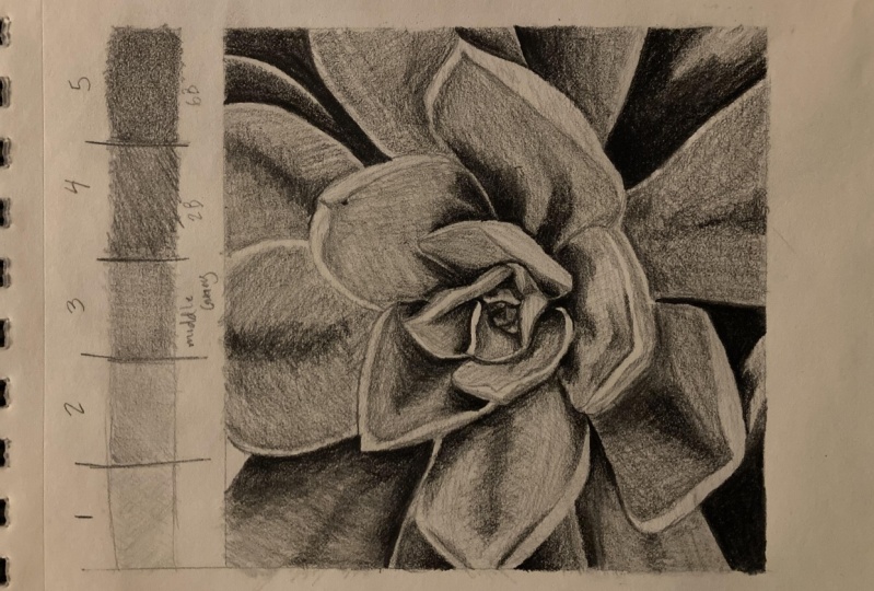
8. Value Scale Exercise: Okay when it comes to light
shading and dark shading, it's all about comparison. We saw that this area here
is a really light gray. The shading next to it has to be the same number of steps away in our drawing
as in the photograph. What we'll do now is
we'll just create a really simple shaded
scale here of one to five. You might have done
this in the learn to draw course or some of my
other classes as well, but just for reference so that we can look at
that photo and go, that's about a number one value, number two, number three, number four or number five value. I'm just going to create a
very simple another grid here. And try and divide
it up into five. We usually start with
putting the center one in, but you can extend each side if you need
to or make it shorter. They don't have to be
perfectly even size squares. We're going to have
one end as number one, one end a number five. You can choose which
end I think I'll. Let's make this one number one. So this is going to
be very, very light. This one's going
to be number five, it's going to be very dark. Number three is going
to be a middle gray. Then when we talk about light
shading or dark shading, we're thinking about the
light shading as being on the left side of middle gray and the dark shading as being on the right side
of middle gray. I'm going to start with
middle gray first. I'd use a two B pencil
just very lightly. Maybe even an HB
if you've got one, I didn't include
that in the list. But we're aiming
for something that is not too dark, not too light. It's just a middle gray. When I look at the photograph, I'm looking at maybe
something like this here. I've taken it from about there. You can see against the
white, it looks quite dark, but this area and
here's a middle gray. I'm just building that square
with a couple of layers. These don't need to be tidy, but they do need to be
as even as you can. When you're shading, this is a good practice when we
get onto our drawing, you can hold your pencil
a little bit further back, move it back and forward. Keep the pressure really light. We're not pushing
down hard like this. You're working this way,
it's hard to control the pressure or you have
a very hard pressure. You're working this way, we're resting the pencil
and then we can just push a little bit more
with our thumb if we need a bit more pressure or we
can ease up really easily. It's hard to ease up when
you're shading like this. So this middle gray, this one I'm going to do as light
as I possibly can, just barely touching the
paper with my pencil. Might be a bit hard to see
this one on the video. For this one, I'm aiming
for maybe this value here. It's coming out from the
edge of that leaf there. You can see it's a
very light gray. Maybe it looks like it's
white until you look at the edge of the page,
which is pure white. Then in between these
two, I'm going to try and shade something that sits
directly in between them. So starting with a value
that's the same as number one and then going back
in another direction. You can see mine's of messy, but overall it is
one flat value. Doesn't change too much. The one at this end is going
to be our darkest value. So we're looking at
in the photograph, maybe this value here. And you can see that that
is pretty much black. So any of those very dark areas
that are in the crevices, those are going to be as
dark as we can get them. So I'm going to start with
a six B for this one. I'm not going to
push really hard because it's hard to
keep your pressure even. I'm going to shade a base
layer both directions. And then I'm going
to layer it up. Pushing maybe just a little
bit harder this time, but not so hard that
you're going to be ruining the paper and scribbling
and denting the paper. We want to allow the
graphite to layer up. So it might look still
a little bit gray on your screen because I've got a bit of light
shining on it here. I'm just going to go
ahead with another six B. This one's a different
brand of pencil and you might be able to see
the difference. It's softer. I just means I get
a darker value. It's probably a comparison with an eight B in
that other brand. So brands are just like that. Some are lighter,
some are darker, some are softer,
some are harder. In here, I'm aiming
for something between my number three
and my number five. I'm going to use a two
B pencil for this one. I'm not spending a whole
lot of time on this. It's just to have
something there to remind ourselves or to reference when we go through the
shading of this one here. What are we actually looking at when we look at the value? Would it be a one or two, or three or four or five? This darker gray, we're looking at in the photograph or
looking at probably this area. It's not black, but it is quite dark and it's going to
create a little bit of the fold or the bend in these leaves here as they come down
towards the inside. Putting a little bit of six
B over this one, as well. Check that you have five
distinct values one, two, three, four, and five. You should be able
to see a clear difference between each one. If you need to, you can go through and just adjust
them a little bit. Maybe my middle needs to be just slightly darker to make it a little bit more different
from my number two. But keeping in mind that
if you go too dark, then you're going
to have to change the ones on the other
side of it, as well. So if I went too dark with this, I'm going to have to make
this one even darker. As long as you've got
a definitive step between each one
of those values, you can squint at it as
well. When you squint. If any of them blend into
each other too much, you can't see them clearly, then that probably means
you've got two that are a little bit too close
together or too similar.
9. About Light, Dark And Depth: Before we start, I just want
to touch on one more thing about creating that illusion
using light and dark. Have a think now about what's actually happening
with that drawing. Why are the light areas light? Why are the dark areas dark? Sometimes it comes down to color and I've got this
picture in color as well. It's a bluey green. Maybe some of those
more purply blues are actually dark marks
on the foliage, but a lot of the darker
areas are where this shadow being cast anywhere there
is shadow being cast, anywhere there is a dark value, it creates the illusion
that there is depth, something is moving
away from us. Something else is
coming towards us. The light areas, you
can see the ends of the petals are light or
the ends of the foliage, those edges, they are
coming towards us. The dark areas are receding to the depth of the drawing
or the photograph. They create the illusion
of those crevices, at least they do when we
put them down as shading. That's what's happening. The light parts are
coming forward. Or they are the parts
of the subject that are emerging towards us
and getting hit by light. The dark parts are the parts of the subject that are
receding away from us and they're getting obscured by other shapes
that are casting shadows. I hope that makes some sense. We could think about
the dark areas as crevices and we
could think about the light areas as say the tops of hills where
the sun is hitting them, something like that,
just to get your head around why the darks and the lights work to
create this illusion when we're using shading
on a white piece of paper.
10. Let's Start Shading: So that's enough of me trying to explain why this is happening. Hopefully, it's making
some sense to you. We're going to go
ahead and get into the practical
application of that and we'll start from the
left and move to the right. We could start at the center and normally I would
start at the center. But it's just a little
bit confusing in there, and I want us to get a
bit of practice first. So we need our three
pencils, two H, six B and B, and let's have a look
at the top left. Now, what's happening
in this leaf up here? What values have we got? We've probably got
about three for the main value and then we've got some fours and some fives. Maybe on this edge
here, maybe a two. We need to account for
all of those values. The main thing is
going to be a three, so I can just go ahead
and start shading with a two B pencil and
what I want to do is create a nice even value
over that whole petal. Petal or leaf is probably some expert out there's
going to watch this and say, they're not petals. I don't
know what they are really. They're probably leave
aren't if it's a succulent. Shading this whole
leaf and again, using your pencil like we did when we're doing this one
to get very light values, using it by holding it a
little bit further back, just letting it rest, maybe
even holding overhand. If that feels comfortable, the pencil goes
underneath your hand. You can rest the base of your hand on the paper
if you're doing that. If you're holding it this way, you'll be resting the side of your hand on the paper
and just letting it move back and forward a little bit or just moving your
fingers back and forward. Trying to find what
works for you. I'm moving my hand a little bit. I'm rubbing the paper.
As if I'm, you know, polishing the paper with my
hand, not pushing too hard. We can do it in sections. So the trick here is
to get an even layer. If we start by pushing
too hard to begin with, we're going to get
an uneven layer. We need to build
it up gradually. And this is also the trick to being able to blend without having to use blending stumps, which is what I really
like you to be able to do. This pencil, this two B
is quite a hard pencil. You'll be able to see some of
the marks showing through. That's okay. I'm going
to do a few layers and I'm going to fill up some of those
little white spaces. If you're coming back in
the opposite direction, then just be a little bit more careful
with that direction. Lines closer together. But ideally, if you're
going to have any marks, they'll be moving outwards
from the center so that they follow the natural
rhythm of the subject. I'm going to do a
couple more layers. I'm building it up to
about number three. Do it in sections if you
find that it's hard to move across the whole length of it without getting
too scribble. We don't often have
to sit down and focus on one thing for more than half an hour
or so this drawing and this exercise is
going to be really good for exercising patients. That's a really
valuable skill to have. It's a necessary skill
to have in drawing. We need to be able to work
through the whole thing, not just do part of it and
go, it doesn't look right. I'm going to give up because
the full illusion of your drawing isn't achieved
until right at the end when you finish and we
have to not judge it in the middle stages or the ugly stages, I
sometimes call them. This getting pretty
close to three. Now I'm going to build up
the darker values over top. This is where we're
going to practice blending. Our shading. We've got this dark side here, and we want to blend it into the lighter part that
we've already got down. We've also got this
darker center line. We don't want it to
be a hard edged line. Look how soft the edges
are in the photograph. We want it to blend into
that layer beneath. So I'm going to start
at the dark part, and I'm going to switch
to a six B pencil. If you feel like that's
going to dark too soon or if you put
something down, it's just like, it's
completely black, then you might want to go
upper grade, maybe a four B, Your two B might be
soft enough that you can do this whole thing
with your two B pencil. But I need to find a definite difference between these two. All I'm doing first
is putting in a light layer of darker value where I
want those darks to go. I'm putting in that center line, there's this dark
shape around here. Then it comes up and around, it's dark against this edge. Dark against this edge. But. So now I've got
my number three value. I've got my I'm getting close to a number
four with this one. It's going to have to go to
a number five right in here. But before I go to
the number five, I'm going to work on
blending these two, and I'm going to
start in the area that I've shaded number four, and I'm just going
to use small circles and very light pressure. So just resting your paper, and now it's all about
controlling the pressure. We start off in the value that we were shading number four. And then as we move
towards the lighter area, we need to lighten the pressure
of our pencil as well. And you might take a few
runs over the same area, making sure you change the
pressure at the right time. So if I'm pushing to get
a number four value here, and then I keep pushing
that same pressure into the number three value,
it's going to go darker. As I come towards
the number three, I need to gradually
decrease the pressure. So I between number
three and number four, I'm using a pressure
that is creating, say, a number 3.5 Let's see if you can think
about it that way. Number four pressure moving into number three pressure,
but in between there, there's going to be a
number 3.5 pressure because that's what we're wanting to put in there to get
these two to blend. So same thing coming
through the center here. On either side of that, I'm
going to move outwards. You can do it in
little sections. You might be able to do
the whole thing at once, lighten the pressure coming this way, lighten the pressure. Then from here to here, I still quite a hard line or divide. I'm going to use small circle, start in number four, move towards number three. It's just learning what kind of pressure you need to apply. It becomes very
natural after a while. If you find that you're
getting a dark line here and it's darker than number four, then
you're pushing too hard. You might need to come back into your number four and
darken that up and then blend that into
this middle value. So from here, when you're
fairly happy with your blends, doesn't need to be
complete transition, but there should be a softness between your darks
and your lights. Then you're going to bring
in your my six B pencil. You're going to bring
in your darkest pencil. This one is definitely not
going to be dark enough. So I'm just bringing
this other brand here. It's not very sharp.
I should sharpen it. But for now, I'm going to start over top of
what was my number four, put in an edge, and
then same thing. Shading a number five, and then as I come
towards number four, lessening the pressure
through 4.5 to a four. And then we can do the same
all the way around here. A lot of this drawing
is about contrast, the light of this one stands out because it's got
the dark behind it. That's a really important
thing to notice. How do these two values
compare to each other? We haven't put this one in yet, but it's going to be
pretty close to white, and this one on the other side
is pretty close to black. Start at the darkest area, starting with my six B
in the darkest area and then allowing the pressure
of the pencil to lessen, that's going to give
me a lighter mark as I move into that number four
that I had down there. Anywhere you end up
with divides or lines, just very lightly
work over those. If you're struggling
at all, just go with the lightest pressure you can over that area where
you need to blend. So light that you're
barely touching the paper and you're just
going to do that a few times. And then reassess. Do I have
blend enough blend here? Now, I got to do a
little bit more there. Do I have enough dark here? I got to darken that up, and
then I need to blend here. Very very light
pressure, reassess. Is it blended enough? I need
a little bit more dark here. And my center definitely
needs to go dark. So we're spending quite a bit of time on this one so that I can explain what I'm actually doing and hopefully
in a way that you can also do that and then we'll get a little bit
faster as we go through. I think that's pretty close. It's not as dark
as the photograph, and I could go darker if I wanted to be really
accurate with it. I think I'm going
to leave it though, because I've got a nice sense
of depth there already. I wonder if just here
needs to go a bit darker. Is the only thing to create
a bit more of that shadow. I'm going to go ahead
and do this one behind these two
behind quite quickly, and you do yours as well. Then we'll talk
about this one here, which has got the
light room on it, and it's going to then
take us into the center. Once we've done the center, I'll probably speed up the rest
of it because you should have a really good idea of how to do it by then and
it's just going to be a matter of persevering
and practicing and having that patience to apply the shading
that you need to.
11. Working On The Left Side Leaves: You should already be
starting to get a sense of the depth if you lean back from your
drawing a little bit, see what's happening in here. Do you get a sense that this leaf here is starting
to tuck underneath? It's got shadow cast on it. It's moving away from us into a deeper area
of the subject. Do you have some
nice transitions from your light shading
to your dark shading? You got some areas
of blended shading. Now, if you feel like
it's not working, have a good look and
ask yourself why? What is it that
you need to change as we go forward into
these other petals? Is it that you started too
dark and you don't have a big enough difference between your light values and
your dark values? You three and your five or
your four and your five, even so this leaf
here has a three, or four and five approximately. Maybe got a little bit of
two or one on the edge, but I haven't put in that
dark part yet to show it. These ones that I
did quite quickly, I put down a layer and then I put down
the darker layer and I've just left that area for
the edge for the light edge. So the way this edge comes into being is having a dark
edge on the other side of it. It's not completely white, so it can have a little
bit of shading over it. These ones here are less important than what's going to be happening in the middle. I haven't done them quite up to the value that
they should be. This one should be a
little bit darker, but I'm just going to
leave it for now and I can always beef them up a little
bit later if I want to. What is it that you need to change if things aren't working? If you're struggling
with the blending, do you need to
practice a little bit on another piece of paper, starting with one value, putting in another value, and then working between
those two values with patience and changing the
pressure of your pencil. Let's move on to this one
and this one and this one. These three are quite important
or this outer ring here is quite important because we can see the full
leaf of each one, they're coming towards us. They have the white tips
and then they also have that dark receding
area where we're getting into the center
of the succulent. We're going to start off
exactly the same way, starting with a base
layer of shading. I'm using two B pencil. The other thing to
think about, if you're finding that you're not getting the effect you want, are you using the right pencils? If you're going
too dark too soon, start with a lighter pencil, even though I've
said two B, maybe you've got a very
dark brand of pencil. If you're not going as
dark as you want to, maybe it's like these ones here, they're quite a light
brand of pencil. Maybe you need to go to
a three B to start with. So I'm shading in all
of this area here and I really want to shade the lightest
value that's in there. What is this value here? Same as maybe this area
and this one here, it's going to be
around about three. Maybe a three, maybe going into a two in this area in here, but I'm going to
treat it as a three. I tend to shade a
little bit lighter than I expect usually. Anyway, by the time
I get the blacks in, soon as you put the blacks in, everything else
looks a lot lighter. Using that back
and forth motion, polishing my paper with
the back of my hand. Keeping my page
in the same place or the same orientation
so you don't get dizzy. But if you need more surface
to rub your hand on, you could be turning your page around if you need
that stability. I'm just going back
over this whole area again, evening it out, tucking into some of
those little areas that are white but
shouldn't be white just with a little bit of small circular movement
just to fill them in. Then once I fill them in, I can do another broad area Lift the outside area white. It can be a very light gray, barely touching the paper. Putting a little bit of
something in there so it's not completely white. It would still work
if you lift it white. So we've got our base layer. Now we're going to put
in our darker layer. And because we've got a dark edge against
the light edge here, we can go in with
almost like an outline, so you can actually
shade in an outline there just to make sure you keep the edge next to
it nice and clean. Just remember use
whatever pencil you want to actually switch to
a four B pencil here. If you only have
a two H, a two B, and a six B, they should get you really far those
three pencils. That's what I usually recommend
as the starting pencils. Because they give you this
range here through to dark. I'm going to put in that dark
area through the center. Using my pencil on its side. I should probably
follow the direction. I'm not doing it very well here, but follow the direction across the leaf this time because it's almost as if
there's veins coming out. Just the pattern
in that dark area. Feels like it's moving out from the center across the leaf. And as we come around here, it's a dark edge,
but it's very soft. Let's zoom in a little bit. Dark along here. Now,
this part here and around in the edge is where we need to have some nice blended shading. It's darker than the rest
of this number three. But it's only a small area and it blends in to
the number three. And what this is going
to do is it's going to create the sense
that this light edge is curving up and over slightly because it's casting a bit of
shadow onto this area here. So this is coming up. It's
got a bit of height on it, and so it's casting some shadow. If we don't get that in there, then we don't get that effect if we don't get
this light shadow in here. A little bit on
the side as well. You can see it also
defines the light area, makes the light area stand
out. It's getting there now. The whole thing
needs to be darker and then I need to blend it in. I'm just going to go over top again with my four B pencil. I think I underestimated
how dark I'd need to go and how light these
pencils are going to be that switching them
up a little bit, depends a lot on
your paper as well and how well the paper
holds the graphite. A lot of variables. So take a good look at this
value in here. What value should it be if
you're looking at your scale? The moment, mine is a three. When I look at the photograph, it's definitely a four. Maybe it's even a five. It's a five when we get in here. So I need to darken this up. I don't want to just go hard out making it
really really dark. I'm going to build
it up in layers so that I can get that
blended effect. So first, I've got, maybe a three
already down there. I'm going to blend
that into the layer that's underneath
it on either side. Just soft soft shading
around that dark area. Not creating a line
but creating a blend. Then I'm going to build
it up, so I'm going to do another dark layer
in the center here. Fading it out as I come up. It's got quite a
strong edge to it. I don't want that, so now I
need to work into the edge, starting in the center
but working my way out. The reason we don't just
go around the edge, you can do that if you've
got a lot of control, but usually you'll end up with just a line between
this one and this one, then a line between
this one and this one. If we start at the
center and move out, then we are starting
at the same value. Putting that down,
finding the pressure, measuring the pressure, and then lessening the pressure
as you come out. So you've got a
starting point then. You're not just
having to try and match. You're starting dark. It doesn't matter if
you go a little bit darker because it's a dark area, and then you're lessening the
pressure as you move out. Controlling the pressure
from the dark point. What pressure do you need
to get that dark and then lightning from that point or lessening the pressure
from that point, it's only going to go lighter. It's getting there now. It's got a nice kind of blend on it. We put the start part in here. Same process, put it in, blend it into the
layer underneath. We are aiming for accuracy here. I'm pushing things a little bit more than I would in
the other classes. I want you to challenge
yourself to match the values to the photograph and to have the patience to keep working on it until you get those values until
you get those blends. I and to get that accuracy, we've got to have
all these skills, but we've also got
to keep looking. So every time I start a
new layer of shading, I'm looking at the photograph
again and I'm comparing it. I'm thinking, is it dark enough? Then as I move out to the area underneath it
as I work on the blends, I'm looking at the photograph
again. What can I see? Where does the blend
stop? Where does it start on this other edge here? How far out does it come? There's no other way to do
it except for looking at the photograph.
It's getting there. It could go a bit darker. What I'm finding is my paper is feeling a little
bit at capacity. There's a lot of
graphite on there now. I'm having trouble
layering it up. I might just come in later with my darkest pencil I've got, which I've got
eight B somewhere, but the six B I might do that
at the end if I need to. We've got this one in, make sure you've got that nice
blend in the center, but also remember
these edges here. I might go a little bit
darker than mine now. Dark and then fades
into the value beneath. That gives you
that slight curve. If we're looking really closely, actually, can you
see the difference? In this light area, there's actually two
values in there. There's a very
light edge right on the rim and then just beneath
that is slightly darker. That's the back
of it curving up.
12. Left Leaves Continued: Okay, moving on, let's
do this one up here. Exactly the same process. You're probably going
to get sick of this, but it's only way to
improve and get better. Now, mine's a
little bit crooked. I've lost a bit of this edge, so I'm just going to redraw it here and you can do that too if you feel like
yours is not quite right. It'll still work even if you
don't have the same shapes. Remember our process, thinking about the value,
what value is it? It's about the same as this one. Most of them start
off the same value. It's like a three shading that whole thing in
with a nice even layer. If you're getting
marks, then make sure the marks move in the
direction of the leaf, the length of the leaf. But the more you practice this, you should be able to
get a nice flat layer of shading without leaving
a whole lot of lines. So I've gone one
way, I'm I'm going over it the other way that's gonna build up a darker layer. Beef it out a little bit. Could even do one more. We haven't used the tissue, but you could use it. So if you're finding
on these ones, you're not getting the
effect that you want. You're not quite there with your coordination,
your pressure. In this base layer, just give it a little bit of a smudge. Now, it's like you are
brushing crumbs off the table. It's not pushing down hard and trying to move
the graphite around because then you're just
going to press it into the paper and it won't move. And also, you'll start
to damage the paper, and things will get kind
of gunked up in there. There'll be too much graphite in between the
tooth of the paper. So just a very brief kind of rub to get rid of
some of those lines. Look at the contrast between this dark area and
this light rim. Again, this dark recess here in the light edge of
this one in the center. So we can put in
an outline there. It's going to match the dark
shading that we put in. If you come around
here, it's going to be a lighter outline because the shading is going to be lighter. But in here, it's
going to be dark. On this side, it's
going to be dark. Looking for the dark shapes, this side here is a bit darker. Probably actually the whole side of that leaf there.
It's all a bit darker. We've got the darker in edge of the light part of the leaf. So it's quite hard to see, but there is just a little
bit of shadow here. Try and identify
that in the photo. I've exaggerated a little bit in my drawing. Just around here. And a little bit here, too. You know what to do now.
Put in this dark layer. Then we work from the
dark into the light adjusting the pressure of
the pencil to blend it. This one here is a little
bit different because it's quite a strong shape. This part of the petal
is casting a shadow. It has a slightly soft edge, but it is more
defined than say some of these other shadows.
We want to put that in. Whatever we see, we
want to put that in. Think about making this a
little bit more defined. It might feel a little
bit strange to start with because we're still in
the initial stages. But once we get all of these in it's going to look natural. It's going to look
like a stronger shadow cast by this one. Then have a look at
that white rim there. Is there any difference in that? You can see the very edge
of it is very light. Could still be a number one, number one value, a light gray, but then it's almost
a number two as we come down a little bit
along the back of it. Up here is a number
two. Well, why not two? Same thing. I've
got a bit too dark there. But it's the same thing. It's got a couple
of values in it. Really subtle. Zoom
in on the photograph, if you can and have
a look at that. A little bit of a light
value in there as well. And just to touch more
of my darkest value. Put it in, blend it
into the layer beneath. Now if you traced yours, you probably got more
accurate shapes than I have my shapes are a little bit wonky because we drew
them by hand using the grid. But you can still see even though this shape
isn't quite right, there's still the sense that it's deep in there,
that there's a recess. The shading will work even if your shapes are a
little bit different. We're going to get
this one in and let's get this one in as well. Do those quite quickly. This one here is pretty basic. Nice dark line there makes
it easy to define the edge. You can see the dark
line coming up just on the in edge of the
rim of the petal. All of this is maybe maybe a two actually,
it's quite light. To moving into a three. Then very dark down here. Think about the light shadow
cast by the white edge. It's not a hard outline. It's just a shaded line. And think about the different
values in the light area. It's a little bit lighter
right at the top. Then we've just got to
put this dark area and so this one's pretty
quick and easy. Switch your pencils
as you need to. It's got a bit of a shape to it, it comes down and then I
think it's going across the center of the leaf where
there's a bit of a curve. So changes direction
and then it fades out. Again, that might
be one that looks a little bit strange to start with because we don't
have reference of the other petals to show
what's casting the shadow, but try to follow the
shapes that you see. Then we're going to do this one. Now, this is a good example of foreshortening or they're
all foreshortened, really. But this one, I think, it's quite clear
what's happening. It's easier to see
the foreshortening. We know that this is
quite long in reality. We know that it goes down deep into that sort of
floral cluster. But when you look at it, if you look at the width
compared to the height of it, it's much wider than it is tall, to create the sense
of foreshortening, again, we need to really look
carefully at the shading. We've got this darker
shadow in here cast by the leaves that directly
over top of that area. We've got this light area here where the surface of it
is being hit by light, and we've got this area
here where there's maybe some shadow being
cast by the edge. The whole thing is going
to be maybe a number two. The general value.
We can think about? What is the main value? Without any light
or shadow on it, what do you think it is? It's probably a two. You could shade this one coming towards the point of the leaf. I'm shading across. And then maybe shade
the other direction. Let's zoom in a little bit more, see what's really
happening in there, and we can use the dark to create the edge that
petal above it. So shade your light layer, blend it with a tissue
if you want to. I'm not going to with this one. And then shade your dark areas. Shade the shadow of the
rim, if you can see it. There's a little bit
here, definitely here, and then work on blending. There's a few things happening in there that look
like maybe marks. I'm not sure if this one's
a mark or it's maybe where the leaf tilts
upwards a little bit more. Going to put that in,
but it's nice and soft and maybe a little bit less exaggerated than it is in the photograph so that
it's not going to stand out. I marked in my dark areas. Now I'm going in
with my six B pencil and I'm going to put those on even darker and then I'm going to blend into the layer
underneath all the time, flicking your eye at the photo, looking at the area that you're shading as you're shading. Remember, you can use
this dark pencil too. Get a nice crisp edge
on the petal above it. Draw in that line or shade in the edge, and then blend it. Now, have a look at
what's happening here as this light area goes into that recess,
it's a bit darker. It's maybe a number
two or number three, and then it gets lighter
as it comes out. Light areas in the shadow
are going to be darker than light areas in the
light, which makes sense. Putting in a very light layer here to bring out
that white edge. I'm just going to leave
the edge white for this one and then shade
in underneath it. About a number two. Then we start to get
that illusion happening. This is coming towards us. The rim of it is tilting
upwards a little bit, casting a bit of shadow in here. Let's do a little bit
of an assessment. Doesn't need to be
darker anywhere. I think mine needs to be a
bit darker on this side. Then we're going to
move into the center.
13. Centre Leaves: We're getting through
it. I'm going to do the center with you and
maybe one or two of these other quite
important leaves and then I'll leave the rest of it for you to do in your own time and I'll just
show a time lapse of that. Have a think about
how you're feeling about your drawing
at the moment. Can you see some of that illusion starting to
happen and that depth? Is there anything that you are still finding that you're having a
real struggle with? Is it the blending? Is
it going dark enough? Is it staying light enough
in the light areas? And remember that this is still in the middle
stages of the drawing. I'd say the ugly stages
except we have done these almost to completion. Quite often when you're working
a drawing up altogether, everything will just feel like it doesn't
look like anything, but you're keeping the
faith in the process and you're following what you
can see in the photograph, putting that in your drawing
and that's really important. That's what we're trying
to do here is not get caught up in what we want
it to look like at the end, but following what we can see, following what we're observing and using this as our guide. Using this as something
concrete that we can compare that to what value is
in the photograph, what does it match to that
we know that we can shade. Let's move into
this center area. It's a little bit fiddly. It's probably the
most difficult part because it's quite difficult
to see what's there. We need to just grab
hold of whatever we can, what makes sense to
you in that area. For me, I can see this
light edge through here. I know it's dark
on either side of that light edge of course also
see this light edge here. I'm going to use
those as markers. This light edge. And
then this light edge is weird shape that we
started with right at the very start of doing the drawing from
the grid with me. I said, at some point, I've said that this is just an interpretation of what I could see to trace there. You may end up having to change these shapes a little bit
to match what you can see. Maybe I need to change the shape here and check the shape here since these are going
to be my placeholders. Then just have a look at this one and make
sure you've got that with that light
room drawn in. It's light room,
and then it's got a shape on either side of it. We want to have that light
edge because that's going to show us the part that's
coming towards us the closest. Thinking about markers,
I've got this one. I've got this one
and then I've got that light edge this marker, and this light edge here. I'm going to shade in this dark shape and this dark shape, all the dark shapes
that I can see on either side of those
light markers that I had. I'm using my two B pencil. Shading this one and I just got a little bit
momentarily confused there just because
it's so big on the screen and it's so
small in my drawing. But this one here,
I'm looking at this. Then I'm going to
put in the darks. Dark here, dark along here. All I'm going to do
at this stage is just put in those darks and then
I'm just going to blend them. I can make everything
a bit darker later on, but I just want to get
that general effect of what's happening
going from light to dark dark on the upper edge of that
marker that I had there. Then underneath this
marker, it's also dark. It's dark coming down the side of this marker
that I had on the right. Shading in the dark
shapes that you can see, even across here, it's dark. There's some things
happening in the center to outline that petal there. I can put in a dark line. Then anywhere else, you
can see a dark line, so I can see something
dark coming up here. I'm going to put
that in and then shade underneath this marker. It's quite dark, but it's going to fade into
a lighter edge. I don't want to have a dark line right around the
edge of this except where it's on that
back petal there. That makes sense,
there's a bit of shadow cast onto
this back petal, but there is a light
edge to this petal. I've got my dark
under my marker, blending that into
a lighter area. Et's do the other
side of this market. It's a little bit
dark at the top. I've got the light area. It's not black on
the other side. It's more like a very dark gray. And then there's a little
bit of black in here. You see how I'm just
looking for values. I've got a four and then a five. Over here, underneath this
first marker that I had, I've got a five and
it fades into a four. On the inside of this marker, I've got a five and the
inside of this marker, I've got a five value as well. Really picking out the values, ignoring what you actually see
in there or what you think you see and drawing
those shapes value. Then when we come in
here, I'm going to do the same thing and it's a
little bit hard to see, but I can see there's
a light area there, so I'm just marking that out. I'm going to mark out a few
other little light areas not exactly the same as the photo, but just something that I can
then put some dark around. Looking at the photo
as you do this but not being too worried
about it being exact. So just getting an
approximation of it, I left a couple of little
sort of light parts in here. I picked out that light
edge there because it looks like a very tiny leaf
that's starting to open out. So if you can work
your way through that, it's going to get easier again. You know, that's kind
of the hard part. Try not to get
caught up in what it looks like at the moment. We can reassess it at the
end if it looks too strange. This marker that I had here, it is not white the
whole way across. I'm going to make sure I have
that change in value from maybe two to a three and then
even to a four in there. I'm just going to
emphasize some of my darks just a little
bit more in here. Anywhere it's light, it
stands out as really light. There's probably a dark side
on the other side of it. Use that knowledge to
find your dark areas. They're really dark black areas. Looks a little bit like
a rose, doesn't it? Okay, let's move on to this one, and we'll do this one with
this weird raised edge. And as well do this one as well since we've got that
viewpoint there. So this one down here
is pretty light. Especially at the top.
I'm using a two H pencil. Just to give it a quick coat. You a tube pencil. Can you see where the center of that leaf changes direction. There's the vein or the stem of it coming
up through the center. It's a bit darker on one side, and then there's a rim, and then it's darker on the
other side of that. This one here, light gets
a little bit darker. Remember, try not to make
it look like a leaf. Just try to shade what you can see and think about what's on one side,
what's on the other side. As I come down here, it's very dark on the
other side of that. As I come around under
here into the leaf that we've already
done, very dark. As I come up this
side also very dark, all of that helps to
define this leaf. I'm going to do this
strange one here. The key for this one is
leaving that white edge. I just have to make mine a
little bit bigger than it was. Is exaggerated a little bit. I'm going to have
this white edge through here and the
other side of it, I've got that lighter shape. Light shape on one side, light
shape on the other side. It's pretty much all we
have to do with that one because then the rest
of it is defined by what is on these
other leaves. I was just looking
at how this one here felt a little bit blurred
into everything else. I've noticed that
what it needs is a darker value behind it
coming up onto this one. I also just want to clean
up that edge a little bit, a little bit bumpy and
a little bit pointy. Okay. Let's do this one. Then I'll probably leave
you for the rest of it. We'll have a look and
see what it looks like. Same process, keeping
that patients, shading everything
in with a base layer first. I'm going to use a two B. It's about a number two up here. Moving into a number four, so it's quite a big
difference there. Look at the shape of the
shadow, the number four. It's quite a sharp
edged shadow, that one? Then for the back of it here, I'm using my two H.
A nice and light. Is building that up a little
bit more so that I have the frontmost edge of the leaf
as the very lightest part. Yeah, I'm just gonna put
a bit of dark shading in behind that so I can start
to see how it looks. So this is the leaf behind it. It's quite dark all the way
around maybe number four, just to give that
a nice clean edge. This leaf here, which we can't quite see
in the photograph, and even this one
coming down here, have a look at where
they have light edges. They're in shadow, but they
still have a light edge. So when we're working our way
through these other petals, we're going to make sure
with these other leaves, we're going to make sure we
leave those light edges. They're both quite light,
but they are in shadow. They're a bit darker than
the rest of the rim. This one here is a good example.
14. Adding Contrast: What I'd like for you
to do now is to work on the rest of these
petals on your own. It's all the same process. It's about putting in that
first layer, a general layer. It's usually a two or three and then adding in your
darks and then blending, light, dark, and blending. What I'll do a little
bit of now with you is just the finishing touches and I'll do them at
the end as well, but just in case you
want to go away and keep working on
this on your own, the thing to do once you
get to a finished stage, they say we've got
everything finished is to make sure you've got the contrast
where you want it. If I squint at that photograph and look for the darkest parts, there's some dark parts around the edges that I'll need
to make sure I have in. But one really dark
part that I can see, especially with it slightly
cropped like this, this in here seems to stand
out as being really dark. I definitely need to
push that a little bit. Same process putting in your
dark and then blending. In here is also really, really no, is that right? Just watch me get confused. Now that it's smaller on the
screen, getting confused. Now that's right in
here is also very, very dark and it
defines the edge of that petal that's coming towards that leaf that's
coming towards us. So I can put that
in really strong. And if you watch my eyes, you'll see how I'm
still looking. I'm never just drawing what I think is there or even just coloring in
to make it darker. I am all the time flicking
my eye back to it. Again, looking for the
really dark darks. And here, I haven't done
this whole life yet, but it's going to be
very dark in there. Very dark just in here as well. That'll be your
finishing touches to just balance things out. If anything looks
too white as well, maybe this is a little bit too. That's pretty white
in the photograph. But anything that's really
standing out to you is just being blank white that might need to be pushed
back a little bit. That'll be the last thing
that you do at the end. Darker in here too, and prolonged here is quite
a strong line of dark. But when I say it's
a strong line, it's a line that's then blended into
what's already there. That'll be what you
do right at the end. I hope it goes well for you. You can watch the
videos that I'm doing. I'll speed them up quite fast, and I'll put some tips in there as well just to remind
you of what we're doing. If you want to watch before
you finish your drawing. If you haven't had a
break, go have a break now and then come
back to it and have a look at it from a distance
as well and see if you can see that illusion
happening for you. You could spread this out over a few days if you wanted to. Now that you've got the idea and you've got that
general process, you could do a little bit each day and just see how
it comes together.
15. Process Timelapse: [No Speech]
16. Using Blending Stumps (Optional): So I thought I'd just stop here and I've got a little bit
more to do so you can see, but just talk about
how you might want to use blending stumps if you want to give those a go. I hope you are finding some
success with this drawing. It's really important
to take a break when you're doing these
long drawings, especially if you haven't
done any for a while or ever. But it's a good indication
of where your patience is at and also how cut out you are
for doing long drawings. Maybe you need to work on this, work on the patients
to just keep doing the same thing over and
over again as we have done with each one
of these leaves. It's a skill in itself that
you can get better at. But in saying that,
as I said before, you can take as many breaks as you want and come back
and just work on this. You know, every now and
again, it's quite nice to just settle down with a bit of drawing, just to chill out, maybe have some music
on, and just work on one leaf at a time and then go do something else
and then come back. What I wanted to talk about with the blending stumps is how you do need to have
most of the work done. So I've got these leaves here, which I haven't finished yet. These ones here probably need
to go a little bit darker, but that might just be me
looking at the screen, as well. Like I said, I've got
some lights hitting this paper and light always
reflects off graphite. So it's a bit lighter on the screen than when I
look at it in person. But getting back
to these leaves, I've say this one
and this one here. And if I do a little bit
of shading on those, so say this one here,
I put in my darks. I've got a bit of dark up
there around the room. We've got this
main area of dark. It's quite dark back
here against this one. If I do that and then I just take it with my blending stump, you want to use
quite a small one for this because
they're small areas. Make sure they're clean
as well before you start. It's good to rub them off
on another piece of paper. But if I just go onto this
and just start blending, I'm going to end up with
something that is very smudgy. It's going to be gray. It's not going to be refined. It's got an approximation
of what's in the drawing, but probably what will
happen is you'll get to a point where you're smudging and you're trying to
make it do something that it can actually
do because all you're doing is relying on
what's on the end of this and you're moving around and then it becomes a big gray mess. It's not actually too
bad what I've got there. But the best thing to do is to get all that
shading done first. Get your blends in there, get your light and your
dark shading in there. Well, light and dark first, get it all up to the
value that you want. See me flicking my eye
back to the screen again, always looking at
what I'm drawing. But if I get something
that's close to what I what I want with my pencil
and pretty much finished. Then I'm going to have
a much better result with my blending stump because all the work is done and like I said at
the very start, some people think of blending
stumps as a quick way or almost shortcut to get a nice smooth look and
get it looking realistic. It doesn't actually
work that way. If I get all my shading
in there first, then all I'm doing is just any small little edges that might be a bit too stark. I can blend those
it's getting a bit rough this one. This
is a better one. I can blend in
anywhere where there's some lines that might be
a little bit too strong. When you're doing this, you're starting there's two
ways you can do it. You can start in
the light area with a nice clean blending stump and work on the light areas and then work on the dark areas because you don't have much graphite on there
from the light areas, or you can start
from the dark areas, work your way out lessening the pressure the same way
you would with a pencil. Start in the dark area,
lessen the pressure. But then if you want to
go into a light area, that's when you've
got to clean it off. What I'm saying is if you're going to use
blending stumps, don't jump ahead and think that it's going to
get you there quicker just by starting with a blending stump
when you've only got a few layers down there. You need to do the work
with the pencils first. Sorry to say, but it's true. If you want a good result, and if you look
around the Internet, you'll see plenty
of drawings from beginners who are just smudging, whether it's with their
finger or whether it's with this and you
just get something that's gray and and lifeless and formless because you're losing
all those nice definition, those steps between the values that we need to
work hard to get.
17. Reviewing Your Drawing: The last thing I want to say
before I leave you to it is to choose a few areas in your drawing that you can assess and just
see what's happening. What I want you
to really look at is the difference between light and dark sides or what's creating a light side is probably what I should say. If I look at this here, I choose one of the light or two of the light sides
to really focus on. This one here, have I
got the steps right between this light edge and what is actually
creating that light edge? What's creating is the
shading on either side of it. I think on this
side, I need to go a little bit darker,
don't overdo it, but just have a look
and try to match the shading that you see in the photograph with one of your values and
put it in there. On this side here, it needs
to go darker as well. That might then lead
to you having to redo the whole rest of
the leaf behind it. But that relationship between the light edge and what's
on either side of it is really going to guide you and help you figure out where you might need to make
some corrections. So that's a good one I just there and that
made a difference. I think still needs to go darker on the inside
of the edge here, and I think that will
mean having to darken up this whole leaf here. If I look at this step here, have I got enough? Probably not. I think it needs to be darker, needs to be stronger on the side compared to this light side. Side, I think is okay. But this side definitely
needs to be darker. I don't know what's
going on down here, something a little bit
strange that I've skipped. Look at the light
edges in the shadow. What's happening there.
There's a light edge here, but it's in shadow,
so it's quite dark. Then maybe there's a hint of a light edge on this
one underneath, but it's got a bit of dark
in between those two. Where else could I
have a look in mine I might need a little
bit of an adjustment. If I look at this
light area here, what's happening on either side. I've got some dark
here, which is good, but as I come through here, it probably gets a
little bit too light. It's too similar. That tells me that all of this here
needs to be darker. All going into this
shadow area here, all under here needs to be darker in contrast with
this edge right here. Even if your shapes aren't correct, don't worry about that. This one's definitely
not correct. It's not exactly the
same as a photograph. I can refine it a little bit, but part of that is just because of the way we draw it freehand. Even if your shapes
aren't correct, have a look at those edges, those light edges, where they hit some dark,
what's happening? How many steps should
there be between them? Do you have enough steps? You should be a master at
blending your shading now, but maybe also have a
look at that. Lean back. Is there anywhere when
you look at your drawing? That looks strange. It looks like there's
a hard edge there, maybe here and my one. And then have a look
at the photograph. Maybe that is there.
It kind of is. If I look at the photograph, there's quite a
strong edge there, but I could just vary
it a little bit. I think there's a really
good way to improve is to just pick out a couple
of things to look at. A couple of areas in
your own drawing. The things I suggest
looking at are light edges, what's happening on
either side of those and blended areas or areas
that may not be blended. Do they need to be blended more?
18. Summary: One other thing that
I didn't mention at the start is there are a
few places where I have left some sections out of the tracing and of the
grid drawing that we did. So you can include
those in if you want to this section of the leaf that's starting
to show up with this nice fade happening
on the light edge, or you can just
shade them in black, and it will still
work shade in all of these areas just plain black
as strong as you can get it. Maybe with a bit of a fade out, like in this one
here, you can see it fades out a little bit. But you don't have to have
those extra bits in there. I hope this class has given you a little bit more
understanding of how you can create different
values, lights, darks and blended values, and also why we need to get good at shading
and why we need to be able to replicate these values from the photograph
into our drawing. The reason is it's the value
that creates the form. When we bring back
this line drawing, you can see how it
doesn't look right, but for some reason,
when we go into our draw we're tempted to put that dark outline there even though it's not in
the photograph. That's not to say
that there's anything wrong with line drawings
because there's plenty of amazing
drawings out there that are line drawings
and famous artists who work with just line. But if your aim is realism
and observational drawing, and I think most
people who come to my classes do have
that goal in mind. They want to be able to draw
something that they can see. The key to realism is shading. It's all about the shading. It's the only way you're
going to be able to get that illusion of three D form on your
white piece of paper.
19. Finishing Timelapse: [No Speech]
 Emily Armstrong, The Pencil Room Online