Transcripts
1. Introduction: Hi. I'm Emily, and welcome
to this drawing class. Got quite a fun
subject for you today, or at least I think
it's a fun subject. We're going to have to go at
drawing a glass of water. Now, focus for this class
is going to be developing that illusion of glass
and transparency. Now, it's not as
difficult as you think, but it does take some
patience and it also takes a bit of a mind shift in the way that you
look at the glass. So we'll talk a little bit
about that in this class. There's going to be a
couple of options as to how you take this class. First option is whether you draw the glass free
hand at the start. Or if you use this
template and trace it. Another choice you
have for this class is what kind of tools
you'll choose to use. Extra tools could include brushes or blending
stumps to get smooth transitions of gray or a mono zero eraser pen to
get fine white highlights, or even a white ink
pen for more impact. I am going to take
a really practical, accessible approach
to this class, and that means just using
pencil and paper and an eraser. But if you do have some
of those other tools, this is a good chance
to put them to use. This class is
suitable for people who have some control
of their pencil. There are instances where
we're going to have to create lines that go from thick to thin and areas
of shading that go from light to dark and
nice smooth transitions. If you're a complete beginner, you might find some of
this a little bit tricky, though you can start by
tracing the template, and that will make it
a little bit easier. But if you as someone who has started drawing and you're
looking to improve, then this will be a really
good class to practice drawing a subject that's
made out of glass, so you can work on how to create that illusion of
transparency and reflection. Take a look at the next
video on materials for some of the options of the tools that you
might want to use. Gather up all your materials
and we'll get started.
2. Materials: So there's quite a
few ways that you can use materials to create this illusion of three
dimensional form on our two dimensional
paper surface. You could use gray paper and use black charcoal and
white chalk or white pen, and that works really well. We're going to take the most simple and accessible approach. So we are going to use just
pencil on white paper. But there are a few
other materials that if you've got them, you might want to use. Going to be using my three
B pencil and my HB pencil. And maybe a six B pencil as well for when we get to some of
the very darker values, and I'm going to need an eraser and a piece of tissue or
something to smudge with, so we can get those
really nice smooth areas of light gray that you can see in the photograph of optional materials if you've got them that you
might want to use, and I'll show you
how to use them, but you don't need them is
a Tombo mono zero eraser, and this is going to be good just for bringing out some of those white highlights that you can see in the photo there. Some of them are quite fine. Or another way that
you could do that is you could use a jelly pen. This is a pen by Uni ball, and It'll go over
top of graphite. It's got like a roller
ball on the end, and it's filled with white ink. So that's another way
that you could bring out those really bright
white values. You might also want to use a blending stump or a
torton of some kind. I probably won't
use this very much. I'm not too keen on using it, and I probably haven't got the
best paper for it as well. I'll show you how to use it
in some areas, but again, it's be getting really nice, smooth values of gray. You do have to be careful
that you don't have too much graphite on the end of this or things will just get smudgy and blotchy. So if you haven't
used one before, maybe better to
leave it for this one or just have a
little bit of a play. Treat this as an experiment. And then you might also,
if you've got them, want to have it go
with using bruh, soft nylon brushes to create that soft gray
value very light gray. You can see in the
center of the glass there where it fades
from light to dark, and it's a very smooth area. You can't see any kind
of texture in there. I probably will
have the texture of my paper coming through
from my pencils, but this is a way that
you could just very gently soften some of that a little bit.
Won't get rid of it. Nothing's going to get rid of
the texture of your paper. The only way that you could get an ultra smooth surface is if you're using something
like bristol board. And also if you are
using like a charcoal, some kind of powdered charcoal
with the brush as well. We're not going to use
charcoal for this one, but there's lots of
options that you can use. But like I said,
we're going to take the most simple and
accessible approach for those of you who maybe don't have a whole
lot of materials, like I do, you might just have your pencils and your
eraser. And that's fine. Just a couple of
different grade pencils and an eraser and
a piece of tissue.
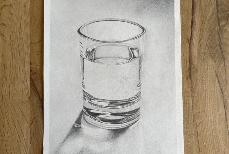
3. About This Project: There are three things that are required to have some
success with this tutorial. And the first one
is a practical one, and we'll go over that in
a really quick exercise. And that's being able to use your pencil in
a way that you can adjust the pressure to get lines that go
from dark to light, and also lines that go
from thick to thin. And you can see around
the rim of the cup, there are some very dark
lines there on either side. Quite thick at the corners, and then they thin out
as they come around. So we need to be able to control our pencil to get that effect. Second thing that we need
to be able to do to have success with this drawing is to forget about the fact that
this is a glass of water. Now that's going to be
pretty difficult to do, but see if you can keep
that in the back of your mind and try to change the way that
you look at this, and I'll show you some
techniques for doing that. But the problem is when we
think about a glass of water, we think about glass and
what we know of glass, we know that glass
is transparent, and we know that
it's reflective. We might think of it as
being very light in value, just because it's see through. But actually, what
you can see there in that photograph is
a really strong black values. There's some really high
contrast light and dark. And so we need to forget
about this idea of glass as being see through and transparent and reflective, and we just need
to be able to see the interlocking light
and dark values. The way they kind of
fit together as shapes. And the last thing we
need to be able to do is to be able to
trust the process. So, this drawing in particular is going
to be one where you don't get the full result
or the full illusion of the form until the
very end until you put in those last
tiny little details. And so there might
be some stages along the way where
you're thinking, Oh, this just doesn't look like that really strong vision of a glass that I had
at the start of this. It just looks like, you
know, gray on paper. And we need to
trust the process. Trust that if we keep following the steps that
I'm going to lay out, and if we keep trying
to see that glass as a series of light and
dark values and patterns, that it will all come together. And it's a little bit linked
with the idea of, you know, what we know about a glass
and what we know about water. We need to forget all
that, and we just need to look and observe
and draw what we see.
4. Tracing The Template (Optional): Because I really
want to focus on shading to create an
illusion in this class, I've created a handout for you that you can actually
trace if you want to. So this is a very detailed
tracing of the glass. I wouldn't use this one,
but this is just to kind of show you what sort of things we're going
to be looking at, what we're looking for with those light and dark
values in the patterns. This one here is a more
simplified version, and so this is one that you
could trace if you want to. And if you don't have a printer or a screen that's bright
enough that you can trace from, then we're just going to
have to draw it free hand. So that's what I'm going to do. I'm going to draw it free hand, but this is here if you do have a printer and
you want to trace trace it just by
putting it under your page and putting
that up against a window, and then you'll be able to
trace around very lightly trace around these
darker outlines here, just to get something
down on the page so you don't have to worry
too much about proportion or
anything like that.
5. Warm Up With Line & Shading Exercises: To start with, I'm just
going to take you through some very basic
drawing exercises of the sorts of marks
that you're going to need to be able to draw. And I mentioned them earlier, they are going
from thick to thin and also from dark to light. So let's try thick to thin. You're going to start off
by pushing quite hard, and then you're going to just
let your pencil taper off until you are not touching
the paper anymore. I'm just using an HB
pencil to start with, might take a couple of goes or a couple of flicks
like this over the line, and then you're just
going to taper it out. It doesn't have to
be a single line. If you're starting pushing hard and then lessening the pressure, you can do that,
but it's a little bit harder to have control. So you can actually
kind of shade the line, and we'll be doing that
quite a bit in this drawing. So shading it quite
dark or quite thick, sorry at the start, and
then letting it thin out. You could try both ways. If you're right
handed, this will be the natural way for you
if you're left handed. This is probably
the natural way, you start at the right
side and then draw it out. I'm moving my hand a little bit across the page
as I come across. You could if it's
very small ones, you can do it without
moving your hand, so I'm just moving my fingers. Let's have a little play around and see what works for you. Then grab a darker pencil. This one is a three B pencil, we're going to do
the same thing, but I want you to really focus on having a really dark end. And then lightening it
up at the opposite end. I've done quite a
thick one there, you could do a really
thin one as well, really dark to really light, trying to keep it the same
thickness all the way along. Another way to do this would
be to just shade a line of maybe a middle gray and then work from the end
to darken it up, but you want to be
able to fade it out. Fading out our shading is also something that you're going
to need to be able to do, and we cover this in quite
a few other tutorials. If you've done some
with me before, you may be familiar with this, but being able to shade
an area and then lessen the pressure and
then working over that to create a really smooth
gradation from light to dark. As I start from the dark side and then come to the light side, I'm lessening the
pressure of my pencil. You might have to
work over a few areas where there's some
strong divides. I'll do another one
from this side here. So if you're looking
at the glass an area where you might
be able to see this is that main area of the
glass in the center. It's light on the
left hand side, and then slowly gets a little
bit darker and not much, so that in that
case, it would be a really, really light gray. You may not even be able to see this very well on the screen, and then disappearing
into a white. I'm moving from right to left, but you could go from
left to right as well. There's two ways that
you can do this, you can do it all in one
go where you start dark, then lessen the pressure, and then you rework
over top of that. Or you could just
shade a base layer. Some shading in area of gray. And then working from one side. You see I'm using my pencil
on its side as much as I can. Working from one side and
adding another layer over top. But as you come to
this side here, which you want to be
the lighter side, you're going to lessen
the pressure until you're barely touching the
paper, and then again, you might rework it
and find the areas where it's a little
bit too divided. You could also use just little
small circles like this as another way of fading out one
value into another value. So have a play
around with that and just make sure that you've
got a handle on that first. Because we're going
to be using that, and we're also going to be using these thick to thin lines. And also dark to light lines. They're not too
different really. But just make sure
that you're able to get a point, very,
very fine point, and you're able to go dark at one part and
then fade it out. An area that this is used
in that glass that I mentioned before is just around the corners of that
opening ellipse. So we might have to
shade a shape like this. And then we have to let it disappear by making the line just come into a
really fine point. And then we're
also going to have to darken that up as well. And it might not
necessarily lighten up. It might stay dark,
in that case, you can have to bring
it to a point again, or in some areas,
it may get lighter. So around the front
edge, on the other side, anyway, it actually
starts to become a little bit lighter
and this front edge is a bit lighter here.
6. Drawing The Proportions: Let's get onto our
drawing over here. You've got the option of tracing out of this
outline if you want to. When you trace it
out, make sure you do it really, really lightly. We want to have our first
initial lines barely show up, so with an HB pencil, even a two H pencil, and it's really just to
get mostly just to get the size and then to
get these larger shapes down onto the paper. I'm going to assume that you can't print this
out and trace it, and so I'm going to
draw it from scratch. And again, we want to keep
it really nice and light. We also want to
try and break this down into a series of
interlocking patterns. And that's why I've also provided that other
print out there. It looks like this. That's essentially what
we're going to be drawing. Now, we're not going to draw every single one
of those outlines, but we need to look at it
in this way to be able to see how the lights and darks
are actually just shapes. There's some very,
very fine shapes and very fine lines down the
bottom of that glass there. But that's all they are is
they're light and dark shapes. Sometimes they have a bit
of this gradation in them, and they go from dark to light, and we need to be aware of that. Let's look again at the glass. And see if you can just start
to break that down into those shapes that were outlined
in that previous drawing. Now here's the more
simplified drawing. This one ignores some of those really fine lines
right down the bottom, but it gives you
the larger shapes. And so when we first
start our drawing, this is really what we
want to be thinking about. What are the larger
shapes that we can indicate into our
initial drawing so that we have some really
good placeholders for when we start to add
those lights and darks. I'm going to bring
back the photograph, but do keep this in mind, and maybe even have this on another screen just so you can keep that
at the forefront. What is it that you're
actually looking for when we're
drawing this glass? We're looking for these shapes of light and dark and the
pattern that they create? If you are going to be tracing your drawing from the handout, now is the time to do that, and then you can skip
forward to the next video. If you don't have
access to the tracing, then we're going to
go ahead and have it go at drawing this free hand. Now, whether you're tracing
or you are drawing free hand, I want you to try and your
lines as light as you can. I'm going to draw a little bit darker than I normally
would, so you can see it, but I'll probably end
up rubbing out some of those darker lines so that it doesn't interfere with
the final illusion. But if you can use a
two H pencil or an HB, if you can use it really lightly and just draw as
light as you can. So the very first thing we
need to do is just make a mark at the top and a
mark at the bottom. Decide how big we
want this to be. I wouldn't make it
too big. I mean, it's maybe just the
length of my fingers. I've got quite long fingers, so maybe a little bit longer. It's a little bit smaller
than real life, I'd say. We want to have space to
be able to get in some of those really fine lines that are going to be down
the bottom here, but we don't want to have
it too big and have to, you know, shade a lot of gray. These are the things
we're going to mark out. We're going to mark out
where the top ellipses, where the ellipse
of the water is. They're about the same
size, which is quite nice. Halfway point is
around about here, so you can see both
those two ellipses, this one and this one
are above halfway. And then we'll also find this
line and this line here. So those are the
placeholders that we're going to find to
just map things out, and then we'll also draw
in these shapes here. Maybe the dark and the light
shapes down the bottom, but not in too much detail. So using that guide there. The green lines as a
guide, here's my halfway. Very lightly, taking a guess at where the water
ellipse comes down to, and then dividing that in half, that's going to give me
the top ellipse here. Then the water ellipse here is going to almost
touch the top ellipse. I got my base down here, and then we just have to figure out how wide is it going to be. If we want to figure
out this distance here, what I'm going to do is I'm
going to take the height, and then I'm going
to see how much of the height this
distance would take up. Here's the height. Is
that pink line there, I'm going to turn it around
and compare it to the width. And you can see there
that the width of the cup is definitely
more than half of the height comes out to here. Maybe we could say
that it's two thirds. Does that look right
to you? Maybe it's a little bit less
than two thirds. So it's just to give us an idea. It doesn't have to be perfect. So this line here is the bottom of that ellipse that I'm going to
create at the top. So what I'll do is find
the center of that. And just take a guess. And
then I need to, you know, once I've decided how wide
I think it should be, then I need to find
something to measure with. I'm going to take my pencil. And I'm going to check that it's two thirds of the height. I'm using this
finger as a marker. I's a little bit awkward for
me to turn my hand around. Here. And I'd say it's more than two
thirds of the height. What I've got. I
need to bring it in a little bit on either side. Probably that circle that I had their first was about right. Keep your lines and your
marks as light as you can, or at least easy to rub out. Take this one here,
compare it to the height. That looks pretty
close to two thirds. Here's the top. This
will be a third. This is a second third. So
I'm going to go with that. Put in my ellipse. Hopefully you've had plenty of practice it during ellipses. I've got a few videos on that and also some YouTube
videos that could help you out if you find that
really troublesome. So I just use the Huluho method, where I just go round
and round and round, trying to get something that is nice and flowing
and even on each side. But you could also just
work your way around. Try not to build
up too many lines. Then the base. I'm not actually going to measure
the width of the base. I'm just going to
look at the slant on either side of that glass. You might even be able
to see the triangle here compared to
a vertical line. If I drew a straight line down, what's the angle that
this needs to come in at? Probably something
like that, and then the other side is
going to be the same. I think mine could be a
little bit too narrow. Maybe you've gone a bit extreme
with this one, I think. And then we've got an
ellipse at the bottom there. And you can maybe see it's kind of hard because there's a
lot of distortion in here, but probably the base of that bottom ellipse
is probably about there. Because of perspective, it's going to be a taller
ellipse than this one. But don't worry too
much about that. We're not drawing so much of a three D
shape for this one. We're going to be looking
at those patterns. But that does give us
an indication of where this shape is going to
start. Make a mark there. It's a little bit less than halfway between our
halfway point and our base. Maybe I'll bring mine up
just a little bit here. And it doesn't actually need
to be analipe. There, sorry. Let's just make a
mark, do it this way. It's a little bit below
halfway between here and here. I don't want to get
too confusing here, but what I'm looking at is here's my halfway
point of my glass. Here's the base of my glass, and this is just a little
bit above halfway. Oh, I thought it
was below halfway, but maybe it's actually
halfway. Let's say halfway. Let's put it about
there. If you see this differently and you've
got another screen and you're doing some
measurements with your pencil, then just go with what you see. Then we're just going to
draw a line across there. It's got a slight
curve in it like this. Then we're going to
draw another one, not quite halfway between
that point and that point, and that is giving us the
bottom of this pattern area. So if I take away
all these lines now, you see there's a sort
of pattern area in here, and then there's a light area, and then there's
another pattern area. So just making markers of where I'm going to start
putting in those patterns. And then also, we're going
to make sure we have this top ellipse of the
water in here as well. So don't worry if you
haven't got these perfect because this is
a different approach to like what we're doing in
drawing everyday objects, where we are trying
to break it down into symble shapes
and three D objects. What we're going to
be doing here is focusing more on the
patterns of light and dark. So it's really just to
get a guide down there. And then also just give an indication of the angle that your shadow
is going to be on. Lo at it, start to draw, and then correct
it if you need to. So I hope you can see that okay. My drawing here is very light. So to summarize what we've done, what you need to have for
this guide here anyway at the moment is you need to have top ellipse and
the water ellipse. Both of those are a
little bit above halfway. Here's my halfway line. We need to have a line to
indicate where this section of pattern underneath
this large area of gray where that sits. So I've got a line
for the top of it and aligned for
the bottom of it, and then I've also
got a line for where the next section
of pattern starts.
7. Adding The Value Shapes: There's a couple of ways that
you can proceed from here. You could just start shading
in the lights in the darks, looking really closely
at each part of the photograph and then shading in and
drawing what you see, or you could map out
all of those lines. Like now tracing here. And I'm going to mark
out some of those lines. And then some of it
will just kind of, like, do as we go along. So we're kind of doing
a little bit of both. But if you really want to have a lot of control over this, then getting something that
looks like that tracing will just help you know
exactly where to put everything before we actually
go into the shading. So if we have a look at the
top of the glass there, there's going to be a
little bit of a rim, so just be aware of that. That I'm going to do as I go. So I'm going to shade, and
then I'm going to look at how it goes from light
to dark and thick to thin, and I'm going to do that just
sort of on the go, I guess. Down here, there are some
shapes that we can put in. So looking for this weird kind of shape that I can't
really describe. But I'm drawing that
in as a marker. And then I'm going to draw
the shape inside it as well, which is that really
bright white shape. And I'm going to do
the same on this side. You can see that this
one on this side doesn't come right out to
the edge of the glass. Something like that, and then it's got these
white parts in it. And then it's got even
more detail in it. Again, you could
map all that out, but I'm actually
just going to do it as I go when I'm
looking at the shading, but I am going to get
the shape in here. The great thing about this is if you don't get
it exactly right, no one's actually going to know. But we do want to get
something similar, get the lights in the
darks in the right place. Marking where the lights
are going to go there. We've got some fine
details around here that we can
put in as we go. Let's move down to the
bottom part of the glass. Along the sides here, you can see that there is a darker patch
that comes down here, so I can mark that
in and on this side, there's a darker patch
and then it's got this ripple in it here. So if you can do these with
nice clean single lines, then that's going to make
things a bit tidier later on. I've got a little bit
sketchy over the side, which means I'm going to have to clean things up at some point. But as we come down here, looking for the shape comes
up and over and then down, looking for this bright
highlight shape in here, it's got a bit of
a dome end on it. And then there's a darker
shape over the side. And then there's some
lines and things. I'm going to do those on the go. Down here, we've got
this very dark shape. Comes still about halfway. It may be an easy way
might be to draw that. You see that almost like
an ellipse shape in there. It's like a gray color. That might make it easier to figure out where
those darker shapes are. There's that ellipse in there. There's this dark
shape on the top. Any lines that are going
to help guide you. There's a very bright high light comes along here and
another one along here. It's all dark and here. Then we've got the base
of that dark shape. Then we've got the
base of the glass. I'm going to do a lot
of this on the go. It's actually very
light down there. It's not a hard outline
or a dark outline, just be careful when you
put that in this edge here, draw in, so you
know where it is. But do just be careful
that it's not too dark. This one here can be dark. Because we're going
to be shading darker next to that
line at that outline. But this one at the base
here, if I take it away. There's a bit of dark
here, but there's not a lot of other dark
value around it, so we need to keep that
line itself light. And then we can start to
put in a bit at the shadow. So you can see how if
you can trace this, it takes a lot of the more
intricate work out of it, and then you can really
focus on shading, but I did want to make sure that you could still
do this if you can't trace from a
printout or from a screen. So I'm just putting
in this shape. There's that darker shape there. There's a darker shape here. It's got a little wrinkle in it. It fades out, so we need to make sure we don't put a
really strong outline. We could also think about
the lighter shapes. There's a light shape
here, I don't want to outline, but just
be aware of it, and then there's a light
shape that comes up here. It's whatever works for
you to be able to mark out where you're going to shade light and where
you're going to shade dark. I can outline this and this because I know that they're going
to be quite dark, soft edged, but still dark. And then I could also
very lightly outline this to show where
that light section is, and then I know that around
that is going to be darker.
8. Add A Base layer Of Shading: Before we start putting in
the lights in the darks, we'll just put down a
base layer of shading. So you can see that
the background of the photograph and the parts of the glass where we're
looking through it. They're all a very light gray. And this is where
drawing on gray paper is a really useful material
for a drawing like this. Then you're just adding
the black and the white, and you don't have
to shade the gray. We're going to shade
in some light gray first before we get
to the details. Now, before we do that, you need to make
sure that you've only got the lines
that you want. If you've got a putty eraser, then you can put that into
a point and just erase the very fine areas
that you don't need. Trying to leave all
those lines that we put in as guidelines. If you've done the tracing, then you may not
need to do this, but what you could
do is just check that anywhere where it's
light in the photograph, like over here, over here, these very bright parts, make sure they don't have
any lines in them, you know, just like messy lines or that they don't have any
really dark lines. So probably over here, I can lighten that edge up just a little bit
with my eraser. Most of the light
lines or most of the light areas actually have a dark area right next to them, so it's not too
much of a problem, but if you've put in this ring
of the back of the glass, which isn't actually
in the tracing. But if you have put that in
that needs to be pushed back, and this one at the front
probably needs to be pushed back a little bit and
one's a bit dark over here. So you see, I've got
quite a dark area or dark edge to that, and it's lighter at the top, so I need to use my part
eraser to get rid of that. Or if you've got your
Tombo mono zero, this is, you know, much easier. Highly recommend
getting one of these to anyone because it's
not super fine, I think it's 2 millimeters, but it is, just so easy
to clean up your edges. You can do it without
having to worry about rubbing out anything
that's important. So you should have a
really light outline of the glass itself
and then the shapes. And now we just need
to put in some gray so that we've got
something for the white to stand out against. And can use my
pencil on its side. This is an HB pencil, and I'm just going to
shade downstrokes, very, very light pressure
coming across, you might be working
from this side. We're going to smudge this a
little bit without tissue. So it doesn't matter if you've
got a few lines in there, but what you don't
want is anything dark. So it will be a little bit hard to see this on the screen, but I don't want to make it too distracting to any of the other values that we're
going to put in there. For this stage,
you're just go to be careful that you keep it
really, really light. Really even pressure. So I'm barely
touching the paper. I'm actually just leading
my pencil can rest, and I'm just moving my
pencil up and down. And we want to shade all
of these gray areas, just a really light gray, and we can blend them
with the tissue. Now, what I want to show you is that when I use an HB pencil, you might be era to see there's
still some lines there. I've still got lines
from my shading. And I'm not too
worried about that. But if you were wanting to
get something that was very, very smooth, then you could
try using a very soft pencil. So this one, this
one here is a six B. And you've just got
to make sure that you are barely touching the
paper because we don't want, any of these dark
lines like this, coming in through your sketching just by accidentally
pushing too hard. But if you use a pencil
that's softer like a six B, then you could use
something like a brush to smooth it out, and you won't have
so many lines. You could use a tissue as well. But a brush is
really nice as well. It just gives you a
very, very soft effect. Seem like you got to see the
difference here to here. Even if I use a tissue
over that HB pencil. It's a little bit more
kind of hit and miss. It doesn't give me that nice, smooth, gray. So it's up to you. I guess the limitation
or the danger in using this six B is that you could end up going too dark. And so that's why I probably
just use an HB if you're a beginner and you're
not so confident with shading really,
really lightly. But the six B, like I said, will give you a nice effect. If you don't have any of the finer tools
like erasing tools, like the mono zero or a putty eraser that
you can put into a point, then we've got to be
quite careful that we don't get shading or smudging into these areas where there's some very,
very bright white. We're going to keep those
as clean as you can. When you erase it,
it's never going to be as clean as the white page. Unless you've got
precision eraser. So we've got in here
in here as well. These all about the same. So just work in your own time. I'll probably keep talking, but work in your own
time building those up. This one here is maybe a
little bit darker, actually. This ellipse of the water. Putting down some six B, using my brush or my tissue
just to smudge that out. Here, here, here goes from dark to light or from light
gray to even lighter gray, so that's something
that you might be able to control at this stage. Starting really, really light. I might use my HB for this. Se I'm really barely
touching the paper. I'm just seeing my
pencil rests like this, and then I'm moving my hand
up and down while it's on the paper so that I don't
get any dark lines, and I also keep a consistent
pressure that way. So I'm not pushing down at all. When you start to
push down on it, that's when you're adjusting the paper, adjusting
the pressure, depending on how your
hand is positioned and how much pressure
you're putting on it either intentionally
or unintentionally. Whereas this way,
you're just resting. I'm not pushing any weight down. I'm just letting the weight
of the pencil do the work. So in here I could
start a little bit darker and then see if I can
fade that out a little bit. And then put the shadow as well. So it's just our base layer, get something down
there, something in these grays of the glass. And then if you have a look at the side of the glass here, it's lighter than
the background, and maybe a few areas
down here as well. So we can also put in some shading for the background as well,
really, really light. This is where using gray
paper gives you an advantage. You don't need to do this step. But I'm going to
assume that people or at least some people
don't have bright paper, so that's why we're
doing it this way. It's just an extra step, and it's also a good way
to practice your shading. Practice getting those
nice even values. When you're using the
tissue, just make sure you're not pushing
really, really hard. It's just about shifting
the graphite a little bit. If you push hard,
you're just going to create smears and smudges, and you're going to also damage the paper a little
bit and potentially. And also, you're going to push that graphite right down
into the tooth of the paper, and it's not really
going to move at all. I is going to do a little
bit more with my six B here. Just have some of that nice
soft graphite in here. There's one other thing
that you could do to get this effect with
a softer pencil, and that's to use some sandpaper and sharpen your pencil
on the sandpaper and collect the filings or the sendings and then use
a brush to put those on. It's a little bit harder
to control because it depends on how much graphite you get on the end
of your brush. You be sanding your
pencil off and then collecting all this just
by tapping it somewhere, and then you can see there's a whole lot
of dust in there. You can then use
that to shade with. It doesn't work so
well with my paper. You can really see the texture of the paper, which
I don't like. I don't like the
texture of this paper when I use that method on it. I don't mind it when I'm
just using regular shading. It's quite a smooth
paper this one, but the more you add shading, the more you tend
to see the texture. We won't spend much
longer on this. It's just getting something
around the outside. You can choose how much of
the outside you fill up. Smudge or brush. The more textured your paper is the easier this is actually going to be for you because you get more coverage
more quickly. When it's very smooth paper, and this one is quite smooth, takes longer to get
a smooth coverage, which sounds a bit ironic, but you really need
to fill in all of the little gaps because
there's no texture there to hide hide any flows
in your shading. Okay, I might just stick
with that for now. So we've got some grays here. I've still left these areas. Light because I'm just going
to go dark with those. Everything else is
going to be done with either an HB or 2b3b4 B pencil, but it needs to be
nice and sharp. So I've given this
one a good sharpen with a knife and some sandpaper. You can just use a
regular sharpener, but do make sure that
it is nice and pointy, so we can get those fine
points. Like these ones here.
9. Drawing The Rim Of The Glass: Okay, now we're up to the
fun part where we start to create this illusion using those patterns of light
and dark that we can see. And this is a time
where we need to forget about the fact that
it's a glass and really focus on what we're actually
seeing in terms of shape in terms of line and in
terms of light and dark. So we're essentially going
to be looking for this. It's going to be
filled in with either light or dark areas. But all of those little patterns is what we're going
to be looking for And what will help is
to do this in sections. So if you have a printout or you even have the photo on a screen or a printout
of the photo, you might want to
hide some of it. So we're going to work on it in pieces, starting with the room, and we're going to zoom
right in so that we can clearly see what's happening with the lines and the
light in the dark. But also to isolate that area and bring that area away from
the full form of the glass, the idea of it being
reflective and see through and light colored
and all of that stuff. So we're really
looking at it almost like the way you'd look
at negative shapes, or when you turn a
drawing upside down, we're distancing it from what it is or what
we know about it. I'm going to go ahead
with a three B pencil. This one is Faber Castell, I think it's called
the green and gold. 9,000 is the model. But they are quite hard pencils, even the soft ones
like this one. And so I know I'm going to get
a nice fine point with it. If you've got a
very soft pencil at my Tombo mono pencils
are very soft, even in the harder grades, then you might want to use
maybe a two B or even an HB. So just see what your
pencil will give you in terms of having a sharp edge. Sharp edges are going to be key. We want a strong
definition between say this is a reflection here between the light
and the dark areas. We might have some grays and then we might
have some dark, and then we might
have some light. Now if you're using a soft
pencil like this one, you might end up with something that's a little bit fuzzier, especially as it
starts to get blunt. So just find the right grade of pencil depending on
what your brand is. And those things are
going to be key, sharp edges to our shapes and also being able
to create gradations. So let's use what we're looking at right
now as an example. You can see on the
left hand side here, we've got this really strong
or really sharp edged shape. And then as it
comes around here, it starts to gray out. So it goes from being dark and sharp to being gray
and a bit softer. And that's what we're going
to be trying to control. And you can see it goes also from dark to gray in some areas. So gradation, dark to
light or dark to gray, and also sharp edges is what we need to
add to our drawing. So I'm going to again
go around the outline. And I've already put some
outlines down there, but I'm just going to refine. And I'm just drawing
in that dark shape. So go ahead and draw that that
dark crescent shape there. And I'm going to shade
that in right now. So this is I said, some of
it I'll be doing on the go. And this rim is something
that we're doing on the go. So we're looking and observing
and changing our pressure, changing our line
quality as we go around. We've got that nice
strong shape in there, and then I'm going to work
my way around here and I'm looking at the rim as I go. It's quite gray, so I
could shade in like a grayish line that
joins up to that shape. But right on the inside here, it's very dark and it comes to a point or it
sort of disappears. Now, don't worry if your
glass ends up a bit wonky. You know, the ellipse
is a tricky thing to draw and to get perfect. And this is again where we
have to trust the process. We just have to keep going till we've got the
whole thing done, and then we'll see
what we've got. And even if it is a bit wonky, you should still have
a really good illusion happening of reflective
glass and transparency. Don't get caught up in things that don't matter so
much at this stage. So I've got this
gray front edge. You can see the very back edge is there is a light
gray line there. It's kind of like a
soft shaded line. So I don't want to draw
a hard outline there. But then there's a second
line underneath it, and that parallels it. That is a bit darker. And that comes around and
it joins up over here. And then when it joins
up on this side, we're going to have to
have that other rim in there the other dark shape. So I'm going to put
that in starting with the back edge of it. Again, it comes to a very
fine point along the back, and then it starts to open
up into a crescent shape. It's going to draw
the outline of it first in the edge of
it around this rim. You see that very strong
white highlight in as well. So we've got to leave that white And there's a very dark line on the other side of
that white highlight. It gets a bit thicker over here, where the white highlight
goes into a point. So shading around
that white highlight, putting in this
darker thicker line here, just underneath it. Very fine. So sing my pencil on its tip as it comes around on the inside of the
white highlight. I'll got a bit of
a wobble there. Doesn't matter. Just
going to keep going. Then you can see how that white highlight ends and then we've got this
in the edge here, it starts to get
thicker and thicker, and it joins into
the crescent shape and then that
disappears to the back. What's happening over this side? Once you've got that darker line underneath the highlight, we've also got another
quite dark line here, and I just draw
it lightly first, get it in the right place. And then you've got to go
dark because it is dark, it's almost black.
But it changes. It gets a little bit pointy
as it comes to this side. So these are all the
really fine things that we need to be
able to look for. Let's look at how this
front rim continues on. So it's it's gray all the
way over to the side. There's a few little details we can put
in there if we want, but let's just get the inner
edge of this gray rim. It's a little bit darker,
so let's just get that in. So I'm just shading a
darker line along there. Maybe make this one a
little bit thicker. How's that back edge, we've
got to get in as well, so the back part of the
rim is see through. So it's light gray. But then
just underneath the rim, we've got this darker
line. Is it black? It probably is pretty
close to black. I was going to shade
it in there first. It fades out a little bit on the side or gets a
bit on the side. So as I talk about these things, see if you can see them
in the photograph. See how that's fading out. See how there's that white
highlight just above it. It's quite a narrow one
and quite a fine one. So you could bring that
out a little bit if you've got a very fine eraser. It's not a huge deal, that one. All of this should be just the same gray as the background. And this line underneath
it is darker. I go to darken that up. Darken it up until it matches
the value of the photo. Being a bit sketchy with
this particular line, it's at the back, and I'm not too worried
about it being super super clean because things
at the front, you want to be
stronger and sharper. So let's just put a nice sharp
edge along this front one. Not darker sharper.
I'm using my pencil. Use my pencil on its tip
to come around here. We'll just put a few little
details in over here, see if you can see
what's happening. There's a little bit of a shape that comes down there,
just shading it, working my way along, looking
and shading what I see, or shading something
that's similar. A bit of a pointy
part comes out there. Then there's another
really fine line around here to it lightly first
and then darken it up. I was going to correct this
shape a little bit, I think. When I look at that
negative space in there, there's a bit more
of a curve here, a bit more of a crescent shape. If you've traced this,
you probably have a much more perfect ellipse
at the top there than I do.
10. Drawing The Middle Section: Right. Let's move down
to the next part. We're going to do this
part over this side here. Can you see that the front
rim of the water ellipse. There's quite a dark line there, and there's a couple of
little breaks in it. I'm going to put that
in really sharp line. And then a break, another little break, and then another sharp
line comes out here. Then we've got these two
shapes that we outlined. Now, you can see that there's a white highlight around
the edge of each one. You could go in and draw
that white highlight. There are some really fine
shapes in there as well, some other smaller
light highlights, and I'm going to just
shade those in gray. Not putting all the detail
in, but most of it. And then I'm going
to start to shade in everything else around that. Excluding the white highlights, excluding those light gray
highlights that I put in. Often when we do a
drawing in these classes, we work on bigger shapes
and then get down to smaller shapes right at
the very end in details. This one, because of
the way we're working, we're actually doing
the details as we go. Once I've got that
shape in there, I can then look at the
variation in the shading. So it's a little bit
darker just here. The whole thing is
actually a bit darker, but then it's a
bit darker there. So lines and shapes
and things in here. Remember to suspend
your knowledge of what a glass looks like. This is a really odd
shape, isn't it? And it's not something that
you are familiar with. So it might feel kind of
strange to be putting it in here in this
drawing of a glass. Keep looking and just
shading in what you see. We are the light parts,
where are the dark parts? Get something that's
similar to it. That's not bad what
I've got there, but I'm going to make this
a little bit stronger. Then you see my whites aren't really showing
up that much, which means I need
to add a bit more shading around the
outside of them. As we do this, can you
see that there's a couple of very light streaks
that come through here? So that's something you could
play with a little bit. They're not very light, but they are very faint, I should say, and they're lighter than
the general value there. And then look at
the other side of this highlight area
of that shape. It's quite dark. But look how soft it is, it fades out into the
rest of the shading. Then there's also
this part here, which I guess is
like the reflection of another part of the base
or another ellipse somewhere. Let's put that in. And be very careful that you don't go too
strong with this. Look how soft all the
shading is there. I'm shading my way along. Remember we practice
going from dark to light or shading a line
that goes from dark to light. This one's going from like
a dark gray, Shading along. It's still quite thick,
but it gets very, very light in the center
compared to what it was. And then maybe gets a little bit darker as we
come over the side here. We've got another one that
comes up around the top here. The more you look at this,
the more you're going to see, make sure you keep
this little light part at the bottom of the rim. But everything else can be
shaded in a little bit more. Using my soft pencil, very little pressure
on the paper. Now that we've got
that in there, that makes these white
parts stand out. I could even push it a
little bit further probably. But if you've got a jelly
pen and ink roller ball pen, that's where we can use
that to bring those out even a little bit
more if you want to. Depending on depends a bit on the shade of
your paper as well, actually the color
of your paper. So let's move over to
if we finish this one, we'll move our way over to the right hand side here
and let's do that around this ellipse of the
water the water level. Soft shading here, and then we've got a little bit of white. I've lost mine, a little
bit of white in there. And then another
little bit of white. Bit of shading between those two and then shading on the
other side of that one. You can see how this is starting to take a bit of form now. Starting to bring in a
little bit of that illusion. And there's another
little white here, and another little white here. You could use a regular eraser for these and you
might end up with a bigger spot than using something like
this, but that's fine. And then it gets darker
on the side of it. Just put in that darker mark, and now we're going to work on this one on the opposite side. This weird shape here.
It's got a highlight around the outside of it,
like the other one did. Then all of this is shaded in. Look at the side
of that highlight, the inner side of
that highlight. Again, it's dark, but
it's very, very soft. So it disappears. Whereas the one on this
side is very hard. So I'm changing from
using my pencil more on the side to using my
pencil more on the tip. And the edge of
this highlight on the inside of that shape, very, very sharp, and then gets a little bit kind of muddy and
foggy on the other side, but very sharp on the side here. The shading goes from dark
to a little bit lighter. There's a few blips in there or a little
bit of a high light, a couple of little high light
lines in there as well. Then up this side of the glass, you can see there's
a light area. So we're just going to
shade a little bit on the other side of that
to bring that out a bit. We might need to build the
shading up here a bit more. Everything is in relation
to everything else. And then let's bring
this water line further around a
nice sharp line, sharp edge to it, a little bit of a blip as
it comes around the side, and then another sharp line. And then there's a couple of grayish areas coming up here. Looking a little bit weird
at the moment, I know. We're going to keep
faith in the process, trust the process, and
we're going to keep going. We're just putting in
these rings in here. I think that whole thing needs
to go a little bit darker. You've always got your tissue here if things are getting a bit liny or your brush,
if you've got one. But when you do that
or either of those, just make sure that you're not going over any of
these sharp areas. They need to stay sharp. Let's have a little
look at that, make sure we've got
everything we need in there. Think, I'm just going to bring a bit more of that
highlight. And there. Bit of a darker line
under that one, and a little bit of gray
around the top of this one. So the more you look at this, the more you're
going to see, you might be seeing the things or hopefully you're seeing the
things that I point out. So when I mention them, actually put your focus
onto the photograph either on screen or
on your own printout, or your own screen, and try to see it yourself
so that you're not just blindly copying
exactly what I'm doing, but you're trying to see what I am seeing and pointing out. Then you might also be seeing other things that I am not seeing, and
you can put those in. There's a little bit of
a darker room just here. It comes out, disappears as we were using that technique that we did right at the start, shading and then fading. This needs to go darker. This part needs to
go a bit darker. Quite a fine line there. Fine sharp line and here too. I think maybe later
I'm going to have to really go in and shade
this quite a bit darker. I think it's darker
than we think. My idea of the glass is being light is
getting in my way of, how dark that actually is. Let's work our way down. We're going to do the
middle of the glass now.
11. Drawing The Sides: Let's look at the
middle of the glass starting on the left here. Got that dark line at the top. We add in this line here. This shaded area, this shape. And it's a bit darker on the outside of it than
it is on the inside. And it's also got
some wobbles in it. So shade in that's kind of an outline
there that you can see. There's also a light
patch or a light strip, a couple of light strips, and then there's another
light strip here. So we need to put those in. They're not in the
exact right place. It doesn't matter too much. Take a guess at where they go. I'm going to shade all this in. You might be swapping pencils from the pencil
that you're shading with could be a very
soft dark pencil, and then the pencil that you're putting in
these sharp lines, could be a slightly
harder pencil. Maybe using a four
B for shading and a two B for these edges. Something like that, and then the whole thing
needs to be darker. I'm being very careful not
to create an outline on the outside of the glass because I can't see an outline there. If anything, it gets
a little bit lighter. And then we've got a
little bit of white. So I'm just going
to leave an area, draw a line between these
22 little highlights there. I've got them going in
the wrong direction. They should be curving around
the glass a little bit. Then we've got this white one, slightly larger white one also curving and it disappears into the gray in
the center there. It's really only defined by the dark above it and
the dark below it. T So then I'm going to draw this long shape
that comes along here. You see that little bit
of light in the center? On the left side there, I'm
going to have to leave that. So I leave a little
bit of a lighter area. It's gray, but it's not as dark as the pattern around
it? Comes down. This is where we're
probably going to get a little bit confused. I might get a bit confused, and maybe we might end up drawing something different to each other, and that's okay. So remember to keep these
really clean edges. Nice, sharp pencil.
Clean dark edges, especially along here. Oops. And then there's a white line. So I'm going to outline that. So it disappears into
gray in the center, but it's quite
white on this side. And then we've got that shape. So hopefully, you're down to that area and you
drew that shape. It's dark outside that shape. I'm just working on this
left hand side and then we shortly move over to
the right hand side. If you're getting
lost, really focus on this area here, this highlight. Look at the shape of it, got some wobbly bits in
the center here, and then the dark area on
the left hand side of it. There's a few little light
parts within that as well. So the little light parts
in here and in here. If you skip those,
it's not a big deal, you could just have a bit of
variation in your shading. Very dark, very
sharp around here. That contrast is really,
really important. The contrast between the
white or the light and then the dark, light dark. A little bit of a flip in there. Let's move our way across. So I'm going to come
up to this side, so I'll do this side here just so I can
match where I'm at. I've got this line
as a marker now. Think about this line here
or this edge as your marker. As we come down this side, we've the background is actually a little bit
darker than the edge. So leave a bit of space there before we
put in this shape. If you've got an eraser, maybe you want to just find a point and lighten
up that edge there. And then put in
this shaded shape. So this side is a little
bit lighter than the side, the shape that comes
down the edge there. But it's got the same
sort of pattern to it. It's light on the outside, and then as it comes towards the center of the glass further, it's got a darker
outline here and a few little variations in the
shading within it as well. So I'm focusing on
the pressure of my pencil as I shade
down that line. It's not the same all
the way. It lessens up. I've actually gone a
bit darker down here, but there's a little bit there where it gets a
little bit lighter. It's a little bit darker. I'm constantly flicking
my eye back and forth, changing my pressure of
my pencil as I work, as I see where that
change needs to come, whether it's light or darker. So here's a good example dark and work my way
around that shape, lessen the pressure because
it's a bit lighter just here. And that comes to
underneath that light edge. So there's a bottom part of that bottom shape of that
light edge that I just erased. And now we should be
down to this part here. We've matched that.
There's some light and some dark in here. Up to you, if you
want to put that in, I'm just going to put
in a little bit of shading there and then maybe get my eraser and just lighten up this
patch a little bit. Probably not go to show
too much because I think my center of the glass
isn't quite dark enough. I'm going to add that in later. You could do it now
if you want and go from darker to lighter, but I think I'll do
that at the end. Where we're at. Following the puzzle pieces, got a sharp regular line there that comes down
to join up with this. Then there's a really
long triangle of light gray and another
line underneath dark line. This is where we're going
to get a little bit lost. Just try to draw the
shapes that you can see.
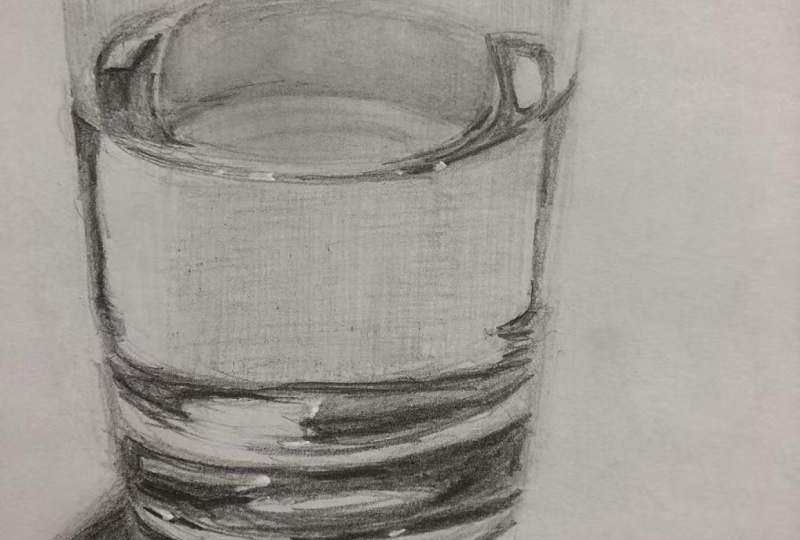
12. Drawing The Base: I hope you can see
something starting to happen with your
drawing now that you've got those really
high contrast lights and darks in there, and sometimes it takes a bit of time or a bit of distance. You might need to
step back, walk away, come back to see
what's happening. Still trust the process. Don't get caught up and try to make this look
more like a glass, but just focus on those
light and dark patterns. And we're going to go into
this more complicated part and here Feel free to just work on your
own and skip to the next video if you
find that easier, or what I would advise is
that you try to work from your own photograph
or your own copy so that you're not just
drawing what I'm drawing, but you're trying to see
what is actually there, but also simplifying
what's there. So you don't have to draw every
single tiny little thing. You just need to
get close to it. So this light shape
is really important. There's a dark shape in here
that's really important. There's some sort
of lines and grays. You could almost
just do that just by doing sort of, you know, lines like this
if you wanted to, and it would still
work because it's just a really small
part of the overall. I'll go ahead and talk
about what I'm doing. Feel free, like I said, to skip or to continue
working away with me. Once we've done that, then
we'll work on the shadow. So you might want to come
back for the shadow. So to do this part, I'm looking at this whole area in
here. It's all gray. There's no white except for a couple of shapes coming
in from this side. I want to get those in
because they're important. I've got the shape, the shape, and then there's a very
strong white highlight. So put that in and let
that be a marker for you. I'm drawing in the
shape of it first. And then I can shade around it. There's another little one just underneath it here as well. Draw around that one. And then shade around it. We want those to be
nice and bright, with clean sharp edges. Mine probably hasn't come
out quite far enough. That's okay. It's very dark
above that longer one. Dark sharp line comes across
and joins up about here. Then like I said, a lot of
it in here is quite gray, so I can shade in all of that. Then I can maybe put in another layer over top that
shows the darker areas. See if you can figure them out, I've got this one that came across the top of that
long white hi there. There's another one
that comes out and up from that one and then comes
along again, it's quite th. This one here is
quite thick and. Then there's a little
one that comes out and across leaving
a bit of a gray space. The little gray one there. So just do the best you can. This part here is
quite important. This is all quite dark. Put that in. And then we want this to have just a little bit
coming into it. There's a little bit of
light gray coming in there and then there's a few
other very light gray paths. So it's not like looks
a bit like a ghost, I, just like a
very bright shape. If something is
obviously not working, then you need to look at not thinking about what the
glass itself looks like, overall, but something in an area that you're doing
just isn't quite working. You really need to look closely
at what is next to what? Is there light or is there
dark next to that light shape, and it changes as you go down. It's dark down here. But
underneath it is a bit lighter. And there's quite a sharp line. Hang on. It's getting
a little bit lost. Yes, this gray line, just underneath the white shape, as you come along here, there's a bit of a
darker edge to it. So that's quite important, dark and sharp, a bit
irregular, but dark and sharp. Now, hopefully you've
made it with me. We're down to this part here. We can leave that really
long crescent shape in here. It goes from light to dark. But let's just draw around that. What can you see in there? I said, light to dark, so we can shade in
this a light gray. Very dark underneath it. Gets a bit trickier
as we come over to the left hand side because
there's a light shape. Let's see, we've got a
little bit of dark there. Bit of dark there.
Joins into Oh, I can see something that's
different in my one. This light shape here,
can you see it's got that long streak of white
that comes out of it. Now, if you've lost
that, don't worry. If you've got an ink
pen, you can definitely bring that back with a
white ink pen later. And then we've got a
little bit of a break and then grayish area. Dark area. I'll see you need quite a bit of
patience for this one. Then we've got the
strip of hopefully, you're matching what you head down or matching your tracing, and we've got the strip
of light gray in here. Mine's gotten a little bit narrow as I've
worked my way down. And then we've got the
strong dark shape. This is important. This is giving us the base of the glass and how it's reflecting curves up just
a little bit at the side. It joins into that
white highlight, which lines up with
this white highlight. Even if yours isn't quite
in the right place, make sure they're in
line with each other. Curves up slightly on the left. Here's the long white highlight. You make sure that
stays in there. Then there is that other little highlight just underneath it, and then there is
that narrow opening. Very light gray. So kind of retracing
my steps again, making sure I've got
everything in there. And when you find a
strong, dark shape, it's quite quite reassuring and satisfying because then you can just draw it in and shade it in. So I'm drawing around
this dark shape here. And then I'm just going
to shade the whole thing. This one's got more of a
soft edge to the top of it. It's not as sharp as
some of the others. But it is still dark. I need to do another layer
or two over top of this. Maybe even come in with
a six B for this one. Just because it's a larger
shape. Softer pencil. Back to my sharper pencil to come between these
two high lights here and bring in the dark
shape on the other side. Little light shape just
there. Get that in there. This gray area in the center, my glass is growing
as I come down. It is a bit of a
point on each side. So I'm just going
to reshape that. So it looks a bit like that, that gray area in there. And then all underneath
here is a dark gray. It's not as dark as
the dark on each side. H What's happening over here? I've missed one of
the highlights. I'm not going to worry
about that too much. Just following it with my
eye, drawing what I see. I missed another highlight
in there as well. Around things that
really helps so outline your highlights as
long as they've got dark on the other side of
them, and most of them do. So I'm going to
make sure I've got a nice sharp edge
to this one that comes around here because that's helping to show the curve
of the bottom of the glass. That is, I'm looking
at this here. This one fades out
as it comes out. There's a very small
amount of white in there. Most of it is like a gray, goes from dark to gray. And I just going to
darken this part up here. Think about how values
compare with other values. This gray is not as
dark as this gray. This dark area is not as
dark as the dark area. This dark aa is almost black. If you're getting a bit tired, losing patience with it, then just get in
the bigger shapes. You can always come back later and put in some of these smaller things
that might be happening in hair or even
changing the gradation of things by adding
another layer over top.
13. Adding The Cast Shadow: So what do you think? Is it starting to come
together for you? I hope it is. I hope you've kept your patience and not
gotten too frustrated. I know it is difficult down
here if you're someone like me who have quite a bit of patience
compared to other people, non artists, but compared
to some artists. I lose patience a little bit. It's a good time to just pull back a little bit and
see what's happening, compare your drawing to
the photograph back and forth and just see if there's anything that
really stands out. For my drawing.
There's something just with this strong line, the strong line here
that I've got happening. D I might have to adjust a
little bit at some point. Not quite sure what it is. Might be that I need another
highlight just in here. It's just feeling a
bit a bit too strong. And you can see in the
photograph there's this lovely sort
of zig zag here, here, and here, that's happening that I've lost a part of. So that's really the only thing that stands out a
lot to me in my one. We're going to move on
and put in the shadow, and that's going to
ground our drawing, so it's not just
floating in space. So we're zooming on that one. Now, the shadow is a lot softer than everything
else in here. Look at the edges of
the shadow shapes. They're very, very soft, so we're going to be careful
that we're going to lay them up so that you have
the lighter edges, and then they get
darker in the center. Now, unfortunately,
this photograph is a little bit cropped. It's the way it came, so I'm missing the end of the shadow, we're just going to fade
it out a little bit. Use. I'm using not my six B, I'm using my three B pencil, but I'm going to use
it really lightly. Let's just put in
the base of this. This is a really good
example where it goes from dark to lighter and also
from thick to thin. Really do your best
to get something that is quite softly shaded, curves up at the edge. So I'm just moving my fingers. I'm not putting a lot of
pressure down on the paper, and it's dark, and then it
gets a little bit lighter, and it also thins out. You might have to use these
kind of flicking marks. Is going to come
all the way around. And disappear into
some gray over here. There's another very
subtle line in between. And then there's another one
underneath this one as well. So we've got three or four rings that are showing up there. I'm focusing on the darker ones. This darker one in here, and then the one
underneath that, the darker one
underneath it actually forms the edge of the shadow. But it does come through this highlight part of
the shadow as well. Keeping it really soft to start with and then
if you need to, you can go over
and darken it up, so darken this part
up a little bit. Then I can really darken
up this part here, which is the start
of the shadow. Just on the edge of
the base of the glass. I've got some definition there. The rest of the shadow
needs to be soft. I'm going to shade this. You could use side to side, you could use small circles, but really focusing on
getting a soft edge to it. You see this highlight
that comes down through here as well. It's quite nice. If you've got some gray
for your background, you could add that in now with
a quick stroke like that. This should all be a gray, very light gray of
your background. Then we've got a very soft
edge coming into the shadows. This is where small
circles will work well, and we're going to layer it up. I'm putting in this layer first. Just doing the small circles
at the edges of that shadow. Lines in between, and
then I can layer up the darker gue over top. I'm going to bring it
around and this shape. Whatever shape you see there. Just making sure you keep in that highlight, see
the highlight in there. We could even just,
very lightly shade the outside edge
of that highlight there to make sure
it stays in place. Then as we come out
further past that shape, it's quite gray,
light gray in here. A I give this one a smudge. Then I can darken up any
areas that need to go darker. This part that sticks out.
I need to go darker but also fade into the tabletop. Then in here, it can go
really dark and soft. I'm going to see, I've got a three B pencil, Tomb moo, pencil, these ones. I like this because
they're really soft. I need to keep that clean edge up against the
base of the glass, but everything else
of the shadow can be. Super soft. Just working on it, building it up until you get
the value that you want, leaving the light
edge of the shadow. I'm coming in a little
bit from what I shaded in the previous layer. It's going to get darker and des closer to the center
of that shadow shape. As you come towards us here away from the
glass it's fading out. We need to do enough to be able to show up this highlight. I need to go just a little bit darker in here,
really soft, though. Look at that shape just
underneath the base of the glass. It's so dark edge there. Then there's a light
shape of shadow, and then a darker shape
of shadow comes in. I've got a little
bit of a flare or something happening in here, you could include
that if you want to, or you could just leave it out. Putting down a base layer, nice and soft, small circles around the
outside of that shape. And a very even pressure. Try to keep your pressure
consistent even if you're doing the small circles with a
different kind of movement. Sometimes you might tend to
push a little bit harder or not have such
a regular rhythm if you're not used
to that movement. So you really go
to put your focus in your hand and your
fingers and your pencil. What are you doing?
Don't push too hard. Just try to keep it soft. Now, there's a little bit of a dark edge to that
highlight just here. We've got the inside edge, and then we've got
the outside edge, a couple of those
flares that come out. But this edge just here just helps to define that
highlight in the shadow. So what's happening
with the highlight in the shadow is there's
a light coming through the glass being reflected
onto the tabletop, where there would
normally be a shadow. And if you like doing things like this
creating this illusion, I've got YouTube video on
shading water droplets, which is quite a
fun one as well. You can follow the process,
and then you can actually start to make up your
own ones if you want to. This line that comes under the room, I need
to fade that out, needs to be soft as
we come to the front. Be stronger and darker as it comes around to the side there. Once you put in these
darks of the shadows, you might find that some areas of your glass are looking
a little bit too light. I just looking at this part here look too light to me
with that shadow in there. Maybe the shape is not
quite right either. So the shadow is the
same as the glass. It doesn't have
the full effect of the illusion until you
get in all of the pieces, the lights, and the darks. So we're still kind of maybe three quarters of the way there. It's not really going
to until we get in the range of values. We can start to do that now. It's going to be quite
dark and here layer up that dark section, quite dark here
on the other side of that little flare,
which isn't white. So make sure it's
not bright white. There's a little flare
coming into the shadow side. But inside the shadow, dark, dense, but soft edges. Fades out as we come towards
the center of the shadow. Then all I need to add
now is this part here, which is just going to help the shape that comes
through here, this dark shape. It's going to help bring
out that high light or that reflected light in the shadow
just a little bit more. I'm just going to do that
with side to side at the moment just to get
the shape in there. A triangle shape in here. You could spend almost
as much time on the shadow as you have with
the glass if you wanted to. It's a very different technique. We're using very soft edges and building up
layers for this one. But you can also get away with just giving an
idea of the shadow, getting in the main
darks and lights because it's not the main
part of the drawing. Even that is working. Look at the whole picture here. You need a little bit
more shadow on this side. A bring in my darker pencil, put in that dark layer. It's got a soft
edge here, but it's quite a strong linear edge. We need to bring that out
a little bit as a line. I same with this one. Soft edge, but quite a strong direction.
14. Cleaning Up Edges: I've put that in a little
bit more shady in here and I think it's just given a
little bit more volume now. Before we add anything else with our tools,
other extra tools, just make sure you've got everything that
you want in there. We want to get this as
finished as possible, before using things
like blending stumps, before using things
like the ink pen. And also make sure you've got some nice sharp edges as well. So if things have gotten
a little bit blurry, maybe just from your hand, or, you know, whatever, just from getting a
little bit too scribbly, identify some sharp edges in that photograph and make
sure you've got the inc, especially around the rim here. With a really,
really sharp pencil, you can just clean up the
edges of those shapes. They are really important. We don't want fuzzy edges. We want nice crisp edges. Try not to change
the shape too much. I don't want to do too much to this one because I think it will end up growing
larger than it should. Some other areas might
be just down in here. So strong contrasting areas. I haven't fixed up that
little bit there yet, but I might do that later, but anywhere where there's just a really strong line that you can see, you
can see one there. Maybe down under here as well. There's those little finishing
touches with a nice, sharp pencil to make things
look crisp and stand out.
15. Using A Blending Stump & White Gel Pen (Optional): This needs to be shaded
in a little bit more. Actually, what we'll do here
is use the blending stump. If you've got one,
you can use this just to smooth out any areas that are smooth in
the photograph. There maybe on the side as well. I wouldn't use it
on the bigger areas because it'll get a
little bit patchy. If you've got a really
nice clean one, maybe a bigger one like this, you could, but you do
really run the risk of just smudging the
graphite around. It's quite hard. Depending on the paper that
you've got as well, it's quite hard to get
a nice smooth gradation and things might get
a little bit patchy. In the shadow is one
place where you could have a bit of a play because it doesn't matter if
it gets really soft. When you're using
these, you want to start in the dark area. And work your way out, or if you're blending a light area, just start fresh
from the light area. So clean it off on a piece of
paper or a piece of tissue. Maybe even start with
a brand new one, if you can, and work in
the light area first. And then and then the dark area. So what I'm saying
is don't go from a dark area into a light area. You can go from a dark
area and just sort of move your way outwards. It's a nice way to
blend a gradation. But then you don't
want to take that and put it into a light area. So I'd start with
something clean. And then I just work
my way around like that back into the
dark area again. Soften off the
edges a little bit. So what you can't do
with these is you can't bring more graphite
into the drawing. So if you're smudging and you're trying to
get it to blend, and there's not enough
graphite there. It's just going to get messy. So if things are starting
to get a bit smudgy, you need to smudgy, you need to come
back with a pencil. You need to actually
put more graphite in there so that there's something for your blending
stick to move around. And what you also find is that once you
put that in there, it dull things
down a little bit. You lose some of
your darkest values. So I would go back and over top, put in another layer
of the dark values. Even if it's just in that very darkest part of
the shadow there. What else have we
got that we can use. You can use your tombo mono zero just to clean up
any highlight areas. If they've gotten a
little bit dirty. It's not great for really,
really fine lines, so I probably wouldn't use
it to try and get a point on this one because it's just going to ruin
what you had there. But for cleaning up parts, maybe extending parts, a
little bit, it's okay. The other thing you can use
is an ink pen or a gel pen. This is called Uni
ball Signo Broad. And it's just white ink, and this is really
good for bringing in some points to your
lines if you've lost some. It should go over graphite it's got a roller ball on the end. But it's really more for the clean areas that
you've already got, just for brightening
those up a little bit. Now, I wouldn't always use this. It depends a lot on the type of paper you've got in the
temperature of your paper. So you can actually see
just when I hold this up, my paper is cooler than the
color around this pen here. And that's kind of the color that's coming out of it as well. So it's a ink is a
little bit warmer. And that's not ideal. But if you've got one,
you could definitely use this drawing to have a bit of a play with one and
see what you could do. So I lost that
highlight down there. I might be able
to bring it back, or it could be that the graphite
is just a bit too thick. Yeah, it's running over there. Sometimes you got to try and
get the ink to come out of it first or roll it on
something else first, there's a good supply of ink
coming out to the roller. I definitely wouldn't
use it to do big areas, these
highlight areas. It's just going to
look kind of funny. It gives you a different
surface to your paper. But if there's any little areas
that maybe you've missed, you around the rim
here, really nice for just bringing out
those really small dots. You have brought out
those ones there. Anywhere else where there's
some bright highlights. I think minus okay,
or maybe there's another bright highlight
down here that I've lost ale bit. I could just bring
a bit back there. It's very subtle,
but it gives you those extreme white
highlights that you need. I think that's everything
we've covered the brush. We've covered the ink pen, blending stumps if
you want to use them. But just with pencil, you should still be able to
get a really good result.
16. Final Thoughts: I'm happy with my drawing, but I am going to go
ahead and just give it a little bit more mph by shading the background
a little bit more. Now, don't do that if you're
not too sure about it. But what it's going to do is it's just going
to bring out some of these highlight
areas like this highlight on the tabletop, a little bit more
and this highlight down the side of the glass. And I'm also going
to go through and just clean up some
of these dark areas. So when I get a bit
of distance from And I'm looking at
the photograph, from a little bit further back. Even squinting, I can see, you know, this is a
really nice, strong, dark area in the photo
in here as well, and mine's got in just
a little bit kind of scrappy and and messy in there. So I'm going to clean
that up a little bit. Just have a look
at your drawing, see if there's anything
there that you think you could improve on in
comparison to the photo. So still not thinking about, you know, does this look
like a glass of water? Hopefully, it does.
Hopefully you've got the illusion of transparency. And glass happening there. But do take a bit of distance both physically
and also, you know, mentally, go and
take a break and then come back and
have a look at it and maybe just see from a
distance how you feel about it. But is there anything in
the photograph that is really strong in the photograph that's missing
from your drawing? I think that's a good
way to approach, you know, making corrections. Squinting your eyes,
like I mentioned, really helps you to pick out those main things
in the photograph. That might be missing
from your drawing. So do a little bit more, and I'll put a time lapse just
so you can see what I do. Hopefully, you've
enjoyed this lesson. I think it's really fun
to do these drawings where it challenges
your mind a little bit. You've got to step away
from what you think it should be looking
like and trying to make it look like something, and you've got to just
focus on what you can see. It's good for your
concentration as well and your patience and
your perseverance. So thanks very much for
joining me for this class, and I hope to see you
in another one soon.
17. Timelapse Of Drawing Finishing: Oh.
 Emily Armstrong, The Pencil Room Online