Transcripts
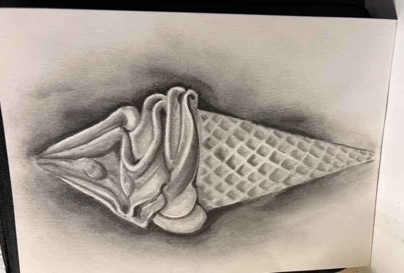
1. Introduction: Hi, I'm Emily. I'm an artist and an art teacher
from New Zealand, and welcome to the
drawing tutorial. In this lesson, we're
going to draw and shade a soft serve
ice cream code. The focus of this
class is shading. It will be a fairly
challenging class, and it will require
some patience. So it's most suitable for people who have done
some drawing before. Who are fairly
comfortable with shading, but just want to take their
shading to the next level. We'll be using blending
stumps in this class. And I'll also be using a
precision erase a pen, this Tombo Mono zero. So it's also a really
good class for people who aren't quite sure about
how to use these tools. If you've taken my sketch
club classes before, you'll know that I don't use
blending stumps very often, but this ice cream cone is
a perfect subject for using blending stumps to get those
nice smooth gradations from light to dark. If you have a look at
the edges of those swirls of delicious ice cream, you'll see that there's no
hard edges between the values. And that's what we'll be using the blending stump for to
get those soft gradations.
2. Materials: For materials you're going
to need your sketchbook. Now, keep in mind that the type of paper you
have in your sketchbook is going to make a difference
to how the blending stumps. Going to blend to the
Pencil on your paper. So if you have quite
a toothy paper, then you might get
more of a texture. If you have a very,
very cheap paper, it might be uneven and some of those irregularities
in the paper will show up when you
use a blending stump. But that is just a sketch and it's a way of
learning and practicing. So I wouldn't worry
too much about going and getting some
really nice paper. Hopefully you will
learn from this one and then you can figure out what paper is going to suit your needs for a more
finished drawing. I'm using two pencils here, a HB in a Tooby. And then later on, I'll also use a darker pencil, like a three or four
bay Pencil. For erases. I've got that precision
and eraser pen that Tombow mono zero
for bringing up. So really Fine highlights. And then I've also
got my patio eraser. You could use it to bring
out Fine highlights. If you don't have
the eraser pen, you may also get away
with a regular eraser, but just cutting it
down with a couple of slices with a craft knife, so that has a nice point
or a nice edge on it. And for blending, I've
got the blending stumps. You could use a
cotton bud if you don't have blending,
paper blending stumps. And I'm also going to be using a tissue for the larger areas, even if you don't have these more specialists
materials like the eraser pen and
the blending stumps. You could do this. Listen without them, but
just keep in mind that you may not get the same
amount of fine detail. It will still be a really good learning experience for how to control your shading to
create smooth gradations, and to use your shading to create the illusion of
three-dimensional form, which is basically what drawing
and shading is all about. So go grid off all the
materials that you need and we'll get started.
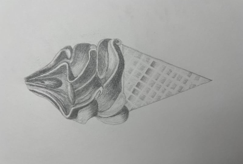
3. Large Shapes: Even though we're
focusing on shading, we've got to start somewhere. And like all of these
classes that I teach, we usually start with
looking at Shapes. Very first thing
though, I would just mark out how big you
want your drawing to be. Working on an A4 page. It's about 8.5 by 11 ",
something like that. I usually recommend
doing a drawing that's about as
big as your hand. I'm not too much bigger because it takes a
long time to shade in. Not much smaller because it just gets very friendly
and hard to see. I'm just gonna make
a muck about here. And then thinking more about
the ice cream part of the, the ice-cream cone rather
than the cone path. So I might make my ice
cream part about here, and then I can flip
the cone and later, just make sure you
got enough space if you want to do
the whole cone. In the main photo, the one that you can download, there's actually a
hand holding the cone. We're not going to worry
about the hand this lesson, but I'm just making maps of where I want the top and the bottom of the ice cream section to be. Now if we have a look at the photograph and it was bringing up a little
bit bigger here. You can see the hand there
on the ice cream cone. Like I said, we're
gonna be focusing mostly just on the
actual ice-cream. If we think about
the main shape. Main shape. If the ice cream for wanting
to fit everything in as kind of like a dome shape. Thinking about something
that is equal on both sides. We're going to use that as how large Shapes to put down
on your piece of paper. And then we're also going
to divide it into levels. So we've got this level here, and then we've got this
level here as well. So can you see how
the ice cream has been trolled around
on top of the cone? Is it first layer here? And then it's
toiled around again and it comes up on
a second layer. And then it finishes with
that peak at the top. How are we going to
approach it with those three sections
or three layers? We'll go ahead and draw that and think about the
height versus a width. But with this drawing, it's not going to matter if yours is a little bit taller
or a little bit wider. And we're actually
not going to worry too much about the proportion because It's more about
the shading this nice. And I don't want to spend
a whole lot of time getting it exactly the
right proportions. There's my dome shape. Just where it
really lightly with your HB or even a to H pencil. And then I'm going to
put in these levels 12. And then I can put
the point up here. Am I make mine just a
little bit wider actually. Even though we're not
dealing with proportions, I tend to do it just
in my mind anyway, I'm not actually
measuring it out, but I can see that there's
something not quite right there anymore like this. Like I said, don't worry
too much about it. I'm just trying to get a
drawing that looks fairly accurate because
I'm the teacher. In this lesson. News could be whatever shape it could be squat or it
could be wider as long as you get those nice soft curves in gradations of shading
from light to dark. So we could put an idea of
the cone if you want to. Like I said, we can
add this in later. So from here, what we're
going to do is just map out those curves
that we can see
4. Small Shapes: So we've got the
top of the tier, the bottom tier there. The sighted kids around. I think, actually start
with this middle one, just because you can see these parts that
jut out towards us. This one here, they,
they, they kinda overlap. Both the top in the bottom tier. Start with this one right
in the middle here. What I'm doing is
I'm really trying to divide this up into Shapes. Now, if we think about this
as the middle of the cone, and I can see this shape here. What I'm trying to draw in. Then I'm gonna go ahead
and draw in this shape. Now at some point we're going
to have to decide where or how we put in there light each and you see the light
each on that one there. When I draw this
second side of it. And I'm going to just keep
in mind that I have to have a space there
for the light edge, which we will either
leave white of the page. We'll, we'll, we'll, we'll
erase it if we need to. Okay, so we drawing in this shape to the lift
of the center line. From here it's got a bit of a, an S-curve in it. And then it comes up and around. Doesn't have to go right
out to the age of your, your dome shape because it is going to come in a bit here. And then it's going
to start to come up towards the center line. Just correct these
shapes if you need to. And I can see but of an
angle coming down here. I can start to build
my next twill or my next what do you call
it? My next ripple. Next door to this one here. So that angle that I
put in this line here, it's just a way to
kinda guide we. The next one is going to go in making this a
little bit fatter than I think because I want
to keep the white area. They're down and around. It doesn't go right
out to the edge. Maybe comes up a
little bit more again, giving yourself room
for the light edge. Now, because this
is a light edge here in the opposite side
of the light edge isn't actually that dark either we're going to make sure it aligns or not to dark this one here. It's not so bad, doesn't matter because if you
look in the photo, It's quite dark all
along the edge. This each on both sides of that line there
is quite Light. Okay, from here, we're
going to curve up and around another angle there. And then someone's
going to create around and up towards
the center line again. Again, if you see any
angles like this one here, they are really useful. That angle we had this
one they had before. It's quite a dark line two, so we can afford to go a
little bit darker and put their done and just
use it as a marker. Come back to because once we
get all of these and it's, it's possibly going
to get a little bit confusing to try and
remember where we are at. So I'm putting in this last
one on the middle section. An S-shape on this just
a little bit down here. Let's put it in. If you miss, it, doesn't
matter too much, but then it just gives us
something to work from. When we put it in
this East stripe. In the Windows, we'll
go ahead and add in this one coming up
to the top as well. Nasals in vet, part of the East. It's going to come up, been around and join that one. I'm just getting rid of the
lines of that level now. So they don't interfere
with what I'm doing. Keep this one just just
for a little while longer. I know we're in it. Okay. What else
have we got here? We've got a little,
little shape in here in the nucleosome lights and some darks and
things in the section, but there's also a drip there. Just get rid of it seemed to line like a drip
coming down here. In the top of it. There's a
bit of an angle on the top. But the drip and then
we've got this one Another one that's going to come down around the outside here, it's got a little bit
of a wobble on it. That's going to join into this final one on this label
here, the second level. I'm just going to
see where that joins up with this ripple and where it joins
up on net side of the report goes from about here. Some of those good to
make these little dots might have seen this in
other classes I've done. Just so you know
where you're at. It's going to go
from there to beer. Down a little bit, little
angle there, a little curve. Then we can go ahead and put
in this bottom layer here. Now this pat on the
sides, pretty simple. We can see it's quite
straight across. Does actually overlap. This one on the second level, just slightly rid of
that straight line. Nif was just part of the
level up a bit along. It's just going to
move down and around. This one up here should
come in a little bit. This one up here, it should
come in a little bit. I just want to make sure that
this one comes out further. Then the ones on
the second level. And then fairly straight here. It's got a very, very
shallow S curve. Angle here. Little almost like a little
triangle shape lifting there. Mine is definitely a
little bit longer, I think then the photograph
in terms of proportion. But I'm not worrying about
that for this lesson. Okay, and then we've got
this lovely cool here. So this one we're gonna
do most of the format, mostly with the shading, so just try and
get an idea of it, but it's probably
going to change. The most important thing
is this angle here. Come down on an angle like that, and then it's going
to start to cut up. And where's it going to join up? It's going to come
underneath this one. Nice. You very shallow
U-shape there. And then from this one
here we come down round. It gets narrower as it
comes to this point. So it's wider and then
it gets narrower. Don't worry too much
about this area. We're going to fix it up
when we come to Shading. And then we've got stuff
from the top here. This one just comes down and it starts to smoke right around. We've got another
similar one here. So it comes down, up
and joins up here. I've looked at that
space on the outside. And we could do that
for the rest of it, the rest of the sides as well. There's this shape here, these ones here looking at it
almost as a silhouette now. And even this one here under the cone or joining
onto the cone near. Just run your eye
around those without all these annoying lines and
the way just do some checks. Maybe but more of an angle here. I've got that shape. Come around the side
looking at the silhouette. I cone is going to be out here. If I come around the other side looking for the silhouette, this one, maybe it comes
out a little bit too far. See, the cone is gonna be about here. We will shade the
cone and later, but for now it's just going
to be just a placeholder. Again, just trying
to get rid of all of these lines that
you don't need. Just the grid lines. They're just the scene two
lines in the lines that we put in to find those
levels right at the start. Now, if you're drawing
is quite dark, it'd be a good idea just to push back some of these, these lines, especially the ones in the
scene to the outside edge, doesn't matter too much of
it's dark because we can put in a dark
background at the end. But maybe some of these ones in here could be just a
little bit lighter. I went wrap mine out too much because I want to make sure
you can still see them
5. Simple Values: The next thing we're
going to do is to start dividing this up
until light in dark. And the easiest
thing to do I think, is to start with
the Darkest area. And for me it's this one here. Now as we do this,
you might start to see a slightly different shape to what you're initially drew. So we can use this shading time to make some corrections
as well if we need to. And then we're just
going to shave it in. Quite likely to start with. It's going to have
a light edge here. So if we wanted to shade
in this next pattern, we need to make a or leave a space there
for the white edge. We could do that. You can
come through with an eraser, especially if you've got one
of these precision erases. And later on you
can come through and bring it wipes out that way. If you don't have
one of those thin, just be really aware of where
those white edges are in. We'll try and keep them
in. This one here. I mean, it's all kind of a light gray and might just
leave it for now. It's a little bit
of shading in here. So we're just looking
for the strongest things that are going to help us
start to put the sticky, the strongest shapes
of light and dark. It's quite dark here. And then again, we've got a
light each try and leave it Light edge and shading,
everything underneath it. I'm just using a side-to-side
shading pattern. You could use small
circles if you want to. We will do a little bit of
blending on top of this. So if you do side-to-side and
you've got a few streaks, we should be able to
smooth those out later on. Moving up level. This line here is quite
strong, quite dark. And then we've got
our Light each. I'm going to mark that out. This is we had to
make sure that there was wide enough to cover the light part in the dark part and
hopefully you've done it. And they needed to
get your head around what happens just up here. So there is a shape in here
that's a little bit darker. And I'm just going
to draw around that shape that I can
see in shaded it. Let's create a bit of
a placeholder there. So it might be a good
idea to put that in now and then come back to our Light section that
we're trying to find. And you'll see how that
comes around and over top of this shape comes in a little bit, little bit light, a little bit darker there and then
starts to come up. The Light edge changes. Sometimes it's
slightly brighter or slightly grayer
than other places. So it's a lot brighter
here than it is here, but we're just leaving
it all white for now. Then we can shade in
this dark part here, even this part of the edge here in the photograph,
it's very dark, but I'm just leaving leaving
it because I know it's the, the front surface or the
front plane of the ripple. Want to make it really clear to myself what I'm dealing with? Try to try to stay clear about
all these different paths. I don't want you
to get confused. And it's probably going to
look a little bit strange to start with until we start
doing some blending. Then we can look at
this next one up. So we've got our light section. There is quite dark above it. And then there's a
light to edge here, very lightly drawing around it. I can shading underneath it. Now the shading on this one, it starts off darker over here and then it gets
lighter as you come up. So just be very careful. Maybe even leave
this part white. Well, very, very lightly shaded. Let's move across
to this one here. Find, find the each, the, the, the front
plane of that ripple. Some drawing around it. Curves under hears quite hard to see because it's very dark, so quite gray in there, but it does curve under the
and it's quite dark just here where it sits on top
of the ripple beneath it. So do my quite dark
so you can save it. Just be weary of how
dark you pushing. It comes up here. I'm going to start, we're
looking at negative spaces in this lesson as well. Each time we were
drawing a ripple, we're looking at a new shape, trying to see it independent
from everything else. Shading here And again, this one
gets very light as it comes out towards the front. Carry on across this way, you could be working
the opposite way. I'm not quite sure which
is a natural way for me anymore because I
changed it up so much, but it might be more natural for you to
go the opposite way. Maybe we'll do that
now let's start on this side and
then move that way. Probably a few right-handers, it's more natural to
go from from left to right because then you're not going to be
smudging your work. This one's all just
a very light gray. Is it Light each year? And even though tunes
into gray down here, I'm still just going to
very lightly outline it, creating those planes. Very, very light here. I know we were going
to leave it, but it is a little bit of shading and this bottom part
here is quite dark, so we can put an, a
darker line there. Now, I'm putting in
these dark lines, Beckett quite soft, so I'm shading back-and-forth over it. I don't want it to be
a really sharp line with the tip of my pencil. And some Shading very
dark underneath this one. Again, just, just a Soft
line shaded back-and-forth. Now we're going to
add in a little bit of a plane here you can
see the light ridge. And then this is where
it folds back on itself. Shaped like that. Just this part here. Let's put that in. And it's quite dark. It's sitting underneath
the lighter edge there. And then it's moved up a level. I'm going to draw
in the light edge, even though it gets
dark towards the top. We've got that weird
little bit and they're going to shade everything on the inside here, coming up to that drip. Coming over to the
other side of the drip. Am using a really
light pressure, but I am trying to fill in
most of these white gaps. I'm just going to pay
attention to this ridge. So it gets a little bit wider as it comes down
with very skinny here. And it's a little bit wider. The S might need to just erase a little
bit of my shading. It may be, I think
it probably actually comes out a little
bit more than I've got something not quite
right about the shape. My fix it up when
we do the shading. Oh, here's what it is.
It comes in a bit here. So kids around and the unit
status to straighten up. And then finally we've
got this one over here, the very light shape. A little bit of shading down
underneath the light shape, and then above that light shape. And I'm just trying to
leave a little bit of white around that each as well. Put in quite a strong
dark line here. And Soft one here. This is just me to get my head around where everything is. It's when you put it
in this gray shading, sometimes you can get
a little bit lost. Is it darker line down here? And then we've got our shading
down under here as well. I forgot about, so we need to make sure we've got this
line coming around, this lightly edge
coming around here. It's sort of disappears. When it gets to the
back of that curve. I'm just going around mine so
you can see it a little bit more clearly within light edges. Down. Let's go up and around. And then we can draw the
other side of the light edge. Then you can see very narrow side of
the light edge there. I think it actually
kills up in his a bit of a square into it to
something like that. Maybe even in a little
bit more because you can see the dark shape
6. Blending Exercise: This point you should
have a sense of three-dimensional form
already starting to happen. These light paths are pushing
forward, coming towards us. And then anything that
is shaded feels like it's pushed back a little bit or it's a little bit deeper. And towards the center
of the ice cream. In a moment we're going
to build up our shading, but I think what
we'll do first is just a very quick exercise. So you can see what you want
to do with your blending. If you just shade a quick
square or maybe even through, Let's do three squares. One, I'm just going
back-and-forth once and then coming back
over the opposite way to do another one here. The other way. So I'm going to be using this
for some of the blending. Ideally, you're going to use your pencil
most of the time. And the way you do that as you just build up your shading over top and you soften off the pressure or less
than the pressure as you come towards the area
you want to leave. What light? We can start again
at the same dark, dark listening the pressure, letting it get
lighter and lighter until it blends with
the layer beneath. So that's the ideal.
And depending on what kind of paper you have, you might get a really good
results just with that. And you might not need
to do any blending at all with these blending stumps. So to show you what it
looks like when we just go over a very flat area. Let's go back and forth. Maybe once back the other way and it's a
very light pressure. You don't want to be
pushing in and scrubbing. You see when I do that, I start to get some
some uneven marks. So it was like You're using your pencil when
you're trying to use this side of it is
just back-and-forth. And then we could
also use it just to tidy up some of
these edges here. If you wanted to blend
two areas of Pencil. Ideally, doing it with your pencil first,
meeting, fade-out. But you can use Blending Stump just to go over
that area where they join. The other thing you can use is I can see you can
use a cotton bud. So it looks very similar
TO Blending Stump. It's very light pressure. You can use a tissue. Now, the problem with the tissue is just going to do
one more square here. It's very hard to get
into those small areas without smudging
everything else. But you might be
honest with folded up almost like one of
these blending stumps. So fold it into a point and
then use that back-and-forth. Again. If you wanted to blend dark
area into a lighter area, It's moving back and forth. So I'd have a go it tasting out what EBIT
blending tools you've got, whether it's just
a piece of tissue or whether it's a
blending stump. And actually what we're gonna
be doing really is we're going to be following
those curves or lines of the ice cream ripples. And that's where the, the Blending Stump is
handy because if you need to get into really
small tight curls like this, you can do that a lot more
easily than with a tissue. So you can come in here, you can soften off
edges as well. So if you want an age
where you can't quite tell where it changes
from light to dark. You can use the the
paper that you're using is going to have a really big effect on
how well these work. And also the pencils
that you use. If I use a, this is
a different pencil, this one here, HB. It leaves a little bit more
graphite. My other one. I'm gonna get different
results when I smudge that. Have little play around. And then come back
to your drawing
7. Building Values Part 1: We're going to build up her
values a little bit more really bringing in
those dark darks and paying attention to
the edges of the edges soft or hard and
they light or dark. We're going to be doing
a lot of shading on here and you might want
to have a tissue down if you are working On top of your drawing depending
on how big your drawing is. So if you're right-handed and you're coming from
right to left, or even lift right to
left, left to right. Either way, you might find
that you're smudging it and just having that they're stops it from smudging
all over the page. I'm just zooming in a
little bit here so you can see the quality of
my Pencil Shading. It's not perfect in any way. But now is the time where I go through and
refine everything. So I'm going to start at
this middle one here again. Probably go back to
my original pencil. If you find that your pencil
doesn't go dark enough, then you're going to switch down to a darker paints or
like a to B pencil. Now I'm paying attention to what kind of max my pencil is leaving in trying to
smooth them all out. And I keep flicking my IBEC to the photograph. So
you do that too. I'm just kinda gauging how
dark this needs to go. I'm going to need to
switch Pintos was definitely not gonna get
dark enough for that one. This one is a to P pencil. Whatever pencil your work
in, whatever sketchbook. This is a sketchbook. The paper is going to have
certain qualities to it. You can see mine picks up in some areas and
doesn't and others. So she really nice
paper but it's not the best based for shading. But if that's happening,
don't worry about that we're creating an
overall illusion. Now, when I come to this
next part, above the light, each stock up here, shading small circles now, and it fades away and then
everything else is very light. This edge here is actually
a little bit grayer here. Then it is here. And here. It's what we're paying attention
to in this might be we bring in your blending
stump if you've got one, makes sure it's nice and clean. And just leaned in that area. We want it to be more gray. You can use this on everything
else if you want to. But again, depending
on your paper, you may get undesirable fix. See if I can clean this up a little bit because
it couldn't little bit me see the very, very light perishes the K
you at least to stop with. Now you could be using
your cotton Burj. You could be using
your tissue as well. Folding it up into a shape. Using this, I don't want to do too much more rubbing
on net one there. But you can use either. Okay, so it might just switch to my TUV pencil now and just
use that for everything else. I'm going to use it very
lightly when I don't want much shading
it all around here. Coming over to the side. Dark parts, very soft. Then is a line, got a faint line that
comes through here. In this dark part that
I've just shaded, we want it to fade into
the area above it. So this is where you
can use, so it's really small circles
just to blend it in to the rest of the
shading or faded out. And then even lighter as
we get close to the Light, each little bit darker here. Again, the edge of this
ripple is actually gray Good. A shadow cast on it
from the one above. I think it's a little
white area just here. That can be gray. And then this pad
underneath needs to be a darker gray to
bring out the edge. In all of this. And
here is a light gray. Something I've lost.
That little bit of light theorem is
going to use it. Eraser, bring it back. And then this H
here is also gray. Can you see how you
have to compare everything to what's next to it. So this edge here
wouldn't be light gray, but wouldn't show up anyway
until I put this docket, slightly darker
gray underneath it. But then I can see that
that's slightly darker gray, then changes to a lighter
gray beneath that. The whole time you
start looking at what's around you in the photograph, what's around, whatever
you're shading, and how you going to
move to that area. Do you need to change the
pressure of your pencil? Do you need to
change your pencil to a lighter or darker one? Do you need to layer
up some Shading? I'm just looking at this
era here and seeing if that's working
before I move on. And what doesn't need. A
little bit more definition of this front edge here. I think it's just this part, very dark pattern there. Comes down and fades out. And then underneath
here definitely needs to be darker, still. Very soft edge here though. Small circles. It's actually a bit
gray and near to each, it's not completely white. The Darkest area is
underneath here. Now that we've built up this, this gray area, we can go in and put in this
really dark area. We can see contrast. Here. Everything is going to compare
to this, this dark area. Now, black point. I'm just looking
at the photograph, looking for areas that I
need to fix up a little bit. In terms of the tonal range. Here is quite gray. But then it has it
really dark area. Create some contrast. Kidding, pretty close. I think maybe a little
bit darker here. And now we can get
really dark in here too. This is where the to-be Pencil. Having put that dark and
you can start to see the illusion he TNI even more now and that's what we're
gonna do with the rest of it. We're going to go
and fill and fill in all the dark areas. Really think about the
value that they need to be. Comparing them to
this black area. Let's go over to the side here. This is all gray and I might just smooth it out a little bit, just use my tissue for this one. Then he's thinking about
what was it the right to kind of gray the right value. I think it needs to
go a little bit dark. And when I compare these
two in the photograph, put down a little bit more
graphite with my Tooby Pencil. Little bit more of a smudge, just a couple of times over. Then I can work on this edge, so it's quite light at the top. I can probably
leave it the way to steer and then HE starts to disappear here it blends into and to the
rest of the ripple. Maybe a little bit darker
around the each year, very, very soft
with small circles. And then it's quite a
bit dark underneath two, so we can add some shading
on the cone later. But for now I'm just going to
put in something to define that each soft, soft edges. We can use it to define this
one too. It's quite dark. The are quite sharp.
They are actually. And through here,
very, very soft. Is it a dark line near, but it's not sharp, like it, like this one. It's like a shaded line. What I'm doing is going
back-and-forth over that area with the side of my
pencil, very lightly. I can build it up, make
it darker if I want to, but I want to just make sure
it's not too dark too soon. Fade out down here. Probably all I'm going to do
to that one at the moment, I think get rid of
this lineup here. If we want to, like I said, we can put in the dark background
and it's going to make very light area just
TO stand out light. But then there's a
bit of shading here to level one, pretty much done. Go ahead and do level two. And then I might leave Level three for you to do on your own. I'll speed up the video
so you can see what I do. But hopefully by the time
we eat to live with three, you've got a good feel for
how to get that 3D illusion.
8. Building Values Part 2: They start on this
side this time, we've got a very light, maybe a couple of lines
and show the ripple marks. And then we'd go very
dark on the side. Smooth, soft line. And then shading here. It's not white here, but it's very light. Maybe a couple of little
highlights on there that we can bring out with L
eraser and later on. So you see the shadow
just here that's being cast by the rib above it. She didn't comes
down to about here. Is a little shadow just
here to quite dark. Comes around onto here. This shape is a dark gray. Definitely afford to go darker. Comparing it to the bottom
and the photograph, dark down here, but not by much. So this should be pretty dark. And this is a really
good example. This area here of a
very, very soft edge. I'm going to bring it up a
bit bigger so you can see it. See this Part around here. It's dark, but then it fades. It's really focused on that area there and see if we can get
something that's the same. So my dark has gone up
a little bit too high. I'm just going to
erase some of it. And make sure I've got the
right kind of shapes here. In all the way down here. Actually, you can see
it's slightly gray, light gray with a bit
of a highlight in it. It's going to create my shape. Down here. We've got very, very light gray fading into
white just around here. I'm just using my
pencil lightly. And I'm using small circles. Create a straight
edge down here. And it's actually dislike a
little bit darker just here. Since these are
really, really tiny, tiny details that need to
be in the right place. That's looking pretty good. It's some gray up
here going small, small circles, darker in here, and it's going to
bring out the age. Now if we sort of
got nothing here no, each year because we
haven't got the contrast. So I need to have slightly
darker line coming down here. Lightens up. It gets
darker around here. So shade right over to
this dark area as well. Once you feel like you've got
everything the right place, you could use your shading, stick, you blending stick. Just to soften off those
gray areas through here. It's being aware that
every time you use this, you're going to be kidding
graphite on the tip of it. So if I then took this and in rubbed it
on this area here, which I can do
because it's gray. It's going to leave a mark
is going to color it and basically fix up this part. And here you can see the edges a bit thicker
than I've got it. And it's all just
done with very, very soft shaded line. Comes around to about
beer for a week, just a little bit too sharp with my line near, but it's okay. If if you haven't got
the shape quite right, see if you can get the
same kind of faked. Just started raining here. Might be pretty less
than sorry about that. I can use my eraser to pick out those areas
that need to be light along that ridge. Maybe just a little
bit coming down there. So to get this light
edge to stand out, we've got to have that
dark edge and behind it. Let's tidy things
up a little bit. When you use these two. If you go over dark area
like this area here, you lose a lot of your contrast. So it pays to then go back. Once you've got a
nice smooth area, go back and add a little
bit more shading. Bring the contrast back again. Blending a bit more
time on this one, just to show you what you can achieve if you want to
spend more time on it. Everything else are probably do a little bit more quickly, but you can see how this is
starting to take shape now. Still needs a little
bit more refinement. Maybe a bit of blending between the light each in the middle so I can erase a little
bit and then come back. Just a little bit
of shading there. Please. Blending
stumps, get dirty. You can rub them off
on a piece of paper. You can use sandpaper
to just sharpen them, but I usually just do this. If I need to go
into a light area, you say I want to come
in here and I don't want to bring too much
more gray into it. I just want to smooth
it out a little bit. It's nice to have a pretty
clean Blending Stump. Still working on net when I haven't quite got
the shape right, I think it means I can't quite get the values
in the right place. Just bringing it down a
little bit at Light part
9. Building Values Part 3: It's been quite a bit of time on this part here just
to show you what you can achieve if you do
have the time to spend on it. For these other paths, I'm
going to treat it a little bit more sketchy like
nicer these classes. I don't want it to be days long, maybe just an hour or two. We can still get something
similar to this. But I, when it's being
quite so much time on it, you might want to follow
through with me and they may be later on your own or
in your own time. Go over some of the
areas like this, maybe this front curve here, and really work on
studying the photograph, studying the changes between the light and the dark and the edges and
trying to get it to look exactly like the photo a little bit like is if you are doing something that was more of a
hyper-realistic drawing. But let's continue along here. And then, like I said, I'll let you do the top
one on your own time. So think about everything. Compete this value
down here and here. It's quite dark, but it's
not as dark as that. When we come around here. It's also quite dark, but still not as dark as this. It's probably about as dark is. Maybe here. I'm
comparing all the time. Working on this one here, build it up quite a bit. Come around here. This is another
area that you could work on in your, in time. We'll do a little bit of it. Some should using small
circles to shade. Now because it's not
really a wide flat area. It's suits the shape
of the small circles. Make sure you leave
enough white space here. Don't go too far and darker along this edge. Then it fades out. And then we can do one
more layer again to, to darken this up even further. So it's getting close to down, down, three down here. It's very dark
spot just in here. Now, sometimes I find
with this paper, especially in some
other sketchbook papers that It's like parts of the paper will just
fill up and you can't add anymore graphite to them. It's not a lot you
can do to this. I think this is one
of those places I can't it's very hard
for me to go darker. Feel it on the paper. Texture. The paper just feels
a little bit different. When it happens, which it may have been a few
using sketchbooks. Just move on. If you were working on something like a
commission drawing, then you'd get yourself some really decent
paper and you test them out and make sure you get exactly the
effects that you want. I'm just going to
go along this edge here with a nice clean area. If my blending stump, try and soften it
off a little bit. I've got a few lines leftover and near from my planning, I'll
get rid of those. When you rub this out, you can see, I'll do
a little bit extra. It creates, it creates
a hearty chicken, which we don't want. So if you do to do any revenue, that's where you
need to come back, soften off that edge. Rubbing along it lightly. If nothing happens. And it mentioned need a bit
more graphite on here. So you either rub and another
area and bring it up, or you do a little
bit of sketching, a little bit of shading here, and then use that to blend with. I'm pretty happy with that huge. But when I look at the photograph
in squint and then look at the Syria in the photograph and squint
and look at this hearing, my drawing and squint,
this really stand out. It shouldn't be that light. Sometimes you see an
area and it looks lives. But in comparison to other light areas is
actually quite dark Moving over to finish
off this second Level, going to find this
little dark spot in here and it's quite
a dark line just standing here to dark line, but soft lines and none
of these edges are sharp that all fade
into another value. Or they just at
least have a very, very soft edge to take a
look at this edge here, it starts off a gray and then it gets brighter as the
light hits it from above. Maybe slightly grayer
here in the and again, really bright white here, and then it starts to
fade into a light gray. That's what we're
working on with Shading, with the pressure of our Pencil, getting it to fade
or can you get to dark gray and
then get brighter? Those transitions
from light to dark. As it comes up here, it is gray with a light age
on the right-hand side. Let's keep working across. Just give this one
a little bit of a smudge here along the each. Just fill this in a bit. It doesn't need much more. It's pretty light
anyway, in the photo. It's very softly along the edge. There is a slight
outline down here, gets a little bit darker. And then we can really build it up over on this right-hand side. Excuse me, backup to
the top here just to figure out which
is a great line. And I said you might
get a little bit confused with all these
different ripples. And I think I had to edges
there dark and soft. In defining the white edge with some shading up against it. Have a look at the
age in the photo. How does it change
its bright up here? And then it starts
to thin out and get maybe just slightly darker
as it comes around. To thin this one out. A bit darker in the
scene to here and down, up against this ripple. Fade all this out. And just check the value. It's a little bit to
light up here in mind. This should all be pretty
much the same down here. Smooth it out a little bit, and then come back with the
darker values if you need to. Now there is a little
bit down here. Hard to see exactly
what's happening, but make it slightly
darker than this. Each. Just put something in there. Then I'm just going to darken up this age again along here. You return, you
work on something, work on one part at a fixed, the other parts around it. So by adding in this dark edge, it's going to make
this white part here stand out further towards us. I'm not just following the
EGF Kotlin my drawing. I'm looking at the
photograph again. Even though I haven't got
the shape quite right, I still get the effect
that it's standing up. So don't worry if
you're Shapes on exactly the same
as the photograph are exactly the same as mine. I probably could correct it a little bit here if I wanted to. When I come into this
last part, the top
10. Assessing The Values: So just take a moment now to do a quick review
of the lightest in the darkest areas
before we move on to do the cone and the background. So if you have a look at
the photograph and squint, you can pick out the light and the dark areas really easily. And then even do that and then shift your focus to your drawing
with your eyes squinted. And don't worry about
Shapes too much, but see if you can find any areas that maybe to light in new drawing
and need to go darker. I can definitely see this
part needs to go darker. And here, you can even do this with my
drawing if you want to, just for practice, squint
your eyes screen now. Squint at that photograph and inflict your item I drawing. It's bring it up a bit bigger and see if you can
pick out those areas. And my drawing that a to Light. I don't think there's
any that a to dark. Just checking all of
the very bright areas in the photograph to hear. Maybe could be a
little bit brighter, but the areas that
need to go darker. Can you see any of those areas? This here when I squint is just one big flat area
of the same value. So in here I need to
bring some more shading. And maybe this is still
a little bit too light. And maybe this one as well, pretty happy with
the second level. Maybe something through here
is a little bit too white. Might just need a
bit of softening, are a bit of blending. It may be in here, could be a little bit darker, but I actually quite
like the way it is. I didn't think it makes
a big difference to HIV, it much darker. So I'm just going
to work on this and this here in this and you go, he'd and squint at your own
drawing in the photograph. Hopefully you've got
a printed out on another screen and you
can put them side-by-side and see if you can find
anything that needs to be edited slightly or refined. So you have the
correct relationship between the light and the dark. Be careful you don't
get carried away with your blending at this
point as well because he would have seen when you're
blending over the dark areas, you lose the values. They tend to flatten out or become lighter than they were. Probably. If you're happy with the
smoothness of things that prevent any
blending at this stage. Just layering up
11. Darkest Values: I'm just coming in
with a three B pencil. It's probably more like a
four B for most pencils, it's a very soft one. Just the brand, which is a tombonojust darkening up some of those areas that I couldn't quite get dark enough before. The main thing to think
about when you're doing this is that you don't want any values out
of place in your drawing. The dark values
in the photograph should be in the same
place in the drawing and the light values in the photographs should be in the same place in your drawing. Okay, I'm going to
stop there for now. Could I do more? Yes, I could. But I hope that that's
given you enough to go on to be able to keep building yours up
if you want to. In the moment,
we're going to move on and we're going
to look at how to create a waffle
texture on the cone. And then we'll also think about what we might be able
to do in the background.
12. The Cone Pattern: I'm pretty happy with
where I'm at right now. There's obviously some areas
that I could clean up. Maybe I'll do that
after the class is finished and you could spend a bit more time
on yours as well. I'll just zoom in a
little bit so you can see it's quite rough in
some areas like here, some of the shading marks
are still showing up. And I could definitely
blend those just to soften them off in its personal preference
a little bit as well. If you've done my
classes before, you'll know that I quite like having a little bit of life, a bit of energy
or something that shows the hand of the artist or the mark of the pencil in there. Maybe it's because I'm
a little bit lazy. I don't know, I just can't spend hours and hours meticulously
blending and shading. But it's definitely
something you could do if you want to after the
class is finished, Just be aware that when you
do blend these darker areas. I said it before, but
I'll say it again. When you blend in
these darker areas with a blending stump, you're going to lose contrast. They gray out a little bit. So you will need
to come in again with some pencil over top, like a two pencil or something, to just bring that
contrast back. When I zoom out, you
can't really see all of those really small
marks in the paper. And that's another thing
that I should mention again, is the type of paper
you're working on is going to
determine what sort of marks you get showing up and how your blending stump works, or how smooth you can get the graphite on
top of the paper. It's worth experimenting
a little bit with different papers if
you're not happy with what you're getting with the
paper that you're using, but if you get a
general sense of three dimensional form
from a distance of maybe a foot or so away, when you're lean
back a little bit, then that's all you need. In my opinion, that's a sign
of skill with your shading. Most people don't look at a drawing or an artwork as close as we're looking at
it when we're working on it. Sometimes like 10 centimeters away or 4 " away from
our drawing surface, so we can get caught up
in those little details. Anyway, let's move
on to the cone. Now if you have a
look at the cone, it's got a waffle
grid pattern on it. There's a couple of ways
that we can do this, depending on what
tools you have. Just do a quick
demonstration here. And then you can
choose, we could shade the whole cone with
just back and forth, maybe going in the
direction of the waffle. Fill in the whole thing. Even small circles will be fine, because what we can
do with this one is we can blend it with our tissue, then come in with
our eraser tool, whether it's this
or a party eraser, or maybe even a normal
eraser that you've cut down to have a
point on it and we can look at the direction of those pattern or
that waffle pattern. I'm just doing this one
with quite big gaps in between so you can
see how it will look. Bring out the waffle that way. And then use a pencil, an HB, or a two B, just to bring in
some of those darker areas. You can see where the light is hitting the
center of the cone, and not hitting so much up here, but each one of these squares technically will have
a bit of shadow in it, depending on where the
light is coming from. Maybe some of these lines
will be lighter than others, some of these raised areas. But this would just be a
really quick way to do it, is put a little bit of shading
into each one of those. Think about where you assume
the light is coming from. Maybe from the top,
from the top and maybe the front and maybe slightly from the
right hand side. The shading would be on the left of each one of
these little parts here. That's one really quick way, and you can see it's
quite effective. Gives us what we want, the
sense of these lines of the waffle coming out and having these recessed
squares in between. If you don't have something
like this precision eraser, then getting those nice lines might be a little
bit more difficult. In that case, what you can do is actually shade in
these darker parts here, not as little squares, but as lines following the direction of
the waffle pattern. But I'm leaving the
white area this time, the area that I erased this
time when I'm shading, I'm going to leave
that white area. You could even go through and draw the sections that you're going to shade
in if you want. Then we'll do the same thing,
going the opposite way, leaving the white area. Now it's not going
to be all white because we've got the lines
going back the opposite way, maybe a little bit of a smudge. And hopefully you've got a putty eraser and then just using that to clean
up some of these lines. But it means you've already got a bit of white space there. You don't have to have a precision quite as precise
a tool as this one here. That's the other way to do it. Then again, you can go
through and just add a little bit of shading
where it's needed. I'm going to use this method. This method is
just as effective. Just had a bit more shading
so you can see how it would bring out that
three D illusion. But this way just maybe
takes a little bit more time and being careful about
putting those lines in.
13. Drawing The Cone: Okay, so let's move over here. We're going to make sure
we got the shape right first and we're ignoring the hand or I'm
ignoring the hand. Just make sure it's coming in at the right place as it relates to the ice
cream on either side. Then we can add in
that rim there. Then if you are just using your pencil to
shade in the lines, the darker areas and
leave the white, you're going to go
ahead and do that. I'm going to shade
in the whole thing. This is where the HB pencil, I could use a two B pencil, but the two B pencil softer. The graphite is more likely
to spread around a lot. And I want this to
stay where it is. I just want to be able to smooth it out a little bit
with my tissue later on getting a rhythm going and then we're
going to come back over. You could go back
the opposite way. I'm going to go the
same way, just trying to fill in some of
those white caps. Make sure you've
got your pencil on its side as much as you can. You're getting as broad
a mark as possible. You don't want to be
holding it up like this. It will take hours for a start. But also you'll get some really strong marks in
there that we don't want. This is not going to take
very long, this step. It's not the main part of
our drawing for a start. And we can also quite quickly
create that illusion. It's nice and smooth. Now, I haven't got a
hard edge around it. I have shaded to about
the same level as I drew the edge in terms of
value, apart from maybe here. But I don't mind that that's
actually a shadow side. It's a little bit darker on the side too, in the photograph. Just make sure you
don't have it, like a really hard outline all
the way around the cone. You could just
race that lightly. If you do, then we're going to take this here and I'm
going to start at the top. And just looking at the
direction that those go in, thinking about where they
join up with the rim there. Then the other one
comes right out here, and then we start to come down the gaps get a little
bit smaller as they go on. Pretty small enough, but the gap between the
white lines gets a little bit smaller as
it goes around to, especially to the left hand side so we can start bigger and then wrap it around and bring it
closer to the other one. When I come up against
something like this, I'm really just concerned about creating an illusion
of a pattern, not about doing every single
square that I can see. Some people will do that for me. I don't have the patience. Sometimes I have
done work like that, especially if it's
like a commission for someone and I want to make sure that I've got
everything in there and it's what they want. But if it's just a sketch
for myself for practice, then I don't usually worry too much about these
really small details. I just get an
illusion happening. The way you do that is
you take something of the pattern that you can
see and you multiply it. They're a little bit
smaller up here, and then they get
bigger down there. That's an example
of taking something that I've noticed from the
pattern and then applying it, making sure that
they're narrower at the top than they are
down the bottom here. These ones are almost vertical. Even that we could
leave the drawing at that stage pretty much if we put a bit of shading
on each side. But I am going to go through
with my to be pencil and again just look at the
illusion that I can see or look at the pattern
that I can see there. And try to create a
similar illusion, especially up close to
the ice cream down here. We could maybe fade
it out a little bit. I'm looking at where
the shadow parts are. They seem to all be just to the underside of the
white raised areas. That's something you
could start with maybe the underside
and the left side. It's not the same
on all of them, but I'm picking out some where I can see
quite clearly what's happening and then using
that for all of them, then I can blend
that a little bit. Then we're also going
to add a bit of general shading over top. You can see on the
right hand side and the left hand
side of the cone. The raised areas are
not actually white, they're like a light gray. We can just put some
general shading over top. But then also maybe when
I put these ones in, I can make the inside the squares just a
little bit darker. I'm trying to stick
to the pattern. I've lost a little bit
of my definition here. I usually like to choose
one area to focus on. Maybe this area here, that's the area that seems
to be most in contrast, you look at the photograph
and then everything else, you can fade it out. And you've created
enough illusion here for the eye to
make up the rest, These ones here,
I'm just putting a little bit of scribble in, but making it a little bit
darker at the top still, maybe a little bit
darker on the left. Still making it quite pronounced in here. Still flicking my eye
back to the photograph, especially when I moved
to a new section, like over here, I think I've lost the rim
of my cat there. I'll tidy that up soon. I'm going to rush through
the rest of them. Just get a little
bit of contrast in each one of these to show
up those white lines. It'd also be nice to just
pay attention to the edges. Actually, there's a little
bit that wraps around here. If you want to include
that, you can. It's like a light edge there
we're wrapping around, I just drew a line and
then put a little bit more shading in there to show the waffle on that
side of that edge. And then paying attention to where we might have an
outline here and just making sure that we're shading in the square areas there to match up
with the outline. Maybe even slightly
inside the outline. And then that will make the
white lines appear like they are projecting out a little bit. That makes sense. They're coming out around a little bit here. We can do that when we
put the background and turf if you want to spend
that much time on it. Okay, I'm pretty
happy with that. And then I can go ahead and
put in some shading over top. Let's shade in this room first. Now, when we put in
the shading over top, we might lose a little bit of contrast and just have to do a bit more work again to
bring out these squares. It's more shadow on this side, There's the shadow there
I've already put in. Then right underneath the room, there's like a soft
line, so dark line. Let's give that a little bit of a smudgy smudge and
bring in this area, shaded area in here just to separate the ice cream
from the rim of the cone. So we're going to
bring in some shading over top of all of this. I'm using my two B pencil, but very lightly, if you're worried about
how dark it's going to go, then use a lighter pencil. Use an H B. Really the only areas where it's bright white or it has some
bright white or in here. And I could afford to do a
little bit more work on those. I'm shading everywhere else, even just under the rim here. It's a bit of shadow
definitely down the side here. And probably down the bottom, Miss well would have a bit of shadow and then might just darken up some of these if you wanted to
take this further, then you could choose a couple
of these to really study. And you'll notice that,
say the ones about here, they are lighter along the bottom than the
one above them. They're quite dark
in the middle. We're looking for where the
highlights are here and here, and maybe through here is shaded a little bit on
the raised ridges. When you're working in
these, just try to keep that same pattern or
same line of the white. I can see mine, it's
getting a little bit crooked just because I'm shading over it in some
parts by accident, just going to give
that a little smudge. Then I can use my eraser just to bring out a few of these
little highlights here. This one, you know, I think this age
needs to go even darker at this point. I'm not worried about it
being exactly the same as the photograph in the cone, but I want to make sure
that it looks natural. If you look at your
cone, then there's any parts that feel like
they're not finished. Then I'd bring just a
little bit more contrast to them as I come down here. Fades out, but
it's quite abrupt. Maybe over here, it's
quite abrupt as well. I just want to integrate any of those areas that a
little bit unfinished. It might just be as little as a little bit of
slightly darker shading. Not finishing all
of them. I'm just putting a touch here and there, especially down the center. That's just made
a big difference. That tiny amount of shading or contrast that
I've added in there. I think I'm going to stop
there, Have a look at yours, See if there's
anywhere you want to add a little bit more form, maybe a bit more
shading down the side. I'll probably do that as I work on the
background as well. I might see some areas that need to go a
little bit darker, but now we're going to
move onto the background.
14. Adding A Background: So you can spend as
little or as much time on the background as you like. It might be as simple as creating just a
little bit of value. You don't have to add in any background if
you don't want to, but just a little bit of
value that you can smudge. Maybe even a softer pencil, like a six B. This is a 3D. That's something
that's quite soft. 3456b, then you got more graphite on there
that you can move around. Or if you want to, you can go as dark as the background
and they're in, I don't think it'll
be able to get quite so dark on this paper. But I do want to get some
contrast between the background and the sides and
maybe bring out those light edges around here. So that's something
to keep in mind. We want to make sure we have
a very thin light each along this side and along this side and around each
of these curves as well. So the background is optional
if you don't want to do it. Lean, no problem. So this is gonna be a
fairly long process. And I'll speed up a lot a bit. But I'm just going to go
through and start shading layer through there as even as I can get and then I've got
something to build on. So as I come around here making sure I've got there light each snow bit hard to see, but I don't want to have
an outline around it. I don't want to leave just
a little bit of white. See that there? I'm using kind of like small
circles really, but they're just
very long circle. So I'm making this
kind of movement. It's up to you what
kind of shading you do. Sometimes you get
these areas where your circles double-up
that are going to be a little bit darker and you
might have some marks, it'll lift over there, but you get the same
thing if you're going back-and-forth
where you overlap, you have some dark max. To keep the light around
here if you need to just very lightly draw an outline. But make sure you're
shading that you put into the background is as
dark as your outline. I'm not going to fill
up the whole page, I'm just going to fade it out. So I'm gonna go ahead and do the wrist in and I'll speed up the video until I get
to the next layer. I'm just going to very
lightly this much that the layer where you
don't smudge your ice cream. So pressing lightly is actually
better than pushing hard. If you push hard,
you're going to squish the graphite into
the fibers of the paper. I just want to smear it out a little bit across the paper. I'm going to come in
with a dark pencil. So this is my 3D, probably more like
a for B pencil. And I want it to be quite blunt using on-site and I want
a sharp point on it. And I'm just going to do
exactly the same thing. I'm going to go around, but
I'm going to really build up the contrast around
these edges here. Do a little bit of the edge
and then small circles. To fade it out with. You can draw an outline, just make sure that
outline is gonna be the same value that you shade. A little bit of light. Just among those EG So this is the long
and boring part of doing a drawing like this. And that's why I say it's
completely optional. Prefer to just leave
the background, but it is going to give us, I guess I'm more
striking drawing because there's an enhancing
all those light areas. It's gonna make them really
stand out in pop forward. I'm gonna do this
all the way around. And then I'll show you, I'll just do a little bit here and I'll show
you what I'll do next and then I'll
speed up the video. Make sure you keep
the light edge. So it disappears up here. And there's a bit of a, a Light Flares here that if you want a you
could to keep that in. I'm just going to make
it a lighter value. Looking at that dark shape, lighter here as well. Maybe some more round
Flares around it. We don't want this to
be too distracting. This flare here. So I'm probably not
going to give it as much contrast is it has in the photograph created one in the, in another one that's sort
of comes around behind it, leave me a slightly
lighter each. And then another one, again leaving a slightly lighter edge. And then this area down here, it was all quite light. Just fade that out. Filling in that dark shape. Then I'm just going
to fade things out. I could put in this lighter
shape in here as well. Shading it in the value
that I want it first, maybe giving you a little bit of a smudge and then filling
in the dark area around it. So that's the second layer. We can play around
a little bit with L Blending Stump
on these Flares. If you want to blend them into the background
area a little bit more. And you couldn't use this Blending Stump all
over that dark area or your tissue that the very
aware that the more you rub, the more you're squishing the Pencil into the
fibers of the paper. I've just done a little bit in. The last thing I'm
going to do is really push down hard with
a darker pencil. And making sure I keep my
shading tight, close together. To create the contrast
that is going to make the ice cream stand out. I'm pretty much doing what
I did on that last layer. I'm coming around the age, putting in the value that I
want in the, fading it out. But because I've put
that layer underneath, I get a nice soft fade
out so I don't get like a very stark edge to it. Just what I want as easy to build it up the
layers rather than just go dark straight
away or it's not easy, but you get a better result. Takes a bit more time. You can see now that I'm
getting a really dark value. Probably could get even darker. This was a six B. What I'm afraid off with this one
is that I might just be two to soft. So it's not, it's
not going much dark. And then my 3D really, and it feels just a
little bit gummy in soft. So I'm going to go back
to the three-beat. Really depends on the
type of paper you've got. Tidy up these edges as you go. And maybe even edge a little bit of irregularity there if you can see anything. Maybe with a white ridges
are coming out a little bit. I'll just exaggerate their a
bit for you to do it quite so obvious as this, but just to show that that Cone isn't completely
smooth as it wraps around. Okay, So you're gonna do your
Light layer first thing, a layer with a 34
or five B pencil. Just gently give each
one of those layers. I blend in the income in
with this dark layer. And I'm not going to blend
this layer if I can help it because I don't want
to lose the contrast. Remember, if you are
getting smudges, you can put down a tissue. So when I come to do
this side, if I need to, I can put a tissue
over the whole thing, try not to move it
around too much. But just I can raise my hand
on there and not worry about getting smudges on my hand and then moving my
hand around and getting smudges all over
my drawing as well. So I could just work like this. But you can also turn
your page around. I'm not going to
turn mine around. I don't think because it's on video and I want to keep everything so you can
see it nice and clear
15. Working On The Light Flares: I'm just working on
some of these Flares. And at the moment they're
a little bit bright. So I'm going to push
them back a bit just by shading over them, but you definitely don't have to add in any of
the Flares or if you've tried to do it and
just feel like it looks a little bit strange
or it's gonna take too long, then you can just shade
over top of them. Do something just like this, all the way around, the outline and faded out. But what I'm really
focused on now is getting in that really dark, dark background or dark areas
of the background here. So this is still just like
a light to dark gray. And I really want to push that. Make it as black as I can. Just buy layering it up. And I'm doing that,
not with them. A huge amount of pressure, STD pressure, and small circles. Taking my time. This one here is kind of disrupting the
background a little bit. I might get rid of it or
just make it smaller. This fleeing. The way I'm shading
in these Flares or around them is I just keep flicking my IBEC
to the photograph. I do a little part
like this one. Flip my backup. See we're to shading nixed, keep flicking my eye. I'm never just steering it. My drawing, I'm always referring
back to the photograph. Just see what I should be doing. It's getting a bit better
now I think that this one's still needs to be
pushed back a lot. I think. You can see
when I outlined my cone, I think it's a little bit
crooked on this side. You gotta be careful that
you don't just keep shaving, shaving away more and more. I'm going to shave off a
little bit on this side here to try and
make it more even. But if you do end up
with a crooked cone, it's probably better
to leave it if it means you're going to
have to take away too much to get it to look, even looking a little bit better and you can
see what it looks like when it's got this dark
outline around it. Really flattens it out. And that's why our outline needs to be the same value as the shading
that we're putting in that disappears into the shading is a flare down here as well
that, that I've left. But again, I'm going
to push that write back and just fade things out. And when you are ready to finish off your edges,
I'm not quite ready yet. We'll finish off around here. You might just use your
tissue a little bit just to blend so I'm rubbing and pulling
out just a little bit. You could do it with a
blending stump as well, but this is easier. It's important area. You're covering that tissue
16. Final Thoughts: Okay, I'm getting there. I still got a little bit
more work to do on this, and you'll see that
in the final version, I might just bring
my dark out just a little bit around
here and down here. But the surface
up at the moment. And so I think I'm
going to go for a surf shortly and then come
back to this afterwards. Just a couple of things I was
thinking about when I was shading that you might
have encountered. You may find that when you're doing these really dark parts, your paper just gets
so loaded that you can't really add
anymore and you look on the side and see that
it's very, very shiny. And sometimes that's just
to do with your paper, and there's not a lot
you can do about it. It's also a little bit
to do with pressure. You don't want to be scribbling
and pushing too hard, but just layering gently one
layer on top of another. But if that has happened, maybe just experiment with
some other types of paper, seeing how dark you can go
by layering up your pencils. Sometimes it depends on the
type of pencil as well so these tombo mono pencils
are really soft, and that's why I
didn't want to use that six B because I put
a little bit on there and it just felt like
it was just leaving way too much and it was
getting way too gummy. And filling up the
tooth of the paper. So it's a bit of
experimentation if you're not quite
getting what you want. Just keep in mind that, you
know, this is a sketch. Most of us are probably
using sketchbook paper, and we might not get
a perfect finish or exactly what we want. Now that I've got the
stark background in here, the other thing I want to
mention is just bringing a final review to your drawing and thinking
about balancing. Now, if I squint at my
drawing, you do this too, squint at mine on the screen, and then squint at that
photograph up there. You can really see that the
cone stands out way too much. It's very, very light. And that's just because I put the contrast of
the background in. This whole cone needs
to be pushed back. Probably quite a bit, but let's just do
a little bit here. And that might mean
that you lose some of your pattern in there. So that's getting better to what it should be on
that side anyway. Again, that's going to
enhance these areas that we want to really stand out by
pushing these areas back. So it could just do like a blanket cover over
the whole thing. Very, very light layer, but with a darkish pencil. Now, I don't want to
smudge too much on there because I'll lose
all of that pattern. So that's why you're using
just a very, very light touch. If you do get a few marks, then maybe just
something like that, with your smudging,
and that's it. And then that's made a big difference to how light it is pret a little
bit too light, and it needs a little
bit more form. So make sure your
cone feels like it's rounded and we do
that by making sure we've got these darker
sides and this side and this side need to be
darker than the center. And then if you do do what I'm doing and
darken up your cone, then you're probably
going to need to go in and darken up
all of these again. Just do a little bit there. Hey, thanks for joining
me in this lesson. I know it's a reasonably
challenging one, so well done if
you've got this far, whether you've done the
background or just the ice cream. And the cone. I hope you've learned something and maybe gotten a little
bit more comfortable with controlling your pencil and using a blending
stump as well to get those light and dark values
to blend over those folds, so you don't have
any sharp edges. I hope that's a skill
that you can now bring to your other drawings using the blending
stump sparingly, only in situations where
you need it and just paying really close attention
to those soft edges, whatever it is that
you're drawing. Happy practicing, and
I'll see you next time.
 Emily Armstrong, The Pencil Room Online