Transcripts
1. Introduction: Hi there, and welcome to the
Skillshare class. I'm Emily. I'm an artist from New Zealand, and in this drawing lesson, we're going to draw
a metal spoon. While it might seem like
a simple object to draw, it's actually a great
subject for practicing how to capture reflections
on shiny surfaces. We're going to focus on three
key shading techniques, identifying light
and dark shapes, using hard and soft edges. Creating smooth transitions
through blending. I'm going to guide you through
the project step by step. And for this one,
you're going to have a choice of how to begin. You can draw the spoon from
scratch along with me, or you can use the
provided template to trace the outline and then jump straight into
practicing shading. Whichever approach you take, the goal is to be able to see shiny objects in a new way and to strengthen your
shading techniques to make your drawings
more realistic. So when you're ready,
grab your materials, and let's get started.
2. Materials: Et's take a look at the
materials that you're going to need for this class
before we get started. You're going to
need some pencils and I'll talk about
those in just a moment. You'll need an
eraser of some kind. I've got this one, and then
somewhere, I also have, here we go, my mono
zero eraser pen, and this is really good for
just cleaning up edges. If you don't have an eraser pen, if you don't have a putty
eraser, that's fine. Just any kind of eraser. So if you make some errors, you can adjust them and lighten up some dark
edges if we need to. I've also got a blending
stump and a piece of tissue. We will do some blending right
at the end of the project. Now, if you have
blending stumps, you're welcome to use them. I tend to discourage people from using them
just because people can get a bit carried away. You could also just use
a piece of tissue under your finger and just use that
to give a gentle smudge. It's just when we want to get some flatter areas or
some smoother areas, I should say, not flat areas. So that really dark, dense area in the spoon there, we want to have that nice and smooth without any bits
of white showing through. Now, for pencils, we've
got a few choices. I'm going to be using a two B
pencil all the way through, and you might want
to do the same. The reason I'm using a Tobi is because it's nice and soft, and so I'll be able
to get that same kind of gradation between
light and dark. And even in the darks, I'll be able to get
some nice soft darks rather than sort
of scratchy darks. But the thing with
using this to B pencil, if you're going to use
it all the way through is you need to be
able to get light, middle, and dark
shading with it. And that's really going to
depend on the way you use your pencil and the way you can control the pressure
of your pencil. So if you have a go and you might want to try this
now with your two B pencil, you're just shading
a little square and trying to get it as
light as you possibly can. I'm holding the pencil
quite far back, and I'm really just letting
the pencil rest on the paper, try not to put too
much pressure on it. So that would be my light value. I might be a little
bit hard to see. And for my middle value,
I'm pushing more like the kind of pressure I'd normally use when I'm
using a pen or a pencil, and I'm holding it a little
bit closer to the end. And then for the dark value, I can do that middle value, and then I can add
another layer over top. And I can get these three values just using my 12b pencil. Now, if you have a go
at this and you find that you can't get
the light value, you can only get this
middle value here. And darker, then that's a sign that you're going to
need to use a lighter pencil. So you might switch
between pencils. This is an HB. You could use
that for your light value, then switch to your two B for your middles and your darks. Now, the reason I
mentioned before I'm using a two B is because
it's nice and smooth. If you're using an HB or
if you're using a two H, it just means the marks sometimes a little
bit scratchier. You might be able
to see that just because it's a sharper pencil. It's a little bit harder to
get a nice smooth gradation, nice smooth area of shading, and it takes a
little bit longer. This is the two B. I can
create a broader mark, and I can have those lines
quite close together. And then there's more capacity to smudge it later on as well. So that's the reason
I'm using two B, but the most important
thing is that you get light middle
and dark values.
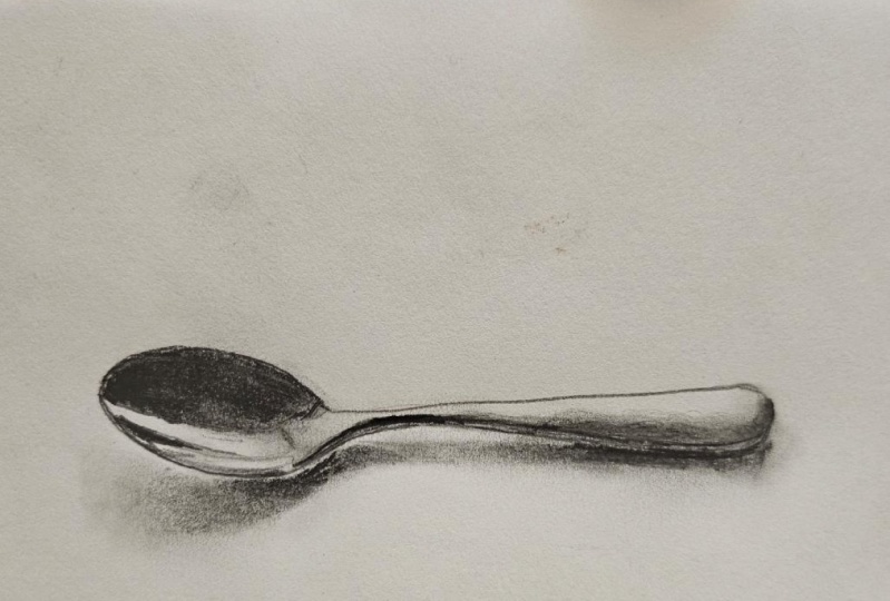
3. Project: So the project for this
class is to draw this spoon. Now, there is a
template that you can use if you want to get
the basic shape down without having to worry
about proportions and things because the focus of this class or
this project is the shading, getting the lights in the
darks in the right place and creating something that feels like it has a shiny surface, a shiny object like a spoon, or you could use similar
techniques for any other kind of metal object that has a lot of strong light
reflecting off it.
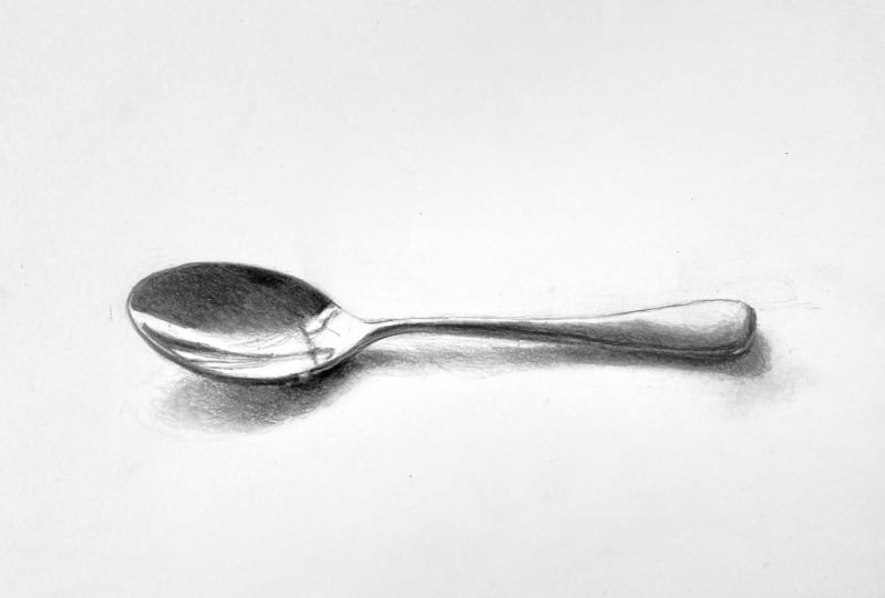
4. Option 1: Tracing the Template: The photograph I'm going to
be using is this one here, and you can download
that photograph. I do have a template that
you can use as well. So the focus of this drawing is going to be on the
shading and getting the feeling that this object is made of metal and it's
reflecting a lot of light. So if you are feeling a little bit uncertain about
being able to draw this spoon
or you just don't want to have to try
too hard today, then you could trace
this template. And if you do trace
the template, I want you to keep the
lines really, really light. You can see the bolder outline here is for the shape
of the spoon and the the thinner lines are for the shapes of the shadow
and the light in the dark. So all of your lines
need to be really, really light when you start off. Now to use the template, you're going to need
a light source, and I find a window is fine. You're going to
take your template. You need to print it out, and you're going to place it
underneath the piece of paper, and you might actually
be able to see. I can almost see through
this paper already. But if your paper is thicker than mine and
you can't see it, then you're going to
need to hold both of these up against the
window so the light is shining through the back
of the template image there. And that's kind of like
using a light box. Might be a bit of wrangling to do to kind of hold
your sketchbook up against the window so that just this page has the light coming
through behind it. If you do use this template, then you're going to
skip the next video and go on to the one after that, which is where we start
looking at light and dark. If you want to challenge
yourself and draw along with me, and start from scratch, we're going to do that right
now in the following video.
5. Option 2: Sketching The Spoon: So if you're
watching this video, it's because you've decided
to take the challenge and draw this spoon from scratch. Now, you might want to download this photograph and
either print it out like I have or have it on another screen just so
that you can zoom in, and it just makes it a little
bit easier to see rather than trying to draw from
what I have on my screen. It will be there the
whole time, though, if you do need to use
that, that's okay. So when we look at this,
and we go to draw it, we've got two main shapes. We've got the circle
of the spoon, and then we've got the handle. Now it seems really simple, but sometimes the simple
objects are a little bit more difficult
because there's not really anywhere
that you can hide. We have to get
those shapes right. Otherwise they're going to
look a little bit wonky. If they do end up a little
bit wonky, that's okay. Remember this is about
practicing shading to create that shiny metal effect. So you might just end up with a wonky spoon, and that's alright. Normally, I would figure
out the proportions of, you know, this spoon part to this handle and
map all that out. Um, just in a simple way, but to have an idea of, you know, how this
compares to this. But the way I'm going
to start this one is just by drawing this shape here. And that's because this is the most important
part of the drawing. And also because even
though it's simple, it is, like I said, a little bit more
difficult than we think. It's kind of an oval shape. But if you have a
look down here, there's almost like a
little bit of a corner to the oval where the
handle comes off it. But what we want to do is just aim to get a general
oval shape on the right angle and the
right sort of proportion. So it's quite a long oval. And I want to make my drawing about the same
size as the spoon, so keeping that in mind. So start by looking at
the photograph and just getting a feel for how big you want that
spoon part to be. Now, we don't want
our drawing to be huge because it's going to
take a long time to shade. We don't want it to
be too small, either. So this oval, you might be able to see it just
starting to come up now. I'm keeping my lines really
light, using my TB pencil, but really light to try and figure out that
oval shape that I want. And mine is probably maybe an inch and a half
across, I would say. Now, I think I've got the
right sort of angle there. I'm going to go a
little bit darker, but I want you to keep your
lines as light as you can. You might go around and just refine the shape a little bit. Now, down here is that part where I said it's
not quite oval. There's a bit of an angle there, and it's where it starts
to then join onto the hand or putting
that angle in as well. And then working my way around, looking at
it the whole time. I've got mine up here. So I'm flicking my eye up to
that the whole time. And you'll be either flicking
your eye to the screen, the photo on screen or to a photo on one of
your screens or to your printout and just working your way around trying
to get that correct shape. So what we're looking
at is we're looking at a spoon, which is, I guess, the spoon part is sort
of egg shaped, you know, the pointer at the end
and wider at this part. But we're viewing
it from the side. So we've got some
foreshortening happening there and maybe a little
bit of perspective as well. You can see that rim there on the side or the thickness
of the spoon there. So we need to allow for that. And I just put that in just very lightly so I can start
to see how it's looking. And then we want
to put this handle and a couple of
things to notice. When we put a horizontal line
here underneath the spoon, where the spoon comes down to, you can see the handle
doesn't come down that far. So the handle is
kind of on an angle, but the end of it
isn't going to line up with this part of the spoon. If we look at the top
part of the spoon, there's quite a big gap there. But we can see that the top of the handle is pretty straight. There's a slight curve
at the end here. So there are a couple
of things that we need to keep in mind. First thing to do is to place where that
handle is going to go. So if we come down here and, if you think about maybe
halfway through that, on the angle of that oval, the handle starts just above that halfway point, so
probably about here. There's a bit of an angle to it. And then, like I
said, it's almost straight all the way across. So I'm just going to put that in kind of get an idea of how
straight it's going to be. We can add the curves and
stuff to it in a moment. Keep your lines really light. Hopefully you can
see what I'm doing. I know it is quite
light. And then I'm going to bring
up this curve, so we've got a nice
sort of S curve. Just take your time, keep looking at the photograph
the whole time, and you're just adding
to that line with light lines sketching light
lines joined together. And then I can just
check and make sure I'm not going to
come down too far. I might have come
down a bit fast. So it was probably about here. I can check the length
of that if you want to. So I've kind of done it by eye. If we were to check the length, so this is the
oval of our spoon. It fits almost two times, a little bit less than two
times into the handle. One So a little bit less than
two times would be there. So the spoon part doesn't quite fit two times
into the handle. So what I'm doing now
is refining the shape, looking at the top edge. It does curve up
ever so slightly. And then straightens out, and then it curves
up a little bit. That's sort of the
part, you know, you put your thumb on
at the end, I guess. And then it rounds
out. Again, making sure I don't come down too far. Now, if you've got into this
point and you're like, Oh, there's just no
way I can do this, you can go back to the template. If you're free to go
back to the template. Otherwise, you just
keep refining this. Don't be afraid to make changes. Keep working your way around, trying to find some
edits that you can make. And remember, you're keeping
your sketching lines really light with this two B pencil. I could look at the
negative spaces, the space in here, and the space down here
underneath the spoon. We could also sketch
in the shadow, and that might help us figure
out some things as well. Shadow comes out just past
the end of the spoon. And I'm using almost a
broken line to sketch this because we definitely don't want an outline
around our shadow, especially as we come over. This side, it's so light you can barely see
it in the photograph. So I'm just going to
switch views so you might be able to
see the photograph, just a little bit better,
a little bit bigger. The next step is to
sketch in some of these darker marks or these
dark shapes, I should say. And this will also help
us figure out the shape. So if you don't
think your shapes quite right, don't worry. I've got this edge
here. I'm just going to clean mine up a little bit because it's very
light on that part. You can see where that
dark shape starts. Comes down past halfway. And then it straightens up here. So as I'm drawing this, I'm looking at this shape, too, this lighter shape or
this lighter half, apart from that little
bit that goes through it. But this compared to this. I'm comparing them
as I draw this, and I can see that, this one
is bigger than this one. And we do have this one that comes through here,
this darker shape. Again, I'm looking
at the dark shape, but I'm also looking
at that light shape between the two dark shapes. And as I come over
here, I'm looking at this light shape right on the edge of the spoon here and compare it to the dark
shape that I'm drawing. Now, you'll see the rim of
the spoon is quite dark. But as you come up here close to this dark shape that we
just drew, there's a very, very faint light line
or very not faint, but very skinny
light line there. And we want to make
sure that we have that so you might want to find a way to mark out that
little light area there. It joins into this light shape. Very subtle things like
that are going to make a difference to the form. Now, as we come over here, we can see that
there's some very, very bright areas,
and then there's a middle gray area or
a transition area, and then there's a dark
area on the handle. If we take a look at
the spoon here and just compare it to this
edit that I've made, which shows us the values divided up just into
black and white. So no grays. You can see that
some of those shapes are, you know, really quite strong. The dark areas on the spoon. The shadow is really
strong in this one here because I've had to decide what becomes light or the
computer program has, what becomes light and
what becomes dark. And if we go back
to this one here, you can see that the shadow does belong to the dark values. It's darker than middle gray. But what I want you to notice is firstly those dark shapes because that's what we're
going to be sketching. Dark and light shapes, but also notice the
difference between that very simplified tonal
version and this version here. So what is the
difference? So this one here looks really realistic. I mean, it's a photograph,
it should look realistic. This one here doesn't look as realistic in terms
of the three D form. So the reason for that is all those missing values in this one here, those
transitional values. They're very subtle grays or soft edges versus hard edges. And that's what we're
going to be looking for when we're
shading the spoon. So we'll have a look at
the transitional values and those subtleties
a little bit later. To start with, we're
just going to draw out where our lights and
darks are going to go. So we've got this dark shape. I've got this dark
shape in here. Now, across the light shapes, you can see there's a bit of a line that sort
of intersects here. There's maybe another
little jaggedy one here. So when you draw these in, if something isn't matching up, so I just went to draw
in this line here, and I realize it's going
to be really, really long, which tells me I've put this one too far down
across this way, needs to come to about here, and it's on a bit of an angle. That means this one needs to come down a little
bit further, as well. So when we put in these
light and dark shapes, it helps us figure
out what might not be matching up with our
basic shapes as well. Now, I think I've
put that too far, so I'm just going to bring
it back a little bit. Now, when you make
these changes, what I didn't do
was have another good look at the photograph. So if I think about
where that bends, that dark shape bends, just after that is about
where this line comes across. And I've got that
small little bit of light in the
intersection there. On the handle, we've got the edge of the spoon is very dark all
the way along here, and then it comes
up into the handle, and there's a little bit
of light along the top. This is a hard part, trying
to draw a straightish line. And then it's gonna come down here and around the back
of the handle there. Now, you can see that this
whole area isn't white, like in our black
and white version, there's actually a
bit of gray in there, so I can sketch that
in very lightly, too. So once you're happy with that, we need to clean it
up a little bit. I'm just going to erase
some of these lines. If you've got a
Monosia eraser pen, this is where this
is really handy because you can erase just
a little bit at a time. If you keep your
lines light enough, then hopefully you won't have to do too much erasing anyway. And even if you do
have, you know, some lines showing through from your initial
sketch, that's okay. You just want to make
sure that you can see what is what
in your drawing. You can see what's supposed
to be the light part, what's supposed to
be the dark part. You can see those
shapes in there. I'm just going to bring my
light edge back across here. It's a bit messy in here, but that's all going
to be dark anyway. That's going to be the
dark edge of the spoon. So I'm not too
worried about that. Now, as I come around here, I can see that maybe I haven't
quite got my shape right. It should come up
a little bit here. I can see that when I look at
that lighter space as well. So even though, very
done the shape, I'm still refining it
if I see something new, and you should be
doing that as well.
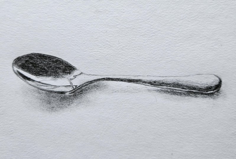
6. Identifying Light & Dark Shading Shapes: So we've identified our
lights in our darks, and now we're going to
start blocking them in. And I'm still using
my TB pencil. I'm just going to
create a base layer. I'm being quite careful
in shading in all of the dark areas to get
a nice flat value, and then I can build on that. So I'm holding my
pencil quite far back, trying to get as
much of the side of the lead touching the page, and I'm just working in one
direction and trying to keep everything nice and smooth. And even. This is where
I said, you know, the soft pencils
give you a kind of a softer mark. As
they should do. Because they're not as scratchy, they get a little bit blunt,
which is actually good. We want that for this
part. When we're shading. We don't want it when we're
drawing lines and edges, but when we're shading,
it's useful for it to be just a little bit blunt because it gives
us a thicker mark. So I've got that dark
in there. I'm going to put in this dark
still looking because I might see something about the shape that
I need to change. And if you use the template,
you should be okay, but if you draw it with me, just be aware that you
can edit as you go. You don't want to just keep drawing like you're coloring in. You want to always be looking, always observing
what you're drawing. So now I'm just putting
in something like this black and white version that we were looking at before. We were just blocking in
the lights and the darks, but we're not going
as dark yet as that. The handle here. Blocking
in the dark part for now. Now, you might notice along
the edge of the spoon, there's a tiny little
highlight there. We didn't identify
that, but we can make a little mark so that
we know to leave that. And then we can shade in
the darker edge here. I might have gone a little bit too thick with mine,
but it's okay. I can clean it up
later if I need to. It's coming right
around to the end. There's no point on the spoon. So make sure you don't
end with a point. It's a little bit
tempting to do that because this dark
part ends in a point, but it follows the round
top or end of the spoon. So I haven't put in
the gray ui yet, that transitional value
between the light and the dark because I want to be able to do that,
to the correct value. I need to know how dark this is going
to be to start with, and then I can shade that out using a transitional sort
of shading technique. Let's put in the shadow here, and this is going to
be super, super light. Using light pressure with
whatever pencil you've got. Remember, you can switch
to a harder pencil, like an HB or even a two
H if you really want to, just so that you get a
lighter shading mark. So this shadow is
somewhere where we can use a tissue if we want to
smooth it out a little bit.
7. Hard & Soft Edges: I so the next thing we
need to look at is edges. Now, I'm going to
sharpen my two B pencil because I want to be able to put in some
really sharp edges. And I can also use it to
put in some soft edges. But if we look
around this top edge of the spoon is
really, really sharp. Obviously, it's
metal, it's hard, and we need to show
that with our edges. So very carefully, it's hard
to do just a single line. You might be able to do it
without being too wobbly. But very carefully, I'm
just going around and keeping my pencil
more on its tip, so I get a nice sharp edge. Trying to keep it smooth and even the edge without
changing it too much. Then this edge here is softer. Down here is harder, so it
can put a hard edge in there, too, but around here
is a lot softer. So now that I've got
that hard edge in there, I can go through and
darken this up again. And if we need to, we can
switch to a darker pencil, but probably end up doing
a couple more layers. So I'm pushing a bit harder. I'm going at least up to the value of the
edge that I drew. Now, how you do
this is up to you. You might do it in
little sections. When you do it in
sections, you've got to be careful that you don't
overlap each section too much because every time you put one layer of shading
over top of another. So if you have an
area of shading here, a shading here and you're
overlapping them a little bit, then that bit in the middle is going to go a
little bit darker, which is why I tend to try and shade across the whole shape. Takes a little bit more control because we don't want to
go outside these lines. And if you had a really big
spoon that you were drawing, your drawing was
really big, then you'd find that kind
of tricky as well. So this has to be
black at some point. It's not quite there yet. If you're happy with your shape, then we may as well go
ahead and do that now. So putting in another layer. I'm not pushing too
hard when I put in these layers because I don't
want to dent the paper, and I don't want to sort of get too much graphite stuck
in the teeth of the paper, the tooth of the paper, and then not be out
a layer over top. So it's not really shiny,
we look at it on the side. It's a little bit, but
it's not that super, super shiny effect that we'll
probably get with this one. So this is a six B pencil. Got my nice hard edge
in there already. And now I can just layer
up with the six B pencil. It's a little bit
blunt, but it's okay. And this is where I
want to go to a black. So shade in whatever direction
feels comfortable for you, shade from left to
right or right to left. It doesn't matter
I'm left handed, so I tend to start over here, but you might start on this end and just
work your way across, keeping that outer
edge nice and crisp. This edge is quite crisp
here until we get to about this point and then it sort of softens
off a little bit. Now, the type of paper you have and the type of pencils
you have are going to affect the sort of layering you get when
you build this up. If you've got very cheap paper, you might find that it's
a bit patchy or you might find that the tooth
gets full very quickly, and you can't really
layer up anymore. But just do your best with
what you've got. Even this. I haven't smudged
or anything yet. It's a little bit
grainy. That's okay. It's still going to give
me the effect that I want because I'm going to get the contrast in there now
as we come down here, we want that sort of
softness around this edge. You can see that softness here. And like I said, maybe a few just kind of
little almost like here. They almost look like
hairs coming off there. It's just something
that's happening in the reflection and
really soft around here. So if that's as dark as
you can go, that's fine. If you've got an A B pencil and you want to
try that, you can. This is my tombo Mono pencil. I probably should
have used this one actually because it's
little bit darker, but, you may not have
access to those anyway. But this is the point at where we could do a little
bit of smudging. I said we're gonna
do it at the end, but this is the
end of this part, so we could blend this
out barely touching the surface because I don't want to disturb
the graphite too much. I just want to smudge
it just a little bit. Maybe along that soft edge, as well. And then that's it. You know, if you keep
working with this and trying to fix
things with it, it's not going to work. You can't fix things with this. It's really just to enhance what you've already
got down there. So if you had an area that
didn't have enough graphite, then you need to come
back with your pencil and put more graphite in there. If it's not dark
enough in one area, it's darker in some areas
and not as dark in others, then you need to bring
your pencil back for that. Don't rely on that blending
stump because it won't work. It's not how to best use it. So now I've got this nice, dark, dense value in here. It's a little bit warmer
than the photograph. So the temperature of
my graphite is warmer. And I think I'm getting a bit of reflection from the
lights in here, so it might not be quite
as dark on camera as it is in real life here. It's pretty much black. And then we can go and just add in
some of these other ones. Remember, we looked
at the edges first. So think about the edge. Is it hard? This one is hard. I've gone back to my TB
pencil, putting in the edge, and especially where we want that little light thin
light line around the rim. You see I've added that in
there. Here's the other side. The edge of the spoon. Nice sharp pencil to do this. And I might as well
go through and put in the rest of the edge now. Have a look at that edge. It's not the same
value all the way. So when we get up to
that little light spot that's reflecting just here, on the other side of
that, it's just a little bit lighter than
the dark side here. It's like a very dark
gray, but not a black. As it comes up towards
the neck of the spoon. We call that the neck? Towards
the handle of the spoon. Remember, you can keep
correcting your shape here if you need to if you see something that is
not quite right. Obviously, you can't
make big changes, but I'm just looking
at the thickness here, and I think maybe I didn't
have it quite thick enough. You know, you don't
always see artists making corrections
in their drawings, so maybe you think they just
get it right the first time. But actually, artists
are always editing. Sometimes they're
editing it in the head, and they've already edited it before they actually
go to make a mark, you know, what they
were first thinking to what they then put down. So it may seem like they are getting it right
the first time. And other times,
you know, they'll be making changes and you won't even notice because
there's such subtle changes. But they make a difference
to the overall drawing. So I think it's important
to always give yourself permission to make changes and actually to look for
those changes as you go. Don't just like I said before, don't just color in what
you've already put down. As I shade this in, I'm looking again
at that photograph. I'm looking at it
for two reasons. One is to see the value because that's what I'm
focused on right now. How does it change as I come
down here? It gets lighter. But the other thing I'm
looking for as I do this, or I'm open to noticing
is changes in the shapes. So maybe I haven't
got this little hook part here quite right. I'm going to change
that when I see it. Not just ignore it and
hope for the best. It's very thin in here
and a little bit thicker, but still quite light, and then there's a few of those
sort of hairy bits. Maybe there's another
little bit of dark up here. So things I didn't put
in the template even or, you know, in our initial
sketch, I'm noticing now. Down here is quite soft. You've got your six B
there if you want to put a little bit of six
B over top of this. I've got something
not quite right here. I think it's just that I've made this a little bit too
wide, just over this part. Can you see that compared
with the photograph? Maybe I've slanted
it up a little bit. If I look at that white
space in the photograph, I think it's a bit wider than
I've got it in my drawing. Maybe this part comes
up a little bit more. Remember, if you're doing the edges, think about if they're
sharp or soft. I just have to redo
this edge a little bit because I've erased some using my two B pencil so
nice and sharp. And then my six B
pencil when I want to get it really dense and dark. And this jaggedy
kind of line here, I'm just using my
60 pencil for that, but I'm keeping it
quite light pressure. Little kind of scribbles,
as I put that in. And this one here
is even lighter. So another little era
that I've noticed here is this white space is a little bit too big
compared to the drawing. So I'm just going
to move that line across a little bit here. Light use my two B pencil so that I can put that line in
a little bit more clearly. We can see the neck of the
spoon in that photograph. And can you see how it's
quite dark along here. And again, another
pretty hard edge where it meets that light part along the top of the spoon. Curves around and down
darker here than it is here, darker here than this part
of the edge of the spoon. So I had that image
up before that had just the lights in the darks or just the
white and the black. And within the white
areas of that photograph, there's a whole range of values, and within the dark
or the black areas, there's a whole range
of values as well. So even though this
was all black, and even though to our eye, it might look like
this is all black, there's actually some
different types of dark gray in there that we need to make sure
that we've got in. So the sharp edge along that part of the handle there where it meets the white not sharp
all the way along. I actually starts to soften
off as we get out here. So let's just do this
part. Just start with the bottom of it is
quite a sharp edge as well. And then in between
those two sharp edges, it's a little bit lighter. So I've got the sharp
edge in this one, and then in here,
I can shade it in. Not quite as dark.
8. Smooth Transitions Between Shading Values: Let's put in the
rest of the handle. Now, as we come down and around the edge
of the handle here, just underneath that
area that we shaded, can you see that very dark line? It's maybe where
there's a bit of a ridge in the
form of the spoon. And that joins up with
this dark edge here. So that dark edge that
we put along the top, just beneath the white area, that continues on down
as a ridge on the spoon. And it's the darkest line
that you can see down there. I've used my two B to put it in because my two B
is nice and sharp. But I may actually
have to sharpen up my six B pencil so they can
go really dark in there. You want to make sure
that's in the right place before you go ahead
and darken this up. You could wait a
little bit if you want to and just put in a bit more shading before you add that
very, very dark line there. So we've got this dark shading
that we blocked in before, and you can see the gray area. Now, as I come down here, the edge of this dark area
gets softer and softer. So I'm not drawing in
an edge this time. I'm just shading in an edge. And there's a bit of gray as we come up towards the light here, light gray and also around here. So I just put that light gray in first so that I can see
where the white shape is. And then I can put
in the dark shape. And what we want here
is a nice transition. So there is quite a
strong line just across here, but it's very soft. And then it angles
down this way, and you can't really tell
exactly where the dark starts, and that middle value
starts or ends. So we can use kind of little
circles with our pencil. This is a two B pencil, but I'm using it with
a light touch again. That's how we get
that transition. So have a dark mark
and a lightish mark. And then I want to sorry, I want to join those together, so I can just work
over this edge with very little pressure. So I don't want to
push too hard or I'm going to get something too dark or I'm going to overlap some areas and make them darker. Just light pressure in between the light
and the dark value. Sort of making this kind of mark with about that amount
of pressure as well. You could do it in a line
as well if you want to, and you could even
do it, you know, going from dark to light, lessening the
pressure as you go. Find that a little bit harder to control, where the edge is. So once you feel like you've got that
transition in there, then we can go ahead and
darken up the dark part. We've got the transition
in there already. So all we're doing is
starting from the dark edge and just moving our way up and almost creating
another transition. We don't want any of these
to have strong hard edges. They will have soft edges, any of these values in here. Just going over the neck here, we've got this very,
very dark part. I'm putting that in
now with my six B. So make sure I can see it. Then we've got something that's a little bit lighter
underneath that. And that part that's a little bit lighter that continues on down underneath our
dark line here, where that ridge of
the spoon comes out. And you might be able to see
there's a tiny little bit of light reflecting down
this end as well. We can leave a
little gap for that. So underneath that is
where our shadow starts. We can put in a dark line
there because the shadow, at least down this end
is very, very dark. Dark, sharp line. And the sharp line is not so
much for the shadow as it is for the edge of the spoon. And if you wanted
to find this net, you could bring a
very fine sharp line all the way across there. So really subtle things
happening in this area, the dark to the middle and then a very fine dark
line underneath that. You can add those in
if you can see them, if you can't about that. Especially if you're just
working from the screen, it might be a little
bit hard to see. I've maybe brought my shadow
down a little bit too far, when I'd put in the draft, so I'm just going to
shape it a little bit. I'm using my to be pencil. It's quite a straight
end to that shadow. And the values of the shadow
are really important. So, again, it is a dark value. The whole shadow is dark, but within that one dark value, there's, you know, four
or five variations. Starting with the darkest
part here because, you know, I don't have to worry too much
about you going too dark. And this has got a really
soft edge as well. So again, little circles on the edge. Try
and soften it off. We can use our blending
tools if we want to. And as we come out here, it is quite soft and lighter. Then it becomes
pretty hard to define as you get to about
this point here. So I can see three main
values in that shadow, this very dark one, and then
maybe a secondary shadow. And then that really,
really light area. So definitely need
some more dark in here in my darkest
part of the shadow. Moving to a six B pencil now. So is the shadow as dark
or darker than the spoon? And I think here, it's a little bit darker around this room. And then as we get to here, you can see in the photograph
that the rim or the edge of the spoon is darker than the shadow when we compare
them to each other. So we need to lighten
up the pressure there. Still using my 60 pencil here, but I'm just going to use
it very lightly as I come across this area of the shadow
because it's quite light. And I'm looking at
the negative space between the edge of the
spoon here and the shadow. He's gonna tell me if I've got my shadow in the right place. And I think it was a
little bit low before. Look at where that space, that negative space ends and
where it hits the handle. I'm looking at my drawing,
and I think when I compare it on the screen
anyway with the actual spoon, mine is a bit bigger, but I think this part here, I've gone a little
bit too big, as well, maybe a little bit too wide. But we still get
the same effect. It's just going to feel
like the spoon is on a slightly different angle,
which is okay with me. Let's do a little bit of
smudging for the shadow. Now, if you don't have
a blending stump, you can use a cu tip. We can just use a bit of tissue and start at the lightest part. Very, very gentle touch and then move into
the darker part. Again, very gentle touch. And then you might
want a new piece of tissue for this part here. So we don't want to have a
whole lot of dark graphite on the tissue and then put
that into a light area. So a new piece of tissue when you're smudging anything light. Remember the edges of that
shadow are quite soft, so maybe you can use
whatever tools you've got to soften off the
edge of the shadow. Keeping in mind that you
can't work magic with this. It's not going to
add anything new. If you need some darker
shading in there, you need to put some
darker shading in there, and then you can
smudge it again. So long here, there's
some subtleties in that part of the
shadow as well. It gets quite light
through here, but we have a transitional
value coming from this end. It's very dark, and
then it gets lighter. Less pressure, less pressure, less pressure as you come
into this part of the shadow. Softening of the age there.
9. Refining & Finishing: So this point, we want to decide if we have our lights in our
darks in the right place, our transitional values
in the right place, and also whether we
have the correct edges, sharp edges or our soft edges. So I'm just going to go around and make any
corrections that I need to sharpen off any edges that
need to be sharpened off. You could do it with a pencil. You might be able to
clean them up if you've got a fine eraser. You careful you don't
go over the line or you're just going to have
to put another sharp edge. As we come along the
top of the spoon, can you see in the
photograph, there's a very, very fine, sharp edge. So I've got kind of some
scribbly lines here. I don't want those in there. I want to use the
tip of my TV pencil, nice and sharp to
put in a fine line. I'm going to go
this way, it's more natural for me, but
you can go this way. Again, looking at the
photograph as I do this wires a bit
of a steady hand, which I don't always have. But a really thin line. Even if it's a thin,
broken line, that's okay. It's a little bit wobbly, that's okay, too, as
long as it's thin. And the key to a thin
line is sharp pencil. You're not going to get this if you're using a blunt pencil. You need a pencil sharpener. So I've got that nice
clean edge in there. I've got this clean edge here that gets to a soft
edge, which is good. That's what I want sharp
edge here and here. Make sure you've got that
rim, nice and sharp. And the shape here actually
joins in to the edge. I think I need to
go darker in here. So check all your edges and
then check your values. And for the values,
we're looking for black. The white's pretty easy to
see, but we're looking for. What is the strongest black? Definitely in here through here just a little bit
darker over a few parts. There'll be a limit to how many layers you can put on yours, but you can see I could
probably put on one more. Can you see the difference
between that and that? And I said before, it'll
depend on your pencils. It'll depend on the type
of paper you've got. And I think the
key to this is not pushing too hard too soon
because that's when you sort of start to
get gummy gumminess in the paper and it gets
slippery and shiny. So build it up with, you know, three or four or five light
layers of dark pencil, dark, soft pencil rather than trying to get it
done in two layers. I've got the dark of the edge. Looking for these
little subtleties, either side of that little
light spot. It was quite dark. So if you're using a 60 pencil, you might have to keep
on sharpening that. We need to keep a nice point
on it when we're doing these edges or when we're doing these fine
parts, at least. I'm going to switch to
looking at my photo now. I've actually been
looking at the screen, but looking at the
photograph and trying to see where these darkest
parts are through here. It's not all the same. Mine's still a little
bit light in this area. So putting in my edges first, identifying where
they should be hard, and then finding the darks. So what you don't want
is a little bit of light somewhere where there
shouldn't be some light. So I had a little bit of light down here or around
the corner here. I've just darkened that up. And the same thing you don't want darks where
there should be lights. So just through here, it should be like a middle
value or a light gray value, and I've gone too
far up with my dark. Now that I've darkened
this line, this area up, the side of the spoon, this
little ridge down here, that needs to be darker. Remember to leave that
little white speck there reflection. So keep thinking
about the range of values within the dark. Sometimes it takes a while to develop the awareness
of, you know, that range of quite
different dark values, but that's what
this class is for. So the final thing I'm
going to do, hopefully, the final thing is I'm going
to just put in this shadow, making sure it's really dark, where I want it really dark, keeping the edges nice and soft. So remember, just here, the shadow is darker
than that edge. There's also a very
fine dark line that comes up along here. That in as well. What we're doing
at this stage is making sure we've
got enough contrast. If you don't have
enough contrast, then you don't have the
full range of values. So to have, you know, really, really bright highlights,
really bright reflections, we have to have
really dark darks. It just doesn't work otherwise. You can't have the
light without the dark, and you can't have the
dark without the light. It's a little bit of a
secondary shadow here, at the end of the
spoon, as well. I want that to be nice and soft. So I've just noticed there's
quite a sharp edge here. I'm going to put that
in. Just the edge of this dark shape
is quite sharp, like it is up here as well. Oh
10. Summary: Now, the final result you
get here is going to depend a lot on the type of paper and the pencils that you have,
like I've already mentioned. Don't worry if you've got something that's, you
know, kind of grainy. What I want you to focus on this one is making sure you have the lights in the darks and you have them
to their extremes. That's the key to getting
this feeling of metal. Things that you may
have ended up with. You might have ended up
with something that's a bit wonky. That's okay. What I'd encourage
you to do is have another practice of the
shape of the spoon. Mine is definitely not perfect. Like I said, I think
this is a little bit a little bit too wide, and we didn't really measure
things at the start. We just sort of started
with a general oval shape. You might have
something that doesn't feel like it's shiny metal, and if you have got something, it doesn't feel like it's shiny, you need to ask yourself,
why isn't that happening? What have I not included? And the key things are
the light and the dark, that extreme light and dark. So black against white. If you don't have
dark enough pencils, then you might not have achieved
the black that you need. We also talked about soft
edges and hard edges, and they're really important
when you're trying to convey material like metal. Metal is a very hard substance, and it's very
reflective as well. So you have these strong, strong divides between
the light and dark, but also softer areas as well. You're going to be quite persistent with sharpening your pencil and don't get lazy. If I use this six B, which is starting to get
blunt to try and do a nice, hard edge or a very thin area, I'm going to end up getting something
that's a bit sort of fuzzy and it's going to detract from that
metal look, as well. You've got slightly wonky
edges, don't worry about that. We're not machines. And it
does take a steady hand. I don't always have
a steady hand. You might be able to clean
some things up with an eraser. If you do, you may then
have to go in again with your sharp pencil and put
those sharp edges back in. I see, I've got a little bit of blurriness there
and a little bit of blurriness just here. There's also a very light
part I notice now actually, that comes around the
top of the spoon here. And that's one that we could
put Anytime you erase, you're going to
have to, you know, make some corrections
with your pencil again. And the other thing we talked about was transitional values. So values that go between
the lights and the darks, and I've just noticed
that here and here, I don't have a transitional
value between them, so I should put a little
bit more shading in there, but I know that I've got
a bit graphite on here. So I'm just blending this dark or this part of the shadow on this
part of the shadow. So that there's a transition between them. And
that's quite a skill. It's very much about
the pressure of your pencil or pressure
of your blending stump. Takes a little while to develop, so don't worry if you
haven't quite got there, but do have a look
at your drawing. If you have any parts
like I just did, where there isn't a blend
and there should be a blend between the lighter
and the darker values. Just work on those
now and see if you can really focus on the
pressure of your pencil, even around the
edge of the shadow. It's quite strong
here, but still soft, and then it gets a little bit softer and lighter
as we come out here, so the pressure of
my pencil needs to get softer and lighter, as well as I do those
little small circles. Another thing I just
noticed is I've gone quite dark with all
these darks, which is great, but that means that
these little marks in here have gotten a little
bit too light in comparison. So just going through these
very subtle details and making sure I've got little dark marks
where they need to be. I'm using a six B pencil,
so it's very soft. These are very fuzzy
these ones in here. Okay, and there's
enough fiddling around. I always do this. I get to the end and
I see little things that I just want to
correct. It's easy to do. I think with a
subject like this, where there's so many
tiny little details that can make a bit
of a difference. So you can take it as
far as you want to. You might want to take a little break and
then come back and see what new things you
can see in the photograph. Thanks for joining
me, and I hope to see you in the
next drawing class.
 Emily Armstrong, The Pencil Room Online