Transcripts
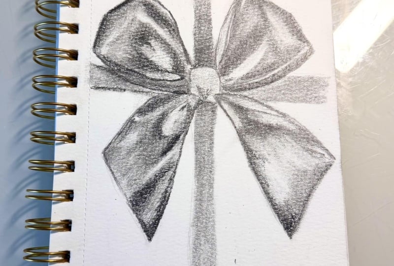
1. Introduction: Hi, and welcome to the
Skillshare class. I'm Emily. I'm an artist from New Zealand, and I also specialize in
teaching observational drawing. In this lesson, we're
going to work step by step through drawing a
realistic, shiny bow. The focus will be on getting an accurate shape and using shading to get a
realistic three D effect. We're going to start by breaking the bow down into
angles and using negative space to
check the shapes so that we can get
the proportions right before we start shading. Then we'll work on building
up layers of shading slowly until the bow really
starts to pop off the page. Lesson is suitable for people with a little bit of
shading experience already, as I don't go into great
detail of the technique. It's a good class to
take after you've already taken the shading
folds of fabric class, which goes into more
detail on how to get smooth gradients or smooth gradations
between your values. The main goal of this
class is to help you see your subject
in terms of light, dark and shape rather than
learning how to draw a bow. The more you train
your eye to see negative spaces and
shapes of value, the easier it gets to
draw complex subjects. So I hope this one's going
to be really useful for you. Grab your materials and
let's get started. And
2. Materials: You here's the materials
you'll need for this class. We'll need some pencils. I'm going to use an HB, a two B, and a four B. You might want to also add some even darker pencils
later in the project, like a six B and an eight B. But if you only have one pencil, that's fine. Just use
whatever you have. Having a variety of
pencils gives you more range between
light and dark values, but you can do a lot
with just an HB pencil. I'm using a putty eraser and a Tombo Monozero eraser pen for cleaning up the
very fine edges. If you don't have these,
any eraser will do. I just like using
these two erasers because they allow for a
little bit more precision. And if you've got
some tissue paper, we're going to use
that for lightly blending the shading to get a nice soft effect in our
base layer of shading. This is totally optional, but it's a useful way
to get a nice smooth, flat layer of shading down before you build
up your values.
3. Starting The Project: Finding The Shape: We'll start with an HB pencil. The first thing
we're going to focus on is the structure of the bow. So try and forget about all
the detail of the folds in the bow and look for
big simple shapes first. We can put in the center
of the bow to start with. Then let's work on the top
left hand part of the bow. I'm switching to a two
B pencil right now just because my HB pencil is a
bit light for the camera, but you want to keep
your lines as light as possible so that they're easy to erase or adjust as you go. Instead of trying to capture every curve in detail right
now, look for angles. This makes it easier to
get accurate proportions. You can see how I've
constructed this part of the bow entirely
from straight lines. If we put in the line of the ribbon that wraps
around the box, the straight line
coming up here, that's going to allow us
to see the negative space. That's the empty space or empty gap between the
ribbon and the bow. And these negative spaces are really useful for
checking your accuracy. So do you have the same
sort of triangle in here? We want to find this large angle of the bottom part of the bow. And again, also put in the flat part of the
ribbon that wraps around the box to help us better
judge the angles of the bow. Look at that negative
space again. If your triangle shape of negative space is quite
different to the photograph, then go ahead and change it. Try and get the correct
angles at this stage. Moving over to the
right hand side, we're going to do
just the same thing, forget about the details. Look for the main angles
and the negative spaces. Help with this stage, you might think about
the bow as a silhouette. So if you were to
cut out the shape of the bow out of paper, what would the overall shape look like and what
would the angles be? We can check the alignment
of the subject as we go by looking at how
different points of the subject line up. So for example, if
we hold a pencil on a horizontal line or even draw a horizontal line
from this point, we can see that of the top corner of the
bow on the right, it sits slightly higher than the top corner of
the bow on the left. So make sure you've got that
difference in your drawing. Keep looking for
angles as we add in this bottom part of the
bow on the right side. Breaking up any
curves you see into a series of two or three angles. That flat ribbon
that wraps around the box is a really
useful reference point. It gives you a horizontal
line that you can compare the angles
of the bow against. For drawing in the straight
lines of the flat ribbon, try holding your pencil
still with a relaxed grip, and instead of moving
the pencil by itself, slide your whole hand
up or down the page. You could try resting
your little finger on the paper as a kind of a stabilizer and move your
whole hand in a smooth motion. Keep the hand relaxed and
don't press too hard, and the pencil just
sort of rests on the paper and moves with
the movement of your hand. And with practice, this will give you pretty straight lines. Check the alignment of your
drawing again by dropping in imaginary vertical
or horizontal lines to compare points
of the subject. Horizontal and
vertical lines are the most accurate
way to do this, the most accurate guides to use, but you could also look
at angles between points, like the angle between this
point here and this one. Do you have that same angle between your points as
you can see in the photo? Check the lowest point of the bow on the
left and make sure it is lower than the point of the bow that
we're drawing on the right. Once you've got the outer
silhouette in place, check the negative spaces again. Look at those
triangle shapes that are created between the bow and the flat ribbon and
see if you have the same triangular
shapes in your drawing. It would be a good idea to
pause the video here and take a few minutes to work
on this correction stage. Take some time to
compare the angles and negative spaces in your
drawing with the photograph. And if you find something
that needs changing, lightly draw the correct line first before erasing
the incorrect one. By doing it this
way, you can see the difference and avoid making the same mistake again. Y
4. Finding The Secondary Shapes: Now we can start looking
for the shapes that we can see inside the main
shape of the bow. Use light lines to sketch in strong shadow shapes or
folds in the fabric. Don't worry about tiny
little details just yet, because a lot of
the details will be refined when we
go into the shading. Instead, look for the bigger shapes that stand out to you. Try holding your
pencil a little bit further back than a
normal writing grip. This is going to help keep
the strokes loose and light. It prevents you
from pressing too hard down on the
tip of the pencil. Some of these lines
that we're drawing now might get lost later on, but by putting them in now, we're becoming aware of
the shapes of light and dark before we start
to shade them in. I'm using the side of the
lead and moving the pencil in the same direction
as the shapes in the photograph as
I look at them. So we need to make
that connection between our eye and our hand. Find the shape in
the photograph, follow it with your eye as you draw in that shape,
nice and light. At this stage, we want to try to forget that we're drawing a bow and just look for
shapes of light and dark. If the lines don't go exactly
where I want them to, that's okay because they're light and they're
easy to change. If you want to, you could also
add some gentle curves to some of the edges if they need to be softened or rounded off. So you're happy with the
main shape of the bow and those secondary shapes of the folds and the
shadows that we can see, we're going to shade the
entire bow with a light, even layer of graphite. This is going to act
as a base layer of value that we can
build on top of. I'm using a two B pencil now, but make sure your
shading is soft and light without applying
too much pressure. You can hold the
pencil further back again and let it
rest on the paper, sliding your hand on the paper in a steady
up and down motion, so you get a nice
consistent coverage, rather than your shading going light and dark and
light and dark. We're shading this
base layer because the bow itself is a dark color. So even the highlights
aren't pure white. They're a light gray,
and this is true for any dark object
that you draw, whether it's red,
blue, green, or brown. The highlights won't be white. Keep the shading pressure even so that the value is consistent. And once the whole
bow is shaded, you can fill in any
little white gaps that you have around the edges. Again, just using
very light pressure. Grab your tissue if you have
one and use it to gently blend and soften that
base layer of shading. This is going to help smooth
out the pencil marks, but it won't fill in
any big white gaps. So if you still see some gaps, fill them in lightly before
you do the blending. When you're blending,
think about using the kind of pressure that you'd use when you brush crumbs off a table
with your hand. It's a very light touch. If you press too hard
when you're blending, you're going to risk getting smudgy uneven marks or
even damaging the paper. Once you've shaded
the entire bow, go ahead and use your eraser
to tidy up the edges. The Tombomnozero eraser pen is great for a really fine cleanup, but a regular eraser
will work as well. You might just have to be a
little bit more careful. H
5. Building Up Shading Left Side: Now it's time to map
out the shadows. Some of your earlier shadow shape guide lines might
still be visible, but we'll work across the bow, looking at the
shapes of shadow in the photograph and lightly drawing them in and
then shading them in. Depending on how dark
your base layer is, you could use a two B
or a four B pencil. Start shading the largest
shadow shapes first. Keep looking back and forth between the reference photo and your drawing and remember to let your eye
guide your pencil. So you can see now
how I've shaded the main shadow shapes that
I can see in the photograph. Just block them in for now, and then we can build
them up darker later. And then we can move to shading the smaller shadows
within the shadows. Now, some of these areas
will need blending between the first
and second layers, and you could use small
circular motions with your pencil to help blend or fade a shadow value
into another. We want to build up the
darkest values and stages. So rather than jumping
straight to shading black, we can build a dark gray and then build that up
further and further. So go ahead and add
another layer of shading. Again, looking at
the photograph, thinking about how
dark the value is, and building it up
a little bit more. Most of those shadow values
are pretty close to black. Each time you add another layer of shading
to your drawing, make sure you're looking back to that photograph so
that with every layer, we're actually
refining our drawing and improving the accuracy. The flat ribbon behind
the bow is very dark. It's almost black. And
we can block it in now, but we don't need to go
full black right away. Moving on to the next
section of the bow, we follow the same process drawing out the main shadow
shapes that we can see, blocking them in, and then building up that shading
with a couple of layers. Try to think about these
shapes of light and dark as puzzle pieces and look
at how they fit together. So where does the
dark shape stop and the light shape start? And this is really
the key to shading is to forget about
what it is that you're actually drawing and look for abstract shapes
of light and dark. You can see that I'm using an up and down motion
a lot of the time. But whenever I need
to soften things off, I change to more of a
circular motion with my pencil and I lessen the pressure of the pencil
on the paper as well. For these larger
areas of shading, you could use your tissue to do a little bit more blending
on that second layer. So we've got the main
dark areas of shadow, and now we're going to shade the shadows within the shadows. Where are the darkest parts
of those shadows now? We've looked for the
shadows within the shadows, but we can also look for
the grays within the grays. So there's this large gray
area here of my base layer. And within that, if you
look at the photograph, there's at least two or
three other values in there. H I'm working my way down
the side here, and there's quite a
strong dark edge. Rather than draw
that as an outline, I'm using my pencil to shade that line in so that
it's nice and soft. We want to avoid hard outlines unless they actually
exist in the photograph, and they're pretty
rare in a photo. Instead of outlines, the
edges are usually defined by a shape of shaded value
and not by a hard line. We can add a little
bit of shading to the bottom of the center part and the top of the center part. And then start working your way over to the right
side of the bow. A
6. Building Up Shading Right Side: We can refine the shape
here if we need to and then start shading in the
darker shapes of shadow. This part here has a nice soft transition
from light to dark. Again, there's a dark
edge along the top here, but rather than draw
it as an outline, I'm using the side of my
pencil to shade it in. And now I'm drawing in those
shapes of light and dark. Sometimes it helps to
look at the dark shadows, but you can also draw in the outlines of the light
shapes that you can see. Just be careful that you keep your lines really nice
and light because we want the outlines that
we're drawing right now to fade into
areas of shading. Now, right along this edge
here, there's a very, very fine, light line. It's where the thickness of the ribbon is
catching the light. So see if you can leave that very fine white
light line in there. Blocking these shadow shapes. You can see how that
base layer forms the value for the
lightest areas. Now, look for the lightest
area on that bow and you'll see that this part
here is actually a bit darker than this part. So it's always
about comparisons, which is the lightest value and which is the darkest value. And then how do all these
other values fit between that? You can shade the
same parts that I'm shading and follow my order, or there may be values or parts of the bow that catch
your eye first. So you don't need to
work on these values in the same order that
I'm working on them. Once you have the main
light and dark values, look again at the photograph and go through and add
a darker layer. Also, look for transitions
between values. You can use very
soft pressure of the pencil to help to
blend the layers together. This is the most time consuming
stage of the drawing. So try to be patient and keep your focus
without rushing ahead. If you need to, you can
always take a break and come back to it when
you have more focus. The only light areas of the
base layer that we want to keep the brightest highlights
that we see in the photo. So everything else should
be shaded at darker value. Check the light areas in
your drawing and compare them with the photograph to see what value they should be. Are they actually the lightest
areas in the photograph, or do you need to add a little
bit more shading to them? As we come down the side here. Again, I'm shading that outline rather than putting it
in with a hard edge. When we shade an outline, it means we have control
over the value of it and the softness
or hardness of it. So outlines, just
like our shading, they need to have lights
and darks because it's the light in the dark that creates the illusion of
three dimensional form, which is what we're aiming
for in this drawing. Et's put in the rest of the flat ribbon wrapping
around the box there. That's going to help increase the contrast so we
can see what we're working with in terms of our range of values
from light to dark. Moving on to this final part of the bow, same process applies, looking for the
shapes of the folds or the shadows or the
shapes of light that you can see and
identifying them with some very light lines so that you have some guidelines
of where to shade. I'm sketching out
those puzzle pieces of the light and dark shapes that make up this
part of the bow. H. Once you've identified the main shapes
that you can see, light and dark and folds, go ahead and start blocking them in with a layer of shading. I'm using a four B
pencil for my shading. Now, these pencils that I'm
using the Sadler lumograph, they are quite a light value
compared with other brands. So don't be afraid to change
to a different pencil. If you feel like
your shading is not dark enough or you're
having to push too hard, you shouldn't have to push
hard with the shading. I'm still using quite
a light pressure. And layering it up. And even when I layer it up
with a darker layer over top, I'm not having to push too hard, maybe slightly harder
than the first layer, but we don't want to
be damaging the paper, so it's always better
to shift to a softer, darker pencil if you're not getting the
values that you want. You could go through and block in all of the main
shadow shapes first, like we've done
previously, or now, if you're familiar
with the process, you can shade one
shape at a time and add in the shadows within
the shadows as you go. For large areas of shading, I'm using mostly an
up and down motion. And then anytime I need
to fade something out, you'll see me switch to more
of a circular motion or a very short up
and down motion so that I've got a little
bit more control over the pressure of the pencil. We've got these main
shapes of dark, and just like the other side, we've got a large area here that is various shades of gray. At the moment, it's
all one shade of gray. It's my base layer, but
I can go through and add in those subtle
values that I see. So I'm working my way down
this part of the bow, and I'm looking at
the photograph as I go and putting in
the shapes of gray within the gray and
adjusting the pressure of my pencil when I need
to go lighter or darker. So I've got all the
values in here, the lights, the
middles, and the darks. We're at a point now
where many people might feel like their drawing is just about finished because you've looked for
light and dark, you've shaded in every area, but still doesn't look
very three dimensional. Once everything is shaded in, to get a better effect, better three d effect, we need to go over the drawing again and look for
values within values. Look for how values
transition into each other. Do they have hard
edges or soft edges? So I could spend at
least another 30 minutes reassessing and balancing
the values in this drawing. And that's the
difference between an okay drawing
and a drawing that has a really strong sense of realistic three
dimensional form. It takes time and patience. It's not easy, but it will pay off if you spend
that time looking, observing, and
refining your values. Can you see the
difference here between the drawing on the left and
the drawing on the right? The drawing on the left is the
stage where we are at now. The drawing on the right
is the end of the class where I've taken you through
refining the values. So there's a couple
of things to look for the number of
values in the drawing. One on the right has
a larger number of values, values between values. And the other thing
is transitions. So if you look at particularly the lightest areas in the drawing on the
left and the right, you'll see that in the
drawing on the right, the lightest areas
have been gradually integrated into the
values around them. And those are the
transitions that we can create using very light
pressure of our pencil. In a moment, we're
going to start working on refining the drawing, but now's a great time to take a break if you feel
like you need one. So you can come back with
some new energy and focus.
7. Refining Our Values For Maximum 3D Effect: So we're going to work our
way around the drawing again, looking for places where
we can refine things. For example, if
you take a look at this shadow shape in the
photo and notice how it reaches down the side
of the ribbon and how it changes from a
darker to a lighter value. Over on this side, there are some extra value
shapes that we can add in with very light
pencil pressure. We can also look
at the edges and decide if there are any that
we might want to emphasize. It's not good to add
an outline to an edge, but what you can do is shade it slightly darker where you see a darker edge or
a darker area of value meeting the edge
in the photograph. This will help give your
drawing more impact. Let's block in a little bit more of the flat ribbon on the box. I'm using my tissue
just to blend those flat areas a little
bit so they fade out. You could use a
blending stump to get some subtle transitions, but I don't think the blending
stumps are necessary. If you look closely,
you can see, I've still got some pencil marks in my drawing like
here and here. I prefer to blend with a pencil itself using very
light pressure because blending stumps
can sometimes over soften shading and everything becomes kind of a muddy gray. And textures and marks in your
shading are actually good. They add energy and
style to your drawing. So the answer to a
three D effect isn't blending all the pencil
marks out of your drawing. It's making sure you have the values in the correct place, and they can be textured
values or smooth values. It doesn't matter,
but they need to be the correct shade of
white, gray or black. The very last stage
in our drawing is adding in the black points. That's the darkest areas that
you can see in the subject. Try squinting your eyes at
the photograph to help see the darkest parts of the
bow a stronger shapes. A sharp pencil is important
for these smaller details. So if your pencil
is getting a bit blunt, give it a good sharpen. And if you find
you aren't getting the black values that you
want with a four B pencil, rather than trying
to press harder, switch to a six B or
even an eight B pencil. Softer pencils will lay down more graphite
with less pressure, and that makes it
easier to build up layers of shading and
get close to black. And remember, when you're
adding in dark lines, maybe the creases
in those folds, use a shading motion rather
than drawing a single line. We can add some contrast by darkening the background
ribbon behind the bow. That's going to make the
bow stand out a bit more. Move from one part of
the bow to the next, focusing on the darkest values. We're looking for areas of black that we can see
in the photograph. And as you add in
these black points, you should start to see the form begin to pop
a little bit more. Your drawing will gain more
three dimensional depth. I keep adding in the darkest shapes
and the black points. But if you see something that you've missed in another area, you can add that in with very light pressure using
the same soft pencil. So I've noticed that in here, it's a little bit too light, and there's some
darker grays in there. And even if you're using, say, a six B or an eight B pencil, you can use that pencil with very light pressure
to get light values. Shading is all about controlling the pressure of your pencil. Some people find that they
shade too dark too soon. Most people actually
shade too light and never get to these very
dark black values. So take a look at
your drawing and ask yourself if you have that
full range of values, are you going as dark as
you can to get to black? And if not, and you've
got darker pencils, then switch to something darker and build that dark
value up in layers. It's not about pushing hard. It's about gradually layering up the dark values until
you get to what you want. If you just start trying to push hard to get the
darkest value you can, you're going to
damage the paper, but you're also
going to get some hard jarring marks in there, and we don't want that. We want this bow to feel shiny, and we want it to
feel like it has soft curves like fabric does. I'm going to fade out these
flat parts of the ribbon by using less pressure as I move away from the center bow. This is a good time
to practice getting a smooth gradient from light to dark and having the value change smoothly by adjusting the
pressure of your pencil. There's another soft gradient down the edge of
this ribbon here. Press a little bit harder where you want it
darker at the edge, and then gently lessen the pressure as you move
away from the dark edge. We're coming to the end
of our drawing now. You can use an eraser to
tidy up any areas where you might have gone outside
the edges of the form. And keep looking back
to the photographs, if there's anything that you can pick out that needs
to be adjusted. It would be a
really good idea to take a break and then come back and spend
another 10 minutes or so reassessing your drawing. Do another layer of shading, work from one side of
the drawing to another, and find some subtle
changes that you can add. Something that you
might be able to see now that you
couldn't before. Now that your brain's
had time to process the drawing and you've
come back with fresh eyes. I'm doing some very
fine refining here, looking at the transition out of that darkest shadow and thinking about how
the values compare, which is the lightest value. So this part here
is the lightest. Everything else needs to be a little bit darker than that. These areas up here need
to be slightly darker. I've got a good range
of values here, but I'm going to jump
to my 60 pencil, make sure it's nice and sharp, and build those darkest parts up even just a
little bit darker. So you can see the difference there using the six B pencil. And I don't need to use it much. It's just to push those darks as far
towards black as I can, because they are black
in the photograph. The greater the
range of values you have from light
through to black, the stronger the three D
illusion is going to be. So if I only have very
light gray to dark gray, I'm missing that darkest
end of the range. And so I'm only going
to achieve, say, three quarters of the illusion
that I would be able to achieve if I have that full range of values
right through to black. The black adds contrast, which creates depth
in your drawing. The dark shadows are where
there are creases and crevices and they're
receding backwards. And then the lightest parts
are usually where there are folds of the fabric or the ribbon that are standing
up a little bit more, so they're capturing the light. All I'm doing here is just
looking at the photograph and moving from one
part to another, looking at my drawing, moving
from one part to another, making comparisons,
and picking out any small little
differences that I see. At the end, it's
always a good idea to ask yourself these questions. What is the lightest
part in the subject? And is that the lightest
part in my drawing? What is the darkest part on
the subject or darkest parts? And have I got those darkest
parts in my drawing? And then do the
opposite, as well. Look at your drawing
in isolation. Identify the lightest
parts of your drawing, maybe the parts that
are almost still white, and then look at the photograph. What value are those same
areas in the photograph? Are they white? Are they the lightest parts
in the subject, or do you need to darken
those up in your drawing? So there we have it a finished,
realistic, shiny bow. We started with simple
construction lines. We built up the shapes,
lay it in our shading, and added those
final black points to really bring that three
dimensional form to life.
8. Final Thoughts: If you take one thing
away from this lesson, I hope it's that a realistic
effect comes from gradually building up your
values and paying attention to subtle changes
in light and shadow. There's no quick or easy fix
to getting a three D effect. Takes time and patience. Next time that you're
doing your drawing, when you think it's finished, see if you can get into the
habit of taking a break and then coming back to your drawing and spending a bit
more time on it, making those subtle
adjustments to the values. We don't always see everything
in the first session, and so looking at the
subject with fresh eyes can help us see our
drawing more objective. Can also get a little bit
obsessive about small parts of the drawing that don't make much of a
difference overall. Maybe you've experienced
that before. That can make us blind to other important
things in the drawing, and taking a break can
help with that, too. If you're a member of the
sketch club community, don't forget to post a
photo of your drawing, and I'll get back to you
soon with some feedback. Thanks for joining me, and I hope to see you in
the next class.
 Emily Armstrong, The Pencil Room Online