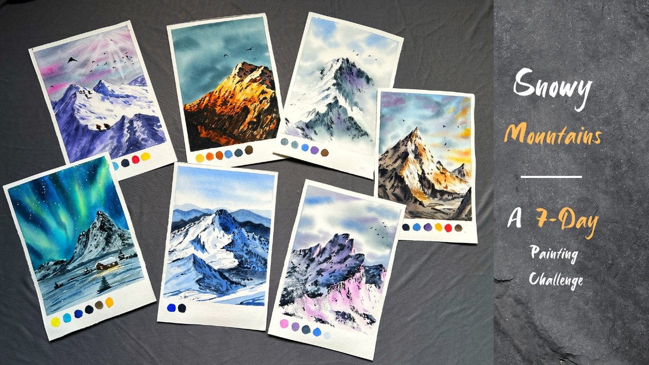
Transcripts
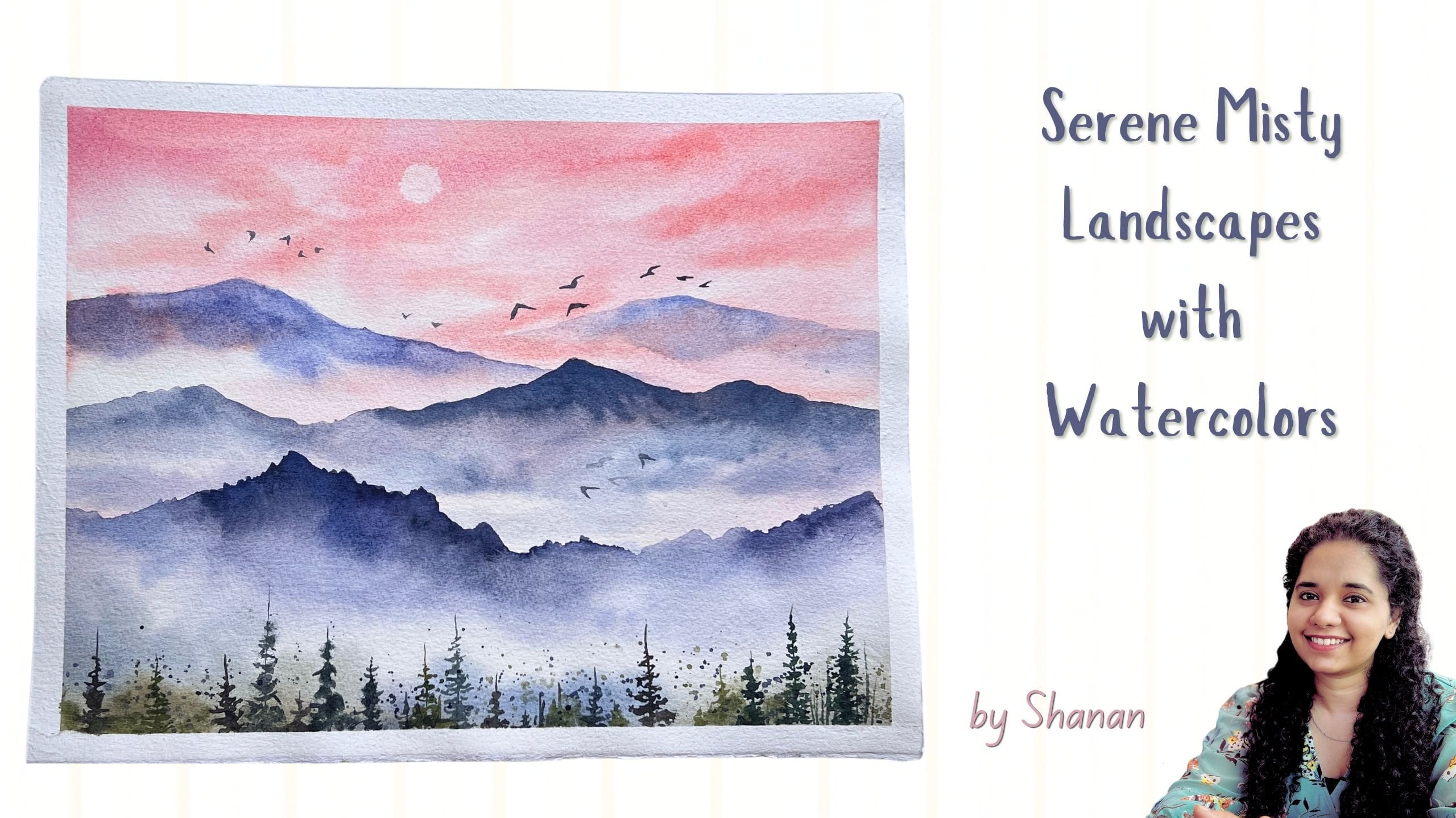
1. Introduction : Do you want to paint a soft, misty landscape that
feels calm and grounding? Well, in this class, we will paint a serene watercolor
meadow with gentle fog, layered greens, and
a peaceful mood. It is a short beginner
friendly session, perfect for slowing down and reconnecting with your
paints and brushes. Hi, I'm Shanan Subhan. I'm an artist from
Bangalore, India. I love painting landscapes
with watercolors and gouache. To check out my artworks, you can visit my
Instagram page Wakul. There I regularly share stories
and posts related to art. In this class, I'll first walk you through all the
art supplies needed. Then I'll show you the
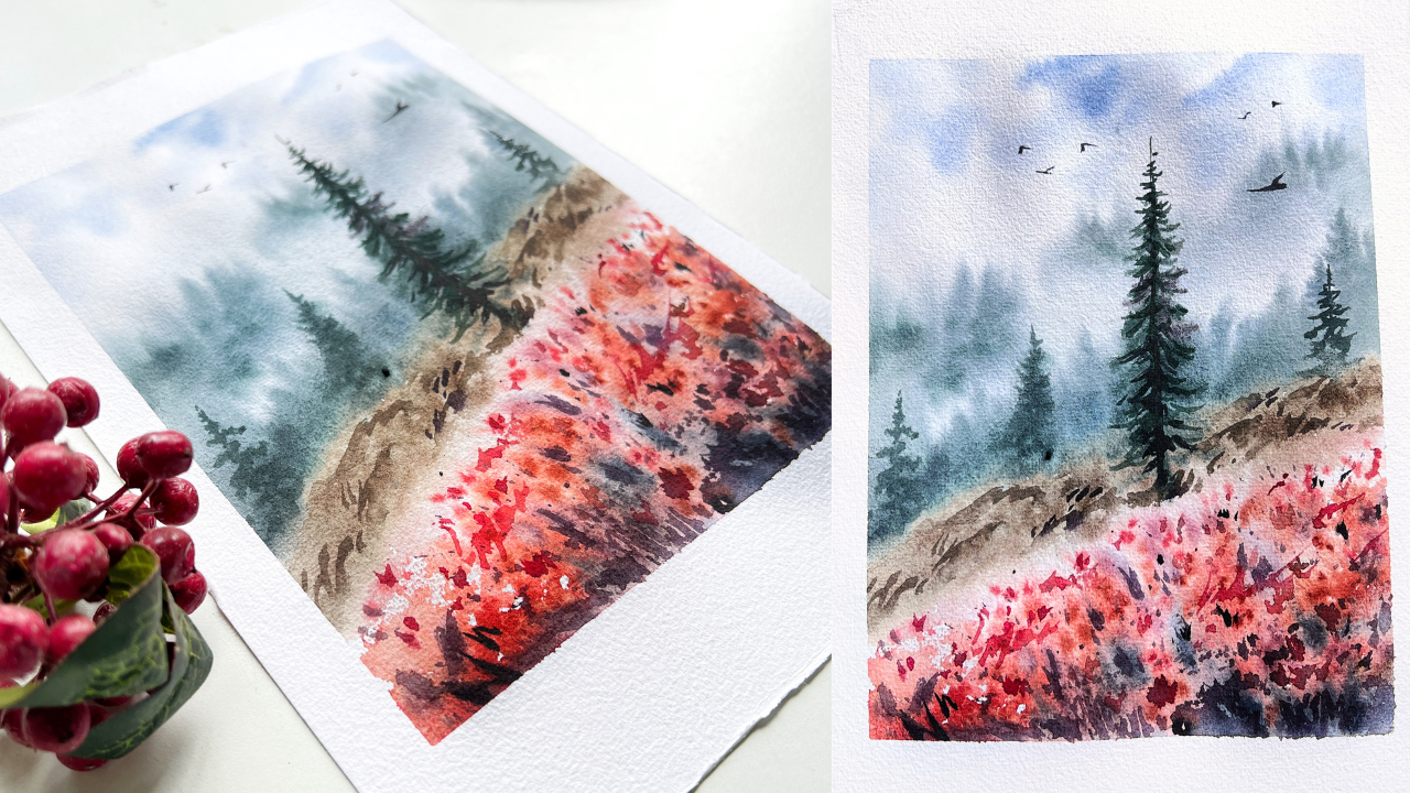
reference image and explain how I have broken it
down into simpler elements. We will practice each element individually so that you feel confident during
the painting process. Then we will begin our
painting process by painting the base layer first
and slowly building the distant background and
layering step by step. From there, we will move
into the meadow part, adding the flowers
and the shadows, trying to create highlights and gradually shaping the scene. I'll also talk about
the mood that I want to capture and at the end, we'll finish off the painting
by adding the details. It is a simple and
quick class designed to help you feel confident
by the end of the painting. And I would encourage you to embrace your own
creative journey. If this is something
that excites you, come join me and let's
paint this together.
2. Art Supplies: Let us discuss the art supplies that we need for this class. Let's start off by the brushes. First, we have silver Ato, golden taklon quill
mob brush of size 80. This holds good amount of water. Next, we have a medium round
size brush of size eight. This has pointed tip, and the next brush is silver
velvet size two round brush. This is for detailing purpose. Next, let's talk about papers. I'll be using Chirput 270
GSM, 100% cotton paper. The texture of this
paper is rough. You can see this
has rough texture, which is really good
for landscape artworks. Now let's talk about the colors. For the distant trees and sky, I'll be using pains gray, ultramarine and hookers green
for the red meadow part, I'll be using
crimson Pyrrole red, Bnciana and opera pink. For the shadow areas, I'll be using let, raw umber, and indigo. Then we would need
masking tapes. I'll be using two different
sizes of masking tapes. You can go ahead with
any size that you have. If you don't want to use
masking tape, that's also fine. Then we need two jars of water, one for cleaning the paints and other one to take clean
water for the washes. Then we would need hair dryer to speed up
the drying process. We need napkins or
you could even use tissues for wiping
off excess water of the brushes and the water spray or water mist for rewetting
the paints and the paper. So that's about the supplies. Let us move on to
the techniques part.
3. Techniques & Practice: In this chapter, we will focus on how to approach the
painting step by step. I will show you the
reference image that inspired this work. So instead of straightaway copying all the colors
and the elements, my goal here is to
simplify the scene into clear sections to
create something similar with a bit
of artistic freedom. So I'll quickly
draw a thumbnail, drawing this slant line, dividing the land and the sky. Below this line, we will have the meadow and
the grassy area. Above the line, I'll
place the trees. Now, let us move on
to the coloring part. So first I'll paint the sky with very diluted bluish
color, keeping it soft. And then I'll add
the misty trees. So in the reference image, the distant trees
are slightly faint. But here, I'll try to exaggerate them so that we can
create a sense of depth. Once this is done, we will then add second layer of midground trees to build a strong sense of layering
in the background. Now, for the land
or the grassy area, I'll use touches of
brown right next to the darker midground area. And then we will
paint the meadows. So while painting the meadows, I'll intentionally leave
a few white gaps and drop in some red
and blue colors. So here I'm trying to create a loose impression of texture. The trees and meadows will
be painted in a rough, suggestive way rather than
exact detailed replica. Remember, the goal
here isn't perfection. It's about approaching
each area one by one and building up the feeling
of depth and atmosphere. Nextile paint, another
layer of pine trees. This time, slightly
darker color. So this is how we will
approach the painting. Moving on, let us practice each section of the
painting one by one. I'll start with the meadow part. So the meadow here has shades
of red and pink, right? So I'm going to take mix of red, opera pink, and maybe
burn Siana as well. So let's swash those colors. Have taken Bziana crimson, Pyrrole red, and opera pink. So I'll be mixing
these four colors. I don't want to stick
to just one color. If you don't have all
these colors, it's fine. You can use one or two
colors like red or crimson, or even burnt sienna. Okay. And the technique
that I would be using for painting the
meadow is wet on wet, which means we apply wet
paints on wet paper. So let's start. Let me apply
the water on the paper. Yeah, two more colors I want to introduce that is
let and indigo. These are the few darker
colors that I'm going to introduce inside the meadow
part for the shadow areas. Okay, so I have wet the paper. Now I'm going to
drop the paints. So this is just rough depiction. Even in the painting, I'll be going with the lose
approach as well. Drop in the red brown
colors that you have. Also leave some white spaces. I'm leaving white to show a sense of light
inside the meadow. Next time dropping
in some let and indigo to suggest
the shadow areas. You could also splatter the
paint using this technique. So once this area dries, we will add some details
using wet on dry. Here, I'm applying wet
paints on dry surface. Adding tiny lines on the
flowers, not on all of them. A few here and there, just to give a sense of detail and sense of
depth to the meadow. So that is how we approached
the meadow in the painting. Now let us move on
to the trees part. In this section, I'm
going to show you how to paint the trees
in the painting. Again, we are going to
use wet on wet technique. So wet the paper thoroughly. Here we are going to
build two layers. One is the distant faraway
land or the trees, and then the midground trees. First, I'll paint
the distant trees. You just have to apply vertical
brush strokes like this. Since the paper is wet, the color spreads very well, creating a diffused effect. Have a tissue or
a napkin handy so that you can wipe off the
excess pains of your brush. Here we are trying to
depict the faraway land. Now for the next layer, we will use slightly
darker color again with same
vertical brush strokes. The color for the
background would be pains gray and hookers green. I'm mixing these two colors, creating a greenish gray color. Now, if you feel the
edges are sharp, you could use a clean brush and blend it while
it is still wet. We have the background ready. Now we will paint the tree
using even darker color. I'll use raw umber
for the grassy part. That is like dry grass
or even the land part. I leave it up to the
viewers interpretation. Even I couldn't
understand if it is the pathway or the
dry grass area. Suppose you are not aware of watercolor techniques like
wet on wet and wet on dry. Here's how it is.
We apply water. And then when we
apply the paints, the paints get diffused and creates a blurry and
soft appearance, whereas with wet on dry, we apply wet paints
on dry surface. It gives us sharp
and hard edges. I hope it is clear. Now, going back to
our tree section, we will fully dry the area. Then I'll show you
how we can add details on the trees
and the ground part. Once the paints are dry, we will go back and add some details using
wet on dry technique. This is just to
create an impression of detailed effect on the
elements of the painting. I'll be adding some
details on a few of the trees in the painting
to bring the attention of the viewer onto these trees and rest of
the trees remains blood in the background. Oh.
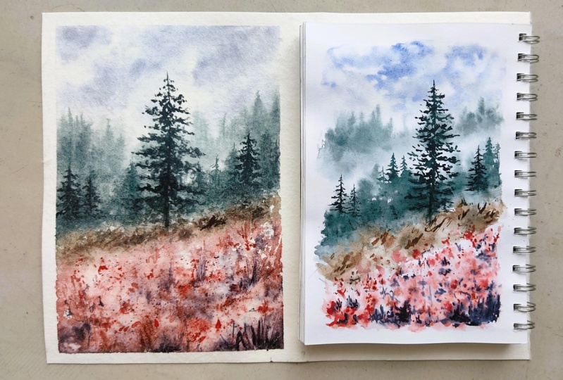
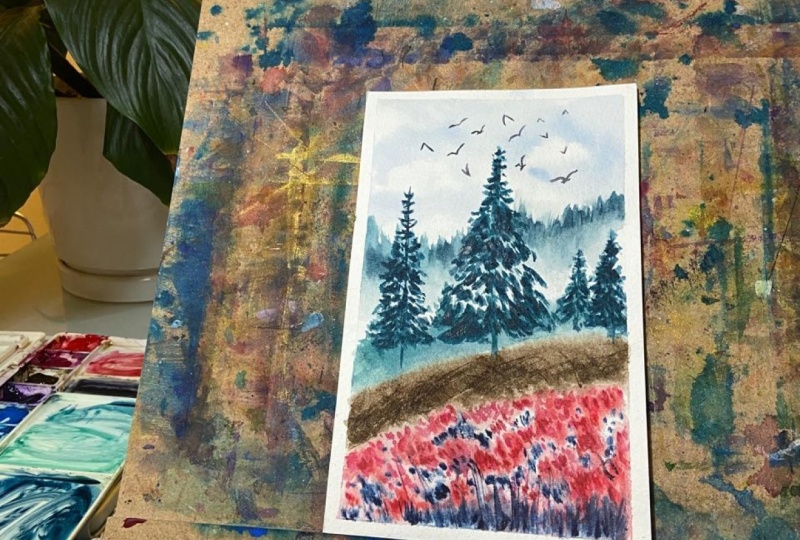
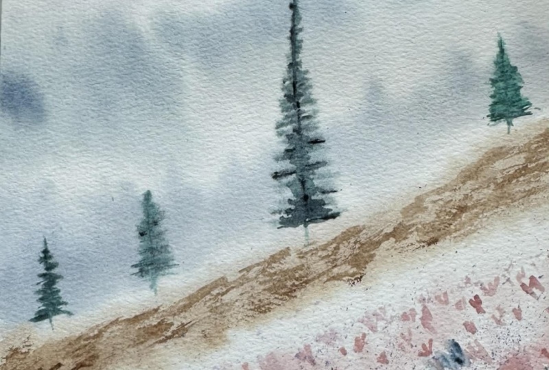
4. Class Project - part 1: Okay, so let's begin
our class project. The paper that I'm
using is chirpet 270 GSM, 100% cotton paper, and it is of the size 11.5 by 7.5 " almost close
to a four size. Okay, so now let's
tap down the paper so that it stays intact during
the painting process. So for the left and
the right side, I'm going to tape it down
using 1 " masking tip, and for the top and
the bottom part, I'll tape it down using two inch water that is
two inch masking tape. This is purely for the
aesthetic purpose, nothing to do with
the functionality. You can tape it down when any masking tape or even if you don't tape,
that's totally fine. We are done securing the paper. Now let us start
with the sketching. Before that, I hope
you have watched the previous chapter
where I explain how to break the reference image into simpler shapes and how to paint the different
elements of the scene. I'll start by drawing
a slant line. This is the area where
the trees meet the land. Above this line, we have
the trees, the misty area, the sky and below this line, we will be painting the
grassy part and the meadows. So I'll roughly mark
the shape of the tree. It doesn't have to be
exactly like this. Just a rough depiction of where the branches are
going to be placed. I'll draw another
parallel line here. Now, let's start painting. First I'll take this mob brush. This is silver Atelio
size 80 mob brush. I'm going to wet
the entire paper because we'll be following
wet on wet technique, right? So for that, we will wet
the paper generously. Apply even coat of water. Make sure there are no pool or puddles of water on the
surface of the paper. Now take your color
palette, and let's start. I'm going to first
paint the sky. For painting the
sky, I'll be using ultramarine blue with
a touch of pains gray, which is already there in
my palette. That's why. You could use any color of
your choice for the sky. It doesn't have to be this blue. So I am applying very diluted tone of
ultramarine blue for the sky, leaving some tiny
white gaps in between depicting the natural
white clouds in the sky. Moving on, let us paint
the distant misty trees. For that, let us
mix paints gray, hookers green, and a little
bit of ultramarine blue. So the aim here is to
achieve a greenish gray. It's okay if you achieve cool or warm gray.
Doesn't matter. Ideally, it should
be cool because it is far from the
viewpoint, right? Now, take a tissue or a
napkin and keep it handy. We need it for wiping
off the excess paint. Use the tip of the brush to paint these repeated
vertical lines. This will depict the misty
pines in the background. Also, use the belly
of the brush to lift the paints and wipe
it off on the napkin. You could also apply
upward brushstroke motion to create the illusion of pine trees in the background. Both ways works fine. You can do whichever
is comfortable to you. Next, we will mix slightly darker tonal
value of the same color. That is the greenish gray
color we mixed earlier. This time we need
slightly darker color. We will introduce
some darker tone in some areas to create this
illusion of tonal variation. If you have ever
seen a foggy view, you will notice how some areas
are completely hidden in the mist while others
peek through partially. That's the kind of effect
we are aiming for here. It doesn't have to be the
main focus of the painting. You can keep it
simple if you like. But by adding just a touch
of this tonal variation, we can create a beautiful sense of depth and atmosphere
in the background. Use clean water to
pull the paints down. This will create a
soft misty effect. All right. Next, let us paint
the second layer of trees. These are the midground trees. They are slightly closer
than the previous layer. I'll first paint
the basic shape. Then on top of the
painted layer, I'm going to add the
trees one by one. Do not take very thick paint. I I paint the pine tree
in irregular sizes. And in between these trees, I'll simply add vertical
lines as filler elements. I don't want to spend
more time painting the trees individually with details because our paper
is going to dry soon, so we'll have to hurry up, learn to paint in
a loose manner. Don't chase perfection. Let go of that control and
just go with the flow. Next, let us paint
the brown patch of land between the meadow
and the background trees. To be honest, I don't
know if this is a pathway or a dry grassy patch of land. Either way, I'm
just going to apply the paint and leave it up to
the viewer's interpretation. Next I'm going to
paint the meadow. So before that, I
want to make sure that the bottom
area is still wet. So I just apply, as in, I just pray some water to make
sure it is still wet. Okay. Next, let us
paint the meadow. I'm mixing my reddish color. Egg the paints in a
medium size brush, and we will gently
dab the paints, leaving some white
gaps in between. If you look at the
original reference image, it has a sort of darker vibe, but I didn't want to capture that kind of
mood in the painting. I'm planning to
achieve a kind of calm and refreshing vibe. I will try to leave some white gap between the
brown and the red part. Since the paper is wet, the colors are
spreading very easily. Take indigo and apply on the
bottom part of the paper. This is for suggesting
the shadow. Add some dots in the
upper part as well. This will create a
nice balance and contrast inside the meadow. We will also use some
darker tonal value of red. Try not to overwork. You might feel tempted
to add more red dot, but try to keep it
minimal and also make sure to leave tiny
white gap in between. Next, adding another layer
of brown in the pathway. Note that my paper
is still damp. If your paper has dried, you could spray water
or leave it as it is. Next, let us paint
the midground tree. We will be using a
darker green color. I'll take paints gray
and hookers green. Add a little bit of let as well. The paper is slightly damp, so I'm going to paint the
branches and the foliage. Since it is wet, it is
spreading very nicely. So you will get
the fuller effect. You don't have to paint
the detailed tree. Switching to my size two round brush for painting
the tip of the tree. Once the paper dries, the tree is going to look
much diffused and dull. I'll be adding another layer
later on with wet on dry. Although the upper area of
my paper has almost dried, but I'm still trying to
paint the tip of the tree. The mid section is still damp. In the background area, I'm adding few pine trees to build a sense of perspective. The paper here has fully dried, so I'm still painting the tree, but on the lower end, I'm using my fingertip to smudge the area and blend
it into the brown part. I'll add another tree
on the left side. Next, we will take a strong or concentrated red
color and we will be dabbing it on the damp
surface of the meadow. The paper is slightly wet, so it won't spread that much. After this, we will leave it for drying and come back once
the paper is fully dry.
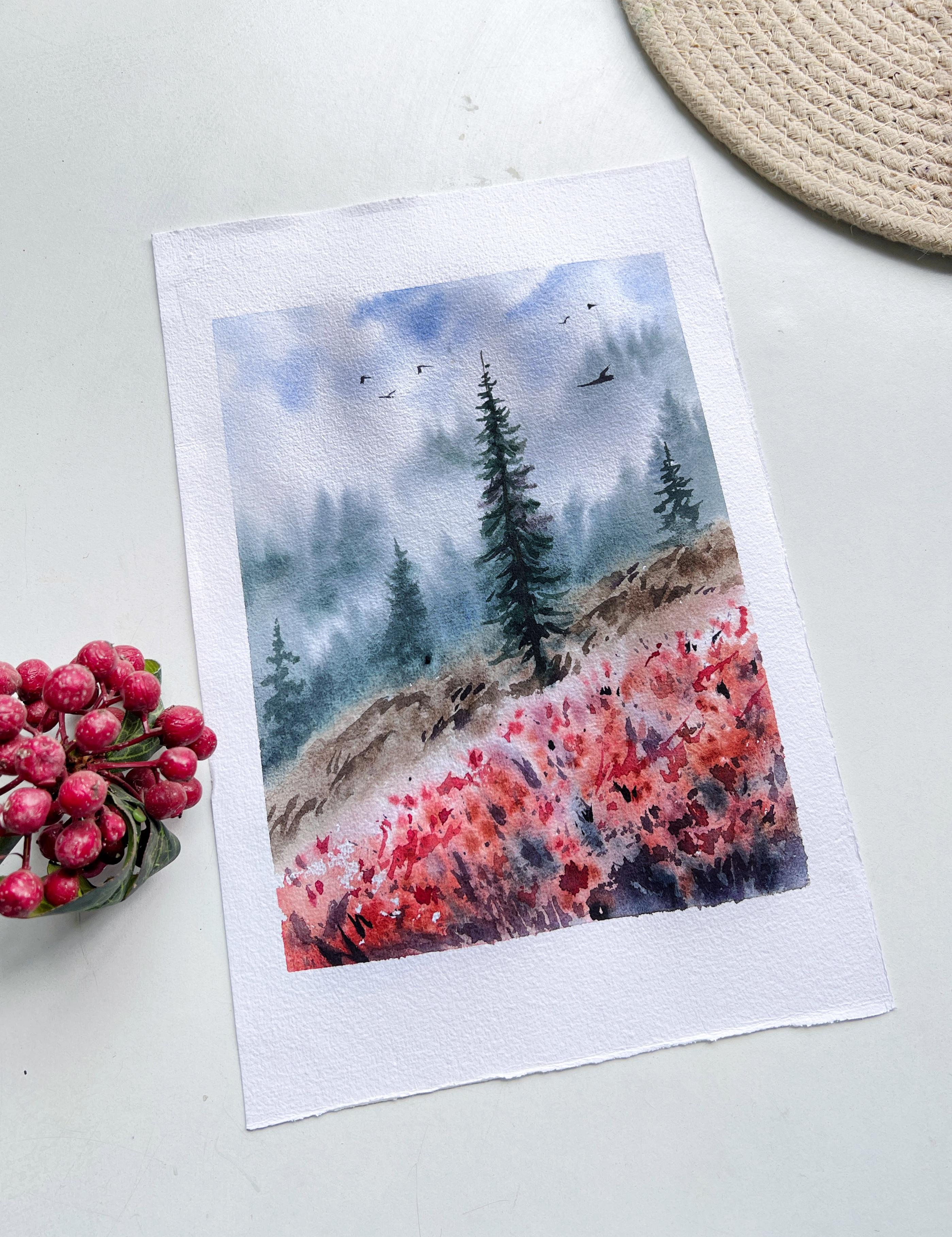
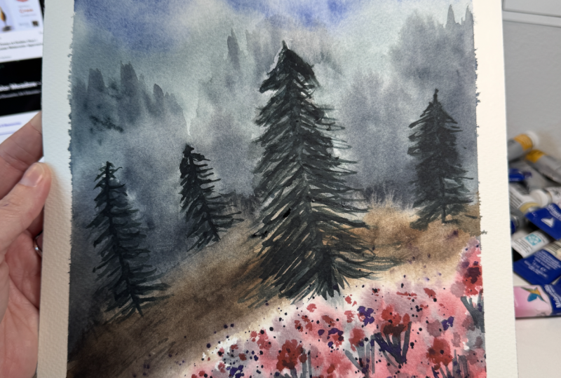
5. Class Project - part 2: All right, the paper
has completely dried. Now let us add some
details on the meadow. So for the detailing part, I'm going to take the red color. So it's a mix of pyrol red
and bidsiana and I'll be adding these random lines over the areas where I've added the dodge earlier,
the red dodge. It is basically like
second layer on the existing paint just to bring out the
essence of the meadow. In the reference image, there were some
particular flowers. I don't want to sit and
add all the details. Instead of creating
all the detailed work, I thought of leaving
some suggestions of the flowers and
to keep it loose. Next, take let or indigo and add some shadow
lines in between. Towards the lowermost
part of the meadow, we will be adding the
bigger brass strokes and towards the center or the
upper part of the meadow, we will keep the
brass strokes short. Next, I'm going to
cover the upper part of the painting to
splatter some paint, take indigo or boil it in darker consistency and splatter the paints, something like this. So when you add these
repeated brush strokes or splatters, try not to overwork it. Try and leave some
base colors to pop. Next, let us add the
detailing work on the tree. I am taking hookers
green, paints gray, and a bit of let and I'll be adding some
details on the tree, not entirely covering the tree, applying some br strokes on
the existing painted foliage. This is simply to
define the shape of the tree and enhance
the overall appearance. This will also create a sense of separation from
the background tree. When background trees
appear diffused and blurry, this tree will stand out because
it is slightly detailed. Um next, let us move on to the brown
pathway or the grassy part. So here with darker brown color. I'm applying some
random brush strokes. You could simply add some
zig zag diagonal lines. This is for defining the
grasses in this area. Now clean the brush and
pull the paints down. Take let and add some in
between the brown grasses. This is for adding contrast. I'll also add in
between the meadow. When you're almost done
with the painting, you could step back and have
a look at the painting, see what is missing, what details you can add. Well Now, let us paint the birds. I'm using Pains gray
for painting the birds. It's simply some V shape, an inverted V shape. I'll also darken the
tree using pains gray. Uh Now using fine liner, take red and quickly
apply some brush strokes. This will create a nice balance. We have darker color,
we have lighter color, so I wanted to add some
mid tones in between to bring in a sense
of balance. M
6. Conclusion - Thank you: Alright, we are done. Let us peel off the
masking tape and reveal the final look
of the painting. I hope you enjoyed and had a fun learning
session with me. There you go. This is how
the painting looks like. If you like this class, please leave a
review or feedback. Your support means a lot to me. Thank you. I'll
see you soon. Bye.
 Shanan Subhan, Watercolor/Gouache | Art Educator