Transcripts
1. Introduction: I ever wanted to paint soft, misty mountains covered in fog or simply want to experience the beautiful
flow of watercolors. Hello, I'm Shanan Subhan. I'm an engineer, turned artist residing in
Bangalore, India. I love painting landscapes. You can check out my artworks inspired by nature on
my Instagram feed, I go by the handle
watercls I have several classes on
Skillshare that focuses on painting landscape.
You can check them out. In this class, we will paint a beautiful mountain
range step by step. I'll guide you through all
the materials you would need. You can use anything similar
that you already have. Guide you through the
color mixing as well. Along the way, I'll teach you simple techniques
to create soft, misty effects and
flowing blends. This is a relaxed, paint along session
where you can slow down, enjoy the process, and truly experience the
magic of watercolors, the way how colors bleed
and blend so naturally. If this sounds like something
you'd love, come join me. I can't wait to see
you inside the class.
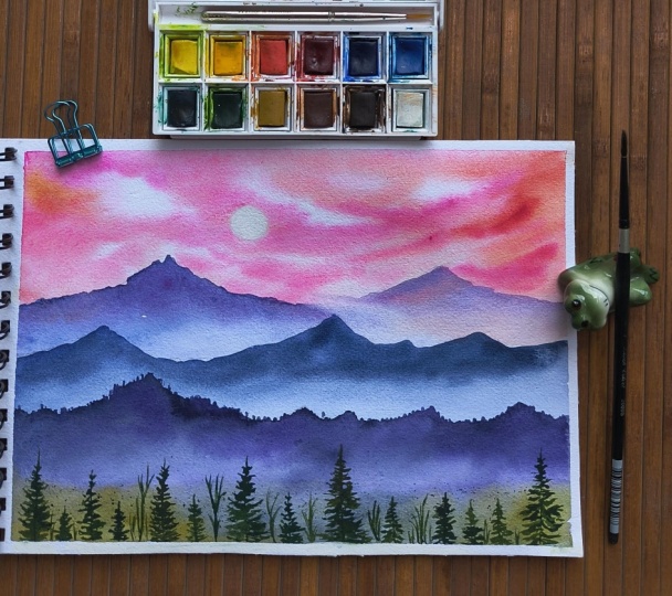
2. Art Supplies: Now, let's talk about
the art supplies. I'll walk you through
all the supplies that I'm using in this class. The first thing that you
would need is paper. This paper is almost close
through a three size. If I have to show
the measurements, it is about 32 centimeter 32 by 25 centimeter. So that is the
size of the paper. This is Hana Mule. I hope I'm pronouncing it right. This paper is 100%
cotton, 300 GSM. I always prefer using 100%
cotton because it is easier to build multiple layers while
painting for the colors, I have this palette. All the colors in this
are by art philosophy. When I was a design team member, I got a lot of art
supplies by them. I've put in this palette and I have realized that I haven't used these
paints in a long time. It has a lot of shades in it. But do not worry about
any of the shades. I'll be explaining you each and every color that
I have used here and the alternative shades that you can use for
mixing the colors. Now let's talk
about the brushes. I'll be using three
brushes in this class, which is this round mob brush. This is by Brostro. It is size eight brush. This is like a mob brush. It holds a lot of water, which is good for
wetting the paper. Now, I have size eight,
long round brush. It has a pointed tip, which is also good for
some detailing work, and it is velvet
touched by Princeton. Then I have silver black velvet, size to round brush, pointed tip again for painting
these trees and the birds. Then I'll use this
clipboard to tape the paper onto this
using masking tape. If you're using a watercolor
block or sketchbook, you can just clip the
sketchbook or put a tape, anything that works for you. We will be painting this
in landscape orientation. If your paper is somewhat
like a portrait orientation, you can turn the paper around and paint it
in this orientation. Then I'll use a piece of
cloth for wiping my brushes, and I have some tissue papers
for wiping the brushes like this to wipe off the paint or to clean the brushes
and then wipe it, remove the excess
water from the brush. This is the purpose of
the tissue or the napkin. I'll be using a hair dryer to speed up the drying process. That's about the art
supplies that we have here.
3. Color Guide: Okay, so let us discuss the
colors in this chapter. I'll be using candy pink. This is by Art Philosophy Co. And there is another
pastel pink color. If you don't have these
colors, do not worry. You can use crimson rose pink or any pink that is there
already in your palette. Don't worry about not having
any colors that I use. Next, to give some warm
color to the pink area. I'll use orange. Here if I mix orange and pink, it will look
something like this. Or pink. This is the color. Again, you can use color, any pink orange pink. There is no fixed rule as such that you have to use
only this color. Now for the mountain, I'll be using ultramarine blue. And a little bit of
this pink again, which will give us a let
color, something like this. Again, if you don't
have that color, it's okay, totally fine. You can use blue or
violet, anything you like. I don't want to restrict
your painting process, go ahead and use whatever
is available with you. Now to mix darker blue, I'll be using blue and a little
bit of brown and violet. It gives me this indigo and
paints gray like color. If you have pains gray
or indigo with you, you can use that directly. You can even mix let to this and create a
little different color. Totally up to you. Even here, I have
used similar blue and let something like this. If you do not want to
mix a lot of colors, you can go with blue and indigo in ultramarine
blue and indigo. That's also totally fine. I'm just making
sure that you don't feel restricted by
the color choices. What's important is to create. Even with single
color you can create by using the tonal values. Now for trees and
this background area, I will be using green
and the existing blue. I will create this green color. I have one more green, which I'll mix with pains gray which will give me this
darker green color. You can choose your greens,
whichever you have, you can mix and match with the existing blues
in your palette. The brown that I have
looks something like this, burned tumber, can mix
it with green and blue. These are the colors that
I'll be using in the class. For birds here,
again, paint gray. Don't worry about not
having particular colors. Feel free to use or
mix your own colors.
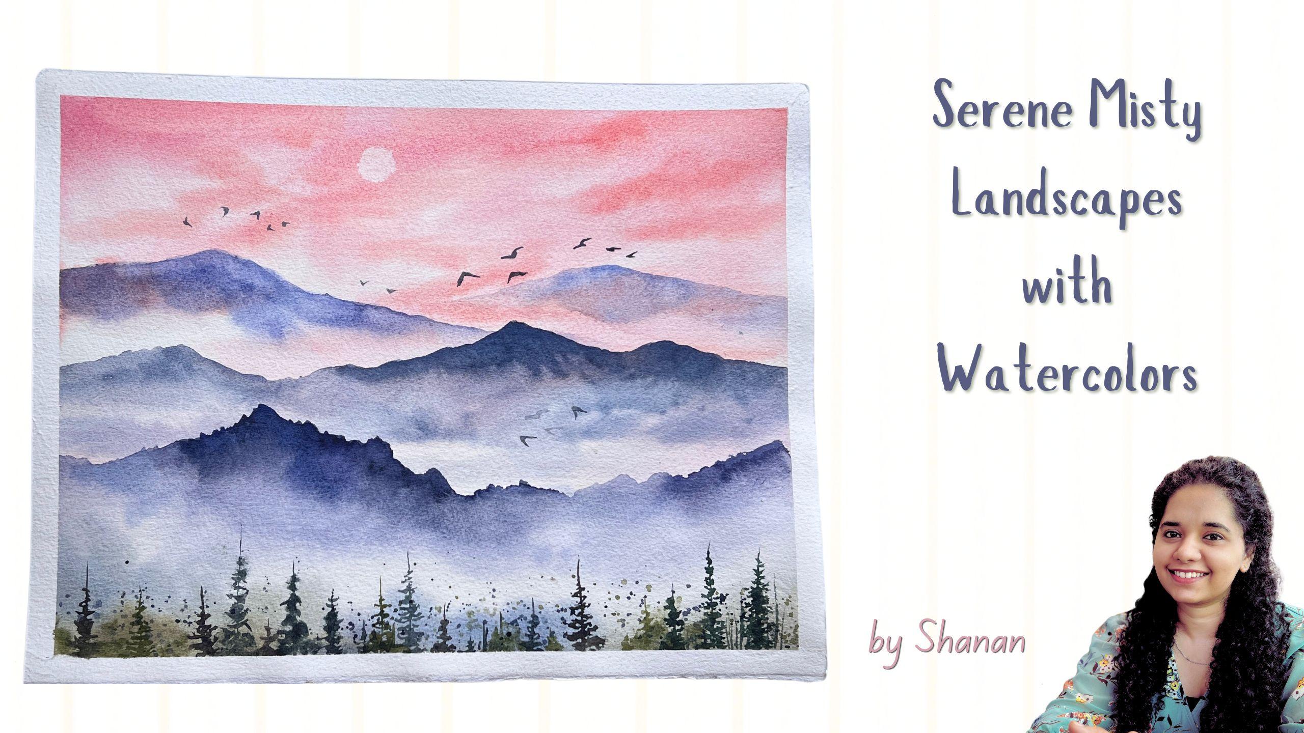
4. Techniques: Today we are going
to paint this. The composition of the painting
goes something like this. We have a sky and then we
have distant mountain, which is slightly hazy
because of the distance. This is the foreground. In between the foreground
and the background, we have the midground. Okay. So we are painting
this in several layers, and this is how it
can be separated. So we have the sky first, and then we have
distant mountain, then we have midground mountain, the foreground mountain,
and the trees. So this is how you
build the layers in the painting. All right? The composition is very simple. We don't have to sketch anything because we might see the
pencil marks on the paper. So to avoid that, we will directly paint using the paint brush
without any sketching. Let me walk you through the techniques that you
would need for this class. I'll be using pulling technique or dragging the paints down. I don't know what is the
exact term for this. As I'm self taught, you take thicker paints. And then you paint the
shape of the mountain, dragging your brush and creating
the shape that you want. This is the peak
of the mountain. Now you clean your brush
and pull the paints down. You just pull the paints down, maybe keep at an inclined angle. If you want you can
add some paints. So let's say you have
painted one mountain, you will not leave
this area as it is. You will use more clean water and maybe paint till the
bottom or the mid area. For this mountain, I have
applied water almost till this area so that there is no patchy surface when it dries. This is one layer. Similarly,
for the other mountains, you use darker colors. To suggest the haze or
mist in the surrounding, you can use the lighter colors. Here you can see for the distant mountains have
used very lighter color, that is to depict the
haze in the atmosphere. Now for the midground, I
used slightly dark since it is closer but not as
dark as the foreground. You will create that lighter to darker consistency
in the painting. So you can also go with tonal values where you add more water to
dilute the paints. Here this is the
thickest consistency. Where you are
taking thick water. Now you apply more
water to this, it becomes mid tone consistency. Then some more water becomes
diluted and you can keep adding water until
it reaches this white, almost transparent state. If the paper has not dried, you will get these effects, which if you want it
intentionally, you can use. Otherwise, you will wait
for the paper to dry. I'll show you here this
area is already dry. Can create any shape
you like by dragging your brush and then create that tilt and
pull the paints down. This naturally creates
a misty effect. Now you can drop in some paints, creating some shift and
variation in the mist. Simply play around with this. You can also pick up some paints using damp
brush or dry tissue. And there is one more way
to paint the mountains, which is to either first create the shape using diluted
paints or clean water. Once you have the
shape in place, you then add the colors. Once the desired shape is ready, you can go ahead and
drop in some colors, leaving some areas blank intentionally to suggest the misty
appearance in the mountain. Could also drop some water So there are multiple ways
with which you can paint. So you can leave the
gap anywhere you want. Is creates a misty
continuation of the mist.
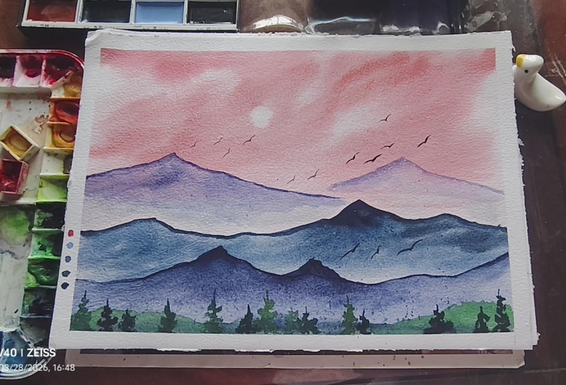
5. Class project - Part 1: Okay, so let us begin
the painting process. I'm going to tape down my
paper on this clipboard. So to tape down the paper, I'm using size 1 " masking tape, and I'm giving about a half
inch border on all the sides. If you don't want to tape it, then you can use a paper
clip or sketchbook, anything you're using,
it is totally fine. Make sure you're painting
in a landscape orientation. Once you're done
taping down the paper, just run your finger over the edges just to make
sure that it is tightly sealed and water doesn't
seep in inside the gum tape. Okay, so let's wet the paper. I'm using this spray bottle. It only has pure clean
water. Nothing else. You can simply use a
brush to apply water. Here I'm using my mob brush to spread the water
across the paper. Make sure it is thoroughly wet. All right. Let's start
our painting process. I'm going to mix the colors now. So first, I'm taking
this candy pink. This is by Art Philosophy Co. You could use any pink color that's
available with you. To this color, I'm adding a little bit of
orange to make it a warm peach or
salmon pink color. Apply on the top part. Til the paper so that
the colors flow down. We have a nice flow when
we til the paper down. Moving it in the opposite
direction as well so that the colors don't look
as if they're flowing down. Leaving some intentional
white areas in between for the white
color of the sky. Keeping this masking tape under the clipboard so that there is slight elevation and created during our entire
painting process. That was our first layer. Now we will add some depth in the sky by painting
some more colors. These are the clouds in the sky. Builds a sense of depth there. If you are fine
with just one layer in the sky, that is also fine. Keep the paper in a tilted manner while
you're painting the sky. This will create a
nice flowy effect. So Take a tissue paper, make a ball like shape. And with this ball, you want to press it
against the paper, picking up the paint. So this will create a
small circular shape depicting the sun or the moon. We can leave it up to the
viewer's interpretation. Whatever they want to
interpret, they can. It can be sun or it can be moon. Now, I'm going to
let this area dry. You could let it dry naturally or use a hair dryer if you have. All right. Now I'm switching to my size eight Princeton velvet
touch Brush. All right. So we're going to start
painting the distant mountain. My mountain in the
distant area will look something like
in blue color. I'm mixing the existing
pink with the blue color. It will give me a
slight purplish color. Can even add pink if you'd like. Take the paints and we'll start painting
the distant mountain, the farthest mountain
from the viewpoint. The color is slightly volaty let's start by
dragging our brush. Okay. So here, I
have realized that the violet color on a pink
background looks a bit muddy, so I'm going to take more
bluish color for this mountain. I'm painting the shape of the mountain using
the brush alone. And for the misty effect, I'll apply water with
the clean brush. You just have to pull
the paints down. Be a little quick with this
step as the paper might dry. You can soften some hard edges so that it doesn't look very sharp Now let's paint another mountain. Before that, let
me wet this area so that there is no
sharp water patches. Adding water creates
a smoother transition and makes it look very seamless. You can drop in
some darker colors. My aim here is to make the
mountain appear very seamless. And for the same color, let's add some more
water, making it diluted. Now, use this diluted pains to create the far away
distant mountain. Have a tissue paper handy
so that you can lift the paints or use clean water. You might get these patches. Don't worry, just
apply some paint and leave it as it is
without much overworking. Sometimes we try
to correct or fix our mistakes going back and
forth between the process. Try to avoid that and
trust the process. Now I'm going to dry this layer. When you're using
the head dryer, the gum tape might
leave its gum, it might peel off. Just press it again. Now let's move on
to the next layer. This would be somewhere
in the midground area. I'm mixing slightly
darker blue color. How do I mix darker blue by
not taking darker color, but simply mixing a little
bit of brown to it. This was let, sorry. Can take any brown. Or if you have indigo
or pains gray, maybe mix that with
the ultramarine blue. Here, the peak of the mountain lies around here and
another one here. For the midground mountain peak, I'll try to paint somewhere
in between the two, not directly under them. So let me paint the next
mountain range somewhere here. You can simply drag your brush and create
the shape you like. Once that is done, then
you apply diluted paints, trying to create
smoother transition from darker to light, and then keep adding water. And here's another way where you use water and
then apply paints. Dropping in some darker paints on the peak of the mountain. The reason behind applying
this darker color is to hide the previous layer
that we had painted. Now, I'm switching to my
bigger brush and applying clear water so that we have a smoother,
seamless transition. Maybe you can apply some
more paints in between. So you can see some
shift in the mist. Maybe you can
splatter some paints. I'm using tissue paper to lift off the paints outside
the mountain area. Uh, Okay. Now let us dry this area. Just check if the
paper is fully dry. Next, let us mix the paints to create the
foreground mountain. Here I'm using ultramarine blue, volet and burn tamber. Using these three colors, which will look similar to
indigo and paints gray, you can use those
direct shades as well. Okay, so I'm taking
this thicker color and dragging my brush, creating a mountain shape. Since it is closer
to the viewpoint, so I'm trying to create these tiny details
on the mountain. On some areas, you can apply clean water and then
apply the paints. This will look as if the upper part of the mountain
is covered with mist. So you can see what
I've done here. I've kept two areas lighter
in the foreground mountain suggesting deep sense of
mist around this area. Also, giving some details with the pointed
tip of the brush. Now trying to blend and create a smoother
gradient effect. Switching to my larger
brush and applying water. Once you have applied water, then you can go back and add some detailings in the mountain. Okay. So now let's mix
green and some blue. This will look like
olive green color. I'm applying this in
the foreground area as the base for the
foreground trees. Make sure to leave
this white space in between mountain and
the foreground area. Do not fully cover
it. All right. Now, we will leave it here and let the
area dry completely. I'm using my head dryer
to dry the paints.
6. Class project - Part 2: This is how the painting
looks once it is dried. You can stop here if you'd like. But I'm going to paint some
trees in the foreground. Not much, a few of them. I'll be using Pains
gray and some green. This is giving me a
very dark green color. Now with this color, let's paint the trees. I'll start by drawing a straight vertical line
and then add the foliage. Using my fingertip to smug
the foliage of the trees. You can use a tissue paper and
wipe off the excess paint. When you do this, you get nice precision to
draw the trees. Just move your hand in
different direction. Try to paint the leaves in a very irregular and
asymmetrical manner. I'll show you what a symmetrical
tree would look like. It would look something
like this where you are painting a straight line
and then you go like this. If you're a beginner,
it is fine, but if you want to
refine your skills, now you compare these two trees. If you still want to follow
this basic technique, then once you're done with this, you can go ahead and add some tiny lines in between
depicting the leaves, trying to break that symmetry. Right. And some tiny
dots on the outside. So filler elements like this. I'll use darker color this time, more of paints gray
and less of green. I can do it here as well. U. We are painting the trees in different sizes. So short, some taller trees. It creates a variation and avoids creating a uniform
look in the painting. Next, let us add some more
trees using the brown color. So this is how it
looks when your paint when your brush is
loaded with the paints. Always, like, dab off
using a tissue paper. I initially wanted to
only paint few trees. As I painted few trees, I wanted to, you know, keep painting them
more and more. Now, I'll take light green and mix it with
the brown color. It kind of gives me this olive green color and start painting some
trees with same technique. You can change the
height of the trees, creating a sense of variation. You can apply the
paints randomly like this and dab it using
your fingertips. This will create an organic
filler element sort of look. Let's not overdo this. We can cover this upper
part, something like this. I don't want to waste
this clean paper, so I'll use this napkin
instead to cover the area. And you can splatter the paints. Just to create that wild and natural organic
effect in the foreground. A splatter some greens. Now, let us add some birds. I'll take paints gray for this. Wipe off excess paint. Painting birds is one
of my favorite thing, but I always enjoy. This area is covered with mist, so I'm going to paint with diluted color just to show that there are birds
inside this misty area. If at all, you feel that there are a lot of splatters around in the foreground area, you can use the tissue
paper to lift the paints. We are done with this painting. Now this peel off the masking tape revealing the
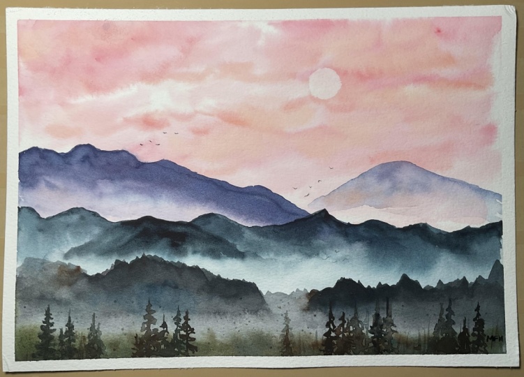
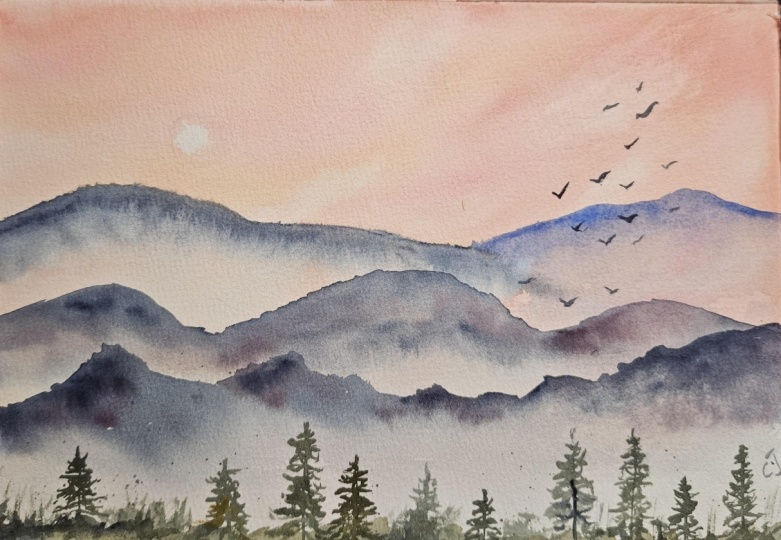
final look of the artwork. Okay. There you go. This is how the
artwork looks like. To be honest, I did not have any
reference in mind. It was, I think, out
of the practice that I've been doing
misty landscapes. I did this imaginary painting where I chose my
favorite color for the sky and we did some mountains from the
imagination itself. I really love how
this has turned out.
7. Thank you :): Thank you so much for joining my class and staying
till the end. I hope you had a fun
learning session today. If you have enjoyed
painting along with me, I request you to please share your artworks under
the project's gallery. And also, you could
leave a review for the class so that it reaches
more people like you. Thank you. I'm really grateful. I'll see you in my next class. Until then, bye bye.
 Shanan Subhan, Watercolor/Gouache | Art Educator