Transcripts
1. Introduction: With each monsoon, the
fields come alive, reflecting the sky's color as the rain nourishes the land. The wet Earth, lush greenery, and shimmering water creates a serene, ever changing canvas. In this class, we will paint the quiet beauty of
the monsoon fields, capturing the magic of this season and its
connection to the nature. Hello, I'm Shannon Suman. I'm an engineer, turned artist, residing in Bangalore, India. I love painting landscapes. You can check out my artworks inspired by nature on
my Instagram feet. I go by the handle water curls. I have several classes
on Skillshare that focuses on painting landscape.
You can check them out. Welcome to my Skillshare class on painting monsoon fields. In this class, we are going to paint a lovely monsoon scene. This class is
designed for someone who has already
been painting with watercolors or is familiar with the watercolor techniques so that it is easy to
paint along with me. If you're a beginner
and new to watercolors, then I would recommend you
check out my older classes, which covers a lot of
watercolor techniques. However, we have a
brief section to quickly brush up on the
techniques needed for the class. I'll share my tips and tricks
to simplify the process, and I'll also talk about all the colors that would
be used in the class. I'll be teaching this class
in a step by step manner, providing clear instructions and careful explanations to ensure you can easily follow
along with me. Without any further delay, let's get started
with the class.
2. Art supplies: Before we begin, let me walk you through all the art supplies
needed for the class. You can use any similar
alternative supplies that's already
available with you. Here are the art supplies
I'll be using for this class. Let's start with brushes. For paper washes are
covering larger area. I'm using silver
ata size 240 brush. This is quite large
and you don't need to have this
exact same brush. Any larger size brush
will work just fine. Next, I have Princeton
Nepsun size six mom brush, which I'll be using for
bigger brush rokes. Since I'm working
on a larger paper, we would need a larger brush. Additionally, I have a
similar sized brush, which is silver ato size 80. These two are similar
sized brushes, and I might switch
between the two depending on what feels more
convenient at the time. Next, we have size 12 round
brush by silver black velvet. This is for the regular brushok. Next, I have silver
black velvet, size eight round brush
with a pointed tip. I'll be using this for
smaller brush strokes, and it is perfect for making precise marks
with the pointed tip. Lastly, I have size two round brush for fine
lining and detailing work. Next, let us talk
about the colors. I'm using artist grade
colors stored in the airtight container
or the palette. This palette has 24 wells, which is great for storing
a variety of shades. I have a separate
chapter dedicated to listing all the colors I
will be using in this class. Additionally, there are
wells in the palette that allow me to easily
mix colors as needed. If you don't have any
space to mix the colors, you could use a glass or a ceramic plate
for color mixing. Next, let us talk
about the papers. Here, I am using Bohng 300 GSM, 100% cotton paper, and it is
of a coal pressed texture, which is slightly textured. This paper being 100% cotton, absorbs good amount of water and remains wet for
a longer duration. The size of this
paper is 14 by 12 ". Next, we will need
two jars of water. Here I'm using one
jar and one tub. The jar is for maintaining
clean water while the other one is for
rinsing off dirty paints. When I'm working
on larger paper, I find a tub more convenient
because it allows me to clean my brushes easily and speeds up the
painting process. Additionally, I have
one more jar of water just in case
I need clean water. We will also need a
water spray bottle, which is useful for spreading
and blending the colors, as well as reactivating
dried paints. Next, we will need some
napkins and a tissue paper. These will be handy
for wiping off excess paints and cleaning
the brushes after every use. We would need a head dryer to speed up the drying time
during the painting process. It's okay if you do
not have a head dryer. You could naturally let it dry. Since I'm going to paint
on a larger paper, I need something to support it. I'll be using a piece
of plywood as my base. I'm going to place the
wet paper on this, which allows me to easily rotate and move the paper
during the painting process. Also, avoid sticking
the paper directly onto the paper as that can restrict the flow and
movement of the watercolors. Using a movable surface
like this will give you more flexibility and
control while painting. All right. That's
about the supplies. Let us move on to
our next chapter.
3. Colors list: In this chapter, we will go over the colors needed
for this class. I'll demonstrate both
the darker tones and the diluted ones, so you can get a better
understanding of the colors and you can select the ones that you
already have with you. The first color is pines gray. Then we have sepia. You could also mix burn
timber and ultramarine blue. It will result in a similar
darker brown shade. Next, we have ultramarine blue. This is a primary
color and cannot be achieved by mixing
any other two shades. Next, we need indigo. You could add some brown
to the blue color. Next is violet. You could get this by mixing
cool red and cool blue. Next, we have a
warmer green color. The name of this color
is yellow green, but I tend to call
it as olive green. Because it is very
easy to remember. Next, I'll take forest green. This is a very cool green color. You could get this
similar shade by mixing cool blue
and a cool yellow. Next, we have a shadow green. This could be achieved
by mixing brown, paints gray, and a
little bit of green. Then we have yellow cer. If you don't have this color, you could mix yellow and
a little bit of brown. Next, we have Indian red color. You could also mix red with the burn Cana or burned
timber to achieve this color. Next is burned timber, and I have poured the
color on the side of the palette because I don't
have any other space left. Then we would need raw umber. If you don't have this color, you could mix burnt umber or any brown color with a yellow color. Next, any yellow color. You could use Cadmum yellow, permanent yellow, and
then lastly, Cobi blue. This is again a primary color. That's all about the colors.
4. Techniques: In this chapter, we will quickly go over some key
watercolor techniques. First, we have wet on wet, where wet paint is
applied to a wet surface. This creates soft and
diffused effects. Next, we have wet on dry where wet paint is applied
on a dry surface. This results in a sharper and
more defined brush strokes. Next is dry brush effect
or dry on dry technique. Here, we remove
excess paint from the brush using a
tissue or a napkin. Then when we apply the paints, it creates a textured look. This is a very
important technique for this class to create
textured effects. Next, let us talk about swift brush strokes or
swift brush movements. In this technique, we need
to move our brush quickly to create dynamic flowing
effects in the element. Watch how I move the
brush rapidly to achieve these swift and smooth effects in the areas we
want to emphasize. I'll be using this in
the fields to create swift movements in the
elements we want to paint. We have to move the brush so fast that it creates a
nice texture defect. Oh. Moving on, let's talk about adding
details on the damp paper. In watercolor, we often build multiple layers while
the paper is still damp. Since the drying
process takes time, we can go back and forth
adding details as we work. For example, I'll paint
a simple mountain. This is just for
demonstration purpose. There's no mountain
in the actual class. But this will help us
illustrate the technique. Below this area, I'll
paint another example, which is a simple field. An After applying
the base layer, as the paper starts to
dry and becomes damp, we'll go back and add details. When you apply the
paints on a damp area, the colors will tend
to appear diffused, but you will still be able
to add the details you want. This is the same
approach we will use in our actual painting where we are revisiting areas to
redefine them as needed. After waiting for
some more time, I have added some
more details here. Similarly, I'll repeat the
same for the field as well. The paper is damp. I'm going to add some
details defining the shape. Next, I'll show you
the difference between single brastrok and
repeated brates. In your painting, try
to use single brakes and avoid going over the
same area multiple times. I'll a greenish color quickly
and a simple as an example. In the first example, I will use one or two
quick rushtrokes, creating a seamless light
and airy watercolor effect. In the second example, I'll apply repeated
brush strokes and you will notice
that it looks overlap. That's why we are using bruh. Try to avoid these
repeated brush strokes in your painting for
a cleaner finish. Now compare the two and you will clearly
see the difference. Which style would
you prefer to paint? Initially, it might
feel challenging, but with practice, you
will get the hang of it. Even I am still trying
to follow this method, though sometimes I slip back
into my old painting habits.
5. Part 1 - Sketching : I'm starting by placing the
paper on a plywood sheet, which is resting on
a slanted easel. This setup allows
me to easily rotate the paper and control the direction of the
pain flow as I work. As I mentioned earlier, the paper size is 15 by 12 ". Now I'm going to wet
the back side of the paper and once it
is thoroughly wet, I'll stick it onto
the plywood sheet. The brush that I'm using here is silver golden
tacklin quill brush. This is of the size 240. It is such a huge brush
for watercolor paintings. I'm really impressed by the
amount of water it holds. Simply amazing for large
watercolor artworks. All right. Now that the paper is
secured with water. Next, I'm going to start sketching the composition
for the landscape. I will begin by making the line where the sky
meets the land or water. I'll place this line in the
upper half of the paper. Now around the horizon area, I'll sketch a few
distant houses. You can keep it simple as well and just add
one or two houses. It's entirely up to you. Next, I will mark the
area for the field. Pay close attention
to the angles between the lines as this will make
it easier to replicate. Fields are often divided by
boundaries which he store water during monsoon season and are later used for
agriculture purpose. T. In the background, I'll add some bushes and
coconut trees as well. I have a nice connection with the coconut
trees and fields. I grew up in a coastal
village in Carnatica, where coconut trees surrounded our homes and
fields were nearby. I remember sitting and
watching buffaloes plowing the fields
during monsoon season. It's truly nostalgic to
recreate such familiar scenes. Next, I'm going to draw the
guiding lines in the field. These lines, pull the viewer's eye
towards the background, creating a sense of perspective and adding
depth to the painting. I'll mark a few slant lines
in the next field as well. This is not very important one because it is in
the midground area. Our main focus is on in
the foreground area. We have two heaps of
grasses in the painting. One is on the right, and
other one on the left. In this painting, the light
is coming from the left side, which means that the shadows
will fall to the right. That's why I'm adding
pencil shading to the right side of the
objects like the heap of the grass and these
houses to make them appear more dimensional
and grounded in the scene. Now on the right most side, I'm drawing a giant tree. This will be a bare tree. Next, I'm going to draw the
women working in the field. I want to capture the movement and show that they're
planting the grasses, but I'm not best at drawing people or portraits,
but that's okay. I still want to include a
focal point in my painting. I'm giving it a try anyway. If you'd rather not
add the figures, feel free to skip this part. It's totally fine. You can follow along with
me or maybe you can pause the video and watch the reference image
and draw it yourself. It's up to you. First, we'll
draw the actual shapes, and then we'll move on
to the reflection part. Also draw the bundle
of these grasses. That is it for the sketching. Now let us move on to
the painting part. I'll be using a quill
brush to wet the paper, but it will be only on the area above
the horizon for now. We'll start with the
horizon area since it is a larger part
of the composition, giving us more time to
work on it properly. Also make sure the backside is so that it doesn't curl up during
the painting process.
6. Part 2 - Sky & Background : The top part of the paper is wet and we will paint the sky. You can choose any
bluish color for this, ideally a darker blue color. I'm mixing paints gray with
a touch of cobalt blue. Now take a larger brush and swiftly apply the
paints to the sky. This technique will
help us create soft and airy clouds giving the sky a
light and open feel. While applying the paints, do make sure to leave some blank spaces as it will suggest the white
color in the sky. Once the colors are placed, I'll tail the paper in different direction to
create nice soft effect. This will also help avoid any unwanted brush strokes and hairy texture in the cloud. Next, let us paint
the background trees. I'll be using paints gray for this as it is a
darker bluish tone, which is perfect for creating hazy and distant effect
in the painting. As per the aerial perspective, objects that are farther
from the viewpoint tend to appear cooler
or bluish in color, which helps enhance the sense of distance in the painting. Just dab the brush
lightly and apply the paint to block
in the background. Once that is done, you
can go back and add the details like palm trees or any other elements you
would like to include. The area above the horizon
is completely wet, including the section where
we had drawn our houses. Since the houses are also wet, it pulls in colors
from the gray section, making it a bit messy. I'm going to use a
clean and damp brush, acre napkin, and lift off all the excess paints from
the roof area of the houses. Additionally, I'll
tilt the paper with the sky on the lower side, which will help control
the flow of the paint. Next letter is paint the
area around the horizon. I'm using forest green. If you don't have
this specific shade, you can opt for any cooler
green that you already have, or you could mix ultramarine or cobal blue into your
green to cool in down. Adding a touch of paint gray or indigo will create a
darker cooler green. Once this color is mixed, we'll apply this along
the horizon line. Next, I'll take darker paints gray to define the shape
of the background trees. Since we initially painted
the trees on a wet surface, they lost some of
their form and shape. Now I'm going back to refine
and sharpen their shapes. Use the pointed tip
of the brush to paint the palm needles or palm leaves. If you notice the
colors are slowly creeping back to the
roof area of the house. This time, I'll use
a tissue to absorb more of the paint and lift
it off with a damp brush. You could also dab the
tissue directly on the roof, but I don't want to risk lifting
paints from other areas. I'll stick to using my brush.
7. Part 3 - Base layers: Moving on, we'll start painting
the mid ground element. In this step, we will
gradually transition from cooler green
to warmer greens, following the rule
of perspective, which is colors in the farther distance
appear cooler while areas closer to the viewer
show their t and warm tones. Let's make a green and also have a larger brush
ready for this section. I have mixed a warmer green using olive green
and yellow cer, and I've loaded my
brush with this paint. Swiftly apply the paints from the sides towards
the middle area. You can see how
I'm doing it here. Also, remember to leave some tiny white spaces to
create a dry brush effect. Now, with this existing green, we'll add the cobal
blue and make it a neutral green color. Now, apply this on the empty section around
the horizon area. Leave a tiny gap in between. I will avoid mixing these
two sections for now as it could cause the colors to blend and ruin that
separation we want. We'll focus on that later. I'll be blending
the same color to the remaining sections
around the horizon area. I'm merging these two
layers in some areas while still leaving a few
white spaces in between for some added
texture and contrast. Next, I'll go back to the warm green area
and partially apply another stroke of green
to enhance the sense of. Next, I'll move on to
painting the next field. For this section, I'll use a mix of sepia and a touch of violet, mixing it in lighter
consistency. I'll apply this stone
across the area. U Moving on, we'll paint the
main foreground element, which is the field
in the front area. Take a larger brush and apply
water in diagonal strokes, starting from the midground and working towards
the foreground part. I'm following the guiding line, so it can create a
dry brush effect in some areas so that we can embrace the
texture that it gives. I'm not completely covering the area with water beforehand. Slowly and gently apply water
using these diagonal lines. We have wet the paper. Next, let us prepare the colors
for this section. First, I'll take raw
umber and diluted consistency and apply it on
the corner of this field. Remember, we had the
board tilted earlier. Now I'm reversing the
tilt so that the sky is at the top and the ground
is on the lower side, which is the field side. I'll go back to the
houses and lift off any excess color
once again using a damp brush and tissue
paper. All right. Now let us resume
painting the fields. I'm taking a bit of
gray and coballu, and applying in the front
section of the field. Apply diagonal
swift brush strokes towards the termit ground area. Do not completely
cover this area, leave some blank spaces as well. This will help deepen the reflection of the sky
in the collected water. This is just the first layer. We'll add multiple
layers going forward. Now I'll take olive green color. It's more of warm green. Now, apply this color starting from the midground towards
the foreground area. These rows of green
grass represent the crops that have
already been planted. You can also see the women working in the field
where they are halfway through planting with the rest of the area
yet to be completed. Next time I'm going
to apply green to the section that's only
partially completed. So applying the green
color will serve as the base layer for the
already planted grasses. We'll return to this area later to add more
details and refine it. Next, let's paint
the boundaries of the fields using a
diluted brown color. I'm using sepia. You could use any
brown of your choice. Now apply some swift brush ropes from the midground towards
the foreground area. This will help in suggesting the grasses planted
in straight rows. Next, I'm painting
the lines shorter to suggest a partially covered
planted area in the field. As I paint the next field, notice the direction
of the lines. I'm using darker colors to paint the boundaries
of the field. Now take green color and mix it with the brown mix
that we already have. We will get a very
darker green color. I'll use this color mix to paint the grassy bushes around the house and the
midground area. So as you are painting
along with me, it doesn't have to look exactly like mine or
match my results. It's perfectly fine if yours
turn out a little different. Next, going back to the
field on the left side, I'm applying some slant lines, suggesting the direction in
which the field extends. On the left side of
the painting frame, there is a small white grap. To cover that up, I'm using the spray bottle. Next, to add a sense of
drama to the painting. I'm sprinkling some
water by my hand. This will create a blooming
or cauliflower effect, leaving a natural
texture in the painting.
8. Part 4 - Foreground Reflection: While the fields in the
foreground are still damp. I'm going to paint the base color for the
foreground elements. Adding some colors for the reflection part of the
woman working in the field. I'm using bluish violet and
red color for the reflection. Next, I'll add bundles of
grasses placed in the field. These represent the
bundles from which the grasses will be
planted in the field. Axe green and mix it
with a little bit of brown to create a
darker green shade. This color, I'll apply as the shadow on the
bundle of grasses. I'll also use the same color mix to paint the grasses
in the field. We'll paint the
lines starting from the midground towards
the foreground. This technique helps us
establish clear guidelines for perspective and a strong sense
of depth in the painting. Now start flickering your brush to achieve a grassy effect. I'll repeat the same step with a darker green color to add depth and dimension
to the field. Here I've taken sap
green and mixed a little bit of sepia and
violet to get darker green. A painting feels more complete when it has a
nice balance of tones, which is lighter tones, mid tones, and darker tones. Next, take any brown color. I'm using diluted tone of sepia. Apply this color in
the form of dots along the same guidelines to suggest the visible soil
lumps in the field. Vary the pressure
on the brush to get thin and thicker
brush ropes. Before moving on
to the next part, I will go back to
the houses and lift off any color that has
seeped into the roof area. Next I'm going to
apply diluted tone of raw umber on the
heap of grasses. This is the base layer. We'll apply darker shadows
in the next layer. Next, you can use
any brown color and apply some dots on
the field area. Moving on, let us lift off some paint between the
rows in the field. For that, I'm using
tissue and a damp brush. Apply pressure and
lift the excess paint. This will create a sense
of separation between the grasses and also add
a touch of highlight. All right. Moving on to
the foreground area. We are going to work on
enhancing the reflection part. Now, I know we have already painted the
reflection earlier, but this step will help us bring more depth and
intensity to it. I'll start by adding a
few bluish diluted tones, especially in the front
area towards the bottom. As we build up the layers, I'm going to mix in
some darker shades of blue to really make
the reflection pop. Don't worry if your
strokes aren't perfect. It's all about playing
with layers and tones to ache that natural
reflective effect. Just take your time
and enjoy the process.
9. Part 5 - Second layer: Next, I'm adding another
layer of trees to the background using
a bluish gray color. The previous layer has
blurred and lost its form. Now we will define
some palm tree shapes. The base is already bluish, so there is no need to
paint the entire thing. While it is not crucial to have highly detailed
work in the background, it's still important to give the impression of
something distinct. Otherwise, it might end up
looking like a plain surface. For the next layer,
I'll be mixing blue with green to create
a bluish green shade, which we will use for the
area around the house. I will apply the paint around
the roof of the house, which will create
two distinct layers. One will be darker green
trees in the midground area, and other will be a set of trees in the distance
near the horizon. This is to create a sense
of aerial perspective. Uh If you observe, there is a sharp and
hard edge over here. To blend it smoothly, I'm moving the brush in back and forth motion to
get a seamless transition. Next, we would need
a brown color. I'm taking burnt umber
in midtone consistency. I'll apply this partially
on the heap of grasses. This step is to create a light and shadow
effect in the heap of grass with this brown
acting as the midtone color. I'll come back later and
add the darkest tone. Next, let us move on to painting
the roof of the houses. Here I'm using Indian red, but you could use any
similar red color. Apply it in a diluted tone on the roof for achieving
softer effect. Note that I'm not applying this red color on all the roofs. Next, I'll make a diluted
version of raw umber and paints gray to get a
darker grayish color. I'll use this to paint some of the walls for the shadow
effect on the house. O. Al mix boil it with this red color to
create a darker shade. Use this color mix to the
last roof in the frame. It is okay if the
color spreads a bit, as this is just the base layer. We can always fix it later. Once this base color is applied, we'll let it dry before returning it and adding
further details. In the meantime, I'll paint the woman
working in the fields. So I'll use three
different color to add variation
to their dresses. The second color I'm
using is violet, and the last one is blue. Next, I'll take a
darker green color and paint some grasses and bushes along the midground area. All you need to do here is use the brush to create the
impression of grasses and bushes. There's no need for a
fixed shape or size. Just da the brush and
that would be it. Using clean brush to
soften the hard edges. The area beside the heap of
grasses feels a bit empty. I'm applying some diluted
colors to fill in the space. Next, a darker brown color and we'll paint the
boundaries of the field. For the slant lines, I'm using swift brush movements so that we get nice
textured effect. Now, on the left side, I'll
paint some grass bushes. I'm going to paint
the next field. This field resembles the lumps of soil scattered
across the ground. Here, let's assume
that it is being plowed and it's
ready to be sown. That's why there is no
reflection in this. We painted in brown. Next, I'll return
to the tree area to further define the shape
of the palm trees. The background layer
has partially dried, which helps to hold the shape
we are aiming to create. All right, we'll let the paints. You could either it
to naturally for about 10 minutes or to speed
up the drying process. You could use a dryer. Oh.
10. Part 6 - Defining background shapes : I. All right, the paints
have completely dried. Now let's move on to adding
the detail to the houses. Here I'm mixing Indian
red and burned timber. This will result in a
brownish red color. I'm applying this on the
rightmost part of the roof. You can watch this and
follow along with me. I'm painting simple lines, depicting some
texture in the roof. Tiny dots and lines, suggesting the tile on the roof. Next, we'll make two colors. One is paints gray
and ultramarine blue. Another color is slightly
brownish purple. Have these two colors ready in your palette and we'll be
painting the shadow colors. I'm dropping both the colors simultaneously so that it
creates a nice shadow effect. Leave the adjacent wall unpainted to create
a high light effect, and then we will apply shadow to the house
that is in the back. Apply darker bluish color under the roof to create a
shadow suggestion. Here, I leave tiny gap and
then paint a shadow line. This will create a realistic
look in the house. Apply some slant shadows. Add some tiny windows as well. Next, take darker brown color. Here I've mixed all the colors
existing on the palette. Apply this darker brown color as the deal value of
the heap of grasses. I'll use this darker brown color to paint some grasses
in front of the houses. This will enhance the
white highlight effect. Next, I'll define the boundaries
by adding darker colors. Use some simple dots and lines. You don't have to apply
the paints entirely. If you have applied
too much color, you could use your fingertip to gently smudge and blend
the excess colors. Next, take a darker
green color and apply some quick zig zag lines
around the midground area. This will create a
sense of definition and depth around
the midground area. Suppose it doesn't turn out
as per your expectation. Then you can smudge that
off using your fingertips. Next, I'll go back
to the field with the soil lumps and I'm going
to add more details there. Using the tip of the brush, dab the brush and create
some dot like textures. I have applied the dots
along the guiding lines, which will help create
a sense of perspective as we discussed earlier. H
11. Part 7 - Defining Foreground shapes: In this chapter, we will define the shape of the
foreground field. First, I'll start by painting the woman working in the field. I've mixed a darker red color by adding some sepia to red. Painting humans, even
in simple shapes, feels so challenging to me. Maybe it's all in my mind. For some reason, I've
started to believe it's not possible for me and now
that the camera is on, the pressure feels
even more intense. I'm a little nervous about
painting these tiny humans, but I don't want to hesitate. Even if it doesn't
turn out right, nothing bad will happen. It's okay. I'll find the courage to forgive
myself if it goes bad. I have painted the
actual shape and the reflection with
red and violet. Before I move on
to the last one, I'm going to add the hands and legs and also the reflection. I have a very diluted brown
color for the hands and legs. Now, let's paint the last human. Now, with the help of Black, I'm adding the head Next, let's add some details
to these bundle of grasses. Moving on, I'm going to
paint the grass by applying some angular brush strokes to depict the blades of grasses. Here I'm using the
tip of the brush. I'll repeat this step on all the grasses in
the foreground field. Paint these grass blades
in an irregular manner. They shouldn't look
like one uniform shape. Add a bit of asymmetry to make
them appear more organic. Also, vary the shades and tonal values in different areas. You could use lighter green in some spots and darker
green in others. This will enhance the
overall appearance and add more depth
to the grasses. Around the area where
the women are working. I'll add some grasses using a very diluted color
to keep it subtle. I'll introduce some
new grass bundles to add a visual interest.
12. Part 8 - Details on Mid ground area: Next, take a darker green color and dap of extra paints
on tissue paper. Now glidio brush creating a dry brush effect
on this field. Applying a few more lines with darker green color
to enhance the texture. This adds a nice effect, and also darkening
the area in front of the house helps to further emphasize the highlighted walls. I'm painting some red
grasses and bushes. Next, mix a darker color, almost like a black or a
very dark brown color. I'll use this color to paint the darkest
shadow in the house, which is underneath the roof. Next, add this darker color
on the heap of grasses. Here, we are adding all the final details to
further enhance the painting. Next, I'll paint
the bare dry tree. Use the tip of the brush
to create the branches. Make sure to paint them irregularly for a
more organic look. The trunk parts should be
comparatively thicker. Next, I'm going to introduce
some new palm trees. I'll be painting them loosely
one next to the other. Painting these palm
trees are quite simple. Just create a star
like shape with brush strokes extending
outward from a central point. You can practice on a rough
piece of paper if needed. Here I am using size
eight round brush, but if you're not comfortable, feel free to switch to a fine
liner or a pointed brush. Next, adding some darker colored
bushes around the house. I'll focus on this piece
of grass on the left side. I'm simply applying some
random brass strokes suggesting the grass blades. Next, apply some darker green for the shadow
effect in the grasses.
13. Part 9 - Final Details: Next, using a very dark color, I'm adding subtle details and scattered elements
around the field like bits of debris or some tiny dots to
create visual interest. I'll apply the darkest tone
to the woman in the field. For the blue dress,
I'll use a deep indigo. For violet, I'll go with a darker volet or
black and For the red, I'm going to use a
blackish red color. This will enhance the contrast and balance the composition. Next, I'm taking sepia
intron consistency. With this mix, I'll paint the darkest tone on the
soil lumps in the field. Use the perspective guidelines
to add the darkest areas. You don't need to fill
the entire space, add some random dots
for the texture. Around the boundary area, I'll add the shadow and reflection of the
grass in the water. Try to vary the pressure
as you dab the brush. This will help you
create bits and pieces in different size for
a more natural effect. I'll go back to the
midground area and add some details on the trees
and around the grasses. O Now I'm going to splatter some paint
across the foreground area. This will add texture and create a sense of movement and visual
interest in the ground. Next, darker green
color and we'll add the de toe on the
bundle of grasses. Add a swift dry
brush effect around the corners of the field to
enhance texture and depth. Now, I'll go back to the green grass and add the
darkest tones to the grasses. Currently, there
are only lighter and mid tones in this area. Adding darker green will
help balance it out. All right. Let's go back to the houses and add
some final touches. So I'll start by adding
small window and door. Then I'll use darker shade to give definition to the
shadows underneath the roof. Next, I'll move to the roof part and use a darker red color. The idea here is
to partially apply this color and create a
shadow and light effect, giving the roof more
definition and realistic. It creates the illusion
of shadows and light hitting the surface
from different angles. Finally, to complete
the composition, I'll add some birds
freely flying in the sky. These birds not only
enhance the overall mood, but also creates a sense of movement and
life in the scene. And that's all my friends. We have completed the painting, balancing light shadows and creating a harmonious and
visually appealing artwork. I hope you have enjoyed
painting this with me, and I'm sure you've
done a fantastic job. But if you're not entirely happy with your
artwork, don't worry. It's completely fine. You can always give
it another shot. And this time,
you'll approach it with more confidence
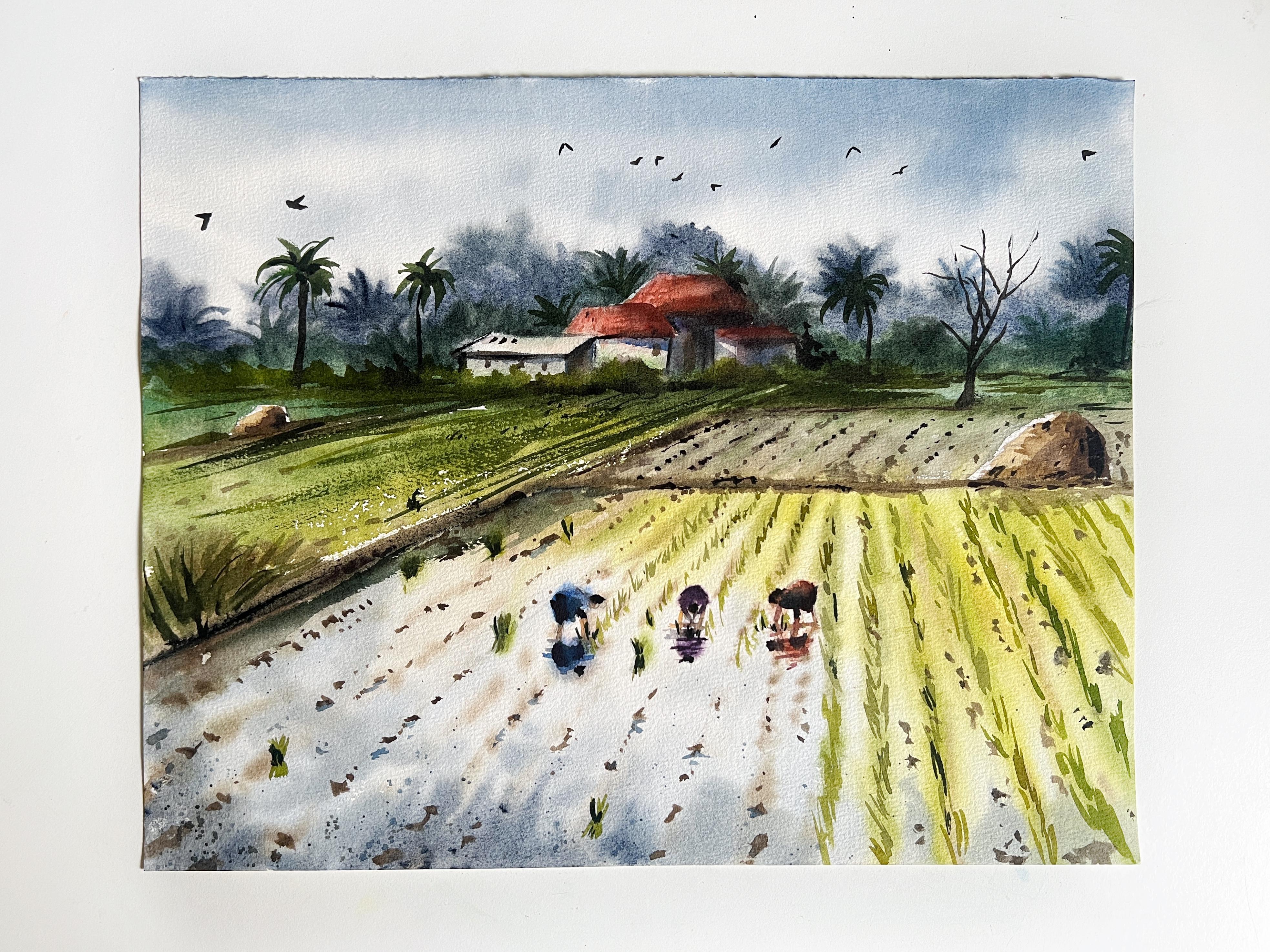
and experience. And there you go. This is the
final look of the artwork.
14. Thank you!: Hello Again. Thank you so
much for joining my class. I hope you enjoyed it and had a fun learning
session with me. If you have painted along, then please do share your class projects under
the projects, Galore. I request you to please share your review or
feedback for the same. Your support and encouragement
means a lot to me. All right then, I will
see you in my next class. Until then, bye bye.
 Shanan Subhan, Watercolor/Gouache | Art Educator