Transcripts
1. Introduction: Painting is more than just
putting colors on paper. It is a way to slow down, breathe, and connect
with yourself. It gives you the
space to express feelings that
sometimes words can't. Painting helps you unwind
and find a sense of calm. And the best part, every time
you finish your painting, no matter how it turns out, there's a little spark of
joy and accomplishment. Hi, I'm Shannon Suhan. I'm an artist, art educator, and a former software engineer residing in Bangalore, India. I have been painting for
over seven years now, and painting landscapes
are my absolute favorite. You can find my paintings on my Instagram page Water Cool. Here I share my paintings behind the scene moments
and creative experiments. I have also created 40 plus
classes on Skillshare, mainly focusing on painting landscapes with
watercolors and gouache. Over the years, I
even had the chance to showcase my paintings
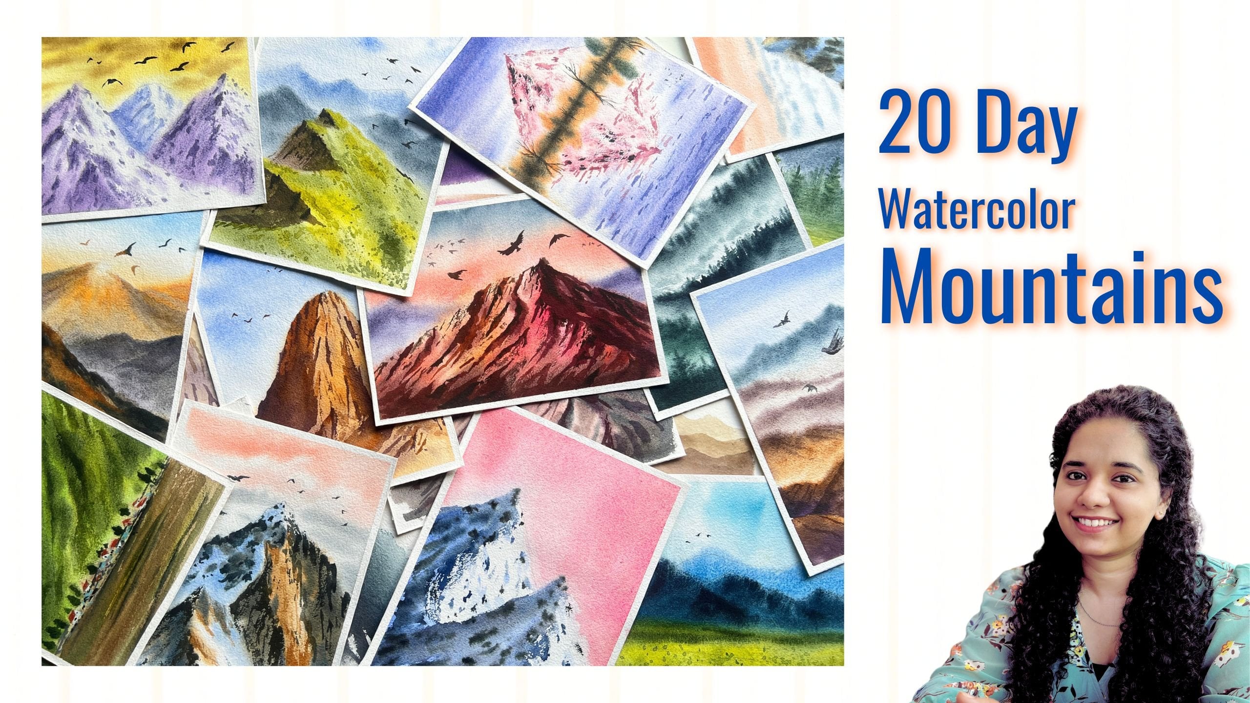
in art exhibitions. Welcome to my class on painting snowy
mountain landscapes. In this class, we will learn seven beautiful snowy
mountain paintings. This class is spread
over seven days. Each day we will learn a new project using the
techniques learned in the class. Now, if painting mountains feel a bit intimidating,
don't worry. I'll walk you
through everything, starting from techniques to supplies and everything
you need for this class. I'll also be sharing some
examples so that you can practice and feel confident as you start the
painting process. This class is not about
achieving perfection. It is about to learn, explore, and let your
creative juices flow. We will be painting
together in real time, allowing you to fully immerse yourself in
the creative process. While I'll guide
you step by step, I encourage you to bring your own artistic touch rather than simply following
a fixed set of rules. Art is all about expression
and exploration, so feel free to experiment, make it your own and
enjoy the journey. I'm really excited to start
this journey with you. So let's dive in
and start painting.
2. An Overview of the Class: Before we start the class, I want to give you
an overview of the class so that you
know what to expect. Firstly, I'll walk you through all the art supplies
needed for the class. You don't have to
worry if you don't have exact same
shades or brushes. What matters is your interest towards learning and
creating artwork. Grab whatever art
supplies you already have and we'll get
started with that. Secondly, we will cover all the necessary
watercolor techniques needed for painting
snowy mountain scapes. Prior to that, I would
expect you to know some basic watercolor skills or techniques like, wet on dry. So in techniques chapter, we will cover the tonal
values and then brush marks. I'll also talk about
creating highlights here and tilting or using the fluidity
property of watercolor. Next, we have this selective
wet on wet where we will selectively create
soft and diffused effects. Then we have this dry on dry effect or
creating snowy texture. And shadow and light, based on the light source, how the shadow and light
changes will cover that and softening technique for softening the hard edges. Once we have learned all the techniques and
you feel confident, we will begin with
the class project. Each day, I will
introduce a new project, each one unique from
the previous one. I'll guide you with step by step instructions as we paint, along with all the necessary
materials and guidelines. While all the projects will
feature snowy landscapes, each will have its own
distinct style and approach.
3. How to Approach this class!: Before we begin, here are a few tips that will help you
make the most of the class. First is to watch the
painting lessons in advance. So once we start
the class projects, I want you to watch each
project in advance, maybe in two x speed or so and understand how to
approach the painting. Watch the process that will help you
understand the flow of the painting and see how I have approached the
painting process. Understand the bigger picture, and then you can go
back and play it at a normal speed and
paint along with me. This will help you
understand the techniques and the approach that I have used in the
painting process. If you already feel
comfortable and feel that you can paint along with me without
watching it first, then you can jump right in. But if you're unsure, I would definitely
recommend you watching it beforehand so that
you feel confident. Next thing I want
you to remember is art is best when
you are relaxed. So art is all about
freedom, right? So painting should be
done with free mind. Be like a child, explore, be curious and experiment with the techniques that you
learn in each class. Next is to embrace the mistakes
and let go of control. Don't try to achieve
perfect pieces. Mistakes are bound to happen, so embrace that and
let go of the control. Next is to pick any
reference image and learn to paint on your own. Once you learn the techniques, I encourage you to
try them on your own, maybe pick some references. When you try your old painting, you make mistakes and you learn. I personally feel that's how one gets to learn will make mistakes and learn
your own techniques, and eventually you will find your own signature
painting style. During this course, if you
have any doubts or queries, you can reach out to me with your questions under
the Discussion tab. I would be really
glad to help you all.
4. Art Materials: Let me walk you through
all the art supplies that we need for this
painting series. I'm going to use Bohng 300
GSM, coal press paper. This is 100% cotton
and acid free. This is coal press
textured paper. You could also use rough
texture that would be really helpful while painting
the mountain texture. But as of now, I have only
coal press texture with me, so I'm painting
with these papers. You could use any watercolor
paper of your choice. I highly recommend using
100% cotton papers. Next, let us talk
about the colors. Here, I'm using
artist grade colors, and I've stored them in
this airtight palette. All the colors here are
artist grade quality. And I wouldn't
insist you on taking the exact same brand
or shade as mine. You can find something similar that you
already have because your creativity
shouldn't be limited by brand or exact shades, right? So go ahead and grab any similar colors
that you already have. I'll be mentioning
all the shades needed before we
start each project. I'll be mixing
colors in the space provided in this container.
It's convenient. And since these are artist
grade, they vet easily. Next, let us talk
about the brushes. So I have these four
to five brushes. One is Princeton Neptune, size six mob brush. Then I have another mob brush. This is Brostro and
it is size eight. I'll use these two brushes for washes and larger
brush strokes. I always try to keep one
brush clean for the washes. Next is Busto size
four mob brush. This is a medium size brush, and another brush is silver
black velvet, size eight. These are for regular
brush strokes. Next is size two round brush
for detailing purpose, and then I have pencil
and eraser for sketching. To wet the paper during
the painting process, we would need a
water spray bottle. Next, we need a clipboard or any hard surface
for taping the paper. This makes the painting
process more convenient. It allows you to move
around and create a better flow and
movement in your work. Also, we would need
two masking tapes, one of 1 " and other
one of two inch. You can also use 1 "
tape. That's fine. But I'll be using these two. 1 " tape is for the three sides. This two inch border is to create the bottom
thicker border. I'll use that space for showing all the colors that
I've used in the painting. Next, we would need
some napkins and tissue papers for wiping off the
pints of the brushes. I'll be using the tissues mainly for the dry brush effect. Tissues absorb great amount of water and gives us
nice dry texture. We're using watercolors right, which means we need
water, obviously. So I got these new fancy
square shaped jars for storing clean water, and I really want
to keep them clean. So to protect their cleanliness, I've also kept
this extra jar for dirty water as a backup. So now, these new jars won't suffer with all
the dirty stains. And I'll also use a hair dryer to speed
up the drying process. It's not mandatory to
have this hair dryer. You could also let the
colors dry naturally. So these are all the
supplies that I'm going to use in
this whole class. You can use whatever
similar supplies you have.
5. Techniques - part one: In this chapter, we will
discuss about the tonal values and how it is used to achieve
depth in the artwork. Take any color of your choice. Here, I'm taking ultramarine
blue in its thickest form, which means very little amount
of water and more paints. I have a value scale drawn to demonstrate
tonal variations. I'll start with the
thickest consistency first, which means very little
water and more pigments. As I move along the scale, I'll gradually add more
water little by little. So around the mid
area of the scale, we should achieve 50 50
ratio of paint and water. As we continue towards the end, we will keep increasing
the water content until we reach a very diluted
watery consistency. So to summarize, we started with the thickest
color consistency and gradually added water until
we reach a diluted state. Alternatively, you
can begin with a diluted tone and keep adding
more colors or pigments. Before moving on to
the mountain example, I will first demonstrate tonal values using
a cube or a cuboid. Next, let's take the example of a cube to demonstrate the
three dimensional effect. I'll be using single color here. But even if we were working with multiple colors in watercolor, we would use different
tonal values to emphasize the lighter
and shadow colors. On one side of this cube, it represents the lighter
areas while the other side, we focus on the darker areas. Next, let us use tonal values
to paint this mountain. I'll start with
the lightest tone for the highlighted side. For the other side, I'll use slightly mid tone
or a darker color. Now, I'll add next layer
using slightly darker tone. Now you can see this way, we are able to build
a sense of depth in the mountain area. I'm giving you the simple
example of an apple. I'll start with
the lighter tone. Lifting of all the excess paint. So now I have a lighter watch. Next I'll gradually
add the darker colors. By adding different
tonal values, we are able to achieve a
sense of depth in any object. So tonal values have this ability to prevent an
object from appearing flat. Even if you're using
multiple colors, tonal values are crucial. So you can practice with
simple elements around you, or you can even try
painting mountains. But make sure to
take your time and practice until you understand
this concept clearly. Sorry for the disturbance here. Okay. So now if you
look at this painting, you will see, I have used
different tonal values. So this way, by
using tonal values, you can create a visually
appealing and dynamic artwork. Next, let us talk
about the brush marks. In this entire series
of painting mountain, brush marks play a crucial role. So let's take some
time to practice them. Here, I'm using a
size round brush, which has a pointed tip and
a slightly thicker belly. I'm using both of
these features to create different brush marks, some thin, some thick, and some medium brush strokes. To make longer strokes, apply more pressure and press the brush firmly
against the paper. For softer brush marks, I lightly dab the brush
with minimal pressure. It's all about
adjusting the angle and pressure to achieve
different effects. You can even make these
tiny dots as well. So let's go to this
mountain area. I'm dabbing the brush, creating small brush strokes. You can even add larger
brush marks as well. On the lighter side
of the mountain, I'll switch to a diluted
version of ultramarine Blue. A as you can see, even in this painting
and the class projects, I've used a variety of brush
marks with different sizes. You can practice
these brush marks on a rough sheet of paper
or even on newspaper. This is just to
build muscle memory. You can also layer
different colors to add a sense of depth. This technique helps
create depth and texture. So here, you don't need any extraordinary
artistic skills as such. Simple expressive
brushstrokes are enough. Simple random lines have
helped shape this mountain. You can also use this
technique to layer or glaze your mountains
for added depth. Take it one step at a time
and trust the process. Next, I'll show you a
continuous textured effect. Start by applying some
zig zag diagonal lines. There's no fixed
pattern as such, but start with
lighter color first. Once you have this
random texture with minimal gap in between, then gradually add darker tones. This technique helps build a sense of dense texture
in the mountains.
6. Techniques - part two: Now, let us discuss the lifting technique
for creating highlights. To demonstrate this, I have painted a shape of a mountain. And then I'll add darker
color on one side. So while the paint is still wet, I will take a clean
and damp brush and gently glide it over the surface to lift off
some of the pigment. The damp brush here picks up the paint, creating
subtle highlights. Another way to create highlight is by dabbing the tissue paper. This will also lift off the
paints from the surface area. In another approach,
you can start by applying a single
base color mountain. Now to introduce highlights, you can lift the paints using a dry tissue while
it is still wet. So once you have
lifted the paints, then you can go back and add those brush marks that
we learned earlier. If at any point you feel
the colors are darker, you could use a damp
brush or a dry tissue. Remember, lifting
technique works best while the paint and
paper are still wet. Once the paint has dried, lifting becomes much more
difficult or even impossible. You can use this technique
to create clouds as well. All right. That was lifting technique for
creating highlights. Next, let us move
on to tilting or moving the paper to achieve
a fluid flowing effect. So this is for the fluidity
property of watercolors. First, I'm going to wet
the paper thoroughly. This helps the paint
flow more smoothly. Now, take any color of your choice and apply
it on this wet surface. As you tilt or move the paper, you will notice that the paint flows in the direction
of the tilt. This allows you to control or manipulate the
movement of the paint. This technique is especially
useful for creating soft flowy effects
such as in the clouds or any organic loose
painting techniques. Simply change the direction of the tilt and you will see how beautifully
the paint moves. This is the reason why I always
prefer using a clipboard. It gives me the flexibility
to move the paper around if you tape your paper directly onto
a table or the floor, the movement of the paint
will be restricted, making it harder to achieve
this kind of effect. Look at how I'm playing
with the paints here. It's very therapeutic to add the colors and
move them around. Next, I'm going to teach you selective wet
on wet technique. In this technique,
we partially wet only the areas where we want to create soft and diffused effect. To demonstrate this, I'm drawing a mountain and dividing
it into two segments. One side will be the
lighter highlight, and the other side will
be the darker part. So now on one side, where I want a diffused effect, I will first that
area selectively. Then I'll apply the paint
inside that wet section, allowing it to spread softly
and create diffused effect. So here I've used diluted paint. Don't go with thicker paints. Okay? So now, on the other side, I will create a few spots and then perform selective
wet on wet again. This technique is great for achieving controlled softness in specific areas while keeping other areas sharp and defined. Another example of selective
wet on wet technique is when painting mountains with
a soft diffused sky. First, I draw the mountains. Then instead of wetting
the entire paper, I selectively wet only the
area above the mountains. Once the surface is wet, I apply the color, allowing
it to blend smoothly. Next is dry brush or dry on dry technique for
creating snowy textures. Here we apply dry or thick
paints onto a dry paper. It is widely used for various
effects, but in this class, we will focus on using it for creating snow
texture on mountain. Now take a small
amount of thick paint, and before you apply it, wipe off any excess paint from the brush using
a tissue paper. When you lightly drag your
brush over the paper, you will achieve a
beautiful textured effect that mimics the look of the
snow on the mountain surface. If your brush has
too much paint, you will end up with
a heavier texture, which is not ideal
for the snow effect. The brush strokes
may appear too thick or very solid, so avoid that. Make sure your brush
has just small amount of paint and wipe off
the excess paint. Moving on, let's draw a mountain shape and divide
it into multiple segments. I'll take a small
amount of paint and wipe off the
excess on the tissue. Using a gentle gliding motion, I'll drag my brush over the paper surface to
create a snowy texture. If your paper has a
textured surface, this technique becomes
much easier to achieve. However, if you are using hot press or smooth
finish paper, it will be more difficult
to get desired texture since the paint won't catch on the surface as effectively. So for the main class projects, make sure to use paper
with some texture, such as cold press or rough pressed paper
to get best results. Next, I'm going to demonstrate the dry on dry technique on
another painted surface. So let's say we have painted a mountain using other
techniques like wet on dry and then adding some darker tonal
values for the shadows. This is what we learned earlier. So we will use this as our base. Now to perform dry
on dry technique, the paper needs to
be completely dry. But since it is wet, so we will use a hair dryer to speed up the drying process. Once it is fully dry, I will take a slightly
darker paint, wipe off all the excess paints
and water from the brush, and then lightly glide the brush over the
textured surface. Both the paper and the
paint should be dry. As I apply the paint, you will see it creates
a subtle texture, enhancing a sense of rocky
surface on the mountain. Now, for the brighter
side of the mountain, I will use a slightly diluted
shade of the same color, I'll wipe off all the
excess water and paint and gently glide the brush
over the surface area. This creates a nice
textured effect. Remember, textures can vary in tonal value depending on how much paint and
pressure you apply. Moving on, let us see how
light affects the mountains. So I will start by sketching the rough
shapes of the mountain, draw a basic V shape, and then divide it into two parts for the
light and the shadow. I'll explain that in detail. But for now, let me
complete the sketch. Drawing another
pack of mountains. Okay, so I'm done
with the drawing. Okay, so now in
the first example, the source of light or
sunlight is on the left side, and in the second example, it is on the right side. The part facing the
light will appear bright while the opposite
side will have darker tones. Since watercolor relies
on transparency, we won't use white
paint explicitly. Instead of applying white, we here use white
color of the paper. So here, I have left white on the left side to represent the brightest part
of the mountain. And then on the darker side, I will apply a mid
tone color of blue. Once all the shadow
sides are painted, I will use clean
or diluted water to connect all these
parts together. Moving on, we will add some texture on the
highlighted side. Since mountains are
washed and textured with natural creases and
ridges to capture this, I'm adding the brush marks. Next on the shadow side, we will need to add
darker creases. So here I'm using indigo. So the shadow color
doesn't always have to be blue because it often reflects
the surrounding color. For example, if the sky is pink, the mountains shadow may
have a hint of pink in it. It is important to keep these
basic principles in mind. So once the main
colors are laid down, we will enhance the
details by adding darker lines in
paints gray or black. This will help define the rocky
surface beneath the snow, making the painting
more realistic. Next, let us paint
another mountain range. The first thing to consider
is the light source. In this case, the light is
coming from the right side. So the brighter side
will be on the right, and the shadows will
fall on the left side, which is the opposite side. We will start by applying
a blue base color, but you can choose
any color you prefer. Once the shadow is added, I will use diluted paint to softly connect
the two mountains. That was next, we will
create texture and some creases using
brush marks to enhance the mountains surface
on the brighter side. Since the brighter side is well lit and almost white
and reflective, we will use a very diluted color for the texture of the mountain
to have a natural look. Whereas for the shadow side, I'll use a slightly
darker shade. Remember the tonal values
we studied earlier, you will need to apply
those principles when mixing the shades. Y. Finally, we will add the darker textures. You could use
concentrated paint, gray or black color. I'll also be applying this
on the whiter part of the mountain to show the rocky
surface beneath the snow. Keep wearing the brush marks. You could also apply some
zigzag brush strokes. I'll go back to
the first example to add more darker color. So never hesitate to go back to your painted pieces
and make adjustments. It's completely natural with watercolors as they tend to
appear dull once they dry. You will only be able to judge the final look after the
paint has fully dried. Next, I'm going to show you softening technique
in watercolor. So this technique is
often used to soften the hard edges that may appear
while painting wet on dry. So when you paint
with wet on dry, you often get sharp edges. Sometimes it could
be intentional, but other times these edges can disrupt the continuity and
harmony of the painting. To soften these hard edges, we use a clean damp brush and gently create a
soft edged effect. You just have to run your damp
brush over the hard edges, and you'll be left with
a soft appearing line. This technique is
especially useful for blending and achieving a more balanced look
in the painting.
7. Day 1 - Pink Mountains - part one : Today, we are going to
learn this artwork. The colors needed for
this class project are opera pink or crimson, violet, indigo or paints gray, ultramarine blue, and we would also need
white gauche paint, or you could take
white watercolor. All right. Let us begin. Before we tame down the paper, I'm going to wet the
backside of the paper. Here I'm applying multiple repeated brush strokes
using a mob brush. So this step helps ensure that the paper remains wet
for a longer duration. Once the paper is
thoroughly wet, turn over the paper and
stick it onto the clipboard. Now, because of the
wetness of the paper, the paper sticks or dies
onto the clipboard. Now let us tape down the paper. I'm using a 1 " masking tape. I'll use this 1 " tape
on the three sides. And for the bottom side, I'm going to use a two
inch masking tape to have a thicker border so that I can paint all the colors that I have used
for the painting. Now, let us move on to
the sketching part. Here I have this beautiful
image of the mountain, so I'll try to create
something similar. Please bear with me while
I try to draw this. My hand to eye coordination
is not that great. So I'll try to make it
as simple as possible. I've drawn this
heart like shape, and then I will draw the
mountain shape around that. So I have drawn this heart as a guideline to
simplify the shape. Once I get the basic proportion, then I'll correct the
shape of the mountain. Drawing some wobbly lines depicting the organic
shape of mountain. It's okay. Don't worry about
achieving exact same shape. A little bit here and
there is totally fine. A drawing another distant mountain
in the background. That is it with the
mountain sketch. Now, let's start painting. I'll rotate the clipboard upside down and
paint the sky first. Place something
underneath the clipboard so that there's a slight
tilt while painting. Let all the water
flow due to gravity. For the sky, I'm going
to use Pains gray, let, and ultramarine blue. First, I will use Pains
gray in medium consistency. Dab my brush, creating
the shape of clouds. Since we have placed the
board in a tilted manner, the colors will tend
to flow downwards. Leave some white
gaps in between. Now, add some let in
medium consistency. Towards the mountain, we will paint the clouds
in smaller shapes because the clouds or the sky near the horizon
appears smaller, and the one in the upper
part appears bigger. So that's the rule
of perspective. I have also added few
dabs of ultramarine blue. When these three shades
get mixed together, it creates a very beautiful sky. Now lift the clipboard and
move it around gently. Here we are making use of
the fluidity or property of water and guiding the paints to flow in certain direction. I'm moving my board in
different direction so that it creates a soft
and diffused effect. Now it's time to dry the paint because I don't
want the paint to interfere with the next layer, which is the mountain layer. So let's dry it well. Okay, so the paper has dried. The sky has turned out really
soft and beautiful, right? Next, I'm going to paint the
sunlit side of the mountain. The sunlit side, in this case, is going to be the
light pink color, while the shadow side will
have a grayish pink tone. To create the pink needed
for the sunlit side, I'm mixing opera pink and let
to a mid tone consistency. In this painting, we are considering the light
source on the right side. So let's wet the right side
of the mountains partially, that is selective wet on wet. So let's wet all the areas that's facing right
side one by one. Keep the two color mixes ready. One is opera and let, and other one is pure let. First, I'll drop in
the pink mix that we have on the wet surface. Leave some white gaps as well. Take the board, let
the colors flow. Also, dropping in
the pink colour on the upper part
of the mountain. Remember, these were the
partially wet areas. Now, add in a bit of
pure let in between. Once this is applied
on all the wet area, we'll lift the clipboard and move it in
different direction, letting the colors
flow naturally. I'll further intensify
this sunlit side by adding more pink colour. So this section is almost done. You can either let
it dry naturally or use a hair dryer to speed
up the drying process. Okay, so the paper is dry. Now, let us move on to
painting the shadow side. So for painting the shadow side, I'm going to need
some opaque colors, but I don't have one. So what I'll do
here is I'll take white gauche paint and mix it with the existing
colors that I have. The reason behind using
opaque colors is to block the light or cancel the transparency
property of watercolor. Watercolors are
transparent, and hence they will show the underneath
color of the paper. That's why I'm mixing
a little bit of white gauze with this
let and paints gray mix. There are readily available opaque watercolors
in the market, but right now I don't have
them in these shades. That's why I'm mixing
the white gauche paint.
8. Day 1 - Pink Mountains - part two: So I have mixed let
and paints gray and a tiny bit of white gauche. Again, I have mixed these
colors in mid tone consistency, which means 50% water, and rest is the
50% color mixture. As I apply the color
mix on the paper, I realize it is more pinkish. So I'm going to add
ultramarine blue to make it a little cooler in color. This shade looks good to me, more like a shadow color. All right. Now, let's apply it throughout the shadow area. Use the pointed tip of
the brush to paint around the edges and the peak area. I'll also drop this pink
mixture in between. It gives a nice variation
between blue and purple. So by adding gauche color, you can see that the
watercolor paint has become more opaque, which is making it appear
denser and less reflective. So here I have used bigger
brush for the center area, and around the mountain edges, I will be switching
to a thinner brush. Y. Painting the shadow side of the background mountain. Next, I'm going to lift
off the paints using a tissue paper on the
sides of the painting. Here I want the focus
more on the center part. Moving on, we will
add some lines and creases to the sunlit
side of the mountain. Simply paint some
random brush marks and diagonal lines in a
loose scattered manner, almost like tiny
dots and strokes. This will help create
texture and depth, making the mountain
look more natural. Adding these diluted
paints along the mountain edges to create
a seamless transition. A we will paint some random marks at the foot of the mountain since this
area is out of focus. These marks are just
there to create a sense of continuity
and momentum. We don't want the
attention to be drawn in this bottom area. Next, while the shadow
side is still wet, we will take paints gray in
slightly thicker consistency. And I'm going to apply
this thick color mix on the damp surface. In case your paper
has already dried, then you can use
slightly diluted tone. Or if you have a
water spray bottle, then just spray one or two
pumps so that the color spreads I'm simply
dabbing my brush, creating some brush marks
on the shadow side. Also adding these darker brush
marks on the sanlit part. Apply brush strokes
of varied sizes, keep some of them
smaller and a few of them very thicker
or bigger in size. Try to create dry brush
effect by gliding your brush. If you feel you're not
getting the right texture, then use a tissue paper and
dab off the excess paint. Here I'm able to achieve
a nice dry brush effect, so I will continue doing it towards the lower
part of the mountain. You can keep your
mountain minimal as well. You don't have to add
these mini textures. A Next, take paints gray
in thicker form. I'm just adding about ten, 20% water. West is all color. We will paint these along
the edges of the mountain, adding brush marks to suggest the underlying texture
of the rock and snow. This will help
define the form and make the mountain look
natural and detailed. Applying tiny dots and brush
marks on the sunlit side. A There is a chance you might feel tempted to add too many brush marks,
but be careful. No overdoing is the key. Too many details can make
the painting look cluttered and overly busy taking
away its natural flow. So keep it balanced and let the simplicity enhance
the overall look. Y. Next, I'll use dry brush effect to create some brush mark that represents the underlying
texture of the snow. This gives a natural rugged
look to the mountain area. Adding some darker colors around the peak area
of the mountain. I got a bit carried away myself and ended up adding
too many brush marks. But you can avoid this. Try to resist the urge to
keep adding more details. Sometimes I struggle to stop because I enjoy
the process so much, but you don't have to add these extra textures at the end. Keep it minimal, keep it simple and let the painting breathe. Next, we will add an important final step that is defining the overall
shape of the mountain. We will have to separate the main mountain from
the background mountain. To do that, I will add darker colors around the
background mountain. This creates separation
between the two mountains, and they look distinct
from each other. Next, let us paint some
birds flying in the sky. There you go. We are
done with this project. Let us peel off
the masking tape, revealing the final
look of the artwork. I hope you enjoyed
painting this with me. If you have painted along, please share your class projects under the projects gallery. Okay, so I'll see you in
the next class project. Until then, bye bye.
9. Day 2 - Misty Mountains - part one : Welcome to day two
of the challenge. Today, let us create
this gorgeous artwork. The colors needed for this
painting lesson is Pains gray, indigo, ultramarine blue,
volet and bon Tambo. You could also use any similar
colors that you already have before we begin, let us prepare the paper
for the painting process. So first, I'm going to wet
the backside of the paper. This will help keep the paper moist for
a longer duration, which will be useful
during the painting. Make sure to generously
apply water. Apply horizontal and
vertical bras strokes so that the water is
evenly distributed. So next, I'll place the paper on the clipboard so that it
sticks to the surface. Next I'll tape the paper on all the sides
using masking tape. So here I'm using
1 " masking tape. And for the bottom side, I will be using two
inch masking tape to create a thicker border. The reason for this border
is so that at the end, we can add the
colors we have used, giving it a neat
and finished look. That's it for the preparation. Now let's move on to
the sketching part. This is the reference image that I'll be using
for this project. So in this image, the light
falls on the left side of the mountain while
the right side of the mountain is in shadow. So it's a simple concept, but to achieve this effect, we will need to build up
multiple layers on the mountain. Let us begin the
sketching process. I'll start with the
peak of the mountain and gradually work
my way downwards. If you observe closely, there's a distinct line that separates the light
and shadow areas. I'll sketch that first and then mark all the
shadow regions. While I may not be
able to replicate the reference image exactly, my goal is to capture
its overall essence, which will focus on balancing
the light and shadow and also creating
smooth transitions on the sides of the mountain. Remember to gently draw the outlines without applying too much pressure on the pencil. Keep your pencil marks light and delicate to maintain a
natural subtle sketch. If you would like,
you can also mark all the shadow areas beforehand to make the
painting process easier. A I'm shading the areas where we have these
dark textured regions. This will help us capture the rocky texture
of the mountain, adding depth and realism
to the painting. Don't worry about
achieving perfect drawing. You can also draw
simple mountain shapes and follow the
painting procedure. All right. That is it
with the sketching. Now let us move on to
the painting process. So let's start by
wetting the paper. I'm using a mob brush and evenly applying water throughout
the paper surface. Run your brush multiple
times to let the paper absorb enough moisture so that it remains wet during
the painting process. Now let us mix the
colors needed. First tile, take
ultramarine blue and mix it in medium
consistency tone. Next, we take Paine gray so I'm using this pains gray PWC and it is almost
similar to indigo, I feel. But it's fine. You can use any similar shade. I'll have both the shades
mixed on the palette. That is indigo and pains gray. The paper is still wet. Take indigo and apply
it on the shadow side. On the upper part
of the mountain, I'm trying to create a sort of misty effect
along the side, which will help to achieve
a smooth transition. And also, the colors may not be exact matched to
the reference image, but our goal is not to
replicate it perfectly. As I mentioned, I want to
create a smooth transition, so I'm applying water and gently blending it into the wide
background of the paper. Make sure you leave
these areas white during the entire process
because that's the lighter or highlighted
part of the painting. Now, while the paper is damp, I'm going to add the sky using ultramarine
blue in diluted form. Now going back to the shadow
side of the mountain, I'm going to apply indigo. At this point, the
paper is slightly damp, which allows us to achieve
the desired shape. If we had applied the paints earlier when the paper
was completely wet, it would have spread too much, giving us less control. Now the paint will
slightly diffuse, but we can manage it better and even lift some
paints if needed. It is important to leave those white areas untouched
for the brighter highlight. Next, we will use violet, or you could also use purple
in a mid tone consistency to add a sense of drama and
interest on the shadow side. This will enhance the depth, making it more
visually engaging. Can lift some pins
of the darker areas to make it feel lighter and
create seamless transitions. Using diluted ultramarine blue, I'm creating some marks
on the highlighted side. This will create a sense of continuity or a sense of
flow in the mountain. All right. Now I'm going to dry this area completely
using a hair dryer. You can even let
it dry naturally, let it sit for about ten, 15 minutes until
it is completely dry or simply use a hair dryer. You can pause the video
if you need more time.
10. Day 2 - Misty Mountains - part two: All right. My paper
is completely dry. I hope yours is too. Now we're ready to move
on to the next step. Now, lettuce mix paints gray and ultramarine blue in a
very diluted watery form. So you can have about 20, 30% of paint and 70% water. Now, apply this mix on the
shadow region of the mountain. Carefully paint the edges. As I go down towards the
lower part of the paper, I use a clean brush and
blend it with water. It. Next, we will drop in
some blobs of paint slightly thicker on the
edges of this shadow area. Moving on to the upper part of the mountain and covering
the shadow area. Carefully paint
around the edges. While you're painting
this, gently drop in some let colour as well. As you are painting towards
the outer right side, add in water and blend it well to create a seamless blend. Like I said earlier, we want a misty
effect in this part. So applying water and
blending it into the paper. Adding some lines using mid
tone color to create a sense of continuity and
flow in the mountain. It should appear as one
single mountain, right? Then using clean brush, blending the hard edges. This is a softening
technique we learned Now, adding some darker color to create that sharp
shadow effect. Take darker paints gray
and drop in some paints on the shadow area so that we don't have a flat
appearing surface. It helps us create a sense of ups and downs in
the mountain surface. On the highlighted side, I will use lifting technique
to soften the darker edges. The lower area is partially
covered with diluted colors, so I'm lifting it off
using clean tissue. This will give a dense
foggy or misty appearance. Now I'm going to dry
it using hair dryer. All right, the paper is dry. Now let's add some details. So we're going to
need pains gray. I'm going to mix paints
gray and burn tumbo. This will give us a
sort of blackish color. Now take a tissue and wipe
off the excess paints. We want to perform dry on dry technique to get
a textured defect. So if you are not able to
achieve the texture defect, you could simply
apply some dots. The texture effect that
we are creating here represents the rocky
surface beneath the snow, which is subtly emerging
through the layers. We will also create this texture on the
highlighted part as well, because that's also a part
of the mountain, right? Try to create rich textures on the mountain to bring out the
essence of snowy landscape. So one mistake I made was
choosing cold press paper. It has mild texture, of course, but rough paper would have been ideal for achieving
perfect results, but it is still better than
hot press papers, right? Now, if you have rough paper or even cold paper, that's perfect. But in case you're using a hot press paper or a
smooth textured paper, then you can take your time and manually build the texture by adding these small
dots of different sizes, and you can experiment with creating the texture
defect. All right. So you can glide the
belly of the brush, creating longer brush strokes
with the texture defect. I'll let you watch
and paint along while I create these
textures of different sizes. Next, I'm switching to
a smaller size brush. This is size two round brush. I'm creating small
dots and lines. Next, we will add
a mid tone color between the light and
the darker shades. Here I'm introducing mid gray and adding a few lines in
the mountain shadow areas. This is mid tone
paints gray, okay? This will create
natural creases and lines in the mountain and make it look
organic and realistic. There is no specific shape
or design to follow here. Simply observe the
natural flow of the mountain and follow
its diagonal direction. Now let's say if you add a horizontal or a
straight vertical line, it may not align with the
mountain's natural flow, right. So try to go with the shape of the mountain that
you have drawn. Yours may not be exactly
like mine, so it's okay. So go for the natural flow. Now, using the pointy
tip of the brush, add some fine lines and creases to enhance the natural
effect of the mountain. This will make the mountain
look more dynamic, organic, giving the impression
that you have thoughtfully put so much
effort into the painting. I Now, let us move on to
painting the birds. Birds are one of my favorite elements
to add to a painting. I just love painting them. It's such a simple
yet impactful detail that brings life and
movement to the painting. All right. We are done
with this artwork. I hope you enjoyed
today's lesson and learned something new. Now, let's peel off the tape. It's always such a
satisfying moment, right? I would love to see
your class project in the project gallery. It would mean a lot to me. And if you have any questions
or need any clarifications, feel free to drop your queries
in the discussion section. I'll be happy to help.
11. Day 3 - Mountain Blues - part one: Hey, there. Today we are
going to learn this artwork. The colors needed for this painting project
are ultramarine blue and paints gray. So here, I have used deep
sea blue by white knight. It's similar to paints gray. You could use any alternative color that you already have. Okay, so I have already
taped down the paper. But before you tape
your paper down, remember to apply
water on the backside. Now I have this image
as my reference, and I'm trying to create
something similar, not an exact copy
because let's be real. That never happens with me. I'm terrible at sketching. Give me a brush and I'm all in, but ask me to sketch
something perfectly. No, that's not happening. My sketches are more like simple suggestions rather
than perfect drawings. So if you are someone
who loves sketching and enjoys getting every detail
right, please go for it. And if you're like me and need a little
help with drawing, then please follow along. I started by sketching a
simple mountain shape and then added partitions inside it to suggest a tree
dimensional shape. Now I'm adding distant
mountain in the background, some very simple curvy shapes to suggest the mountains
in the background. And remember, to be very
gentle with the drawing, if you sketch lightly, you will have the flexibility to erase and adjust
things if needed. Now for the foreground, I'm drawing another
mountain with basic shape, dissecting it into two parts and then take this line
and connect it outside. Let's just imagine
this outer mountain extending into the sin. If I seem slow at some point, that's because I'm
thinking about how these shapes connect
with each other. I don't always have it
figured out right away. When I see the painting,
I think, Okay, I can do this, but
when I start drawing, it feels so difficult. So remember, I'm just
adding some guiding lines, and we'll refine everything
once we start painting. So don't stress about getting
the exact shapes right. Things will come
together as we go. So now that we have the
reference image in hand, you can see where the
shadow areas are, right? According to my painting, I'm marking these
shadow areas by adding some shading lines
using my pencil. So this helps me stay organized during the
painting process. So I don't get confused
about which areas are highlights and
which are shadows. I'm simply marking all the spots where the shadows will fall. It is like leaving little notes for myself before
I start painting. All right, we are done
with the sketching part. Now let us move on to
the painting process. So let me take my color palette. For this painting lesson, I'm going to use
a new shade that is gray blue missed
by white knight. This is a granulating color, and I recently bought it, so I thought, let me use
it for this painting. You could use indigo
or Pains gray. The shade is similar to Pains gray, so you
can go with that. Mixing the color in
mid tone consistency. Next, I'll also take ultramarine blue and mix it in same
mid tone consistency. We'll start by painting
the distant mountains. Take paints gray and
ultramarine blue mix. Take this mix and apply it on
the distant mountain area. This is wet on dry, directly applying wet
paints on dry paper. To soften the hard
edges of the mountain, I'm using clean brush. On the left side, I'll
add another mountain, which is actually a continuation of the previous mountain. Since the main mountain in the center is
blocking part of it, you won't see the
full connection. Next take paints gray and paint another mountain
right next to this, or let's say just below it. This helps distinguish it
from the previous mountain. Again, painting the same
mountain on the right side. To add more depth, I'm using a very diluted color to paint another mountain
in the background. So here, there is no fixed shape you have to follow to paint
these mountains. So don't worry about
getting it perfect. Just go with whatever you have drawn in the sketching stage, or if you feel like it, create a new shape. It's fine. So the orall idea
is very simple. Just add a few layers of distant mountains
in the background, and you are good to go. Next, let us start with the main hero element that
is the center mountain. I'll begin with the
shadow areas using a very diluted mix of ultramarine blue and a
tiny bit of paints gray. The consistency should be
very watery and light. Now, we're going to fill in the shadow areas
we marked earlier. So it's a simple step. But if you find it
tricky, don't worry. Focus on creating balance
between highlights and shadows. Okay? On the right side
of the upper mountain, I'm applying these
diluted tones, following the marked areas I'm also leaving
some white spaces here just to try my luck and see if I can create some natural looking highlights in between the shadow areas. For some reason, I
have this feeling that I might mess this
up at some point. But hey, that's part
of the process, right? So let's give it a shot. Now, I'm taking a
slightly darker tone compared to before. This is a mix of 30% paints
and 70% water approximately, which gives us a nice mid
tone to start adding depth. Painting the smaller
shadow areas within the highlighted section. These subtle shadows
add more depth and make the mountain
look very natural. I'm dabbing it off
using a tissue paper to prevent hard edges
on these areas. I'm simply applying
some diluted lines along the creases to create
a mountain like texture. These lines define the form and add a natural
feel to the surface. Moving on, let's paint
the lower mountain. So I'm going to add this diluted color on
the left side first. Don't get confused here. The right side of the
mountain is much more darker, as you can see in
the reference image. This means that less light is hitting on the
surface of the mountain, so we are keeping it
lighter in comparison. I lifted off some
paint using a tissue on the corners of this mountain to create
a subtle highlight. Next, I'm going to apply
a mix of ultramarine and paint gray on the right
side of this mountain. So this is the actual shadow
area of the mountain. Once we add this darker color, you will start to see
everything come together. Initially, when I added the diluted color
on the left side, it might have looked confusing. But now when I add
this darker color, it all makes sense, right? That's why I always say, learn to trust the process. This contrast between
light and shadow is what really brings
the mountain to life. And
12. Day 3 - Mountain Blues - part two: Next, I will use Pains
gray to add shadows. Since this is the valley area, which is a low point, so I'm using a darker
shade that is pains gray. Along with that, I'll also
add few brush marks on the slope part of the shadow area and then blend it with the ins gray section. It's okay if the
color bleeds a little or doesn't come as
per your expectation, doesn't have to be perfect. Next, I'm adding some dilute and blue in the lower front area and creating a few random lines to depict uneven light and
shadow effect on the snow. Moving on, I'll add
another layer over the shadow areas to
intensify the shadows. Since my paper is slightly
moist in this area, I'll apply the paint directly. You could also use wet on dry if your paper
has already dried. Both technique works fine. I Using a damp clean brush, I'm lifting some paints, trying to define the
edges of this mountain. Adding diluted color,
I'll add few lines. Adding such lines enhances
the texture of the mountain. It prevents from appearing flat. Introducing some more lines on the white highlighted area. Use very diluted paint here. Otherwise, it might ruin the whole appearance of
the highlighted section. Add smaller brush marks. Over here, I'm thinking
of adding a sharp shadow. Let's see if it works. If not, we'll remove
it. That's fine. So I'm adding paints gray, and it looks a bit off, so I'm lifting it off
using a clean tissue. Just dab on the
area where you made a mistake and it will come
off. That's totally fine. So with watercolors,
you always need to leave some room for
experimentation. Trial and error is how
you learn and grow. Just because I'm teaching this doesn't mean I get
every step perfect. The background
mounted we painted earlier looks a bit flat to me. So I'm going back
to add more depth. I apply slightly darker tone and blend it with clean water. This way, it will create a
nice soft, misty effect. All right. Now let's
allow it to dry. I'm using a hair dryer here. Next, let us add the
details on the mountain. Take any darker color like
black or darker blue. I am using blue gray mist by white nights in
thicker consistency. Now, I apply this color on
the mountain edges using dotted or random brush marks to create the underneath rocky
texture on the mountain. While I add these
dots and brush marks, I'll let you absorb and
follow along with me. You can pause the video
if you need more time. Here in the background, I'm adding more texture defect to create a rocky mountain. Use tissue paper to
wipe off excess veins, and let's create dry on dry
effect on the shadow side. Using diluted
paints, I'm creating these lines and creases
on the mountain surface. Since this is the
highlighted area, so I'm using diluted color and some mid tone creases
in the foreground area. Using darker blue, I'm adding some brush marks on the
highlighted area as well. So I never try to copy
the reference exactly. Instead, I try to focus
on capturing its essence. If you start comparing
every tiny detail, it can get frustrating and take the fun out of
the painting process. And honestly, that's not great for your
growth as an artist. The good thing is that you
don't need to get everything perfect for your art to
be called beautiful. So let go of that pleasure, and it gives you more
freedom to explore and make the painting your own. If you compare my
reference and my painting, they're about 80% similar
in texture and feel. I've tried to create my own
brush marks and my own shape. So that's totally okay. At is about expression
and not just accuracy. So trust yourself and
enjoy the process. Applying darker colors
on this valley area, mostly dry on dry technique. When we darken this lower area, it helps the other
two shadow areas with the blue color
stand out even more. This contrast make the
painting feel more balanced. Adding some random
lines and textures on the mountain to create
a natural appearance. A Okay, so we are almost done
with the mountain part. Now let's rotate the
clipboard and paint the sky. This is the easier way
to paint the sky because the water or the paints will
flow down due to gravity. So first, let's apply clean water carefully
around the mountains. Keep it in a tilted position. Now take ultramarine blue and apply this mix along
the edges of the paper. We are creating a
very minimal sky. Apply some horizontal lines
towards the mountain area. Okay, so let's turn the board back to
its normal position. I think we're almost done. Let me add some final details so that the foreground is
also slightly defined. I will also add some
grasses in the front area. So simply apply
some grass blades by making vertical brush marks. All right, so we are
done with this painting. Let's peel off the masking tape. There you go. We are
done with the tape peel, and this is the final
look of the painting. I hope you enjoyed
painting along with me and had a fun
learning session today. Don't forget to share
your class projects under the project's gallery and
let me know your thoughts. I would love to see
what you have created.
13. Day 4 - Sunlit Mountain - part one: Hi there. Today we
are going to learn this artwork and the colors we need are Bziana Painted gray. Pains gray. Next colors
are for the sky, which is ultramarine blue. VletPermanent yellow. Red and burn tumber as
well for the mountain. You could use any similar
color that you already have. So let's start the
painting project before we tape down the paper. I'm going to apply water on
the backside of the paper. This will help retain the
moisture for longer duration. And once this is done, we'll start taping the paper. You'll have to apply
multiple layers of water by repeated brush strokes. That's when you will know that the paper has absorbed
good amount of moisture. Now, turn the paper,
stick it onto the clipboard and start
applying the masking tape. Here, I'm using 1 " tape, giving about a
quarter inch border. For the three sides, I'll use 1 " tape, and for the bottom side, I'll be using two
inch masking tape. That is because I want to list the colors that I've
used for the painting. So here I have this
two inch masking tape. I'm applying it on the
bottom area. So let's begin. This is a reference image I
have for today's project. I'm not going to entirely
use this in my painting. I'll just replicate the shape, and for the sky, I'll go
with a different color. Let me warn you beforehand. My sketches aren't
always perfect. I don't always get
everything right, so please bear with me. If you are good at sketching, feel free to copy the one
you see on the screen. Otherwise, you can simply follow along with
me step by step. I have drawn the
basic mountain shape roughly in the
middle of the paper. Then I will draw another
line dividing it into two parts and further
dividing this area into two. Totally, we have
created four sections. Now, focusing on
this third section, I'm drawing a few lines
to indicate shadows. It is a little tricky to explain the exact
placement of these lines, but I hope you get the gist. You also have the
reference image. I've added some diagonal lines representing the creases
in the mountain. In the foreground, I'm adding some continuous lines to make the mountain
appear more connected. The foreground area is darker as there isn't
enough light here. In the background area, I'll add another
distant mountain. So this background mountain is not there in the
reference image. I've added to enhance
the composition. So yeah, that's about
the sketching part. Now, let's get started
with the painting process. I'm applying clean water throughout the paper
using a mob brush. Apply generous
amount of water and spread it evenly
throughout the surface. Keep running your brush
into and fro motion. A paper needs to absorb
good amount of moisture. Next, we will take burnt sienna
and mid tone consistency, which means 50% of
paint and 50% of water. Now apply this color on the
right side of the mountain. Using a mob brush, I'll spread the colors while
leaving some white spaces. This will create
a snowy effect in some areas and a brownish
appearance in other. Moving on, let us
paint the shadow side. So for this side, you
will use a dark color, probably burnt amber
and paints gray. I'm using tinted gray and burned tamber and also a bit
of white gauche color. You could use any brown
color for the shadow side. Doesn't have to be exactly
the same shade as mine. Apply this shadow color to all the areas
marked for the shadow. Inside the shadow area, you can add some
different colors. Here, in some areas, I'm applying pure
tinted gray color. You could also add paints gray or ultramarine blue mixed with the bond tumber just so we can create slight
variation in the shadow area. Then I'll also apply the shadow color in the
mid to partition area. Applying diluted colors around
the foot of the mountain. Going back again to define
the shape of the shadow area. By using the tip of the brush, you can easily adjust the
edges of the mountain. Once the overall mountain
shape looks good to me, I will dry this painted
area using a hair dryer. You could also let it dry
naturally. It's up to you. Okay, so the paper
has completely dried. Next, I will mix a darker color, taking a tinted gray. You could also take paints gray or any other similar color. Also, mixing a tiny bit of white gauze to make
the color opaque. I'll start applying the paint from the peak of the mountain. Also, have a tissue paper handy so that you can wipe
off the excess paints. Apply the veins in
downward motion. A applying the same color in the midsection shadow area. Dropping in some
concentrated color. Apply the paints along
the shadow edges. Next, I'm going to
take diluted color, about 20% paint
and rest is water. And with this colour mix, I'll paint the creases on the highlighted
part of the mountain. Use a darker color, such as paints gray or black to paint the
foreground area. And then we will cover the previously
painted lighter areas with these brush marks. So here on the shadow areas, I'm adding the brush marks,
creating the texture. Otherwise, it will look flat. Next, let's take
concentrated paint. It could be paints gray or
black or sepia, any color. It should be very
concentrated and dark. So I'll apply some brush
marks to create darker edges, creases and lines in the
mountain shadow area. Next on the right side, I'll swiftly apply
a brush strope creating a side mountain. To achieve this texture, I have used dry on dry. Next, I'll add some
concentrated brush marks on the shadow areas.
14. Day 4 - Sunlit Mountain - part two: Moving on, let us paint the distant mountain
using a diluted color. I'm using diluted gray. Moving on, let us add some details to the highlighted
section of the mountain. Here, I'm using
diluted mix to create some brush marks and also incorporate the dry brush
technique for texture defect. Remember, you don't have to replicate exactly
what I'm doing. You do based on how you have
achieved your base layer. Wherever you have
this brown area, there you can add the
brown brush marks and also add some mid
tone colors of Benciana. If achieving dry brush
technique feels difficult, you can use tissue paper, wipe off the excess paints, and then dab the brush. Next, I'll take a very
watery tone of paint gray and add some lines creating
texture like effect. No. I'll also apply
this diluted color around the lower part
of the mountain, blending it gently to create a connection
with the shadow area. So now, take a moment to observe your painting and the overall
shape of the mountain. Try to establish a natural flow between the highlights
and shadows. Don't let them feel
like separate elements. This subtle blending will help create depth and
harmony in the painting. Adding a few darker brush marks. Some areas are still wet, so I want to dry them to
dry the paints completely. I'm using hair dryer. Moving on, let us
take a thick color. So I'm going to take burn
timber and paints gray mix. So this will look
like black color. With this concentrated colour, I'm going to create
the brush marks on the shadow side
of the painting. Apply a variety of brush marks, some small and some bigger. Don't just take to one
type of brush marks that will make your painting
look unnatural. Now adding some brush marks on the highlighted section as well. Don't add a lot of darker
marks on the highlighted side. We'll try to keep it subtle. On shadow cards, I'm going to add some lines and brush marks. Use dry brush technique
to create the textures. Just light the brush
against the paper, and it will give you a
nice textured effect. Next, take Bonsiana in mid tone, and we will add some brush
marks on the highlighted side. Do leave some white
spaces as well. Don't entirely cover this
area with brown marks. Since we are applying
wet paints on dry paper, it leaves some hard edges. That's why I have dabbed my fingers on the
painted surface. Applying some random
zigzag lines, trying to connect
the shadow areas. Next, let us dry this completely so we can go ahead
and paint the sky. The reference image here
has a different sky. I'm not going to create that. Instead, I'll paint
a simple sky. So using my mob brush, I'm going to wet the
area above the mountain. So carefully apply
water around the edges. Don't let the water flow inside the painted
mountain area. Next, I'll take
ultramarine blue with a little bit of bursiana
to mutrate down. Applying this color
on the upper part. Then slowly applying
diluted mix of this color towards
the mountain area. I'm going to add in
other colors as well, but this is the base color. O. Now with this diluted tone, I'm going to apply the paints
around the mountain edges. Hilt the board and
move it around in different direction so that
the colors flow really well. Next, I'll take paints
gray and dab the brush, creating clouds in the sky. Okay. Since we have created a yellow effect
on the mountain, so I'm going to add a
hint of sunlight with a few streaks of yellow
and red in the sky. This will enhance the atmosphere and bring a sense of
warm to the scene. O. Now, while we are transitioning
from yellow to blue, this might look a bit odd. So I'm going to create smoother blend by adding
hints of purple in the sky. This will help bridge
the colours naturally, creating a soft transition from yellow to purple
and then into blue. Also adding some yellow color
on the upper area as well. So you don't have to
paint this kind of sky. You could even paint
some simple sky as well. Now, I'll spray a few
pumps of water to let the colors blend naturally instead of having
these hard edges. Once the water is sprayed, you can use a hair dron to guide the paints in
different direction. Or you can even tilt the board. Yes. Now, let us add some words in the sky. You can use a pencil
to mark the shape of the birch and then take a fine line of brush
and paint the birch. Lastly, I will add few
details on the mountain. All right, so let us peel off the masking tape and reveal the final look
of the painting. There you go. This is how
our artwork looks like. Isn't it gorgeous? I hope yours has turned out
beautifully as well. Please share it with me in the projects gallery. I
would love to see it. And don't hesitate to share, even if you feel it didn't turn out exactly
as you imagined. Let's just embrace the
creative process together.
15. Day 5 - Northern Lights - part one: So today we are going
to learn. This artwork. The colors needed
are lemon yellow, or you could use any
cool yellow color. Then the next color
is Azure blue. This is like a aqua blue color. We'll use this for the
Northern light effect. Next is ultramarine blue indigo, or you could also
take pains gray burn tamber permanent yellow. This is a warmer low. That's about the colors. So let us begin the
painting process. I have already taped down the paper on all the four sides. And remember to wet the
backside of the paper. Today, we are going to paint a snowscaped mountain with beautiful Northern
light setting. So let's begin. I have two images here. I'm going to combine
them into one. I'm going to pick the mountain from one image and
combine it with a tiny little hut and snowy foreground
from another image. Don't worry. I'm going
to draw everything here. So first, let us draw the horizon line in the
lower half of the paper. Note the proportion in which
we have divided the plane. Now let's draw the mountains. Below the horizon area, I'm drawing a tiny little hut. I'm not drawing from the main image you see
in the mobile phone. It is the bottom one
in the left side. I like the image, but I forgot
to open. So there it is. This is the one. I'm not
creating the exact replica. I just like this idea of having glowy window and
snow covered roof. So that is how I
combined two images. Let's define the roof of the house since it is
covered with snow, so we will add some
dimension over there. Let me show you two main colors that would be needed
for this project. One is lemon yellow, and other one is azure blue. If you don't have this blue, then you could also use
cobal blue or serleanblue. The colors are
poured over here in the palette. So let's start. I'll first wet the paper, applying clean water throughout
the surface of the paper. Apply repeated brass strokes to make sure it remains wet
for longer duration. If the paper remains moist, we can work on multiple layers for the northern light effect. Now, let's mix the
colors before we start. So I'm switching to my
size eight round brush and taking lemon yellow in mid tone to slightly
thicker consistency. The next color I'm
mixing is azure blue. So this is slightly
like aqua blue color. The next color I'll
mix is indigo. You could also take paints gray. Okay. Now that all
colors are ready, let's take lemon yellow, and we are going to apply the paints in a swift
sweeping motion. Don't worry if it doesn't
turn out perfect. This is not the final layer. We will refine it as
we paint further. Next time taking azure blue and applying it next
to the lemon yellow. The colors, I'm hoping that
they'll blend naturally. Otherwise, we'll have
to do it manually. So first, let's fill in all
the empty white spaces using some swift vertical
brush strokes in back and forth motion. This will help us create a smooth blend suggesting the
effect of northern lights. Now I'm lifting the
clipboard and tilting it vertically to allow the
pain to flow downward. Now, clean your brush
and use a damp brush. Here, I'm guiding the paints in controlled
downward direction. At this stage, you can see
the paints are flowing down. So take a tissue
and gently wipe off the excess paint from
the mountain region. Remove any color that has
flowed into the unwanted areas. So here I also want the
yellow to remain visible. So I'm carefully lifting off any excess blue that has
seeped into the yellow area, ensuring that the yellow
color stays visible. Also, I don't want it to
be very vibrant as well. So simply lifting off any
excess paints in this area. While the paper is still damp, I'm taking a bit of indigo, and I'll again apply
this blue paint in a swift swirling
downward motion. In the next step, I'll simply
mix ultramarine blue to the indigo to enhance the
bluishness of the color. Your output doesn't have
to be exactly like mine. Feel free to experiment with
your own swirling motion as long as it captures the
essence of Northern lights. At this point, I feel unsure, and I worry I might be
ruining my artwork. But I try to manage it somehow. Let's see how it turns out. So here, to soften
any harsh edges, I'm lightly spraying water
over the painted surface. So once I've done that,
I'll tilt the board in a vertical manner to let the colors flow
downward naturally. While the paper is in
tilted upright position, I'm also guiding the paints to flow in the
desired direction. If you notice the paint moving horizontally or in any
different direction, you can adjust the angle of your board to control the flow. I have sprayed the water again, and now I'll move the board to guide the
paint where I want to. I want some colors to flow
in a diagonal slant motion. So you can see how the colors shift as I change
the board's angle. This creates a beautiful, soft northern light effect. Next time adding
some paints gray to enhance and
intensify the painting. When we introduce a
darker color like this, it naturally makes the lighter
color stand out even more. So the paints are
flowing downward, and I'm preventing it from
entering the mountain area. So defining the shape around the mountain You can use the tissue paper to lift off any excess paints. All right. Now let us dry this
using a hair dryer. Or you could let it
dry naturally and paint at your own pace
by pausing the video. A
16. Day 5 - Northern Lights - part two: Alright. Now that
the painting is dry, I'm simply embracing
how it has turned out. Let us move on to
paint the mountains. Since we are painting
a night scene, we won't have those
bright white mountains because there is lack
of light, right? Instead, I'll cover
the entire area with diluted shade of indigo
and ultramarine blue. You could use any blue color. Make sure to keep the paint
very watery, about 80, 85% of water and only and
only about 15% paints. Apply it section by section, like first paint the mountain and then go to the
other elements. Keep the strokes
light and fluid. Next, I'm going
to paint the roof of the tiny little house. Next, we will add the windows and doors of this
tiny little hut. And for that, I'll
take warm yellow in mid tone consistency and
apply it on the marked areas. Below this area, I'll apply
a layer of water and drop in the reflection of the warm light that's coming from
inside the house. Since the ground is
covered with snow, the light will be
reflected immediately. To enhance this effect, I'll softly apply a diluted mix around the reflection area. As I mentioned earlier, we are painting this
entire snowy region with diluted colors to achieve
a soft glowing effect. I'll be adding
multiple layers with different tonal values to
create some depth in the snow. Next, we'll take a slightly
darker tonal value of the same color and apply a few brush strokes in
the foreground area. This will create
subtle variations. Though the difference
may be minimal, but the key here is to practice adjusting tonal values
to add a sense of depth. Right now, I'm drying the paper before moving
on to the next layer. Moving on, let's create the
texture of the mountain. Mix a slightly thicker
version of indigo. Now slowly add some
diagonal brush marks to shape the mountain, keeping them organic
and natural. Nothing too precise, a few raw strokes to suggest
the texture on the mountain. We'll follow the same step for the smaller
mountain as well. Covering the right side of this smaller mountain to
suggest the shadow part. I'll add in some
darker indigo along the boundaries of this partial
half visible mountain. So for this larger mountain, I'll divide it into
two sections to create depth and a three
dimensional effect. Draw a partition like this
with your brush itself. One side will be in the shadow, so we will paint a darker tone, while the other side
will remain white or lightly colored to represent
the bright sunlit area. Similarly, I'll also paint this smaller mountain
adding dimension. Now returning to the lighter
side of the main mountain, I'll add tiny lines to define
the creases and textures. Vary the sizes of
the brush stroke. So should be smaller, while some slightly larger. This will create a
natural uneven look on the mountain texture. Then lastly, I'll take a darker shade of indigo
and add some details. This will enhance the shadow
area of the mountain. Apply brush strokes
of different sizes. Also apply it on
the lighter side to bring out more
texture and depth. Next, let us use the dry
brush technique near the horizon area and around the mountains to create a
subtle texture in the snow. And also, I want the
hut to stand out more and the roof snow to
appear a little lighter, so I'll darken the background in that area to give it
a stronger contrast. Next, I'm going
to paint the hut. So for that, you can
use any brown color. I've mixed a little bit of blue to get a
darker brown color. A Next, we will add a darker
color on the mountain. So for this darker color, you can either use
black directly or mix brown and paints
gray or indigo. That will give us a
darker intense color. Whatever color you mix, make sure it is rich and dark. Now I'm going to dab and create some textured impression
on the shadow side mainly. Then we'll also add them on
the lighter side as well. So one thing to remember is to keep the marks
varied in sizes, to maintain an organic look. We'll place more of these
darker marks on the shadow side and fewer on the lighter side to enhance a sense of contrast. Be careful not to overdo it. Too many dark marks might
overwhelm the painting. So if you notice, adding these darker areas makes the lighter parts of the
painting stand out more, right? Even though we initially
used a blue color, the contrast that we created here makes
the highlight pop. It looks almost white now. That's the beauty of balancing light and shadow in a painting. Without these darker colors, the painting would look
pale and incomplete. Next, I'll use the
dry brush technique. I'll wipe off the
excess paints from my brush using a
clean tissue paper and gently glide it across the mountain area to create the textured effect,
the minute textures. This effect is great for
achieving natural rugged effect. So after applying it, I feel maybe I shouldn't
have added this texture, but that's the self doubt that creeps in every time
I paint something. It's completely fine, I think. That's a part of the
creative process. Art is all about
experimenting and learning. Sometimes you regret a choice, and other times you surprise yourself with what you create. Either way, I'm happy with how this has turned
out right now. So here, I have noticed this blue color in
the mountain area. So I'm going to cover that
up using black color. Adding darker paint
along the edges of the mountain line to
enhance a sense of depth, and it will also
define the mountains form and create a
realistic look. Just a reminder, your
mountain shapes and textures don't have to
look exactly like mine. Even if they match 50% or
less, it's completely fine. Don't stress about perfection that can hold you back
from being creative. Like I said earlier, I want the roof of the hut to appear
bright and stand out. Even after using the dry
brush technique earlier, I still feel it is
not prominent enough. So I'm going back and adding a slightly darker tone
to enhance the contrast. Make sure to leave
tiny gaps in between. This will help create a three dimensional effect rather than having a flat
surface around the hut. Here I have mixed indigo and ultramarine blue and use them
in mid tone consistency. Next, let us paint
the foreground area. In this painting, our focus
is not on the foreground, but on the hut and the mountain, which we have painted carefully. So for the foreground, we will
keep it loose and simple, applying some paint randomly and swiftly without
overworking on it. A apply a few brush marks near the horizon to create a separation between the
mountain and the snowy land. Now, I'm going to paint
some rough pine trees. We'll paint a few more of
them around the house. And as filler element, I'll add some vertical lines
depicting the smaller trees. Now, after adding these trees, the painting has a
different perspective, almost like a wide angle
shot. Do you see that? It adds more depth and makes the scene feel
more expansive, right? C. Next, let us take a slightly
darker tonal value of blue and apply it
on the snowy area. This creates a sense of separation and unevenness
on the ground. Throughout the painting
process, I don't know why, but my mind kept focusing
on the roof of the hut. I just really wanted
it to pop somehow. I guess you two might
have noticed that. Now I'm going back to
the same hut and adding white highlight using
white gauche paint. It's not mandatory. You
can skip this part. But if you are like
me who want to, you know, do something extra, then you can go back and add it. I'll also use this white
gauge paint to add a snowy highlight on the
tree just by dabbing the brush for a
more wintry feel. Finally, since we are
painting a night sky, I'll create some stars by splattering white
paint across the sky. It's okay if it falls
on the mountain or the snowy land.
That's totally fine. Also, I'm adding a few highlights
on the snowy mountain, mainly because I had some
paint left on my brush, and I felt like
adding it somewhere. That's just me. You can
choose to skip this step or add your own personal touches to make the painting
uniquely yours. Okay, so we are done. Now, let us peel off
the masking tape. I hope you enjoyed
painting this with me. Do share your class projects
under the project gallery, I would really love
to see your artworks.
17. Day 6 - Sunset Mountain part one: Hi there. Today we are going
to learn this artwork. And the colors needed are
permanent yellow, orange, burned Siana ultramarine blue, paints gray, and burned tumbo. You can use any similar alternative colors
that you already have. Before we tape down our paper, let us apply water on
the back of the paper, apply repeated brush
strokes so that it remains wet for longer duration and absorbs
good amount of moisture. Now, turn the paper and
place it on the clipboard. Now let us apply the masking
tape on all the sides. Now for the bottom part, I'm applying two inch masking tape. You could also apply the same 1 " masking tape
that's up to you. All right. Now let us begin
with the sketching part. I'm going to take inspiration
from this picture and try to capture the sunlit
essence on the mountain. I'm so sorry the camera
got a little blood here. I'll start from the
peak of the mountain. You can see the slight
curvy angle here. At this stage, I'm only
marking the rough shapes. Since this video is
slightly blurred, so I'm going to speed up
the sketching process. Once the basic shape of
the mountain is done, then I will mark all the
darker shadow areas. It doesn't have to be
exactly like this. You can mark anything as
per your convenience. You can pause the
video for some time and sketch something
similar on your paper. I hope you have completed
the sketching part. Now let us move on to
the painting process. So let's start with painting the sunlit
effect on the mountain. Let's mix the colors
needed for that. First is warm yellow. You could use any warm yellow, and then the next
color is orange. So I'll have two colors ready. First, take yellow color
in mid tone consistency and apply it on the left part or the highlighted
side of the mountain. Now on some areas, I'm going to add orange color. Here I'm following wet on dry. The paints are wet
and the paper is dry. Towards the peak area, I'm applying water to create a smooth gradation from
lighter to mid tone colors. Towards the bottom
part of the mountain, I'm applying orangish color. Next, apply slightly
darker orange color for the lower part. I painted it separately
just to create a mental separation
between the two elements. Next, applying orange
on the shadow side. This will enhance
the shadow when we paint with the
blue colors next. Next, take a tissue
paper and a clean brush, lift off some paints
on the brighter side. Now to create a
sense of variation, I am splattering
some orange beants. I will also splatter some water drops so that it creates
nice textured effect. Now I'm going to let this dry. So I'll use a head dryer to
speed up the drying process. You could also let it dry naturally for about
ten, 15 minutes. If not, you could simply
use a head dryer. All right, the paper
is completely dry. Now take ultramarine blue and
a little bit of pains gray. I'm going to paint the shadow
side of the mountain using a size round brush using its pointed tip to precisely paint
the detailed shape. Here, orange acts as the
undertone for this blue color. Next is another shadow site. Dropping in some blue paints on the painted surface to create
an uneven textured effect. Also dropping some orange
hues on the same area. And using paints gray, I'll apply some paint along the boundary
area of the mountain. So the blue and yellow might
turn green once they dry. So to avoid that, I'm adding
some darker orange here. Right? Next time adding some longer brush
marks to create a sense of creases and
texture on the mountain. So this is going to be darker brown once we are
done with this. So for that, we are now
painting the base color. For the lower part
of the mountain, use darker orange color. Paint these brush marks
in different sizes. We don't want to have a uniform symmetric
appearance here. Now for the mid area, I'm using diluted orange. A so if you observe the reference image, there is a small section which
has this orange highlight. So I'm creating that
stripe in the shadow area. Next, I've taken a color mix of paint gray and burnt tamber. This gives us
almost black color. Apply this on the area above the stripe that
we have painted. I'm simply painting some zigzaggy lines
and random shapes. So at this stage, it
might look a little ugly, but please go on
and keep painting. This is where you need
to trust the process. I And towards the bottom area, I'll completely
fill in this area with the same darker color. Now, I'll go back to
the previous segment and add another layer
of darker paint. So this segment, the darker one represents the shadow
area within the mountain. So we are painting
it in darker color. Even though it is shadow, it still has definition, the texture effect, right? So we are creating that
using darker tonal values. There could be multiple
ways of painting this, but this is how I
chose to paint. Next, let us take burnt Siana and mix it in
medium consistency. I'll apply this on
the lower strip that we painted earlier. The previous layer looked
very bright after drying, so I'm adding another coat. Next, using the same color. I'm painting some
slant diagonal lines to enhance the texture
of the mountain. Not that I'm not exactly
replicating the textures. That feels a lot of work
or very daunting to me. So I'm trying to create
my own style of pattern to create or capture the essence of the mountain we have
here in the picture. Et's add some random textures on the yellow section
of the mountain. This will help us create more dynamic and realistic
effect in the mountain area. You can simply create dry brush
effect using thick paint. Do not worry if you have not achieved the exact
same result as mine. Go ahead and embrace
your own artwork. It's okay if you
have made mistake. Now let us dry this area
completely using a hair dryer.
18. Day 6 - Sunset Mountain part two: Next, I'll mix paints gray and burn dumber to
form a black color. I'll use this to create markings and texture on the yellow
side of the mountain. Now on the lower darker
shadow side of the mountain, I will add thicker patches
for more depth and texture. Next, we will go over the previously painted
segment one more time to create a sense of depth and layered effect
in the shadow area. A a Next, I will use a
darker brown color. So I'm mixing burnt Siana
and ultramarine blue. Now, take this color and add some random marks to the
lower part of the mountain. This will create a
smoother transition from black to dark brown then
to orange and yellow. You will see that graded effect. I will also add these darker brown marks
on the upper part as well. A adding the brush marks on the orange stripe
in the shadow part. Creating some tiny brush marks to add a sense of
texture and creases. On the lower shadow side, I don't want these highlights
to be very prominent, so I'm covering it up
with the brown color. Moving on, let us add some details on the shadow
side of the mountain peak. Here I'm simply
dabbing my brush, creating the brush marks. Randomly adding some dots wherever I feel it needs
some darker impression. Now, using a head dryer, I'm drying the paint so that it doesn't interfere
with the next layer. All right, the paper
looks completely dry. So moving on, let
us paint the sky. So for that, we need to
rotate the clipboard and place a masking tape under the board so that there is a
slight tilt while painting. So we will go with wet
on wet for the sky and I'm carefully applying water around the boundaries
of the mountain. Once the water is applied
around the boundaries, then you can roughly apply
water on rest of the area. You can paint your sky
in any color you want. I'm going to paint it in a
slightly muted blue color, like the one in reference. I'll be using ultramarine
blue and a tiny bit of orange in the color mix to
mute down the vibrancy. You could use any blue
that's available with you. Gently apply the pains. Do not let it go inside the yellow highlighted
part of the mountain. You could add some
darker clouds in the sky or leave it simple plain
sky. It's up to you. A I'm using paints gray for darker clouds now. All right. Now let us use the hair dryer to speed
up the drying process. Now let us add some
birds in the sky. Alright, we are done
with this artwork. Now let us peel off
the masking tape. There you go. This is the
final look of the artwork. I hope you enjoyed
painting this with me. And please do share your class project under
the projects gallery, and you can reach out to me under discussion
section if you have any doubts
or clarifications regarding this class project.
19. Day 7 - Mountain & Humans part one: Hi there. Today we are going
to learn this artwork. The colors we need are let. Ultramarine blue, opera pink, cerulean blue. Paints gray. You could also use
indigo, red and yellow. So this pink, red,
yellow, are for the sky. Now let's start the painting. I have already taped
down the paper. And remember to apply
water on the backside of the paper before taping
down the masking tape. So this is the
reference image I'll be using for today's
class project. It's a beautiful image with strong contrast between shadow and highlights in the mountain. The reference image
has blue colors in it, but I'm going to use bluish violet color for this and a different
color for the sky. So it's not entirely same. Now let us start
the sketching part. I'm roughly marking
the basic shape, then I'll add all
the inside details. Starting from the peak part, I'll draw a line to
divide the mountain, bringing it down
towards the foreground. Then there's another mountain
in the foreground area. This mountain has
several segments representing the
shadow and highlight. So I'll use rough lines to divide them and mark
the shadow areas. This will make it
easier to paint later. The left side of the
mountain is in shadow, while the right side is
intensely bright white. In the background area, I'll add another mountain and some more mountains just as we have in the
reference image. Okay. The curve that I've drawn
here is quite steep. So I'm going to adjust it to
make it slightly smoother. Add all the necessary
shadow marks, seeing the reference image. I'll correct the
drawing here as well. If you have already
drawn it right, then don't erase anything. Like I've already told you, I'm not very great at
drawing perfect pictures. So please bear with me. Moving on, I'm going to draw some humans
climbing this mountain. So I'll start by
drawing two lines, and then the head
and the torso part. And lastly, the feet. So it's just a rough depiction. And then I'm adding the
shoulders and the ant. Draw it very lightly. Do not apply more pressure because then you
won't be able to erase if anything goes wrong. I've done very rough and
basic shape of humans here. I hope they turn out good. If not, it's fine. We'll do something. I'll draw some more humans
near the peak area. These tiny humans are not
there in the reference image. I've just added as an addition. Okay, so let us begin with
the painting process. Before we begin, let us
mix the colors needed. I'm going to take a mix of
ultramarine blue and violet. I'll mix them together. This gives us a lety blue color. Now, let's apply this
on the shadow side. So I am using a mob brush. You could also use a size
eight or similar brush. Carefully paint
around the edges. If you observe the paint,
here appears seamless. Try to achieve this
kind of effect. Do not apply repeated
brush strokes. Painting all the shaded areas. Now coming to the
foreground mountain, here, I've marked
some shadow areas. So I'll take a slightly diluted
tone here because there is a lot of variation
in the tonal values. So I'll start from the
latest tonal value. This is to create a
sense of distinction. I'll not be leaving any bright, intense light area because this area also comes
under the shadow part. So I'll try to keep
some diluted colors. Adding some shadows in the
background distant mountains. Now, take a tissue
paper and dab off some paints from the
foreground area, creating a sense of highlight. We still have some diluted
paints left on the paper. It's not very bright white. Okay. Next, take very diluted
or watery paint, and we will apply around the edges to soften
the hard edges here and also add some lines and creases
on the white area. This is the snow part that
reflects the white light. I'll also add this diluted
slightly darker tone on the slope part of the mountain just to
suggest the overall shape. Next, let us mix this color in a slightly
darker consistency. About 70 is to 30 ratio. Using this darker shade, I'll intensify the shadows
in the background. So I'm also going
to apply this to the foreground by
dabbing my brush, leaving some brush marks, leave some gaps as well to suggest the diluted color
we painted earlier. This lighter color suggests the brighter highlights
inside the shadow part. So when you have this lighter and darker color
randomly applied, it creates an uneven texture
on the snowy ground, making it look more
rugged and natural. It gives the
impression of a bumpy, uneven surface like
clumped up snow. Then after leaving some
space for this slope area, I'll swiftly glide my brush, creating this mild texture
on this slopy part. Adding some more
diluted color on the highlighted side to
build a sense of depth. Remember the brush marks we learned in the
techniques chapter. Make use of that and apply brush marks
in different sizes. Now, inside the shadow area, I'll dab my tissue to give
a sense of textured effect. Look at how beautiful
these textures appear. Now for the distant
mountain here, I realize that it shouldn't
have been so dark, so I'm applying water with
my brush and dabbing of the excess pins Suppose you have made a mistake by adding darker color
in your painting, then you can use this
technique of re wetting the painted area and lifting the paint using a tissue
paper or a damp brush.
20. Day 7 - Mountain & Humans part two: I moving on, I'm going
to paint the humans. So to make it pop, I'm going to use red color. I'll apply this for the
head and the back area. The red part on the
head suggests that the person is wearing
some cloth or cap. Next, I will take black
color and apply on the lower area and the head. So I'm not trying to achieve
any perfect human shapes. Just rough depiction
would be enough. And also painting some of the tiny humans in
the distant area. Don't forget to add the
legs and the hands. Otherwise, it will look like flying ghost in the mountains. I have taken a pointed
tip round two brush, and I'm adding all
the details here. Adding legs and hands on the tiny humans
in the distant area. Okay, so we are done
painting the humans. Next, let us add some
details on the mountain. So I'm mixing paints gray with the purplish
make sure we have. This forms a darker mix. Now, add the brush marks on
the mountain shadow area, as well as the highlight area. This suggests the underneath
texture on the mountain. And when we add this
darker details, the lighter part of the mountain naturally gets highlighted. I don't want the darker texture
to be very dark because I felt it is getting
confused with the humans. So let me keep it slightly lighter by dabbing
off the excess pins. So adding some water to
make it slightly diluted, now adding some texture on the shadow area
of the mountain. These are simple brush marks. When we add multiple tonal
values layer by layer, it creates a sense of depth
and makes it more appealing. Adding some more brush marks using darker tonal value
of the same color. Next, let us paint the sky. We're almost done with
the mountain part. So to paint the sky,
I'm going to turn my clipboard and keep
it in a tilted angle. So first, I'm going to wet the empty area with clean water. So using a larger
brush so that it is easier and faster as well. Carefully apply water
around the mountain edges. I'm going to apply repeated
brush strokes of water so that the paper
absorbs more water and remains moist for a
longer duration that will help us work on the
sky for a longer duration. Now take cerulean blue
or even cobalt blue is fine and apply some horizontal brush
strokes on the wet area. So you don't have to paint exact same kind of sky as mine. You're free to go ahead
and paint your own skies. But if you want to follow along, then you can paint
along with me. Next, I'll apply opera
pink on some areas. So this is a mix
of blue and pink with some yellow in the sky. Now let's add some darker
clouds in the sky. So I'm going to take paints
gray and mix it with the red existing on palette this gives me a
brownish gray colored. Randomly applying the paints, allowing it to form a natural cloudy
appearance in the sky. Adding some more pink cues. Now, I'll allow
gravity to do its job. So I'll move it around
in different directions so that the paints flow and
create a nice soft effect. Next, take a clean
and damp brush and also a tissue paper. We will lift off the paints
from this damp area. I'm creating some sunbeams on the upper part by
lifting the paints. If your paints have already dry, then you can simply
create a simple sky. That's also fine. Don't worry about not having
perfect results. Since we have the
highlighted part of the mountain on
the right side, that's why I have created this sunbeam effect on the
right side of the painting. That's the only reason. So you have already seen
the reference image. It was plain blue sky, but the sky that I'm creating is totally
different from that. So here I just made it up. I'm doing my own imaginary sky by adding random colors and
creating this beam effect. Okay, so we will
leave that for now. Now going back to the
tiny humans here, I'm adding some thick red color and some yellow color as well. This is to create the impression that the
humans are carrying some sort of bags or some
trekking items with them. Just thin brush
marks are enough. Do not overdo it. I'll also
add some green as well. Next, let us paint the
shadows of these humans. So I'm using the same darker, bluish violet color and applying some lines
under the humans. Lastly, I'll go back to the mountains and add
some more details. Adding some texture
using dry brush effect. In the foreground area, we need to add some
details because the focal element is around
the humans in the foreground. So let's add some details there. I'm using different tonal values to create a sense of balance. So texture on the white
part of the mountain. Now, to make the distant
mountain stand out, I'm going to add some
bluish let colour. Okay And some tiny brush marks on the white part as well. Don't overdo it. If you feel you have added
a lot of them, then you can wipe it off
using a tissue paper. Now using a hair dryer, I'm drying the paints. Now, let's add some birds
using paints gray or black. A Alright, we are done with this. Now let us peel off
the masking tape. I hope you enjoyed
painting this with me and had a fun
learning session. Do share your projects
under the projects Gallery. I would really love to see
your artworks. There you go. This is how the painting looks in the end. Beautiful, right? I hope yours turned out just
as well or even better. C.
21. Thank you!: Hello again. Thank you for joining this
painting challenge. Your support and encouragement
means a lot to me. I would really appreciate
if you could share your artworks under
the project's gallery. Also if you like this class, please leave a
review for this that would be really helpful in reaching more students like you. All right. I'll see you in my next class until
then, bye bye.
 Shanan Subhan, Watercolor/Gouache | Art Educator