Transcripts
1. Intro: Hi, guys. Welcome to
the world of Seaborn, the ultimate Python library
for creating beautiful, insightful and professional data visualizations with these. In this course, we
will explore Seaborn. One of the most powerful
and user friendly Python libraries for creating
stunning visualizations. By the end of the course, you will be able to
take any dataset and turn it into something
visual engaging. That tells a clear story. We will start with the
basics, setting up Seaborn, understanding how it integrates with other tools like Pandas, and learning about
the various types of plots you can create. We will also dive into
hands on example to see how Seaborn seamlessly
integrates with MD plot leap, enhancing its functionality and making data visualization
even more powerful. Whether you're making a
simple bar chart, heat map, or scatterplot, you will learn how to do it efficiently
and effectively. This course is
perfect for everyone looking to enhance their
data analysis skills, especially if you're
working with Python and want to level up
your visualization game. Let's get started.
2. Getting Started with Seaborn: What It Is, How to Install It, and How It Compares to Matplotlib: Hello, guys. Let's
discover Seaborn. Seaborn is a Python library
used for data visualization. It's built on top of MD
plot leap and integrates closely with Pandas for easy data manipulations
and plotting. Seaborn makes it
simple to create attractive and informative
statistic graphics, such as heat maps, bar plots, scatter plots, and time
series plots among others. The main advantage
of Seborn is that it comes with a set of
default themes and color palettes
that help you make visually appealing plots
with minimal effort. It also provides
higher level functions for creating complex plots, so you don't need to write
a long complicated code. Why should you learn Cburn? For beginners, CBurn
is great because it simplifies many of the tedious aspects of
data visualization. You don't need to
worry much about the details of
styling your plots, since CBurn had that
covered for you. This makes it easier
to focus on the data itself rather than how
it will be displayed. Additionally, Seborn integrates
perfectly with Pandas, meaning you can directly pass Pandas data frames to
Seaborn functions. This feature is extremely
useful because it reduces the need for extra data wrangling
before plotting. How does Seaborn differ from other visualization
libraries? Well, while MD boot
leap is powerful, it often requires more effort
to create polish plots. Seaborn abstracts many of
those details and provides simpler functions that automatically generate
attractive plots. It has built in support for visualizing the
distribution of data, relationships between multiple variables
and data comparisons, which is more advanced than what Mt Bot leap
offers directly. Seaborn has a more user
friendly and concise syntax, allowing you to create
complex plots with less code. The library uses
standard plot settings, making them more attractive
and easier to understand. It also requires less effort to create presentable
visualizations. As I said before, Seaborn
integrates with Pandas, making it easier to
display statistical data, which is ideal for data
analysis and visualization. Although Seaborn and Pandas work together for
data visualization, they serve different functions. Pandas specializes in processing and analyzing tabular data, providing extensive
capabilities for filtering, grouping and
computing statistics. Seaborn focuses on
visualizing static data. The key difference between
Pandas visualization and Seaborn lies in their
functionality and complexity. Yes, Pandas also has built in plotting functions that work
directly with data frames. It's simple and quick
for basic plots, but they have less customization and styling options
compared to Seaborn. Seaborn offers more powerful and visually appealing tools for
advanced data visualization. Well, to start working
with the Seaborn library, you need to install it. You can use the PIP
Baggage manager by executing the command,
PIP install Seaborn. Alternatively, you
can use Anaconda and install Seaborn using
the Conda install Seaborn. Now, let's proceed to
the practical part. First, we import Seaborn and
assign it to the As SNS, which is a shorthand
for Seaborn. Next, we import Mat Blot Leap, and you will see why. Okay, right now, we are
dealing with Seaborn tutorial, and we know that
the Seaborn library is built on top of Mat Blot Lip. I want to show you the
difference right now. For this, as always, I need some dummy data, which I will create now. Using this data, we will build the simplest
plot together. This is the command from the Matplot Leap library in Python, specifically used to
create a two D line plot. What do you see now was built using Matplot Leap, not Seaborn. Now I will use the
SNS set function. I simply copied
the same command, and we will get a
different result. It looks significantly
different. The SNS set function
is shorthand for using a function
called set theme. When we use this function, we automatically get
predefined settings. We have the function that has preset styles, colors, and text. All we need to do is apply this to get a more
attractive plot. If we expand this
function and take a look, we can see the preset parameters that were used for this plot. Thanks to the set function, we updated the default Md boot lip settings and
apply those used in Seaborn. Now let's explore
the available styles and choose one for ourselves. There are various
styles, and let's, for example, choose white grid. Now we are using a
different style. After executing this command, we get a completely
different look. This is how Seaborn
collaborates with Matplot lip or rather how Seaborne is
built on top of Matplot lip. Okay, what we did here, the first line tells Seaborn to set the overall visual
style of our plots. In this case, white
grid means that our graph will have a light colored background
with grid lines. This makes it easier
to read the data, especially when dealing
with trans or comparisons. The second line comes from MD Bot leap and is used to
create a basic line plot. But there is a key
part. Even though we are using Md plot leap to
actually draw the plot, the styling is
coming from Seaborn. Seaborn is built on
top of Matplot leap. And when we set a
theme in Seaborn, it automatically applies
to all Mdplot leap plots. This means we don't have to manually tweak things
like background color, grid lines or default fonts. Seaborn does it for us. So with just those
two lines of code, we are demonstrating
how Seaborne influences Matplot Lips appearance without changing how we create plots. The result, a cleaner, more readable visualization
without extra effort. Now I want to set the title. When working with Seaborn, we get something very similar to what we saw in Matplot Leap, but a slightly
better appearance. As we can see, we need
to specify the title in the same cell where
we draw the graph if we separate the code
for creating the plot and the code for setting the
title into different cells. Jupiter notebook may
display the figure without the graph,
as we observed here.
3. Exploring Seaborn Built-in Datasets: Using histplot and scatterplot for Data Visualization: Seborn there is something pretty convenient. Built in datasets. This means that Seborn
already comes with several example
datasets that you can easily access and start
working with right away. We can load this built in dataset using the load
dataset function. This function allows us quickly
access example datasets without needing to download or prepare any files manually. You don't have to
search for or load your own data to begin
exploring the library. For example, TIPS dataset, which contains information about restaurant bills and tips, including attributes
like Bill amount, gender, and whether
it's lunch or dinner. Another building
dataset provides information about iris flowers, including Sapple and
petal lengthened width. There is also data
on the number of passengers on flights per
month in different years. Here we have examples
where exercise impact on heart rate and
blood oxygen levels. And also characteristics
of diamonds, such as weight,
quality and price. This is super helpful
for beginners because you can
instantly dive into data visualization and
start making plots without the need to go through the hassle
of data preparation. It's like having an instant
playground for Seaborn, where you can experiment and see how different plots work
with real world data. As you may notice, I'm
using the head function. In Seaborn, we work with datasets that are loaded
as Pandas dataframe, and head function is a
function from Pandas that allows us to quickly preview the first few rows
of the dataset. By default, it shows
the first five rows. To see the available datasets, we can use the Git
dataset names method. Don't forget the parenthesis. This will show all the datasets available by default in Seborn. Now you can experiment,
pick any dataset, and explore what
data is available, what can be done with it
and how to work with it. For example, using the car crashes dataset will
provide information about car accidents while
brain networks has more detailed data. Let's however return
to our Tips dataset. Let's explore plot, perhaps one of the most common
ways of visualizing data. We will use the same dataset, and we will only
take one column, total bill, as we want to show the distribution of
total bill amount. We will set the kernel
density estimate equals true, take 30 bins and set the
color equals to sky blue. This is the resulting plot. Here we're selecting
a single column from the dataset and using it
to create a histogram. If you worked with
Pandas before, you'll recognize that
using square brackets, it how we access a specific
column from a data frame. In this case, we are pulling out just the total bill column and passing it to Seaborn
for visualization. We can redefine it a bit
by specifying the title, then X label, and then ylabel, making the chart
more presentable. Simply put setting kernel
density estimate true. Tell Seaborn to estimate the
data's distribution using kernels instead of just counting values like a
traditional histogram. This results in a smoother and more readable
representation of data, making it easier to
see overall patterns, especially when we don't
have a large dataset. It's a great way to get a
clearer picture of how the data is distributed without relying
on rigid histogram bins. Now, after plotting
the histogram, here we used the PLT title, PLT x label and PLT y label from Mud plot Lip to add
labels to the chart. As we can see, Cibern is mainly focused on creating
and styling plots, while Matt lip handles fine
tuning like adding titles, labels, and other
customizations. And since CBRN is built
on top of MD Bot Lip, we can modify it using
MD Bot Lips function. Now let's build an example
with a scatter plot. We will explore the
relationship between the total bill amount
and tips overtime. I'm using the CNS
scatter plot function and passing the data. X will represent the total bill, and will be our tips? We will divide the dataset based on lunch and dinner times, assigning a distinct color
to each time on the plot. Next, we specify the
dataset source from which we are taking all
this information and set the palette equals
set two to define the color palette for making different categories
of time on the graph. Let's add a title to the plot. This cara plot allows us to visualize the
relationship between the total bill amount and tips with a separation
based on time, lunch or dinner, achieved
through different colors. And now you can
see how it looks. This adds an additional
dimension to the analysis. Abserving how the distribution
of points varies with time can lead to interesting
conclusions or observations. Here we can see the correlation between tips and the total bill, as well as how it depends
on the time of the day. We can notice that the largest tips are received in the evening,
which is logical. The higher the bill,
the higher the tip. In Seborn, there is another
parameter called size. It indicates the
variable used to determine the size of the
points on the scatter plot. Let's specify it. I'm
adding the size parameter. In our example, it will be the size column
from our dataset, which indicates the number of people in the group
ordering the dish. After appending this, we can observe several
dependencies, including the time
of the day and the number of people in a
group affects the data. Let's go back to our H plot
and make some modifications. I will add the Hue parameter, which will allow us to
see how the data is divided and marked with different colors
on the histogram. Since I also want to observe
the dependency of gender, I will pass Hue sex. I want to show you
two different ways to pass the data into H plot. In the first approach, we
were directly selecting the total bill column from the dataset and
passing it to Seaborn. Now, in this case, I'm passing the entire
data frame data, but separating which
column total Bill should be used for the X axis. Seaborn then finds that column inside the dataset and plots it. For quick simple plots, we can use the first variant. But for larger projects
or cleaner code, explicitly specifying X and
data is the better practice. And look what we got. This example shows
the distribution of the total bill amount with gender separation
males and females. When you use Seaborn's hist blot and provide both X
and Y variables, it creates something called
a bivariate histogram. This is different from the usual histogram you might
be familiar with, which shows the distribution
of a single variable. Instead, a bivariate histogram helps visualize the relationship
between two variables. The key idea here
is that the plot divides the space into
rectangular bins, similar to how a
regular histogram divides the X axis
into intervals. But instead of counting how many times values appear
in each interval, this plot counts how frequently
different combinations in the X and Y values
appear together. It then colors each
bin according to how many data points fall
into that combination. The heat map effect
that comes from the coloring makes
these relationships even easier to spot at a glance. Additionally, I will specify CBr equals true to
display a color bar. We can also replace the
color parameter with CMP. The difference is that color
defines a specific color, while CMP determines a
color palette that adjusts dynamically based on the values of the third variable
throughout the plot. Please ignore this duplicate.
I was experimenting.
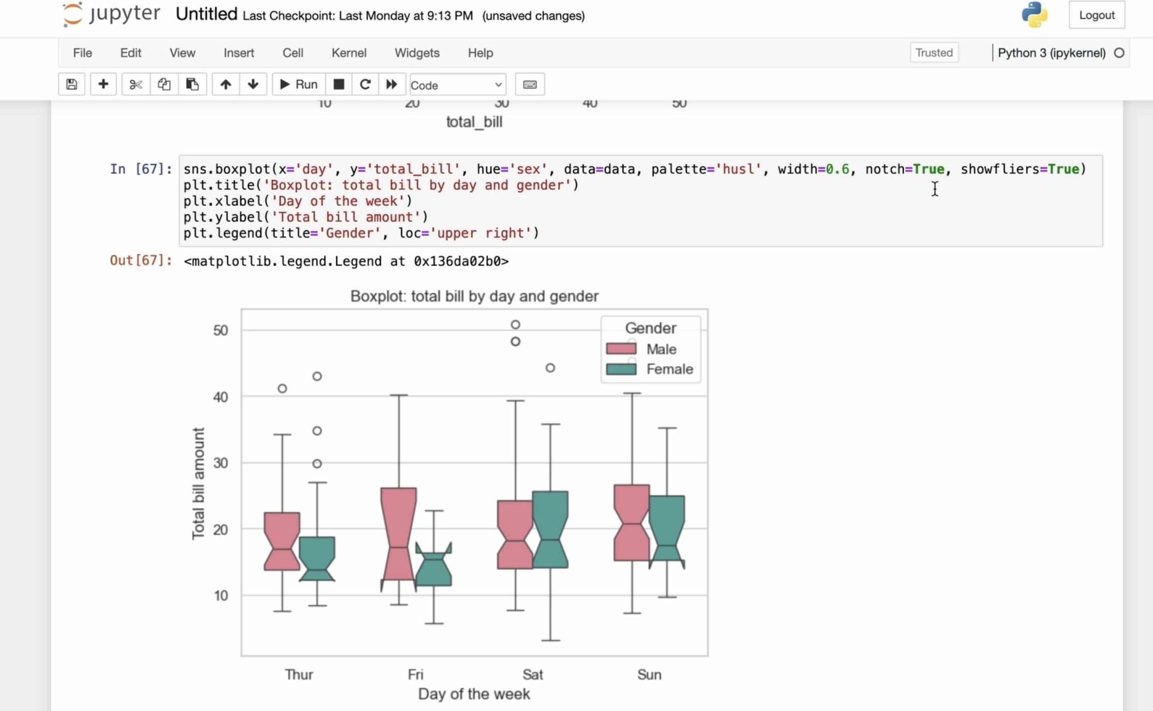
4. Advanced Seaborn: Exploring Boxplot, Catplot, and Extended Parameters like Hue, Showfliers, and More: Now let's get acquainted
with the box plot. First, execute the
box blot command and specify the X
and Y parameters. We will use the day variable on the X axis and the total
bill variable on the Y axis. Next, we specify
the hue equals Tax, which will separate the plot
by gender for each group. Then we define the
data parameter, which is our dataset. In this case, the tips dataset. After that, I will specify
the palette equals Haskell, which sets the color scheme for marking gender differences. We can also adjust the
width of the boxes. By default, it's
determined automatically, but you can modify
it if you need it. The notch parameter helps us see how precisely the
median is positioned. We also set Showfler
sequels true, which makes sure that outliers, those layers that
are much higher or lower than the rest are
actually shows on the plot. These outliers appears as individual dots outside
the main range, outside the whiskers
of the plot. This helps us clearly see any unusual data points
instead of hiding them, which can be important for understanding the full
picture of the data. Let's work with readability. And I add a title using
the PLT title command. Next, I add the label for the X and Y axis using the
PLT x label and PLT Y label. Finally, we add a legend, which will be positioned in the upper right corner.
This is what we got. We can experiment with the width to find
the optimal value. For example, setting it to
wide may not look ideal, so we adjust it to 0.8. Or let's set it equals to 0.6. Now let's discuss
the notch parameter. This picture helps us see how precisely the median
is positioned. By default, it's set to falls, and in most cases, you
can emit it entirely. If we enable it, we see
protrusions or cuts at the top of the boxes indicating the approximate
location of the median. If we set notch equals falls,
these notches disappear. I will return
everything as it was. Let's continue with CAT plot. This is a function and Seaborn
library used to create categorical data
plots that combine different types of plots
within one interface. Using Cat plot, you can easily generate categorical plots, such as bar plots, point plots, and others, depending on
your data analysis needs. So let's dive in. I'm using the Catblot
function and specifying D on the X axis and total
Bill on the Y axis. Like in the previous plot, I want to group the
data by gender, men and women, so
pass hue equals sex. Next, I specify the
data parameter, which is our data frame and set the kind to bar
to create a bar plot. I choose the palette equals
set two for color styling, then using the height
and aspect parameters, we adjust the height and
aspect ratio of the plot. After that, I specify parameter for the
confident interval. In this case, using the
standard deviation, the confidence interval
determines the range of values that are likely to contain the true
parameter value. For example, in bar
or point plots, confidence intervals
shows the level of uncertainty around the mean
value or other statistics. They give you an idea of how
reliable that number is like a little range that says the real value is probably
somewhere around here, but don't worry too much
about this right now. Just be aware that
this option exists. Next, I set a title and add labels for the X and Y axis using
X label and Y label. Finally, we add a
legend and place it in the upper right corner.
We got an error. It suggests switching to bar because the older
version is deprecated. This warning just indicates
that born is improving how figure elements are positioned for better layout compactness. You can safely ignore it. So this is the graph
we have created. In our case, we use CAT plot to build a grouped bar
plot that compares the total bill amounts for different days of the week and by gender from the Tips dataset. From the graph, we can see
that almost every day, men tends to spend more. Their total bill is higher
than that of women. There is also a useful parameter called Cal shortf column. This allows the plot
to be split into different subplots
based on a variable. Let's take a look at
that. I want to divide the analysis based on whether
someone smokes or not. So I copy the name of the column smoker and after adding the call
equal smoker parameter, we now see two subplots. One for those who smoke and
one for those who don't. And by the way, we can observe that those who smoke
tend to spend more. Now I will remove the
unnecessary parts, leaving only the palette. As I mentioned
before, you can use various plot types
with cat plot. This means you can build
different types of categorical plots
like a box plot, for example, here's what we get. Or we can replace it
with a violent plot. Sorry for misspelling,
this is what we got. This is especially
useful when we want to examine a dependency
in the data, but aren't sure which type of plot will best represent it.
5. Seaborn Visualizations: Working with Violin Plot, Strip Plot, and Jointplot for Advanced Data Insigh: Let's look at violin
plot in more detail. A violent plot is a graphical
method for visualizing the distribution
of numerical data across one or more
categorical variables. To use it, I call the
violin plot function. Then we pass in our data. X will be the day. Y will be the total bill. Equals sex will separate
the data by gender. And data, it's our tips dataset. Next, we want to split the
plot by category, gender. So we use split equals true. We said the palette equals pastel and with the inner
parameter equals quartile, we show the quartiles
inside the plot. Here's what we get.
Let's refine a bit, add a title, the X and Y axis. And include a legend, placing it on the left. This is the final graph. Here we used the inner parameter
to display quartiles of the total build distribution for different days of the
week and genders. Quartiles divide the data
into four equal parts, each containing
25% of the values. Inside each violin, a line shows the median which represents
the certain trend, the shape of each violin gives insight into the
data distribution, whether it's
symmetric or skewed, thick or narrow, providing information about where
the data is concentrated. From this graph, we can infer that on certain
days of the week, men tend to show a wider distribution
of total bill values. The violence for men are
in some cases broader or concentrated in higher
value areas indicating that men tend to spend more than women let's dive
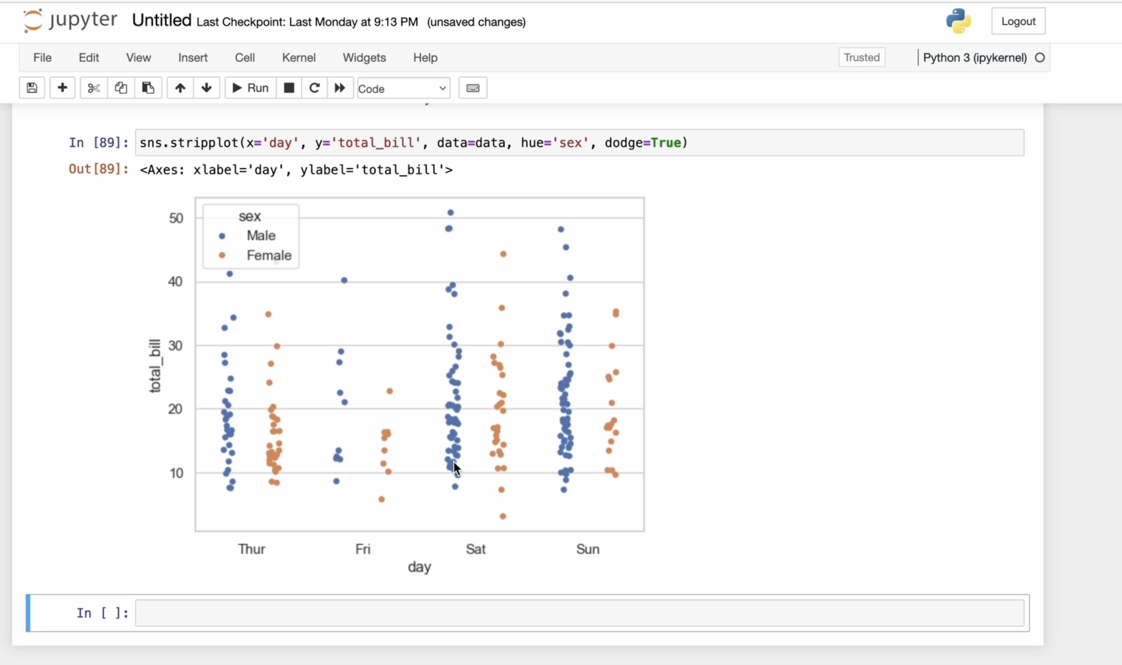
into the strip plot. This is a graphical method for displaying the distribution of numerical data across one or more
categorical variables. It places all data points
along the category axis, allowing you to see
the concentration and distribution of values. In short, a strip plot
gives you a clear view of how your numerical data is distributed within
each category, helping you understand
patterns and differences that might not be obvious in other types of plots. I will use the same data. I will specify X and Y. The X axis represents
the day of the week, and the Y axis shows the total bill amount
for each of those days. And of course, I pass the
data frame as a data. I encounter an error. What happened? Oh sorry,
another misspelling. Now it's fixed. Now I want to split the
plot further by gender, so I add the hub parameter. With the Deutsche
parameter set to true, I separate the data showing distinct distribution
for each gender. This helps to avoid overlap and makes the scatter
plots more readable. When I say Jitter equals true, it means I will add a
little random noise or slight movement to
the positions of the data point along the X axis. This is done to prevent the points from
overlapping too much, especially when there are many points on the same category. Without Jitter, the points might stack perfectly
on top of each other, making it difficult to see the
true distribution of data. Let's use slightly
different colors like this. And here we are. Now let's get acquainted with Joint plot. Joint plot in Seaborn is used to visualize the
relationship between two variables and
their distributions. Let's work with it. I will use Joint plot, passing X and Y, X will be total Bill, and Y will be tips specifying the data frame and choosing kind equal
scatter for scatterplot. We also choose a skyblue
color for the graph. Next, I will add a title to the entire plot using
the PLT subtitle. This is typically
used when you have more than one
subplot and want to add an overall title that indicates the
general idea of theme. You can experiment by changing the kind to see
different types of plot. For example, you could try kernel density estimate or specify kind equals
reg for regression. I highly recommend pausing here and experimenting
on your own. Check the documentation and
try different datasets. Your own experience is
the best way to learn.
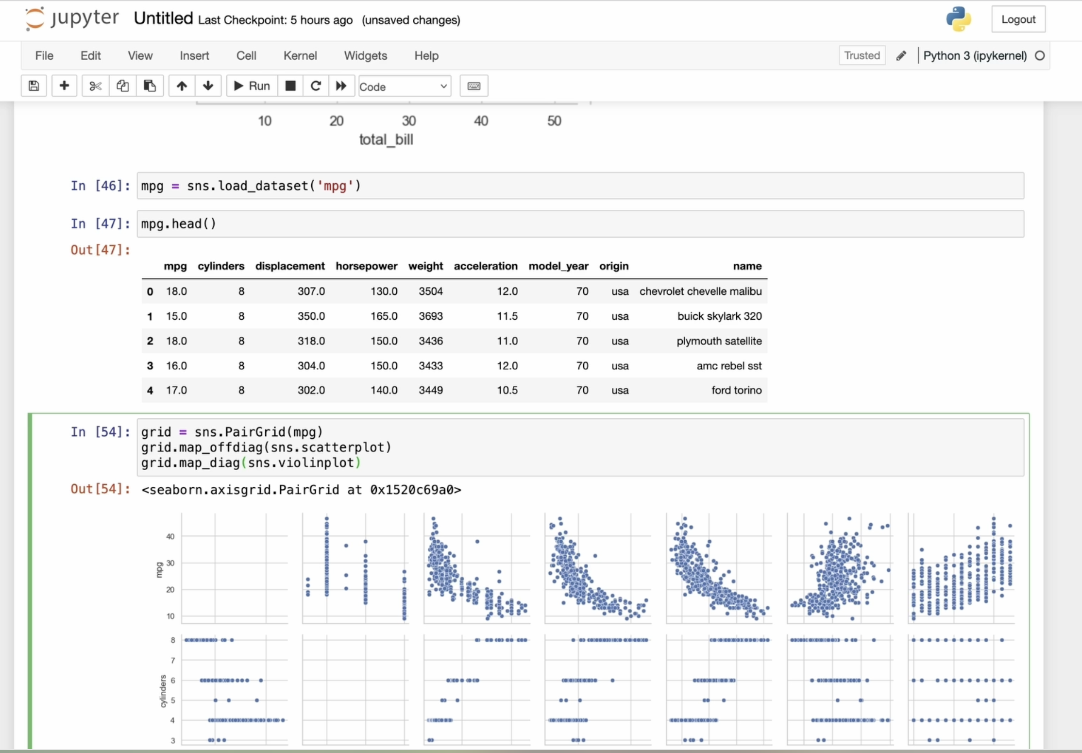
6. Advanced Seaborn: Working with PairGrid Plot and Heatmap from Pivot Table in Titanic Dataset: Now let's take a look at an
example of using PAR grid. Suppose we have a
dataset about cars. In this line of code, we are loading the built
in dataset called MPG. This dataset contains
information about the cars with columns
like model name, release year, price,
engine volume, and letters, and
other information. Let's load the dataset and create a pair grid
by passing the data. By default, this
will create a grid of empty graphs for
each pair of columns. To add specific
plots to this grid, we can use the map method. For example, we can build a scatter plot for
each pair of columns. We can also use a barplot. Let's see how that turns out. However, I'm not quite
satisfied with it, so let's experiment with a plot. Here's the result.
That's much better. Seaborn allows us to apply different visualization
function to the diagonal and non diagonal
parts of the grid of plots. Now I'm going to use the scar
plot method for all plots, except the diagonal ones. This way, we will get a scar
plot for each variable pair, leaving the diagonal blank. Let's discover map diagonal. This method applies
the specified function only to the diagonal plots. So the violin plot type will be displayed only on the
diagonal plots like this. Seaborn gives us
flexibility by allowing different visualization
function for different parts of the grid. We can also use a
function that applies a given visualization only to the plots below the diagonal, excluding the diagonal itself. In this case, I will use the kernel density
estimate type. Similarly, we can
apply a function to the upper plots by using
the map upper function. It might take some
time to build, but here's the result. We use two methods, map upper and map lower and apply different types
of plots in each of them. As a result, we obtained the
following visualization. Let's add the familiar
hub parameter and divide by the
cylinders variable. The aspect parameter controls the width and height ratio
of individual plots. By default, the
aspect is set to one, making the plots square,
but we can adjust it. I will set the
aspect equals two, making the plots rectangular. The height defines the height of each individual
plot and the grid. I'll set it to three. Rebuilding the per grid
plot takes some time. Adjusting the height and aspect ratio can help achieve an
optimal display of the grid, depending on the dataset
and style of visualization. You can experiment based
on your datasets needs. Now let's change the
color palette to set two, which will give us
completely different colors. Here we have an endless
field for experiment. Next, let's build
a heat map using the Pivot table and
heatmap function. For this example,
I will work with a dataset about
titanic passengers. Let's lot the dataset. Now I will create a table
to count the number of male and female passengers
who survived or died. For this, I will
use a pivot table. Pivot tables is a tables that are created using the Pivot table function on a data frame, allowing you to
summarize and reorganize the data based on column
index value pairs. I covered this in detail
in my Panda scores. So if you're interested,
check that out. Let's define the index as gender and the
columns as survival. The ag funk parameter
is set to size, counting the number of
observation in each group. This means for each combination
of gender and survival, the total number of passengers those characteristics
will be calculated. Now we have a table with columns for each combination of
gender and survival. Let's build a heat map
based on this table. I pass the data to the heat
map function, set annotation, equals true to display
the value of each cell, showing how many people
survived or died. The FMT parameter defines the format of the
values as integers. We can also adjust
the legend titles and axis labels using methods from Mbap charts, as we did earlier. You can set the color scheme
of the heat map using C map, for example, like this, a
completely different look. You can experiment
with the appearance of the heat map and set the line
thickness between cells. I will set it to one, but it's not very
visible right now. Let's change the color map to make the lines
more noticeable. Now the lines are visible, and you can also adjust
to the line color. By default, the line
color is absent, and the line thickness
is set to 0.5, but you can change
it as you like. I highly recommend
experimenting, reading the documentation, downloading the dataset, and
building your own plots, adjusting parameters to
understand what they represent. As you continue exploring
data, remember, great insights often start
with simple visualizations. Keep practicing, stay curious, and let your plots
tell the story.
 Olha Al, Software engineer