Transcripts
1. Intro: Welcome to the MD
Blot Leap course. In this course, we will learn how to work with Matlot Leap, the most popular and
widely used library for data visualization
and Python. It's highly demanded
in the fields of data science,
machine learning, and analytics because it makes creating powerful
visualizations quick and easy. We will also cover
the main functions and capabilities
of Matplot Leap, including how to create
different types of plots, customize them and make
interactive visualizations. You will learn how to use
MD Blot Leap effectively to present data in a
visually compelling way. In our first project, we will create an animation
using fake data that we will generate with a
simple Python function and the num pi library. This will give you hands
on experience with how animations work and how to
dynamically update your plots. For the second project, we
will use the Python library Y Finance to fetch real stock
data for Google and Apple. We will then create
an animated graph to visualize the stock
price movements over a specific period of time, showing you how two
real world data can be represented dynamically. By the end of this course, you will have a solid foundation in creating different
types of plots and animations with Md plot leap and be ready to explore even
more advanced features. Let's get started.
2. Matplotlib Setup & Basics: Line and Scatter Plot Tutorial: It's important to know
MD Blot leap because it allows creating charts and
diagrams for visualizing data, making it easier to understand
and analyze information. By using MD Blot leap
along with Bands, you can easily visualize
data from a data frame. The library provides a
wide range of settings and customization options
for plots and diagrams. Before we begin, make sure you
have Matlod lip installed. If not, use the Command
Pep Install Matlod Lip. Or if you're using Anaconda, you can use this command. I already have Mud
blood leap installed, so all I will do is
launch Jupiter Notebook, and we will start
working together. I'm opening the terminal, activating my
virtual environment. Which already has Jubiter
notebook installed, what a virtual environment
and how to work with it, you can see in my bonus video. You don't have to use a
virtual environment right now. You can comfortably
work in the terminal. But for the future, knowing what it is will be very useful. Also, it's very convenient
when you need to work with different projects and different
versions of libraries. I will slightly increase
the size of our terminal, and here I'm launching
Jubiter Notebook, having previously navigated to the directory where our project
will start automatically. You can use Jupiter Notebook in whichever way works
best for you. We are right now in
Jupiter in this directory where we will create
our first file to explore Mat Blot Leap. Let's create our file. So let's go through the basic steps of
using Matplot Leap. First, I import the library
with the Alias PLT. Next, we need data to work with. Data based on which we
will build our plot. Let's create something
very basic like this. D. And now we can build our first data visualization,
building the plot. And here it is, our
first simple line plot. In the past, we used the magic command MD
plot leaping line in Jupiter Notebook to display plots directly
in the notebook. However, in the latest
version of Jupiter, this command is usually
not needed anymore. It's enabled by default. So when you create a plot, it will automatically appear in the notebook without needing
to add Mud blot leap line. So now users can simply call visualization functions and the plots will
automatically display. For now, we imported the Mult plot leap library
and assigned the alias BLT, as is common practice
for convenience. Then we created some data, not really fake, but data based on which we
will build our plot. Then using the plot function, we created our plot. In the end, we either had to add Show function to display our plot or write Md Blot
leap in line about it. But as I mentioned, in our case, we are working with
the latest version of Jupiter notebook, and under the hood, we have this already. We don't need to
take extra steps. I will remove this line
because we don't need it. We can also add a label here
and display it like this. And here it is. We can see
our label on the chart. Now, let's build a scatter plot. Scatter plot is a powerful
visualization tool that helps us understand the relationship between
two numerical variables by plotting data points
on two dimensional graph. Each point on the plot
corresponds to one pair of values with the X and Y axis
representing different variables. To create a scatter plot, we first need to pass the
data for X and Y axis. These are the values that will define the positions of
the points on the plot. Then we can specify the
color, let it be red. Next, we specify the marker, which is the symbol or designation used to mark
each data point on the plot. The marker can be of
different types and size, allowing you to choose how you want to display
individual data points. Then we indicate the label, which will be displayed
in our legend, add the legend and here it is. This is what we got
a scatter plot.
3. Exploring Data Visualization: Bar Charts, Multidimensional Analysis & Scatter Plot Styling: Now let's also learn how
to build a bar chart. And to do this, I will slightly manipulate the database on
which we will build this. Let's restart everything
and build our bar chart. I will use the bar
function this time. Then we pause our
parameters again. Let's make it green and provide a label and of course,
let's display it. A bar chart is a
visual representation used to compare different
categories or groups. They are commonly used in
data analysis to represent data such as sales or any
other categorical information. Now let's talk about how to add a title to our plot
using the title function and how we can label our plot xs using X label and Y label.
Let's go through this. For this, we will use the title X label
and Y label methods. And look, now we get a
title and labeled excess. Let's also learn how to change the style and color
of our plot markers. Line styles and
colors can help make our plot more informative.
Let's experiment. For this, let's go to our line plot and
make some changes. We just added a marker, set a style for our line, made the color blue,
changed our legend. And we got a much
better representation on the same line plot. Now, let's go back
to the scatter plot. There's another parameter, S, which controls the marker size. We can set different values, experiment and see how it works. There is also a
parameter called Alpha. It sets transparency.
As you can see, we can experiment with this too. Zero means full transparency, and one is full opacity. Try experimenting yourself. Now let's work with
multidimensional data. Scatter plots are not only for simple cases where you see the relationship
between two elements. Let's imagine we have a dataset that contains
three variables, and we want to determine how two variables interact
and influence the third. For this, we will use a scatter plot and work
with multidimensional data. So I import Numbi then generate random
data that I will need. This line sets the
initial value for the random number generator
in the Numbi library. In the case of SED equals 42, the number 42 is chosen
at the initial SED value. This results in the random
number generator reproducing the same sequence
of random numbers each time the program is run. Don't focus on it right now. It's not necessary for
you to learn immediately. Just try to repeat it so you have an idea of
what we are doing. Then we generate our
multidimensional data, X one, X two, and Y. We generated random numbers
using the Napi library, which is extremely important. If you haven't learned it yet, there is a tutorial
in my profile. Check it. And here it is. Our data is ready. Now let's create a scat
up plot based on it. We pass the first and second
parameters, then the label. Here I will be looking at the interaction
between X one and Y. Let's make the color blue, and then I will compare X two
with the third parameter of Y. Labeling it with
a different color. And here's what we
have at the moment. Let's add a title
for completeness. Then label the axis with
X label and Y label. In this example, we use two
sets of markers to display the relationship
between X one and Y and between X two and Y. This way, we can easily compare the influence of both
variables on the variable Y. Scatter multidimensional
plots in MD plot leap are often used to visualize relationships between
multiple variables. They help in
understanding patterns, correlations or
clusters within data. By representing each data
point in multiple dimensions, they allow for better insights
into complex datasets, often used in machine learning, data analysis, and statistics.
4. Exploring 3D Plots & Histograms in Data Visualization: We have more than two variables, three D plots become an important
tool for visualization. Let's consider, for example, creating a three D plot
for three variables. For this, we need to import a module from the
Matplotlap library that contains the axis three D class designed for creating
three D plots. This module extends the
basic functionality of MDPlot leap for displaying and analyzing three
dimensional data. It adds classes
and functions that simplify the creation of various
types of three D graphs. To avoid repetition, I
will copy this here. Refine it a bit and
rename variables. Now I will quickly
write the code, and then I will explain
what we did here. Meanwhile, post the video, copy the code, and then we'll
go through it together. So we imported this module, then generated random data. Next, we create a figure object, which is the container for
all the elements of the plot. It is a fundamental part
of any Mdlolap plot. After that, we create a three D subplot using
the AdSAlot method. This creates a subplot with a three D projection based on the figure object
we created earlier. The parameter projection three D indicates that we want to
create a three D subplot. After calling this command, we get an axis three D object that allows us to
draw three D plots. We can call methods
like scatter and others on this object to
visualize three D plots. Let's call scatter using
the scatter method and add points to the
plot for X, Y, and Z. These are data for the
respective dimensions. The C parameter is for color, so the color of
the points is red. Then we specify the marker, which in our case
is circular next, I specify the label to add a legend and then
run all of this. Oops, we got a typo. Let's fix it. And look at
the nice plot we got here. We can observe the
scattering of plots in three dimensional space using the provided X,
Y, and that data. This is very convenient
when you need to understand relationships
in complex datasets. Now let's learn
about histograms. Histograms are an important
tool for visualizing data distribution
and identifying patterns in numerical datasets. They divide the range of
values into intervals and display the count
of observations that fall into each interval. So let's consider
creating a histogram using MD plot leap
and some random data. We generated data using
Napi and in this example, we generate 1,000
random numbers. Then we call the hist function and pass our generated data. The Bins parameter determines
the number of intervals. The color parameter sets
the color of the histogram, and the edge color determines
the color of the edges. Let's also add a title. Sorry for another typo. Let's quickly change
that restart, and here it is all working. Let's add X label and Y label for a more user
friendly display on the plot. And here's what we got. Pause this video and practice. Try to repeat or change
something like changing the bean values or creating your own color for
this histogram, or, for example, generating fake data to build
a new histogram. You can customize every plot
we build to your liking, and the more practice
you have, the better.
5. Pie Charts, Saving Plots in Various Formats & Animations with FuncAnimation: A Pie chart is an
effective way to visualize the proportions or frequencies of different categories
in a dataset. This type of plot is
particularly useful for representing portions,
frequencies or percentages. Let's see how we can
create a Pie chart. And first, I create data based on which we
will build the Bie chart. In this example, I use the Pi function to
create Bie chart. And here I pass the sizes. Parameter specifies
the proportions for each category labels, parameter defines the names of the categories
and the colors. Parameter sets the color
for each category. Then comes the parameter that sets the format for
displaying percentages. The start angle parameter allows rotating the chart
at a certain angle. Usually it's set in degrees
and can be any number 0-360. Let's add a title. The start angle parameter
that in Mud blot lip specifies the angle from which the pie chart
start drawing. By default zero
degrees is typically at the top of the chart
and without rotation. Drawing starts from the
positive X axis direction, increasing counter clockwise. We can experiment
with this and try different values,
see how it works. Also, M plot leap provides an easy way to save plots
in various formats, such as PNG, GPG, and PDF. This is especially useful
when you need to use plots in other programs
or publish them online. We already have our pie chart. Let's save it as a PNG file. You can also change
the extension by specifying a different file
format like GPG or PDF. The DPI parameter specifies
the dots per inch resolution, allowing you to control the
image quality. Run this cell. The file will be saved in the current working
directory as hist PNG. Saving the plot may
take a little time, and here we have our
saved Pie chart. Bie charts are often used
in marketing to illustrate the market share of products or services compared
to competitors. They can also be
used to evaluate the time spent on
different project stages. Now let's dive into something more interesting Mud
Blood leap animation, which allows us to build plots with live
data in real time. Animation are useful for visualizing changes
in data over time, making them ideal for real
time data monitoring, simulations, and interactive storytelling
in data science. We will learn how to
create animations using funk animation from Md Blood
leaps animation module. This function allows us
updatablot at set intervals, simulating the
effect of live data. I will switch to visualize
Studio code for this example, as I find it more convenient for myself. So
let's get started. First, we import
everything we need. Of course, we will
need some data. In real life, this data
comes from external sources, for example, stock market charts or any other real time
data visualization. In our case, we will
generate the data ourselves. Let's create a
function that will constantly generate
new data for the plot. If you know Python basics, it will be easier to understand. But if not, don't worry,
copy this function. Post the video and
rewrite this code. I will explain what we are
doing right now a bit later. In real project, you will receive data from
external sources, so you don't need to fully understand this
code right away. I hope that makes sense. So pause the video and
rewrite this code. Right now, if I'm
running the script, we will see a window
with an animated plot. It might take a little
time, but here it is. We can now see our
data in real time. Notice this warning message. In some cases, the cache
can grow unbounded, leading to potential
memory issues, especially for long
running animations or animations with a large
amount of data per frame. To mitigate this issue, Dlod Lib disables
frame data caching by default and displace
this warning message. If you don't want to
see this warning, you can follow the
instructions and set cache frame data
equals to false, or you can simply ignore it. Now let's break down
the code step by step. First, we imported MD plot leap. Then we imported the
funk animation class. We also imported Napi to
generate random numbers. We need an update
function that will be called to update the
plot for each frame. In this case, the new data
is generated randomly. But as I mentioned earlier, you can modify this
part of the code to use real data from
an external source. So what does the
update function do? This function generates new data to be displayed in
real time plot. We initialize a new data object that generates random
numbers using Num Pi. Then we use a list in Python and the append method to add these generated
numbers to the list, ensuring that the list
is constantly updated. This continuously
updating list forms the basis of our real time plot. Next, we have a line object, which represents the line
being drawn in real time. We use the set data method on this object,
passing two arguments. The first argument defines
the X axis values, and the second argument
defines the Y axis values. Here we use the
length of the list as X values and the list
itself for Y values. Then we create a new
figure using PLT S alots. The function returns
two objects, the figure and the axis. Next, we update the
axis limits dynamically because the minimum
maximum values of the X and Y axis
change over time. To handle this, we
use the Lin function. This recomputes the data limits
based on current values. Then we have autoscale view. This automatically
scales the plot so that all new data
remains visible. This ensures that the plot smoothly updates as
new data arrives. Now let's configure the
properties of the plot. Here I used the legend function. You already know that this
is added legend to a plot. It helps identify
different elements by displaying labels
for plotted data. I set X axis limits 0-50. Y aces limits 0-1. Then I set a title for the plot, and I add labels for both xs. Finally, to create an animation, I use funk animation. First, I pass the figure object to which the animation
will be applied. Then I pass the update function, which will update
each animation frame. The frame's parameter determines
the number of frames. Since we set it to none, the animation continues
indefinitely. The interval
parameter determines the delay between
frames in milliseconds. For example, if interval
equals to 1,000, a new frame will appear every 1,000 milliseconds or 1 second. This controls the
animation speed, and at the end, I call PLT
show to display the animation. And this is what we got. There are many animation effects available in Mad Blot leap. You can see it in documentation. So you can experiment with them. Here you can find
some more code. You can rewrite it and run. Feel free to add your
own modifications.
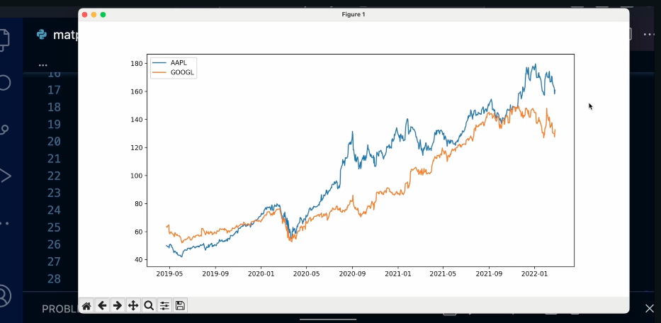
6. Animating Stock Price Charts with Matplotlib & yFinance: Apple vs Google Comparison: Now let's do some practice. We will retrieve stock
data for Apple and Google, then plot their stock price
graphs over the past years and create comparative chart to determine which stock is currently more
profitable for us. For this, I will use the Yahoo Finance and
Mod Plot Lip libraries. Yahoo Finance is a library that allows you to obtain
historical stock price data, dividends, balance sheets, and other financial indicators for
publicly traded companies. First, we install the library
using the package manager PIP in the previous example
with funk animation, we simulated our data
using the update function. Now I will fetch the real
data from Yahoo Finance. After installing the library, we import it and retrieve
Apple's stock data. I specify the ticker, which is a unique
alphanumeric code, identifying a public company
of the stock exchange. You can check
available tickers here and choose the one you
are interested in. In our case, we selected Apple. Next, I create an object
and define the start and end dates for the
period I want to analyze. Then using the history method, I retrieve historical
stock price data for the selected period. Now let's bring the
data we obtained. And here it is. It was so easy. Now we import Mtodlp
and visualize the data. We create a figure.
In matplot leap, a figure is a overall container that holds all the
elements of a plot, including axis titles, labels, and the actual data
visualization. It source as the canvas where multiple subplots or
charts can be placed. The fig size parameter defines the size of
the figure in inches. It controls how large or small the plot appears when
displayed or saved. Adjusting fig size helps
improve readability and layout, especially when working with multiple plots or
detailed visualizations. Then use the plot
function to draw a graph. As the first parameter, we have X access values, and here we have data index. The data object is a Pandas data frame that
contains historical stock data. If you don't know
what Pandas is, I highly recommend
check my profile. You can find Pandas tutorial. This is extremely
important library. So the index of this data
frame typically contains dates time steps because Yahoo Finance provides
time serious data. This means we are plotting
stock prices over time with dates in X axis. The second parameter,
data close, this represents
the Y axis values. Close is a column in
the data data frame, which contains closing prices
of the stock for each date. The closing price is
the last recorded price of the stock at the end
of each trading day. I also added title
and axis labels. And then display the plot
using PLT Show function. The result is a graph
showing changes in Apple's stock price
over the selected period. Now let's add Google
stock data and compare the prices of these two tech
giant over the same period. We create a list of tickers, adding Google alongside Apple. Next, I create a
list of objects, corresponding to each ticker
using a list comprehensions. If you're not familiar
with Ismprehension, welcome to my Python course. Just check out my profile here. There is an excellent
course of Python that takes you from beginner to
object oriented programming. I keep the start and end
dates the same and create a dictionary that
stores historical closing price data
for each company. For this, I use a
dictionary comprehensions. Quick tip. I highly recommend getting familiar
with Python generators. You will often come across them, and they are very useful. Now let's adjust the layout a bit to make the
code more readable. I remove print data. Next, I create a figure
with a specified size, and I use for loop to plot the closing prices of each company's stock
on the same graph. Each line represents a
company's stock price trend. We set the title
X aces label and Y Acess label and a legend
using PLT legend function. And at the end, display the final comparative graph
with PLT Show function. The result is the graph, comparing Apple and
Google stock prices over the selected period, where each line represents the price movement
of the company. Now let's make the
chart animated. First, I import the
animation module from MDPot Lip Then we create a few figure using FLT subplots and specify
the axis labels. In the first case,
when I used X label, ylabel, it was an attribute directly associated
with the axis object. It's a way to access or modify the label of
the X axis and Y axis. However, this is not recommended
or most common approach. In this case, I use set
X label and set Y label. The second case, these are
the method provided by Mt Blot Leap to set the labels for the X
axis and Y labels. It's a more robust
and preferred way to interact with the plot. These methods is part of the
official Mtplot leap API. So you just need to know
that we have two variants. The first variant,
these are attributes, and it might be a shortcut
or older approach, but it's less flexible
and less widely used. The same applies to the title. Next, we define the
animate function, which will be called for
each animation frame. This function clears
the graph using X clear function and then plots the stock prices
for each company by iterating through the data dictionary using the four loop. Each line in the animation corresponds to a
different ticker, and we use plot
to plot the data. The X axis represents dates and the Y axis represents
closing prices. If you're familiar with Pandas, you already know
that I alg selects rows or columns by index
positions or range. Here, we dynamically select rows on each new
animation frame, creating a gradual accumulation
effect on the graph. The label parameter ensures that the correct company name
appears in the legend. So as in the first case, we have data items, and from these data
items, we got prices. And we have prices
index as date, and we use it for X acess value. Then we use prices
for the Y axis value. Now we create the animation
using funk animation, similar to the previous example. Here I specify the number of frames the
animation will have. It sets the total number
of frames to the length of the data for the first
ticker in the tickers list. Meaning the animation
will update once for each data point in
that specific dataset. This allows the animation to show how the stop price
changes over time. We said the repeat equals
to false parameter so that the animation doesn't
restart after finishing. Finally, we display
the animation. After running this code, we get an animated graph showing Apple and Google
stock price changes over the selected years. Try experimenting with
different stocks. Visit the NASDAQ website, choose other companies and create your own
comparative chart. Which stock would you invest in? As you can see, Mat Bot Lip is a powerful library for data
visualization and Python. It plays a key role in the Python ecosystem for scientific computing
and visualization, providing flexible
and efficient toolkit for creating a variety of plots, for simple charts, to complex visualizations for
different analytical tasks. Mat Boot Lip remains one of the most widely used libraries in data science and finance. I highly recommend learn it.
7. Bonus: Efficient Work in Virtual Environment. Setting Up Your Workspace: Very often in reality, you will have to work with
multiple versions of Python. This is because each project has its own technology stack
and package versions. To avoid creating a mess on your work computer and dealing with conflicts between
different versions, it's ideal to use a
virtual environment. It's not urgently
needed right now, but I suggest you to
understand how it works. It will help you a lot.
You can skip this part. It will not affect your
learning of the Python basics. This will be more necessary when you start
working on a project. And now let's get started. Guys, if you want to manage multiple Python versions
on your machine, there is a tool PMF. It lets you easily switch
between multiple versions of Python and change the global Python
versions on your machine. Let's get started
from the Macos and then I will show you
how it works on Ubuntu. The first step you
need to take before installing anything
new, it's update. And just in case upgrade
to upgrade all packages. The first command updates local repository metadata,
the second command, Brew upgrade, upgrades all
the installed packages on your system to the
latest available versions. It's commonly used practice that users first run
Brew update to get latest metadata and then run Brew upgrade to update
their installed packages. This ensures that the system has the latest
software installed. We go to the Github and
follow the instructions. Then we use them Brew
install for installing PMF. Just copy this command
and execute it. Let's return to
the documentation and see what we need to next. Scrolling down, and here we
are I use Z SH or shell. It's a common line
shell that serves as an alternative to the more
commonly known Boss shell. So I copy all this code
and post it in SHC file. So we have installed PNF, and now I want to talk with you about Virtual environment. Virtual Environment
solves a real problem. You don't have to
worry about packages you install on the
main system location. PyNVirtoNv is a plugin for
the PNF tool that allows user to create and manage virtual environments
for Python projects. With this, you can isolate project dependencies
more efficiently. So again, follow
the instructions and install this plugin. After installation,
we copy this command and add this to the SHRC file. In this case, we do it manually. Open the HRC file. It's a hidden file and typically located in the
user's home directory. I use simple user friendly
text editor nano. You can use VIM. Here we can see three
rows of code that was executed when
PAN was installed. And pause this command here. I write my comment for the better understanding
in the future. Again, for nano text editor, I use the commands Control
O and control exit. It allows me write and
exit from the text editor. You can use your text editor
and execute your commands. Then restart shell
with this command. And we can use these tools. So let's check it. Here we
can see a small documentation with commands for
PNP and PM Vertls. The first command,
we check PN version. It displayed the currently
active Python version, along with information
on how it was set. For now, I don't have any. If I want to now list all
Python versions known to PM I use the Command
Pimp versions. And for now, I didn't install any Python version with PMP. If I want to see the list of Python version available
to be installed, I can use the Command
PM install dash list. So let's try to install
Python with PM. For this, we use the
command PM install, and then I specify the
version of Python. I will install
another version of Python to demonstrate how you can work in isolated
virtual environments with different Python versions. Now at the same time,
you will learn how to install and remove
Python using PNP. If I now check the versions, we will see several
Python versions. The Asterix indicates that right now I'm in a system
global environment, but I have two Python
versions that I can use for creating new virtual
environments for other projects. On this operating
system, I have globally, I mean, Python
version 3.10 eight. I said globally because
for every project, we can have its own
Python versions. And now with this command, I will create the first
virtual environment. For test project, I use the
command Py Virtual ENF. Then I choose the
version of Python, and then I can call my
virtual environment, whatever it's up to you. I will call it NF and
version of Python. And now with the command
PN virtual lens, I can see list all existing
virtual environments. To activate my newly created
virtual environment, I use the command PNF, activate, and then name my virtual
environment V 3.90. I immediately can
see that I'm in it. If I check the
Python version here, it's 3.90, unlike the global version
that we tested earlier. If you have several
virtual environments and want to switch between them, you can execute the
command PM, activate, and then name other
virtual environment, even if you write now in another active
virtual environment. Now if we install
something here, it remains isolated from
global environment. Any packages or
dependencies installed inside my virtual
environment will not affect the system wide
Python installation or other virtual environments
that we can create. So let's install something here. Let it be Jupiter. I go to the documentation
and follow the instructions. Jupiter it's a tool
for code execution. I choose Jupiter, for example, it can be any packages
or libraries you want. Now with the command PIP freeze, I can see all packages that was installed in
my virtual environment. PP is a package
manager for Python. Now let's imagine
that we don't need this virtual environment
anymore. How we can delete it. First, if it's active, we should deactivate it with
the command PM deactivate. Then we use the command Virtual delete and name our virtual environment
that we want to delete. So when I check Pi
on Virtual lens, we don't see our virtual
environment anymore. It was deleted along
with all packages and libraries that we installed
there very useful thing. But it doesn't mean that
Python version that we use in this virtual
environment was also deleted. If we check Python versions, we still can see several. I added before another one, just to show you how we can uninstall Python
versions with BMP, the command, uninstall and then version of
Python and Viola, we uninstall Python
version 3.9 0.8. With these tool, it's so simple manage different
Python versions. Now let's install it on a
Bunto. We do the same thing. Go to Github page and
follow the instruction. Here, I chose
automatic installer. And here I copy this
command for installation. Before installation, I use
the command pudo Ug update, this command, managing
system packages, then psudoUg upgrade. So we update and upgrade all installed packages
on our system. Now we can install PAMP Fast this command
that we copy previously. Then return to the front page, or documentation, and copy
these three lines of code. We will write it
in Bahar C file. I is also hidden file. It's very similar that we
did with MACOS previously. If you couldn't install
Tmp and you got an error, make sure that you installed
all dependencies for Python and have Gid on your PC. After all of this, restart
shell with the command, and we can use this tool. We use here the same command we used previously on Macros. Let's install Python 3.90. Here we can see our
installed Python. Now let's create
virtual environment based on this Python version. We activate it the same way
as previous with MacOS with the command and activate and then name a
virtual environment. Probably you won't
encounter this problem, but I have inconvenient
behavior on my system. Right now, I don't see that
I'm in virtual environment. If I check it, I can see
that we have created it. So I had to add these few rows of code in my BachRCFle
and everything works. On a Bundu, I also
use nanotext Editor. These commands allow me to write and execute
from the BachRCFle. Execute the command source BRC. It's for execution
the BRC script in the current shell session. And while we fixed it. Right now we are in our
virtual environment, and inside, we have the Python version that
was used for creation. So, guys, all commands
and all the next steps, the same as we did previously. I hope this knowledge will help you see you in
the next lesson.
 Olha Al, Software engineer