Transcripts
1. Introduction: We've done pencils.
We've done brush pens. We've done fi liners. Is there another tool that can help us to create
quick sketches? Yes, there is. We're going to use these guys, alcohol markers. Alcohol markers are really
great for quick sketching. Not the colored one, as you
can see here, but grea tons. We don't want to get into
color that we need to learn. Colored theory blending
and mixing colors and no, it's not for this art class. We want to do quick
sketches with ink, and these guys are
ink, too, alcohol ink. Ah, different kind of
ink. Still, the ink. We're going to add
gratons to our drawings. No, that's slightly different from what we've done before. But all the previous
techniques and what we've learned about light
and shadow and shading, we'll come back when we're
going to use these markers. We're not just gonna
play with them. No, we're gonna
flour up our fridge. We're going to create
some fridge magnets, and I got them all free
of them right here. We're going to work on
these fridge magnets, and let me tell you, they look great on your fridge. They make great gifts, too. And as you can see, these look quite different from
what we've done so far. So let me show you how
to get the difference in your quick sketches by
using alcohol markers.
2. Combining Pens and Markers: Welcome to this lesson. Now I said in the introduction, we're going to change
things a little bit. We're going to work
with alcohol markers in combination with ink. Now, alcohol markers
do contain ink, so they work perfectly
with pens and fine liners and fountain
pens and so on. Now we have to make a choice. We can work in two ways. We can either go alcohol markers
all the way and just use a black alcohol marker like this to sketch to quick sketch, and then start shading or we can just pick a fountain pen. Your fine liner or
even a regular pen, that's the choice we can make. Alright, we're going to
explore both of them a little bit and just
show the differences. And for that, we're
going to change cameras, and I'll show you a little
bit of a difference. Now, as you can see, I've
drawn a little scene already, and in the next
lesson, we're going to really draw a
little bit more, and I'm going to show
you some things. For now, I'm just going
to explore a little bit, and I'm going to show
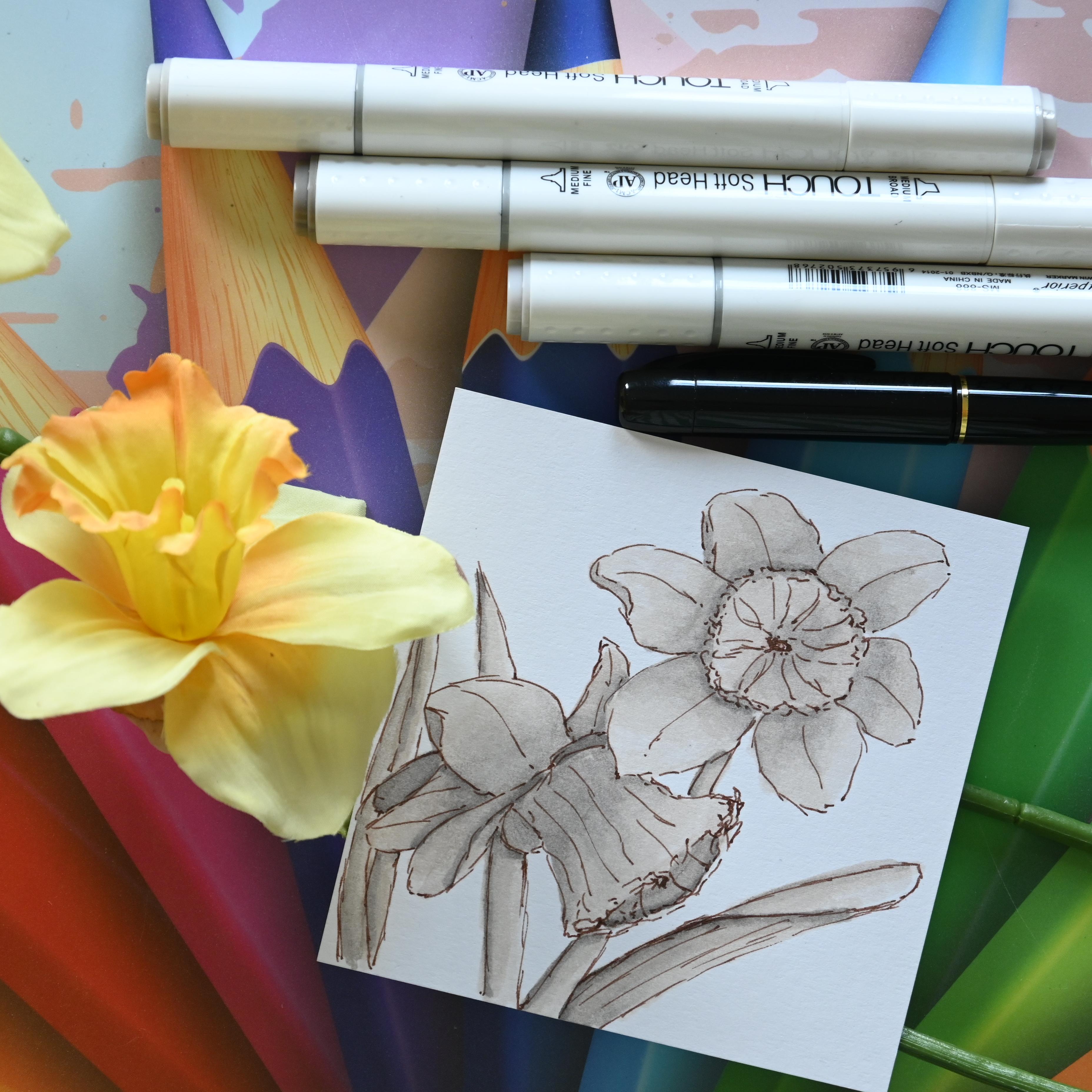
you the difference. Now, here you see a set of
daffodils done with Sepia ink, with this pen here,
fountain pen. In a combination with markers. Now, that looks like this. It looks very nice. The other way we can go is we can use an alcohol
marker to sketch. Instead of using a pen, we can use an alcohol marker. Now, that would look a little
bit like using a brush pen. Although it's not as flexible, it still would work very well. Now alka markers have a
slight little problem. They give off a lot of ink, and that means they can
bleed through your paper. So you draw on one paper, and then it just goes
right through that paper, and it ends up on
the next paper. Now, to prevent that,
what we're going to do is we're going
to use an extra paper to make sure that the paper under it will not
be covered in ink. Alright, let me show you that. Okay. So there's an
empty page below it, and what I'm going to do now, I'm just going to take
a piece of paper, and it doesn't really
matter what it is. I'm going to put
that in between. And now if I draw
on here and the alcohol marks as you can
see here goes through, it will go on this
paper and will not get on my nice
blank piece of paper. Well, I might not use
this paper, by the way, there's a photograph, so let
me use a different paper. And get just a scrap piece of paper and put that in
between. There we go. Alright, settled. So now I can start drawing
with the alcohol marker. Okay, before we're gonna draw, let me show you just a
little bit of difference between the alcohol markers. You've got various
kinds of them. You've got these
just cheap ones, and they will do just fine. And this one has a
nice bullet tip, and it has a chisel mark. Now, the chisel tip we're
not really gonna use. We're just mainly going
to make use of this one. Now, you can buy a set
of more expensive ones, and then you get something
like this called Copics. And what this one has, it has a brush on this
side, very flexible, and you can paint with
it a little bit more, and it still has the
chisel tip on that side. Now, I'll show them next to
each other. There you go. So this is more firm. This is flexible. Now,
that's not gonna fit here. Do the right cap
on the right one. But you can also buy
nowadays this kind. Let me pick that. Here you go. There's one. This is
pretty much the same. Although it is thinner, this has a flexible brush tip, too. And it's just this is, again, a different brand. So I've got free
brands here now. Cheap expensive, less
expensive and very cheap. So is there any
difference between these? No, there really
isn't any difference. The copies really aren't much better than the
alternative brands. The alternative brands
are really affordable. So you buy three of these copies while you get a whole set of 50 beautiful colors of
these alternative ones, and they work just as fine. Alright, well, let's
get back to drawing. Okay, so let me
put that pit away. I'm going to put the
brush tip away too. I'm going to use
this one for now, but you also could use this one. So now the difference you will see right away, let
me start drawing, and I'm going to just
draw this again, and I'm going to do that here. And you see it's a bit thicker. And it's more like a brush pen. There we go. And
now the nice thing about a marker is the
same as with a brush pen. I can color in a
part right away. Now, since this is a
bit of a demonstration, I'm not going to put a
lot of work into it. Just give you the impression of this. There's a fold there. There you go. And there we go. And under here, there's
definitely a second one, and I'm just sketching this in. And there we go. Now, later on, we're going to
use this again. And there you go, and then
they're stuck under it. Now, you could
leave it like this. You could use this to shade,
too, if you wanted to, which in this case,
I'm not going to do because that's
what we're going to do in the next lesson. So you can clearly see the
difference between the two. This is way more
like a brush pen. This is nice and fine. And it's just what do you choose?
What do you like, okay? This has its certain appeal, this will have its
certain appeal, too. Now, to get a better comparison, let me just add some
shading to this too, and let me pick
up these markers, and I'm going to
give it some color. And I'm going to
start really lightly. Alcohol markers we
great on smooth paper, but really, you can use
them on rough paper, too, and it gives a certain effect to
them a certain charm. The only thing which you
can do less good if you use rough paper is the blending. Blending goes
slightly different. Alright. But since we're
not going to blend a lot, we'll be fine with
any paper we choose. So that's the first marker, and I'm just moving up in colors going from light to dark. So you adding a bit of darker. Yeah. And the light would come from here
obviously in this image. And there you go. Now, tips a little bit and a little bit, and now you already
see the difference. Now this would be
pretty much dark. And I'm moving up one
color? No, let me do. A little bit there because
there wouldn't be so light. And I'm just moving
up one color, the last color I'm going to do. I seem to pick on the
wrong sides. There you go. And now you can see how
these alcohol markers add really something special
right away to this drawing. Now, keep in mind this
was done very rough. This was, of course, spent
a lot more time on it. But you get the
idea. It's looking like this the difference. Okay, and there we go. And there you go. Now, now, there's a much more
clear difference between this and this. Now, both have its charms, don't they? This is more fine. This is more rough.
The advantage of this is that if you use the rough append that
you won't get into those details as quickly as
you might get on this one. So, still, they both
have their uses. Alright, so I'll let you make that choice.
I'm going to do both. But you can choose
if you say, Well, I want to combine my fine liner, my fountain pen with
alcohol ink, go for it. If you say, no, I want to
go alcohol ink all the way, use these gray tones
and that black. Do that, too. One thing you need to
keep in mind, though, with alcohol mark is if
you're going to use ink, make sure your ink is dry. Otherwise, the alcohol marker will just take it and smear it, more like watercolor paint. It reactivates it again. If your ink isn't really dry, it just reactivates it again
and just takes it along. You don't want to do
that. Then you get black where you don't
want to have black. And so, yeah. So keep that
in mind. Let your ink. If you use a pen, let
your ink dry first well, and then go in with the
alcohol for the shading. Alright, that's it.
For this lesson. I'll see you in the next lesson.
3. Shading with Gray: Okay, you've made a decision. Go with ink, combine it
with alcohol markers, or just go alcohol
markers all the way. Now, what are you going
to need for this lesson? For this lesson,
you're going to need either then a pen or you're going to need that
black alcohol marker. The next thing you're
going to need is three colors of gray. Now there's a lot of
choices with gray. You can go cool gray, warm gray, blue gray, green gray, and this will totally depend
upon your marker set. Now, for example, I've got
this set of topics here. These are warm gray. A warm gray, except
for the black. That's no war, but these
are all warm gray. Now the alternative marks, I got a set, warm gray, too, but that's not all. You can also go blue gray, get a whole different
kind of gray. Or, as I said, you
could go green gray, so that goes grayish a
little bit to the green. Yeah. And the last
what you could do is, let me find them. Coogray. Okay. And there's the gulGray. Now, the word already says it probably.GoGrey
versus warm gray. The cool gray has a
bit more harsh colors. And the warm gray has a
bit more pleasant colors. Leave that up to you. The image I showed last time this one is
done in warm gray. It has a pleasant
look. But for flowers, green gray or blue
gray works gray, too. Just make sure
that you only have a selection that
belongs to each other. So only cool grays,
only warm gray, only blue gray or
only green gray. Rather not mix them because then it doesn't look really
pleasant anymore. Yeah. Now, we're working in gray. Why do we do that?
We're avoiding color. We want a quick sketch, and
as soon as you go into color, you need to make all
kinds of choices. A flower has might have red. Blue and green in it. But the red isn't just red. It has all kinds of shades
of red. Same with the green. It has all kinds of
shades of green, and the yellow in the heart
would have certain shades, too, and certain flowers even
have more shades of color. So then you have to pick and think about all these colors. With grays, it's really easy. We're only going to
pick three colors. We're going to pick a light one, a medium one, and a dark one. And some of them
have a larger range, so just pick three of them. So if you have 7 grays, just pick three of
them and make sure they're a bit apart from
each other like these. You know, show them up closely. Or you could go
also with this one, middle one, and
go with that one. Yeah. Make a
combination of grays, light, mid and dark tone. That's what we need. Now,
let's get into shading, and for that, I'm going
to need some paper. So let's go. Alright, I said we
were going to draw, but actually, we're
not going to draw that because we're going
to need some paper. Now, for the demonstration, I will use Regular
paper, just like this. But when we're going
to draw, you have a choice of papers
for alcohol markers. That can either be
that sketchbook, but you also can use
something like this, the mixed media paper, paint on, or the other alternative is
really alcohol marker paper, but that is really, really thin, and when you're going to
sketch outdoors is tricky. The good alternative for
that is Bristol paper, which is a smooth paper. Now you have two choices
of bristol paper. It's either smooth, regular
bristol or the vellum. I wouldn't go with the vellum. I would go with a
sturdy Bristol paper with which has a smooth surface. Alternatively, you could
use watercolor paper, but keep in mind if you use
watercolor paper with marks, it will drain the ink a lot quicker than
the other papers. Okay. Now we're going to draw. What I'm going to show you is, I'm going to show you
a bit of shading. Now, you see that already here, but I'm just going
to demonstrate it. I've did it really quickly here, but we want to pay a little
bit more attention to it. Okay. Now, what I'm
going to do is I'm going to draw a
box with this pen, and I'm using a color
that stands out on purpose so that you can
see it really well. Okay, and I'm going to
divide the box into two parts because I want to
work with two kinds of marks. Now, if this is the box
and we want to shade that, normally we would
start where it's dark, hetching it, and then cross
hedging it, and so on. With marks, we don't do that. We just draw our
outline like here. And then we're going to go
into shading right away. Now, shading is exactly
the same principle as with the pens or the brush
pens, light and dark. So if I'm going to say, Okay, my son comes from this side, now, we already know that means that that part
would be light. This part will be dark, and
we have a part in between. Now, with Marcus, what
we're going to do? I'm going to
demonstrate two kinds. I'm going to pick
this range here. Light, light, medium dark. I'm going to start with
the marcus with the light. Now, the nice thing about Marcus is if you give it
a color like here, it will stand out
from the paper, but you could bring
in a fourth one. So what you could do
is you could draw this whole thing in paint it in. I want to do that, perhaps
the second roll to get a nice bit of even color. There you go. And that
would be then right away, this would be my
highlighted part, the highest part, then
I get the second one. And I would start
painting it in, let's say, right here. I could choose one in
between, of course. There you go. And now, when this
goes into the paper, as you can see that goes
into the paper a little bit, it looks a little bit nicer
and then the third one. And there you go. Okay. And what I would do, lastly, I would go back in with that lightest color and
mix this in a little bit. And if it is still wet, see, I can create a little bit of
a transition here between all the colors going into
the and there you go. Now, for this, we're
doing it rather roughly. Now with regular paper, you can't go unlimited layers, then you will destroy the paper. If you have something
like Bristol paper or a mixed media paper
that will take the marker a bit better. I might just demonstrate
that right away. Now, this is what it looks
on a regular sketch paper. Now, as you can see, the paper will take some of that ink in, and if I look at the back and you should
be able to see it there, it just bleeds right
through and see on my paper here, there's no. All kinds of dots and things. Okay. Now, let's go for a
different kind of paper. Alright, so let's go
for a different paper. Mixed media paper, paint on. I've got Claire Fontaine. You can use Kens and
whatever brands. There is cheap brands. No brands, doesn't matter. This is just very affordable but really high quality
paper by Claire fontain, so one of my favorite papers. And we're going to
just work in that. Let me find a blank page. I've got a blank paper. Now I'm going to do the same again. I'm just going to pick
the same markers. Let me do this. And let's
see if we see difference. Now, you probably see this
already on this paper. The ink is much more on top. I don't want to divide
this into two again. I'll show you a minute why. Now, let me dry that
ink for a little while. Let me put this one next to it. And you can see,
because this is white, this paper this color
gets out way stronger. Okay, I'm going to do the same. But now let me demonstrate the same with do the same colors, or should I pick a closer range? Yeah, let me do a closer range. Again, the sun comes
from the same distance. I got to make sure I get this warm gray one that is
this one, the very light one. And I'm going to
carefully draw it in. Blend in everything
a little bit. There you go and let it dry. And now once it
dries, it evens out. I see Watch it. And then I'm going to go for the second layer that
is number three. Let's say that would
go around here. Now, I'm still doing
it rather quickly. The slower you do this, the nicer blends you get. And now, since this
is mixed media paper, what I do with this is
I would go back with that light color and
basically blend it in nicely. And then the next step I
would do, and as you can see, if you leave it a little while, it just smooths
out really nicely. I would go with that W five. So I have W one. So I have W one, W
three, and W five. And now I would go in
with that W one again. Now I lost my W
one. There it is. And I would basically
blend this in nicely. A little bit on the
edge, and there you go. Now you have nice,
free, nice tones. Alright, that's the
demonstration with the copic. The next thing I'm
going to do is I'm going to change the pens, and I'm going to use these
sorry, expensive one. No, the really cheap ones. Well, I've got these cheap ones, and what I'm gonna do, I'm
going to just do the same. As you can hear, they sound
a little bit different. Now, the best thing
with Marcus is to go as far as you can go and avoid going over the
same place again. And now I'm going to
do this rather quick. I'm going to do the second one. Yeah, that would work.
This is going to be a bit darker tone
already right away. Quite a dark tone. And
that looks like this. I'm going back in
with that light tone. Mixing this in a little bit. And then lastly, I'm going
in with that very dark tone. And as you can see, this is quite a different
range than before. But when it goes to tones, This works really well, and I'm going to go in with
that light color again. Mixing this in a little
bit on the edge, too. And as you can see, with the light color,
these work really well. I can actually lighten a certain part a
little bit of cedar. And let's try it, and it's going to dry by itself, and you get this
effect different. Now, these are those brush pens, but I cut those other ones, too, and I got to
demonstrate them too, because they look slightly
different than the brushes. Let's do that now. Now, you see, I added another box. What I'm going to
demonstrate now is I'm going to work
with the cool colors, and I got the cool grays, two, four, and six with it. And
we're going to use those. Now, these have a different tip, as you can see, that is
quite a different tip. And what I have to
do with this one, basically, I can't work that quick. I'll have
to take my time. I'm going to put
it not like this. I'm going to put it
to its side two, and it covers quite an area. But what I need to
make sure of with Marcus that I do overlap the
previous part I've drawn. So if I draw a line, I'm just going to take
my time and overlap it. So when I draw, I'm not
going to do this. Lift it. I'm gonna go paint, but
I'm going to make sure I keep on the same part. And then you get a
nice even blend here, even better than
this, of course, because now I'm taking my time. See, and this is what you
want. A nice even blend. Let me do that with
that Copic two. This is, I don't know
what akopic warm five. See if you go over it, you get a nice warm tone, you get a nice blend. Alright, I should
get that warm gray. Do I have a two? No, I
don't. Unfortunately. Let me see if
there's a warm gray. I don't think I have the same, but I do have a five. Okay. Well, see if you take your
time, you get a nice blend. Not as quick as I go
for a demonstration, but a nice blend, yeah. Alright, now I got to
get back to my markers, and I used a cool gray. To? So what I can demonstrate
on this one, take my time. This is a cool gray four. And now you already see the huge difference
between these and these. Now, and then I'll go back
to my warm cool gray two. The first one gonna
blend this one in. And now look at that, see how
nicely that blends there. If you take your time,
you get a nice blend. And now I need that
cool gray six. That is this one, my last one. And I'm putting it
there, taking my tie, and I'm taking that
lightest color again. And I'm doing this.
One more time, blending that in,
and there you go. And now you get a nice blend. Now, these are probably a
bit too close to each other, but as you can see, you get a nice blend, and
that is what you want. The disadvantage
of alcohol markers is that they dry really quickly. So you have to work relatively
quickly to get going. If a layer dries, it's harder to mix in the
next layer you put on it, so you want to work reasonably quick and work in smaller
areas if you can. Alright, let's
finish this drawing. While drawing, it's
not really a drawing. I'm going over with
this cool gray. But or now say, okay, that shadow
was around there. Se and I'm taking my
time a little bit more. And I'm going
really quick again. And you see the
difference between style, and I got to go back
with that cool gray too. Now, I can still mix
in that a little bit. But it won't work great, but let me try and work away that edge a little
bit. And that works. Right. And then the last one, that will be that six. And now you see a huge
difference between these colors. Now, for flowers, personally, I would prefer using
that cool gray. Yep, the warm gray. Now, what you can do
with this one, too, I've got this lightest color, not starting at the top,
but I'm starting there. And now I'm mixing in this color with it, and there we go. And that way, if I do that, I'm more preserving my
highlight. Let's blend it in. And that's the great
thing about markers. See, they blend in
nicely once they dry. So if you go quick, you
get something like this. If you take your time, you get a nice transition like this. Alright, well, that is
shading with marks. And if you had a
fourth color with it, and I might have a fourth
color with this one, if you have it, I've
got a cool gray eight, so I have six was the last one. You could do a last layer too, or do some accents, and then I'm taking
that light color again. And I'm now not going
all the way up, but I'm starting at
this point again. Blend that in a bit more trying to create a
little bit of a transition. So if you go over it a
couple of times like this, it will blend in a bit
nice and let that dry, and now you get those
four nice shades. All now, that's interesting
to adding this fourth color. And while we're on a one thing, I could demonstrate I don't have blue grays but I've got a
few of them Green grays, and I got to just find them. Where are they? They're
hiding somewhere. Alright, so I found them. I only have two, unfortunately, but enough to do a slight
little demonstration in color. The green grays. Okay, I got to start with the
lightest color. Let me just add that
right next to this one. And a green gray
looks like this. See? It's somewhere. It's close to the cool gray, but it's not as cool
as the cool gray. You know? It has a bit
of a warmer tint to it. There's a little
bit of green in it. So that one would
look like this. Now, as you can see, mix that in a little bit
nicer. There you go. Alright. So if you spend
some time on the edge, mix it in a little
bit like I did. A couple of times
over it, it blends in really nicely as long
as your ink is wet. This is a green gray. Now, that would be for
plants really nice, too. Now, this is very pleasing. This would be for
plants gray, too. This might be a bit too cool. But hey, some people really
love that kind of color, and for certain
drawings, it's great. Now, of course, I can say
a lot more about markets. You can do a lot more
things with them, but for this lesson, for quick sketching, we do
have everything we need, so we can move to
the next lesson. But before we moved
in the next lesson, I got to give you
a little bit of an assignment, of course. Well, make a choice whether you're going to go with ink all the way or combination
or just do both too, and practice a little bit. Practice what I've did, take three distinguished gray colors and start mixing
them and blending them and do them on the
two ways I've showed. So going with the light color
all the way all the time, or go with the light
color only in the part you've done previously to
get a bit of a more nuance. Don't forget the edges, work them away a little
bit, and take your time. Try Try Rough. Yeah, do that, too, of course, experiment with Rough
and then take your time in a smooth blend and
see what you like most. Okay, once you've done that, yes, I will see you
in the next lesson.
4. Project - Creating Fridge Magnets: Welcome to this lesson. We're gonna have some fun
with those alcohol markers. Yeah, we're going
to put them to use. What you need you need,
depending on your choice, the black alcohol marker
and the rest of the grays, or you need your
pen and the grays, and, of course, we're
going to need a flower. We're going to work on these
daffodils together, okay? There's photos in
the book of notes, so you can use the photos, find your own perhaps
that's up to you. And we're going to put
them in some positions, and we're going to
just draw that. So, first off, I'm
going to draw, and then once I've drawn, I'm going to just
show you the shading. But with the drawing, of course, I'm not going to
explain everything because we have that in
the previous lessons. And if you need to go
back to certain lessons, go back if you need to
practice something, don't totally understand
what I'm doing. Go back to one of the
previous lessons, and there's all the
information you need. So I'm going to
draw them. So you will see it really quickly. And once I've drawn them,
we're going to shade them, and I'm just going
to show you that. What are we going to do with
this? We're going to make fridge magnets with
this. Really fun, yeah. We're going to make
some not huge drawings, but not tiny drawings, em, but just some fun drawings. And I'm going to
show you how to get these on your
fridge, okay? Right. Now, let's get going then. Well, before I start, of course, I need a new paper. I'm going to work on
this mixed media paper, and I'm going to
show you something. See? What happened there? I didn't put a paper
in between and because I did not put
a paper in between, the markup went through and
got onto my next paper. So I'm not going
to use this paper, but I'm going to
just use this one. Okay, I got to see
if that works well. Yeah. Now, my choice is twice. Of course, as I said, I'm going to have these
flowers here. And what I'm going to draw is I'm going to draw these
daffodil flowers. Now, you could draw them
in various positions. You can draw them just like they are here. I can draw them. Like this. I can change the position of one of
them. That would be fun. I could do one like this. The other one totally
opposite way around. I could do one like this and then turn the other one
let's see if that works. Like that, I've got
various choices, you? Then I might do two
different rigid magnets. Okay, that's set. I'm not going to
do huge drawings. And I'm just going to draw. So I do them twice. For my first drawing, I'm going to use
a fine liner 0.5, but as you can see,
I've got a pencil here. If you need to use
a pencil first and draw your scene with a
pencil, please do so here. I'm not going to do
that. I'm going to go straight into the fine liner. For the second drawing,
I'm going to use the alcohol marker
with the bullet tip. If you have an alcohol
marker with a brush tip, works fine, too, yeah. Just make sure with the drawing, you don't press too hard, but keep you a little
bit of control. Okay, let's start drawing. He All right. So I've got two. Now with the one,
as you can see, I added some leaves to it, so there will be
some photographs of some leaves so you can add
a little bit of leaf to it. Looks a little bit better. The second one I just left like it is. Now we're
going to shade. I'm going to use two
different grapes for that, too, to just show
the difference. Alright? Let's go shading
then. That's this. Now, before I start to shade, I'm going to put that
piece of paper in between because I know that
once I start shading, there will be a lot
of bleeding through. Okay, so I've got my pre set up. I've got a number
of these markers. I'm going to use the copies,
and I'm going to use the cheap markers to do this and do both of
the bit different. Alright, so let's
have fun with that. And this part, I'm going
to talk you through it. Yeah. Okay, let's start I'm going to start
with these copies. Okay, I'm going to start
with the lightest color. And that would be
the number one. And what I'm going to do now, instead of doing a whole flower, I'm going to
concentrate on a part, and I'm going to start with
the leaf like right here, and I got to decide where
my light comes from. Now I'm going to take
my time coloring this, and I'm going to take
this one in too. I'm going to decide my
light comes from here. That's the most prettiest one. Okay. Then you get the
most of the light. So if the light comes from here, that means that basically this
part will be a bit darker. And that part two, and now I'm going to go back in
with that number one. And I'm just gonna blend that in to get a nice transition. Now, I'm going to
leave the dark color. Yeah. For now, I'm going to
keep that for something else. Okay. Let me do then
this part here. Now, this would be
obviously quite light. And I'm going to go in
with that number three. Not the number five.
Number three, please. And on the here, it would be dark and on the
back here and right there, and I'm going to leave a
little bit light there, let me shade that in and blend
it in nicely. Okay, right. Now, as you can see now, pretty much what I'm doing here, these two are too close, so I'm going to throw
out that number three. I'm going to pick that
number five for now. So the three and the five, and I'm going to do some shading. The number five,
and for later on, I'm going to pick
that number seven. I'm going to leave it like this. I was just going to use
this one to blend again. Make a nice transition. There you go. Let it blend
in. Lovely. There you go. Okay, well, I do
this top part here. And I'm going to go
with that number five. Do this edge and basically do the edge
there and the rest, I'll let it catch
a lot of light. Now let's go
blending. There, too. Create a nice blend. Now, let me get this flower. Now, what you see
right away here, there's no distinguish between this top petal and the bottom petal anymore, so
I got to bring that back. And to bring that back, I'm
going to use that darker one that number seven to create some edges, some shadow edges. Let's go. So I want a shadow
edge basically under here. They go, I want shadow edge right there and perhaps
one on the top, and I want this to be a little
bit more in shadow there. And now I want to blend it with that light color a little bit. Blending the edge, create
a nice smooth edge cloaca. That looks a lot better. And right away, I want
to do the same here. I want to create a
little edge there. But I don't want
to blend that in. I'm going to leave
that like this. Alright, let's continue. Gonna go with that
number three again, and let's go for this petal. And now you see, I'm taking my time to color this
in and blend this in really nicely instead of
going that really rough way. But as said, that is
totally up to you. I'm back to the number five. Gonna do the edge around here. Do a little bit there
and under here and let that top part catch a little bit of light
and now I'm gonna blend. To get a nice transition. I go to work away some of
those edges, and there you go. See, and now you get some
nice transitions here. Alright. And while I
have this number one, I'm going to do this top part, so I'm still working only with
the one and the five now. And I'll need that five. Make sure this is a five years. Create an edge there. But not too much. There you go. Go back to that number one. Blend it in nicely.
And there you go. I like that. I'm going
to go that number seven. And this little fold here, I want to go really
dark and just No, I'm not going to do those. I'm going to leave that
only that fold I'm doing. Alright. This is
good. I'm going to that number one again.
Now, this leave here. Doing that number one
needs something there. And around the edge, I'm doing number five. There you go, and that's
all I'm going to do. No just go to blend the two in. Good. And that's good enough. Let's go for this one. The stark, I'm not
doing the bottom half. I'm doing the top one. Now, that needs number five, definitely there and around that backside and the
rest I'm not doing. So let's blend that in nicely. Okay, and now I'm going
with that number seven. And this needs to be dark that part and just
the back of it. And back, I'm gonna
with the lightest one, make a nice blend a
nice transition here. Not touching this part
only on this back petal. There you go. Now you get a nice light and dark
effect. Let's do this one. Alright, let's go in
with that number five. Around where the petal is and a little bit on the
back and on the bottom. Alright. Good. And this I'm gonna blend in a bit better. Good. Alright. That's this. Okay. Now, that's the
first flower of this one. Now, I've got a second flower, but I'm not gonna talk
you through that one. I'm just gonna colour that one. And once I'm done
with that, I'm coming back to you and we'll
go to the other one. Alright. Well, let me do that. Okay, well, that's this flower. Now, this one is done. Yeah.
So I've done this one, too. I left that heard a
little bit lighter as the rest and played a
little bit of the shadow here. Just free colors. Now, if
you have a fourth one, you could go in with
a fourth color, but you don't really
need to since there's enough nuance in here, enough shades in
here to work with. And this goes fairly quick, as you've seen, Okay, now let me put away
these copic markers, the expensive ones and go for the really inexpensive
ones and do that second flower with
it. Alright. Let's go. Okay, now with this one, I'm
going to change the light. Obviously, I want
it from this side. That is the nice side, but it could also go from this side and create the dark parts
there. What shall we do? Let's clip them both. Now, let's shade
from the other side. That looks really cool
because we got two. Okay, let's go with
the lightest one. I'm gonna do this flower, and then I'll speed up the rest. Let me do this flower
or, let me do that. Start with this. Now,
as you can here. This one definitely isn't
as soft as the other one. Now I'm going make sure
I got the right one. I'm gonna leave that
number seven for later. Okay, so the light
comes from here, that means that on the bottom. Pass the shadow for this one. And now I'm going
to blend that in. But on purpose not going
all the way there. I'm going to leave this up here, down here, and create as it is, a first tone with this. So now I got three light, mid, and a darker tone at the
bottom, blend it in. Okay. And since I
have the light one, let me do this leave here. Let me leave them open since
I'm using only these two, let me not just close
them all the time. Let me make sure this
is the right one. Yes. Now, this one, the shadow is definitely blocked there by all those leaves and let's go like it
is with a shadow, and then get that second one and blend in
that shadow nicely. There you go. I'm going to leave that line there that
will blend it by itself. Alright, do this
one. This petal. And now, obviously, this petal is going to be
quite dark right there, and I'm going to blend this in. Work away that
line a little bit, get a nice transition,
and there you go. Alright. That's looking
interesting already. Let's go to this petal. And the same with the copies. I'm taking my time to color
it in and get a nice blend. Shadow would be there,
shadow would be there. Shadow would be
definitely under there. And a bit like this. And now let me
blend it in again. And there you go. The main thing with blending is to work away these edges and get a
nice smooth transition. Now, let's do this one. And I want a shadow. Stronger around there. Let's start blending. And there we go.
Alright. Looking good. Are you sure I got
the right one? No, that's the wrong one. Let's start with light one. And there we go.
Now, this one will be a lot more in shadow there and around
the edge here a little bit. And there and this part will
be catching a lot of sun. This will be blocked by this petal and this will be
getting a lot of sun. Let's make use of
these markers and create that first tone. There you go. Now, free tones. Nice. Okay. Now, that little bit of this petal would
be really dark. I've done that right away. Let's go with this one. Now, the light comes in, so this side here would
be pretty light, but the side opposite from that I would be pretty
dark in the heart, a little bit dark here too. Now, if this one due
to the rough pen, you can't see the heart as good. So let's go for this and we might create an edge
Just under there. All right. Let's start blending. You could also do this
circular motions blending. Instead of doing it straight, just get some circular motion
going, and there you go. Alright, now that looks nice, catching light, having
dark shadows. Great. Okay. Bit more there, and I missed
a little bit there, I see. Okay. This is that
part. Let me do. This leaf with it
and this leaf too, and then there's a leaf too. Now, that this leaf here
pretty much dark all the way. This leaf would be
dark on the here, perhaps a little bit there. This leaf dark there,
and that's it. Let's blend this.
And there you go. Alright. Good. Bit there. Okay, now let's go in
with the dark color. Make sure I'm keeping this one
open and closing this one. Or, wit should I do? Ah, well, let's go with these and make all
of these leaves. But determine where
dark and shallow comes. Now, this leaf here.
Dark all the way. And these leaves We're
giving some dark edges. Now I will close this one. Blend in these. Not touching
that one, leaving that dark. Okay, keeping this one. Now we'll go with
this dark color. Let's see. Why do we
want the dark color? Or is the advantage of this one. This has a brush, and a bullet tip might just as well make use of the bullet tip. The dark color comes
there, in there, around there around
there. Little bit there. Okay. Let's blend
that in though. E Nice. This one doesn't need dark. This needs slightly dark, but leave it like that. Okay. The dark color let's switch
to that wash though for this. Dark color will
be on this petal. It will be on there and there. And it definitely will be there. Let's now blend this in. Only on the edge, I'm going
to do this. There you go. I want this a bit dark,
this slightly dark. And around there, I want dark, but I want this to be lend
in nicely now in the heart. I want that part to
be dark and the rest. I'm fine with all the light
coming in, and there you go. Okay. This one, yeah, we could use a little bit
of dark here around where. It's blocked by that part. So this part is in
front of it and would block this a little bit, and it in, and there we go. All right. Looks good. Looks different, as you can see, quite different from this one. And you got to choose which one you like better, which way. Okay, I'm gonna
continue drawing, but not going to explain
everything I do again. So when I'm done, I'll be back. I finish these two now, but I want to make a fd one, a smaller one, a square one. I want to do that with
a small pen, well, a fine pen, and on a small little card, I
want to create that. And I want to use the
different markers, which I haven't
demonstrated, yet. With the solid bullet point. Okay, I want to use those two. So this will be a
fd little magnet, a smaller magnet, not
as large as the others. And you can see the size
is nice compared to this. So let's do that now. Okay. And now I'm done. I got three lovely
drawings of a daffodil, and I can put the plastic on that with the
lamination machine, and then I can turn them
into fridge magnets. Alright, I'll be doing that. And once I'm done, I'll
get back to you with the result and show you
how to get that tape on. Okay. Well, see you later.
There they are. Mine are ready. The
fridge magnets, at least. Put plastic on it. But there's something missing. These will not
stick on my fridge. So what I have for
that is this stuff. This is magnetic tape
in a nice holder, and I'm just going
to stick that to it. Now, you can buy this
at various places. So one side is magnetic, the other side is tape, and I'm just going to put it on my designs and put
this one away, flip it over, make sure
it's a little bit clean, and I'm just going
to take a piece of this tape about this length. Cut it off. Well, I need two
hens for that. There you go. And just put it on. My magnet. Well, no, my fridge magnet, which
now becomes a magnet. Alright. That's one. Let's
do the other one, too. And there I go. On the bottom. And now this has become a magnet.
Let's do the other ones, too. I could do a strip in the
middle too for more strength, but for now this works. Now, the other one, this one, you can see, I cut
it out differently. I cut it in a shape
so you don't have to do squares and rectangles. You can make rounds of
it. You can do anything. So I made a nice shape of it, and we're going to put
some tape on there, too. And there we go. I got three, ready to go. Fridge magnets now.
That concludes this? No, that doesn't.
I need a fridge. So let's walk to my fridge, my kitchen, and let's see
if this works or not. Alright. So I'll head
over to my kitchen. I'll see you there.
Welcome to my kitchen. Well, at least part of it. You're looking at my fridge and not even the
complete fridge, but just part of the fridge. Yes, I've got the
camera pointed at my fridge to show you
the magnets we made. Alright. Well, here's
the first one, and there's the
magnet stuff on it, and we're gonna put it on
there and look at that. Great. Sticks
nicely. Works great. Put that second one
on it, too. Alright. Look at that. How nice. And I'll try to fit this one. Probably have to
move that a bit. And put it the right
side up, if possible, and there you go, Oh, my this one there now.
And there it is. How about that? Original
fridge art made by me. While you're enjoying this view, we're gonna close this lesson.
And with your assignment. Now, I've made these
fridge magnets already. Probably you've
drawn them already, and now it's your turn to
turn them into magnets. And that's a lot of fun, as you can see, original frigat. Now, if you don't have
the plastic like this, the plastic is on it to
prevent smudges on the paper, and it's way easier to
take that off than it is. To do that with the paper, and if you just have to
pull the paper off, it's gonna damage, it's
going to get smudges. If this has some smudges on it, I can clean it. Yeah. So that's why
I put the plastic on it laminate them to
protect the art. But of course, you could put
the tape right on the paper, too, that would work, too, although this is
a bit more sturdy than I would use some
cardboard probably to draw on some sturdier paper and not flimsy paper because
that's not gonna work. Alright, well, that's it. For the lesson, then we're done. So create some
beautiful magnets, too. Put them on your fridge. Or what you could do too, if this is give them away. This would make a great gift. Yeah, these give
an original gift to somebody, a great magnet. Now, you don't have
to do them as big. You can make, like, a
small ones, of course. We've made nice big ones, but you could make very
little ones, too, yeah, really small ones, too, and create miniature fridge magnets and then give them away. That's it for this lesson. I'm going to switch
off the camera now and let you create some
pretty magnets, too.
 Benjamin A, Art Teacher, illustrator Art by Benjamin