Transcripts
1. Intro: Hey, what's up, everyone? I'm a designer and entrepreneur and I've been designing five or ten years now. I've worked with all sorts of businesses, ranging from small local businesses to multi-billion dollar companies. In this course, I'll be sharing some quick design tips that I've learned over the years are designing. Hopefully you can apply them to your own designs. So let's get into it.
2. Choose Your Personality: When it comes to designing anything, whatever it maybe you've got a workout, the personality that you want to give your website or whatever it is you're working app, website, whatever. So I wanted to look at two websites that have very different and have very distinct personalities. So this website arrival, you can see it's very sort of smart on corpora, very modern. You can see all the buttons are very square. You can see the fonts also very square, very minimalist color palette as well, just blacks, whites graze. And yeah, very smart and sophisticated design and personality. Denis giving, even with the fonts, having uppercase fonts like this, where the spacing between the letters as well, just a very modern looking approach. However, when we look at hunk, which is a messaging app, you can see very, very different. It uses a lot lighter colors. It has rounded corners, very, very rounded corners. Even the font itself that they use has rounded corners on the end, the button is very rounded. You can see these little quirk animations. There's lots of different colors going on. The icons, you know, bounce around, move around. A very different look and much more friendlier solve look. It looks pretty good. This website and the arrival website both look fantastic. They just have very, very different personalities. So whenever you're designing something worked out what your personality is, what the personalities that you're trying to get across for that brand, for that website, and go from there. It's good to look at other examples, is good to look at other websites and see what they do when it comes to delivering on their personality. So as a quick example, I'm going to mock up two different saw a website's not full websites, but just to give you an idea of what it's like to add personality to a website. So we'll add a frame in FISMA. Let's make this 1200 width actually, let's make it a bit wider. Can we make it wider and get it fitting? Yes, we can. Okay. Great. So yeah, I think I'll make a banking website. So now she's put bank the top up here. And we'll go for a pi minimalist color palette for now. And let's also put some headings. So Login, sign up. I'm just going to be very quick of Alice. Let's add a rectangle. Navbar. For example. Let's bring that down. Oh, we wanna get all of these and align them. Bring these over T. And when it comes to the font, what we'll do is we'll use into, because I think into is quite a good, smart, sophisticated phone. He has very sharp edges to it as well. Let's make the logo a little bit bigger. I think making fonts bold as well can help give it a more edgy look to it. We'll make this white as well. Let's go to and splash and again, image to include in our design. So let's get this image in. Let's make it fit inside, of course, bringing underneath everything. And then we actually want it in the frame area. What we'll do is we'll also add a Yeah, we'll add a fill on the top of it. Make a solid fill. And obeying the opacity down. Maybe two around 70% will also make this dark color. Has put it around their eyes, make these white. Let's make this a bit bigger. T 14, I think is good. And the spacing between them semi bowed down the colors on them. And what I'm actually gonna do is I'm going to remove this header. And I think actually look good, look better without the header. And these up again to turn around there. And then we'll add some copy right now because it's black. But we'll make it quite a bit bigger. Like say, an extra space there. Bring it into the middle. Let's also add some text underneath. Let's make these like say gate. And we'll make this obviously a lot smaller. Maybe 16 bit D much yesterday we got Alex better. Maybe we'll get this colour tee. We'll add a button. The button, the gold collar. Now we had like say, well actually I think it's going to need to be lets make it a bit darker in color. Thing looks pretty good. To make it semi bowed. It's also make that button a bit bigger. So I changed the color of the button because I think blue actually looks a bit better. But yeah, there we are. We've just made a very quick sort of banking website header. And I've chosen a very simple image. Corporate image use very modern fonts with sharp edges, buttons with no sort of radius on them whatsoever. And from like it just looks very corporate and very businesslike, very banking, like we'll give it a name of bank. And what we'll do is we'll do another one. And this one let us say is more fashion related because there's going to be very, very different looking. So let's give it the name just fashion. Very easy. So for this one, we're going to use a font called Made mirage, big favorite of mine. And we change all fonts. I should we use t fonts will use made mirage and we'll use termini because we're going for more of a fashion look. We use quite a few different funds for this one. So terminate again is one of my favorite fonts. Think it looks fantastic. Make you all uppercase suite. And maybe we'll make this like blog. Contact. Cu will also make the leg a little bit bigger and it's a bit smaller. They're like side. What we'll do is we'll remove the background image and then will go to and splash. And we'll look for a fashion related image. So we'll use this image here. We shall remove this text where we made the button as well. When we have everything, will use this image here. Make it obviously a lot smaller than that. Maybe we'll make it around this big here. Also bring this down a little bit more, bring the frame down a little bit. We'd keep out 1400 damp area. And we'll put something like just a big title in our favorite font. Make it white. And we'll make it huge as well. Something like that. It makes it less, make sure everything is centered as well. And we are, what we will do this as well, will actually crop this image. So make a rectangle from here to here and get the image. And we uses mosque. And again, I think that is better. We could even make this title even bigger actually. Yeah, let's make even bigger like this. And we'll make it a bit thin at t, Navy guy. And what we'll do is we'll add some text below. I, maybe just some dummy text. Like say I think that might be a bit too much dummy text. Show me some of it. And also make it a bit smaller. It can add a date. And we'll make this date a term and a font. Let's increase the line height at that t. And then we can add a button to say, read more. Again. Let's make that our other font. And yeah, there we are. We just have a very quick sort of fashion blogs or thing that I've set up. And it looks obviously very different to our corporate banking website that we made earlier. And that's just a really quick and easy way to add some personality AT a website. Figure out the personality that you can use. Different fonts is different Button Shapes. Whatever else it may be, look at inspiration and apply your own personality to own websites.
3. Don't Use Greys: When you first start designing, it's actually very easy just to use blacks and grays and whites when it comes to your design. But what I like to do is, is unlike t's grazed that have a hint of color in them. Whether it be a bluey hint, a greenie hint, or yellowy hint to them. Or maybe even like a red hint to give it more of a warmer look. And in a hint of color to your greys can really live and upper design and transform the way it looks. So I'm going to quickly show you what it's like to just make some normal grace and then add some grays with some colors here. And sigma will make a quick color palette. Give buttons above around corner. I just love my buttons having rounded corners. And I'll see you when we start with black. Will do a black colour. Gray color. Did another gray somewhere around there. Let's make sure actually these are the ACGME is going to kill me. So here we have a bunch of blacks, grays, and whites. Looks fine. You can use this in your design. And I do sometimes used completely black and completely gray colors in my design. There's nothing wrong with that. However, if your website has an accent color, for example, blue, I don't see why you can add some blue to your grace. So we'll do that. So we made this IVR and we'll bring this up, but we'll bring it to around blue around here. And what we'll do is we'll bring it over here, somewhere around here. Now, it's very, very subtle. And then if you begin to see on your screen, but you can see this is very much a pitch black, but this is more of a sort of bluey in key black in a way. And what we'll do is we'll make different shades of that gray. So as we go through the color range, we can just use the color picker. And we'd like to do is I'd like to go in that sort of angle, you could say. So. Not just like straight up, I do like to sort of go in an angle, say like this basically. But let's go back to what you're doing. Go around here maybe. Yeah, I think that looks pretty nice. Around here, I think. Yeah. Actually, let's make it a bit darker and there. And then around there, what color his desk, desert B. So we'll make it around a. B, I think. Around there. Yeah. What's this? This is a d. So bring your attitude D around there. And then finally B1, last color. Now we are. As you can see, there's a hint of blue in those grays. And I think it just adds a bit more color and characteristic to any design that you work on. And that's a really quick way to make a color palette of grays with a hint of color in them. So here I've quickly mocked up an app just using Blacks, grays, and whites, and immediately looks okay. But it lacks personality. I say that because it makes me laugh with after luck I would design out that looks like this anyway. And, but, but anyway, we wanted to add some color to this app. So we're going to change our Grace and give them a bit of color to them. So we're going to first start with the background. So let's choose a blue that we like. Bring it over. And we can already see there's a little bit of a change between this one and that one. Let's change our hamburger icon. Lets choose audibly Pat ground. And let's bring that up. Maybe two around there. Yeah, I like it there. I think. Do the same with our notification bell icon. And we're just going to slowly go through and change the color of our graze too a bit more blue. Let's make it a bit lighter. Actually. There you go. Whoops. That's the wrong color. So you can already see that's making quite a big difference. You can already see there's quite a bit of color within the actual app itself. So let's keep going. Change it that. Yep. And then we'll also add a color to our button because our button is currently just grey. Say, let's give it a color area. That's looking pretty good. We'll give our cards some color as well. Maybe even changed a here little bit. Guy. Changed the progress bar, is good, that a bit of color like so. We're looking pretty good in angle again, we're getting there, we're getting there. Getting there very, very quickly. Let's zoom in a little bit so that we can change these colors as well. So when it comes to something like this, this button, lots of people, what they usually do is they'd make it Y, and then they're probably give it an capacity of 50 for example. But I think that's a mistake that a lot of people make. And, and I think it looks right. The best thing that I found that you should do is you should actually give the button a color that's more a sort of lighter blue or lighter color like so. I just think that looks a lot better than just using a white and then changing it to give it some capacity would do it for these ones to actually we used the background kinda like say among bring these turn around there. Yeah, I think that will work. And again, with this text here, the, I think most people would make it white and then give it an opacity. But we don't want to do that. We want to give it a bluey tinge, but of a blue color to it like so. And then we can just do the same for the others. You know what, I'm going to copy and paste this one just to make it a bit easier for myself. And there we are. You can see we've taken a great app, very dark gray app, and we've given it quite a bit of color and it looks a lot differently. It gives the Apple bit more personality, gives it a bit more color, and just makes it look like there's some sort of branding behind it. So, yeah, it's great to use grays. You can't use blacks and grays if that is the look you're going for. But if your brand has an accent color like a blue color like here, then I think it's always a good idea to add a little bit of blue to your grace, your blacks and whites.
4. Letter Spacing: Something I like to do when it comes to my designs is I like to increase or decrease the letter spacing depending on the text and the context. So for example, here we have an image, we have a category, we have a title, and we have some text. Somebody texts. And I'll go and do is I'm going to copy all of this so that I can show you a before and after. So we'll copy it over there. Yeah. And then what we'll do is we'll make this all uppercase. And then we'll increase the letter spacing by as if 50%. Now that's a bit too much. Let's do 10%. There we are. I think that looks pretty good. And I think that works really well when it comes to small bits of text like that, inner light labels and things like that. Having uppercase lettering with some spacing just looks a lot better than what you see here. But then when it comes to titles, what I actually like to do is I like to decrease the letter spacing. So let's decrease it to maybe minus 5%, something like that. And there we are. It makes it letters a lot closer together and it looks more like a heading. And you can really see the difference. Decide where there's no lead spacing and this side where there's increased laser spacing and decreased letter spacing.
5. Text Line Height: So much designed programs. And usually when you develop a website or code website and you put in text, the text can look a bit too compact, too close together. It makes it reading the text a lot harder than it should be. And a very easy to, which a lot of people I think miss out on. It's just to increase your line height. So if we go to increase the line height where she just here, it's currently on 17 as its default. But if we increase it to 22, for example, instantly we can see that it's just so much easier to read. There's a lot more spacing between each line. Our eyes find it a lot easier to read each line as well. And it just helps a lot when it comes to readability. Now, the only thing with this is you don't want to have the same line high. If you have a title, say for example, if I, or even just a larger font in general. So if I make this one quite a bit larger, because it's kinda have 14. And then we put line-height also. Like this. It's still pretty readable even with a larger font. But when actually increasing the line height for larger fonts, you don't want to increase it as much as you would with a paragraph. So currently it's at 29 as the default unless just increase it to 32. And yeah, you can instantly see it's just so much easier to read. What I'll do is actually make these a bit smaller to just to show you the different side-by-side, how much of a difference dairies. So if we copy and paste days over, bring them over here. And then we put auto as a line height. We can see this side here is with line-height increased. And this side here is just a line height and alter it. And it's just so much easier to read the side that has the line height increased. So you have very quick, simple tip for anyone who's making website, anyone who's dealing with any sort of large bodies of text.
6. Paragraph Width: Designing any website, or maybe you're designing a blog or something like that. We have loss of text. It's quite easy to have large images and large bodies of text. However, I mistake Garcia lobule makers at a stretch the text all the way across the website, all the way across, just to make it seem like it fits the image. But this is completely wrong and not always you should do things because it makes reading the text quite difficult. Your eyes really have to go back and forth to read every single sentence. And it's actually quite tiring and quite annoying for the reader. So a very simple thing to do is just to decrease the width of your text. And a good rule of thumb is to keep it between 40 to 80 characters per line. Now obviously is not really that easy to count each single character that you have on each line. But as you keep doing it, as you solve, mess around with the design, as cheeky, messing around with the width of the text, you get a good idea of what's easier to read and what works with the font that you're using. So yeah, another very quick tip on just making your text easier to read.
7. Make Your Forms Better: So when it comes to forms, I see log websites have forms that look like this, where you have all of these input fields and they seem to be weighty wide. And there's no separation. Just a lot of input fields. And it's not very user-friendly, just doesn't seem very neat and tidy. And something that you want to fill in. Now it's actually really easy to fix this and it's really easy to separate each part of the form and just make it more sort of digestible for the user who's filling in the form. So what we'll do is we'll copy this over and we'll first start at the top of the form. So let's start separating things. Let's add a border along here. Make it t pixels. Give it a very light gray. Actually, we can just make it one pixel. And we'll move all of these forms down. So we'll make our form of bit, bit bigger like sine. So we'll move everything down a tad. There we are. Just to give us some room. What we'll do is we'll actually separate the input fields. So we have the input fields on the right and then on the left and have a description of that section. So for example, here we can title it user info, for example. Make it semi bone like sewing. And then we can put a description for that section, which I think can be very helpful, especially for people who are signing up. One can also help here is working in a grid system. So we can see that the input field itself is 880 wide. And we can split that into three and then put 20 pixels of panning between each. So that gives us a column of 280. So we can make this 280 for example, like so. And then we bring this up here, give 20 pixels of padding. So move it by 20 pixels, 12, and then make our input field to 80. Like say, however, when it comes to the actual inputField, do not feel like you have to stick to the 280. What I like to do is I like to design the input field while the width of the input field, depending on how long the input I think will be. So for example, with a street address that can vary a lot, it can be very long or very short. So you've got to think about the length of the input field and what you expect to go in there. So a first name and last name, usually they're not crazy long, so we can bring those up here. And we can make those 280. And I think there'll be too much of an issue. So there we go. We have our first section and we can already see that's a massive difference compared to what we see here, will tackle in the next section, which is the address section. So in this section we'll call it billing address. Because obviously this is a soft payment registration form. So call it billing address, like so. We'll copy over this. And like I said, I don't feel like you have to make the input field to 80. And with a street address unique, it can vary so much. So I think it's actually a good idea to have this as a full width imput field. I think the city field could actually stay as a 2-SAT with same with the State and County field can just make it to 80 here quickly, like so. Same with the country field, and then same with the zip code. And then we have our final section, which is the card information. So let's copy this over. And we can put something like just to reassure the user. Just making something out right now will increase the line height of it. Bring over the cardholder name. Yeah, I think actually it would be a good idea to make this that sort of length card number, I think could actually be 2-SAT. And what we'll do is we'll actually keep the card number on its own line. Because I think that makes a lot more sense. Having in like that. Like so we'll bring the register button up there. And then we'll also make our form compact. And there we go. We can already see that there's a massive difference compared to what we have here. We've actually taken all those fields, imput field, and made it, made the form itself more compact and also made it a lot more legible for the user. They can see what they need to fill in. They can see clear separations between each part of the form just makes it a lot more digestible for the user. And that's a really quick and easy way to make your forms a lot easier to read.
8. Radio Buttons: So usually when you design a form, sometimes you'll have radio buttons like this and they work, they looked fine, but I think we can do a much better job here and make these radio buttons look better. So we'll copy all of this over, bring it down like so. We'll remove the radii. And then what we'll do is we'll put in a rectangle, like say, maybe give it some rounded corners. Make it white. Give it a drop shadow. Bring this down here. What I'll do is actually to make it easier, I'll just pull all of this into a folder, separate this out into a new text layer. And then we'll make this quite a bit bigger. Maybe 18 actually, let's make it 1618, maybe a bit too big. We get semi bowed. And what is the pricing? Quite a bit larger to bring it over. And then underneath here, we can put some dummy text. Big T, big. Actually delete a line. And I think that's already looking much better. So we'll copy it for the other ones as well. So we'll make this into a group. And then we can also maybe do a design for this selected one. Say, we could actually change the color of this. To be fairly likely. Maybe. We'll add a strike to it. And B will make their strike to name again. Actually, let's make it brighter as well. I think we should definitely be biter. Maybe like that. Maybe anti color a bit lighter to any guy. And now we are, It's as simple as that. You can see that we've taken your standard radio buttons and just made them look a lot better looking and a description. And just made it easier to read them and added quite a nice design flair to them.
9. Icon Colors: So a common mistake that I see when people design user interfaces is when they make the icons the same color as their text font. So here we can see we have the icon, we have the text, but it just doesn't look right. And the icon seem like they're a bit to you waited. I feel as though they're taking a bit too much attention away from the text itself and they just not weighted correctly. So a good way and a very easy way to fix this is to copy and paste it. Circus show you the difference. We literally simply make the icon a lighter color than the text itself. So it may be something around there. Yeah. I think that looks pretty good. And then we'll do it for each of them. So now that we've done, if each of the icons, you can see a massive difference between this side over here and decide here. It just seems a bit more neutral, a bit more equal when it comes to the colors and the weights, even though the text itself is actually a dark color than the icons themselves. So that's just a quick tip on making or dashboard. Icons and labels look a bit more equal.
10. Don't Enlarge Icons: So when you put icons into one of your designs, usually the icons that you put in odd signed by an American designer who has already designed their icons to a set width and height. So a lot of icons of deacon varying sizes. But for example, these icons are currently at 64 by 64, but the original size of these icons, or actually 32 by 32. So I've enlarged them here to sort of fit the card and to look more like they're taking up more space. However, that's actually a mistake. That's not something that you should do. And it's something that I see a lot of junior designers do. When you want to have larger icons. Usually the icons should have more detail as they get larger and larger. If you enlarge a smaller icon, you just enlarging something that's already designed to be in a very small space and enlarging that just doesn't look right. It doesn't really flow with the design. And clearly the icon itself hasn't been designed to be enlarged. So what we're going to do is we're going to take this and we're going to change these icons down to their original size. But we also still want them to take up the space, to take up a, a good amount of space on the card itself. And there's a really quick and easy way to do that. So we'll copy this one down. For example, will make the icon it's original size of 32. And then what we'll do is we'll actually add a circle behind the icon. So let's make it 80 by 80. Like say, I spring it behind the icon. Let's center it. And then let's center the icon within it. Orders as well. We'll make the Ikhwan blight. And then we'll make this the blue color that we had. Actually, we'll make it a bit more. I think that I might be a bit too large. Let's make it 70 by 70. The area. And we can already see that's made a massive difference because this icon was designed to be 32 by 32, not 64 by 64. So let's do it to the other ones as well. And there we are. It's a small difference, but I think it makes a big change, a big impacts of the design. Because most icons aren't really designed to be made smaller or enlarged. They're designed to be the size that they are designed, and that's the whole point of them. And a good way to make them take up more space is to add shapes behind them like I've done here, doesn't have to be a circle. You can make it a square, you can make it a diamond, a hexagon, whatever shape you like, wherever shaped fits your brand. And he had just a quick way to make your icons better in your designs.
11. Do Dark Mode Correctly: So we adopt mode being as popular as it is. Most people, what they do is they'll design or see their light version of the app, like you can see here. And then they'll just invert their design. And it looks okay. It's definitely functional. It doesn't look right. Again, it just doesn't look right, having it inverted. And the reason for that is when you design a light interface, what you usually do is you have the darker colors in the background and then he had the lighter colors in the foreground. That's what creates depth. That's what makes it look like things are popping off the design. And when you do that with an inverted designer and inverted light made, the actual backgrounds are lighter than the actions that are in front of you. So let's correct that. So we'll copy this over. And then we only need to make a few tweaks and really isn't that many. So we'll start with the background will make that considerably darker. And there I think looks pretty good. Will make this also darpa and needs to be darker than the actual buttons themselves. Like say, you know what already, I think that looks significantly better. And you can see what we've done is we've made the darker colors in the background where they should be. And we've made the lighter colors in the foreground where they should be. And it just makes the dark might look much better and just much more pleasing to the eye than having the actual colors themselves inverted.
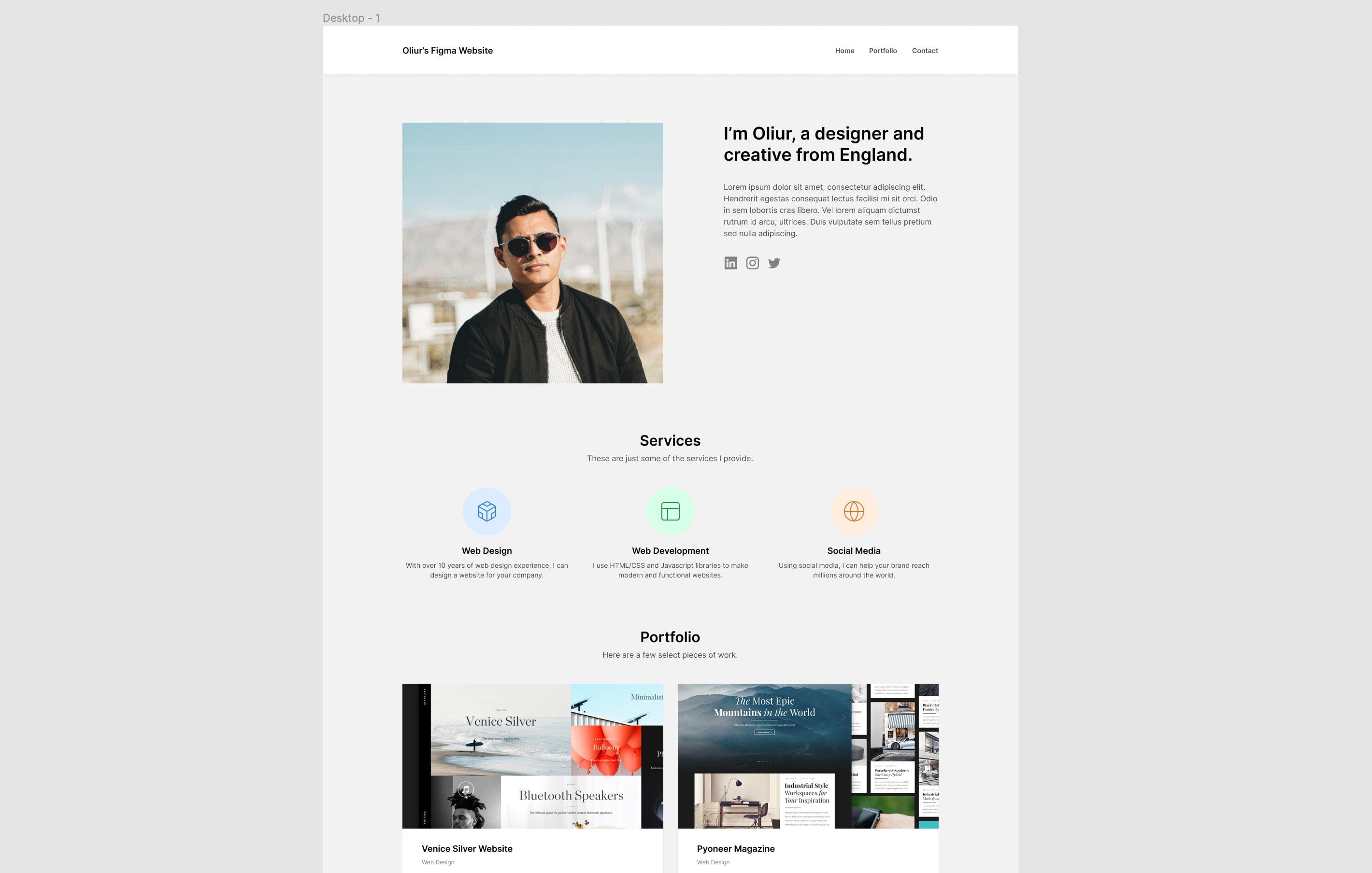
 Oliur, Designer and creator.