Transcripts
1. Intro: Hey everyone, all your hips. In this class we'll be
going through how to take great pictures
with your iPhone. I'll be going through how I take them, how I compose them, how I edit them, and
their settings that I used for my iPhone when it comes to taking those pictures. Let's get into it.
2. Setting Up Your iPhone: Let's start with setting up our iPhone using the
settings that I use to take great patriots will have a
different setup depending on the iPhone that you have at the time of
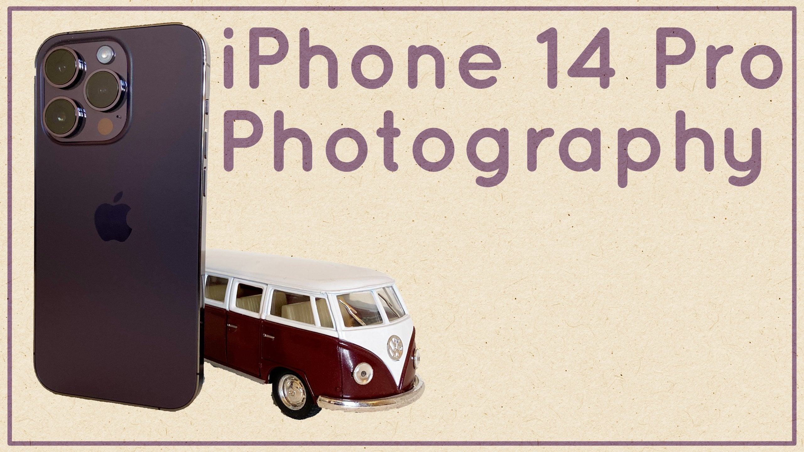
making this class, I'm using the iPhone Pro. This has a 3D camera setup. It has wide, ultra-wide,
and telephoto cameras. My personal favorites are
the wide and telephoto. I don't actually use the
ultra-wide that much at all. The standard wide camera is usually the best
camera on the phone. It will have the
best lens elements, bigger sensor, and
a better aperture. All of this usually leads
to better quality pictures. It's the camera I use
mice and it's the one that I would recommend
you use also, I only usually use the
telephoto when I'm outside and there's a
lot of light pro-war, so I pretty much exclusively
shoot in RAW on my iPhone. You can find the option for pro Rob are going into Settings, camera and then formats. And then you'll see an
option for pro-war. Apple says in the settings what Pro is and it's
exactly why I use it. Pro-war gives you bigger
files that contain more data, making it easier to make
adjustments to the images was also giving your
images more dynamic range. These files also make it
easier to adjust the colors to my liking and edit
the picture how I like, which we'll go into later on when in the camera app itself, I pretty much leave
everything else on auto. The iPhone is pretty good at figuring things out on its own. All I made sure to do is have the option enabled at the top.
3. Shot Composition: Shot composition is
the act of arranging elements as subjects in
your photo to your liking. The great thing about this
is that there is no right or wrong when it comes
to composing a shot. The great thing about
taking photos is that composition can be
erased however you like. Whatever you think
makes a great photo. That's what makes
photography unique. Everyone has their own
way of composing a shot, but I'll be sharing how I
compose shots in this class. First thing is making
sure I'm shooting in a scene where there
is a lot of light. I find cameras always do a much better job
in lots of lights. So shooting in daytime is
ideal for the cleanest images. I also like to use natural
light as much as possible, shooting indoors or under
fluorescent lighting, most of the time
doesn't look great, so I avoid it as much as I can. I like having a central subject
or element in my shots. You've probably noticed this from looking at my
other pictures. There's definitely a sort of
focal point of the image. I love to use leading
lines when shooting interiors, architecture,
and landscapes, which means trying to angle the phone to have whatever is in the center as
straight as possible as you can see from the
shots of Tower Bridge. I have one of the main arches in the center and straight
through the frame. Here's another shot
of a sharp interior. I'm stood right in the middle, but all the lines from
the shelves to the flooring and the
ceiling all lead to a central point in the center of the frame
where shooting a product, I also usually have that
in the sense of the frame. I try my best to
have backgrounds that aren't distracting. Usually clean
backgrounds where there are muted colors and tones. If there was something bright
colored in the background, it can end up becoming
quite distracting. Here's an example of a
shot of another iPhone. The background is
super clean and muted, only black and white, making the subject really
pop out of the frame. Here was another example
of a shot of a bottle. If I were to redo this shot, I would actually
remove the glass on the left side of the frame as I find it quite distracting, I wanted to show actually
what it's like to compose a shot using
leading lines and stuff. Everything that I mentioned. We're on a road here. And I just think to
myself This is perfect. If I stand in the
middle of the road, I can get a nice
composition with the buildings on either side
and with the O2 at the end. So you can see how
nicely complacency as we sort of just in
the middle of the road. I'd probably use three
times here. There we go. Take the shot. I'm just trying to think of another
shot that we can get now. I'm trying to think of good
focal point for the image. Like I said, I like
to have a sort of central focal point when
it comes to my images. So yeah, we're pretty
much by the water. I've got the buildings
on the right, I've got the cable car
thing on the left. And then there's a part below. You can see down below
I have the stairs. I'm trying to get the stairs
in the middle in a way. Like so. And now we have our shop. Like I said earlier, when it
comes to composing a shot, it really does come down to what you like, what
you like, the look of. I would highly recommend
looking at other photographers, seeing what types of shots they take and then try and
replicate them trying to, trying to do your
own version of them. Then over time, you're
going to end up learning how to compose a shot.
4. Editing Process: So now that we
have our pictures, it's time to edit them. And I added all of my
pictures on my iPhone. While I said Hold my pictures, all of my iPhone pictures, I edit them on my iPhone. And the app that I
use is Lightroom. Lightroom for mobile. You can use the free version. You don't need to use
the paid version. The paid version that obviously has a few extra features
here and there. But most of what
we're going to be doing can be done in
the free version. The main reason I use Lightroom is because I
feel like it's actually a good sort of app for
beginners and professionals. If you're someone who's
new to photography, need to photo editing. I don't think it's too daunting. I think it can be quite
easy to understand and use. But if you're someone
who wants to become a professional and really get
deep into photo editing. Lightroom is definitely one
of the apps to go with. Now, we don't have to go
with Lightroom. Of course. A lot of the stuff
that we're going to be doing can be done in other apps. Most fighter editing apps
are very similar these days. They all pretty much
do the same thing. But a few of the reasons as
to why I use Lightroom is because my photos are synched between my phone
and my computer, my presets as well, our sync between my
phone and my computer, my presets you can find on my website and no
pressure or anything. But the presets just
make it easy for me to apply self-consistent looks
across different images. Lightroom is also
constantly being updated with new features
and functionality because obviously there
is the paid version behind it is going to be a surface that's
going to keep going, keep being updated, having new features and
stuff in the future. So I'm willing to invest
in this platform, have my photos on there. And yeah, just makes it easy
to use Lightroom because of how integrated it is with
my phone and my computer. I'm going to be editing some of the pictures that
you saw me take. And I'm also going to be editing some other pictures that
I've taken in the past. So let's start with one of
the first pictures that I took of the I2 down the road. As you can see in this image
already looks very good, but I'm going to make a few
adjustments here in there. Let's go into my presets. And you have a bunch
of p sets here. We can try a bunch
of different ones, see what we like. The look of I quite
like that one actually. I think that one
looks pretty nice. Now that we've
applied that preset, Let's change the lighting and exposure and stuff
so you can see the highlights are
already quite low. The shadows are quite high
and these are most of the adjustments
that I would make when it comes to the lighting. Exposure contrast highlights
shadows, whites and blacks. I usually adjust exposure contrast highlights
and shadows the most. I don't touch whites
and blacks that often. I might do sometimes, but it's mainly exposure contrast,
highlights and shadows. And I'm hoping most people
understand what they do, but we'll quickly run through them so you
can get a good idea. Exposure brings up the
overall brightness of the image as you can see, as I'm sliding, really makes
the image very bright. As I slide it down, it
makes the image darker. But we'll leave
that where it is. Just double tapping
to lever is contrast. I think a lot of people
understand what contrast does increases the difference between the whites and the blacks. If we got it all the way down, you can see there isn't
much contrast in the image. And then all the way
up just a bit too much contrast and
then Highlights, highlights in
particular targets, the bright parts of the image, as the name suggests. You can see if we bring
up the highlights, it really makes the whites
very bright and sort of almost gets rid
of them anyway, so blends them together. But we don't want that.
Because I've found that pro-war images on the iPhone always seem to have
very bright highlights. I'm not sure exactly
why, but luckily, because it's a pro-war image, we can bring down
the highlights and bring a lot of that data back. And that's the
benefit of pro-war. There's a lot of data
when it comes to the bike parts and the
dark parts of the image. Same with the shadows here. We can bring up the shadows just to bring a bit
more detail back. Like so, There we are. I think I'm actually very
happy with that image. As you can see when it
comes to these edits do go for very limited edits when
it comes to my pictures. I'm not looking to make
anything super drastic. I'm not looking to change
the colors too much. I do try and go for sort of natural muted look when
it comes to my images. If we look at the before, you can see this is what
it looked like before. There is a bit more
color. There's also a bit more contrast. But then if we
look at the after, we can see a bit brighter, a bit more sort of
minimalists looking, you could say muted
looking, as I mentioned. But I like it. We might actually adjust the
temperature a little bit, maybe make it a bit colder. Like so because I
like my images having a sort of cold and
cool look to them. If we do the next image, we do this one here. Go through my presets. Maybe we will try a
different preset this time. Let's have a look. Let's see what we've got. We just use the same. Let's
go through them very quickly. Let's have a look. This one, yeah, we use this one. What we'll do is
we'll bring down the exposure like
say, There we are. The highlights are
already quite low, shadows are quite high. And you know what, I don't
think I would do much else. And maybe we'll
lower the contrast, bring it down to minus ten. Maybe we will also adjust
the color later but make it a bit cooler again, like so. And you know what? I'm actually pretty happy
with that image already. You can see again, array
metered look to it. If we look at the before,
that's what it looks like. And then the after,
before, after. Quite a big difference
to the image. I quite like it. Let's do another image. We'll do this one here
because I think this one does a very good job of demonstrating what pro-war is capable of. This image, to me is too dark. I need to make it brighter. What we can do is
we'll first add one of my presets will
add, glad this one. We've brightened up the image, but the shadows themselves
to lack detail. What we'll do is we'll first bring down the highlights
because the highlights, I think are a bit too strong. Maybe we will bring down the
exposure as well like so. Then we'll bring up the shadows. As you can see. Bringing up the shadows
really brings back the detail of the black
parts of the image. If we set it, you can
see the bag itself, the top kit in the middle, just looked a bit too dark. There wasn't much detail there, but bringing up the
shadows were brings that detail back and just makes
it look much better. I would say I think this
image is a bit too warm, so we'll bring down the color, maybe make it a bit cooler. Not too much like so. Very minimal editing. Like I said, I don't want to
move the sliders too much in either direction because then
it just looks a bit too, I guess tacky tacky is the
best way to explain it. Like I said, I like to go
for minimal adjustments. There. We already
have our final image. If we look at the before, we can see quite a dark, it doesn't look
very clean image. And then after we can see
a much brighter image with the shadows adding
more detail as well. We'll do one more
of my living room. This is my liver, him at home. We'll apply one of
my presets again. Let's go through them very
quickly, like that one. Oh sorry, six already looked for a good will bring up
the exponentially. Now you weren't being
able to exploit you. I think their exposure was fine. Bringing down the
highlights quite a bit. Maybe bring up the
shadows a little bit, make the image a bit
brighter in that way. I liked the warmness
of this image, so I'm not going to adjust
the color temperature. But yeah, I already really
like to look at this. It's really brought out the
richness of the walnut, the shelving and
the coffee table. If we look at the before, we can see the walnut
just looks a bit dreary. I'm not gonna lie and it's
not really representative of what it looked like when
I actually took the picture. But then if we
look at the after, just looks a lot better, a lot nicer in my
living room looks a lot brighter and a little more
homely, you could say. Um, but yeah, that's it when it comes to my editing process. Very simple, very clean. I'm just trying to
go for simple edits. And I don't want to make
too many crazy adjustments. But I think it does
a really good job of highlighting what Pro is capable of shooting
and protocol, which just gives me so
much more flexibility when it comes to their
changing colors. Adjusting exposure
contrast highlights, shadows, all that sort of stuff. So you don't always have
to worry about having your picture looking completely perfect when he
actually take it. You can't bring it
into Lightroom, adjust it and make it
look the way you like.
5. Outro & Project: That's it for this class. Hopefully you've
learned something when it comes to
iPhone photography, taking better pictures
with your iPhone. For the class project. Please take pictures
with your iPhone. Please take roll pitches
with her iPhone, edit them, and then
share them with me. I'd love to see what other
people come up with, how they edit their pictures, the other types of images that
other people come up with, That's the great thing
about photography is such a broad landscape
when it comes to Stalin and imagery and
just artistic choices. I just have my one-star when
it comes to photography. But I really liked seeing other styles when it
comes to photography, I like seeing what other
people can come up with. So please submit
your own photos. I'd love to see them. I love to see what you can
take with your iPhone. Hopefully you guys enjoyed this class. Thanks for watching.
 Oliur, Designer and creator.