Transcripts
1. Intro: everyone. Mining's olia. I'm a designer. You are UX designer I've been designing for over 10 years now. I've had the privilege of working with various different companies ranging from small local businesses, multibillion dollar companies. In this class, I'll be starting with a blank slate and showing you how to design a personal website and put a lot of designers do make it look easy because they've been doing it for a while. But I want to show you how easy is as well, and I want to show you step by step, how I get it done. This class is ideal for beginners and anyone who is interested in design, so I hope you guys enjoy. Let's get into it.
2. Getting Started: right. So before we get started with anti one to download fig, MMA, fig MMA is free. It works on Mac on Windows. I've chosen figure Mark because it works on Mac and Windows eso that I'm not sort of limiting people to one operating system. I'm actually new to figure myself, so I'm learning as I go, but it's very easy to pick up their easy to use. You know, if you're stuck on something or want to learn a specific tool, they're sort off like resource is help center away, that's all. Stuff is very useful. I usually download there. Where is it? I usually download their desktop up, even though you convey is ein in the browser. I usually like to use the desktop app anyway, so, you know, once we've done loaded fig MMA, we can open it up. So here we are with figure my open. I've got a new document open here is well on. You just want to familiarize yourself with what you've got in front of you. So, you know, we just have sort of like your options and stuff. Here we have the moving scale. We have frames, lies just your regular soft tools that you need Teoh to get designing. Basically. So to get started, we're going to make a frame. A frame is basically a space where you're going to be doing your design, making your design once you've actually selected a frame. So when you click this button up here, you can choose different sizes on the right. It's on the right, you know, we can choose find tablet desktop. We're gonna go it. I stop 14 40 by 10. 24. And this is what we get in front of us when we choose one of those friends. Now, first things first. I want to make a grid so that I could basically align my content. Alarm my design to a great to do that, we simply go over here where you see layout grid on the right hand side. Press on it and we'll get a new quit. However we don't actually want. That's off grid. We want columns. So here we have a bunch of columns. Now, now I'm going to give my columns 12. Say the number 12 I will say, going tohave it centered, and I'm going to give each column a week off in 65 on a gutter with off 30. This is what I like to work with. You know, you can choose whatever grade you like, but this is what I like. This is what works for me. And this basically just gives me a salt content area to work in. And I have 30 pixels between each column, which I like as well, I should I gotta press enter the guy. So he pixels between each column and yet gives me good spacing for my content. However, before we actually get started on what we're designing today is a good idea to have a wire frame, a sort of idea of what you'd like to design an idea off what the page should look like. So I quickly made a wire frame here that you can see because we're making a very simple personal website. You know, I have sort of nap bar at the top with the logo navigation links. I have profile image heading description. Then I have, like, a services section portfolio section and then a fitter where I'm going to have higher me short description contact buttons, So yeah, very quickly. Put this together I usually actually have a good idea over. I'm going to start in my head. I don't actually usually make wire frames, but if wire frames help you, please do it. Having a wire frame to basically just illustrate We're going to be designing before you really start designed. The high fidelity version come really help. It can just sort out your soft thoughts and make sure you got something down on paper. So that's it for this one. And the next one will. Actually, it started with a design and taking a wife for him into a high fidelity design.
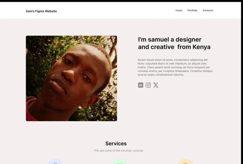
3. Nav & Hero: so welcome back. Now that we're going to actually start in the design, let's go back to our wire frame and have a look at what we're working with. So let's start with the header on dis off heading section the hero section here. So what I usually liked it is I because this is obviously in my protest. My design, you know, is what I like to do. You don't have to follow it exactly. But what I like to do is I have a card based design that I like to use quite a lot, So we're actually going to give the background a color. So when it comes to the color, I'm actually going to use one of the default colors that you find in Fig MMA. You know, I do you have a color system, but I just want to make it really simple, really easy for you guys. So we weren't going to color system or go Teoh the color section here, choose personal colors on would just use this color as our background color, and then we'll create a rectangle. So I press are on the keyboard. You can also press up here, so you can actually see the shortcuts here for the shapes, rectangle, line, arrow You know, whatever you need. Basically. So it would create a rectangle stretching all the way along. And what I like to do is I like to get the rectangle color off white. Have you guy Andi also give it a drop shadow? So let's give it a very subtle drop. Shadow will give it a blow of two. Give it a Y distance off one and then give it an capacity. Well, yeah, I pass it, er five, every guy. We'll also actually hide the layout grid. See it There is Powersoft header section. So next we're going to add our logo. I'm actually just going to add a text. Lego Teoh, secret text foodie just pressed the text button on the top and we won't actually make sure that this is within our grid. So if we quickly just put in our like I swoop in, we'll use fig, my website. Just make it easy. Just a simple text leg. Let's see our grid again. Hope getting wrong layer on their guy on. Yeah, there we go. We can see that it's now aligned with the grid so most of the content is going to be aligned within this grid. This layout grid they see. But I don't see the layout grid as a rule. It's only a guy, no rule, so you can break out of it like I have with the header with the background header with a header. Background even. And you could break out of it when it comes to light, full whip stuff, images and things like that. But it's just a good way to make sure that, you know, have margins and spacing and stuff. That's why I like to use a layout grid. So let's hide the lower court again, select our frame and then just pressed that to hide it. When it comes to fonts. One of my favorite funds that I like to use his Inter se in tow, I think just looks fantastic. It's a free phone as well, and it's specifically designed for Web design. You I design APs like interface design or that sort stuff, and I think it just looks great. So we'll change the size of it to be a bit larger. Gotta get my layout grid again, actually, so I can make sure it is within the layout. There we go. Maybe it will give it some weight. Semi boat will make it have a guy looking pretty good already. When again? When it comes to the color of it, I think is a bit too dark. Maybe give it a bit more of a great color. Yeah, I like this color here. I think that kind of looks break. It actually might make it darker. Give a hex code of one. Next thing we're going to do is add our navigation so we'll create a text again, and then we'll add home is one of them. Well, uh, portfolio as the other, um, And then also contact. So I'm simply copy and pasting these, you know, control, Copy, command copy. And then command V control V. Just Teoh. Create multiple text or texts or boxes. Um, would change the front size. So I'm selecting all of the layers. Holy shift. And I'm setting on the layers because I think the front is a bit too light. Will make it 14. Yeah, 40. Nothing looks pretty good. We'll also change the color of it. Teoh A lighter grey. Yeah, I think that is looking pretty good. So one of the useful tools with a designed to like figure is that you can actually automatically align all of your items. You're never items to have same distance to be vertically aligned or that sort stuff. So we're going to select all of those layers, and we're going to use this tool here to align the vertical centers. Now they're aligned. We're also going to use this tool here. Toe tidy up on this will give each of these items and equal mount spacing the equal amount . Spacing is actually here the number 54 pixels between each of them. But I think that's a bit too much. Let's bring it down to 30. And now it will give 30 pixels between all of them and we can align it to our layout. Great. And there we are. That is the navigation header. Pretty much done. So obviously, is a good idea. Teoh organized all of your layers. That's what we're going today. We're going to group this selection. I'm going to call it now. Bar. There we go. And yeah, I think we've made a good start so far. Looking pretty good. Next thing is, we're going Teoh drag in an image. So a profile image or whatever it may be. So here I bought in an image of myself. Very little idea. Media myself will change the width of it. So something like 500 quickly, just that weekend. So gauge the size with and the rest of the page rather than having it take over. The whole page will get the layout grid again on what we'll do is we'll re size this so that it takes up a specific number of columns. So I'm going to hold shift that I'm gonna get the corner of the image on and drag it, Teoh, I think 5 40 years what it should be. Yes, perfect. Now is taking up six columns. I'm on this side. You will have our text. So while my also do is actually make the corners around it, which you can do very simply by using the sort circular Icahn on any square, any image, whatever it may be, we can also quickly hide and show a lower grade by using control. G. That's control G on the Mac. I'm not actually complete. Surely is on windows, but I'm sure it's very, very similar. So now let's get our image and bring out to the tops that we align it. And let's make sure that the spacing is is even so. For example, I'm going to bring it down by 100 pixels. What? I usually like to get a hold shift, and then I press down on the Iraqi 10 times. So 123456789 10. So now we have 100 pixels off space between the image on the navigation bar. Next, let's add some text. So let's get layout grid again that we can see our text where text is gonna go. So I think the text might actually be a bit too close. If I put it, anything picks his way, I'm actually going to put it a bit further away. So I'm going to add text here going to make text box, and then I'm gonna put something like, um, hey, actually, let's look, will you? A designer on creative from England? Let's just do something like that. Very simple, very easy. Let's change the side of that because it's heading. Wanted to be large and prominent for my people to Big 36. Looks pretty good. Sweet. Let's hide the grid again. I think that's already looking pretty good. Uh, let's also add some dummy text. I'm actually just gonna control copy and paste. This going to give it three pixels off spacing from above. Then I'm going to put some dummy text in here Now. A plug in which I'm going to use to add the dummy text is a public called alarm. It's, um Now I'll quickly show you there plugging that I've got installed for fig MMA. So if you go Teoh there, I can appear in go to plug ins and you can see any plug in its that figure mankind has available. You could see the ones that have been stored. I have material design icons, feather icons on Laura maps in those of the only plug ins have installed. So let's go back to our document design on. Let's use the alarm. It's lay out their guy, select some text layers. Here we go. Um, begin yet close pocket. Yep. Uh, generate every guy. Cool. Let's make sure our tax obviously isn't way too large because it kind of is to larger. Let's change the front size Teoh. Let's change it to 16. I think 16 would be better there also. You know, it just doesn't look right. Text, usually body text just doesn't look right when it's unstylish. So let's change this Teoh regular. And then let's change the color because I don't want it to. So be as dark as the heading title. So let's give it a lighter shade of gray, but it still looks a bit off on the main thing that lives off is the line height. So to change the line, I we're going to choose a text, and then we're going to choose who we got line height. So let's change that. So currently the line high is 19. Let's change it to something like 22. We can already see. It looks quiet. Better maybe 24. Yeah, There you go. I think that just looks straight away much easier to read. Obviously, it's no in English, but it's just much easier. Teoh read much more legible looks cleaner as well, so we could actually lead this up here and lead that there may be it. Let's put in some social media icons. So here I've just dragged and dropped some social media accounts that I've put off the Web . Very simple. Let's change the size of them. I'm gonna change this 1 to 30 Jane that 1 to 30 as well, very good and then changed it to Tricon's 32. There you go on. Then let's change the distancing between them. But I think it's a bit too much a shaved out to 20. Actually. Don't think that's still a bit too much. Maybe 15. Yeah, I think that looks a little bit better now. Let's drag it on me alone. They're not the same because padding between them, let's change the color because I think it's a bit too bright. Say we can change it to something like done. There we are. So that is the soft navigation by hero section. That's it for this one, and the next one will get started with the services section
4. Services: So welcome back now that we have our bar on heroes Off section finish, let's do the services section. But we also want to make sure our items are actually folded and grouped together. So let's do that quickly. Let's call this the section. Actually, just we can remove section. We don't need section that we could just call it here. I know we got cool. So we actually want to make our frame bigger so we can select our frame by either clicking here or kicking up here. And then we simply just drive it down and make it bigger. We'll make it quite a bit bigger us that we can feel off our content. There we go. Nice. So now we're going to make our services section. So when we go back to the wife and we could see we have services short description. Thes circles are meant to be icons and then the service whenever is on a short description off that service. So let's put in the heading services. Let's bring it into the middle and let's bring it down 100 pixels. 123456789 10 Have you got just so that is an even amount compared to the hero on the nut bar. Also, I think this fun is maybe a bit too big, too. So let's change the size of this. Change it, Teoh 24 actually, 24 I think might be a bit too small. Let's change it, Teoh. 30. Yeah, I like that. I think it looks better already. Court centered it. And then below it will add a services description. So we'll change the front size of this as well. To 16? Yeah, the guy. Change it to regular change the color to a lighter. Grey. Something like that. Every guy. Now, I could just put in a quick description, something like that. Now we're going to be putting an icon, so I'm going to be using one of figments plug ins. I'm going to be using the feather icons tool. So here we are, with the plug in my pond will put in maybe something like So I'm not gonna be very like to solve. Picky about making sure that I can't matches the service because, honestly, I'm just doing this. That's demonstration by, like, this icon. So let's bring that in Here we are. We have it here. Make sure that that icon is in our frame. They have a guy. Let's make it quite a bit larger. I think it's a bit too small. Let's bring it up. Teoh, 48 and with way, want to keep the size the same hope. Yeah, we want to constrain the properties of it, says here night constrained proportions even not properties and change the icon size hope made it to small 48. I still think that icon is a bit too small on usually with icons like this, because it's not very detailed. You shouldn't actually make them too large. So the best way to solve make them take a bit more space is to add a circle or a shape or whatever. It may be behind it. So I'm going to add a circle behind it like this Muda layers so that it's in the middle above even and then align it and we can already tell that's making a massive difference. Now let's get that circle a very light shade off, Great, something like that. And then let's give it a color. Maybe we should choose one of the colors that they have here. Actually, what used to start flew from what we'll do is we'll give the background of the circle. Ah, light blue color is, well, something like that. I think that looks pretty good. Nice, quick that, um, call it just icon, something like that. And then we'll add in a service. So we just put something like Web design. Have a guy. I want to give it 20 pictures off, banning from the top. Make it a bit larger. Maybe make it 24 not 24. Too big. Let's keep it at 18. We also want to get our grid up again because we want to make sure that we have everything allying properly. So because we have talked 12 columns and we're making three different services, so sleep each column is going to kill. Each services section is going to take up four columns. I say. Let's change the width of this so that it takes up four columns, every guy and then that's center. The icon to that will make the icon will make the service heading semi bold, and then we shall give our service a description. So change the front size, too. 14. Rami's the weight and then give it a lighter. Great. Um and then we can I d in any sort of description with over 10 years off when design experience, I can design a website before you company. My copyright skills aren't the greatest, but hey, I'm trying to do this as quickly as possible. Really? Don't spend too much time on making sure that it's perfect. So we want to make sure is, well, that the line height again looks right, because right now the text just looks a bit too compact. So we're gonna up the line. I it's a default off 17 will make it 20. Never go or what he looks much, much better. So that's our first services section. Will group. It will call it service, and then we shall copy it and paste it and then bring the next one into the middle like so , uh, very good. Make sure it's aligned sweet. Next one, we could do something like Web development, and then we compare something like I use hace email CSS Java script libraries to make more than and functional websites. What would years will change this icon so again. We'll get the feather icons plug in, and then we'll find maybe a relevant icon, something that should looks cool. Uh, what could look good? Oh, I like this one. That's perfect, actually. Site, let's bring it in. Appear very good. Nice. Uh, let's move the layers around. So our previous life, almost 48 when I make sure this one is also 48 constrain proportions change the size to 48 like, say, and then sent to it. Well, actually use a different color for this icon. Maybe will use green that she's green and then we'll also give it unlike shade like so cool Cu cu cu cu cu next services section must make that nice copy and paste over there we are sent to it and then we'll call it something like so sure media. Um And then we put something like using social media like in take your brand pushy. I can help you brand reach millions around the world. I'm really am making stuff up along here. It sounds ridiculous, but hey, it works So again we'll add another icon. Used the feather icons plug in on. Then we shall find relevant. I can you know what is fine? We just use this one. Every guy we'll put in the world icon they see here or globe. I can't even Onda. We shall take this Globe icon. Send to it. Remember the layout one constrain proportions resize 48. Any guy will change the color of it. Of course, we'll give this one orange, red, orange Let's give it orange and then give it a very light background like so might actually have to make it a bit darker because it's a bit too bright there we got. Yes, I think that looks pretty good. Now let's bring our services section up my service off pots, bring them up and then we'll give them 50 pixels. One Teoh 345 50 Pictures of padding between the title description section and there we are . That is, our services section is good. All together quickly. Sanders is sweet. So that's it for our services section. That's it for this one. In our next one, we're going to be handling the portfolio section
5. Portfolio: I say, Let's create our first portfolio item. So one thing I noted with what with my wire frame is I have the portfolio item, but there's no sort of title description of what it is, so I'm actually going to design it in a card sort former like I did with the Navajo. The top. So well, first a copy. Either the text, the title and description from services, and we'll bring that down here. There you go. Make sure that it has 100 pixels. Air padding from the top. 123456789 10. Cool. And then we shall see. We name it put for the I another going to select description. I feel select pieces off back. Cool. Who? My spelling is correct. I always get pieces wrong sometimes just one of those words where you don't know if that I go first with you guys first. So let's make our first card. So going to hit our to make a rectangle most are going to show occurred again to make sure that we are within the create on it looks like in the Andes. Take up six columns so it's gonna be 5 40 with the height, Um, let's actually start with our image. So if we make the height of it 300 very guy, I think that's looking pretty good. And then we give it a white background. Actually, have just the background. Doesn't matter because we're going to be putting an image in here. So I'm just going to pull some images from my own dribble portfolio. Let's pull this one, for example. That's just copy this image on paste it in so automatically Fig Maher war. Basically feel that the rectangle with your image, which can be very, very useful. So I basically just masks it easy to go straight away. Easy to you straightaway. So that's our portfolio image, but we want to add a title description at the bottom. So, um, I should going to add another rectangle. Make sure it's aligned with the image of a guy, and I'm going to put it underneath the image, give it a white background, and then again, I'm actually going to give it a shadow. So a drop shadow give it up, allow to a Y axes one and then give it an I pass ity off 5%. There we go. I quite like the squared off look, but it doesn't match my profile image. So I'm actually gonna go back to my profile image and remove the radius. Just so you matches better, I think it looks sharper. And I'm going for a more sort. Serious look. Rounded corners definitely give you more of us are playful. Look, I I found. So now we're going to add our portfolio item title. Let's make a text box text type on text layer and we'll call it. What did I actually call it? My job by phone. I just call it magazine Block Template will call it Venice Silver website. You know, just because I'm just taking off what I see here. So we're also going Teoh, make sure that it's aligned properly. So let's give it some padding, so we'll give it 30 pixels from the left. 123 and then they pictures from the top 23. I actually think it could do with more padding on the left, so we'll give it one more. Well, 10 more pixels from the left. Very good. We'll make it bigger because I do think it's a bit too small. Will make it 18 or the Texas actually allying. Teoh be in the middle Texture line center lesson texture line left. There we go. And then that's trying to front sight because any will stick to where it is. Give it some weight and then we're going to copy paste this text layer. I'm giving a category something like Web design, and then we change the fun of that. 12. Removed the weight. Change the color to something quite like every guy. And then we'll bring it down. 10 picks Source. Change this so you have it aligned. And there we go. We have our first portfolio whiter. Now let's put it all into a Greep because we want to make sure that our layers are all sorted nicely. That's cool and portfolio item, and then we can copy and paste this over. Bring it over and make sure that is in line. Toe agreed it is, and we have our port filing item. Now we want to change this image so we can choose image likely have here, or we could just get another image and copy and paste in. So let's do that Let's take this one could be image based. Oh, that's not What Copy? Image paste. There we go. Now we've pasted our image in Actually change the way, even crops the image within the square in the rectangle. Bet I'll leave it. How is how it is? There we go, and then we'll rename this one as well. We'll call it something like Pion e magazine. We'll leave the Web design section and then let's finish it out by creating female what to more put 40 items. 123 Make sure that it's unlined and has an equal amount of padding for this portfolio. Items will actually put in a photo, so let's put that one in. There we go. Then we'll put in something like iPad 30 a case rename this to photography Sweet and then let's do one more. So to quickly show you how mighty changing the image here, I'm actually selecting this rectangle here. You can see it selected on. Then I've command copied my image from my desktop, and I'm literally just put in command V on or control V, and it just replaces image. Very simple, very easy figure makes it super easy to your stupid place images whenever you need works. Base set up. I have a guy. So that is it. We have our portfolio resection done this major ways aligned probably from the top. So 12345 Cool. Let's make choice within our grid. It is. And we are done with our portfolio section. Let's make sure this is also in the center away. That wasn't actually in the center. There we go. So to make sure your item is in this state center of a page, you can just select it and then use one of these tools up here, align it, tear the page or to align it with another item. So that's it for the airport for actually, we need Teoh. This group our items as well put five and there. Yeah, we have our portfolio section done. So that's it for this one. In the next one, we will design the fitter
6. Footer: Okay, so welcome back. Now that we have a good portion of our website down. Last thing to do is that foot a section. So the fitter has the large background. Has Jaime Section armies are title short description and then in contact button. So let's make our frame much larger. Let's give it a rectangle. Now we have our fitter. And then let's make sure it hasn't same out space from between the other sections. I've actually just realized the portfolio exception does not have 100 pics sorts. There you go. That's better. So, yeah, let's make sure it has 100 pics with Phoenix Section 123456789 10. Bring it down 100 pixels and then let's give it a dark background color. It's got even darker than that. Must go down to somewhere like they're never going. That's also copy our hex off section headings from the other sections say we also need to make sure that's legible, so we're going to change the text color like say we got and then let's bring it down by what he's done. I don't even know. Actually, let's bring it down by. I think you should bring it down by 50 money to bring it down by more. Maybe 81 2345678 Yes, I think that looks better. So let's change this. Miami Very good. Me for you. Next project there. We cool. Now we want to add a button site again. Put in a rectangle like, say, Doesn't need Don't need to be too fussy on the size and whatever else it may be for Button . But let's put in a color for the butter. Yeah, I like I like that color. Maybe. God, one night let's put in contact me. So this all seems in very legible, so we're going to make it white. Andi, make it a semi bold like, say, that's also make the button a bit wider. And then the center text within any guy. Cool, I think. Yeah, well, keep the square design. I think the square design looks pretty good. What we could also do is even though we have a contact me button, but could also put a silence. 123 Yeah, we could also put maybe something like download my regimen underneath. Sigh. There we are change the font size Teoh 12. Yeah, maybe making regular on. Let's change the color as well of it something like that. They we are So there we are. We have the foot of done and that's pretty much it for this off very basic personal website . Hopefully it gives you a good idea off my salt worked late process and how easy it is to make something you look, you know, pretty simple. Minimalistic, Also good at the same time. You know, you don't need to make your portfolio super fancy ads, all sorts of animations. You should mainly make your work do the talking for sure. So I would be guys enjoyed this quick sough personal website Design guide hopefully gives you a good insight and overly, you know, if you are interested in getting a design, that's a good way to start because I think the best way to learn that she makes something Thanks for watching this would be guys enjoyed it
 Oliur, Designer and creator.