Transcripts
1. Introduction to the Course: Hey friends, welcome to this course. My name is Samira and I am a UX and product designer. I've designed this course for beginners who want to learn sigma for UI UX design. In this course, I'm going to take you on a journey from the client's requirement to understanding what is a wireframe, which is the requirement which is illustrated. And then designing this website absolutely from scratch. We're going to use the learning by doing methodology, which means that when I'm creating this, you can follow this exact design of the course. And vile you are doing that, you will learn all the features and functionality of sigma. One suggestion which I would like to make at this point is to do this course and practice side by side. If you have two monitors like this, then you can fire a Fichman one monitor and use the other to run the course. If you don't, you can use a mobile or a tablet and run the course on the mobile app and use your computer to work on sigma. I'm very much excited for your journey of learning sigma. I'll get this introduction short and let's begin. See you in the next class.
2. Setting up the environment: Let me jump into actual learning. Let us set the environment first. I want to bring your attention to two files, which I'm going to reference in the links of this lecture. So one is the workbook file, excellent study abroad. The workbook file. This is the file is something that you are going to use to work with. It has the client brief, it has the wireframe. I've provided the wireframes so that it becomes a little easy for the final design. And then you will get workbook areas to make your own color palette to set the own typography. I also included the images over here. And then here you can start the actual design. And the second file which I have included in the resources section is the reference file in which this is the file which I have used to make this design. So you'll see this color palette which I have designed to work the course the same, which you can also design with me. You can see the topography, which I've said, and you can see the final design into this. So basically I have provided two links. So what I wanted to do is to click on a link. So that's something like this will happen. So once you will click on a project link and you just enter, first of all, you are required to sign in with FISMA. Fisma works in a browser. Fisma has application as well. I will recommend you to download the application. So ok, so once you have clicked down the resources, something like this will open. It has meant to be a view only file. So this is the workbook file which you have. So what you have to do is you have to go over here in the bill only section and you have to duplicate this to your drafts. So by this, what will happen is when you duplicate this file, this file is copied onto your fig my drafts and it becomes a part of your recent files or any project which you currently have going on. So I'm just going to duplicate this to my drafts. And once that happens, I can just open this. And you will see that it has now opened and this is completely editable. It has small guided approach as well. I can just ignore that for now. But then I will be able to make changes to the way I want into this file. So basically I want you to use these links to get to the files. Alternatively, I'm going to download the files and also provide a zip file so that you can physically download those files and maybe even upload them or import them into sigma. Okay, then I think this is enough for setting up the environment. See you in the next class.
3. If you're having trouble with importing files: The alarm off, you are not able to open the workbook file after downloading it from the previous lecture. I'm trying to find a quick solution for that. But in the meantime, you can always use the links which are provided in the previous lecture, as well as this lecture in the description to directly open the workbook file or the reference file. As you know, for sigma is online collaborative tool. You do not need to download the files and import them exclusively. You can just use these links and get, get to learning all the best.
4. HELLO WORLD: This lesson we're going to explore the very basic features of sigma and tried to understand the sigma user interface. But before that, I want you to ensure that you are using this file, which is excellent study abroad, the workbook file. For the sake of repetition, I would just like to tell you again that this is going to be the file that you are going to use throughout the course to design. For example, this file has these pages over here. It has the client brief, it has the wireframe, the color palette. This is just one structure. You'll be able to follow me in the goals and create your own color palette. Same for typography, some images. And this is going to be a blank canvas where you design. So I want to urge upon you to keep this file open and just follow me and let us try to understand the fig, my interface. When we learn coding, the very first program that teaches is that of hello world. Hello world is nothing but just a simple introduction into the world of coding. We are going to do something similar for design. So far that I want do design just a couple of screens off an app. And I'll try to use as much as the features as I can. So let's see. I'll introduce you to sigma. So this is the entire workspace. This is what we have to work with. These are called the region tools. I'll select the first legion dual that is of a frame. In FISMA, the odd mode is called a frame. We have all these options on the right. For example, you can choose a frame for a phone. You can choose a frame for a tablet versus desktop presentation, watch, paper, etcetera. I will just select are the frame for the phone. Let's do iPhone 11 pro. So once I click on that, I get this frame over here, which also becomes my art board. So this will exactly look into the iPhone once we have completed the design of the app. If I can, here, I can double-click this and I can maybe read him this art. I would like to rename it login screen for now. Login screen. So for our app, which we're currently just designing for our Hello World app. This is going to be the login screen. Now, I'll go to the text tool and I'll just click anywhere, and I'll just write login. It really works very simply. It's fairly straightforward. And now I'm going to change its font. In order to do that, I can go to this design panel over here, and then I can see text. So this area is related to the, all the manipulations that we want to do through the text. I'm going to just increase the font size from 12 to 80. Once I, once I do that, you can see that the font size has been increased. I'll go to the shape tools again. I'll select the line and then I'll just casually draw line below this. Now, when I'm drawing the line, you can see that it's going pretty Hayward. But if I press Shift while dragging that, then the line kind of snaps into 4590 degree angles. Pretty cool. Feature this. So I'm going to just draw a line, right? Do make it a little, you know, have some semblance of a login screen. Now, we want to do the same thing to capture the password appeal as well, right? So one quick way to do that as I'll select both of these elements like this, I'm just going to drag and I'm going to just press Enter on my keyboard. And then we'll do just duplicate it like this. I'm just dragging it simply. And then I'll just write password over here. Fairly simple. So don't worry guys, we're just kind of tinkering with the interface. All the real learning is going to happen in the next lectures. And I'll be much more detailed and I'll be a little slow as well so that you can just work it out as you are learning. So that is going to help you build the skills as well as not spend much time later revising them. Okay, so coming back to this, now what I can do is I need to add a button over here that says perhaps enter. So how to do that? So I'm going to go to the shape tools as an actor rectangle. And I'll just draw random rectangle. So the good thing about sigma is if I'm, if I start moving this rectangle, it will just show me the guide for alignment, this red line that you are seen. So I'm just going to align it here. And I want, I ever want to change the color of this. So in order to do change the color, we again go to the design panel and we select on the filled. So once I click on this, I get to choose any color that I want by. Again, just use this slider to go through any gamut of colors. I'll choose to choose this. Okay, this sounds a lot brain, so I'll just close this. As you can see, the color hasn't been changed. For this to sort of make it look like a button, I'm going to add a corner radius. This will happen only here. I'm just going to make it late 20 pixels so that it looks like a metal. Perhaps I'll do 30. It'll give it a more rounded look. Okay, and now in order to put text onto it, I'm again going to the Text tool and I'm going to write here and and again align it by just dragging it along. And so, so far we have created a very rudimentary login screen of sorts. Now one very cool thing about sigma is sigma lets you download a lot of plugins which help you with the workflow. I'll show you how to download the plugins. So if you just go to the status bar, there is already a bar godless plugins. I have downloaded all these plugins fodder for this course and for my FISMA. So in order to download a plugin, you need to go to Manage plugins. And then if you, these are the plugins which I have installed, i'm going to recommend you to install web gradients. Quantifier and splash these three plugins. So the basic way to do that is to go here. And then just search for the plugin. Like for example, if I want to download and splash, I'll just search for this. And you see them splash plugin. Right now it's installed that my system. But if you just click on this, like for example, as you'll see such a button, if you don't have it installed, it installs in a single click. You don't have to do anything. And once you go back to your worksheet, it will be there. So I'm going to just open the icon if I plug in right now. So and I'll just find an icon, icon if I plug-in lets you find any icon. So I'll sort of download this. I really like this. I'll download this for 200 pixels. I'll close this and just place it here. Cool half. So this is how we just managed to design a very rudimentary login screen of some sorts. So let us just genes this color we can change it to. If you want to match this with the color of the button, you can just choose the color picker. You can click over here as you can see the colors changing. If you want something a little more vibrant, you can go for a linear gradient. And you can choose sort of two different colors of different families and then try to, you know, just jazzy cup, you know. Ok. So this looks cool, right? So okay. So let's move ahead. Let's design one more screen. Just for fun. We're just trying to tinker around. There is no right way, there is no wrong way for now. So I'll go ahead and now I want to create another onboard. So the way to do that is I can perhaps duplicate this art board as well by pressing Command D. And you'll see the same onboard popping over here. I can just delete this by clicking on backspace or delete whatever keyboard you're using. So in order to add one more story, and I'll go back to the iFrame tool. And I'll add the iPhone 11, Bruce green again. And now this is going to be sort of a product page, you know. So this is going to have any image. So again, there is this beautiful plugin called Splash. I'll just show you how easy it is to add an image. So I'm going to go to plugins. I select and splash. Okay, so, but before that I will just draw rectangle over here so that I can directly place my imagined to this rectangle. So I'll go to the rectangle tool from the shape tools. I'll sort of just keep a rectangle over here, centrally aligned. And then I'm going to search in this plugin. I'll search for shoes. And oh, this is great. I think I'll just use this image. So putting this image on this rectangle is so simple and just clicking on it and see you get your image over here. And just, I'll use a text field to just mention some price. I look like here. I'll write dollar 350. Sounds about right, for such vibrant shoes rate, these are Nike as Okay, so no distractions. Okay, so then I need to just make a very big buttons maybe, but it just now. So I will go into the rectangular dual Again. I'll select the rectangle. And then I'm going to again select the big rectangle. I'll round off the edges to toddy from this area. And in order to give this up color, I'm going to use another plugin right now. It's called web gradients. Gradients, and this plug-in already has a few gradients in bulk. So I'm going to just keep on scrolling till I find a plug-in that I really like. Perhaps I like this one. So I'm going to just click on this and you can see that we have got a gradient to this. I'm going to use a text tool. And right by now, I will just align this in the middle. And so we have no too rudimentary screens of our app. I'll quickly try to sum this up. I'll add one more frame through the region tools. And I'm just going to write success over here. And I'll just align this. Okay, so this is how we have just put together something by tinkering with sigma. In order to zoom in at any part. What you're going to do is you can press Z or Z and then you can just drag a square like this, and then it just gets zoomed to that area. If you want to use your scroll wheel on the mouse, you can press the command and then scroll up, scroll down in order to sort of zoom in and zoom out. And then if you want to grab this and like make it slide, then you can use the handle. The hand tool lets you just grab and slide the art boards around and you can just press Escape to let go. One of the cool features of sigma is also that fig miser prototyping. So let's see what we mean by that. So, so a user event, the user comes to this AP Hill, he or she will see this screen first and then they'll enter and go to the page. And then when they click on buy, now they'll get this success message. This is the very basic flow that we currently have in front of us. So in order to do that, I went to go to Prototype section. And then I have to just connect the buttons to the destinations. Like for example, if I want, if the user clicks on enter, the user should go to this screen rate. So I'm just going to time this art board. And if the user clicks on this button, they should go to this screen. And That's it. So now let's just review what we have done so far. Just tinkering around by clicking on the present tab over here. If I click on present, it is just going to show me the app. Let's see how it looks. Ok, so this is actually in an iPhone frame. So if I click on enter, it shows me this screen. If I click on buy now, it shows me success. So this is, this is the very basic operation of sigma. Throughout the next lessons, we are going to add a lot of nuances to this. In the UI UX design that tool. It's just one part of it. Understanding of the process is the majority of knowing and practicing UI UX design. So in the next lectures, what we're going to do is we're going to go through the process of understanding steps from the client brief to knowing the wireframe, to setting the color palette topography, and then jumping into their design. I am very much excited for your journey into sigma and see you in the next class.
5. Understand client Requirement and Wireframe: Now we will take a look at the client brief for ease of use, I have included the client brief in this page in the excellent study abroad workbook. To zoom inside the client brief, either you can press command on Mac or Control on Windows and use the mouse scroll wheel. Or there is a neat trick wherein you can press Z or Z and then just drag a selection and then you'll see it zoomed to the selection that you make. A project brief is essentially something which the client sends you, the client sends a designer. It's typically a Word document. For instance, this document speaks about the name of the company which is excellent study abroad. What is the objective is for us to build a landing page for the new company website. There are components on the hero page. It's all there in this requirement. In order to slide this, you can grab it using the hand tool and you can sort of move around the cardboard as you like. Now, this client brief has been converted into a wireframe, and I've included that wireframe in this particular file. At the end of the course, we'll take a quick ten minutes on how to make a wireframe. But for your learning right now, I think you can use this landing page Bagram, which I've included already. Let us go through the wireframe really quick. And then let's start the actual design process. I'll use z and then I'll just make a selection. So basically we are talking about the front page of the website. There's going to be a logo here. There's going to be this navigation bar. This is the copy in two font sizes to die faces. These are the social icons which are mentioned in the client brief. This means there is going to be an image here. The client has already mentioned in the client brief that they would like a photo of a girl who is college going because this is going to be like because this is going to be study abroad website. These are the services which they currently have. On the website. There is also details of some upcoming university events. These are the countries that they cover. There is going to be when testimonial and then there is this final call to action called as are you ready to realize your dreams? And then the button is apply no, for you or if I go to the client brief right now, you'll see that exactly all the things are covered in this. I've used this very client brief to create that wireframe. And just to give you a glimpse of what is going to come, if you open the excellent study abroad reference sigma file, which I have given. So this is the final design which I've created from that wireframe. And this is going to be the entire glass all about, wherein you'll be learning how to convert that wireframe. You'll be learning to how to convert this wireframe and do a design like this. That's it for now. See you in the next class.
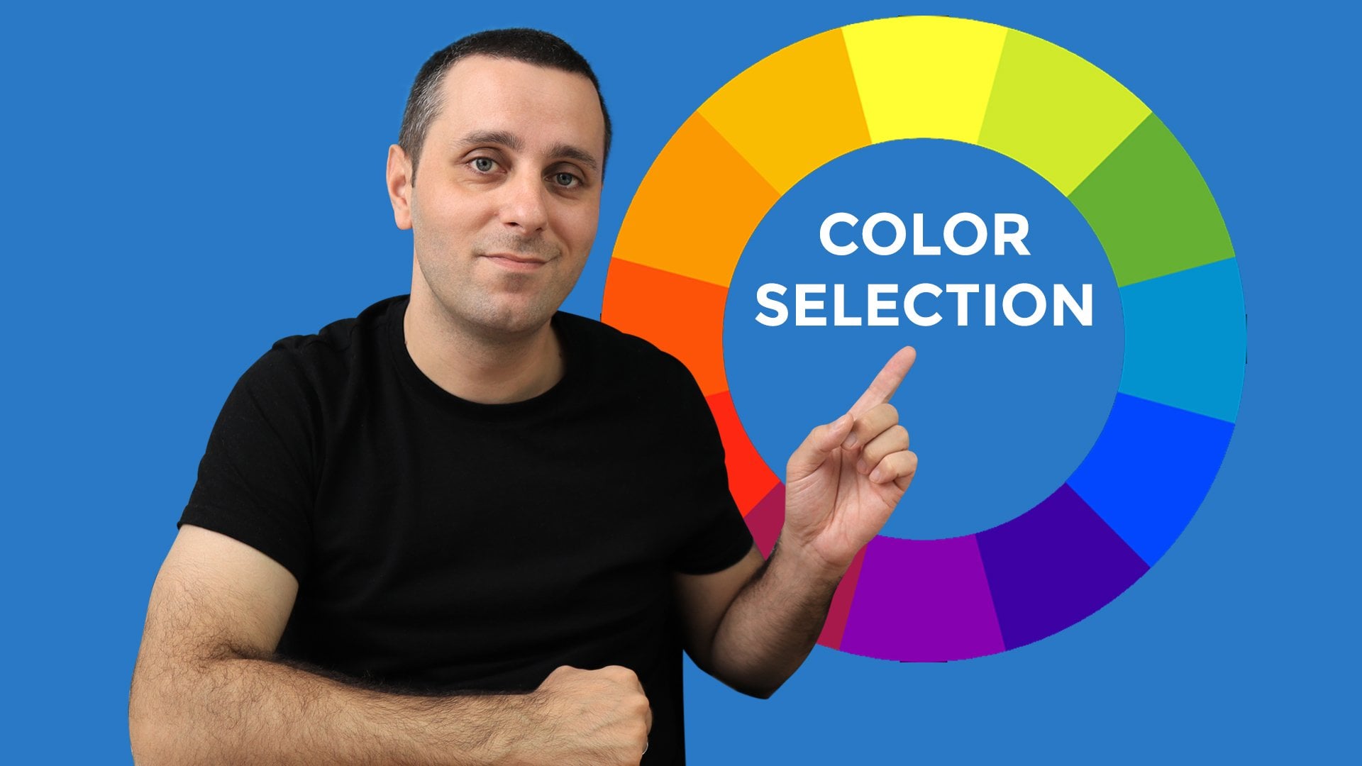
6. Color Pallete and Primary Colour: There's going to be a very interesting lesson. In this lesson, we're going to design our color palette. What I've done is I've included a template in this page, the color palette page. Let's check out what this template is all about. So this is the template. This is essentially an auto-layout. We'll cover that as we go along in this course. And this has a color, right now, this one. And then it has a ten tins of the color. So when you add bite to a color, it becomes it's tent. So the purpose of this template is, for example, let's say if I change color by going to the selection colors and maybe choosing red, then you will see that you will get all the tendons of red, which we have which we have planned for. I'll tell you the purpose behind this. The purposes maybe while you're designing, you'll find that maybe this particular read is to Gaudi or two in your face. And you would want something of a milder resistor. So perhaps maybe you would like this to go on your document. So in order to make a very visual choice, what we do is basically we take color and then we make tens of Puppet. I'll just do Command Z or Control Z to undo this. And now let's talk more about colours. We are going to make four types of colors, primary colors, secondary colors, tertiary colors. And then we are going to make graze. Let us see how we can do that. So I'll just duplicate this that are going to be two primary colors because the logo for Excellence study abroad company has a linear gradient. Let us just check that out quickly. I will copy this logo from the images page onto the color palette page. I'll paste it here. And if I go and analyze the film over here, you'll see that it's a linear gradient. And the linear gradient is from this particular color, which is this value, to this particular color, which is this value. So what we're going to do is our primary colors are going to be the two colors which form the gradient of the logo. This will be synchronous to the brand guidelines or the brand colors that the company has. Let's see how we can do that. First of all, I'm going to select this set of colors. And then I am going to just duplicate it by pressing Command D, because there are going to be two colors. I'll rename this as primary colours by double-clicking here and writing primary colors. Okay, grid. There are going to be two secondary colors as well. So y naught, let us just create the whole template thing. I'm going to speed this up. I'm going to just duplicate this one more. And I see the primary colors coming here. I'll just put it down. I just snap it into place, is really great with this. You get you get grids when you're trying to move elements around. I'll rename this as secondary colors in order to rename this. Now, when I select this, the corresponding eyeball over here is highlighted. I can rename this as secondary colours. Now I want to further duplicate this. So what I'll do is I'll press the option key or the alt key on Windows. And when I do that, you will suddenly see that the cursor, there are now two cursors. You know, you will see the mirrored or leg double cursor. That just means that whenever you drag something, it will just duplicate it. Here we go. I'll rename this quickly as tertiary colours. Now tertiary colors, as there are two primary colors, there are two secondary colors, will just cover that in a bit. But tertiary colours are basically accent colors and we typically use for icons. So why not have loads of tertiary colours? So possibly will have six tertiary colours. I'm just duplicating By Command D. And it's happening. And then we'll make some space for our greys. I'm going to press the Option or Alt key on Windows. And I'm going to make this graze. Fantastic. So coming to the primary colors, I'm going to press Zed and just drag this selection so that it is zoomed for our benefit. So the way I'm going to do is I'm going to copy the blue color code from here. And I'm going to paste it in the selection color. After selecting this first row. I'm going to paste it here. And we have our first primary color. For secondary color, I'm going to do the same. I'm going to choose the other color code. And I'm going to paste it here. So we do have our primary colors. Let us check out how to make the secondary colours, tertiary colors, and the grace in the next class.
7. Secondary Colours and Tertiary Colours: In the last lesson, we created these primary colours. And while creating them, we base them on the color scheme from this logo. Let us now understand why did we do that? So basically primary colors from majority of the elements in the visual design. That goes for headings, that goes for any links, any major components, any call to actions, etc. And it is good that that is synchronous to the overall brand guidelines on the brand colors so that it looks good. And that is the reason why we chose the primary colors from our logo. Let's start talking about the secondary colors. It's a rule of thumb that primary colors and secondary colors are complimentary to each other. And by that, I mean that the secondary colours and primary colors, they create this harmonious look. Now how to find colors which are complimentary to these two colors. So basically what I do is I use a really good tool called as Adobe color. So let us quickly check what can be done. So I'm going to just select the color wheel. I'm going to navigate to the color wheel of the color dot adobe.com. And while this is loading, ok, so this has loaded. So the quickest way to do, the quickest way to get a complimentary color is by following this method. So I'm going to select this color code. And then I'm going to paste it over here. And then I've presented, it shows me that this is the colour. And over, over here, it has a lot of options to apply the color harmony rule. So I can go monochromatic, wherein it is going to just show me shade sentence of the same color. I can go to triad, which is a three color combination. And then I come to complimentary. So when I'm coming to complimentary, so all the other colors are complimentary to this. So I'm going to choose possibly this color as my first complimentary color. So I'm going to copy this color code over here. And I'm going to paste it in the selection color over here. And voila, we do have our first secondary color. I'm going to repeat the process for the second secondary color. I'm going to copy this and paste it here. And then I take this color code and I pasted in the selection color and wallah, if you think that this color is a little too green, maybe it is too fluorescent, then we can always change using this, this option. And perhaps this is more of a Mac look, and maybe I'll select this. So there we go. So now we have two primary colors and then we have to secondary colors. So let's talk about the tertiary colors. But before that, let us quickly understand where are we going to use the secondary colors? We're going to use the secondary colours for accent pieces mostly. And I will recover the accent pieces and I'll refer back to these secondary colors as and when we are designing in the next few lessons, coming to the tertiary colors, tertiary colors are used really sparingly in the whole design. We're going to use them for the items mostly. So the wave width, which I create the tertiary colors is I'm using the same Adobe color wheel. So I'm going to copy this and I'll perhaps paste it here. And then I'll go for a compound colors. And then I'm going for a compound colors. So I choose the colors that I like from this. And I'll just start making the dice three colors. You are free to choose whatever colors you want. Just make sure that these are not the shades or tins of the primary and the secondary colors. Basically, we are just going to use them for icons. So there's that. I'll speed this up a little bit and see you in the next class.
8. Tertiary and gray: So these are the tertiary colors which I have created using the exact same process which I showed in the previous lecture. You can use these same colors in your design. You can reference these of the reference file which I have shared as part of this class. Or you can use the same process and make your own calendar. I would very much recommend you to try to come up with as many color ideas that you can using the Adobe color B and make them your tertiary colors. These are going to be just used for icons for at least our design. And let's see what you guys can come up with. Now let's talk about the grease. Graze. It. This is, in our case, we are going to use them for our forms anti phases. Basically, this first color is total black, as we can see. And now these are like the things of the same color. As you can see, we are, we are reducing the opacity of that color by 10% each. So, so basically, what I like to do is I like to have the original grey color in my designs be a function of my primary color. So let me show you what I do. This is not very hard and fast, but I think it's a very nice little new ones to have. So what I'm going to do right now is I'm going to make a rectangle over here. And then I am going to, I'm going to use my primary color as the core of this rectangle. So I'm going to copy this and I'm going to paste it over here. Okay, so we have a rectangle in primary color. I'm going to duplicate this. I can either do that by doing command D or I can use the option on the altar key. I'm going to duplicate this. And then I'm going to make this black. Okay? And now when I'm going to super impose the both of them. So if you now see clearly, I'll just zoom this in. So if I reduce the opacity of the black, then it starts looking like a fusion between the black color and the blue color. I'll do that at 50% for you to see it, it's almost, you can see 50% of the blue that there is. So that is too much, that that's not great. But if I do 90%, then this is great enough. And this is definitely a shade lighter than the 100% black. So there we go. So I would like to use this color for my gray area. And what I'm going to do is I'm going to choose this. I am going to use the color picker. And I'm just going to click over here. So there we have it. So this is not all black, this is not all six zeros, but this is this is 000318. So that is going to be our gray color. Okay? All right, so in this section, what we did was we entirely designed our color palette. We have primary colours, we have secondary colors, tertiary colors, and grease. This, we are ready with our color palette. And from the next lesson, we are going to deep dive into the actual design process. See you in the next class.
9. Typeface Selection and Typescale: We have designed this beautiful color palette. Let us focus our attention on typography. Typography is essentially everything to do with the kind of text, typefaces and fonts that we are going to be using in our design. Over here, you will see. And of course I'm zooming in by pressing zag and then dragging a section. So basically, this is an odd word wherein we are going to select our typeface for headings. I'm zooming out by pressing command. And then I'm using the scroll wheel on my mouse. And then I'm dragging this by pressing the spacebar, and then I'm just dragging using the left-click on memos. So basically we are going to take two type faces, one for headings and one for body text, so that there is a natural variety and what ions in the design. Then we are going to do something called as type scale, which is arranging the font sizes in a way that everything looks harmonious. And then we'll be getting into heading styles and paragraph headings. You know, what are we going to exactly use or paragraph edits as well as for paragraph text. Let us dive in really quickly in order to scale. In order to just zoom out to a 100% of scale. What you can do is you can use a shortcut called US ship one. So when I do shift and one, it zooms to fit. Ok, let's begin now. So we are going to choose a typeface for our headings. Let me just take this out of the way. Okay, great. So one of the main questions is, Hey, what kind of typeface do we consider? What is it that we should be looking for? How to find the typeface is how to select the phones. So everybody has their own method. I would like to show you my method. I always go to the site Google fonts to choose the typefaces. Let's set to Google forms. So right now in front of me, I do have fonts dot google.com, which is the Google Fund's website. And on this site you can preview a lot of fonts. A funny thing about fonts is if you go to the categories, then the serif and sans-serif, which means without serif, are the two basic type of fonts which from which we have to choose upon. Let us understand quickly what is a serif and what is, what is a sans-serif? So if I just deselect this all, then let me just zoom this leg really in BC, this basis at, under this letter a or this l. Do you see this base? So this base is called a serif. So in all the typefaces, Serif family, that bases always there. Also, if you carefully observe the thickness of the stroke, the brush stroke of the pen stroke, it varies, right? C. So this line is. A little thinner than this line, and so on, so forth. Basically, as a rule of thumb, we use serif fonts when we print something on paper, especially at very readable font size. Serifs, improved readability when it is on paper. But if we are talking about something to be displayed on the screen, we should always go for sans-serif. Again, like one can definetely use sans-serif fonts on paper and Serif fonts on the screen as well. There is no hard and fast rule, but something like rubato, which is quite modern, sans-serif font or typeface. It really looks good on screen. So basically, you can definitely go through all these fonts to make choice for the, for the form which you want to include in your design. I'm going to select Poppins for my headings. Either I personally like this font and perhaps that is the reason with which I'm going to choose that you can choose any other font, typeface style you like. And for the body, for the typeface, which I'm going to do for the body. I'm going to choose the open song. So let us go back to for sigma and pi phase from the headings. I'm going to use Poppins. So let me write Poppins For the headings. That's about right. And let me select the font. Let me select a typeface, Poppins. Okay, it has changed, and then I'll just keep it 55 so that it is of the correct heading size. Now, China is a very visual activity. So I would like to first imagine first see the different styles of typefaces. How do they look in order to get an idea what and when and how am I going to use this particular typeface in my design? So for that, I'm just going to duplicate this possibly three times. I'm going to do that by pressing Command Z or Control G, pardon me, Command D and Control D. Okay, so right now, this style is medium over here. I've converted into regular, and this is going to be semi bold. So now, if you can see there are three hierarchies in the weights of the typeface. And I think I would love this to go on as my main heading for the ancient. Ok, now let's do the same process for the body text. For the body text, I have decided to go for open-source MS. So I'm just going to write here that. And I'll select the typeface to OK. Great. One thing to remember over here is these two, both of these typefaces are pretty common and they were preloaded. And they come with sigma. If you choose to get any other accustomed TI phase, then you would need to install that font on your system first. Okay, so for readability and women, blue jeans is 255. And I will be interested in, again, visually combating debates against each other just to see how it looks. So I'm going to duplicate this BY commonly. And let me just go on changing from late. Two, regular semi bold, bold, extra bold, metallic maybe. Ok, but I do get an idea. So most of the times I'm going to stick with either this weight, the lightweight. Okay, so that's about the headings and the body text I faces which we have chosen. This over here is Poppins. This is going to be used for headings. And this is when this is open song, which is going to be used for body. Okay, moving along. So now let's talk about something called as a type skin is type scale. Let's find out. Let me take you to this really good web resource called as type scale.com. It's a visual calculator. As you can see, all these fonts are laid out in a particular fashion. Now let's just explore what that is. Let us do that for Poppins, which is our heading typeface. And let us take the base as 1818 points. And the scale is going to be major. Third, that is 1.25. So if you observe each of the progressions are 1.25 times the earlier one. So this creates this beautiful harmony of the timescales. And then it is very pleasing to the eye. Everything isn't proportion. You don't have to worry about is my heading in proportion to the body, which is proportional to the subtext. So it's all covered here. So this exactly is what is called as timescale. And then we are going to use this in order to set the fort hierarchy for our own design. I'm going to do that by copying this onto my sigma workbook. And I'll just paste it randomly here. And as you can see, these are the font sizes which we are really looking for. Let me just zoom in to this. So 54, which is going to be fifty five forty four thirty five, twenty eight, twenty two point five and eighteen. I like event 24 on this. So let me show you how we can make these changes. So in the timescale art board, what I'm going to do is I'm just going to write any random text. Let us write excellent study abroad. And then I'm going to make this into our, our main type phase, which is Poppins. And then I'm going to duplicate this six times. So I'm going to combine the six times. And then I'm going to change the fonts aspect of this. So let me do this at 255. This would be 43. And I'll just zoom out a bit. This is going to be 35. This is going to be 28. I'm going to check this to 2422.5. It's a personal preference. You can choose to adhere to this strictly. And this is going to be 80, which is 80. So this is our time scale. Now this is the very nice harmonic progression we have got going with our eye faces and the font sizes. And this is definitely going to translate into a better design. So let me just delete this and in the next lesson, we are going to use these very three things. Our foreign selection or Taipei selection for headings, body text, as well as the timescale. And we're going to use that to create the heading styles and paragraph, paragraph text. See you in the next class.
10. Heading Styles: Welcome back. In the last lesson, we did goal whether typeface's form the headings, body text, as well as the type scheme. Now we have seen that the type scale is the harmonious progression of the foreign sizes, which gives a very good visual API. Now, what we're going to do is we're going to convert these pipes, kills headings are the headings planes. Let us see how to do that. So I'm going to select these. Then at a couple of ways to select, I can either go keep holding Shift and then going, go on clicking. But I can just do control AR commonly like this. And now what I have to do is I have to start off bayes back into the heading styles over here because that's their designated area for the heading states. So let's see how that could be done. So I'm going to hold down the Alt key or the Option key. So you'll see that Nobel Carson. And then you'll be able to take this out. But in order to insert that into this heading styles, in order to insert using the auto-layout. I've recorded down command Jasmine, and then I hold them, come on. You can see that it has done blue all of a sudden. It is asking me whether it erupted below or above the adding stance. I'm going to drop in blue and I'm gonna leave it. You'll see that it ties up beard and do the heading states. So I'll go ahead and delete this so that now what I've done is I've essentially duplicated this. But now these are willing to be our heading styles. For example, this could be the heading one. Heading one. I would like to be a leader board. This is a Poppins 55. But I would wander, will be as Boulez this. So I'm just going to copy the properties and I'm going to paste it here. So that is going to be my heading, MAN. I again make this heading two. I think Heading two should also be bold. So I'm going to again copy their properties. I'm going to base your TA. This is heading h3. Heading three can be normal. This is heading for now. We can go as much in depth into the headings that we weren't. But basically what we're trying to do is we are trying to get a harmonious progression of the foreign sizes. And this could be finally the headings six. So, so yeah, so these are the heading styles which I have creator. You have absolute freedom to create your own heading styles. Just make sure that these are absolutely in. How do we name that teacher that oh, wait, I think I have missed this dial. So yeah, this should not be 55, this should be 43 according to this timescale. So I'm going to just, I, just though, formed before D3. Great. So you can play around with it, any progression that you like. You can go to the timescale website and then you can play with the different options that I have a little bit. But for design purpose, I'm going to use these. Instead. It's now coming to the last part of the typography we have to assert than what we're doing to do further paragraph headings. Batygin have headings are either not the actual headings sought of that dot on the heeded bitch, then BBN into their design. So I'm going to choose heading three, the style heading three photo Maya paragraph headings. I'm going to copy the properties and the properties here. Grit. And then from that paragraph text, I'm going to choose the 24 font. I'm going to copy the properties and paste it here. But if you can see that I have just made the heading styles for the Poppins, but I would like open song in my bag enough text. So I'm just going to change the face of the font type to open song. And then you go. So this is all about the topography that we are going to be concerned about the way we are designing fought over project. See you in the next class.
11. Setting up artboard and grid: Now that we have sorted, the topography will be heading into design. Please note that in the images page, I have kept all the images that we are going to use in our design. Later in the course, I'll be off course covering how to add images from external sources as well. And we have already seen what we can do with plugins, and we'll be using bit of plug-ins as well. So without further ado, let us go to the design page and let us start our design. First of all, we would like to make an art board or a frame for that matter. For that, you can either go to this region to select frame, or you can press F on the keyboard. And then you will get this cursor with which you can drag a frame. Before we do that, we can see that there are a lot of options given here further frame sizes across phone and tablet and desktop and whatever. For this purpose, I am going to choose a random frames. So I'm going to draw a random rectangle. And I'll go to this region wherein I am going to set the width to 1600 pixels. I'm taking 1600 pixels. Before this project, you can choose to directly choose some, some actual preset like a desktop or a tablet or a mobile based on your requirement for this project, we will take 1600. Now, I'll set the length of this art board to be 5 thousand because this is going to be a long scrollable website, website page. And so I thought that let us just to begin with, let us start with abundance. Okay? So now that the art board has done, what we're going to do is we are going to place a grid on this art board. Again, I'm using Zed and dragging, using my mouse to zoom in. The purpose of the grid is to really align the elements inside in a much pleasing way to look at. I'll go to the, I'll select this R. And then I will go to the layout grid section over here. And I'll just click on it. As you can see. Right now, the layout grid is visible over here. I'll just zoom in and zoom out. You can see the grid. For this project's purpose. I'm going to go for the vertical grid. So I'm going to click here. And I'm going to get a column grid. So as you can see that these are the columns. I will further reduce the opacity to 5% so that this doesn't become intrusive. And I'm going to center these columns. Let us choose 12 columns to begin with, because it really becomes easy to align elements. The width of each column could be 72 pixels. That's in sync with what we're trying to do. And the gutter, which is the distance between two columns. So this could be 32. Okay, so we're all set with the grid. The reason behind I have chosen 12 columns is I can, when I'm using 12 columns, I can arrange perhaps two objects, three objects for objects, and six objects in one line. So that's the main advantage of choosing 12 as a number of count for the number of columns. You can obviously toggle the grid on and off by either clicking on this icon to shut it down and to start it again. Or you can use the keyboard shortcut Control G. It has the same effect. Ok, so now we are through with our Ad Board and the grid. So first of all, what we would like to do is to place the logo. So if you go to the images page, you will see this typographic logo. I'm going to copy that command C, and I'm going to paste it here using Command V. And I would like to keep the logo at the top, at the top to the left. But I would like to align it like in a proper way to the edges, so I'm going to choose 64 pixels. The reason behind using 64 is the getter is 32. So twice the better would be 64. So I'm going to just modify the x and y's of this. This means that this X value means the distance from this edge to this logo. If you click on Alta, then you can be able to see if you just put it down on paper and then just hover your mouse around, you will see that different. So see if you can see yet it's 90 and the axes 90. So my d is this distance. So I'll make it 6464 days of m. So with this, we have placed our logo in place. See you in the next class.
12. Making the Navigation Bar: In the last lesson, we learned about setting the outboard, setting up the grids, and then we place this logo, 6464 pixels equidistant from the x and the y. So now we'll just go to the wireframe and understand what, what we need to add more. So let us talk about this navigation bar. So this navigation bar will feature on the top of her design page. So what I do is I will just copy this command C and I will paste it on my design. And then I can just align it with respect to the logo which you have just placed. That's one way of doing it. But I'll show you a wave which is more reusable and perhaps a better way for the overall aesthetic that we are going for. So I'm going to choose the text tool from here. I can also just click on P on my keyboard and the tool pops up. And then I'm going to just write, write the names of the elements in the navigation bar. So that's about us. We have one element. Now I'm gonna duplicate that. I could do that with command li and then just drag it down. Or I could just, I wanted to duplicate it three more times. I could just press on the Option key or the key. And then when I see the Nobel cursor, I quote, again, drag it down. And then I could just copy and pasted with Command C, Command D. And so here are the four elements, essentially these elements you're talking about. So I'm going to just write them out. These are the services. These are the testimonials and this button is for the apply. Great. So now when we are, so these are currently individual elements as you can see, but we want them together as a group. So the way to do that is I can just select all of them. I could do that individually. And after I have done that, I use either I'll right-click and I'll click on add auto-layout. Or I can use Shift and aid to add order layer. So once I do that, you can see that all these elements are in one layout. Now, auto-layout is the coolest feature of sigma that you can use like almost for every element and it saves a ton of time. Now, as, as you can see that these are stacked on top of each other. These are vertical, but we want them to be horizontal for our case. So if I go to the auto-layout section over here and I can click on this button. This says horizontal direction. And voila, we have these in our horizontal direction. This is about spacing between items. Right now it is 46, it is a little arbitrary, but I can choose it to be 64 and see how equally spaced out that looks like. I can also experiment using may perhaps 32 because that's the gutter width. But I think 32 is a little crammed up, so I'm going to stick with 64. I just do Command Z to undo. And now if you observe, if you observe these elements, then these are using the rubato typeface, but this is not the typeface which we have selected. So what we can do is we can go to that topography. And perhaps I would like to use the heading for, which is medium and 28 for my navigation bar. So I am going to copy these properties. And I'll go to the design. I'll select all the elements. So the cool part about this is now it's an auto-layout. It, you try to select everything inside it. But if you press on command and just hold your mouse to something on some element, then you have the ability to choose it individually. So, so I'm going to select all the insides of the element using command a. Well that'll select everything and then I'm going to paste the properties. So then we go before we actually place it, I would like to check the color. It's pure black right now if you can see here. But as we have decided in our topography that we are going to use a unique, or rather we have decided in our color palette, we're going to use a very unique shared of Black. So basically this is that shade. So, and so this color shade is over here. And then it is passing through at 90%. So I'm going to just copy this and I'll go to design. And I'll just paste it here. Read it will just change the color by just literally just a little much. But this will be more congruent to our original color scheme. I'll also do this at 90%, so it gives a really good effect. And now with this, I can place this navigation bar and I'll align it according to the gridlines which sigma already provides us with. So yeah, so that's all about setting up the navigation bar. I'm going to delete this. Ok then see you in the next class where we will be starting to fill up the text.
13. Headings and Text Styles: Welcome back. In the last lesson, we did apply this navigation, but one thing that I missed is we need to align this navigation bar in such a way that this end is 64 pixels from this end. So the way to do that currently is if I press the Alt key or the Option key C, I can see that it is 184 pixels away from that. Let me just zoom in by pressing zag and this. Ok. So if I press the Option key on the Alt key, I can see that it is 184 pixels away from that. And now if I press the direction key on my keyboard, if I press right, then you can see that it has when it did three. Now, whenever you do 101, similarly, if I keep on pressing left, it is going to just shift in one pixel impediments. However, if you press shift by doing so, and then press the direction q0, then it is going to change in the ten pixel increments. So as we want this to be 64, I'm willing to just do one made the 64 volume. So I'll just do control G, removed the grid and just take a look. And this definitely looks neat. Okay, so the greatest back on. And now let's go to the wireframe to actually start putting the text elements, the headings in this final design. And for that we need to go to the wireframe. This is, this is going to be the subject of this lesson. So this copy is given to us. We help you to build your dream. And then this, we are at liberty to consult etcetera. So what I'm going to do is I'm going to copy the things and I'll paste it randomly. Over here. This is a different element. This is a different element. So I'll just copy this and I'll just paste the text as well. Ok. So now what we need to do is we need to align this to the start of the grid like this. And this is going to be our first heading rate. So when we're doing our first heading, we have already assigned the value for that in our topography. So if you go to typography and if, if I select this heading one, then I'm going to copy these properties. And then I will come to the design and I'm going to paste this properties on this. And then we have very bold 55 bind bump in semi border. This is going to be our main the main heading, the main text. That is, and this is going to be the subtext from that. So for this, I'm going to choose the heading tree, which is 35 Barnes medium pumpkins. And I copy. I'll copy the properties. And then I'll go to the design and I'll paste the properties here. And as you can see that it has moved to it has mood as well as it has genes, the foreign term, then I will keep this overhead. There is another way to do this in sort of just copying properties and pasting properties. Let us quickly check what that is. So I'm going to undo this whole thing. I'm doing Command Z. So as you can see, so there is a lot of undoing here. Okay. So yes, so I haven't done everything. The another way which I wanted to show you is if I go to typography and when I know that this is going to be my heading one. So what I can do is I can create a text style. I'll show you what I mean by that. So this heading one is going to get textile. So for that, what I can do is I can click on this style icon and I can click on this plus sign that says create style. And I'll write this as Heading one. And if I create this tile, then that becomes the style. So basically there is a component creation sort of a thing happening that in it saves Heading one as US textile so that I can select any text and then apply it to that. I'll similarly do for Heading three rate. So I'll just go here. I'll usually come plus an irate heading three. Cool. So the easiest way to do that is then I'll go to design. I'll select my Text, and then I'll just go to this style icon. And then I'll just click on this and see we have 55 Poppins. I'll go here, I'll just click on heading three, and then we do have that as well. And I can just keep it over here and we're good to go. Okay, so we basically talked about heading styles in this lesson. In the next lesson we'll be adding an auto-layout to this and also adding the image. And under that I will see you in the next class.
14. Creating background and pasting image: Back. Before we proceed further, let us just check the wireframe for ones. So basically what we have done is we have put the logo, the navigation bar, and these two lines of text is what we have put in our main design. This time slot image, we have to insert an image over here, and then there is a call to action Cortes apply now. And we have to do that as well. And then this lesson will do exactly that. So let's go to the design page now. Okay, so I just examined the image which I wanted to insert. So this is the image which we want to copy on to the design thing. Before we do that, let us just try to jazz this page up by including some color elements. I'm going to do once you are free to choose any other Sky linear that ship. You, you'll, you'll see the pattern and then you can apply your own creativity to create your own backgrounds. What I currently am going to do is I'm going to choose the Ellipse tool. I could even press on my keyboard. And with this tool I can draw a circle. The way to do that is to click and drag. So while I'm drawing, you can see it is making an ellipse centered this taking the ship according to how am I dragging. But if I press shift on my keyboard, then it creates a perfect circle. So there is no hard and fast rule measurement to this. I'm going to create a circle like this. And then in order to fill it, I'm going to create a linear gradient, which is going to match to the logo, the sector of colors that the logo has, which are basically are primary colors, as we did create them in our color palette. So coming back to this, I'm going to fill this, I will do, I'm going to do a linear gradient. And when I'm doing the linear gradient, I am going to just go to the color palette, Select the primary color. Come over here, paste it here. Okay, so we have one colored and I'll go back to the color palette. I'll choose the secondary color. And you come back here and I'm going to paste the color code over yet. And we have our gradient. But gradients, where do we get to this axis that we have gives us the choice to sort of choose the way that gradient, that interacting with everything. So this end is though MyTime, as we can see, that this is the lightest ten of this color overhead. So you can play around with this as much as you want and choose a gradient which you think looks more flattering. Okay, so I think that this is going to do it for me. I sort of just like this. Okay, so that's my gradient. So now what I'm going to do is I'm going to make it a little more transparent. So I'm going to make it 60% opaque. We, I'm going to add this to a passage or to 60%. Okay? So what I do is I will just try to create an element or what he heard of which is going to help us put an accent. Do the other way is drab image. I'll just duplicate this using the turkey. I'll again duplicate this. I'll keep this thing on the absolute top. I'll bring it to the front. And in order to just add an accent, what I'm going to do is I'm going to reverse the gradients are unwilling to make the blue as the light battle thing. And so, okay, so this is just an accent piece and you can definitely do it the way you like. I think I like this and we can play with this now with this as a bag alone, what I'm going to do is I'm going to paste, I'm going to copy this image Command C and paste it. And paste it over here. And I think this provides a bit of a balanced look to this. So if I just go back to the wireframe now, I can see that I have put this logo, the navigation bar, these two lines of text and image. Now let us just add the call to action which is applied now. And we'll do that in the next class. See you in the next class.
15. Call to Action Button: So far we have designed this much. And one thing that I usually follow is I click on this Play button at the top over here. That gives me the actual live view or the prototype of what I've designed. And it looks like this so far. I tend to do that. I tend to look that on the big screen so that I can exist as my visual judgement. If I find that, if anything is off, if I wanted to add just anything, if I have some impromptu feedback to myself, I can just incorporate that. So this was about looking at the preview. Now, let's come back to our main design. And now what we will do is we are going to add a call to action, as we have seen in the lab frame. There is a clean call-to-action called as a planet. And then there are these social icons. So in this lesson we are going to boo, add these two elements. Let's go to the design them in order to design that button. I want to choose a process which is very grassroots. I could just copy that button, paste it here and then do some superficial adjustments to it. But I want to start from scratch. And for that, I think I'm going to go to the Text tool takes tool can also be activated by typing T on the keyboard and I'll write apply now over here. If you see the Apply Now currently is in the Roberto I face. I'll go to my typography and I think I'll choose Poppins medium, this heading for two b. I will choose heading for it to be the style for my call to action which is applied now I'm going to just paste that. So now you can see this apply now button having the text property of Poppins and medium there. In order to convert that to a button, I can use a very clean hack of the auto-layout, which I can activate by pressing Shift tiny. Or I could just right-click and click on Add auto-layout. So when I add an auto-layout, what happens is this piece of text, this text string, it gets converted into a component, it gets converted into a button. And these are the auto-layout settings. What I can do is I can add padding of 32 pixels. So if you can see there is padding now 32 pixels from all sides to this button. But buttons are usually not this bulky. So I'm going to go to this section, alignment and padding. And then I'm going to sort of make the padding 16 on the vertical edges and 30 to one the horizontal edges. So press Enter. So that looks about right. In order to give this a border, because right now it's just a shape, but it doesn't have a border. So I'll go to the stroke, stroke section. I'll click on this and then maybe two pixel border to have. So, okay, so we now have a rudimentary button with this. It is quite similar to the one in the wireframe. But in order to make it into like a proper button with a call to action, What I'm going to do is I'm going to round the corners of AI around them to possibly a 100. And this type of a button is called as a pill button. So now, as you can see, the burden is taking shape. This is a call to action. A call to action. Basically we have to use the primary color. So I'm going to choose the text color to be the primary color. I can select that from the color palette. This is the quarter four primary color. I'll copy this and come to their design. And then I'll paste it over here. And there we have it. This is our button. Looking at the button right now, I feel that a couple of ways to improve this stuff. All I would like to challenge the opacity of this typhus. I'll bring it down to possibly 80%. Okay, now that has a very pleasing register and this is similar to the background which you are seeing. So this is more congruent now. And then I would like to just drop an arrow into that, just a small item. So for that, we'll use I quantify. We have, we did cover that in the earlier lessons. So I'll go to the plug-in and then I'm going to click on icon. I will choose a arrow for an icon, I want a right arrow. So this is the right arrow and no 36 pixel height seem suitable. So I'm going to just import the item. Okay, so now that the icon is important, what I'll do is I'll change the color to the call-to-action itself. I already copied that and then I will convert this to a d. Okay, now, in order to insert this into this button, this is actually an auto-layout. What I'm going to do is I'm going to drag this. But while I'm dragging that, if I press the command key, then it lets me directly insert into this. So if I just drop it in, there you go. So this looks pretty neat. Hmm. So that's how we have created our button and the call-to-action. Now what we need to do is we need to add a layer to this right now all these texts are pretty arbitrarily placed and there is no real relation between the spacing in between them. So that can be easily sorted out. What we could do is we can just select all the three elements. And then we can add a, another auto-layout by shift a. And when I do that, you can see that this thing has already, it now has a fixed line width. And then I can be adjusting the space between items to 6060 pixels. And maybe 60 pixels look a little ridge. So if I do that to 72 pixels. And now there is like a harmonious look to our page. Now, everything is sort of coming together at this point. So that's about it for this lesson. In the next lesson, we will be adding the social media icons and then we'll start designing for the next sections. See you in the next class.
16. Next section and autolayout: Back. Before we move ahead, let us apply some drop shadow to this call-to-action button so that it actually looks like a clickable link. Here is how to do it. You have to select the button. I have done that by double-clicking inside this auto-layout. And then I'll go to effects. And the effect is the drop shadow. Right now we'll keep it at the default settings, which is like 44 blur. And four on the y-axis of the shadow, which is like, which falls in the vertical direction but downwards. So that's about it will just keep it at the default level. And if you can see now this button actually looks like a clickable link. So I'm going to press shift one, zoom to fit. And then again I'm going to press and drag and hear about it. So now that we have finished with building this section, let us quickly go to the wireframe and see that we have to add these social icons. And after we've done that, we'll be going to the next section of the hero page, which is the featured universities. Let's add the icons. Now. What I've done is I have kept these icons in the images page. Usually what happens is you have to download these icons from any I can sight and then use them into the image. For ease of use, I have just kept them in the images page. I'll paste the icons like this. I'll bring them down. And now, again, in order to align all these icons horizontally, we are going to use the magical tool of auto-layout. I'll select all of them. I lose shifted. So an auto-layout decided, and I'll just go to the auto-layout settings and I'm going to click on the horizontal direction. And you have all the icons in the horizontal direction. I'll change the spacing between the two eigen spacing between items to 32 pixels. And this has a uniform look and feel to it. And voila, I can even put on the grid by pressing control g in order to see that I'm aligning the consent to the grid like this. Or maybe this this in relation to the this burden is not looking symmetrical. So I'll just move back again and I'll choose central symmetry to both of these elements. I'll switch of the grid and I'll click on the play button just to see how the prototype is, are the, how the designers shaping up. And I think it is coming up in a really good way. Okay, grade then I'll go to the workbook and now let us design for the next item, which is the featured in universities tab from the wireframe. So for that I'm going to go to the design page. What I'm going to do right now is I'm going to create sections inside this page itself. To do that. I first try to do something on the screen and then tried to explain it as we go along. I'm going to build a rectangle. And rectangle such as this. So this rectangle but it is going to do, is going to cover this layer of the image. Because we would like because this, this Crawford the images pretty good and standard right now. So I'm going to just use this extra layer, extra shape of a rectangle to break the page into legible laminates. And then I'm going to work on top of this. So let's see what has to be done now, if I go to the wireframe, I'll see that it's written featured University, so I need to write featured universities over there. But before that, what I'll do is I'll change the fill of this of this rectangle that is the color. And I'll change it to something more palatable such as this. This is actually a document and color. This E phi, if I even E5 is one of the grays which we have already defined in our color palette. So this looks a little somber. And now in order to write featured universities over here, I'm going to go to the Text tool to click inside this rectangle so that it becomes a part of this whole rectangle. And I'm going to write feature universities. So while I'm writing feature universities, Islands center align it like this. This is good enough. Heading style for our feature University. This is directly taken from the subheading of this element. Although what I would like to tweak is I would like to make it a little less opaque. So I'm going to change the opacity to 80%. Let's see how it looks. I think this looks all right. If we can tweak the typeface and a font size as we go along when we just keep on proving what we are made. So now in addition to this, what we need to do is we need to add the four logos of the universities which are feature. So I'll just select them like this. I'll copy them. I'll bring to their design page. I'm copying using Command C. I'll do a command v here, so I have pasted them. So now these four images, usually before FISMA, what we need to be needed to do was to sort off manually, send them, and then worry about the distance between the images and everything. But thanks to fig, mine, thanks to auto-layout, it is so simple. Now let me show you. I'm going to select all four. And I'll do auto-layout either by right clicking and clicking here, or I can use the shift EIA thing as well. So I'll just click here. And auto-layout created. I'll go to the auto-layout settings. I'll do the horizontal reaction. And there we have it. And Central and I do a center alignment. Now that I think about it, I would like a little separation between both the images. So all I need to do is I need to go here, which is spacing between items. I linspace them 16 pixels in between items. It looks a little less. So I can bump this up to 32. Okay? And I think this looks pretty decent. I will just add just did right now. What can be done is I can also make a auto-layout of this shape so that all the other spacings and taken care of, but that's not necessary right now. We will possibly take a relook at everything. And we will group all the components and we'll standardize all the spacings at the end of this project once we have completely designed this. So, so yes, so, so far we have designed two main items. One is the hero page and the second is the section for feature universities. Let's take a quick look at this by clicking on Play. This is a really good practice to do so because it gives you a fair idea about what you're trying to build. And I think that this is coming to a really good shape right now. So that's it for this lesson. See you in the next class.
17. Designing Feature Cards with Auto Layout: I hope you are following through so far. In this lesson, we are going to design further. Let us quickly go to the wireframe page and see what we have in front of us. So basically we have this section for now and let us see what we do with it. Basically, my idea is to depict all these features that excellence has into cards. And we're going to make the cards using auto layout, which is the best feature of FISMA. Let's start. I'll start by selecting everything and I'll just copy that on board design page. So I've just been very dirty copy-and-paste job. Over here, I switch off the grid for now by concluding G. Okay? Now this our services is going to be our heading for the section. The section heading, as we have already decided, is going to be a heading three. So when we go to a heading three, This serves as our section heading. This is going to be the subtext to this heading. So we'll assign this as heading for. It is very easy once you pick these textiles. And if I just do heading for and voila, we have this adding full c over here. You can see that this is, this is fitting in quite nicely. Okay, so now the task at hand is to convert these into cards. And basically, I'm going to do the process for this career counseling one. And then I'll also repeat that for the university admissions and then you can do for the rest. And that is going to be a lot of creative freedom in World. So let's go ahead and basically I'll start with duplicating this. So I'll press altar on the keyboard. I'll just duplicate this and then I will remove all these body text from this. I'm going to just remove all all space, all the blank space from it. And I'll do the auto width over here. Now for this, this is going to be the heading of the bear with me. I'm I'm sure that you are not currently able to visualize how the curve looks like, but we'll get there. So I'm going to assign this the same way as this style. And this is heading for, for us. So I'll just do a heading for here. I'm going to go to text and I'm going to select here. I'll do Heading four. So okay. So we do have our career counseling heading over here. And then we copied this, right? So now I'm going to remove the career counseling bit from this. Remove the extra space as well. And this is going to be the body text or the paragraph text. Now if you go to our topography, we'll see that the paragraph text is the open song at 24 wait, 2446. So I'm going to just copy this. I'm going to copy the property and I'll just paste the property for this. And see we have the Open Sans and at 24, I will do a quick auto width for this by clicking here on October eighth. And then I'm going to just cut down on the width and you can see the text flow. This is a cool feature. It comes with auto-layout. And I'm going to keep three rows of text so that there is uniformity. So there's that. Now we want a call-to-action here. It's missing in the wireframe, but this guard is going to link to some page on the website. So there is going to be a learn more call-to-action. So I'll go to the design, I'll go to the design, I will. So right? So we have to design a call-to-action. Learn More. And I'm going to do that by using the text tool. I'll use T on the keyboard, and I'll just type Learn more. So as you can see, the Learn More isn't in open science had 24. This is going to be a CPA buttons, so I would prefer it to be in Poppins, which is our primary typeface which you have decided. So I'm going to just four 1s type Poppins over here. Four pins at medium there is looking good. I just reduce the weight by, I'll make the font size to 22. I think this looks a little better. So as this is a call to action, this should have the primary color. So I'm going to fill, and then I'm going to select this color, which is incidentally our primary color, which you have selected. The cool thing about sigma is in this box, big my shoes, the document class. And in the document colors, it keeps all the colors which are present in this document. So if you observe, these are the very colours which we have created in our color palette. So now that the primary color is selected, I'm going to just reduce the opacity to 80% and then just add a bit of drop shadow to it. So I'm going to go to effects and I'm going to do the drop shadow 44. So this in fact looks like a clickable button. Now, what I'm going to do is I'm also going to add an arrow, just the kind of arrow that we have kept to the original CTA apply now call-to-action. So in order to do that, what I'll do is I'll click on the plugin icon. If I, I'm going to search for an arrow, I'll go for a writer again essentially. But this time, as the font sizes are 22, I'm going to keep the height of the arrow 222 as well. And I'm just going to import this icon. So as you can see, the icon is imported and is imported. So yes, so once the icon is important, I'm just going to bring that I come into the frame one. This is just a small thing to do in order to see that everything is not messed up. This is not that important. Anyway. I'm going to give this arrow again, the color of the brand, the color of the CTA, which is this right here. So there we go. So we have our arrow as well as which is matching in color with discipline, learn more CDA, right? So in order to now make this into a card, we spoke in the beginning that these are going to be cards now. So what I'm going to do is I'm going to make this Learn More CPA into an auto-layout style button. So I'm just going to press shift a. So the auto-layout is added with, I'm going to press 16 here, 16 for the padding on all the sides. Now what I'm going to do is I'm going to take this arrow, this little arrow, I'm going to resize it. I'm going to make 22, 10-22 heights so that it becomes a little larger in size. And then I'm going to just drag it into this layout by pressing command. So when I press command, it lets me put elements into the auto layouts. Now that you can see that this becomes one button, one layout. Although you can see that the arrow is slightly higher than the Learn more. So this can be sorted out by going to this menu over here and pressing this. So I think this Learn More CTA is ready. So in order to now convert this into card, what we're going to do is we're going to make another auto layout of all these elements. And then we're going to fill it with white and then put some drop shadow. Let's see how to do that. So I'm going to begin by selecting these three elements. I'm willing to do Shift a, that is for auto-layout. The auto-layout does added. Now after I've added the auto-layout, I will go to the padding section, and I'm going to add 16 pixel padding to it so that you can see that there are spaces around the text. And then as the next step, I'm going to introduce some filter it. So when I click on fill, the default Phil is that of white. So now this entire thing has a white fill, fill. And then I'm going to go to effects and I'm going to apply the drop shadow effect. Now as you can see, even with a very minimum, a drop shadow default effect, you can actually see that it's taking a shape of a card. We need to just accentuate that more. So I'm going to go to the drop shadow menu and I'm going to change the blurred to 30. And then I'm going to change the wire 215. And there we go. So we have our first card ready for career counseling. A couple of points to be improved for this card, which come to my mind is this learn more needs to be aligned to the left. So I'm going to just select that element. And this is a issue of the padding itself. So I'm going to go here and I'm going to change the left padding to 0. And as I do that, you can see the Learn Moodle just shifts to the left either. It is much more than I am. One of the things that could really add a really good Flavor to this design is going to be an icon. So, and tides and icons, they go really well together. For this career counseling, we have to find a contextual icon. Career counseling is all about the conversation. It's about a dialogue. So I'm going to go to my plug-in icon effect. And I'm going to search for something like a message. A message. I can, I think this I can, I like this. I could. You are free to choose whatever I want. And then I'm going to choose the icon itis 64 pixels. And when I do that, I'm going to just import the icon over here. We icon is imported, as you can see. You see. So the icon is right here in this element and this auto-layout, this was because we had this selected, then we imported the icon. Lci can would have landed anywhere on this page. So cool. Now, if you remember, while we were designing the color palette, we had decided that all their tertiary colors is something that we're going to use for icons. Tertiary colours are flare colors. So I'll go back to the design and I'm going to choose a tertiary color for this little icon. So let me go to the color palette. I think I'll go with this color. So I'm going to select the colorCode. And I'm going to go to Design. And I'm going to paste it here. And it changes the color. And I'm going to make it 80% opaque. And all I have to do this is auto-layout box, so I just have to drag it and make it just sit there. So this is how the archive is ready in order to further accentuate the look of the card. What I can do is I can put out 20 pixel coordinate radius. So this is going to just make the guard pop. So here we go. This is the card over which we have designed. Now we have to place the card on the screen. So for that I'm going to activate the grid again by control g. And I'm going to take this card and I'm going to align it to the grid. So that's how we have created this card. What I am going to do now is I'm going to repeat the entire process for the university admissions guard as well. And then I'm going to stop this lesson. And then you can do the same process for the rest of the cards. So let's begin. I'm going to switch off the, the greater by pressing control G. And I'm going to duplicate this, this box. So I'm going to press alter and I'm just gonna duplicate. By the way, if you have gotten the hang of the process, then you can stop this video right now and get working on your cards or you can start the next video as well. So now coming back to the process, I'm going to delete these lines. I'm going to just remove all the blank space and give it some auto width. And I'm going to give the text style as heading for. With the heading for text style. I'm going to take this and I'm going to remove the heading from this. I'll also do away with all the extra space than there is. I'm going to give it an auto width. Yeah, this goes beyond the lines. And then I'm going to give it the paragraph text style which we have taken, which is the Open Sans font. So I can, what I can do is I can select these properties and I can copy these properties. I'll just paste it here and the properties are pasted. What I can also do is I can take this and creators pile out of this. I can name that as my paragraph style. And the paragraph style is created. We are going to make this into three lines. So basically what I'm going to do is I'm going to just resize this and make it into three lanes. I'll zoom out by pressing control and my scroll wheel. And when they do that, then I will just copy this element. I just duplicate this other. I'll press and then I'll just take it out. I'll keep it over here and weekend. Just add an auto-layout to this. I will do shift a to add the auto-layout. This is very much elaine. I'm going to pick 16 pixels padding. This is coming out nicely. I'm going to give it fill the default. Phil is going to be white. And then I'm going to go to the effects and I'm going to pop the drop shadow effect with the blur as 30 and y value to be 15. Then I am also going to take the gardener radius to 20 pixel and the guard is ready. But wait a minute, we have not added the item. So in order to add the icon, what I'm going to do is I'm going to my plug-in, iconic phi, and I'm going to search for university. So I think this is a decent university item. I can get it for the 64 height. And I'm going to just import this. So when I import this icon, what I need to do is this icon comes in it's own, its own art boot. So I have to, and this is the icon rate, so I have to add this to the frame 29. And then I can just delete this outward from here. I can just change the color to any of the tertiary colors which I like. I'll go to the color palette and maybe I'll choose discolored one university. And we're going to copy this. And I'm going to paste it here. I will do the opacity to 80%. And then I'm going to just move this icon to the top of the line. And thus we have a little second card. Ready. I'm going to stop this lesson in Munich. And I would request you to do all these three cards by yourself. When one of the ways to do that as possibly to just duplicate this layer like this, and then trying to just type it out so that you do not mess with any of the work which we have done. What can be also done is you can refer to these layers in the reference material which I have provided so that you can take, you can directly reference the cards that which had already been made and possibly reverse engineering them and learn from them. So I think I'll stop this lesson for now.
18. Adding Background to the Cards: Welcome back. I suppose you are on a similar page and you have actually worked ban God these guards for yourself. It's okay if there is a little difference between what you're seeing on the screen right now and urine output. There is definitely creative autonomic creative freedom with us with the specular tertiary colors with respect to the font sizes, etcetera. So the important part is you having all the five cards right now in front of you so that we can proceed and we can add our accent pieces. Let us talk a bit about background as an accent piece. So if, if it is not for this background of the colors, the three circles which we put with that gradient, this image would look really, really done. So VOD, those colors are currently doing, is they're providing a background and they're providing an accent which is very pleasing to the eye. So we are going to do something of the same sort over here. And just to keep it playful, the image was on the right side of the axis. So we'll put our accent piece on the left side. In order to put that accent piece, I'm going to select the circle tool, the Ellipse tool that is. And I'm going to click and drag. As you can see, it is like free-flowing. It's forming a free-flowing ellipse shape, but the moment I press shift, it just locks onto one shape and that is a circle. So I'm going to take this circle and I'll place it right over here. Now, in order to put a gradient into it, last time we had chosen all primary colors. This time we are going to use a little more efficient way. So there's this plug-in called as web gradients. And I'll click on web gradients and I'll just check the gradients that they have on file. I think the rainy Ashwin is fairly congruence to our primary color scheme. So I'm just going to click on this. And voila, we have that any Ash Villa right here. I'll add just the transparency on this one. I'll add just the opacity. That is, I'll make it 50% opaque. And then I'll just duplicate this for an effect. I'm going to press older or control or option. And then I'm going to just duplicate this. And just for fun, I'm going to change the gradient on this one as well. I'll open that same plug-in. And let us now have a little complimentary color for the plugin. I think we can settle with this. Tempting as your, which is fairly similar to one of the tertiary colors which you have selected. So if I do that, it comes to this. I'm going to again change the opacity to 50%. I'll perhaps take the fill down to 80% as well. And now what I have to do is I have to click on both the pieces and I have to send them to back. And just like that, we have just transformed the way this screen looks just by adding those two acts and pieces. See you in the next class.
19. Building Cards the other way for the next section: Before we dive into the next bit, let us quickly preview what we have done so far. We'll click on this present button. And then we are going to see one is to one actual preview of our work. Looking so far, so good. Ha, okay, so this is our hero page which you have designed. Everything looks pretty neat. The, this is a second section which we did, which was further featured universities than a few university logos equal spacing between each one of them. And this is the third section that we designed, which has about our services. And then we designed these guards from scratch. And then we also added this visual element. So with this, let us now start working on the next section. And for that, let us quickly go to the wireframe and understand what is next. So we have designed for this section primarily, that is our services. So the next section is upcoming in USD events. So I'm going to use the fairly similar pattern of operations which I was using earlier. I'm going to select everything. And I'm going to just copy this. I'll go to the design phase and I'm going to paste it somewhere here. Okay? Okay, now, the task at hand is to convert this into like really visually appealing section of this website. So for that, first of all, what I am going to do is I'm going to make a rectangle and a rectangle of this color. So basically the setting we're going for us. There is a white section with some colorful accent piece, and then there is a rectangular gray section which doesn't have any accent. Then again, there, there is this white piece. And now then again we'll go for a Greenpeace over here. So I'm going to click on and just draw random rectangle. I'm not willing to pay much attention to the dimensions for now. And I can use the color picker. And a color picker just picks the color on which you click. So I'll click over here. And thus we have big that color. So with this, what I'll do is I'll copy this element onto this rectangle. I'll just drag this. I need to send this to back first so that the layers are not disturbing. But now I'm going to just copy this over here. I'll use the center alignment. And then this is basically Heading three, which we have used over here for our services. We can also use this, which is going to be not exactly heading three, this is Poppins and 28. So this has to be a heading four. Let me just check the topography. Yes, it does. In fact, heading four, you can see Poppins on 28. So let me just create this pile called as heading for so that we can seamlessly use this. Okay, and then, so I'm going to use heading for, for this. Great. And I'll be using this style, which is again heading for for that text below it. So I'm going to take it here. And then I'll just click on style. And I'll go for heading for. Although now the problem over here is what is happening is both the heading as well as a subtext have same font size, same colorant, same bit. So perhaps what I would like to do is I would like to increase this size because anyway, this is going to be like a section header. So I make it a heading three. I'll align it in the center. And I'll take it a little down so that it is not crowding. Fine. We go over the auto-layout thing, perhaps at the end so that we can standardize the space. Okay, so now going ahead, this is the information that we want to depict over here. And this has to be in a very visually appealing format. So for that, what we can do is we can design a card, but we will not follow the same process that we use to design these cards. Let us see another way that we can create a card with. I'll start with the Text Tool. So I'm going to just press T on my computer. And then I'm going to write 24 April over here. Okay? So 24 April, then what we can do is we can convert that into a button sort of a thing. So I'm going to do is shift a, which does the auto layout. And once the auto layout is done, I can choose the fill. And this time I'm going to use one of the tertiary colors. We decided that we'll be using tertiary colors for icons as well as for little accents. Let us kind of treat this as an item. So I'm going to go to color palette. And perhaps I would like to use this color. This color sounds good. So I'm going to use this particular color at 30% opacity. I'll copy this. I'll go to design, and then I'm going to click this into the film. And I am going to fill this 230. I think I could use it a little lighter, so perhaps I'll do 20%. Okay, that looks fine. Although now what I feel is this need some room to breathe. It's like feeling a little trapped. So I'm going to increase the padding to 16 pixels and then curve the radius to perhaps ten pixels. Grade. This looks fine. This absolutely looks fine. Okay? So moving ahead, what I'm going to do is I'm going to take the text from here and I'm going to paste this text next to this. We don't want this 10:00 AM to 02:00 PM. For now. We'll present it in a better way. And for this, I'm going to just click on auto width so that it sort of gets resize the box and the box gets resized. And now what I'm gonna do is I'm going to change the heading two heading for. So I'll go here and I'll click on heading four. Okay, my heading has changed. And then just for symmetry, I'll try to bring this like this. And as I'm moving the box, that text is flowing inside. And there we go. So we have this 24th April and the University of Western Australia. So we have written these two components of the card which we are trying to create. I'm going to select both of them. Go for an auto-layout shifting. Ok, if you can see this unit of Western Australia is slightly above the symmetry line for this. So to address that, I'm going to click on here, which is the alignment and padding option. And I'm going to bring it in the middle. So that's it. So this is how we have created this particular component. We have a lot of text under that. So what we'll do is we'll use some kind of a similar process. I'm going to copy this text. I will paste this text over here and I will just drag it in a way they're legible. Okay? And then I'm going to use the paragraph text option. See we have used Paragraph Text option over here as well, which is the Open Sans font at 24 Legler. So I'm going to use the paragraph text on this one. So I'll go to the text styles and I'm going to do paragraph style. And okay, so you have this says, okay, so basically when I'm visualizing this button, are this card, I want this card to be linked to maybe a calendar or maybe email list or something. So you will require a call-to-action. I'll simply double-click over here and then I'll click inside. And then I'm going to just duplicate this. I'm going to press the Option key. And then I'm going to bring it over here. And we do have our little call to action to add to this. And now the last thing remaining is to add the time, which is 10:00 AM to 02:00 PM. So I'm going to just copy this and paste it here. Namely, I'll do the auto width on this one so that it becomes manageable. I'm going to align this over here. And I will again use the paragraph style for this. Although now, although now think about it, perhaps I could just add a little bit of weight to this typeface. But if you see over here, the option is gone because we have chosen a pre-selected textile. So in order to get that option back, what we are going to do is we're going to click here, which says detach the style. So as we detest this style, again, the whole text options thing comes out. And then I'm going to just Do it semi bold, okay? And I think this looks a bit better than the previous line weight. Okay, so in order to just add some more flair to this, what I am going to do is I'm going to get an icon of a clock which will signify time. So for that, I'm going to go to iconic phi. I will click on an icon. If i from the list of plugins, I'm going to search for clocks. And perhaps I would like to choose this, add 24 pixel height. And then I'm going to just import the icon and is here. Finally, what I can do is I can select that icon. And then I'm going to drag it and put it next to my timing section. And just to make it a little more uniform, I am going to add an auto-layout shifted. If you can observe the clock has tilted to the top. So what I'm going to do is I'm going to go to this section and try to bring it down and all centered and aligned. I'll just align this to, I'm going to align this element to our call to action. Here we go. So there are a couple of steps left now. So in order to make an actual, actual card off it, what we're going to do is we are going to use another rectangle. So I choose a rectangle. Do I get even press R? And then I'm going to just draw a rectangle like this. What I'm going to do is I'm going to fill this with white because that's what I want to do. And then I'm going to send it backwards. So as I'm sending it backwards layer by layer, you can see everything has started To pop and come to front. Keep doing this till all the elements are appearing in front of me. And voila. So this is where all the navigation happens. And in the, in the future classes I am going to teach you how we can better organize this, how we can group elements together. But for now what I'm going to do just for this purpose. So I'm going to select this and I'm going to select all the layers inside. And then I'm going to do command G to create a group. So now that I've created this group, all these elements will move together. Okay, so as this is a card, what we're going to do is we're going to give a corner radius of 20 pixels so that it appears around it on the corner. And then I'm going to also give the effect of a drop shadow. For drop shadow, I'm going to keep 30 as the blur and 15 as the y. Exactly how we have done for these cards. So this is how one guard we have created. In order to place this card into this design, what I can do is I can reactivate that grid by doing control G. And then again, perhaps align it to the start of the grid. I'll deactivate the grid using control G again. So now that we are here, I'm going to stop this lesson in a minute, and I'm going to request you to do a similar car for this event from the Monash University and see you in the next lecture.
20. Building next section with images and cards: I suppose you have created a, such a card as we spoke about in the last lecture. So let's now move ahead. But before we go ahead, I want to bring to your notice that we have not implemented the scroller, which is present in the wireframe into our design. This scroller actually gives user the idea that there is more to come and hence the user can scroll. I could just copy this scroll over here and call it a day. But I would like to design this from scratch so that we can see yet another method of using elements, using shapes, as well as using auto-layout. So to create this from scratch, I am going to choose the Ellipse tool. I could have just clicked on my keyboard as well. And I'm going to draw an ellipse, rather, I'm going to draw circle. So in order to draw a circle, I'm going to keep pressing Shift. And then perhaps I would stop anywhere. Now, this looks like humungous says, I'm going to make this 16 pixels. So once I make this 16 pixels, this looks a little bit teeny-tiny and possibly the size that we are currently looking for. So what I will do right now is I'm going to duplicate this by using my Option key. And I'll just make four such small circles, which are pretty analogous to what we are trying to design. Now, I want to darken this circle and I am going to use perhaps a primary color for that. So I'll go over here and I'm going to select this primary color from my document color now. And as the last step, I'm going to select all of them. And I'm going to just add auto-layout. I'll press shift a and an Auto Layout is added. I will pick the spacing between items to 16 pixels. And I'll center align this by just selecting. And that's how we get a scroller. Great. So let's now go ahead and let's go to the wireframe to see what the next section has in store for us. So by far what we have done is we have covered the upcoming university events. We have also added the scroller, and now we have a Countries tab to be designed in front of us. This is going to be, there will be three images. Now, these three images would be about the countries that the client wants us to keep on the page. And then there is going to be another scroller. So let's just jump into this. As usual, I'm going to just copy this. And I'm going, and I'm going to paste this onto my design. I'll take this here. I'm going to delete this because we have designed this. Now, countries seems like a section header. So I think I'll place it here and I'm going to use that text style of heading three. So that it, it really pops out as it really pops out as a section header. Now after that, I want you to focus over here. So these three elements have to be in tandem. There has to be a card for this. And this is going to be an element when there is going to be when image over here. So let us just design this from scratch. For that I'm going to activate the grid by control g, essentially. So I want to align this to the left. So what I'm gonna do is I'm going to do draw a rectangle now. And I'm going to draw a rectangle from here. Here I'm going to draw a rectangle spanning four grid lines. I'm doing four because we have Dwell Gridlines. And then that way we will be able to design for three rectangles. So now this rectangle is going to be where our image is going to be housed. So there are multiple ways to put images into a rectangle, but for now, I'm going to use the plugin called as an splash. And I will just select and splash. In an unspliced plug-in. It just speeds up the workflow when you are trying to import images. So I'm just going to search for Canada. I can't even search for a satellite, Toronto or Vancouver, or something of that sorts. But this image looks a bit cooler. So what I'm going to do is I'm just going to click on this image. And then you will see the image coming over here. I'll just close this and splash plug-in. Now, I have to build the rest of the elements which is studying Canada. And I'm just going to drag it over here and the subtext behind studying Canada. In order to make my life easier, what I'm going to do is I'm going to do directly take these these styles. I'm going to copy these tiles from the heading as well as for the subtext. And I'm going to paste it over here. So let's do that. I'm going to copy the properties. I'll paste the properties here. Okay? And I'm going to copy the properties of that subtext as well. And I'm going to paste it here. Okay? So now in order to convert these three elements into a card a, we will be using the same procedure that we used for our services cards, which is we are going to combine all these three into an auto-layout. I'm going to use Shift a for that so that you will see that everything is rearranged. Now, I'm going to add 16 pixel padding. And then I'm going to add a film. And the film is going to be off white color. So when I'm adding a fill and I'm doing the padding, it starts looking like a card already. I'm going to just do a 20 pixel corner radius so that it light browns off the corners. And an effect, I'm going to add a drop shadow. And for the drop shadow, the blur is going to be 30 pixel and the y-value is going to be 15. And just like that, our card is ready. I will just disable the GRID_WIDTH control G. And you can see that we have a card. So I'm going to stop this lesson right now. And I will request you to work out the rest of the cards by yourself in addition to the scroll bar at the bottom. And then let us regroup in the next lecture to design the further sections. See you in the next class.
21. Do it yourself for the rest of the design: I suppose that you have designed all these three cards by yourself from the title which I designed in the previous session. I had done quite few modifications to these guards, especially with the paddings, so that it looks a little bit cohesive. I will request you to try that as well. Now, this is the section where the background is white and we need to add some visual element to this. So basically what I'm going to do is I'm going to just copy the visual element which I have designed earlier. Let me show you how. So I'm talking about these two circles. So I click on them. I'll select both the circles and I'm going to duplicate them by using the option key. And I'm going to just drag them over here. And I'll just say print them and I'll keep one like this, the other like this. And and I think yeah, I think we're done. You wouldn't believe how much of a difference it made just to have a little accent piece in the design. And this just gets the job done really well. I'll press Shift button to zoom to fit. And if you can see, this is so harmonious. So all these accent pieces on the hero measure on the right, then on the next card, on the left, on the next card on the right. So, so there's that. So before we go into the next sections of the design, what I want to do is I want you to try everything. In the next couple of sections. These are going to be the same techniques which we have used so far to design this much. So I'm just going to take you to the reference sheet which I have already included. And we'll just go over what needs to be done. And I am going to request you to do it yourself. Take some time out to practice on what we have learned. And you can always reach out to me if there are any difficulties. If you want some guidance, you can drop me a message and I will help you to get past your hurdle. So I'll just click on this reference sheet and I'll just zoom in. So basically what we have done is we have completed like designing together till the Countries tab. We have also included these two circles for visual element. So in the next section, there is going to be a testimonial. For the testimonial, we are going to follow this pattern of that offer great grey background. The, this is these are our headings and these are our subheadings. And this is a card which we have designed. So if you go to the wireframe, you will see that the testimonial is already given there. It's the same testimonial, same person. So all that has been done for the final designers. I've added this image from an splash, and I have chosen this as the heading and this as the body. This is the same scroller, which is, they're all over. So that's this section of testimonials. In the next section, there is a very short section and there is a call to action called as ready to chase your dream. This is going to be our heading one, Poppins 55. And then this is the Apply Now button which we have designed over here on the first page. So this is the same Apply button. And then this section, it just the footer. The photon is given in the wireframes. It's not in the actually the footer is given in the client requirement document. It's not in the wireframe, but anyway, this is just a simple rectangle painted with primary color text as invite. And these are the elements. So this effectively completes the entire design of the webpage that we have made. And I want to request you to do all these elements by yourself and try this out. Get back to me if you face any difficulty. And I'll see you in the next class.
22. Thank You: Hey friends, thank you for completing this course and watching this so far. I sincerely hope that you have learned something of value and are using sigma to do UI and UX design. I am in the process of creating additions to this course. First of all, I'm targeting client feedback and changes aspect of the things. I have shown this exact design to five to six people who are in the industry right now. And I have gathered that feedback and I'm in the process of creating video lecture as a part of the course itself. And I'm planning to complete that by 28th of February 2021, which is this year. And I'm also going to augment the course with one more project, that of unmoved by lamp. This mobile app project will be completed by 15th of March 20211 thing special that this mobile app project is going to have is that we are going to explore the components part, the reusable components, which are one-off sigmas, core strengths. So we are going to cover that part completely in this mobile app project. And we're also going to do some prototyping. So see you in the next class is.
 Saumitra Newalkar, Product Designer and Figma Enthusiast