Transcripts
1. Introduction: hi, guys. And welcome to your ex. Why do then fundamentals from beginner to intermediate? I'm glad that you're taking this course, because this course you will give it the full intentions you need in orderto because it designer, I would like deep into hope, please, and quickly so that at the end of the question will be able t o design your own software products. We will be able to land an internship or even to work in a company. As a designer, I'm not just gonna show you how to do it. I will make sure you understand that at a deeper level. Because believe me, when I tell you that a great designer is not the one that only when teachers a good color and makes things look pretty and said a great designer understands what that means, what it does and why it's so important for building with products. I really believe that the ability to think as a design is much more important than along the tortures on Thanks. If you can't beaker colors as good that someone will this it doesn't just a matter of time to get good at believe what's most important is creating that go design. A design that works, huh? So you understand how design solves problems great value and entertain people. Also, I will not teacher sketch or adobe is the or FEMA I'm going to talk about them with and what I think of him. But there are far more better teachers on the trend that could teach you this. The stools, as I said I would teach you design, not just playing with tools, because that's the easiest part is to give you a quick overview off some of the aspects that women go through. What is your Why and what is your ex? What released Zain stands for how design makes life easier. Was the difference between you x in any white. How those have to work together to quit a great design? What did you say? Persona, user flow or user general So cold? What? Ah, what are the priests? Pulls off good interference design. That's that's exactly how and why a particular page look. So what? We will talk about topography. Kohler's images if one combinations, the scores also will include the psychology, of course, so I can understand that cause and pick them wisely, and you will know how to make pages look credible off the subject that will go through our purpose. Our user research. Why? Framing usability? Testing the intuitive design are responsive design and how the eyes work on the screen. How to work with the theme. Because that's important. I mean anymore. And I'm even going to talk you about golden racial because I told you guys, I will not to just show me how to put on bottles on a page. But I will make you understand more than the every Zander. So? So that you start with the right foot, their professional designer career, and I will help you think as a design, I will show you. And I'm sure how I think I won't do it. Uh, this course will make you from beginning or intermediate this on there. I will help you through this journey. So would you have to promise me that you will be attentive in your You were put in the hard work? Because gas, things just don't happen fast. You will need perseverance, does the way off getting good and landing a job. If you're familiar with some of those subjects, that will be treated teaching. You can also benefit from this, since it covers a lot off aspect in the design industry, and I'm just, uh, going to end with the coat by Steve Jobs, he said. Design is not just what it loses, looks like and feels like Zayn is how it works. And now, and that's exactly guys, what I'm going to teach him. Oh, by the way, you can leave comments or interviews. You sure the course is great? Just give it a good review. If it sucks, let you know. I want to know your since your opinion. So without any further ado, let's jump into it.
2. What Design Is: hi guys and working with sickle ism here are gonna talk about what the needs. And I really hope by the end of this less and that you were real grasp with the concept of design. So what does anything? Well, it's really hard to define. If you're served from Google, you will probably find the explosion off coolers, topography images. But that barely explains what design is. Unfortunately, that's what majority of people believe off then, as a profession. Onda. What's funny? That some designers believe that the warn the world design is really populating is generally used to describe physical appearance, but it's every designer should know that it's much more than that. It's Joe. That design represents the way a certain object looks like the appearance over a chair. But more important is that design is the process of creating an object based on someone's needs. So remember that based on someone's needs in our case is over user, if you've ever if you have a heart that the dirt user century design, that's what it means. So for the chair design also means how comfortable is it is the chair or stable? Is it? And so take this exam. You don't come across difficulties when writing with a marker, right? What is that thing? It's because it helped him build for the human again for our needs. Oregon has five fingers and well, that's no new discovery, that it can hold a mark or very well. However, a cat could not use a marker, since the cats part is different, right? Therefore, we can say that the market is has been quite quickly built for us, so it has a good design, but it does not have a present for our four legged friends. We can design a new marker that cats will be able to use, but you can imagine it to look very much different. And that's what the others do. Design. The design is the person. Remember the person that equates something beautiful and the engineer the things horse something will work and that it serves its purpose, so that would be a open looks wonderful. It has a great visual Zain, and it is built quality, so that so that the passenger we have an excellent experience driving it or think in the back seat that is also designed and much more important nowadays because you can have a big impact on almost every aspect off a brother and a company. Good design is good business. Never forget it. And and by the way, there hasn't been a better time in better moment in history, Toby adds. Ended No, with the time to solve the world's problems. You see, that's what done is Lou. They solve problems. That's what we're talking about you and speaking about design in general design is them easing the money? Get a coffee. Me in the It's in the handle of your car. There are different metals, depending on water serving that may involve made this in education or transport industry. But for all these industries designed, it helps them to find solutions to problems those they face. And how does designed to that by creating better brother, let me tell you the sort of for handing back this guy so we would have a better idea. In 1931 handed, Baker realized that the London Jube it was very, very hard to understand by ignoring the actual decencies and thinking off what would make it easier for the for the end user where it is eating them up here. He became a hero to millions off Orban Commuter. See, there was a problem in this Is the solution a good design contest of ideas into simple products? Take the example ever. Apple products or insulin for people with diabetes. This dispense Aled a problem for these people? The correct The product is small, fast and easy to use, and he has a great design. Okay, I think you have grassed a little bit of the concept. Now let's look at another example. Do you think this car has a good? No, it's awful. It even, you know, the laws of physics. That's a very by the example of is a what? This one beds and makes people angry. And the reality is that often people blame themselves instead of the bed, but that it doesn't make it doesn't have to be like that. So let's This, then, is a process off rating something meaningful with the user in the middle. And, yes, it should look, look good designs. Law solves problems. It creates something better that we have what we have had so far. So your forehead that has a good design, that's why you're using it so often if it, if it was had to use, you will probably get get angry and never use it again. You don't tell a designer to make things look pretty because pretty is that an adjective. Design is everybody. I think you have understood the importance of design and, uh, that it's all around this. So what is it about them? It's about off of things. Actually, John is about people. The main activity or designers is to understand people and their goals, problems, reasons, expectations and so on. You need to understand the user toe, make this good, decide design decisions. Joining about aesthetics then also means beauty. But But it didn't it notes. It's not like art. I'm gonna I'm not going to discuss here what art is. But the idea is that the goal off a good design is not to be admired for its beauty like a picture, for example. Instead, its goal is to be pleasant and use about function. The zone is also about the process. There are techniques and methods, but there's no step by step process to that. However, it is very important to understand that each of decision and action don't buy a designer affects the final product. The designer should take into consideration a lot of variables before making a decision, and there will be hundreds of decisions until the product is good and useful for the people . Better design process results in Better Brother Design is about innovation designs. Home means starting problems. Remember in solving problems that people even don't know they have that the design process is created so the decisions will be innovative, then is not going to solve the world's problems. But it can surely helps. Design is about teamwork. It's hard and almost impossible to make make a great product alone. That's why designers ask for help from another designer's from other domains, adjust engineering and the friendship, merit marketing years and so on. No, I want to tell you how we interact with the design off everyday things. We as people have a limited amount of mental power. Therefore, paying attention to the little things we do every day would would make us insane very rapidly. That's where habits play hydro by doing something repetitive. Okay, the habit and after one or brains on our brain doesn't play pay intention so that thing anymore, we go on, we go kind of on out a ball. It lets it. This is good. This is good for us because it saves us matter. Energy that begins for the other things. Take the example of drug you don't know. I don't know if you if you drive or not. But at the beginning, it's almost impossible to concentrate on anything else in the car. You can. You can take something music and you can't speak to anyone in the court, and you just have to be focused on and driving, or you might get in tow on accident. However, after some practice, it becomes a habits, and you can slowly turn the music on and then speak while you're driving so on. But I'm trying. What I'm trying to say is that this adaptation off hours is sometimes good and sometimes not, and it's not good when it prevents us from not the thing the bed designed around us, because we have adopted this away off living, for example. No, some apples have stickers in the were when you're very hungry. You can eat that because you have to get to this tinker with the nails and damaging the fresh. And then the roaring group running up the sticker on your finger. You know what I mean? And then trying to freak it off everything. The first time we did that, you may have felt that angry feeling with after our dozens off times you just did the feeling of the label off. And after hundreds of times, you don't even know this the leg. And that's how habits and prevent us from seeing the bad designs. Let Mr let me tell you the story off Mayor Anderson, so you can have a better understanding in 19 would do. In York City she was visiting. It was called a snowy day, but she was a warming a streetcar as she was going to her destination. She notes that the driver opening the window train token off the excess. No, But when he opened the window, she let all this cold air in. And there was for ST Ng, most passengers who just thought may dead just a fact off life. He has to open the window to clean it. But this that's just authorities. They my thought, but not mere Anderson. He didn't she thought about. How could the driver clean the windshield from the inside? So she took her pain in paper, and she sketched what would become the world, the world first windshield wiper and that the job of a designer could not. Just those little things and things that I'm sure you can. You can think off from bad designs, examples that urine called encounter everything. So just shower the shower, handle it, don't it one way, and it's way too hot. But if you're doing it the other way and it's likely and the it's way too called is that thinking means figuring out awaits off those problems and such as far they use it. And that, my friend disorders I need, I hope, understood this lesson on just what designed really means and if not so, really be sure he really slightly build une image off what is and is in the next lessons. So see you then
3. What is UX and UI Design ? The difference between the two: hi guys in Welcome to the class. The last lesson we talked about the world, that Sami's what we talked to. That design solves problems we talked about. The design is the way something works. And we thought that the bad design is everywhere around us because design represents the exterior, but also how it works, so so that anyone who uses it would have a great experience and would not get angry because the product is stupid. And now we're going to discuss about what is us and what is ur didn't because there's a lot of confusion about this year. Let me start with you accident, which is Anambra Vision for user experience. Let's start with the Phoenicia. Although this is bad user experience, that is the process off manipulating user behavior through his ability, usefulness in desirability provided in the interaction with the brother. So let me explain. We have to look at an example. So these is a car, in fact, is the first, and did you know that cars didn't use to have stating grills? Instead, they had something like a likable ever, And so it was one lever that the driver would have to move left and right with one hand. And one day did that. Their body moved also right. It was very hard to control here. Ah, you x is on that. What? We have observed that behavior and that it was not easy toe money over the car. Get there right with the level. And he might have might have interviewed the professional drivers to see what problems the defeat. You would have searched for the reasons behind the bad experience. Why was it so bad? And afterwards he would There come with its own concepts. Some ideas about kind of Hawkin, which is experience for the drug. And a good concept would be, ah, wheel. Except whatever this way the driver would hold both hands on the wheel and it would not have to move after right anymore. That's what the U. S design and would have done, however, are you are descended and the senator would do something very different. You would have actually built the real. He would have chosen that, my dear owes their colors so that they came in present so he would have trust on where they were. Window where? On the wheel. The bottles from replaced a house move. The turning off the wheel should be. And so, in other words, in the simulator with the car, I, your designer, would have analyzed the experience of the user. I would find the problem that he faces, and they will find solution on DSM. Tom Concepts off a new way to drive the car so that the driver would would have a better experience and the U. S. Is. And I would have thought about how to build the were medical good and present to understand better these definitions. It helps to look at what questions would with each of these designers asked. So are you examined? Would ask, What is the user trying to achieve here? What kind of problems and pain points that does the user hair is the solution solving those problems heart? Can I make it easier for the user to get things now and and you? I design? Uh, typically, we would ask, How will the user find their desired action on the screen? What's the most important thing? I use it on the screen for years there on the screen. At this point in time, I work in a prison that information, so it's clear and simple for the user to fund. So here, the job off are you examine would be more analytical, doing things like your research understanding people's needs to their pain, points, behaviours and so on, probably doing their workshops, sketch and concepts and typing ideas and their own offer. Your identity is much more visual. Are most of Asia. So how can I put things in front of our users so that they can clearly see what they need to do in a simple way? No. Let's look at a U X and y design. Then it's for my job perspective. You as a your example, with the work more with people doing research, conducting exit interviews, a running workshops together, ideas and things that help on your own eyes and stuff. Province, I say you are. You examine. You would be doing a lot off mall taking, sketching, using digital post to make wire frames and prototypes so that you would validate your ideas . So you have analytical mind, love solving problems and love working with people. Then you're you exact might be for you as a you Exanta. You would work more in the digital space using towards to make the televisual designs. And I think because off their project, the scenario would be like that. Are you ideas? And I would take the water frames for my UX designer and make the televisual designs and then passed those to a day of team which were really called the application. So if you like visual things like colors, typography and graphic design, you like making and you like making, um, complex things simple then you I made me for you. It's been a thought as you are being part of the U. S. Because at the end of the day, a good visual, then is also I would experience, right. So to wrap it up Ewg's Zion source problems by creating a product that are usable ingredient for the user. Andi, Just a quick history lesson here. The term Yorks was adopted in the community in the nineties when the famous Don't Norman started to refer to the way by the product were built for the user as years of experience. Well, im doing you have a descent job is never done. Why? Because you see the product. The product has a life span. And while it leaves the people, people interacted in the several Penis. They have frustrations and you will find how their experience was, and you will try it to improve it. But did you? I design makes, uh, make this look good and be built in a way that the user can interact with the brother. This is kind of this is kind of how the the US work through. Looks like we can prosecute if you want to. A nice afloat. We're going to learn each of them further intercourse. And this is called the the whole process. Look lax for now. Take a look and try to understand for yourself, be imaginative and make a mental image off these steps. I'm going to show you the steps further as we progress, so everything will make sense. That's that's what the guys hope. You grasp the concept off you extend your why doesn't and I see you in the next section
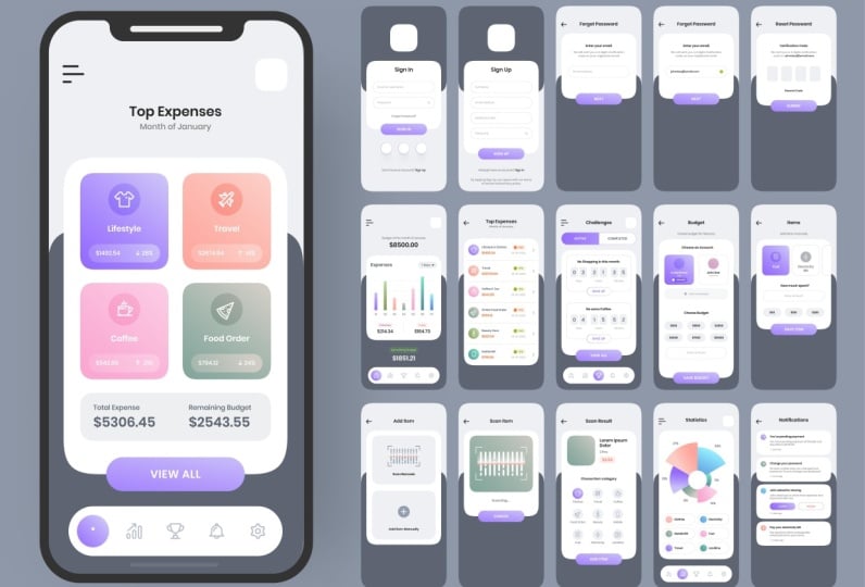
4. UX Design: User Persona: hi. In this Listen, we're going to talk about user centered design in particularly what is used that person. So according to Nielsen Norman Group, and use their personal is the same if Arsenal Character, which is based, are in quarantine there. Okay, so remember that personas have behaviour and traits that will make them use your brother much, much like a real person. Therefore, it's kinda over a person whom we specify all the trades. All these character traits should be relevant for our product because, say, if we have a taxi up, whether or not our persona has a red cat at home is completely irrelevant. However, our 11 characteristic for for this person would be if she or he has a family, because if he has a family or she we might implement different features in the upper that will bring a feed a big family. So why do we need personas? We'll use their personal will help us find for whom we're building this up for. This will help us made the court design decisions so that up will be the needs, motivators and wishes off our users. We have to limit the number off personal to two or three. Well, that depends on the product, but usually two or three is enough. Moreover, if we create too many personas, we might lose the focus on what's really important. There are different to user research methods that we can we can base our person on, and we will talk about those in other lesser. But for now, it's a key toe. Take an educated guess about how this personal will look like with what goals she or he will have. But what motivations and someone let and let her way we should call for him those through research, the purpose off, making upper size to help the product and the thing that makes it folks on the losses and the user's needs. So if don't correctly, those really improved dramatically our design in its features. Therefore, we examine sweet because of drinking on making up for them rather than for us, because this happens all the time. Designers make APs that they like instead of their user, and that's a very big mistake. Another big mistake is in a personal falls in a general typology, for example, what is the user off our taxi? It's wrong to say that everybody, because everybody uses taxi. The right persona is the people that don't have Gore or young people don't don't even know how to drive. We have to be specific about. There are persona this week here, possibly in making that up. Now let's create a person say our is Ah, appear professions and you're burning up toe. Help her at her work. The components off our persona should be. First you want to serve an image, one that defines very well our user. You should not become celebrities or car took pictures. Instead, you wanna you're not. Pick someone that they represent the age, gender and personal personality of your persona. You and I give the name on a real name because you're going to refer to it as a real person on. The person has thoughts, fooling and behaviors that you can empathize with while making that we're making the design in the future. Decisions name a good person is key. It's it adds a human element in the creates a storyline narrative who ate the problem solving Next, Give your personal short by a based on the research conducted, feel free to use personal and employment that the points that were shared during your interview. Next, you should include a quote for their persona. Your coat can be quick, a quick snapshot of their personality or something that is important for them. Again, the goal is to allow everyone on the team to empathize with the person. An example quote for Genie's to be good, be out. I have to be up on the trains, which is where Instagram comes in handy. This court described their personal motivations and typical behavior brothers next, traditional, different brands that they represented. Person. These brands alot you to other contact to una persona that will act as our as a mood board . When you look back at your person at a later date, you will lean on that big snapshot of these brands that can help trigger empathy for two years, a percent. If you're persona as every brands on Twitter Jones, Instagram and Lift, you will guide your product differently. Daughter. Then if if their preference, their brands were my sorority and we don't you can deduce a lot off things about two persona by their favorite brands. Next, you should add beliefs and behaviors for example, genius Genius's should over there, whatever it takes to protect your client. She's not afraid of hard work and, uh, spend all day in the hole and office jumping from from Grand could climb. She uses instagram and Twitter toe. Keep opened the restaurant. Next, we should outline your personal goals. It's important. Understand their aspirations, since you want to protect your feet in the doors goals, for example, genius driven by equating the most value for headline. She wants to be there whenever they call, even even if that means spreading yourself too thin. Next, you should ask them to understand their pain. Points are things for state your persona? Did the day hate doing busy work or tasks? I want to understand their frustrations. You can solve their problems and feel better products if it there needs genius. Frustrated by the fact that she has a multiple email accounts for each of her line, she's financing for on Is it slow her down when she has to check those constituting Kara Morning commit next East personality organ of 36 this is pulled from the Myer Briggs personality test. Well, it's a great touch is not completely necessary. Genies are social and loves toe know the freedom that the financing off her skirt. He's always the first to arrive at a party in the last one to leave, and lastly, we want to understand their motivations. Oh, it can be beneficial to show this in a more visual way, so you can easily see what drives a person Jeanne has. Ah, for example, Gene has a sense of pride in your work. It's motivated by the social interaction she has with her family and the co workers, and that's that's all. I have a personal guys. I hope you understood them, and I see in the next one.
5. UX Design: User Research: Hi, guys. This is and we want to discuss about tweaks its search. It's a very important topic that falls in today, the eggs on your face and I'm going to start out by you. Quoting Tim Brown. Empathy is at the heart of design. We thought understanding, fourth other see feel and experience design is a pointless well. Remember what we talked about your ex use that experience Design is the process of designing products that are useful. Is it used in a pressure to engage with? It's about a hazing, the tarp experience people have while interacting with the product and making sure that should they find the value participation in the life. So let me give this, um, an average if a mountain peak represents ago. Important, various Yuxi research methods are the path of year designers used to get up to the top of them out. Your research is one of the most misunderstood yet critical steps in the UX design. Sometimes treat, it's it's treated as an afterthought order on an affordable luxury. But the record search and user testing should inform every design decision, every product, service or or user interfaces under screen in the safety uncomfortable their workplaces has toe somehow surviving the Empress pair in the In the real world, right counters, people will engage with our equations in an unpredictable environment where which the donors have no control, you actually step. She is the key to grounding ideas and reality and improving the odds of success. But the recession can be a scary award to my son. Like like money. We don't have, like, theme. We time. We can spirit on an expected recover seat in order to do your excuse it effectively and to get a clear picture off a teaser. Users, you just think and why they do what they do. We have toe coat, walk a mile in. The users shoot as a favorite yaks, Maxim goes. It's essential that user experiences, honors and productive is conducted. The research often and regularly contingent upon time researching and budget, the deeper they can dive the best. There's a long and comprehensively stuff for your research methods important by the user researchers. But, um, at its center is the user and how they think and behave they their needs and motivations. The Brooklyn Ah, York City, Sir, does does the strokes, evasion techniques, task analyses and other feedback methodologies. There are two means to mean types off. You use the research. There's the quantity of type of the quality of type I want to give her. It's more about US 50 statistics that can be covered and then computed. But qualities are such is about insights, but it's concerned with descriptions with which can be observable but cannot be completed. Quality of research is primarily exploratory research, and it's used to quantify the problem by by way of generating. The were called out on data that can be transformed into usable statistics. Some command data collections metal methods include various forms off service like online service, paper surveys, more bar stories and cask service, and more. On the other hand, quality research. Direct assessment off behavior based on observations. It's about understanding people's beliefs and practices. It can evolve. Several different methods included contextual observations, ethnographic studies, interviews, field studies and so on. These are the city is not typical off tradition science, with ethnography being its courses, that Cuba effective visibilities contextual and depends on a broad understanding of human behavior if it's going to work. Nevertheless, the tops off you use the research that you can or should perform will depend on the type offside system. We're happy you're developing your time on in your environment. These are some of the your exit search methods. Firstly, there's a car 30. Basically, it allows the uses to group and sort of site information in college structure that can that will typically drive navigation and the sites information architecture. This helps ensure that decided to start your images the way users think the single one is introduced. One on one discussions we to use the show hope, particularly user things. It works. They enable you to get detailed information about the use, attitudes, desires and experience the doubling its first click testing. It's a testing method. Folkestone Navigation, which can be performed before the function website up Rotary. What are wife ring? Local local groups are more detailed discussions with a group off users allowing inside into the user's attitude, ideas and desires. We talked about user persona in the previous lesson. Remember that the information that we have given to each of the person has to be confirmed through research. The next morning surveys it. Ah, it's a serious off questions asked. Multiple uses off your website. Taken popular about the people who visit or your side, the last one are easy usability testing These help you in it. Five years US frustrations and problems with the site to one A one decisions. We're, ah, Riel Life user performs tasks one on the side being studied. Now let's look at your X research benefits. It firstly helps us to create a product that is truly relevant to users. Secondly, it help us to create a product that it's easy and impressionable to use. All right, he also helps improve the pair from acidic, incredible to the website or app. It think with this exporter and sales, which means the growth. Ah, in the customer base, it reduces the border of resources, which means more efficient work process. That's all I have on your such guys. I hope you made there on a day or four forties and what's it used for? And I see you the next
6. UX Design: User Flow, Wireframes, Prototypes. : hi guys. We know we're going to discuss about firstly user floor water, their journeys. These this anything we're filming in prostate, I'm going to start with. Use their phone eso once, once we have a using persona and we already have an idea about up and its goals. We mustn't find the main user for the user flow in these air genie, because I see that getting us in the same thing is the steps that someone makes to go from point A to point B. So it Z not a skid show for the interface or a markup. But it is the connection off pages and sets off actions. What the steps for the step. We have to be very attracted national, and because it is necessary and what is not. Let's look at an example, so you can understand. Let's see, it's a website. The greater can buy shoes andan types in the product name a review of the product added to basket when he goes to check out his ass to log in. After that, he's able to pay and then receives a confirmation email, all right, and that I just love starts here and goes these rate these rare and ends here. This is user flow. It stay poor action. They want toe want our user to make in order to achieve his goal. But there are different steps amongst those steps, and that's that's the interesting part. For instance, need the user doesn't want to search. His item is that he wants toe scroll down and access a pair of shoes from there, where instead, there flogging he mostly just the first. These is the happy path because most of USA's we'll follow it. But we have to know that there are alternate bats, like once. I said before that we go where we'll go. Different Say the product is looking for is not in stock what they have time, the wrong name of the product in the search bar. What do you do that you don't cause you don't want to lose our custom? Or do you? If you do lose them, you can't say that you're the U. S. Is bad. If you do lose them, we can say that you exam is bad. So if you if the product is not bean the stock, we can show them our message with informations about the product. Will we really be in stock again? And so I encourage you to do our task. Now take a piece of paper and a pen and quit the user for for apple that the orders are coffee for you. Be attentive. What is the easiest for for the users, so that you can order he score faster than besides right by the APS experience. Pause the video and dough that after we were jumped the wire frames my things are reused. Teoh, early in the development process, established the basic structure of off the page before visual design. Incontinent is it is the first visual designer to do in the design process. It's our law field to design layout. In contrast, a highly lt design is the final mock up off the design. We told the details and colors and styles. Profitable designs don't have a lot of details. They just focus on the main content in the structure of the page. The purpose of four seems to think about the structure. What content? Hajto connect things together. You don't use the color skiers and so on. I personally use pen and paper orders make workings dearly in digital environment, such a Sikh muskets and so on. But I personally used paper first, and then I create them. Fig. Mom, I feel like like like when I do that, it's easy for me to generate ideas. So some key elements what they should take into consideration when starting where Flemmi's . You want to know how much content and what type of pointed you have really be having on the page long text or four text. It is going to be blawg or the visual only display features. Also, you need to take into account home. You're making this design truth. For instance, see if you make a design for elderly people. You will probably want to make their photos and text a bit bigger or ah, if that we will be used while in a car, will take care to make the bottoms big so that people can create them or, if you are fast, cheap and perhaps the most important impermanent were frames are meant to change. As you gather morning formation, you have to use a resurgence stakeholder input where him served at the common language. Putting designers to use their stakeholders in gives your compassion after him from everyone was simple enough. Toe be bogged down by tomorrow. Tea till or design language. Remember that. What dreams are only the first or second step toward a prototype. The case prototypes are meant to be the most function, draft or reporter. Why frame served toe Help you focus on the placement of the content and set a course towards a functional prototype Your mission is to is to make it be easier for your users to accomplish their goals. We're representing information in this way. Ah, you are aligning. The business goes off product with the needs of your users, all by laying some lines and squiggles. Pretty cool, huh? So now I'm going to throw in practice. What they prototyping is you can't prototype your were friends or Haifa guilty designs. Prototyping is just linking the bridges and making toe work like a normal up. It just doesn't have functionality It You can taste up this way with your personas and they get through that. So now I'm going to make three pages with bottles that go from one to another. So I'm inter pages Pedram pitch to embrace three. Each pitch has bothered buttons to go to the others two pages or they are interlinked and what they were put stepping. There's just linking them and making the work as a whole. So in fig Matt to do prototyping, you just go Rocky render on the right side in my own Impressed for tonight and you are now on about that are being reviewed. Now go in telling the pages, you just you just want to go to the bottom. You want to press like that and drug this thing to the the screen you want to go to, For example, on the first page, If I want to praise the the page to button have gone the peace too. So we do the same thing here. Hope to the page No, now our for our pay, our first pages linked to the second and the third page. But you can see that the second progenitor which are not linked Ah, the other pages so do the same thing. But for these two pages going John, No, no. You get your idea of interlinked the model B, C, D and Division today gives you the possibility to put this on your smartphone and tested committee users for our case. We're just, uh do that. Of course there you will not have such simple screens, but more complex on. So now we're on a big run. If you want to go on the base, that just press on the bottles that you reject us to the second page. No, no, we are on second page. If you want to go back this again a big one each to a rubbish you want. But we want on pastry the press pastry. Now you got on. Please. Three. If you are not going back on the page One express on the page, just kind of want to work. I mean, you So you can put these on your on your real phone and test with users We're not to test. That I have for you is to make a simple for pay design off ordering a coffee from an app. We're told that I've taught before with their floor. We're filming a prototyping. Ah, make it a part of that to just wind frames. You don't need the very detailed usual designs you're seeing model because if for whatever you make toe, make your designs and, ah to next time have a good night
7. UI Design: Visual Design Principles: hi, guys, this less I'm going to teach you the principles of good usual design. One of the most difficult parts off dark in there about sports of design is figuring out is harming the principles are there or there 57 of them And it was that's been figured out. Which of these sports the line for the men's cells should be included. Search for Principles of Design and Google, with the donor results for articles that include the from five to more than a dozen individual principles. Even the article that agree on the numbers don't necessarily agree on which off the ones should be included in that number. In the reality, there are roughly our doesn't basic principles off designed. The beginning and end experts design alike should keep in mind we're working on their projects. In addition, there are another dozen or so state Kandari design principles that are sometimes included as basics. I really illustrates and explain the main design passports for their in business. So the first design passport is core interest, one of the most going. The complaints Dernis have about clients Feedback win often revolves around glance will see by design needs to pop more weren't that sounds like a completely arbitrary turn. What? The client generally muses that the design needs to have more countries corn trust affairs , toe hold, different elements are in my design. Particulary, I just don't elements well. These differences make various events to stand out. Core just is also a very important aspect of quitting accessible designs. In a sufficient contrast came tactics to condemn, in particular very difficult to read, especially for people with visual impairments. Look at this example. Airship Industries has more contrast, meaning that it drops more first like it has a different colored on the next. Next to any class in need of this shape that also give it. Give it more contrast in this example that takes is bigger, meaning it has more contrast and therefore catches that I faster the next Presupposes balanced every element off my design, like topography, colors, images, shapes, bottoms, carries a did your weight. Okay, you remember that So Merriman's are heavy and draw the eye while others are lighter. The way these elements are laid out on a P should create a feeling off balance. There are two basic types of balance. There's Smith, Coburn's and as Mexico balance, mutual designs have elements off equal weight on either side, off on images center line, whereas a symmetrical balance uses limits off different ways, often laid out in the in the aeration toe, a line that is not centered within overall design. The example. You see, it's an example of a symmetrical design. This part of the screen has more weight than this one. Therefore, the line that supported those two is not central. The next Chris Paul is emphasised. It was his deals with the part of the design that the main percent out in most cases this mean this means the most important information the design is made to convict if his emphasis can also be used to reduce the impact of certain information. This is most apparent in instances where fine print is used for ancillary information in a design turning top of every doctor way at the bottom off a page areas much less with them and then and most anything else in design and is therefore December sites, the next principales proportion proportions. One of the one of the easiest, because I'm supposed to understand, simply put, is the size off elements in relation to one another. Proportion signals what's important, united and what isn't Larger elements are most important, smaller elements. Unless this is also good example, this image is bigger than the images. Next week. The next baseball is repetition. The petition is a great way to reinforce an idea. It's also get rid to unify. Designed brings together out of different elements. The petition can be done in a number off raise via repeating the same color that freezes shapes or other elements in a design. This presentation, for example, uses are petitioning for more the titles like this one. Each design principle is formatted the same as the other in the section sending trader that they are all of equal importance in that they they are all related question headings unified these remains. Of course, of course. Bridges. The next principle is a rhythm. The space between rabbinic elements can cause a sense off reading to form, similar to the way the space between notes in a musical composition territories. There are five basic types off visual rhythm that designers came acquit, which is random, regular, alternating, flowing and progressive around normal rhythms have no discernable patterns regular. It was followed the same millions spacing between each element of it. No operation, all donating, written before I set off pattern that they're beatable. There is a relation between the actual elements that just 123123 butter flowing rings follow bends and girls seems to similar to the ways and unions on the late or waves float. Probably progressive rhythms change as they go along with each change adding to the previous iteration. The rhythms can be used to create a number of Phoenix. They can quit excitement, particularly flowing and progressive reasons. What great assurance and consistency, he told, depends on the way there implement the next. Baseball is better, but they are nothing more than a repetition off multiple design elements warning together well, paper partners, the more suddenly present example of patterns that get really everyone is familiar with in his eye. However, partners can also refer to set standards for hold. Certain elements of design, for example, took navigation is that example attended the majority. If users I have interacted with that expense, but his wife speaks. What's piece also referred to as negative space is the area so far designed that do not take with any design elements. The space is eventually many beginnings. Anna's could they need toe part every piece of it's some type off design and overlooked the Valley off white space. But why? But what's based service many important purposes in design for the most forgiving elements , then at home to breathe. The produce based can also help highlight specific content or specific parts over design. It can also make elements of enzyme easier to this term. This is why topography is more eligible when upper and lower case letters are used. Scenes, never their spaces more varied, uh, around the lower case letters which of those people to interpret them more quickly, then express. But this movement movement refers to the way the eye travels over a design the most important that I mentioned the date to the next thing. Most important, and so this is don't throw apportioning embassies and older than elements already mentioned what is turning, meaning the inertial force on certain hours of exam. First, the next disposes variety right in designing is used to quit. Visual interest without a variety ad sign can very quickly become an auto knows causing the user to those interests, all right, they can be equated in a write off, freeze the color typography images, shapes individual. Any other design elements. However, variety for the sake of all right is pointless, right issued the reinforce the other elements of a designing and be used alongside them to create a more interesting, an aesthetically pleasing outcome that improves the users experience the next Presupposes unity. Everyone has seen a website or other than out there that seemed to just throw elements on a baby with no regard for how they work together. Newspaper ads that use 10 different phones come to mind almost immediately. Unity refers to how well the elements of exam work together. Visual elements should have clear initiative Pretty Children on design. Beauty also helps insure concepts of being communicated in a clear or hits of fashion designs with the good. Unity also appeared to be more organized and of higher quality and authority, then designs with poor unity. Also, the same principle don't work alone. Combining example. Suppose isn't just limited to tow time. More truly great designs combine at this half off these elements and sometimes more for example, these grab side uses a variety of principles. Firstly, contrast between the hot pink and the green, the petition in the partners being used, inconsistent shoes, her cut and sunglasses, unity among the various outwards, which is further reinforced by the deputy and partners in Detroit. In the thighs. Off out, it's It is a strong design, a statement that forwards multiple principles toe individually appearing and eye catching website. Here is another example of design that uses multiple principles effectively. The large heather equates impulses on the particular text. Well, the smaller types up your lace important do the proportion the sheeps in the background create a sense off random reason and movement, while the similar color scheme between them creates unity stronger and larger shapes on the right balance, it takes in the white space on the left. Some designers follow these principles without even realizing they're doing it. Other times it then I can't quite put their finger on Wired's and isn't working. But when they consoled these principles, they can often find a solution. Understanding the response off then and how they interact with each other is off. Part of on the importance for both new and expertise on this. I like implementing them perfectly. In addition, in his own project is key to creating visually appealing and fortune designs. This is for the principles of design guys. I hope you found it useful and I see in the next.
8. UI Design: Typography, The psychology of colors, How to use colors in UI: Hi guys. In this lesson, we're going to talk about typography psychology. Of course, I had to use colors in your eye. So to begin with, there are four types date faces. There's the sensitive type of the stories Taipei the script and they despite x rays. What's the difference between the sensor? Different cities is the decorative stroke. This I think some serious sentence from French means without answering for means strokes also called the feet off the letters keeps. Script obviously, is grand of it in my hand display. If our is more used for titles, that's the difference between sensitive sensory science is in the front. San Serif is in the back. Now we're gonna discuss about typographic error key because that's very important, effectively organizing content of, you know, design so that you don't understand. The question is one off design is the most important jobs it is. Much of the contact centers work with IHS stakes based, creative and effective typography. Hurricane is one of the most important things, added Anna can learn we're practicing and experimented with. Creating an effective Harkey is the best way to really mastered the skill. There are a number of guidelines, designers should learn first before setting out on their own. After all, it's impossible to break the rules effectively without first knowing what they are beginning. The sometimes underestimate an assistant for using hurricane of topography. Yet goods exam this information is being is being conveyed on both sides. Yet on the left is impossible to tell. There's a There's a header located about detects, but on the right side it's immediately upper and that there is a heritage toe. The information being provided the photographic Harry shows that read their whichever missions to folks on which is most important and which is simply supporting the main points . There are a variety of things that make up about a topographic hurricane. This includes, so it's generally the first thing the new designers total toe win trying to create the A topographic hurricane. And that's for good reason. It's merely an easily then if I bought by the reader because bigger equals. More important, smaller equals less important, but science can become a cordial in. There are so many other options to quit a here. The next one is weak. Making a tape is bolder or thinner is another easily Eric Garner recognizable weight. Create here, kid that easily. We're in trouble even by non desires. The next Tony's car called the resulting overlooked as a way to create hierarchy. But but it's a fantastic corruption. Even using lighter or darker shades off given color can create more distinct work. Creating more contrast between type and it's broken can also add typographic heritage. Then it Tony's going trust be in contrasting course. The contrast between the different types sizes are weights, and Stites is also key to creating. The graphic here difference off one or two points in type size, one quite enough contrast to make the herky apart and through most users. Instead, designers should use easily distinguishable sizes, weights and styles to easily quit contrast between things like here. This embody decks. The Knicks won his case while capitalising Body takes to generally not a good idea. From our credibility perspective. Using upper case characters in headings or subheadings can shop differentiate different headings or other types. The next one is positioned enlightenment, the positioning off headings and subheadings, along with other type that I don't know what stand out can have a lot of impact on where type falls within a year. Centric tripe, for instance, things to make it sent out. Sitting type outside of the regular imagines off page can also make the type to stand out within the hierarchy of a page. Now let's see how quickly that that program, for sure Susanna's have a lot of options when it comes to creating a typographic Yorkie. But just knowing what goes into equating herky alone want necessarily help this under squid and effective hurricane. One of the first thing to positive is how many labels off hair key essential cap. As a general rule, every design should include three labels off Eric heading subheading embodied text. From there, it's up to the design and because of the additional levels that might be necessary, these could include captions, additional subheadings, pool codes amid the informations. From there, it's get to figure out how to distinguish between the different parts of the turkey. It they should go without saying, but heading strip, be more planning programming and then subheadings. We should be more permanent, and body copy captions should generally be less prominent. That body copy and pull courts should be somewhere between core body Cup and suffocating. Now let's look at type sizes. Traditional typographic skills exist to help these analysts get started. Well, these are only a starting point, and designers should feel free to experiment with different weights and styles while they vented from these traditional skills, most based, their scale on the sides of the body ticked in expense on the the classic typographic skill from the elements off typographic style are from here tomorrow designers as they tend to be , defaults for most of word processing programs we're in selecting foreign sizes. You can see the scales in front of you. There are additional typographic scale examples of their full of various mathematical equations for calculating increasing sizes. Designers have a tendency to the photo a 12 point by the text size, but increasing that 14 or 16 or even high as 24 can lead to increase the credibility depending on the type that phrase being used. Jeffrey since seven Personal website, for example, use AH 24 pixel phone size for the body copy while walk that come uses on 19 BC body dig sites. Now let's talk our teachers funds together well, what sits a professional design a partial, more moderation. Forts is the commission off that faces well, to be honest, effectively combining the offices, part egotistic and part science. But there's there are a lot of guideline. Designers can afford to combine the crazy from different families first, mixing serves and some service is significantly easier than combining two cities or to send serves. But it's not as simple as grabbing any serious in any sensory and turning them together like this because he did that text in which that I preserve will be used, for example, if the design is supposed to be light, and for they make sure that I freeze our feet that mood, if they design eyes more serious than that, the faces should reflect that. In other words, the mood off whatever typefaces are being a combined should match. For example, the Border Needs website combines a city friend, the sensitive type trees that both have a slightly retro and high in the movie designers. Should you'd contract to their advantage to combining thin and thick. The typefaces often works better than combining two that are very similar in weight. Well, look at this example. We're guidelines can be helpful in greeting type freeze combinations. Nothing will replace experimentation and practice. Zana should spend time experimenting with the faces and practice, combining them as often as they can. Finding a few four bucks, they face combinations they can work in. A right of context is also helpful for projects where the budget and associates available don't allow for a runoff trial and error. Now let's look at these examples. Ah, very bold phoned like be Run doesn't pair well with their light for like he will take a new but even worse, a better with something a little bald like Jill Sense or a Magic SG's a very casual front and doesn't pair well with basketball. But, um, Atticus Jeb pairs better with dressing slap, which is also casual. Now let's look about psychology off colors and why is it important? Well, each color portrays a portrait of feeling, and you can use this very wisely. Win building websites. We can play with court based on your user in the goal of the apple website. First, let's look at the blue collar. The blue cooler usually portray stability, harmony, peace can and just I think it's best. Remember this, but you should feel them. That's very good. The yellow color portraits. Happiness, Positivity, optimism, A summer and warning and the Red. The Corp. Which is excitement, passion, danger, energy in action. The greener colors usually portrays growth. Fertility, Health Juniors and Andy. An Orange Fortress Creativity adventure in 2000. Success on bar black and white. You really go together. Black portrays mystery, power, elegance, sophistication, sadness over anger and white usually portrays light goodness, purity cleaners and minimalist. Now little is how to use colors in your So let's start with this. You already know what they find. The caller. There's the RGB values, hex values and Asia's B is also very important. And it's comfortable to play around with hash from my just be things for sorry Hash from HSBC stands for Hugh, which is the core itself, like green blue or Red s stands for situation in B stands for brightness. Really, there aren't off off best practices and begin colors my mind by money. Britain does these over these values and no literal eyes. This image, this is the wrong way. Toe be cli turns over over color need to decrease the hue and the saturation and only increase the brightness instead of increasing both bodies and separation. This is the right way. This quiz, Hugh decreased situation and one great brightness in Peking doctrines, vice versa to death, decreased the hue and the brightness and increase separation. You can proceed if you want to analyze for yourself. This image. Now, Speaking of all shadows, you should know that in real life, shadows are never black on light is never wait. So is in the detail work when picking a color for a drop shadow. Never choose pure Black said they wanted Choose accord that is most used in your design. For this example, There's barbell now, as the golden ratio goes cooler should not be too much. Use a neutral primary color, like for a 50 to 80% and make sure it's credible if you is more partially and analyze a big the course off on this happy Soviet on the same bed. And finally we have for the different colors portrays different feelings in this example with this notable, well picked color for this bottom, because it is like, don't touch me, what I may blow up and because the readies so bright it catches your eye your eye intently when actually, you should look at the green button first. The ski bottle needs only a small size talk in the inside of it should be black, because this way it is viewed by our brain. Other secondary bottom. The buttons says, Hey, I'm not so important. You should click on my friend Mr Wynn from next to remember the principles that I said this example uses contrast to establish which button is more important and color. But it's a huge jewel on making contrast now just to give you some piece of advice, don't you? Scholars that are not in the safe zone, maybe in rare cases, but usually colors from outside the zone hurts the eye and just look OK. Oh, I am. Either way going back to that, it just be a few experimental little bit. You really observed that. For example, if you look over here when you're when you're going up right there, the burden increases respectively when going down decreases. So it's vertical saturation ago. Their hand is horizontally from left to right, so let it increases and moving to write it decreases and here is only I just bought from these big it with here. So I have here three websites that will help you peeking cores. Go ahead and use them, and they really see you in the next lesson.
9. Design Thinking: Understanding what matters: Hi guys. In this lesson, I'm going to talk about what really matters in design. You have to understand that design is nothing if it does not solve a problem where does not serve its purpose? A person isn't a designer if he knows that was like feed, mask, edge and so on. He just a good practitioner. And that doesn't make you My design is that design thinking is the right approach isn't work, is there thinking you the exclusive property of ZANIS? All great innovators in literature, art, music, science, engineering and meters have practice it. What's special about this ain't thinking is that the owners work processes help us systematically extract, teach learning about these human centric things. To solve problems in a creative, creative and an innovative way in our designs, in our business, in our countries, in our lives, is anything is an intuitive process. Neutra seek to understand the user challenge assumptions and redefine problems in an attempt to identify alternative strategies and solutions that might not be is certainly up around with our initial level of understanding. At the same time is any thinking provides solution based approach, foreign problems. It's a way of thinking and working as well as a collection of hands on methods, is anything. It revolves around a deep interest in developing an understanding off people for whom we're designing the product or service it helps us to observe. And the Europe empathy with the target user is anything. It helps us in the process of questioning. Question the problem. Question the some from questioning the implication. Their thinking is extremely useful in tackling problems that you'll defined or are no by the framing the problem in the human centric race. Creating many ideas in brainstorming sessions and adopting hands on approach in prototyping and testing the whole approach and how to do these anchors going balls, ongoing experimentation, sketching, prototyping, testing and then trying out concept and ideas and then testing again. And so the exam you see in a dribble are not always the best. Yes, there. Those are not beautiful, but not in the practice, especially making me think what some of those Russia thing just make an absolute Those surrenders in the performer's. If you're up doesn't serve its poor person, it's pointless. Let me give you this example. If you have a landing beach was purpose East to get the lines well. And there's not that culture action. And the website doesn't help you get clients. Then the website is pointless or even it may worsen your business situation. What I wanted to take from this is to think outside the box and think to build borders and solve problems to satisfy their clients. Okay. Thank you for staying with me and that. See you in the next list.
10. UX/UI Design Process: now, since you understood the concept in the different phases of design, order to look, I don't remember See declaration between faces. How how they affect each other they designed. Start by discovering you don't throw yourself directly into sketching in design. Should start by understanding the user was the product purpose. What should you do? And also you can analyze competitors in the market depending on the case. Then you're going into the fixing all the problems he's. We redefine your concept. Then you're going to our everything for the typing, and then you just you actually should taste everything. Ever there you can just whenever we want and whenever you need. What 1/4 phase. You make the mock up with tales, of course, and test it again. The third and the fourth are repetitive phrases. You would do them over and over again until the product is good enough, and then and only then you go into releasing or giving them further toe. The lefty, I said in one of the videos that but you before this and this never done well. That's right. Designers improve the border even when he's already released on the market. You didn't receive it doesn't fit back and you will know what and how to improve. That's what they you etc. Why faces? Guys? I hope you have a better understanding off those cold design process.
11. Case Study: Designing for kids: Hi, guys. No, that you understand. What? The same thing in G's. I want you to make this exercise with me to take, to understand. Well, we will try toe them for kids are very interesting personnel. I would say we made the weight this key studies from his labrum Go follow you exploit. They have what some interesting post where you can learn a lot from so our user is like it . You can imagine this time we look very much different than then. I did it for adults. So at first we need to understand how are kids different than adults by violating each aspect. So from 0 to 2 years old, I can't cannot understand the question. Can't reach even people from memory and can formulate the asphalt. Neither evil wait or communicate and find an answer from 2 to 4 years old, he already can understand equation about a basic answer before he can communicate with the detail device from a 4 to 7, his already begin off. Uh, so to use ah diesel device properly, he's just not able to immoderate meaning hasn't already developed no critical thinking in the next one. Speak for themselves I think you have a good idea. We will want to design differently, especially for these regions. From 2 to 11 years old. Kids engage better with symbols and illustrations, then with plain. Therefore, if we want to keep them engaged, we need to use more illustrations. They're organized in connect with symbols much faster than with type. Also, kids don't have developed language skills, so we need to get down to their level. Therefore, a sudden bottom can be Hamadan or ago. Just be creative in you. You release it, you find the right words. Another thing we want to take into consideration the fact that they can't type what even don't know how to. That's why using slides or something that, uh, they can only touch is what you're solve. Our problem. I help them achieve their goals for the moment. Okay, we're just then I hope you're stayed with me through this case. Study and defend your understanding of design thinking. Think thoroughly when designing for a specific user in and understand the user properly so that they will have a great experience, were using the app or website or whatever you're building. So see you next time and until didn't have a great day
12. Responsive Design: Okay. You all remember those websites where you needed to zoom mean to you the quantum from Mubarak phone, right. And if you try to top about the new tops another on my mistake. Well, supposing design eliminates those problems may creating a better experience on every design You open the website when they stop for the website will be region content, whereas on the phone the country will be restructured and it's done in the less than in the Dexter ball turns them better. Imagine a piece of paper that has a specific with and hate. If you draw something on it, you can't use the same job being on a piece of paper 10 times smaller. That's why you need toe make a drawing so that it will be still reasonable in smaller pieces of paper. This is in essence, what s positive Chinese? The question Is it possible to design websites so that it will look good on all the devices ? The answer is yes. Anyway, it looks somehow own and other devices just experience won't be as good luck. Long story short the responsiveness and makes a website put up with the device. Yeah, the website should be adopted from small is a Shinto, even 40 resolution. Let's look at Starbucks and how they do their were responsive design. Firstly, to get into responsive when you have to double, click, click, inspect, other balls have different maimings but they also based here we inspect. No, I have to click this little button here and you know you are responsible. You're either again are not from home here and the city websites How See how their website looks on different Mobil's like a list of 6 to 8. And this is how the website look so not justify one this iPhone or we can know manually change the width of the page. You just click. You just look on these line on the right of your screen and just drag it to the left and you will see how the various portions and works each pieces of drugs that regroup together and the restructure. Okay, here I have three pieces of advice. Well, we're gonna start your in keeping in mind that the most important content should be always first. I think what's important for the user to see and nothing makes you make sure to be visible on smaller resolutions. Also, think about making buttons because of the people Can is very quick on them. Practice and encourage it to open a random website that rely again greatly to disclose to design in wire frames after you are done. Check with the Texas wasn't designed to see how the how close you were, Uh, and this is for this video. Keep practicing and I'll see you in the next one.
13. Microcopy: hi guys. As designers, we focus a lot of attention when interaction and differences that. But how can you continue to raise the bar two and create these appalling that they're more useful, engaging and simple to use? It's simple words they yelled More power than any other month you're exploiting in particular is an essential part of design process because it can dramatically improve user in management concerning team usability. Experts in the Nielsen Norman Group claimed that scanning Texas typical behavior for higher literacy users, users read only about 20% of the text on average page, with the 608 100 words in corn, Concise takes objective language and scannable copy improved visibility by 124%. There are a lot of distractions and constraints competing for years and engagement with digital brothers. High quality. Your ex writing cannot be underestimated as a vehicle to both improve the user experience and engage, they use it and after overlooked yet poor for four months, X riding is miracle. So where does me go? Good, Bigger copy. Is this more informative? Any instructional takes on forms for box buttons searching puts, and so they inform and assist people in small ways as they are using. The brother. Michael Cooper serves as a guide when users take specific actions, such as searching for the product or trying to use an appropriate response. Microscopy serves as a guide when users take specific actions, so just searching for a product or trying to choose an appropriate response. Microprobe can also build trust and empathy with the user in the for a stronger bond with the brand off raw, effective US make copies clear, concise and easy to understand. It takes on the voice in the door on the brand detainee visually and feels like a part of the design Please, I need as a question our bills empathy. Effective Miko Copy seeks to understand and anticipate user expectations. It allows the user to feel as if they are having a conversation with the interface. Any deals that ball to engage uses an increase conversation. Because my Cocopa builds user, adding emotion to make a copy creates a better connection with the user and helps foster a stronger bond. Use this formula with brands of make them lawful on feel better about themselves. But how do we know what conveyed. Quit the right emotions well by conducting in depth to use a research at the beginning of the UX process. Understanding they uses and there are unmet needs, motivations and behaviors will assist US designers when crafting the most effective empathetic. Another example of building user embassy with meager copy is showing the steps that are being taken When placing an order. Giving users are little extra. Contest will provide them with a sense off what is going on and alleviate the stress off wondering when they're older Will right. It just creates clarity and control. There are many reasons why uses abandon, shopping carts, stop using products and Cason subscriptions. First, there's a ambiguous or confusing messages. Too many personal questions or reforms. Too much jargon. Career shipping charges, not enough information about the product, serious or persons and uncertainty around the house to cancel an order We're using me. Gran Copy, on or on the bottom is painful. They user what happens next when they're going through the purchase secrets. Help them feel more in control. Another examples using open when installing and what a baking Our brother we teach. Step the group topic and let the user know exactly what it is or will be happening for conveying planet in control. 50. Effective you exceed. Macroscopic does not have to feel open an entire paragraph. It simply needs to be clear and concise. The gold from my use perspective is to reduce anxiety and better inform users. This example from Mill Chimp Show was an effective use off micro copy when a user is having an issue signing in, uh to the platform. And these quits their experiences because these new products can raise a concern for security and privacy. Microscopic that build straws will have a poison back to in the Eurex. For example, if people feeling insecure or sore suspicious while making a transaction it came into the abandonment of a Portuguese or being skeptical about continuing to use a brother, you're a few scenarios were that my vehicle might occur, asking for too much personal information on on species. Why did they has about guarantee warranty? Replacement of the brother asking for grid card goes for Free Street. Our subscription instead, off assuming users who will give you all the information asked, Effective me got beginning from the user why it's being asked and hope will be used then. It thinks signup process is an excellent example of providing your transparency with macro book. They provide reassurance or by letting people know when they can cancel a trial without being germs. Another excellent example of microscopy being used to provide the residency is a linguine during the designer process for their premium service, they explain exactly why they need a queen's guard it is and how they were being charged. Microscopic problems. People to take action. Good effective micro copy can help people complete Ask Dr Engagement and encourage users to go further and do more. For example, if people are are using an economist side and they remove items for their from their court . My God, what can be strategically placed in corn? Jing them to continue exporting other similar products. Driving engagement, providing empathy and transparency and giving us things off clarity and control. All tenets off effective. My burger, P X and brother designers have multiple opportunities to improve the user experience. Now let's talk about the effect off Poor micro copy. Yes, it is under should always drive to great effect in Maghrib, but but there's any microscopy better than none at all. Not necessarily put. Make a copy can ruin even the best years within our brother. You're some tenants off poor Magara. Go unclear and confusing. Two variables are engaging, revolved and miss guarded tone deaf and non empathic. When engaging ticks, that is, wagon Andrea can misguide uses to take unwanted actions, leaving them angry and confused. Now about that. Mind guys. The benefits of effective X microscopy as substantial, and we're to use an engagement brand loyalty, trust and feature on this product experiences when they used correctly Good macroscopic in shorter product. Stand out in, ah, in an increasingly competitive marketplace, user adoption rates tend to be higher and products experience less journal darts and make a copy. Guys, I hope you enjoyed it and that it was a useful and and see you in the next one.
14. Tips: The F-pattern, Button Design, The best Shadows, Correct Labelling: Hi guys. We talked about a lot of things, and now at the end, I want to give you some things for your wife. Here are some of the examples of bad labor, so you are in a Web site that sells shoes is good to be descriptive in your labour, so not available should be replaced with just sold out. Not available. Leaves out off place for misunderstanding. They seem the same thing here isn't clear for the user. How quiet the demand is so specific. The third is a complete nightmare. How many pieces are left? Do I hear time to buy them or not the same here on the fourth, you miss it. People buy this kind off. Labelling Green is not just better explain, but maybe maybe new customers, since offer expires soon can drive people away. Among any injuries. Contributions? Chlo What a few eggs. Perhaps one of the most cited is the f shaped really better off for Web content, which were in the department without any six. Over the years, many have referred to D C surge, sometimes quickly and in many other instances, misinterpreting it. Firstly, scanning the Web does not always take the shape of an F. There are other common skinning patterns, too. Secondly, the F pattern is negative for business in the users, and totally good design can prevent if shaped, scanning Because, because remember, it's not always good. That depends on the case. The F shape scanning pattern is characterized by many fixations concentrated at the top and the left side of the page. Specifically, users first redid the horizontal movement usually accords the upper part of the content area. This initial element for the the F stop bar next to users move down the page a bit, and in the red across a second horizontal movement that typically covers a short earlier than the previous movement. This additional remains from the ifs Lower bar. You finally use this scan, the contents and upside in a vertical movement. Sometimes this is a slow and systematic skin that the pieces as a solid stripe on my dragging kidnap. Other times users the move faster and creating a supporter hitman. These last elemental forms the F steam, so first lines off text on a page receiving more gazes the next lines off text on the same page. First, few words on the left of feature line of text received more fixation than the next words on the same line. This on the first lines of takes, people will scan more words on the rights than on the following lines. These scanning partner resembles the shape off the letter F. For example. In some cases, people may become interested in a paragraph down the page and may fixate on more words reading toward the right again. So the part in comes to resemble on eight. In the case they were speaking about bottoms. Remember I told you that shadows are never black and lights are never white doing to his black shadows with bottoms. Instead, use the color of the body. If the bottom doesn't have a feel but only a stroke, then sure, those are not needed. The bust of the bottle shadow she would be more than 40% thirties idea. You may think that's not visible enough, so I thought at the beginning. But don't overthink this thirties in off next. The Shadow should not have the bottles with does it look this custom, he said. Make it 70% of the bottles and placed in the centre or slightly to the right, and the secret formula is well known secret, but it does look as so. The passage would be 35 extra B zero. Any. Why should be between 18 and 24? The blower should be between 14 48 and spread should be minus 12. And lastly, this is how your eyes work. Take a look. This is based on trust Core. Dressed in size means this thing you have just wait. That's the war. The first states bigger than dollars in his black. So it'll culture I installed the second this mother and so on. And this is the end of the course. Guys, I hope this course kept during your journey towards you. Exercise designed carrier. And just remember, the most important thing is to think like a design. I think our stuff will come with time. You still designing and you will get there. So, having said that, see you guys next time
 Alex Matei