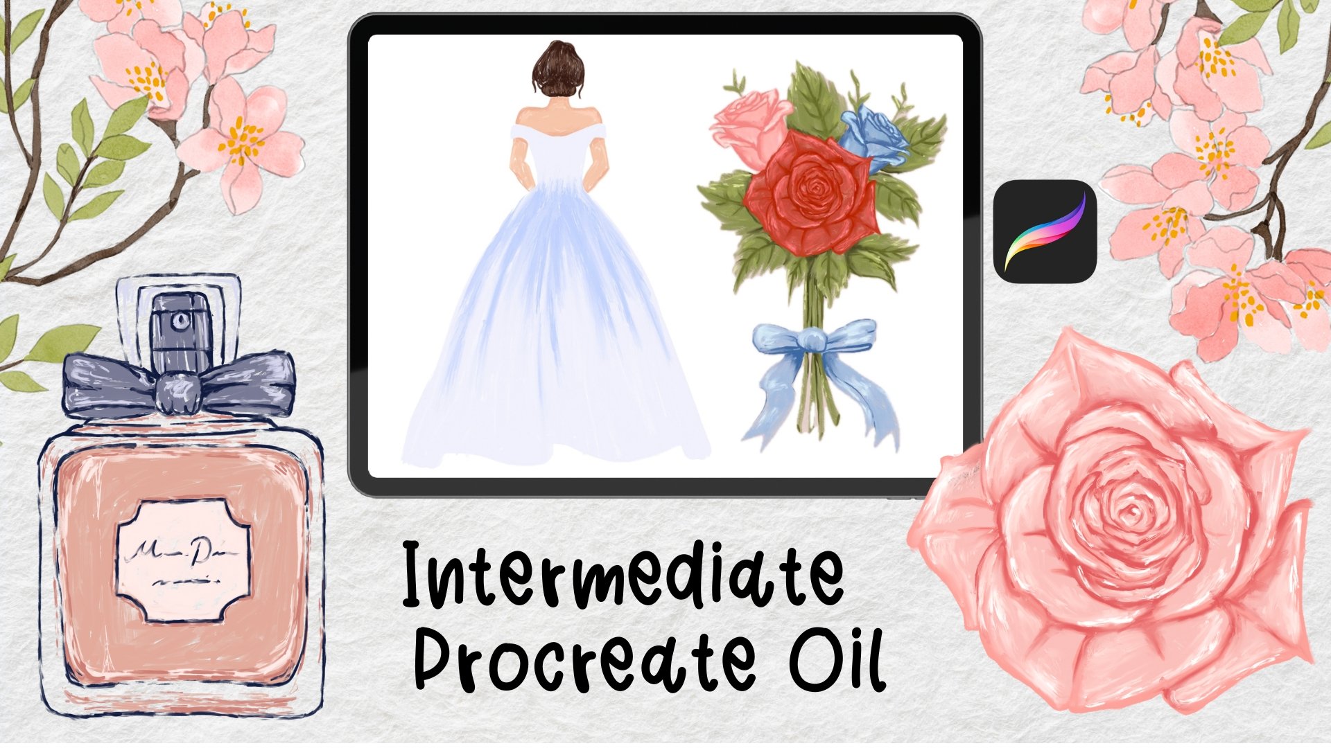
Transcripts
1. 01 Intro F: Have you ever wanted
to paint in oil but have no clue
how to get started. If you have an iPad, then this class is for you. I'll teach you how
to observe and break any seemingly
complicated painting down into a few sections. And then we'll do three
paintings together in Procreate, all using my oil brushes. I'll first quickly show
you the common mistake. Then introduce a better
way of planning and executing a painting
in just a few steps. And that is the
routine we'll follow for all paintings
throughout this class. The focus of this
class is number one, layer brushes in a logical and simple
way to convey texture. Number two, capture lights
and shadows with colors. As you can tell, probably
sketching or getting perfect shapes is not the focus in this
beginner's level class. So I'll either provide
the sketch or make sure the sketch we'll do together or be
very, very simple. You find a download link in
the Class Description section that includes all the resources you need to complete this class. This includes all the
oil textured brushes I will use in Procreate. All the reference images, all color palettes and sketches. You might be wondering who I am and why you should
take my class. Well, my name is Millie, and I like to work
smarter, not harder. Another type of
person that likes to spend two months
on a painting or hours after hours don't fixing details to after
completing a painting. So if you're a little impatient
or even lazy like me, then this class is
perfect for you because I take pride
in simplifying the process for you and
I make sure we stick to it when we practice so you
can familiarize herself, but my technique and use
it in your next artworks. This class is for
beginners who have been overwhelmed by advanced or, or complicated tutorials
or techniques. The paintings we're
doing together are simple and don't require
previous knowledge in arts. And I'll take your hand and guide you each step of the way. Don't worry about not
getting the shapes, colors, or details, right? Because this class comes with all the helpful
materials you need. I encourage you to download all the files I spent a
lot of time creating. So you can make the
most out of this class. I'll see you on the other side.
2. 02 Method: We'll first talk about
the wrong method, at least run in my opinion, to approach a painting. That is to paint
whatever you see, wherever you see
first or whatever catches your eye first
Dupain left first, and then you filling
that gap later, which is used this
plan as an example. A lot of people
might start with the red because that's the
most obvious color. And then start with that. And then they realize, Oh, I can't do all the red, at least not right now because I need to draw the shape of the desert first and then
paint red on the edges. Then they draw the
shape of the plan. And then realize there are
two colors on the body. So might as well
separate those now. And Bill the top with brown and then the bottom
with the yellow right now. And we'll wrap it up by
adding the rest of the red. If your logic is similar
to what you just saw, then you want to hear this. What are the dominant
colors of this artwork? What looks more like
extra decoration on top? What if we follow
this order instead? Sketch, then paint brown on
top and yellow on the bottom. Before the yellow paint dries to have some brown
and the top of the yellow part and blend it and then paint
the red details. Our last have to cover some areas more than once if
you follow this technique, but the artwork will look
a lot more cohesive. The best part is you
can paint everything following this
method, not just oil. So the better approach we're introducing and we will use it. Sketch, base color,
shadows and highlights, blend if necessary,
and extra details. Our last, we'll look
at a few more examples together so that can help you
strategize before painting. The first one we're looking
at is a pomegranate made in Procreate
using my oil brushes. And it's pretty obvious that the base color is some
sort of read write. And then the bottom, especially the bottom-left side, looks really, really dark. But the closer it
is to the center, the less dark it is. And the closer it is through the edge, the darker it looks. So there's this
gradual shift and the top right looks
a lot brighter and we can obviously see some
almost white patches. Those are the highlights. If you take a closer
look at the texture, it's quite obvious that the
brushstrokes are visible. So these are the notes were taking before we
come up with a plan, how to approach it? If we're going to
paint this together, then this is the rough plan. And we're only talking
about the red fruit part, not the top in orange. First, we'll get the
shape in a sketch. Then we will cover the entire shape in
one red base color. And then we'll add a very, very dark shade of the
red on the bottom left. And we will add lighter shades of the red on the top-right. And we will just
plan to the strokes together a little bit to form the gradient
that we just saw. And eventually we'll add some dry white patches on
the top as highlights. Okay, Let's see another oil
painting done in Procreate, and this is a strawberry. And we're only looking
at the red part now, the top in green, the logic is the same. I just wanted to
simplify it for you. So the base color is
some sort of read again. And if you take a closer look, the edges are darker, the outside area, right? And in fact, the closer
it is to the center, the brighter it is, the farther away the darker. And there are some
white little highlights in the very center, right? And also I can see some
smudged brushstrokes as well. So I'm taking notes. I want to add brushstrokes
on top and then use the blender to create
this much to look. If we're going to do
this rubbery together, then this is the rough plan. First, we're going to do
the sketch and then we'll cover the shapes up completely
in our base color red. And then we'll move to the darker shade and just
use that to cover the edges. And then we'll choose the
second darkest shade of red. And just paint
next to the edges. And we'll move closer and
closer to the center. And then we'll use
very light shade in the very center and will use almost white color on the
very top as highlights. And then we'll use
the blender to smudge some of the
brushstrokes while leaving some traces without completely smudging them
into one big smush. Finally, we will add some
seats on the very top. Well, we can just
talk the talk, right? It's time to walk the walk
with three more examples.
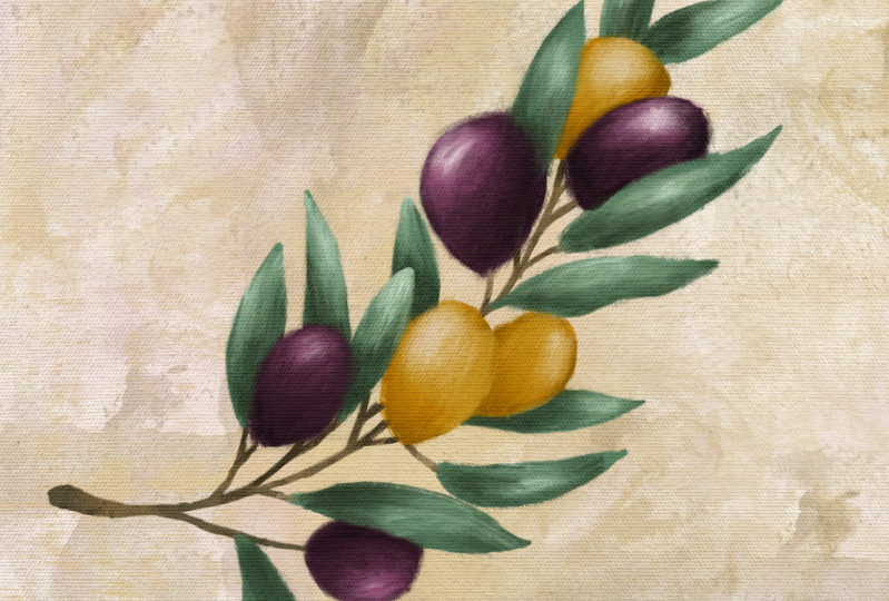
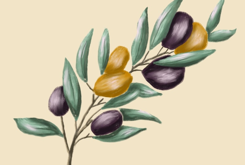
3. 03 Painting 1: Olive: The first subject to paint in this class is a
beautiful Olive Branch. I got the reference image
from Travefy on Canvas. Let's first observe
the reference image so we know how to approach it. It's obvious that
there are three parts, branch, leaves and olives. And therefore main colors used. Brown for brunch,
green for leaves, and purple and orange for Alex. Alright, that's not so hard. Let's take a closer look. There are some darker
and also lighter colors added on top of each element. And the highlights look almost white or actually pure white. I marked the
differences in colors. So what I'm talking about
and about the texture, it seems that the base is just a normal oil
or acrylic texture, but the shadows and highlights
look really, really dry. We can even see the
crystals on the brush. So I'm taking a mental note and we'll pick brushes
that perform this way. Alright, It's not hard to make a plan following
this observation. Here's what I'll do roughly. First, I'll make a color
palette of for base colors. Then I will add
darker shades and also lighter shades of the
same colors to the palette. Then I will start painting
with the base colors. After that, I will add some darker strokes
on top as shadows, and also lighter strokes
on top as highlights. Finally, I'll just move in the rough edges and
then that's it. Since I already made the
color palette for you, you can skip the next step. But I strongly recommend
that you learn and use this method for all
future color picking. Because this is the
best way to easily make a harmonious pallet with a few dominant colors and a
bunch of supporting colors. You see our palate
looks really full, but the painting looks
harmonious because there are only four main
colors plus white. Of the four main colors, only two are vibrant
and eye-catching, while the other two, the brown and green,
are more low key. A trick to picking
different shades of the same color as to move
your slider diagonally towards the bottom-right for darker shades and towards the top left for lighter shades. Let's get the project started. We'll start by opening
a new canvas of 3,000 by 3,000
pixels at 300 DPI. Assuming you've already
downloaded my files, I want you to insert
the Olive sketch onto the canvas just by
tapping the wrench icon. Then tap, Add, then insert
a file or insert a photo, depending on how you saved it. If you like the way it looks
on your screen, do nothing. But if you want to
change the orientation, just tap the arrow icon, and then drag the
green God around. You can use one finger to
drag it to the center. Once you're happy with the
way it looks on your screen, reduce its opacity, and do that. You want to tap the
double square layer panel and then tap the N side, and then move the
slider to about 20%. With all the prep work done, the actual painting stars now tap the double
square layer panel, then tap the plus sign
to add a new layer. You can use one finger to
drag the new layer and place it below the sketch and
then released their finger, will begin painting
on this new layer sun and will use my classical
IL-2 0.0 set for them. The first brush we're
going to use is called wet on dry streaky. Assuming you've
downloaded all resources. Now, all you need to do to
get the Brush is to find the Brush Set file
from your iPad and then tap it once to upload. Now you can find it in Procreate just by tapping the brush side. And they should be
the first set in the very top of
your brush library. Just tap that to
reveal all brushes in this set will use this
brush for two purposes. Outline and filling
each product Olive. We wanted to use the
second darkest shade of each color for this step. Feel free to take the palate to the canvas with you so you don't have to open
the color panel every time you pick a new color. To enable this function, all you need to do is tap the round color icon and then drag the horizontal
line to the left. I'll start by outlining and
filling in the branches, then move to the leaves, followed by the olives. You want to make sure they're
on three different layers. Because the branches
are very thing and the leaves and
olives are much broader, it helps to adjust your
brush size as you go. The top slider on the left is
for controlling Brush Size. Make the most out
of the texture. So my oil brushes try not to paint the same
area more than once. Because overlapping strokes
will cover the textures. For this particular
brush. Though. The lighter you press, the more texture is this shows, I know it's weird, but
it just works that way. Also. It's okay if there are some small gaps between your strokes. I think they look quite
realistic this way. I'm pretty cute. The painting in layers should now look something like this. The base is now complete. Did you think there'll
be this easy? We're halfway there
already actually. Next, we will need to paint
the darker and lighter areas. We'll start with the
branches as usual. I want you to add a
new layer and drag it directly on top of the
colored branch layer. Because we don't want
our new strokes to go outside the
existing branch area. We want to tap the new layer
and set it to Clipping Mask. Alright, let's use
the dry massive brush to add a darker and lighter
shade to the branches. This is not intended as a super realistic
painting anyways, so I wouldn't be too scientific about
where to place these. A general rule of thumb though, as the areas that are
supposed to be covered by other elements are
supposed to be in the shade of other elements,
tend to look darker. Areas, dephase, not abstraction from the light source
tend to be the brightest. I'll pick the darkest
shade of brown and color the bottom part of
the thickest branch first. And then also the branch
does in the middle because light may be obstructed by all these
leaves around it. I'll use a lighter shade
for the top of the branch. Because the branches
are very thing. We'll have to reduce the
brush size for that. When we paint it the base layer, we use the same brown for
the center of each leaf, and we will lighten these now. Now the Brunch is done. That's just repeat the same step for the leaves and elipse. That means we need
to add a new layer directly on top of
the leaves layer. Another layer directly on
top of the olives layer. Clipping mask needs to be enabled for both of
these new layers. For the leaves, I will focus the dark shade on
areas that seem to be under an Olive and
some random places near the edges for the lips. The same logic applies. I will focus on areas
that seem to be under a leaf and random
places near the edges. I will focus the lighter shades mostly on the center
of each element. And I'll be careful not to cover the entire base that we spent so much time
painting before. All right, Finally, let's
use the semi wet bristle brush to adding a white
highlight for the leaves. And Alex, I'll just focus
that in the very center. With all the heavy lifting done. Now, all we need to do is to smoothen some of
the brushstrokes. To do that, we need everything
to be on the same layer. But I don't want to
merge all layers into one because I may want to change the colors for certain elements or make
other changes in future. So a non-destructive way
to do this, or B2B first, make a copy and then merge the coffee
into one flat image. To do that, just swipe right on each layer you
want to select. And we don't want the sketch. Then tap group, then swipe
left on the new group, tap Duplicate, then
tap the top group, and then tap flatten. Now we have a flat image of all the layers merged into one. We also have the original
layers in a group. Awesome. Toggle off the visibility
for the group below, and then the sketch
layer as well. Using the Smudge tool, not the Painting tool. Let's select the
blender bone dry brush, and start smoothening
out some of the edges. Okay, you can stop
here if you want. The painting is done. But I just wanted to quickly add a light beige color
for the background. The background color is by
default white in Procreate. You can either change here
by opening the layer panel, scrolling all the way
to the bottom to find a background color and
tapping any new color. Or you can just add a new layer and drag it all the way to the very bottom and
find a new color you want to use and drag
it onto the canvas. If you followed along a major first Olive painting in oil, I want you to pat yourself
on the shoulder for me. I told you it wouldn't
be so difficult to deny
4. 04 Painting 2: Bird: The next painting we're gonna
do is this colorful bird. I found the reference image from the public domain. As usual. Let's observe the
reference image first. We have a good idea
what to do next. There are again
four main colors. We see dark blue, yellow, red, and brown. The challenge here is to convey the textures
of the feather. I also want the oil
texture in this piece to look slightly
wider than the Olive. Because I want to
create the look of wet paint smearing
into each other. Alright, here's the plan
following the observation. First, I'll make a color palette of these four main colors. I'll also add darker and
lighter shades for each color. I did this for you already. Then we'll break the Bird down into four main parts
following the colors. Since there's a lot of ground to cover, will work smarter, not harder this time by not painting
everything ourselves. That's the beauty of
digital painting. I'll show you how
interests a bit. And as usual, we'll follow
the routine base color, then darker or lighter
areas highlights on top. For this one, we want
to add a little extra IO texture and then in the end, blend everything to
smooth and rough edges. The tools we'll be using for making this painting
is my effortless. I'll set, which is also
included in your downloads. As usual, open a new canvas. I'm just gonna do
my usual 3,000 by 3,000 pixels, add 300 AVI. You do whatever you want. If you've purchased
my Bird stamps, you can just use Bird 15. Just dump it onto the
center of the canvas. If now no problem, you can add the sketch that
I'm providing for this course using the same method I showed
you in the Olive video. I showed you one wage
lower the layer's opacity. Here's another one. You can just tap the N sin in your layer panel and
then look for multiply. Next. Just we're fine. We can add an Oil background. I'm just inserting
Oil background 12 and place it on the
bottom most layer. The painting starts. As usual. You can drag the
color palette tab to the side to make
this process easier. Will use the detailed
grunge brush to outline and filling each
section of the word. And we'll use the
second darkest color as usual for this step. Let's start by
outlining and filling in the dark blue
parts of the Bird, which includes the beak, wings, legs, and tell. For this method to work though, you have to make sure you draw a closed shape first and
then drag the coloring side. If there's any opening and
the shape, it won't work. You can always toggle off the sketch layer to
check your shape. Next in a new layer, filling the red parts, which includes the lower
chest and upper tail. Next in another new layer
filling the yellow parts, which is just the chest area. Then in another new layer, instead of using the
second darkest yellow, will be using the
lightest yellow shade for the facial area, beginning of the beat, and the color dividing the yellow and red on
the chest area. Finally, it's time to filling the tree branch with Brown
in another layer. Of course. The base layer is now complete. Remember I told you that we're going to work
smarter, not harder. That's what I meant.
We covered everything without having to
paint anything yet. The next step is to add the
darker and lighter colors. As usual, we need
to add a new layer directly on top of
each existing layer, but not counting the stamp. And we need to enable clipping mask for all
these new layers. Will use thick oil three
Brush to complete this step. And we can use the stamp and original image as a guide
for color placement. For the blue part, the lines on the stamp
indicate where you need to add darker shades
for shadows in the wind. So that makes our
work a little easier. You can follow the video for a color placement if you want, because it should be clearer
than the vintage photo. As usual or routine
tells us we need to flatten the image at this
point for extra work on top So we're just group
all layers except the sketch and duplicate
the group afterwards, flattened the top
group into one image. Let's quickly adding the
details for the face and class using the thick oil
three Brush for the I, just darken the circle with
dark blue and orange and filling the pupil living to
white spots as highlights. Let's not over-complicate. This is not important
for the class. Just paint the area where the Class touched the branch
with the yellow color. That's it. We're almost done with
this Bird at this point. It might say the paint seems to smooth and it doesn't quite
look like oil or acrylic. It's never too late
to add that texture. Let's add a new
layer on top of this and set the blending
mode to add, reduce its opacity to
about 20:30 percent. Then we'll use palette knife one brush to add anymore all
you texture to the artwork. We can just use a
plain white color for some quick highlights. Follow the better you see
where you can do this. You can ever go wrong
adding the highlights to places you previously used, the lightest shades
and nearby areas. The only thing left
now is blending. So we'll just turn off
the Bird stamp for now. Tap the hand sign
for a blending tool. Then select the thick
IL-3 Brush and just start smoothening out some of the edges on the current
highlight layer. Make sure you use
short sweeping strokes when you're blending
and don't overdo it. You also want to make
sure your brush size is fairly small
for this purpose. Otherwise too much
paint will be pulled. We'll do the same for the
flattened Bird layer. Make sure you blend
out harsh edges like the shading and
highlights we just added. And also the division
between the colors of the bird and the outer
edges of the feathers. One technique I love is to pull paint of one color
into another color. And the longer you go, the less color is pulled. It looks like a
traditional Brush, slowly running out of paint, creating that perfect log of two colors running
into each other. Okay, that's done. But if you don't like
the way the aisle background compliments
to painting, you can adjust some settings
now to fit your liking. I'll play with blending mode to find a color I like better. Also, I think a look better
if we just zooming on it. So tap the arrow side and use
two fingers to expand it. And when you're happy, just tap the arrow sign again to exit. Voila. There you have it. A colorful bird with IO textures
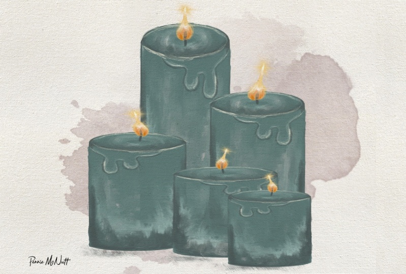
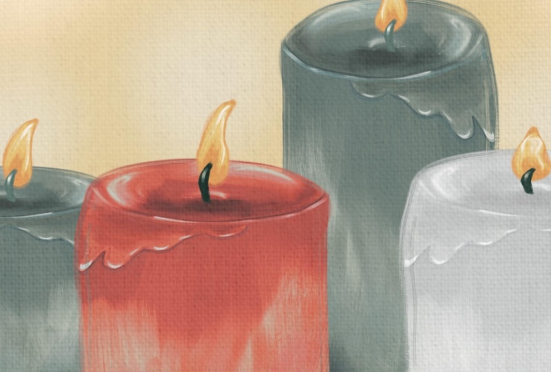
5. 05 Painting 3: Candles: In the last video, we'll make a set of four Candles
in two different colors. But don't worry,
we'll continue to work smarter, not harder. We're only paint one Candle
plus one wick and flame. And then I'll show you some
tricks to duplicate, resize, relocate, and re-color one
Candle to create many, many more in seconds. Before starting as usual, you want to drag the color
palette to the side. Let's first sketch. This one is super easy, so I encourage you
to follow along, but you can always download mine to use any brush to sketch. But in this case, I'm using
detail to Brush at 2% size. We'll pick the
darkest blue color to outline a cylinder that resembles a Candle first and
do your best to draw an ark. But don't lift your Apple pencil when you're done, don't lift it. Just wait for 2 s or so. And it will autocorrect your
ARC into this perfect one. See, repeat that in the bottom, and then draw one vertical
line the same way. Don't lift your
Apple pencil when you're done and illustrate and sit up for you to repeat
another line on the right. And finally, one final Arc. Next you guys did. We'll add a new layer below the sketch to blocking
the base color. I'm using palette
knife Canvas Brush at 50% opacity and
five per cent size. I'll choose the second
darkest blue color. To blogging the Candles body. Feel free to experiment with the size and opacity
if you want. And you can also try to
press harder and lighter on the screen with your
Apple pencil just to see what textures you're getting
in which you liked the most. Don't worry too much of
this patch here first, because we're be layering
watercolors on top. You're going to erase
any imperfections on the edges afterwards
if necessary. This object looks better
with a defined outlines. So we're going to merge
the outline layer and color layer just
by painting them into each other
with two fingers. If you've been paying
attention, then you know, in the next step we will add, you write the shadows
and highlights. Since I want us our work
to have a rougher texture, I will use the dry
feather brush for this and the size
is at about 20%. I want the top part that's
closer to us to look darker. And social edges and the
bottom of the Candle, since it's not supposed to be a realistic painting anyways, I'm just going to add the
highlight in random places, like the center
near the wick and next to the darker shade
on the body for contrast. At this point, the body
of the Candle is done. Next, we will just
add the wax strip, will use the same brush, but let's lower the
size to about 3%. I promise it's easier
than it looks. Okay. Let's just start by using the darkest blue color to
roughly outline a wax strip. You can shape it
however you want. And then we'll just
shade the base of the wax strip with the
second lightest color. Then use the lightest
color to add a stronger highlight around the edges of the wax strip
and the rim of the Candle. Please follow the
video to see where exactly you need to
add these colors. See it wasn't that hard, right? It's just like our routine of adding colors on
top of each other. Next, let's add the a flame in a new layer will use the
darkest blue color for the WIC. It's very easy. Just draw a vertical
little line in the center and then you
have it, the work is done. Next, we will use the second darkest orange color for the base of the flame. The exact shape doesn't
matter too much. Just painted like number eight and make the
top point here. All right, Finally,
let's just add the shading with the darkest
orange in the center. And then a few strokes of white as highlights near the edges. See even with the
tiny little D is how we'll just
following the routine. Now the painting part is done. We'll just need to smudge
some of the brushstrokes. Let's switch to the blender
tool and find blender. Old bristle brush will
use 15% also size for smaller areas and
then increase that to 30 to 40% size for
covering larger areas. Well, first you start
to smoothen some of the edges of the flame and then move to the
body of the Candle. You want to use this tool moderately to preserve
the textures. Here are two tips for
our blending in general. One, you want to use short
sweeping motions instead of dragging your Apple
pencil across the canvas to If you're using a larger
brush size for blending, you can consider tapping on the canvas instead of
dragging the pencil. Just tap, tap, tap like a stamp. Make sure you don't
touch the line that divides the top of the
Candle and the body. And be careful around the edges. In general, if you want to
preserve the rougher look, just much were to very
distinctive colors meet like in this case where the shadows and highlights meet and you
can leave the rest. But of course you can continue blending like I am doing for a smoother look is now complete. It's time to turn
this one into four. Okay, let's group
these two layers together and turn off the
layer visibility for now. And you want to duplicate
this group three times. It's time to modify these Candles individually so that they all look different. And I'm going to work from
bottom up and we'll leave the first one as is
for the second Candle. Select the Candles body layer by tapping once and it
should look blue now. And we'll use the transform
tool to make a low shorter. For that, you need to
tap the arrow side and make sure you're
on Free Form mode. When you drag the blue dot
from the top downward, the height will change,
but not the what. You can also just make the Candle thinner without
making a taller or shorter by moving the blue dot on the side. Isn't that neat? Okay, now you can select the flame layer
and move it down. You can use the
Transform tool again to change the size of
the flame if you want. But you can also adjust
the direction of the flame using warp and then adjusting
the growth a little bit. Repeat the same steps for
the next two Candles. Just make sure that each
have a different size. To add more variations
to these Candles, You can flip one or two of them horizontally using
the transform tool. Just first select the Candle
you want to flip and then tap the arrow side and
then flip horizontal. Next is time to
arrange these Candles. Please see my reference
image for placement. You need to make sure that all group layers are toggled on. And inside each group, each individual layer
is also toggled on. And you need to turn
on the transform tool and use one finger
to move each group. When you just tap
a group and then tap the arrow side and then
use a finger to move them. Everything inside a group moves with you at the same time. You can also tweak the sizing. Now if necessary. It might be thinking, don't want all Candles to
have the same color. Is it too late to do anything? Of course not. Let's just pick up a brush
and start painting again. I'm just kidding. I'll show you a trick to recolor some of the
Candles in 1 s. Let's choose the second
lightest white-collar for now and just drag it
onto Candles two. And for the entire
Candles look different. And it's even capital shadows, highlights, wax trips
and everything. Just make sure when
you're trying to drag any color into anything, the particular layer
that you're trying to do our coloring two
needs to be active. For example, you need to
tap Candle 2s body layer. Just tap it once
to make sure it's blue and then drag the coloring. I'm only if you want
to add a little shadow that's cast by the Candles,
You can do that now. Make sure you add a new
layer directly on top of the background layer and
choose any shade of blue wheel-like any brush you like to just draw
some lines under the Candles and then lower the layer's opacity until
you're happy with how it looks. It's not super
realistic anyways, so don't sweat the
little details. And looked a little
intimidating, didn't it? I mean, for Candles plus wax, strip, plus work and flame. But it can still be done just by following our routine of sketch, base, color,
shadows, highlights, blend, and extra details, right? I hope painting
these three artworks with me has helped
you understand my simple Method and
has given some of you the confidence boost you need to start
painting on your own. Don't worry, I'm not going
to leave you hanging. I prepared some more things to help you in the
project section
6. 06 Project: The project for this class
is very interesting. First, I want you to observe
the three paintings that I picked for you and make a
plan for each one of them, just like how we did together. And to, I want you to paint at least one artwork following the videos
using my brushes. One of the three would
just did together. Again, you can find
all the resources, including the three paintings that I just showed to you and my Procreate brushes in the
link in Class Description. And if you don't think that
is challenging enough, you can always choose
to paint one of the exercise examples
after making the plan
7. 07 Reminders: Before you get
started on your own, I wanted to give you a
few quick reminders. One, every time before you
paint using a reference image, you have to have some sort of strategy. And you have that. You have to observe the
reference image and make notes. And to you want to start with the base color and then add shadows and highlights on top. Then give it a
blend if necessary. And only then do you
add the extra details, the dry details, the eye-catching details on
the top in the very end. And three, you need to pick brushes that behave
the way you want. Let's take oil for example. There are wetter looks, paint smearing into each other. They're also dry or looks like the dry details we
just saw on the Olive. I'm giving you a lot of
options for brushes in the download and you need to use the right one for
the right purpose. And I trust that
will be pretty easy because I labeled
all of them already, what exactly they do. And lastly, you
don't want to over paint or over blend
the same area. Well, Digital Painting
behaves a bit differently from actual oil. In traditional oil. The more strokes to add, maybe the more obvious
to texture is, but that's totally, totally the opposite in Procreate
with my brushes. And if you over
paint the same area, add so many strokes
on top of each other, you end up covering
the textures. So be careful
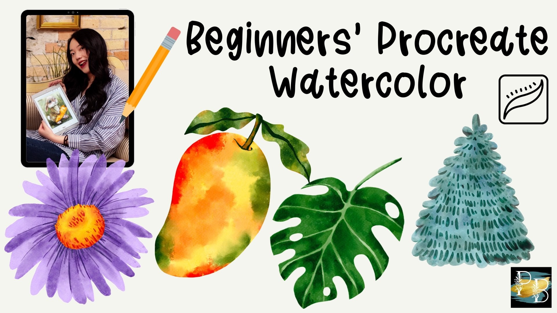
8. 08 What's Next...: If you've stayed till the end, then you must resonate
with my teaching style. Then you should
probably check out my previous Skillshare class. Beginners Procreate
watercolor, where teach you how to paint four different
subjects step-by-step. It also comes with all
the nice materials just like this class, including 27 of my best-selling acrylics watercolor brushes
for Procreate. I plan to publish
more classes here, so make sure you follow
this account so you can be notified the next time
a new class comes out. Meanwhile, you can find me at Millie ProcreateBundle
on Instagram and TikTok. If you want some
quick inspirations or add ProcreateBundle
on YouTube. If we're looking
for more brushes, you can check out my website
procreatebundle.com. And if you wanted to
practice more painting with my ready-made sketches
or coloring pages, then you can find
them there as well. Alrighty, I'll see you
in the next class.
 Millie ProcreateBundle, Artist, Procreate Brush Developer