Transcripts
1. Introduction: In this class, you're
going to learn how to make four wedding themed paintings with my
procreate oil brushes. My name is Milli. I'm a procreate brush developer and I create trendy
designs for a living. If you're an experienced
painter using procreate, you can probably take
this class directly. This is an intermediate
level class where we attempt something a bit more challenging
than what we usually do in beginner
level classes. We'll paint glass by capturing light that reflects off
of a transparent object. We'll also paint an
entire composition rather than just
single elements. This time we'll paint a bright, but don't worry, I'm
going to make it easier for you this time by
painting the bag. Instead, we'll sketch
some parts of our designs this time instead of completely relying on my ready made
sketches like before. By the way, I also have a basic sketching class now
where I go into details with nine examples to help
you get the shape of the object right before
you paint it with color. If you're completely new to
painting oil in procreate, you have to check
out my first class, procreate oil Painting
for Beginners, which lets you download all
the procreate brushes used in that class and teaches you the simplest three
step formula to paint. Pretty much anything in oil. I take and walk you through
with three examples, all in just 40 minutes. Once you're done with that, come back to this intermediate
level class. I will not go into
details to explain the basics of using procreate
the app in general, such as how to add a new layer or how to change
your brush size. But don't worry, I'll
still break everything down step by step
for you as usual. And you'll have access to
all the tools needed for completing this class as usual,
including other brushes. I'm using all the
sketch templates, other color palette
and reference images. I'll see you on the other side.
2. Brush Overview: Before we start painting, I want to give you
a quick overview of the 12 brushes that you're
downloading so that you understand how they perform and you can decide
for yourself how and where you want to
use them with thick oil. Number three, when
you brush lightly, it has gaps in
between and you can see almost each bristle clearly. It's great for texture. When you use more pressure,
it looks smoother. You can use this to lay down on base color when you
lower the size. It's also great for
adding details on top with palette 91. This is how it looks when you
paint with little pressure, and this is how it looks
when you press hard. It looks streaky
at a smaller size. So it's ideal for adding
rough texture on top. For example, you can pick a white color and add high
lights with this brush on top. After you're done with the
painting with semi wet parsol, it looks light and with a rough texture when you
press gently and dark. Beto with the rough texture
when you press harder. It looks super choppy
when it's small. So it's also great for
adding details on top, such as shadows and highlights. When you increase the size, it looks dark and smooth. But still with a
bunch of texture. It's also ideal for laying down a wet base layer or adding a second layer of wet
paint after the base. The dry feather
brush looks super rough and super
textured and dry. No matter what you do,
this is your best friend. Whenever you're looking
for that dry oil look split Bt wet on dry brush looks like smooth oil but not fully
loaded with wet paint. You can still see the Btls if you were painting
traditional acrylic, use this when the first
layer of paint has dried and you want to
add a new layer on top. But you don't want
the two layers to smear into each other. In procreate, you
can use this after the base layer to introduce
different shades on top. All my wet on dry brushes
are intended to be used to introduce new colors
or new shades on top of another
already dried layer, but they each come with
a different texture. This wet on dry, sandy brush in particular has a sandy texture
when you press lightly, but looks quite smooth
when you press harder, depending on your needs. You can pick this
brush and paint with a lot of pressure to form
a solid looking base. Or you can paint lightly
to introduce the lovely, sandy texture on top
of another layer. This pastel brush
has a delicious, smooth oil texture and is even more obvious when you
paint with more pressure. I love to use this one for laying down
paint, for the base, to use my blenders unless otherwise
specified in the name, always use the
smudging function. A blender is usually colorless. When you blend on an empty
spot, you see no change. You can use this to mix two
colors into each other, or pull the paint of
one color into another, like from white to blue
or from blue to white. This brush comes with
a very dry look, like a super old
brush you're supposed to throw away the other blender. Old bristle has the same logic, but this one looks somewhat smoother than the
previous blender. With background wash,
canvas texture brush, you can choose a big
size and brush all over the entire canvas without
lifting your apple pencil. In a couple of seconds, I designed it to act
like the brush is running out of paint and
water as you drag it, just like a traditional
paint brush would do. You can also use
less pressure or decreased opacity
for a lighter look. The canvas texture brush offers a smoother canvas
texture look and it won't run out of paint
like the previous brush does. You can use this
one before painting as if you're priming
your canvas with Essl, but you can also add that to certain sections
of your painting after it's done to let some of the canvas
texture show through. The light canvas texture brush is similar to the previous one, it just has a lighter look. I also included that as part of your download and you can choose whichever one
you like to use.
3. Color Palette: Before you start painting, I also want to show
you how to use my color palettes
for each project. For each video we do together, I always prepare a palette, and I only use limited colors, but I add multiple shades
of the same color. This way you can use the
middle one as the base color, and then the shades to
the left as highlight, and those to the
right as shadows. Your paintings would have an interesting color
combination this way, but without using too
many different colors and risk looking not harmonious.
4. Rose: In our first Ao class after
laying down the base color, we did one layer
of highlight and one layer of shadow for
pretty much everything. I made you do that as an
easy way to get you started. But now you're
comfortable painting and you're familiar with
that technique already. I'm going to show you how
to bring more contrast by painting a shadow of your shadow and a highlight of
your highlight. It might sound confusing, but the concept
is really simple. Look at this pomegranate. Here's the first
batch of darker and lighter strokes applied
after the base. After blending them, a
darker shadow was added to the edge of the
previous darker area to reinforce the shadow. And an almost white
highlight was added to the center of the
previous lighter area to reinforce the highlight. Now this pomegranate looks
a lot richer in color, even though we mostly just used many different
shades of the same red. Following this
logic, let's paint arose with five shades
of the same pink. First, make sure you
download all materials necessary and then
you'll get a zip folder. All you need to do is tap
the zip folder once to open it and then tap the brush set or palette
you want to import. To procreate, you'll find
the brush set at the top of your brush library and the new palettes all the way in the bottom of your
palette library. For this artwork, we'll be using a ready made rose stamps sketch. If you've bought this already, just stamp this
onto the center of the canvas and then
resize it if necessary. If not, that's okay. You can manually
insert it because I just gave it to
you as an image. You need to tap the
wrench tool and then add and then insert a file. Then go to your
downloads and tap the sketch image coloring this flower we can adding an optional background first
go to your layers panel, then background color, then tap the lightest base
color from our palette. Then we can add a new
layer below the sketch. We'll use the background
wash canvas texture brush at about 60% size. And then we'll pick a darker
base color and then just wash it in to add a little bit of texture
to our background. Free to drag your
color palette tab to the side so you can have
access all the time. We'll need adding a
new layer on top of the background canvas
texture and quickly blocking the base using the
pink color in the middle. And we'll do that with
the dry feather brush at about 30% size. I know it looks flat right now
with not much oil texture. It's okay because a
lot of it will be covered later by
texture brush strokes. Okay, now the base is done. We'll work on that
first layer of shadow. We'll place that around the
outlines of the petals. Add a new layer, grab the wet on dry sandy brush at
around 5% size, and pick the second
darkest pink color. We'll just roughly trace the outlines.
That's easy, right? These shadows are
usually common on the petals and where
the petals overlap. That's why we're tracing
the outlines for this step. Feel free to reduce the
sketch layers opacity. It's also fine to not
follow the exact outlines, especially at the center
because it's quite complex. We want the end of the petals to be thin and the center thick. Since this brush is
pressure sensitive, just press hard for a thicker paint and press
lightly for thinner lines. Okay, it's time to
reinforce the shadow. We'll repeat the previous step in a new layer and
this time we'll pick the dark pink to define the darker shadows in the flower, the
shadow of the shadow. Remember, try to follow
the previous shadow lines, but don't cover
those up completely. I'm overlapping some, but
painting right next to some, both colors are visible. It's also a good idea to reduce the bush
size a little bit. The shadow of the shadow will be a little smaller and thinner, and will avoid
complete overlapping. Now the reinforced
shadow is done. We'll move to the lighter shade, add a new layer and pick
the semi wet prsal brush at around ten to 15% size and
pick the second light is pink. Further step, this is usually seen at the pointy
ends of the petals. They receive more light
because they're on the open end and they're
not getting crowded inside. Let's add a new layer for the highlight of
the lighter shade. The lightest part of a rose is also at the tip
of the petals, but it should be less thick
as in the previous step. Think of this as the highlight
of the highlight, right? It's good to reduce
your brush size low and add some quick and short
strokes to the very tips. Now that we have completed
the coloring for the flour, if you remember what we
did in the first class, you know it's blending time. Before that, let's quickly group all the layers and
flatten them into one. Then duplicate the group
for a backup if you want. At this point, we can turn
off the sketch layer. We'll pick the blender out, sal brush to blend some of the parts of the flower
instead of smoothening. Think of the step of
smearing the paint and adding more interesting
textures to the artwork. The easiest way to ruin the
painting, at this point, in my opinion, is to the
blender too wide or too long. Instead, using short strokes to pull paint of one color into
another is a better way. Especially when you're
pulling the red from the outline into
the pink petals. You want to mostly
follow the outline, but at a slight angle. If you think the flower needs
more definition or texture, feel free to paint
more high lights on top and blend if necessary. You can also modify
my palette by adding an even darker and an
even lighter shade of pink. And repeat the shadow of
the shadow and highlight of the high light process to introduce more color
variations if you like. My point is to tell you now you're more
confident in painting. Now you can decide for
yourself and for each artwork, how much shadowing
or highlighting you really need or want is
more always better. In the next video, I'm going to paint a
simple wedding gown that doesn't have any shadow or highlight at all and
it's still pretty.
5. Gown: The next video is quite different from what
we're used to doing. We need to modify a
sketch to suit our need. We will paint a human portrait. But without painting the face, we will try to create an
interesting look without using shadows or
highlights. See that's new. We will use more than
one color per section. Remember in the first oil class, we limited ourselves to using only one color per section
to make things easy. But we're going to
change that now. Let's get started. I have already made wedding
gown design from before. Let's just insert that manually into our
procreate canvas, like how we did in
the rose video, because I want to make this
bright portrait easier. We'll just paint the back
instead of the front. The design is about the front. We need to make some
modifications to the sketch. That's very simple. We'll just erase the neck line, the bust, the flower
and the slit. Then filling the lines like
how I'm doing, see done. You can use my final painting as a reference and keep it on the side for the entire
painting process that. First, find the image file from your downloads and
then long press it, then tap Share, then save image. You should now be able to
see it from your photo app. Then just tap the wrench tool. Then canvas, toggle
on reference, tap image and then
tap the bright image. You can drag the
reference anywhere you like next in a new layer, let's add a rough sketch of the back view
of the bright so that this painting
will have a person instead of just be
about the gown. Use any brush you want for this. Trust me, it's not complicated. First, draw two circles
above the dress, but don't part them as wide
as the top of the dress. Connect those with a slightly
curved horizontal line. And then draw two lines to connect those with the sleeves. Don't make them vertical, they should be directed
outwards a little. Now you have the
back and shoulders. Next we'll draw two curves on the top for the neck and
then an oval for the hair. Then this rough oval shape
at the back of the head. It's okay if it's not
perfect right now because it's just a rough sketch and
we'll clean it up later. Now all we need is to
complete the arms, just extend the short
lines under the shoulders, past the sleeves, then
end about halfway out. And then add two more
circles for the elbows, and then two more short lines connecting them to the body. Next, reduce the layer's opacity and clean up the sketch
in another layer. Like how I'm doing the video, let's add two curves
as hair falling down and make sure your lines for the body
are a bit more curved. I wouldn't worry too much if the final sketch is
not super accurate anatomically because
the background color is pretty close to
the skin color, so it's quite forgiving. And also the focus
is on the dress. And the focus of this class
is still oil painting, so I don't want to be too
stressed about the sketching. You can now delete the
rough sketch layer and merge all the
layers into one. Reduce the layer's opacity
and set it to multiply. Before we start
coloring the sketch, let's add an
optional background. As usual, go to
your layers panel, tap background and then
tap the lightest page. Then let's add a new
layer below the sketch. And use the background wash
canvas texture brush at about 60% with the
darker beige color to add a little bit of
texture to our background. Next, as usual, drag
the color palette tab to the side so you can have
access to it at all times. All right, let's start painting, add a new layer and we'll get the base
color done for now. First, grab your Pastor brush, and I'm using that 3-10%
I'll use a smaller size like 3% for hair and a larger size like 10% for
the dress. For the hair. Use the middle brown color. First outline the hair
and then filling the rest with vertical strokes because that's how hair falls
down naturally. You don't have to fill
it up completely. The gaps you leave can
work as highlights later, and that'll save us some time. For the skin. Increase
the brush size a little bit so we can work faster and fill it
up completely with the middle skin tone
color, leave no gaps. Lastly, for the dress, we'll do something
we never did in the previous class I taught you. You could paint
anything by using one color as the base
for any given area and then by adding lighter
and darker shades of the same color as
high light and shadow. Right? But that doesn't have
to be the only way to paint. I'll show you an easier way. You can use more than one
color and you don't have to add high lights and shadows
for everything you paint. Add a new layer and use the almost white blue to
cover the entire address. With mostly vertical strokes, feel free to leave some gaps here and there for
texture if you like. Now add some blue strokes
under the waist line with my split or so white on dry
brush at around 15% size. Try to follow the fold line in the dress as you make
your blue strokes. Now the base is complete. At this point, we can turn
off our sketch layer. To complete this painting, all we need is to add some
dimension to our bright. And also help the two colors on the dress smear into each other. Set it to mask so we don't
go over our base color. And go back to the pastor brush. And we'll use
around 3% for size. We'll add in shadows and
highlights to the hair and skin, the same way we did in the beginner's class in
case you forgot. If we don't have an
obvious light source, we typically add
shadows to areas we think light is obstructed
in this bright painting. We can also use shadows to add some dimensions
around the edges. We'll add some dark
skin tone strokes around the neck and
shoulders for definition. We'll also add the two
areas under the hair, under the sleeves,
under the elbows, and just behind her dress. Next we'll add
some highlights to bring some contrast
with the shadows. We'll place the live skin
tone strokes close to the dark shadows and you can follow my video for
a color placement. Don't stress about
this particular step. The focus of this artwork
is actually the dress. Repeat this step for the hair. Vertical strokes of dark
brown around the edges and the very top for a
dimension on the button. Because it's in the shadow, because the head
is like a sphere, the middle part is protruding. So the hair just above the
bond would be in the shadow. Right for highlight, just
add vertical strokes in light brown in the center of the bond and
middle of the head. After it's time to get blending, we'll use the blender
old brush for the step. For the skin and hair, Set the size to around 10% and will increase it to
about 15% for the dress. For blending, remember using a short sweeping motion is necessary to create an
interesting texture for the dress. Focus on
pulling the blue paint down so it smears into
the white on his path. Also pull the blue
in the top upward, a little in the same fashion. Now, the blue and the
white are forming a beautiful gradient.
All right, done. Congratulations. We can take a step back and re
evaluate this work. Um, I'm seeing that the blue on the dress seems a
little too pale now, but don't worry, we can
fix that real fast. Let's just add more blue paint to the dress as a
finishing touch. And we'll do that with
the split brisle, white on dry brush, and then blend a
little bit afterwards. If you don't like
the rough texture Vatne, I want to do a quick
recap on the techniques used to create this artwork because this is more complex
than what we did before. So we used our routine from the beginner's class
for hair and body, and the routine is base color, shadow, and highlight
for the dress. We tried to make two
colors ear into each other and we didn't do any highlight or
shadow for the dress. You see a simpler no shadow, no highlight painting
can also be pretty. I did this to show you, you don't have to be restricted by a particular way to paint. Now, after knowing all
these can be pretty, you can decide for yourself what technique to
use for each piece. Depending on the look you
want to get out of it, right.
6. Perfume: The main goal for
this perfume video is to show you how to capture
light in oil painting. And we will do that with
a rough vintage look. That's relatively easy. You just need to make sure you
pick brushes, start a dry. We're now aiming to be super
realistic in this video. As usual, I know this one can seem really intimidating,
don't you worry? I already looked
for some photos, real photos of perfume
bottles online, so we can observe why they
look the way they do. And then come up with a
plan for this painting. In the first photo, we can see that the background is visible through
the perfume bottle. Also, the edges of the bottle is the
darkest in color, right? Also, I can see that
light is reflected from the bottom and
the top of the bottle. All right, let's move
to the second photo. All right. I'm
seeing similarities. It's obvious that
the background is visible again through
the perfume bottle. Also, the edges of the
bottle are the darkest. And I can also see
light reflected from the bottom of the bottle
and also the side. That's a good sign we're
seeing similarities. Let's move to the third photo. It's pretty much
the same as others, right like the background is again visible through
the perfume bottle. We can see the edges of the
bottle being the darkest. I can also see light being
reflected from the bottom, the top, and the
side of the bottle. Moving on to the fourth photo, it's again the usual, but I'm also noticing
that the perfume at the bottom looks the darkest. Also translucent cap
also reflects light. In the last photo,
there's the usual, but I'm also noticing
something new that is depending on the light source
where it comes from, there can be light reflections on any parts of the
body of the bottle. And that's something
will incorporate as well into our final painting. Here's what we're going
to do in order to show that the glass
is transparent. It's best to have a colored
background and make sure when you're painting the glass on top
of the background, don't cover the
entire bottle with paint so the background
can show through. We need to leave a
lot of sections of the glass bottle blank to
show that there's light. Also, we need to add the darkest shades to
the edges of the bottle. Remember, we also need to add darker shades to the bottom of the perfume so that
that part looks darker, just like in one of our
reference photos we saw earlier. Also, we need to add white highlights on
parts of the bottle as light reflections from a light
source. Let's get started. First, import my
perfume sketch onto your canvas and
resize it as needed. Make sure it's at the center. I have a trick to check
if something is centered. You can turn on your drawing
guide and then add it. Your drawing guide set
the grid size to max, and it's easy to see if
the sketch is centered. Now you can toggle off the
drawing guide afterwards. This ready made sketch
doesn't have a label, but I think a label
is really pretty. So let's just sketch a
square in the center, then erase the corners and curve them inwards
just like this. Now you have a label
shape already. Before we start adding colors, set the sketch layer
to multiply and reduce the layer's opacity to around
20% so that we can see it. But then not let it get in the way our subject
is made out of glass, which means that
it's transparent. Whatever that is
in the background will influence how
the glass will look. In this particular one, a pretty background
is mandatory. Let's just add a new
layer below the sketch. And pick the canvas
texture brush, set it to 20 to 25% in size. And you can drag the color
pallet tap onto the side. And we'll use the darkest, darkest blue around the
edges of the canvas. Then let's use the
second darkest blue for the center of
the background. The second lightest blue
for the foreground, which is just the
small lower part. If you prefer a smoother look, you can choose to smoothen the background and
foreground a bit using the smudging tool and choosing the light
canvas texture brush. Let's proceed to drawing the perfume bottle
on a new layer. Let's lay down the
darkest colors first. These are usually found at
the edges of the bottle. Remember, you can use
the outlines as a guide as to where to place the darkest colors
when you're painting. Consider adding my final
result image as a reference, so you can follow
a lot more easily. For this step, let's
use the palette knife. One brush, add around one
to 2% and we will use the darkest blue
for the bottle and darkest pink for the
edges of the liquid. Don't worry if some
spots look choppy. That's exactly what
we're aiming for, is we want a rough vintage look, right, In case it's not
super obvious in the video. The order I'm doing this in is darkest blue for the
cap, then ribbon, then bottle body,
then label edges, then inner cap, then
sprayer and reflection. After that I'm using the darkest pink for the
liquid seen from behind the label and then reflected from the front
and top of the bottle. For the next step, we'll be adding almost solid colors for the cap ribbon perfume
liquid and the label. Let's add a new layer behind the dark outlines and
pick the thick oil. Three, brush at around 10% size. Let's use the second darkest
blue for the sprayer and ribbon and the
second darkest pink for the perfume liquid. The labels color should
be the lightest pink. For this step, it's okay if some parts aren't
completely filled in. That's the look we're
going after next. It is time to work
on the reflections from the perfume liquid. Switch to palette
knife one brush, and add some dark and
light pink streaks at the base of the bottle and also the corners of
the perfume bottle. Next, let's proceed to adding the light reflections on
the perfume bottle itself. First, use the
lightest blue color for the cap ribbon and sprayer. Once you're done
with that, move to using the lightest pink
color for the liquid. Please follow my video
and reference image for color placement in case you're wondering what that was. Well, this would
be the highlights or the light reflections
on the bottle. Why did we choose the lightest
blue or lightest pink instead of white
as the highlight? Well, you can use white, but then there may be a
lot of white everywhere and that would and
wouldn't be realistic. We often use the lightest shade of a color as the highlight. To replace white, then that way it looks more interesting
and more realistic. Now let's work on the logo. Let's use the second
darkest blue color and just scribble something
something like this is fine. As I said earlier, this
isn't supposed to be super realistic if fits our rough
vintage theme just fine. At this point it's almost done. Let's group all the painted layers and then
flatten them into one. Duplicate the group
for a backup. Now we want to turn
off the stem player. As a final touch, let's add some pure white color as
highlights on the edges of the cap ribbon bottle and label to make their materials
pop a little as usual. Follow my video and the reference image
for color placement. Let's blend everything
a little bit with the blender tool using
light canvas texture brush. This time, please,
please try not to overdo this step because we're still hoping to get that
rough vintage look. Just only blend where
that is necessary, where the overlapping
colors look really awkward. All right, this
painting is now done. I feel this is more complicated
than what we did before. I'll give you a quick recap. To show light, it's best
to have a background and then whatever it is that you paint on top
of the background, you have to make sure that you leave certain sections
of that blank, the background can show
through and that's how we can tell this glass or
whatever it is, that your painting is
transparent or translucent. Also, when you paint
things like glass, the edges are
always the darkest. Thirdly about light reflection, we usually use white
as highlights on top. But then you don't
have to always use white, or only use white. You can also opt for the lightest shades of the other colors
that you were using. This way it's more
interesting with the combination of white and
it looks more realistic.
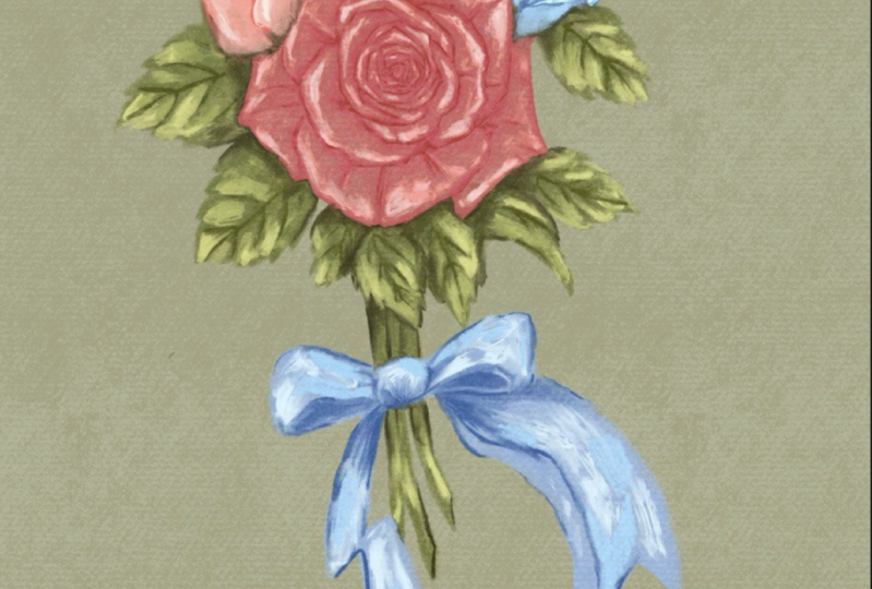
7. Bouquet: The last painting we'll
do together is a bouquet. It's not because no wedding
is complete without it, but because I want to
use this opportunity to introduce some basic
composition rules. Also at this point in the
intermediate level class, you should have the confidence
and ability to paint an entire composition rather than just individual elements. You just need to understand some basic composition rules and paint the seemingly many
elements one after another. If you know how to paint one, which you do now, you
can paint them all. The good news is not all elements in the composition
are equally important. You can just focus your
efforts on the important ones. It's not even as hard as
you're thinking right now. There are many composition
rules out there. I don't want to
overwhelm you today. So I'll focus on only five of them that
concern this bouquet. We'll go over them one by one. The first one is rule of odds. Well, for some reason, objects in odd numbers seem more interesting and natural than
objects in even numbers. I guess even numbers can
appear overly symmetrical. For this reason, I've decided to draw three flowers
for this bouquet. The second rule is to employ different shapes.
Well, that's simple. It's boring to have
only one shape since the flowers
are mostly roundish. It's a good idea to incorporate leaves that are
pointier and perhaps a bit triangle leaf shaped and stems that are
narrow and long. We'll also add a ribbon for that were three triangular
arrangements. These are considered to be
aesthetically pleasing. It's very similar to the rule of odds because you guest
natural asymmetry. What I want you to
remember is that when we say triangular arrangements, we don't mean that
you should force your elements into
a perfect triangle. We just want to loose
vague triangular shape. For this reason, I'm going
to make this bouquet. An upside down triangle
with flowers and leaves, mostly at the top and stems, and a ribbon at the bottom. Number four focal point, that's where you want the
viewer's eyes to lend. That's the primary area of
interest in any painting. It doesn't have to be
in the dead center, but it should be in
a prominent spot. Never on the edges.
For this reason, I'm going to make one of the three flowers the focal point. I'll place it close
to the center. But considering the
bouquet is top heavy, I'll have to move
it slightly upward to make sure the central
flower draws attention. I'll make it bigger
in size and also brighter in color than
the rest of the elements. Finally, number five,
simplification. This is easy. It means we shouldn't
get too many elements. Use too many colors or paint unimportant things with
the same level of detail. So in our case, I think
three flowers, some leaves, stems, and a ribbon is
not overly crowded, so that's perfect there. As for the colors, I'll use a three
color only palette. We will paint unimportant
elements such as leaves and stems quickly with larger brush strokes
and fewer details. I found this artwork from the public domain that fits the composition rules
I just mentioned. We will just roly
follow that as a guide. I also want to make
things easier for you. We will recycle the rose we just painted and use that as
the flower in the center. For the two supporting flowers, we will use a ready made sketch and only
paint one of them because we'll change
the color and orientation and make
another one out of it. Okay, with all that information, here is the plan for
this composition. I personally don't like how
the reference is left heavy. So I'll make my overall shape a straighter upside down
triangle when I'm sketching, since leaves and
stems are already green and we have
a reddish flower, and we decided to use only
three colors for the palette. I'll use blue as the last
color for one of the flowers, and the ribbon, and we'll use
red for the other flower. Main elements are three
flowers with a big rose from the first video
in the center and two smaller ones on top
forming a triangle. But I'll change the
color of the rose to a brighter, more saturated red. The other flower could
have the pink color, the rose was originally
in the last flower, and ribbon would be
baby blue instead of bright blue so that they don't compete with the red
rose in the center. The leaves and stems
green would also be a, be muted For the same reason. The central flower already
has a ton of details. We'll make the other two with
relatively fewer details, and we'll paint the rest
faster with bigger strokes. In the end, we'll take a look and adjust anything
that's awkward. All right, it's time
to get sketching. You can use my photo as a reference and keep it
to the side at all times. Use any brush you
want for this part. Let's first draw a large
upside down triangle. And then drag the old row
sketch just above center. And get the other row sketch
onto the canvas as well. Reduce its size and duplicate it and change
its orientation. You can distort it
to make it look more different and make
the three flowers also form a triangle. The next step, we'll
sketch the leaves, stems, and ribbon
in a new layer. Sketch some loose leaves
around the flowers, and fill up the upper side, including some bigger
and some smaller leaves, some a bit longer, some a little s for variation. Since it's a rose only bouquet, all leaves should
have the same shape. I'll give you a trick for
drawing natural looking leaves, that is to use C curves and S curves for each and
every one of them. Remember, rose leaves are
supposed to be serrated. Give them some teeth in the end, add a sea curve in the
middle of every leaf. We will also draw some
smaller leaves as fillers to fill up
some awkward spaces. Then add some stems to the bottom just like so
don't stress about it. And finally, a ribbon. All right, it's time to merge all these layers
into one and reduce its opacity to around 30%
and set it to multiply. This will serve
as our guide when coloring painting
Moving forward, we'll also be using
the same brushes as the flower artwork
from lesson two. Before coloring, let's add a background the
same way as before. Set the background color to the lightest page and then add a new layer
below the sketch layer. And use background wash,
canvas texture brush. Add around 60%
size and just give a dark beige color
wash for some texture before coloring the
rest of the bouquet. Drag the color palette
tab to the site. Let's first paint
one new pink rose. Since this is just a
supporting flower, I don't want to spend
too much time on it. Remember we painted the
big rose in five steps. We'll cut it down to three. Just base color, one
shadow, and one highlight. Since we want the colors of the supporting flower
to be less saturated, we'll only use the lighter
three shades on the right. As usual, add a new
layer and let's quickly block in the base color
with my dry feather brush. Use about five to 10%
size for that and we will use the middle of the three pinks
which you selected next. Just paint following
the outlines of the petals, just like how we made
the previous rows. And we will do that with
the wet on dry sandy brush. Add two to 3% size. And we will use the that's one shade darker than the
base, which is used. Just use the stamp as a guide when drawing the
outlines also play with your pants pressure
again and make the ends of the petals
tapered by pressing lightly, and the center thicker
by pressing harder. We will switch to the
semi white bursal brush at around 5% size, and we'll pick the
lightest shade of pink, that is for the highlight. This is usually
seen at the ends of the petals and the corner
of the base of the flower. Now we have completed the
coloring for this flower. Let's group them and then
flatten them into one. Duplicate the group for
a backup if necessary. Now it's time for blending and we will use the blender
old bristle brush. Again, it's the same as the
big rows we just did before. Instead of smoothening
the paint strokes, you want to smear the paint
into each other to add more interesting textures
to the artwork and also blend some of
the awkward edges. Finally, I want to adjust
the pink color a little bit. I'll just tap the magic one tool and then tap hue
saturation brightness. I'm just printing up the brightness and
saturation little bit now. I'm pretty happy
with this flower. We'll work on the next one. For that, let's just toggle
on the sketch layers. We can see where things
are supposed to go. All we need to do for
the second flower is to duplicate the first
one we just created. And then select one of the rose layers, doesn't
matter which one. And then tap the arrow sign
and drag a rose to the right. Then you want to
flip it horizontally and resize it to make it
look a bit different. You can also dist it
doesn't really matter what exactly it looks
like and doesn't have the sketch exactly. As long as it's
there, it's good. Next, let's drag the
middle blue shade onto the duplicated flower
and make sure you drag it onto the red base color
portion of the flower. You want to avoid dropping it onto the shadows or highlights. Okay. Before the threshold
pop up, disappears, and you can slide
it left or right to adjust how much it fills the
flower with the new color. It looks a bit too pale to me. Right now I'm dragging the second darkest flu onto the shadow
portion the same way. Adjust the threshold slider until you're happy
with how it looks. The next element we'll work
on is the rose in the center. My favorite way
to grab something from one canvas to
another is this. First, go to the old canvas, Find the flat image, and press your finger on it
until it moves a little bit, and then drag it out
of the layer panel. And at the same time, use the other hand to
tap the gallery sign. And then tap the
composition canvas, and then it opens up. Only now can you
lift your finger to drop your rose into
the new canvas? Be careful, you can't
lift your finger until the rose is
in the new canvas. Just like that, we
have our center rose. You can adjust its location and size the same way
we did to the blue one. And make sure it's on top
of the other two flowers. No part of it is hidden. All we need to do now is to
make sure one looks redder. We'll use the same
color change method. Let's drag the middle red to the base or mid tone portion. And then adjust threshold. And then drag the darker
shade to the shadow portion. And also adjust threshold if
you don't like the color. Now another thing
you can do is tap the range tool and then
open color balance. And play with the sliders
there until you're happy. I like this bright and
slightly orange shade of red. So I'm just going
to settle there. Now the heavy lifting is done. Let's quickly paint
the leaves and stems. Add a new layer below
the flowers and use Dr Feather bush and the middle green to lay
down the base color. You want to increase
your brush size so you can do it quickly. It doesn't have to be perfect because it's just the
supporting element. Remember, don't forget about the teeth shapes on the leaves. You can reduce your
bush size layer to fill up the stems
and filler leaves. Next, you will move to the darker shade and switch to wet. On dry, sandy brush
will mark the center of every leaf and also connect that to the edges of each leaf. These are also sea curves. Some of the smaller leaves on the bottom seem to
have become a blob. You can take this opportunity to bring some definition
if you like. Next, we'll pick the
darkest shade of green and mark the place where the leaves
and flowers are meeting. Since the leaves are
under the flower, the areas directly under it
would receive some shadow. Also do the same
between some stems. Don't worry about
accuracy too much. Next, let's use the second
lightest shade of green on parts of every leaf that is not covered by any darker shade. I'm mostly just focusing
around the teeth. And finally, pick the
lightest shade of green and add some highlights around
the tip of every leaf, and then some random
areas of the stems. We will quickly finish
the ribbon and then we will blend both layers together. Add a new layer above
the stem, layer above. And then switch back
to dry feather brush and pick the middle blue
for the base of the ribbon. Just fill your sketch up. Then switch to wet on dry sandy brush and pick the blue that's one shade darker. And just draw some
broken lines around some of the edges of the
ribbon for some definition, don't cover all the edges that
will look too cartoonish. And also paint under the stems because those areas
are in the shadow. Lastly, we'll drop the
second lightest blue paint for highlight with the
semi white verso brush. You can follow my video
for a color placement. It doesn't really
matter that much. Okay, now you can turn
off the sketch layer and blend the same way as before with the blender
old personal brush. And we will blend the
leaves, the stems, and the ribbon all
at the same time. I want you to pat yourself
on the shoulder because this big composition
piece is now completed. But before we wrap it up, I want you to take a step back and re, evaluate this piece. Does anything look odd? What about the colors? What about the shape? Anything you want to adjust? Um, well, for me, I don't like how it's too close
to the top of the canvas, so I'm going to move
them down as a whole. For that, I will
open the layer panel and then right swipe on every layer and then tap the arrow sign and I'll
reduce the size a little. See, they're all shrinking
at the same time. That's what we want.
I also want to tilt the entire composition
a little bit to the right. I'll just put my finger on the green dot and then rotate
it right a little bit. Okay? If you want to adjust
any elements colors, you can just tap their respective
layer and make it blue. And then you can play with the hue, saturation, brightness, or use the color balance thing that I just showed
you earlier for me. I want to further enhance
the central flower. I'll just bring
up its saturation and brightness
just a little bit. And I'll mute the
supporting elements colors by turning down their saturation and brightness a little bit. Now I'm really happy with
this piece. What about you?
8. Project: The project is to
upload an image into the project section of at least one painting you
made following this class.
9. Outro: I hope you enjoyed
following these tutorials. If you found them too advanced, then you should
definitely check out my first oil class that's called procreate oil painting
for beginners that goes at a slower pace and
we paint easier objects. If you like my step by
step teaching style, then I encourage
you to also check out my procreate
watercolor class. I also have one on basic
sketching before painting. Consider following this
account because I'm working on new classes and you'll get a notification when
the new ones come out. The brushes you downloaded are some samples from my wide
selection of procreate brushes, if you like, how they help
you paint out more of them. At my website, Procreate Bundle.com Other than
oil and acrylic brushes, I also develop brushes
for watercolor, gage, alcohol, ink,
and calligraphy. I also make all kinds of
stamps and coloring pages. Other than that, you can
also find me on Youtube at procreate bundle and add milli procreate bundle
on social media. See you in the next class.
 Millie ProcreateBundle, Artist, Procreate Brush Developer