Transcripts
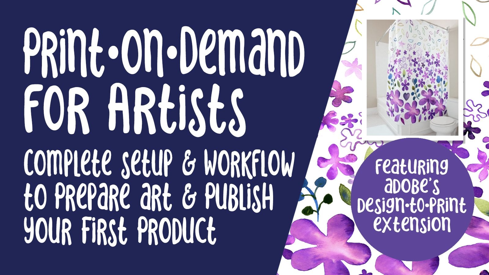
1. Intro Procreate Large Floral Wall Art for POD: Hey guys and welcome. My name is Dolores Nas credit and I'm coming to you from sunny, Manitoba, Canada. Today's class I'm bringing you is called Procreate large fluoro wall art or craft for POD sites. And specifically tailoring this to POD because that's where I get most of my bread and butter income from art licensing. I'm going to be taking you through is showing you some of the POD sites that I deal with. And we'll take a look at large floral wall art that's trending right now. Now, I have created this course based around brushes that I create. And I'm going to be giving you a few of those brushes to play around with. If you've been following my other classes, you probably already have a good selection, but this will just add to them. I'm going to be showing you a way to structure your documents so that it's really easy to produce multiple copies. Because the whole point of doing this sort of work is to create actual collection. A collection of art is always more appealing than just a single one-off. The reason for that is if the client is looking for a number of pieces, then they can get a coordinated set that works well together. Throughout the process, what you're doing is developing a technique that's unique to you. We'll be talking about that in class as well. Then we'll get into the nitty-gritty of the techniques that I use, including things like Alpha Lock and masks. These are tools we definitely want to be able to use to create the art that you really envision in your own mind. I hope you've been enjoying these Procreate classes. If you do, make sure you hit that follow button up there so you'll be in foreign. If my classes, as I released them. At the end of this class, we are slipping into Photoshop to just do the final proud for POD. I'll be showing you how to adapt your pattern, your layered file to different sizes so that you'd have art available for all the different layouts needed on a POD site like Society 6. In fact, Society 6 is where we're going to be landing for uploading and testing out our patterns. Now just in case you don't know, you can actually adjust the speed on this video. If I appear to talk too fast at times, I know I get excited and I'm really sorry about that. But you can slow me down if you need to. This is all sound like something you'd be interested in doing. Okay, Well, let's get started. I'll meet you in that first lesson.
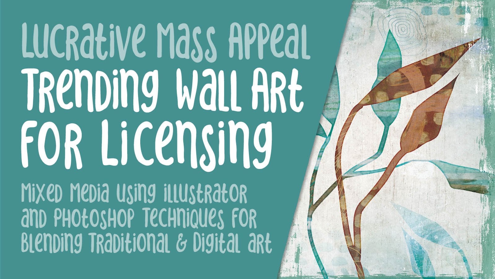
2. Overview and POD Site Inspiration: Guys, welcome less than one and less than one here we're going to be taking a look at some of those POD sites for inspiration. Let's get started. So as I mentioned in the intro, we're going to be looking at creating some large wall art, floral wall art, with the idea of trying to create something that's different. So something that you really don't see out there specifically. So if you take a quick look, I've got bold floral art here as my search and look you through this, I can see all kinds of different styles that I've seen that are very syllable, you know, the kind of thing that you do see out there are probably a lot of this could be POD, we could check out Society 6 and same thing, large, bold, plural. Now we're going to have all kinds of stuff that comes up. Who's kinda cool seeing it on defiled bags, but just kinda check out these florals here. And I want you to think about what you see out there, what's really common, and what could you do to stand out? So I've gone to a couple of the sites that I sell through so that we could talk a little bit about the styles that are out there. So we do see a lot of this sort of, I guess you'd call loose acrylic painting. Here's some sort of silhouette style. I really quite like that style. Watercolor flowers. Of course we see tons of those still pretty common to see. This is a style that seems pretty interesting and pretty basic. It's just looks like pencil sketches that have been softly watercolor it and then some bold backgrounds put in and on down to the bottom here I've seen some really nice ones. Hope Bainbridge, this work is beautiful watercolor work. That's something kind of different in my opinion. I like how loose it is. I like the overall shapes that are being made here. I feel like that's something unique in that I haven't seen around very much. Here's something that's really cool too, is super, super simple acrylic work, silhouettes with big areas of color as the background. And if we're looking at this kinda stuff can be really inspirational. But at the same time, you really want to keep your work unique. So how do you stand out when you take a look at what's happening out there in the marketplace right now. So another gallery that I sell through is this studio L. And again, you know, take a look through the different offerings there and which these thumbnails were a little bit bigger. But you can get an idea here. I think Studio L is a lot more traditional as far as the artwork that's available. So traditional still kinda works, I guess. And here's some of my work at the fulcrum gallery. So not a lot of my florals here and this series here at the top, I've actually probably 20 pieces with this kind of patchwork of, I guess you'd say, collage of different florals that I've done over time. This one here, this sage obscurity 3 is 1 to actually help his pillow on my bed right now. So here at the fulcrum gallery, I actually did another search for bold florals. And again, pretty cool ideas. I mean, some of this is just a very traditional old stuff. But then there's some really nice new stuff out there as well. So these are all places I would look inspiration. Now for me, the whole challenge was to create something that was quite different. So this is what I ended up doing and I was really determined to create the artwork almost completely in Procreate. So if you've been in my other Procreate classes and you've been creating brushes along with me. This is just another installment, I guess, in that same series. Now, I'm working with two different ages now. And one of them requires sort of more realistic stuff and a little bit more traditional. And then the other one is bold wall art. And so I kind of set out to experiment and create some really unique looks. This is an example of one of them. Here's another one. Now this one incorporates a scan of traditional watercolor for the background with then all of these brush stamp imprints. This one I've ordered to put on my own wall is kinda goes with my color scheme. And then this is another one that I've ordered. I'm not sure. I might hang that one in my studio of the kinda goes with the colors in here a little bit more. But again, this is tying together a bunch of the techniques that I've been teaching you with the addition of, I guess more of a mixed media look with this imposition or a superimposed collage art in the background. And this as well. This one also incorporated photographs that I had just recently taken from my garden and use in that previous class that I did on continuous line art florals. So I have these great beautiful photographs and I was doing this particular project and then thought, you know what, I'm going to bring that photograph images experiment. So this is another look that I'm going to be kind of explained to you how you can achieve. So without further ado, I think we should move on to the next lesson where we're going to start the whole process. All right. I'll see you there.
3. A Look at the Structure: Hi guys, welcome to lesson 2 and Lambda 2. Here we're going to be taking a look at the structure of the document. Let's get started. So to meet my document, the first thing I wanted to do is to have a texture. And I'm going to use this one here. It's a watercolor paper. I've given this to you in a couple of other classes. And if you look at this structure here, I've got the paper. I've got a variety here. You can use all of them, you can use one of them. You can create a completely different look by changing B way these watercolor layers blend with your artwork. So let me just show you a quick example here. Now you can see that if I zoom in here, there is a lot of different texture happening here. Depending on what I've got FET for my blending mode, you can see how it interacts with whatever's on the main part of the document. So Heller burns seems to work quite well for a lot of them. For this one I might use something like multiply and then reduce the opacity. So it's really up to you how you want that to look. And this is just another level of adding variety to the artwork. Oh, I'll turn these off one at a time so that you can kinda see how they're affecting the color. And if I were to turn them all off, this is what the original watercolor looks like. So you can see how much these textures really add to the overall finished look. So I am going to be using kind of a watercolor look for this particular project. And I'm actually just going to use this document because it's a duplicate of one that I had and I can eliminate all of those layers. And now we're ready to start. So I find that for me the best thing to do is to use a bunch of my brushes and just put something down. It's like there's no real way of telling you how to do this. I can tell you that I often work in groupings of odd numbers. So I would never put four images on at the beginning and try to make it work unless I was really varying the size. So I'm going to be talking you through a lot of this as I'm doing it because I can't really just give you the instructions on it and you really have to see how I do this in action. So I've got a new set of brushes that I've been creating. And you can see that it's an enormous set already. So I'm not quite sure how I'm going to sell movies. I'm actually planning to do brush sets, lipid talking about this, I know for a month or two, I just haven't gotten around to doing it because I'm so busy doing artwork at this time. So I'm going to show you real quickly how I would start. So let's visit as you brush I just created last night, and let's work with this color scheme. So I've got a bunch of pallets here that I've either bought or created. But I think I'm fine working with this particular group. So I'm going to clear the most recent colors that I use. And I'm going to just start by stamping these flowers. So I'm going to go really large. And I'm going to make sure that I am not on that filaments layer. So I've got the document with a painting layer here just so that it's less confusing. And also what I'm gonna do is lock this so that I don't accidentally put something on one of those layers. So let's just start by just damping and mistakes by just stamping one of the flowers. Now here you can see that texture is coming out beautifully. Could decide whether or not you want to change the position may be rotated little bit. And let's just grab a couple more. So I'm just kinda doing the recent ones that I did because I haven't used a lot of these apps. And let's switch colors. So let's try one in this color. And what I wanna do here is add a new layer. I'm making my brush is pretty big because it's always go down in size rather than going up. And I'm just kinda roughly positioning them. This is probably going to change. Let's try this guy. So you can see I've got some that are positive and some that are negative. And what I mean by that is, in this case, the flower is just a regular outline and in this case, it's a solid. Okay. And I kind of like that low one. This is a case where I might have an even number, but we're going to be doing a lot of work on this before. We're at the point where we would consider it finished. So let's do an outline version of that too. And I think I'm going to go into a different color here. And that third peel, new layer. And recall as big as I can at this point. And you can see that when I'm stamping this, I always tap into the middle because then I can move it around to where I want it and I'm not worried about it cutting off because if I was to stamp at the edge there, I wouldn't have the whole flower. And for now I'm just going to put that here, move out a little bit. And the other thing you can do is to vary your sizes. So never have them to similar in size. A little bit smaller without one. And I know for sure that this one here, this little one I'm going to end up doing probably blended with a different blending mode right now, which is set on normal. I'm concerned it off for now, but I know that it's there, so I'll be able to use it to start filling out the design. Now I want to start adding a few other elements. So I'm going to start with stems and my stems category here. And I'm gonna start with this silhouettes. And I'm going to sample this dark color here. Actually, I could have just picked it out from my palette and that was this one. I'm just going to make sure I have another layer. So I'll just resize it as if it was going to be used for this flower here. And I really like sometimes contrasting. So having a solid fields branch with a outline flower. So I like those two together. I'm going to actually drop one on top of the other so that I have it in a group because that way I can move it together because I really want to avoid having something right in the dead center, especially if it's something heavy like this. And I think I'll move that flower down a little bit. Now when you're moving something, if you've got it selected, you can actually just do a little bit of tapping to move it a couple of pixels at a time. And I'm not sure, I'm going to maybe try that stem still over here for a second and try another stem out. Maybe this one here. Kind of like that one better actually something a leave that one there. And this one I'll bring out of that group. And it's now been cut off as you can see here. So if that's an issue and you can't use it that way, then you'd have to get rid of it. But i'm I'm going to leave it for now because I'm not sure exactly what I'm doing here yet. I'm going to add a new layer. And let's think about another element for over here, I think in that case, I want to add another jam of sorts. And yet this firm would probably do. So. I've got the newly area and I'm going to switch to a different color here. And of course we're going to be able to make adjustments to all of our colors. And we'll also be using blending modes for some of these things. So right now it might not look that great, but just bear with me. We'll eventually, and let's bring this one above that R2P. Second is to see, I think this one might be one that I do have kind of cutoff. Always afraid to do that at the beginning because once you move it to the outside, you definitely will have Procreate cropping it. And I wouldn't position it here because now I've got too much of a straight row kind of happening here. So I am going to position a little bit lower and I am permitting. So yes, I have now cut off that flower. And then let's show that other little flower again because I might want to use that one. Oops, to help fill out this area a little bit. And I want to move that other one. Will move that one down so Leo is coming together so to speak. I will add more things. And I also know that here in this blue flower and then again here in this flower, we have part of the image showing through in a way that I don't really like. So I'm going to probably be creating masks to mitigate that problem. Add a couple more flowers. I think I'll go back to the line art flowers. And let me see what I can add in that upper corner and make it more interesting. So maybe here I would add something with a completely, completely different color, make a new layer, and just have a bit of it kicking in and really adding to the third diagonal interests of this layout. So, okay, I think I'm ready to move on into the next lesson. And that lesson, we're definitely deal with the masks. And we're going to talk a little bit about alpha lock. I will see you there.
4. Clipping Masks and Alpha Lock: Hi guys, welcome to lesson 3. That's a three here we'll focus on Alpha Lock and creating mass. Let's get started. So creating a mask is super easy. I have added a mask here for this layer because I want to, as you can barely see that, but I want to get rid of that little bit without really getting rid of it. So what the mask does is it allows me to hide that without destroying the original. If I wanted to ever get rid of it, then all I have to do is clear it and it's back to normal or I could eliminate it completely. And that would just be by dragging to the left and undoing or deleting. But I'm going to keep it. That's one thing. I don't have to worry about it at this point. So let's take a look at this one here because it'll be easier for you to see. But I'm masking is this kind of stem bit here. So I have to do is click on it and hit mouse eye mask is there, and then I choose a brush and I think I've just got my paper and pressure brush and I'm going to paint on the mask and get rid of whatever I don't want showing. So again, it's a really great way to do it just because it's non-destructive. And what I mean by that is I can always go back layer as it was when it started. And what you saw me do there was to just take streamline off that tapered brush so that I could color more naturally your draw with it more naturally. So I've gotten rid of everything back here, I think let me just double-check by turning this off. And now it's all well enough hidden that it doesn't show through on the flower. This one, I could also do that part of the leaf that overlaps. Where am I on here? Sure I'm on this mask. And see how beautifully that works to mask or hide that little bit there. This one, I don't mind overlapping because it makes it look like that one's in behind. But I do need to do this one here as well. So that's this one here. Put these together. They don't need to be, but I'm going to put them together because I'm using it as a guide to mask. So let's add the mask here. A couple. A part that's kind of showing through on the outlines of the flower. And honestly sometimes I leave the mask you till the very end because I could move these around and then have to adjust my mask. I just wanted to show you how that works. Now the other thing that's really useful is using the Alpha Lock. And that allows me to do things like change the color or add texture to a motif. So let's go ahead and work with this little one here because I don't really know what I'm doing for the rest of it at this point. But this one I think we can, we can sacrifice. So I'm going to add the Alpha law and what that does. And you can see here in the layers panel that that little checkerboard has showed up in the back showing us that it's a alpha lock, but it has Alpha Lock on. And I'm going to go into this flower and add some texture. So let me go to my textures category here. And I'm just going to add just some dots to it. So I'm going to sample the color and go a little bit later and go pretty small with my texture or secondary thought it wasn't working, but it's just that I had too dark of a color and it just wasn't showing up. So let's go fairly light. And even that you probably can't see, I can see it but you probably can't see it. So I'm going through and just adding a little texture here and you can see that it's not transferring onto my background is just locked within the flower because I've got the alpha lock on. So those were two really useful little skills for when you're trying to add interest to your layout. When else can we do with alpha lock here? One of the things I've done before is to add highlights and shadows so we can go in on, let's say this branch here and at the alpha log. And let's go in with quite a deep shade. Maybe, maybe this. I'm going to switch to my soft pastel. So here's my super soft pastel. And I'm just going to go in and add a little bit of shadow on that stem. And then let's switch over to some highlights on the end of the leaves. So it's hard to see whether that's going to make much of a difference at this point because we still have an added our background. So I think in the next lesson what we'll do is we'll add that watercolor background and then start thinking about how we make this that's going on, on the screen right now, work with that watercolor that we create. Now I've left the watercolor till after I've got these positioned. I sometimes start with the watercolor and sometimes I add it later once I've got a lot of my positioning done, I think once we have that background, we're going to be able to tell a little bit better how the colors here are working. Alright, so I will meet you in that next class.
5. Watercolour Background and Other Details: Hi, welcome to lesson 4. I know we've done this a little bit differently than the other classes I've taught. Usually we come up with the background for us, but in this case, we're coming up with the background after we've got our document partially made. I think you're gonna find that this is an equally interesting way to work. Let's get started. So this step is to create our background, our watercolor backgrounds. I'm going to add a new layer here and drag it down to be below everything else. And if you've been in my other classes, you know that you can actually use pretty much any brush to add color because of the blending tool that we're going to be using. I'm going to just opt for a large quash type brush and let's just, let's just go for it. I'm just going to add a few colors to this background and kind of vary it. Opened bigger sort order to do too many. And you can see this is a very nice blending brush that I have this off. I guess it's a soft pastel. And I created that one using Adobe Capture, believe it or not, I took capture of a part of a pillow that I have in my living room. And it was enough to Creator very nice soft brush background. I mean, there's a lot more involved there and I'm definitely gonna be showing you sort of a quick review on creating a brush so that you have that, or maybe you haven't even taken any of my courses, but I want you to have that information. So I've got, I think most of the colors that I would need to try kind of a brighter version of this blue because my blending generally kind of creates a darker color. So I wanted to, to introduce another color there. So the brush I'm going to be using, if you've been in my other classes, you've got this one and you've used seemed to use it and you've used it more than once. It's the blender, terrific. And then of course I'll probably be using these other blenders as well. So I'm going to start with the blend, terrific. And if I start, I'm going to actually put this to white. And if I start in a white area here, you can see that I can nicely blend. Just by the way, I'm sort of circling with my brush. If I want to start with a different color, I go right into that color and I can start moving it around. And you can see that you can completely blended together. Because As if you've got a lot of water on your brush and you're in there with some wet pigment and you're just moving it around. Mostly the color is going to be showing through behind these images. And a lot of these, I think we're going to color in solid so that they stand out against the background. So I'm just kind of focusing on these open areas more than anything. And already I'm I'm quite liking what I've got here. I think it's quite usable already just the way it is but were fitted. Try adding a bit of texture. I'm going to go to that textured blend. And what this does is it gives us those blooms that you'd get if you had kind of a semi dry area and then you added pigment to it. And you know that you can go back, of course, and blend some of them out if they're just a little bit too prominent for you. And when you've got your foreground shims already placed, it's sometimes a nice way to deal with it because you can use the watercolor in the shape that you're making to emphasize. If you're wanting that sort of a look. Once you start doing this part of it is really personal tastes. So I can tell you how I did it and you're gonna wanna do it different anyways, let's try the smooth blend and we'll just blend some of, some of this up a little bit. But editor, really big size see the more I blend, the more I'm able to get rid of a hard line. But then I'm also creating a bit of a line with a different kind of finish. It doesn't have quite the same texture, but you know, that would be a really cool way to do it. And now we can go back to that super soft pastel and grab a lighter blue if we want to lighten up an area. And you see how nicely that just blends with whatever's going on behind it. And I think I'm quite happy with that. Actually. I know that we're going to be doing some stuff with these foreground items to really make them stand out. I'm going to try this big field watercolor in that soft blue and just see how that might work in areas. A really soft watercolor as well, and kinda works a little bit like the blenders, but it does have color. So if you drop it down, you can see that you have some pigment and some color there. And the more you move it around is, the more you can make it blend. So what do you think so far? I think I am starting to really like this color scheme too. Now if one of these flowers you want it to have as a watercolor, you could certainly do that as well. You can add a new layer and then go in and just do some separate watercolor for one of the flowers. So that's something you could use. So I'm adding kind of a light amount of pigment here. And then I would go into the original layer and probably just blend some of that out. And in that case I might have just water. And I'm bringing in white from that section in behind. I can also choose white here. So that's kind of making that darker watercolor background layer melt away a little bit so that, that flower can stand out while we're at it. We could actually add a watercolor flower. Where are those? Maybe the ones labeled watercolor. Let's grab one, I think is an interesting one. And I'm gonna go with a fairly darkish blue and add a new layer at the top. Doesn't need to be part of that group. I'm going to put it in, in the middle here, but then move it off. And these watercolor brushes actually can add a lot of interests. So you can go back to that watercolor set that I had originally given you with another class and add a couple of those in to be interesting. And with those, we could also experiment with a blending mode because that's kinda nice to have. It's subtle. I like that one that we pass. Screen was nice. Hard Mix is not bad. Let's go back to screen and a light that because it's subtle. So there's a couple of things you can do with watercolor to really make your layout interesting. So in the next lesson, we're going to work on adding some texture and then also giving these foreground outlying flowers, probably just this one, a fill so that it can really pop against that watercolor background. So I'll see you in that next lesson.
6. Texture and Motif Fills for Contrast: Hi guys, welcome to lesson 5. This lesson is going to be all about texture, and I'm even going to show you how to apply texture to the motifs. Let's get started. I always feel like he gets to a certain point where a piece kinda looks not that great, but really needs a lot of work. And we're kind of at that point right now. And I know it seems like a lot of work for me to be able to get this to look good, but I really can do it quite quickly and easily. So the first thing I want to do is to fill in this motif here. So make sure I'm on the right layer, and that's this one here. And I'm going to fill it with just a really neutral ish color. So maybe that and I'm going to go even a bit lighter. So I'm just going to drag this color in and it's only going to fill in areas that are continuous. So I'm going to go through and kinda do it this way. Cool thing about this I think, is that I can probably fill that center with a slightly different color. So I think I'm going to do that. Doesn't even look that bad. Just going through that background, does it? Let's try something a little bit darker. Just kinda the same tone though, like same kind of color. And I do like that. I am going to go back to this color. And I see that I've got a couple of areas that have to be taken out. So we're going to use the selection tool and automatic. And this is what I want to do, is select this. And I'm going to add this. So I hit the Add button there. And this I think crate here. And you can see as I'm dragging that, it leaves a little bit of a like pixels that I don't necessarily want in it, but I'm going to try and just see how this works. And actually that's worked decently well. So I think that will be suitable for what I need it for here. So I like that it's really seems to stand out. And now I didn't put any watercolor in behind in that very spot there. So I'm gonna go back to my watercolor and just add a little bit. And I can do that. I can even just add, you know, use that soft pastel. Really almost anything is going to work. It's got a large area that's showing, I'm going to actually try the blend, terrific. And just kind of see if I can just smear some of my color up into that area. I'm going to try the texture. Wouldn't mind a little bit darker in here. And I think I need to add a bit of color so much. Just use that super soft pastel and just add a little bit so that looks good. I think that's done kind of what I wanted to. Now that flower really stands out. I can still add texture or do whatever I want in the middle here. That's something that we'll probably do in the long run. But I'm thinking here now, what I wanna do is maybe add a little bit of texture to this motif because it just looks a little bit flat. So I'm going to use the Alpha Lock. Actually, no, I'm going to add a new layer and I'm going to do a little bit of texturing. Which brush shall I use? I'm going to try just a cross hatch and see how that looks. I'm going to go It's actually pretty big already. I'm just going to take a tone a little bit darker than what I have there. And I'm just going to go in. And now you can see that because I don't have the alpha lock on, I'm actually coloring in the background here as well. So I think we're going to use a blending mode for that. I just thought I would want to experiment a little bit with the blending modes instead of using the alpha lock this time. And let's add some texture in the middle here too. And you can see that if I press softly with this brush, I get a very subtle texture. I'll give it up here so you can see it. And if I press harder, you can really see the crosshatching. But now that I've got a little bit of it added here, let's go with a blending mode to see how we could make that more interesting. I'm going to put that linear burn that I really like. I think that's my favorite is the Linear Burn and I can lighten that up a little bit. And then what I would need to do is add a mask to this layer and then go in with another brush. I'll just grab this tapered brush and I'm just going to go around the edges here and paint it out on the mask. And it's crosshatch shading. So if you accidentally had something like that, like I just did, it wouldn't be the end of the world. Since I did catch it here in this spot here, it doesn't even look like I would need to mask it out. It kind of looks neat actually that you got a little bit of cross hatching going in as almost like a shade, like a shadow. I'm happy with what I've done there so far. And I might want to brighten that flower up a little bit. So I'm just going to select it and I'm going to go into curves here and drag this a little tiny bit to the left. And I'm on gamma, so it's adjusting the light. Now I want to add some really nice texture areas in the background kind of area. So I'm going to add a new layer here, a little bit lower down. And let's go in and check out some of those other textures. So this is where you really have to use your judgment as to what's really adds to it and what is sort of taking away from it. So definitely takes a little bit of experimenting to get the feel for what works. Uh, kinda like adding if I've got some dark areas here but nowhere else than a lake, kind of balancing it out with some darker spaces like that or textures like that. And one of my favorites is this one here. And I'm going to go with a blue and a little bit darker. And I'm not going crazy with it. Like I'm at this moment just kinda sticking to the outside here. I can switch colors if I need to for more subtle areas, I'm going to go like super light and add some in there. And you can do that to make some of the inner areas a little bit more interesting. I just sampled that color and I'm going to go just a teeny bit lighter. And you can see how subtle that is in there. And let's look for something a little bit more interesting here. As batter is always good. I find it's just kind of a subtle thing that you can add that makes it look a little bit more like natural media. And I love these Winding Circles. So that's something that you could put in. This really starts to look very mixed media is at this point, I'm going to try this in almost a weight and a little bit here and there. Make that interesting. I've gotta make a bunch more textures, honestly, I've used a lot of these in more than one of my classes. So you've probably seen me go through and use these sample be a little bit later here to add these lines in the background. I liked the addition of lions because I really feel that adds depth. I don't know how that works exactly, but it works. And then of course, I could go in and make changes within any of my motifs and thinking that we could add a little bit of texture on top of that. So let's go into that layer and add. And let's think about this one maybe with a dark. Now, something like this. My texture is just way too big at the moment. So what I would do is go in and sort of the grain and scale it down. You can see that it's making it smaller here. You know, I like that, but I kinda did like that other one there too. So this one we can also scale down, well a little bit later, not quite dark enough and actually really like that, that works perfectly so with little openings kinda showed through that other initial color that we had, but it really added some interests to that flower. So I think I can kind of proceed. I might do a little bit of work off camera because this angle that I'm working out for film doesn't allow me to make really good judgments on this layout. So I might take some time to really perfect it. And it won't be anything that you haven't seen me do at this point. I will definitely have the time-lapse that I can show you for you to be able to see how I proceeded with perfecting my layout. All right, and I got to go grab a little suffer on getting hungry. So I'll see you in a minute.
7. Alternate Methods to Add Interest: Hi guys, welcome to lesson 6. And lots of six here I'm going to be showing you some alternate methods for adding interests to your layout. Let's get started. So I wanted to start this one off, showing you a time-lapse of pretty much our whole process. So as we started, pretty much our whole part. So I wanted to start out by just kind of showing you a time-lapse of our whole process. And you were with me every step of the way here where we did all of the positioning, our, our initial elements and then adding the watercolor background, adding a few additional motifs and then coloring the mean central motif. Adding little bit of shading to doing some experiments with the blending modes. And then adding some of that textural interests in the background and around the edges. It's really cool to look at the time-lapse. And this is something you can do with Procreate is to record a time-lapse of your entire process. So here I'm adding a couple of additional motifs, not quite sure where I'm going to go with this. I've also added some additional texture to this main motif. And then here I'm adding a kind of a release using a really blocky liner block brush. Not sure whether this is something I'll keep or take away, but it's just a different method to add a bit of interests. So then we're going to work on what I've got here and I'll do that with you on camera. So I know that there's a lot going on here. I'd probably spend a bunch more time this kind of working this all out. But there's one last idea that I have and I want to show you and that's in incorporating a photograph here to add even more interests. Oh, I'm just going to grab one that I have. So you go to the Actions menu here under the wrench. Insert a photo. And here's a bunch of the photos that I took the other day. So let's just try this one here. I know you saw that in one of my other layouts, but I just want to show you how this could work. So I'm going to enlarge it. I could commit there and then continue to enlarge it to make it a little bit easier on myself. And let's move this up. And let's just do a little bit of experimenting with the blending modes. So I know my layout was starting to look kind of dark. So one of my goals might be to lighten it completely. This is kind of changing the overall look. And that's actually kinda pretty that's using hue here. So really, it's just an experiment at this point. And exploration on your part. Remember to try a whole bunch of different blending modes out. And then like I just did their experiment with the opacity. You could also experiment with the colors. So go into hue saturation and brightness. You could completely desaturated, for example, or you can really saturate it. You could adjust the brightness. And of course, you could go through and experiment with different colors here. Sometimes what this does is a really good job of making the image more homogenous. Everything kind of goes together better when you've got one overlay that mixes with all of the different layers and colors that you have going on. So it's just a thought, I mean, just something else that you can try. Hi that one and try another one. Insert a photo. Let's try something really textural. Remember you can partly enlarge it and then commit, and then you've got a smaller piece to position. Let's try some blending modes with this one. I don't like this one as much. I don't think I think it's just a bit too much. And of course, I've got it right now. On top of everything. You can easily drag that down so that it doesn't affect some of the foreground items, but more so the background overlay. And yeah, overall, I don't like that one, so I'm just going to delete this one. The weight might be and they serve mix and talk about a completely different look and feel a really love what's happening in some of these areas where you're getting some other real like the photo itself mixing in with the painted or stamped elements. Sometimes it means adjusting some of your other layers to make it work. And as much as anything when I'm showing you all these techniques is just to open your mind to the possibilities of alternate methods to work out your problem and your problem or your puzzle is to get this all to work together to make a really creative and original art piece. And I think I'm fairly happy with this. As far as that background goes. I think it does add, I could reduce the opacity a little bit to make it a little bit more subtle, I might do things like change the color of the stems or whatever. I will. A few more changes, corrections. What I usually do at this point would be to go into my gallery, select it, and duplicate it so that I'm not affecting that original file too much. And I'm going to make some changes to that and surprise you with how different I can make that Leo Outlook. Then of course, I want to take some time to show you a little bit more about brushes. So I'm going to show you that in the next lesson.
8. Prep for Photoshop and Review Brushmaking: Hi guys, welcome to lesson 7 and less than seven here. And we're going to finalize our layouts and get ready for taking this into Photoshop to prepare for the POD sites. Let's get started. So I'm going to begin again with the quick time-lapse so that you can just see the whole process. This is a good spot or a good time to review and take a look at the different things that I've put together for the different steps I've taken to get to the point where I then start making decisions about the finalization. I would say all tools and illustration like this probably takes me a couple of hours to complete, maybe three, if I'm being really elaborate. So here you see me kinda start to do some experimenting. A lot of it has to do with the blending modes and adding additional motifs. You see me adding texture year. A lot of little bits of individual lines and texture has been the experiments with the photographs and how that kind of ended up. And then you have just a little bit of resizing and restructuring to try to make it what I would consider finish. So moving stuff around, anything that really works to move it around. Now here in this next one, you're going to see me do a little bit more in the way out, trying to decide what elements were really working and what works. And what I really stood back into a look at it. I just wasn't sure about this one motif with all the different details and textures and that sort of thing in it. I looked back at some of my other examples are my original art. I've got about eight or ten of these done now. And I just felt like it was not really working with the rest of the collection. So that's when I decided to take you that mean flower out and do some experimenting with a different motifs here. So these are also brushes that I have. So I was able to make the changes really quickly. And overall, I was really happy with the way this one ended up. And that's why I think I've decided this is the one that we're going to take into Photoshop to finalize. I want to show you a couple of things first before we get to that point. So here I wanted to show you two of the different files that I've created based on that one that we were working on. So I went into this one and made some changes. But you'll see that I've added texture in on some of the motifs. I've changed some of the blending and coloring of this leaf motif here. I've added a couple of additional ones here. Overall, I think this is a usable file, but it just wasn't one of my favorites. And I think what really bothered me the most in the end was this particular flower here. So I went in and did an alternate where I eliminated that flower completely and added a large DZ light silhouette. And this is another one that I just traced and created a brush for from a photograph that I had from a flower in my garden. So overall, I like this one a lot better. I liked the way the colors turned out. It was a little bit more in keeping with that original color scheme palette that I had, which was this one here. So overall, you can see that that works a lot better. And yeah, now I really am quite happy with this. I've tone down some of the contrasts with the different motifs. For example, remember this one was rusty colored line with kind of soft rust color in the background are more of flesh color, I would say almost in the background. And I think now the palette works a lot better. And I've got really exactly what I need here to go into Photoshop. So I'm keeping all of the layers exactly as is here. I think I did reach my maximum amount of layers here, you can see because of things like these textural bits that I added and I wanted to kinda keep some of those on separate layers because I want to leave my options open. So I think now I've got what I want as my final one, and this is what we're going to work with in photoshop. So in order to export it to Photoshop, what I do is go to the Actions menu again, and we're going to go to Share. And here you can choose the different formats. If I was going to be just using it in Procreate, Of course I would just save it as a Procreate document. If I was doing something like creating brushes, sometimes I use JPEG. It really all depends here what it is that you're going to be using as your final sort of method for creating what we would call camera ready file. So I'm going to go into PSD here. I'm going to hit Export. And then I'm going to save it where I know I can open it on my desktop. So for me that is saving it to Creative Cloud. So I'm going to go to files here, and this is my iCloud Drive here as you can see. And I'm going to save it. Where am I going to save it? I'm going to make a new folder, I think can call this one watercolor layered floral. Done. And now I can save my watercolor layered floral right here. So hit Done, Save. And now the rest of the class will be done in Photoshop on my desktop. Before we start doing the Photoshop, I wanted to also review quickly how to make a brush. And this one I've done based on a photograph, I took one of the lilies in my garden. So I took the photo here and brought it into Procreate. I did that by going to the Actions menu here, insert a photo, and this photo here that I brought in, I positioned it the way I wanted it. And then what I did is a quick tracing. And I did the tracing in a light blue, which is just a throwback to the olden days. When we used to do that, we needed under an ink drawing with a blue pencil because then it wouldn't show up in the copy camera that was used to meet negatives and so on. So I will hide that now because I don't need the photograph. And what I did is I just went through and did a simple black and white tracing than that drawing. Oops, not that layer is layer, so the drawing is now hidden. And then to make that brush, you go, you, well, there's a number of different ways and I'm sure you've done it a bunch of different classes. You can simply copy the image as one of the methods. It was a positive image. And you need to work with a negative image. So this needs to be reversed in order to work, what I would do there is hi, this white layer and I would invert this one. I've got my background down here, said it block. So now I could copy, go into this brush to edit, go into shape and paste. Now this is going to give me the opposite of what I need. You see how it's a black box. So what I do here is just a two-finger tap and it inverts it. And then I've got my brush. So that's probably the fastest and easiest way to do it. I also do usually aversion that has a white background. So I would take that same, same one here in cubic units. I would hide this one. And on this one I would bring the white in so that I've got the opposite. Lions being black. I've got the bill being black and same process, copy, duplicate, shape, edit, paste. And then let's take a look at how that looks. It's going to be the opposite of what we need done here twice and see how we have that black box. So we don't want that. We have to go back into the edit here and two-finger tap, and you instantly got what you need. So that's the fastest way to create the brushes. I just wanted to give you a bit of a review on that. We can now move into Photoshop to do that, finalizing for the POD sites. So I'll meet you there.
9. Finalization & Prep for POD Sites: Hey guys, look into less than eight and less than 8 here we're going to finalize everything. Let's get started. So I could fill an entire class with information about society. Six, I want to keep it simple, so we're going to do just one orientation. And what I mean by that is we're just going to have a horizontal layout and that's only going to fit on a certain number of societies. Six products. There are many orientations and I'll show you that real quick here by going into one of my posts. So if I were to check out one of these that I've had on here for awhile, I say something like this. This is one that has sold really steadily and very well for me over the years. I probably had this product for 10 years and I think on Society 6, I maybe had it for a heel five to seven years. I don't remember exactly. But you can see here just by looking at this when you look at all the products. So I've got this on all at the moment. And when I start scrolling down, you'll see that there are square products, there are round products, there are long products. So landscape format Products, portrait format products. There's a whole raft of them. So if they are switched on, like they are here, so I've got this switch, the on position. That means I've got that product available in my shop. Now some of them are switched off as you can see here. And the reason for that being the art just didn't work for that particular orientation. So in some cases with some of my products, I've gone in and created square or round artwork if I think is worth it. So if it's something that I have never ever sold in my shop, then I really don't even bother. So that's something to keep in mind. And like I said, I could fill a whole class with doing the different layouts, but I want to focus right now just on the landscape format. So I've brought this in from procreate and let me just check the size here. So in Procreate, I hadn't had 7200 by 4800 pixels. So in inches about was 24 by 16, which is a standard that I use a lot. So let's go back to the pixel dimensions here because this is what is important for your products. You can download a whole list from the Society 6 website. I've got a list of all of the different artwork sizes so that I know what the size needs to be for that product. That being said, I like to kinda generally create each of those orientations that I talked about. So we'll have a landscape, I'll have a portrait, I'll have a square, I'll have a circle. And those are mainly the ones that I need to worry about. Now if I had a bunch of lettering on here or if there was a ton of stuff around the edges that I was afraid of losing, that I would have to make adjustments with my file. I also know that generally for the landscape, I want to create a file that's big enough to work on some of the bigger products. So the biggest one that I usually do is 1, 0, 0, 0 pixels wide, and 507 000 pixels high. So we're enlarging here, which we all know is really considered a no-no in graphic design. The reason being that we're going to get some pixelation and a lot of the other issues that not only do they look bad on your artwork, but it may actually be rejected at Society 6. So you may go through all the trouble of loading, creating all these different orientations that you've enlarge this. So it's a little bit fuzzy around the edges, so it's considered not usable. And Society 6, we'll just pull it on you so you really don't want to spend the time creating everything and then have it just taken away. So I wanted to show you a couple of ways that I get around it. So I'm going to set my canvas size at the size of him talking about change to pixels here first. And then we can type in two measurements and hit. Okay, and then let's take a look at what this does with our file and how big we might have to enlarge it. So it's not terribly bigger. I think that I can get away with either moving some of my images around, some of my layers around or enlarging them. In the case of, let's say the background, the background can be enlarged and you're never going to see any degradation of quality. Let's talk about how you can get around that problem with enlarging. So I'm thinking that I can enlarge pretty much everything. When you really look at it closely, look at the height, especially it's not much of an enlargement going from this size to this size. So I think I'm going to do it and then check it out and see if see if we can get away with it as far as quality and pixelation and whatnot goals. Actually, I'm going to do the whole document including this. So I'm going to unlock the paper textures. I'm going for everything here, and I'm enlarging it. Now in order to fill these outside edges here, I'd have to decide, do I want to make everything bigger than I think in my case I do. I can move my objects here. One of the things I like about Photoshop it as opposed to Procreate is that when I crop it like this or when I enlarge elements and they go beyond the canvas size, they don't get cropped. So I can then grab them and move them back into the image area the way I want. So I think I've only done maybe a 10 to 15 percent enlargement here, and I think that's as old as much as I would want to go. I don't encourage you to enlarge, for the most part because you're going to get some pixelation. But I think that with the style that I have here and that paper texture over top of everything. I think it is very forgiving, so I don't feel that that's overly pixelated. And I have another trick up my sleeve to even mitigate that a little bit more. So you saw the edge that I just showed you with this flower. One of the things I have is a action that creates a rough edge around it. And that rough edge is what makes it look like an authentic watercolor. So I would go to my rough edges automator and I would do to some light texture on the edge. So I'm going to enlarge this so you can see the action will add a watercolor type edge on my image. If that isn't enough, if light wasn't enough, I could go back and I can go and apply a medium one is dead, so make sure you're on the right layer and you see how that adds watercolor type effect on the edges. And I think I liked it before, so I'm going to leave it. You can buy it the rough edges automator. There are several of them available on the market. I bought this one from artifacts forage, but you know what, I don't really even think that that's going to be super necessary because I'm happy with the way it looks, even with that small enlargement, I might do a few alterations like moving some of these flowers around to make it work mainly in the sort of central part of the image. But of course, you know, all of this stuff is going to be a part of it and put a line here that just might be the background as it was. I'm going to delete that background, not necessary. And I don't like this little spot here, so I might just choose to move that for any branch. And I think I'm going to run into trouble with all of these unless I lock this top-most layer, which is the paper textures, of course, see if I can locate that for anything that came up. Maybe have this on the outside here. So it won't necessarily show up on all of my layouts. And that's why I sometimes find that it's necessary to do additional layouts because some of them just don't work or don't fit or don't show enough of my image where I want it to be. So there's always that possibility that I'm going to have to move things around and save out more than one artwork. But for now what I can do here is save this one. So I'm going to save it as a JPEG. That's pretty universal format for society six and most POD sites. And it's going to call it art one. Normally I have a complete naming protocol, but for today's purposes, this is going to work just fine. So the duplicate, the JPEG is going to be all merged. And I always do it with a large file size. Another image format that's often used as a JPEG is very suitable for society six. So let's go into society six. I want to add a new artwork, so I'm going to click on this button here. Now, the studio here allows you to load your different orientations here, I'm only going to have the one that hit Select File, go to where I've saved that Coleman art one. And I'm going to upload. And if I had the other sizes, I would of course go through and put them in here, the square and what not, then you have to name it. So let's call this. I would definitely come up with a much catchier name, describing it a little bit better, but let's just say that's what I want. So we can move on in. And I will check this off that tells and Society 6 that you're not violating any Terms of Service or copyright infringements or anything like that. And there's no mature content and hit Continue. And now it'll take a minute. But this is going to emulate any of the objects in their product line that this artwork will work with, the ones that it fits perfectly. This switch would be on. Now you can decide, you can look at these and decide you know what, that looks fine in this orientation for one of these prints personally, I don't like any distortion, so I probably wouldn't. But you can see that there are a lot of items that they did fit just fine. So for example, the throw pillow and the wall clock normally would require a square artwork. But this artwork looks great. It really looks fine on here. So in this case, I would probably hit the on button here. I can edit it, which I recommend that you take a look at because you might find a piece of your artwork that's actually nicer to have in the image area. Okay, So you can decide that I'm going to kind of set it about here. And you can see that I can't go up and down at all because of the shape and I can't enlarge it here at this point, but now I can hit Save and Enable. And what this bop, bop divs is, ask you whether or not you might want to apply that same crop and positioning to all of these other items. So I'm going to go ahead and say yes because that's going to make all of these available. And If I had liked that original cropping than I think I would be fine with it on the other products, I recommend that you definitely check everything. So now there's a bunch of other ones that had been flipped on here. It's taking a minute to upload here. And this wood wall art is one that I would point out to you just because it's something to keep in mind that it kind of distorts your color a little bit. The cool thing about that would Waller though, is that it shows the grain of the wood. So this is really cool. I've got a lot of products listed here. I'm going to turn off this wallpaper because that wasn't a seamless repeat. And it works fine for many, many, many of the different items here. So I could go back and create specificly an artwork that matches in size for this, Let's say credenza or for the bath mat. I could go in and do that so that it matches perfectly, but that's a lot more work. Now the one thing that I might be interested in though, is something like the duvet cover or the comforter. And you can see here that what's holding me back is the size here. So this would need a 6000 pixels by 6000 pixels tall image. So I would need a perfect square for some of those. And I would not recommend that you necessarily, you can't actually even enable this because that is bigger than that original art that we created. So you would have to go back and I would save a duplicate of this file and we call it large square. Go to the image size in this case. And the width is not what's really important here. It's the height that's important in this case, I'm going to lock the ratio here. I'm going to put this at 6000 pixels high. Now just remember though that I'm going, I'm enlarging a lot here. So it might not be a good enough quality anymore. Now, I've personally ordered comforters and pillows, all kinds of different items. Largest thing I've ever heard is a comforter and this is the reason I ordered it was that I was enlarging my art work quite a bit to fit. And it turned out absolutely beautifully anyways. So in some cases, and I'm not going to say all cases, but in some cases, the quality is still fine if you enlarge it, I would definitely not recommend you do that with fine line work or anything with quotes. But it's definitely something worth looking at and worth thinking about. Another thing that I've done sometimes to mitigate the problem is I will get a paper texture like the watercolor paper, but I'll buy a really, really large file, high resolution, and I'll drop that over everything. And that can make it seemed to be a very good quality as well, because it stimulates the paper texture. It kind of cancels out the pixelation that might occur on the edges of some of my motifs. Looking at it to meet the quality is perfectly fine. You can definitely check this for yourself and it depends, like I said, on your particular type of artwork, I might do things like possibly go in and do the rough edges on this one as well. So I would probably just do the light. And you can see it's going through a process here, creating a mask and I pick it, crystallizes it. Just something I do in procreate sometimes to add kind of a watercolor look to the edges. If that doesn't seem strong enough, then I'll apply this layer mask and I'm going to try this medium. And again, if you watch over here, you'll see the process happening. And that's giving it more of that sort of rough watercolor look. If that's something that you're looking for, I think I'm gonna go back to what it was before, scroll back through a few of those steps. And I'm back to my original, which I think was more than adequate. So think about this too. You've resized this. Maybe some of the foreground items, maybe like that flower, for example, might be good if it was moved a little bit closer to center part of the image. Because remember with that other one it crops up, I should get off on the sides. So you don't think about that. It definitely takes work and time sometimes to relocate all of your elements, but I'm going to just save it out like this. For now. I think this is going to be fine. I'm going to call this one flattened just so I can recognize it on the list. And like I said, normally I add a size to adhere as well when I'm exporting. Always check off large file here. And now we can upload this one, 6 thousand pixel I image. So we've got the largest that we've created. And you'll see here now that it will give us the option for resizing or moving it around based on different comforters sizes. So I think I'm going to position it like this. So we get some of this flower and this flower, especially on a king size. And I'm going to save and Enable, and that's going to allow me to again go through and choose any of the products that will fit that proportion. So for the most part, usually I will do a square back and use for things like the pillows and blocks and whatnot. Bet, if this is going to work for the purposes of my demonstration today, I think it's adequate. So each time I do this, every different shape of artwork that I uploaded, it will then allow for a lot more products to be made available. So at this point we're just kinda missing, I'm going to turn that off, missing things like the curtains, which could be 1909, a 100 pixels high. But you see now a lot of the blankets and things are available. And I still, even though it's cropped, I absolutely love this as a comforter. You imagine like that would be absolutely gorgeous. So I've shown you a few little things here with Society 6. And like I said, I could go on for probably an hour showing you all the different layouts and things that I create when I am actually uploading a product. But that would take a whole class honestly. So I just wanted to give you a taste for that. Because I want you to be encouraged to go ahead and upload and create some items for sale in your shop. Because I think that is a really great way to build up some confidence. And you know what if you've got the money, order a couple of products, there's nothing more rewarding than opening up that package of items with your own artwork to take a look at. Another thing that I often do at this point too, is I will enlarge my thumbnails here and do screenshots. So Command Shift 4 is a shortcut on a Mac, I'm not sure on a PC, but I'll create a little thumbnails that I can use. So here's that little image and that can be used on a site like Instagram to just promote your product. So there you go. Another thing that you can do with your artwork now that you've created it. And I'd love to see some of these little mockups on the projects page here. I'd love to see your work and I'm sure other students here would love to share in your little journey. All right, so I think that kind of draws my class to a close. As you know, I could spend hours talking about all the stuff box. I think you have absorbed enough information today, so I will see you in that last lesson.
10. Outro: Hey guys, I'm so glad that you made it to the end and we've got another great project to put into our portfolios. I love the idea that you're learning some new techniques and you've got some other ideas now that you can apply to your art licensing endeavors. Take some time now to create a really unique brushes and then you'll find that this process is really streamlined. I like to spend a day just doing some random drawing the night, either photograph or scan them in, or I go and photograph a bunch of flowers. Then I can use these for creating my brushes and creating unique things that no one else is going to help put me know if you've really enjoyed this process and you haven't done so before, make sure you hit that follow button up there. That way, I'll be able to let you know whenever I have a new class coming up or if there's anything else that I want to share with you. Also don't forget to go to my website at shop dot dollar or it got CA and add yourself to my mailing list there. That way you'll be getting all of my other mailings that I do. And believe me, it's not too many. I really don't have a lot of time to spend on that at the moment. So you're only going to be getting maybe one email a month for me. Make sure you check out my society six shop as well. And on Society 6, I'm also in the denied designs category. Those are designs that are completely unique and art in my regular society six shop. You can also check out my other stores. I've got one on Sawzall.com, that's probably the biggest one. And then he Canada here I have one at Arctic where if you're looking for resources, don't forget to check out my Pinterest sites. The one at alerts art dealers now sprint has a really great category on flowers photographed and illustrated. So check that one out. Also you can check out my surface pattern design, bold flowers category. Hopefully you'll find some ideas there. Well, you know, I think that's it for today, so I'm going to say goodbye for now and I'll see you in my next class. Don't be late.
 Delores Naskrent, Creative Explorer