Transcripts
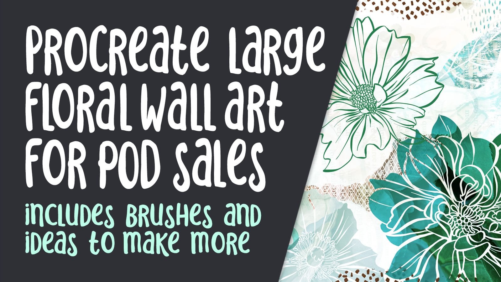
1. Introduction and Overview: Hi, guys. My name is Dolores NASCAR, and I'm coming to you from Sunny Manitoba, Canada. So got another class for you on the adobe designed to print extension. I know I've already done one on this, but this one I want to use to take you right from the very beginning the set up of the file , the touch up of the artwork all the way up to the final composition and then uploading it to the South Pole site. This is the artwork that I'm going to be using. So we're gonna be taking the artwork, separating all of the elements, touching up the backgrounds and doing what we can to make this into a beautifully clean file. We're gonna be working on the composition right in the photo shop program. But the great news is that the will be designed to print extension integrates directly into the Zazzle website. I want to reassure you that I'm not making any a feeling it income from either of those two sources. I'm just doing this because I want to show you how simple and convenient it is to work with . So, like I said once we separated out all of the elements were going to be moving them around and creating a really nicely out for a shower curtain. The shower curtain is one of the largest document sizes that you can use either a shower curtain or a tapestry, and I really recommend that you start with the biggest possible layout because then it could be reduced down to fit onto any other item and not lose any of the quality. The fact that we're separating all the elements also makes it really flexible for different proportions of your document. So, for example, the shower curtain is pretty much a portrait layout. But you might also want to create items in landscape format or even round for some of the items that you find on P O. D. Sites. We're also going to be talking about other P O. D sites, not just the Zazzle website, so I'm gonna be giving you some insight on how I go about working with them as well. I'm really passionate about this subject because one of my regrets, I guess, if you call it that, is that I didn't start doing this sooner when I had lots of big commercial contracts I didn't even think about just the idea of having a little bit of a bread and butter income when I'm working on passion projects like pattern design, which I've been focusing a lot on lately. When you're working on something like that, it's really nice to just have a little bit of income coming in just to make your month easier, if you know what I mean. So, yeah, this course definitely touches on passive income, but it really focuses on the skills necessary to get an artwork from really conception right up to an actual final listing. All right. Are you ready to get started? Okay, I'll meet you in less than one.
2. Prep and Touchup of the Original Scanned Art: Hi, guys. Welcome to Lesson one. Unless someone here, I just want to show you some of the artworks that I prepared and how I go about just getting it ready for that initial layout. Let's get started. So before starting, I wanted to show you the artwork that I am going to be using. And I'll just kind of show you overall how I go about doing my watercolor paintings that I use for a lot of artworks in my pattern. So this one is the one that we'll be using. You can see that it's actually pretty rough. There's a lot of stuff that could be touched up out of this. This is one of the things that we're gonna be touching on when we start the lesson. I'm gonna be using these pieces here as filler. And this is a pretty good example of how a work, actually What? I'm looking at this. It just reminds me of where I was. I was happening at the time, and I was doing these outside on the picnic table and just kind of just get that feeling back of that day and what the weather was like. It was just a gorgeous sunny days. It was a beautiful day to be working on watercolor, cause the lighting was so good. So I just went for it and I did. Well, you could see here in tons and tons of different things that at the time I was thinking about pattern design that could be used, and I have use in a lot of different applications. And there was one of my classes where I used this for a background that I was working on. So you might recognize that if you've been in my other classes, and certainly a lot of these are really just for doing background textural patterns. I've experimented all kinds of different colors, but it really isn't necessary to always do it in full color because you can change the colors when you're in your software. So something like this, for example, I've got all these different motifs that I could scan in and use but change the color when I'm actually in my software. So basically all of this is just watercolor painting. Some of them aren't complete. I've got all this stuff here that I can use when I'm thinking about putting together a layout for a product that I'm gonna be selling on a P o. D. Site. So let's get started with the set up of this particular file. So for my first lesson, what I want to do is talk to you a little bit about the set up of the shower curtain. I've chosen this as the product to create for this class because it has one of the biggest file sizes, and the beauty of setting it up at a really large size is that that artwork can be reduced down and rearrange easily to work on all the different products that are available on P O D sites. It's always best to start with the biggest possible project that you can think of. So look for the biggest product and then set up your artwork to that size. Now that being said, every P o. D site has a different requirement. This is Theo, exact size needed for the society six shower curtain, and it isn't the biggest size that I've ever seen. Generally, when I do set up my mean filed, I'll use for numerous products, set it up to be 9600 pixel square The one that we're gonna be working on today, however, is the one from Zazzle, and I've chosen Zazzle to demonstrate this whole process because the adobe designed to French extension is right here in photo shop. And I can just click on, create new design to print project, and I'm given the complete listing of the products that you can make and sell through Zazzle. So I figure if I can set it up here for a shower curtain, it'll probably work forward. Most other sites. Let's just check it out and see what the actual size of their master document is for a shower curtain. So here it is here, and I'm going to take a look at the dimensions. So I'm going into image size, which is manned auction I and you see here that that's a fairly nice sized file, 11,100 pixels, it's and 11,500 pixels high. Now I remember the measurement that we looked at on society six, I believe, was 300 pixels per inch. I think this will be more than the adequate for setting up a master, so I am actually going to be using this for setting up my artwork. The main thing I want to show you about setting up the artwork was in doing the touch out necessary to actually make all of your icons usable such a way that they are very flexible so you could move individual items. So right now you could see that these are all in one big clump or just a few clumps. There's a couple of individual ones that I have isolated because I want to demonstrate something. But for the most part, this artwork is only in two or three pieces. I'm gonna take you into this document here again, and this is one of my finished setups, and as you can see here, check out how many layers I've got here. You can see that I've got pretty much all of the flower separated here, and that's really ideal when you are going to be setting up for different shapes and proportions. So the shower curtain, it's almost like a letter size kind of a portrait set up, but I do a lot of products that require a square artwork. So one of the things I haven't done is crop it. So I'm just going to show you here. If I move my cropping box or bounds, you could see that most of my original items here go beyond the edges of the pain. And that's great. Because that way, if I was to set this up to be square, So if I went to 1 to 1 ratio and I set this up to be square, I'm not gonna crop it because I don't want to cut those guys off. If I did, I want to read a square document. You could see that I could move a lot of these items around to make it works. We're gonna get out of that now. This is one of my best selling shower curtains. This one I've been selling on Society six and I've sold quite a few of these. And it was one of my own favorites. So I have this one in my own bathroom. I've also got a little bath mat that I ordered at the same time, and I was really curious to see the quality of those items before offering them a sale. So that was kind of my incentive to to go ahead and order some. That's my excuse. Anyhow, I wanted to see the quality of the actual fabric and the prince. You know, it's really hard to tell when you are setting up something like this. How forgiving the original icons and the original artwork has to be in order to be enlarged to this size. Now, my artworks, I've done a lot of these flowers, So the ones that you're seeing on my documents, I've done these flowers, actually very small. I think all of these any much fit on one page out of my big watercolor pads. So the arch really high resolution in themselves. So when I scanned them, even though I scanned them at a very high resolution, you can see that there are, you know, a lot of bumpy edges and blotches and things like that. And, you know, I wasn't sure if that would look OK, so I wanted to do a test for myself. And I can tell you that is 100% okay. It looks fantastic, is a shower curtain, and I love that you can see all of those little imperfections. That watercolor is kind of famous for all the texture and the color changes and the blotches actually really show up well, and I think it really adds to the look of the design. I know my my watercolor instructor would probably be rolling over in his grave right now looking at some of this stuff because this was definitely not the look that was the proper so called way to do it 30 years ago, where 40 years ago, when I was learning This is a very new modern watercolor technique and I love it. I love that it's so forgiving. And I really like seeing those imperfections and flaws. It actually looks very, very good on a shower curtain. So in order to prepare my file, there are a few steps that I need to take. I'm not sure if I'm gonna be using all of these flowers, but I've gone through and done a lot of clean up on this already. My number one piece of advice for you is to scan it as large as you possibly can. So my original scan was at 600 pixels per inch, and that gave me a really nice scan. Will show you my original here. I do need to do some work on the cleanup here. I really need to get rid of this background and do a little bit of other cleanup work. So I'm gonna do that real quick for you in this lessons so that we can move on to actually constructing our file. So I did most of it off camera. I'm gonna show you using a couple of different flowers here. I've separated this one and this one because this one is so dark. And this one is so light that my level setting wouldn't work very well with both of them. One over the other would be ineffective. I originally did this one and at the same time is all the rest of them. And I lost most of the detail in this one because it's so light. But I do like it. I like the lightness of it. So I wanted to keep it. So I've separated it onto its own layer in order to separate things. And you'll see here that these are all still in kind of one big mass. I find that the fastest way to do it is to select the item I'm on the later that has the item, and I do command J, and that makes a new layer with that item. So I will likely go through and do all of this. But I'll do that off camera so that I don't have to waste screen time showing you that over and over again. Now, the next thing I would want to do and in a case like this one here, is to clean up that background. So I want to get rid of that gray that's there in order to move layers independently without having to go over here to select them. You can just hold down your command key, and you can see by the smart guides that I have on that is going to move just the individual items. So if you see up here on the control bar, when I hold down my command key, this little check mark shows in the auto select for the layer. So that's a really helpful little tip there because I didn't know that for the longest time , and I was constantly going over here to my layers palette to just select a layer. If you're like me, really wanna work on increasing your productivity and efficiency, then that's one of things. That photo shop here is something I just can't live without. So we're gonna go back to this layer here. This is the one that I want Teoh effect at this point. So I'm gonna go into the levels command, so command l gettinto levels and let's just zoom in a little bit here. So, you know, as I'm in my levels, I can still use my space bar and command key to zoom in. Now, the easiest way is to grab that I drop her there and took on anything that you want to have pure white. So in this case, because that gray is almost the same everywhere, that's what I did. Now you can see that there's still a little bit here, so that means that that area was a little bit darker. So then I'm going to click on that instead. And you can see that that has no added that even more. You can still play with your controls here to make some changes on your exposure or levels throughout. I think I'll just kind of leave it where it waas and just move that white in just a little bit and I'm gonna click. OK, now, the reason it's important for me to get all of that out of there is because I want to actually have all off my icons cut right up to their edges. So, for example, if you were to look at this flower here, I put a little background behind it for you to see. You could see that it is cleanly trimmed right up to the artwork. So I'm going to just get rid of that. It was just there to demonstrate. So now this flower here, actually, let me just grab that back again. Let's just slide that down here and we'll put it under this layer and you'll see that that layer still has a ton of the white on it. Okay, so let's just enlarge that in behind here so that you can see what I'm doing. And what I want to do is get rid of this white completely. So I'm going to use my magic wand, and I'm going to select, which should select most of it. Because of those exposure things that we did, you could normally just hit delete here. But what I personally like to do is extend my selection a little bit into the colored area here, and I really just want to go in a tiny little bit. So in this case, I'm going to do it just one pixel in. So I've got a short cut. My shortcut is command comma for expanding my selection, and I'm gonna expand by one pixel and you see how that's just kind of digging right into that colored area. It's just one pixel. So it's really not going to show. Then Look how clean oven edge I'm gonna have here. If you're looking for that particular command, it's under select here to expand. But you could see that I use that a lot, cause I've got a short cut for it now. The other thing I really like to do is also feather it slightly, and in this case, I'm gonna do pretty much the same thing. Just one or two pixels. Let's try to we hit okay again. You could see that very little has been adjusted there, But when I hit my delete key, you can see that I am still getting a nice, soft edge that looks really realistic. It doesn't have hardness to it so it doesn't have a harsh line, and that's what I want. And with that feather key, you can actually hit your delete more than once. If you are trying to clean it up even more so I'm pretty happy with that. You can see that in some areas here, I've still got a little bit of junk. Now you can decide whether or not you want to keep that in some cases. Looks fine. To keep it, I'm gonna do a little bit of erasing. So I'm going to grab my favorite eraser, which is Kyle's natural edge. So any of these natural edge brushes air quite nice. And then I'm just gonna go in and just physically race a little bit so you can go all around. I'm using my hand tools. So I'm just pressing down on my space bar, which has given me the hand so I could move around here and, you know, you have to make a judgment call. I think in this case here that I am going to just leave it now. The other thing, when you are enlarged this size, you might want to do a little bit of touch up with some of these pixels that are inside your watercolor. You could go nuts with that. I personally find that that is really not that important. Like you're not gonna see that too much with your final shower curtain. And if the shower curtain is the largest thing you can imagine when it's reduced down is going to be really just fine. However, if you are really dead set on getting all of those little imperfections out, and I would suggest the rubber stamp tool so that's access Using s on your keyboard, and what you would need to do is option. Click in an area that would be your source, and then you can just go over the spots that you don't like, and it'll magically clone from whatever area you specified personally. Like I said, I think that some of those imperfections are what really make a watercolor look realistic. So I'm not going to do too much of that. If he wanted Teoh, spin your artwork to make it easier for your arm to do the erasing or the rubber stamping R on your keyboard will allow you to rotate your image, grab my eraser again and do a little bit of your racing. So what I like about Kyle's natural edges just exactly that. It allows for the natural looking edge to come out. You look at the brush itself here, you can see that it's a little bit rough, and that's what I like about it. This is a good a time as any to make any corrections to the shape that you might want to make. And, yeah, that's mainly the process going through and using the levels to remove any of the gray in the background, keeping everything pure white, then selecting that background, deleting it and then using either your eraser or your gathering. And you're expanding of the selection to make the edges look really nice and clean. Now for resetting my view. Here, I hit Oregon on my keyboard, and then I can just hit reset view. So I'm gonna save now. And in the next lesson, we're gonna take a look at working on our layout. Teoh kind of start our basic composition, so I'll see you there
3. Separating Elements for the Composition: Hi, guys. Welcome to lessen, too. So we've done a lot of the initial work preparing our file. And now what I want to do is actually start separating out the elements and kind of roughly working out our layout. Let's get started. Remember, I mentioned that sometimes the exposure has to be different on the levels that you do, just based on the fact that a certain piece of the artwork is a lot lighter. So this was a really dark one that we just did, and I just want to kind of demonstrate what to do with a very light one. So I'm gonna go to the levels again, and this time, what I'm gonna do is I'm going to slightly adjust the darkness in that image, at least for now. I can always lighten that later, and I'm gonna try using this eyedropper or the light. No, it hasn't done to bad. It hasn't lost too much of what's in here. So I think I'm okay with that. And then I want to use the magic wand to get rid of that white in the background. So that's the tricky part. Really? Because when I do this selection here. You can see that it's picking up a lot more than I want. Basically, don't want any of the inside of the flower to disappear. So what I need to do here with my magic one tool is to adjust the tolerance. So I'm gonna go about half of what was there, and let's see how that works. Well, I can't believe I hit that first time. Usually it takes me two or three prize, but it looks like that's pretty good. So I'm going to do that, expand selection by one, and I'm gonna do the feather as well. We really need to put a short cut in for that one. Well, there is one shift F six. Okay, I got to remember that. And I'm gonna just feather it one, because this is a smaller flour and hit delete. And now I've got that flower prepared, so I'm going to do a bit of a time lapse here for you as I go through and separate my items . This might take a couple of minutes, so I'm going to go through and you'll see me selecting from this main layer. I'm gonna probably hide these guys because I know that those are already completed and I'm just going Teoh first select the layer, then I actually just want check here and make sure that I got that background deleted. I think I did do that. So I'm gonna go through probably with my last you mostly and select. And then man J two separated. And as soon as I have separated it, I'm going to hide it. And I'm just gonna keep going one by one until I've got them all on their own layers. Make sure you're on the right player, huh? Before you do the command, J. And I'm gonna work my way up from this lower right hand corner to my upper left. Another method you could use would be to Koch selectively command X, of course. And then, if you wanted to paste it right back in that same position, you could do command shift V and it would pay Sit back in that same position. That might be an equally fast way to do it just simply because it also gets rid of it on that other layer. So I don't have to remember which ones I've done and not done so maybe I will use that method. Just pull him down here when I'm done. Now, some of these I'm gonna leave in a bit of a clump because I think I may be using them in that way. I can always separate them after the fact anyways, so these I have decided to just you in groupings and these I'm going to do fairly separate . I've kind of got a big idea of what I want For my final design, I'm gonna take this grouping of leaves out together. So command X, Command V and I'm going to just do a little bit of the cleanup here, but I'm for now. I'm just gonna keep them like this because I am not a higher percent sure how I'm gonna be using those that I don't take the time to separate them if it's not necessary. So let me just shut off all of these things here to see what I've got left. And I am pretty darn close. So I've now separated all of my different flowers and leaves, and I'm ready to move all of this stuff into my other documents. So I'm going to be working with the shower curtain document that we just downloaded through our adobe design to print. In order to make that easy, I have had them in their own folder. So I'm gonna call this one final separated flowers. I always keep an original. And generally speaking, I keep this document pretty much as is. I'm going to save it, and I'm gonna drag that entire folder into my shower curtain documents. So generally, all you do is you grab your folder. I'm gonna drag that entire folder into the shower curtain document. Then I'll meet you in the next lesson where we're going to start working on our composition .
4. First Steps in Laying Out the Composition: Hi guys. Welcome to less than three. So we've done all the initial work that we need to with our layout. Let's start working on our composition. So it turns out my computer was running really slow, and so I decided to do a complete restart and shutdown my photo shop. So I'm back at square one here, and I thought that I might as well just review really quickly how to get to the shower curtain set up on the Zazzle website. So again, this adobe designed to print extensions, one that you can download free from Adobe Exchange and once you have it installed, I suggest. I mean, it's up to you, but I suggest you keep it up here in one of your swatch panels. I like having it here and then being able to just quickly access it. It just kind of makes it easier for me to actually put something up for sale after I've created it. So it's just that extra little ease that's given to me by it being here. So when I click on create new designed to print project, then here I'm going to search out shower curtain that I'm going to double click on it or you could hit the create button. And I'm given a nice new blank template here. I suggest you keep your complete original file there in layers just for other setups that you may need. For example, now that these air all separated, it would be really easy for me to create a coordinating repeat pattern from this. That's something I'm probably gonna do at some point soon I'm gonna drag this whole folder into this document, and then I'm gonna have all of my separated items here and available for me to use. Now I can see here that what I had originally was even bigger than I needed, which is wonderful. Of course I'm not complaining. It's better to start bigger. As a matter of fact, if you're getting to this point and you have to enlarge your artwork, let's say double the size in order to have your different individual icons of adequate size . Then I would strongly suggest you start over. Sorry about that, but you really need to have very high resolution original files when you're working on this kind of a master file. Now for the shower curtain, I could say it's quite forgiving. So you might get away with enlarging your artwork. Let's say 150% but I certainly wouldn't go much larger than that. Ideally, what you want to do is have it scanned at a large enough or high enough resolution that you can have really good size images to start out with here so I can see that I'm probably a good double what I need to be here in size. Let me see if I could just you a chunk of them at a time here. Yes, I can, actually. What I'm gonna do is select all of these. I'm just clicking on the top one and then holding down my shift key and clicking on the bottom one. Did you command T Or if you're on a PC, control T And I'm just going to reduce these in size, I'm guessing about 3/4 of the size will be just about right. So I'm just going to type in my measurements here, and I'll go from there, click the check mark or hit return to commit your transformation Now, because this is such a large document and high resolution, it takes a little bit longer than maybe normal. But I think I'm gonna be good here. Gonna hide this big flower. I'm not even sure I'm using it. So the idea that I had for this was to have larger flowers in the bottom and have some of these leaves and have your items down to the bottom. So the little stems with the with the little round leaves, I think I'm gonna arrange those kind of towards the bottom. And then I'm going Teoh have the smaller little purple flowers in between, and then the lightest little flowers at the top. So I'm physically trying to do a cascade. If you look over here on your design to print Tab, you've got kind of a preview of what the curtain is going to look like. So that's another reason I like to keep it up here. You can. I mean, depending on the proportion of your document, you could slide it all the way over, and then you can enlarge that particular tab so that you can see your preview a little bit better. You can look at it at the front or you can actually look at it as if a person has it right in their bathroom. Now I wish they had 1/3 view off like a regular layout of a shower curtain. Because, in my opinion, I know I have never seen this ever in my life. So I don't know whose bathroom this is. It's cool, but I have never seen this. Mainly. What you see is just like a flat on view of the shower curtain. I looked online at shower curtains, so this is a good suggestion for you is to take a look and do some kind of analysis when you're looking at them and ask yourselves which ones are your favorite, like, What are you aiming towards, like sort of a Leo? Do you like? I like personally, very nice, big, bold patterns. I don't love these kind of patterns with a rip each. I mean, that's just my personal opinion. I prefer something like this that's kind of more of what I like when I'm designing my shower curtains almost like outplacement print. It's It's a single prince in Canada. We call them spot graphics. It doesn't rip each, and it just has the icons in it that much larger. So this is another pretty one. I love this one. I'm sure this is a repeat, but it's just so nice and big that it's makes a really bold statement, which I really like this kind of a thing. I have something like this in my cabin, and I love that. It's got, you know, just really huge florals and how it kind of phase off to nothing at the top. This is probably the closest to what I'm aiming for, really, of the ones that I'm seeing here. So that's one of the things that you have to decide when you're started to work on your composition. You could paint it exactly like you want it and then just have one image instead of what I'm doing here, which is composing it right in the program. It depends on your level of your level of experience, I guess, with using the software. Personally, I I love that it's so flexible and that I can individually move things around especially, you know, using the command key shortcuts. So as long as you're on the move tool, you can individually, when you Raban item, you could do it just by holding down your command, G. So actually, I really like being able to do it this way. And it reminds me of piecing together a quilt or something where you're actually physically moving your items around Teoh come up with a pleasing design. So I'm going Teoh probably do quite a bit of time lapse as I'm doing this for you and may even still go in and separate more of these items just to make it easier. But the basic idea is that I am going from dark at the bottom to light at the talk and I'm separating out the individual icons or motifs away that will reinforce that whole idea. So I may be mixing some of these darker, small purple flowers in here. We'll see. It's all kind of fluid at this point. So I'm gonna do a time lapse as I arranged this stuff and if there's anything really significant, I will pause and talk to you about it as I'm working my way through. All right. I think I'm gonna duplicate these leaves here, and I'm gonna make it them a little bit smaller to start out with and to duplicate them. Command J will make a perfect duplicate of that layer about two of them here, it's only one of them to the side. And I'm gonna rotate this one just to make it look a little bit different than that one. I think those might end up being what I have at the top here. Not sure yet. So the Manti shortcut for transform is one that you definitely want to get used to using It speeds up your process quite a bit if you can resize on the go. So command T allows you to both and large reduce the size or rotate. So that's a handy thing toe to know. So right now I'm basically just loosely placing them in their approximate positions. I need to get them kind of just organized and sorted to make it easier for me to do my final composition. So this is not probably gonna be anywhere near what my final composition is. I'm going to duplicate those leaves so that I can have a set over here probably separate them one of things that I sometimes do. If I've got elements that are gonna be really close to each other, that air repeating and this bold kind of maroon colored outline leaf is pretty Obviously the same is this one. What I would do is do a bit of a change in my hue and saturation. So I'm beginning command auction. You option? Well, let me reset this. And then I'm just gonna do a slight shift to make it a little bit purple, more purple and just a change in the saturation. And that has already made it quite different from this one here. Now I'm working in a pretty zoomed out view because I find that I can visualize it better. It's up to you what your preferences are and check out the preview here. Isn't that just so pretty already? Now these I've still got in a clump, but I think I'm gonna leave them that way because then I don't have to individually move them. I can probably make some adjustments later on. Now, if I want to duplicate something I don't have to do command Jay, I could also just hold down my option key at the same time. It's my command key. And when I drag, I'm making a duplicate now because this is an exact duplicate of this one. I might do that kind of a shift in Hue and I'm gonna rotate it. Now I'm going to save because you just never know when replace that document I had there and I'm going to actually demonstrate on this one because it's the same as this one. I'm going to just quickly use the puppet warp to change it slightly so you can go to puppet work here. And what you could do is just tack areas or spots that you want to move or keep stationary . And I find watercolor is very forgiving. It does allow for changes. I mean, you don't want a quadruple the size of it or anything. But once you like it, you can hit the Czech market the top on the control bar, or you could hit return and you've committed that. And now this flower looks significantly different from the original. So I'm gonna take some time off camera to you, do a little bit more work on this, and I'll meet you in the next lesson. We'll have something that's a little bit closer to the finish, starch. I'll see you there
5. Fine Tuning the Motif Position and Composition: Hi, guys. Welcome to lessen for So we've done a lot of the initial work and we're ready to start Really? Finalizing this composition. Let's get to it. I'm gonna continue here with my time lapse. And if there's anything significant, I'll stop to give you more details. Just flipping that one. Then I'm going Teoh individually, select a few more to fill this area here. So I'm just last doing an area. And I'm just going to hold down my command and option key to do a duper kitsch Slightly changed the color. The hue V will give you back your move tool if you're ever off of it. L is what I'm taking are using to get to my last you tool. Remember demanding option to duplicate. And I'm gonna duplicate those in here. I'm going to rotate them justly aren't too obviously the same is this one. And again, I'm gonna change the human saturation, the Kunkle green. But I'm de saturating it. V will get me back my move tool and yeah, just give it more arranging here, remember to save frequently. You've got a pretty sizable document here and you sure don't want to do all that work and then lose it. Now, what do you think So far? Take a look at this preview and I'm liking what I see so far just a little bit more. And I think I'm gonna be pretty satisfied with this whole thing. I like that You can see the update if it seems to be running really, really slow. And you don't need to be looking at that preview all the time. You can actually turn off the auto update. I person like having it there. It seems like it's keeping up, so I'm gonna leave it on for now. If you move that center point down Teoh a corner or going here like I'm doing, you can rotate from that point as a pivot. That could be really handy in the bottom. Here I'm adding leaves and making thedc on tent just a little bit more dense. I'm separating this big flower here and I'm just gonna have to do a tiny little bit of your racing on the edge to clean it up. I've copied this little flower over and just to make it different rather than using puppet work, I'm gonna check out these of the work tool. It's actually really easy to use, so you should check that one out. Give it a try. When you're working with your last you tool, you can add by holding down the shift key, you can subtract by holding down the option key. Now I can see that my photo shop here is switching out a little bit, and that gives me a really good indication that the amount of RAM available right now for doing the processing is not very. There's not much left. Let's just say so what I'm gonna do and let's just take a look here. But you can see that all of these moves here are being remembered by Photoshopped right now . So a good way to clear that out is to go under edit to purge. That's gonna clear everything. For example, items that were left on the clipboard. So, for example, if I was to just hit pace right now, this item here was still on the clipboard that will be eliminated when I hit purge. All of the histories will be eliminated, and that's okay with me. I mean, you think about that before you hit the spot and make sure that you're OK with that. And I definitely recommend that you save first. And so I'm gonna clear that out. This does give me a warning that it can't be undone. I'm gonna say OK here and that should help for a shop along a little bit. I've decided to move these guys thes flowers to be in front of thes stems. So they kind of look like a complete flowers like I've done here and a fast way to move them up in the stacking order because right now, this is in front, and I want this to be in French, so I'm selecting it, and then you can use your bracket key so the rate bracket key and just keep hitting it until you get it to be in French. Now, one thing I haven't talked to you about is the safe and bleed area of this document. All of the templates that you'll open up, you'll see a dotted line there, and that just shows you areas that aren't necessarily safe to put anything really important on. I do use the area for bleeding artwork right off my image because I really like that effect . But it's just to warn you that if you had something, for instance, like lettering, you could lose some of it if it was in this area. So that's just kind of an area allowed for, let's say, hemming or edging. And if you are afraid of losing part of the image there, just avoid that area completely. Like I said, I use that a lot, you know, for bleeding off artwork like this, so I wouldn't necessarily care if that was cut off. I think it looks just fine. You're gonna be seeing it in the preview in a second, and that's just something that I hadn't pointed out. So I just thought I should. So I'm getting closer and closer to what I'm aiming for. You can see from my layout here or my preview that that's pretty much exactly what I said I was going to do, which was larger motifs at the bottom, getting smaller and being less dance towards the top. So more white space at the top. So I'm going to do the rest of this work off camera. Since photo shop is having to work so hard, I'll come back to you in the next lesson, and I'll have a pretty much finished Leo that we can add a couple of other details to when I want to do is something similar to this where we're gonna add a line arch over the top of it, and that's a vector piece that I have. I've got a bunch of different floral vectors that I'll use, so I'll come back to you, and that's what we'll do in. The next lesson is add that vector floral foreground piece and then maybe we'll think about whether or not we want to add anything else in the background, too. Add to the finish. Look of this. But I'm kind of liking this composition, and I'm not sure that I want you. I might just leave a lot of white space in this one. I'll see you in the next lesson with more finished composition
6. Finalizing and Publishing the Layout: Hi, guys. Welcome to less than five. I love this part. This is where we really finalize the layout and we get this uploaded and published. So I've got a layout here that I'm quite happy with, and I'm thinking that this would be a good time to publish. You could take a look at it here in my preview, I think it looks super pretty. I'm actually thinking about my new house that I having built. I'm having a small house built and I'm keeping the bathroom really white because I want to be able to change out my shower curtains. I've already got that. It was a cluster, this one here. But this would be super nice as well. Now, I was going to import a line art piece like this to put in, and I tried it and I actually didn't like it. It was to no distracting. It didn't. It didn't work in the same way as this one. And I think the reason why is because this one had a lot of really big flowers in the background. And then the line art in the foreground looked really good. I just didn't like it on this one, so I've decided not to do that. So I think what I want to do now is take you through the process of publishing. So we've got our little project complete, and my next step is to hit the publish button. Before I do that, I'm actually going to go into edit here and purge all just in case I don't want any processing or memory issues. At this point, I have saved it. So I'm sure that I've got this original here and I'm going to hit this publish button here . Now, In this case, I think I'm pretty happy with choosing a flattened image. Upload. I've talked about the object level upload in a couple of other classes, specifically the course that I have that goes through all of the features of Adobe designed to print and something like object level upload is really important. When you're doing artwork, let's say, for example, greeting cards and you want the customer the ultimate end user. I guess you'd say on the Zazzle site to be able to customize their card, and I don't think that would be important for a shower curtain, so I'm just gonna hit okay here to upload a flattened image. The other thing is this will load a lot faster as a flattened image. Now, the cool thing is, it's going Teoh, open up my browser for me. So it's gonna take me straight to this as well. Site. So let's give it a second to do that. Yeah, And so here we are, right in this Astle site. So again are two previews air here, which we've already seen right in photo shop. We were able to look at that particular preview and I like what I see. And when I look at it straight on, I think it's also very lovely. What I like about really bold designs like this is if you happen to be a person that keeps your shower curtain or shower open all the time, so you slide your whole shower curtain over to the side. A pattern like this looks super nice. I can tell you that from experience. So now that we're here in the sight, we can hit the sell it button. If this were something like a card greeting card or something else ICA, I do a lot of ornaments at Christmas time. and the ornaments are often customized by the customer. You can hit that at it designed button, and you could put in template items that a customer could customize. In this case, I don't think it's necessary, so I would hit the Sell it button. No, I would log in. It's gonna take me to the set up page, and here I would do all of my information for listing the product. What comes to the title I always try Teoh make It is descriptive as possible, so I would do something like, um, floral, watercolor, purple. We put the word purple at the beginning. Now shower curtain. If you could see up here, it says it will be added automatically to the end of the title, so you don't have to put that there you could, and additional words here, whatever you think is applicable, it might not be a bad idea. Teoh. Use your Google AdWords or check out some of these other curtains and see if you can find some really suitable he words that they're using. I think on some of these sites the key words will actually be listed, but definitely keep that title as descriptive as possible. In this case, there's only one department that you can indicate here, depending on type product that you're doing something like a greeting card could fall into some several different categories, and they would be listed here then a really thoughtful and descriptive kind of a story is a great idea here. It just gives additional keywords and information that can be searched out by a customer. So again, here I would talk about the colors, talk about the composition, maybe the effect that you're trying to get tie in as many senses is possible. So this is what I've come up with. You should keep a Microsoft Word file for all of my descriptions. I have also reviewed that in my last course I won't review it here. I could just select all and copy, take it into your browser and paste just someone little spelling error there. But my description is, if summer could be captured in assent, lilac and lavender would be top on the list. This fresh and bold floral is sure to make you smile on even the coldest day of the year. Close your eyes and imagine you will definitely be asked, Where did you get that? By any discerning guest? Give your bathroom an outdoorsy spa like atmosphere with this gorgeous shower curtain. I don't know. That might be a little bit too flowery, but you know, rather air on the side of saying too much rather than saying too little. I've got lots of colors listed here, and I mean, it really makes you think of that when you are looking at the artwork, it just makes you feel like spring and gardens and all that good stuff. You're still gonna be able to put keywords down at the bottom here. So here I would add things like lilac. Now you could put a comma between your descriptive words and you'll see that it will convert them all into separate tags. So I've got comments between all of those. As soon as I hit add tags, you'll see that these have all been added separately. So I've put in theology is things that I had kind of in my description and in my title. I think I might change this to Lila because I think that's a nicer word, a little bit more catchy, Then you would put in additional information here, these air required. So obviously this would be suitable for a general audience. I want everybody to be able to see it. I don't want a customize it button on there. And here's where you can set your royalty. So just for comparison, state, I'll tell you that the shower curtain on Society six are only, I think $55. Yeah, well, $69 regularly, and a lot of times they have it on sale. That's one thing to keep in mind when you're setting your prices here is not to price yourself out of the market completely. I have pretty much always just kept my royalty percentage of 20%. And that seems to be okay. I mean, I've sold some shower curtains here as well as on Society six and Red Bubble. So I think that anybody looking for a beautiful custom shower curtain is willing to pay this amount. It's nice, chunky royalty that you get here, though, so you could Maybe you don't decide whether you maybe want to change that to 15. If you change it, it'll be updated here and you'll see. Per item. $10 is definitely a good amount to make. You don't necessarily sell a lot of shower curtains, but it is nice to get that little chunk every once in a while. I'm gonna leave it at 20 and then you can check this off because you're the original artist . You have the right, the copyright for it, and then you simply hit post it and it is now available in your store. So then you get to this page, It gives you a bunch of links to your product to your store. These are things that you can email or post that will lead customer straight to your product. Generally, what I do when I am creating a product like this, I would go to my latest products created, click on it. And then this is something that you could share. You see all the share buttons down here. If you wanted to post to instagram or on your website, possibly you could also do a screenshot of this. So command shift four will give you these crosshairs. You can select the picture, maybe a portion of it standing on where you're publishing it. Your screenshot comes down to the corner of the screen here. If you're on a Mac, I'm not sure about a PC. I don't know exactly. I think I had when I did have a PC, I had a separate little software program to do screenshots and you can send it here or you can save it. You click on this share button, you can open it up in preview and then you can save it to your desktop or wherever it is that you savior mock ups. I'm just gonna save it to my desktop for now. So I just hit command D on my Mac, or you could click over here it save, and then I've got a copy of that that I can boast. So we've basically gone through all of the steps here for you to publish right from within photo shop. This is quite a new extension. There's not a lot of people that I know of that are using. Yet I actually couldn't find any support material on it. When I was first wanting to use it, I couldn't find any tutorials on its use, and there was very limited information online about it. Even Adobe didn't have a really detailed description of how to go about using it, but I think already been using 40 Shaw, and you're very comfortable with it. This is just one additional new little thing that you could add. That's an extension and just published straight from here. And believe me, if it's in your four shot program like this, it is just a lot easier to do it. You don't have to save it out and then go to the marketplace website. Upload your artwork. I'm in a wide. This just seems so much more intuitive and convenient. So that's really the power of this particular extension, and I strongly recommend that you download it and install it. I'll talk a little bit more about that installation in the last lesson, so I will meet you there and we'll do a little bit of a wrap up.
7. A Final Look and Course Wrap Up: Hi, guys. Welcome to the wrap up. So before I let you go, I want to show you how to get this extension, where to find it. And we're gonna go through a few other things that I haven't touched on and then we'll part ways. One of the things I want to show you here real quick was where to download the extension. So this is Adobe Exchange and it's free to download so you can sign into your ago, be account and then download it. And the insulation is super quick and easy. I've explained the whole process in my other class, so I won't explain it here. I noticed on thesis search when I searched, it'll be designed to print extension. My course is listed here. Turn your passion to profits using the adobe designed to print extension. So this is the course I'm talking about. This class explains in really good detail how to create two of my best selling items, which are the greeting cards on Zazzle, and the other one is Christmas decorations. So I've got a lot of explanation on those two. They're quite a bit different than what we've just done because they have more than one surface. So here, in this case, we had on Lee the front here. So you'll notice that if you go to do the greedy card or the ornament, you're gonna find that there are a lot more surfaces to fill, and those surfaces air also all different proportions and shapes. That's why I always start at the largest item that I'm going to be creating artwork for or creating layouts for. And for me, that's always been the shower curtain, Another really large one that you can check out on society. Six is the tapestry, so you're going to just try to produce the artwork as large as you can around this size. So a shower curtain size, I think, for Red Bubble. I might even do them at 9600 pixel square that something you can check out right Bubble will also have a list just like this. I actually printed this list and I've got it in a notebook. I've also given myself a whole bunch of written directions. You might find that when you are first doing this, that it's nice to Dio point form kind of ah, set of instructions for yourself so that you can go through the process more easily. The best thing you can do is repeat, repeat, repeat. So once you decide that you're going to do this, Sue already products the first day that you can kind of get a feel for the whole process and you will get faster. I also, like I said, have a master document on which I keep all of my tag and artwork numbers that's in my paper . Works for Zazzle. I'll have a master list with all of my artwork numbered and then a list of tags and other texts. So again, that is something I've explained a lot more thoroughly in that other class. So I would recommend that you go there to get additional information on how to do this. But we've basically gone through the whole process here. It's a really easy thing to dio download this extension so that you could be doing this all directly from voter shop. Upload as frequently as you can try to keep your stores full of fresh new product and then do your best to promote it to get traffic driven to that site. If you want my opinion on which marketplace is the most popular. I hate to admit it. I know other artists are very successful on Let's Say, Society six or Red Bubble. But I make the bulk of my money from the Castle website. So that's just an insider tip for me. And I guess that could be different from artist to artist. There are lot of forces you can take that Other artists have hosted that list their P o D favorites, but hands down for me it Zazzle. I just love that this is integrated into photo shop. Now the adobe designed print Web site actually says that this is the first integration that they've done and that they plan to doom. Or so I think that as the popularity of this extension builds and there's more demand, we may see other people G sites integrated into this software is well, all right, so that's it for the information on this particular task of this particular set of skills. I think we're done. We've got everything that we need in order to continue with our little process of uploading to our stores. Our really hope that you set out to do a whole bunch of products to start out with so that you really get the feel for it and you get comfortable with the whole process. The more you do with the beginning, the easier it'll be to remember in the long run, right? A few notes. If you think that will help, it certainly did help me at the beginning. If you like my courses and would like to know whenever I am uploading a course, please hit that follow button. That way you'll get the information to both of courses. As I released them, I would love it if you can leave me a review that always helps when students are looking for a class and they get the inside scoop from somebody who's actually watched it. If you're interested, I've got to Pinterest sites. One is called The Lord Start Delores NASCAR and and the other one is called Teacher Delores . NASCAR and I share a lot of artistry sources, and you'll see a lot of the references that I talk about on those sites. I'd like to also invite you to check out my social store, and, of course, I've got stores on society. Six. Read bubble and in Canada at art of Where? So I guess this is bye for now. I'll see you next time.
 Delores Naskrent, Creative Explorer