Transcripts
1. Intro to Layered Brushes and Motifs for Pattern Making in Illustrator: Hi there, welcome. My name is Dolores nascar, which I've been an artist, an art educator for about 30 years. And throughout that time, I think I would describe myself as a mixed media artist. This class I'm bringing you today is going to be a mixed media project. But we're going to do most of the work in Illustrator and Photoshop. I'm going to show you how to do these mixed media artworks in a digital way. The great thing about doing this kinda work digitally is it makes it a lot easier for you to produce art in collections. And that's really great for you if you are into art licensing. I'm going to show you all kinds of techniques, kind of a spin off from my liquid or wall art class. In that class I showed you a particular technique and we're gonna build on that using a bunch of other ideas. Believe me, once you start this process is pretty addictive and it's hard to just settle on one thing because there's so many amazing things that you can do when you're doing it with this method. One of the other benefits of doing it in this way is that you can create assets that you can sell as well. So that can be a completely separate thing from producing this wall art. I feel really privileged to be here today teaching you, and I hope that you enjoy this class. If you do, can you give me a thumbs up and make sure you hit that follow button if you haven't done so already. That way you'll hear all about my classes as I release them. Are you ready to get started? All right. I'll meet you in less than one.
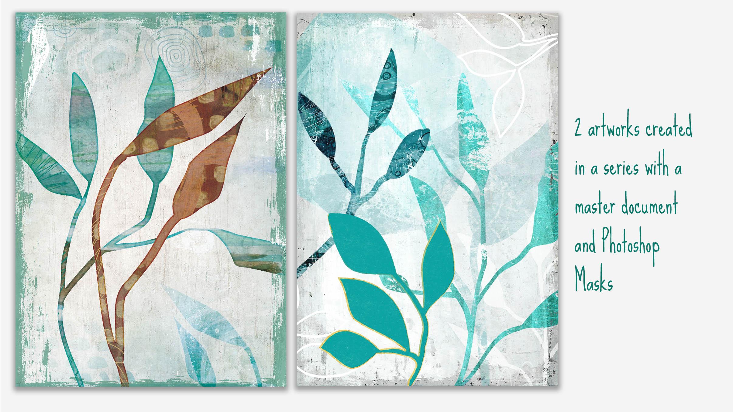
2. Using the Blob Brush to Create Leaves: Hey guys, welcome to lesson one. So in this lesson we're going to be in Illustrator and we're going to produce some of the assets that we need for creating this mixed media project. Let's get started. So if you were in the other classes I've been creating in this lucrative Waller series. I've got three of them, the Waller design and licensing than I did. I guess it started with this one which was the trend forecasting for reading high-demand. Walmart had followed it up with this one for 2021, a class where I taught you the technique I'll be using today in creating a different kind of, I guess, type of wall art that I am submitting for licensing. It uses the same basic workflow as I did in this class. I will be definitely reviewing all of that for you as we go through the class. The artwork that I have been working on looks somewhat like this. And so we're going to be in Photoshop using these documents that I've created with the different groups with masks, textural masks that kinda started out looking like this. And these are mixed media backgrounds that I have created in a variety of different ways and I will be reviewing that with you. Now you'll have to excuse some of that noise that you hear in the background were having terrible windstorm today. I don't know what's happening here, but temperature is actually fairly warm that we've got winds gusting up to 1550 kilometers an hour, 80 kilometers an hour. I don't remember, but you'll hear the wind howling of the background and sometimes I hear the big branch on my tree scraping across my roof here. And I've also got a roaring fire going in the background. So you'll hear occasional crackling of the fire as I tried to stay warm here of working. So we're gonna start here in Illustrator. And in Illustrator we're going to create these sort of, I guess you'd say, loose leaves kind of unidentified. I couldn't tell you what kind of a tree this is from. Kind of reminds me of a fig tree that I had a few years back. But it could be really almost any tree there, really, really simple to draw. And we're gonna be taking those in and using them as masks in Photoshop here. And you'll see the mask that I created is a silhouettes, basically of the leaf. So we'll leave that we grabbed from over there. And illustrator uses a mask on a group and we do a bunch of other little things to add interest in texture. But it all starts with that document in Illustrator. So let's go back there real quick and I will show you the basic technique I used for drawing these leaves. So if you were in my recent blob brush class, you'll find this super easy and I'm going to just move this over. I do have an art forward here that's hidden. It doesn't really matter because I'm not actually taking the time to export these. I can show you how, but what I do is I just copy and then paste them between illustrator and Photoshop. So if you have another program other than illustrator to do this kind of vector arch, then you'll probably be saving them out, exploiting them or whatever you need to do in order to be able to import them into Photoshop. Most of the techniques I think you could probably recreate in procreate as well. We're going to stick to Illustrator and Photoshop today. The blob brush, as you know, creates a mucus. Mucus went a little bit bigger. One of the positive things about the blog brush that I like is that you can enlarge the tip of the brush by using your bracket keys, which is something you can't do with part brushes. The basic principle is sat, this, even though it behaves like a brush, actually creates shapes. So E on my keyboard switches me to my direct select tool. And you can see here that it did not create a brushstroke. If I had done a brush stroke, you would see that it is still a stroke. It has not become an actual shape. I could make this into an actual shape. Let me just make it a bit bigger for you. I could change this now into a shape by going to expand appearance. And it does change it into a shape, but that's an extra step. So I just kind of stick with the blob brush when I'm creating something like this. As a side note here, a blob brush will work with any calligraphic brush shape. So if you don't want to work with a straight round shape, you can work with mucus bigger. You can work with a brush that works with the thin lines. That's completely up to you. Basically, you're going to get to the same end, which is what I will be showing you. So these are now editable as you can see. Oops, no, that wasn't into calligraphic brush. My bad shift B for the blob brush. When you see what happens here? Yeah, there we go. So I had just I was on the brush tool and not the blob brush. So shifted B is what gives you the blob brush BY just gives you a regular brush and you see how the Brush itself has a little star beside it. And that's what tells you it is a regular brush and floss brush looks like this. The cool thing about the blob brushes that you can just add to the shape, but you have here and make a continuous shape. And there are also settings that we can take a look at here. Right now I've got it on full-on smooth mode o the lines that it creates, even if I'm pretty wobbly with my brushstrokes, will straight and write out. So if that's a look that you want, that's definitely something you could go for if you want it to be more accurate and to really reflect what you're drawing as you draw it. This one stays more true to form. In this particular application, I did stick to that lower down on the scale here, either with accurate or just a little bit up from inaccurate because I wanted them to look fairly natural. Okay, so that's the basic idea for drawing the leaf. So in the next lesson, I think what we'll do is we'll draw the stems. I'll show you how to combine the shapes will create actual branches here that we can use in our mixed media illustration that we're producing in Photoshop. Alright, ok, I will see you there.
3. Adding Branches and Working with Shapebuilder: Hi guys, welcome to lesson two. So that was kind of fun. We produced our leaves. Now without sub-branches, i'm gonna be showing you a little bit more with the blob brush. And of course we're going to use the great shape builder tool. Let's get into it. So in this lesson, I want to show you how to add the branches on these leaves. And I want to also point out that the only thing we're using in here, I'm going to hit on my keyboard to get my direct select. If I option click, you can see that I can select the entire shape. And what I really want is that interior shape. I don't want an outline leaf. And so I just basically use the blob brush to draw some really quick shapes like this. So I'm, you click on the outside of all of these and hit delete and their goals. Now, did you notice how many points there were on this particular won in comparison to these? And that's because of this one as well, I guess. And that's because of the setting that I had here, the fidelity setting, the lower you put it here, so the more accurate it draws is the more points that you'll end up with. So one of the things I do right off the hop is select all my Shapes. I'm going to just drag select over them. I'm holding both my option and command key, so the entire shapes are selected. And then I'm going to simplify them and I have a shortcut for that, which is Command period. But if you don't, I would tell you make one because you'll definitely use it a lot. And if you don't have it, you can find it here under the object and path menus to simplify, but I've added that because I use it so frequently. And another one I use a lot is this, remove anchor points. We may use that at some point. So just wanted to point that out to you that you could add. So I'm going to hit simplify and now it has already done it without me making any specific requests here. But I could hit this three dot ellipsis here and open up this menu or open up this panel to get even more settings. Now, I'm really not going to be picky about this. I'm happy with homage to has simplified my shapes. You can fool around with this, of course. And, you know, habit either more accurate or less accurate, but I'm just going to settle on that and then something like this. If you were unhappy with that little area, this is one of the areas where I would use that remove anchor point setting. So I will hit Q on my keyboard to get my last few. I'm selecting that area and using my shortcut to straighten it up a bit. You can also hit F's on your keyboard or the smooth tool. And you can often smooth out areas just by dragging over like that k. So now I've got my people do that here as well. Here I've got my different shapes and I'm ready to add a branch. So with the blog brush, there are different settings. Again, back to that double-clicking on the brush to get these rush two options. Right now I don't have either of these selected or checked off. And that means that I can just simply add to these with the blob brush by just simply drawing. And you'll see here that it automatically joins into the original shape. So if you, there are reasons for having that setting or leaving it on that setting, as well as reasons for merging only with selected. And that'll come up I'm sure at some point, so I won't explain it now. But also here is a good spot to take a look at some of the things that you can do with a blog brush. You can affect the roundness, effect, the angle. Change what affects those settings here. And that would give you a little bit more variety when you're drawing your branches. So that's something you could consider. And I would say, definitely experiment with, with this size one here. I like changing it so that there's a bit of a variety and the thickness of my lines, I think that's more natural. So I'll show you how that is, how that plays out in a second. And I'm going to round this back to almost normal and hit OK here. So you'll see now that if I press harder, I can get a thicker or thinner line. Now in that case, that wasn't as much as I would like. So I am going to increase that in. Let's see. And you can see now as I press harder that I can get the branch thicker at the bottom. So that's something to keep in mind. Now here is where you would maybe start thinking about your layout of your branches. So I just grab that leaf, moved it over. If I press command on my keyboard while it still selected, I get the transform boundaries here showing up and that makes it easier for me to just resize on the fly. And also don't forget that you can option and command and drag to make duplicates. And when I make a duplicate, I tried to also make sure that I change the weight. It's oriented to the branch so that it looks different than the original one. And in a case like this, I might even grab some of these widgets here, one of these witch's, let's just grab one and just change the leaf itself, the actual shape, just to have a bit of variety than I would grab my blob brush again, shift B and just simply add the stem that connects it to the main branch. So just like that, I've created one that is more than usable in Photoshop. Let's try a couple of other ones here just real quick. There's one almost looks like a pod from peace. But do a little drawing here. I'm gonna do shift B and draw a couple of them right in place here. And you can see how roughly I'm drawing them like a mean. You definitely don't have to be a perfectionist when it comes to the shape of the leaf. Remember again a on your keyboard and if you want to select all of these at the same time, hold your shift key and hit delete, and you will get rid of everything that's there. All right, so let's cross branches here. Shift B and the column kinda draw main branch here. And clinical gets smaller because little branch. And then remember you can always do offshoots from those branches as well. And now in a case like this, if you wanted to draw your leaf actually in black, you can do this and I'll show you what we can do to incorporate that inside part, integrated right into our main leaf drawing. So I've drawn it really rough here because I want to show you a couple of things here. Now. I'm going to select this whole thing and you can see how many points there are. So my first step will be to simplified. So you can see why have shortcuts for this stuff. Because if it's something I do frequently, I definitely want to be able to do it as quickly as possible. So command period for my shortcut, and you can see here it had 253 points. I reduced it to a 118, and I can probably reduce that even more by changing the simplicity of the curves. So there we go. It's almost a 150 points that we've taken off. So I'm going to hit OK here. And you can see here that in some spots the branch didn't actually integrate with the original one. So in a case like this, I would switch to my shape builder tool which has shifted em. And you can see that now as I drag over them, I get this kind of a graph. And that graph tells me that if I drag over them, I will be connecting them into one solid shape. So you see that's perfectly integrated and I can use that same technique to tie in the middle of that leaf that I had drawn, that wasn't necessary. Now here, there's a couple of spots where I would eliminate points. So there's a couple different ways you could do that. Minus on your keyboard will give you the pen tool delete, which you can then use to click on a point and delete it. You can use your direct select and select the point and convert it to a smooth point. That might take a little bit of adjusting. What was that other spot? And we are right here. And in this case I think I would use the minus and then just make an adjustment here. I might just choose the click on the point man comma for me as my shortcut to remove an anchor point. And, you know, I just go through and check the entire shape and exit up until I am happy with it. So in the next lesson, we will take one of these branches into our Photoshop document. I could actually resize that to make them closer to my originals. And I might point out here too, that this is something that would be perfectly saleable if you're also into selling some of your assets on something like Creative Market, you could create these and sell them. So that's another thing that you can keep in mind when you're doing this. Now if you did want to export these, you could open up your asset export and just drag them in there. You could actually drag the whole bunch of the man and they'll come up as separate assets and you could export them. Like I said, you could sell them as separate assets or even just catalog them for yourself. So will meet in the next lesson where we're going to take a look at that Photoshop document for the first time. Alright, I'll see you there.
4. Mask Making and Adding Textured Edges: Hi guys, welcome to lesson three. So less than three here is going to be the start of our Photoshop work. We're going to be making some masks and I'm going to show you how to add a textural edge. What I need to do is import those leaf or branches that we created in Illustrator. Now if you had been working with infinity designer or an iPad with Adobe draw, you would need to import those shapes. So you would go to File and open or place embedded to get that shape and bring it in. Just switch to one of the documents that is just a background at the moment. And I'm going to show you that here. If you're working with an illustrator, you can simply just select it. So let's select this big one I'm going to copy. And then I can go straight into Photoshop and paste. I can choose whether I want to import it as pixels or paths. And for my intents and purposes, it doesn't matter, it's also will be fine. So I'm just going to hit OK here and it will appear in my document. And here I am going to enlarge it roughly to the size that I want. Once I have it where I want it, I just hit Return and I've now got it here in my layers. Now you'll note that right now my layers thumbnails don't show up very well. And thus because I've got an RGB document that I'm using, I could switch to a CMYK document fights. We are going to be working with some filters in here that can only work when we use RGB documents. So I'm not going to change it over just yet. Fortunately, the company that I worked with, the agent that I have, I can submit all my files in RGB and the conversion is done somewhere else. So I don't have to worry about it now, I might choose at this point to also import a second one. Remember that in my sample here, I've got three of them. So I'm going to go and grab that other one that we drew. Same thing. Just copy and paste it, say OK, and enlarge it to the approximate size that you want to use them. And I was thinking I might experiment with bringing this one in from the side. I'm not quite sure. I can mess around with that leader. There are a lot of different things you can do here. I'm going to hide that first one, and I'm going to show you real quick that if you wanted to change the shape of it, you could use your puppet work here in Photoshop. If you've seen that before, it puts a mesh on your graphic and you can click and put a tack into position where you might want to either move it or curve, something like this. I would probably put at least that many tax in there and then I could move these branches independently. Now this is something that can distort an image, but I find that with these black and white silhouettes, it works just fine. Once you have what you like, you can just hit return and freezes that shape. So now I've got two branches here. I might even choose to bring in a third wind to put up in this corner at some point, we'll figure that out as we go along or eight, in Illustrator as well, you could be reshaping using the Puppet Warp. So that's something I didn't show you originally, but same idea. You'd get a mash and then you can use the tax to move your various parts around just a little aside there. You know, it's funny how when you're working on stuff like this, I wouldn't have thought that at the beginning of class that this is something that I would bring up during the class, but as I'm working on a file and start making changes or adjustments, all these other little tools come into play so it's good to know how to use them. I cover these in a lot of other classes too, but I mean, really Two-minute explanation is more than enough for you to understand how it works. Ok, so now we've got our two nice branches. And what I would like to do is make these into masks so that I could paste anything I want to actually make up the leaf on this example here you'll see that if you look at 3AM Layers panel, that my note, let me just look at something here. Oh, here you can see I've got this on CMYK and that's why my Layers panel looks the way it does. You can see the graphically aren't all bitmapped and weird like they are on this other one? No. I had done some work with filters. I was close to the end of my production, so then I switched it to CMYK just so that I could get a better look at what was happening here in my panel as I was working away. So that's something to keep in mind. But anyways, this is what I'm gonna do is I'm going to create one of these group masks and it's super, super easy. All you need to do is click on the group down here at the bottom, this group, which is a folder that as a group, and then click on this, which will add a mask and I believe a copy biblical back to this electoral and copy. And then I could hide that actually and option click on this mask and I can paste in my branch, didn't exactly save the position. So here I have the freedom to move this around, which is fine. One of the things that I do, just to help make my artwork look a little bit more hand created is to add a bit of a texture on the outside lines. So here you can see it's still very Vector3 looking. It's not textured at all. It doesn't look like it was hand painted. So what I would do here is to add the texture and I've got a couple of different ways to do that. So the easiest method that I know of is to apply a filter to this. So we're gonna go under filter here. I could actually just hit my last setting, which is the crystallized filter, which is what we're going to be using. You can apply that same wine by going to shortcut and your last settings will be applied. So this is great if you're working on a series, which is what I had just about always do. If I'm gonna do one of these leaf kind of artworks to submit for licensing. I'm gonna do ten so that there is a fall collection or full series. But I use my magic wand, select it. You can hide your selection if you want to. Men, each will hide the selection. It still remains selected. Superman each switches that often on and let's go back down into crystallized filter. And now you can see that it is adding a texture here to the edges. Maybe it doesn't do it in real time on here, but nonetheless, you see it here, right? So you can hit OK, and you'll see that will apply to the edges here. Ok? Now, sometimes you get this sort of little bit of an artifact left at the edge. So what I always do two, I'm going to deselect. So Command D go to my levels and just make a slight adjustment on the levels here to kinda get rid of the artifacts. Not that, that's necessarily a bad thing when you're doing a mixed media piece, but mess around with these a little bit till you get what you like to tell myself, I have actually recorded these into actions at, I have here in my actions panel and applying this texture, all I need to do is hit it there and it'll do the job for me. Control Command F on your Mac will give you that shortcut. Okay, so that's textured. So that's the one method. And that gives you that as kind of a rough edge, almost like a watercolor. Now the other method I want to show you involves creating a path. So what we're gonna do here is we're going to select the artwork. We're gonna go over here to the paths palette. Just click on the pacs tab here. You're going to make this into a path. So go to the flyout menu here, k. So Make Work Path tolerance will control how tightly it traces. In this case, because we're working with a vector graphic, there's no a little notches are debits. This tolerance will be fine. You could probably even go to five and would be fine. Then you go to the File menu again, drop path. And what you gotta do is stroke it with a brush. Now, when you go to that, this brush that shows up is the one that you last selected. So I know you're going to want to experiment with this. I'm going to try this one and I'm going to set it in about I find that about 60 for the size of my document. And it's going to do that last brush that we just selected, emphasized that we selected in the color that's here in the foreground. Now you can simulate pressure, which will give some thin and fixed bought. So line, I personally don't want to do that for this particular application, sums can hit OK. Now I'm going to just save the path here, right here, you can save it. So hit save path, I'll just leave it as path one because I'm not going to have any more paths, are very many paths to worry about. Know, the cool thing now is that we will still have it when we need it. See that beautiful brushed edge now and that looks really awesome. So now we can go back into our layers. So actually note, let's see here for 1 second, there's one last thing I want to do here, and that's to invert this, because what we need is to have the background completely black and the leaves and branch showing through with white. And that's what's going to give us our mixed media look. Once we start pasting in some of our textures, that's going to be the fun part. So we're gonna do that in the next lesson. And I'm going to explain to you where I get these mixed media bits that I add to it. Alright, so I will see you in the next lesson.
5. Adding Mixed Media Fills to Branches: So this is where the fun really begins. We're going to be adding a whole bunch of fills, the shapes, these masks that we've created. And we're gonna do that with a bunch of assets that I have from my journals and sketchbooks and canvas. Let's get started. So I wanted to give you a quick explanation of where I get most of my textures. I've got a huge selection of scans that I've done from various art journals and campuses and things that I have saved over the years. I through a few of them into a folder here for our use in the class. But you can see basically, I've scanned different pages of my journals and these I use when I'm creating my art for licensing. So all these backgrounds are original and almost all of them hold some kind of real nice textures or experiments with paint. That's one of the ones that I've used more than once. Some of them are specificly scanned for particular projects. And I've got hundreds and hundreds of pages of these sort of things. They come in really, really handy when I'm working on a project like this. Knife also grabbed a couple of downloads that I've got from various sources. And I'll point out a couple of them that I have looked at before on Creative Market, for example, you could find mixed media textures. This one sounds like a really good deal, $12 even for the commercial license. And there are tons of different ones here that you could use for a project like this. Here's another selection that I found and that reminds me a lot of the kind of experimentation that I would do in my journals. A lot of them are not artwork that stand alone per se, but they can definitely be used in a project like this. So let's just go back to Photoshop there and experiment with one of these. So what I would do is selected area that I see some real interest in. What's maybe just grab this. It doesn't matter the color, even if you are specifically working towards a certain color scheme, what you're really looking at is the texture. So I'm going to copy that and I'm going to go back to my document. I make sure that in the folder that I just created with the mask and then I just simply paste. So you're gonna see the texture show up in any of the white areas that I had on my mask. Now I know that the orientation of that particular piece could be changed. So Command T gives me my handles, transform handles, and then I can enlarge to fit my piece. Okay? And you can see here in the layers panel, the full rectangle is there, but it's only showing through where I actually had the mask. Now let's zoom in on here and you'll see that edge is quite nice, quite natural looking with that brush stroke. So that's kind of a neat thing. Then I would just make adjustments you might color to make it fit the color scheme that I want I want to speak to that right now as well, just to talk to you about color schemes and how do you look for actual trends. It's really important if you're creating Walmart to try to have licensed that you work with the trends that are current. The trend forecasting classes that I produced, I speak in great detail about looking for trends. This is just one of the places that I go to when I'm looking to see what's trending out there in colors, I kinda create a color scheme or a series of colour schemes that I would use for the upcoming year. What I am producing now, for example, the series that I'm producing with these leaves, their artwork that would be likely see in 2021. So that's why I created the 20-20 one class to just talk about upcoming trends. Current trends, that color was definitely a current trend because that's something that we saw as the Pantone color of years. So of course, that became a trend for 20-20. Like I said, go back to those other classes and take a look at the information about color trends. So once I've decided on a color scheme that I would use, I'll give you an example here. This is art that I have created for art licensing. And you can definitely see specific color schemes that I used. And you can see that I create a minimum of five for a particular collection. These three here are kind of a different version of what we're working on today. So let's go back to our document and work a little bit on that color. In order to change the color of something like this, you hit Command Option you, and that will get you the hue and saturation dialogue box. And you can move the slider along until you find a color that you prefer. Now, I'm kinda working with a desaturated palette or move this down into the desaturation and then do all kinds of things to affect the saturation of your color. I led a kind of a blue with the hue and saturation. And the second thing I did here was go into levels to make some adjustments. Command L will give you the levels dialog box, do some experimenting with that. A third thing that you can do is to grab another 1 second texture and see which one should we grab here? Let's try something like this just for the fun of it. Let's select an area here. Copy this, paste it, resize it. Now this one I can see what's not scanned at a very high resolution, so this might not be adequate quality for my liking. You can usually tell by zooming in and you can see if it's kinda bitmapped. Sometimes that's an issue, sometimes it's not. And a lot of times it depends on what you do here with your blending. So what I wanted to show you was working with these blending Modes to blend two artworks together. So what I've got is that original just texture. And then I've got this one with the color. Actually let's hit hue and saturation and recolor that slightly closer to our, the color scheme that we're working towards. And then just check out the blending modes and see if you can get anything here that is interesting to you. And why that seems so interesting account like that. But it's really up to you at this point. This is where your artistic judgment comes into play and this is how you make the work really original. So let's try, try one of these overly kind of blend because I want some of that texture from the new artwork showing through onto the other one. Now a lot of times after you do the blend and it gives you weird color that you don't like. So you can again hit hue and saturation option and reset and then make some changes here. So in the case like this, if you're working towards it, these saturated palette, you might want to really take a lot of that color out, but you can see how much fun this is going to be two experiment. So I'm gonna do another group here, material that's not in that group. And to go to this second branch guy did select all copy option click looks at the mouth, cursed. So hit the mask here at the bottom create Mask button, then option click. You'll be in your mask position that where you would like it. This can be changed by the way, at any point. This is where you would then go through and add your texture. So in this case, I can come to just try to apply that crystallites filter and we'll see how that one works out as compared to the brush. No, I've got a really large documents, so that's why it takes a little bit of time to apply some of these filters, but I like that. I think that's good. And I'm going to hit command i to invert it. And just like that, I've created the other mask so I can hide this. Let's go grab one of those textures and you can see how you could get a real flow happening here, like a really good workflow. I like to work on three to five documents at a time so I can go through and mix and match, use some of the textures more than once. Make sure that I'm in the right group here in my layers palette paste transform. So at Command T, to change anything that I need there. Let's see a little bit bigger here. It OK, hit hue and saturation. And let's move that over more into the colour, colour scheme that we're looking for. So that's how quick it is. Now in the upcoming lessons, I'm going to show you how to add a lot more interest to our leaves and to make them even more realistic with some added texture. And now few surprises will figure it out as we go along. Alright, so I'll see you in the next lesson.
6. Adding Texture and Grunge Elements: Hi guys, welcome to less than five. So in this lesson, I'm going to show you some more masking techniques so that we can add some grunge effects to our layers. Let's get started. So the next thing that I want to introduce into my layouts is this sort of texture that you see flowing through these designs that I have submitted for art licensing. So if you took my other course on creating art for wildlife, creating art for wall art licensing. Then you will have already created some of these, but just in case you haven't, I will explain exactly how I go about doing that. So let's take a look at this one has a lot of texture. So let's take a look at that one. So that's my 945 artwork. So if you create for art licensing, you've already got a numbering system. I'm going to go to the large layered version of this. And what do they say? What number 945 does not correspond? Must have renamed it. Now and this will take even a little bit longer to open then the files that I am currently working on, because this one is even larger and scale. Also, this one will have tons and tons of layers. As you can see, these were very, very intricately built up. Also with these are one of the giant ones, but most of the time I worked in the proportion of 32 by 48. So when I'm working on them and still have the layered files like this, they will often be of a smaller size, but that works out okay for what we're doing. Now, I'm going to show you one of these layers. Which one should we take a look at here? This one, I want to show you the mask. So that's exactly what the mask look like. Looks like that created a sort of weathered wood and crack crackling, cracking paint. So let's copy that one actually, I'm going to select all and copy. We're going to go back into our document. We're gonna create a new group and we can have it within these other groups because what we really wanna do is add texture to this stuff here. So I've got new group now within that other group, I'm going to add, add the mask and option click and paste about crackled Pete texture. Now these are also things that you can by on Creative Market, besides the ones that I create, I have a bunch of purchased ones. And this is one of those. Just make sure that if you're going to use them for commercial purposes that you do by the commercial license. I've also also like I've shown you with the other textures that we did have open, it's actually fairly easy to create a texture to be used for your masks. You would just copy a section that's highly textural. Let's go down here, which let's copy this area. This looks even more interesting. Gonna copy that and go back into my document for this, will create another group within that group at the mass, oops, add the mask. Option click and we're gonna paste that in. And now it's going to come in, in grayscale, anything that you paste into the mask layer has to be in grayscale. You could leave it in grayscale and it would still apply texture. Or you can do like that other mascot that I showed you and have it really high contrast. You could actually get rid of all of the gray within just by sliding yours fighters here in the levels experiment until you have something that you like. Click OK when you're done. And you can take a look at how it would affect that particular layer by dragging that now into, into that group. Now, in this case, It's adding too much. Why don't we go in option, click on this and invert this though it's more like that other one that we were looking at. You could also select more of the area I'm feathering the edge of my selection. You could select anything that's really dark going to your levels and further lightness by dragging that slider across, say OK, let's click back into the document and you can see how it's added some really nice texture to that particular branch. So that's something really fun to experiment with as well. And let's go back to this one that we created. This was the purchased texture, that one there. And let's drag these two into that group. And you can see now that it's added the texture onto those leaves. So that's one of the things you can do and it's really fun. And we'll add a lot of interest to your layouts. Sometimes what I do also is to take layers that I have after I've got the blending mode with the way I like it, and I flatten those together so I can either right-click on it and merge the layers here. Took me a minute to find it because I've got a shortcut. I'm not sure if it's a Photoshop shortcut Command E also flattens them together. The adventure of doing that is then you can actually affect the levels for the combined layer. So then you can work on the contrast or whatever you need to without having to work with separate layers and doing that K. No, I'm thinking for this one, I want to add a little bit more to it. So I'm going to take a look at some of my other textures. And it opened a couple of the textures that I have saved here. Let's just randomly open a few. This last one that opened up here is one that I go back to again and again. So simple and yet I've used these different textures so many times in so many artworks. So lets just grab a piece of one of these. Maybe we'll grab this one. Now, something like this. I'll show you, I usually scan at a fairly large size physically as well as high resolution. That way, I'm not limited, work on quite large documents and still be able to count on its integrity. I can use it various ways that even then look it, I have to enlarge it in order to use it in here. So let's make that fish. It doesn't look like anything copied. Hang on and go back to that copy. Paste. There we go. And that's the one I was copying. And you know, every time you pay something in like this, it just heightens your creativity, I think, because I'm looking at this now and thinking Jesus would be really nice if it was then jewel tones instead of in the muted tones. So that's something I could explore, Of course, for another series. And then I'm going to go through here and experimental little bit width, see if I can come up with anything cool. And then even these, of course, you can go into hue and saturation and make your adjustments, change your levels, and anything else you need to do to make it work for your work that I've been up here. Let's try this little section here. And this is kind of a fun bit of collage work that I did using some pre painted papers that I don't even remember how the stuff that I do, honestly, and this is a little journal that's gotta be about ten or more years old because I remember working on this when I was at school on lunch hours or even in class when we were working on our journals. Copy, go back into this document. This one might be small, but isn't that just so much fun? Like another one of those things that I could do all day long, just experiment with this stuff. I want to show you a bunch of other stuff though. So we're going to stop playing with this for a minute and move into something else. And the next lesson, but I want to do is show you that path. Using that path that we saved and working with brushes a little bit to add some detail. So I'll see you in that next Austin. So I'll see you in that next lesson.
7. Using Saved Path for Enhancements: Hi guys, welcome to lesson six. So less than six here we're gonna make use of that saved path that we did earlier. And we're going to be adding some really interesting background details. I'm here to give you a bunch of ideas. So let's get started. So bent a little bit of work off camera. You can see here there are some changes since you last saw this file, I've added a couple of other layers and this is something that I grabbed from one of the scans that I was showing you. So I want to just kind of go through a couple of things with you before we start that other thing with the paths. So yeah, I wanted to show you some of my textures and talk to you a little about why I have so many of these and how useful they are to me. I think I've mentioned before that I use a lot of these for backgrounds, as well as adding texture to a lot of my artwork. A lot of them I wouldn't even consider completely done. There definitely are kinda crazy some of them. But I work in lots and lots of layers. And you can see that there's collage work on here. A lot of texture that I can grab, and a lot of it is just plain old experimentation. So the reason I wanted to talk to you a little bit about this is because I really think it is a valuable thing for graphic designers, commercial artists, pattern designers, illustrators, to have this kind of outlet. And what I find for myself that it does is it helps me on a gain confidence in things like using color, using line work, building layer upon layer, and basically having all these pieces that are not really done kind of ID process. I can pick up any of these journals at anytime and just flipped to a page that interests me. Add more detail or more collage. If a super relaxing processes kind of therapeutic, I would say, I can't tell you how many times I've gone back to these two using backgrounds for cards or some of my large canvas art that I do for art licensing. So I just wanted to talk to you a little bit more about that before I moved on to the next part of this lesson. So what we're gonna do now is add a little bit of additional detail in here, and I'll go back to my original example here. And that kind of shows you some of the stuff that we've been doing. Because he here, in this particular instance that I've used the past and brushed it in order to add a little bit of a dark pooling of color around the edges. This is something I cover in one of my really early classes as a two part series. And they're called, who knew you could pick a watercolor. And this is one of the techniques that I cover in that class. So I wanted to show you how to do that. And there are a couple of different ways of doing it. So this may end up being kind of a long lesson. So back to my document here, I will be doing a lot of work off camera once I explain a couple of these things to bring this particular artwork up to the same level of completion as the other ones so that you can see some of the things that I apply. And I'll explain as much as I can are all due some time lapses just so that you can see my entire process. And believe me, it is a process, especially the first couple, couple in a series. I find that, you know, they take a little bit more time for development. Once you have the first one or two done, then the rest come quite quickly. So now remember in this document we saved that path, which was the basic outline for this particular set of leaves on the side here. When we save a path, it ends up here in the channels. So it's there and available for us to reload at any time, go to the paths here. And what we're gonna do is we're going to select that path and then stroke. Now remember I was telling you in the other lesson that we can set our brush before we do this in order to add that outline. And we're gonna do something a little bit different than we did the last time. So what I'm gonna do is go into my brushes, select a brush and let's try a contour brush. I just want to try to get something with quite a bit of texture. You can see here I'm setting it a little bit wider than last time. So I've gotten at 91, I think last time we set it at 60 points. So let's reload that paths and we're going to stroke it with that brush stroke. Now I should have selected a color here. Let's actually just make it block to start. Also, let's make a new layer here. I am probably going to be working in this layer. But for now what I'll do is I'll add a layer above it so you can see what I'm doing are the result of adding this brush stroke. I'll just drag that one right out of that group. Go to the path, stroke the path. And now it's going to stroke in black with the brush that we chose. I'm going to take the simulate pressure off so that it's an even brush stroke. All along, I can see my Photoshop is starting to run really slowly and I think that's because of all these documents I have opened. So just give me a sec. I'll close them all off and then we'll continue. You can see there that my half had slightly shifted but that stuff okay, we can easily adjust that. So I'm going to slide that whole brushstroke into the folder. So the edges will now be also under the control of the mask. So the mask is giving us a nice clean outline. And I think I'm happy with that as far as the degree of roughness, you look it up or look up real close to it. You'll see that there's definitely a natural-looking edge there. And we're going to just colorize it and use some blending Modes anyhow, so let's give that a shot. I'm gonna hit option command u, which will give me my hue and saturation dialog box. And here we can, I've got it on colorized, as you can see in the corner here. And I can, and the more I like is the more that that particular color will show replacing the Blau, I want to go more to that, kind of utterly blew some sliding that over a bit. And I want to really desaturated which just mess around with these sliders until you're happy with what you have. It's one of those things, again, that is your judgment as an artist and what look you're trying to achieve. And also, we're going to be playing with those blending mode so that can make a difference to you may come back in here and change these completely at some point or another. I'm just going to hit OK here. And let's just go slowly through these different blending modes so you can kind of get an idea of what each of them looks like. So there's some really neat things that you can achieve. Using these kind of techniques, you could actually have a completely contrasting lines. You could have a second color in there. And I think I'm going to use multiply. I'm going to reduce the opacity and kinda check out overall. You can see how easily that would work. I want to kind of compare it to one of the artworks that I had scanned from my art journals. I'll show to you here because it's kind of easier to see all of the different textures that I had kind of put aside for this course just to share with you. This is a kind of a neat trick if you ever want to look at your thumbnails really large, if you go to your finder to look at them on the window, you can go to show view options. And then here you can make adjustments to your thumbnail size. You can space things around more. But the nice thing is if you are trying to find something really quick or you really just want to see how they all look. This is a great way to do it. Now you can see I've got everything from backgrounds to actual artworks, all at different degrees of completion. I'm going to open this one and this one to show you, again, I can right-click here and choose what application I want to open it with. And I'm going to open it with the Photoshop I'm using right now, which is 2020. So the reason I open feast whom up was to show you some of the experiments that I do kinda try in my art journals. And you can see on this one here really thick black outline. That's not really the look I'm going for right now in my piece, but it just goes to show you that technique that I just showed you with the brush stroke. You could do this sort of a look with that technique. This is another really good example of just some experimental kinda stuff that I've done in my journal. This is one that I've actually thought of developing more than once because I kinda like the look of this and the multiple different outlines that I accomplished using paint markers, this would be really great and fun stuff to do in Photoshop. The colors may not be current of course, but cares right? You can always change the color and that's just the fun of it. Experimenting like this is a, a really great way to gain confidence in your abilities to mix colors or techniques, experiment with things like thick outlines or something like this where you've got a silhouette and then another line within it. There are so many different things that you learn by keeping an art journal like this. So close those two and then I think what I'll do is start working on this. I want to bring in another set of leaves and then I'm going to really do a lot of work with my color and layout. If there's anything really significant, I will stop to explain it to you. For the most part. I think it's going to be a lot of the steps that we've already reviewed together. But if there's something that I know that I haven't mentioned that I will stop. The one last thing I do want to point out is that I did say there were a couple of different ways of accomplishing that. Stroked PAT, I'll show you the other method which is to copy from illustrator. And when you go to p, you will get this option that you can select, pasting it in as a path. I'm going to paste it in conjunction with this solid blue layer that I have here. Let me pull that up to the top and I will paste as a path, Click OK. And if you take a look over here in my layers palette, what it's done is it's recognizing it as a mouth. If I go to the paths here, you can see that it has added it as a path. And I can enlarge it just like anything else using. Transform. So I am transforming. You can actually use the controls up here. I really didn't need it to be that small, is too small, so I will actually enlarge it here in Illustrator first, copy it, go back into Photoshop here and make sure I'm still on, still on a black layer here. Hit paste and it looks like it's come in here. Nice enlarge. Now I'm gonna go a little bit smaller just so that I can crop it the way I want and I like that. So now we can go into the paths here is that path and I could name it, save it, stroke it, do any of those things that I want to with this pass. So I am going to position it first and then I will continue with my time-lapse. Here. I'm gonna go and make the group in. I can actually just physically drag that mask onto that particular group. And you know, while I've got it selected here, I might as well stroke it, make sure I make a new layer, somebody to do something different with this stroked path. Now this is an example of something that I can do with loading the selection or loading the path as a selection, I can just load selection right here at the bottom of the paths palette. And I can go back into my layers actually in my channels, I'm going to switch back to RGB, gonna go back to my layers and now, and just copy because I want to copy that texture from this particular layer and then just paste. Let's move right up to the top here and paste. And now you'll see my leaf. I'm going to actually move it out of that group for now so you can get a good look at it. Thought was just a texture. I happened to have a layer that was down here at the bottom. And now I can do a bunch of really cool things with this one. So I want to load it another texture that I am going to use to distress this leaf a little bit. So I'm gonna make a new folder, again, had a mask option. Click into the mask, paste my texture. And I'm going to, and we're going to actually make a duplicate of it to fill a page. I just don't want to make it to over resolutions, so I'm hoping this is going to be alright, let's check it out. Drag this in to this folder. And that's pretty interesting. For one to tone down your texture, go into your mask by Option clicking here, and then change your levels. So the darker you make it is, the less of an impact that texture has on the layer. As I near the end of my project, I also start eliminating layers that I have decided against using for whatever reason. So off camera they resisted a couple more adjustments. I move this big branch here a little bit to the right because I felt like it was really right in the very middle and kind of not a very good balance. And then I've changed out this front foreground leaf. And I think really at this point, I'm ready to start adding my finishing touches. And I think we can do that in the next lesson. So let's take a little bit of a break. I'm going to go have a cup of coffee and I will see you there.
8. Finessing and Finishing Touches: Hi guys, welcome to lesson seven. So at less than seven here we're going to just do some more finessing and finishing. Let's get to it. When it gets to this stage of the process, I would consider this the finishing touches or finessing the document. Now, I've gone and compare it to that original that I was kind of fashioning it after. One of the things that I kinda concluded, one of the things I really liked about this document was the movement in here. So I liked the curves. I want to show you quickly how you can affect the movement in your document. I also want to talk to you about foreground, background and Middleground, which will achieve by changing levels of darkness or lightness. And a few other things, though document like this, you can see has become quite complicated. We've got lots of things going on over here. But the cool thing about this is that depending on really simple things, even like changing the order that you have these in can really affect your overall look. Moving the layers around, moving the groups, all that kinda stuff helps you to use this document over and over again. So that's one of the advantages of doing this. I know it takes a while to develop that first one, the first one or two, I guess by now we've got these as a basis for starting our next projects. A lot of times when I open them up, this is how they look. They basically just have a single sort of background that I want to use. Then I would have something like this open and I would drag each group into that new document and then change the actual content. So what I wanna do now is just show you how to curve. And I think that what would be easiest is if we duplicate this group here. So Command J will duplicate the whole group. We'll hide the original because I want to keep that in its layers for use in another document. But now I can flatten this one. So Command E will merge it. And once it's merged, it basically has all of the effects frozen into it now, but you'd have to do is go back and apply the blending mode. So here you can see that was a subtract blending mode. So I'll go back, do the same thing, back to subtract. And then I can also control click on this and apply the later math. So now I've got basically just the branch. And behind that I've been the branch with all of those effects applied to it. So that's kinda good cuz then you can move it independently. And you've always got that folder with all of the original settings there to go back to you if you need to. Now here I've got a short cut for Command Shift P or Command Option P. Which one is it? Command Option P, I think how I can tell I'm really working my Photoshop. Harvard was taking a lot of computing, lot of processing. And now I've got the mesh, the puppet mash that I can use to reshape? No, what I'm thinking, maybe we won't use the puppet mesh. I will instead use the warp for this oneness because really all I need is a simple curve Comanche, so Transform. And then I'm given this set of controls, which I think actually it's going to work just fine. And it's a lot less processing power needed. And already I'm liking men that have curbed their return when you're happy with the current, I definitely like that a lot better. So you could use. Either the Puppet Warp or just the regular Warp tool also depends on the size of your document. Of course, I told you that this is 30 by 40 to 300 pixels per inch is what is required for submission for the agent that I work with. And I'm much happier with the shape of that. It's just a little bit more interesting. The other thing that I have done here is add this pattern Fill Layer. And what that has done is just given that kinda texture that you see throughout. So it's like watercolor paper kind of a texture to it. And then another thing that I want to do is just play a little bit with this foreground background in Middleground. Publicity, I guess will be the thing that I'll use there, this leaf here, you probably notice I did add an extra texture tube and it was really fun. It's one of those from one of my journals. And you can see that, you know, if you wanted to work in those different color schemes, they're still just so much that you can do. I'm keeping my palette kind of neutral and monochromatic. And now what I can do with each of these is experiment with the levels of lightness or darkness. So the brightness. So I'm actually going to close all of these groups to make it a little bit easier to deal with. And now we can experiment. I think that one, I'm going to leave it a 100%. I think this one I want to lighten a little bit, which when his actions, when I guess you'll keep that one. And you see how that accomplishes. What I set out to do, which was to have background quite light than kind of a middle ground and something a little bit closer. And then these two definitely in the foreground. Now the other fun thing that you can do is to add line work. I often just grab just a really thin, I think this is my belt and incur so go into whatever masked layer that you want. And I'm going to work with this one. I'm going to add a new layer, just check the thickness there. And then I'm just going to add some scribbly lines here. Now, it's hard to explain how to do this. Basically, just a lot of experimenting. And that kind of gives you that confidence that you need to do this sort of thing. Or you can go ahead and do that on any of the layers that you want within the groups. If you have a layer like this one which we remember used the group and merged, this one no longer has the benefit of the masking, but that's okay because you can make a new layer, do your scribbly lines and they don't have to be in white by the way. And you can select another color that's in your palate already and add it. Maybe like a dark teal here might be nice and spots. And now that's a look that you might want. But if you don't specifically want that, you can also go with your blending modes here to figure out neat things like I like this color dodge or these burns, and they all kinda give different effects. So again, that's something that you want to experiment with. Another thing that I think is really fun is to add accents like foil. So I opened up this PNG, have a foil that I had purchased online and I selected at all, used the Define Pattern command here. Now I've got the pattern that I can use. So what I would do is choose, I think I'm going to do it with this layer that's in the foreground. And I'm gonna make a new fill layer using pattern and then click OK here. It's flipped into something I'd already made into a pattern for some reasons. Still in there, I'm going to choose this gold foil, and let's just try making that a little bit smaller. I can be a really fun way to give your own individual spin on an artwork. Now you could use the etching technique that we did in one of the other lessons. So right now I've just selected, I used the mask to make my selection and I can go to the paths and make it into a work path. Now I probably should have changed the tolerance so that it wasn't quite as detailed. Let's go back and do it again from a change out to both five. And you'll see it'll be a lot less anchor points. It'll be less of a strain on my Forshaw here. And what I wanna do is create a path again with a brush. So let's go back to the layers. I'm gonna do it right here in this group again. So I just added a layer and let's go back to the brush. And this time, let's see what can we use here, whom you try this round bristle. Now, I'll go back to my paths here and I'm going to stroke the path. And just to show you the difference, I'm going to do this Simulate pressure and say OK. And that's going to give me some thin and thick areas just to be a little bit different. Now you can barely see it because it's in that teal color. But you can see that some areas are thinner here than others. There's a wider area on the right-hand side here, which is fine. If this path was broken, then it would do thin and thick between the broken part for the path. That's something explain a lot more in detail in my digital alcohol inks class, I just want to show you this real quick. What we're gonna do is go back to the layers. We can actually get rid of path by the way. And we've got that stroke, that brushstroke and you don't like that makes a really nice interior pooling as well. So maybe we'll just duplicate this layer. Let's used one and slightly blurred. So I'm going to go to the Gaussian blur because then I can kind of control spinning beach ball of death solenoid when my computer can't keep up with my thumb, is going to be satisfied with whatever it gives me a disappointing from those human patients. So let's just hide that one for now. I'm going to select this one. So select all and copy. Let's move up here and make a new group. I'm going to give it a mask. I'm going to click into the mask and paste that pace by path in there. It's not going to be in the right position, but we're going to be able to move it and I'm going to invert it because what I want is for the goal to show up within these lines so you can adjust your levels. It looks a little bit created me and like I'm not sure here with this, the fact that the path wasn't broken, it from this point to this end point on this side and somewhere in the middle here is where it did the thin stroke simulating pressure. So if I'd had breaks them align, it would have worked better. Just want to use this to give you a bit of an idea. Now, with this group, I can now yeast a gold foil if copied. This one is as a bunch of foils that i bought on Creative Market up use these a lot actually. And now if I paste, you see my foil is pasted into that mask. And of course I can still move the mask as fishnet where I want it. And that I could even grab and drag right into that other mask. To give a bit of a foil look to it now I think it would have been better with some roughness, may be thickness and thickness, and some of the areas you could experiment with that. I've done a few of these. I can show you a couple of examples here. Remember that you can also go in and effect of this mask. You could use an eraser to add detail. Remember hearing Photoshop, you can ultimately need to. Actually, I'm going to switch to a white brush will accomplish the same goal and let's choose something super interesting. So check this helicases one of Kyle's fairly new brushes, the Sosa background, comics background with the key calls it. But you could use any of these brushes to do some really interesting details. And that's just by looking up the mouse, I option click on it and you can see here, let me reset the view Fourier. You can see that it has basically just erased bits, which then allows that gold to show through. So I would have to put a fair bit more thought into it. And I just have I'm going to probably do some more in the way of finishing, but just know that you can't add absolutely anything you want here to individualize your artwork. The last thing that I always do as well is go into the meta tags. So that's the information for the document Command Option Shift. I will get you into this dialogue and here I would name it. Now of course right now it's got whatever the last thing is that I saved. I have saved one of these, the one that was called Sprague. I have different properties of course here you can see that this is going to change in a second. And there are still a couple of changes I would make here. So I would put the correct size in, make sure you have your information in here that will protect you. Vibrate wise, change it here as well. Go in at any other detail you want to do the kind of words that help in a search for your product. These are the key words or the metatag, so make sure that you are quite descriptive here. What else can I add a pickup up? Pretty much everything I need here. Make sure you repeat your name in here if anybody's ever searching. And this is something that's been picked up and is now available online via a way that they might find you. And the committee put something like layered leaves, subtle tones like I've already got desaturated yet soft desaturated colors. And if I know I'm doing a series, I would save this. So I will hit the export here and it's going to save this information the next time. And actually I have to change, change the name of adherence and the spot rate. And this is something that I have to do when I am submitting it. That information has to be on my artwork. So that's just a little aside for you there. And otherwise I'm pretty happy with it. There's going to be a few things I'm sure I will do to make improvements or yeah, there was one other thing I was going to mention and that's in my document here. I'm going to close all these folders here. I also have one that I've copied over from the other sort of master document I had. And this one is called shapes and elements. In this case, there's only two of them here, but that's another thing that you can experiment with is to see if you can improve your overall look and design by moving around some of these background elements. You could change them, you course kid, you know, change the blending modes on them. You can turn them on or off. You can add all kinds of different other details. But that's just another thing to keep in mind. Sometimes it's just a really nice way to really tie in your artwork, even if it's really subtle, white light in there, there's something to be said for adding that kind of large shape in the background. So I believe I've covered everything that I can think of and I just can't wait to see what you guys come up with and how you add your individual spin to this sort of an artwork. I will do a bunch of work off camera and then I'll come back with a finished piece that I will use for the project in the last lesson, that project is going to be the same as we did in the other lucrative wall art classes. And that's to create a gallery wall. So I will see you in that last lesson.
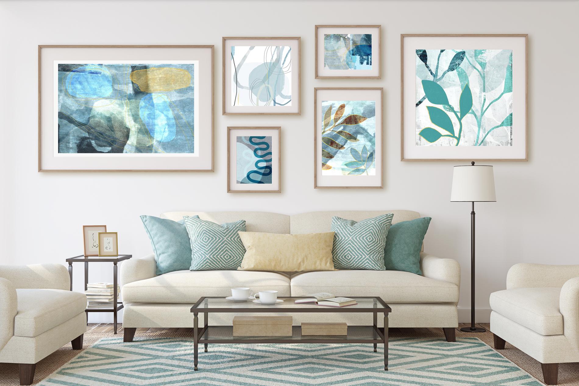
9. Gallery Wall Project and Wrap Up: Welcome to lesson eight. So we're at the end and we're going to be creating that project, that gallery wall that I was talking about, a gallery wall that I used in those other classes. So I bought it here on Creative Market is one of my favorite spots for picking up resources like this. And I've bought more than once mockups by Julia. This is the one that I've been using and it was a really good deal. I thought I pay $20 for it and it gave me all these different choices of color. So that's this document that I have open and I've already placed one of my art works here, that one that we were just working on. And I'll show you how easy it is to really add or put in an artwork into this gallery wall. So let's actually, we'll go on to this one here. Yes, this is the one I want. And when you take a look at the artwork here in the Layers palette, it's a Smart Object. Soil you need to do is double-click on it. That's the artwork from the previous mockup that I did. I am going to open up, I did a flattened version of the one that I called sprig, that original one. So I'm going to open that up, select all and copy. It might not be in the right proportion, but I'm just showing you how this works. Now you can turn off the frame if you want. I'm gonna keep it there. I'm going to just paste that new artwork in there and resize it. So it looks like it will be about 30%. I'm going to click on this upper corner here, 30. Let's link that. And pretty darn good guess, I'd say, let's just make it a little bit smaller. And it's going to kind of roughly do this. And I've got it in position Now, let's move that top edge down a bit so we get that nice texture. And once you've got it the way you like it to save, once you save it, it'll update it here in your mockup. So the color's not necessarily a 100% rate for this. I would suggest that you go through and populate this wall with more of your own original artwork, maybe do some coordinates, maybe do something abstract to put in here. My other class goes through a lot of the detail of Pretty MS. mock-up together. Now if you needed to change the color, it's really great because she's got here several different color schemes that you can choose from. If for some reason they don't work for you. She's got this layer here that you can use to help you select different things that you might want to have changed. I'll just move that up there. So for example, if you wanted to slightly change the color of the pillows, you could use your magic wand. Let's just select all of them and then flip that layer off, go into the layer that has the pillows. So that would be this interior here and turn that green went off. And I could use hue and saturation much as I did for changing the colors in my art works. And I could drag along to wherever I want to make changes to make it work better with my wall. So that's a really awesome kind of bonus with these particular mock-ups. So I would strongly recommend that this is one that you go ahead and use and have some fun with it. Now at this part of it is very rewarding and this kind of a mock-up is a great way to promote yourself and to use maybe in cell sheets or to send to art directors or to find an agent, also just for posting on Instagram and Facebook. These mockups are a fantastic way to show off your work. So a Julia, Julia mockups, I'd strongly recommend and take a look at what she's got. She's got a whole store. I've bought several different mock-ups from her and I find them all very easy to use. So kudos on that work there, Julia. Alright, so I'm going to continue with my wrap-up here. I thank you hardly for having been here with me today. I really enjoy working with you and doing these projects. Working with you is just a really great way for me to be inspired as well. I figured out a lot of stuff when I'm doing these classes and it gives me ideas for more serious and more artworks that I can produce for my art licensing business. I think after today I can easily produce a whole series in this method, and I can use all kinds of other things for silhouettes. It doesn't have to be leaves and branches. I can do flowers, I can do all kinds of stuff. I'm just dying to get started. How about you? If you've really enjoyed this class, leave me a bit of a review. I think those anecdotes really helped other people who are trying to find their way in this business. And if you have any questions at all, please post them in the discussion section. I love getting ideas from those discussions for future classes. And I also invite you to visit my stores. My biggest one is on Southall.com. I have wanted society Six when it red bubble. And in Canada here at Art of where. I also invite you to visit my website. I'm starting a mailing list there. So if you want to get on that, I'm going to be trying really hard to write new blog posts and to post any of the items that will help you and to offer artists resources in the future. Also, of course, check out my two Pinterest sites have got one, Dolores art slash Dolores Nas grant, and another one that's called teacher Dolores mass grid. I share tons of resources on those two sites. I also want to wish you the best of luck in your pursuits. I think this is a really great way for you to build your practice. Build a collection that you can post on these sites like Society six, red bubble Fine Art America. Any of the sites that you have already been selling on hosting collections is the best way to get people interested in your work and give some choices. And choices are good. Alright, well I guess this is by for now. Watch for my other classes and I'll see you next time.
 Delores Naskrent, Creative Explorer