Transcripts
1. Intro From Pitch to Publish: Hey, they're glad to see you were curious enough to actually click on this class and take a look . Do you just love the time of year when all the calendars come out? I sure do, Usually around Christmas time in any mall. You'll see kiosks and displays full of calendars for the following year, and they could be good business for you. But is it a mystery to you what the process is? It may surprise you to find out that you can take the art that you do in your art journals , sketchbooks for fun and relaxation, and have the made into calendars for which you would get royalties from every calendar. Sold can be a really good outlet for you and your art. Yeah, I know it's a thing. I have taken art for my art journals, published them up in photo shop and illustrator and then package them all in an in design document and pitch them for just this use. I will take you through the process from start to finish from pitching your idea to publishing and hey, if a calendar company doesn't pick it up, you could publish this for yourself and then you get all the profits. I mean, it's a win win situation. I'll take you through the whole process. First of all, I'm going to show you my raw journal art and give you maybe a little tour of my little journaling escapades. Then I'm gonna take you through all my steps broken down into bite sized lessons. This class is suitable for all skill levels. There's definitely some digital work that gets done, but you may be able to get away with very little. If your journal pages are already really polished, take this class with me and you could be published next year. Are you ready to get started? All right, let's get to it.
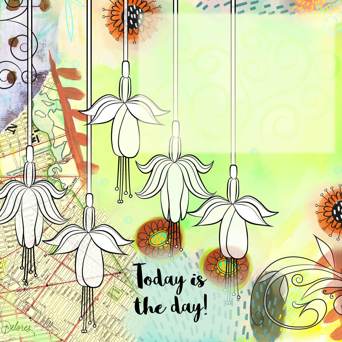
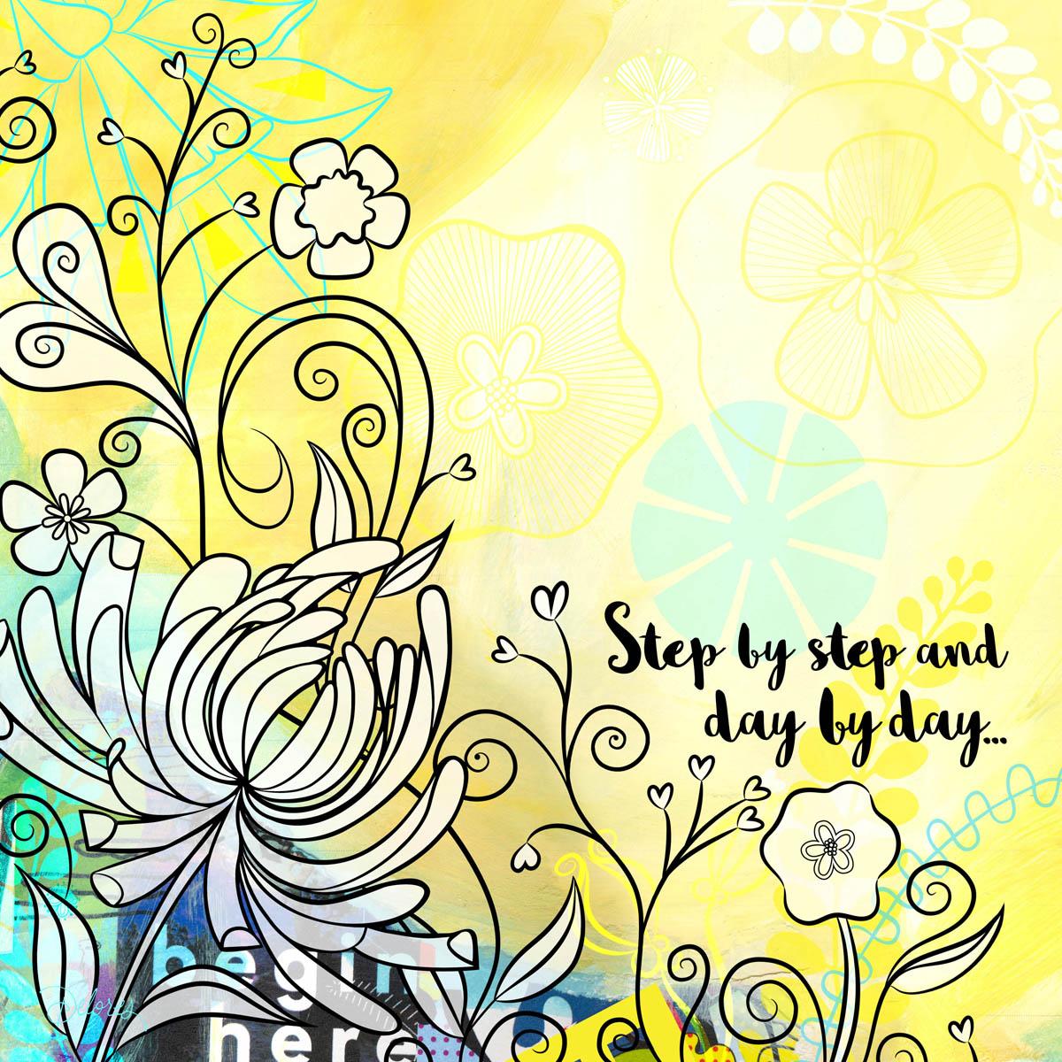
2. Lesson 1 Inspiration: Hey there. Welcome to Lesson one. I'm so happy that you committed and that you're here ready to learn all about my process when it comes to doing art for calendars, Really, almost anything goes. If you take a look at some of the calendar art that's out there, you'll get an idea of the kind of calendars that cell at the beginning of this class. What I'm gonna do is just show you some of the calendar pages that I absolutely love. Some of the calendar themes that work. Believe it or not, I have an actual collection of calendars. You'll see what I mean in a minute. So the next thing I'm gonna do is show you my journal art. A lot of what I pitch for ideas for any sort of licensing project starts first in an art journal. I've got tons of art journals. I take them with me wherever I go. I even have a little traveling kid of art supplies that I'm gonna show you what I decided to pitch. I'm going to show you the exact pages that actually became my great day calendar. And then all the next lessons will focus on taking those pieces of art and putting them together, first of all, to pitch the idea and second of all the final publishing. So we got a few lessons ahead of us. Let's get into this one right now, so I just want to share with you my healthy obsession with calendars. This one is by Lee Stanley and Mary Angle Bridge. Who doesn't love Mary Angle, Britain Hope I pronounce her name properly. Robin Pickens. So do some research on this gal, Robin Pickens. She has done this season a calendar so many times I've seen probably at least 10 years of it. So seize the day calendar, look it up and you'll see some amazing artwork that she's done. All of our calendars are fabulous. It's really cool to look at the changes that she's made over the years for this calendar. It really is a gold standard when it comes to calendars. So research her Robin Pickens. I also love these little calendars, so I'll even take a calendar and reuse it year after year. By like it, I just make it into a perpetual calendar by cutting the months off, and then I pick the correct starting day for the month, and then I can just clip it on. And I've got that calendar to use for another year. Hey, I love this artwork. I find all of the typographic layouts very motivating. So I just really like having this on my wall in my studio. Here's another one of the little tiny ones again, just great lettering. Layouts these air by Mary Kate McDevitt, Another girl that has lots of calendars, so research that all of the patients are coffee related. It's perfect for me, honestly, Perfect. And who doesn't love a coffee? Coffee beans are magical. I just wanted to show you a quick tour of what inspires me when I'm looking at calendars and what kind of calendars I like to buy. So that was a good starting point for me for the actual design process. When it was first suggested to be by my agent, he sent me this document. This is just such studying original art by the artist Ophelia, and it was great inspiration for me. I knew I wasn't going to be creating a calendar exactly like this, but it just reminded me that there is so much that you can do for calendars. And so it got my thinking cap on. I wanted to go through my art journals and see if there was some existing art that I could pitch for calendars. Some people call them art journal. Some people call them sketchbooks. Anyhow, I started to go through to see if there were some ideas that I already had existing that I could use. It took me a little while to formulate my plan, but I decided to scan a bunch of my backgrounds and look through for some florals that I could use for a calendar. Though I stopped on this page here because this is one of the pages that I did end up using behind one of my florals. The important thing was that there was a big blank area in the middle that I could use and put my actual calendar information in. I also knew I wanted to work with Floral, so I pulled out another sketchbook. And in this sketchbook I've done a lot of crazy floral. So I knew that I could probably find enough to at least pitch the idea. So I went through. There's Wonder the pages I eventually used. It's another one that I eventually used. I mean, I polish them up so much, I it's it's almost embarrassing to show you the originals because of how they actually ended up turning out. But, I mean, it's just the idea. I needed this raw idea, and I really wanted to use some of my mixed media backgrounds. So that ended up being a page again, Pretty rough here, but good for the idea. This ended up being a page. So these florals, I completely redid. But I did use this background. I didn't use this one. This is one that I did after. I'm always thinking had to. Okay, What? What am I gonna do for next year's calendar? So this is one that I'm gonna probably pitch at some point, I go through many, many stages. When I'm doing these pages one day, I would just go in and do about your backgrounds. The next day, I might do a bunch of collage. I've got all kinds of different collage elements. I mean, it's it's really crazy, and this is definitely one that I use. I recognize this corner here. I didn't use this one's of us a newer one that I'll use Maybe next time I pitch. I don't think I used this one, but I think I marked this page just to be able to show you some of the stuff that I do in my backgrounds. I think I used this one. But again, you can see the way I set up my pages. I use a lot of this for greeting cards as well, so I always leave kind of a central area for whatever might typography would be. But you could see all the crazy little things that air around the outside thistles. A physic acrylic paint done lots of extra little bits with acrylic, these air. I know that this map was from a trip that we were on. This is from probably from the original, altered art books that I use. This is looks like the library card from the books from the school I was working at. There's another page with a flower. I didn't use this one either. This one I did use an actual. This one ended up being the cover art. All of this flower art here I ended up redoing an illustrator. I'm not sure there's anything else in this book that I used, but I mean, this is just a really good example of a treasure trove of artwork that I can use in future projects. A lot of these have become greeting cards for me. I think I used part of this floral like I remember this flower here. You can tell like I do a lot of journal art. And again, there's so many different stages and levels that I do on a page. This would be a very early copy of this page. I haven't done a lot of the other details. That was a little commercial job I did for wedding invitations. There's a floral that I haven't used yet, so this would be a good one that I could possibly use on the next calendar that I do. I do a lot of these girls. This is one of the projects that I did in another course I have. So check out my other courses if you get a chance. So, yeah, that's my art journal practice. And like I said, I try to do it every single day. This is my little traveling art bag that I take with me Wherever I go, This wraps up the little tour that I wanted to give you of my sketchbooks and how I use those to create licensed art. So I also just quickly want to show you the ideas that I did pitch. This is my binder of all my licensed artwork. Here is that cover one that I was showing you and one of the interior pages. So it looks like I just actually pitched the cover and one of the interior pages. And then here with all the Finnish pages, some Here's the cover. All the interior pages. January, February, March, April, May, June, July, August, September, October, November, December sense Just a blank page they could use, maybe for an index or something. I can't remember why I sent thes, but probably something they asked for. So yeah, that's it. So let's now get into the steps and I'll show you all the stuff that I did in order to get this ready to go
3. Lesson 2 Prepping Images for Backgrounds: So here we are in the next lesson. So what I want to do in this lesson is show you through the process of scanning my images and then cleaning up scans for uses my backgrounds. I will talk to you a little bit about the template that I ended up being sent after the company committed to licensing. I'll show you how I have to lay out the actual artwork in order for it to work on the layout that I've been provided. All right, let's get into it. The first things First, I would take my original journal art pages, and I would scan them. And the most important thing to remember here is to scan them at a very nice high resolution, definitely not less than 300. Usually I scan it about 600 depending on the size of the original artwork. If it was a really small artwork, I would even go as high as 1200 for this demonstration. I've simply just saved it to the desktop, and then I'm gonna flip it over to the other computer that I'm going to use. So here are a couple of the scans that I did and you can see that a lot of these I'm almost embarrassed to show them because they're really rough. So what I'm gonna do to demo my process is just show you a couple of these files once they're in use, I'll try to explain how I kind of spice these together to be a square. What I ended up doing was separating the flowers from the background. So what I had to do was actually cut the flowers out completely. And those flowers I actually hand inked separately, an illustrator I'll show you in the set up of my documents. How the backgrounds during doubt in the next lesson, when I'm gonna show you, is how I go about doing my line art. And then in the following lesson after that, I'm going to show you how it all starts to come together. We'll see in the next lesson
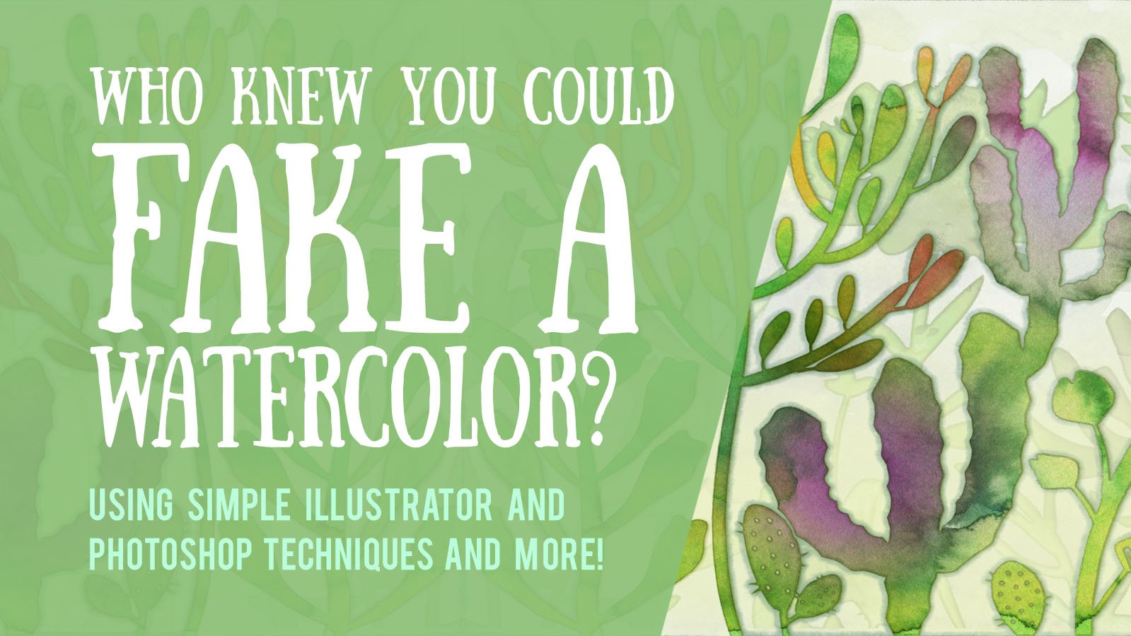
4. Lesson 3 The Line Art: So in this lesson, I want to show you how I took my original raw flour arch and took it into illustrator and re ink. All of the lines I'm going to give you. Ah, very quick version of this. I teach brush use in a couple of my other classes, so I would recommend going to those classes to really learn the ins and outs of how to make my brushes. All of these were based on one or two simple brushes. Honestly. So I'm gonna give you a quick overview of what I did, and then I'll show you just importing that artwork into my final background. Leal's. So the first thing I do is I open up my original drawing. In this case, I believe I traced it onto chasing paper and then scanned it or took picture of it. I change it to rgb color. It's what I want to do is change the color of this to be a light blue eyes. That's what I like to use when I am going to be tracing an illustrator. Just use human saturation. Teoh, change the color, polarize it, making a very pale blue that I save it. This is Jay. Peg is fine That I opened up a new document in Illustrator. I've opened it up to 10 by tan. It's not really necessary to have it exact size of the calendar. But if you're doing the completely out in there, sometimes it works out best. So I used the place command Teoh, place my artwork. I'm gonna pull it to the full height here, so I get it nice and big, and then I locket command to will lock it. So I'm gonna open up one of the documents that I had, where I did the other florals, and I'm gonna export the brush library. Just Teoh. Show you how that's done. You go to the fly out menu here on the brush panel, have saved it as brushes for florals. One and back. In my documents, I go to the fly out menu again and go to open brush, library or other library. And I locate the library that I just saved. Most of my brush libraries have you know, 10 or 20 brushes in it. This one, just as an example, has only two that probably could have created these Justus quickly as doing this whole process, but I just wanted to show you I do a pretty intense, detailed explanation of brushes in my heart. A fake a watercolor art, one course. So if you really interested in making some supercool brushes and great compositions, please check out that class of mine. So I got my two brushes here. I've dragged him into my brush library, and I'm just going to draw a couple of lines here just so that you can see the difference between them. I often create versus up each of the brushes in different sizes just to make everything faster for me when I'm in my actual painting mode. So here you can see the two strokes one of have kind of rounded ends together. One has early pointed ends, size wise, they're gonna be perfect. For the size of my template. I'm gonna make up slightly bigger, slightly smaller version. So this is me going through the whole process of changing my brushes. And then I start painting with, um now I double clicked on the brush tool itself and changed my fidelity to the smoothest. So it'll help correct my lines as I draw them. I'm gonna fast forward this next part as I go through the process of drawing all my little parts. And this is the spot where I might switch to a slightly thinner brush stroke. Once you roughly drawn all the parts, I suggest you enlarge it and then you could do a little bit of work with lining out some of the endpoints here. I'm selecting all the endpoints and I'm using average to put them directly on top of each other. And then I go through and just make any other quick little corrections. Now what I've done, Teoh and I would suggest that you do. This is I'm going out of my way to make sure that I have no actual open shapes is what I want to do is be able to fill those shapes easily. So I want to select with the Magic Wand Tool in 40 shop. So it's really important that my shapes are all closed. If you're getting really annoyed with the snapping, you can turn it off under the view menu. And then there's this other spot here in the upper right hand corner of your workspace, and this is another spot where you can also affect the snapping. So just experiment with those in figure out which one is actually affecting what you're doing right now. So than proceeding with my other flowers, basically just drawing with my brushes. Personally, I like my brush strokes to be drawn from top to bottom so you'll see that I just about always pull in that direction, make these little dots at the end of these brush strokes, I use ellipse, tool, make little circles and then copy and move them around. A lot of times I'll go in and just kind of make thesis Urkal rougher than an actual circle have gone through and drawn that whole thing. And just for fun, I'm gonna show you what you could do with creating your own brushes. I've straightened out and copy this entire little branch here. And if I drag it into the brushes panel, I could actually create a brush to use for the rest of the branches of my dandy lion. So when I use this brush, I can draw a complete branch, so you might not want to do this for all of your branches. You don't want them all to be absolutely identical. That's just an example of what you can do when you're creating brushes. Check out my other classes, Teoh, to see a lot of in depth explanation of this process. So pretty much what I would go through and do is create all the rest of my flowers, like selecting all of these endpoints and using shortcuts, Command, auction and J get average. Put it on both axes and say Okay and you'll get them lined up completely. I almost always have my navigator open as well, so that I can quickly move to another location even when I am fully and large. So this is another one where you could probably duplicate maybe at least one or two of the of the pedals. So here I'm using the rotate selected all click, where I want the rotation Teoh be anchored. And then, if I hold down commanding option key at the same time it's you have, it has changed to a double headed arrow, and it's actually duplicating, so I maybe do two of them like this, and then draw another one. Maybe this one could be actually duplicated in its entirety and not rotated to give me another version at the pedal. I think what this flower, what I would do is probably create another rush by dragging this one and duplicating it and then going in with that one and actually reducing it down to maybe 6%. Now I can select thes and simply apply the other brush. So it's slightly thinner than this one, which is the thicker 10%. So that's one of the ways you can change your strokes. Or you can go into your stroke panel and actually physically reduce the size here. Okay, so you've got the idea of how the brushes work. I'll show you that initial our garden here. So we're gonna import that into our four shop layout, and I'll give you an idea of how I do all the compositing in the next lesson. So I'll see you there.
5. Lesson 4 Compositing Inking with Backgrounds: be there. Welcome back. So in this lesson, what I want to do is import my black and white Leinart that I created Mila straighter and position it and get it ready for all of the finishing. I also have a whole bunch of fillers that I use. So I'm going to talk a little bit about those fillers and how they come in handy for when you're laying out your final pages. All right, let's get to it. So what I'm gonna do in this lesson is take you through this artwork from start to finish. This is the original scan, and this is how it looks when it's absolutely, completely done. Let's go back to the original scan and we'll start from there. But one of the first things I would do I can see a necessity for it. Right here is I would adjust the level Mandel on your keyboard brings up your Levels channel. You basically just moved these sliders till you get the light levels wrecked. And this one is one of those that's your own better judgment. Can't really tell you how to do it right or wrong. It totally depends on that original began that you have or fold or whatever you're using. I like to lighten it up and increase the contrast a little bit right net. And when I'm done, I just click, OK, and it's applied it. So let's just take a quick look at the final art and that looks like I would say about the same amount of flight. The other thing I'd probably go in and do is adjust the color balance. To me, this looks a little bit yellow than the original. So just until you are pleased with what the coloring looks like Okay, the next step I know we have to do. We have to make this into a perfect square, and so I kind of had to go back and refer Teoh what I ended up with to see the steps that I probably took. So looks like I even much completely eliminated this edge and got rid of the stitching here on the inside of the spine and did some general repair. Of course, I take out all of the flowers here because I've got new ones to position. I'm just gonna go for it and how to explain things as I go along. So the first thing I'm gonna do is fix my ratio at 1 to 1 so that I can re eighth e case file. And actually, before I do that, I'm going to select this corner and copy it, make a new layer and paste it in there because I see some details here I may want to use. So we'll move it right over to the side here so that it ends up being cropped with my 10 by 10 square to shut off temporarily. And I could do that. So I've selected. I could have done it with a cropping tool, But I'm I've done it with a selection, and I can crop the document lately. So now we know it's the opera square ratio. Let's check our image. Size is going to do it 10 by 10 at 300 pixels per inch. That resolution is a good resolution for anything that's going to be printed hidden. That additional layer that I have there and what I'm gonna do now is go through and get rid of this stitching here. The quickest way I can think of to do that is to select another area apply a little bit of feathering and copied over and put it in position here. It's just select this area here, make sure I'm on the background layer copy and paste. And I've got this little strip that I can use a block out that stitching. So that's one of the methods. The other method that could work as well would be to use the rubber stamp tool. So clicking on the rubber stamp tool, enlarging my brush, sampling a spot that I could copy and then just painting but that rubber stamp to get rid of the stitching. So I mean, that was super quick. We've got that gone. Um, I think the actual strip here, I'm going to arise it making a little bit yellow. So this is with it having no adjustments whatsoever, colorize. And I'm gonna slide this along until I get kind of a yellowy dark for sex. Bring it to my yellow ish color, and then do the lightning losing there somewhere right about there. I'm gonna flatten it to this layer because I want to actually do some of the rubber stamping on there just to make it look less obvious that that was copied, then our sick. I'm moving it up. They want to keep some of that texture in there. Hate, flatten, damp. And I'm gonna option, like to sample that area and then just kind of start painting over that. Now, I've got to get rid of these flowers. So my next step, we're gonna take a look at this other layer that we had and see if there's usable areas, use my marquee and just select this area here, Poppy, it's shut it off based. And let's see if we can use that going to get rid of that flower. Of course, I got this one little area that I can use to do some of the covering rotated so that texture is on the same side. Remember, what we're trying to achieve is just getting rid of thes flowers completely and having a nice, clean background to work with. I have been smart. I would have had this all scan before starting my thinking, but you just can't think that far in it. Vance, when you're working in your journals, say so. I am going to do about two rubber stamping, and I'm probably going to time lapse the process so that you don't have to watch everything that I do. Rubber stamp tool is awesome When you wanted to copy over some of the other details on your image, eventually you run out of spots that you could sample from the case like that. You would have to paint in the details so you have to have a brush that works and matches your texture. One of my favorite go to brushes is Kyle Webster's Wash. Agogo just seems to match the texture and the backgrounds that I use the painting, that kind of thing. So let's find that sucker he ago Gua sha Go Go on. I'm gonna sample some of the blue hate and see about painting over this stuff Once my take a look at it, that was You can see it works pretty good for matching the original texture. Didn't go in and do a little bit of adjusting to the settings. Just the color dynamics and gonna change. Have two tones of that blue in there. So foreground background, Jeter here gonna set it. Just looking At first, it seems pretty good. So I'm going to use that to do a bunch of this stuff painting like I wage normally paint. If I was illustrating kind of cool because I can go in now and some of the rough edges and things that basically perfect this time lapse this next little bit just so that you don't just sit here and watch you every little move I make, I use a light touch. You can see that I'm not putting too much color on that compress harder when I want true opacity. And I know that originally I actually went through and re colored this texture you can see in here. I actually redid this whole side section not going to do that right now because you get the idea. You can see how it ended up. Painting in the blue here actually looks a lot lighter. Something horrible back. Show me that also looks like it added a bunch of white details on the side here. So I'll go and do that as well. Okay, so my background is pretty much prepared. I'm going to use the one I absolutely finished, but I just want to give you the idea of the kind of thing I could do to go in and prepare my backgrounds to my check and see if I did something with that. Yes, I took that out completely. The number 23 did I do so I just kind of left. Just watercolor. There must have got that watercolor from another page. So I am just going Teoh 10 that this is color that I used. I'm going to use a rubber stamp tool and use it to get over this to prepare that background way you need it, toe. Look, So you basically use whatever means necessary, so that's yet or that you got my background and this is what I end up. I'm ready to know start compositing with my Leinart. Okay, so we've got it all crop to the right size. All of the touch up has been done. Now we're going to import Leinart. So I go to place embedded, locate my Leinart and as you can see, I composed flowers away. I want TEM in illustrator and then just click OK, And my file has been placed on a rasta rise the layer first. So in order for the white background not to show, I can either select it with a magic wand tool and hit leet Get rid of it. Get rid of any of the white that they did not want. Actually, I'm gonna get rid of all of the white. What I'm gonna do is like one area go to select similar that will get rid of all of my white. And I'm left just the Leinart, so I would position it exactly where I want it. And one of things that I would do to make it easier for myself is to taste in a copy of the calendar block that's going to go in here just to make sure my positioning is good. So, in my opinion, the fastest way to do that is just to go into my in design document and take a screenshot of the master page from the document that the clients any will include that screenshot with the project files in case you have no other way of getting one. So here is the page, nor the fact that I've already got these set up here. Just pretend I don't. Okay, so this will be the screenshot I'd want to take. So man shift for and I get to select the area that I want to go back to four to shop open. The death star will pop up and open it left all coffee. Get rid of it and paste it here. Just enlarge it to fit. It's not going to be printed. So it does not matter if it is a really resolution is simply using it to help us position our artwork. So I am going to reduce the opacity. But now I can see what I'm working with. So I know I want to keep this area open for lettering. Looks like my artwork is positioned exactly like I needed to be. Course I was an illustrator composing the position of the flowers. I also used that screenshot. So I just want to show you that little process. So I'm going. Teoh will walk that, and I'm actually gonna hide it. So now I can go through and start doing all the work on my flower, Leo. So for this Look, this calendar, what I did is I went through and I put white behind all of my flowers, so I'm actually gonna take you into the finished document now to save time, you don't need to watch me do all of this stuff, I will just explain. So there were my flowers imported in position and then you can see that added this white background time the flowers So I can see here that they've come out of their proper position. So I'm going to quickly fix that. I must have at some point reposition to these flowers. So the way I would create that White Phil behind the lowers is by using the magic, want you alive, selecting the area outside of flowers in any of thes trapped inner areas. And I'm gonna select inverse using command shift. I now only my flowers are selected. Want that layer to be separate. So I'm gonna make another layer that I'm going to use to fill with the white and go under edit to fill white there, My flowers. I have their white background and on all of these layouts have actually screen that white a little bit. I don't have it 100%. So in an area like this, I would want the white to fade out a little bit, not have a hard line. So I'm gonna set my feathery here 44 pixels and I'm just going to select that little area at the bottom, Delete a couple times. I see I have it nicely blended there. So let's double check that with our calendar block. So I'm liking the position of all of this is gonna check it with some of the text I'm going to be using. That looks like it will be all right. I always have. My signature is hidden here in the lower left hand corner on this layout. And then I also have a whitened area that I put there for the calendar block, which makes sense once we take it into the in design document. So now what we're left with is just trying to figure out some other feelers that we could have in here. So, like I told you at the beginning, I've got a ton of feelers. I've got those here in this folder. Some of them I use some I didn't use. So basically, if you've just got a folder ful of these kind of items that you can use when you are actually working on your layouts, it makes things a lot faster. So I've got a huge folder of them. I will show you. That's all. My flower gardens got a ton of flowers that I could bring in in the background. I've got birds, I've got single flowers. I've got heated corner flourishes, leaves individual flowers, random little shapes that I probably do for something specific. And this makes it just so much faster. When I'm actually composing my backgrounds, I'm essentially finished showing you compositing here. And, of course, every Leo that you do will have its own individual works and adjustments that need to be made basically had taken my journal page lemon age, the Leinart that I had on their used that Leinart and re Ain't it in illustrator and went back to my photo shop document, imported my line arch and then did polarizing or filling on shapes and the flowers and then added flourishes. And what? Not in the background. What I learned from having done this process more than once now is that I, through the backgrounds in my journal art and often keep them just blank so that I can have them ready for putting flowers or whatever line our time, adding So I'll do collage and painting and then leave Batch Bank area. I know I can add something else to. If you do this process more than once, you'll figure out shortcuts. Each of these individually oats that I needed all have their own little quirks and things that I had to do to make them work. For example, this one have read role work in the corners and red circles. It's of little red flowers, this one. You can see this blue scrollwork in the background, a little bit of black. Here is a lot of little painted marks that I did in photo shop and a lighten. The area where I was gonna position the lettering is one had some individual flowers imported and placed for feeling and a bunch of little killers and details that I added afterwards. See, every page has its own individual works and challenges in order to make it a beautiful finished page. So in the next lesson, what I want to do is talk to you a little bit about the lettering and just what I did. Teoh customize it a little bit to make it a little more interesting, right? So I'll see in the next lesson
6. Lesson 5 Prepping Month Labels: there. I hope you took a little break. I know I have to take little breaks between these lessons, so I wouldn't blame you one bit. So in this lesson, I want to show you what I did to prepare the monthly calendar labels. I did those separately, and I import them into my final document. Hey, here we are with our lettering demo, and you're probably wondering why I've got these two shapes here at the top. What I'm gonna do is I'm gonna make it custom brush to show you how I made some of these thers is. So what I'm gonna do is use this ellipse. I don't want this endpoint to be flat. I wanted to be pointed. So I'm going to grab the convert anchor point tools from the tool Options bar. And I'm going to just click on this point and it'll convert it to a corner point. And I'm gonna put this rectangle over the oval because I want to get a blunt end like this . Select them both. Go into my pathfinder, use minus front, and I'm left with that shades, finesse a little bit. This is going to make my flourishes it looks like I've got it approximately the size that I would use it. Always find that easier to just kind of ballpark it and get it very close to what I need. Open my brushes palette. Get rid of these, and I'm going to drag that into brush palette on making an art brush and leave all the settings like this for now, look okay, and let's give it a test run, so that makes a decent flourish. And for the most part, it's the shape that I need. Let's work with that's wash for now. So the font that the client ended up choosing was this. I had actually gone through the trouble of a bunch of hand lettering, which is what I would have preferred. I just a little bit more personal that a chosen this bunch Sofia. So I needed to go in and just add some flourish to that. So that's why I went to the process of making a brush. And once I had my lettering typeset, I went and created outlines and shift. Oh is a shortcut to create outlines. You can see the lettering is all still separate onto Pathfinder united to make it into one shape will surely that again close out. So that's without it being united and how it's united. So it's all one shape. So once we have that and we have the flourish, expand the appearance of it. So it makes it into an actual shape and pretty much do the same thing. Didn't position where I want it selected, select both parts and use Pathfinder to unite them. So the other thing I did was that I filled the shape and added a stroke to it. So I went to and filled it with whatever color coordinated with the months even see. January was purple February ridge and so on, so forth. So this is the purple. I was kind of going for for this one and opened up my Pantone's watches, and I picked a nice purple. Now it's in my swatches, and I can use it to fill for the outline on this lettering. I chose a black stroke just to make it stand out a little bit better against the background . You can see here, so stroke lock. And as you can see here right now, it is creating the outline and centering that outline on the stroke. And personally, I wanted to be on the outside. So go into my stroke panel and align the stroke to the outside. That's pretty much what I did for the lettering. I know. I added a swash here at the tail end. I could probably use the brush again. Or I could just simply go in and make adjustments to the stroll because it's just basically what you think would be faster for you. Everyone has their preferences for doing stuff, and I personally use brushes whenever I can. Bitch, there are some cases wears just not necessary. Or I'm just gonna use that brush one time. Forget it. Take out a couple of these extra points to help me control my better and get the nice curve . Can't remember exactly what I did here. I did a the swishy curve. I want to be a point. So I went to use is to convert, make a couple more adjustments here. Now, I don't like that this is snubbed like this, so I'm going to change that by changing the miter limit here. And I'm gonna add a point here or subtracting and adding points you just use the minus key or the plus key once you're on your stroke and and I just want that so that I can use it. Teoh, create that tip that goes under. So it ended up somewhat like this. Now, with the 2018 I also put a little bit of a swash underneath the two. So those are all things that again are very subjective. Do what you need to do. Sometimes the client will ask you to make these changes. Sometimes you present them this way in the first place. That was basically the process I went through. And then I saved each of these months separate so that I could bring them into my design document and position them where I wanted them. So I think that but all our parts ready and we're gonna you have to go into our in design document now and do are finally else I'll see in the next lesson
7. Lesson 6 Finishing and Prepping for InDesign Output: Hey there. Welcome back in this lesson. What I want to dio is just show you a little bit more of the finishing. How I say vote my documents and get them ready for in design. We're getting closer and closer to finishing our document. All right, let's get to it. So this last didn't shows you the actual finishing off the document. Once I had the contract to produce the calendar. I just wanted to show you this process so that you would see the big picture for initial pitching of the idea, a complete finished layout in photo shot would be sufficient. One of the hardest things I found when I was setting up my initial hitching of the document was to find the calendar block and put it in the corner here. Get it already for that actual layout. So you can use that screenshot that I provided and you could just put a calendar block in the corner when you're submitting. Okay, so now back to our in design documents. Okay? So first things first, we'll go into this photo shop document and make sure we've saved it exactly the way we want it for the final layout. So let's take a look at that one we were working on. So January documents. I had the type in this lower right hand corner and that was imported in with my photo shop documents. So let's go back to the photo shop document. Make sure it's in the right position. It always come back in a justice later. And then what I'm going to do is save a dupe kid of this file with no layers that I can import into my design documents. So did you save as just command shift s So I'm going to save it as a tiff without layers at this point, and I'm gonna hit, save no compression. And that part of the document has been See, so that is ready to go. And let's go back into our illustrator and I'm going to get rid of our GMO and use my art board tool to make this altar to the right size. Okay, so now back to our in design documents. I'm gonna add that new blank page at the end of my documents. So I go to insert pages after page 15 and I want to base it on that ridge. So I choose Grid is the master and hit. OK, so you can see here I am now on that page. So this becomes my final layout. So I want to insert my pictures. So I'm gonna use the place command, which is command D, and I'm gonna go to that folder that I just created. Here's my original Months folder you can see here. I must have had a brush saved. Those are all my completed months right there. But I'm gonna go to the two demo pieces that we just did, and I am going to insert them. It opened. Here's my January lettering And then here is my background and I'm going to have that one fit. Of course, this one's in front of the other one. Very easy to accept problem. Just right. Click on it, arrange and sent back. So there's my January lettering and my background is positioned perfectly moving my January lettering into position. And one of things I can see here is that in Illustrator forgot to make this into a compound path so that it would show through the background here. So let's just take a quick back to that document. I'm gonna temporarily put a ground in here so you can see what's happening. So I'm gonna select both parts of that letter, and I'm gonna go under object compound paths and make. And then you can see it's like a doughnut hole and now shows through what's in the background there. I'm going to delete that yellow it, save it again, and then we'll go back to our in design documents. Delete that, and command E will go back and we'll reimport that lettering. And now you can see that it does indeed show through to our background, which is what we wanted. Of course, I would have had my 2018 lettering in there, but the purposes of our demonstration I didn't go through that process. Basically, that was it for me, for setting up the individual pages I would put in the months the quote you could see my signature is down here in the lower corner, and there was the great area which I was instructed not to worry about, that they would put in all of the numbers, and I think they leave that blank because they might possibly use that again. Another year. Maybe I'm not sure you can see the page is kind of cool to revisit this actually myself. And look at the pages that I set up. I've since done other versions of this calendar, and it's it's always kind of funny because you look back and you think Oh, my God, you know, look at this little thing that I did wrong, But in the big picture, it was perfectly fine. Now, I personally never did see this in stores. So, you know, because I'm in Canada, I've sold this to the company in the U. S. So perhaps it just never made it north of the border. If you ever see it out there or if you happen to have bought that, I would love to hear about it. But it's really cool to go through and look at that. They had a little sticker. I guess they put on the outside of the packaging and yeah, that's it. Now you can see all the links here. All the different things that I had to put in the missing you PC and I spn was something that they were putting in at the end as well. If there were links like this one that were somehow missing or something was wrong, I would double click on it and find the original file that was supposed to be linked. I'm not going to do that for the purposes of our demonstration. But at this point, when it quickly just show you how you go about getting this ready to actually ship or upload to your manufacturer. So once we're done a complete document, you've double check, you've printed it off. You've done all the proofing necessary. You would go under file to package and what this does. First of all, it alerts you to anything that's missing. And secondly, what it does is it gathers absolutely everything in one package that is very easy to zip and send off to your manufacturer. So of course you would deal with any of the missing files before you would do this. And you would do that down in your links here. Some of these things, like I said, our hearts that they put in afterwards. So even if it said it was missing here, I was able to just go ahead and package it up. You can go through these individually to see all the settings. Basically, at that point you just hit package. It alerts you if you need to save it. You can put in all of your information meat that capital in all of my data, it continue to use a spot. When I was gonna put it on the desktop and I'm gonna hit package these restrictions, I totally get the font software. Unless you own it in a bottle license for it. You can't just use it. However, this is not my problem. This is the manufacturer. And they sent me this information or sent me the fonts, though they have a license agreement. So I'm gonna hit Don't show again and not gonna hit, OK, these fonts aren't currently available again. I don't need to worry about this. This is something at the other end that the manufacturer would deal with. Okay? And it's alerting me to missing linked files again. I know what files were, and it was ok, but he okay. And then it goes through this whole process off collecting absolutely everything there is to do with this document in one spot. And the process is over. I'm gonna take you to that folder and we'll take a look at what's in there. All right, so that's done. I am going to my desktop and we'll take a look at that folder and this is what is collected for us. So we've got our documents, a pdf version of the whole calendar. All of the fonts have been collected in one spot. My instructional texts Basically my i d and then all of the links. So in here are all the files that were necessary for the output to be absolutely seamless. They have everything they need here to output that calendar successfully. So that's it. Basically, you've gone through the whole process with me. I hope it hasn't been do confusing. So I'm really hoping that you're gonna go to my last lesson. Because in that lesson, I have an exciting project for you. What you're gonna do is you're going to set up your own calendar pages to submit for possible publication. You're gonna choose a couple of artworks at work. Well, together three would be awesome from your sketchbooks or your journals. Or you could even produce some pressure work if you're so inclined. And I'm gonna explain the steps that you need to take. And I'm even going to give you a list of manufacturers that are actually accepting calendars of missions from artists. So excited. I absolutely can't wait to see your project files below. So are you ready to get into it? Okay, let's get into that last lesson. See you there.
8. Lesson 7 The Project: well, we're at the finish line now. I am thrilled that you've gone all the way through and are now going. Teoh. Attempt Teoh. Create your own calendar. First step is to go through artworks that you have existing. Try to pick two or three that really go well together that you could actually picture as a calendar. Scan those at a very high resolution, preferably 3 to 600 pixels bridge and at least 2 10 by tan in size. Do the steps necessary to create a squarely haute, then go through each of the lessons as it takes you through the layout of the calendar and the project files below. You'll find the lesson sheet. Print that out, and there's a checklist there for you to go through as you take these steps to finalize your calendar. Included in that lesson file is the list of manufacturers that I know of their accepting calendar ideas, and I'm gonna give you some reading material as well. There are a couple of blog's here that I think are a must read when it comes to the idea of creating your own calendar. So good luck. Can't wait to see your finished work. If you'd like, you can post your project files as you go through them for comments, and I would be happy to give you some pointers along the way. And it will be a great experience for everyone involved in this class to see your work and to comment on each other's work. So let's do that. So I'm really hoping that you'll share anything that you've put together. Make sure you tag me in anything that you post on social media. My handle is Delores nascar inch slash skill share, and I really hope to see you in some of my other courses. You'll see in my class offerings that I dabble in a lot of things. I'm not just a graphic designer. Please visit me in social media and check out some of my stores. Thank you so much for being in this class with me.
 Delores Naskrent, Creative Explorer