Transcripts
1. Child's Birthday Card Intro: Hey there. Welcome. Glad to see that you have clicked on my course and you're ready to dig in. My name is Dolores NASCAR INGE. I'm an artist living in Sunny Manitoba, Canada. My first course on the greeting card industry was regarding self publishing your cards. In this course, I intend to show you the creation of a card from start to finish in one of the most popular categories of cards out there. The two main categories for greeting cards are everyday cards and seasonal cards. And, of course, in the everyday cards, the birthday card is the most popular. So that's what I'm going to focus on. We're going to create a Children's birthday greeting card, and I'm going to show you how to design and create the little characters that we have on the cards in. Illustrator, you're going to think this guy, and then you're gonna compose the card completely in photo shop. It's gonna be so fine. I can't wait. I'll see you in the first lesson
2. Lesson 1 Preparing the Template: Hey there. Welcome to lesson one. So, in this lesson, what I want to do is take you through the process of cleaning up your photo or scan and importing it into illustrator to get it ready, Teoh actually use as a template for our drawing in the resource files. I'm going to include a couple of ideas for you for doing some research before you start your drawings for this particular Siris of cards I wanted to keep. My little printer is quite simple. None of the lines are very complicated. We're gonna take these into illustrator to do all the thinking, and I wanted to keep it quite basic. You'll probably see a few of these in the upcoming lessons because I've already used these to make some cards in this series for today's class. What we're gonna do is focus on this cute little piggy. The first thing I'm gonna do is scan it. Don't throw it into my scanner here and the settings air adequate. So I'm just going to go ahead and scan it so that we can open it up in photo shop and do a couple of adjustments. I see. I cut his ear off a little bit, but that's that's of no consequence. I'll be able to fake that in no problem and what I like to do with my scans and anything I'm going to trace it. Illustrator is I like to change the color of it in Illustrator. You could dim the opacity of it, but I prefer to have it kind of in a light blue color. So I'm gonna go under human saturation and I'm going to colorize it to be a light blue. I don't know why I like this light blue. It probably harkens back to the olden days where when we were using mechanical cancels with light blue lead and then we could Inc right over the drawing. And once it was camera ready, we would use a great big copy camera. Teoh actually take a picture of it and all of the light blue would drop out. But like I said, that's the olden days. Anyways, I think that's a good blue for me. I'm gonna click, OK, and I'm going to save it. And you can either go into illustrator and place it so I could go under file to place and import my little piggy, or I could simply select all in Photoshopped copy his way. I usually do it and then just hit paste and he shows up in my document here resize. Um, size is of little consequence, really? Because it's a vector. So no matter what size we end up doing it, it's going to come out nice and sharp and clean in whatever program we use it, no matter how much being large, I'll just leave it at this size, and the first thing I'm gonna do is I'm going to lock it. So lock is under the object menu. I know a shortcut command to So that's what I use. I use as many keyboard shortcuts that possibly can when I'm working. It certainly speeds up the process. We're gonna draw lesson one to a close, and in less into What we're gonna do is we're going to start thinking this little guy. I'll see you there
3. Lesson 2 Inking Our Critter: Hey, guys, welcome to lessen too. So in this lesson, I'm going to take you through the process of designing a brush. And we're gonna use that brush to ink this little character, and you're gonna learn a lot of illustrator tips and tricks along the way. Are you ready to get started? Yeah, me too. Let's go. So we're gonna work on this little guy today, Isn't he Just a cubist. So for this sort of illustration that I'm going to dio, I'm gonna give you a look at a couple of them here in motor shop. You can see that I've used pretty much one or to brush profiles in Illustrator. And it's a brush that I created. It's an art brush, and it has kind of, ah, slight taper to it. So it's generally the same thickness, and it just tapers at the ends. Okay, so we'll hot back into illustrator, and I'm gonna show you how to create that brush. Somebody used the lips. I always try to create my brushes at approximately the size that I think that I'm going to need them. So let's just look at this really close to the pig. So we can see, Remember, make sure all my snapping is turned off. So if you go into this little icon in the upper right hand corner, it looks like a Magnus, and I'm gonna turn off all of this snapping, especially when you're working on something small. A snapping can be very distracting if you don't turn it off there. You could also turn off here, and I'm gonna make sure that snapped pixel is even off so that my brush will not snap when I'm using trying to create it. So I'm gonna go up really big here, and what I'm doing is I'm creating the profile for the brush. So what I want is pretty much what I've got here. The ends, we're gonna be slightly rounded, it's going to be thicker in the middle, and I am going to add a couple of anchor points on both sides here, and then I'm gonna take these middle points and bring them down this a bit. So it basically just flattened coach my lips. So I thought pretty much the profile I want I don't want to thick in the middle, so you look at it a little bit larger so that I can further refine it. So it's definitely still a lips, but it's kind of flattened out ellipse. So that's what I want from my brush profile and take it back down to closer to the size that I need. So I'm looking at the thickness of it here in the middle and matching up to thickness of the line that I have. So if I look back at the one in photo shop, look at the line closely, you can see that that's about what I want. It gets, stays pretty consistently thick and then comes to a thin point at the end of the line. So I think this one is gonna work out just fine. I've watched the shape the way I like it. So now what I'm gonna do is I'm going to open up my brushes. Then I simply drag my profile into my brushes palette. I'm met with this dialog box that asked me what type of brush I want to create, and I want to create an art brush look, okay? And I know from experience that I can leave these settings pretty much as it is because I have created the brush to the right size. Now as faras the direction for pulling or creating your brush strokes That can be changed afterwards. So I'm going to leave it as such. And I'm gonna change the colorization. Too tense now I think with my pig, I have it in black. But I know with the air I had changed the stroke to be brown. So if I change it to tense here now I know that I will be able to cull. Arise that stroke later on. So I click. Ok, I'm ready to go to start doing my brushwork. Delete that stroke profile. So maybe on the keyboard gets you the brush to okay. And I'm going to go and select that brushstroke. Couldn't make sure over here that I have no Phil. So I'm going to put no feel here. My stroke, his block, and let's give it a test run. So that looks perfect. That's exactly what I was looking for. So in the next lesson, what I'm gonna do is I'm gonna show you going through all of the drawing of this little piggy, so I'll see you there
4. Lesson 3 Inking and Brushwork: Hey, guys, welcome to Lesson three. In this lesson, what we're gonna do is we're going to continue with our brushwork and we're going to do the complete drawing for this little piggy. So when the first lesson we created the brush and that brush is here and I'm going to go through and I'm going to do the main brushing, I'm gonna explain as I'm going through, I make adjustments to line thickness and you'll see a lot of the necessary adjustments that I make along the way. Let's go back and take a look at this piggy. And I mainly kept the brush strokes to the same thickness. There are times when you want to make the brush a little bit thinner, and that might be in these interior areas here, like some of these details. So when I get to that point, I'm going to give you a good look at that. Close up how I adjust that brush. So when I was creating the brush, you probably saw that I did not change the direction of the pull of the stroke. So I'm kind of person who likes to pull downwards on my strokes. If you prefer to pull upwards on your stroke and double click on your brush and you can change the direction here. Now, in a case like this, where the breast stroke was the same at both ends, it really doesn't matter too much. But when you create a brush that has, let's say a in white and a thick. And there's a lot of cases where I would use a brush like that that I would have Teoh adjust the direction off the pole. So that is a personal preference. But that's how you go in and adjust it. You simply double click on the brush and you can go in and make the adjustments. So here we go. Go Now. One thing you'll notice here I purposely kept the lines from joining up so that I could show you. Oh, I can align those points easily. All for these points need to be aligned. So what I would do is I would grab my direct selection tool, which is the letter B on your keyboard. You see how it switches to that single Aargh! And I would drag over both of the points, and then what I'm gonna do isn't it average points one on top of the other. So average or in the menus? Let's see, this is where it would be under object to path and you would go to average. See the keyboard shortcut. There is command auction and Jay the other way. You could do it. It's like right clicking. And you could also go to average right here. Hey, I have just learned the keyboard shortcut, and that's what I always use. So here we want Teoh average points to be directly on top of each other. So we're gonna do both and we're gonna click, OK? And then you can see that my points are directly on top of each other, which means that the lines meet here. So that could be very important. Because when we go to fill these, we want that area to be closed off. I'm gonna go through, and I'm going to average all of these points. Make sure that directly above each other in a case like this, where you might not be able to drag and select both of them Oh, I just managed to do it. But if you couldn't because it was going to be walked by another path. You could actually select all three and then auction shift, click to de select the path you don't want or you could just select them manually. You could move that point to a better location so that you could select them by dragging over them. Or like I said, just look on one or two shift key, click on the other and then do your command shift. Jay, I could make a slight adjustment on this curve here. Remember that you can use your arrow keys to move in very small increments. They're now this here is perfect. These guys will cut off, but I think I can fake it again. I'm going to go through and I'm going to average these points. It is realized that it was still snapping. So I think it was my smart guys that are doing that, so I'm gonna turn them off. But it's like that double point there, so that could move this whole it over, and I'm going to just flatten this out a little bit. Grabbing those handles allows you to adjust the way that curve looks OK and they could get over that. That's lightly as far as the increments, girl, for when you are using your arrow keys, the distance can be adjusted in your preferences. Okay, So you can go into your preferences here and let's find the spot here is right here in the first place. I look so in general and you can specify here. So mine is going in increments of 0.0 each of an inch and you can change this to a higher number which will make this is smaller. So I don't know if it will make much of a difference with what we're doing. They'll just change it to nine, and it will be moving at a smaller distance here. I didn't make that much of a difference, but so that you know where that's done. You can see as I'm going along, I'm correcting my illustration and I think I want more of ah, heard here. I'll get a time lapse the rest of this original in King part of it, so that I don't bore you with the step by step drawing. One thing I did forget to mention is that you can set the tolerance on your brush to have its move or you. So if you double click on the brush, you can see here I've got my accuracy for my curves Smooth this on a very smooth setting here, I'll show you how that affects the drawing of the line. So if I had it on accurate when I'm drawing, it's gonna draw almost exactly what I draw. Okay, Now, if I was to do the same thing with the fidelity at super smooth there when I draw, even if my hand is shaky, its trying to interpret what I want that smoothing it out. So I find that the higher the setting is, especially when you're doing long, smooth lines like this better. So what I'm finding here in this area is that my brush is too thick. So you have two options here you can create another brush that is thinner. So what I'm gonna do is I'm gonna duplicate this brush, driving it onto this little page icon at the bottom and double clicking on it. And I'm going to reduce it so that it is a smaller brush size and you can see it's changing everything here. When I say OK, I'm going to say leave the stroke. So the original stroke stay the same. I've got these two brushes to choose from. I can click on this one, or I can click on this one and have a smaller brush stroke. A. That's one of things that often do. Just have a selection of brushes here that are the different flying weights the other way. I could have done it, and I could still do. It would be Teoh have the line drawn in the same breast stroke and then use my strokes palette to reduce the thickness. So you can see that as I'm clicking on the different sizes, I'm reducing or increasing the way to the line. And I think I'm going to try this one. It about 10.75 and I'm liking that. That'll be fine. So I can now continue with my drawing and we're almost there. Okay, so now we're ready to start drawing these facial features, so I'm gonna go back to my brush palette. I'm just gonna check out these brushes here to see how they would work for my eyes. So what I've got here is a basic round brush. So that's the one I'm going to use. And of course, you can see it's too big here. So what I'm doing is I'm using the square brackets, a left bracket to reduce the size of my brush. Now the right bracket would increase the size. So I'm going to just reduce the size one little tap and I've got my eyes. So if you look back at this, these nostrils were drawn with a brush, but I'm gonna show you a kind of a cool way to do it. I am going to increase the size of my brush here. I'm going to do the two dots for the nostrils. Then I'm gonna select both of these and I'm going to expand the appearance. Now they become shapes so you can see they have a path going all the way around. I'm going to use this scissor tool so you can see that the scissors Tulis. See, I am going to rate a path right here. This is the path that creates the outside of the stroke. I'm gonna do it right here. And so if you were to look up close at these, you would see that they are now separated just fine. We'll see and click right on the point. I'm going to rotate this one by just holding down my command key for the transform tools and rotating it slightly cause I want that opening to be there. And this one does have the opening there. See? So if I was to know, apply my brush first of all, I'm gonna take the fill off of it and you could see that there just path. This one has a lot of points. For some reason, I am going to go under object to path and simplifying preview. Just simplify it so that they're both just the points at the top of the point at the bottom . Say OK. And now I could use my brush stroke to create the nostrils and use a smaller brush stroke. And now that we're enlarged this large, I'm going to do the mouth. So I'm gonna go back to that day and brush, draw, smile, and then I'm gonna use that same trip with the round brushes with a round brush tip, Get the size I want, and then just one quickly and I've got the end of my little piggy drawings, so it looks pretty good that maybe do a little bit of work here on his foot. Make that one a bit bigger. About extra points here that I don't need, if you can see that. So I am going to use my minus key with my pan tool. So I had the pen tool selected, but I used the minus key. And you see this a little minus at the side of the pan that allows me to get rid of points that I don't want. So I'm gonna do I need that one. I don't even need this one. So I'm gonna take owt, and then I'm just going to use this one to adjust my path. Less points you have generally is Theo easier. It is to make adjustments to a path. So I always try to keep the amount of points to a minimum. I'm going to make that one just even slightly smaller. Gonna make that 0.65 Okay, so I believe we have her little piggy complete. I'm going to go into the layers palette. Look in here, and what we can do is get rid of our template. So I'm gonna unlock it, and I'm going to toss it out. Take another look at him. Looks to me like the only adjustment I would make is first of all, to make sure that thes two paths join with the neck, make sure all of my paths were closed. I think I'm going to get rid of this, and I'm going to pull this point down to put his hoof. I'm going to just adjust it that way. It looked a little clunky the other way. I feel like this one is a little too thick, so I'm going to reduce that one. So it's great to have that initial drawing, but you're the final judge of how that worked out, and you can always make other adjustments, which are things that I'm doing right now. So I had followed my template all along, and now I'm just making some guess. You call it fine tune adjustments to get it the way I really want. And here's an example of too many points affecting the shape. So I'm taking that one out and pull that one till I get it smooth. What do you think he looks done to me? So now that we have completed the thinking on this character. It's time to start colorizing. So that's what we're gonna do in the next lesson. I'll see you there.
5. Lesson 4 Preparing for Colorizing: you guys welcome back. So the first thing we need to do is to convert this into shapes rather than paths. That way we can fill them with the colors that we want. So I'm gonna select the whole piggy, and I'm gonna go under object to expand appearance. And as you can see, it has changed my paths into actual shapes. Okay, I'm going to use Pathfinder now to combine all of these shapes currently their separate shapes like this. So we're gonna go into Pathfinder, and we're gonna use this very first auction, which is unite. Now you can see it has united all of my shapes. Everything that was overlapping is now united. Now, if it wasn't overlapping, we need to fix that. So I'm going to just pull that one over. You got stuff again? Hopefully, Wolf. We've got them all now. Don't know if you use this navigator, but this is a very good example of a time when you could use it to move around on your documents. So this little red square over here, if you move it around, it's so much easier to navigate. So all the spots that you need to see, rather than using your plus and minus keys to zoom in and move around or your hand tool with your space bar. So here I've just discovered another spot. Maybe these three look like they possibly aren't connected. So I'm gonna go in real quick and were laughed them a little bit. Unite them. Should have checked all these before expanding appearance, but I didn't take the time. Well, so right here. Looks like it was okay. So here I'm using my hand tool. Like I said, this is a great way to move around so I could go in and do a lot of little repairs here, like, you know, taking care of these little notches. But for the purposes of my demonstration, I'm sure it's gonna be fine. So all my house have been expanded, and what that does is it allows me to select the inner part, which is a different layer, and I'll be able to colorize that separately. So let's say I wanted to color that yellow. Let's give it a try. So I'm going to select that, like the color hopes doesn't work. So there's a reason for that right now. These are considered count pound path. So I'm going to undo that, and I'm gonna select all again, and I'm gonna go in your object to compound path, and I'm going to release now. It looks weird because it looks like it's filled with black, and it has. But it'll be fine, because now I could take. And I can colorize that shape completely separately, if ever you want to see just a skeleton of your drawing. Just the outlines, Command. Why on your keyboard will give you that so you can see everything is still there? Hey, so just for the purposes of making this a little bit easier for you to see, I'm going to go back and color these in white that way. Look, just like the line drawing we were working on. So now these are all filled with white that the heart was Okay, well, that leads me to believe that there might be an open path here. No one looks okay. Ah ha. Okay. Well, flap. Yes, and just didn't quite overlap it with Pathfinder and united. So here we go. Let's go back to look at it. If you ever want to look at an actual size. The shortcut is command one which is similar to it in window, which is command zero. And because my art board is this size, it thinks that this is what I watch. I'm going to just change the art board right now so that that shortcut come work for me. Now you can see it has united all of my shapes, ready for colorizing. That's going to be our next step in our next lesson. And we'll talk about color schemes and everything related to the color in that lesson, so I'll see you there.
6. Lesson 5 Colorizing: So in this lesson, what I plan to do is show you all of the colorization off our little character and pointers on color schemes. In general, once he's finalized, he'll be ready to go into photo shop for the final composition of our card. So we're getting there. So we're at our final step in Illustrator. Now, in this lesson, what I want to show you is colorization of this little guy, and I'm gonna show you a couple different ways to create the color scheme. So you go to your colors palette and you'll see here I've already created a palette, but I'm gonna show you exactly what I did to create it. So in this case, just to cheat, I copied my little guy from my Photoshopped document, and I use the eye dropper to sample and save each of my color swatches. So if I sample, let's say the heart here that comes up in my swatches here my fill and then I can just drag it in and add it to my palette it so I would create a new group, so I would have created a new group. In order to do that, I want to show you a couple of other really cool ways to get a color palette. We're gonna hop over to safari here and take a look at some color schemes. I just typed in pink color palette in the search panel in the search bar. And I mean, look at this. So much to choose from for the purposes of our demonstration. I can't remember. I think I picked maybe this one here and I also picked one with icing cake. I think maybe it was this one. So we'll go back, Teoh illustrator. And I'll show you how I utilize both of these to create different color palettes. Okay, so I'm point you create a new group you could damage is gonna leave it at that for our purposes. And so I've got actually that first color here because I had it in my field box over here. What I'm gonna do is I'm going to select each of these colors individually from one of the pallets that I stole from the internet that I borrowed from the Internet, I should say, and you could see that every time I click on it with the eyedropper tool, which I grabbed over here in the tool panel. I is a shortcut for that Could see here will have to do with click on the color, rob the swatch and bring it down into my group. So I just went through and grabbed each of the different colors until I created my full palette. Okay, so that was one of the ways. Another way is I could use a photograph, and I could use the eye dropper in the same way, create my new room and use my eye dropper and select each of the colors. Either rob the colors here from the hell it that was created. Or I can actually go in directly to the photograph and grab colors from there so I could work my way up from light to dark. Doesn't really matter. You create your palate in whatever way, suits you best. So I just want to show you those two quick ways to create color palettes. Okay, so I'm gonna work with that first pallet that I had here, so I'm actually going to delete these to hit the trash can at the bottom. I'm gonna get rid of this picture. I'm gonna get rid of this and I'm gonna keep this guy here is my guide. But I'm going to use this guy over here and colorize him. Okay, so I've got all the colors here, and as you know, we have expanded the appearance of all of our shapes. And now we can go ahead and feel them. So if you look at this, colors came over here. Let's pull this, Kyle. The closer you can see that this medium pink is what I use for the ears. I use a really light pink for most of his body. Let's start with that. I'm gonna start with the lightest pink. Make sure I'm on the Phil. Make sure I just select the inside here. Now, the fact that it's selecting both inside and the outside tells me that somewhere along the way I haven't got this as a closed shape and I can see right here. This is the culprit right here was not overlapping when I did Pathfinder. So let's go in really close, So I'm going to overlap it now. And united, I think I'm gonna start with the main body parts. I'm gonna use my direct select tool a on your keyboard and I'm going to ship select both of the main body parts, and I'm gonna fill it with my lightest pink. Now, this is happening because it is still considered a compound path. So I'm going to select all again and go back to camp own paths and release back to that. So I've released the compound path and now I can select these two areas and fill them with my light pink that Ah, first part of my coloring. Done. So let's choose the inside of the years now and that will be like my next shade could see. This is gonna go very, very fast. My heart can't see it there so much ago, control why? And select both parts of it and bring it to the French. And I got the sneaking suspicion. No, it looks like it's OK. I thought it might have not been a nice shape. Nice Philip will shape, but it iss so it's like that color there. This one looks likes color here, maybe a little bit later, and there we have it very, very simple. Now I think the only other detail that I added were these little rosy cheeks and I can use my brush tool. Go back to these round brushes, how big you devote like that. And it's going to be the stroke color that I choose for that. And I'm gonna go try this color, and that looks pretty good. If you wanted to do a bunch of more advanced things like Put Grady and Sand and that sort of thing, that's a lesson for another day. So it looks like for now we've got everything completed and we're ready to take this into photo shop, and that's going to be our next lesson, so we'll see you there.
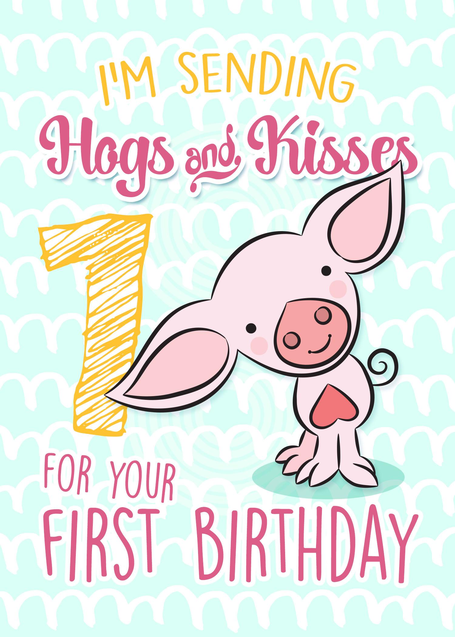
7. Lesson 6 Final Card in Photoshop: Hey there. Welcome back. So now that we're in Photoshopped, I'm gonna show you the compositing of this little guy. We're gonna work with layers. We're gonna use layer effects. We're gonna do all kinds of little things to make our card extra special. So we're gonna do that right here in photo shop. We're gonna use some of the custom brushes that we have that were created by Kyle Webster, one of my favorites, and we're just gonna create a really simple graphic background. Okay, let's get into it. Here's my complete little pig ready to go into photo shop. So I'm gonna flip over the four shop right now and let's get started. This is what my finished card looked like. I had put kind of an awkward background with a pattern. I created myself right here in photo shop, and so I used basically try added color scheme. So the tragic color scheme is one that uses colors that are evenly spaced around the color wheel to use that kind of color scheme successfully, it's got to be carefully balanced. The one color usually dominates, and the others are usually accent. My dominant color here is a kind of magenta color and the yellow and soft teal definitely are less dominant. Choosing a color scheme is really important when you're creating greeting cards and I try to keep my hell it fairly simple. If you want more information about color, there are tons of resource. Is you confined? I'd say the first place to look would be something like Pinterest, but like I said, there's tons of information out there. I liked this color scheme that I saw on the Internet, so that's what I decided to go with. So I'm going to go back there to photo shop and let's get started with that background. So my card is set up. Here it is five by seven inches, 300 pixels per inch, and this is basically what the background looked like in order to create that. I think I have figured out what I did in the first place. I'd be using two brushes by Kyle Webster, which are now built right into photo shop. The first, when I really light, was his large Breyer buying that now you can see the humongous selection of brushes by Kyle . I can remember back in the day when I actually had to buy these directly from Kyle. And now they're built right into photo shop. And here you can see I've got it in my tools. I'm not using latest version of photo shop Sisi. I'm one behind because the newer version I have some glitches with it. So before the latest version, they were kept here in the tools. And now, in the latest version, if you're up to the 2019 4 to show up, you'll find them in brushes. Makes no difference. They do exactly the same thing. So I love this Breyer boss that he's got. And like I said, color for the background that I chose was this pale teal and this Breyer basically just pays a nice line across the page. So you saw there that there were several Breyer airs, and each of them has kind of a different textural bit to it. If you look at it up close, you can see the textures, and I really like that. So it says, if you've used a rare for Lina Block and you're just painting on or rolling on the texture , that's basically what I did for that background. Super super simple. And I didn't have to buy the background. I've done it myself. The next thing I did was to use another brush of hiss. Yeah, it was a chisel. And enlarge it. Of course. I'm using the right and left brackets to enlarge or reduce the size of my brush. I'm going to do it for you in block here so you can see basically what I did is I went through and just drew a pattern. Based on this, you take a look at the one that I did I've got Not exactly the same. You can see that the roads are a little bit different. If you were to really check closely here and here, you'll see the pattern repeats. So I must have done five lines and then repeated that. But that's how I arrived at that background. Okay, so you can create your own backgrounds. It's really no problem at all. My next step is to import my little piggy. So I'm gonna go to place embedded I wanted embedded and I find my final piggy hit the place Command. And here Yes, no far size goes Yeah, I think I have a little tiny bit smaller hit my return key and he is placed now I'm just gonna leave the size of that. So we go back here to my Finnish car, you can see the different font. So that shows. Here, This one is called DK Lemon yellow sun. And this one is called lightning. And then this literally here for the word and is done with a font called Kibosh. So I'm gonna show you a couple quick things like our king the lettering and then adding the stroke on the outside, but a couple of effects to add to the lettering. And then we're gonna add some effects to a little piggy. And we're really close to being completely done. Our cards will go back to the card that I'm setting up. Now. I want to make this into an arc, swallow one, actually, make sure he's completely centered. So I'm selecting both of the layers here in the layers palette. He sure that that letter is centered and then I'm going to use this warping tool to a little bit of a narc on it. Now, that is way too much. So I'm going to bring it down a little bit. Let's do it somewhat like this. And I know I need to tighten up us facing between the lettering and probably make it smaller. Let's go back and take a look at the final one. Yes, so I'm going to use to transform to reduce the size of it. And then I'm going to adjust the koerting of lettering, select it'll and less bring it down to and thinking minus 30 or so like that. This is all judgments that you make as you're working on your card. What size is to make all the lettering, and I'm sure that once I typeset everything, I'm still gonna make adjustments. So that's my heading for now, and I'm going Teoh type the hogs and Kiss is selectable and want that I'm using. There is lightning, so it's called Lightning script date regular. That's a thought that I bought from Creative Market again. I'm adjusting size. I'm going to make sure that it's centered and we've got that one in this pink, so I'm going to sample that pink. I can see the easiest and fastest way to copy it over to the other document is to copy this hex to decimal number, but copy. And I'm gonna go back to my other documents select, All going here. He's that Hexi decimal number and say OK, now I know that this font here is actually high washed, washed regular, and I'm pretty sure it was a glitch. If that gave me this particular look off the lettering here toe access the cliffs. This icon here, if it's not showing, no wonder window to glimpse and you'll see almost any fawns. All the additional symbols will be in the cliffs and just selected the word and you have to double click on the cliff. And it'll pop right in reducing the current ing on the end there, increasing the current in here and basically have watch that word typeset. And one of the things I really liked about the lightning want I've used it extensively on my car designs is that it does have a lot of glitz for the different lettering, so a cliff would be visible here with a little kind of a pattern below the lettering. When you dio I light a letter, this little choice of glitz pops up so you can actually switch out some of the lettering if you want. I don't believe I it on this one's look like I did, but I have many times on many other want. So if I wanted to change, let's say this letter G. I would just be able to select it here now, in this case, I'm not going to, but that's how you would do it. Let's see if it's any cool SS do something like that might be cool. In some cases, I'm not going to do that. And this one, because that's not what I did. Actually, to enlarge the hated that lettering a little bit and something like Kern Ing is again a real judgment call on your part. I've done overall current ing of minus 30 but I'm also going in and changing some of the spacing between some of these other letters to either increase a little bit more or reduce it. I do. A lot of that kind of adjusting is to perfect it, so to speak. So that's pretty close to what we had there. And then, for your second birthday was all done in DK Lemon yellow, sun soul, all types at that Ikea lemon. It'll son I'm going to flush it left and see what I did there. I think I have chosen to separate type areas because this one is angled a little bit to match that number two. So I will do that. I'm gonna cut these apart. Control t angle it slightly separated. You just do this one for your first birthday. Looks like you could go a little bit bigger. Remember to make sure that those two are lined up here on the left edge. Then the last thought that I used for the numbers and I'm going to do a number one this time is one I believe is called a bit sketchy. And Marge had a little bit and I'm gonna angle it. Just a touch and color at the same yellow. Now this one has to go behind my piggy, actually put my picking away at the top in front of everything. And so we're getting pretty close to that design. If ever you want to grab a layer without having to go over here to your layers palette. Just hold down your command key and drag in the vicinity of the layer. You want to move and you can just move it independently, very useful to get faster. So I know when all of these I actually added a nice, thick white stroke to have it stand out against the background. So this is a perfect place for us to stop in the next lesson. What we're gonna do is take a look at layer styles and effects. I know you're about ready for a break because I know I am. So go and grab yourself a cup of tea or cup of coffee, and I'll see in the next lesson.
8. Lesson 7 Finishing Touches: hope you had a good little stretch, A good little break. So now we're gonna take a look at all of the little finishing touches that make this card look like part of the Siri's I originally designed. The first thing I want to do is show you how I got this pick outline on the lettering and talk to you a little bit about how the layer styles work here in photo shop. So the olden days you would have to actually physically make the stroke on the outside by selecting and adding a stroke under your edits menu. Now you could do it is part of these effects, and I mean, that's for the years that you've been able to do this. But there was a time that I can remember when that wasn't possible. I just love that you could do it here now, so it sticks with your lettering or sticks with whatever you're doing. And it's not a separate layer that you have to deal with. So here I've got the stroke and the stroke, I added. Or to see what I've done. Look on the stroke here. I've got it at 16 pixels and I've got it on the outside and I've got a pure white. I also have a drop shadow. And here we're all the studies for my drop shadow. Okay, so I've got it on a deep teal color at about 50%. Distance 21 spread 17 and size 16 pixels. So that gives that soft shadow behind the lettering to have it pop on the background. So we'll go to our card and let's try this. Hogs and kisses were going Teoh, add the effect by clicking down here at the bottom of the layers palette, and we're gonna go to it. Doesn't matter which one. Honestly, it'll open up this whole palette and then you can make your changes. So right now this will show the most recent settings that I have used already coming up. It's 16 pixels on the outside and the color here. Wait. And then the drop shadow. So you can see that all the settings I had in the other document remained here, which is pretty cool. So we've got all of that set up ready to go when you can see that it has added it up here on my hogs and kisses. I'm gonna say OK, And then the cool thing is I can actually drag this effect to another one of the layers. So without having to do any work, I am adding it to all of these other layers. Now we may end up going in and making adjustments. But at least for the most part, my work is done. So all of my lettering has it now, in my opinion, I wouldn't want that drop shadow on this lettering. Necessarily. Let's go back at probably. You see, I didn't put it on that lettering at all, so we can go back to the document. And I could actually just either hide or drag that for the trash on each layers that I don't want it on. I'm gonna drag it off that it cozies up so they don't take up so much space. And I think there's one more appear. And so now you can see I've got that thick white order in the drop shadow where I want it on all of my lettering, and it's going to move with the lettering. Okay, so you don't close to my original. Hey, I'm thinking that drop shadow would look really good on my piggy. I'm going to drag it from his hogs and kisses lettering and put it right up to my final piggy. And now he's got a drop shadow. Now that looks a little bit too harsh or too dark. So I am going to double click on it. I'm gonna go to this drop shadow, and I'm going to tone it down a little bit. I could move it around here, just dragging. You see, It's changing it on the lettering as well. I could change the angle here. So wherever this little Linus pointing is where the light source would be so you could see that the light would be coming from the upper left hand corner and casting a shadow on the lower right hand side. Gonna click OK there. And I've got my drop shadow on my little piggy. And the very last thing I want to do is to add this little format that he's standing on. Just gonna do that on another layer to tidy up my document. I'm going to put all of the type players into a group folder, call it tight, and then I'm going to make a new layer. And on that layer I'm going to draw on the lips oval on As long as I have one of these selection tool selected, I can move my oval anywhere that I want and I'm going to feel my oval Now if you look back here on it a little bit transparent, so do that now. Reduce the transparency to kind of like that. About 37%. And I'm pretty much done pretty much done that part any waste. Last thing I want to do is go back to my type player Number one. He's the one to select everything on the outside of this letter and selecting verse. It'll new layer below it and fill it with white so that behind this letter is white and you can see here there's just a little section that didn't feel I could do that with my last you tool. Feel it with white as well. So now that lettering is done, and then the very last thing. I don't know if you could see here that there are some concentric circles in the middle here, white concentric circles, those we're going to make an illustrator. So we're gonna pop over to illustrator again. What I did here to create those is I created just a single circle start out with with a very thick outline. Perfect circle. Okay, then I went under object path and offset path. I've already set the amount that I wanted to off Satch. Click. Ok, and I've drawn a second circle there. It would be great to have a keyboard shortcut so I could just do that now, in order to repeat my circles So offset path has no keyboard shortcut to set that I wonder . Edit keyboard shortcuts go to many commands, go to object. Down to path. There. I would find my offset path shortcut. I'm gonna put in there is one that I know I never use command auction T It tells me here it's gonna cancel it. I don't eat it. So I'm just gonna say yes. And now I know that if I do command option T, I'll get that offset path and I could just hit return, so I'm just doing command option tea and return command option T return command option T return. And I've created a very quick concentric circles, so I'm gonna save that outta here is concentric circles. When I go into Photoshopped, back to my place embedded. Import them, look okay and position it Now. Here it is, as a place to object. What I want to do is Rast. Arise it because it is still a vector. So I've right clicked on concentric circles onto Rast Arise layer. And now, when I want to colorize, it can just hit the you and saturation, which is a man shift. You color it anyway, that I want by adjusting the sliders here it okay, and let's try the lighten blending mode so that or screen might work. Yes, screen alike screen. And then this is something I just had, actually, below all my type and just above the pattern. I know it's really subtle, but it actually really added to the finish. Card Printed sample is always good for making your final checks to see how all of your adjustments have worked out. So it's just a little out of touch that I put in. It's all a matter of judgment at this point. It's your artistic judgment that you use to create this final layout and think about my finished guard s so what I want to do in the next lesson is show you how to create the mock up. That's gonna be our final lesson. And in order for this card to be used to the mock up, I want to save it as a J peg. So it's all in one layer. I'm going to choose J Pig, and I'm going to call it finished Iggy for mock up course. Normally I do everything with a numbering system, but for the purposes of this class, this will work just fine. Save. And we're done this lesson. So now we're gonna go right into our last lesson. We're gonna work on our mock up. I'll see you there.
9. Lesson 8 The Mockup: Okay, guys were done. We have composited the front of this card. I'm really excited. Our final step in this process is to create a gorgeous mock up to help you sell your card. There's nothing that sells card better than seeing it placed on an actual card. And we're gonna do this using this mock up. So I created this mock up and I am attached. It here is a project file for you Here. You see the front of one of my other cards in the Siri's. That idea and this guy basically was created exact the same way as we just did our pig. I have incorporated a couple of other techniques, like using a Grady int on his tummy and then adding some darker shadow areas around the edges, which I believe I painted in with Photoshopped brushes a slightly more detailed background . But these are all things that are now within your reach with what I've talked to you in the first part of this course. So the way this mock up works is that this artwork is a smart object, and you could see it here in the layers palette. And that's smart object if you were to double click on it, we'll take you to the layout with that artwork on it. So what I'm gonna do is I'm going to paste in the layer that I created from this card. I'm gonna select all copy on. We're gonna go to the smart object and we're going to paste it. Now until we flatten this and put this card on the background layer, it won't show up in our mock up document. It's still showing up as the fox. Check this out as soon as I flatten it and I'm using command e the shortcut on my keyboard . Or you can go to flatten image here on the side. And now that it's flattened, I hit. Save well back to my document. Uh, now my card is there. Now, this card has been set up completely for you already. Got the drop shadows. It's already Gotsche. The details showing that the envelope is open. All of that is there for you. All you need to do is double click on this card front and it will take you to the document where you can paste your card. Now if you want to change the color of the envelope you could on the envelope layer is hue and saturation. Word shortcut for that is command auction you and you could drag the hue slider until you get to a color that works for whatever your design is. You could mess around with saturation, lightness and darkness, and the other thing you could do is you could go into levels just man auction L. And there you could increase the darkness of the highlights. And shadows still can have a little bit of control here, and you can change things in the layout. You can use hue and saturation to basically change the color of anything on here. So if I want to change the pencil, go to color pencil layer and the same thing hue and saturation, and I would be able to change the color of the pencil so you can see I can change the color to anything I watch. You want to learn a little bit more about mock ups and how to automate putting this image on. I have a class that I teach called the Secrets of Automation, and in that class I could show you how to process an entire folder of five by seven artworks to create a separate mockup for each of your artworks. I did this for my Shopify store and created probably 1000 mockups in just a few minutes. If you don't like this mock up, there are tons available. I just was checking out creative markets, and I typed in greeting card mock up, and all of these came up. I have it on 2 to $3. You could change this Teoh 2 to $20 depending on how much you want to span. And there are literally hundreds of different designs here available, and they're really, reasonably priced, so most of them would have a smart object. I would definitely check that. Make sure that they have that smart object for you so that you can replace the artwork very easily. Let's just check this one out here, and this one doesn't say, but there are plenty of them that do have the smart object if I type that in. So this one here for $14 does have a smart object that you can replace, so sometimes that's worth your while. But there are some really nice mock ups here depends on the shape of your card as well, so you can check them all out and decide what works best for you. So back to our mock up, that pretty much wraps up my class. I sure hope you've enjoyed taking this class with me. I have really enjoyed sharing this information. And honestly, any artist should be selling their art on cards. It's a very quick and easy way to make some money. Check out my other class on the greeting card industry where I show you at least five different methods for making money with your cards. I hope to see you there. Check out my next segment here where I'm gonna talk to you about a little project that you're going to create. See in a minute.
 Delores Naskrent, Creative Explorer