Transcription
1. Introduction à créer des pinceaux de procreate simples pour des compositions rapides: Hé les gars et bienvenue. Je m'appelle Nascar de Dillard et je viens vous voir de Sunny, Manitoba, Canada. J' ai dépensé une aide étrangère glorieuse aujourd'hui à planter un tas de crédit que Wilson m'avait donné par mes voisins. Quelle communauté d'accord. Et regarde par ma fenêtre, tu verrais qu'il y a de l'herbe verte qui pousse. Ça bat définitivement le tas de saleté qui était la chevelure elle il y a quelques semaines. La saleté et les rochers, croyez-moi, j'ai ramassé ses rochers que je veux encore ramasser. Donc, avec tout son temps que je passe dehors, j'ai un peu pris du retard. Mon travail achète un retard, mais j'ai vraiment l'impression que je dois avoir, je suppose que ce que vous appelleriez des stratégies
d'efficacité pour obtenir la quantité de travail que je dois faire. J' ai été super excité plus tôt cette semaine de savoir à une grande entreprise va peut-être produire certaines de mes œuvres d'art sur des mois qu'ils vendent dans les boutiques de cadeaux, lire partout au Canada et aux États-Unis et peut-être vous ailleurs. Je ne sais même pas. Nous en sommes actuellement au stade du développement où ils vont créer des prototypes. Je suis juste en train de décider une offre à développer. Et ce sera pour qu'ils puissent faire des prototypes et les tester sur le marché. Donc je suis super excité à propos de ça. Et bien sûr, ce sont des fleurs. Donc j'ai, vous savez, j'ai travaillé sur des fleurs. Je pense que j'en ai parlé un peu dans une autre classe, mais j'ai vraiment trouvé que parce que j'utilise tellement Procreate pour les développer, que je voulais vraiment créer un tas de pinceaux avec fleurs que je pourrais utiliser aussi bien dans le œuvres d'art ou comme charges, peu importe ce que je travaille sur un tas. Alors j'ai pensé que c' un excellent processus que je partage avec vous. Donc j'insiste sur cette petite classe pour vous montrer ce que je fais et comment je vais le faire. Donc, je dessine à la main tous les motifs et
puis crée des pinceaux par-dessus eux parce que ce sont des pinceaux de timbre. Il y a très peu de paramètres que nous devons nous inquiéter dans le studio de brosse. Donc ce sera une chose amusante à traverser. Et je vais vous montrer comment vous pouvez utiliser ces bords, ces pinceaux de timbres d'
avion ou les pinceaux de dispersion. Donc, si vous êtes familier avec les pinceaux éparpillés d'Illustrator, vous pouvez obtenir le même effet ici dans le studio de brosse. Donc je vais vous montrer tout ça dans cette classe. Une des choses que j'ai vraiment hâte de vous montrer, c'est comment j'utilise ces timbres. J' ai un tas de petits projets vraiment soignés et je vais vous montrer chacun d' eux individuellement afin que vous ayez une idée de ce que vous pouvez faire avec ces pinceaux. Êtes-vous prêt à commencer ? Très bien, allons y entrer. Je te verrai dans la leçon 1.
2. Présentation et promenade rapide: Salut les gars, bienvenue à la première leçon. Donc, une des choses que je n'ai pas mentionné dans cette introduction est que lorsque vous créez des ensembles de pinceaux comme celui-ci, vous pouvez aussi le faire pour les offrir à la vente afin que vous puissiez créer des ensembles de pinceaux de scout complets. Et j'en ai vu des tonnes. J' ai acheté beaucoup. C' est une des choses que je viens d'oublier de mentionner au début. Dans cette leçon, je vais vous montrer un aperçu de la production de l'un des timbres. Donc je vais juste vous montrer pas à pas là-dessus. Ensuite, nous allons examiner tous les paramètres et décider de la stratégie que nous allons utiliser pour créer un tas d'entre eux. D' accord. Ok, commençons. Donc, comme je l'ai mentionné dans l'introduction, l'
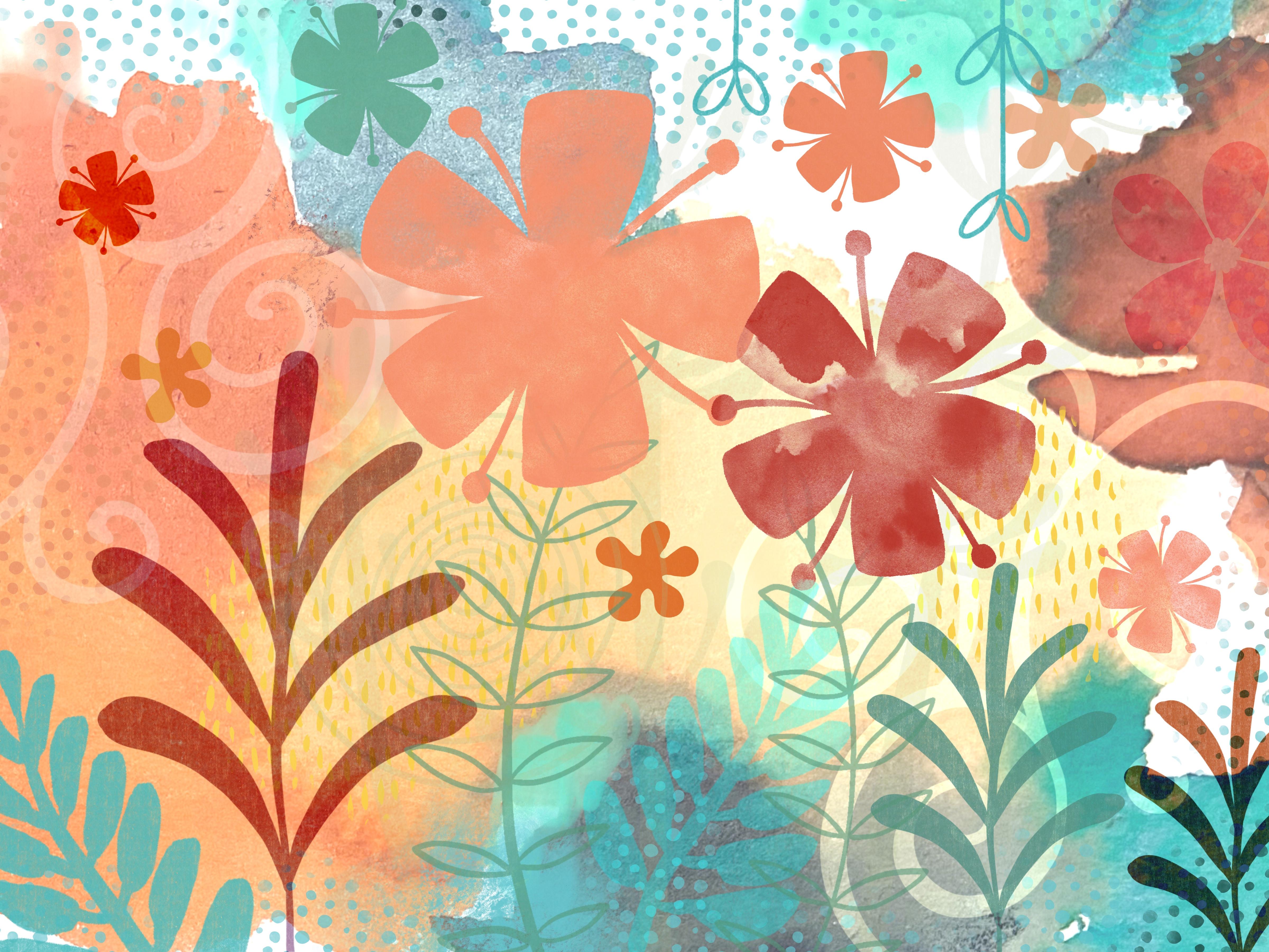
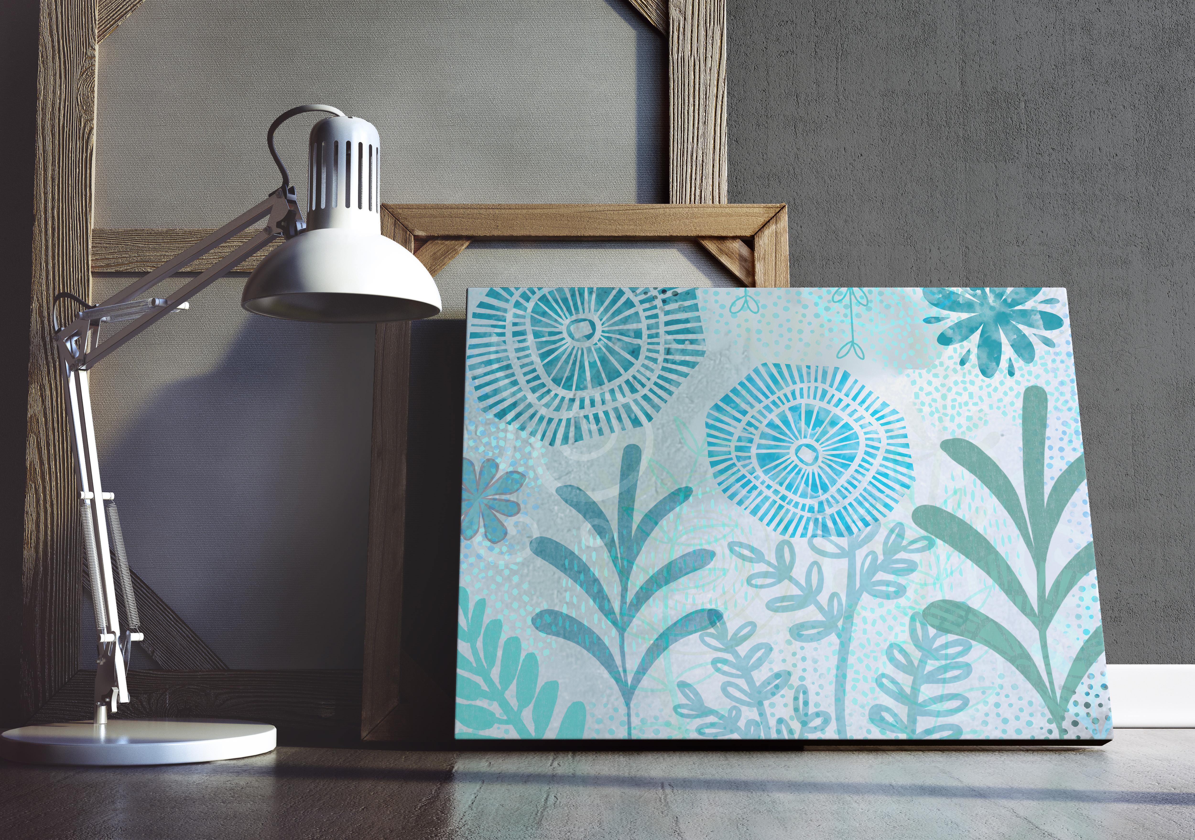
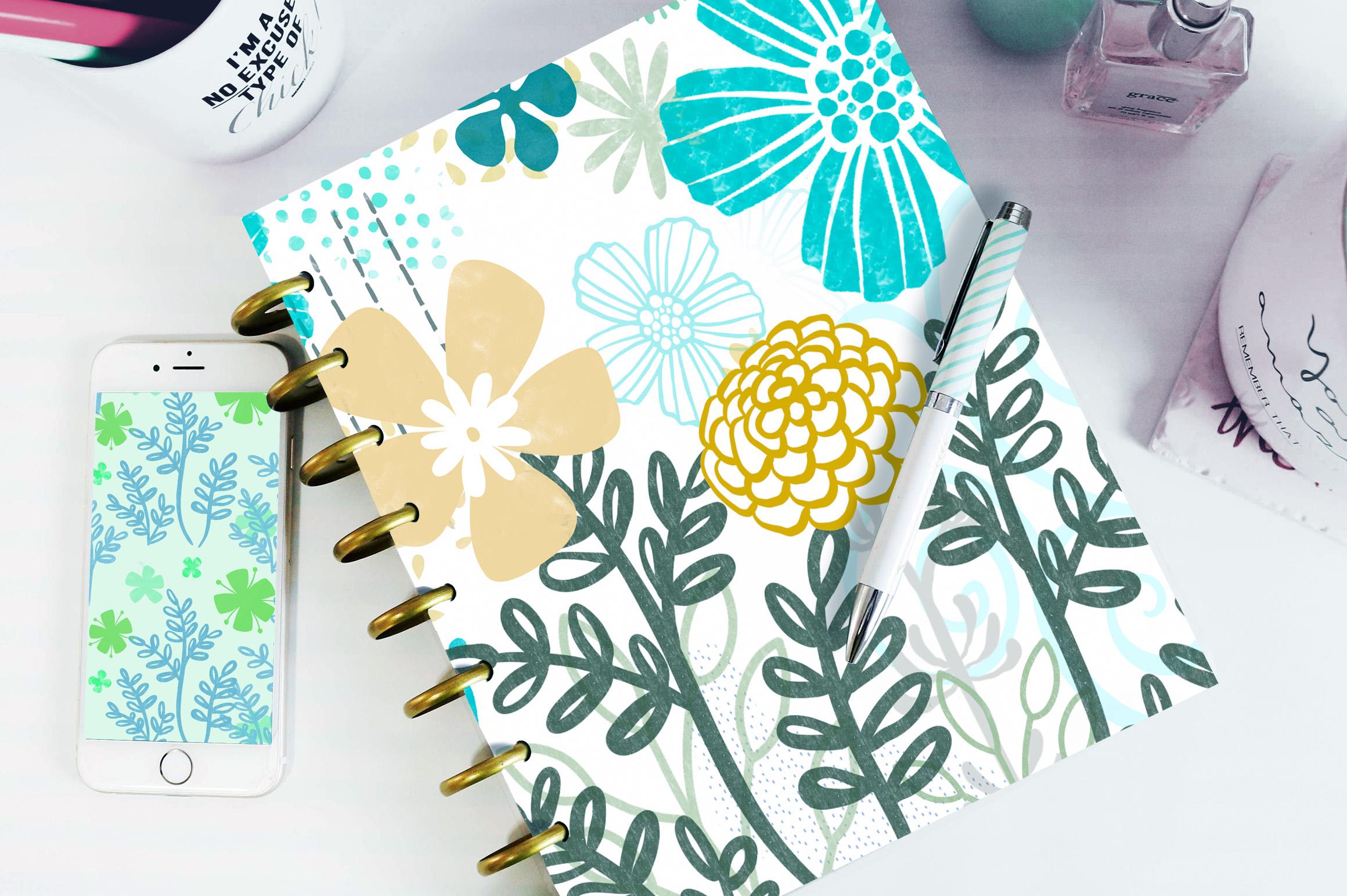
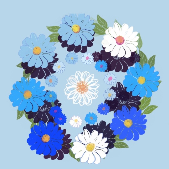
une des raisons pour lesquelles j'ai décidé que j'allais créer un tas de nouveaux pinceaux pour moi-même, était que je devais trouver un moyen de créer un tas de dispositions florales et de motifs comme le plus rapidement possible. Donc, et je voulais que ce soit original pour moi. Je ne voulais donc pas acheter de pinceaux pour créer ces œuvres. J' ai commencé par créer des fleurs très simples et ensuite je suis devenu un peu accro. Et vous pouvez voir ici que j'en ai créé une tonne de différentes, ainsi qu'un tas de textures et puis juste un tas d'utilisation générale. La Russie, j'ai tout ici, des aquarelles aux pastels, toutes sortes de mélangeurs différents, monocot, courge. Et je pense que si vous avez pris le cours de coupe de la gamme, je vous ai donné un échantillonneur dans mes pinceaux et je vais vous donner un échantillonneur aujourd'hui aussi. Donc, je vais vous donner quelques pinceaux de chaque catégorie juste pour que vous puissiez les regarder bien et peut-être même les utiliser comme point de départ pour vos pinceaux que vous allez créer. Donc, vous pouvez voir qu'avec cette variété de fleurs, il est assez facile pour moi de créer des mises en page intéressantes. Et j'ai un tas de choses différentes configurées avec celles-ci pour que je puisse les créer à différentes tailles. Je peux les utiliser comme timbres. Je peux les utiliser comme un pinceau de dispersion. Et je vais vraiment vous guider dans la création de toutes ces choses différentes. Maintenant, chacun de mes pinceaux individuels eux-mêmes, si vous allez dans l'un de ces pinceaux, vous verrez que j'ai un vert avec la plupart d'entre eux. Je ne l'ai pas fait avec tous. Je voulais une variété. Donc, dans certains cas, j'aurais eu deux versions de la même brosse. Par exemple, celui-ci ici, et c'est, le premier a le vert, et le second ici n'a pas de grain. Il y a donc des applications différentes pour ces choses. Donc, si je devais te montrer et celle-là, choisissons une nouvelle couleur. Vous pouvez voir que le vert est dans celui-là. Et si j'utilise celui-ci, allons-y un peu plus petit. Vous pouvez voir qu'il n'y a pas encore de grain. Eh bien, je vais passer par la création d'un tas de pinceaux. Nous allons essayer quelques choses différentes jusqu'à la création elle-même. Et ensuite, nous allons passer en revue et parler des compositions et de certaines des choses que nous pouvons faire pour rencontrer ces compétitions. Plus intéressant, je vais vous montrer mes documents maîtres que j'ai mis en place pour créer les différentes fleurs. J' en ai un qui est un fichier très haute résolution qui
permettra de créer des pinceaux en l'utilisant. Et puis j'en ai un pour les petits pinceaux. Et donc c'est un peu moins de résolution. Et je vais vous emmener à travers la création de tous ces différents pinceaux que je vous ai montrés. Et oui, peut-être même vous montrer ce pinceau ici, qui est la base de tous mes pinceaux pastel. Et c'était une capture que j'ai faite avec Adobe Capture de motif qui se trouve sur un de mes oreillers dans mon salon. Et il a fait un pastel doux absolument magnifique, vraiment agréable et mélangé. J'aime vraiment ça. C' est un de mes favoris. Donc je vais vous montrer tout ça. Et puis l'autre chose dont je veux vous parler, Creative Market ou chewing-gum road, n'importe quel endroit où vous voyez vendre des pinceaux, je pense que Design Cuts, fascia tellement, je ne peux même pas commencer à les nommer tous. Et oui, alors vous pouvez faire un peu de revenus à partir de ces pinceaux que vous créez, plus d'être capable de produire une mise en page et des motifs très rapides. Alors nous allons nous retrouver dans la prochaine leçon où nous allons
passer par la construction très basique de l'un des pinceaux. D' accord. Je te verrai là-bas.
3. Création de pinceaux étape par étape: Salut les gars, bienvenue à la leçon 2. Donc, cela va être inpublié lente étape par étape. Donc, je peux vous montrer chacun des différents paramètres dont nous allons avoir besoin. Commençons. Donc, pour cette leçon, ce que je veux faire est de vous emmener dans la production réelle d'un des pinceaux. Alors créons quelque chose de complètement nouveau et ce sera quelque chose que je peux ajouter à mes pinceaux. Et je vais utiliser une de mes plus grandes configurations de documents ici. Donc j'en ai un, comme vous pouvez le voir à 1800, j'en ai un à 3000 par 3000, j'en ai un à 600 par 600. Et je trouve que les meilleurs pinceaux qui me donnent les tailles dont j'ai besoin pour la plupart sont sur ce document ici, qui est le 3000 par 3000, donc c'est 10 par 10. Vous pouvez, si vous avez déjà une toile et
que vous voulez savoir quelle taille il va.
4. Paramètres pertinents au studio de pinceaux: Salut les gars, bienvenue à la leçon 3. Dans la leçon 3, nous allons juste passer en revue les paramètres pertinents dans le studio de brosse. Commençons. Je vous ai expliqué un peu la stratégie que j'avais pour créer un pinceau et ensuite utiliser ce pinceau pour tous les autres pinceaux de cet ensemble. Maintenant, cela ne fonctionne pas nécessairement si vous essayez de produire un tas de différents types de pinceaux. Mais pour cette classe particulière et pour le genre de pinceaux que nous allons produire, ça marchera très bien. Donc, je vais vous guider à travers les propriétés pertinentes ici que j'ai utilisées pour créer ces pinceaux. Il y a un couple que je ne couvrirai pas dans ce cours. Nous n'utilisons pas du tout de conique dans cette classe. Pour ces types de pinceaux, je n'utiliserai pas de rendu autre que pour définir le type de mélange qui se produirait. Le mélange humide est quelque chose que je n'aurai pas besoin de changer la dynamique des couleurs. J' y parle peut-être,
mais ce n'est pas nécessaire pour ce que nous essayons de faire. On va faire un peu avec la dynamique ici. On va toucher le crayon Apple. Les propriétés sont l'une des plus importantes que nous allons couvrir. Ensuite, nous allons parler un peu de la façon d'identifier votre pinceau pour montrer que vous êtes le fabricant de ce pinceau. Cela pourrait donc être important si vous envisagez de vendre vos ensembles de pinceaux, par exemple. Vraiment les plus importants avec lesquels nous avons affaire, notre forme, propriétés de
pluie, et un peu sur la dynamique, un peu à la fin pour étiqueter notre pinceau. Laissez-moi vous expliquer ce que je fais quand je crée le pinceau. Donc je t'ai montré créer un de ces tourbillons. Et en fait, je vais passer ce soir quand je regarde la télé et renomme tous mes pinceaux ici, je ne donne pas un très bon exemple, n'est-ce pas ? Je vais certainement nommer tout ce qui va dans n'importe quel ensemble que je vends ou donne. Je ne l'ai pas encore fait avec cet ensemble de fleurs. Je l'ai fait avec les textures que je crois avoir traversées et nommées toutes, et je ne l'ai pas fait. Mais vous pouvez voir, au fait que je les ai ici, c'est qu'ils ont tous à peu près le même nom avec juste un numéro différent à la fin. Et c'est parce
que j'ai utilisé ce même maître pour presque tous ceux de ce Sache. Donc, ouais, passons en revue chacun des paramètres pour le pinceau et nous allons revenir à la même brosse là-bas. Et je vais vous parler un peu de la façon de travailler avec ça et comment tester votre brosse au fur et à mesure que vous le fabriquez. Donc, voici où nous pouvons tester notre pinceau lorsque nous avons changé les paramètres. Ce tapis de dessin, vous pouvez effacer à tout moment vous pouvez travailler en couleur si vous trouvez que un peu plus facile à identifier ce qui se passe avec les différents paramètres. Commençons ici en haut avec la trajectoire de course. Maintenant celui-ci est important dans un sens, et je suppose que j'aurais dû dire que ce serait l'un de ceux que nous couvrirons. C' est quelque chose que je vais assez souvent avec un pinceau que je l'utilise. Parce que pendant que je l'utilise, je comprends que, vous savez, j'ai peut-être besoin d'ajuster l'espacement, peut-être besoin de l'avoir plus rationalisé avec ce genre de pinceaux. Cela ne s'applique pas tellement parce que je ne crée pas, disons comme une ligne que j'ai besoin vraiment lisse pour lettrage bien que généralement jusqu'à garder ce assez bas, la gigue parle ici de la façon dont le seul timbre se rapporte à ce central ligne. Laisse-moi éclaircir ça une seconde. C' est à ça que ça ressemble. Si je n'ai pas de gigue et si j'ajoute de la gigue, vous pouvez voir que cela se déplace autour de chacun des timbres loin de cette colonne vertébrale centrale, ce serait passer par elle. Donc, si vous êtes familier avec Illustrator, ces types de pinceaux ressemblent assez à un pinceau dispersé que vous créeriez. Vous seriez en mesure de contrôler la gigue ou la façon dont elle se déplace en fonction de cette colonne vertébrale centrale, si cela a du sens. Donc, comme je l'ai dit, nous pouvons revenir à cela car nous utilisons les pinceaux qui font notre composition à la fin. Donc maintenant, je vais juste sauter en forme. Et c'est celui qui est probablement le plus important à ce stade. Effacons à nouveau ce tapis de dessin. Dessinons juste un coup pour que vous puissiez regarder ce qui se passe ici aussi. Ou vous pensez qu'il gigue et disperser mélangé à ce que scatter fait par opposition à la gigue, est qu'il déplace le timbre individuel au hasard lui-même. Donc, chaque individu est en fait il
tourne juste tampon de pinceau de sorte que vous pouvez voir ce qui se passe là-bas. Et c'est vraiment bien parce que vous l'utilisez comme un pinceau de dispersion ou que vous l'estampiller à plus d'un endroit dans votre composition. Donc si je devais tamponner ici et que je veux le tamponner ici, ils ne sont pas exactement les mêmes positions. Donc, c'est ce que j'aime à ce sujet, c' est qu'il fait ressembler à un pinceau différent, même s'il est basé sur le même timbre. Maintenant, à la rotation, je vais effacer le pavé de dessin et faire une autre ligne. La rotation ici, vous pouvez voir fait une chose similaire. Maintenant, avec ce coup de suivi, quand vous allez jusqu'aux extrémités, vous arrivez à suivre un AVC. Et ce que ça fait, c'est. Vous pouvez voir que la rotation de chacun de ces individus, disons qu'un gros gros là-bas. Vous pouvez voir qu'il tourne dans chaque position différente mais suit le trait. Maintenant, je ne suis pas en train de jouer avec toutes ces autres choses ici. C' est quelque chose avec lequel vous pourriez faire une expérience, mais avec les timbres que j'ai fait pour cette classe particulière, nous ne sommes tout simplement pas inquiets à ce sujet. Donc, en général, je voudrais juste garder cela à 0 et c'est
ce que c'est pour à peu près tous les pinceaux dans cet ensemble. Le grain est une zone où vous pouvez choisir de
mettre une sorte de texture dans chacune de ces fleurs individuelles. Dans ce cas, je l'ai laissé complètement plan. Je vais dupliquer ça parce que je veux t'en montrer un avec le retour à ce bleu. Je vais vous montrer qu'il y a une texture. Donc, pour ajouter de la texture, j'ai appuyé sur Modifier ici. Et pour rendre cela vraiment facile, allez dans votre bibliothèque source et choisissez simplement l'une des bibliothèques préexistantes. Donc il y a un tas de vraiment super à choisir. Allons à quelque chose de genre de candidature juste pour que j'espère que c'est assez évident. Encore une fois, tu as fini et je ne sais pas si tu peux le voir là-bas. Essayons ici. Je pense que son ampleur est un peu trop petite. Donc, si nous ajustons l'échelle ici, vous pouvez maintenant voir une bonne texture dans cette fleur. Donc c'est un autre pour vous d'expérimenter. Je vais le laisser au même endroit pour cette partie de la leçon. Je n'ai fait aucun ajustement à l'un de ces autres paramètres ici dans la partie verte du studio de brosse. Ok, donc on va juste laisser ça pour cette fleur en particulier. Ensuite, sur le rendu, je l'ai comme un mélange intense, vous pouvez vérifier tous ces différents paramètres. Ils vont tous vous donner différentes sortes d'effets. Et souvent, ce n'est pas vraiment évident ce qu'ils sont ici. Je vais les parcourir, mais vous pouvez voir qu'il n'y a pas de changement avec les autres paramètres que nous avons avec notre brosse. Donc, c'est encore une autre que vous pourriez juste laisser comme le mélange humide. Je ne vais pas faire de changements ici. Je joindrai des informations sur chacun de ces différents paramètres et sur la façon d'y apporter des ajustements. Mais dans cette classe, n'est tout simplement pas quelque chose que je veux aller en profondeur et couvrir notre dynamique de code. C' est celui que j'ai, ont changé sur certains des pinceaux que j'ai traversés et changé, exemple, la gigue de la couleur du timbre. Donc, si vous deviez changer ça en, disons trois, signifions que vous pourriez passer à travers et expérimenter avec tout ça. Ce ne sera pas super évident à moins que vous ne fassiez vraiment dans les pourcentages les plus élevés ici. Mais c'est parfois amusant d'avoir un peu de variation. Donc, vous pouvez simplement utiliser ces petits curseurs ou vous pouvez même passer par et simplement écrire dans vos chiffres. Ou si tu écris le numéro deux ici, ça va le changer. Et vous pouvez expérimenter et voir, j'ai mis ces très bas, donc il y a un léger changement dans la teinte. Donc, vous pouvez voir que c'est légèrement différent. Personnellement, je préfère faire ce genre d'ajustement car j'utilise les pinceaux. Dynamics est quelque chose que je vais également expliquer un peu plus que nous entrons dans la classe un peu plus. Pour la plupart des pièces, vous pouvez les laisser et vraiment la vitesse ne doit
pas nécessairement être important si vous voulez juste quelques très bonnes brosses de timbre droites. Et vous pouvez voir que quand j'utilise le côté de mon crayon, j'
ai des versions logicielles du pinceau. Si je frappe directement vers le bas ou dessine avec mon pinceau parfaitement vertical, c'est à ce moment que j'ai le plein impact de tous mes autres réglages. Donc pour l'instant je vais juste laisser ça comme le sien aussi. Cela va être beaucoup plus évident une fois que nous allons utiliser ces pinceaux, chacun de ces paramètres fera l'affaire et comment nous pouvons les affecter si nous voulons changer les choses d'une certaine façon. Donc, encore une fois, je vais joindre quelques informations supplémentaires pour cela, mais pour les besoins de notre classe, nous n'avons vraiment pas besoin de nous en soucier trop. Maintenant, les propriétés sont une que je vais dans un peu et faire des ajustements pendant que je travaille. Disons que j'avais ceci comme taille maximale pour mon pinceau. Quand je vais l'utiliser dans le document, je peux trouver que c'est trop petit et donc je vais venir ici très rapidement et juste faire un ajustement rapide sur cela pour m'assurer que je peux obtenir une fleur beaucoup plus grande si j'en ai besoin. Très bien, donc encore une fois, la plupart de ces choses deviendront claires quand nous utilisons réellement les pinceaux pour créer des mises en page. Je pense donc qu'il sera beaucoup plus efficace pour nous d'aller de l'avant et de commencer un document et d'essayer ces choses ? Oui, comme ces pinceaux. Je te donne quelques brosses ici. Il sera situé dans les sections des projets afin que vous puissiez télécharger et vous pouvez simplement travailler avec ceux que je vous donne si vous voulez, car vous êtes juste un peu de départ. D' accord ? Ok, donc je te verrai dans la prochaine leçon.
5. Idées de projets avec des tampons à pinceaux: Salut les gars, bienvenue à la leçon 4. Moins de 4 ici, je veux vous montrer quelques-unes
des différentes applications qui utilisent ces brosses pour. Commençons. Je pensais vraiment que ça aiderait si je devais vous montrer
quelques-unes des choses que j'ai faites avec ces pinceaux que j'ai créés. J' ai donc quelques compositions que je testais juste l'utilisation des pinceaux pour obtenir les réglages corrects. Donc c'était l'un d'eux. En voici un autre. Et sur ce document, je crois que j'en ai deux. Alors je vais éteindre ces deux-là et te montrer celui-ci. Je veux dire, c'était juste rapide. Je testais juste les pinceaux et nous allons en parler un peu plus. Donc, juge, et puis oui,
c' était le deuxième. J' ai fait un tas de pinceaux supplémentaires hier soir. J' ai donc décidé de faire un peu d'expérimentation, en ajoutant quelques arrière-plans ici. Mais je voulais vous en montrer d'autres, comme des idées vraiment dehors. Je suis donc passé en revue chacune de mes catégories et j'ai juste un peu attrapé une des œuvres d'art de là et j'ai juste ajouté quelques pinceaux à un fond existant. Donc, cela juste pour vous montrer comment les pinceaux peuvent être polyvalents. Et une chose que j'aimais vraiment. C' était donc un contexte que j'avais déjà créé ici à d'autres fins. Je pense que j'ai sur ce document une tonne de textures et d'arrière-plans
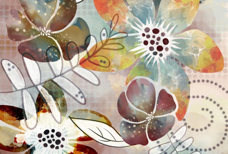
différents que je peux utiliser pour les composites. J' ai parlé de créer ces composites dans d'autres classes. Donc, ce serait un document que j'apporterais dans Photoshop et peut-être faire quelques combinaisons. Ma dernière classe faisait ce genre d'arrière-plans d'aquarelle. Et j'avais expérimenté ces milieux en collaboration avec les abeilles. Il se trouve que c'était un qui était dans ma galerie, un peu complet. Alors je viens de l'ouvrir et vous pouvez voir que l'ajout ces pinceaux a créé une œuvre d'art vraiment unique et belle. J' ai particulièrement aimé la façon dont ces textures fonctionnent et vraiment lié à la conception globale. C' était donc une de mes catégories, une autre catégorie que j'ai, et j'ai l'intention de faire un cours sur ce genre de portrait. Donc créer ce qui ressemble à un vecteur, une sorte d'illustration stylisée. J' adore Procreate. Et ici, je viens d'utiliser certains des pinceaux pour ajouter quelques détails. Donc, en arrière-plan. Il y a donc une très grande utilisation des pinceaux et quelque chose que je peux faire encore et encore. Donc c'était l'un d'eux. Je me suis vraiment intéressé quand je faisais ça hier soir. Donc en voici un autre où j'ai incorporé un tas de
pinceaux plus récents que j'ai créés et certains des actifs d'achat que j'ai qui sont similaires, expérimenter avec les actifs de quelqu'un d'autre comme
celui-ci est un bon moyen pour vous d'avoir des idées sur le genre de pinceaux que vous pourriez vouloir créer pour cela m'a donné très
bonnes idées en ce qui concerne le genre de pinceaux que je vais créer à l'avenir. Et c'est donc juste un tas d'expériences utilisant les pinceaux existants. Donc, ceci est juste pour vous illustrer à quel point la création de votre ensemble de pinceaux comme celui-ci pourrait être précieuse. Voici un autre fond d'aquarelle. Celle-ci que je n'ai pas composté avec autre chose. Extra sage, je viens d'ajouter des couches avec les différents pinceaux. Une des choses que j'ai remarquées était que je devais faire des ajustements aux tailles
de pinceau parce que ce document avec lequel je travaille est 24 sur 16, donc il est beaucoup plus grand que celui que j'utilisais dans la dernière leçon. Je pense que j'utilisais un document 10 par 10. Donc, parce que c'était un Lion 24 sur 16, j'ai dû entrer et quels pinceaux utiliser ici. J' ai dû y aller et faire des ajustements. J' ai fait de cela la taille maximale que je pouvais basée sur le timbre original. Donc, quand je reviendrai à un document 10 sur 10, ça peut sembler un peu trop grand, alors nous allons, je vais vous parler un peu plus d'ajustement de ce genre de choses. Sommes-nous aussi je voulais souligner que j'ai
traversé et nommé tous mes pinceaux ici. Enfin. Ils ont tous un nom qui, je pense, est peut-être un peu plus pertinent. Et ça va être quelque chose de nécessaire pour moi si j'ai l'intention de vendre ça. Triste. Donc oui, j'ai continué mes explorations ici. Voici juste un document que j'avais déjà existé. Et j'ai traversé et vous pouvez voir ici que j'ai ajouté quelques timbres, donc ce sont ceux qui ont ajouté à partir de cet ensemble que j'avais créé. Ok, donc ces cinq couches, et ça améliore vraiment la mise en page. Alors avant, c'est comme ça que ça avait l'air. Et puis, comme j'ai ajouté chacun des différents timbres, vous pouvez voir à quel point cette mise en page est améliorée. Maintenant, celui-ci est quelque chose que je suis absolument sûr d'explorer. J' ai juste pris une de mes peintures à l'aquarelle en arrière-plan. Donc il y a une couche ici avec la peinture. Ensuite, j'ai ajouté celui de ces arrière-plans que j'avais créé dans ma classe d'aquarelles intenses, qui était le dernier que j'ai publié avant celui-ci, j'utilise les modes de fusion pour que ces deux couches fonctionnent vraiment ensemble. Et puis vous pouvez voir ici que j'ai ajouté tous ces différents pinceaux et j'ai vraiment expérimenté ici avec les modes de mélange de ces pinceaux. Donc, ce calque que j'ai créé est maintenant Color Burn. C' est à quoi cela ressemblerait normalement. Et puis cela utilise Color Burn. J' ai traversé et ajouté un tas de motifs supplémentaires ici. Ces deux-là, celui-ci et celui-ci sont exactement la même brosse. Juste un d'entre eux a une texture vraiment agréable ajoutée. Donc, si j'essayais de vraiment intégrer celui-ci dans un look aquarelle, mais je pourrais aussi faire est d'entrer et d'utiliser Liquify qu'un cristal assez petit. Et puis je faisais le tour et je peignais un peu les bords pour qu'il ressemble à une texture de bord beaucoup plus rugueuse afin qu'il n'ait pas l'air si pointu et si dur. Maintenant ce timbre est celui que j'ai créé avec ce document moyen de taille plus petite, je pense que 600 par 600 pixels pour les pinceaux sont un peu doux bord comme ils le sont dans ce cas. Mais certains des pinceaux que j'ai ne le sont pas. Donc, dans un cas comme celui où je voulais vraiment l'intégrer et le faire ressembler à un motif d'aquarelle réel. Ensuite, je passerais à travers et ajouter ce petit peu de cristallisé
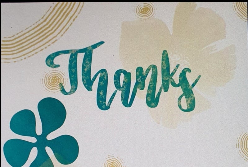
le long des bords pour le rendre agréable et texturé et authentique à l'aquarelle. Je crois donc que ce n'était pas tout à fait tout. Désolé. Celui-ci, j'ai juste rapidement fouetté un papillon en utilisant l'aide au dessin. Sur mon papillon initial, j'ai désactivé l'aide au dessin et ajouté toutes ces fleurs supplémentaires en arrière-plan. Donc c'était vraiment amusant. Et je pense vraiment quelque chose que vous pourriez vraiment facilement utiliser pour créer des produits d'impression à la demande comme des cartes de vœux, étuis de
téléphone, ou quelque chose comme ça. Oh oui. Ici, je suis allé dans une image de marbrage que j'avais créée dans ma classe de marbrage et y ai ajouté quelques images. Et encore une fois, juste joué avec les modes de fusion. Laisse-moi te montrer que c'est la petite rose dans le coin. Donc soustraire comme mode de fusion. Maintenant, il a également expérimenté ici avec l'ajout d'une couche de paillettes. C' est quelque chose que je couvre dans mon patron d'or étincelant. J' ai l'impression que je fais de la publicité pour tous mes cours. Ce n'est pas mon intention, mais voici l'exemple de ce que cela ressemblerait. Alors je vais allumer ça. Et bien sûr, il se perd un peu en arrière-plan parce qu'il y a de l'or en arrière-plan. Donc j'ai aussi ajouté une sorte d'ombre portée là. L' ombre portée que vous pourriez ramollir, vous pourriez la garder solide. J' aime vraiment ce regard d'une ombre portée très dure et solide. Mais si tu n'aimais pas ça, tu pourrais entrer dans le flou gaussien ici sur la couche. Et comme vous faites glisser votre petite ombre floue. Et bien sûr, vous pouvez changer la couleur de celui-ci ou tout ce qui fonctionne pour votre mise en page. Ensuite, vous cette catégorie. Et je voulais vous montrer très rapidement comment j'ai pu produire très rapidement quelques mises en page de cartes de vœux cinq par sept. Et c'est juste avec peu de prévoyance dans le Leo réel et conçu par la rapidité avec laquelle j'ai été en mesure de fouetter cela. Donc, si tu avais besoin d'une carte de vœux rapide à donner à quelqu'un qui vient de te donner quelque chose. Je pense juste dans ma tête hier que quelqu'un a déposé probablement 30 pots de plantes avec des vivaces dedans pour mes nouveaux jardins. Donc pour moi, c'était ouais,
c' était un vrai régal, quelque chose pour lequel je devais remercier. Et je peux rapidement produire une carte comme celle-ci. Et oui, faites-le imprimer sous la main. Et voilà. Il y a une autre idée rapide pour toi. Bien sûr, vous pourriez également créer ces deux cellules sur les sites POD comme éblouissement, je reçois tous les jours en ce moment, probablement 10 à 20 cartes échoue de Zao,
donc de l'art de l'usure et de l'univers de la carte de vœux. Ce sont donc trois endroits avec lesquels je vends des cartes de vœux, et bien sûr autour des fêtes spéciales sont des occasions. C' est là que vous commencez à vendre beaucoup. Donc maintenant, je viens de terminer la fête des mères et la fête des pères est en train de se produire. Comme je l'ai dit, chaque jour je vends, je ne sais pas, dix cartes sur chaque site. Disons, je sais que ce n'est pas beaucoup 0,50$ la carte, mais tout s'additionne, non ? Tout cela fait partie de vos flux de revenus. Donc il n'y a que quelques idées pour vous. J' espère que ce genre de juste obtenir les roues vont dans votre tête que vous allez trouver quelques idées pour les utilisations si vos timbres, à un moment donné, je vais expérimenter avec la création de modèles répétés ainsi. Donc, je ne suis pas sûr si je peux couvrir cela dans cette classe, mais peut-être que je vais faire une classe auxiliaire qui a cette information dedans. Donc, oui, ce ne sont qu'un tas d'utilisations que j'ai pu expérimenter en une soirée. Alors imaginez avec un ensemble de pinceaux que cette vaste. Combien de choses différentes vous pourriez faire et comment vous pourriez créer chacune de vos différentes mises en page. Donc, oui, dans la leçon suivante, essayons l'une de ces mises en page afin que nous puissions travailler sur le
réglage précis des paramètres de la brosse juste pour être sûr que vous comprenez parfaitement comment le faire. Bon, donc je te verrai dans la prochaine leçon.
6. Ajuster nos mises en page de fine: Salut les gars, bienvenue à la leçon 5. Et moins de cinq ici, on va juste faire un peu d'accord. Commençons. Ok les gars, commençons notre première composition. Donc, juste au moment où j'étais sur le point de commencer ce cours, j'ai sorti ceci ou vu cela assis ici près de mon ordinateur et acheté, eh bien, voici un très bon exemple que je peux vous montrer pour une utilisation
possible pour vos pinceaux que vous les créez. Et donc je voulais juste te montrer ça très vite parce que, je veux dire, regarde ce modèle. C' est un motif très simple créé avec des timbres très simples. Et puis cette idée, regardez ces fleurs magnifiques ont été. Comment serait-il facile de créer des sons aussi complexes ? C' est quelque chose pour vous de penser à l'avenir ? Ce sont, je ne sais pas si tu es comme moi, mais j'ai attrapé et classeurs comme ça plein de tout le genre de choses quotidiennes que j'ai besoin de faire et oui, gardant une trace de toutes les choses que je vois avec chacune des différentes sites d'impression à la demande ou des clients que j'ai. Plus vous vieillissez, vous avez besoin de ce genre de stratégies. Ok, alors pensons à créer une carte comme celle-ci. J' ai un préréglage et je ne sais pas, peut-être que c'était déjà un préréglage ici dans Procreate, mais j'ai un préréglage pour cinq cartes sur sept. Je pense que j'ai dû faire celle-là parce que je l'ai à 600 pixels par pouce et c'est une taille à laquelle je produis toujours mes cartes de vœux. Plus la résolution est élevée, votre art sera net et propre. Commençons par créer un seul mot. J' ai donc importé une police que j'aime pour les cartes de vœux. Donc, je vais aller ajouter du texte ici, et c'est dans le menu Actions. Et nous allons juste taper, eh bien, faisons juste une autre carte de remerciement. Donc, je peux cliquer sur le clavier ici, ou je peux cliquer, cliquer ici et ouvrir mon clavier ici et juste taper le mot. Merci. Maintenant, je vois juste que j'ai ça en blanc. Alors changeons ça pour n'avoir pas vraiment de couleur sarcelle. Vous pouvez double-cliquer dessus avec votre doigt ou avec votre styliste qui se sentait comme avec mon doigt et y apporter des ajustements. Vous remarquez que ce menu apparaît lorsque j'édite mon texte. Si je clique sur le Panneau de configuration, il ouvre ce grand panneau et c'est là que je peux faire toutes mes modifications. Alors mettez en évidence le mot et j'ai double-cliqué dessus avec mon doigt. Et vous pouvez choisir la police que vous voulez. Donc je pense que l'autre que j'aime beaucoup utiliser pour les voitures, Il est un peu plus vieux. C' est un arc-en-ciel laiteux et vous pouvez voir qu'il est mis en évidence. Et je peux faire les changements parce qu'il y a ce genre de contour bleu dessus. Donc, une fois que vous désélectionnez, ce contour bleu disparaîtra. Alors mettons-le en position. Maintenant, si vous aviez votre claquement et votre magnétique, vous seriez en mesure de centrer parfaitement. Donc je vais éteindre ça parce que je n'ai pas besoin de ça pour le reste de ce que je fais. Je n'en veux pas quand je travaille avec mes timbres. Pour la prochaine chose serait de simplement décider d'un pinceau que vous pourriez vouloir utiliser comme votre pinceau ou votre premier. Mais le type de fond d'un objet ou disons les tiges à vos fleurs. Et je pense que je vais l'utiliser ici. Alors choisissons juste une couleur. Maintenant, vous pouvez ouvrir une palette et l'avoir ici pour pouvoir l'utiliser. Si vous faites une série complète, cela pourrait être une excellente idée de créer une palette afin qu'elles soient toutes cohérentes. Donc, une fois que vous sélectionnez cette couleur que n'importe quel timbre que vous avez, sera tamponner dans cette couleur. Donc, faisons juste un rapide, oops, ajouter un calque. Faisons un timbre rapide de ce motif particulier. Donc j'ai un ensemble particulier. Je crois que j'ai fait ça accidentellement. J' ai une sorte d'angle là-dessus, mais vous pouvez voir, et j'ai remarqué que sur beaucoup de motifs, j'avais accidentellement un peu d'angle assis ici. Et parce que j'ai copié ce pinceau et l'utilise encore et encore, j'ai dû aller corriger les coups sur beaucoup d'entre eux. Alors gardez cela à l'esprit si vous voyez quelque chose hors de son positionnement, il y a des
chances qu'il soit dans votre catégorie de formes. Donc ça corrige ça. Et donc à partir de maintenant en frappant Fait là, à partir de maintenant, quand je tamponne avec elle, ce sera jusqu'à l'angle dans lequel la brosse a été créée. Maintenant, avec celui-ci, la taille pourrait être différente. Donc tu pourrais, si tu fais tout un tas de cartes et que tu le sais, ok, si c'est trop petit pour toutes mes cartes, alors je te suggérerais d'aller à la propriété et de changer cette taille maximale. Donc systématiquement, ce sera la même taille partout que je l'utilise pour ces cartes. Maintenant, c'est quelque chose que si je travaillais sur cette autre taille que j'ai travaillé avec communément le 24 par 16 pour l'art mural grand POD, alors je l'aurais probablement dit au maximum et le garder de cette façon. Bien sûr, vous pouvez également sélectionner et agrandir votre forme une fois qu'elle est dessinée. Donc, vous n'êtes pas complètement limité à la taille de la brosse. Nous avons la base pour notre carte. Allons ajouter quelques fleurs. Donc j'aime vraiment ce rapide que j'ai fait. Et je vais choisir ça. Je vais aller avec une sorte de recette, la couleur du poisson rouge. Je pourrais changer ça après. Et encore une fois, je vais juste ajouter un nouveau calque et faire un estampage rapide pour positionner cela. Et encore une fois, comme je l'ai dit, vous pouvez le redimensionner ici, mais si c'est quelque chose que vous voulez constamment redimensionner et certainement aller dans votre panneau Propriétés et le redimensionner là. Je vais essayer celui-là aussi. C' est celui avec la texture. Donc, dans un cas comme ça, peut-être que j'irais faire. J' aime faire différentes couches pour pouvoir les déplacer. Donc, je vais essayer celui-là dans une version très légère que je place derrière le texte. Si rapide, pas assez léger que vous pouvez simplement entrer dans la couche ici et réduire l'opacité. Vous pouvez également entrer dans votre saturation de teinte et la luminosité si vous le souhaitez. Et vous pouvez légèrement changer la couleur d'elle, quelque chose que vous préférez. Je vais aller un peu plus saturé et un peu plus lumineux. Donc ça disparaît là. Et je les garde sur des couches séparées quand je fais une composition comme celle-ci, juste pour avoir un peu de flexibilité ici en ce qui
concerne le positionnement et la taille du nouveau rose et celui-ci ici, je veux aussi le garder et le rendre un peu plus grand. L' autre paramètre dont nous avons parlé un peu était le tracé et l'espacement. Et je voulais vous montrer comment vous pouvez utiliser ça presque comme un pinceau de dispersion dans Illustrator. Donc, ce que cela ferait est de vous permettre de créer une chaîne de ces fleurs. Alors essayons ça. Allons dans cette sarcelle, peut-être un peu plus sombre. Et nous allons simplement faire glisser, oops, créer un nouveau calque et faire glisser un trait pour que vous puissiez voir ce que cela fait là. Comment il répète la tavelure qui les espaces. Maintenant, si j'avais juste traversé, vous pouvez voir qu'il n'y a pas beaucoup de variation là-bas. Donc si vous vouliez des variations, vous pourriez aller ici et changer cette gigue. Et vous pourriez aussi vous mettre en forme. Et je pense que nous en avons parlé et nous nous adaptons à la
façon dont chacun des timbres est en rotation. C' est parce que je suis sur le côté de mon crayon. Si je suis droit de haut en bas, j'ai la couleur. Et puis si je suis quelque part entre les deux et que vous obtenez ce genre de fondu. Maintenant, cela peut être contrôlé dans le crayon Apple ici. Donc la pression, je l'ai pour que ça affecte l'opacité. Donc si je l'avais à 0 et que mon timbre serait toujours autant d'opacité. Mais si je l'ai plus haut, vous pouvez voir qu'il a alors différents degrés d'opacité lorsque je tire mon esprit. Et vérifions rapidement l'autre chose dont je parlais, voir cette inclinaison. Donc, c'est une erreur de ma part où j'ai copié un des pinceaux encore et encore pour créer différents timbres et que sur une légère inclinaison pourrait être une bonne occasion pour vous d'expérimenter avec cela aussi. Donc, vous pouvez voir ce que cela fait, c'est comme faire flotter chacun des timbres sur un peu. Personnellement, je m'en fiche, donc je ne le change pas d'habitude. Mais nous avons commencé avec des paramètres vraiment simples et maintenant serait votre chance de vraiment expérimenter et voir ce que certains des paramètres peuvent faire. Donc je voulais aussi vous montrer ici que j'ai ajouté mon logo et mis mon nom sur les pinceaux. Et c'est quelque chose que si vous les gardez et que vous les utilisez simplement pour vous-même, vous devriez vous inquiéter. Mais si jamais vous voulez vendre vos statistiques de pinceau, je vous recommande de le mettre. Quiconque achète ensuite votre set ne peut pas simplement
copier vos paramètres et copier votre vers le haut et faire leur propre car cela restera là en permanence. Donc, cette œuvre n'est pas nécessairement belle dans ce cas, mais nous avons vraiment créé cette œuvre rapidement. Vous pouvez également penser à ajouter des motifs supplémentaires ou à entrer et ajouter certaines des textures. Je vais vous donner quelques textures aussi pour que vous puissiez expérimenter. Et ce cours, je ne couvre pas vraiment la création de ceux-ci, mais disons juste que vous vouliez ajouter quelque chose en arrière-plan ici. Sur ce calque. Ce calque est vide pour le moment, nous allons simplement l'utiliser pour ajouter un peu de texture ici. Maintenant, vous pouvez voir quelle est l'échelle de cette, donc, le plus grand que je peux faire ce pinceau. Si je voulais qu'il soit plus grand, j'irais dans les paramètres ici, dans les propriétés et mettrais cela à sa taille maximale, puis j'aurais un peu plus de variété avec la façon dont le coup est fait. Quelques-uns des amusants que j'aime vraiment sont ceux qui ont un fond solide. Donc, dans un cas comme celui-ci, je pourrais, disons échantillonner cette couleur. Donc j'appuie juste mon doigt sur cette couleur. Je vais y aller un peu plus tard donc, donc il coordonne. Et puis je peux mettre un peu de couleur en arrière-plan ici. Donc c'est peut-être leur amino pourrait le faire derrière le lettrage. Les possibilités sont infinies et n'oubliez pas, vous pouvez affecter le degré d'opacité si vous
vouliez avoir une sorte de fond vraiment léger et un peu comme un plein sur. Mais dans un cas comme celui-ci, vous savez, vous pourriez faire une zone solide et ensuite entrer et éditer vos textes. Donc, si vous avez un calque de texte, cliquez sur le calque, vous pouvez aller ici pour éditer le texte. Et je pourrais envisager de changer la couleur en blanc parce que nous n'avons pas frappé White exactement. Lorsque vous êtes dans cette zone près de votre blanc. Si vous double-cliquez sur votre petit point là, il vous donnera le blanc pur. Donc, sélectionnons il offre l'aller au blanc pur. Et ça pourrait être amusant de travailler avec deux, je devrais déplacer ce gars et je sais que c'est super rapide, mais ça va juste te montrer à quel point ce serait amusant et facile à faire avec ces timbres. Et puis expérimentez avec d'autres pinceaux. Vous avez probablement d'autres ensembles qui seraient tout aussi bien. Donc voici un ensemble de Lisa glands, et j'ai utilisé celui-ci un peu pour faire des textures sur les mises en page et c'est assez agréable. Je crois que je l'ai utilisé dans un des portraits, le portrait de Frida Kahlo. Je l'ai utilisé ici pour ajouter un peu de détails. Donc, dans la leçon suivante, je pense que ce que je veux faire est de vous parler un peu plus sur composition d'une œuvre d'art complètement avec l'utilisation des pinceaux. Donc, oui, je te verrai dans la prochaine leçon.
7. Stratégies de composition rapide: Salut les gars, bienvenue à la leçon 6. Alors, comment vont les six ici ? Faisons juste une composition rapide. Je veux vous montrer à quel point il est facile de rassembler des œuvres d'art très simples et des tas d'autres choses que j'ai essayées. Commençons. Très bien, donc la plupart du temps, quand je planifie une composition, j'aime commencer par un ou deux plus gros fond, sorte de composants d'
arrière-plan. Ou dans le cas des fleurs, je commencerais probablement par des tiges ou quelque chose comme ça. Donc je vais aller dans mes fleurs et juste, eh bien, tout d'abord, vous
montrer que la nuit dernière, je suis allé ajouter encore plus de pinceaux, ensemble si humungous. Maintenant, je vais prendre un de ceux que je ne crois pas avoir utilisés en classe. Voyons voir. C' est un que je n'ai pas utilisé avant. Alors mettons quelques belles tiges en place là-bas et je vais choisir une sorte de vert désaturé. Il suffit donc de tamponner pour créer vos motifs. Si vous avez l'impression de vouloir les déplacer, vous pouvez les conserver sur des calques distincts. Je vais en fait désactiver mon accrochage pour pouvoir ajouter un nouveau calque et en tamponner un autre. Et ici bien sûr, vous pouvez faire des ajustements pour la taille. Si vous vouliez quelque chose d'un peu plus petit, ajoutez un autre calque. Revenons en arrière et jetons un coup d'oeil à d'autres pinceaux qui pourraient être un peu soignés à utiliser. Je vais essayer celui-ci et je vais aller assez grand avec son auto qui n'est pas assez grand pour se rappeler que vous pouvez aller dans les propriétés et le compte agrandir en fait,
c' est le plus grand qu'il peut aller. Donc, dans un cas comme ça, je l'estampille quelque part au milieu et ensuite j'utilise ma transformation uniforme. Donc nous allons mettre ces deux-là pour l'instant et peut-être moins placer quelques fleurs juste pour
que nous ayons une idée de la façon dont notre composition pourrait commencer à s'effacer. Donc je vais utiliser cette palette que j'ai décidé, donc je vais prendre, je vais peut-être commencer par la plus sombre. Et allons prendre cette fleur ici. Wow, celui-là est un gros. Alors allons-y un peu plus petit. Et dans ce cas, je pense que je voudrais peut-être y aller et ajouter une texture à cela. On dirait que je n'ai pas fait ça à l'époque, alors peut-être que je vais le dupliquer. Et puis sur celui-ci, j'irai dans le grain au cœur de ma bibliothèque source. Et je vais ajouter ce document ici. Juste une belle aquarelle. Nous regardons et je vais ajuster le vert parce que si c'est trop petit, vous pouvez voir le motif du vert. J' aime avoir une fleur un peu plus grande ou plus petite. Donc je vais mettre quelques-unes de ces fleurs plus ternes en arrière-plan, c'est que je ne sais pas qu'elles sont non, ce n'est pas le cas. Nous allons donc ajouter un nouveau calque. J' aime les garder sur des calques séparés parce que vous avez un peu plus de flexibilité pour le redimensionnement et le déplacement. Ou vous pouvez choisir de mettre chaque fleur sur une couche individuelle ou simplement de regrouper le même type de fleurs. C' est vraiment à vous quel changement à l'une de mes couleurs plus riches ici et peut-être aller juste un peu plus lumineux. Une de mes très belles fleurs, je pense que j'aime ce 11 de mes favoris en fait que j'ai créé ici. Ensuite, on va en faire un plus petit. Ceux-là, je vais juste garder sur la même couche. Je pense. Ce que je regarde quand je crée une mise en page comme celle-ci est d'abord une vraie variété et aussi un genre de travail en nombres impairs. Donc si j'ai deux de quelque chose
, la prochaine fois, je vais en avoir trois de ce que c'est. Donc on va faire le solide. Le 1er mai être un peu plus lumineux. Je commence un peu à sentir que c' belle composition qui se passe ici assez centrale. Alors ajoutons quelques autres choses ici. Juste une sorte de le rincer. Je vais aller derrière ces choses ici et ajouter un calque. Je vais déplacer celui-là en dessous. Et je vais mettre deux de ces gros tourbillons dedans. Vous avez sur sa propre couche pour que je puisse l'agrandir et que je puisse y aller et l'alléger. Maintenant avec l'écureuil. Souviens-toi que je les ai dans la même direction. Donc, une des choses que je pourrais faire est d'ajouter un calque. Je veux que ce soit exactement le même que celui-ci. Donc, je le retournerais horizontalement et peut-être même verticalement pour peut-être mettre dans l'un de ces autres coins. Et encore une fois, je vais en réduire l'opacité. Vous pouvez voir qu'avec un très grand ensemble comme celui-ci, vous pouvez vraiment assez rapidement mettre en place une très belle composition. Et j'ai ajouté un tas de petits ornements, je suppose que tu les appellerais avec quelque chose comme ça. Les grands cercles pourraient être quelque chose que je pourrais utiliser. Peut-être que j'allais avec un vert plus léger et était une nouvelle couche, mettre quelque chose comme ça dedans. Maintenant certaines de ces choses supplémentaires, je ne veux certainement pas qu'ils se battent avec mon image principale. Donc, travailler avec l'opacité aide vraiment à l'empêcher d'être trop occupé. Personnellement, j'ai l'impression que cela a besoin d'un peu de luminosité. Donc, je vais ajouter une sorte de couleur de tige d'or là-dedans aussi. Maintenant, je pense que vous avez l'idée de la composition. Je vais faire un tas de peaufinage de ça, j'en suis sûr. Mais en ce moment, ce que je veux faire est d'importer un arrière-plan que je peux utiliser ici. Donc, je vais vraiment aller dans certains de mes composants abstraits ici et prendre un de ces arrière-plans aquarelle. Celui-ci, je vais prendre juste le calque d'arrière-plan ici. Alors balayez vers le bas, copiez, retournez à mon floral et collez. Nous allons ajuster certains paramètres ici. Et maintenant, je vais passer par et Fairmont avec des modes de
fusion sur tous mes composants que j'ai ici. Donc, c'est vraiment juste l'une des stratégies que vous pouvez utiliser la moyenne, tout le monde a sa propre méthode de création d'illustrations en couches comme celle-ci. Je voulais juste vous montrer une des méthodes car c'est une façon amusante et
expérimentale de développer une œuvre ou un look. Et c'est certainement un essai et une erreur au début, essayez de comprendre à quoi vous pourriez vouloir que cette mise en page finale ressemble. Souvent, je fais un tas d'expériences comme ça pendant quelques jours parfois pour trouver un,
un regard que je pense pouvoir soutenir sur un regroupement ou une collection d'œuvres d'art. Donc ce processus expérimental est vraiment important pour moi. Donc ce que je vais faire, c'est beaucoup d'expérimentations à ce stade. Et je reviendrai vers vous dans quelques minutes avec plus de pièces finies et je vous ferai savoir tout ce que j'ai fait pour que ça marche. Ok, donc voici ma mise en page folle avec un tas d'ajustements. Ce que j'ai fait, c'était d'aller jouer avec le mode de fusion. Donc beaucoup d'entre eux, vous pouvez voir comment les modes de fusion spécifiques que je me sentais vraiment fonctionné. Et j'ai changé de couleur sur certains d'entre eux. Et je pense que je suis toujours dans cette palette de couleurs. Donc, parmi les choses que je vois ici que je voudrais changer, vous ne le faites pas, vous venez juste de finir. Je vais aller dans cette couche ici, et j'ai juste un gros pinceau et un pinceau Nikko règle dans ce talon doux. Et je vais juste ajouter un peu de sarcelle dans le fond ici pour que cette branche se démarque un peu plus. Et je me sens comme ça précieux, juste un peu trop transparent. Donc ce motif particulier, je pense que c'est celui-là. Donc, il y a une variété de choses différentes que vous pourriez faire. Ce que j'ai fait avec celui-ci ici, que j'ai aussi senti un peu transparent, c'est que j'ai ajouté une fleur blanche ou juste une fleur blanche dupliquant cette fleur et en remplissant simplement le blanc en utilisant le verrou alpha. Donc je pense qu'un peu, l'autre chose que vous pourriez faire, donc pour celui-ci ici, peut-être que ce que je ferais est juste de dupliquer la fleur. Et puis vous voyez que les deux couches rendent un peu plus opaque et peuvent les pincer ensemble, finissent par être juste une fois de plus, je pensais peut-être ajouter un peu de texture ici. Alors je vais aller dans mes pinceaux de texture. Et à moins d'essayer quelque chose comme ça, des points de
folie, assurez-vous que j'ai une nouvelle couche. Et je vais aller droit au bas de la pile ici, avoir une couche et je ne suis pas sûr de quelle couleur encore, donc je vais juste aller pour elle et puis juste décider si je l'aime ou non. J' aime bien cette sarcelle là-bas. Donc peut-être que ce que je ferais est à travers la sarcelle sur une couche, ajoutant un peu de vie à elle. Et puis faire une autre couche et essayer un peu de peut-être cette couleur pêche, mais nous allons aller avec juste un petit peu plus sombre et ajouter un peu de texture là-dedans. Voilà donc le genre de choses que j'irais faire vers la fin de mon genre de production de ce Leone. Et voyons ce qu'on a d'autre ici. Je pense à une sorte de jaune. Maintenant, j'ai toujours échantillonné à partir de ma mise en page quand je choisis une nouvelle couleur
, puis l'ajuster légèrement parce que je pense que cela finit par le faire sur son propre calque. Je pense que ça finit par être plus analogue à ce que vous travaillez. Donc, cela fonctionne mieux avec votre jeu de couleurs lorsque vous avez fait cela. Et une autre chose que je fais parfois, juste pour vraiment tout unifier, est de mettre une couche sur le dessus et de le remplir d'une sorte de texture. Je crois que j'ai une texture de papier importante ici. Oui, vous pouvez voir que c'est juste une texture de papier. Je vais remplir toute cette histoire ici. Faisons-le en noir en fait. Donc, vous pouvez voir que j'ajoute la texture, je vais l'agrandir, peut obtenir un très beau grand vert pour que vous puissiez voir cette texture là. Et ajustons la couleur de celui-ci. Je suis sûr qu'il va être très difficile pour vous de voir à l'écran, mais vous trouverez que ce que cela fait, c'est qu'il aide aussi à unifier parce que vous obtenez une sorte de flux global vers l'ensemble de la mise en page. Vous pouvez le tonifier en réduisant l'opacité ou même en essayant différents modes de fusion. Je trouve que la lumière douce est généralement un bon mélange. Ouais, je pense que c'était probablement mon préféré là-bas et, tu sais, si je pouvais l'éteindre, tu peux à peine voir qu'il y a une différence, mais j'ai l'impression qu'ici je le regarde
et ça lui a donné un peu plus l'unité à elle. Et donc tout ce processus a été juste pour moi de le ressentir. Apprenez comment fonctionnent mes brosses. Demande-moi si j'ai la quantité de pinceaux et les pinceaux dont j'ai besoin. Et puis ce que je ferais c'est expérimenter et faire tout un tas plus comme ça. Il y a tellement de choses que vous pouvez faire maintenant pour vraiment explorer. Et vous savez, beaucoup de fois ça a à voir avec vos antécédents. Vous pouvez lubrifier toute cette mise en page maintenant, donc je le sélectionne, dupliquerai, puis je vais sur le duplicata et peut-être même complètement changé cet arrière-plan, en
apporterai un nouveau, puis expérimentez avec cette arrière-plan. Peut-être qu'il y a quelque chose qui peut être fait là-bas. Cela pourrait être quelque chose qui est mélangé avec l'arrière-plan que vous aviez en premier lieu. Et peut-être qu'un nouveau regard pourrait être établi en l'ayant fait. L' EPA que j'ai souvent fait est de prendre ce contexte et de l'agrandir de sorte que j'
ai deux sections différentes pour voir si elles pourraient mieux fonctionner avec mon design. Et puis, tu sais. Glissez-vous avec votre teinte et votre saturation pour voir s'il y a quelque chose qui peut être fait là pour le rendre plus intéressant. Il y a donc beaucoup de possibilités ici juste avec expérimenter ce que vous avez déjà sur votre écran. Et bien sûr, vous pouvez ensuite expérimenter avec changer vos motifs. Sont-ils plus de texture ? Expérimentez avec les différentes fleurs et motifs que vous avez créés dans le cadre de votre ensemble de pinceaux. Donc je pourrais alors vraiment aimer cette mise en page, mais ne me soucie pas vraiment de ces fleurs particulières que j'ai au premier plan. Alors sortez-les, changez
peut-être le mélange sur certains d'entre eux, puis entrez et prenez quelques fleurs différentes et
essayez-les à la place de celles que vous aviez là en premier lieu. Et c'est le temps de jeu. Alors assurez-vous que vous expérimentez. Faites des choses qui sont complètement différentes. Pour cela, vous pouvez avoir l'idée de la façon dont ceux-ci peuvent fonctionner pour créer une nouvelle mise en page ou un nouveau look. Rappelez-vous, vous pouvez toujours aller dans vos propriétés pour ajuster la taille des objets ainsi que utiliser les curseurs sur le côté ici pour augmenter ou réduire la taille de vos motifs. J' espère donc qu'à travers toute cette démonstration et votre observation de mon processus ici, vous avez eu quelques idées sur la façon dont vous pourriez aller avant et faire une partie de cette expérimentation maintenant que vous avez un ensemble de pinceaux. J' ai donc trouvé des mises en page très différentes. Donc comparé à ça, et vraiment ça a été juste un voyage d' exploration juste pour comprendre quelques-unes des choses que je pourrais faire avec mon ensemble de pinceaux. Si je me donnais des tonnes d'idées, j'ai vraiment adoré ça. Ce qui ressemble à une ligne de sculpture, timbre ou pinceau. Et je pense que c'est quelque chose que je vais certainement expérimenter et explorer plus. J' avais récemment fait une ligne de cheval de bloc et créé quelques timbres là. Donc je pense que je pourrais y retourner et explorer ça un peu plus. Je pense vraiment vraiment à mes timbres maintenant et à quel genre de milieux pourraient fonctionner ou ne pas fonctionner, peu importe. C' est certainement quelque chose que, à moins de prendre le temps d'explorer, vous ne comprendrez jamais. Donc j'espère que ce cours vous a montré un tas de choses
nouvelles qui vous font tourner l'esprit et vous font commencer. Alors, oui, nous allons nous rencontrer. Dans la dernière leçon, il y avait que je vais faire un peu d'enveloppement. D'accord. Je te verrai là-bas.
8. Outro: Hé les gars, alors c'est tout. Nous sommes encore arrivés à la fin. Voici donc une autre compétence que vous pouvez ajouter à votre ensemble de compétences. Et ainsi vous pouvez facilement produire ce genre de pinceaux pour vous-même. Il m'a vraiment fallu très peu de temps pour produire ces cinq maquettes. Idéal pour les empreintes sur les tasses, pour l'art mural ou les pièces de tissu comme les sacs fourre-tout, étuis de téléphone
portable et les housses de livres. Et bien sûr, ce sera fabuleux pour créer des motifs répétés, qui est quelque chose que je vais certainement expérimenter dans les prochaines semaines. Ce n'est qu'un aspect de la production de pinceaux dans Procreate. J' ai déjà un autre cours en tête. Dans cette classe, nous allons probablement faire un tas de paramètres plus avancés. Mais pour l'instant, je pense que c'est un excellent moyen d'avoir mis fin à ce cours. Vous pouvez créer un ensemble complet de pinceaux dès maintenant. Et puis vous pouvez les utiliser pour tant d'applications. Si vous n'avez pas une minute, pouvez-vous vous assurer de laisser un peu d'avis ici pour moi ? Et oui, si vous avez des questions, laissez-les dans la zone de discussion à la façon dont je réponds à votre question et quiconque a la même question peut voir quelle que soit la solution. Maintenant, si vous ne l'avez pas déjà fait, assurez-vous d'appuyer sur ce bouton de suivi là-haut. De cette façon, vous serez informé de tout par les coûts, les
indices ou tout ce que vous avez publié ou tout ce que j'ai à dire. Aussi, si vous avez une minute, consultez mon site web au choc, le Dr Laura affirme dossier. C' est toujours en développement, mais vous pouvez ajouter engager les listes de diffusion et de cette façon, vous
obtiendrez tous les cadeaux que j'offre et Python, mais tout ce qui se passe. Si vous avez le temps, la caisse acheter magasins par le plus grand est sur South Hill.com, mais il vend aussi à l'article II, ne sont pas entendus comptés, consultez l'une de mes autres classes ont plus de 70 classes ici maintenant, alors assurez-vous vous les vérifiez tous. Merci encore de traîner avec moi aujourd'hui et je te verrai la prochaine fois. Au revoir pour l'instant.
 Delores Naskrent, Creative Explorer