Transcripts
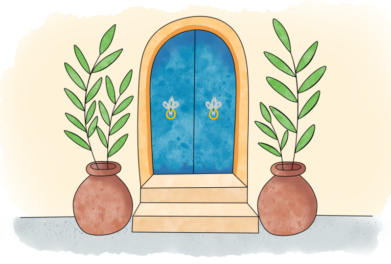
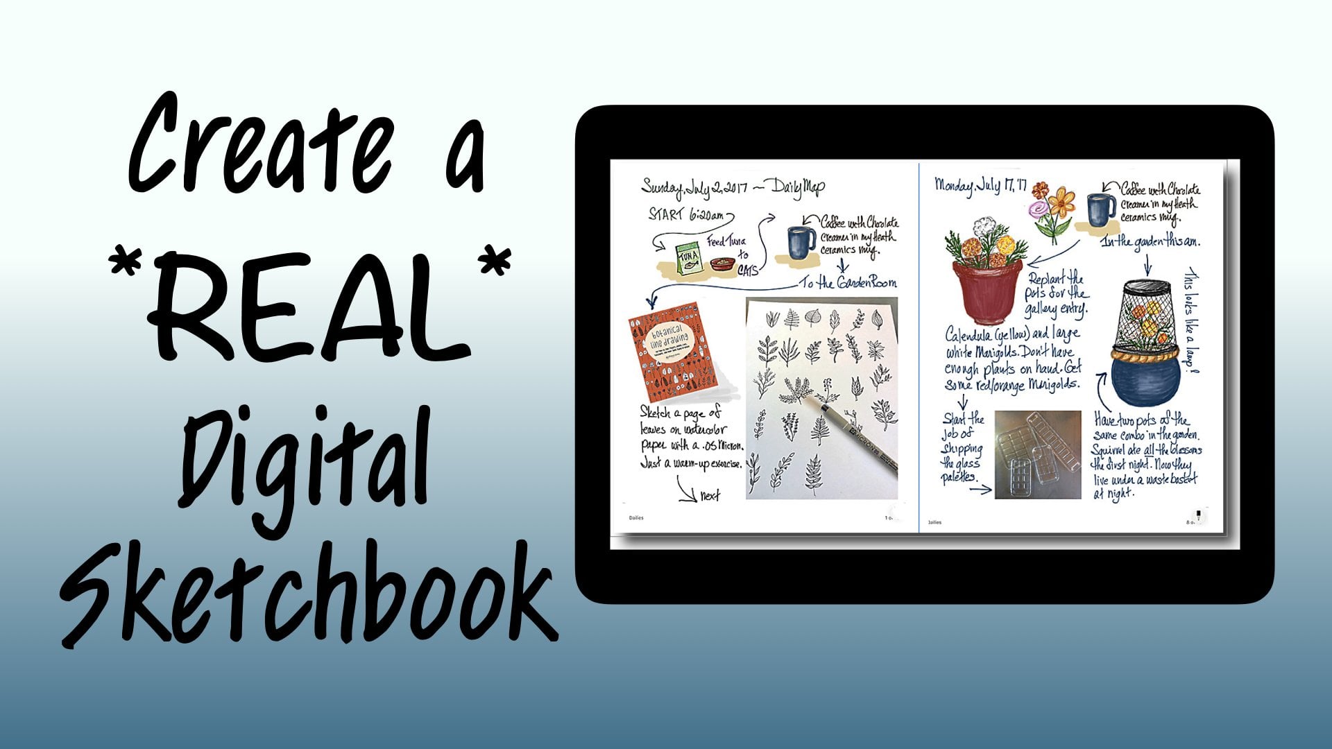
1. Introduction: this workshop is about sketching on an iPad in a way that says Close as possible to sketching in a sketchbook. The iPad is amazing, an amazing thing, and it was amazing even in the first place when it came out and you could only draw with a stylist and you couldn't touch the screen with your hand and so on and so forth. It still had hundreds and hundreds of art APS drawing APS and painting abs, everything that you could imagine. So it was. It was just a piece of magic for anybody who's interested in an art tool or a new art tool , and that was me. So I got one, and I studied it for a year and studied all the abs, and none of them had manuals. And so I thought I would put together an IPAD studio workshop that went on for the entire year of 2012 and again in 2013. And hundreds of folks learned to draw on the iPad and learned how these different APs worked. There were a lot of absent, were very exciting. The procreate came to the surface pretty quickly. Procreate did everything. There were lots of lots of abs that did lots and lots of tricks. You know, there were once for watercolor and for sketching in for all of these things. But procreate had everything. It had every kind of tool. It had pencils and brushes and markers and water, color and texture tools and charcoal and cran. And it goes on and on and on. It's a complex app, but it Haddon interface. In the beginning, that was like when you turned it on, it was easy. You could do it. The only thing that wasn't easy was that you had to use a stylist and you and you couldn't really had a draw like this. And and it was a real shame, because wonderful act like this was limited in that way. And then, of course, the iPad pro came along. The iPad had been on art game changer all my itself. But when the iPad pro came along and the apple pencil particularly, it was a whole new ballgame. No, you didn't draw with a fat rubber tip and you weren't quite sure where it was going to make the mark. Now you have something that just resembled your regular art tools. your pencil and it had a little tiny point. And the most important thing, I think, is that you can put your hand right on the screen and draw. And this made it exactly like being able to draw on a iPad the same way that you would in a paper sketchbook. And I got very excited because I love sketch booking. I love drawing in in pencil on planning things out. And then I love using incline and I love using water media, and I love being able to blend into, you know, soften and to right, you know, notes with, you know, real hand writing. This is my real printing, and so all of a sudden I was completely enabled to keep a sketchbook on an iPad. Now I will never to be honest with you. I will never give up my real sketchbook and my riel watercolors and my real pens. But what I loved about this was that I do a lot of travelling and road tripping, and I do a lot of sketch booking to journal those travels, and I never keep up because every you know, every day I'm having adventuring in the night at the at the hotel. I'm trying to do that pages and I spend a lot of time on my sketches, and so I'm just terribly behind. And then I would forget everything that was going on. And with the iPad in the pencil and procreate, I could actually do the preliminary travel journal Aiken import photos. I could do all kinds of things. I could keep a digital travel journal and a sketchbook travel journal. And when I got home, I could relive the trip by looking at the digital journal and doing my sketchbook from that . Now there are a lot of people that just they fight these things. They fight these changes. It's like an either or I don't want to know how to do that because I really love the feeling of paper. And I love how watercolor works and so on, and nobody's saying either or or saying also, you know, when acrylic paint came along. It's a lot of screaming about that. It's it's always been true, but every new medium in art threatens everybody because I don't know, because I have to learn something new, but this is not an either or this is an also and the process of sketching on the iPad is so close to the process of sketching in a sketchbook that I decided to do a skill share class on this and we're going to take a real world sketch, and we're gonna follow the same procedures using the iPad and giving a result that is very , very similar. But more than that, you will know how to use procreate at least preliminarily, to do a sketch by the end of this class because procreate has a beautiful interface. And if you take it one step at a time and you and you learn as you do, you can use it without knowing anything. Beyond the simple beginning interface. This is a sketch I did on watercolor paper. Um, it's ah. I live in Santa Fe and this is a Santa Fe wall and door. Um, we have blue doors here that stand for good luck. And this is ah, Dobie Wall and a couple of terror kind of pots. And that kind of, you know, we don't have, like, a lot of pavement or finished kind of civilization stuff. In fact, living here and living in a gravel road. Is it really like a elitist symbol? So we won't even talk about that. But this was done with watercolors. Um, on I'm not in a sketchbook this time on a piece of watercolor paper. And the way it started Waas with a pencil sketch. It was very, very rough, but basically laid out in a really simple way. That is really easy to draw. And all I have to tell you is a couple of things and boom, you can draw that. And so after the messy pencil sketch, it was inked over to clean it all off. The pencil was erased and the water color was put on, and so that's a really life procedure that you wouldn't think a new Elektronik device could do. But in the case of the iPad and course the pencil and procreate, I'm going to show you how you translate that very process, uh, to a digital format. And it's not because you want to replace this. It might be because you just want to do a different version of things Is that that's our class. Announce our project and, uh, join me in the beginning
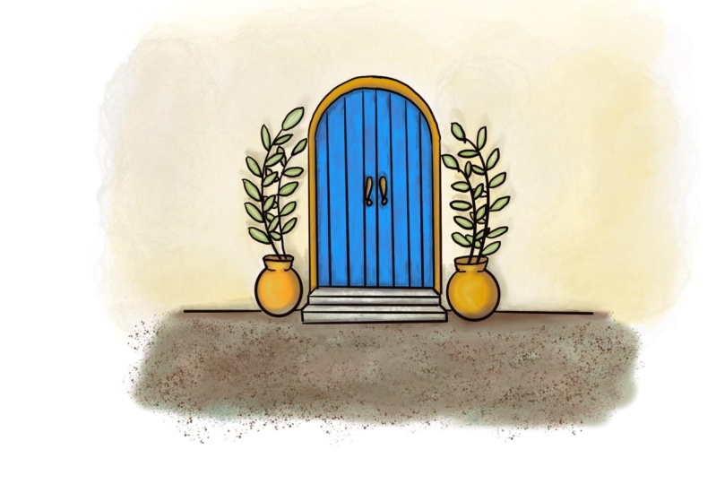
2. In the Beginning: starting at the rial beginning means starting at the rial beginning. And so we need procreate. We're gonna have three supplies for this class. One is the pro create app. One is an iPad. This is a studio pro. You don't need that. You need any iPad that I work with the apple pencil. You need an apple pencil. So with those three things will have everything that we need. So go to the APP store, hit the search button type procreate in the search, and you should come up with this. This is the proper icon. I don't know what the prices thes days because I've had procreate forever, but I know it's only about $10 or something. It's probably just the best value in an art supply in the entire world. Truly, when you open a newly installed procreate up, you're not gonna have all of this stuff. I have it because it worked with procreate all the time and everything that I dio. But you are going to create a new canvas to work on up here In this corner, you can select add it pre existing ones. You don't care right now because you don't have any, You can import things and you can import a photo. But we don't want to do that because we're gonna learn to sketch in real simple terms. And so we're just gonna hit the plus button. The plus button gives you a lot of choices of page sizes that are common for the sake of simplicity. We are just going to choose screen size and blank canvas. But instead of screaming and running away, I want you to understand how wonderfully simple this app is in this format. This app is so complex and can do so much, and you can go so far with it. But the beauty is when you first open the app, none of that overkill us there. What opens is very, very simple and easy to deal with. And it probably will even have some brush pre selected so that you can just put your pencil on and just draw stuff that simple. So if you have never drawn with an eye pencil on our ample pencil on a tablet before, you might want to do a little sampling right here isn't undo. And you weren't gonna want that too, I'm sure. So it's as simple as this. Since this is kindergarten, we're going to learn how to sketch on our iPad with procreate just the way we would sketch on paper. And so what we need to sketch on paper according to the way I teach sketching anyway, is a pencil. So up here is an icon that's for choosing brushes, and the brush library is super overkill. And mine is especially because I have brushes that are imported for certain reasons. But yours will be nice and full of choices. Too many choices to begin with. We're gonna work with sketching as a category, okay? And you have choices of a technical pencil on HB pencil a six B pencil, which would be more smeary. Um, one of my favorites is a Narendra pencil. Uh, just because it's simplistic, but let's start with something you're familiar with, which is an HB pencil, and then we tap back on our screen and this is our HB pencil, just like pencil on paper. Just Azizi is congee. So over on the left, right here are just two controls and then your undoing redo button. So that's how simple this is. The top control is the size of your stroke. The apple pencil, also in many tools will will be pressure sensitive, but this is only one of them. I don't have a set that way anyway. And, uh, I have this size slider all the way to the top. But anywhere in there, let's just go halfway. You're gonna get a lighter, Uh, wait of line for easy visibility. I'm going to keep my pencil up at that, um, thickness And right down here, this other control is opacity. So at the top, you have the darkest at the bottom you have. You can't see it at all. So all the way along here, you have a value change and the league blankets lighter as you go down. So I like mine. You know, about 3/4 like a gray lead would be the color that you're going to draw with is chosen with color button. It's in the upper right, and the color controls air familiar to people who've used a computer at all. But you have a palate and you can choose a color from in there and you can move this around . You noticed that as you do the color in the upper right hand corner is changing to what you're going to be using. So if we went to a dark brown, say and we were drawing with that, we have a colored pencil justices, magic is that could be in any color you can imagine. But I'm gonna go back and I'm gonna get the black because we're going to start at the beginning. So this tool is the eraser tool, and that's obvious as well. And so if we use that tool, it also has a whole bunch of choices which are the same as your brushed choices. So you could be using an eraser with exactly the same properties as your brush. But what we're gonna do is we're just going to get a big eraser because I want to get rid of all of this, and we're going to keep the eraser at full capacity. So it's going to get rid of things when I go like that. If we didn't, we could partially erase, and I often talk about making a light sketch in and not quite erasing the whole thing in order to correct for it. That works really well here. You would do something like this. Every time you go over it, it's going to get lighter. So if you were doing lettering and you had to move it, but you wanted the guide, then that would come in handy. There's other ways to go about that, though, too. But I'm just going to have Lee erase everything that's on here so that we can start over again and start over. Very simply. I'm going back to the pencil and we are ready to start our scotch.
3. Sketching the Door: So we're going to start just like we had a piece of paper, a sketchbook page and a pencil, and we're going to start by drawing, sketching it the best little circle that we can. And we're working with sketchy lines so that we are getting the best circle that we know how to draw. You'll notice if you tipped to the side of an ample pencil. It acts exactly like riel pencil, and it will make a fatter kind of a shading line. So we have a circle that's pretty good one. And then we're going to cross the middle of our circle with a straight line right in the center. Then from where that hits a circle on each side, we're gonna bring a straight line down now on procreate. If you draw a line and you don't pick the pencil up, it will correct that line for you. It would have also drawn a great circle for us if we did that. I'll show you if I draw a circle and then I hold you see what it does. It makes a circle perfect and you can size it so we could have done that. But we all need, Ah, other practice. We can get on drying good circles. So I'm just going to undo and I'm coming back with my pencil and I'm gonna drop a straight line over here, and I'm gonna hold until it pull straight, and then I'm gonna close the bottom off just about Oh, here and again. I'm gonna hold to get a straight line that I can leave in place. Now, you don't have to do this. Hold trick. If that's just to computerized for you. And I don't like my line, so I'm gonna make it again. No, I'm just gonna go across here. I can I can tell if it's where I want it better when I'm right side up here. I think that's good. Okay, if you don't, As I started to say, if you don't want on this computer help, you don't need it. Because if you don't hold appropriates, just gonna do what you want to dio and not change anything. But what have we got here? Something strange. But if I remove a couple of lines So I just came up here and I had the racer and I don't want the razor huge I want a little control. Don't wanna wiping out anything. So I'm pulling down on the size. I'm leaving the opacity of foot full capacity. So it's erasing completely. And I'm going to get rid of that line right there because we don't need it. And some of these extra pencil lines We don't need this. And we don't need this per this circle. And we have, ah, very nice shape. It is a door now, obviously, as in other classes, we refer to letters. This isn't upside down you capital you. But this time I just kind of wanted it more perfect than that. And so that's why I used the other method for making an arch door, which is combining a circle in a rectangle. I'm going to get rid of these right here and now we're left with a door, so this door is going to be made out of wood slats, And so, uh, and it's gonna be a double door that kind of opens like that. I'm going to start and drop a line right down the center, and I have to figure out if I want four boards on each side, which would mean I go in half and then half those haves and I think I like that. So I'm gonna do that on both sides. So the the first line to go down is gonna be the one that divides outside in half, and then the one that divides that section in half. And it doesn't matter if you're not coming down straight, causes procreate, will help you straighten that out and allow you to move it into place. That wonderful. Some people would say it's cheating. I wouldn't be one of those people. Okay, on this side, the same thing we're going, Teoh eyeball, where the middle of this probably is Drop a line down and move. It wouldn't connect that there, too. And then I'm going to divide this section in half and a section. Now It looks like a solid door at this point, and it could be and we could put a dorn up over on one side. But I just kind of think it would be fun to have this be to have maybe fancier handle on the door. And it would also remember, this is a rough sketch. So would be like right around there and they got to be kind of the same. Okay, now, I would like to put a door frame around my door, so I'm going to make a parallel line just about as wide as one of these slants, and I'm gonna draw it up and around the door, and I'm trying to say is parallel there as I can, and I'm gonna have to turn my paper and you will have to turn your sketchbook in order to make this a nice even. Thank because your hand would get too uncomfortable just trying to go around the whole thing at once. And it won't give you that ability to watch the space between the two of them cause she'll be concentrating on your hand being uncomfortable. So there we have a frame around our door. And now what? I just put those lines in there, but I'm going to take him out because I just had an idea. I'm thinking it would be kind of nice to have, like, a little, uh, step where the door is instead of it just meeting the ground flat. And so I am going to do that with a little slanted line on each side. Just about until it's going to meet the two lines of the the doorway. And then that first step rule be like one of our boxes, and it will. It will be here, and the top edge of it will be here. Que rough sketch. I didn't have that very even. So I'm going to even it out, and I'm gonna get in there with Money Racer and just get rid of the confusion. You want to do that any time we can. Same way that you would do if you were just working with a pencil. So we've got our door and we've got a step. And I think I'm gonna put another step below this one just for fun just because we can. So let's put another couple and and we're doing like basically, if we continued that line, it should be parallel to that line. And over here, a swell. So you can just do some light pencil to test that. And then I'm going to put my front of that a little porch step thing and I'm gonna drop a true vertical from here. One from here showing nose like this, get money, eraser and get rid of my guidelines or because they are visually confusing to what is now a really kind of a cool little porch. Now, how can we figure out where that this door is setting a wall? Obviously, it's not sitting out on the beach, or it would be a server realistic drawing, which we're not doing right now. How do we figure out where the line that defines the bottom of the wall is? Well, we have to know what we know, and we know that this piece of porches sitting on the ground and we know that the wall this step here is aligned with the wall because we can tell that by the set back of the door there. And so what we have to do in our sketch period is to finish this box off, because if you could see through this, if this was transparent, it would tell you where that back corner is. And you know that the back corner of this has to be sitting on the ground and that the wall is going to meet the ground. No, I hope that didn't confuse anybody too much. But what we have to do is we have to look at, just like we used to draw boxes and all of our classes that we've done after Lake finish off this step in our mind's eye anyway, as if we can see through this box. And we'll do that here too, just to make it more clear. So we know that's a vertical. And we know that I would have to parallel that because this whole thing is a box, right? Well, we've got it pretty well established that this step line would really be delight of the wall as well, because that would be where it comes from the corner. And so we're going to do that on both sides, and this is the bottom of our wall that meets the ground, and we're gonna go now, go in because that is not the transparent step. We're going to take that inside view out of there, but it helped us, and there are a lot of times on your drawing things that it helps If you turn the whole thing transparent. You might have noticed that sometimes I turn the high pad and sometimes I turn the picture to get a better drawing angle um, this is just my poor brain being really confused because I draw in sketchbooks in real life and on the iPad and procreate, and I go back and forth and generally confused everything about everything.
4. Sketching Pots and Plants: so far, so good. It's just like drawing in our sketchbooks. So let's put something sitting behind or not behind beside our door. And let's start with a nice big circle like research. The top of the Dorie can be kind of rough, and we can go over here and do it. This is gonna sit right on the ground that we have established here. And we're going to turn these into a pot that is is sitting here and it's gonna hold some plants. Okay, so that part is the bottom of the pot, and it's a kind of around one. And then we're gonna do a little toilet paper roll thing appear. If you've been taking my classes, you're really familiar with that The top of ah, of a cylinder and roughing this in now and we're gonna get rid off this line here. I put these two little lines to connect that top of the cylinder to this circle, and then I'm I'm gonna round out from there now. I can't run into the porch. Gonna just here. I think there's just a little bit too wide, and I'm gonna take this line out of here so I can kind of have Ah, good. Look out Whether I drew a kind of a good pot, it's probably going to be like a terra cotta pot and hold some things and I kind of like my pots. Or now I'm gonna go over here and I'm gonna see if I can possibly duplicated. Ah, Circe is good enough for rush sketching. So if I put a little nuck over here and then reinforce the circle that the neck is sitting on and get rid of the extra fat lines here we have another pot. I've made my top of my pot on the left a little shorter hair. Didn't really mean to do that. And so my choice now is to erase and redraw it, which is how I would have to do in a sketchbook. But there is a little trick and procreate that could be helpful. And that is you come up to this s appears little ass shaped thing, and it stands for select. And so whatever you draw around is a selective part of the picture. And you can move it and resize it and do some things. And so you get this movement arrow from beside the select tool and you don't even have to be in it. You can just be outside of it. And you see all the things that can happen here. I could use this little green thing here and I could turn it. If you get inside the box and tried movie, you're gonna resize it so we don't want to do that. And so outside the box, I can move it rips. I was re sizing it there. Anyway, we out here, I'm gonna move it until it looks like it's at the same level. So the midpoint and there's the lines that help you in everything. This'll looks like the same height now and then to get rid of the selection and all this business, you just go back and hit the select alone. It's all gone. So now I can get my pencil again and I can make this. I want, like, the one on the right and I'm gonna get the eraser. All right. We got quite the sketch going on doing now, just exactly as I would do with a sketch book and a pencil in any racer I go in and I make my eraser little smaller And I look for problems. I've got, like, something is this is wider right here than over here. So just go back and I'll be sketchy and I will just correct things exactly as I would do. The only difference is I'm not turning around and going like this or style I stylists is that you can do that with but and I think there's waste even do it with the new apple pencil. But this isn't the new one. This is the older one. Okay, I like this a lot. But if I lived here and this was my door, I think that I would have some plants coming out of my pots. So I've got my pencil again, and I'm going to do a big couple of big parentheses. Curves okay? And over here, they're opposite, and they don't have to be identical to the runs over here. They're just stems of plants that grow. Like I said, this this parentheses thing is all over in nature, and I am going to put leaves on them for this. And so at the end of each one, I'm going to start with to parentheses that are closed together. In other words, a leaf or AP pedal in our flower during classes. And then you have a choice on these kind of plants. Um, when you put a leaf on one side, some plants grow with the leaves right across from each other. So that's one of your choices opposing leaves. And that looks like that. But you could also do something that's a little more interesting sometimes. And I'm gonna undo that leaf, and you can have what they call alternating leaves. And in that case, they don't meet right across from each other. Rather, they alternate, and it makes a little less symmetry in a little more visual interest when you do it that way. So there would be one here in the in betweens and one here. Now we got this plant, and we're going to do the same thing, and some of them will overlap. But don't worry about that, because we will use our eraser and we'll make everything work. Can this one? I'm gonna put the first leaf here 2nd 1 here, and I'm very in a size a little bit again for visual interest, okay? Or on the side, and and then this run is going to have some overlapping happening. And this is a rough sketch, so we'll be able to correct things. And there I'm liking this. This is a very nice little sketch of, ah, door and a couple of pretty wild plants, and it is just as if we took a pencil in a sketchbook and did the very same thing. And that's what's wonderful about procreate is without knowing a thing about procreate. You can do a really nice sketch when you first get it. I have an empty space right here. Stick a leaf in there. Okay, so we now have a pencil sketch and it's a rough sketch. And next we will make a refined sketch based on a rough sketch, just the same as when we would ink over a pencil sketch in a real life sketch port
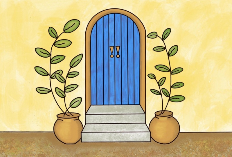
5. Creating the Ink Layer: put on your seat belts because here comes the only complicated part of our current class with procreate, and that is layers. Layers have confused everybody since the dawn of photo shop. They shouldn't, but they do. You have to think of layers as clear pieces of acid Tate that you lay, I would say tracing paper, but you can see right through him there clear so transparency ease that you can stack up on top of a picture you can draw on each one. If you want. You can shuffle thumb, and you can do just neat things that you can't do if you're drawing everything, painting everything on one surface. And especially in the iPad, there are ways that you can use layers that you will see that are just wonderful. And so we are going to hit this little icon right here, which is layers, and there we go. So this isn't confusing right now at all, because there's always a background layer, and then one on top of it are pencil drawing. That we just did is on this layer. It's not on the background, it's on layer that was in place by default. So a layers. Visibility can be turned off for on by checking that one or touching that little box watch Goodbye. Sketch makes you feel like Oops, but no, because you can turn it right back on. Okay, Goodbye, White background. Now the sketches there and you can tell it's there. You can't see it very well. So we want that white background behind it. But this sketch is actually on a clear layer like a clear transparency. Now there are things that we can do to this layer and a lot of things. We're not talking about him yet. Now we could clean our sketch up by drawing and erasing like we would in a sketchbook and redrawing and erasing and redrawing and erasing. However, because we're on an iPad and we're in procreate, there's a lot easier way to go about this in that easier way is that we can draw our good drawing on another layer, and we won't be affecting this layer at all. But we can be doing our clean up without having to do a lot of erasing here. And so we are going to make ourselves another layer that's an ink layer. Before we do that so that we're going to avoid some confusion. We're going to tap the layer one, and we get some choices of things we can do here, and we are going to choose to rename it. And now we can type a, um, a title for this layer so that we'll be able to keep him straight. So I am going to call this the sketch layer. Then you just hit return. And there you go in, the name is changed to sketch. Now we're now I am going to draw on incline over this on the next layer I put in, Um, I'm gonna get confused if these lines Oeiras dark is there here. So another thing that we can do to layer is we can change the opacity if we hit this end right here we have right here in opacity control. So if we move that down, watch are drawing, fade and fade and fade. So you like to take that down to where you can see it but not be distracted by it. Any black line we make on top of that is going to really show. And so then we can hit this again and we go back and we have our background, our sketch layer and our sketch layer is is way backed off in, um opacity. So it's like we can trace it. And I was just like we put a tracing a piece of tracing paper over our sketch. Jeevan looks like it now. So where we going to draw? We are going to add a layer to drawn, and we're going to do what we did a minute ago and we're gonna tap that and tamp rename and make this layer the ink layer. And now we have sketch and we have ink and we have the first place that you can get really screwed up. And you always will get screwed up by this. And it's just something that happens, and that is your drawing on the wrong layer. So any time you do something, don't seem right. Ah, you can just go toe layers and you can check which one is blue, in which everyone is blue is wound that you're working on. And so even when you've been doing this for how long have you been doing this? Something like eight years. I consistently find myself working on their own layer. And so I don't know if someone someday comes up with a plan that doesn't happen. That would be just great. However, I don't know what the plan is. So tap back here, the layers thing is gone. We know that we're on layer to and I'm going to get a different tool. And this time I'm going to go to the inking choices and you can try all these out and see what you like. But I basically like, um, a technical pin that gives me the same thing as a fine liner would give you on a real sketchbook. And I I like that kind of line. Now there are a lot of lines. It'll go thick and thin and, um, gel, pen line. And of course, everything can be sized over here. And so you have a lot of choices. But for right now, why don't we just get a fine liner or technical pen and see how we do with that? So my color is still black. My opacity. I'm gonna want to be full black as I'm using ink and only size. I don't every run of the brushes that you get has a little difference in default size. And so it's a really good thing to make yourself a stroke, and that's way too fat. Also, this this is a, uh, thick, thin, pressure sensitive tool. So it's going to matter how lightly you touch Oh, or how heavily you touch, which is kind of me. It can screw up, but it's kind of neat. So I'm undoing here, getting rid of all of those, and I'm gonna try. You get when you do this, you have a little spot in there, You see that? And I don't find the rise so accurate because that should give me a little line and it doesn't. But this is your up and down in size, and so I kind of I'm trying about 1/3 of the way up my girl like that. That's a little light. So I'm gonna undo Move this up just a little more. Try it. That's kind of good. I like that. So I'm not about to have we, Mark. And now it's just easy as pie. You're going to go in and you are going to go over your lines with ink, just like you would when you and over a pencil sketch in your sketchbook. But it isn't just like real life, because in real life, when you do a fine liner, that's an incline and it's there and too bad for you, you know, like where you put it, there is no getting it off. However, the iPad is not that unforgiving. And your incline, just like we just did, we can use undo to get rid of it. We can also erase it with our eraser. So Fearless city is far is your thinking, and what you're gonna do is pretty much follow your pencil lines with a good incline when you get toe overlapping leaves right here. Ah, you're gonna make a choice as you as your role and what's overlapping. What? And I think let me put the top leaf in here. But I think I'm going to have this one forward. So my leaves here are going to be whole. But the relief behind them is showing through. That is your artistic choice. You do not have to do it that way. You can make the other one be on top. Anyway, this is the procedure. If you make a screwball online, you can undo the screwball online. If you make of this group are lying, your other option is to erase your screwball line. So this is called like, no fear thinking. And I am going to go ahead and not bore you to death watching me, and I'm going to ink over my pencil sketch cleaning it up, and then we don't even have to erase the leftover pencil. We can just turn off the visibility of that layer. Now it's worth mentioning that that trick of draw a straight line and hang on to the end of it is really good in the inking staging. It's not cheating. Just go ahead and do it, because then you're gonna have something you're happy with. And when is that ever cheating? And also remember that you can turn this all around in any way upside down or whatever, and you can resize it. Whatever makes you really comfortable in drawing the lines, there's another little tip that I find helpful. I keep my finger on the, uh, undo button in my thumb. One of whatever is comfortable in the way you know, the position I'm drawing in. Keep it right on the on. Do so. If I make a line and I don't like it and I try it again, I don't like it. You see instantly. You can correct as you go. All that being said, though, you don't want perfection. Perfection looks like a machine did it. And even though this is a machine technically a device, it didn't do it. You did it. This is a hand drowned sketch. Just using a different tool. No. Are there those little helpful things? Like your lines? Straight? Absolutely. And that's a good thing. But didn't you Didn't say to this draw door, Drug leaf. You drew it. And so it should look hand drawn. So little Bibles and little weirdness is air perfectly OK.
6. Creating the Paint Layer: here we sit with our very cool in drawing, and we have two layers. We have our sketch layer, which is where our pencil waas and we have that turned off. And we have our in clear, which we don't have turned off. And now we're gonna move to do coloring. And when you color and you have your on your in Claire, I mean, that would be how you do it in a sketchbook, right? You're all ANC up, and so you get some pain, you start coloring. But we have erased Herbal Inc. Your and so if you make a mistake, it's going to be tricky to get an eraser and fix a mistake without raising your inclines. And then if you erase your inclines, you have to redraw them and then get the brush back and blah, blah, blah. So what we do is we use layers to help us with that, and I'm getting very simply explained this. But using one layer called color, although in our further lessons we're going to separate our layers and have layers for the different colors because that makes even more sense and you'll see why. But for right now, we want to go to layers and we want to create a new layer. And that new layer called layer three right here, ended up below are in clear for some reason. But you know what? That's a good thing, because that's the second part I'm going to tell you. But later, three. We don't want to be called that, so we're gonna tap it, and we're going to say rename like we have before, and we're going to rename it color. So now we have a layer of mature pencil sketches and it is not showing, and we have a layer in which are ink sketch is in it issuing and we have a layer on which our color will be and it is showing. But we don't have any color yet, so we also want to do a bit of rearranging if this hasn't happened automatically for you. And that rearranging is that we want to hold and pull are in clear to be the top layer. It puts our inclines over our color, and it makes our cleanup a lot easier. You are not when you're coloring. This is kind of opaque, just like, you know, maybe wash or something would be. And when you're coloring and your color is over the incline, I'll show you. Okay? I'm just going to grab a brush here in a brush and ah, color. I've got green. And I'm Rina Color right here. And you see how my incline is getting obscured there. Painting right over the incline of that happens in real life too. But wouldn't it be better if it didn't happen that way? And if you're inclining, stayed very precise and brilliant, Well, that can happen just by having the ink layer above the color earlier. So I'm going to hold and drag money color layer beneath Ian Claire. And now look. No, my black ink is back very strong. So your arrangement is going to be that you have your in, Claire, your color layer, your sketch layers land back there, not visible. And we are ready to move on to painting now.
7. Begin Painting: and now we come to coloring, and we're also going to enter into never land of choices here. I'm procreate. There's going to be too many choices, and we're gonna try to step carefully through them so that we don't give up in confusion before we start. The first thing we're gonna do so that you can see better on my iPad and then you can also see better on your iPad is that we're going to go to the preferences and you click that little wrench up there and there are a lot of things that you can do. And I guess it's actions. It's called the wrench. There are a lot of things that you can do, and we'll talk about that some other time. But where we're going to do right now is go to preferences and we are going to this very first line. It says light interface, and we're going to turn that on and look at the differences. Faras visibility. Your sliders aren't quite as visible, but look how visible your brush preview is. And, um, you didn't even know there was a little number going on with that, did you? Because you can see it before. So we're gonna work in the light in her face so that you can see what I'm doing. And you can make your own choices. What's comfortable for you? I personally can't see the stuff in black and I don't want to be there. We're going to be painting now, so we're not going to want a fine liner ink pen. We're not gonna want an HB pencil. We're going to want a paint brush. So we go back to our brush icon and we have been to sketching brushes. We have been to inking brushes, but this time we want to go to painting brushes and I'm looking for looking for it, looking for it There it iss Okay, lots of lots of choices from a round brush like you're used to using real life to all kinds of stuff. And some of them are. I've uploaded from other places and they won't be on yours. But what will be will be watercolor. There's there's a watercolor. There's a water brush. We want water color. We highlight that brush and then go back to our picture. And now that's the brush that we have active to use to paint, and we're going to set the size of that brush. We're going to keep the opacity right up with the top, and we're gonna set the size of the brush to 30% and you watch this little percent right down here. And obviously, if you can't get right on 30 that's already too. But that's 31 there. We have a brush watercolor brush, and we haven't size the way we want it. And now we are needing to go and get a color. When you hit the color button, the default is usually this color wheel. It's way it's set in the beginning, unless you changed it. You know, working before and the color wheel is really neat, but it's not a place for us to make a recipe, and I have chosen a nice yellow Oakar color that I want us to use, and I would like it if you could have exactly the same yellow ochre color. And so we were going. We're going to a different part of this color Disneyland here, and that is lab color down here, and it's next to the little pellet icon there. When you go there the Parcher interested in of all these parts is this little three some right here. This is our G B RGB stands for red, green on blue, red, green and blue are the primary colors When you're working with the color of light, it's a different thing than working with pigments where we all learned about red, yellow and blue in kindergarten. But the color of light is a different thing, and I won't get too scientific on you about it. But all of the combinations of the three primaries make white, whereas in pigment, as you probably know, to mix all the primaries together to get black or a dark grey or something. So in the world of digital art, you can mix any color with the formula of red, green and blue. The top possibility that you can have is 255 and the lower zero obviously. And so we are going to mix our yellow because I'm going to give you the recipe in terms of RGB. And that recipe is that your read on the top line is 2 55 and so all you need to do is pull that to get the 2 55 all the way to the right and then are green is to 21 and you can take this little slider and go back and forth and watch the number until you hit on it and you'll drive yourself nuts. So rather than doing that, it's better to double tap it. It's going to bring up our keyboard, and we can put our to 21 in and hit done in there. It ISS no sliding and fooling around. Okay, are blue is 86. So again, double top, we're gonna 86 done. And now the color that we have right up here is the same yellow that I have. And we know that because we just mixed it to match, we are ready to paint. The first thing to be sure of is that you are on the color layer. So check that because if you're on the in clear, you could make a big mess and have to undo the whole thing. So make sure you are on the color layer, so we have a watercolor brush at 30% size. We have a special yellow that we've mixed, and so we are going to apply our paint to our wall Now, I have very little pressure applied to the pencil. Therefore, the color I'm putting on is pretty light. But if you want some variety, alter the pressure of the pencil. You see that? So a little more pressure, a little darker color. And I'm kind of swirling around to give it some texture like you would expect on Adobe Wall . I'm gonna put a little darker color behind the leaves because their front of cast a shadow of sorts and along the bottom of the wall is usually a little darker. And I'm not worried about going over the lines and you'll see why. So I like that side. I'm gonna continue or to the other side of the wall, just fill up my wall color and again go a little darker toward the bottom of the wall behind the product and up behind the lives on here should be dirt, because there's gonna be some shadow. Okay, now, if you see any area that you think just is a little too blotchy, there's a beautiful tool sitting up here by the brush, and it is the blend tool. So what's right here. It looks like a finger. Like you're gonna rub this all with your finger, and you can size that too. And the larger it is, you can see the size there a larger that it iss, the more it is going to blur. And so I'm gonna use it just in these areas along my shadow just kind of blend one area of color into another. That's sweet. If you could only do that in a real life watercolor, right? Never gonna happen. You know, I just want my shadow, too. Come out and blend into here, okay? I'm pretty happy except of your love all over everything. Right? And it's not the problem that it would be in real life, because I'm gonna get my eraser, and I'm able to just erase anything within my inked shapes where I don't want the color. Just Azizi, is that you? Just bring it right back out. So it's ready for what? We paint over it. Clean up my door here. This is just with the eraser. Now I leaves. I'm not really concerned with because I'm going to use a green on them. And the green over laid on this amber color will be a nice thing. It's not gonna be a problem. So there we go. This is all on the color player. Not on the in. Clear. Uh, if you think any of your leaves are too dark and you want to come to the mail, you go right ahead and do that with your eraser. But you don't have to, because the green will be nice over the top.
8. Painting Leaves: next we're gonna tackle our leaves. And so we're gonna need a nice leafy green. And the recipe that I have for you is 83 on the red 1 42 on the green and 16 on the blue. So when you have that one mixed, you have the very same green as I will be using. So now we have our color, and you might notice the history here has the yellow that we used and so on. This is not sure how many it keeps in the history. Maybe Justus, Many as SOS. But this is our green that we just mixed right here. We're also going to need a different brush because obviously we can't stay in the lines with all of the big watercolor brush that we were using. Even small. It's not a stay in the lines kind of thing. And so we're going to go and look for something more controllable and right at the top of your pain. A painting brushes list is round brush. That's kind of what we usually use anyway in a in a red sable or or a synthetic. We've got our brushing our color. But before we start painting are leaves. We're gonna make our life a little bit easier by adding another layer. I told you, we're gonna like these layers by the end of this. Okay, a new layer is made with a plus. And then we're gonna tap it. We're gonna hit rename, and we're gonna call it Green. We're still under our Inc. And that's a good thing. I don't know why it did what it turned out that way. If it didn't, we can hold and drag it. But our INC is still on top of everything, but our layer for making our green is on top of our layer. That was our yellow, and that's called color. But you know what we're gonna do now? We're going to change the name of that to your girl. So if you hit this, you hit rename, you type yellow ogre in return. So this is our wall now are wrong color and the green is gonna be our leaves. And this is gonna allow us to erase our green if we go on to the lines without erasing the yellow with it and having to try to fix that So this is no magic trick that you can do when you're working digitally and it's really great. Remember, though, go back to that green layer before we start coloring. Otherwise we'll be coloring on the yellow, and it won't be a good thing. So what I intend to do here is mimic my are dark toe light, watercolor blended thing that I do with riel paint. And I'm going to do that by taking my green and this brush and just outlining the Leafs. I'll do a few at a time cause drying is not an issue for us right now. And this, uh, we're gonna use the blending finger tool, and that's why we're gonna have a chance of going out of the lines and making a green blob . And if we do, it's great. We can grab the eraser and get rid of it, and we will not be erasing the background. And that would be a real pickle that trying to fix that. So we're happy, all right. And this one, you know, I'm gonna grab my blending tool, and I have this at about 8% and I'm going to go into these leaves and I'm gonna blend and What have really blending is the green into nothing. And so the where there is the nothing the yellow shows through and it gives you almost exactly the same. The fact is, if we have put the green right on the own layer and we're actually blending the two paints together, but you get the same look. But you're not in trouble because his blending thing can go out of the lines and make a mess. And this way we can get rid of it and we don't get rid of Are you more with it? So if you want to bring the green more into the metal, you kind of push it to see how you can push it with that tool. If you want to bring it back out, I gotta push the empty space and you can get to where I am right now. You have just too much green smearing around and you can You don't have anything empty to put back anymore. But that's OK, because some leaves can be darker than others. And remember that you have on do, and I'm gonna show you different on Do a double finger cap. We'll give you a non do so one thing you can do about it being too dark as you can take the eraser tool and you can just take away some of the green in the middle. Now we're back to where we were. We're gonna go and work with our blend so you can't get in too much trouble here, which is a wonderful thing. This is all during your painting and procreate. This is a great thing that you're going to go with the eraser and you can put a highlight in and then you can blend. It s o much easier than really then Riel paint. So everything has its own set of skills and in real pain, you got one of those skills. And in digital paint, you learn a whole other set. I thought it would be a good idea to show you a real close up of this procedure. It's a lot like, uh, I don't know. I think of it as putting, you know, a lot like watercolor pencil put on and then blended with water. But you can think of it however you want, Teoh. And don't get freaked out when you get in. Really? close in your inclines, or like have a little tails and all that that makes it look more hand run. So the brush that I'm using with my green is the round brush at the top of the painting list of brushes, and I am using that at four or 5% on the scale there. And in a minute when I used the blending figure, I'll tell you the number on that. So I am pretty much making sloppy marks inside my leaves with my green brush. And then I was switching to the blending finger, and I have that said, at 16 16 19. I think nineteen's a little big somewhere in there. And so I'm gonna make this so big you can see exactly what happens on that blending. Think Finger is hitting, if you recall, is not hitting yellow and green's hitting green and nothing over a yellow background. And this makes a really nice blend. And again, if you're too dark and you need to add some light, you can do that with the eraser and just add a little white right in the middle like that, and then go back to and I have that said around the same size as the brush I'm using. Um And then you go back to the finger and you can work it with a little more light in the middle. You can shape it to because you go every direction that you would want. Start from the light and go into the dark that are preserved more of your light and the leaves. Ca NBI varied too. If you think you're too stripey, you can eyes futz with that edge and soften it just like you would with a watercolor edge. So that should give you the idea. And don't be afraid to work really big like this because it helps.
9. Filling the Pots and Door Frame: I'm pretty happy with my leaves. And I'm ready to move on to my next color. And it's gonna be a terra Codec type of color that I'll be using in the frame of the doorway and with my pots here. And so I'm going to go up here. And I had already chosen, um, one from a previous project of mine here. But I am not crazy about how yellow it is not. And so I'm in this color wheel. That's the first thing that you get right here when you go to color. And there are two ways to adjust existing color hair, one of which is to pull this circle around the outside. Any other is to go with value. In here. This is changes hue, which means color. And then, uh, this changes to value from a lighter or darker, all the way to wait all the way to black. And so I'm going to move this more toward yellow, warming up a little bit and then gray it a little bit. Ah, not really great. But lighten the value, so you're just you fool around until you get a color that you think is gonna work, and I think that might work. I'm going to check it. And if I like it will be going and looking up to formula so that you can mix it too. Now, I'm just going to check it with, uh, we're still own painting. And I'm just going to use ah, plain brush. Uh, like, re pointed round that we used to do my checking because then I can see the real color, and that is not a bad start. However, I'm gonna undo this because I am still on my green layer. We haven't made a new one yet, but now I've got a color I like. I probably would have been smarter to make the new layer first, but not always smarter. So we'll do that now, though. So let's goto layers. We have a review again. We have our sketch layer are in Claire, are your local earlier and are green layer. Remember that any time you can return to work on one of the other, Like if you saw some really bad messy spots on your thank you could go there and use eraser , and you'd be correcting your message spots on your ink. The whole trick, though. Don't forget and leave it on ink. And then you're painting away because in urine clears are painted and that'll overlay or other colors, so that will be a good thing. So let's make a layer. And let's name it terra cotta and really terra cotta for our purposes here is kind of ah, raw sienna. Okay, so now we have our layer on we're on it, okay? And let's go back to color without changing it. And let's go over to her recipe area and see what that turned out to be. And so I will tell you that the red is 2 23 the green is 1 50 nine and the blue is 64. And I'm gonna put those on our recipe card that you can download as well. But if you set the three of of the RGB at those numbers, you'll have the same color that I'm working with. Okay, so at the risk of being complicated by telling you another way to do something, I'm gonna do it anyway. We have the intention here of filling certain areas with what in the real world would be a smooth color wash And then the intention is gonna be to go in over them and do some shading and some texturizing. So this color filling I have that, you know, pointed round brush and I can sit here and color, and it doesn't really going evenly because you're not. Your pressure is a little different on your pencil as you go, and so there's a lot easier way to do this, and that is using a fill function and procreate. But the problem is that it will only work within a bounded area. It's a lot like pouring a color and having it go on Leah's first, the edges of the black. Now we don't want to pollute our black ink area or layer. I'm sorry because we wanted to be pristine for maybe some other purposes And what So what we're gonna do is we're going to duplicate, are in clear, and we're going to use it to do some filling both with their terra cotta and with our door color, and you'll see what I mean as we go. So don't get confused, but it is just a option. If you don't want to do this at all, and you want to do it with the brush, the way you're doing it right now. Awesome. Go ahead and do that. We're gonna fill this frame of the door with terra cotta. We're gonna film the entire pot and the inside top of the pot with terra cotta. But to show you this other method and not get too confused by what's there, I'm going to show you how to clear a layer. Now, remember, the layer that we're on is a terror connell layer. The only thing on it is this brown that I put in with the brush. And so let's go look at our terra cotta lair and I want to get that out of there. So I'll be able to show you this other Phil idea when we tap. They're Thea the picture area of a layer, and we were used to doing that because we get renaming All that well, clear is the 123 4/5 thing down and it will remove everything from a lair. So I suppose that you had your terra cotta layer and you had done a whole lot of painting and you didn't like it and you didn't want any race, all that you can do, you quickly clear it that way. Very convenient. Now, we're not getting rid of our terra cotta layer because we'll come back and we will use it, you know, to put our shading in our texture on over the solid Phil. But together, a solid Phil, we're going to need a second in clear. And so if you swipe that way on a lair, you get three choices. You get toe, lock it to duplicate it to delete it. We want to duplicate it. So now we have to in Claire's that are identical. I'm going to take, I believe, the one on top like we've had it so that our black line is always on top of everything. I'm going to change the name of the copy to Phil there. I'm not feel later, but I'll just put Phil okay. And we are no on the deal where because it's blue and I also see something here. I'm gonna change, but I'm not talking about it because it would just confuse the issue there something that will work better for us. Okay, so here is the trick. There isn't any paint bucket tool and procreate. That is, you know, just like the one in photo shop where you just click and it dumps color. But it's even easier than that. All you do is you click on your color and you drag it to the area you want to fill. So I wanted to fill that pot. I want to fill that top area. But, you see, it stops where there's an incline. That's why we needed in England to do this. That's where we needed a copy of our in clear. So I'm gonna bring it down here to the middle here. Oops. And I did this on purpose. Okay? What happened here? A leak? You see it? A little league in the ink line. So when we dumped that liquid color liquid color here, it got out and went everywhere. It could go. So we're gonna undo that and fix our league. I hope we're gonna to that there and we're going to fix our leak. So to do that, we'll get a brush. We'll go back to our inking. We'll get our technical pen. We'll go back to our black for a color and you notice that this stays here, so we'll be able to grab it again. And so we're going down here, and we're gonna close that gap and carefully look for any other gaps that are gonna make that trouble for us. So that is bound to happen to you. So I made it happen to us. So you'll know what what to do to fix that. So I'm going back to get my terror kind of color and try this again and drag it this time of state where it has to stay because little gate got shut. All right, so Oh, I didn't even hit that right. The tip of your pencils really gonna be right in the little space. There we go. Um, that filled both of them because there's a tiny little breach right there. See, It will get through the tiniest tiniest hole. Okay. And there's one more area that we want to be have a terra cotta base like that, and that is our door frame. We're going to do this and hope for no leaks. I like it
10. Shading and Highlighting Pots: The idea is that we're going to make a different or darker version of our terra cotta, and we are going to use a brush with some texture. And we are going to paint over the plane and maybe do some blending shading stuff like that . And so what we do has to show on top of this, and this isn't opaque color on our fill layer. So we're going to have to go and change our layer structure here earlier. Yeah, structure. And we're going to put our terror Khanna layer above our Phil still under the angry still want to yank on top. But now any mark that we make with it darker color is going to show up against the lighter color that we already have their. The next thing we have to do is make ourselves a darker version of this color, and so we're going to go there in the best place. There's there's one there we could use. But the best way to do this is to go to the the color circle version here and then to pull the color down and you're gonna get a double circle. They were split surplus E is going to show you how it is changing the color. And there's, like, kind of ah riel dark version. I am just making kind of a judgment call here. All right. You know, I want to know what color that is, so I can share that with you. So where I go, I go over here Value area again, and our dear are dark terra cotta is a read of 1 71 a green of 1 23 in a blue of 57. Let's go and test that. We're gonna make sure that we are burned the right layer, which is gonna be the terra cotta lair, and then find a brush and go toe painting. And I'm going to start with just a round brush and put a little shading. And where would shading be on this? And how big is their brush? Are Russia's small. So let's see how this works. So we know that there would be some shading at this back edge of this part and all the way down because the light would not be hitting it there. And the bottom edge of Aponte is usually almost got some shading us. Well, and even the I. I usually have my light coming from like here, But But even so, there will be some shading that is around this side is just not as much. All right. And then it comes a little bit like this as well. And the inside of this pot is very definitely going to be darker. Strange birds going by this morning. Now I'm gonna grab my blending finger, and I'm gonna make that shading smooth work of right along the edge of it. Remember, not we're not really mixing it into the flat color because flat colors on another layer. So we're kind of mixing this into nothing. Those of you took some of the other classes will remember that We did this with a, uh, watercolor pencil in a water brush. Recalled it vignette ing, But we basically just did a soft treatment. I'm going on the lines, but it's okay. Let me look at when you say, Do we think that that is enough contrast? If we don't, we should be able to get our brush a gun and add a little more dark color. And of course, you know you can eyes go mix and even darker one every every might. We might do that as a finishing touch, but for right now, getting the brush again, adding more over the darker color of the terra cotta, getting our blending tool softening that up. It's looking pretty good, I think, except for where I'm not have blocked all over the place. But we know what to do about that, too. Don't worry. Take that out of there. There's sort of here no rehab shaded. Our pot rooms are exactly the same thing to the other one. Let's see Hartl exponents down to that side we make. We might come back and add a little more contrast with value for right now. I want to talk about shading this the door frame because the door frame goes in to where the door is. So that means let's get our brush. And it means that there is going to be darker area back here because it's gone, you know, back into that corner, not corner but edge. I don't like that last Not last wonder, A little fat. I mean Okay, then I am going to get the finger again. Smudge finger, so much trouble and just got a kind of work out making that transition smooth. This is so much easier than doing this with watercolor that it didn't fine again. It doesn't replace where calling. It's just a different Truell to use. And now we have. No, I have my doorway shaded. Should it be a little more? Maybe. All right. No new was take her work. Maybe one deep in in a little way back. There were talks in and doesn't matter for granted the lines. So you get some in the lines to and then the finger for smoothing anything that doesn't look smoothed out. Shadow Midtown areas you always want them to blend comes softly. I need my eraser. I need to get rid of all the slop here and there. I have the shading pert of my, uh, doorframe. So you go ahead and and shade your pot over here, and then we'll move forward. So while we're still here and these look pretty good, we could use a little highlighting as well as shading. So to do that, go to colors. We'll get our yellow joker that we were playing with before we'll go to make sure that we're on our terra cotta layer and then we'll add a little highlight and we'll do that in the same way as and I still have that pointed round brush. We'll do that the same way we did with the shadow color. Put it right and where the brightest area would be right where the light would hit it. Now you can see if your ah krilic current royal pain or stuff how are you? Good. Get all your brush drugs going on. Not do so much blending That's up to you. It's all style thing. I'm a blunder, but you can see that you could stop right there And you could have an interesting, painterly look. You could have done it on these leaves and everything else to just don't blend it anyway. Uh, I am going to blend these highlights just to make everything. Um, I gotta turn it. I I just got to have a certain angle sometimes to work out. Yeah, right. So I'm gonna soften the edges and you see I'm spreading. Are making a midtown transition here, too, because spreading it out and it's not remember, it's mixing into the paint is here on the same layer. But it's not fixing in to the based here economists underneath because it's on a different layer. I kind of like that. It's got, you know, some weird marks right here, But it is a pottery thing, and so it's not supposed to be all perfect. Never can tell if I'm gonna turn the iPad or turn the page. Kenya. Anyway, you get the idea. We don't need highlights in our doorway. Sometimes if it's a painting, um, you would you'd have a lighter line right along here, where it turns that corner and the light hits it. But this is an ink and watercolor or ink and color drawing, and so, you know, im scarier inclined with that, so I'm pretty happy with this.
11. Stone Steps: here we are in layers again, and I'm just making a decision but would like to get painted next. And I am thinking this ground, which since this is a Santa Fe doorway, the ground is going to be kind of textured and probably earthy. Um and so let's make a layer for our ground, and we're going to give it that name instead of the color name. So we know what we're doing. So, ground, there we go again. We want our in klier to be the top layer, and but make sure that we are on ground. So I'm gonna do this probably in really sloppy away. So it's gonna be great that we have our own layer that we can come back and clean up that line between the wall and a house. So now we're gonna tackle our ground and our steps, and we'll be working in two different layers there. But we're gonna be working with one color. And here it is. It's a gray rarely down a grey stone color to begin with and so go to recipes. And this gray is 1 86 on the red, 1 88 on the green 1 62 on the blue, we have our gray, we have a new layer named ground and we're going to begin by working on that, we're going to get an airbrush to lay down a nice soft background color for our ground, and we're gonna put texture over it. But this is an airbrushing category under the brushes, and I have chosen a soft brush, the bigger one. There's a soft airbrush up here and then just a soft brush here, and it's huge and is too huge. It'll cover our whole thing. And so I have brought the size down to 7%. And so I'm just This is simple, simple in our bottom step, like so makes it pretty boring next to ah, the ground. But we're going to be shading and lightning our steps, and we are going to be texturizing our ground. We're going to stay right here on the Phil layer. Uh, to texture and tone are steps in that same time with one tool just really kind of fun. And the tool is going to be the eraser tool. And I told you earlier you can choose brushes to go without two, so I am choosing the sketching brushes right now, and I'm going down to the artist cran and choosing that and so over here for the size I've got. If they were, just stay there for a minute. 4% on my size. And I've got my opacity at about half a little bit bigger on my 5%. And then it's a simple is this? I'm gonna blow it up so you can see what happens. We're going to take some careful strokes right across her stub. We get the instant concrete stub and then we're going to do that on the front of both of these, and then up in here, there wouldn't be too much because is set back again. It be a little darker at the corners, but along here would be kind of later. You're gonna go over the lines a little bit. It doesn't matter to use your on, Do you don't like a stroke? That happened. But this makes our steps look pretty darn Step E. And once we have a darker texture and everything going on down here in the ground, this is gonna show up really nicely. And that was just our eraser using a certain kind of brush
12. Textured Ground Cover: Now we're closing in on the grand finale. I have created a layer, a new layer called ground texture, because I experimented with doing our texture on the ground layer, and I got in trouble when I went Teoh. You raise some of what we didn't want, and so a new layer called ground texture. You know how to do that. You click new layer, you click this picture, you're type a new name, and that's the one that we're going to work on here. And then we go to brushes. And this time we are looking for spray paints and spray paints is right there. And when we get spray paints, you'll have one called flicks, and that's where we want to start. Goodness, the pencil doesn't seem to want to be connected, either, and we're going to start with our terra cotta color Now. That's as it comes out of the bag there, and you can adjust this what you can any brush larger and smaller and more or less opaque. So my first passed through is going to be kind of covering with the medium size flick of paint to get kind of a lot of our terra cotta on hair earth tone with the great behind it. Now, if you were to pull your opacity down, you will be putting down a lighter flick. And it doesn't matter if we get on the stairs in this wall because we can erase it. And if you push your slider up, the brush gets bigger. But if you watch this here, the spots get further apart because that's kind of brush, that is. And so, if you do that, then you got bigger. See, I'll do it up here cause we don't care. Now you've got a bigger, um dot and so I think that we might want to go to our darker terra cotta color, which I don't know where I put it. But I think it's there, and we might want to put in some darker dots. Now remember, on do because if you don't like what's going on under it and maybe it wouldn't be it be less obvious and you'd be happy. But we're putting down a kind of and you can just use the brushes or the apple pencil is a kind of stamp, too. Now, eventually, if we did this enough, we get ahold ground looking thing. And there's another brush that we can throw into the mix, too. So let's go back to brushes and we're still in the same area. But let's go to splatter instead, which they're here. That's where you can change things. But we're not going to complicate your life right now like that. And we're gonna take a splatter brush, come down here and see what we throw down with that interesting. Okay, is it got larger? This one gives you a bigger splatter. So you gonna and also your pencil can, uh, Ken's pressure. It seems like it's is pressure sensitive on this tool. But who? Comptel, Right, So we have enough of a mess here. We can go and we can get our blending think finger and our blending tool and put this capacity for it at half and put the size all the way to the top and then just likely passed over. Do it up here and you'll see the effect that you're having. It's not real strong, but the more you do it, the more it kind of blends the spots, but it doesn't blend them totally away. If you want a little more strength. You raise your A pass iti a little bit on the blending tool, and it will lighten it in blended even more so. If you want to take some of the craziness out of your texture, that is the way to do it. And we've got the full size, and we're playing with your capacity here to get the strength that we might want. See, I'm liking this texture better when all the blobs are not. That was a little too much, though. See, undo is a wonderful thing that brings it back a little bit, a little bit more there. I might have gone higher than I want to hear. So it is. Take it easy because you can come back and do more. But undoing the blend toes little rough because there so many strokes your on doing so When you get to a place of happiness, sort of happiness, you can stop. At that point, we will get our eraser, the eraser tool on the round brush, and we can go and clean the over spray mess that we made. We are on the ground texture layer, so it is not even going to erase where we splash the pure gray color of the ground onto the wall. We got to go to the ground layer to do that, but we can get rid of any splatter mass by keeping up with the eraser until it's all gone from this layer. Remember to take it off your pots off your stairs and we'll be back to get this done. Well, I'm back and it looks like I ve raised a lot of my mess, but you'll see in a minute that I really didn't. Something else that I'm gonna want to dio is to make this a little more realistic by shadowing it a little bit. And it's the same trick that we did in the pot. We can stay right here on our ground texture layer, and we can go and get our paintbrush, the round brush and come over here and I've got it again and boat three or 4% and I've got the opacity of top and I still have my dark terra cotta color. And so I'm going to go in. I've already started this. I'm going to go in and I'm going to just create dirt. Brown brushed drugs along where there would be shadow and we're blending it in a minute. So we don't We're not worried about that. There's a hard line, but the other thing you'll notice is when you get in here, you are going to see that you didn't clean up all those splatters necessarily. So it's kind of a good thing to grab that eraser again when you're in here and get rid of these ones that you can't see from down there and that you missed. Okay, I've got the eraser kind of small here. I'm gonna make it a little bigger so that we can get rid of those. Now I'm going to grab the blending tool, and I'm going to bring that down to about. We used that at about 30. I think is a nice size that we did the pots with and about a halfway on the capacity. And so that is gonna work here as well. To get rid of that line that we have, where are shadow is and to kind of do a blend, Okay. And I'm going to keep that up under the stairs right here around this pod right here in along the wall, a blended shadow that looks just like this. And I'm also going to go on, keep my eye open for splats, like living here on my door. I'm gonna have to get the eraser tool and get those splats out of there. But it's cool because we're doing all of this on the texture layer for the ground. And so we're not affecting any of the rest of our picture. So I'll be back when that is done. So when you have that all done, if you feel like you lost too much texture here, I feel like I did. I did that so I could show you where it would feel like. Um, here. I like it. I didn't blend it too much here. I didn't are there. Here I did, and I don't like it. And so I'm going back to brushes and I'm going to go back to our spray paint and get that little flicks guy there, which is more controllable and come back and bring the size down to about 11 and leave the opacity a little bit light. I still have my dark brown in my dark terra cotta, and I'm just gonna go in here and yes, I'll be racing again. But you can make it smaller, and then you won't be racing quite so much. But you can put back some texture into that area that might make it look like somebody smooth ground too much. I mean to come over here to and you see, you can rough that up and get just what you want that done. Get your eraser and just clean up this little mess that you made. Now, in case you're wondering about this whole mess that we have around the edges here, don't worry about it, because we will be saving this and we will be saving it to our photos where we will be able to crop that away. And it'll all just be lovely. So I think the ground is Dunas. We're going to do it this time around, and what is left is our door, and we will be handling that in just a minute.
13. Painting the Blue Door: in Santa Fe, most of the Southwest, a blue door. It stands for good luck, and it's gonna block any evil from coming to your house. So Blue door is something that's fun to have. So we're gonna have one in our drawing. And the other thing is that people go out of their way to have really old doors on their houses. They spend thousands of dollars, sometimes for door, this barely even holding together. And then they shore it up and they put it on the rich house and and saw cool anyway, whatever. Right. And so we're gonna make our door blue, and we're gonna make it look kind of old. And we're going to use a couple new layers to do that in a couple of new colors. And so let's get this happening. We are going to use Phil. But if we use our old Phil Layer, we've already got some other colors on their We could get in some trouble that we don't see coming. And so we're going to go and do what we did before and duplicate are in Clare now. I already did that. I have to in players here, but you're gonna swipe left on your ink. Later, you're gonna hit, duplicate, and then we're gonna use the copy that's below because we always want our black inclines on the top of the whole shebang here. And so in this level, this duplicate that we just made, we're gonna name it, rename it Blue Door. All right, And now we've got the right layer. We need the right color. We go over here, I really like this color. And so I'm going to give you that recipe in the recipe is 27 on the red and 1 55 on the green and 2 47 on the blue. And it gives us this nice light blue. So now we have our color, and one by one, we're going to paint the slats of our door by pulling and filling. It's all a flat color, and it doesn't look bad, but it's not wonderful either, because it doesn't have life to it. So we're gonna aged a little bit. All right, are based. Color is on our basic bad. Our basic bad, like our basic good luck is here. Let's hope it holds for us. So now we're going to create another layer. And if we hit this plus it should land on top of whatever later we were on. And that's a good thing because we were on the blue door in this layer we want to name all right door texture. Now, this part is going to be fun. We're going to get ourselves a darker blue to start with. And if we go to the color wheel, we can pull a darker blue. But I already have one for you. And that is, uh I'm gonna remind you, How do we do these? That's an 81 on that, um, the, uh, read and on the green is 1 15 and on the flu is 187 If you see, we've got a nice, darker blue now to work with. All right now we want a brush that's going to give us let us age this door and we want to work on our new layer of door texture. So let's go to brushes and let's go toe painting and let's go down and get something called the old brush right here. And then we're gonna size the old brush till it looks You see that there you wanted to look about the size of one of the slaps of the door like that And that waas 8%. That's what I have anyway. Okay? And so we're gonna be at our high capacity here, and you can go in a little closer and see your door. And we're just gonna put some aging texture in here, and you see what it does. It's like a dry old pink birth, and it's going to give some life. This is all to you, says Ernest. Uh, privilege and license. So this isn't the wood grain, Really? This is kind of new and old paint texture, and again, we're gonna be able to raise because we're on a layer of our very own here, Right? And now go back to brushes and get the guy That's right next door. Here it's called a dry brush, and again, we're gonna size this. We're gonna look at it as we size it, and we're gonna size it to about Thea with of a door panel here. And then when we come back and we paint with this, we are getting ourselves some wood grain and paint strips and the harder you press, the more you get Caesar now that's starting to look great. Good door that has a little personality to it. And then get your eraser to all and go and get that same brush for the eraser that we just had. So we're in here with the research and painting already with the round brush we were using . And let's just go down to the bottom and get that Dr Rush for the Eraser as well. And let's make that what we think is about the size of a panel. And that's about 11 10%. Something like that. Pull that down. So it's not solid white. All we're doing is giving a little more personality to our paint here to see that happening , right? A little bit of white put back in. I'm going to bring the opacity of a little bit more. Give us little I light here and there. You could do this with white pain as well, but I think I like it. I think I like it. So I'm gonna take my eraser and go back and get the round brush at the top, and I'm going to get rid of what I the mess I made here, which, in my case, I have blue belong here that I don't want And down here at the bottom of the door. And I have some along the okay, I can see a mess I made in another layer there. I got that pretty cleaned up except for the little door knobs.
14. Our Grand Finale: I wonder if it still feels like you're in the beginning. Procreate class. Kind of hoping not thinking that you know a lot now that you didn't know when we started. We have a beautiful sketch and we have a couple of things to do. Can you spot what they are? The obvious one is we're gonna pain our little door knobs, but not so obvious. One that we could forget is that when we did our base for our gray for our ground layer, we got we went right over our pots there and we kind of let that go. Well, we did all the rest of this, but those parts should not be late. Grand the bottom unless you're like, in that way. But this shading wouldn't work that way either. So where were those power? Where was that gray? We're going to our layers because we can always go back to anywhere. And we have a layer called ground. And that was where we put all that that solid gray end. And so that's where we want to work. We want to once more usar eraser tool and with a little bit of size to it, not a lot, Maybe five or something like that. Full a pass ity and we're going to go in here and get rid of the gray that sits over our terra cotta pots shading and that nice that we can get rid of that. Get rid of it over here too, just erasing it on this layer. Now, I had slapped over a little gray here onto my yellow wall. Also, that I don't want and some getting rid of that and I don't have much over here, but if there's any, I'm going to get rid of it. And I think that is a done deal. And now where should we go to paint our door knobs? I'd like to make him gold kind of harmonize with the rest of the, you know, the pots and the term on the door. And I need to find the layer that would be best to work on. And I am thinking the blue door layer where we filled our solid blue color before we put all of our ah, and taking on top of it. And here's what that would look like if we didn't see the antique ing I just turned the antique ing off on that layer. Amazing. And there it is, still back again. So I'm going to do the door knobs on the blue layer blue door and I rent and got my golden color here, which was, I think our our light well, it might have been our wall color, I don't know, but you could also use the terra cotta that we used as well. They're both work, and I'm going to get a brush that is a plain round brush and make it pretty tiny because I don't want to speak sloppy or and that's about 4% and full color and I'll just get up here so I can be kind of neat, and it's got to be smaller than that. I'll be doing erasing where I don't want to do it. Okay, so here we go. So just color in and you're black. Incline is on the black ink line at the top, so you're not going to have to worry about that. Just don't grow it into that blue area. It will be just fine. We're taking a chance here. You know, we could have made another layer to do their son but I thought it might be overkill, and we're almost done and retired anyways. Okay, now we're done. Not almost done. We're done. So what do you do with this beautiful artwork that you make in procreate? Well, it's automatically being saved to your procreate gallery where you can access it any time that you want to do more, work on it or print it out or do anything with it, and just by tapping it, you're right back. But we want to save this to our photos because we will be able to crop this to a nice shape , will be able to do anything with it that we can do with a photo like print it, for example. Um and so we're going back to a wrench up here, which is called actions, and we have a share button, and we just choose a new image structure. Now, the most common in the easiest to deal with is the J peg. So that is what I'm gonna dio. And it's exporting a J peg. And then it says, Where do you want? And you could share it message and all that kind of stuff. But right here is a save image that saves the image to your photos and that really is what you want. So you are no longer a beginner. But what I would do if I were you is I would get a new procreate document and I would pick something really simple something you've drawn before and sketched and painted before in a really life sketchbook. And then I would just go from the beginning of this lesson. I would do a pencil sketch and in Claire and then color at whatever kind of ah complication you want to do. You can just fill that in player like your coloring in a coloring book. There's a very insistent bird right here in the was to come in the greenhouse. Um, Anyway, this is your finished project here, and we would love to see it in the project section. And I would also love to see any sketch that you do that I I am procreate that you do, Uh, because of this class, I think you're now gonna have a comfort level, and you're gonna be able to get more of that advanced later. But I wouldn't necessarily get to advanced too quickly because beauty of this program is how much you can do slowly and step by step. And there's always time to get complicated. But at every step of the way, make sure that you haven't got confused before you get more complicated. Feel free to ask any questions when you upload your project to the project area and I will check and I will answer any of them provided I know the answer. But if it's about this class, I'm likely to know the answer so until next time.
 Jessica Wesolek, Artist/Teacher