Transcripts
1. Welcome!: If you look at any field
of art and design, you'll notice that color is a major factor from painting
to fashion, photography, graphics design,
illustration, logo design, abstract art, web design, interior design, even
marketing in general. If there is one
skill that you can master to make it in
basically any of these, it's probably using
color. Hi, I'm Duple. I'm an experienced artist
and designer from Germany, and I'd like to welcome
you to the color class, the ultimate course for using
color in art and design. Say applying colors
creatively is my specialty, and it has carried a
good amount of my work. Over the years, I've done
a lot of research on colors because I think it's
fascinating what they can do. In this course, I want to
share my practical approach to color theory and
show you how you can apply it to any field
that interests you, from the absolute basics to advanced techniques using tons of examples and
clear explanations. You will learn how to use color psychology to
achieve stunning effects, how to create color harmony, how to utilize color schemes, how to make your
own color palettes for different situations, and how to avoid the most common color errors that
I see everyone. I've worked very hard on this to include
everything that you need, and finally put an end to the confusion when
it comes to colors. With this course,
you will develop a deep understanding of every main color and
learn how to combine them to excel at anything
related to art and design. And I would say you
can heavily improve your marketing skills as well by understanding
color theory, whether you're
painting a picture, creating a website, designing
a thumbnail or logo, making abstract art, or even editing a photo or
color grading a video. Because at the core, it's
really all the same. Once you know what color
does and how you can use it to your
advantage, you win. And with this course, I
want to guide you there. Sounds good. Then see
you in the first lesson.
2. Why Color Matters: Color matters because it's all we perceive when
we open our eyes. I mean, what we see
with our eyes is basically just a collection
of different colors. So it's the first thing that you notice about any
visual presentation, be it a logo, a website, a photo or whatever. Before you can read any text and before you can analyze
or recognize shapes, your brain has already processed colors and made
associations with them. Therefore, color
is a major factor when it comes to
brand recognition, probably even the
most important one. It cannot be underestimated how much effort
companies put into perfecting the precise colors of their logos and
their brand design. They really care about it. Think of stuff like the
bright yellow of McDonald's, the tetradic color scheme of Microsoft or the complimentary
colors of Fanta. They are all internationally
recognized. Think about it. If you want to buy a coke, do you read the text on
every product in the shop and search for the white
script that says Coca Cola? No, you ask yourself,
where are the red cans? So owning a color scheme or even a color is one of the biggest
achievements a brand can make because this gives you an insane amount of leverage for attention once
people know about it. But obviously, not only big companies care
about their colors. Every single artwork
and design needs to have good colors
because there too, it's the first thing
that we notice. How you use colors
in your artworks or designs matters a lot. It immediately makes a visual interesting or not
in a split second. Unexciting or even uncomfortable colors are the
fastest and one of the biggest turn offs
for potential customers or viewers of your
artworks and designs. So not knowing what colors
do and which ones look good together can quickly lead to
very unfortunate situations. And I'm telling you,
every good artist and designer thinks a
lot about colors when creating something
because that's a very important step to make it look professional and honestly, to make it work in
the first place. Not only knowing
about color schemes and color harmonies and how to make them
look good together is essential for art and design, but also being familiar with
color psychology and having a complete understanding of the immense effects that
each color can have. So, I'd say it's about time that you get really
good at this stuff. Here is everything you
need to know about colors for art and
design. Let's go.
3. Color Basics: Alright. Before we dive into any of the real
interesting stuff, we first got to clear
up some definitions. I know, doesn't
sound too exciting, but it's absolutely
necessary because there are a few specific terms that people use when they
talk about colors, and you definitely want to
know them as an artist or designer in order to not
appear completely incompetent. So let's start.
First and foremost, what even is our color? Well, we humans are gifted
with being able to see stuff by perceiving light with our eyes, which is very nice. We can differentiate between
visual areas with our eyes because they have
different colors that we can then process
with our brains. This is how we identify
almost all objects in life. Generally, there are three
aspects that in combination, make such a visual appearance
that we call a color. Those are hue, value
and saturation. Let's start with hue.
Hue is the type of color being determined by the wavelength of the
light that hits your eye. I don't know how else to
describe it to you than just, you know, green, blue, red, yellow, et cetera. You get it. When we talk about
different colors, we actually mean hues
most of the time. A hue in its purest form
without any darkness or brightness or gray
is known as chroma. This is a color at its
maximum intensity. But because we can add darkness
or brightness or gray, we have more options
to describe a color, and that brings us
to the next aspect. Value, value describes
the darkness or brightness of a color. Starting from aroma, there
are two ways to influence its value adding
black to make it darker or adding white
to make it brighter. The more you add, the more
dark or bright it becomes. Simple as that. But there
are actually terms for this. If you add black to a color, this new color is called shade. And if you add white,
it's called tint. We can put the two together, and then we have the whole
value range of a color. We have different shades then the chroma and then
tints. All right. Value is very important
in art and design. In fact, it's the main factor that makes something
visible or not. If all parts of an
image, for example, have simular values, it becomes very hard on the eye and it's difficult to spot
different objects. You then have to use lots of different colors to make
clear what's going on, which in turn can also lead to your image
being hard to look at. So using different
values to create contrast is crucial in
both art and design. In fact, value is probably the best and most simple
way to create contrast. When everything in a
picture is bright, you look at that one part
that is dark and vice versa. So a colors value is a very important thing
to pay attention to. So far so good. But there is also the possibility to
mix your color with gray, not darker, not brighter, just less of the color. By adding gray, you are lowering the saturation of a color
and creating tones of it. Saturation is also known as intensity because the more
saturation a color has, the more intense it appears, and the stronger its
psychological effects are that we'll talk about later. And the more saturation
a color has, the more visible it is. When all parts of an image
are gray and desaturated, you look at that one part
that has more color, naturally, which is
a very useful thing to know in art and design. Alright, this is
how color basically works and how you can describe
it with different terms. And before you forget them, here's an example of
me using these terms to describe an image so
you can internalize them, and we have a little
bit of context. So this is a digital
painting sketch that I made about
three years ago. What can we say about the colors based on what we know by now? Well, first of all, we have a variety of different values, which results in
lots of contrast. We have white in the background, and then we have
this black hair, black glasses, and black beard. Plus, we have some
different values on the skin with shades of brown in the shadows and
tints of brown in the highlights. So far so good. Then of course, we have
a few different hues, red, green, and a few
yellow and orange hues. And these yellow and orange
hues are very desaturated, which means they have
been transformed into tones that we know
as brown and beige. Generally, the picture has
relatively low intensity, which means that the
colors are not very saturated, except of course, this red here, which appears in its chroma and therefore
clearly stands out. All right, I think we
got it all covered. You can have a nice overview
of all these aspects if you open up a
drawing software like Creta or Photoshop, and you make the color
selector triangular, which is what I recommend. Here is the pure color or chroma at its maximum intensity. You can change the hue by
sliding around on this wheel. You see, there are all the
different hues, green, blue, red, pink,
yellow, whatever. In any case, here is always black and here
is always white. You can slide on this side to
only get tints of a color, slide on that side
to get shades of it and go straight
through the middle to only change the saturation of a color and get
different tones of it. Everything in between is a mixture of these
simple aspects. This is how it works, and that's actually already it
for color basics. It's not that complicated
if you think about it, but the potential for
using colors is huge, and that's what this
course is about. So let's get started with exploring color on
a deeper level.
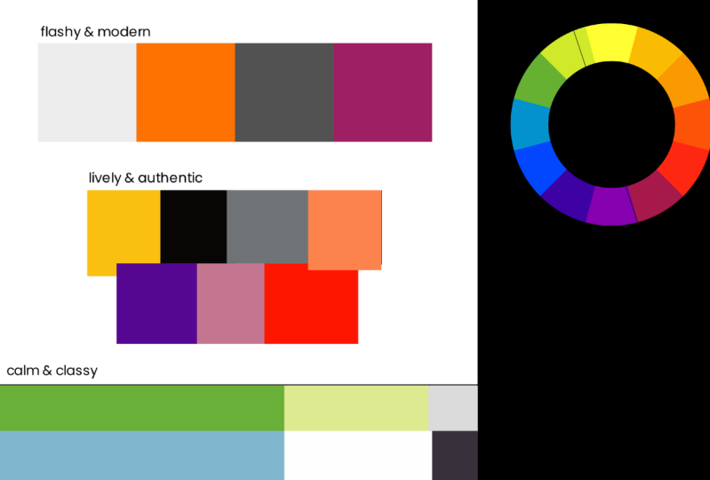
4. The Color Wheel: In order to understand color and use it for color schemes
and color palettes, you must first know how it is arranged and how different
colors relate to each other. We're specifically
talking about hue now. And you've certainly
seen this before. You can model how
the different hues connect using the color wheel. Now, the color wheel is
actually not entirely correct because there are actually different color wheels
with different purposes. For example, there is the
RTB color wheel that is most common in drawing
and design softwares to represent the color selector. Then there's the CMY color wheel which is used for printers, and there are even
more that get crazy. These color wheels describe different ways in which
colors can be mixed, but don't worry, that's
not really important here. For art and design,
we're going to use the classic RYB color wheel that is most common
amongst artists and works very well to
explain how color works. It's also the best for creating color schemes and color
harmonies, in my opinion. That's what we're
going to work with. And here it is the
good old RYB or red, yellow, and blue color wheel. I'd say it's very likely that
you've seen this before. The reason why it's called
that way is because red, yellow, and blue are
at the core of it. These are the so
called primary colors. They cannot be created by mixing any other two colors
on the color wheel, but they are the ones that are used to make all the others. So if you mix two
primary colors, you get a so called
secondary color. Mix blue with red,
and you get purple, mix red and yellow, and you get orange and
mix blue with yellow, and you get green. These are the three
classic secondary colors. But as you can see, there
are still gaps between the primary and secondary colors indicating that you can
mix them once again. If you do that, you end up with the six so called
tertiary colors, each created from one primary
and one secondary color. Now, the cool thing about
these tertiary colors is that you don't have
to remember their names. There is a rather simple
formula for finding them out. For example, the thing between yellow and
orange is called yellow orange and the thing between blue and green
is called, guess what? Blue green. Isn't
that beautiful? You take a primary and
a secondary color, combine them to get a new hue, and then you just combine their names to get
the hues name. I wish everything
could work that way, but, well, it's just
the color wheel. It's a rather simple model. In real life, there are obviously
way more different hues between the primary secondary
and tertiary colors, and they are flowing
into each other without any clear
borders or something. The color wheel shows us the arrangement of the main
hues that we've given names. And if you add tin
shade and tone, there is a near
infinite amount of possibilities for
having a color. But this color wheel is a model that illustrates
very well how hues basically work together and how we can mix them
to create new ones. Of course, it's a crucial part to creating color schemes
and color palettes, which we'll talk about later. That's nice and all, but
what does color actually do? Let's find out in
the next lesson.
5. Color Psychology: Color does a lot. No, ****. You are here because
you know that it is important and you
want to learn about it. But even still, color does probably more than
you think right now, and you need to understand this. I've told you how
we can associate colors with memories
and how that makes color an incredibly important factor when it comes to stuff
like brand recognition. You know that by now, but
we're just getting started. The real deal is not that, but how different colors
affect our psyche. Because every color has individual meanings that
can evoke certain emotions, and those can be
surprisingly strong. For example, the color of food
can affect how it tastes. The color of a room can affect your mood and how you feel, and your favorite color can reveal something about
your personality. And no before you say anything, collab psychology is not like magic crystals that have
effects or something. This stuff has actually been proven scientifically
over and over again, and all the big companies use it and spend money on
optimizing their colors. So there has to be
some application. Alright, now we got
that out of the way. Let's start with the
most basic example that I can think of for
colab psychology, which is color temperature. If you look at the color wheel, you can pretty much
split it into parts and divide it into warm
colors and cold colors, which means if you
have an image with many colors from this
side of the color wheel, it will have a
more warm feeling, and the temperature seems higher than if you used colors
from the other side. Just observe how the mood
of this image changes as I slide the hue back and forth
between cold and warm. Sometimes I find it quite
impressive how just changing the hue makes a scene look like it's in a totally
different environment. That's why I always love
playing around with hues after I finished
an artwork or a design, just to see how it feels
with different colors. Sometimes that's
really interesting. But why is that? Well, it actually
depends on the color, but it's either
through evolution and instinct or through conditioning and experience in the world. Both is possible.
Red, for instance, is usually more evolutionary. It evokes high
alertness because we instinctively connect
it with fire and blood. Purple, on the other hand, is a color that we often connect
with royalty and luxury. But that's more
because of society and our personal experience with how purple is used in the world. We could go more
into depth here, but I would say the why of a color's meaning is less
important than the what, because we as artists
and designers are practical people and just want our colors to
look nice and fitting. So I won't bother you with too much useless theory
here. Don't worry. Just remember, color can have a strong psychological effect. And we're not just talking
about warm and cold here. As an experiment in
multiple prisons across a few countries including
the US, Germany, and Switzerland, prison
cells were painted in so called Baker Miller pink to calm down
aggressive prisoners. Yep, you heard that right.
The feminine appearance of pink evokes humility and that makes it hard to be
enraged in its presence. And when prisoners were put into the pink cells, this
actually worked. Well, prisons are
pretty extreme places, and after about
15 to 30 minutes, other psychological
factors outweighed the effects of the pink paint. The calming effects of Baker Miller pink are
rather short term, which is why not every prison in the world has pink cells. But still, it's an
impressive example for how color can affect our psyche and how
that can be used in the most unexpected
ways you can imagine. So by internalizing what
different colors do, you can develop an intuition for using them effectively
and efficiently, which is a powerful
tool that you can use purposefully in art,
design and marketing. So let's dive deep and explore the psychological effects
of the ten main colors.
6. Understanding Blue: Let's start with
everyone's favorite. Blue is the most popular
color amongst humans, at least according to surveys. And for good reason, I
mean, blue just looks nice. It's the natural color of
the sky and the ocean. Blue generally stands for trust, reliability, calmness,
loyalty, and coolness. So pictures and visuals
with lots of blue seem a bit more slow
and less energetic. This makes them feel
relaxing and pleasing, but not necessarily boring. This is not everything, however, because blue is actually
a pretty complex color, as I look at its
different effects at different brightness
levels can show us. For example, dark blue
stands more for trust, dignity, intelligence,
and authority, while bright or
normal blues stands more for strength
and cleanliness, and light blue, like the sky, symbolizes peace,
spirituality, and infinity. It also has to be noted that
the lack of dynamic energy that blue has can give it a
sad and melancholic vibe, especially when used
with low saturation. So if a subject in your artwork or design is
supposed to feel that way, you can use tones of
blue to support that. This works very well because the symbolism of blue
is quite universal. As you can see, blue can have a variety of effects
depending on how you use it. But the dominant feelings
of trust, loyalty, and reliability make blue a super popular color
for company logos, especially in banks and insurance companies that
want you to trust them. You can often observe that
they have a brand design, so their logos and their website that contains lots of
blue or only blue. And this is also the case
for technology companies and healthcare companies because you just want to seem reliable
in these industries, and this is where
blue comes into play. I mean, it's understandable because you can't really
go wrong with this color. It's universally popular and accepted as something
that just looks good as the global adoption of blue jeans and blue suits
indicates, for instance, Blue works very well
as a background color or as the basis for an
artwork or a design because it's very calm and
doesn't really get in the way accidentally as something
like red or orange could. The only downside of using lots of blue that I can think of is that it's really hard
to stand out with it because it's
literally so popular. If you only want to
evoke reliability, like this is classic and good, or if you just want
to seem competent, then the chill color
blue is a good choice. However, to grab a new
viewer's attention or to make people notice
your design amongst others, you will most likely have to
do more than just use blue. Blue is probably not enough, so you will have
to combine it with a more energetic color for contrast or use another
color altogether. But combined with other colors, blue is definitely great, and it can unfold
its potential as a super pleasing
and popular color.
7. Understanding Red: Let's continue with red. Red is in many ways, the opposite of blue, not necessarily in terms
of popularity. Red is also higher by the list, but more in terms of
energy and emotion. Red is the natural color
of fire and blood, so it evokes higher alertness
on an evolutionary level, which makes it a
very powerful color. Only yellow is even
more attention grabbing and calls for higher alertness. Red is internationally used
as the color for stop, and almost 80% of the world's
nation's flags contain red, as well as many, many,
many company logos. Interestingly, as the
history of language shows, red is the most
likely color to be described by any language
right behind black and white, which are basically just
darkness and brightness. As I've said, people really
pay attention to red. And the symbolism of red
is very strong, too, because it's pretty
much the color of extremes and intensity, violence, love, danger, passion, anger, seduction,
energy, and speed. Looking at these terms, you can probably already tell that when you have an artwork or
a design with lots of red, it will feel very intense, either positively or negatively, depending on how you use it. With varying subjects
and intentions, this intensity can apply
to very different things, ranging from love to violence. So you got to be careful. When using red, context
is very important. Also, when you choose
the colors are rounded because red can have very different effects
depending on that. When it's surrounded by black, it seems very powerful and almost seems to glow because
of the high contrast. As opposed to white, where
it's a bit more dull and even seems smaller than
if you put it on black. And if you put it on a
bright, saturated orange, it looks lifeless
and almost cold, even though it's
officially a warm color. So yeah, context plays
a huge role for red, but in general, it definitely
has very high energy. You can use that
to make scenes or subjects pop or appear extreme. And in design, red
is very useful to guide a viewer's attention
and show them where to look. Now I don't only mean
clickbait thumbnails here. Red is the call to action color, as you can tell by
looking at most websites, buttons or links
that people want you to click on are
very often red. This color creates a sense of urgency and it can
even induce appetite. This is why many fast
food restaurants use red in their logos, too. But the power of red
is so huge that it can be as tiring as it
is attention grabbing, especially when used a lot
and with high saturation. Red is often and
easily overused, and it's just not nice to
look at after some time. Imagine if all the walls
in your house were painted with bright
saturated red. I mean, I would probably
go crazy pretty quickly. So red usually cannot be added as frequently and
as easily as blue. With this in mind,
always consider your usage of red carefully. Does it really fit the subject? Do you want the viewers
attention to go there? And are you perhaps using
a bit too much of it? Always ask yourself
these questions when using the color red. My advice is have a clear
purpose when you use red. Put red in places where
you want action and attention and use it
appropriately and precisely. Just don't use it too much
and let it stand out amongst other colors to harvest its
big energetic potential.
8. Understanding Yellow: Yellow. Yellow is the last classic primary
color that we need to cover. It's a very interesting
color because it has similar energetic and attention
grabbing effects as red, but it's still
totally different. Yellow has two sides. On one side, it obviously
stands for warmth, friendliness, happiness,
creativity, and optimism. It's naturally found
in many flowers, and the fact that it's by far the brightest hue makes us
associate yellow with the sun. That's also the
reason why yellow is often the color for
deity in religions, like in ancient
Egypt or Hinduism. It's a super popular color for logos of brands that
want to be seen. Yellow is often used by food
companies, for instance, because it induces appetite
or also as an eye catcher in newsfeeds if they don't want to seem super
dramatic like with red, but still want your attention. That's a very smart
use of yellow. On the other side, however, yellow can also
stand for jealousy, egoism, betrayal, plus
physical illness and caution. It's frequently used as a
warning sign for stuff like toxic materials or danger or in traffic because
of its high visibility. Again, the psychological
effects of yellow strongly depend on the
context in which you use it. But if you wanted to
appear warm and friendly, absolutely make sure
that you use it in a bright and especially
saturated form. Unlike other colors that
just get darker and sometimes a bit more intense when you decrease their value, yellow doesn't like
darkness so much because it reacts very strongly to black and quickly fades to a muddy, green, brownish
tone that doesn't look very welcoming
and friendly anymore. One of the very few
colors that you could pretty much describe
as objectively ugly. There are no real dark yellows. This color literally wants
to be bright and shining, so that's also how you want
to use it most of the time. Here's another interesting
use of yellow. When editing a visual scene, you can give it a slight
overlay or filter with yellow and it immediately feels more warm and
more comfortable. That's a very easy
and common effect in movies that you can also
use in art, for example. Use bits of yellow like light bulbs that
you put somewhere. It's an excellent color
for creating contrast, especially when used with
darker colors like dark green, dark blue or black. That way, it looks pretty
much always awesome. But as a main color, yellow is actually
not used that often because it can be very
tiring, just like red. Due to its high energy and
attention grabbing effects, it's also very easily overused. So be careful. Always mind the context in which
you use yellow. Use it carefully
and purposefully, and I recommend you use it mainly as a small accent color. Pick the right subjects for yellow and the right amount of it and you can benefit
from a variety of effects, ranging from happiness
to physical illness. Let yellow be a bright
accent to contrast other darker colors and it will stand out
like nothing else.
9. Understanding Green: Moving on to green, we got the color of nature and growth. Green is another
very popular color in branding for
exactly that reason. If something is
saturated with green, it looks fresh, natural, eco friendly, and it
promises future growth, which is why it's
also a popular color in the financial industry, and banks also like to use it in their logos,
just like blue. Green is used in
rising stock prices, green check marks, and green traffic lights that tell you that you're good to go. It looks fresh and clean, and it's also often used
in the cleaning industry. The symbolism of green
comes from plants, and we associate
almost every object that's green with nature
in one way or another. Why? Well, perhaps that's because literally everything
in nature is green. Obviously, green
is the color for eco friendliness and companies
that produce organic food. It's mainstream in that regard, and you will have many
competitors if you decide that your company that has
something to do with nature shall have a
green logo or website. But don't worry. That
doesn't mean it's bad. Green is still
often a good choice because it's just so
fitting for this purpose, and there are many
different versions of it. Aside from nature, green stands for hope, health, freshness, and prosperity, but also
potentially envy and bordom. Generally, green comes in probably more variations
than any other color. So green is not just green. It can be used in so
many different ways with varying hues, tones, and values making
a huge difference. Green looks more fresh
and exciting and darker green looks more
calm and grounded. If you use green with
lower saturation, it will make anything
look natural and base. Like it comes
straight from nature. When used in a bright form and with high
saturation, though, green can look surprisingly
unnatural and toxic, like cheap plastic or something, but it depends on the subject. What's also interesting is
Green's color temperature. As a mixture between the cold color blue and
the warm colored yellow, it's neither warm nor cold. Its temperature strongly depends on its hue and the colors
that you add are round. Green can look very cold if
it's more on the blue side, but also very warm if there
is more yellow in it. Pay attention to the color
temperature if you use green. It can quickly shift and not
have the desired effects. Green will always be
your choice if you draw, paint or design something
that has to do with nature. That's not going to
change so quickly, but try mixing it with other colors in order to
make your visuals stand out. Remember that green has
many different variations, ranging from emerald and avocado to turquoise
and the ocean. Green is a color that's truly
worth experimenting with.
10. Understanding Orange: Orange, here we go, a very polarizing color. People tend to either
love or hate it. Fun fact, the color orange is actually named
after the fruit, so it's the only main color that got its name from an
object, which is funny. But let's get to the point. Orange is the color for warmth as a mixture
of red and yellow, that's pretty obvious and it also inherits some of the
effects of red and yellow. Naturally, orange is found
in fire and sunsets, flowers, fruit and vegetables, leaves in autumn, and sand. For that reason, orange looks not only hot but also healthy, which makes it a super popular
color for food companies. You can see many, many food products
use the color orange. Its general symbolism is
energy, excitement, warmth, adventure, change, and vitality, which is generally really nice. But orange can also suggest a lack of discipline
or a lack of serious intellectual
values because the color is very free,
loose, and energetic. Plus, there are also
slight differences depending on the
value of orange. Darker oranges can look spicy, earthy, and comforting,
a bit like brown, while brighter oranges look a bit more soft but energetic, hot, and healthy, which is a quite interesting combination. So if you use orange
in marketing, think about who you
want to speak to. Notice that highly saturated
orange can look cheap, but not necessarily
in a bad sense, maybe just that it
stands for a goodbye. Because of its high
energy and looseness, orange also speaks to children pretty much
internationally. Orange also has very
high visibility, almost as high as yellow, which is also why it's often used as a warning
and safety sign. You will pretty much always notice the orange
bits in a picture, no matter what or how many
other colors there are. Orange works excellently with its complimentary colors
like dark, blue or green. So it doesn't look too
hot and demanding. And if you combine
orange with black, it pops even more and looks very intense, potentially
even aggressive. But orange can also
work very well as a background color
if it's not super intense but more light and less saturated or very
dark and less saturated. That works too. And that way, it will provide
viewers of your work with warmth and comfort. Explore orange nuances. There is a huge variety of
effects that it can have. If you use it well, you can create compelling artworks and designs that look exciting but comforting at the same time.
11. Understanding Purple: Next up, we got purple. Purple is a very
interesting color because in nature,
it is very rare. It's well possible that many of our prehistoric ancestors never saw a purple flower,
bird or fruit, which is why even today, purple mainly symbolizes the supernatural rarity
and being special. Purple has actually stayed
rare for a long time, and the only known way to dye
something purple used to be extracting it from
literally thousands of shellfish for a single
gram of purple dye, which is why only the absolute richest people could
afford to wear it. In the Roman Empire, the
color was, for some time, strictly reserved
to be only worn by emperors or very wealthy
and privileged individuals. Now, times have
changed, of course, and purple is now all around us, but it's still
heavily associated with luxury,
royalty, and wealth. That's the main symbolism
of purple for most people. But also purple
stands for mystery, creativity, spirituality, imagination, and
the subconscious. And just like orange, purple
is a very polarizing color. So people tend to
either love or hate it, and young people tend to like
it more than old people. Notice that purple also has slightly different effects at different brightness levels. Light purples look more
loose and lightheaded, while dark purples look more sophisticated
and intellectual. The fact that purple is significantly more
popular amongst the youth is something that you should keep in
mind in marketing. Purple can make a
brand design look expensive, luxurious,
and intelligent. But speaking to a young
audience at the same time, which is a quite
interesting combination. With purple, however,
you have to be careful. It can also stand for
decadence and make a brand design seem stupid
if there is lots of purple, but the product or website don't provide any
significant value. So don't mess with purple. Only use it where you feel
confident and your product or service can live up to the high expectations
that this color induces. Like green, purple is a color that's neither completely
warm nor cold. It just depends on
whether it's more on the blue side or
on the red side. Red obviously being
more warm and blue being more cold. So
pay attention to this. When you make a design or a
painting with lots of purple, its color temperature
is very sensitive, and you definitely
want it to be right. Look at the subject and
the theme of your image or design to decide in which direction you want
to move with your purple. Purple, as the color with
the highest wavelength on the light spectrum is a very
powerful and intense color. So I recommend not overusing it, especially if you want
to sell something. Remember that you can always
use lower saturation or lower values to
influence a color like purple and use
it in moderation. That way, you can make it look professional
without seeming decadent and you can profit
from its powerful meanings.
12. Understanding Brown: Brown. Now, what
does brown do here? Brown is not really a hue on the color wheel but
it's more like a dark, desaturated version
of orange and red. Well, brown is here simply
because it has meaning. It doesn't need to be
a specific hue to have specific effects because even though brown is a variation
of orange and red, it has very different
effects and meanings that you should
be aware of when using it. Brown is one of the most
common colors in nature. It instinctively
makes us think of Earth and everything
that comes from it, like tree stems, for example. That's why brown is like green, often used for designs of
companies that produce organic food or brands that want to seem
connected to nature. But brown doesn't
look as healthy, fresh, and growth
inducing as green. It's more grounded,
down to earth, respectable and stabilizing. Brown evokes trust, and it
stands for authenticity, dependability, and something
that comes from nature. The color is very
friendly and comforting, but it's not striking and
signaling like red or orange. So it's an excellent choice for backgrounds rather
than main subjects, which is also how it's
used most of the time. Brown actually works
very well with other colors and
pretty much any of them because brown alone can be a bit boring, dull
and predictable. It can even evoke loneliness
because of its simplicity. Brown puts reality over fantasy. It doesn't really have intensity like most hues on
the color wheel, even when used with
higher saturation. Remember to use brown if you
want to seem authentic with your brand or realistic with
your painting, for instance. Don't forget to add other striking colors in
contrast to brown, and it can unfold
its potential as a super versatile
baseline color.
13. Understanding Pink: Okay, pink. Before you ask, no, pink is not the
same as purple. I know they look
kind of similar. I mean, they're both hues
between red and blue, but pink definitely has unique meanings and effects
that I want to show you. Pink is basically red mixed with lots of white and
a little bit of blue. So it's a bit more on the
red side than purple, and it's usually
quite a bit brighter. It basically ranges from
salmon pink to berry pink, depending on how much red
or purple there is in it. Generally, lighter and
less saturated pinks are more soft and
innocent and darker, more saturated pinks appear more intense and romantic,
a bit like red. Either way, pink is heavily
associated with the feminine. I don't think this comes
as a surprise to you. However, there is a little bit
more to it than just that. Pink inherits some of the energizing and
compassionate effects of red, but through its
mixture with white, it comes with way
less intensity. It can even seem relaxing, calming and comforting
because of that, which gives the
color contrasting effects depending on how you use it and how you adjust the
values and the saturation. In general, pink stands
for compassion, love, femininity, playfulness, but also emotionality
and immaturity. Pink is a very friendly color. It induces romance and warmth. That's why pink is often
associated with sex. The big contrast of
pink is that it somehow stands for innocence and
intimacy at the same time. Don't ask me how that happened, but it certainly has
something to do with the simultaneously friendly and timid wipes that pink gives. It's surely a weird color, and it's mainly
used in marketing if a brand wants
to speak to, well, girls, or if it wants to be seen as easygoing, casual,
and youthful. Using darker and highly
saturated pinks for larger areas of a design can make it very
tiring to look at, as it's the case for
all energetic hues. But brighter, less saturated
pinks can be very useful for that and they can make
something seem quite modern. Notice, however, that
an overuse of pink can make a brand design
seem cheap and careless. Try to think of pink
as the brighter, more red version of purple that seems less
deep, less serious, less expensive,
and more playful, it works very well
with countercolors, like green or blue to cob
it down a little bit. And yeah, that's pretty
much it for pink. Be aware of its varying
effects and you've got another versatile tool
to evoke strong emotions.
14. Understanding Black: Now black. Wait, is that really a color?
I'm going to be honest. I don't know, and there is certainly a debate to
be held whether or not black and white are actually
colors because technically, they aren't is pretty much just the absence
of any light and color, and white is the opposite. But guess what?
They are something that you can add to an
artwork or a design, and you can definitely see when something is
black or white. So they have unique effects on the viewers that we
should discuss here. So let's start with black. Black generally stands
for power and intensity. Any color as you
decrease its value will get more and more serious
until you end up with black, which is the ultimate
symbol for class. If something is black, it often looks big, intimidating
and strong, and it exudes authority
like no other color, which is why you see
many, many black cars, for example, because people
like to be seen that way. Our brand uses black in its
logo or website if it wants to be seen as serious,
elegant, and expensive. But black can also seem sad,
depressing, and dominating. Because of its complete
lack of light and hue, black doesn't shift in any
direction on the color wheel, like cold or warm or
energetic or relaxing. But black doesn't
reveal anything. It's just there being strong and powerful without
any bias or wipe. Black works excellently
as a contrast to bright, striking colors,
and it makes any of them more intense than
they would be by nature. And this is the main
reason why it's a super useful tool
in art and design. The color black is one of
the best ways to frame something or to direct the
viewers attention somewhere. You can either use black for the focus point in a
C or lighting color, which can make the subject
seem powerful or even evil, or you can use it to
surround our focus point, which makes the
subject seem weak, helpless or also heroic. Black is an essential
tool in art and design. You should not forget about
its existence amongst all the interesting effects of different hues on
the color wheel. How you use black
in your painting, design or logo will influence
a lot how it feels. The addition or removal of a black bit will always make a huge
difference in your work, no matter what it is, and
more than any other color. You will use black a lot
as an artist or designer, no matter what your
preferred style or mood is. So be careful with black. Black is not really a color, but more like a
manipulation of color. It's a tool for contrast
that you have to master in order to create awesome
artworks and designs. Combine black with bright or saturated colors to
create contrast, and you're pretty
much guaranteed to have something that
grabs attention.
15. Understanding White: Finishing off with the opposite
of black, we got white. White light is the combination
of all colored light. So this means white
is not really a hue, but it's pretty much the
definition of brightness. Any color as it gets brighter and brighter,
fades to white. This makes white pretty much the baseline for most
artworks or designs. It's the color of a blank
canvas, blank paper, and it's the background color in pretty much every drawing
and design software. White waits to be filled or
combined with other colors. It's pure, innocent,
neutral, and nice. So its symbolism is mainly peace, neutrality,
and cleanliness. This makes it the most easy going and soft
color out there. Look at toys and
clothes for babies. They are often
colored in pastel, which basically means any color
mixed with lots of white. This makes any color
soft and neutral, no matter its original
meanings and effects. Now, is that all for white? Just nice and neutral? Of course not, white
can also be used in a very different way to
create striking visuals, heroic scenes,
memorable artworks and lots of tension
in our design. Think of the examples for using black from
the last lesson, just the other way around. When everything is dark, you look at that one
white part of an image, and when everything's white, you look at that one bit
that's darker or colored. Because white is the
definition of light, it is, along with black, the best
color for creating contrast. I don't think this
comes as a surprise. However, brands don't really use white as the main color
in their logos or website because
it's super neutral and not really attention
grabbing or memorable. It has to be combined with
other colors in order to work. So you can see that it's
still part of many logos, but just used as contrast
to make other colors pop even more or add it as tint to give other colors
a bit more detail. So yeah, white may not be
a real color, technically, but it's still an important part of most artworks and designs, and you can definitely use it to achieve
psychological effects, either as an innocent basis or as a tool to create
powerful contrast. So that's already it
for the details of the most important
colors that you must know. Now let's continue.
16. Color & Culture: Now you know quite a lot about the effects that different
colors can have on viewers of your artworks
and designs. Or do you? There is actually
one important point that we should not forget about, and that has to do with where our associations with
different colors come from. As I've told you, there are two main ways in which
color can affect us based on instinct and evolution or based on what
we've learned in society. And yeah, here's the thing. Societies around the world
are quite different. Oh, no. So does that mean that the
collab psychology that we've learned only applies to a few specific
parts of the world? Don't worry. Not really. What I've told you so far are very universal associations
that people make with colors because the symbolism of colors doesn't usually come
from anywhere, obviously. The societal effects are often based on the
evolutionary effects, which means that you can
use what you've learned so far pretty well
in most cases, and it will have the
desired symbolism for most people on the planet. Red stands for energy, blue
stands for relaxation, yellow stands for joy, and
green stands for growth. This is pretty much the
same all around the world, so you can count
on these effects. However, there are some nuances that you must be aware of. Now, if you make art, the symbolism of your
colors is probably way less important than whether or not they look nice and fitting. In art, you can mainly focus on color harmony and
color palettes, which we'll talk about
in depth later on. But specifically for
brand and logo design, you have to get
everything right. So I want to tell you
something before we move on. You often have to deal with the fact that in
different countries, colors can have
different effects, which might have an impact on how your brand is perceived. So you got to watch
out for that. In India and China, for example, red is a color that's
typically used for weddings. While in South Africa, it
stands for grief and mourning. And the color purple generally looks expensive in
most countries, but it actually looks cheap in some others. And
that's not everything. There are also
differences for genders. Blue is the number one, most popular color
for both men and women, but for number two, it's actually not so
clear because men tend to prefer green and not like
pink and purple as much, while for women, it's
the other way around. Also, there are some studies showing that in some societies, including what we call the West, women are generally able to name and distinguish more
different colors than men, which is quite interesting. It's also funny to look at which colors actually have names
in different societies. While in Japan, blue and green have literally
the same name. The inuit have 17 different
names for shades of white. Yeah, because they spend basically all their
life in the snow and they just describe
different shades and tones of that snow
with different words, which makes sense for them, but seems totally
stupid to most people. That's a little fun fact
that illustrates how different the perception of colors is in
different societies. But not only culture and gender can play a role in our
relationship with color. Age too is a thing that
you have to watch out for. Young children generally prefer more intense and warm colors, which you can tell
by looking at toys. They are usually bright,
saturated and have warm hues. On the other hand,
the older people get, the more likely they
are to prefer calmer, colder and more classy colors. Also, people living in
sunny climates like Africa, on average, prefer warmer and more saturated
color palettes. While people in colder
places like Scandinavia, prefer colors that are a
bit more cool and neutral. Now, obviously, not every person that's part of a group acts
like that group all the time. Not every Africans favorite
color is red or yellow. Not all children only
enjoy warm colors, and not all women are able to name more colors than
the average man. These are just statistics
and the results of many, many surveys and studies. Individual people often
have their own taste, so you can't make sure that your artwork or design speaks to everybody in the same way and has exactly predictable effects. That's just impossible,
unfortunately. But the statistics
are still there, and they simply predict probabilities that are
very useful for marketing. If you use a cool
pastel color palette for a marketing
campaign in Norway, not every single
Norwegian will love it, but the probability
that it works is statistically higher than
if you went with a bright, saturated color
palette, that one would probably have
better chances in Africa, for example, or South America. Obviously, you should
not just research the favorite color of your target audience
and just use that. It also depends on the type
of product you're selling, the brand image,
your personal style, or preference, color psychology
and stuff like that. These are all factors
that you can and should take into account when you select
colors for something. But what I'm trying
to say here is that culture and the people
who you want to speak to are also factors that can be very helpful in
your decision making. It can be that crucial bit of extra information to perfect the color palette for a design, and many people
forget about this, which is your
competitive advantage. If you want to target
a specific audience, use these group specific
color effects to make your artwork or design look pleasing for that
group specifically. By doing this, you can
increase the probability of your message working and
your colors looking great. That way, you're in many cases already far ahead of
your competition. Color is a tool that may be
tricky to handle sometimes, but it's always worth it investing time and
research to get it right. Trust me, it will pay off.
17. Color Context: If you want to use
color in any way, you must be aware of
color context because colors can look very different depending on how
you connect them. Not paying attention to
this is probably one of the most common mistakes that artists and designers
make when using color, and you don't want to
be one of them, right? Here is what you need to
know about color context. Whenever there are two or more
colors next to each other, they influence how they
look and how they feel, especially when they
are quite similar. Take this pink right
here, for example. If I place it on top of
this blue spot right here, it looks warm and glowing because compared to the
background color, it is. But now if I put exactly the
same pink on a bunch of red, then it looks pretty cold and even a little
bit desaturated, even though it's the
exact same color. Or look at this red square
put on different backgrounds. It looks striking and
intense on black, a bit dull on white, brilliant and glowing on blue, and almost lifeless
if you put it on orange. Here's the deal. Don't just think of
colors as absolutes. Like this color is
warm, that one is cold, this one looks happy,
and that one looks sad. Yes, colors do have absolute meanings that you
can rely on most of the time, but you should also consider a color's relative position
to its surroundings, because depending on that,
it can look very different, not just in terms of
color temperature, but also in terms of visibility, intensity, value, and even the psychological
effects that a color can have. Contrast is an
important factor here. Let's take this strong, saturated and intense yellow
and make a pattern where we mix it with an equally
intense pink. Look at this. The whole thing doesn't
look as strong anymore, but rather smooth and calming, even though the colors on
their own are very energetic. Due to the lack of contrast, the colors can't really
stand out and do their job, but they even seem to cancel
each other out a little bit, which is not necessarily
a bad thing, but it just changes the
effects that the colors have. This shows us that color context mainly plays a
role if colors are close to each other
on the color wheel and have similar
value and saturation. Depending on the direction in which you move on
the color wheel, when adding another color, it will have an according
effect like this. When you have a blue,
desaturated artwork that looks very cold and you
add green and purple, then these two colors
will look very warm, even though officially
they are pretty neutral in terms of
their color temperature. But compared to
their surroundings, they now look pretty
warm and glowing. But if we take colors that are further apart
on the color wheel, they pretty much always look
pure and intense because there is lots of
contrast between them and they don't really
interfere with each other. When colors are further
away from each other, they don't really compete and
each color can do its job. This green looks very green and this pink looks very pink. They don't cancel each
other out, but instead, they even seem to
strengthen each other, which you can, of course,
use to your advantage. But more about that later when we talk about
color schemes. Color context also
plays a role for value. How you perceive the
brightness of a color is dependent on the values
of the colors around it. A very clear example of this is this line put over a transition
from black to white. It almost looks like the
line has a transition too, ranging from a brighter gray on the left to a darker
gray on the right. But if I remove the background, we'll see that it's just 1 gray and we've been tricked
by color context. Another funny thing
is how our brain reacts when color is
added or taken away. Look at this yellow screen
and pause the video for about 20 to 30 seconds and don't look away
during that time. And now, if I remove the yellow, it looks purple or blue, even though the
screen is just white, your brain has gotten
somewhat used to this yellow during the
time you've looked at it. And once it's gone, everything looks like it's
complimentary to yellow, which is this blue,
purplish tone. So here is what you
should remember. Whenever you add another color
to an artwork or a design, think about the effects
that this color would have, not just the absolute effects, like, is this a warm color? Does this color look
bright and energetic, but also the relative effects. Is this color warmer, brighter or more or less energetic than the colors
that are already there? And would that be fitting? Adding a tone of
yellow to an image does not necessarily
make it look more warm, as you can see here, even though it's officially
a warm hue. Same thing with
saturation and value. Always keep our colors context
in mind and combine the absolute with the relative
effects. That's how you do it.
18. Color Harmony: Now we're entering the
core of this course, the really important stuff
that you've been waiting for. Welcome to color harmony. Color harmony is the science,
if you can call it that, of making colors
look good together, which is quite useful like every time you use
more than one color. So we're done with
it. This color does this and that
color does that, and we will now
explore how to pick multiple colors for your work and how to ensure
they don't suck. Let's go. The first rule of color harmony is to not use too many saturated
colors at once. Like, please, this is the most classic
beginner mistake that you see in every field
of art or design. More is not always better. If you just spam colors and fill the whole image with
supersaturated forms and shapes, you won't get more nice
psychological effects from that. The only thing the
viewers of your work will experience is a strong
desire to look away. Colors generally
work best when there is focus, a nice balance, and not too much going
on at once so that each individual color can be noticed and do its job properly. And we'll talk about
how to do that. Use color schemes,
make a color palette, choose a few fitting colors, and stick with them. Having unrelated colors with high saturation
everywhere is one of the quickest
ways to make sure your visual looks awful. I'm sorry, that's
just how it is. Now, does this mean you shouldn't
make colorful pictures? Of course not, but it's way
better to just focus on a few colors and
picking them carefully based on a color scheme rather
than adding them randomly. Or you can just make your colors desaturated so they
don't burn in your eyes. That's also a way
to make it work. But what if you do want
to use many colors? I mean, there are
plenty of artworks and designs out there that
use many different hues, but still manage to look great. Well, let's look at
some nice pieces of art and see how they do it. Oftentimes, you can observe that there are just one or two, maybe three colors that dominate a picture and
appear in most parts of it. And the other colors are
just in the details. That way, they don't
really compete with the main colors and look harmonious without
being overwhelming. So if you just focus on a few colors that
dominate a picture, you can usually add more
to spice up your details, and the picture will look good. As long as the spots
where you have these unrelated extra
colors are very, very small, all right, another way to make
unrelated colors look good together is to bring them closer together by lowering
their saturation. Let me give you an example. Right here, we got
many different colors that don't really
connect with each other. They are just there looking like a wild kindergarten party and none of the colors really speak because they
are all equally loud. But now if I lower the saturation and increase
the brightness a little bit, the whole thing actually starts looking like
a pleasing texture, and it can be used as a background for a
design or a text, and you can even add colorful
brush strokes and spots, and they look right
because of the contrast. This is a useful
technique that you can observe being used in
many great paintings. The artist uses many different unrelated
colors and connects them simply by bringing them closer together with
low saturation. This is a great way to create harmony between
unrelated colors, and it's a great way
to give your paintings an extra layer of
detail and life. Having not just one
color in a texture but multiple colors with
low saturation is, I would say, a pro
trick to elevate your art to the next
level in terms of color. But not only saturation can be used to make unrelated
colors look good together. Another great way is to create a value
contrast between them. If you want to combine two
or three unrelated colors, you can make one or two of
them very bright and the other very dark or two very dark and one very bright
or something like this. When there is a huge value
contrast between colors, there is focus and
a clear separation. And that way, as you can see, I can make different
unrelated colors look quite interesting together. And generally, I just
have to say this, a good variety of
values is one of the easiest ways to enhance your art and make
it more interesting. This is certainly more important
than a variety of hues. By using darkness and
brightness efficiently, you don't even need any
different hues to make an image interesting and
direct the viewers attention. This is the basis
of color harmony. Create balance and focus rather than having lots
of different colors. Choose a few main colors, and you can add more
in the details, bring different hues in a texture closer
together by lowering their saturation and use different values to create contrast and enhance
the whole picture. All right, sounds pretty good. But what if you want to create harmony between strong colors? I mean, not everything can be a desaturated texture
or a small detail. Well, you've heard me talk about related and unrelated colors. So let's clear up
what that means and explore which colors
generally work well together. I think there are probably way more options than
you're aware of.
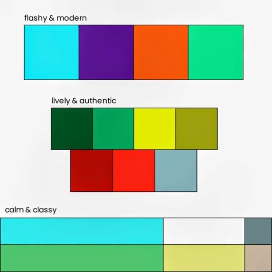
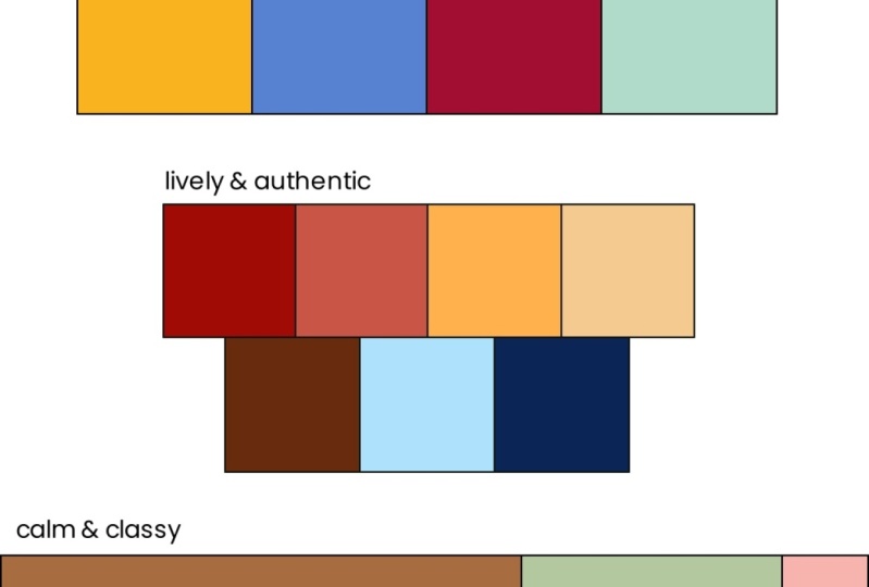
19. Color Schemes: Ladies and gentlemen, it's
time that I introduce you to the most useful tactic for picking colors and
creating harmony, and that is using
a color scheme. A color scheme is a framework that you can utilize to find out which hues would work well together in an
artwork or design. So hue scheme would be
technically more correct, but it is what it is, and it's called color scheme. Color schemes are
well explored and pretty much every artist
and designer uses them. If your color selection is
based on a color scheme, you can be pretty sure
that it looks harmonious. So pay attention.
You will need this. Here are the six
main color schemes. First of all, we got the good old monochromatic color scheme. Monochromatic means
it's basically just one hue with different
shades, tints, and tones. Who would have thought if
you use only one color, you can't really go wrong. However, what you
should notice about monochromatic color schemes
is that your values, shapes and subject need
to be really good. If you don't have any
interesting colors, the viewer will naturally completely focus on the subject, and they will pay lots of
attention to the shapes. So they have to be
on point if you want your work to be
appealing and visible. Also, since the color has to
perfectly fit the subject, it has to be carefully selected. In an artwork that
has only one color, a lot of the feeling of the artwork is based on
the effects of that color. So you have to choose it very carefully and be aware
of its psychology. And in marketing, the
message of a logo, if it has a monochromatic
color scheme is also heavily based on the
effects of that singular color, which can have positive
but also negative effects depending on the color
psychology and how you use it. So monochromatic color schemes are especially useful to create focused and atmospheric scenes or a clear and obvious
message in marketing. If you want to achieve
similar effects, but feel like using
more than one color, then it's probably a good idea to use an analogous
color scheme. This one uses two, three, or four different hues that are adjacent on the color
wheel and therefore just naturally work well together because they
have roughly the same, let's say, vibe and usually
a simular color temperature. Analogous colors
are easy on the eye because they usually have
a simular type of energy, but they still provide you
with enough variety to have different visual areas,
which creates interest. They usually result in a
comfortable and peaceful mood. You can often find analogous
colors in nature with different shades of green and blue that look really
nice together. This is a very beginner friendly color
scheme because it's easy to understand and
honestly, hard to do wrong. Just pick a few colors that
are next to each other, and it usually works out well. So make use of a simple
analogous color scheme, and your artwork or
design will surely look pleasing pretty much
without any risk at all, because analogous
colors always work. Alright, then we got color schemes using
complimentary colors. This is pretty much
the opposite of monochromatic and analogous
color schemes because a pleasing harmony
of simular colors is not the only way to make
a visual look appealing. Another method is to create
a striking contrast, which usually results
in even more interest. And that's where complimentary
colors come in handy. For a complimentary color
scheme, you pick one color, and then you pick the one on the opposite side
of the color wheel, yellow and purple, blue
and orange, red and green. These are classic complimentary color pairs that you probably know and you can use to create intense and
striking visuals. I should note, however,
that you can also slightly move left or right when choosing your
complimentary color, due to the fact that there are slightly different color wheels. But in order to have a
complimentary effect, two chosen colors should be very far away
from each other. Just remember this and
you're good to go, no matter if you're
using the RGB, RYB, or CMY color wheel. Color theory is luckily not
that precise, so don't worry. Complimentary colors are very popular because they
naturally work well together, and using them is a
very efficient way to make an image up here
interesting and pleasing. But not through a calm
and harmonious look, but because of the tension that complimentary colors
have between them. This is what you
should be aware of. You don't even need to give
your complimentary colors different values to create contrast because they
just naturally have it. If you have a visual
where two colors bring totally different effects to the table like
complimentary colors do, you can play with
that very well. Often complimentary colors
are used to intensify a polarity between two
parties, like good and evil, for example, and light
and shadow areas in video games or movies are very often highlighted with the complimentary
colors orange and blue. So complementary colors are very useful to separate elements that are supposed to be opposing each other or simply to make
something stand out. But they can also
be used to give a more uniform element
like a pattern, more depth and more interest. Complementary colors are
just a natural eye catcher, and therefore, many companies use complimentary
colors in their logos. Plus, complimentary colors are the reason why many
natural things look nice, like a Christmas tree with red decoration or a sunset
over the sea, for example. Here is a pro trick for complimentary colors that
many people don't know about. You don't have to
only use two colors. You can also choose a
few analogous colors and then you add a single
complimentary color to them. This results in very rich and pleasing looking
compositions, and it gives you more options
than just two colors. But here's the important thing, only add analogous colors to one member of the
complimentary color pair. Really have just a few
analogous colors and then a single
complimentary color to create a little bit
of contrast and tension. If you add more complementaries, then you have too many colors, and this should be avoided. Notice that complimentary
colors generally work better when one color
is dominating the other. Like in this image right here where we have a
complimentary color pair, but one color is obviously the main part and the other
one just a small accent. This works well because you have the interest and tension that complimentary
colors give you, but there is not that
much competition. If you have a picture where two complimentary colors
are equally distributed, they might start biting
each other a little bit, which can be good or bad depending on what
you want to achieve. So be aware of that. Some might argue that complimentary
colors are overused. They are easy to understand and many people know about them. But still, I would
say you can make very unique things when
using this color scheme, if you explore all
the different options with analogous colors or
different distributions. Generally, a complimentary
color scheme is a great choice if you want to make your art or
design stand out. Alright, moving on, we got
the triadic color scheme. A triadic color scheme
utilizes three colors that are equally far away
from each other on the color wheel and
create a triangle. So it's a bit like
complimentary, but with three colors
instead of two. This results in a more
rich color selection if you choose to go with
a triadic color scheme. Three colors from completely
different parts of the color wheel each bring a
different energy with them. So you have a lot going on
with this color scheme, and it can be tricky to pull
off a triadic color scheme because it often makes images look cartoony or too colorful. But if you handle it right,
it's definitely awesome. This is why triadic colors are a popular choice for
eye catching logos. They have lots of variety while still looking,
harmonious and complete. Like complimentary colors,
triadic colors work best when one or two
colors dominate. So for example,
you have one color and two are the accent, or you use two colors a lot, and you use one as the accent. But generally, you should avoid an equal use of all three. And especially don't make all three colors
super saturated, except, of course, you want
to have something that looks very cartoony
and colorful. So the triadic
color scheme may be a tool that's a bit
more tricky to use, but triadic colors are
powerful if they fit the subject and each
color serves a purpose. Okay, then we have the split
complementary color scheme, one of my personal favorites. This one is made up
of one color and then the two colors that are next to its complimentary color. So it's a bit like the
complimentary color scheme, but with two colors
instead of one. So you have more
creative freedom. And the interesting thing
is that with this one, you can create tension, but also balance, depending
on how you use it, which makes it really versatile. Generally, a split
complimentary color scheme with saturated colors makes images look very joyous and lively, like this one right here. Many great artworks make
use of this color scheme, which is quite understandable. It's super versatile and
useful in art and design. In my opinion, a split
complementary color scheme is one of the best ways to stand out amongst
your competitors. It's a little bit underrated, and many artists and designers
don't even know it exists. What I like to do and what
I would recommend is using the one color as the main color and the two opposing
ones as axons. This works pretty much always and results in
really nice visuals. So you should
definitely try this out when using a split
complimentary color scheme. Trust me, it's a
really nice one, so make use of it. All right. And finally, we got the tetradic or double
complimentary color scheme. This one is composed
of two pairs of complimentary colors
like this, for example. So this one provides you with a huge variety of color choices. And because there
are so many options with so many different colors, it can be hard to get the
tetradic color scheme right. You should definitely avoid an equal use of all four
colors because this will result in a wild and
overwhelming composition that you want to
avoid at all costs, except you have a super
simple subject like a square, and you still want to make
it look alive and colorful, like the Microsoft logo. In that case, you can go all in. But generally the tetra
color scheme works best when the two complimentary
color pairs appear in different
parts of the image. You can, for example, separate the foreground and
background of an image very nicely and
professionally by using different pairs of
complementary colors for them. That way, both parts are visible but still distinct,
which is pretty cool. Or you can use the complimentary
color pairs like this with one appearing in one part and the other
one surrounding it. So I would say the
tetradic color scheme is definitely an advanced one. You should use it when
there is a lot going on in your image that you need
to separate somehow. When used right, the tetradic or double complementary
color scheme can result in a very
interesting color composition, and it can help you keep the viewer in your
picture for a long time. All right, these are the main color schemes
that you should know and utilize if you want
to become a master of color. Look at any artwork or design that you find pleasing
in terms of color, and you will most
likely find one of these color schemes
in one way or another. A natural approach to making an artwork or design
is to start with one subject that has
a color and then choosing the other colors
using a color scheme. For example, if your subject
is supposed to stand out, you can just add one complimentary color
in the background, and if your subject
is supposed to be embedded in a
lively environment, you can choose more colors using an analogous triadic or split
complementary color scheme. Always think about how many
colors would be appropriate. More colors usually result in more energy and they make
your visual look more alive. Think about if you want more
harmony, in which case, you would choose colors on the same side of
the color wheel or tension for which
you lean toward color schemes with
opposing colors. In a practical sense, you can start by using
a color scheme to pick fitting hues for
your artwork or design, and then you select
these hues and simply vary their
values and saturation. That way, you can
fill your image with a huge variety of colors while making sure
they look harmonious, and this is how you
can use color schemes. Okay, once you've
understood this, move on to the next
lesson where we add another dimension
to color schemes by exploring color palettes. Let's go.
20. Color Palettes: Moving on, the next
step after deciding on a color scheme is
creating a color palette. Now, you might ask yourself, but what's the difference? Not even a bad question.
A color palette is like a color scheme, a collection of colors that
you put together in order to model which ones you want to use in your artwork or design. But while a color scheme only refers to the hues
and how they connect, a color palette is a
direct color collection. So that also includes value and saturation to model the
final colors of your work. So this is not
only for the hues, but for the actual colors
that you're going to use, which is very useful
because obviously not only hues play a
role in art and design, but also values and the
saturation of your colors. So it makes sense to model
your colors and see if they work together before
starting the creation process. And that's what color
palettes are made for. Color palettes are
very flexible. You can make fancy boxes in a design software or simply just scribble some
dots next to each other. You literally just
want to check what your colors look like next to each other to
imagine what it will look like in the final
picture or design. So you can do pretty much
whatever you like here. Depending on where you look, a color palette typically
has 4-7 colors. But this can vary. If you plan to create a big painting with
many different colors, then you can make a
color palette with eight or more colors to see
how they work together. Or if you make something
very simple like a logo, then you can also
experiment with two or three colors and just fine tune
their relationship. Color palettes are also
flexible in terms of detail. You can make a color palette for an artwork and just model the two main hues with two
values for each of them. Or you can model five
different values and saturation levels for each of the hues and end up with a color palette that
has ten colors, which is, I would say, an unusually precise
plan for an artwork. But some people like
to work like that. Officially, there are no
rules for how detailed you should get with
your color palette but here is what I would do. Think about what the most extreme colors of
your artwork are going to be and model them
with a color palette. The extreme colors. That's
the important part. So maybe one or two of
the brightest colors, one or two of the darkest, the most saturated color, and at least one of every type of hue that
you're going to use. You don't have to
model every value and every saturation
level of your artwork. This just doesn't
make sense because there are usually way
too many of them. But as you've hopefully learned from the color schemes lesson, there are usually just two or three maybe four different hues that you have in an artwork. And when you make
a color palette, you should include at
least one variation of each of the hues
you're going to use. So just model the
extremes and the hues. All right. Now, here are some example color palettes with five colors that I just made. I'm going to go over them
and explain them to you. So you know the thought
process behind them. Typically, a color palette has a main color and at least
one variation of it. So in this case, it's
blue, and as you can see, I got some very dark
blue in here as well. Usually, I like to start
with the main color and its variations on the left
side, but it's up to you. As you can see, I
got some variations of brown here to see if that value range of brown connects with
the main color blue, which it does in
this case, I think. And the purpose of a color palette can be as
simple as that. Just, Yo, I'm going
to use brown here, so let me see if
different versions of brown work together
with this blue. And yeah, that way, you
can see where it's going. And now you can see
why we've covered color scheme so
intensely because maybe you've already noticed
every color palette here is based on a
different color scheme. If you like, you can pause
the video now and try to find out which color scheme applies to which color palette. Would be pretty good
practice, actually. But yeah, it's up to you. Let me explain what's
going on here. First, this is a
bit tricky to spot, but we got a double
complimentary color scheme, very desaturated and pastel, because four saturated colors are sometimes tricky to
combine and very intense. But like this, as you can
see, it works out great. Could be used to make some edgy, modern website or something. At least that's what they
all seem to look like. Then we have a classic
complimentary color scheme, very deep and saturated blue, but very desaturated orange, which makes it appear brown. That way, the two
main hues don't have super high
tension between them, but they still provide enough variety to have
different visual areas. So this could be used to paint like a ship on the
sea or something. All right, then we got a split complimentary
color scheme in this palette right here, green and purple shades with some very bright
yellow as an accent. This could be used to paint
like a garden with flowers or generally a scene in nature that looks very harmonious
and colorful. Then we got an
analogous color scheme with a nice transition
from yellow to pink, but also from light to dark. This color usage would result in a scene with a
very clear mood, like a sunset with reflections
in the clouds that results in all these colors being
used, simple and harmonious. And this one obviously a
monochromatic color scheme, one hue and yeah, this one could be
used for anything that has this one color. Honestly, you don't really have to create a
color palette if you want to make something with a monochromatic
color scheme, but I just wanted
to include it here. Finally, of course,
the last one missing, we got a very intense
triadic color scheme, including the primary
colors yellow, red and blue, but
also black and white. You just can't see
the white right now unless I lower the brightness
of the background. And yeah, this one
would probably be fitting for a striking
company logo. And what I just did is
something that I highly recommend you do when you make a color palette for a design. Check if your
colors work well on both dark and
bright backgrounds. As you can see, there would be visibility issues with
some of these colors if you use that
color palette for a logo and you put that logo
on a different background. This is also the case if you make something
for a website. There could be a dark mode, so you need to think
about that and check if your colors work
for that as well. But yeah, these are
some examples for what your color palettes could look like in very
different situations. They all vary in
their color scheme, their range of hues and values, their saturation, but also their usability
for art or design. There are so many options
for color palettes that I'm pretty sure you
already have some ideas, but hold on to
them for a minute. The amount of each color that you use is very important, too, not just this color in
this color and this color, but you should also define what's the main color
and what are the axons. For example, split complementary
color schemes often work best when the color on
one side is the main color, and the two on the opposite
side are the axons. What I would do is start with the main color
on the left side, maybe add one or two variations, and then the other colors. That way, you have
an overview of your color structure before
committing to your work. So before you start making a
digital design or artwork, create a color
palette that gives an overview for your
intended range of values, saturation, and hues, ideally based on a
fitting color scheme. Instead of messing around
with a color selector, just select the colors from
your color palette and only adjust value and saturation
according to your needs. I like putting a
color palette on a separate layer
when I'm working on a digital artwork,
for example. I just turn it on
and off whenever I need to select a
specific color from it, which is very practical. And this works in every drawing and design
software that has layers, which should be pretty
much any of them. That way, you have
a great orientation for which types of
colors you want to use. You can just slightly vary the values and the
saturations a little bit and keep the hues the same as they are on
the color palette. And then you don't
have to think about color so much and
you can completely focus on creating good shapes
and a good composition. By the way, when you make
a traditional artwork, it often helps to create a digital color palette first and really fine
tuning your colors like that because you don't want
to experiment so much with real life colors
because that can get very messy and
also wasteful. Just make a digital color
palette, optimize it, and then mix your
real life colors so they look like the
colors from that palette. So yeah, there are many, many ways to use color palettes. Before you start making
an artwork or design, make a color palette
to imagine what it will look and feel
like in terms of color. Include your most important and your most extreme colors and then fine tune them and make sure there is harmony
before you start creating. That way, color palettes are a reliable insurance for your
colors in art and design. So why not use them?
21. The 60-30-10 Rule: Now, it's not only important which colors you use in
your artworks or designs, but also how much
of which color. I've told you that you can use a color palette to make
distinctions between, for example, the main color
and the accent colors. But are there actually
any rules for color distribution as there
are for color selection? In general, not really. You see, there are artworks with two colors that work
equally together, artworks with one dominant
color and one small accent, artworks with four main colors and pretty much anything
you can imagine. So in art, it mainly
depends on context, which is nice because you have lots of freedom when it
comes to color distribution, if you just use contrast
and composition well. But in design, there is actually one reoccurring theme
that I want to show you. It's not really a rule, but more like a practical
orientation for how much of which
color you should use to make something
look pleasing. And that is the 603010 rule. The 603010 rule states that 60% of a visual should
be the main color, 30% another color, and
10% an accent color. You can mainly observe
this distribution being used in interior design, web, and UI design. I would say, let's have
a look at some examples. Right here, we got a
super classic example for a room that uses
the 603010 rule. 60% is white, as interior
designers like to do it. Then 30% is brown in the chairs, table, and stairs,
but also the carpet. And then 10% is this
green accent with these small plants that give the whole thing some
life. Another one. Here we got 60%
blue in the wall, 30% brown in the furniture, and as the 10%, we got these white accents
all over the room. Now, as you can
see, there are also other colors in these
objects in the room, like red or yellow and
some green plants. But the point is that
all the main elements, the things that make up, let's say, 90% of the room follow this 60,
3010 distribution. And here's an example for
this being used on a website. We got white as 60%, blue as 30%, and nothing else. So it looks nice and harmonious, except a few yellow call to action buttons that they
want the viewer to click on. And if you look closely, you can also observe
a little bit of that yellow on
these penguins. On websites, this is a very
common color structure. You have for 60%, something very, very neutral, like white or black or gray or something
very desaturated. Then you have one color to contrast that to give
it a bit more interest, that is a bit more
defined, usually. And then for the 10%, that's the small accent which is usually
used for stuff like call to action buttons or things that are supposed
to draw attention, they have a very saturated
and signaling color. So it clearly stands out. So that's usually something
like red, orange, yellow, pink, purple, or light green or
something like that. And yeah, that's very
common for websites. However, websites that contain
many or big images usually cut back on the default colors because that would be a
bit too overwhelming. So when you have a website
with many or big images, maybe just use one
neutral background color like white or black or gray, and then one color
for the call to action buttons that clearly stands out like
blue in this case. May have noticed the 603010 rule usually doesn't refer
to only single colors, but more like types of colors. The main color may not
only be plain white, but white and light gray
or white and beige, like in this case, the
secondary color for 30% may not only be blue but blue and a bluish
green, for example. The only important thing
is that the colors in each segment should be
quite close to each other. If you look at their hue, their value, and saturation, at least two of these
aspects should be almost identical for the
603010 rule to work. Take this room right
here, for example. The main color,
the 60% is white, which allows for some variation
in the other segments. So as the 30%, they put brown and blue. These colors look very
different at first glance, but they have almost identical
value and saturation, which is why they work
together as one segment. There is a bit darker, more saturated
counter to the white. And as the 10%, we obviously got these
yellow chairs and pillows, which clearly stand
out and therefore just make up a very small
part of the room. So this room is a
great example for a more sophisticated
use of the 603010 rule. The rule is mostly used with very neutral colors
occupying one segment like white or gray or beige and pretty much any other two colors
work with that. If you choose, however, to
have three saturated colors, it makes sense to use,
can you guess it? Of course, a color scheme to make sure they
work well together. Obviously, as you
have three segments, a triadic color scheme or a split complementary
color scheme would be a fitting choice. But depending on
how many hues you have in which segment,
this can vary. Just remember what I told
you in color harmony. You should probably not make all three colors
supersaturated in most cases. As you can see, this 603010
rule is quite flexible, which you can use
to your advantage. Here is how you can
use it to level up your color palettes
for our design. What I like to do
when using the 60, 3010 rule is making a color
palette with six colors. So two variations
for each segment. And, of course, as this
is about distribution, I also model the amount of each color that I'm going
to use 60, 30, ten. And then I can see
if it looks good, and I can use it for a
design, potentially. Here is another idea for
modeling color distribution. You can make different
layers in a design software, each resembling one color
with its approximate size, and then move these layers
around, multiply them, and see how the colors could
work together and whether or not they fit with the
60, 3010 distribution. That way, you can make
a very abstract model of something where you
simply check out the colors. Such a color sketch,
as I like to call it, is not only useful when you make something with the 603010 rule. But generally, if you
plan an artwork and you want to model how your colors could look like
inner composition. This is like one level
after color palettes. This is not super common because usually it's
enough to just make a color palette and imagine the distribution
of your colors. But if you make an artwork or a design that requires
lots of work, then you can use such
a color sketch to make sure that everything is
absolutely right with the colors. And this is also useful
if you have problems imagining what the colors from a color palette would
look like in an artwork. With a color sketch, it's a bit more clear what's going on. So yeah, a color sketch
may not be super common, but it's just another tool
that I wanted to show you. If you use the 603010 rule, make a color palette where you include the distribution
of your colors. Again, for color palettes, it doesn't really
matter if you make clean boxes or you just scribble around to approximately resemble
the 603010 distribution. The rule is a clever solution if two colors would
be too boring, but you don't want to seem too colorful and overwhelming
with your design. One main color, one
medium contrast, and one small accent
at roughly 60, 3010. Follow this rule in
interior design, web, and UI design, and
you can be pretty sure that your colors look
pleasing and professional.
22. Applying Color Theory: Now let's talk about how to actually use the stuff
you've learned so far because I'll admit that
was quite a lot of theory, and putting all of that
into practice and thinking about all these things can be a bit tricky
in the beginning. The thing is, there are
many different ways to apply color
theory to your work. Every good artist
and designer uses the principles that we've talked about. That's why we've done it. But everybody's process
is a bit different, and you may be confused
where to start. So how can you practically implement color
theory into your work? Well, it heavily depends
on what you're making. So let me give you
a few examples for different situations
in art and design. First of all, I should
mention that if you draw or paint something
purely from reference, you don't need color
theory at all. You see the thing, you
recreate the thing. Simple as that. Color
theory is only useful if you need to make decisions related to color when you
create something new, which you don't have to do if
you just replicate a scene. But you can also
paint something from reference but with
different colors. That's also an option. Or you modify a scene to
fit a certain color scheme. This is a popular
approach for painting. In that case, you can
apply color theory to make your image more pleasing and
to achieve certain effects. You can, for example,
make a green bush more saturated and shift
the hue from blue to even more green in
order to increase the contrast with
the red flowers and make the image more tense. So you can draw or paint objects from reference and
recreate the shapes, but you can additionally
use color theory to improve them and
achieve certain effects. Plus, you can modify or
leave out elements of a certain color if they are disturbing a potential
color scheme. This is a super useful approach
because by doing that, you can use pretty
random scenes as reference and make them look
super cool and artistic. Or you can compose
a scene made up of different elements that you draw from different references. In that case, you also have
to make color decisions, and you can apply the
knowledge from this course. But this is pretty hard
because you often have to adjust the lighting of the
elements to fit that scene. So putting together
elements from different references
is not super popular, but if you do it, you have
to make color decisions. So let's talk about how to make good color decisions
by using color theory. Imagine you want to
create an artwork. Oftentimes, you already
know your subject. You know, you want to
paint somebody doing something and maybe some
trees in the background. In that case, you already
know a few things. You will need green for the
trees, blue for the sky, and a little bit of gray and brown for the tree
trunks and the ground. So there are a few colors
that are pretty much fixed, and you need to make them work. But there may be other
things that you have not yet decided on like the
clothing of the character, for example, and these things are where you need to
make good decisions. So the clothing of the
character in this case, will probably be a focus point. So it makes sense to
stop at this point, look at the color wheel
and ask yourself, what would be the best choice? Do you want the
character to stand out? Maybe chose a color that is complimentary
to green and blue, or do you want the character to harmoniously fit into
the environment? Then chooser color analogous
to green and blue. And the amazing thing is that these compositional
choices often work very well together
with color psychology. If you give the
character blue clothing, they will fit in, look
sophisticated and harmonious, not only because blue is an analogous color
to the environment, but also because
that's what blue does. Give them red clothing, and
they're going to stand out, be an energetic focus point against the calming
background scene, and possibly even look
like an intruder. Not only because red is a
totally different color, a complimentary color
to the environment, but also because that's
just what red does. It's an aggressive,
energetic color. And this works for all
angles on the color wheel, colors that are far
away from each other often have opposing
psychological effects. So by applying that
purposefully to your subjects, you can use that to
your advantage and give your compositions a whole
different level of meaning, and you can improve
them both in terms of color harmony and
color psychology. And how do you
experiment with this and find out what would be fitting before
committing to your work? Of course, by making a color palette and testing
your colors like that. This shows how color
psychology and color schemes can beautifully
support each other. In art, you have many options
to implement color theory, but you're always safe if
you think about it first, immediately after
deciding on a subject. As soon as you have one
subject with a fixed color, start a color
palette and then use both color schemes and color
psychology to complete it. You want to paint a fox,
it's going to be orange. Do you want it to harmoniously
fit into the environment? Then make it stand in an autumn forest or lie in the sand or sit on
some desert rocks? Wanted to stand out and be an energetic focus point
with its orange color, then let the fox walk
through a snowy field, a dark cavern with green, bluish light or sail on a boat
in the ocean or something. I know it's a very simple and kind of stupid illustration, but I think it shows very
well how you can make these color decisions because this is basically how it works. And I honestly really
enjoy using color theory to fine tune my subjects and deciding what
I want to depict. On the other hand, if you
make an abstract art work, oftentimes your colors are the main subject and not just
something to support it. So here it's a bit different. What I like to do for abstract
art is choosing colors first and then coming up with ideas for how these colors could interact with each other. Sometimes there are hard
edges and lots of contrast. Sometimes the colors smoothly flow into each other and so on. In abstract art, this is
very much based on feeling, and you can choose
pretty crazy colors and still manage to make
them work together. That's the cool thing
about abstract art. Intuition and flow are key here. In abstract art, you generally
have lots of freedom. But color theory is always
there to help you out. Whether you need to make an
artwork look more harmonious, or you need ideas
in the first place. It just always pays off being
familiar with color theory. Of course, there is way more to abstract
art than just that, which is why I've made
separate courses on it where I dive a bit deeper because I think it's very interesting. But I'm going to be honest, having a good understanding
of color alone is in many cases already enough to make artworks
that look awesome. I'm not even kidding.
Choose a few colors using a color
scheme and randomly combine them on the canvas, and it pretty much always looks like a pleasing
abstract artwork. That's the power
of color theory. Now let's move on to design because here it's
a bit different. If you design a website
or a logo for a company, you often have given outcomes that you need
to achieve with it. Brand identity is very
important and should be communicated with the colors of a logo and website.
You know that by now. Strong and striking or
easy going and playful, full of action or
calm and relaxing. Speaking to a young
audience or an older one, looking expensive or cheap, smooth and pastel
or bold and clear, flashy and outstanding or
natural and authentic. In design, you basically collect keywords for what you're
trying to achieve, and you make color decisions
based on these keywords. Again, not only in terms
of color psychology, like red for action, blue for trust, green
for growth, and so on, but also in terms of color schemes like
we've talked about, complementary colors
for a striking effect, triadic color schemes for
a rich and complete look, analogous colors for a
harmonious look, and so on. Color is directly connected
to brand identity. So whenever you find yourself in a situation where you have to decide something for a company, ask for as many
keywords as possible. And if you are responsible, ask yourself and
collect keywords. Who is the target audience? Which colors do they prefer? How should the
brand be perceived? Collect your keybords,
then you can use color schemes and
color psychology to create a fitting
color palette, and then you can use it
to create the design. And if your design is
supposed to look pleasing, maybe consider using the 60, 3010 rule in addition to that, which you can also model in your color palette,
as I've shown you. So these were some examples for how you can apply color
theory to your work. But keep in mind that these are just useful ideas and
common practices, not necessarily what you have
to do in order to succeed. You can also use keybords to select colors for an artwork, or you can make very artistic
websites, for example. There are endless possibilities, and color theory is
a tool that's not only powerful but also flexible. You can always return to
this course to rewatch the important lessons about certain colors or color schemes. It's all there, so practice
what you've learned and you will find your way to apply color theory to your work.
23. Color & Light: Now we have to talk about color and light, at least
for a moment. This is one of the most complex subtopics of color theory, so I won't go too much
into detail here. Light in general, is something that definitely deserves
its own course. So this is still
just about color. But there are some interesting
things that happen with color and light that I don't want to leave
out in this course. First of all, if you
look at the color wheel with all these different
hues in their purest form, you may think that hue is the only thing
that separates them. Same saturation, same value, just blue, green, red,
yellow, et cetera. Let's add a few of
these romas here. Just a few bras strokes with
hues in their purest form. Now I'm going to set the image mode to
grayscale in Creta, so all the saturation
is removed. And look at this.
These basic hues actually have very
different values, and you can even see that
on the color selector now. As I slide around here, the value of the color changes, even though I'm technically
only changing the hue. This becomes very clear if we take pure blue and
pure yellow from the bottom right corner of the color selector and put them over each
other like that. Let's set the image
mode to grayscale. And yeah, this is a
clear difference, almost black and white. So different hues have
different values. Now, what do you do
with this knowledge? Well, it's not that useful. Just something to keep in
mind when making an artwork. Sometimes you can just
add a different hue instead of tint or shade to
create a value contrast, which can result in your
images looking very alive. And if you want to make an
image with a dark feeling, make use of dark hues, not only dark values
to intensify that. That way, you can
give your images that little bit of extra spice. So remember this, it might
come in handy at some point. Next, this is a bit
more intuitive, but colors get brighter and fade to light blue the further
they are away from you. You can see this very clearly in landscapes like this
picture right here. We got this big dark rock that looks kind of neutral and
even a little bit orange. But these other rocks that
should be of the same material get brighter and brighter and more light blue the
further they are away. And this happens to any object, as you can observe in real life or any pictures of landscapes. To determine how much
your colors are affected, I recommend looking at references or going
by your feeling. There is no exact
formula for this. Like every 100 meters, your hues shift by eight degrees of the color wheel and
your values shift by. Unfortunately, no, you just
have to look at references, and you can eventually develop an intuition for this if you
paint without reference. So yeah, keep this in mind. Okay, now comes the
really weird stuff. When light hits an object and produces shadows
and highlights, it doesn't only change values. You know, darker
weather is shadow, brighter weather is light, but there are also interesting
things that happen with hues when they are
affected by light or shadow. Let's have a look at a
seemingly simple example. This ball right here is
struck by light from the left side and therefore
casts a shadow to the right. So it's bright on the left side and darker on the right side. Makes sense. But if
we look closely, there is actually a lot more
going on than just that because even though the
original light source is clearly up on the left, there are reflections from both the ground and the
white box behind the ball. The ball is a bit blue on the bottom because of
reflections from the ground. And on the right side, where
the ball should be dark, it's actually a bit
brighter than in the middle because of
reflections from the box. As you can see, even in
very simple objects, colors can get crazy and unpredictable depending
on all kinds of factors. For example, the angles of the light, different materials, reflections from all
kinds of directions, or even multiple light sources, which also happens, and
then it gets really wild. This makes it quite
challenging to draw or paint realistic objects
that are struck by light. And the only thing
you can really do is use a reference and
observe it carefully. Don't just look at an
object and be like, All right, this is a ball. It has light on the left, so it's a bit darker
on the right. You can do that if
you make a ball that is far away and
not very detailed. Nobody will care about different colors or reflective lights if your object is not the focus
point and just very small. But if you want to make
something that really has this realistic feeling
in terms of light, use a reference to
determine how your colors are affected because
this is a complex topic, and unless you're already
a master painter, you will have no idea how to correctly use
light and color. Look closely, and you will
very often find that there is actually a lot more going on than just highlight
area and shadow area. You need to include this in your painting if it's
supposed to look realistic. That's all I can give you here. Alright. Here's another example for how light can affect colors. In this image, we have a few
trees and a gray street. Now, look at the
color selector as I select colors from the image. If I pick the colors
from the street, you can see that it's
not actually gray, but a little bit
yellow and orange. If I pick the colors from
the shadows, though, you can see that
they're actually on the total opposite side
of the color wheel. The shadows are not only darker, but they have colder
hues as well, like blue. And if I pick the
colors from this tree, you can see there
is light orange in the highlights and dark
blue in the shadows. Light and shadow do not only change the
values of objects, but also their hues. And this is not just from
reflections, but by default. Shadows move hues
toward green and blue, and light moves them
toward yellow and orange. You can observe this everywhere from good character
sketches to real life. So if you paint something that has highlight
and shadow areas, shift the hues in
the highlight areas a little bit toward yellow, and in the shadow areas a
little bit toward blue. It doesn't have to be super saturated or completely
yellow, completely blue, but just a slight shift
in the hues can often be that one factor that makes your images look more realistic. For example, let's look
at this tree painting that I made in another
one of my courses. When painting trees,
we need, of course, lots of green for the foliage and brown
for the tree trunk. But look at the color selector
as I select the hues now. The green is closer to yellow in the highlight areas and closer to blue in
the shadow areas. And on the tree trunk,
it's the same thing, starting with a different hue. We have brown, which is desaturated orange,
but in the highlights, it's a bit more on
the yellow side, and in the shadows, it's a
bit more on the red side, which is closer to blue. Plus, we even got a little bit of blue reflective lights here. So that's a reference
to the previous point. By the way, making
impressionist art basically just means heavily
exaggerating these effects, like this very old birch
painting that I made where the shadows on the tree
stems are straight blue, but they don't even
look out of place. Or this classic painting
by Claude Mony, where the shadows are
completely saturated with blue, and the highlights are saturated
with orange and yellow. But it doesn't even
look that unrealistic, just a little bit
over exaggerated. This tells us that
we intuitively know how light affects colors and
that it changes the hues. But if we create art ourselves, it's very easy to forget that. We have to actively become aware of how light
changes colors, and that's basically
what this lesson is for. At the end of the day,
my best tip for you is use a reference if you want realistic light and colors because it can get
complicated very quickly. You can slightly
exaggerate light and color to increase the psychological effects like I've shown you. But then you have to be even more careful
to get them right. So use a reference,
study it carefully, and you're going to go when
it comes to light and color.
24. Color Transitions & Gradients: All right, here is a
little extra lesson about color transitions and gradients because it's not only possible to have single colors
interact with each other. Sometimes they flow and
create a transition. Especially the designers
amongst you will know this because that's
a very common effect. For many people, even experienced
artists and designers, this poses a huge challenge when creating color schemes and color palettes because
they don't know how gradients and color transitions
fundamentally work. And that's why many people
just choose to leave them out, which is a pity because
color transitions are an incredibly useful tool to elevate your designs and
artworks to the next level. So let me clear up a few
things here and let me give you a few tips. This
is going to be interesting. First of all, it should be noted that color transitions and gradients reduce the
contrast between two colors. That's because you have all the middle versions
in the transition area. For example, when you have a transition from black to white, you have all sorts of
gray between them. A transition like this
removes the hard edge, the immediate difference
between two colors, which is responsible
for the contrast. This can be used to
give your images a little bit more detail without making them
too hard on the eye. And this works easily for value and saturation
transitions. Nothing to worry about here. For hues, however, there
are a few important things. Hue transitions
are a great way to introduce more detail to
a sunset, for example, to just make an image feel more interesting and
moral life without having too much contrast
or tension or to do stuff like adding detail to snow with blue and white flowing into each other or a few different types
of sand in a desert. There are many options to make
fancy transitions between simular colors to give them
a bit more depth and detail. However, what if
you want to make a color transition between
complimentary colors? Complementary colors have lots of contrast and
tension between them. So would a transition
between them make them more neutral and
possibly even calming? Is this a good idea? Well, let's have a look. I'm going to fill this canvas
with bright orange first, and then let's add a blue
gradient on top of it. Blue is the complimentary
color of orange. I'm going to pull it
over here and then boom, here is our color transition
from blue to orange. Be honest. Does this look nice? Well, the software does its best to make the
colors flow smoothly, so it does have some
appeal because it's a bit like a pattern and the human
eye just likes patterns. But in terms of color harmony, well, it doesn't work at all. We have this weird gray, muddy looking area
in the middle that wouldn't be a very smart
addition to most designs. And this happens with the other
complimentary pairs, too. If I fill the image with
green and add a red gradient, if I fill the image with purple and add a yellow
gradient and so on, the transition area is
just always well, ugly. And there is an interesting
reason for why that happens. Look at the color
selector as I select the colors from this transition
from blue to orange. I'm clicking many times here, so you can see, many samples. And have you noticed something? The hue slowly shifts
all the way over the color wheel from
one color to the other Because this is
how a transition works. You need all the colors
between two colors, and maybe now you
can already see why a color transition between two complementary
colors doesn't work. You need too many
different hues, which contradicts
basic color harmony. And this happens for any of
the complimentary colors. Boom, boom, boom, boom, boom. We have all these different hues that destroy any chance
for color harmony. Now, the interesting
thing is that the software actually
makes use of one of the tricks that
I've shown you in order to avoid a
rainbow pattern. Look at the saturation
of the colors as I select them from the
transition once again. We start with a very
saturated blue. It becomes less and
less saturated. And then when we get to orange, it becomes saturated again. This is why this transition doesn't look like
a rainbow because all the hues in the middle
are less saturated, as I've told you
in color harmony. You can bring different hues closer together and make them look harmonious by
lowering their saturation, but it still looks
awful because you still need saturation for
the colors on the edge, and you just need too
many different hues to connect the
complimentary colors. You have to move all the
way over the color wheel. So don't make transitions
between colors that are far away from each
other on the color wheel, except you have a very
specific reason to do so. I honestly can't think of an example right
now. Maybe you can. Remember that in order to create a transition
between two colors, you need all the
colors between them. In traditional art, this should
usually not be a problem. If you mix two colors that
are far away from each other, they immediately
become ugly and you'll notice that you probably
shouldn't be using that. But in design and digital art, don't let the software fool
you because it's desaturated. It will still probably look bad because there
are too many hues. So if you want or need a
color transition somewhere, make it more subtle. Use analogous colors. This is the way to do
it. Or alternatively, you can also desaturate
the whole thing immensely to make the different colors
not bite each other, as I've told you
in color harmony. That's pretty much
the only way to make a transition between
complementary colors work. But if you want actual
saturated colors, they have to be analogous. A color transition between
blue and light blue or green and blue or red and
orange looks very nice. Just notice that the further the hues are
away from each other, the more hues you
need between them, and this can influence
your ability to use color schemes
or saturation. One color transition alone already includes a
few different hues, so it acts like a small
analogous color scheme, and you have to
calculate that in in order to not make a visual
that's too chaotic. This is what most people get wrong about color transitions. As soon as they introduce one, they have too many colors, and the image looks awful. Now, here's how I would use color transitions
and gradients, and this is a general
pro tip for art. If you choose a color scheme, I recommend you always use the classic RYB color
wheel with 12 colors. By the way, you can download this in the course description. I think I forgot
to mention that. Then when you make a
color palette for which you also need to include
value and saturation, you have to make use
of a color selector, or you mix in more
colors traditionally. But notice, if you
make an artwork, you can always
slightly shift left or right for every hue
and it will still work. If you use a blue hue, feel free to add a few slightly different
variations to it. You can make them
flow into each other, create a color transition or make a hard edge or
whatever you like. As long as you have a very
small range between two hues, they will still count as one
segment of a color scheme, and you can choose the other
colors relatively freely. Generally, the
bigger a transition, the less other
colors you can use because it acts like an
analogous color scheme. You can observe this in many
great paintings, actually. There is not one
single exact hue for one segment of
a color scheme, but a few different ones
that are just very similar. And sometimes there
is a small transition or gradient between them. This often makes artworks or
designs far more exciting. If you expand the
transition, however, you need to calculate that
into your color palette. If you have a transition
from yellow to orange and blue as a
complimentary color, it will work in most cases. But if you have a
transition from yellow to orange and then one from
blue to green as well, then it's probably too much simply because
there are too many hues. This is how you can
use color transitions. Keep them subtle and analogous and be conscious of
basic color harmony. Then gradients and transitions
can be an easy addition of depth and detail that elevates your arch or
design to the next level.
25. Common Color Errors: So by now we've covered everything that's
really important. Before I can let you go, I
want to warn you of some of the most common and detrimental
errors in color usage. This is the part that
I've been waiting for the whole time because
now I can rent. I've made a bunch of color
mistakes in the past, and you will also make them if you don't
know what they are. Let's talk about these
errors so you can minimize the probability of them
happening. Let's go. First of all, I'm just
going to say this again, but using too much color
and too much saturation. Yes, you've heard it in this
course before a few times, but it's still the
most common error that beginner artists and designers make when they try
to use color theory. So you must internalize this. Tune it down unless you really
know what you're doing. If you've got a color palette, look at it and ask
yourself which of these colors really
have to be saturated. Just because you know of all these nice psychological
effects of blue and green and orange and white doesn't mean that you have
to use all of them at once, because they will likely cancel
each other out and become hard on the eye unless you're like a
master of abstract art. Always ask yourself which colors really have
to be saturated and which ones could
be tuned down a little bit or left
out completely. Using a basis with
desaturated hues and a few different values and then just one chroma as a contrast
works pretty much always. If you use two or three
or more saturated hues, they really have
to fit together, and all of them must have
a reason for being there. Otherwise, they become
annoying to your viewers. So use color moderately
and appropriately. If you really want
something to stand out, saturation and hues are
nice, but not necessary. Oftentimes, it's just best to go for value or a different
type of contrast altogether, like shape or
direction or texture. But yeah, contrast is a huge and underrated topic that I'm going to make a
separate course about, which brings us to
the next aspect, which is not using
enough contrast. If you want to achieve
anything with a visual, like a painting or a design, there has to be some sort of contrast that guides
the viewer's eye. Value is probably the most common and most
versatile form of contrast. So I generally recommend using lots of value contrasts
in your work. When everything is
bright, you look at that one thing that is dark.
That's just how it is. But of course, also
other types of contrast can be used
like saturation or hue or different types of compositional or
conceptual contrast. Just always use some sort of contrast whenever you
make something visual. Homogeneous and flat pictures are just not
interesting to look at. And websites where you can't even tell apart the
different elements won't hold viewers for more than 2 seconds,
especially nowadays. There is a reason
why we pretty much always use black or
dark blue to write something on white paper or white text on black or dark
gray, like right here. Treat your artworks and
designs the same way. If you want something
to be visible, it has to be different to its surroundings,
which is contrast. As I've said, there are many
different types of contrast, and it's definitely worth it
diving deeper on this topic. But regarding color,
just make sure there is enough contrast
in terms of value, hue or saturation, and the viewers can see
everything clearly. All right. Another common
error that people like to make is not deciding which
colors to use beforehand. I mean, you should
have learned in this course that you
first want to make a color palette to test your colors before
committing to your work. But in art, this is
really important. So I want to mention it again. It's very hard to
change the colors of individual objects in
a complex painting without making ugly mistakes. And I speak from
experience here. I mean, yes, in digital
art, after you're done, you can shift around the hues and the saturation just to see how your image feels with different colors and
with a different vibe. And in abstract art, this definitely works very
well because you don't have anything realistic that looks horrible
with different colors. Like, for example,
nature paintings that immediately become
dysfunctional as soon as you shift the hues. Selecting individual
objects can work, but it's not super precise, and it's very easy
to make mistakes. Also, it's just dead annoying. Trust me, I've been there
quite a few times in the past, being not satisfied with
the color of an object, and, yeah, you don't really
want to be in this situation. It's always the best
if you just know what the final colors of your work will be
during the process. That's why we make
color palettes. You can work with a clear vision and apply it to
the whole picture. So the subject, the
shapes, the colors, and the composition all work together and speak
the same language. So plan your colors and think
about what you want from them before starting to make
an artwork or a design. That will give you
the best results. Okay, this next color error is once again, mostly for art. And that is being too
conservative with colors. Yes, making realistic paintings
and having colors that look like they
come straight from nature is generally
a good thing, but it can get boring. If you look at
pictures that have super awesome colors
that seem so deep, you'll often find that they're actually not that realistic. Colors are powerful,
and that's why many artists choose
to exaggerate them, especially in expressionism
and impressionism. These art movements
have gifted us some of the most memorable
artworks of all time. But color exaggeration is also popular in
modern illustration. So you should definitely
experiment with colors that are not
necessarily super natural, but that would look nice and
have an interesting effect. For example, by making
some parts more or less saturated or slightly
shifting the hues. If this results in more
contrast or you can approach a color scheme,
this is often worth it. For example, let's say you
have a blue background and a human that's not necessarily supposed
to be super realistic. You can shift the hue
of the skin a bit more toward orange and make
it more saturated. That way, you have a bit more
intensity and more contrast because you approach the complementary color
scheme of blue and orange. This is how many great
illustrators work actually, just a few tiny adjustments
to improve the color harmony. Of course, this doesn't
mean that you should oversaturate everything and put too many colors everywhere, which would be the second mistake that we've talked about. But this is just an idea that
I want to share with you. If your illustrations
sometimes look a bit boring, maybe just experiment
with the colors more, even if they're not
that realistic. Use this to break free
from boring visuals. Don't be afraid of using
crazy colors once in a while. I'm telling you, as long as your color harmony is right,
it's going to work out. Next up, color trends. Oh, God. In my humble opinion, color trends are
precisely 100% useless. They're nothing but a tool for lazy people who
don't know how to handle color themselves and want to outsource
their color decisions. And if you paid attention to
the lessons of this course, you're not one of them anymore. You don't have to be
up to date with color. You only have to
understand how it works and what you want
to achieve with it. Color psychology exceeds
any color trends, and it absolutely trashes
them when it's one on one. Do what you have to do and use your whole color knowledge
to achieve results with it. Why would you
restrict yourself by only using colors that
are currently in? There are artworks
out there that look cool and their colors
achieve effects, even though they're
like 1,000-years-old or a few thousand years like this Egyptian thing
right here, probably. Do you think Michelangelo asked around which colors people
prefer this season? This course shows you
precisely how to use color, and the principles that I've
taught you are timeless, unlike any color trend that
you might come across. You have enough competence
to not give a damn. So if you have any goals with
your artworks or designs, other than blending
in, don't waste your time researching
trendy colors. Even when you make a
seasonal artwork or design, like adjusting the colors of your website
when it's winter. Don't just use the colors
that some magazine praises as the January color combo
of 2025 or something. Use colors that you associate with winter
and that you like. It's really that simple. You now know how to
use any color at your will only based on
intention and practicality, which you can use to make
your colors look good, always, not just the spring. So apply what you've
learned in this course, and you don't have to
be up to date with color trends at all. Thank you. Okay. Last but
definitely not least, make your own color palettes. For real, you've
seen how it's done. No need to outsource
this part of the creative process
to some website. I mean, sure, there
are some nice tools out there like Adobe color. You click on try it,
you move it around. It's gonna make a color
palette or on coolers, where you literally just press the space bar and it generates a random
color palette for you. Let me tell you something.
You don't need this. Even if some of them look nice, there are major
disadvantages that come from using a
generated color palette. First of all, half of them don't even look good
or even terrible. This proves that
there is more to finding colors for your
work than just doing it technically correct by using some formula like
these websites do. Your colors have
to be specifically selected with purpose, and that's clearly missing
from these generated palettes. You can use color
schemes to find out which colors you want
to add to your palette, but this doesn't
guarantee a good look. These websites just generate
palettes that follow some formula and are only
supposed to look not wrong, which they often don't
even succeed at. But even if one of these
palettes looks nice to you, you haven't made it,
so you cannot rely on its usability for
your art or design. If you pick your colors step
by step and with purpose, they will look way better
and be more fitting than any color palette
from the Internet. I can promise you that. Plus, it might even
save you time. Having an idea for a main color, choosing a few accents, and adding some variations
to them is most of the time a quick and intuitive process once you know the basic
rules, of course. Plus, it's fun. Do you really want to sit there
clicking again and again, waiting for the
website to gift you the perfect color palette like a gambling addict
on a slot machine? I mean, you are here and
you've taken this course. So why not use your skills
and your knowledge? You can look at websites
like Color Hunt, where the palettes are
at least uploaded by users and not
automatically generated. But I would use that as
inspiration at most. It feels so satisfying to
come up with an awesome, unique color palette
making an artwork with it, and then seeing how
it actually works. So don't skip this part
of the creative process. You will have a better
workflow and a better result. I guarantee that. All
right, this is it. Using too much color
and saturation, not using enough contrast, not deciding on
colors beforehand, being too conservative
of colors, using color trends, and not making your
own color palettes. These are absolutely
detrimental color mistakes that happen in all fields
of art and design. And now that I've told you, you have no excuse to repeat them. So avoid these color errors at all cost if you want to become
a master at using color.
26. Class Project: Okay, here we are. You now
know basically everything about color that
you need to know as an artist or designer. You know what to do, and
you know what not to do. Nice. But we all know that
knowledge alone isn't enough. So let's actually practice
some of the stuff that you've learned here
in a very simple way. Because this is a very
general course that applies to any field
of art and design, it wouldn't really
make sense to give you a super specific task like paint a landscape
with nice colors. The designers amongst you
would be pretty annoyed. And, vice versa, if I
told you to make a logo, the artists would probably
not be motivated, either, which is understandable. But something that
everybody can profit from is making a
few color palettes. That's not too much
to ask, is it? I mean, I've praised
color palettes as a tool so many times
here that it would be kind of a waste
if I didn't give you the opportunity to
practice making them. So I've added this image as a downloadable file with presets for three
color palettes. So download it right
now and open it up in your favorite drawing
or design software. And anything works here,
Creta, Gim, Photoshop, Procreate, whatever you like the most and you actually
know how to use. Alternatively, if you don't have a software or you don't
know how to use one, you can also just put some drips of paint next to each other on a piece of paper or scribble
with colored pencils. I just made this
file to make it as simple as possible for
the software users. So just do whatever is the
most comfortable for you. Literally, all you
have to do is fill these boxes with well chosen
colors that fit the theme. So we got three different
color palettes with a different amount of colors
and different topics. One palette with
four colors that's supposed to look
flashy and modern, one with seven colors
lively and authentic, and one with six colors that's supposed to
look calm and classy. You can probably already
tell that each of these palettes would be most useful in a different situation. The first one flashy and
modern has only four colors, so that would be fitting
for a startup logo, an outfit or maybe a website. The second one lively and
authentic has seven colors, so that would be
more fitting for a big artwork with a
lot going on, perhaps. See if you can find
a colour combination that works for that
and fits these terms. And the last one
with six colors is split into three
segments at 603010. So that one would be useful
for a website or a room, but possibly also an elegant
outfit or something. I know the task looks simple, but that's why you
should be very precise with your
color selection. Really think about which colors would make, in your opinion, a color palette that
fits these terms, flashy and modern and so on, and make them look
harmonious, of course. Try to apply all the
knowledge from this course. If you forgot something, just rewatch the according lesson. Everything you need is here, so use this opportunity and practice your newly
acquired skills. This will help you
manifest what you've learned so you won't forget
about it so quickly, because if there is something that you should have
learned from this course, you should be making lots of color palettes in
art and design. Maybe you even want to use these palettes for your
individual projects. An artwork, a website, maybe an outfit that you
want to wear, you name it. And if not, it's just
really beneficial if you think about pure color selection
at least this one time. I mean, you've watched
this whole course, so do this right now and enjoy. Then here is another
interesting way to practice color theory. Look at your
favorite artworks or designs and try to find out which color scheme they use or try to replicate
their color palette. You can do this on your
own without my help. So right here, let me show
you some of my artworks, and I want you to find out which color scheme I
used for each of them. Then I'm going to explain my
color choices a little bit. Are you ready? Let's go. Which color scheme did I use here in this
abstract artwork? Well, there is just
red and black. So it's a clean
monochromatic color scheme. We got some very bright
and intense red and it glows even more through
its contrast with black. So we have lots of tension
and energy with these colors, which is the exact same thing that these shapes communicate. So we could say that here, the colors and shapes
support each other, which results in a clear and
straightforward atmosphere. Then which color scheme is this? That's a
bit more tricky. We have purple, and
then on the other side, we have variations of light
green and light orange. We don't have the direct
complimentary color of purple, which would be yellow, but the colors to
the sides of it, which makes this a split
complimentary color scheme. We have multiple layers with different colors and shapes
that flow into each other. The main thing about
this artwork is probably the high contrast because we have lots of black
and dark purple, and then we have these
two bright spots, the eye and the sun. The split complementary
color scheme gives a picture a rich and complete look while providing us with different visual areas that
we can look at. Alright, what do we have here? Small tip, you just have
to count the colors, and then it's pretty obvious. We go green, red, light orange and blue for
the main part of the image. So that's four colors, which makes a tetradic or double complementary
color scheme. Red and orange for
the main subject, which is the foliage
and the tree trunk and green and blue for
the ground and the sky, which makes the background. So we have a clear separation
between different colors here as they appear in
different parts of the image. So the picture has many
different saturated colors, but it's still clear
what's going on, and it's not too
overwhelming, I think. Okay, one last picture. Which color scheme did
I make use of here? Don't ask me why the candle
melts at the bottom. This is my first
digital artwork ever. So we have a very warm
and harmonious look. The colors pretty much
range from orange and brown to red and purple. So we have a big range
of analogous colors. But then we also have this
tiny bit of green here, which is on the opposite side
to all the other colors. So we have analogous
colors for, like, 99% of the picture, but then we have this
small, small accent. So it's technically a
complimentary color scheme. Due to the fact that this
is mostly analogous colors, the picture doesn't
have too much tension, and it's not too
hard on the eye. As you could imagine if
I had more green here, then it would probably
be a bit too much. But the green part here is
very small and also dark, so it fits in very well here. It gives a picture a more
complete look and makes it more interesting without
interfering with the composition too much. The main contrast and therefore
focus point is definitely this very bright candle here because the whole picture
has relatively dark values, and this is very light. So we have very
simplistic subjects, but I think they still
look somewhat pleasing and interesting because
of the color choices. A big range of analogous
colors to set a clear mood, a value contrast for
the focus point and a small accent with a
complimentary color to complete the harmony. Alright, these are some
examples for how you can play with color and how
you can practice applying it. Have fun, and don't forget
to make the color palettes.
27. Outro: Alright, this is it. That
was everything you need to know to use color like a
Pro in art and design. I hope you enjoyed the course. I put a lot of effort into this because
this is a topic that I'm very passionate about and I really believe
in its importance. So thank you so much
for being here. I really appreciate it. Here is one final note that I want you
to listen to for a second. I know I've praised
color theory a lot, but don't let color
theory discourage you from creating truly unique
color combinations. Maybe you want to combine
purple with light red and make an abstract artwork
that maybe looks a bit weird and doesn't follow a
traditional color scheme. These wild unorthodox
color combinations can often look very interesting, too, especially in abstract art. Color theory simply
predicts whether or not people will like
your work on average, and color psychology simply predicts which
emotions they will feel on average and which effects your colors
will probably have. You can make your own color
combinations, for example, combine light blue with desaturated pink and some green or whatever. I
really don't care. If you like this, if you
think this looks good, then maybe your taste is a
bit weird, but it's fine. Who am I to tell you
which colors to like? You don't always have to apply color theory precisely
and use color schemes. But then don't expect
other people to like it. Color theory works very
well for the most part. So the chance that you enjoy a color combination
that cannot be traced back to any color scheme is not that high actually. And there are so many
possibilities to create awesome, unique color palettes with the color schemes and
harmonies that I've shown you. So you will not run out
of ideas so quickly, even if you strictly follow
every rule of color theory. But if you like
something that is not described by color theory
directly, why not go for it? Color theory is just
a tool to increase the probability of your work looking pleasing
to other people. So if you only make
self expressive art, then color theory may only be a shortcut to arrive at a point
where you like your work, which happens to me a lot, or it may be useless, and you just do
whatever you want. But in marketing and design, where you speak to many people, it cannot be compromised. Color theory is your tool
to efficiently make visuals pleasing and to influence how people think
about your products. So if you have anything
to add, any ideas, any comments, leave a review
and tell me about it. This is very useful for me because I always
like to improve. So yeah, I'd be very
grateful to see yours. And once again, thank you so much for participating
in the course. I really appreciate it. Don't forget to download the PDF files with the most important
theories summarized. I recommend you
immediately apply what you've learned and test your
new knowledge in practice. Maybe just make a spontaneous abstract artwork
with random shapes. Test if you can make it
look pleasing simply by applying a good color
palette. Just an idea. Also, don't worry if at
the start your colors are maybe not as perfect
as you imagine them to be. Color can be understood. That's why I made this course, but it can still
be practice, too. It's not that easy to
immediately put everything into practice if you've never worked
with color theory before, which is good because you can get better and
better at using it. You can improve your intuition
for choosing colors, using them intentionally,
achieving certain effects, and making your artworks
or designs more pleasing. Color alone can make an image great as I look at
abstract art shows. I'm not trying to say that
color can save everything, but honestly, it can
save almost everything. So don't overcomplicate
things in your work. Always focus on good color
harmony and contrast. Make a color palette, avoid the color errors
that I've shown you, and maybe even add a little
bit of color symbolism. Everything you need
is in this course, so feel free to return and
rewatch the important lessons. With that being said,
I hope you have a good day and
have fun creating. Let's make things look better.
 Duplo, Designer, Artist